Zed
A blueprint-paper developer-tool interface built on a cool blue-gray canvas, IBM Plex Serif blue headlines, and a monospaced iA-Writer body voice. The system reads as a precise engineering document — faint plot-line gridding, near-square 2px corners, keyboard-cap shortcut badges with inset bottom-edge shadows, and dark syntax-highlighted code mockups that carry the brand's color voltage. Minimal, technical, and quiet, closing on a dark navy footer.
---
version: alpha
name: Zed-design-analysis
description: A blueprint-paper developer-tool interface built on a cool blue-gray canvas, IBM Plex Serif blue headlines, and a monospaced iA-Writer body voice. The system reads as a precise engineering document — faint plot-line gridding, near-square 2px corners, keyboard-cap shortcut badges with inset bottom-edge shadows, and dark syntax-highlighted code mockups that carry the brand's color voltage. Minimal, technical, and quiet, closing on a dark navy footer.
colors:
brand-blue: "#74ade8"
brand-blue-alt: "#73ade9"
ink: "#121316"
body: "#4e5a5f"
muted: "#6a7282"
paper: "#dce0e5"
paper-alt: "#dadde2"
surface: "#ffffff"
surface-tint-1: "#a9afbc"
surface-tint-2: "#b2b9c6"
surface-tint-3: "#acb2be"
hairline: "#e5e7eb"
canvas-dark: "#101828"
on-primary: "#ffffff"
on-light: "#000000"
syntax-teal: "#6eb4bf"
syntax-purple: "#b477cf"
syntax-green: "#a1c181"
syntax-red: "#d07277"
syntax-rust: "#b1574b"
syntax-orange: "#bf956a"
typography:
h1:
fontFamily: "IBM Plex Serif, Georgia, serif"
fontSize: 48px
fontWeight: 340
lineHeight: 1.2
letterSpacing: -0.96px
h2:
fontFamily: "IBM Plex Serif, Georgia, serif"
fontSize: 26.4px
fontWeight: 400
lineHeight: 1.25
letterSpacing: normal
h3:
fontFamily: "IBM Plex Serif, Georgia, serif"
fontSize: 16.8px
fontWeight: 400
lineHeight: 1.1
letterSpacing: normal
body:
fontFamily: "iA Writer Quattro, ui-monospace, monospace"
fontSize: 13px
fontWeight: 400
lineHeight: 1.5
letterSpacing: normal
button:
fontFamily: "iA Writer Quattro, ui-monospace, monospace"
fontSize: 14px
fontWeight: 400
lineHeight: 1.429
letterSpacing: -0.35px
rounded:
none: 0px
sm: 2px
md: 4px
lg: 6px
spacing:
xxs: 4px
xs: 6px
sm: 8px
base: 10px
md: 12px
lg: 16px
xl: 20px
xxl: 24px
huge: 32px
section: 48px
section-lg: 64px
components:
top-nav:
backgroundColor: "{colors.paper}"
textColor: "{colors.body}"
typography: "{typography.button}"
early-access-banner:
backgroundColor: "{colors.paper}"
textColor: "{colors.brand-blue}"
typography: "{typography.button}"
hero-band:
backgroundColor: "{colors.paper}"
textColor: "{colors.brand-blue}"
typography: "{typography.h1}"
padding: 48px
button-primary:
backgroundColor: "{colors.brand-blue}"
textColor: "{colors.on-primary}"
typography: "{typography.button}"
rounded: "{rounded.md}"
button-secondary:
backgroundColor: "{colors.surface}"
textColor: "{colors.on-light}"
typography: "{typography.button}"
rounded: "{rounded.md}"
kbd-badge:
backgroundColor: "{colors.surface}"
textColor: "{colors.body}"
typography: "{typography.button}"
rounded: "{rounded.sm}"
feature-block:
backgroundColor: "{colors.paper}"
textColor: "{colors.body}"
typography: "{typography.body}"
card:
backgroundColor: "{colors.surface}"
textColor: "{colors.body}"
typography: "{typography.body}"
rounded: "{rounded.md}"
testimonial-card:
backgroundColor: "{colors.surface}"
textColor: "{colors.body}"
typography: "{typography.body}"
rounded: "{rounded.md}"
code-mockup:
backgroundColor: "{colors.canvas-dark}"
textColor: "{colors.surface-tint-1}"
typography: "{typography.body}"
rounded: "{rounded.md}"
section-heading:
backgroundColor: transparent
textColor: "{colors.brand-blue}"
typography: "{typography.h2}"
input:
backgroundColor: "{colors.surface}"
textColor: "{colors.body}"
typography: "{typography.body}"
rounded: "{rounded.none}"
footer:
backgroundColor: "{colors.canvas-dark}"
textColor: "{colors.surface-tint-1}"
typography: "{typography.body}"
padding: 48px
---
## Overview
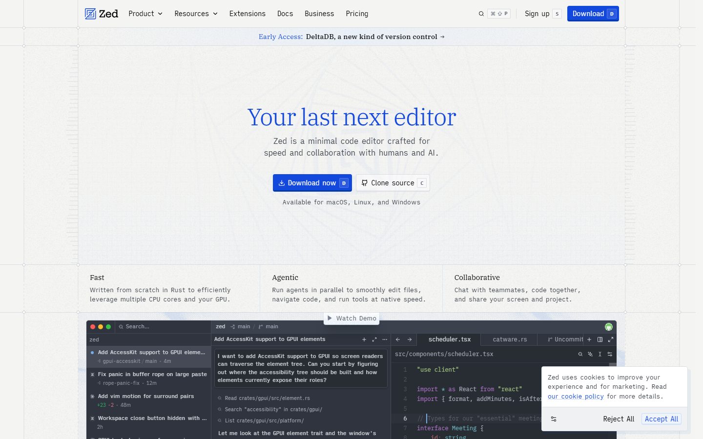
Zed's marketing surface reads like a precise engineering document. The canvas is a cool blue-gray paper (`{colors.paper}` — #dce0e5) overlaid with faint plot-line gridding and dotted survey-cross markers, the headline is set in **IBM Plex Serif** rendered in brand blue (`{colors.brand-blue}` — #74ade8), and the body voice is **monospaced iA Writer**. The combination feels like a blueprint sheet for a code editor — quiet, technical, and exact.
The type split is deliberate and unusual for a SaaS page: a **serif display face** (IBM Plex Serif) carries every headline, while a **monospace text face** (iA Writer) handles body copy, buttons, navigation, and labels. That inversion — serif headings over mono body — is the system's signature voice. The mono body keeps the page feeling like source text; the serif headlines give it editorial warmth.
Brand voltage comes from two places: the **blue serif headline** and the **dark syntax-highlighted code mockups** (`{colors.canvas-dark}` — #101828) that anchor the lower bands. The code editor screenshot is shown as the real product chrome — file trees, tabs, an agent panel, and a multi-color syntax palette (`{colors.syntax-teal}`, `{colors.syntax-purple}`, `{colors.syntax-green}`, `{colors.syntax-red}`, `{colors.syntax-orange}`) — rather than a marketing illustration of it.
Corners are nearly square. The dominant radius is `{rounded.sm}` (2px), with buttons and cards at `{rounded.md}` (4px). There are no pill shapes, no big rounded cards — everything stays tight and document-like.
**Key Characteristics:**
- Cool blue-gray paper canvas (`{colors.paper}` — #dce0e5) with faint engineering plot-line gridding and dotted cross markers.
- IBM Plex Serif blue headlines (`{colors.brand-blue}` — #74ade8) over monospaced iA Writer body — a serif-display / mono-text inversion that is the brand's voice.
- Keyboard-cap shortcut badges (the "D", "S", "C" letters beside buttons), rendered as small `{rounded.sm}` chips with an inset bottom-edge shadow that mimics a physical key cap.
- Dark syntax-highlighted code mockups (`{colors.canvas-dark}` — #101828) carry the brand's only saturated color, via the syntax palette.
- Near-square geometry: `{rounded.sm}` (2px) dominant, `{rounded.md}` (4px) on buttons + cards, square (`{rounded.none}`) inputs.
- A blue primary "Download now" CTA against an otherwise near-monochrome blue-gray field.
- Dark navy footer (`{colors.canvas-dark}`) closes the long-scroll page.
## Colors
### Brand & Accent
- **Brand Blue** (`{colors.brand-blue}` — #74ade8): The hero headline, inline links, the early-access banner label, and the primary Download CTA. This is the one saturated hue in the marketing chrome. `{colors.brand-blue-alt}` (#73ade9) is a near-identical measured variant of the same blue.
- **Syntax Palette** — only appears inside the dark code mockups: `{colors.syntax-teal}` (#6eb4bf), `{colors.syntax-purple}` (#b477cf), `{colors.syntax-green}` (#a1c181), `{colors.syntax-red}` (#d07277), `{colors.syntax-rust}` (#b1574b), `{colors.syntax-orange}` (#bf956a). These are product chrome shown as content — never used on marketing UI.
### Surface
- **Paper** (`{colors.paper}` — #dce0e5): The default page floor — the dominant measured color (frequency 1000). A cool blue-gray that reads as drafting paper.
- **Paper Alt** (`{colors.paper-alt}` — #dadde2): A second, near-identical paper tone used for alternating bands and faint dividers.
- **Surface** (`{colors.surface}` — #ffffff): White cards, secondary buttons, key-cap badges, and testimonial cards.
- **Surface Tints** (`{colors.surface-tint-1}` — #a9afbc, `{colors.surface-tint-2}` — #b2b9c6, `{colors.surface-tint-3}` — #acb2be): The mid blue-gray family used for the plot-line gridding, faint UI strokes, and muted body text on the dark code mockups and footer.
- **Hairline** (`{colors.hairline}` — #e5e7eb): The 1px divider tone between sections and rows.
- **Canvas Dark** (`{colors.canvas-dark}` — #101828): The dark navy of the code mockups and the page footer — the only dark surface in the system.
### Text
- **Ink** (`{colors.ink}` — #121316): Strongest near-black text, used sparingly.
- **Body** (`{colors.body}` — #4e5a5f): Default running-text color — a muted slate.
- **Muted** (`{colors.muted}` — #6a7282): Secondary labels and fine-print.
- **On Primary** (`{colors.on-primary}` — #ffffff): Text on the blue Download button and inside the dark code/footer surfaces.
- **On Light** (`{colors.on-light}` — #000000): Text on white secondary buttons (the measured `button.color`).
## Typography
### Font Family
Zed runs **IBM Plex Serif** for all headlines and **iA Writer** (Quattro/Mono, a monospaced text family) for body, buttons, navigation, and labels. Both are open-source typefaces (SIL OFL), so they can be shipped directly — no licensed substitution is required (`fonts_licensed` is empty).
The split is the brand's identity:
- IBM Plex Serif (headings, 340–400 weight) — h1 in brand blue with tight -0.96px tracking, h2/h3 in serif at normal tracking.
- iA Writer (body + UI, 400 weight, monospace) — paragraphs, buttons, nav, captions.
If IBM Plex Serif is unavailable, Georgia is the documented serif fallback; for the iA Writer mono voice, `ui-monospace` / system monospace is the documented fallback.
### Hierarchy
| Token | Size | Weight | Line Height | Letter Spacing | Use |
|---|---|---|---|---|---|
| `{typography.h1}` | 48px | 340 | 1.2 | -0.96px | Hero headline ("Your last next editor") — IBM Plex Serif, brand blue |
| `{typography.h2}` | 26.4px | 400 | 1.25 | normal | Section heads ("Zed Just Works", "Open Source") — IBM Plex Serif |
| `{typography.h3}` | 16.8px | 400 | 1.1 | normal | Sub-section / card titles — IBM Plex Serif |
| `{typography.body}` | 13px | 400 | 1.5 | normal | Default running-text — iA Writer monospace |
| `{typography.button}` | 14px | 400 | 1.429 | -0.35px | Button labels, nav links — iA Writer monospace |
### Principles
The serif-heading / mono-body inversion is the rule, not an accident. Headlines stay in IBM Plex Serif; never set a headline in the mono face, and never set body copy in the serif. The h1 weight is a light 340 — Plex Serif at light weight with negative tracking is the brand's display signature; do not bold it.
Body type is genuinely monospaced — it keeps the page reading like source text and pairs with the engineering-paper canvas. Type sizes are small and dense (13px body), reinforcing the tool-for-developers voice.
## Layout
### Spacing System
- **Base unit:** 4px, with a heavily-used 6px step.
- **Tokens:** `{spacing.xxs}` 4px · `{spacing.xs}` 6px · `{spacing.sm}` 8px · `{spacing.base}` 10px · `{spacing.md}` 12px · `{spacing.lg}` 16px · `{spacing.xl}` 20px · `{spacing.xxl}` 24px · `{spacing.huge}` 32px · `{spacing.section}` 48px · `{spacing.section-lg}` 64px.
- **Tight inner rhythm:** The two highest-frequency values are 4px (frequency 315) and 6px (153) — most internal padding and gaps are very tight, matching the dense, document-like feel.
- **Section spacing:** `{spacing.section}` (48px) is the most-used large step between editorial bands.
### Grid & Container
- **Feature rows:** 3-up at desktop ("Fast / Agentic / Collaborative"), and 2-up + 3-up grids in the "Zed Just Works" and extensions bands.
- **Body bands:** Single centered column for hero copy; left-aligned section headings introduce multi-column feature grids below.
- **Footer:** Multi-column link list (Product / Resources / Company / Social) at desktop.
### Whitespace Philosophy
Whitespace is generous at the band level (the hero floats in a tall paper field with plot-line markers) but tight within components (4–6px inner gaps). The result is a page that breathes between sections while keeping each component dense and exact — like a well-laid-out spec sheet.
## Elevation & Depth
| Level | Treatment | Use |
|---|---|---|
| Flat | No shadow on the paper canvas | Hero, feature bands, nav |
| Key-cap inset | `rgba(111, 123, 144, 0.1) 0px -2px 0px 0px inset` | Keyboard shortcut badges + buttons — the signature 2px bottom-edge "key cap" shading (also at 0.05 alpha for softer chips) |
| Card | `rgb(5, 55, 148) 0px -2px 0px 0px inset, rgb(230, 239, 254) 0px 1px 3px 0px` | Cards — a dark-blue 2px bottom inset plus a faint pale-blue drop |
| Blue offset | `rgba(7, 77, 207, 0.06) 6px 6px 0px 0px` | Occasional offset-shadow card treatment — a hard 6px blue shadow with no blur |
| Floating popover | `oklab(0 0 0 / 0.2) 0px 20px 25px -5px` (plus a layered stack) | The cookie-consent popover — the only soft floating shadow in the system |
The depth philosophy is **flat-with-an-edge**: most surfaces sit flat on the paper, and emphasis comes from a hard 2px bottom-inset border that makes buttons and key-cap badges look slightly raised, like physical keys. Blue-tinted shadows tie the depth back to the brand blue.
### Decorative Depth
- Faint plot-line gridding and dotted survey-cross markers in the surface-tint family overlay the paper canvas — engineering-drawing texture rather than a flat background.
- The dark code mockups carry their own internal product-UI shadows; these are product chrome shown as content, not system tokens.
## Shapes
### Border Radius Scale
| Token | Value | Use |
|---|---|---|
| `{rounded.none}` | 0px | Text inputs — square corners |
| `{rounded.sm}` | 2px | The dominant radius (frequency 613) — key-cap badges, small chips, most surfaces |
| `{rounded.md}` | 4px | Buttons and cards |
| `{rounded.lg}` | 6px | Rare — a single larger-corner case (frequency 1) |
### Geometry
Zed's geometry is almost square. Nothing approaches a pill or a large rounded card — the maximum measured radius is 6px and it is barely used. The 2px default keeps every chip and surface looking like a precisely-cut element on a spec sheet. Product mockups inside the dark code surface retain their native editor chrome radii.
## Components
### Navigation
**`top-nav`** — Paper-canvas nav bar carrying the Zed wordmark + logo at left; a horizontal menu (Product, Resources, Extensions, Docs, Business, Pricing); and a right cluster with search, a command-palette hint, "Sign up", and the blue "Download" button. Labels in `{typography.button}` (iA Writer 14px). Background `{colors.paper}`, text `{colors.body}`.
**`early-access-banner`** — A thin band directly under the nav ("Early Access: DeltaDB, a new kind of version control →") with the label in `{colors.brand-blue}` against `{colors.paper}`.
### Hero
**`hero-band`** — Tall paper field with plot-line gridding. Centered h1 in `{typography.h1}` (IBM Plex Serif 48px, brand blue), a two-line mono sub-headline in `{colors.body}`, then a button row and an "Available for macOS, Linux, and Windows" caption. Vertical padding `{spacing.section}` (48px).
### Buttons & Badges
**`button-primary`** — The blue "Download now" CTA. Background `{colors.brand-blue}` (derived: the exact CTA blue was not isolated by the analyzer; mapped to the nearest measured blue), text `{colors.on-primary}`, type `{typography.button}`, rounded `{rounded.md}` (4px). Carries a key-cap shortcut badge ("D") at its right edge.
**`button-secondary`** — White "Clone source" button. Background `{colors.surface}`, text `{colors.on-light}` (#000000, the measured button text color), rounded `{rounded.md}`, carrying a "C" key-cap badge.
**`kbd-badge`** — The signature keyboard-cap shortcut chip ("D", "S", "C") shown beside buttons and nav items. Background `{colors.surface}`, text `{colors.body}`, rounded `{rounded.sm}` (2px), with the 2px inset bottom-edge shadow that gives it physical-key depth.
### Content
**`feature-block`** — The 3-up "Fast / Agentic / Collaborative" row and similar feature grids. Transparent over the paper canvas, h3 title in IBM Plex Serif, mono body in `{typography.body}` and `{colors.body}`.
**`card`** — General content card. Background `{colors.surface}`, rounded `{rounded.md}`, carrying the dark-blue 2px bottom inset + faint pale-blue drop shadow. Used for the "Zed Just Works" feature tiles and extension cards.
**`testimonial-card`** — Customer-quote card in the "Trusted by world-class developers" band. White surface (`{colors.surface}`), mono body quote, rounded `{rounded.md}`, with avatar + name + role rows.
**`code-mockup`** — The dark editor screenshot anchoring the hero and several lower bands. Background `{colors.canvas-dark}` (#101828), text in the surface-tint family, syntax tokens in the syntax palette. Shows real product chrome — file tree, tabs, agent panel, and source code — at small scale.
**`section-heading`** — Left-aligned band headings ("Zed Just Works", "Open Source", "Growing extensions ecosystem"). Brand-blue (`{colors.brand-blue}`) IBM Plex Serif in `{typography.h2}`.
### Forms
**`input`** — Text input (search, forms). Background `{colors.surface}`, text `{colors.body}`, type `{typography.body}`, rounded `{rounded.none}` (square 0px corners — measured). The square input is a deliberate counterpoint to the slightly-rounded buttons.
### Footer
**`footer`** — Dark navy footer closing the page. Background `{colors.canvas-dark}` (#101828), text in `{colors.surface-tint-1}`, mono body type. Multi-column link list (Product / Resources / Company / Social) with the Zed wordmark. The only dark surface besides the code mockups.
## Do's and Don'ts
### Do
- Keep the serif-heading / mono-body inversion intact: IBM Plex Serif headlines, iA Writer monospace body. This is the brand voice.
- Set the h1 in brand blue (`{colors.brand-blue}`) at the light 340 weight with -0.96px tracking.
- Use the key-cap badge treatment (`{component.kbd-badge}`) for keyboard shortcuts beside buttons — it's the system's signature interactive detail.
- Keep corners near-square: `{rounded.sm}` (2px) by default, `{rounded.md}` (4px) on buttons and cards, square inputs.
- Reserve saturated color for the syntax palette inside the dark code mockups — let the product chrome carry the color voltage.
- Keep the paper-canvas plot-line gridding faint, in the surface-tint family.
- Close the page on the dark navy footer (`{colors.canvas-dark}`).
### Don't
- Don't bold the h1 or set headings in the mono face — the serif at light weight is the display signature.
- Don't put body copy in IBM Plex Serif or headlines in iA Writer.
- Don't introduce pills or large rounded cards — the maximum radius is 6px and barely used.
- Don't apply the syntax-palette colors to marketing UI; they belong inside the code mockups only.
- Don't add dark surfaces beyond the code mockups and footer.
- Don't document hover states — default and active/pressed only.
## Responsive Behavior
### Breakpoints
The site was captured at desktop width; the following are inferred from the captured layout and standard practice (derived).
| Name | Width | Key Changes |
|---|---|---|
| Mobile | < 768px | Collapsed nav; hero h1 scales down; 3-up feature rows stack 1-up; code mockup scales proportionally; footer columns wrap |
| Tablet | 768–1024px | Feature grids 2-up; nav tightens |
| Desktop | 1024–1440px | Full nav; 3-up feature rows; full-width code mockups |
| Wide | > 1440px | Same as desktop with more outer paper breathing room |
### Touch Targets
- `{component.button-primary}` and `{component.button-secondary}` carry key-cap badges; effective tap area extends across the label + badge.
- `{component.kbd-badge}` chips are decorative/shortcut indicators, not primary tap targets.
- Exact button heights and padding were not cleanly measured (see Known Gaps).
### Collapsing Strategy
- The 3-up feature row reduces columns before scaling cards.
- The dark code mockup scales proportionally to keep syntax-highlighted source legible.
- The footer multi-column link list wraps to fewer columns on narrow screens.
## Iteration Guide
1. Focus on ONE component at a time and reference its YAML key directly (`{component.kbd-badge}`, `{component.code-mockup}`).
2. Variants of an existing component live as separate entries in `components:`.
3. Use `{token.refs}` everywhere — never inline a hex.
4. Document default and active/pressed states only — never hover.
5. The serif-heading / mono-body inversion is the immovable core. Don't blur it.
6. Keep new color only inside the syntax palette / code mockups; the marketing chrome stays near-monochrome blue-gray with one brand blue.
7. When adding depth, prefer the 2px inset bottom-edge "key cap" treatment over soft drop shadows.
## Known Gaps
- The blue "Download now" CTA's exact fill color was not isolated by the analyzer (the measured `button.color` of #000000 corresponds to the white secondary button's text). `{component.button-primary}` is mapped to the nearest measured blue (`{colors.brand-blue}`, #74ade8) — treat as derived.
- The measured `button-primary` padding was `0px` (an inner element), and button/input heights were not captured — padding and height tokens are intentionally omitted rather than guessed.
- IBM Plex Serif (`plexSerif`) and iA Writer (`writer`) were identified from computed font roles; the exact iA Writer cut (Quattro vs. Mono vs. Duo) is inferred — `iA Writer Quattro` is documented as the representative family. Both are open-source (SIL OFL), so no licensed substitution is required.
- Letter-spacing for h2, h3, and body measured as `normal`; recorded as such rather than converted to a px value.
- Max content width / container width was not measured; the grid description is from screenshot ground-truth.
- Responsive breakpoints are derived from the desktop capture plus standard practice, not measured at multiple widths.
- The pricing page was captured but its tier-card spec was not separately measured; pricing cards are assumed to reuse `{component.card}`.
- Animation, transition timings, and the engineering plot-line grid's exact stroke spec are out of scope.
<!-- Documented by duply · real-world design systems as ready-to-use DESIGN.md for AI coding agents · https://duply.ai/zed/design-md -->
Color Palette
Accent
Neutrals
Typography
h148px · 340 · 1.2
The quick brown fox jumpsh226.4px · 400 · 1.25
The quick brown fox jumpsh316.8px · 400 · 1.1
The quick brown fox jumpsbody13px · 400 · 1.5
The quick brown fox jumpsbutton14px · 400 · 1.429
The quick brown fox jumpsSpacing & Shape
Spacing
| Name | Value | Preview |
|---|---|---|
| xxs | 4px | |
| xs | 6px | |
| sm | 8px | |
| base | 10px | |
| md | 12px | |
| lg | 16px | |
| xl | 20px | |
| xxl | 24px | |
| huge | 32px | |
| section | 48px | |
| section-lg | 64px |
Border Radius
| Name | Value | Preview |
|---|---|---|
| none | 0px | |
| sm | 2px | |
| md | 4px | |
| lg | 6px |
More like this


---
version: alpha
name: Zed-design-analysis
description: A blueprint-paper developer-tool interface built on a cool blue-gray canvas, IBM Plex Serif blue headlines, and a monospaced iA-Writer body voice. The system reads as a precise engineering document — faint plot-line gridding, near-square 2px corners, keyboard-cap shortcut badges with inset bottom-edge shadows, and dark syntax-highlighted code mockups that carry the brand's color voltage. Minimal, technical, and quiet, closing on a dark navy footer.

colors:
  brand-blue: "#74ade8"
  brand-blue-alt: "#73ade9"
  ink: "#121316"
  body: "#4e5a5f"
  muted: "#6a7282"
  paper: "#dce0e5"
  paper-alt: "#dadde2"
  surface: "#ffffff"
  surface-tint-1: "#a9afbc"
  surface-tint-2: "#b2b9c6"
  surface-tint-3: "#acb2be"
  hairline: "#e5e7eb"
  canvas-dark: "#101828"
  on-primary: "#ffffff"
  on-light: "#000000"
  syntax-teal: "#6eb4bf"
  syntax-purple: "#b477cf"
  syntax-green: "#a1c181"
  syntax-red: "#d07277"
  syntax-rust: "#b1574b"
  syntax-orange: "#bf956a"

typography:
  h1:
    fontFamily: "IBM Plex Serif, Georgia, serif"
    fontSize: 48px
    fontWeight: 340
    lineHeight: 1.2
    letterSpacing: -0.96px
  h2:
    fontFamily: "IBM Plex Serif, Georgia, serif"
    fontSize: 26.4px
    fontWeight: 400
    lineHeight: 1.25
    letterSpacing: normal
  h3:
    fontFamily: "IBM Plex Serif, Georgia, serif"
    fontSize: 16.8px
    fontWeight: 400
    lineHeight: 1.1
    letterSpacing: normal
  body:
    fontFamily: "iA Writer Quattro, ui-monospace, monospace"
    fontSize: 13px
    fontWeight: 400
    lineHeight: 1.5
    letterSpacing: normal
  button:
    fontFamily: "iA Writer Quattro, ui-monospace, monospace"
    fontSize: 14px
    fontWeight: 400
    lineHeight: 1.429
    letterSpacing: -0.35px

rounded:
  none: 0px
  sm: 2px
  md: 4px
  lg: 6px

spacing:
  xxs: 4px
  xs: 6px
  sm: 8px
  base: 10px
  md: 12px
  lg: 16px
  xl: 20px
  xxl: 24px
  huge: 32px
  section: 48px
  section-lg: 64px

components:
  top-nav:
    backgroundColor: "{colors.paper}"
    textColor: "{colors.body}"
    typography: "{typography.button}"
  early-access-banner:
    backgroundColor: "{colors.paper}"
    textColor: "{colors.brand-blue}"
    typography: "{typography.button}"
  hero-band:
    backgroundColor: "{colors.paper}"
    textColor: "{colors.brand-blue}"
    typography: "{typography.h1}"
    padding: 48px
  button-primary:
    backgroundColor: "{colors.brand-blue}"
    textColor: "{colors.on-primary}"
    typography: "{typography.button}"
    rounded: "{rounded.md}"
  button-secondary:
    backgroundColor: "{colors.surface}"
    textColor: "{colors.on-light}"
    typography: "{typography.button}"
    rounded: "{rounded.md}"
  kbd-badge:
    backgroundColor: "{colors.surface}"
    textColor: "{colors.body}"
    typography: "{typography.button}"
    rounded: "{rounded.sm}"
  feature-block:
    backgroundColor: "{colors.paper}"
    textColor: "{colors.body}"
    typography: "{typography.body}"
  card:
    backgroundColor: "{colors.surface}"
    textColor: "{colors.body}"
    typography: "{typography.body}"
    rounded: "{rounded.md}"
  testimonial-card:
    backgroundColor: "{colors.surface}"
    textColor: "{colors.body}"
    typography: "{typography.body}"
    rounded: "{rounded.md}"
  code-mockup:
    backgroundColor: "{colors.canvas-dark}"
    textColor: "{colors.surface-tint-1}"
    typography: "{typography.body}"
    rounded: "{rounded.md}"
  section-heading:
    backgroundColor: transparent
    textColor: "{colors.brand-blue}"
    typography: "{typography.h2}"
  input:
    backgroundColor: "{colors.surface}"
    textColor: "{colors.body}"
    typography: "{typography.body}"
    rounded: "{rounded.none}"
  footer:
    backgroundColor: "{colors.canvas-dark}"
    textColor: "{colors.surface-tint-1}"
    typography: "{typography.body}"
    padding: 48px
---

## Overview

Zed's marketing surface reads like a precise engineering document. The canvas is a cool blue-gray paper (`{colors.paper}` — #dce0e5) overlaid with faint plot-line gridding and dotted survey-cross markers, the headline is set in **IBM Plex Serif** rendered in brand blue (`{colors.brand-blue}` — #74ade8), and the body voice is **monospaced iA Writer**. The combination feels like a blueprint sheet for a code editor — quiet, technical, and exact.

The type split is deliberate and unusual for a SaaS page: a **serif display face** (IBM Plex Serif) carries every headline, while a **monospace text face** (iA Writer) handles body copy, buttons, navigation, and labels. That inversion — serif headings over mono body — is the system's signature voice. The mono body keeps the page feeling like source text; the serif headlines give it editorial warmth.

Brand voltage comes from two places: the **blue serif headline** and the **dark syntax-highlighted code mockups** (`{colors.canvas-dark}` — #101828) that anchor the lower bands. The code editor screenshot is shown as the real product chrome — file trees, tabs, an agent panel, and a multi-color syntax palette (`{colors.syntax-teal}`, `{colors.syntax-purple}`, `{colors.syntax-green}`, `{colors.syntax-red}`, `{colors.syntax-orange}`) — rather than a marketing illustration of it.

Corners are nearly square. The dominant radius is `{rounded.sm}` (2px), with buttons and cards at `{rounded.md}` (4px). There are no pill shapes, no big rounded cards — everything stays tight and document-like.

**Key Characteristics:**
- Cool blue-gray paper canvas (`{colors.paper}` — #dce0e5) with faint engineering plot-line gridding and dotted cross markers.
- IBM Plex Serif blue headlines (`{colors.brand-blue}` — #74ade8) over monospaced iA Writer body — a serif-display / mono-text inversion that is the brand's voice.
- Keyboard-cap shortcut badges (the "D", "S", "C" letters beside buttons), rendered as small `{rounded.sm}` chips with an inset bottom-edge shadow that mimics a physical key cap.
- Dark syntax-highlighted code mockups (`{colors.canvas-dark}` — #101828) carry the brand's only saturated color, via the syntax palette.
- Near-square geometry: `{rounded.sm}` (2px) dominant, `{rounded.md}` (4px) on buttons + cards, square (`{rounded.none}`) inputs.
- A blue primary "Download now" CTA against an otherwise near-monochrome blue-gray field.
- Dark navy footer (`{colors.canvas-dark}`) closes the long-scroll page.

## Colors

### Brand & Accent
- **Brand Blue** (`{colors.brand-blue}` — #74ade8): The hero headline, inline links, the early-access banner label, and the primary Download CTA. This is the one saturated hue in the marketing chrome. `{colors.brand-blue-alt}` (#73ade9) is a near-identical measured variant of the same blue.
- **Syntax Palette** — only appears inside the dark code mockups: `{colors.syntax-teal}` (#6eb4bf), `{colors.syntax-purple}` (#b477cf), `{colors.syntax-green}` (#a1c181), `{colors.syntax-red}` (#d07277), `{colors.syntax-rust}` (#b1574b), `{colors.syntax-orange}` (#bf956a). These are product chrome shown as content — never used on marketing UI.

### Surface
- **Paper** (`{colors.paper}` — #dce0e5): The default page floor — the dominant measured color (frequency 1000). A cool blue-gray that reads as drafting paper.
- **Paper Alt** (`{colors.paper-alt}` — #dadde2): A second, near-identical paper tone used for alternating bands and faint dividers.
- **Surface** (`{colors.surface}` — #ffffff): White cards, secondary buttons, key-cap badges, and testimonial cards.
- **Surface Tints** (`{colors.surface-tint-1}` — #a9afbc, `{colors.surface-tint-2}` — #b2b9c6, `{colors.surface-tint-3}` — #acb2be): The mid blue-gray family used for the plot-line gridding, faint UI strokes, and muted body text on the dark code mockups and footer.
- **Hairline** (`{colors.hairline}` — #e5e7eb): The 1px divider tone between sections and rows.
- **Canvas Dark** (`{colors.canvas-dark}` — #101828): The dark navy of the code mockups and the page footer — the only dark surface in the system.

### Text
- **Ink** (`{colors.ink}` — #121316): Strongest near-black text, used sparingly.
- **Body** (`{colors.body}` — #4e5a5f): Default running-text color — a muted slate.
- **Muted** (`{colors.muted}` — #6a7282): Secondary labels and fine-print.
- **On Primary** (`{colors.on-primary}` — #ffffff): Text on the blue Download button and inside the dark code/footer surfaces.
- **On Light** (`{colors.on-light}` — #000000): Text on white secondary buttons (the measured `button.color`).

## Typography

### Font Family
Zed runs **IBM Plex Serif** for all headlines and **iA Writer** (Quattro/Mono, a monospaced text family) for body, buttons, navigation, and labels. Both are open-source typefaces (SIL OFL), so they can be shipped directly — no licensed substitution is required (`fonts_licensed` is empty).

The split is the brand's identity:
- IBM Plex Serif (headings, 340–400 weight) — h1 in brand blue with tight -0.96px tracking, h2/h3 in serif at normal tracking.
- iA Writer (body + UI, 400 weight, monospace) — paragraphs, buttons, nav, captions.

If IBM Plex Serif is unavailable, Georgia is the documented serif fallback; for the iA Writer mono voice, `ui-monospace` / system monospace is the documented fallback.

### Hierarchy

| Token | Size | Weight | Line Height | Letter Spacing | Use |
|---|---|---|---|---|---|
| `{typography.h1}` | 48px | 340 | 1.2 | -0.96px | Hero headline ("Your last next editor") — IBM Plex Serif, brand blue |
| `{typography.h2}` | 26.4px | 400 | 1.25 | normal | Section heads ("Zed Just Works", "Open Source") — IBM Plex Serif |
| `{typography.h3}` | 16.8px | 400 | 1.1 | normal | Sub-section / card titles — IBM Plex Serif |
| `{typography.body}` | 13px | 400 | 1.5 | normal | Default running-text — iA Writer monospace |
| `{typography.button}` | 14px | 400 | 1.429 | -0.35px | Button labels, nav links — iA Writer monospace |

### Principles
The serif-heading / mono-body inversion is the rule, not an accident. Headlines stay in IBM Plex Serif; never set a headline in the mono face, and never set body copy in the serif. The h1 weight is a light 340 — Plex Serif at light weight with negative tracking is the brand's display signature; do not bold it.

Body type is genuinely monospaced — it keeps the page reading like source text and pairs with the engineering-paper canvas. Type sizes are small and dense (13px body), reinforcing the tool-for-developers voice.

## Layout

### Spacing System
- **Base unit:** 4px, with a heavily-used 6px step.
- **Tokens:** `{spacing.xxs}` 4px · `{spacing.xs}` 6px · `{spacing.sm}` 8px · `{spacing.base}` 10px · `{spacing.md}` 12px · `{spacing.lg}` 16px · `{spacing.xl}` 20px · `{spacing.xxl}` 24px · `{spacing.huge}` 32px · `{spacing.section}` 48px · `{spacing.section-lg}` 64px.
- **Tight inner rhythm:** The two highest-frequency values are 4px (frequency 315) and 6px (153) — most internal padding and gaps are very tight, matching the dense, document-like feel.
- **Section spacing:** `{spacing.section}` (48px) is the most-used large step between editorial bands.

### Grid & Container
- **Feature rows:** 3-up at desktop ("Fast / Agentic / Collaborative"), and 2-up + 3-up grids in the "Zed Just Works" and extensions bands.
- **Body bands:** Single centered column for hero copy; left-aligned section headings introduce multi-column feature grids below.
- **Footer:** Multi-column link list (Product / Resources / Company / Social) at desktop.

### Whitespace Philosophy
Whitespace is generous at the band level (the hero floats in a tall paper field with plot-line markers) but tight within components (4–6px inner gaps). The result is a page that breathes between sections while keeping each component dense and exact — like a well-laid-out spec sheet.

## Elevation & Depth

| Level | Treatment | Use |
|---|---|---|
| Flat | No shadow on the paper canvas | Hero, feature bands, nav |
| Key-cap inset | `rgba(111, 123, 144, 0.1) 0px -2px 0px 0px inset` | Keyboard shortcut badges + buttons — the signature 2px bottom-edge "key cap" shading (also at 0.05 alpha for softer chips) |
| Card | `rgb(5, 55, 148) 0px -2px 0px 0px inset, rgb(230, 239, 254) 0px 1px 3px 0px` | Cards — a dark-blue 2px bottom inset plus a faint pale-blue drop |
| Blue offset | `rgba(7, 77, 207, 0.06) 6px 6px 0px 0px` | Occasional offset-shadow card treatment — a hard 6px blue shadow with no blur |
| Floating popover | `oklab(0 0 0 / 0.2) 0px 20px 25px -5px` (plus a layered stack) | The cookie-consent popover — the only soft floating shadow in the system |

The depth philosophy is **flat-with-an-edge**: most surfaces sit flat on the paper, and emphasis comes from a hard 2px bottom-inset border that makes buttons and key-cap badges look slightly raised, like physical keys. Blue-tinted shadows tie the depth back to the brand blue.

### Decorative Depth
- Faint plot-line gridding and dotted survey-cross markers in the surface-tint family overlay the paper canvas — engineering-drawing texture rather than a flat background.
- The dark code mockups carry their own internal product-UI shadows; these are product chrome shown as content, not system tokens.

## Shapes

### Border Radius Scale

| Token | Value | Use |
|---|---|---|
| `{rounded.none}` | 0px | Text inputs — square corners |
| `{rounded.sm}` | 2px | The dominant radius (frequency 613) — key-cap badges, small chips, most surfaces |
| `{rounded.md}` | 4px | Buttons and cards |
| `{rounded.lg}` | 6px | Rare — a single larger-corner case (frequency 1) |

### Geometry
Zed's geometry is almost square. Nothing approaches a pill or a large rounded card — the maximum measured radius is 6px and it is barely used. The 2px default keeps every chip and surface looking like a precisely-cut element on a spec sheet. Product mockups inside the dark code surface retain their native editor chrome radii.

## Components

### Navigation

**`top-nav`** — Paper-canvas nav bar carrying the Zed wordmark + logo at left; a horizontal menu (Product, Resources, Extensions, Docs, Business, Pricing); and a right cluster with search, a command-palette hint, "Sign up", and the blue "Download" button. Labels in `{typography.button}` (iA Writer 14px). Background `{colors.paper}`, text `{colors.body}`.

**`early-access-banner`** — A thin band directly under the nav ("Early Access: DeltaDB, a new kind of version control →") with the label in `{colors.brand-blue}` against `{colors.paper}`.

### Hero

**`hero-band`** — Tall paper field with plot-line gridding. Centered h1 in `{typography.h1}` (IBM Plex Serif 48px, brand blue), a two-line mono sub-headline in `{colors.body}`, then a button row and an "Available for macOS, Linux, and Windows" caption. Vertical padding `{spacing.section}` (48px).

### Buttons & Badges

**`button-primary`** — The blue "Download now" CTA. Background `{colors.brand-blue}` (derived: the exact CTA blue was not isolated by the analyzer; mapped to the nearest measured blue), text `{colors.on-primary}`, type `{typography.button}`, rounded `{rounded.md}` (4px). Carries a key-cap shortcut badge ("D") at its right edge.

**`button-secondary`** — White "Clone source" button. Background `{colors.surface}`, text `{colors.on-light}` (#000000, the measured button text color), rounded `{rounded.md}`, carrying a "C" key-cap badge.

**`kbd-badge`** — The signature keyboard-cap shortcut chip ("D", "S", "C") shown beside buttons and nav items. Background `{colors.surface}`, text `{colors.body}`, rounded `{rounded.sm}` (2px), with the 2px inset bottom-edge shadow that gives it physical-key depth.

### Content

**`feature-block`** — The 3-up "Fast / Agentic / Collaborative" row and similar feature grids. Transparent over the paper canvas, h3 title in IBM Plex Serif, mono body in `{typography.body}` and `{colors.body}`.

**`card`** — General content card. Background `{colors.surface}`, rounded `{rounded.md}`, carrying the dark-blue 2px bottom inset + faint pale-blue drop shadow. Used for the "Zed Just Works" feature tiles and extension cards.

**`testimonial-card`** — Customer-quote card in the "Trusted by world-class developers" band. White surface (`{colors.surface}`), mono body quote, rounded `{rounded.md}`, with avatar + name + role rows.

**`code-mockup`** — The dark editor screenshot anchoring the hero and several lower bands. Background `{colors.canvas-dark}` (#101828), text in the surface-tint family, syntax tokens in the syntax palette. Shows real product chrome — file tree, tabs, agent panel, and source code — at small scale.

**`section-heading`** — Left-aligned band headings ("Zed Just Works", "Open Source", "Growing extensions ecosystem"). Brand-blue (`{colors.brand-blue}`) IBM Plex Serif in `{typography.h2}`.

### Forms

**`input`** — Text input (search, forms). Background `{colors.surface}`, text `{colors.body}`, type `{typography.body}`, rounded `{rounded.none}` (square 0px corners — measured). The square input is a deliberate counterpoint to the slightly-rounded buttons.

### Footer

**`footer`** — Dark navy footer closing the page. Background `{colors.canvas-dark}` (#101828), text in `{colors.surface-tint-1}`, mono body type. Multi-column link list (Product / Resources / Company / Social) with the Zed wordmark. The only dark surface besides the code mockups.

## Do's and Don'ts

### Do
- Keep the serif-heading / mono-body inversion intact: IBM Plex Serif headlines, iA Writer monospace body. This is the brand voice.
- Set the h1 in brand blue (`{colors.brand-blue}`) at the light 340 weight with -0.96px tracking.
- Use the key-cap badge treatment (`{component.kbd-badge}`) for keyboard shortcuts beside buttons — it's the system's signature interactive detail.
- Keep corners near-square: `{rounded.sm}` (2px) by default, `{rounded.md}` (4px) on buttons and cards, square inputs.
- Reserve saturated color for the syntax palette inside the dark code mockups — let the product chrome carry the color voltage.
- Keep the paper-canvas plot-line gridding faint, in the surface-tint family.
- Close the page on the dark navy footer (`{colors.canvas-dark}`).

### Don't
- Don't bold the h1 or set headings in the mono face — the serif at light weight is the display signature.
- Don't put body copy in IBM Plex Serif or headlines in iA Writer.
- Don't introduce pills or large rounded cards — the maximum radius is 6px and barely used.
- Don't apply the syntax-palette colors to marketing UI; they belong inside the code mockups only.
- Don't add dark surfaces beyond the code mockups and footer.
- Don't document hover states — default and active/pressed only.

## Responsive Behavior

### Breakpoints
The site was captured at desktop width; the following are inferred from the captured layout and standard practice (derived).

| Name | Width | Key Changes |
|---|---|---|
| Mobile | < 768px | Collapsed nav; hero h1 scales down; 3-up feature rows stack 1-up; code mockup scales proportionally; footer columns wrap |
| Tablet | 768–1024px | Feature grids 2-up; nav tightens |
| Desktop | 1024–1440px | Full nav; 3-up feature rows; full-width code mockups |
| Wide | > 1440px | Same as desktop with more outer paper breathing room |

### Touch Targets
- `{component.button-primary}` and `{component.button-secondary}` carry key-cap badges; effective tap area extends across the label + badge.
- `{component.kbd-badge}` chips are decorative/shortcut indicators, not primary tap targets.
- Exact button heights and padding were not cleanly measured (see Known Gaps).

### Collapsing Strategy
- The 3-up feature row reduces columns before scaling cards.
- The dark code mockup scales proportionally to keep syntax-highlighted source legible.
- The footer multi-column link list wraps to fewer columns on narrow screens.

## Iteration Guide

1. Focus on ONE component at a time and reference its YAML key directly (`{component.kbd-badge}`, `{component.code-mockup}`).
2. Variants of an existing component live as separate entries in `components:`.
3. Use `{token.refs}` everywhere — never inline a hex.
4. Document default and active/pressed states only — never hover.
5. The serif-heading / mono-body inversion is the immovable core. Don't blur it.
6. Keep new color only inside the syntax palette / code mockups; the marketing chrome stays near-monochrome blue-gray with one brand blue.
7. When adding depth, prefer the 2px inset bottom-edge "key cap" treatment over soft drop shadows.

## Known Gaps

- The blue "Download now" CTA's exact fill color was not isolated by the analyzer (the measured `button.color` of #000000 corresponds to the white secondary button's text). `{component.button-primary}` is mapped to the nearest measured blue (`{colors.brand-blue}`, #74ade8) — treat as derived.
- The measured `button-primary` padding was `0px` (an inner element), and button/input heights were not captured — padding and height tokens are intentionally omitted rather than guessed.
- IBM Plex Serif (`plexSerif`) and iA Writer (`writer`) were identified from computed font roles; the exact iA Writer cut (Quattro vs. Mono vs. Duo) is inferred — `iA Writer Quattro` is documented as the representative family. Both are open-source (SIL OFL), so no licensed substitution is required.
- Letter-spacing for h2, h3, and body measured as `normal`; recorded as such rather than converted to a px value.
- Max content width / container width was not measured; the grid description is from screenshot ground-truth.
- Responsive breakpoints are derived from the desktop capture plus standard practice, not measured at multiple widths.
- The pricing page was captured but its tier-card spec was not separately measured; pricing cards are assumed to reuse `{component.card}`.
- Animation, transition timings, and the engineering plot-line grid's exact stroke spec are out of scope.

<!-- Documented by duply · real-world design systems as ready-to-use DESIGN.md for AI coding agents · https://duply.ai/zed/design-md -->