HyperDX
A developer-first observability product site built on a near-black canvas (#0f1215) with terminal-green outlined CTAs (#50fa7b) and Inter throughout. The system reads as engineered, dense, and console-like — real product UI (session replays, log streams, status-coded events) is shown directly inside the page rather than abstracted into marketing illustration. Brand voltage comes from the terminal-green accent against deep dark surfaces and from monospaced-feeling product chrome shown at scale.
---
version: alpha
name: HyperDX-design-analysis
description: "A developer-first observability product site built on a near-black canvas (#0f1215) with terminal-green outlined CTAs (#50fa7b) and Inter throughout. The system reads as engineered, dense, and console-like — real product UI (session replays, log streams, status-coded events) is shown directly inside the page rather than abstracted into marketing illustration. Brand voltage comes from the terminal-green accent against deep dark surfaces and from monospaced-feeling product chrome shown at scale."
colors:
primary: "#50fa7b"
canvas: "#0f1215"
neutral-black: "#000000"
surface: "#212529"
surface-elevated: "#373b3e"
hairline: "#41464b"
ink: "#ffffff"
body: "#ced4da"
muted: "#adb5bd"
muted-strong: "#6c757d"
neutral-600: "#495057"
neutral-300: "#dadada"
neutral-200: "#dee2e6"
neutral-100: "#e9ecef"
surface-light: "#f8f9fa"
accent-blue: "#3788f6"
accent-blue-deep: "#215294"
accent-red: "#ff5d5b"
accent-violet: "#8f57f3"
accent-amber: "#ffc107"
typography:
display:
fontFamily: "Inter, sans-serif"
fontSize: 48px
fontWeight: 700
lineHeight: 1.167
letterSpacing: 0
title:
fontFamily: "Inter, sans-serif"
fontSize: 28px
fontWeight: 500
lineHeight: 1.2
letterSpacing: 0
subtitle:
fontFamily: "Inter, sans-serif"
fontSize: 18px
fontWeight: 500
lineHeight: 1.5
letterSpacing: 0
body:
fontFamily: "Inter, sans-serif"
fontSize: 13px
fontWeight: 400
lineHeight: 1.45
letterSpacing: 0
button:
fontFamily: "Inter, sans-serif"
fontSize: 13px
fontWeight: 400
lineHeight: 1.5
letterSpacing: 0
rounded:
sm: 6px
md: 8px
pill: 25px
xl: 32px
spacing:
xs: 8px
sm: 12px
md: 16px
lg: 24px
xl: 48px
xxl: 64px
section: 80px
section-lg: 128px
section-xl: 160px
components:
button-primary:
backgroundColor: transparent
textColor: "{colors.primary}"
typography: "{typography.button}"
rounded: "{rounded.sm}"
padding: 6px 12px
button-text-link:
backgroundColor: transparent
textColor: "{colors.ink}"
typography: "{typography.button}"
top-nav:
backgroundColor: "{colors.canvas}"
textColor: "{colors.ink}"
typography: "{typography.body}"
nav-link:
backgroundColor: transparent
textColor: "{colors.muted}"
typography: "{typography.body}"
announcement-pill:
backgroundColor: "{colors.surface}"
textColor: "{colors.body}"
typography: "{typography.body}"
rounded: "{rounded.xl}"
padding: 12px 24px
github-star-badge:
backgroundColor: "{colors.surface}"
textColor: "{colors.ink}"
typography: "{typography.body}"
rounded: "{rounded.sm}"
padding: 6px 12px
hero-band:
backgroundColor: "{colors.canvas}"
textColor: "{colors.ink}"
typography: "{typography.display}"
padding: 80px
product-mockup-card:
backgroundColor: "{colors.neutral-black}"
textColor: "{colors.body}"
rounded: "{rounded.sm}"
card:
backgroundColor: "{colors.surface}"
textColor: "{colors.body}"
rounded: "{rounded.sm}"
feature-card:
backgroundColor: "{colors.surface}"
textColor: "{colors.body}"
typography: "{typography.subtitle}"
rounded: "{rounded.sm}"
padding: 48px
pricing-band:
backgroundColor: "{colors.surface}"
textColor: "{colors.body}"
typography: "{typography.title}"
rounded: "{rounded.md}"
padding: 48px
footer:
backgroundColor: "{colors.canvas}"
textColor: "{colors.muted}"
typography: "{typography.body}"
padding: 64px
---
## Overview
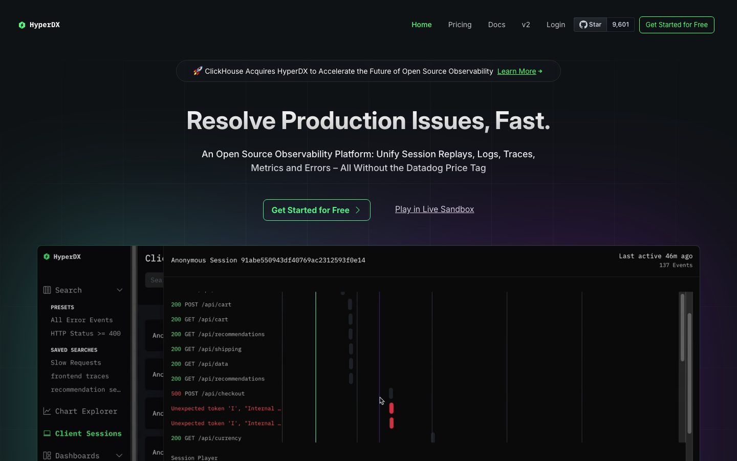
HyperDX's marketing surface is a developer-first observability product site built on a near-black canvas (`{colors.canvas}` — #0f1215). It reads like the product itself: dense, console-like, and engineered. The single chromatic signal is **terminal green** (`{colors.primary}` — #50fa7b) — used on outlined CTAs and on emphasized inline text — set against the dark floor. Everything else is grayscale Inter.
The type voice is entirely **Inter** across one display weight (700) and a set of medium/regular UI sizes. The hero headline ("Resolve Production Issues, Fast.") runs at `{typography.display}` (48px / 700), while supporting copy drops to a compact `{typography.body}` (13px / 400) — a notably small body size that reinforces the dense, dashboard-adjacent feel.
Brand voltage comes from **real product UI shown directly inside the page** — session-replay panels, log streams with HTTP status codes (green `200`s, red `500`s and error rows), a sidebar of saved searches. HyperDX doesn't paint marketing illustration of the product; it drops the actual console chrome onto the dark canvas, where the status-colored log rows (green/red/amber) supply the secondary accent palette.
**Key Characteristics:**
- Near-black canvas (`{colors.canvas}` — #0f1215) everywhere; there is no light page mode. The footer shares the same canvas rather than inverting.
- Terminal-green outlined CTA (`{component.button-primary}`) — green text (`{colors.primary}`) on a transparent fill with a green hairline border, `{rounded.sm}` (6px), compact 6px × 12px padding.
- Inter for everything: one 700 display weight, 500 for titles/subtitles, 400 for body and buttons. No second typeface.
- Small body type — `{typography.body}` at 13px — gives the site a dense, technical, reading-a-dashboard cadence.
- Product UI fragments embedded as content — session replay timelines and color-coded log rows carry the accent palette (`{colors.primary}` green, `{colors.accent-red}` red, `{colors.accent-amber}` amber).
- Surfaces are subtle near-black grays (`{colors.surface}` — #212529, `{colors.surface-elevated}` — #373b3e). Cards are nearly flat, separated by a faint 1px ring rather than a drop shadow.
- Border radius is restrained: `{rounded.sm}` (6px) for buttons + cards, `{rounded.md}` (8px) on some panels, `{rounded.pill}` / `{rounded.xl}` for the rounded announcement pill at the top of the hero.
## Colors
### Brand & Accent
- **Primary** (`{colors.primary}` — #50fa7b): The terminal-green brand color. Used as outlined-CTA text + border, emphasized inline links ("View Documentation for More"), the "Client Sessions" active sidebar item, and the green price figure ($0.40) on the pricing band. This is the single deliberate brand color.
- **Accent Blue** (`{colors.accent-blue}` — #3788f6) and **Accent Blue Deep** (`{colors.accent-blue-deep}` — #215294): Appear in product UI chrome and link accents.
- **Accent Red** (`{colors.accent-red}` — #ff5d5b): Error rows and `500` status codes inside the embedded log stream.
- **Accent Violet** (`{colors.accent-violet}` — #8f57f3): Trace/timeline markers in the session-replay panel.
- **Accent Amber** (`{colors.accent-amber}` — #ffc107): Warning markers inside product UI.
These accents are mostly carried by the embedded product chrome rather than applied to marketing components — only the green crosses into the marketing layer.
### Surface
- **Canvas** (`{colors.canvas}` — #0f1215): The universal page floor — hero, all sections, and footer.
- **Neutral Black** (`{colors.neutral-black}` — #000000): The product-mockup panel background — the embedded console is darker than the canvas around it.
- **Surface** (`{colors.surface}` — #212529): Card and feature-card background, pricing band, announcement pill, GitHub star badge.
- **Surface Elevated** (`{colors.surface-elevated}` — #373b3e): A slightly lighter near-black for nested/hovered panels.
- **Hairline** (`{colors.hairline}` — #41464b): The 1px border tone on dark surfaces.
### Light Neutrals (product chrome)
- **Surface Light** (`{colors.surface-light}` — #f8f9fa), **Neutral 100/200/300** (`{colors.neutral-100}` — #e9ecef, `{colors.neutral-200}` — #dee2e6, `{colors.neutral-300}` — #dadada): A light grayscale ramp that appears inside the white-background session-replay video player and other light product panels — not used on the dark marketing surfaces.
### Text
- **Ink** (`{colors.ink}` — #ffffff): All headlines and high-contrast text.
- **Body** (`{colors.body}` — #ced4da): Default running-text on the dark canvas (low-contrast measured body color).
- **Muted** (`{colors.muted}` — #adb5bd): Secondary text.
- **Muted Strong** (`{colors.muted-strong}` — #6c757d): Tertiary text, footer labels, fine-print.
- **Neutral 600** (`{colors.neutral-600}` — #495057): Disabled/very-low-emphasis text and dividers.
## Typography
### Font Family
The system runs **Inter** for every role — display, titles, body, navigation, and buttons. No second or display typeface was measured. The fallback stack is `Inter, sans-serif`. No licensed/custom fonts were flagged (`fonts_licensed` is empty), so no substitution is required.
The hierarchy is functional rather than expressive: one bold display weight (700) anchors the hero, a medium weight (500) carries section titles and subtitles, and regular (400) handles the dense body and button labels.
### Hierarchy
| Token | Size | Weight | Line Height | Letter Spacing | Use |
|---|---|---|---|---|---|
| `{typography.display}` | 48px | 700 | 1.167 | 0 | Hero h1 ("Resolve Production Issues, Fast.") |
| `{typography.title}` | 28px | 500 | 1.2 | 0 | Section heads ("Correlate End to End", "Visualize in Detail") — h3 |
| `{typography.subtitle}` | 18px | 500 | 1.5 | 0 | Feature-card titles, sub-heads — h2 |
| `{typography.body}` | 13px | 400 | 1.45 | 0 | Default running-text, descriptions, footer links |
| `{typography.button}` | 13px | 400 | 1.5 | 0 | CTA + button labels |
### Principles
The single bold display weight (700) is the only typographic emphasis — there is no italic, no second family, no expressive tracking (all letter-spacing measured as normal/0). Hierarchy is built almost entirely from size, since weight only ranges 400→500→700. The compact 13px body size is deliberate and part of the developer-tool voice; do not inflate it to a marketing-default 16px without re-checking the whole rhythm.
### Note on Font Substitutes
No licensed typefaces were detected. Inter is open-source and ships directly; the standard `Inter, sans-serif` stack is the full specification.
## Layout
### Spacing System
- **Base unit:** approximately 8px, with frequent 12 / 16 / 24 steps.
- **Tokens:** `{spacing.xs}` 8px · `{spacing.sm}` 12px · `{spacing.md}` 16px · `{spacing.lg}` 24px · `{spacing.xl}` 48px · `{spacing.xxl}` 64px · `{spacing.section}` 80px · `{spacing.section-lg}` 128px · `{spacing.section-xl}` 160px.
- **Section padding:** large vertical rhythm between editorial bands sits at `{spacing.section}` (80px) up to `{spacing.section-xl}` (160px) for the most generous spacing before product showcases.
- **Card internal padding:** `{spacing.xl}` (48px) for feature cards and the pricing band; smaller `{spacing.lg}` (24px) and `{spacing.md}` (16px) for tighter inner clusters.
- **Gutters:** `{spacing.lg}` (24px) between cards in the 2-up feature grid.
### Grid & Container
- **Max content width:** ~1200px centered (derived from the captured hero width).
- **Hero band:** single centered column — announcement pill, h1, sub-head, button row, then a full-width product-mockup card beneath.
- **Feature grids:** 2-up at desktop ("Blazing Fast Performance" / "Intuitive Search Syntax" / "Automatically Clustered Event Patterns" / "Correlated Session Replays").
- **Footer:** 5-column link list (Product / Resources / Languages / Platforms / Legal / Social).
### Whitespace Philosophy
Despite the dense 13px body, the bands themselves are generously spaced — large vertical gaps (80–160px) separate the centered hero, the feature grid, the "Visualize in Detail" showcase, and the pricing band. The result is a dark page that breathes between sections while staying information-dense within each card.
## Elevation & Depth
| Level | Treatment | Use |
|---|---|---|
| Flat | No shadow, no border | Body sections, hero, footer — all share `{colors.canvas}` |
| Hairline ring | `rgba(82,82,82,0.6) 0 0 0 1px` (measured) | Cards, panels, GitHub star badge — a 1px ring rather than a drop shadow |
| Surface block | `{colors.surface}` (#212529) fill on canvas | Feature cards, pricing band, announcement pill |
| Darker inset | `{colors.neutral-black}` (#000000) | The embedded product-mockup console reads as darker-than-canvas, pulling it forward by contrast |
The elevation philosophy is **flat-with-hairline** — the single measured shadow is a low-alpha 1px ring (`rgba(82,82,82,0.6) 0 0 0 1px`), not a blurred drop shadow. Depth is communicated by surface-darkness contrast (black console on near-black canvas) rather than by lighting.
### Decorative Depth
- The embedded session-replay panel and log stream carry their own internal product chrome (timeline markers, scrollbars, color-coded rows) — these are content, not system tokens.
- A faint radial/grid glow appears behind the hero headline in the captured screenshot; it is decorative and not a documented token.
## Shapes
### Border Radius Scale
| Token | Value | Use |
|---|---|---|
| `{rounded.sm}` | 6px | Standard buttons (`{component.button-primary}`), cards, GitHub star badge |
| `{rounded.md}` | 8px | Pricing band and select larger panels |
| `{rounded.pill}` | 25px | Announcement pill (rounded capsule at the top of the hero) |
| `{rounded.xl}` | 32px | Largest rounded containers — the announcement pill / wide capsule treatments |
### Photography Geometry
The site uses no marketing photography. The only "imagery" is embedded product UI, which keeps its native rectangular chrome with `{rounded.sm}` outer corners. There are no avatar circles or rounded-photo treatments in the captured surfaces.
## Components
### Top Navigation
**`top-nav`** — Canvas-colored bar across the top of every page (`{colors.canvas}`). Carries the HyperDX wordmark + logo at left, a horizontal menu (Home, Pricing, Docs, v2, Login) in `{component.nav-link}` (muted gray), a `{component.github-star-badge}` showing the GitHub star count, and a `{component.button-primary}` ("Get Started for Free") at the right. Menu items render in `{typography.body}`.
**`nav-link`** — Inline nav menu items. Transparent background, `{colors.muted}` text. The active item ("Home") shifts toward `{colors.primary}` green.
**`github-star-badge`** — A small surface-filled badge (`{colors.surface}`) showing the GitHub logo, "Star", and a count (9,601). Rounded `{rounded.sm}`, padding 6px × 12px, text in `{colors.ink}`.
### Buttons
**`button-primary`** — The signature CTA. Transparent background, green text (`{colors.primary}` — #50fa7b) with a green hairline border, type `{typography.button}` (Inter 13px / 400), rounded `{rounded.sm}` (6px), padding 6px × 12px. Appears as "Get Started for Free" in the nav and hero. (The outlined-green treatment — green text/border on transparent — is what `color: #50fa7b` resolves to in the measured component.)
**`button-text-link`** — Inline text button, no background or border, `{colors.ink}` text. Used for "Play in Live Sandbox" beside the hero CTA.
### Cards & Containers
**`announcement-pill`** — The rounded capsule at the very top of the hero ("ClickHouse Acquires HyperDX… Learn More →"). Background `{colors.surface}`, text `{colors.body}`, with a green inline "Learn More" link. Rounded to a full capsule (`{rounded.xl}` / `{rounded.pill}`), padding 12px × 24px.
**`hero-band`** — Centered hero on `{colors.canvas}`: announcement pill, h1 in `{typography.display}`, sub-head in `{typography.subtitle}`/`{typography.body}`, button row, then the product mockup below. Vertical padding `{spacing.section}` (80px).
**`product-mockup-card`** — Full-width panel showing the actual HyperDX console: a left sidebar of saved searches, a session-replay timeline, and a color-coded log stream (green `200` rows, red `500`/error rows). Background `{colors.neutral-black}` (darker than canvas), rounded `{rounded.sm}`, 1px hairline ring. This is the marquee artifact — the real product shown as content.
**`card`** — Generic surface block. Background `{colors.surface}`, rounded `{rounded.sm}`, no drop shadow (hairline ring only).
**`feature-card`** — Used in the 2-up feature grid ("Blazing Fast Performance", "Intuitive Search Syntax", "Automatically Clustered Event Patterns", "Correlated Session Replays"). Background `{colors.surface}`, rounded `{rounded.sm}`, internal padding `{spacing.xl}` (48px). Title in `{typography.subtitle}`, description in `{typography.body}` (`{colors.body}`).
**`pricing-band`** — The "Fight Incidents, Not Your Observability Bill" band. Background `{colors.surface}`, rounded `{rounded.md}`, padding `{spacing.xl}` (48px). Carries the green price figure ($0.40 in `{colors.primary}`) in `{typography.title}`, "$0 per User / $0 per Host" lines in `{typography.body}`, and a green "View Pricing" inline link.
### CTA / Footer
**`footer`** — Shares the `{colors.canvas}` floor (no inversion — the whole site is already dark). Multi-column link list (Product / Resources / Languages / Platforms / Legal / Social) in `{typography.body}` with `{colors.muted}` text. Vertical padding `{spacing.xxl}` (64px). Carries "Made with ♥ in San Francisco", a copyright line, and a SOC 2 Type II badge.
## Do's and Don'ts
### Do
- Keep the entire surface dark — `{colors.canvas}` (#0f1215) for every band including the footer. There is no light mode in this system.
- Reserve `{colors.primary}` (#50fa7b) terminal green for CTAs and emphasized inline links. Green is the only color that crosses into the marketing layer.
- Render the primary CTA as outlined green-on-transparent (`{component.button-primary}`) — not a filled green block.
- Use Inter at 700 for the hero, 500 for titles, 400 for body. Build hierarchy with size, since the weight range is narrow.
- Embed the real product console (`{component.product-mockup-card}`) rather than illustrating the product. The status-coded log rows supply the accent palette.
- Keep cards flat with a 1px hairline ring (`{colors.hairline}`), not a drop shadow.
- Keep body type compact at `{typography.body}` (13px) — it is part of the dense, technical voice.
### Don't
- Don't apply the accent palette (red, violet, amber, blue) to marketing components — those colors belong to the embedded product UI / log status rows.
- Don't introduce a second typeface; Inter carries every role.
- Don't fill the primary button with solid green — the system's CTA is an outlined green capsule.
- Don't use radii larger than `{rounded.xl}` (32px) outside the announcement pill, or smaller-than-`{rounded.sm}` square corners on cards.
- Don't lighten the canvas for "feature" sections — depth comes from darker (`{colors.neutral-black}`) panels, not lighter ones.
- Don't add hover-state styling beyond default and active/pressed.
## Responsive Behavior
### Breakpoints
| Name | Width | Key Changes |
|---|---|---|
| Mobile | < 768px | Nav collapses; hero h1 48px scales down; product-mockup card stacks full-width below copy; feature grid 2-up → 1-up; footer columns wrap to 1 |
| Tablet | 768–1024px | Horizontal nav tightens; feature grid stays 2-up; pricing band full-width |
| Desktop | 1024–1440px | Full nav with GitHub star badge + CTA; 2-up feature grid; product mockup full-width |
| Wide | > 1440px | Same as desktop with more outer breathing room; content caps ~1200px |
### Touch Targets
- `{component.button-primary}` uses compact 6px × 12px padding at `{typography.button}` (13px); on touch surfaces this should be padded up to a 44px effective tap height.
- `{component.nav-link}` items are text-only; tap area should be expanded with surrounding padding on mobile.
- `{component.github-star-badge}` at 6px × 12px padding is small — verify minimum tap size on mobile.
(Touch-target adequacy is inferred from desktop captures; mobile padding was not separately measured — see Known Gaps.)
### Collapsing Strategy
- The centered hero stacks naturally: announcement pill → h1 → sub-head → buttons → product mockup.
- The feature grid reduces from 2-up to 1-up rather than scaling cards.
- The product-mockup console stays full-width and scrolls/scales rather than reflowing its internal chrome.
- Footer columns wrap from the multi-column list down to a single column.
### Image Behavior
- The embedded product console retains its native aspect ratio and chrome at every breakpoint; the card resizes around it.
- No marketing photography or avatars are present, so no crop behavior applies.
## Iteration Guide
1. Focus on ONE component at a time. Reference its YAML key directly (`{component.feature-card}`, `{component.product-mockup-card}`).
2. Variants of an existing component (`-active`, `-disabled`, `-focused`) should be added as separate entries in `components:`.
3. Use `{token.refs}` everywhere — never inline a hex in a component.
4. Never document hover. Default and Active/Pressed states only.
5. Green (`{colors.primary}`) is the only marketing accent — keep it scarce and tied to actions.
6. The whole site is dark; depth comes from darker panels (`{colors.neutral-black}`) and the 1px hairline ring, not from light surfaces or shadows.
7. When in doubt about emphasis: larger Inter before any color change.
## Known Gaps
- **Button states:** Only the default `button-primary` was measured (color #50fa7b, 6px radius, 6×12 padding). Active/pressed, hover, and disabled states were not captured. The outlined-green rendering (green text + border on transparent) is inferred from the measured `color` plus screenshot ground-truth.
- **Filled vs. outlined CTA:** The measured component reports a text color only; the transparent-background-with-green-border interpretation is from screenshots and may differ from a solid-fill variant elsewhere on the site.
- **Letter spacing** was reported as "normal" for all roles and recorded as 0; any optical tracking on the display headline was not separately measured.
- **Accent palette ownership:** Red/violet/amber/blue accents were measured by frequency but appear primarily inside embedded product UI (log status rows, timeline markers). Their exact marketing-vs-product usage split is inferred from screenshots.
- **Light neutral ramp** (`{colors.surface-light}`, `{colors.neutral-100/200/300}`) appears inside the white session-replay video player; its precise component mapping was not extracted.
- **Spacing tokens** above 80px (`{spacing.section-lg}` 128, `{spacing.section-xl}` 160) had low measured frequency; the section rhythm naming is derived from those values.
- **Mobile padding / touch targets:** Only desktop and a full-page composite were captured; mobile-specific spacing, nav collapse, and tap sizing are inferred.
- **Animation/transition timings** (session replay playback, scroll reveals) are out of scope.
<!-- Documented by duply · real-world design systems as ready-to-use DESIGN.md for AI coding agents · https://duply.ai/hyperdx/design-md -->
Color Palette
Accent
Neutrals
Typography
display48px · 700 · 1.167
The quick brown fox jumpstitle28px · 500 · 1.2
The quick brown fox jumpssubtitle18px · 500 · 1.5
The quick brown fox jumpsbody13px · 400 · 1.45
The quick brown fox jumpsbutton13px · 400 · 1.5
The quick brown fox jumpsSpacing & Shape
Spacing
| Name | Value | Preview |
|---|---|---|
| xs | 8px | |
| sm | 12px | |
| md | 16px | |
| lg | 24px | |
| xl | 48px | |
| xxl | 64px | |
| section | 80px | |
| section-lg | 128px | |
| section-xl | 160px |
Border Radius
| Name | Value | Preview |
|---|---|---|
| sm | 6px | |
| md | 8px | |
| pill | 25px | |
| xl | 32px |
More like this


---
version: alpha
name: HyperDX-design-analysis
description: "A developer-first observability product site built on a near-black canvas (#0f1215) with terminal-green outlined CTAs (#50fa7b) and Inter throughout. The system reads as engineered, dense, and console-like — real product UI (session replays, log streams, status-coded events) is shown directly inside the page rather than abstracted into marketing illustration. Brand voltage comes from the terminal-green accent against deep dark surfaces and from monospaced-feeling product chrome shown at scale."

colors:
  primary: "#50fa7b"
  canvas: "#0f1215"
  neutral-black: "#000000"
  surface: "#212529"
  surface-elevated: "#373b3e"
  hairline: "#41464b"
  ink: "#ffffff"
  body: "#ced4da"
  muted: "#adb5bd"
  muted-strong: "#6c757d"
  neutral-600: "#495057"
  neutral-300: "#dadada"
  neutral-200: "#dee2e6"
  neutral-100: "#e9ecef"
  surface-light: "#f8f9fa"
  accent-blue: "#3788f6"
  accent-blue-deep: "#215294"
  accent-red: "#ff5d5b"
  accent-violet: "#8f57f3"
  accent-amber: "#ffc107"

typography:
  display:
    fontFamily: "Inter, sans-serif"
    fontSize: 48px
    fontWeight: 700
    lineHeight: 1.167
    letterSpacing: 0
  title:
    fontFamily: "Inter, sans-serif"
    fontSize: 28px
    fontWeight: 500
    lineHeight: 1.2
    letterSpacing: 0
  subtitle:
    fontFamily: "Inter, sans-serif"
    fontSize: 18px
    fontWeight: 500
    lineHeight: 1.5
    letterSpacing: 0
  body:
    fontFamily: "Inter, sans-serif"
    fontSize: 13px
    fontWeight: 400
    lineHeight: 1.45
    letterSpacing: 0
  button:
    fontFamily: "Inter, sans-serif"
    fontSize: 13px
    fontWeight: 400
    lineHeight: 1.5
    letterSpacing: 0

rounded:
  sm: 6px
  md: 8px
  pill: 25px
  xl: 32px

spacing:
  xs: 8px
  sm: 12px
  md: 16px
  lg: 24px
  xl: 48px
  xxl: 64px
  section: 80px
  section-lg: 128px
  section-xl: 160px

components:
  button-primary:
    backgroundColor: transparent
    textColor: "{colors.primary}"
    typography: "{typography.button}"
    rounded: "{rounded.sm}"
    padding: 6px 12px
  button-text-link:
    backgroundColor: transparent
    textColor: "{colors.ink}"
    typography: "{typography.button}"
  top-nav:
    backgroundColor: "{colors.canvas}"
    textColor: "{colors.ink}"
    typography: "{typography.body}"
  nav-link:
    backgroundColor: transparent
    textColor: "{colors.muted}"
    typography: "{typography.body}"
  announcement-pill:
    backgroundColor: "{colors.surface}"
    textColor: "{colors.body}"
    typography: "{typography.body}"
    rounded: "{rounded.xl}"
    padding: 12px 24px
  github-star-badge:
    backgroundColor: "{colors.surface}"
    textColor: "{colors.ink}"
    typography: "{typography.body}"
    rounded: "{rounded.sm}"
    padding: 6px 12px
  hero-band:
    backgroundColor: "{colors.canvas}"
    textColor: "{colors.ink}"
    typography: "{typography.display}"
    padding: 80px
  product-mockup-card:
    backgroundColor: "{colors.neutral-black}"
    textColor: "{colors.body}"
    rounded: "{rounded.sm}"
  card:
    backgroundColor: "{colors.surface}"
    textColor: "{colors.body}"
    rounded: "{rounded.sm}"
  feature-card:
    backgroundColor: "{colors.surface}"
    textColor: "{colors.body}"
    typography: "{typography.subtitle}"
    rounded: "{rounded.sm}"
    padding: 48px
  pricing-band:
    backgroundColor: "{colors.surface}"
    textColor: "{colors.body}"
    typography: "{typography.title}"
    rounded: "{rounded.md}"
    padding: 48px
  footer:
    backgroundColor: "{colors.canvas}"
    textColor: "{colors.muted}"
    typography: "{typography.body}"
    padding: 64px
---

## Overview

HyperDX's marketing surface is a developer-first observability product site built on a near-black canvas (`{colors.canvas}` — #0f1215). It reads like the product itself: dense, console-like, and engineered. The single chromatic signal is **terminal green** (`{colors.primary}` — #50fa7b) — used on outlined CTAs and on emphasized inline text — set against the dark floor. Everything else is grayscale Inter.

The type voice is entirely **Inter** across one display weight (700) and a set of medium/regular UI sizes. The hero headline ("Resolve Production Issues, Fast.") runs at `{typography.display}` (48px / 700), while supporting copy drops to a compact `{typography.body}` (13px / 400) — a notably small body size that reinforces the dense, dashboard-adjacent feel.

Brand voltage comes from **real product UI shown directly inside the page** — session-replay panels, log streams with HTTP status codes (green `200`s, red `500`s and error rows), a sidebar of saved searches. HyperDX doesn't paint marketing illustration of the product; it drops the actual console chrome onto the dark canvas, where the status-colored log rows (green/red/amber) supply the secondary accent palette.

**Key Characteristics:**
- Near-black canvas (`{colors.canvas}` — #0f1215) everywhere; there is no light page mode. The footer shares the same canvas rather than inverting.
- Terminal-green outlined CTA (`{component.button-primary}`) — green text (`{colors.primary}`) on a transparent fill with a green hairline border, `{rounded.sm}` (6px), compact 6px × 12px padding.
- Inter for everything: one 700 display weight, 500 for titles/subtitles, 400 for body and buttons. No second typeface.
- Small body type — `{typography.body}` at 13px — gives the site a dense, technical, reading-a-dashboard cadence.
- Product UI fragments embedded as content — session replay timelines and color-coded log rows carry the accent palette (`{colors.primary}` green, `{colors.accent-red}` red, `{colors.accent-amber}` amber).
- Surfaces are subtle near-black grays (`{colors.surface}` — #212529, `{colors.surface-elevated}` — #373b3e). Cards are nearly flat, separated by a faint 1px ring rather than a drop shadow.
- Border radius is restrained: `{rounded.sm}` (6px) for buttons + cards, `{rounded.md}` (8px) on some panels, `{rounded.pill}` / `{rounded.xl}` for the rounded announcement pill at the top of the hero.

## Colors

### Brand & Accent
- **Primary** (`{colors.primary}` — #50fa7b): The terminal-green brand color. Used as outlined-CTA text + border, emphasized inline links ("View Documentation for More"), the "Client Sessions" active sidebar item, and the green price figure ($0.40) on the pricing band. This is the single deliberate brand color.
- **Accent Blue** (`{colors.accent-blue}` — #3788f6) and **Accent Blue Deep** (`{colors.accent-blue-deep}` — #215294): Appear in product UI chrome and link accents.
- **Accent Red** (`{colors.accent-red}` — #ff5d5b): Error rows and `500` status codes inside the embedded log stream.
- **Accent Violet** (`{colors.accent-violet}` — #8f57f3): Trace/timeline markers in the session-replay panel.
- **Accent Amber** (`{colors.accent-amber}` — #ffc107): Warning markers inside product UI.

These accents are mostly carried by the embedded product chrome rather than applied to marketing components — only the green crosses into the marketing layer.

### Surface
- **Canvas** (`{colors.canvas}` — #0f1215): The universal page floor — hero, all sections, and footer.
- **Neutral Black** (`{colors.neutral-black}` — #000000): The product-mockup panel background — the embedded console is darker than the canvas around it.
- **Surface** (`{colors.surface}` — #212529): Card and feature-card background, pricing band, announcement pill, GitHub star badge.
- **Surface Elevated** (`{colors.surface-elevated}` — #373b3e): A slightly lighter near-black for nested/hovered panels.
- **Hairline** (`{colors.hairline}` — #41464b): The 1px border tone on dark surfaces.

### Light Neutrals (product chrome)
- **Surface Light** (`{colors.surface-light}` — #f8f9fa), **Neutral 100/200/300** (`{colors.neutral-100}` — #e9ecef, `{colors.neutral-200}` — #dee2e6, `{colors.neutral-300}` — #dadada): A light grayscale ramp that appears inside the white-background session-replay video player and other light product panels — not used on the dark marketing surfaces.

### Text
- **Ink** (`{colors.ink}` — #ffffff): All headlines and high-contrast text.
- **Body** (`{colors.body}` — #ced4da): Default running-text on the dark canvas (low-contrast measured body color).
- **Muted** (`{colors.muted}` — #adb5bd): Secondary text.
- **Muted Strong** (`{colors.muted-strong}` — #6c757d): Tertiary text, footer labels, fine-print.
- **Neutral 600** (`{colors.neutral-600}` — #495057): Disabled/very-low-emphasis text and dividers.

## Typography

### Font Family
The system runs **Inter** for every role — display, titles, body, navigation, and buttons. No second or display typeface was measured. The fallback stack is `Inter, sans-serif`. No licensed/custom fonts were flagged (`fonts_licensed` is empty), so no substitution is required.

The hierarchy is functional rather than expressive: one bold display weight (700) anchors the hero, a medium weight (500) carries section titles and subtitles, and regular (400) handles the dense body and button labels.

### Hierarchy

| Token | Size | Weight | Line Height | Letter Spacing | Use |
|---|---|---|---|---|---|
| `{typography.display}` | 48px | 700 | 1.167 | 0 | Hero h1 ("Resolve Production Issues, Fast.") |
| `{typography.title}` | 28px | 500 | 1.2 | 0 | Section heads ("Correlate End to End", "Visualize in Detail") — h3 |
| `{typography.subtitle}` | 18px | 500 | 1.5 | 0 | Feature-card titles, sub-heads — h2 |
| `{typography.body}` | 13px | 400 | 1.45 | 0 | Default running-text, descriptions, footer links |
| `{typography.button}` | 13px | 400 | 1.5 | 0 | CTA + button labels |

### Principles
The single bold display weight (700) is the only typographic emphasis — there is no italic, no second family, no expressive tracking (all letter-spacing measured as normal/0). Hierarchy is built almost entirely from size, since weight only ranges 400→500→700. The compact 13px body size is deliberate and part of the developer-tool voice; do not inflate it to a marketing-default 16px without re-checking the whole rhythm.

### Note on Font Substitutes
No licensed typefaces were detected. Inter is open-source and ships directly; the standard `Inter, sans-serif` stack is the full specification.

## Layout

### Spacing System
- **Base unit:** approximately 8px, with frequent 12 / 16 / 24 steps.
- **Tokens:** `{spacing.xs}` 8px · `{spacing.sm}` 12px · `{spacing.md}` 16px · `{spacing.lg}` 24px · `{spacing.xl}` 48px · `{spacing.xxl}` 64px · `{spacing.section}` 80px · `{spacing.section-lg}` 128px · `{spacing.section-xl}` 160px.
- **Section padding:** large vertical rhythm between editorial bands sits at `{spacing.section}` (80px) up to `{spacing.section-xl}` (160px) for the most generous spacing before product showcases.
- **Card internal padding:** `{spacing.xl}` (48px) for feature cards and the pricing band; smaller `{spacing.lg}` (24px) and `{spacing.md}` (16px) for tighter inner clusters.
- **Gutters:** `{spacing.lg}` (24px) between cards in the 2-up feature grid.

### Grid & Container
- **Max content width:** ~1200px centered (derived from the captured hero width).
- **Hero band:** single centered column — announcement pill, h1, sub-head, button row, then a full-width product-mockup card beneath.
- **Feature grids:** 2-up at desktop ("Blazing Fast Performance" / "Intuitive Search Syntax" / "Automatically Clustered Event Patterns" / "Correlated Session Replays").
- **Footer:** 5-column link list (Product / Resources / Languages / Platforms / Legal / Social).

### Whitespace Philosophy
Despite the dense 13px body, the bands themselves are generously spaced — large vertical gaps (80–160px) separate the centered hero, the feature grid, the "Visualize in Detail" showcase, and the pricing band. The result is a dark page that breathes between sections while staying information-dense within each card.

## Elevation & Depth

| Level | Treatment | Use |
|---|---|---|
| Flat | No shadow, no border | Body sections, hero, footer — all share `{colors.canvas}` |
| Hairline ring | `rgba(82,82,82,0.6) 0 0 0 1px` (measured) | Cards, panels, GitHub star badge — a 1px ring rather than a drop shadow |
| Surface block | `{colors.surface}` (#212529) fill on canvas | Feature cards, pricing band, announcement pill |
| Darker inset | `{colors.neutral-black}` (#000000) | The embedded product-mockup console reads as darker-than-canvas, pulling it forward by contrast |

The elevation philosophy is **flat-with-hairline** — the single measured shadow is a low-alpha 1px ring (`rgba(82,82,82,0.6) 0 0 0 1px`), not a blurred drop shadow. Depth is communicated by surface-darkness contrast (black console on near-black canvas) rather than by lighting.

### Decorative Depth
- The embedded session-replay panel and log stream carry their own internal product chrome (timeline markers, scrollbars, color-coded rows) — these are content, not system tokens.
- A faint radial/grid glow appears behind the hero headline in the captured screenshot; it is decorative and not a documented token.

## Shapes

### Border Radius Scale

| Token | Value | Use |
|---|---|---|
| `{rounded.sm}` | 6px | Standard buttons (`{component.button-primary}`), cards, GitHub star badge |
| `{rounded.md}` | 8px | Pricing band and select larger panels |
| `{rounded.pill}` | 25px | Announcement pill (rounded capsule at the top of the hero) |
| `{rounded.xl}` | 32px | Largest rounded containers — the announcement pill / wide capsule treatments |

### Photography Geometry
The site uses no marketing photography. The only "imagery" is embedded product UI, which keeps its native rectangular chrome with `{rounded.sm}` outer corners. There are no avatar circles or rounded-photo treatments in the captured surfaces.

## Components

### Top Navigation

**`top-nav`** — Canvas-colored bar across the top of every page (`{colors.canvas}`). Carries the HyperDX wordmark + logo at left, a horizontal menu (Home, Pricing, Docs, v2, Login) in `{component.nav-link}` (muted gray), a `{component.github-star-badge}` showing the GitHub star count, and a `{component.button-primary}` ("Get Started for Free") at the right. Menu items render in `{typography.body}`.

**`nav-link`** — Inline nav menu items. Transparent background, `{colors.muted}` text. The active item ("Home") shifts toward `{colors.primary}` green.

**`github-star-badge`** — A small surface-filled badge (`{colors.surface}`) showing the GitHub logo, "Star", and a count (9,601). Rounded `{rounded.sm}`, padding 6px × 12px, text in `{colors.ink}`.

### Buttons

**`button-primary`** — The signature CTA. Transparent background, green text (`{colors.primary}` — #50fa7b) with a green hairline border, type `{typography.button}` (Inter 13px / 400), rounded `{rounded.sm}` (6px), padding 6px × 12px. Appears as "Get Started for Free" in the nav and hero. (The outlined-green treatment — green text/border on transparent — is what `color: #50fa7b` resolves to in the measured component.)

**`button-text-link`** — Inline text button, no background or border, `{colors.ink}` text. Used for "Play in Live Sandbox" beside the hero CTA.

### Cards & Containers

**`announcement-pill`** — The rounded capsule at the very top of the hero ("ClickHouse Acquires HyperDX…  Learn More →"). Background `{colors.surface}`, text `{colors.body}`, with a green inline "Learn More" link. Rounded to a full capsule (`{rounded.xl}` / `{rounded.pill}`), padding 12px × 24px.

**`hero-band`** — Centered hero on `{colors.canvas}`: announcement pill, h1 in `{typography.display}`, sub-head in `{typography.subtitle}`/`{typography.body}`, button row, then the product mockup below. Vertical padding `{spacing.section}` (80px).

**`product-mockup-card`** — Full-width panel showing the actual HyperDX console: a left sidebar of saved searches, a session-replay timeline, and a color-coded log stream (green `200` rows, red `500`/error rows). Background `{colors.neutral-black}` (darker than canvas), rounded `{rounded.sm}`, 1px hairline ring. This is the marquee artifact — the real product shown as content.

**`card`** — Generic surface block. Background `{colors.surface}`, rounded `{rounded.sm}`, no drop shadow (hairline ring only).

**`feature-card`** — Used in the 2-up feature grid ("Blazing Fast Performance", "Intuitive Search Syntax", "Automatically Clustered Event Patterns", "Correlated Session Replays"). Background `{colors.surface}`, rounded `{rounded.sm}`, internal padding `{spacing.xl}` (48px). Title in `{typography.subtitle}`, description in `{typography.body}` (`{colors.body}`).

**`pricing-band`** — The "Fight Incidents, Not Your Observability Bill" band. Background `{colors.surface}`, rounded `{rounded.md}`, padding `{spacing.xl}` (48px). Carries the green price figure ($0.40 in `{colors.primary}`) in `{typography.title}`, "$0 per User / $0 per Host" lines in `{typography.body}`, and a green "View Pricing" inline link.

### CTA / Footer

**`footer`** — Shares the `{colors.canvas}` floor (no inversion — the whole site is already dark). Multi-column link list (Product / Resources / Languages / Platforms / Legal / Social) in `{typography.body}` with `{colors.muted}` text. Vertical padding `{spacing.xxl}` (64px). Carries "Made with ♥ in San Francisco", a copyright line, and a SOC 2 Type II badge.

## Do's and Don'ts

### Do
- Keep the entire surface dark — `{colors.canvas}` (#0f1215) for every band including the footer. There is no light mode in this system.
- Reserve `{colors.primary}` (#50fa7b) terminal green for CTAs and emphasized inline links. Green is the only color that crosses into the marketing layer.
- Render the primary CTA as outlined green-on-transparent (`{component.button-primary}`) — not a filled green block.
- Use Inter at 700 for the hero, 500 for titles, 400 for body. Build hierarchy with size, since the weight range is narrow.
- Embed the real product console (`{component.product-mockup-card}`) rather than illustrating the product. The status-coded log rows supply the accent palette.
- Keep cards flat with a 1px hairline ring (`{colors.hairline}`), not a drop shadow.
- Keep body type compact at `{typography.body}` (13px) — it is part of the dense, technical voice.

### Don't
- Don't apply the accent palette (red, violet, amber, blue) to marketing components — those colors belong to the embedded product UI / log status rows.
- Don't introduce a second typeface; Inter carries every role.
- Don't fill the primary button with solid green — the system's CTA is an outlined green capsule.
- Don't use radii larger than `{rounded.xl}` (32px) outside the announcement pill, or smaller-than-`{rounded.sm}` square corners on cards.
- Don't lighten the canvas for "feature" sections — depth comes from darker (`{colors.neutral-black}`) panels, not lighter ones.
- Don't add hover-state styling beyond default and active/pressed.

## Responsive Behavior

### Breakpoints

| Name | Width | Key Changes |
|---|---|---|
| Mobile | < 768px | Nav collapses; hero h1 48px scales down; product-mockup card stacks full-width below copy; feature grid 2-up → 1-up; footer columns wrap to 1 |
| Tablet | 768–1024px | Horizontal nav tightens; feature grid stays 2-up; pricing band full-width |
| Desktop | 1024–1440px | Full nav with GitHub star badge + CTA; 2-up feature grid; product mockup full-width |
| Wide | > 1440px | Same as desktop with more outer breathing room; content caps ~1200px |

### Touch Targets
- `{component.button-primary}` uses compact 6px × 12px padding at `{typography.button}` (13px); on touch surfaces this should be padded up to a 44px effective tap height.
- `{component.nav-link}` items are text-only; tap area should be expanded with surrounding padding on mobile.
- `{component.github-star-badge}` at 6px × 12px padding is small — verify minimum tap size on mobile.

(Touch-target adequacy is inferred from desktop captures; mobile padding was not separately measured — see Known Gaps.)

### Collapsing Strategy
- The centered hero stacks naturally: announcement pill → h1 → sub-head → buttons → product mockup.
- The feature grid reduces from 2-up to 1-up rather than scaling cards.
- The product-mockup console stays full-width and scrolls/scales rather than reflowing its internal chrome.
- Footer columns wrap from the multi-column list down to a single column.

### Image Behavior
- The embedded product console retains its native aspect ratio and chrome at every breakpoint; the card resizes around it.
- No marketing photography or avatars are present, so no crop behavior applies.

## Iteration Guide

1. Focus on ONE component at a time. Reference its YAML key directly (`{component.feature-card}`, `{component.product-mockup-card}`).
2. Variants of an existing component (`-active`, `-disabled`, `-focused`) should be added as separate entries in `components:`.
3. Use `{token.refs}` everywhere — never inline a hex in a component.
4. Never document hover. Default and Active/Pressed states only.
5. Green (`{colors.primary}`) is the only marketing accent — keep it scarce and tied to actions.
6. The whole site is dark; depth comes from darker panels (`{colors.neutral-black}`) and the 1px hairline ring, not from light surfaces or shadows.
7. When in doubt about emphasis: larger Inter before any color change.

## Known Gaps

- **Button states:** Only the default `button-primary` was measured (color #50fa7b, 6px radius, 6×12 padding). Active/pressed, hover, and disabled states were not captured. The outlined-green rendering (green text + border on transparent) is inferred from the measured `color` plus screenshot ground-truth.
- **Filled vs. outlined CTA:** The measured component reports a text color only; the transparent-background-with-green-border interpretation is from screenshots and may differ from a solid-fill variant elsewhere on the site.
- **Letter spacing** was reported as "normal" for all roles and recorded as 0; any optical tracking on the display headline was not separately measured.
- **Accent palette ownership:** Red/violet/amber/blue accents were measured by frequency but appear primarily inside embedded product UI (log status rows, timeline markers). Their exact marketing-vs-product usage split is inferred from screenshots.
- **Light neutral ramp** (`{colors.surface-light}`, `{colors.neutral-100/200/300}`) appears inside the white session-replay video player; its precise component mapping was not extracted.
- **Spacing tokens** above 80px (`{spacing.section-lg}` 128, `{spacing.section-xl}` 160) had low measured frequency; the section rhythm naming is derived from those values.
- **Mobile padding / touch targets:** Only desktop and a full-page composite were captured; mobile-specific spacing, nav collapse, and tap sizing are inferred.
- **Animation/transition timings** (session replay playback, scroll reveals) are out of scope.

<!-- Documented by duply · real-world design systems as ready-to-use DESIGN.md for AI coding agents · https://duply.ai/hyperdx/design-md -->