Dub
A precise, developer-first link-attribution SaaS interface built on a near-white canvas (#fafafa) with crisp white cards, a near-black primary CTA, and Satoshi display headlines paired with Inter for everything else. The system reads as engineered and quiet — heavy use of pill shapes (9999px), 12px content cards, real product UI fragments embedded inline, and faint hairline/ring shadows rather than heavy elevation.
---
version: alpha
name: Dub-design-analysis
description: A precise, developer-first link-attribution SaaS interface built on a near-white canvas (#fafafa) with crisp white cards, a near-black primary CTA, and Satoshi display headlines paired with Inter for everything else. The system reads as engineered and quiet — heavy use of pill shapes (9999px), 12px content cards, real product UI fragments embedded inline, and faint hairline/ring shadows rather than heavy elevation.
colors:
primary: "#0a0a0a"
ink: "#0a0a0a"
neutral-900: "#171717"
neutral-800: "#262626"
body: "#404040"
muted: "#525252"
muted-soft: "#737373"
disabled: "#a3a3a3"
hairline: "#e5e5e5"
hairline-soft: "#f5f5f5"
canvas: "#fafafa"
surface: "#ffffff"
on-primary: "#ffffff"
black: "#000000"
accent-blue: "#2563eb"
accent-blue-bright: "#3b82f6"
github-dark: "#24292e"
success-bg: "#dcfce7"
success-text: "#166534"
error: "#d32f2f"
error-bright: "#ff0000"
gray: "#6b7280"
typography:
display-h1:
fontFamily: "Satoshi, Inter, sans-serif"
fontSize: 48px
fontWeight: 500
lineHeight: 1.15
letterSpacing: normal
display-h2:
fontFamily: "Satoshi, Inter, sans-serif"
fontSize: 48px
fontWeight: 500
lineHeight: 1.0
letterSpacing: normal
heading:
fontFamily: "Inter, sans-serif"
fontSize: 16px
fontWeight: 500
lineHeight: 1.5
letterSpacing: normal
body:
fontFamily: "Inter, sans-serif"
fontSize: 20px
fontWeight: 400
lineHeight: 1.4
letterSpacing: normal
button:
fontFamily: "Inter, sans-serif"
fontSize: 14px
fontWeight: 500
lineHeight: 1.429
letterSpacing: normal
rounded:
xxs: 2px
xs: 4px
sm: 6px
md: 8px
lg: 12px
xl: 16px
xxl: 20px
full: 9999px
spacing:
xxs: 4px
xs: 8px
sm: 12px
md: 16px
lg: 24px
xl: 32px
xxl: 48px
xxxl: 64px
components:
top-nav:
backgroundColor: "{colors.canvas}"
textColor: "{colors.ink}"
typography: "{typography.heading}"
button-primary:
backgroundColor: "{colors.primary}"
textColor: "{colors.on-primary}"
typography: "{typography.button}"
rounded: "{rounded.md}"
padding: 8px 16px
button-secondary:
backgroundColor: "{colors.surface}"
textColor: "{colors.body}"
typography: "{typography.button}"
rounded: "{rounded.md}"
padding: 8px 16px
input:
backgroundColor: "{colors.surface}"
textColor: "{colors.ink}"
typography: "{typography.body}"
rounded: "{rounded.sm}"
padding: 8px 16px
badge-pill-success:
backgroundColor: "{colors.success-bg}"
textColor: "{colors.success-text}"
typography: "{typography.button}"
rounded: "{rounded.full}"
padding: 4px 12px
feature-card:
backgroundColor: "{colors.surface}"
textColor: "{colors.ink}"
typography: "{typography.heading}"
rounded: "{rounded.lg}"
padding: 24px
product-mockup-card:
backgroundColor: "{colors.surface}"
textColor: "{colors.ink}"
rounded: "{rounded.xl}"
padding: 16px
integration-tile:
backgroundColor: "{colors.surface}"
textColor: "{colors.ink}"
rounded: "{rounded.lg}"
padding: 16px
testimonial-card:
backgroundColor: "{colors.canvas}"
textColor: "{colors.ink}"
typography: "{typography.body}"
rounded: "{rounded.lg}"
padding: 32px
avatar-circle:
backgroundColor: "{colors.surface}"
textColor: "{colors.ink}"
rounded: "{rounded.full}"
logo-wall-item:
backgroundColor: transparent
textColor: "{colors.muted}"
typography: "{typography.heading}"
---
## Overview
Dub's marketing surface is a quiet, developer-first SaaS interface. The page floor is a near-white `{colors.canvas}` (#fafafa) while content surfaces step up to pure white `{colors.surface}` (#ffffff). Brand voltage is intentionally low-contrast: there is no loud hero color, almost everything is monochrome neutral, and the only true "color" moments are small accent badges (the green `New Event` pill) and the blue connectors inside embedded product diagrams.
Type voice splits cleanly: **Satoshi** carries the two display roles (h1/h2 at 48px, weight 500) and **Inter** handles everything else — headings, body, and button labels. The display weight is unusually light (500, not 600/700), which is a big part of why Dub reads as precise and engineered rather than promotional.
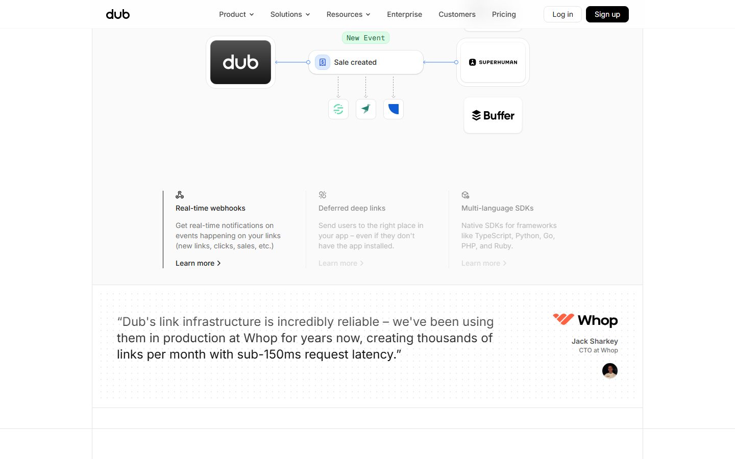
The signature structural move is **real product UI shown inline** — booking/partner dashboards, link rows with click counts and verification badges, automation flow diagrams connecting the Dub logo to integrations (Superhuman, Buffer). Dub doesn't illustrate the product; it embeds product chrome directly into white mockup cards.
Shape language is dominated by the pill: `{rounded.full}` (9999px) is by far the most frequent radius in the measured set (365 occurrences), used on badges, tags, avatars, and small toggle controls. Content cards sit at `{rounded.lg}` (12px), the second most common radius. Elevation is deliberately faint — most surfaces use either no shadow or a 1px hairline drop shadow, with focus rendered as a soft ring.
**Key Characteristics:**
- Near-white `{colors.canvas}` (#fafafa) floor with pure white `{colors.surface}` cards stepping up subtly.
- Near-black primary CTA (`{colors.primary}` — #0a0a0a) with white label; ghost/secondary buttons use dark-gray `{colors.body}` (#404040) text on white.
- Satoshi display headlines at weight 500 (light for a display face) — the engineered, precise voice.
- Inter for all UI text — headings, 20px body, 14px button labels.
- Pill radius (`{rounded.full}`) everywhere for badges, tags, avatars, and toggles; 12px (`{rounded.lg}`) for content cards.
- Real product UI fragments embedded in white cards — link rows, dashboards, automation flow diagrams.
- Faint elevation: hairline drop shadows, soft focus rings, occasional inset shadows. No heavy or colored shadows.
- A monochrome logo wall (Twilio, Superhuman, Perplexity, Vercel, Raycast, Framer, Zillow, Buffer) rendered in muted neutral.
## Colors
### Brand & Action
- **Primary** (`{colors.primary}` — #0a0a0a): The near-black used for primary CTAs ("Start for free", "Sign up") and the Dub logo tile. Pairs with `{colors.on-primary}` (#ffffff) labels.
- **Black** (`{colors.black}` — #000000): A measured pure-black, used in icon/illustration chrome.
### Accent
- **Accent Blue** (`{colors.accent-blue}` — #2563eb) / **Accent Blue Bright** (`{colors.accent-blue-bright}` — #3b82f6): The connector lines and small interactive accents inside embedded product diagrams. Used sparingly — Dub is a near-monochrome brand.
- **GitHub Dark** (`{colors.github-dark}` — #24292e): Reserved for a GitHub-styled control.
- **Success** (`{colors.success-bg}` — #dcfce7 / `{colors.success-text}` — #166534): The pale-green pill + dark-green text combo used for the `New Event` status badge.
- **Error** (`{colors.error}` — #d32f2f / `{colors.error-bright}` — #ff0000): Validation / destructive accent.
### Text
- **Ink** (`{colors.ink}` — #0a0a0a): Headlines and primary text.
- **Body** (`{colors.body}` — #404040): Strong body text and secondary-button label color.
- **Muted** (`{colors.muted}` — #525252): Secondary running text.
- **Muted Soft** (`{colors.muted-soft}` — #737373): Tertiary text, captions.
- **Disabled** (`{colors.disabled}` — #a3a3a3): De-emphasized / disabled text (e.g., dimmed "Learn more" links on inactive feature columns).
- **Gray** (`{colors.gray}` — #6b7280): An alternate neutral text tone present in the measured set.
### Surface & Neutral
- **Canvas** (`{colors.canvas}` — #fafafa): The page floor.
- **Surface** (`{colors.surface}` — #ffffff): Cards, inputs, mockup containers.
- **Neutral 900 / 800** (`{colors.neutral-900}` — #171717 / `{colors.neutral-800}` — #262626): Dark neutrals used in dark UI chrome and high-contrast fills.
- **Hairline** (`{colors.hairline}` — #e5e5e5): 1px borders and dividers on light surfaces.
- **Hairline Soft** (`{colors.hairline-soft}` — #f5f5f5): Barely-visible dividers between white-on-white sections.
## Typography
### Font Family
The system runs **Satoshi** for display headlines (h1, h2) and **Inter** for all other text. Satoshi is a geometric grotesque (distributed free via Fontshare); Dub uses it at weight **500** — a deliberately light display weight that reads as precise and technical rather than loud. Inter handles headings, body, and button labels with no letter-spacing adjustments (measured `normal` throughout).
### Hierarchy
| Token | Family | Size | Weight | Line Height | Letter Spacing | Use |
|---|---|---|---|---|---|---|
| `{typography.display-h1}` | Satoshi | 48px | 500 | 1.15 | normal | Hero headline ("Turn clicks into revenue") |
| `{typography.display-h2}` | Satoshi | 48px | 500 | 1.0 | normal | Section heads ("It starts with a link", "Measure what matters") |
| `{typography.heading}` | Inter | 16px | 500 | 1.5 | normal | Card titles, nav links, feature labels |
| `{typography.body}` | Inter | 20px | 400 | 1.4 | normal | Running body copy, testimonial quotes |
| `{typography.button}` | Inter | 14px | 500 | 1.429 | normal | Button + badge labels |
### Principles
Satoshi at weight 500 is the brand voice for display — never bold it up to 700. Inter carries the rest. The boundary is strict: display headlines in Satoshi, everything else in Inter. Body text is comparatively large (20px) for a SaaS landing page, which contributes to the calm, generous reading rhythm.
### Note on Font Substitutes
`fonts_licensed` is empty in the measured analysis — Satoshi is freely available via Fontshare. If Satoshi cannot be shipped, **Inter** at weight 500 (or **General Sans**, also Fontshare) is a close substitute that preserves the light-weight geometric character. The fallback stack is `Satoshi, Inter, sans-serif`.
## Layout
### Spacing System
- **Base unit:** 4px (with frequent 6px and 8px steps).
- **Tokens:** `{spacing.xxs}` 4px · `{spacing.xs}` 8px · `{spacing.sm}` 12px · `{spacing.md}` 16px · `{spacing.lg}` 24px · `{spacing.xl}` 32px · `{spacing.xxl}` 48px · `{spacing.xxxl}` 64px.
- **Dominant steps:** 8px and 16px are the two most frequent values in the measured set (307 and 313 occurrences) — they drive most internal padding and gaps.
- **Card internal padding:** `{spacing.lg}` (24px) on feature cards; `{spacing.md}` (16px) on tighter mockup/integration tiles; `{spacing.xl}`–`{spacing.xxl}` for editorial/testimonial blocks.
### Grid & Container
- **Editorial body:** centered single-column content with a 3-up feature grid ("Real-time webhooks / Deferred deep links / Multi-language SDKs").
- **Logo wall:** a horizontal monochrome row of partner marks at desktop.
- **Feature grids:** 3-up at desktop, collapsing on smaller widths (see Responsive Behavior).
### Whitespace Philosophy
Dub leans on quiet, generous whitespace and large 20px body text. Sections are separated by hairline-soft dividers rather than color blocks, so the page reads as one continuous near-white canvas with product cards floating in it.
## Elevation & Depth
| Level | Treatment | Use |
|---|---|---|
| Flat | No shadow, no border | Body sections, nav, logo wall |
| Hairline drop | `0 1px 2px rgba(0,0,0,0.05)` | Cards, small chips (most common elevated state — 22 occurrences) |
| Soft lift | `0 4px 6px -1px rgba(0,0,0,0.1), 0 2px 4px -2px rgba(0,0,0,0.1)` | Mockup cards, hovered tiles |
| Focus ring | `0 0 0 3px rgba(0,0,0,0.05)` / `0 0 0 4px rgba(0,0,0,0.1)` | Input + control focus states |
| Inset | `0 2px 6px rgba(0,0,0,0.2) inset` | Pressed/recessed controls, toggle wells |
| Large | `0 10px 15px -3px rgba(0,0,0,0.1)` / `0 20px 20px rgba(0,0,0,0.09)` | Floating hero product card, elevated overlays |
Elevation is intentionally soft and monochrome — Dub never uses colored or heavy drop shadows. Focus is communicated by a low-alpha black ring rather than a colored outline.
### Decorative Depth
- Embedded product fragments (link rows, dashboards, automation flow) carry their own internal chrome and faint shadows from the product UI itself — these are content, not system tokens.
- The hero "Affiliate Programs" product card floats above the canvas with the large drop shadow.
## Shapes
### Border Radius Scale
| Token | Value | Use |
|---|---|---|
| `{rounded.xxs}` | 2px | Tiny inline chips / nested UI detail |
| `{rounded.xs}` | 4px | Small icon containers |
| `{rounded.sm}` | 6px | Inputs (measured grouped input `0 6px 6px 0`) |
| `{rounded.md}` | 8px | Buttons (primary + secondary) |
| `{rounded.lg}` | 12px | Content cards, integration tiles (second-most-common radius) |
| `{rounded.xl}` | 16px | Larger product mockup containers |
| `{rounded.xxl}` | 20px | Occasional large rounded panels |
| `{rounded.full}` | 9999px | Pills, badges, avatars, toggles — by far the most frequent radius |
### Photography & Avatars
Avatars use `{rounded.full}` (perfect circles) — seen on testimonial author photos (Jack Sharkey / Whop). Exact avatar diameter was not measured (see Known Gaps).
## Components
### Navigation
**`top-nav`** — Top bar on the canvas (`{colors.canvas}`) carrying the Dub wordmark at left, a center menu (Product, Solutions, Resources, Enterprise, Customers, Pricing) in `{typography.heading}`, and a right cluster with a "Log in" `{component.button-secondary}` and a black "Sign up" `{component.button-primary}`.
### Buttons
**`button-primary`** — The near-black CTA ("Start for free", "Sign up"). Text `{colors.on-primary}` (white), type `{typography.button}` (Inter 14px / 500), rounded `{rounded.md}` (8px), padding 8px × 16px. The black background (`{colors.primary}`) is taken from screenshot ground-truth; the measured button capture returned the secondary/ghost variant.
**`button-secondary`** — The ghost/light button ("Log in", "Got a demo"). Background `{colors.surface}` (white), label color `{colors.body}` (#404040, measured), type `{typography.button}`, rounded `{rounded.md}`, padding 8px × 16px.
### Inputs & Forms
**`input`** — Text input / domain field. Background `{colors.surface}` (#ffffff, measured), text `{colors.ink}`, type `{typography.body}`, rounded `{rounded.sm}` (measured radius `0 6px 6px 0` — i.e. right-rounded as part of a grouped/prefixed input). Padding `8px 16px` (derived from the dominant spacing steps).
### Cards & Containers
**`feature-card`** — Used in the 3-up feature grid (Real-time webhooks / Deferred deep links / Multi-language SDKs). Background `{colors.surface}`, rounded `{rounded.lg}` (12px), padding `{spacing.lg}` (24px). Carries a small icon, a `{typography.heading}` title, body description in muted text, and a "Learn more →" link. Inactive columns dim their text to `{colors.disabled}`.
**`product-mockup-card`** — White card displaying actual Dub product UI (the Partner Program / Affiliate Programs dashboard, link rows, automation flow). Background `{colors.surface}`, rounded `{rounded.xl}` (16px), padding `{spacing.md}` (16px). These cards show the product rather than illustrate it, and carry the larger float shadow.
**`integration-tile`** — Square white tile holding an integration logo (Superhuman, Buffer, etc.) inside the automation-flow diagram. Background `{colors.surface}`, rounded `{rounded.lg}`, padding `{spacing.md}`. Connected by `{colors.accent-blue}` lines.
**`testimonial-card`** — Customer-quote block (Whop / Perplexity / Framer). Background `{colors.canvas}`, rounded `{rounded.lg}`, padding `{spacing.xl}` (32px). Quote set in `{typography.body}`, with a `{component.avatar-circle}` + name + role at right.
### Badges & Avatars
**`badge-pill-success`** — The pale-green `New Event` status pill. Background `{colors.success-bg}` (#dcfce7), text `{colors.success-text}` (#166534), type `{typography.button}`, rounded `{rounded.full}`, padding 4px × 12px.
**`avatar-circle`** — Circular author photo, `{rounded.full}`. Background `{colors.surface}` when empty.
### Logo Wall
**`logo-wall-item`** — A single partner logo in the monochrome trust row. Transparent background, rendered in `{colors.muted}` neutral, labels in `{typography.heading}`.
## Do's and Don'ts
### Do
- Reserve `{colors.primary}` (#0a0a0a) for primary CTAs and the logo tile. Dub's button is near-black, not blue.
- Keep Satoshi display headlines at weight 500 — the light weight is the engineered voice.
- Use Inter for everything that isn't an h1/h2.
- Default to pill radius (`{rounded.full}`) for badges, tags, avatars, and toggles; use `{rounded.lg}` (12px) for content cards.
- Embed real product UI fragments (link rows, dashboards, flow diagrams) inside white cards rather than illustrating them.
- Keep elevation faint — hairline drop shadows and soft rings, never colored or heavy shadows.
- Render the partner logo wall monochrome in `{colors.muted}`.
### Don't
- Don't bold Satoshi up to 600/700 — it breaks the precise, technical tone.
- Don't introduce loud hero color fills; the system is monochrome with only small green/blue accents.
- Don't use accent blue (`{colors.accent-blue}`) on primary CTAs — it belongs to diagram connectors and inline product accents.
- Don't add heavy or colored drop shadows; stay within the measured faint hairline/ring/inset set.
- Don't put body copy in Satoshi or display headlines in Inter.
- Don't add hover-state styling beyond default + active/pressed.
## Responsive Behavior
| Name | Width | Key Changes |
|---|---|---|
| Mobile | < 768px | Nav collapses to hamburger; hero h1 (48px) scales down; 3-up feature grid stacks 1-up; logo wall wraps; product mockup cards scale proportionally |
| Tablet | 768–1024px | Nav tightens; feature grid 2-up; mockup cards resize |
| Desktop | 1024–1440px | Full horizontal nav; 3-up feature grid; full logo wall row |
| Wide | > 1440px | Same as desktop with more outer breathing room |
### Touch Targets
- `{component.button-primary}` / `{component.button-secondary}` measured padding 8px × 16px; effective height with line-height keeps tap area comfortable but verify ≥ 44px on touch.
- `{component.input}` padding 8px × 16px.
### Collapsing Strategy
- Feature grids reduce column count rather than shrinking cards.
- Embedded product mockup cards scale proportionally so link rows and dashboard chrome stay legible.
- Logo wall wraps to multiple rows on narrow widths.
### Image Behavior
- Avatars crop to circles (`{rounded.full}`) at every breakpoint.
- Product UI fragments retain native aspect ratios; the surrounding white cards resize.
## Iteration Guide
1. Focus on ONE component at a time and reference its YAML key directly (`{component.feature-card}`, `{component.product-mockup-card}`).
2. Variants (`-active`, `-disabled`, `-focused`) live as separate entries in `components:`.
3. Use `{token.refs}` everywhere — never inline a hex in a component.
4. Document default and active/pressed states only — no hover docs.
5. Display headlines stay Satoshi 500; body stays Inter. The split does not blur.
6. Default to pill radius for small controls, 12px for cards.
7. When emphasizing, prefer size and whitespace over color — the brand is monochrome.
## Known Gaps
- The button capture returned only the secondary/ghost variant (text color `#404040`, radius 8px, padding 8px 16px). The black `button-primary` background is taken from screenshot ground-truth, not from a measured token — treated as derived.
- Primary-button text color (white) is inferred from screenshots; the measured "on-primary" color value (#404040) corresponds to the ghost-button label, not white-on-black text.
- The input radius was measured as `0px 6px 6px 0px` (right-rounded, part of a grouped/prefixed control); the standalone full-radius value and input border color were not captured.
- Component padding values not directly returned by the component extractor (e.g., card internal padding) are mapped to the dominant measured spacing steps and noted where derived.
- Avatar diameter, exact card max-widths, and section vertical rhythm were not measured.
- No dark surface / footer tokens were captured; the footer area is out of scope from the provided screenshots.
- Animation and transition timings (flow-diagram connectors, demo playback, toggles) are not in scope.
- Form validation/error states beyond the measured `error` accent (#d32f2f / #ff0000) were not extracted.
- `fonts_licensed` is empty; Satoshi is freely available via Fontshare, so no licensed-font substitution is strictly required, though Inter/General Sans substitutes are documented.
<!-- Documented by duply · real-world design systems as ready-to-use DESIGN.md for AI coding agents · https://duply.ai/dub/design-md -->
Color Palette
Accent
Neutrals
Typography
display-h148px · 500 · 1.15
The quick brown fox jumpsdisplay-h248px · 500 · 1
The quick brown fox jumpsheading16px · 500 · 1.5
The quick brown fox jumpsbody20px · 400 · 1.4
The quick brown fox jumpsbutton14px · 500 · 1.429
The quick brown fox jumpsSpacing & Shape
Spacing
| Name | Value | Preview |
|---|---|---|
| xxs | 4px | |
| xs | 8px | |
| sm | 12px | |
| md | 16px | |
| lg | 24px | |
| xl | 32px | |
| xxl | 48px | |
| xxxl | 64px |
Border Radius
| Name | Value | Preview |
|---|---|---|
| xxs | 2px | |
| xs | 4px | |
| sm | 6px | |
| md | 8px | |
| lg | 12px | |
| xl | 16px | |
| xxl | 20px | |
| full | 9999px |
More like this


---
version: alpha
name: Dub-design-analysis
description: A precise, developer-first link-attribution SaaS interface built on a near-white canvas (#fafafa) with crisp white cards, a near-black primary CTA, and Satoshi display headlines paired with Inter for everything else. The system reads as engineered and quiet — heavy use of pill shapes (9999px), 12px content cards, real product UI fragments embedded inline, and faint hairline/ring shadows rather than heavy elevation.
colors:
  primary: "#0a0a0a"
  ink: "#0a0a0a"
  neutral-900: "#171717"
  neutral-800: "#262626"
  body: "#404040"
  muted: "#525252"
  muted-soft: "#737373"
  disabled: "#a3a3a3"
  hairline: "#e5e5e5"
  hairline-soft: "#f5f5f5"
  canvas: "#fafafa"
  surface: "#ffffff"
  on-primary: "#ffffff"
  black: "#000000"
  accent-blue: "#2563eb"
  accent-blue-bright: "#3b82f6"
  github-dark: "#24292e"
  success-bg: "#dcfce7"
  success-text: "#166534"
  error: "#d32f2f"
  error-bright: "#ff0000"
  gray: "#6b7280"
typography:
  display-h1:
    fontFamily: "Satoshi, Inter, sans-serif"
    fontSize: 48px
    fontWeight: 500
    lineHeight: 1.15
    letterSpacing: normal
  display-h2:
    fontFamily: "Satoshi, Inter, sans-serif"
    fontSize: 48px
    fontWeight: 500
    lineHeight: 1.0
    letterSpacing: normal
  heading:
    fontFamily: "Inter, sans-serif"
    fontSize: 16px
    fontWeight: 500
    lineHeight: 1.5
    letterSpacing: normal
  body:
    fontFamily: "Inter, sans-serif"
    fontSize: 20px
    fontWeight: 400
    lineHeight: 1.4
    letterSpacing: normal
  button:
    fontFamily: "Inter, sans-serif"
    fontSize: 14px
    fontWeight: 500
    lineHeight: 1.429
    letterSpacing: normal
rounded:
  xxs: 2px
  xs: 4px
  sm: 6px
  md: 8px
  lg: 12px
  xl: 16px
  xxl: 20px
  full: 9999px
spacing:
  xxs: 4px
  xs: 8px
  sm: 12px
  md: 16px
  lg: 24px
  xl: 32px
  xxl: 48px
  xxxl: 64px
components:
  top-nav:
    backgroundColor: "{colors.canvas}"
    textColor: "{colors.ink}"
    typography: "{typography.heading}"
  button-primary:
    backgroundColor: "{colors.primary}"
    textColor: "{colors.on-primary}"
    typography: "{typography.button}"
    rounded: "{rounded.md}"
    padding: 8px 16px
  button-secondary:
    backgroundColor: "{colors.surface}"
    textColor: "{colors.body}"
    typography: "{typography.button}"
    rounded: "{rounded.md}"
    padding: 8px 16px
  input:
    backgroundColor: "{colors.surface}"
    textColor: "{colors.ink}"
    typography: "{typography.body}"
    rounded: "{rounded.sm}"
    padding: 8px 16px
  badge-pill-success:
    backgroundColor: "{colors.success-bg}"
    textColor: "{colors.success-text}"
    typography: "{typography.button}"
    rounded: "{rounded.full}"
    padding: 4px 12px
  feature-card:
    backgroundColor: "{colors.surface}"
    textColor: "{colors.ink}"
    typography: "{typography.heading}"
    rounded: "{rounded.lg}"
    padding: 24px
  product-mockup-card:
    backgroundColor: "{colors.surface}"
    textColor: "{colors.ink}"
    rounded: "{rounded.xl}"
    padding: 16px
  integration-tile:
    backgroundColor: "{colors.surface}"
    textColor: "{colors.ink}"
    rounded: "{rounded.lg}"
    padding: 16px
  testimonial-card:
    backgroundColor: "{colors.canvas}"
    textColor: "{colors.ink}"
    typography: "{typography.body}"
    rounded: "{rounded.lg}"
    padding: 32px
  avatar-circle:
    backgroundColor: "{colors.surface}"
    textColor: "{colors.ink}"
    rounded: "{rounded.full}"
  logo-wall-item:
    backgroundColor: transparent
    textColor: "{colors.muted}"
    typography: "{typography.heading}"
---

## Overview

Dub's marketing surface is a quiet, developer-first SaaS interface. The page floor is a near-white `{colors.canvas}` (#fafafa) while content surfaces step up to pure white `{colors.surface}` (#ffffff). Brand voltage is intentionally low-contrast: there is no loud hero color, almost everything is monochrome neutral, and the only true "color" moments are small accent badges (the green `New Event` pill) and the blue connectors inside embedded product diagrams.

Type voice splits cleanly: **Satoshi** carries the two display roles (h1/h2 at 48px, weight 500) and **Inter** handles everything else — headings, body, and button labels. The display weight is unusually light (500, not 600/700), which is a big part of why Dub reads as precise and engineered rather than promotional.

The signature structural move is **real product UI shown inline** — booking/partner dashboards, link rows with click counts and verification badges, automation flow diagrams connecting the Dub logo to integrations (Superhuman, Buffer). Dub doesn't illustrate the product; it embeds product chrome directly into white mockup cards.

Shape language is dominated by the pill: `{rounded.full}` (9999px) is by far the most frequent radius in the measured set (365 occurrences), used on badges, tags, avatars, and small toggle controls. Content cards sit at `{rounded.lg}` (12px), the second most common radius. Elevation is deliberately faint — most surfaces use either no shadow or a 1px hairline drop shadow, with focus rendered as a soft ring.

**Key Characteristics:**
- Near-white `{colors.canvas}` (#fafafa) floor with pure white `{colors.surface}` cards stepping up subtly.
- Near-black primary CTA (`{colors.primary}` — #0a0a0a) with white label; ghost/secondary buttons use dark-gray `{colors.body}` (#404040) text on white.
- Satoshi display headlines at weight 500 (light for a display face) — the engineered, precise voice.
- Inter for all UI text — headings, 20px body, 14px button labels.
- Pill radius (`{rounded.full}`) everywhere for badges, tags, avatars, and toggles; 12px (`{rounded.lg}`) for content cards.
- Real product UI fragments embedded in white cards — link rows, dashboards, automation flow diagrams.
- Faint elevation: hairline drop shadows, soft focus rings, occasional inset shadows. No heavy or colored shadows.
- A monochrome logo wall (Twilio, Superhuman, Perplexity, Vercel, Raycast, Framer, Zillow, Buffer) rendered in muted neutral.

## Colors

### Brand & Action
- **Primary** (`{colors.primary}` — #0a0a0a): The near-black used for primary CTAs ("Start for free", "Sign up") and the Dub logo tile. Pairs with `{colors.on-primary}` (#ffffff) labels.
- **Black** (`{colors.black}` — #000000): A measured pure-black, used in icon/illustration chrome.

### Accent
- **Accent Blue** (`{colors.accent-blue}` — #2563eb) / **Accent Blue Bright** (`{colors.accent-blue-bright}` — #3b82f6): The connector lines and small interactive accents inside embedded product diagrams. Used sparingly — Dub is a near-monochrome brand.
- **GitHub Dark** (`{colors.github-dark}` — #24292e): Reserved for a GitHub-styled control.
- **Success** (`{colors.success-bg}` — #dcfce7 / `{colors.success-text}` — #166534): The pale-green pill + dark-green text combo used for the `New Event` status badge.
- **Error** (`{colors.error}` — #d32f2f / `{colors.error-bright}` — #ff0000): Validation / destructive accent.

### Text
- **Ink** (`{colors.ink}` — #0a0a0a): Headlines and primary text.
- **Body** (`{colors.body}` — #404040): Strong body text and secondary-button label color.
- **Muted** (`{colors.muted}` — #525252): Secondary running text.
- **Muted Soft** (`{colors.muted-soft}` — #737373): Tertiary text, captions.
- **Disabled** (`{colors.disabled}` — #a3a3a3): De-emphasized / disabled text (e.g., dimmed "Learn more" links on inactive feature columns).
- **Gray** (`{colors.gray}` — #6b7280): An alternate neutral text tone present in the measured set.

### Surface & Neutral
- **Canvas** (`{colors.canvas}` — #fafafa): The page floor.
- **Surface** (`{colors.surface}` — #ffffff): Cards, inputs, mockup containers.
- **Neutral 900 / 800** (`{colors.neutral-900}` — #171717 / `{colors.neutral-800}` — #262626): Dark neutrals used in dark UI chrome and high-contrast fills.
- **Hairline** (`{colors.hairline}` — #e5e5e5): 1px borders and dividers on light surfaces.
- **Hairline Soft** (`{colors.hairline-soft}` — #f5f5f5): Barely-visible dividers between white-on-white sections.

## Typography

### Font Family
The system runs **Satoshi** for display headlines (h1, h2) and **Inter** for all other text. Satoshi is a geometric grotesque (distributed free via Fontshare); Dub uses it at weight **500** — a deliberately light display weight that reads as precise and technical rather than loud. Inter handles headings, body, and button labels with no letter-spacing adjustments (measured `normal` throughout).

### Hierarchy

| Token | Family | Size | Weight | Line Height | Letter Spacing | Use |
|---|---|---|---|---|---|---|
| `{typography.display-h1}` | Satoshi | 48px | 500 | 1.15 | normal | Hero headline ("Turn clicks into revenue") |
| `{typography.display-h2}` | Satoshi | 48px | 500 | 1.0 | normal | Section heads ("It starts with a link", "Measure what matters") |
| `{typography.heading}` | Inter | 16px | 500 | 1.5 | normal | Card titles, nav links, feature labels |
| `{typography.body}` | Inter | 20px | 400 | 1.4 | normal | Running body copy, testimonial quotes |
| `{typography.button}` | Inter | 14px | 500 | 1.429 | normal | Button + badge labels |

### Principles
Satoshi at weight 500 is the brand voice for display — never bold it up to 700. Inter carries the rest. The boundary is strict: display headlines in Satoshi, everything else in Inter. Body text is comparatively large (20px) for a SaaS landing page, which contributes to the calm, generous reading rhythm.

### Note on Font Substitutes
`fonts_licensed` is empty in the measured analysis — Satoshi is freely available via Fontshare. If Satoshi cannot be shipped, **Inter** at weight 500 (or **General Sans**, also Fontshare) is a close substitute that preserves the light-weight geometric character. The fallback stack is `Satoshi, Inter, sans-serif`.

## Layout

### Spacing System
- **Base unit:** 4px (with frequent 6px and 8px steps).
- **Tokens:** `{spacing.xxs}` 4px · `{spacing.xs}` 8px · `{spacing.sm}` 12px · `{spacing.md}` 16px · `{spacing.lg}` 24px · `{spacing.xl}` 32px · `{spacing.xxl}` 48px · `{spacing.xxxl}` 64px.
- **Dominant steps:** 8px and 16px are the two most frequent values in the measured set (307 and 313 occurrences) — they drive most internal padding and gaps.
- **Card internal padding:** `{spacing.lg}` (24px) on feature cards; `{spacing.md}` (16px) on tighter mockup/integration tiles; `{spacing.xl}`–`{spacing.xxl}` for editorial/testimonial blocks.

### Grid & Container
- **Editorial body:** centered single-column content with a 3-up feature grid ("Real-time webhooks / Deferred deep links / Multi-language SDKs").
- **Logo wall:** a horizontal monochrome row of partner marks at desktop.
- **Feature grids:** 3-up at desktop, collapsing on smaller widths (see Responsive Behavior).

### Whitespace Philosophy
Dub leans on quiet, generous whitespace and large 20px body text. Sections are separated by hairline-soft dividers rather than color blocks, so the page reads as one continuous near-white canvas with product cards floating in it.

## Elevation & Depth

| Level | Treatment | Use |
|---|---|---|
| Flat | No shadow, no border | Body sections, nav, logo wall |
| Hairline drop | `0 1px 2px rgba(0,0,0,0.05)` | Cards, small chips (most common elevated state — 22 occurrences) |
| Soft lift | `0 4px 6px -1px rgba(0,0,0,0.1), 0 2px 4px -2px rgba(0,0,0,0.1)` | Mockup cards, hovered tiles |
| Focus ring | `0 0 0 3px rgba(0,0,0,0.05)` / `0 0 0 4px rgba(0,0,0,0.1)` | Input + control focus states |
| Inset | `0 2px 6px rgba(0,0,0,0.2) inset` | Pressed/recessed controls, toggle wells |
| Large | `0 10px 15px -3px rgba(0,0,0,0.1)` / `0 20px 20px rgba(0,0,0,0.09)` | Floating hero product card, elevated overlays |

Elevation is intentionally soft and monochrome — Dub never uses colored or heavy drop shadows. Focus is communicated by a low-alpha black ring rather than a colored outline.

### Decorative Depth
- Embedded product fragments (link rows, dashboards, automation flow) carry their own internal chrome and faint shadows from the product UI itself — these are content, not system tokens.
- The hero "Affiliate Programs" product card floats above the canvas with the large drop shadow.

## Shapes

### Border Radius Scale

| Token | Value | Use |
|---|---|---|
| `{rounded.xxs}` | 2px | Tiny inline chips / nested UI detail |
| `{rounded.xs}` | 4px | Small icon containers |
| `{rounded.sm}` | 6px | Inputs (measured grouped input `0 6px 6px 0`) |
| `{rounded.md}` | 8px | Buttons (primary + secondary) |
| `{rounded.lg}` | 12px | Content cards, integration tiles (second-most-common radius) |
| `{rounded.xl}` | 16px | Larger product mockup containers |
| `{rounded.xxl}` | 20px | Occasional large rounded panels |
| `{rounded.full}` | 9999px | Pills, badges, avatars, toggles — by far the most frequent radius |

### Photography & Avatars
Avatars use `{rounded.full}` (perfect circles) — seen on testimonial author photos (Jack Sharkey / Whop). Exact avatar diameter was not measured (see Known Gaps).

## Components

### Navigation

**`top-nav`** — Top bar on the canvas (`{colors.canvas}`) carrying the Dub wordmark at left, a center menu (Product, Solutions, Resources, Enterprise, Customers, Pricing) in `{typography.heading}`, and a right cluster with a "Log in" `{component.button-secondary}` and a black "Sign up" `{component.button-primary}`.

### Buttons

**`button-primary`** — The near-black CTA ("Start for free", "Sign up"). Text `{colors.on-primary}` (white), type `{typography.button}` (Inter 14px / 500), rounded `{rounded.md}` (8px), padding 8px × 16px. The black background (`{colors.primary}`) is taken from screenshot ground-truth; the measured button capture returned the secondary/ghost variant.

**`button-secondary`** — The ghost/light button ("Log in", "Got a demo"). Background `{colors.surface}` (white), label color `{colors.body}` (#404040, measured), type `{typography.button}`, rounded `{rounded.md}`, padding 8px × 16px.

### Inputs & Forms

**`input`** — Text input / domain field. Background `{colors.surface}` (#ffffff, measured), text `{colors.ink}`, type `{typography.body}`, rounded `{rounded.sm}` (measured radius `0 6px 6px 0` — i.e. right-rounded as part of a grouped/prefixed input). Padding `8px 16px` (derived from the dominant spacing steps).

### Cards & Containers

**`feature-card`** — Used in the 3-up feature grid (Real-time webhooks / Deferred deep links / Multi-language SDKs). Background `{colors.surface}`, rounded `{rounded.lg}` (12px), padding `{spacing.lg}` (24px). Carries a small icon, a `{typography.heading}` title, body description in muted text, and a "Learn more →" link. Inactive columns dim their text to `{colors.disabled}`.

**`product-mockup-card`** — White card displaying actual Dub product UI (the Partner Program / Affiliate Programs dashboard, link rows, automation flow). Background `{colors.surface}`, rounded `{rounded.xl}` (16px), padding `{spacing.md}` (16px). These cards show the product rather than illustrate it, and carry the larger float shadow.

**`integration-tile`** — Square white tile holding an integration logo (Superhuman, Buffer, etc.) inside the automation-flow diagram. Background `{colors.surface}`, rounded `{rounded.lg}`, padding `{spacing.md}`. Connected by `{colors.accent-blue}` lines.

**`testimonial-card`** — Customer-quote block (Whop / Perplexity / Framer). Background `{colors.canvas}`, rounded `{rounded.lg}`, padding `{spacing.xl}` (32px). Quote set in `{typography.body}`, with a `{component.avatar-circle}` + name + role at right.

### Badges & Avatars

**`badge-pill-success`** — The pale-green `New Event` status pill. Background `{colors.success-bg}` (#dcfce7), text `{colors.success-text}` (#166534), type `{typography.button}`, rounded `{rounded.full}`, padding 4px × 12px.

**`avatar-circle`** — Circular author photo, `{rounded.full}`. Background `{colors.surface}` when empty.

### Logo Wall

**`logo-wall-item`** — A single partner logo in the monochrome trust row. Transparent background, rendered in `{colors.muted}` neutral, labels in `{typography.heading}`.

## Do's and Don'ts

### Do
- Reserve `{colors.primary}` (#0a0a0a) for primary CTAs and the logo tile. Dub's button is near-black, not blue.
- Keep Satoshi display headlines at weight 500 — the light weight is the engineered voice.
- Use Inter for everything that isn't an h1/h2.
- Default to pill radius (`{rounded.full}`) for badges, tags, avatars, and toggles; use `{rounded.lg}` (12px) for content cards.
- Embed real product UI fragments (link rows, dashboards, flow diagrams) inside white cards rather than illustrating them.
- Keep elevation faint — hairline drop shadows and soft rings, never colored or heavy shadows.
- Render the partner logo wall monochrome in `{colors.muted}`.

### Don't
- Don't bold Satoshi up to 600/700 — it breaks the precise, technical tone.
- Don't introduce loud hero color fills; the system is monochrome with only small green/blue accents.
- Don't use accent blue (`{colors.accent-blue}`) on primary CTAs — it belongs to diagram connectors and inline product accents.
- Don't add heavy or colored drop shadows; stay within the measured faint hairline/ring/inset set.
- Don't put body copy in Satoshi or display headlines in Inter.
- Don't add hover-state styling beyond default + active/pressed.

## Responsive Behavior

| Name | Width | Key Changes |
|---|---|---|
| Mobile | < 768px | Nav collapses to hamburger; hero h1 (48px) scales down; 3-up feature grid stacks 1-up; logo wall wraps; product mockup cards scale proportionally |
| Tablet | 768–1024px | Nav tightens; feature grid 2-up; mockup cards resize |
| Desktop | 1024–1440px | Full horizontal nav; 3-up feature grid; full logo wall row |
| Wide | > 1440px | Same as desktop with more outer breathing room |

### Touch Targets
- `{component.button-primary}` / `{component.button-secondary}` measured padding 8px × 16px; effective height with line-height keeps tap area comfortable but verify ≥ 44px on touch.
- `{component.input}` padding 8px × 16px.

### Collapsing Strategy
- Feature grids reduce column count rather than shrinking cards.
- Embedded product mockup cards scale proportionally so link rows and dashboard chrome stay legible.
- Logo wall wraps to multiple rows on narrow widths.

### Image Behavior
- Avatars crop to circles (`{rounded.full}`) at every breakpoint.
- Product UI fragments retain native aspect ratios; the surrounding white cards resize.

## Iteration Guide

1. Focus on ONE component at a time and reference its YAML key directly (`{component.feature-card}`, `{component.product-mockup-card}`).
2. Variants (`-active`, `-disabled`, `-focused`) live as separate entries in `components:`.
3. Use `{token.refs}` everywhere — never inline a hex in a component.
4. Document default and active/pressed states only — no hover docs.
5. Display headlines stay Satoshi 500; body stays Inter. The split does not blur.
6. Default to pill radius for small controls, 12px for cards.
7. When emphasizing, prefer size and whitespace over color — the brand is monochrome.

## Known Gaps

- The button capture returned only the secondary/ghost variant (text color `#404040`, radius 8px, padding 8px 16px). The black `button-primary` background is taken from screenshot ground-truth, not from a measured token — treated as derived.
- Primary-button text color (white) is inferred from screenshots; the measured "on-primary" color value (#404040) corresponds to the ghost-button label, not white-on-black text.
- The input radius was measured as `0px 6px 6px 0px` (right-rounded, part of a grouped/prefixed control); the standalone full-radius value and input border color were not captured.
- Component padding values not directly returned by the component extractor (e.g., card internal padding) are mapped to the dominant measured spacing steps and noted where derived.
- Avatar diameter, exact card max-widths, and section vertical rhythm were not measured.
- No dark surface / footer tokens were captured; the footer area is out of scope from the provided screenshots.
- Animation and transition timings (flow-diagram connectors, demo playback, toggles) are not in scope.
- Form validation/error states beyond the measured `error` accent (#d32f2f / #ff0000) were not extracted.
- `fonts_licensed` is empty; Satoshi is freely available via Fontshare, so no licensed-font substitution is strictly required, though Inter/General Sans substitutes are documented.

<!-- Documented by duply · real-world design systems as ready-to-use DESIGN.md for AI coding agents · https://duply.ai/dub/design-md -->