Fivetran
A precise, data-infrastructure SaaS interface on a white canvas with a near-black ink (#222222), a bright blue primary CTA, and a distinctive JetBrains Mono voice for eyebrows, labels, and body copy. The system reads as engineered and technical — small 4px radii, tight 16px spacing rhythm, monospace section labels, deep near-black dark bands (#00170f / #001525) for platform diagrams, and lime/peach accent flourishes inside product and case-study cards. Brand voltage comes from the monospace type signature and the contrast between white editorial bands and the near-black platform band.
---
version: alpha
name: Fivetran-design-analysis
description: "A precise, data-infrastructure SaaS interface on a white canvas with a near-black ink (#222222), a bright blue primary CTA, and a distinctive JetBrains Mono voice for eyebrows, labels, and body copy. The system reads as engineered and technical — small 4px radii, tight 16px spacing rhythm, monospace section labels, deep near-black dark bands (#00170f / #001525) for platform diagrams, and lime/peach accent flourishes inside product and case-study cards. Brand voltage comes from the monospace type signature and the contrast between white editorial bands and the near-black platform band."
colors:
ink: "#222222"
ink-soft: "#333333"
ink-muted: "#494a4c"
canvas: "#ffffff"
off-white: "#fafafa"
surface-soft: "#f7f8fa"
surface-muted: "#edeff2"
surface-tint: "#e8f1ff"
primary: "#4d83f7"
link: "#306bea"
accent-blue: "#2e54b6"
accent-navy: "#001525"
surface-dark: "#00170f"
accent-lime: "#c9f227"
accent-peach: "#ffdbc0"
hairline: "#d0d3d9"
hairline-soft: "#dddddd"
neutral-mid: "#cccccc"
neutral-soft: "#c8c8c8"
black: "#000000"
on-primary: "#ffffff"
on-dark: "#ffffff"
typography:
display-lg:
fontFamily: "Inter, sans-serif"
fontSize: 44px
fontWeight: 700
lineHeight: 1.182
letterSpacing: 0.16px
title-md:
fontFamily: "Inter, sans-serif"
fontSize: 28px
fontWeight: 700
lineHeight: 1.286
letterSpacing: -0.19px
mono-eyebrow:
fontFamily: "JetBrains Mono, ui-monospace, monospace"
fontSize: 14px
fontWeight: 500
lineHeight: 1.429
letterSpacing: 1px
body:
fontFamily: "JetBrains Mono, ui-monospace, monospace"
fontSize: 14px
fontWeight: 500
lineHeight: 1.429
letterSpacing: 1px
button:
fontFamily: "Inter, sans-serif"
fontSize: 14px
fontWeight: 600
lineHeight: 1.214
letterSpacing: -0.19px
rounded:
sm: 4px
md: 10px
lg: 14px
pill: 100px
spacing:
xs: 8px
sm: 10px
md: 12px
base: 16px
lg: 20px
xl: 24px
xxl: 32px
huge: 40px
components:
top-nav:
backgroundColor: "{colors.canvas}"
textColor: "{colors.ink}"
typography: "{typography.button}"
height: 70px
announcement-banner:
backgroundColor: "{colors.surface-dark}"
textColor: "{colors.on-dark}"
typography: "{typography.button}"
rounded: "{rounded.sm}"
padding: 16px
button-primary:
backgroundColor: "{colors.primary}"
textColor: "{colors.on-primary}"
typography: "{typography.button}"
rounded: "{rounded.sm}"
padding: 8px 12px
button-secondary:
backgroundColor: transparent
textColor: "{colors.ink}"
typography: "{typography.button}"
rounded: "{rounded.sm}"
padding: 8px 12px
eyebrow-label:
backgroundColor: transparent
textColor: "{colors.ink}"
typography: "{typography.mono-eyebrow}"
hero-heading:
backgroundColor: "{colors.canvas}"
textColor: "{colors.ink}"
typography: "{typography.display-lg}"
platform-band:
backgroundColor: "{colors.surface-dark}"
textColor: "{colors.on-dark}"
typography: "{typography.display-lg}"
padding: 32px
card:
backgroundColor: "{colors.surface-dark}"
textColor: "{colors.on-dark}"
rounded: "{rounded.sm}"
padding: 16px
feature-card:
backgroundColor: "{colors.surface-soft}"
textColor: "{colors.ink}"
typography: "{typography.title-md}"
rounded: "{rounded.sm}"
padding: 16px
case-study-card:
backgroundColor: "{colors.surface-dark}"
textColor: "{colors.on-dark}"
typography: "{typography.body}"
rounded: "{rounded.sm}"
padding: 16px
cert-badge-tile:
backgroundColor: "{colors.surface-tint}"
textColor: "{colors.ink}"
typography: "{typography.mono-eyebrow}"
rounded: "{rounded.sm}"
padding: 20px
stat-figure:
backgroundColor: "{colors.canvas}"
textColor: "{colors.link}"
typography: "{typography.display-lg}"
cta-band:
backgroundColor: "{colors.surface-tint}"
textColor: "{colors.ink}"
typography: "{typography.display-lg}"
padding: 40px
footer:
backgroundColor: "{colors.canvas}"
textColor: "{colors.ink-muted}"
typography: "{typography.body}"
padding: 32px
logo-strip:
backgroundColor: "{colors.canvas}"
textColor: "{colors.ink}"
typography: "{typography.mono-eyebrow}"
---
## Overview
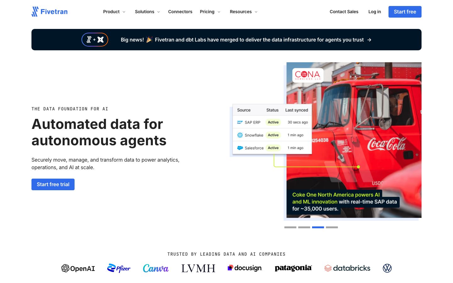
Fivetran's marketing surface is a precise, technical data-infrastructure SaaS interface — white canvas (`{colors.canvas}` — #ffffff) with near-black ink (`{colors.ink}` — #222222), a bright blue primary CTA (`{colors.primary}` — #4d83f7), and a distinctive **JetBrains Mono** voice for eyebrows, labels, and running copy. The system reads as engineered-first: small 4px radii dominate, the spacing rhythm hammers a single 16px base unit, and the section labels are set in monospace small-caps tracking.
The type system splits into two families: **Inter** carries the display headlines (h1/h3 at 44px / 700, h4 at 28px / 700) and button labels, while **JetBrains Mono** carries the eyebrow labels and body copy (14px / 500 with +1px letter-spacing). The monospace body is the brand's most distinctive signature — it makes every supporting paragraph read like a data console.
Brand voltage comes from the contrast between bright white editorial bands and the deep near-black platform band (`{colors.surface-dark}` — #00170f / `{colors.accent-navy}` — #001525). The platform diagram, case-study cards, and the announcement banner all flip to the near-black surface, while feature grids and certification tiles stay on white or barely-tinted off-whites. Lime (`{colors.accent-lime}` — #c9f227) and peach (`{colors.accent-peach}` — #ffdbc0) appear sparingly as accent highlights inside product UI and case-study cards.
**Key Characteristics:**
- White canvas with near-black ink and a bright blue primary CTA (`{colors.primary}` — #4d83f7). Buttons are tightly rounded (`{rounded.sm}` — 4px) with compact 8px × 12px padding.
- JetBrains Mono for eyebrows + body copy (14px / 500 / +1px tracking) — the technical signature. Inter for headlines and buttons.
- Near-black platform band (`{colors.surface-dark}` — #00170f) holds the architecture diagram and case-study cards — the only dark surfaces, used to make product chrome pop.
- Small 4px radius dominates (291 occurrences); 10px and 14px appear rarely, and `{rounded.pill}` (100px) only on a couple of pill elements.
- Blue stat figures (`{colors.link}` — #306bea) — the big "500+ GB/hr" metrics render in blue, not ink.
- Lime + peach accents inside product UI and case-study cards add controlled chromatic energy against the monochrome editorial system.
- Tight 16px spacing rhythm — 16px is by far the most-measured spacing value, with 8/10/12/20/24 as secondary steps.
- No measured box-shadows — the system relies on color-block contrast and hairlines for separation, not elevation.
## Colors
### Brand & Accent
- **Primary** (`{colors.primary}` — #4d83f7): The blue primary CTA color ("Start free", "Start free trial", "Get started for free"). White text on blue.
- **Link / Stat** (`{colors.link}` — #306bea): Heading-accent and stat blue — used on inline links and the large numeric stat figures ("500+ GB/hr").
- **Accent Blue** (`{colors.accent-blue}` — #2e54b6): A deeper blue used in secondary accent moments and gradients.
- **Accent Lime** (`{colors.accent-lime}` — #c9f227): A bright lime-yellow flourish appearing inside product UI fragments and case-study highlights. Used sparingly — never on primary actions.
- **Accent Peach** (`{colors.accent-peach}` — #ffdbc0): A soft peach accent seen in product/diagram fragments.
### Surface
- **Canvas** (`{colors.canvas}` — #ffffff): The default page floor.
- **Off-White** (`{colors.off-white}` — #fafafa): Barely-there section tint.
- **Surface Soft** (`{colors.surface-soft}` — #f7f8fa): Feature-card and section-divider background.
- **Surface Muted** (`{colors.surface-muted}` — #edeff2): A slightly stronger neutral fill for nested tiles.
- **Surface Tint** (`{colors.surface-tint}` — #e8f1ff): Light blue tint used on the certification tiles and the pre-footer CTA band.
- **Surface Dark** (`{colors.surface-dark}` — #00170f): The near-black platform band, announcement banner, and case-study cards.
- **Accent Navy** (`{colors.accent-navy}` — #001525): A near-black navy variant used in dark diagram surfaces.
- **Black** (`{colors.black}` — #000000): Pure black, used rarely (logos, fine accents).
### Text
- **Ink** (`{colors.ink}` — #222222): All headlines and primary text.
- **Ink Soft** (`{colors.ink-soft}` — #333333): Slightly softened body/heading text.
- **Ink Muted** (`{colors.ink-muted}` — #494a4c): Secondary text — captions, footer body.
- **On Primary / On Dark** (`{colors.on-primary}` / `{colors.on-dark}` — #ffffff): Text on blue buttons and the near-black platform band.
### Hairlines & Neutrals
- **Hairline** (`{colors.hairline}` — #d0d3d9): The 1px border tone on light surfaces.
- **Hairline Soft** (`{colors.hairline-soft}` — #dddddd): A lighter divider.
- **Neutral Mid** (`{colors.neutral-mid}` — #cccccc) and **Neutral Soft** (`{colors.neutral-soft}` — #c8c8c8): Quiet borders and disabled/decorative grays.
## Typography
### Font Family
The system runs **Inter** for display headlines + buttons and **JetBrains Mono** for eyebrows + body copy. Both are open-source — no licensed/custom typeface was flagged, so the production stack ships exactly what was measured. The fallback stacks are `Inter, sans-serif` and `JetBrains Mono, ui-monospace, monospace`.
The split is deliberate and unusual: most marketing sites set body in a sans, but Fivetran sets body copy and eyebrow labels in **monospace** (14px / 500 / +1px tracking) — the console-like voice is part of the brand. Inter is reserved for the large display headlines and button labels.
### Hierarchy
| Token | Size | Weight | Line Height | Letter Spacing | Use |
|---|---|---|---|---|---|
| `{typography.display-lg}` | 44px | 700 | 1.182 | 0.16px | h1/h3 hero + section headlines ("Automated data for autonomous agents"), large stat figures — Inter |
| `{typography.title-md}` | 28px | 700 | 1.286 | -0.19px | h4 sub-section heads, card titles — Inter |
| `{typography.mono-eyebrow}` | 14px | 500 | 1.429 | 1px | Eyebrow labels ("THE DATA FOUNDATION FOR AI", "TRUSTED BY LEADING DATA AND AI COMPANIES") — JetBrains Mono |
| `{typography.body}` | 14px | 500 | 1.429 | 1px | Running body copy, descriptions, footer links — JetBrains Mono |
| `{typography.button}` | 14px | 600 | 1.214 | -0.19px | Button labels, nav items — Inter |
### Principles
The display/body boundary is strict and unusual: headlines and buttons in Inter, everything supporting in JetBrains Mono. The monospace tracking (+1px) is part of the voice — the eyebrow labels read as small-caps console text. Display weight stays at 700 across both display sizes; the 28px title and 44px display share the same weight and differ only in size.
Note that the h2 role was measured as the monospace eyebrow (14px), not a large heading — section labels at Fivetran are monospace small-text, while the visually large headings resolve to the h1/h3 (`{typography.display-lg}`) role.
### Note on Font Substitutes
No licensed typefaces were detected (`fonts_licensed` is empty). Both Inter and JetBrains Mono are freely available open-source web fonts and can be shipped directly — no substitution required.
## Layout
### Spacing System
- **Base unit:** 16px — by far the most frequent spacing value (543 occurrences). The secondary scale runs 8 / 10 / 12 / 20 / 24 / 32 / 40px.
- **Tokens:** `{spacing.xs}` 8px · `{spacing.sm}` 10px · `{spacing.md}` 12px · `{spacing.base}` 16px · `{spacing.lg}` 20px · `{spacing.xl}` 24px · `{spacing.xxl}` 32px · `{spacing.huge}` 40px.
- **Card internal padding:** `{spacing.base}` (16px) is the dominant card/component pad; certification tiles and CTA bands step up to `{spacing.lg}`–`{spacing.huge}` (20–40px).
- **Gutters:** `{spacing.base}` (16px) is the workhorse gap between grid items.
### Grid & Container
- **Editorial body:** Centered content column; hero band uses a left-text / right-image split (headline + sub-copy + CTA at left, product/photo card at right).
- **Feature grids:** 4-up "Enterprise-grade capabilities" tiles at desktop; certification badges in a 6-up row.
- **Stat grid:** "Fivetran by the numbers" in a 3-up × 2-row figure grid.
- **Footer:** Multi-column link list (Product / Pricing / Resources / Company / Support).
### Whitespace Philosophy
Spacing is tight and consistent — the 16px base unit dominates, giving the page a dense, engineered cadence rather than airy marketing whitespace. Sections separate by color-block contrast (white → near-black platform band → white) more than by large vertical gaps.
## Elevation & Depth
| Level | Treatment | Use |
|---|---|---|
| Flat | No shadow, no border | Body sections, top nav, hero bands |
| Hairline | 1px `{colors.hairline}` / `{colors.hairline-soft}` border | Tiles, certification badges, dividers |
| Color-block | `{colors.surface-soft}` / `{colors.surface-tint}` fill | Feature cards, CTA band, cert tiles |
| Dark inversion | `{colors.surface-dark}` background | Platform band, case-study cards, announcement banner — contrast does the elevation work |
No box-shadows were measured (`shadows` is empty in the analysis). The system relies entirely on color-block contrast and hairlines for separation — there is no soft-shadow elevation layer. The product UI fragments shown inside cards (sync-status tables, the architecture diagram) carry their own internal chrome, which is content, not a system token.
### Decorative Depth
- The hero's product-status card ("Source / Status / Last synced") floats over a photographic background — its depth comes from the photo composite, not a token shadow.
- Lime (`{colors.accent-lime}`) and peach (`{colors.accent-peach}`) accents inside the architecture diagram and case-study cards provide chromatic emphasis against the near-black surface.
## Shapes
### Border Radius Scale
| Token | Value | Use |
|---|---|---|
| `{rounded.sm}` | 4px | The dominant radius — buttons, cards, tiles, banner, badges (291 occurrences) |
| `{rounded.md}` | 10px | Occasional larger card/container corners (7 occurrences) |
| `{rounded.lg}` | 14px | Rare — a single larger container |
| `{rounded.pill}` | 100px | Pill elements — appears on a couple of elements only |
The system is overwhelmingly 4px-cornered. The small, consistent radius reinforces the technical, engineered character — nothing rounds soft or consumer-friendly.
### Photography Geometry
Hero and case-study photo cards use `{rounded.sm}` (4px) corners. Product UI fragments (sync tables, source browser, architecture diagram) retain their native chrome at small scale inside the cards.
## Components
### Top Navigation
**`top-nav`** — White nav bar at the top of every page. `{colors.canvas}` background, ink wordmark + logo at left, primary horizontal menu (Product, Solutions, Connectors, Pricing, Resources) center, right-side cluster with "Contact Sales" + "Log in" text-links and a blue "Start free" `{component.button-primary}`. Menu items in `{typography.button}` (Inter 14px / 600).
**`announcement-banner`** — Full-width near-black banner pinned below the nav ("Big news! 🎉 Fivetran and dbt Labs have merged…"). Background `{colors.surface-dark}`, text `{colors.on-dark}`, rounded `{rounded.sm}`, padding `{spacing.base}` (16px). Carries a small icon lockup at left and an arrow CTA at right.
### Buttons
**`button-primary`** — The signature blue CTA. Background `{colors.primary}` (#4d83f7), text `{colors.on-primary}`, type `{typography.button}` (Inter 14px / 600), rounded `{rounded.sm}` (4px), compact padding 8px × 12px. Used for "Start free", "Start free trial", "Get started for free".
**`button-secondary`** — Transparent text-button for "Log in", "Contact Sales", and inline arrow CTAs. Background transparent, text `{colors.ink}`, same type + radius as primary.
### Type Fragments
**`eyebrow-label`** — The monospace small-caps label above headlines ("THE DATA FOUNDATION FOR AI", "TRUSTED BY LEADING DATA AND AI COMPANIES"). Transparent background, `{colors.ink}` text, `{typography.mono-eyebrow}` (JetBrains Mono 14px / 500 / +1px tracking). One of the system's signature elements.
**`hero-heading`** — The large Inter display headline. `{colors.ink}` text on `{colors.canvas}`, `{typography.display-lg}` (44px / 700).
**`stat-figure`** — Large numeric metrics ("500+ GB/hr", "9.1+ Petabytes"). `{colors.link}` (#306bea) blue, `{typography.display-lg}` — the figures render in blue, the captions below in monospace body.
### Cards & Containers
**`card`** — The measured dark card. Background `{colors.surface-dark}` (#00170f), rounded `{rounded.sm}` (4px), no shadow, padding `{spacing.base}` (16px). The base dark container used for case-study cards and product fragments.
**`feature-card`** — The 4-up "Enterprise-grade capabilities" tiles (Security / Governance / Extensibility / Hybrid deployment). Background `{colors.surface-soft}` (#f7f8fa), text `{colors.ink}`, title in `{typography.title-md}`, rounded `{rounded.sm}`, padding `{spacing.base}`.
**`case-study-card`** — Customer-result cards ("Accelerated time to insight…", "Increased operating profit by 21.5%…"). Background `{colors.surface-dark}` over a photo, text `{colors.on-dark}`, body in `{typography.body}` (monospace), rounded `{rounded.sm}`. Lime accent text highlights key metrics.
**`cert-badge-tile`** — Certification badges (SOC 1 & SOC 2, GDPR, HIPAA BAA, ISO 27001, PCI DSS Level 1, HITRUST). Background `{colors.surface-tint}` (#e8f1ff), label in `{typography.mono-eyebrow}`, rounded `{rounded.sm}`, padding `{spacing.lg}` (20px).
**`platform-band`** — The near-black "The Fivetran platform" architecture band. Background `{colors.surface-dark}`, heading in `{typography.display-lg}` white, padding `{spacing.xxl}` (32px). Holds the MOVE / MANAGE / TRANSFORM / CONTEXT LAYER diagram with monospace labels and lime/peach accent tiles.
### CTA / Footer
**`cta-band`** — The pre-footer "Start building your data foundation for AI" band. Background `{colors.surface-tint}` (#e8f1ff), heading in `{typography.display-lg}`, padding `{spacing.huge}` (40px). Carries a blue `{component.button-primary}` ("Get started for free") and a secondary "Book a live demo".
**`logo-strip`** — The "TRUSTED BY…" customer-logo row (OpenAI, Pfizer, Canva, LVMH, Docusign, Patagonia, Databricks, Volkswagen). White background, monospace eyebrow label above, grayscale logos.
**`footer`** — White footer closing the page. Background `{colors.canvas}`, link text in `{colors.ink-muted}`, `{typography.body}` (monospace), multi-column link list (Product / Pricing / Resources / Company / Support) plus language selector and legal row. Padding `{spacing.xxl}` (32px).
## Do's and Don'ts
### Do
- Reserve `{colors.primary}` (#4d83f7) for primary CTAs. White text on blue is the only primary-action treatment.
- Set eyebrows and body copy in JetBrains Mono (`{typography.mono-eyebrow}` / `{typography.body}`) with +1px tracking. The monospace voice is the brand signature.
- Use Inter 700 (`{typography.display-lg}`) for large headlines and `{typography.title-md}` for card titles.
- Render large stat figures in blue (`{colors.link}` — #306bea), not ink.
- Use the near-black `{colors.surface-dark}` band to make the platform diagram and case-study chrome pop — it's the system's only dark surface mode.
- Keep radii at 4px (`{rounded.sm}`) almost everywhere — it reinforces the engineered character.
- Use lime (`{colors.accent-lime}`) and peach (`{colors.accent-peach}`) only as small accent highlights inside product/diagram/case-study cards.
### Don't
- Don't add box-shadows — none were measured; the system separates surfaces with color blocks and hairlines.
- Don't set body copy in Inter — the monospace body is intentional and on-brand.
- Don't use lime or peach on primary CTAs or headlines; they are content-level accents only.
- Don't introduce radii beyond `{rounded.lg}` (14px) on cards; the system is built on 4px corners.
- Don't place dark `{colors.surface-dark}` surfaces casually — reserve them for the platform band, announcement banner, and case-study cards.
- Don't loosen the 16px spacing rhythm — the dense base unit is part of the technical feel.
## Responsive Behavior
### Breakpoints
| Name | Width | Key Changes |
|---|---|---|
| Mobile | < 768px | Hamburger nav; hero headline scales down from 44px; hero text + product card stack vertically; feature/cert grids collapse to 1–2 up; logo strip wraps |
| Tablet | 768–1024px | Top nav tightens; 4-up feature tiles → 2-up; stat grid 3-up → 2-up; platform diagram scales proportionally |
| Desktop | 1024–1440px | Full horizontal nav; 4-up capability tiles; 6-up certification row; 3-up × 2 stat grid |
| Wide | > 1440px | Same as desktop with more outer breathing room; centered content column |
### Touch Targets
- `{component.button-primary}` uses compact 8px × 12px padding; on touch surfaces effective hit area should be padded toward 44px minimum.
- Nav text-links and footer links sit in dense rows; tap targets rely on line-height (1.429) and surrounding spacing.
### Collapsing Strategy
- Top nav collapses to hamburger on mobile.
- Hero's left-text / right-card split stacks to single column.
- Feature and certification grids reduce column count rather than scaling tiles.
- The near-black platform band's architecture diagram scales proportionally while keeping monospace labels legible.
- Footer columns wrap from multi-column to stacked.
### Image Behavior
- Hero product-status card composites over the photographic background; both scale together.
- Product UI fragments retain native aspect ratios; their cards resize.
- Customer logos render grayscale and wrap to multiple rows on narrow viewports.
## Iteration Guide
1. Focus on ONE component at a time. Reference its YAML key directly (`{component.feature-card}`, `{component.platform-band}`).
2. Variants of an existing component (`-active`, `-disabled`, `-focused`) live as separate entries in `components:`.
3. Use `{token.refs}` everywhere — never inline a hex in a component.
4. Never document hover. Default and Active/Pressed states only.
5. Headlines + buttons stay Inter; eyebrows + body stay JetBrains Mono. The two-family split does not blur.
6. The near-black `{colors.surface-dark}` band is the only dark surface — don't add other dark cards casually.
7. Keep radius at 4px and spacing at the 16px base unless there's a measured reason to step up.
## Known Gaps
- **Button color conflict:** the measured `button` component reports `color: #222222` (likely the label/foreground or a secondary button), but the visible primary CTA in screenshots is blue. `{component.button-primary}` is documented with `{colors.primary}` (#4d83f7, measured as an accent) + `{colors.on-primary}` white from screenshot ground-truth; the exact primary-blue token assignment should be confirmed.
- **Body font:** body copy was measured as JetBrains Mono (matching the monospace eyebrow exactly). This is unusual; if a separate sans body role exists on untested pages it was not captured.
- **No shadow tokens:** the analysis returned an empty `shadows` array. If subtle elevation exists on any card it was not measured — elevation is documented as color-block + hairline only.
- **Hover/pressed states** were not measured; only default states are documented.
- **Spacing scale** includes several off-grid values (7, 9, 11, 18, 21, 27px) at low frequency that were not promoted to tokens; the canonical scale is built from the high-frequency values.
- **Accent role certainty:** lime (#c9f227), peach (#ffdbc0), and the several blues (#306bea / #2e54b6 / #4d83f7) were observed by frequency; their exact semantic roles (link vs. CTA vs. gradient) are inferred from screenshots and may need confirmation.
- **Component coverage:** only `button-primary` and `card` were machine-extracted; nav, banner, feature/case-study/cert tiles, stats, CTA band, and footer are documented from screenshot ground-truth using measured tokens.
- Pricing and pricing-features pages were captured but yielded no distinct component measurements beyond the landing page.
<!-- Documented by duply · real-world design systems as ready-to-use DESIGN.md for AI coding agents · https://duply.ai/fivetran/design-md -->
Color Palette
Accent
Neutrals
Typography
display-lg44px · 700 · 1.182
The quick brown fox jumpstitle-md28px · 700 · 1.286
The quick brown fox jumpsmono-eyebrow14px · 500 · 1.429
The quick brown fox jumpsbody14px · 500 · 1.429
The quick brown fox jumpsbutton14px · 600 · 1.214
The quick brown fox jumpsSpacing & Shape
Spacing
| Name | Value | Preview |
|---|---|---|
| xs | 8px | |
| sm | 10px | |
| md | 12px | |
| base | 16px | |
| lg | 20px | |
| xl | 24px | |
| xxl | 32px | |
| huge | 40px |
Border Radius
| Name | Value | Preview |
|---|---|---|
| sm | 4px | |
| md | 10px | |
| lg | 14px | |
| pill | 100px |
More like this


---
version: alpha
name: Fivetran-design-analysis
description: "A precise, data-infrastructure SaaS interface on a white canvas with a near-black ink (#222222), a bright blue primary CTA, and a distinctive JetBrains Mono voice for eyebrows, labels, and body copy. The system reads as engineered and technical — small 4px radii, tight 16px spacing rhythm, monospace section labels, deep near-black dark bands (#00170f / #001525) for platform diagrams, and lime/peach accent flourishes inside product and case-study cards. Brand voltage comes from the monospace type signature and the contrast between white editorial bands and the near-black platform band."

colors:
  ink: "#222222"
  ink-soft: "#333333"
  ink-muted: "#494a4c"
  canvas: "#ffffff"
  off-white: "#fafafa"
  surface-soft: "#f7f8fa"
  surface-muted: "#edeff2"
  surface-tint: "#e8f1ff"
  primary: "#4d83f7"
  link: "#306bea"
  accent-blue: "#2e54b6"
  accent-navy: "#001525"
  surface-dark: "#00170f"
  accent-lime: "#c9f227"
  accent-peach: "#ffdbc0"
  hairline: "#d0d3d9"
  hairline-soft: "#dddddd"
  neutral-mid: "#cccccc"
  neutral-soft: "#c8c8c8"
  black: "#000000"
  on-primary: "#ffffff"
  on-dark: "#ffffff"

typography:
  display-lg:
    fontFamily: "Inter, sans-serif"
    fontSize: 44px
    fontWeight: 700
    lineHeight: 1.182
    letterSpacing: 0.16px
  title-md:
    fontFamily: "Inter, sans-serif"
    fontSize: 28px
    fontWeight: 700
    lineHeight: 1.286
    letterSpacing: -0.19px
  mono-eyebrow:
    fontFamily: "JetBrains Mono, ui-monospace, monospace"
    fontSize: 14px
    fontWeight: 500
    lineHeight: 1.429
    letterSpacing: 1px
  body:
    fontFamily: "JetBrains Mono, ui-monospace, monospace"
    fontSize: 14px
    fontWeight: 500
    lineHeight: 1.429
    letterSpacing: 1px
  button:
    fontFamily: "Inter, sans-serif"
    fontSize: 14px
    fontWeight: 600
    lineHeight: 1.214
    letterSpacing: -0.19px

rounded:
  sm: 4px
  md: 10px
  lg: 14px
  pill: 100px

spacing:
  xs: 8px
  sm: 10px
  md: 12px
  base: 16px
  lg: 20px
  xl: 24px
  xxl: 32px
  huge: 40px

components:
  top-nav:
    backgroundColor: "{colors.canvas}"
    textColor: "{colors.ink}"
    typography: "{typography.button}"
    height: 70px
  announcement-banner:
    backgroundColor: "{colors.surface-dark}"
    textColor: "{colors.on-dark}"
    typography: "{typography.button}"
    rounded: "{rounded.sm}"
    padding: 16px
  button-primary:
    backgroundColor: "{colors.primary}"
    textColor: "{colors.on-primary}"
    typography: "{typography.button}"
    rounded: "{rounded.sm}"
    padding: 8px 12px
  button-secondary:
    backgroundColor: transparent
    textColor: "{colors.ink}"
    typography: "{typography.button}"
    rounded: "{rounded.sm}"
    padding: 8px 12px
  eyebrow-label:
    backgroundColor: transparent
    textColor: "{colors.ink}"
    typography: "{typography.mono-eyebrow}"
  hero-heading:
    backgroundColor: "{colors.canvas}"
    textColor: "{colors.ink}"
    typography: "{typography.display-lg}"
  platform-band:
    backgroundColor: "{colors.surface-dark}"
    textColor: "{colors.on-dark}"
    typography: "{typography.display-lg}"
    padding: 32px
  card:
    backgroundColor: "{colors.surface-dark}"
    textColor: "{colors.on-dark}"
    rounded: "{rounded.sm}"
    padding: 16px
  feature-card:
    backgroundColor: "{colors.surface-soft}"
    textColor: "{colors.ink}"
    typography: "{typography.title-md}"
    rounded: "{rounded.sm}"
    padding: 16px
  case-study-card:
    backgroundColor: "{colors.surface-dark}"
    textColor: "{colors.on-dark}"
    typography: "{typography.body}"
    rounded: "{rounded.sm}"
    padding: 16px
  cert-badge-tile:
    backgroundColor: "{colors.surface-tint}"
    textColor: "{colors.ink}"
    typography: "{typography.mono-eyebrow}"
    rounded: "{rounded.sm}"
    padding: 20px
  stat-figure:
    backgroundColor: "{colors.canvas}"
    textColor: "{colors.link}"
    typography: "{typography.display-lg}"
  cta-band:
    backgroundColor: "{colors.surface-tint}"
    textColor: "{colors.ink}"
    typography: "{typography.display-lg}"
    padding: 40px
  footer:
    backgroundColor: "{colors.canvas}"
    textColor: "{colors.ink-muted}"
    typography: "{typography.body}"
    padding: 32px
  logo-strip:
    backgroundColor: "{colors.canvas}"
    textColor: "{colors.ink}"
    typography: "{typography.mono-eyebrow}"

---

## Overview

Fivetran's marketing surface is a precise, technical data-infrastructure SaaS interface — white canvas (`{colors.canvas}` — #ffffff) with near-black ink (`{colors.ink}` — #222222), a bright blue primary CTA (`{colors.primary}` — #4d83f7), and a distinctive **JetBrains Mono** voice for eyebrows, labels, and running copy. The system reads as engineered-first: small 4px radii dominate, the spacing rhythm hammers a single 16px base unit, and the section labels are set in monospace small-caps tracking.

The type system splits into two families: **Inter** carries the display headlines (h1/h3 at 44px / 700, h4 at 28px / 700) and button labels, while **JetBrains Mono** carries the eyebrow labels and body copy (14px / 500 with +1px letter-spacing). The monospace body is the brand's most distinctive signature — it makes every supporting paragraph read like a data console.

Brand voltage comes from the contrast between bright white editorial bands and the deep near-black platform band (`{colors.surface-dark}` — #00170f / `{colors.accent-navy}` — #001525). The platform diagram, case-study cards, and the announcement banner all flip to the near-black surface, while feature grids and certification tiles stay on white or barely-tinted off-whites. Lime (`{colors.accent-lime}` — #c9f227) and peach (`{colors.accent-peach}` — #ffdbc0) appear sparingly as accent highlights inside product UI and case-study cards.

**Key Characteristics:**
- White canvas with near-black ink and a bright blue primary CTA (`{colors.primary}` — #4d83f7). Buttons are tightly rounded (`{rounded.sm}` — 4px) with compact 8px × 12px padding.
- JetBrains Mono for eyebrows + body copy (14px / 500 / +1px tracking) — the technical signature. Inter for headlines and buttons.
- Near-black platform band (`{colors.surface-dark}` — #00170f) holds the architecture diagram and case-study cards — the only dark surfaces, used to make product chrome pop.
- Small 4px radius dominates (291 occurrences); 10px and 14px appear rarely, and `{rounded.pill}` (100px) only on a couple of pill elements.
- Blue stat figures (`{colors.link}` — #306bea) — the big "500+ GB/hr" metrics render in blue, not ink.
- Lime + peach accents inside product UI and case-study cards add controlled chromatic energy against the monochrome editorial system.
- Tight 16px spacing rhythm — 16px is by far the most-measured spacing value, with 8/10/12/20/24 as secondary steps.
- No measured box-shadows — the system relies on color-block contrast and hairlines for separation, not elevation.

## Colors

### Brand & Accent
- **Primary** (`{colors.primary}` — #4d83f7): The blue primary CTA color ("Start free", "Start free trial", "Get started for free"). White text on blue.
- **Link / Stat** (`{colors.link}` — #306bea): Heading-accent and stat blue — used on inline links and the large numeric stat figures ("500+ GB/hr").
- **Accent Blue** (`{colors.accent-blue}` — #2e54b6): A deeper blue used in secondary accent moments and gradients.
- **Accent Lime** (`{colors.accent-lime}` — #c9f227): A bright lime-yellow flourish appearing inside product UI fragments and case-study highlights. Used sparingly — never on primary actions.
- **Accent Peach** (`{colors.accent-peach}` — #ffdbc0): A soft peach accent seen in product/diagram fragments.

### Surface
- **Canvas** (`{colors.canvas}` — #ffffff): The default page floor.
- **Off-White** (`{colors.off-white}` — #fafafa): Barely-there section tint.
- **Surface Soft** (`{colors.surface-soft}` — #f7f8fa): Feature-card and section-divider background.
- **Surface Muted** (`{colors.surface-muted}` — #edeff2): A slightly stronger neutral fill for nested tiles.
- **Surface Tint** (`{colors.surface-tint}` — #e8f1ff): Light blue tint used on the certification tiles and the pre-footer CTA band.
- **Surface Dark** (`{colors.surface-dark}` — #00170f): The near-black platform band, announcement banner, and case-study cards.
- **Accent Navy** (`{colors.accent-navy}` — #001525): A near-black navy variant used in dark diagram surfaces.
- **Black** (`{colors.black}` — #000000): Pure black, used rarely (logos, fine accents).

### Text
- **Ink** (`{colors.ink}` — #222222): All headlines and primary text.
- **Ink Soft** (`{colors.ink-soft}` — #333333): Slightly softened body/heading text.
- **Ink Muted** (`{colors.ink-muted}` — #494a4c): Secondary text — captions, footer body.
- **On Primary / On Dark** (`{colors.on-primary}` / `{colors.on-dark}` — #ffffff): Text on blue buttons and the near-black platform band.

### Hairlines & Neutrals
- **Hairline** (`{colors.hairline}` — #d0d3d9): The 1px border tone on light surfaces.
- **Hairline Soft** (`{colors.hairline-soft}` — #dddddd): A lighter divider.
- **Neutral Mid** (`{colors.neutral-mid}` — #cccccc) and **Neutral Soft** (`{colors.neutral-soft}` — #c8c8c8): Quiet borders and disabled/decorative grays.

## Typography

### Font Family
The system runs **Inter** for display headlines + buttons and **JetBrains Mono** for eyebrows + body copy. Both are open-source — no licensed/custom typeface was flagged, so the production stack ships exactly what was measured. The fallback stacks are `Inter, sans-serif` and `JetBrains Mono, ui-monospace, monospace`.

The split is deliberate and unusual: most marketing sites set body in a sans, but Fivetran sets body copy and eyebrow labels in **monospace** (14px / 500 / +1px tracking) — the console-like voice is part of the brand. Inter is reserved for the large display headlines and button labels.

### Hierarchy

| Token | Size | Weight | Line Height | Letter Spacing | Use |
|---|---|---|---|---|---|
| `{typography.display-lg}` | 44px | 700 | 1.182 | 0.16px | h1/h3 hero + section headlines ("Automated data for autonomous agents"), large stat figures — Inter |
| `{typography.title-md}` | 28px | 700 | 1.286 | -0.19px | h4 sub-section heads, card titles — Inter |
| `{typography.mono-eyebrow}` | 14px | 500 | 1.429 | 1px | Eyebrow labels ("THE DATA FOUNDATION FOR AI", "TRUSTED BY LEADING DATA AND AI COMPANIES") — JetBrains Mono |
| `{typography.body}` | 14px | 500 | 1.429 | 1px | Running body copy, descriptions, footer links — JetBrains Mono |
| `{typography.button}` | 14px | 600 | 1.214 | -0.19px | Button labels, nav items — Inter |

### Principles
The display/body boundary is strict and unusual: headlines and buttons in Inter, everything supporting in JetBrains Mono. The monospace tracking (+1px) is part of the voice — the eyebrow labels read as small-caps console text. Display weight stays at 700 across both display sizes; the 28px title and 44px display share the same weight and differ only in size.

Note that the h2 role was measured as the monospace eyebrow (14px), not a large heading — section labels at Fivetran are monospace small-text, while the visually large headings resolve to the h1/h3 (`{typography.display-lg}`) role.

### Note on Font Substitutes
No licensed typefaces were detected (`fonts_licensed` is empty). Both Inter and JetBrains Mono are freely available open-source web fonts and can be shipped directly — no substitution required.

## Layout

### Spacing System
- **Base unit:** 16px — by far the most frequent spacing value (543 occurrences). The secondary scale runs 8 / 10 / 12 / 20 / 24 / 32 / 40px.
- **Tokens:** `{spacing.xs}` 8px · `{spacing.sm}` 10px · `{spacing.md}` 12px · `{spacing.base}` 16px · `{spacing.lg}` 20px · `{spacing.xl}` 24px · `{spacing.xxl}` 32px · `{spacing.huge}` 40px.
- **Card internal padding:** `{spacing.base}` (16px) is the dominant card/component pad; certification tiles and CTA bands step up to `{spacing.lg}`–`{spacing.huge}` (20–40px).
- **Gutters:** `{spacing.base}` (16px) is the workhorse gap between grid items.

### Grid & Container
- **Editorial body:** Centered content column; hero band uses a left-text / right-image split (headline + sub-copy + CTA at left, product/photo card at right).
- **Feature grids:** 4-up "Enterprise-grade capabilities" tiles at desktop; certification badges in a 6-up row.
- **Stat grid:** "Fivetran by the numbers" in a 3-up × 2-row figure grid.
- **Footer:** Multi-column link list (Product / Pricing / Resources / Company / Support).

### Whitespace Philosophy
Spacing is tight and consistent — the 16px base unit dominates, giving the page a dense, engineered cadence rather than airy marketing whitespace. Sections separate by color-block contrast (white → near-black platform band → white) more than by large vertical gaps.

## Elevation & Depth

| Level | Treatment | Use |
|---|---|---|
| Flat | No shadow, no border | Body sections, top nav, hero bands |
| Hairline | 1px `{colors.hairline}` / `{colors.hairline-soft}` border | Tiles, certification badges, dividers |
| Color-block | `{colors.surface-soft}` / `{colors.surface-tint}` fill | Feature cards, CTA band, cert tiles |
| Dark inversion | `{colors.surface-dark}` background | Platform band, case-study cards, announcement banner — contrast does the elevation work |

No box-shadows were measured (`shadows` is empty in the analysis). The system relies entirely on color-block contrast and hairlines for separation — there is no soft-shadow elevation layer. The product UI fragments shown inside cards (sync-status tables, the architecture diagram) carry their own internal chrome, which is content, not a system token.

### Decorative Depth
- The hero's product-status card ("Source / Status / Last synced") floats over a photographic background — its depth comes from the photo composite, not a token shadow.
- Lime (`{colors.accent-lime}`) and peach (`{colors.accent-peach}`) accents inside the architecture diagram and case-study cards provide chromatic emphasis against the near-black surface.

## Shapes

### Border Radius Scale

| Token | Value | Use |
|---|---|---|
| `{rounded.sm}` | 4px | The dominant radius — buttons, cards, tiles, banner, badges (291 occurrences) |
| `{rounded.md}` | 10px | Occasional larger card/container corners (7 occurrences) |
| `{rounded.lg}` | 14px | Rare — a single larger container |
| `{rounded.pill}` | 100px | Pill elements — appears on a couple of elements only |

The system is overwhelmingly 4px-cornered. The small, consistent radius reinforces the technical, engineered character — nothing rounds soft or consumer-friendly.

### Photography Geometry
Hero and case-study photo cards use `{rounded.sm}` (4px) corners. Product UI fragments (sync tables, source browser, architecture diagram) retain their native chrome at small scale inside the cards.

## Components

### Top Navigation

**`top-nav`** — White nav bar at the top of every page. `{colors.canvas}` background, ink wordmark + logo at left, primary horizontal menu (Product, Solutions, Connectors, Pricing, Resources) center, right-side cluster with "Contact Sales" + "Log in" text-links and a blue "Start free" `{component.button-primary}`. Menu items in `{typography.button}` (Inter 14px / 600).

**`announcement-banner`** — Full-width near-black banner pinned below the nav ("Big news! 🎉 Fivetran and dbt Labs have merged…"). Background `{colors.surface-dark}`, text `{colors.on-dark}`, rounded `{rounded.sm}`, padding `{spacing.base}` (16px). Carries a small icon lockup at left and an arrow CTA at right.

### Buttons

**`button-primary`** — The signature blue CTA. Background `{colors.primary}` (#4d83f7), text `{colors.on-primary}`, type `{typography.button}` (Inter 14px / 600), rounded `{rounded.sm}` (4px), compact padding 8px × 12px. Used for "Start free", "Start free trial", "Get started for free".

**`button-secondary`** — Transparent text-button for "Log in", "Contact Sales", and inline arrow CTAs. Background transparent, text `{colors.ink}`, same type + radius as primary.

### Type Fragments

**`eyebrow-label`** — The monospace small-caps label above headlines ("THE DATA FOUNDATION FOR AI", "TRUSTED BY LEADING DATA AND AI COMPANIES"). Transparent background, `{colors.ink}` text, `{typography.mono-eyebrow}` (JetBrains Mono 14px / 500 / +1px tracking). One of the system's signature elements.

**`hero-heading`** — The large Inter display headline. `{colors.ink}` text on `{colors.canvas}`, `{typography.display-lg}` (44px / 700).

**`stat-figure`** — Large numeric metrics ("500+ GB/hr", "9.1+ Petabytes"). `{colors.link}` (#306bea) blue, `{typography.display-lg}` — the figures render in blue, the captions below in monospace body.

### Cards & Containers

**`card`** — The measured dark card. Background `{colors.surface-dark}` (#00170f), rounded `{rounded.sm}` (4px), no shadow, padding `{spacing.base}` (16px). The base dark container used for case-study cards and product fragments.

**`feature-card`** — The 4-up "Enterprise-grade capabilities" tiles (Security / Governance / Extensibility / Hybrid deployment). Background `{colors.surface-soft}` (#f7f8fa), text `{colors.ink}`, title in `{typography.title-md}`, rounded `{rounded.sm}`, padding `{spacing.base}`.

**`case-study-card`** — Customer-result cards ("Accelerated time to insight…", "Increased operating profit by 21.5%…"). Background `{colors.surface-dark}` over a photo, text `{colors.on-dark}`, body in `{typography.body}` (monospace), rounded `{rounded.sm}`. Lime accent text highlights key metrics.

**`cert-badge-tile`** — Certification badges (SOC 1 & SOC 2, GDPR, HIPAA BAA, ISO 27001, PCI DSS Level 1, HITRUST). Background `{colors.surface-tint}` (#e8f1ff), label in `{typography.mono-eyebrow}`, rounded `{rounded.sm}`, padding `{spacing.lg}` (20px).

**`platform-band`** — The near-black "The Fivetran platform" architecture band. Background `{colors.surface-dark}`, heading in `{typography.display-lg}` white, padding `{spacing.xxl}` (32px). Holds the MOVE / MANAGE / TRANSFORM / CONTEXT LAYER diagram with monospace labels and lime/peach accent tiles.

### CTA / Footer

**`cta-band`** — The pre-footer "Start building your data foundation for AI" band. Background `{colors.surface-tint}` (#e8f1ff), heading in `{typography.display-lg}`, padding `{spacing.huge}` (40px). Carries a blue `{component.button-primary}` ("Get started for free") and a secondary "Book a live demo".

**`logo-strip`** — The "TRUSTED BY…" customer-logo row (OpenAI, Pfizer, Canva, LVMH, Docusign, Patagonia, Databricks, Volkswagen). White background, monospace eyebrow label above, grayscale logos.

**`footer`** — White footer closing the page. Background `{colors.canvas}`, link text in `{colors.ink-muted}`, `{typography.body}` (monospace), multi-column link list (Product / Pricing / Resources / Company / Support) plus language selector and legal row. Padding `{spacing.xxl}` (32px).

## Do's and Don'ts

### Do
- Reserve `{colors.primary}` (#4d83f7) for primary CTAs. White text on blue is the only primary-action treatment.
- Set eyebrows and body copy in JetBrains Mono (`{typography.mono-eyebrow}` / `{typography.body}`) with +1px tracking. The monospace voice is the brand signature.
- Use Inter 700 (`{typography.display-lg}`) for large headlines and `{typography.title-md}` for card titles.
- Render large stat figures in blue (`{colors.link}` — #306bea), not ink.
- Use the near-black `{colors.surface-dark}` band to make the platform diagram and case-study chrome pop — it's the system's only dark surface mode.
- Keep radii at 4px (`{rounded.sm}`) almost everywhere — it reinforces the engineered character.
- Use lime (`{colors.accent-lime}`) and peach (`{colors.accent-peach}`) only as small accent highlights inside product/diagram/case-study cards.

### Don't
- Don't add box-shadows — none were measured; the system separates surfaces with color blocks and hairlines.
- Don't set body copy in Inter — the monospace body is intentional and on-brand.
- Don't use lime or peach on primary CTAs or headlines; they are content-level accents only.
- Don't introduce radii beyond `{rounded.lg}` (14px) on cards; the system is built on 4px corners.
- Don't place dark `{colors.surface-dark}` surfaces casually — reserve them for the platform band, announcement banner, and case-study cards.
- Don't loosen the 16px spacing rhythm — the dense base unit is part of the technical feel.

## Responsive Behavior

### Breakpoints

| Name | Width | Key Changes |
|---|---|---|
| Mobile | < 768px | Hamburger nav; hero headline scales down from 44px; hero text + product card stack vertically; feature/cert grids collapse to 1–2 up; logo strip wraps |
| Tablet | 768–1024px | Top nav tightens; 4-up feature tiles → 2-up; stat grid 3-up → 2-up; platform diagram scales proportionally |
| Desktop | 1024–1440px | Full horizontal nav; 4-up capability tiles; 6-up certification row; 3-up × 2 stat grid |
| Wide | > 1440px | Same as desktop with more outer breathing room; centered content column |

### Touch Targets
- `{component.button-primary}` uses compact 8px × 12px padding; on touch surfaces effective hit area should be padded toward 44px minimum.
- Nav text-links and footer links sit in dense rows; tap targets rely on line-height (1.429) and surrounding spacing.

### Collapsing Strategy
- Top nav collapses to hamburger on mobile.
- Hero's left-text / right-card split stacks to single column.
- Feature and certification grids reduce column count rather than scaling tiles.
- The near-black platform band's architecture diagram scales proportionally while keeping monospace labels legible.
- Footer columns wrap from multi-column to stacked.

### Image Behavior
- Hero product-status card composites over the photographic background; both scale together.
- Product UI fragments retain native aspect ratios; their cards resize.
- Customer logos render grayscale and wrap to multiple rows on narrow viewports.

## Iteration Guide

1. Focus on ONE component at a time. Reference its YAML key directly (`{component.feature-card}`, `{component.platform-band}`).
2. Variants of an existing component (`-active`, `-disabled`, `-focused`) live as separate entries in `components:`.
3. Use `{token.refs}` everywhere — never inline a hex in a component.
4. Never document hover. Default and Active/Pressed states only.
5. Headlines + buttons stay Inter; eyebrows + body stay JetBrains Mono. The two-family split does not blur.
6. The near-black `{colors.surface-dark}` band is the only dark surface — don't add other dark cards casually.
7. Keep radius at 4px and spacing at the 16px base unless there's a measured reason to step up.

## Known Gaps

- **Button color conflict:** the measured `button` component reports `color: #222222` (likely the label/foreground or a secondary button), but the visible primary CTA in screenshots is blue. `{component.button-primary}` is documented with `{colors.primary}` (#4d83f7, measured as an accent) + `{colors.on-primary}` white from screenshot ground-truth; the exact primary-blue token assignment should be confirmed.
- **Body font:** body copy was measured as JetBrains Mono (matching the monospace eyebrow exactly). This is unusual; if a separate sans body role exists on untested pages it was not captured.
- **No shadow tokens:** the analysis returned an empty `shadows` array. If subtle elevation exists on any card it was not measured — elevation is documented as color-block + hairline only.
- **Hover/pressed states** were not measured; only default states are documented.
- **Spacing scale** includes several off-grid values (7, 9, 11, 18, 21, 27px) at low frequency that were not promoted to tokens; the canonical scale is built from the high-frequency values.
- **Accent role certainty:** lime (#c9f227), peach (#ffdbc0), and the several blues (#306bea / #2e54b6 / #4d83f7) were observed by frequency; their exact semantic roles (link vs. CTA vs. gradient) are inferred from screenshots and may need confirmation.
- **Component coverage:** only `button-primary` and `card` were machine-extracted; nav, banner, feature/case-study/cert tiles, stats, CTA band, and footer are documented from screenshot ground-truth using measured tokens.
- Pricing and pricing-features pages were captured but yielded no distinct component measurements beyond the landing page.

<!-- Documented by duply · real-world design systems as ready-to-use DESIGN.md for AI coding agents · https://duply.ai/fivetran/design-md -->