Attio
A precise, near-monochrome SaaS interface for an AI CRM — bright white canvas with pure-black headlines and primary CTAs, Inter Display typography set tight with negative tracking, and soft hairline-bordered product cards (~12px radius) that show real CRM chrome at small scale. The system reads as engineered, dense, and quietly confident — color is almost entirely grayscale, with a single blue (#266df0) and a single green (#0fc27b) surfacing only inside product UI fragments.
---
version: alpha
name: Attio-design-analysis
description: A precise, near-monochrome SaaS interface for an AI CRM — bright white canvas with pure-black headlines and primary CTAs, Inter Display typography set tight with negative tracking, and soft hairline-bordered product cards (~12px radius) that show real CRM chrome at small scale. The system reads as engineered, dense, and quietly confident — color is almost entirely grayscale, with a single blue (#266df0) and a single green (#0fc27b) surfacing only inside product UI fragments.
colors:
primary: "#000000"
ink: "#000000"
ink-soft: "#242629"
ink-soft-alt: "#232529"
body: "#5c5e63"
body-alt: "#505154"
body-alt-2: "#505155"
muted: "#75777c"
muted-soft: "#9fa1a7"
muted-blue: "#8f99a8"
border: "#cad0d9"
hairline: "#e4e7ec"
hairline-soft: "#eeeff1"
surface-tint: "#edeff3"
surface-soft: "#f4f5f6"
surface-faint: "#fafafb"
surface-strong: "#e6e7ea"
canvas: "#ffffff"
on-primary: "#ffffff"
accent-blue: "#266df0"
success: "#0fc27b"
accent-maroon: "#672322"
typography:
display-xl:
fontFamily: "Inter Display, Inter, sans-serif"
fontSize: 64px
fontWeight: 600
lineHeight: 1.0
letterSpacing: -1.28px
display-lg:
fontFamily: "Inter Display, Inter, sans-serif"
fontSize: 56px
fontWeight: 600
lineHeight: 1.071
letterSpacing: -0.84px
display-md:
fontFamily: "Inter Display, Inter, sans-serif"
fontSize: 32px
fontWeight: 600
lineHeight: 1.188
letterSpacing: -0.32px
eyebrow:
fontFamily: "Inter Display, Inter, sans-serif"
fontSize: 12px
fontWeight: 600
lineHeight: 1.167
letterSpacing: 0.72px
button:
fontFamily: "Inter, sans-serif"
fontSize: 15px
fontWeight: 500
lineHeight: 1.467
letterSpacing: -0.16px
rounded:
xs: 6px
sm: 8px
md: 10px
lg: 12px
xl: 14px
spacing:
xxs: 4px
xs: 6px
sm: 8px
md: 12px
lg: 16px
xl: 24px
xxl: 32px
xxxl: 36px
components:
button-primary:
backgroundColor: "{colors.primary}"
textColor: "{colors.on-primary}"
typography: "{typography.button}"
rounded: "{rounded.md}"
padding: 0px 8px 0px 12px
button-primary-active:
backgroundColor: "{colors.ink-soft}"
textColor: "{colors.on-primary}"
rounded: "{rounded.md}"
button-secondary:
backgroundColor: "{colors.canvas}"
textColor: "{colors.ink}"
typography: "{typography.button}"
rounded: "{rounded.md}"
padding: 0px 8px 0px 12px
nav-link:
backgroundColor: transparent
textColor: "{colors.ink}"
typography: "{typography.button}"
top-nav:
backgroundColor: "{colors.canvas}"
textColor: "{colors.ink}"
typography: "{typography.button}"
eyebrow-pill:
backgroundColor: "{colors.surface-soft}"
textColor: "{colors.ink}"
typography: "{typography.button}"
rounded: "{rounded.md}"
padding: 8px 12px
hero-band:
backgroundColor: "{colors.canvas}"
textColor: "{colors.ink}"
typography: "{typography.display-xl}"
section-tab:
backgroundColor: transparent
textColor: "{colors.muted}"
typography: "{typography.button}"
padding: 12px 16px
section-tab-active:
backgroundColor: transparent
textColor: "{colors.ink}"
typography: "{typography.button}"
card:
backgroundColor: "{colors.canvas}"
textColor: "{colors.ink}"
rounded: "{rounded.lg}"
product-mockup-card:
backgroundColor: "{colors.canvas}"
textColor: "{colors.ink}"
rounded: "{rounded.lg}"
padding: 16px
feature-card:
backgroundColor: "{colors.canvas}"
textColor: "{colors.ink}"
typography: "{typography.display-md}"
rounded: "{rounded.lg}"
padding: 24px
cta-band:
backgroundColor: "{colors.canvas}"
textColor: "{colors.ink}"
typography: "{typography.display-lg}"
logo-strip:
backgroundColor: "{colors.canvas}"
textColor: "{colors.muted}"
---
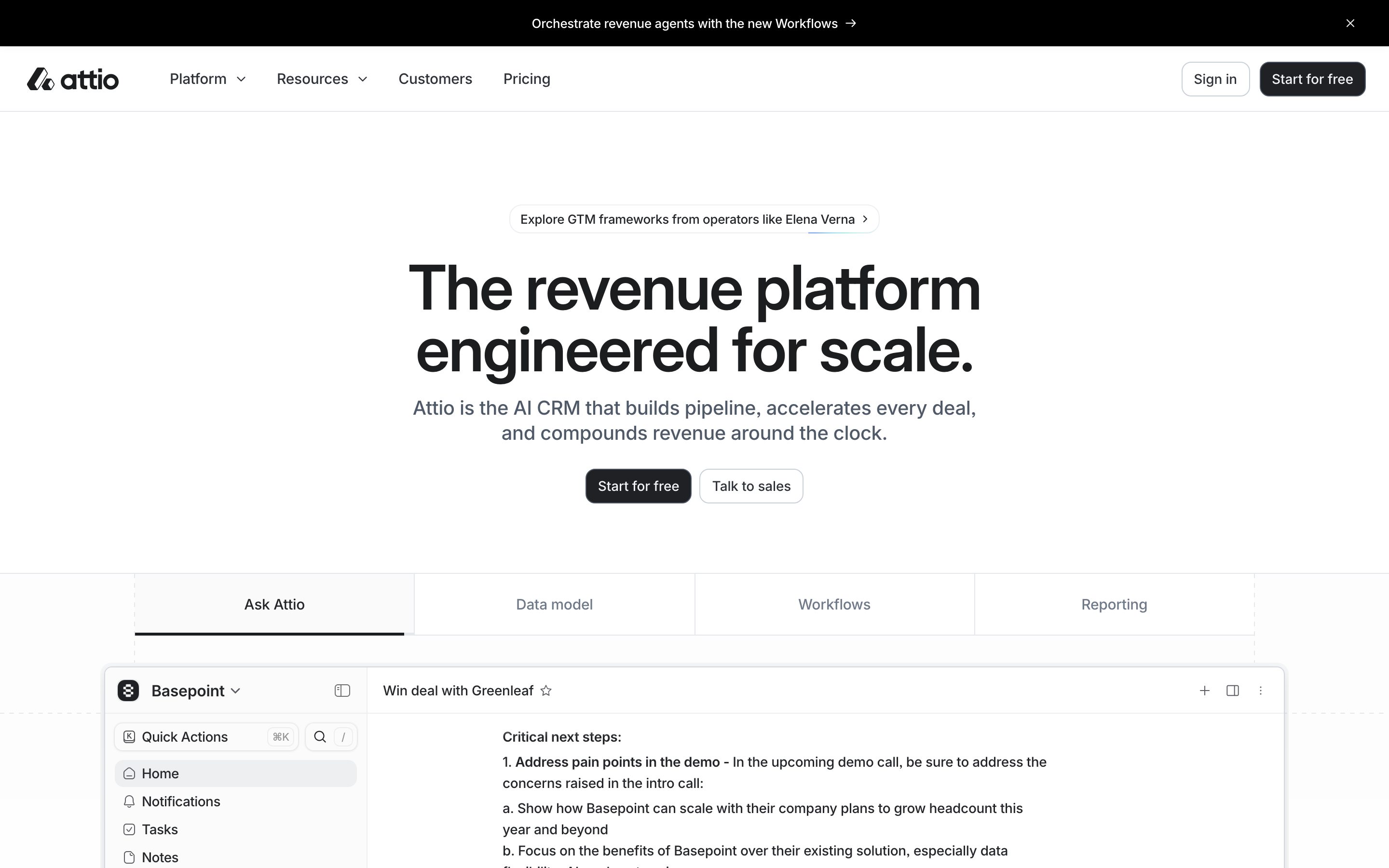
## Overview
Attio's marketing surface is a precise, near-monochrome interface for an AI CRM. The page floor is pure white (`{colors.canvas}` — #ffffff), headlines and primary CTAs are pure black (`{colors.primary}` — #000000), and the supporting palette is an almost-entirely grayscale ramp running from `{colors.ink-soft}` (#242629) through `{colors.body}` (#5c5e63) down to `{colors.muted-soft}` (#9fa1a7). The system reads as engineered and quietly confident — there is no decorative color at the marketing layer; the only chromatic moments (`{colors.accent-blue}` — #266df0, `{colors.success}` — #0fc27b) appear inside the embedded product UI.
The type voice is a single family — **Inter Display** for headlines and **Inter** for UI labels — set tight. The hero h1 runs 64px / weight 600 with -1.28px tracking; section display headlines run 56px with -0.84px tracking. The negative letter-spacing across all display sizes is the signature: condensed, dense, technical.
Brand voltage comes from **real product UI fragments shown directly inside cards** — a CRM workspace with a deal pane, automation flow diagrams, lead-research panels, and reporting charts. Attio doesn't illustrate the product; it embeds the actual app chrome at small scale inside soft hairline-bordered cards. The product itself is the hero image.
**Key Characteristics:**
- Pure-white canvas, pure-black primary CTA (`{colors.primary}` — #000000). Buttons are `{rounded.md}` (10px) with Inter 15px / 500 labels and a tight -0.16px tracking.
- Inter Display headlines set with aggressive negative tracking (-0.32px to -1.28px). Dense, condensed, engineered feel.
- A grayscale ramp does almost all the work — five surface tints (#fafafb → #e6e7ea), a hairline tone (`{colors.hairline}` — #e4e7ec), and four text grays.
- Soft hairline-bordered cards (`{rounded.lg}` 12px), most with no shadow; the hero product card carries a faint elevated shadow.
- Real CRM product chrome embedded in cards — deal panes, automation flows, lead panels, charts. The single blue and single green live only here.
- A horizontal tab row ("Ask Attio / Data model / Workflows / Reporting") with a black underline under the active tab switches the hero product view.
- A logo strip (Granola, Flow, Listen, Obvious, Modal, USV) in muted gray below the hero.
## Colors
### Brand & Action
- **Primary / Ink** (`{colors.primary}` — #000000): The dominant color — every headline, the primary CTA fill, the logo wordmark, and nav links. Attio's button is pure black, not a brand hue.
- **Ink Soft** (`{colors.ink-soft}` — #242629 and `{colors.ink-soft-alt}` — #232529): Near-black tones used for strong secondary text and, derived, the pressed state of the primary button.
### Accent (product chrome only)
- **Accent Blue** (`{colors.accent-blue}` — #266df0): The single blue. Appears inside product UI fragments (links, selected states, the faint blue glow shadow). Never on marketing CTAs.
- **Success Green** (`{colors.success}` — #0fc27b): Used for positive/recorded indicators inside the embedded CRM chrome (e.g., the green deal-context accent bar).
- **Accent Maroon** (`{colors.accent-maroon}` — #672322): A rare deep-red tone observed in product chrome avatars/badges.
### Text
- **Body** (`{colors.body}` — #5c5e63, with `{colors.body-alt}` — #505154 and `{colors.body-alt-2}` — #505155): Default running-text and sub-headline grays.
- **Muted** (`{colors.muted}` — #75777c): Secondary labels, inactive tabs, logo-strip text.
- **Muted Soft** (`{colors.muted-soft}` — #9fa1a7) and **Muted Blue** (`{colors.muted-blue}` — #8f99a8): Tertiary captions and cool-gray micro-labels inside product chrome.
- **On Primary** (`{colors.on-primary}` — #ffffff): Text on the black primary button.
### Surface & Lines
- **Canvas** (`{colors.canvas}` — #ffffff): The page floor everywhere.
- **Surface Faint** (`{colors.surface-faint}` — #fafafb), **Surface Soft** (`{colors.surface-soft}` — #f4f5f6), **Surface Tint** (`{colors.surface-tint}` — #edeff3), **Hairline Soft** (`{colors.hairline-soft}` — #eeeff1), **Surface Strong** (`{colors.surface-strong}` — #e6e7ea): The stack of barely-different gray tints used for pill backgrounds, card fills, and section dividers.
- **Hairline** (`{colors.hairline}` — #e4e7ec): The 1px border tone — used as the `0 0 0 1px` ring on cards and inputs.
- **Border** (`{colors.border}` — #cad0d9): A slightly stronger 1px divider/outline tone.
## Typography
### Font Family
The system runs **Inter Display** for headlines and **Inter** for UI labels — both open-source (no licensed faces were flagged). Inter Display is Inter's display optical size, tuned for larger settings; the fallback stack walks `Inter, sans-serif`. The boundary is functional rather than aesthetic: display optical size for headlines, standard Inter for the 15px button/label text.
### Hierarchy
| Token | Size | Weight | Line Height | Letter Spacing | Use |
|---|---|---|---|---|---|
| `{typography.display-xl}` | 64px | 600 | 1.0 | -1.28px | Homepage h1 ("The revenue platform engineered for scale.") |
| `{typography.display-lg}` | 56px | 600 | 1.071 | -0.84px | Large section / CTA-band headlines ("Start with 14 days of Pro, for free.") — captured by the analyzer as `body_text` |
| `{typography.display-md}` | 32px | 600 | 1.188 | -0.32px | Sub-section heads / feature-card titles |
| `{typography.eyebrow}` | 12px | 600 | 1.167 | +0.72px | Small uppercase section labels / eyebrow tags (positive tracking — the only positive value in the system) — captured as `h2` |
| `{typography.button}` | 15px | 500 | 1.467 | -0.16px | Buttons, nav links, tab labels, pill text |
### Principles
The display voice is defined by negative tracking that tightens as size grows — from -0.32px at 32px to -1.28px at 64px. This is what makes Attio's headlines read as dense and engineered rather than airy. Display weight is fixed at 600 across all sizes — never 700, never 400. The lone exception to the negative-tracking rule is the 12px eyebrow label, which runs +0.72px positive tracking — the standard uppercase-micro-label treatment.
### Note on Font Substitutes
No licensed faces were detected. Inter and Inter Display are both freely available open-source web fonts and can ship as-is. If Inter Display is unavailable, standard **Inter** at weight 600 with the same negative letter-spacing is a faithful substitute, since Inter Display is the same family at a display optical size.
## Layout
### Spacing System
- **Base unit:** measured spacing clusters tightly around 4px and 6px (the two highest-frequency values), with a coarser 8 / 12 / 16 / 24 / 32 / 36 ramp above.
- **Tokens:** `{spacing.xxs}` 4px · `{spacing.xs}` 6px · `{spacing.sm}` 8px · `{spacing.md}` 12px · `{spacing.lg}` 16px · `{spacing.xl}` 24px · `{spacing.xxl}` 32px · `{spacing.xxxl}` 36px.
- **Dense micro-rhythm:** The high frequency of 4 / 6 / 8 / 12px values reflects the tightly-packed product chrome embedded in cards — list rows, deal panes, and inline badges sit on a 4–6px internal grid.
- **Card internal padding:** product-mockup cards observed around `{spacing.lg}` (16px); feature copy blocks use `{spacing.xl}` (24px).
### Grid & Container
- **Editorial body:** centered single column; hero is fully centered (eyebrow pill → h1 → sub-head → button row).
- **Feature rows:** a left copy column paired with a multi-panel product-chrome grid on the right (observed as 2–3 panels per row on the landing scroll).
- **Logo strip:** single horizontal row of partner logos in `{colors.muted}`.
### Whitespace Philosophy
Attio pairs a roomy, fully-centered hero with dense, information-rich product cards below. The macro rhythm breathes (large vertical gaps between bands); the micro rhythm inside cards is tight (4–8px). This contrast — generous outside, dense inside — mirrors the product itself: a calm marketing shell wrapped around a dense CRM workspace.
## Elevation & Depth
| Level | Treatment | Use |
|---|---|---|
| Flat | No shadow, no border | Body sections, hero band, top nav, logo strip |
| Hairline ring | `0 0 0 1px` ring in `{colors.hairline-soft}` (#eeeff1) or `rgba(0,0,0,0.05)` | Cards, inputs, embedded panels |
| Faint micro-shadow | `rgba(28,40,64,0.18) 0px 0px 2px` + `rgba(0,0,0,0.04)` | Small floating elements (e.g., the cookie consent card) |
| Soft drop shadow | `rgba(28,40,64,0.06) 0px 2px 6px` / `rgba(0,0,0,0.04) 0px 12px 30px` | Elevated product cards / floating panels |
| Hero product card | `rgba(28,40,64,0.08) 0px 10.85px 21.7px -4.34px` layered with two tighter shadows | The marquee CRM workspace card under the hero |
| Blue glow | `rgba(15,107,233,0.12) 0px 2px 4px -2px` | A faint blue accent shadow on a selected/active product element |
The elevation philosophy is **soft and subtle** — most surfaces rely on a 1px hairline ring rather than shadow, and the few real shadows are low-alpha, navy-tinted (rgba(28,40,64,…)), multi-layered, and tight. No heavy shadows, no glassmorphism. The default `card` component carries `shadow: none`.
### Decorative Depth
- The embedded CRM chrome carries its own internal shadows from the product UI — these are content, not system tokens.
- Wireframe/isometric line illustrations (hexagon clusters, cube outlines) appear in feature rows as light decorative geometry rather than filled imagery.
## Shapes
### Border Radius Scale
| Token | Value | Use |
|---|---|---|
| `{rounded.xs}` | 6px | Small inline chips, dense list-row items inside product chrome |
| `{rounded.sm}` | 8px | The most common radius — buttons-in-chrome, small panels, badges |
| `{rounded.md}` | 10px | Primary + secondary CTA buttons, eyebrow pill |
| `{rounded.lg}` | 12px | Content cards and product-mockup cards (the `card` component) |
| `{rounded.xl}` | 14px | Larger framed panels / outer container corners |
Radius usage is tight and consistent — nothing exceeds 14px. The system never goes fully pill-shaped at the marketing layer; even the eyebrow tag uses a modest `{rounded.md}` (10px). The restrained radius reinforces the engineered, professional tone.
### Photography & Geometry
Attio shows almost no photography at the marketing layer — the visual content is product chrome and thin-line isometric illustrations. Embedded product panels keep their native internal radii (6–8px on list rows and inner buttons). Avatar elements inside the CRM chrome are small circular crops.
## Components
### Top Navigation
**`top-nav`** — White nav bar pinned to the top. Carries the Attio logo + wordmark at left, a horizontal menu (Platform ⌄, Resources ⌄, Customers, Pricing) center-left, and a right cluster with a "Sign in" `{component.button-secondary}` and a black "Start for free" `{component.button-primary}`. Menu items use `{component.nav-link}` (Inter 15px / 500, `{colors.ink}`).
**`nav-link`** — Inline nav menu item. Transparent background, `{colors.ink}` text, `{typography.button}`. Dropdown items carry a small chevron.
### Buttons
**`button-primary`** — The signature CTA ("Start for free"). Background `{colors.primary}` (#000000), text `{colors.on-primary}`, type `{typography.button}` (Inter 15px / 500), rounded `{rounded.md}` (10px), measured padding `0px 8px 0px 12px` (asymmetric to seat a trailing icon/glyph). Pressed state `button-primary-active` shifts to `{colors.ink-soft}` (#242629) — derived from the near-black ink ramp.
**`button-secondary`** — White button with hairline outline ("Talk to sales", "Sign in", "See our plans"). Background `{colors.canvas}`, text `{colors.ink}`, 1px `{colors.hairline}` ring, same radius and label type as primary.
### Pills, Tabs & Eyebrows
**`eyebrow-pill`** — A small rounded pill above the h1 ("Explore GTM frameworks from operators like Elena Verna ›"). Background `{colors.surface-soft}` (#f4f5f6), text `{colors.ink}`, `{typography.button}`, rounded `{rounded.md}`, padding ~8px × 12px, with a trailing chevron.
**`section-tab`** + **`section-tab-active`** — The horizontal product-view switcher ("Ask Attio / Data model / Workflows / Reporting") under the hero. Inactive: transparent background, `{colors.muted}` text. Active: `{colors.ink}` text with a black underline bar. Both use `{typography.button}`, padding ~12px × 16px.
### Cards & Containers
**`card`** — The base card primitive. Background `{colors.canvas}`, rounded `{rounded.lg}` (12px), `shadow: none` by default (relies on a `{colors.hairline}` ring when bordered).
**`product-mockup-card`** — A card showing actual Attio CRM chrome — workspace sidebar, deal pane, automation flow, lead-research panel, or reporting chart. Background `{colors.canvas}`, rounded `{rounded.lg}`, padding ~`{spacing.lg}` (16px). The hero instance carries the layered `rgba(28,40,64,0.08)` drop shadow; in-scroll instances mostly rely on hairline rings. These cards display the product — they don't decorate around it.
**`feature-card`** — A copy + chrome block in the landing scroll ("Revenue agents at your command", "Already there when you arrive", "Continuous context for everyone"). Background `{colors.canvas}`, title in `{typography.display-md}` (32px), body copy in `{colors.body}`, an "Explore →" text link, paired with a product-chrome panel. Rounded `{rounded.lg}`, padding ~`{spacing.xl}` (24px).
### Bands
**`hero-band`** — Centered white hero: `{component.eyebrow-pill}` → h1 in `{typography.display-xl}` → sub-headline in `{colors.body}` → button row (primary + secondary). No background color, no shadow.
**`cta-band`** — A pre-footer prompt ("Start with 14 days of Pro, for free."). Headline in `{typography.display-lg}` (56px), a `{component.button-primary}` plus a `{component.button-secondary}` ("See our plans"), accompanied by thin-line hexagon illustrations.
**`logo-strip`** — Single horizontal row of partner logos (Granola, Flow, Listen, Obvious, Modal, USV) below the hero. Background `{colors.canvas}`, logos rendered in `{colors.muted}` gray.
## Do's and Don'ts
### Do
- Reserve `{colors.primary}` (#000000) for headlines and the primary CTA. Attio's button is pure black, never a brand hue.
- Keep `{colors.accent-blue}` and `{colors.success}` inside embedded product chrome only — they are product-state colors, not marketing accents.
- Set every display headline in Inter Display 600 with negative tracking (-0.32px to -1.28px). The tight tracking is the brand voice.
- Use the grayscale ramp deliberately: `{colors.body}` for running text, `{colors.muted}` for secondary labels and the logo strip, `{colors.muted-soft}` for fine print.
- Embed real CRM chrome inside `{component.product-mockup-card}`. Show the actual app, not an illustration of it.
- Lean on the 1px hairline ring (`{colors.hairline}`) for card separation before reaching for a shadow.
- Keep the eyebrow label at 12px with positive +0.72px tracking — it's the one place positive tracking belongs.
### Don't
- Don't introduce additional accent colors at the marketing layer. The system is grayscale outside the product chrome.
- Don't bold display type past 600 or set it without negative tracking — either reads as off-brand.
- Don't exceed `{rounded.xl}` (14px) on any element. Larger radii break the engineered, professional tone.
- Don't add heavy or high-alpha shadows. Attio's elevation is faint, navy-tinted, and multi-layered.
- Don't put body copy in Inter Display or headlines in plain Inter — keep the display/UI split clean.
- Don't document hover states — primary darkens to `{colors.ink-soft}` on press; nothing else changes.
## Responsive Behavior
The landing and pricing pages were captured at desktop width. The reference shows a centered single-column hero and full horizontal nav. The following collapsing behavior is inferred from standard SaaS patterns and the observed layout; exact breakpoint values were not measured (see Known Gaps).
### Breakpoints (inferred)
| Name | Width | Key Changes |
|---|---|---|
| Mobile | < 768px | Nav likely collapses to a menu trigger; hero h1 scales down from 64px; feature rows stack copy above chrome; logo strip wraps |
| Tablet | 768–1024px | Horizontal nav tightens; feature chrome panels reduce to fewer columns |
| Desktop | 1024px+ | Full nav, centered hero, multi-panel product-chrome feature rows |
### Touch Targets
- `{component.button-primary}` / `{component.button-secondary}` label type is 15px; effective height was not measured.
- `{component.section-tab}` rows have ~12px vertical padding; combined tap area should clear comfortable minimums.
### Collapsing Strategy
- Hero is already centered single-column and collapses cleanly.
- Feature rows (copy + chrome panels) stack vertically on narrow viewports.
- Embedded product cards should scale proportionally so the dense chrome stays legible rather than reflowing.
## Iteration Guide
1. Focus on ONE component at a time. Reference its YAML key directly (`{component.button-primary}`, `{component.product-mockup-card}`).
2. Variants (`-active`, `-secondary`) live as separate entries in `components:`.
3. Use `{token.refs}` everywhere — never inline a hex in a component.
4. Never document hover. Default and Active/Pressed states only.
5. Display headlines stay Inter Display 600 with negative tracking; UI text stays Inter 15px / 500. The split does not blur.
6. The marketing layer is grayscale — keep blue and green confined to product chrome.
7. When in doubt about emphasis: bigger Inter Display before bolder. Weight stays at 600.
## Known Gaps
- The analyzer captured a `body_text` role at 56px / 600 — this is clearly a large display headline, not running body copy. **True body / paragraph text size and weight were not reliably measured**; the `{colors.body}` (#5c5e63) tone is documented from frequency, but its paired font-size is a gap.
- The `h2` role was measured at 12px with positive tracking — this is an eyebrow/label, not a section heading. A mid-tier heading between 32px and 56px may exist but was not captured.
- Footer was not captured on either page; footer surface, structure, and link styling are unknown.
- Pricing-page-specific components (tier cards, plan tables, toggles) were captured visually but not measured as discrete tokens; their padding, fills, and typography are gaps.
- The `{colors.accent-maroon}` (#672322) role is inferred from product-chrome avatars/badges; its exact usage is uncertain.
- Exact button heights, input dimensions, and form-field states were not measured (only button radius and asymmetric padding).
- Responsive breakpoints and mobile nav behavior are inferred, not measured.
- Animation and transition timings (tab switching, product-chrome reveals) are out of scope.
<!-- Documented by duply · real-world design systems as ready-to-use DESIGN.md for AI coding agents · https://duply.ai/attio/design-md -->
Color Palette
Accent
Neutrals
Typography
display-xl64px · 600 · 1
The quick brown fox jumpsdisplay-lg56px · 600 · 1.071
The quick brown fox jumpsdisplay-md32px · 600 · 1.188
The quick brown fox jumpseyebrow12px · 600 · 1.167
The quick brown fox jumpsbutton15px · 500 · 1.467
The quick brown fox jumpsSpacing & Shape
Spacing
| Name | Value | Preview |
|---|---|---|
| xxs | 4px | |
| xs | 6px | |
| sm | 8px | |
| md | 12px | |
| lg | 16px | |
| xl | 24px | |
| xxl | 32px | |
| xxxl | 36px |
Border Radius
| Name | Value | Preview |
|---|---|---|
| xs | 6px | |
| sm | 8px | |
| md | 10px | |
| lg | 12px | |
| xl | 14px |
More like this


---
version: alpha
name: Attio-design-analysis
description: A precise, near-monochrome SaaS interface for an AI CRM — bright white canvas with pure-black headlines and primary CTAs, Inter Display typography set tight with negative tracking, and soft hairline-bordered product cards (~12px radius) that show real CRM chrome at small scale. The system reads as engineered, dense, and quietly confident — color is almost entirely grayscale, with a single blue (#266df0) and a single green (#0fc27b) surfacing only inside product UI fragments.

colors:
  primary: "#000000"
  ink: "#000000"
  ink-soft: "#242629"
  ink-soft-alt: "#232529"
  body: "#5c5e63"
  body-alt: "#505154"
  body-alt-2: "#505155"
  muted: "#75777c"
  muted-soft: "#9fa1a7"
  muted-blue: "#8f99a8"
  border: "#cad0d9"
  hairline: "#e4e7ec"
  hairline-soft: "#eeeff1"
  surface-tint: "#edeff3"
  surface-soft: "#f4f5f6"
  surface-faint: "#fafafb"
  surface-strong: "#e6e7ea"
  canvas: "#ffffff"
  on-primary: "#ffffff"
  accent-blue: "#266df0"
  success: "#0fc27b"
  accent-maroon: "#672322"

typography:
  display-xl:
    fontFamily: "Inter Display, Inter, sans-serif"
    fontSize: 64px
    fontWeight: 600
    lineHeight: 1.0
    letterSpacing: -1.28px
  display-lg:
    fontFamily: "Inter Display, Inter, sans-serif"
    fontSize: 56px
    fontWeight: 600
    lineHeight: 1.071
    letterSpacing: -0.84px
  display-md:
    fontFamily: "Inter Display, Inter, sans-serif"
    fontSize: 32px
    fontWeight: 600
    lineHeight: 1.188
    letterSpacing: -0.32px
  eyebrow:
    fontFamily: "Inter Display, Inter, sans-serif"
    fontSize: 12px
    fontWeight: 600
    lineHeight: 1.167
    letterSpacing: 0.72px
  button:
    fontFamily: "Inter, sans-serif"
    fontSize: 15px
    fontWeight: 500
    lineHeight: 1.467
    letterSpacing: -0.16px

rounded:
  xs: 6px
  sm: 8px
  md: 10px
  lg: 12px
  xl: 14px

spacing:
  xxs: 4px
  xs: 6px
  sm: 8px
  md: 12px
  lg: 16px
  xl: 24px
  xxl: 32px
  xxxl: 36px

components:
  button-primary:
    backgroundColor: "{colors.primary}"
    textColor: "{colors.on-primary}"
    typography: "{typography.button}"
    rounded: "{rounded.md}"
    padding: 0px 8px 0px 12px
  button-primary-active:
    backgroundColor: "{colors.ink-soft}"
    textColor: "{colors.on-primary}"
    rounded: "{rounded.md}"
  button-secondary:
    backgroundColor: "{colors.canvas}"
    textColor: "{colors.ink}"
    typography: "{typography.button}"
    rounded: "{rounded.md}"
    padding: 0px 8px 0px 12px
  nav-link:
    backgroundColor: transparent
    textColor: "{colors.ink}"
    typography: "{typography.button}"
  top-nav:
    backgroundColor: "{colors.canvas}"
    textColor: "{colors.ink}"
    typography: "{typography.button}"
  eyebrow-pill:
    backgroundColor: "{colors.surface-soft}"
    textColor: "{colors.ink}"
    typography: "{typography.button}"
    rounded: "{rounded.md}"
    padding: 8px 12px
  hero-band:
    backgroundColor: "{colors.canvas}"
    textColor: "{colors.ink}"
    typography: "{typography.display-xl}"
  section-tab:
    backgroundColor: transparent
    textColor: "{colors.muted}"
    typography: "{typography.button}"
    padding: 12px 16px
  section-tab-active:
    backgroundColor: transparent
    textColor: "{colors.ink}"
    typography: "{typography.button}"
  card:
    backgroundColor: "{colors.canvas}"
    textColor: "{colors.ink}"
    rounded: "{rounded.lg}"
  product-mockup-card:
    backgroundColor: "{colors.canvas}"
    textColor: "{colors.ink}"
    rounded: "{rounded.lg}"
    padding: 16px
  feature-card:
    backgroundColor: "{colors.canvas}"
    textColor: "{colors.ink}"
    typography: "{typography.display-md}"
    rounded: "{rounded.lg}"
    padding: 24px
  cta-band:
    backgroundColor: "{colors.canvas}"
    textColor: "{colors.ink}"
    typography: "{typography.display-lg}"
  logo-strip:
    backgroundColor: "{colors.canvas}"
    textColor: "{colors.muted}"
---

## Overview

Attio's marketing surface is a precise, near-monochrome interface for an AI CRM. The page floor is pure white (`{colors.canvas}` — #ffffff), headlines and primary CTAs are pure black (`{colors.primary}` — #000000), and the supporting palette is an almost-entirely grayscale ramp running from `{colors.ink-soft}` (#242629) through `{colors.body}` (#5c5e63) down to `{colors.muted-soft}` (#9fa1a7). The system reads as engineered and quietly confident — there is no decorative color at the marketing layer; the only chromatic moments (`{colors.accent-blue}` — #266df0, `{colors.success}` — #0fc27b) appear inside the embedded product UI.

The type voice is a single family — **Inter Display** for headlines and **Inter** for UI labels — set tight. The hero h1 runs 64px / weight 600 with -1.28px tracking; section display headlines run 56px with -0.84px tracking. The negative letter-spacing across all display sizes is the signature: condensed, dense, technical.

Brand voltage comes from **real product UI fragments shown directly inside cards** — a CRM workspace with a deal pane, automation flow diagrams, lead-research panels, and reporting charts. Attio doesn't illustrate the product; it embeds the actual app chrome at small scale inside soft hairline-bordered cards. The product itself is the hero image.

**Key Characteristics:**
- Pure-white canvas, pure-black primary CTA (`{colors.primary}` — #000000). Buttons are `{rounded.md}` (10px) with Inter 15px / 500 labels and a tight -0.16px tracking.
- Inter Display headlines set with aggressive negative tracking (-0.32px to -1.28px). Dense, condensed, engineered feel.
- A grayscale ramp does almost all the work — five surface tints (#fafafb → #e6e7ea), a hairline tone (`{colors.hairline}` — #e4e7ec), and four text grays.
- Soft hairline-bordered cards (`{rounded.lg}` 12px), most with no shadow; the hero product card carries a faint elevated shadow.
- Real CRM product chrome embedded in cards — deal panes, automation flows, lead panels, charts. The single blue and single green live only here.
- A horizontal tab row ("Ask Attio / Data model / Workflows / Reporting") with a black underline under the active tab switches the hero product view.
- A logo strip (Granola, Flow, Listen, Obvious, Modal, USV) in muted gray below the hero.

## Colors

### Brand & Action
- **Primary / Ink** (`{colors.primary}` — #000000): The dominant color — every headline, the primary CTA fill, the logo wordmark, and nav links. Attio's button is pure black, not a brand hue.
- **Ink Soft** (`{colors.ink-soft}` — #242629 and `{colors.ink-soft-alt}` — #232529): Near-black tones used for strong secondary text and, derived, the pressed state of the primary button.

### Accent (product chrome only)
- **Accent Blue** (`{colors.accent-blue}` — #266df0): The single blue. Appears inside product UI fragments (links, selected states, the faint blue glow shadow). Never on marketing CTAs.
- **Success Green** (`{colors.success}` — #0fc27b): Used for positive/recorded indicators inside the embedded CRM chrome (e.g., the green deal-context accent bar).
- **Accent Maroon** (`{colors.accent-maroon}` — #672322): A rare deep-red tone observed in product chrome avatars/badges.

### Text
- **Body** (`{colors.body}` — #5c5e63, with `{colors.body-alt}` — #505154 and `{colors.body-alt-2}` — #505155): Default running-text and sub-headline grays.
- **Muted** (`{colors.muted}` — #75777c): Secondary labels, inactive tabs, logo-strip text.
- **Muted Soft** (`{colors.muted-soft}` — #9fa1a7) and **Muted Blue** (`{colors.muted-blue}` — #8f99a8): Tertiary captions and cool-gray micro-labels inside product chrome.
- **On Primary** (`{colors.on-primary}` — #ffffff): Text on the black primary button.

### Surface & Lines
- **Canvas** (`{colors.canvas}` — #ffffff): The page floor everywhere.
- **Surface Faint** (`{colors.surface-faint}` — #fafafb), **Surface Soft** (`{colors.surface-soft}` — #f4f5f6), **Surface Tint** (`{colors.surface-tint}` — #edeff3), **Hairline Soft** (`{colors.hairline-soft}` — #eeeff1), **Surface Strong** (`{colors.surface-strong}` — #e6e7ea): The stack of barely-different gray tints used for pill backgrounds, card fills, and section dividers.
- **Hairline** (`{colors.hairline}` — #e4e7ec): The 1px border tone — used as the `0 0 0 1px` ring on cards and inputs.
- **Border** (`{colors.border}` — #cad0d9): A slightly stronger 1px divider/outline tone.

## Typography

### Font Family
The system runs **Inter Display** for headlines and **Inter** for UI labels — both open-source (no licensed faces were flagged). Inter Display is Inter's display optical size, tuned for larger settings; the fallback stack walks `Inter, sans-serif`. The boundary is functional rather than aesthetic: display optical size for headlines, standard Inter for the 15px button/label text.

### Hierarchy

| Token | Size | Weight | Line Height | Letter Spacing | Use |
|---|---|---|---|---|---|
| `{typography.display-xl}` | 64px | 600 | 1.0 | -1.28px | Homepage h1 ("The revenue platform engineered for scale.") |
| `{typography.display-lg}` | 56px | 600 | 1.071 | -0.84px | Large section / CTA-band headlines ("Start with 14 days of Pro, for free.") — captured by the analyzer as `body_text` |
| `{typography.display-md}` | 32px | 600 | 1.188 | -0.32px | Sub-section heads / feature-card titles |
| `{typography.eyebrow}` | 12px | 600 | 1.167 | +0.72px | Small uppercase section labels / eyebrow tags (positive tracking — the only positive value in the system) — captured as `h2` |
| `{typography.button}` | 15px | 500 | 1.467 | -0.16px | Buttons, nav links, tab labels, pill text |

### Principles
The display voice is defined by negative tracking that tightens as size grows — from -0.32px at 32px to -1.28px at 64px. This is what makes Attio's headlines read as dense and engineered rather than airy. Display weight is fixed at 600 across all sizes — never 700, never 400. The lone exception to the negative-tracking rule is the 12px eyebrow label, which runs +0.72px positive tracking — the standard uppercase-micro-label treatment.

### Note on Font Substitutes
No licensed faces were detected. Inter and Inter Display are both freely available open-source web fonts and can ship as-is. If Inter Display is unavailable, standard **Inter** at weight 600 with the same negative letter-spacing is a faithful substitute, since Inter Display is the same family at a display optical size.

## Layout

### Spacing System
- **Base unit:** measured spacing clusters tightly around 4px and 6px (the two highest-frequency values), with a coarser 8 / 12 / 16 / 24 / 32 / 36 ramp above.
- **Tokens:** `{spacing.xxs}` 4px · `{spacing.xs}` 6px · `{spacing.sm}` 8px · `{spacing.md}` 12px · `{spacing.lg}` 16px · `{spacing.xl}` 24px · `{spacing.xxl}` 32px · `{spacing.xxxl}` 36px.
- **Dense micro-rhythm:** The high frequency of 4 / 6 / 8 / 12px values reflects the tightly-packed product chrome embedded in cards — list rows, deal panes, and inline badges sit on a 4–6px internal grid.
- **Card internal padding:** product-mockup cards observed around `{spacing.lg}` (16px); feature copy blocks use `{spacing.xl}` (24px).

### Grid & Container
- **Editorial body:** centered single column; hero is fully centered (eyebrow pill → h1 → sub-head → button row).
- **Feature rows:** a left copy column paired with a multi-panel product-chrome grid on the right (observed as 2–3 panels per row on the landing scroll).
- **Logo strip:** single horizontal row of partner logos in `{colors.muted}`.

### Whitespace Philosophy
Attio pairs a roomy, fully-centered hero with dense, information-rich product cards below. The macro rhythm breathes (large vertical gaps between bands); the micro rhythm inside cards is tight (4–8px). This contrast — generous outside, dense inside — mirrors the product itself: a calm marketing shell wrapped around a dense CRM workspace.

## Elevation & Depth

| Level | Treatment | Use |
|---|---|---|
| Flat | No shadow, no border | Body sections, hero band, top nav, logo strip |
| Hairline ring | `0 0 0 1px` ring in `{colors.hairline-soft}` (#eeeff1) or `rgba(0,0,0,0.05)` | Cards, inputs, embedded panels |
| Faint micro-shadow | `rgba(28,40,64,0.18) 0px 0px 2px` + `rgba(0,0,0,0.04)` | Small floating elements (e.g., the cookie consent card) |
| Soft drop shadow | `rgba(28,40,64,0.06) 0px 2px 6px` / `rgba(0,0,0,0.04) 0px 12px 30px` | Elevated product cards / floating panels |
| Hero product card | `rgba(28,40,64,0.08) 0px 10.85px 21.7px -4.34px` layered with two tighter shadows | The marquee CRM workspace card under the hero |
| Blue glow | `rgba(15,107,233,0.12) 0px 2px 4px -2px` | A faint blue accent shadow on a selected/active product element |

The elevation philosophy is **soft and subtle** — most surfaces rely on a 1px hairline ring rather than shadow, and the few real shadows are low-alpha, navy-tinted (rgba(28,40,64,…)), multi-layered, and tight. No heavy shadows, no glassmorphism. The default `card` component carries `shadow: none`.

### Decorative Depth
- The embedded CRM chrome carries its own internal shadows from the product UI — these are content, not system tokens.
- Wireframe/isometric line illustrations (hexagon clusters, cube outlines) appear in feature rows as light decorative geometry rather than filled imagery.

## Shapes

### Border Radius Scale

| Token | Value | Use |
|---|---|---|
| `{rounded.xs}` | 6px | Small inline chips, dense list-row items inside product chrome |
| `{rounded.sm}` | 8px | The most common radius — buttons-in-chrome, small panels, badges |
| `{rounded.md}` | 10px | Primary + secondary CTA buttons, eyebrow pill |
| `{rounded.lg}` | 12px | Content cards and product-mockup cards (the `card` component) |
| `{rounded.xl}` | 14px | Larger framed panels / outer container corners |

Radius usage is tight and consistent — nothing exceeds 14px. The system never goes fully pill-shaped at the marketing layer; even the eyebrow tag uses a modest `{rounded.md}` (10px). The restrained radius reinforces the engineered, professional tone.

### Photography & Geometry
Attio shows almost no photography at the marketing layer — the visual content is product chrome and thin-line isometric illustrations. Embedded product panels keep their native internal radii (6–8px on list rows and inner buttons). Avatar elements inside the CRM chrome are small circular crops.

## Components

### Top Navigation

**`top-nav`** — White nav bar pinned to the top. Carries the Attio logo + wordmark at left, a horizontal menu (Platform ⌄, Resources ⌄, Customers, Pricing) center-left, and a right cluster with a "Sign in" `{component.button-secondary}` and a black "Start for free" `{component.button-primary}`. Menu items use `{component.nav-link}` (Inter 15px / 500, `{colors.ink}`).

**`nav-link`** — Inline nav menu item. Transparent background, `{colors.ink}` text, `{typography.button}`. Dropdown items carry a small chevron.

### Buttons

**`button-primary`** — The signature CTA ("Start for free"). Background `{colors.primary}` (#000000), text `{colors.on-primary}`, type `{typography.button}` (Inter 15px / 500), rounded `{rounded.md}` (10px), measured padding `0px 8px 0px 12px` (asymmetric to seat a trailing icon/glyph). Pressed state `button-primary-active` shifts to `{colors.ink-soft}` (#242629) — derived from the near-black ink ramp.

**`button-secondary`** — White button with hairline outline ("Talk to sales", "Sign in", "See our plans"). Background `{colors.canvas}`, text `{colors.ink}`, 1px `{colors.hairline}` ring, same radius and label type as primary.

### Pills, Tabs & Eyebrows

**`eyebrow-pill`** — A small rounded pill above the h1 ("Explore GTM frameworks from operators like Elena Verna ›"). Background `{colors.surface-soft}` (#f4f5f6), text `{colors.ink}`, `{typography.button}`, rounded `{rounded.md}`, padding ~8px × 12px, with a trailing chevron.

**`section-tab`** + **`section-tab-active`** — The horizontal product-view switcher ("Ask Attio / Data model / Workflows / Reporting") under the hero. Inactive: transparent background, `{colors.muted}` text. Active: `{colors.ink}` text with a black underline bar. Both use `{typography.button}`, padding ~12px × 16px.

### Cards & Containers

**`card`** — The base card primitive. Background `{colors.canvas}`, rounded `{rounded.lg}` (12px), `shadow: none` by default (relies on a `{colors.hairline}` ring when bordered).

**`product-mockup-card`** — A card showing actual Attio CRM chrome — workspace sidebar, deal pane, automation flow, lead-research panel, or reporting chart. Background `{colors.canvas}`, rounded `{rounded.lg}`, padding ~`{spacing.lg}` (16px). The hero instance carries the layered `rgba(28,40,64,0.08)` drop shadow; in-scroll instances mostly rely on hairline rings. These cards display the product — they don't decorate around it.

**`feature-card`** — A copy + chrome block in the landing scroll ("Revenue agents at your command", "Already there when you arrive", "Continuous context for everyone"). Background `{colors.canvas}`, title in `{typography.display-md}` (32px), body copy in `{colors.body}`, an "Explore →" text link, paired with a product-chrome panel. Rounded `{rounded.lg}`, padding ~`{spacing.xl}` (24px).

### Bands

**`hero-band`** — Centered white hero: `{component.eyebrow-pill}` → h1 in `{typography.display-xl}` → sub-headline in `{colors.body}` → button row (primary + secondary). No background color, no shadow.

**`cta-band`** — A pre-footer prompt ("Start with 14 days of Pro, for free."). Headline in `{typography.display-lg}` (56px), a `{component.button-primary}` plus a `{component.button-secondary}` ("See our plans"), accompanied by thin-line hexagon illustrations.

**`logo-strip`** — Single horizontal row of partner logos (Granola, Flow, Listen, Obvious, Modal, USV) below the hero. Background `{colors.canvas}`, logos rendered in `{colors.muted}` gray.

## Do's and Don'ts

### Do
- Reserve `{colors.primary}` (#000000) for headlines and the primary CTA. Attio's button is pure black, never a brand hue.
- Keep `{colors.accent-blue}` and `{colors.success}` inside embedded product chrome only — they are product-state colors, not marketing accents.
- Set every display headline in Inter Display 600 with negative tracking (-0.32px to -1.28px). The tight tracking is the brand voice.
- Use the grayscale ramp deliberately: `{colors.body}` for running text, `{colors.muted}` for secondary labels and the logo strip, `{colors.muted-soft}` for fine print.
- Embed real CRM chrome inside `{component.product-mockup-card}`. Show the actual app, not an illustration of it.
- Lean on the 1px hairline ring (`{colors.hairline}`) for card separation before reaching for a shadow.
- Keep the eyebrow label at 12px with positive +0.72px tracking — it's the one place positive tracking belongs.

### Don't
- Don't introduce additional accent colors at the marketing layer. The system is grayscale outside the product chrome.
- Don't bold display type past 600 or set it without negative tracking — either reads as off-brand.
- Don't exceed `{rounded.xl}` (14px) on any element. Larger radii break the engineered, professional tone.
- Don't add heavy or high-alpha shadows. Attio's elevation is faint, navy-tinted, and multi-layered.
- Don't put body copy in Inter Display or headlines in plain Inter — keep the display/UI split clean.
- Don't document hover states — primary darkens to `{colors.ink-soft}` on press; nothing else changes.

## Responsive Behavior

The landing and pricing pages were captured at desktop width. The reference shows a centered single-column hero and full horizontal nav. The following collapsing behavior is inferred from standard SaaS patterns and the observed layout; exact breakpoint values were not measured (see Known Gaps).

### Breakpoints (inferred)

| Name | Width | Key Changes |
|---|---|---|
| Mobile | < 768px | Nav likely collapses to a menu trigger; hero h1 scales down from 64px; feature rows stack copy above chrome; logo strip wraps |
| Tablet | 768–1024px | Horizontal nav tightens; feature chrome panels reduce to fewer columns |
| Desktop | 1024px+ | Full nav, centered hero, multi-panel product-chrome feature rows |

### Touch Targets
- `{component.button-primary}` / `{component.button-secondary}` label type is 15px; effective height was not measured.
- `{component.section-tab}` rows have ~12px vertical padding; combined tap area should clear comfortable minimums.

### Collapsing Strategy
- Hero is already centered single-column and collapses cleanly.
- Feature rows (copy + chrome panels) stack vertically on narrow viewports.
- Embedded product cards should scale proportionally so the dense chrome stays legible rather than reflowing.

## Iteration Guide

1. Focus on ONE component at a time. Reference its YAML key directly (`{component.button-primary}`, `{component.product-mockup-card}`).
2. Variants (`-active`, `-secondary`) live as separate entries in `components:`.
3. Use `{token.refs}` everywhere — never inline a hex in a component.
4. Never document hover. Default and Active/Pressed states only.
5. Display headlines stay Inter Display 600 with negative tracking; UI text stays Inter 15px / 500. The split does not blur.
6. The marketing layer is grayscale — keep blue and green confined to product chrome.
7. When in doubt about emphasis: bigger Inter Display before bolder. Weight stays at 600.

## Known Gaps

- The analyzer captured a `body_text` role at 56px / 600 — this is clearly a large display headline, not running body copy. **True body / paragraph text size and weight were not reliably measured**; the `{colors.body}` (#5c5e63) tone is documented from frequency, but its paired font-size is a gap.
- The `h2` role was measured at 12px with positive tracking — this is an eyebrow/label, not a section heading. A mid-tier heading between 32px and 56px may exist but was not captured.
- Footer was not captured on either page; footer surface, structure, and link styling are unknown.
- Pricing-page-specific components (tier cards, plan tables, toggles) were captured visually but not measured as discrete tokens; their padding, fills, and typography are gaps.
- The `{colors.accent-maroon}` (#672322) role is inferred from product-chrome avatars/badges; its exact usage is uncertain.
- Exact button heights, input dimensions, and form-field states were not measured (only button radius and asymmetric padding).
- Responsive breakpoints and mobile nav behavior are inferred, not measured.
- Animation and transition timings (tab switching, product-chrome reveals) are out of scope.

<!-- Documented by duply · real-world design systems as ready-to-use DESIGN.md for AI coding agents · https://duply.ai/attio/design-md -->