Increase
A precise, infrastructure-grade fintech interface built on a white canvas with a deep slate-navy (#1a2b3b) as the dominant brand and text color. The system reads as serious engineering software for developers — restrained near-monochrome surfaces, 8–12px rounded cards, dark code panels shown inline as product proof, and a single high-voltage accent set (teal, lime, electric blue, orange) deployed only in geometric hero shards and syntax highlighting. Brand voltage comes from the diagonal gradient banner shapes and live API code, not from colored UI chrome.
---
version: alpha
name: Increase-design-analysis
description: "A precise, infrastructure-grade fintech interface built on a white canvas with a deep slate-navy (#1a2b3b) as the dominant brand and text color. The system reads as serious engineering software for developers — restrained near-monochrome surfaces, 8–12px rounded cards, dark code panels shown inline as product proof, and a single high-voltage accent set (teal, lime, electric blue, orange) deployed only in geometric hero shards and syntax highlighting. Brand voltage comes from the diagonal gradient banner shapes and live API code, not from colored UI chrome."
colors:
primary: "#1a2b3b"
primary-dark: "#132030"
ink: "#000000"
heading: "#1a2b3b"
body: "#314352"
muted: "#687887"
muted-soft: "#8995a1"
muted-softer: "#a6b0ba"
border-neutral: "#bdc2c8"
hairline: "#e1e5e9"
hairline-strong: "#cdd2d8"
hairline-soft: "#edf0f2"
canvas: "#ffffff"
surface-soft: "#f5f6f7"
surface-softer: "#fcfcfc"
on-primary: "#ffffff"
accent-teal: "#31f2cc"
accent-teal-2: "#31f2bf"
accent-lime: "#e4ff33"
accent-orange: "#ff5f33"
accent-blue: "#34bcff"
accent-blue-2: "#33bbff"
typography:
display-xl:
fontFamily: "Inter, sans-serif"
fontSize: 72px
fontWeight: 700
lineHeight: 1.05
letterSpacing: -1.5px
display-lg:
fontFamily: "Inter, sans-serif"
fontSize: 40px
fontWeight: 700
lineHeight: 1.1
letterSpacing: -1px
heading:
fontFamily: "Inter, sans-serif"
fontSize: 24px
fontWeight: 600
lineHeight: 1.3
letterSpacing: -0.3px
title-sm:
fontFamily: "Inter, sans-serif"
fontSize: 16px
fontWeight: 600
lineHeight: 1.4
letterSpacing: 0
body-md:
fontFamily: "Inter, sans-serif"
fontSize: 16px
fontWeight: 400
lineHeight: 1.5
letterSpacing: 0
body-sm:
fontFamily: "Inter, sans-serif"
fontSize: 14px
fontWeight: 400
lineHeight: 1.5
letterSpacing: 0
caption:
fontFamily: "Inter, sans-serif"
fontSize: 13px
fontWeight: 500
lineHeight: 1.4
letterSpacing: 0
button:
fontFamily: "Inter, sans-serif"
fontSize: 14px
fontWeight: 500
lineHeight: 1.429
letterSpacing: normal
nav-link:
fontFamily: "Inter, sans-serif"
fontSize: 14px
fontWeight: 500
lineHeight: 1.429
letterSpacing: normal
code:
fontFamily: "ui-monospace, SFMono-Regular, Menlo, monospace"
fontSize: 13px
fontWeight: 400
lineHeight: 1.5
letterSpacing: 0
rounded:
xs: 4px
md: 8px
lg: 12px
full: 999px
spacing:
xxs: 4px
xs: 8px
sm: 12px
md: 16px
lg: 20px
xl: 24px
xxl: 32px
xxxl: 40px
huge: 64px
section: 96px
section-lg: 112px
components:
top-nav:
backgroundColor: "{colors.canvas}"
textColor: "{colors.heading}"
typography: "{typography.nav-link}"
button-primary:
backgroundColor: "{colors.primary}"
textColor: "{colors.on-primary}"
typography: "{typography.button}"
rounded: "{rounded.md}"
button-secondary:
backgroundColor: "{colors.canvas}"
textColor: "{colors.muted}"
typography: "{typography.button}"
rounded: "{rounded.md}"
padding: 4px 8px
nav-link-text:
backgroundColor: transparent
textColor: "{colors.heading}"
typography: "{typography.nav-link}"
code-panel:
backgroundColor: "{colors.primary}"
textColor: "{colors.on-primary}"
typography: "{typography.code}"
rounded: "{rounded.lg}"
product-demo-card:
backgroundColor: "{colors.canvas}"
textColor: "{colors.heading}"
typography: "{typography.body-sm}"
rounded: "{rounded.lg}"
feature-card:
backgroundColor: "{colors.canvas}"
textColor: "{colors.heading}"
typography: "{typography.title-sm}"
rounded: "{rounded.lg}"
icon-feature-tile:
backgroundColor: "{colors.canvas}"
textColor: "{colors.heading}"
typography: "{typography.body-sm}"
rounded: "{rounded.md}"
partner-card:
backgroundColor: "{colors.surface-soft}"
textColor: "{colors.body}"
typography: "{typography.body-sm}"
rounded: "{rounded.lg}"
cta-band-dark:
backgroundColor: "{colors.primary}"
textColor: "{colors.on-primary}"
typography: "{typography.display-lg}"
rounded: "{rounded.lg}"
eyebrow-label:
backgroundColor: transparent
textColor: "{colors.muted}"
typography: "{typography.caption}"
footer:
backgroundColor: "{colors.canvas}"
textColor: "{colors.muted}"
typography: "{typography.body-sm}"
---
## Overview
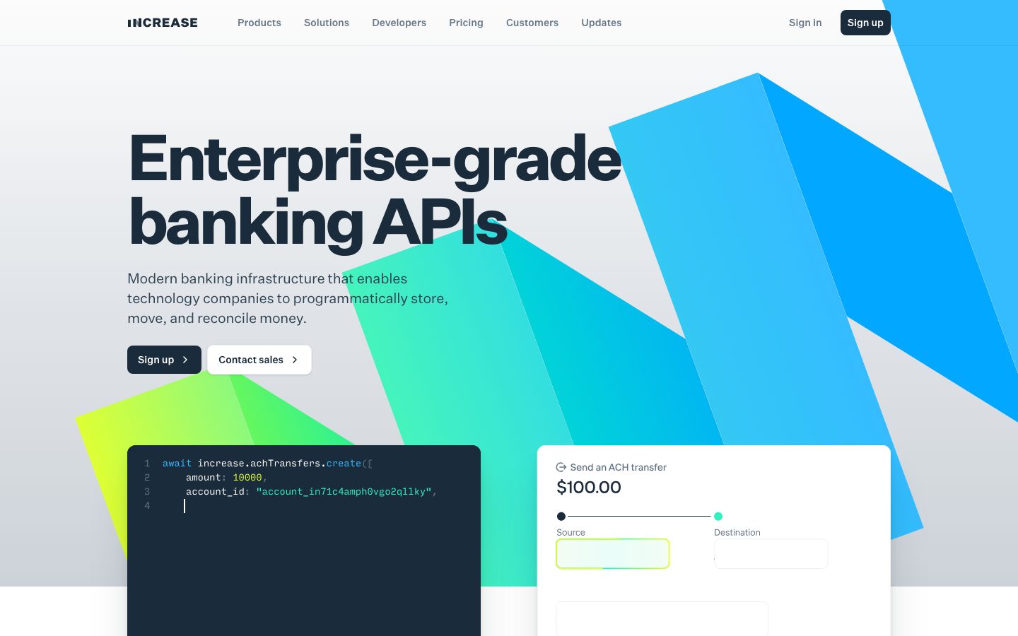
Increase's marketing surface is a precise, infrastructure-grade fintech interface aimed at developers and engineering teams. The page floor is white (`{colors.canvas}` — #ffffff) and the brand spine is a single deep slate-navy (`{colors.primary}` — #1a2b3b) that does triple duty: headline text, primary CTA fill, and the dark code/CTA panels. It reads as serious banking software — restrained, near-monochrome, technically literal.
The signature visual is a set of **diagonal gradient shards** in the hero — overlapping translucent prisms in teal (`{colors.accent-teal}` — #31f2cc), lime (`{colors.accent-lime}` — #e4ff33), electric blue (`{colors.accent-blue}` — #34bcff), and orange (`{colors.accent-orange}` — #ff5f33). This is where the brand's voltage lives. The chrome of the actual UI stays monochrome; color is reserved for the hero geometry and for syntax highlighting inside code panels.
The second voltage source is **live API code shown inline as product proof**. Dark slate code panels (`{component.code-panel}`) sit directly in the hero and repeat down the page beside each feature claim — Increase shows the actual `increase.achTransfers.create({...})` call rather than illustrating it. Paired with these are white product-demo cards (`{component.product-demo-card}`) rendering a real "Send an ACH transfer / $100.00" widget.
Type runs in **Untitled Sans**, a licensed grotesque (substituted with Inter here). Headlines are heavy and tightly tracked; body and UI text are mid-weight and quiet. The text color is the same slate-navy as the brand, keeping the whole system on a single hue axis with white and a fine ladder of cool grays (`{colors.muted}`, `{colors.muted-soft}`, `{colors.hairline}`).
**Key Characteristics:**
- White canvas with slate-navy primary (`{colors.primary}` — #1a2b3b) used for headlines, the "Sign up" CTA, and dark panels alike — a deliberately single-hue system.
- High-saturation accent set (teal / lime / blue / orange) confined to hero gradient shards and code syntax highlighting — never on buttons or text chrome.
- Dark code panels (`{rounded.lg}` — 12px) shown inline as product proof beside feature copy.
- A fine cool-gray ladder for borders and secondary text: `{colors.hairline}` (#e1e5e9), `{colors.hairline-strong}` (#cdd2d8), `{colors.border-neutral}` (#bdc2c8), `{colors.muted}` (#687887), `{colors.muted-soft}` (#8995a1).
- Soft, low-alpha drop shadows on cards (measured `rgba(12,25,39,0.05) 0 6px 8px` and similar) — modern-SaaS depth, never heavy.
- Border radius is tight and hierarchical: `{rounded.xs}` (4px) for small chips, `{rounded.md}` (8px) for buttons, `{rounded.lg}` (12px) for cards and panels, `{rounded.full}` for the rare pill/dot.
- Spacing rhythm climbs to `{spacing.section}` (96px) and `{spacing.section-lg}` (112px) between major bands.
## Colors
### Brand & Accent
- **Primary** (`{colors.primary}` — #1a2b3b): The dominant brand color (measured most frequent by a wide margin). Headlines, primary CTA fill, dark code panels, and the dark CTA band. The whole system orbits this slate-navy.
- **Primary Dark** (`{colors.primary-dark}` — #132030): A deeper navy used inside code panels and nested dark surfaces.
- **Accent Teal** (`{colors.accent-teal}` — #31f2cc) and **Accent Teal 2** (`{colors.accent-teal-2}` — #31f2bf): The dominant gradient-shard greens in the hero; also appear as syntax-highlight string color in code panels.
- **Accent Lime** (`{colors.accent-lime}` — #e4ff33): The lime corner of the hero gradient and the highlighted active-row in the dark CTA band's command list.
- **Accent Blue / Accent Blue 2** (`{colors.accent-blue}` — #34bcff / `{colors.accent-blue-2}` — #33bbff): The blue prisms in the upper-right hero geometry.
- **Accent Orange** (`{colors.accent-orange}` — #ff5f33): A small warm prism in the hero gradient; appears rarely.
These accents only appear in decorative geometry and code syntax — they are never used on buttons, links, or text.
### Surface
- **Canvas** (`{colors.canvas}` — #ffffff): Default page floor and card fill.
- **Surface Soft** (`{colors.surface-soft}` — #f5f6f7): Low-density section backgrounds and partner-logo bands.
- **Surface Softer** (`{colors.surface-softer}` — #fcfcfc): Barely-tinted alternating section fills.
### Text
- **Heading** (`{colors.heading}` — #1a2b3b): All headlines and primary text (same hue as primary).
- **Ink** (`{colors.ink}` — #000000): Measured pure-black text used in some body runs.
- **Body** (`{colors.body}` — #314352): Default running-text slate.
- **Muted** (`{colors.muted}` — #687887): Secondary text, secondary-button labels (measured as the button text color).
- **Muted Soft** (`{colors.muted-soft}` — #8995a1) and **Muted Softer** (`{colors.muted-softer}` — #a6b0ba): Tertiary text, captions, disabled labels.
- **On Primary** (`{colors.on-primary}` — #ffffff): Text on the primary CTA, code panels, and dark CTA band.
### Borders / Hairlines
- **Hairline** (`{colors.hairline}` — #e1e5e9): The standard 1px border tone on light cards.
- **Hairline Strong** (`{colors.hairline-strong}` — #cdd2d8) and **Border Neutral** (`{colors.border-neutral}` — #bdc2c8): Slightly heavier dividers and input outlines.
- **Hairline Soft** (`{colors.hairline-soft}` — #edf0f2): The faintest divider between sections sharing white canvas.
### Semantic
No dedicated success/warning/error tokens were measured. See Known Gaps.
## Typography
### Font Family
The system runs **Untitled Sans** (Klim Type Foundry — a licensed grotesque, captured here as `Untitled Sans-1cf12cb0fe365505`). Untitled Sans is not freely redistributable; this spec substitutes **Inter**, whose neutral grotesque proportions and full weight range approximate it closely. The fallback stack walks `Inter, -apple-system, BlinkMacSystemFont, "Segoe UI", Roboto, sans-serif`. Code panels use a monospace stack (`ui-monospace, SFMono-Regular, Menlo, monospace`).
Only the **button/nav** role was directly measured (Untitled Sans, 14px, weight 500, line-height 1.429, letter-spacing normal). All display, heading, and body roles below are **derived** from screenshot ground-truth and standard grotesque baselines — sizes are approximate and should be confirmed against source CSS.
### Hierarchy
| Token | Size | Weight | Line Height | Letter Spacing | Use |
|---|---|---|---|---|---|
| `{typography.display-xl}` | 72px | 700 | 1.05 | -1.5px | Hero h1 ("Enterprise-grade banking APIs") — derived |
| `{typography.display-lg}` | 40px | 700 | 1.1 | -1px | Section heads ("Embed financial services that scale") — derived |
| `{typography.heading}` | 24px | 600 | 1.3 | -0.3px | Sub-section heads, card cluster titles — derived |
| `{typography.title-sm}` | 16px | 600 | 1.4 | 0 | Feature card / tile titles — derived |
| `{typography.body-md}` | 16px | 400 | 1.5 | 0 | Default running-text — derived |
| `{typography.body-sm}` | 14px | 400 | 1.5 | 0 | Dense body, footer links — derived |
| `{typography.caption}` | 13px | 500 | 1.4 | 0 | Eyebrow labels, fine-print — derived |
| `{typography.button}` | 14px | 500 | 1.429 | normal | Button + nav labels — **measured** |
| `{typography.nav-link}` | 14px | 500 | 1.429 | normal | Top-nav menu items — measured (shares button role) |
| `{typography.code}` | 13px | 400 | 1.5 | 0 | Inline API code in dark panels — derived |
### Principles
Headlines are heavy (700) and tightly tracked; everything supporting drops to 400–600 and quiets down. The same slate-navy (`{colors.heading}`) carries from the largest headline to body text, keeping the type on a single hue. Code is the second voice — set in a monospace face inside dark panels — and is treated as content, not decoration.
### Note on Font Substitutes
Untitled Sans is a licensed Klim typeface and cannot be shipped here. **Inter** is the recommended open-source substitute and is used throughout this spec; **IBM Plex Sans** is a viable alternative if a slightly warmer grotesque is wanted. Match the measured 14px / 500 / 1.429 button signature exactly when substituting.
## Layout
### Spacing System
- **Base unit:** 4px (measured steps cluster cleanly on 4 and 8).
- **Tokens:** `{spacing.xxs}` 4px · `{spacing.xs}` 8px · `{spacing.sm}` 12px · `{spacing.md}` 16px · `{spacing.lg}` 20px · `{spacing.xl}` 24px · `{spacing.xxl}` 32px · `{spacing.xxxl}` 40px · `{spacing.huge}` 64px · `{spacing.section}` 96px · `{spacing.section-lg}` 112px.
- **Section padding:** `{spacing.section}` (96px), the most frequent large-step measured, with `{spacing.section-lg}` (112px) used for the tallest band transitions.
- **Most frequent micro-steps:** 8px (50 occurrences) and 4px (44) dominate internal padding and gaps; 12px and 16px handle component-internal rhythm.
(Minor measured values of 5px, 10px, and 15px occur at low frequency and are treated as off-grid; align to the 4px scale.)
### Grid & Container
- **Editorial body:** Centered content column with a left-aligned hero (h1 + sub-head + button row) and product artifacts (code panel + demo card) anchored to the right / below.
- **Feature grids:** Observed as 4-up icon/feature rows on the landing page ("ACH, Cards, Bank accounts, Wires…"), collapsing through 2-up to 1-up.
- **Partner-logo band:** A single horizontal row of customer logos under the hero.
- Exact max-width and column counts were not captured — see Known Gaps.
### Whitespace Philosophy
Increase uses generous vertical rhythm (96–112px between bands) against tight internal padding (4–8px micro-steps). The effect is technical and scannable: each band pairs a single claim with a literal code/demo artifact, never dense lists of marketing copy.
## Elevation & Depth
| Level | Treatment | Use |
|---|---|---|
| Flat | No shadow, no border | Body sections, top nav, hero copy |
| Hairline | 1px `{colors.hairline}` border | Feature tiles, inputs, dividers |
| Soft card shadow | `rgba(12,25,39,0.05) 0 6px 8px` + low-alpha layers (measured) | Product-demo cards, floating cards |
| Subtle UI shadow | `rgba(0,0,0,0.1) 0 1px 3px, 0 1px 2px` (measured) | Buttons, small chips |
| Brand-tinted shadow | `rgba(26,43,59,0.07) 0 6.6px 4.7px` (measured) | Hero artifact cards lifted off the gradient |
The depth language is **soft and modern** — low-alpha, navy-tinted drop shadows that lift cards a few pixels off the canvas. No heavy shadows, no glassmorphism. The dark code panels and CTA band rely on color contrast (slate-navy on white) rather than shadow for separation.
### Decorative Depth
- The hero's diagonal gradient shards (teal / lime / blue / orange) overlap with partial transparency, creating a layered prism effect behind the hero artifacts. This is the system's primary decorative-depth moment and is purely illustrative.
- Code panels carry their own internal syntax-color hierarchy (string greens, numeric/keyword accents) which reads as depth-of-content rather than UI elevation.
## Shapes
### Border Radius Scale
| Token | Value | Use |
|---|---|---|
| `{rounded.xs}` | 4px | Small chips, inline code tokens, tight inputs |
| `{rounded.md}` | 8px | Buttons (measured), small controls |
| `{rounded.lg}` | 12px | Cards, code panels, product-demo cards, CTA band (most frequent radius measured) |
| `{rounded.full}` | 999px | Slider dots, status dots, occasional pills |
The shape language is tight-cornered and engineered — 8px on interactive controls, 12px on every content surface. Nothing rounder than 12px appears on cards, which keeps the system reading as professional infrastructure rather than consumer app.
### Geometry
The hero gradient shards are hard-edged parallelograms (no corner rounding) — a deliberate contrast against the rounded UI chrome. Partner logos render as flat wordmarks without containers.
## Components
### Top Navigation
**`top-nav`** — White nav bar across the top of every page. Carries the "INCREASE" wordmark at left, a horizontal menu (Products, Solutions, Developers, Pricing, Customers, Updates) center, and a right cluster: "Sign in" (`{component.nav-link-text}`) plus a "Sign up" `{component.button-primary}`. Menu items use `{typography.nav-link}` (14px / 500). Background `{colors.canvas}`.
### Buttons
**`button-primary`** — The signature CTA ("Sign up"). Background `{colors.primary}` (#1a2b3b), text `{colors.on-primary}` (#ffffff), type `{typography.button}` (14px / 500), rounded `{rounded.md}` (8px). Carries a small chevron affordance. (Background mapped from screenshot ground-truth to the measured dominant brand token.)
**`button-secondary`** — White outline CTA ("Contact sales"). Background `{colors.canvas}`, text `{colors.muted}` (#687887 — the measured button text color), rounded `{rounded.md}` (8px), padding 4px 8px (measured), 1px hairline border. Carries a chevron affordance.
**`nav-link-text`** — Inline text link ("Sign in"). Transparent background, `{colors.heading}` text, `{typography.nav-link}`.
### Code & Product Artifacts
**`code-panel`** — Dark slate panel showing a live API call (`await increase.achTransfers.create({...})`) with line numbers. Background `{colors.primary}` (#1a2b3b), text `{colors.on-primary}`, monospace `{typography.code}`, rounded `{rounded.lg}` (12px). Syntax highlighting uses the accent set — string values in `{colors.accent-teal}`, numerics/keywords in the lime/blue accents. These panels repeat down the page beside each feature claim as literal product proof.
**`product-demo-card`** — White card rendering an actual product widget ("Send an ACH transfer / $100.00" with a Source→Destination slider). Background `{colors.canvas}`, text `{colors.heading}`, rounded `{rounded.lg}`, soft brand-tinted shadow. Slider track/dots use `{rounded.full}`; the active source field is highlighted with an accent-teal/lime fill.
### Cards & Tiles
**`feature-card`** — Cards in the "full-stack feature set" and "Everything you need" grids (ACH, Cards, Bank accounts, Wires, Checks, RTP, FedNow, Push-to-Card…). Background `{colors.canvas}`, title in `{typography.title-sm}`, hairline border, rounded `{rounded.lg}`. Each carries a small accent-colored icon at top-left.
**`icon-feature-tile`** — Smaller dense tiles used in the 4-up capability rows. Background `{colors.canvas}`, body in `{typography.body-sm}`, rounded `{rounded.md}`. Pairs a tiny accent glyph with a one-line label.
**`partner-card`** — Soft-surface cards naming integration partners ("Ramp partners with Increase…", "Digits…", "Capital-OS…"). Background `{colors.surface-soft}`, body `{typography.body-sm}`, rounded `{rounded.lg}`, with a "Read more" chevron link.
### Eyebrow & Labels
**`eyebrow-label`** — Small uppercase/accented section kicker above each section head ("Bare-metal APIs", "Flexible solutions", "Customized compliance", "Modern tooling", "Banking for builders"). Transparent background, `{colors.muted}` text, `{typography.caption}`, prefixed with a small accent dot/glyph.
### CTA Band
**`cta-band-dark`** — Full-width dark feature band ("Flexible financial primitives for developers"). Background `{colors.primary}` (#1a2b3b), text `{colors.on-primary}`, head in `{typography.display-lg}`, rounded `{rounded.lg}`. Contains a two-column layout: a command list on the left (the active row highlighted with `{colors.accent-lime}`) and an embedded `{component.code-panel}` on the right, plus "Read our documentation" links.
### Footer
**`footer`** — Light footer on white canvas. Background `{colors.canvas}`, link text `{colors.muted}`, type `{typography.body-sm}`, organized into multi-column link lists. (Footer structure partially observed; see Known Gaps.)
## Do's and Don'ts
### Do
- Keep `{colors.primary}` (#1a2b3b) as the one brand color — use it for headlines, the primary CTA, and dark panels alike. The single-hue discipline is the brand.
- Show real API code in `{component.code-panel}` beside feature claims. Increase proves capability with literal code, not illustration.
- Confine the accent set (teal / lime / blue / orange) to the hero gradient shards and code syntax highlighting only.
- Use `{rounded.lg}` (12px) for all content cards and `{rounded.md}` (8px) for buttons — the tight-corner ladder keeps the system reading as infrastructure software.
- Use the cool-gray ladder (`{colors.hairline}` → `{colors.muted}`) for borders and secondary text; let white dominate the surfaces.
- Pace bands with `{spacing.section}` (96px) vertical rhythm and tight 4–8px internal padding.
### Don't
- Don't put accent colors on buttons, links, or text chrome. Color lives in geometry and code, never in controls.
- Don't introduce a second brand hue — the slate-navy carries headlines, CTAs, and dark surfaces by itself.
- Don't round cards beyond `{rounded.lg}` (12px); larger radii read consumer, not banking-grade.
- Don't add heavy shadows — depth is low-alpha and navy-tinted only.
- Don't document hover states; render default and active/pressed only.
## Responsive Behavior
### Breakpoints
Exact breakpoint widths were not captured. From the landing + fees screenshots, the following collapsing behavior is observed:
| Name | Behavior |
|---|---|
| Mobile | Top-nav collapses to a compact bar; hero h1 scales down from ~72px; code panel + demo card stack below hero copy; 4-up feature grids reduce to 1-up |
| Tablet | Horizontal nav tightens; feature grids reduce to 2-up; CTA band's two-column layout may stack |
| Desktop | Full horizontal nav, left-aligned hero with right-side artifacts, 4-up feature rows |
### Touch Targets
- `{component.button-primary}` and `{component.button-secondary}` carry chevron affordances; the measured secondary padding (4px 8px) is tight — ensure an effective tap area of at least 40–44px via min-height in implementation.
- Nav links use `{typography.nav-link}` at 14px; space them to reach comfortable tap targets on mobile.
### Collapsing Strategy
- Hero artifacts (code panel, demo card) stack beneath the headline column on narrow viewports.
- Feature grids reduce column count rather than shrinking card content.
- The dark `{component.cta-band-dark}` stacks its command-list and code-panel columns vertically on mobile.
## Iteration Guide
1. Focus on ONE component at a time and reference its YAML key directly (`{component.code-panel}`, `{component.product-demo-card}`).
2. Variants (`-active`, `-disabled`, `-focused`) live as separate entries under `components:`.
3. Use `{token.refs}` everywhere — never inline a hex in a component.
4. Never document hover. Default and Active/Pressed states only.
5. Keep the single-hue rule: slate-navy for brand/text/dark panels; accents only in geometry and code.
6. When adding emphasis, prefer larger `{typography.display-*}` over new colors.
7. Confirm derived typography sizes against source CSS before shipping production type scales.
## Known Gaps
- **Typography is largely underspecified.** Only the button/nav role (Untitled Sans, 14px / 500 / 1.429 / normal) was directly measured. All display, heading, body, caption, and code roles are **derived** from screenshots and standard grotesque baselines — sizes, weights, and letter-spacing must be verified against source CSS.
- **Untitled Sans is a licensed Klim typeface** and cannot be shipped; this spec substitutes Inter throughout. The licensed family is documented in Typography with substitutes.
- **No measured background for the primary button.** The analysis captured a button text color (#687887) and tight 4px 8px padding, which is mapped here to the secondary/ghost button; the dark "Sign up" primary fill is mapped to `{colors.primary}` from screenshot ground-truth, not a measured button background.
- **Color roles are inferred from frequency + screenshot context.** The accent prisms (teal/lime/blue/orange) and the gray ladder are measured hexes, but their precise role assignment (border vs. text vs. fill) is partly interpreted.
- **No semantic color tokens** (success/warning/error) were measured.
- **Grid, container max-width, and exact breakpoints** were not captured; responsive behavior is described from screenshot observation only.
- **Shadow values are truncated** in the source data; full multi-layer box-shadow strings should be pulled from production CSS before implementation.
- **The fees page** was captured but its table/pricing components were not measured in detail; fee-table styling is out of scope for this entry.
- **Animation and transition timings** (hero gradient motion, slider interaction, code-panel reveals) are not in scope.
<!-- Documented by duply · real-world design systems as ready-to-use DESIGN.md for AI coding agents · https://duply.ai/increase/design-md -->
Color Palette
Accent
Neutrals
Typography
display-xl72px · 700 · 1.05
The quick brown fox jumpsdisplay-lg40px · 700 · 1.1
The quick brown fox jumpsheading24px · 600 · 1.3
The quick brown fox jumpstitle-sm16px · 600 · 1.4
The quick brown fox jumpsbody-md16px · 400 · 1.5
The quick brown fox jumpsbody-sm14px · 400 · 1.5
The quick brown fox jumpsSpacing & Shape
Spacing
| Name | Value | Preview |
|---|---|---|
| xxs | 4px | |
| xs | 8px | |
| sm | 12px | |
| md | 16px | |
| lg | 20px | |
| xl | 24px | |
| xxl | 32px | |
| xxxl | 40px | |
| huge | 64px | |
| section | 96px | |
| section-lg | 112px |
Border Radius
| Name | Value | Preview |
|---|---|---|
| xs | 4px | |
| md | 8px | |
| lg | 12px | |
| full | 999px |
More like this


---
version: alpha
name: Increase-design-analysis
description: "A precise, infrastructure-grade fintech interface built on a white canvas with a deep slate-navy (#1a2b3b) as the dominant brand and text color. The system reads as serious engineering software for developers — restrained near-monochrome surfaces, 8–12px rounded cards, dark code panels shown inline as product proof, and a single high-voltage accent set (teal, lime, electric blue, orange) deployed only in geometric hero shards and syntax highlighting. Brand voltage comes from the diagonal gradient banner shapes and live API code, not from colored UI chrome."

colors:
  primary: "#1a2b3b"
  primary-dark: "#132030"
  ink: "#000000"
  heading: "#1a2b3b"
  body: "#314352"
  muted: "#687887"
  muted-soft: "#8995a1"
  muted-softer: "#a6b0ba"
  border-neutral: "#bdc2c8"
  hairline: "#e1e5e9"
  hairline-strong: "#cdd2d8"
  hairline-soft: "#edf0f2"
  canvas: "#ffffff"
  surface-soft: "#f5f6f7"
  surface-softer: "#fcfcfc"
  on-primary: "#ffffff"
  accent-teal: "#31f2cc"
  accent-teal-2: "#31f2bf"
  accent-lime: "#e4ff33"
  accent-orange: "#ff5f33"
  accent-blue: "#34bcff"
  accent-blue-2: "#33bbff"

typography:
  display-xl:
    fontFamily: "Inter, sans-serif"
    fontSize: 72px
    fontWeight: 700
    lineHeight: 1.05
    letterSpacing: -1.5px
  display-lg:
    fontFamily: "Inter, sans-serif"
    fontSize: 40px
    fontWeight: 700
    lineHeight: 1.1
    letterSpacing: -1px
  heading:
    fontFamily: "Inter, sans-serif"
    fontSize: 24px
    fontWeight: 600
    lineHeight: 1.3
    letterSpacing: -0.3px
  title-sm:
    fontFamily: "Inter, sans-serif"
    fontSize: 16px
    fontWeight: 600
    lineHeight: 1.4
    letterSpacing: 0
  body-md:
    fontFamily: "Inter, sans-serif"
    fontSize: 16px
    fontWeight: 400
    lineHeight: 1.5
    letterSpacing: 0
  body-sm:
    fontFamily: "Inter, sans-serif"
    fontSize: 14px
    fontWeight: 400
    lineHeight: 1.5
    letterSpacing: 0
  caption:
    fontFamily: "Inter, sans-serif"
    fontSize: 13px
    fontWeight: 500
    lineHeight: 1.4
    letterSpacing: 0
  button:
    fontFamily: "Inter, sans-serif"
    fontSize: 14px
    fontWeight: 500
    lineHeight: 1.429
    letterSpacing: normal
  nav-link:
    fontFamily: "Inter, sans-serif"
    fontSize: 14px
    fontWeight: 500
    lineHeight: 1.429
    letterSpacing: normal
  code:
    fontFamily: "ui-monospace, SFMono-Regular, Menlo, monospace"
    fontSize: 13px
    fontWeight: 400
    lineHeight: 1.5
    letterSpacing: 0

rounded:
  xs: 4px
  md: 8px
  lg: 12px
  full: 999px

spacing:
  xxs: 4px
  xs: 8px
  sm: 12px
  md: 16px
  lg: 20px
  xl: 24px
  xxl: 32px
  xxxl: 40px
  huge: 64px
  section: 96px
  section-lg: 112px

components:
  top-nav:
    backgroundColor: "{colors.canvas}"
    textColor: "{colors.heading}"
    typography: "{typography.nav-link}"
  button-primary:
    backgroundColor: "{colors.primary}"
    textColor: "{colors.on-primary}"
    typography: "{typography.button}"
    rounded: "{rounded.md}"
  button-secondary:
    backgroundColor: "{colors.canvas}"
    textColor: "{colors.muted}"
    typography: "{typography.button}"
    rounded: "{rounded.md}"
    padding: 4px 8px
  nav-link-text:
    backgroundColor: transparent
    textColor: "{colors.heading}"
    typography: "{typography.nav-link}"
  code-panel:
    backgroundColor: "{colors.primary}"
    textColor: "{colors.on-primary}"
    typography: "{typography.code}"
    rounded: "{rounded.lg}"
  product-demo-card:
    backgroundColor: "{colors.canvas}"
    textColor: "{colors.heading}"
    typography: "{typography.body-sm}"
    rounded: "{rounded.lg}"
  feature-card:
    backgroundColor: "{colors.canvas}"
    textColor: "{colors.heading}"
    typography: "{typography.title-sm}"
    rounded: "{rounded.lg}"
  icon-feature-tile:
    backgroundColor: "{colors.canvas}"
    textColor: "{colors.heading}"
    typography: "{typography.body-sm}"
    rounded: "{rounded.md}"
  partner-card:
    backgroundColor: "{colors.surface-soft}"
    textColor: "{colors.body}"
    typography: "{typography.body-sm}"
    rounded: "{rounded.lg}"
  cta-band-dark:
    backgroundColor: "{colors.primary}"
    textColor: "{colors.on-primary}"
    typography: "{typography.display-lg}"
    rounded: "{rounded.lg}"
  eyebrow-label:
    backgroundColor: transparent
    textColor: "{colors.muted}"
    typography: "{typography.caption}"
  footer:
    backgroundColor: "{colors.canvas}"
    textColor: "{colors.muted}"
    typography: "{typography.body-sm}"
---

## Overview

Increase's marketing surface is a precise, infrastructure-grade fintech interface aimed at developers and engineering teams. The page floor is white (`{colors.canvas}` — #ffffff) and the brand spine is a single deep slate-navy (`{colors.primary}` — #1a2b3b) that does triple duty: headline text, primary CTA fill, and the dark code/CTA panels. It reads as serious banking software — restrained, near-monochrome, technically literal.

The signature visual is a set of **diagonal gradient shards** in the hero — overlapping translucent prisms in teal (`{colors.accent-teal}` — #31f2cc), lime (`{colors.accent-lime}` — #e4ff33), electric blue (`{colors.accent-blue}` — #34bcff), and orange (`{colors.accent-orange}` — #ff5f33). This is where the brand's voltage lives. The chrome of the actual UI stays monochrome; color is reserved for the hero geometry and for syntax highlighting inside code panels.

The second voltage source is **live API code shown inline as product proof**. Dark slate code panels (`{component.code-panel}`) sit directly in the hero and repeat down the page beside each feature claim — Increase shows the actual `increase.achTransfers.create({...})` call rather than illustrating it. Paired with these are white product-demo cards (`{component.product-demo-card}`) rendering a real "Send an ACH transfer / $100.00" widget.

Type runs in **Untitled Sans**, a licensed grotesque (substituted with Inter here). Headlines are heavy and tightly tracked; body and UI text are mid-weight and quiet. The text color is the same slate-navy as the brand, keeping the whole system on a single hue axis with white and a fine ladder of cool grays (`{colors.muted}`, `{colors.muted-soft}`, `{colors.hairline}`).

**Key Characteristics:**
- White canvas with slate-navy primary (`{colors.primary}` — #1a2b3b) used for headlines, the "Sign up" CTA, and dark panels alike — a deliberately single-hue system.
- High-saturation accent set (teal / lime / blue / orange) confined to hero gradient shards and code syntax highlighting — never on buttons or text chrome.
- Dark code panels (`{rounded.lg}` — 12px) shown inline as product proof beside feature copy.
- A fine cool-gray ladder for borders and secondary text: `{colors.hairline}` (#e1e5e9), `{colors.hairline-strong}` (#cdd2d8), `{colors.border-neutral}` (#bdc2c8), `{colors.muted}` (#687887), `{colors.muted-soft}` (#8995a1).
- Soft, low-alpha drop shadows on cards (measured `rgba(12,25,39,0.05) 0 6px 8px` and similar) — modern-SaaS depth, never heavy.
- Border radius is tight and hierarchical: `{rounded.xs}` (4px) for small chips, `{rounded.md}` (8px) for buttons, `{rounded.lg}` (12px) for cards and panels, `{rounded.full}` for the rare pill/dot.
- Spacing rhythm climbs to `{spacing.section}` (96px) and `{spacing.section-lg}` (112px) between major bands.

## Colors

### Brand & Accent
- **Primary** (`{colors.primary}` — #1a2b3b): The dominant brand color (measured most frequent by a wide margin). Headlines, primary CTA fill, dark code panels, and the dark CTA band. The whole system orbits this slate-navy.
- **Primary Dark** (`{colors.primary-dark}` — #132030): A deeper navy used inside code panels and nested dark surfaces.
- **Accent Teal** (`{colors.accent-teal}` — #31f2cc) and **Accent Teal 2** (`{colors.accent-teal-2}` — #31f2bf): The dominant gradient-shard greens in the hero; also appear as syntax-highlight string color in code panels.
- **Accent Lime** (`{colors.accent-lime}` — #e4ff33): The lime corner of the hero gradient and the highlighted active-row in the dark CTA band's command list.
- **Accent Blue / Accent Blue 2** (`{colors.accent-blue}` — #34bcff / `{colors.accent-blue-2}` — #33bbff): The blue prisms in the upper-right hero geometry.
- **Accent Orange** (`{colors.accent-orange}` — #ff5f33): A small warm prism in the hero gradient; appears rarely.

These accents only appear in decorative geometry and code syntax — they are never used on buttons, links, or text.

### Surface
- **Canvas** (`{colors.canvas}` — #ffffff): Default page floor and card fill.
- **Surface Soft** (`{colors.surface-soft}` — #f5f6f7): Low-density section backgrounds and partner-logo bands.
- **Surface Softer** (`{colors.surface-softer}` — #fcfcfc): Barely-tinted alternating section fills.

### Text
- **Heading** (`{colors.heading}` — #1a2b3b): All headlines and primary text (same hue as primary).
- **Ink** (`{colors.ink}` — #000000): Measured pure-black text used in some body runs.
- **Body** (`{colors.body}` — #314352): Default running-text slate.
- **Muted** (`{colors.muted}` — #687887): Secondary text, secondary-button labels (measured as the button text color).
- **Muted Soft** (`{colors.muted-soft}` — #8995a1) and **Muted Softer** (`{colors.muted-softer}` — #a6b0ba): Tertiary text, captions, disabled labels.
- **On Primary** (`{colors.on-primary}` — #ffffff): Text on the primary CTA, code panels, and dark CTA band.

### Borders / Hairlines
- **Hairline** (`{colors.hairline}` — #e1e5e9): The standard 1px border tone on light cards.
- **Hairline Strong** (`{colors.hairline-strong}` — #cdd2d8) and **Border Neutral** (`{colors.border-neutral}` — #bdc2c8): Slightly heavier dividers and input outlines.
- **Hairline Soft** (`{colors.hairline-soft}` — #edf0f2): The faintest divider between sections sharing white canvas.

### Semantic
No dedicated success/warning/error tokens were measured. See Known Gaps.

## Typography

### Font Family
The system runs **Untitled Sans** (Klim Type Foundry — a licensed grotesque, captured here as `Untitled Sans-1cf12cb0fe365505`). Untitled Sans is not freely redistributable; this spec substitutes **Inter**, whose neutral grotesque proportions and full weight range approximate it closely. The fallback stack walks `Inter, -apple-system, BlinkMacSystemFont, "Segoe UI", Roboto, sans-serif`. Code panels use a monospace stack (`ui-monospace, SFMono-Regular, Menlo, monospace`).

Only the **button/nav** role was directly measured (Untitled Sans, 14px, weight 500, line-height 1.429, letter-spacing normal). All display, heading, and body roles below are **derived** from screenshot ground-truth and standard grotesque baselines — sizes are approximate and should be confirmed against source CSS.

### Hierarchy

| Token | Size | Weight | Line Height | Letter Spacing | Use |
|---|---|---|---|---|---|
| `{typography.display-xl}` | 72px | 700 | 1.05 | -1.5px | Hero h1 ("Enterprise-grade banking APIs") — derived |
| `{typography.display-lg}` | 40px | 700 | 1.1 | -1px | Section heads ("Embed financial services that scale") — derived |
| `{typography.heading}` | 24px | 600 | 1.3 | -0.3px | Sub-section heads, card cluster titles — derived |
| `{typography.title-sm}` | 16px | 600 | 1.4 | 0 | Feature card / tile titles — derived |
| `{typography.body-md}` | 16px | 400 | 1.5 | 0 | Default running-text — derived |
| `{typography.body-sm}` | 14px | 400 | 1.5 | 0 | Dense body, footer links — derived |
| `{typography.caption}` | 13px | 500 | 1.4 | 0 | Eyebrow labels, fine-print — derived |
| `{typography.button}` | 14px | 500 | 1.429 | normal | Button + nav labels — **measured** |
| `{typography.nav-link}` | 14px | 500 | 1.429 | normal | Top-nav menu items — measured (shares button role) |
| `{typography.code}` | 13px | 400 | 1.5 | 0 | Inline API code in dark panels — derived |

### Principles
Headlines are heavy (700) and tightly tracked; everything supporting drops to 400–600 and quiets down. The same slate-navy (`{colors.heading}`) carries from the largest headline to body text, keeping the type on a single hue. Code is the second voice — set in a monospace face inside dark panels — and is treated as content, not decoration.

### Note on Font Substitutes
Untitled Sans is a licensed Klim typeface and cannot be shipped here. **Inter** is the recommended open-source substitute and is used throughout this spec; **IBM Plex Sans** is a viable alternative if a slightly warmer grotesque is wanted. Match the measured 14px / 500 / 1.429 button signature exactly when substituting.

## Layout

### Spacing System
- **Base unit:** 4px (measured steps cluster cleanly on 4 and 8).
- **Tokens:** `{spacing.xxs}` 4px · `{spacing.xs}` 8px · `{spacing.sm}` 12px · `{spacing.md}` 16px · `{spacing.lg}` 20px · `{spacing.xl}` 24px · `{spacing.xxl}` 32px · `{spacing.xxxl}` 40px · `{spacing.huge}` 64px · `{spacing.section}` 96px · `{spacing.section-lg}` 112px.
- **Section padding:** `{spacing.section}` (96px), the most frequent large-step measured, with `{spacing.section-lg}` (112px) used for the tallest band transitions.
- **Most frequent micro-steps:** 8px (50 occurrences) and 4px (44) dominate internal padding and gaps; 12px and 16px handle component-internal rhythm.

(Minor measured values of 5px, 10px, and 15px occur at low frequency and are treated as off-grid; align to the 4px scale.)

### Grid & Container
- **Editorial body:** Centered content column with a left-aligned hero (h1 + sub-head + button row) and product artifacts (code panel + demo card) anchored to the right / below.
- **Feature grids:** Observed as 4-up icon/feature rows on the landing page ("ACH, Cards, Bank accounts, Wires…"), collapsing through 2-up to 1-up.
- **Partner-logo band:** A single horizontal row of customer logos under the hero.
- Exact max-width and column counts were not captured — see Known Gaps.

### Whitespace Philosophy
Increase uses generous vertical rhythm (96–112px between bands) against tight internal padding (4–8px micro-steps). The effect is technical and scannable: each band pairs a single claim with a literal code/demo artifact, never dense lists of marketing copy.

## Elevation & Depth

| Level | Treatment | Use |
|---|---|---|
| Flat | No shadow, no border | Body sections, top nav, hero copy |
| Hairline | 1px `{colors.hairline}` border | Feature tiles, inputs, dividers |
| Soft card shadow | `rgba(12,25,39,0.05) 0 6px 8px` + low-alpha layers (measured) | Product-demo cards, floating cards |
| Subtle UI shadow | `rgba(0,0,0,0.1) 0 1px 3px, 0 1px 2px` (measured) | Buttons, small chips |
| Brand-tinted shadow | `rgba(26,43,59,0.07) 0 6.6px 4.7px` (measured) | Hero artifact cards lifted off the gradient |

The depth language is **soft and modern** — low-alpha, navy-tinted drop shadows that lift cards a few pixels off the canvas. No heavy shadows, no glassmorphism. The dark code panels and CTA band rely on color contrast (slate-navy on white) rather than shadow for separation.

### Decorative Depth
- The hero's diagonal gradient shards (teal / lime / blue / orange) overlap with partial transparency, creating a layered prism effect behind the hero artifacts. This is the system's primary decorative-depth moment and is purely illustrative.
- Code panels carry their own internal syntax-color hierarchy (string greens, numeric/keyword accents) which reads as depth-of-content rather than UI elevation.

## Shapes

### Border Radius Scale

| Token | Value | Use |
|---|---|---|
| `{rounded.xs}` | 4px | Small chips, inline code tokens, tight inputs |
| `{rounded.md}` | 8px | Buttons (measured), small controls |
| `{rounded.lg}` | 12px | Cards, code panels, product-demo cards, CTA band (most frequent radius measured) |
| `{rounded.full}` | 999px | Slider dots, status dots, occasional pills |

The shape language is tight-cornered and engineered — 8px on interactive controls, 12px on every content surface. Nothing rounder than 12px appears on cards, which keeps the system reading as professional infrastructure rather than consumer app.

### Geometry
The hero gradient shards are hard-edged parallelograms (no corner rounding) — a deliberate contrast against the rounded UI chrome. Partner logos render as flat wordmarks without containers.

## Components

### Top Navigation

**`top-nav`** — White nav bar across the top of every page. Carries the "INCREASE" wordmark at left, a horizontal menu (Products, Solutions, Developers, Pricing, Customers, Updates) center, and a right cluster: "Sign in" (`{component.nav-link-text}`) plus a "Sign up" `{component.button-primary}`. Menu items use `{typography.nav-link}` (14px / 500). Background `{colors.canvas}`.

### Buttons

**`button-primary`** — The signature CTA ("Sign up"). Background `{colors.primary}` (#1a2b3b), text `{colors.on-primary}` (#ffffff), type `{typography.button}` (14px / 500), rounded `{rounded.md}` (8px). Carries a small chevron affordance. (Background mapped from screenshot ground-truth to the measured dominant brand token.)

**`button-secondary`** — White outline CTA ("Contact sales"). Background `{colors.canvas}`, text `{colors.muted}` (#687887 — the measured button text color), rounded `{rounded.md}` (8px), padding 4px 8px (measured), 1px hairline border. Carries a chevron affordance.

**`nav-link-text`** — Inline text link ("Sign in"). Transparent background, `{colors.heading}` text, `{typography.nav-link}`.

### Code & Product Artifacts

**`code-panel`** — Dark slate panel showing a live API call (`await increase.achTransfers.create({...})`) with line numbers. Background `{colors.primary}` (#1a2b3b), text `{colors.on-primary}`, monospace `{typography.code}`, rounded `{rounded.lg}` (12px). Syntax highlighting uses the accent set — string values in `{colors.accent-teal}`, numerics/keywords in the lime/blue accents. These panels repeat down the page beside each feature claim as literal product proof.

**`product-demo-card`** — White card rendering an actual product widget ("Send an ACH transfer / $100.00" with a Source→Destination slider). Background `{colors.canvas}`, text `{colors.heading}`, rounded `{rounded.lg}`, soft brand-tinted shadow. Slider track/dots use `{rounded.full}`; the active source field is highlighted with an accent-teal/lime fill.

### Cards & Tiles

**`feature-card`** — Cards in the "full-stack feature set" and "Everything you need" grids (ACH, Cards, Bank accounts, Wires, Checks, RTP, FedNow, Push-to-Card…). Background `{colors.canvas}`, title in `{typography.title-sm}`, hairline border, rounded `{rounded.lg}`. Each carries a small accent-colored icon at top-left.

**`icon-feature-tile`** — Smaller dense tiles used in the 4-up capability rows. Background `{colors.canvas}`, body in `{typography.body-sm}`, rounded `{rounded.md}`. Pairs a tiny accent glyph with a one-line label.

**`partner-card`** — Soft-surface cards naming integration partners ("Ramp partners with Increase…", "Digits…", "Capital-OS…"). Background `{colors.surface-soft}`, body `{typography.body-sm}`, rounded `{rounded.lg}`, with a "Read more" chevron link.

### Eyebrow & Labels

**`eyebrow-label`** — Small uppercase/accented section kicker above each section head ("Bare-metal APIs", "Flexible solutions", "Customized compliance", "Modern tooling", "Banking for builders"). Transparent background, `{colors.muted}` text, `{typography.caption}`, prefixed with a small accent dot/glyph.

### CTA Band

**`cta-band-dark`** — Full-width dark feature band ("Flexible financial primitives for developers"). Background `{colors.primary}` (#1a2b3b), text `{colors.on-primary}`, head in `{typography.display-lg}`, rounded `{rounded.lg}`. Contains a two-column layout: a command list on the left (the active row highlighted with `{colors.accent-lime}`) and an embedded `{component.code-panel}` on the right, plus "Read our documentation" links.

### Footer

**`footer`** — Light footer on white canvas. Background `{colors.canvas}`, link text `{colors.muted}`, type `{typography.body-sm}`, organized into multi-column link lists. (Footer structure partially observed; see Known Gaps.)

## Do's and Don'ts

### Do
- Keep `{colors.primary}` (#1a2b3b) as the one brand color — use it for headlines, the primary CTA, and dark panels alike. The single-hue discipline is the brand.
- Show real API code in `{component.code-panel}` beside feature claims. Increase proves capability with literal code, not illustration.
- Confine the accent set (teal / lime / blue / orange) to the hero gradient shards and code syntax highlighting only.
- Use `{rounded.lg}` (12px) for all content cards and `{rounded.md}` (8px) for buttons — the tight-corner ladder keeps the system reading as infrastructure software.
- Use the cool-gray ladder (`{colors.hairline}` → `{colors.muted}`) for borders and secondary text; let white dominate the surfaces.
- Pace bands with `{spacing.section}` (96px) vertical rhythm and tight 4–8px internal padding.

### Don't
- Don't put accent colors on buttons, links, or text chrome. Color lives in geometry and code, never in controls.
- Don't introduce a second brand hue — the slate-navy carries headlines, CTAs, and dark surfaces by itself.
- Don't round cards beyond `{rounded.lg}` (12px); larger radii read consumer, not banking-grade.
- Don't add heavy shadows — depth is low-alpha and navy-tinted only.
- Don't document hover states; render default and active/pressed only.

## Responsive Behavior

### Breakpoints
Exact breakpoint widths were not captured. From the landing + fees screenshots, the following collapsing behavior is observed:

| Name | Behavior |
|---|---|
| Mobile | Top-nav collapses to a compact bar; hero h1 scales down from ~72px; code panel + demo card stack below hero copy; 4-up feature grids reduce to 1-up |
| Tablet | Horizontal nav tightens; feature grids reduce to 2-up; CTA band's two-column layout may stack |
| Desktop | Full horizontal nav, left-aligned hero with right-side artifacts, 4-up feature rows |

### Touch Targets
- `{component.button-primary}` and `{component.button-secondary}` carry chevron affordances; the measured secondary padding (4px 8px) is tight — ensure an effective tap area of at least 40–44px via min-height in implementation.
- Nav links use `{typography.nav-link}` at 14px; space them to reach comfortable tap targets on mobile.

### Collapsing Strategy
- Hero artifacts (code panel, demo card) stack beneath the headline column on narrow viewports.
- Feature grids reduce column count rather than shrinking card content.
- The dark `{component.cta-band-dark}` stacks its command-list and code-panel columns vertically on mobile.

## Iteration Guide

1. Focus on ONE component at a time and reference its YAML key directly (`{component.code-panel}`, `{component.product-demo-card}`).
2. Variants (`-active`, `-disabled`, `-focused`) live as separate entries under `components:`.
3. Use `{token.refs}` everywhere — never inline a hex in a component.
4. Never document hover. Default and Active/Pressed states only.
5. Keep the single-hue rule: slate-navy for brand/text/dark panels; accents only in geometry and code.
6. When adding emphasis, prefer larger `{typography.display-*}` over new colors.
7. Confirm derived typography sizes against source CSS before shipping production type scales.

## Known Gaps

- **Typography is largely underspecified.** Only the button/nav role (Untitled Sans, 14px / 500 / 1.429 / normal) was directly measured. All display, heading, body, caption, and code roles are **derived** from screenshots and standard grotesque baselines — sizes, weights, and letter-spacing must be verified against source CSS.
- **Untitled Sans is a licensed Klim typeface** and cannot be shipped; this spec substitutes Inter throughout. The licensed family is documented in Typography with substitutes.
- **No measured background for the primary button.** The analysis captured a button text color (#687887) and tight 4px 8px padding, which is mapped here to the secondary/ghost button; the dark "Sign up" primary fill is mapped to `{colors.primary}` from screenshot ground-truth, not a measured button background.
- **Color roles are inferred from frequency + screenshot context.** The accent prisms (teal/lime/blue/orange) and the gray ladder are measured hexes, but their precise role assignment (border vs. text vs. fill) is partly interpreted.
- **No semantic color tokens** (success/warning/error) were measured.
- **Grid, container max-width, and exact breakpoints** were not captured; responsive behavior is described from screenshot observation only.
- **Shadow values are truncated** in the source data; full multi-layer box-shadow strings should be pulled from production CSS before implementation.
- **The fees page** was captured but its table/pricing components were not measured in detail; fee-table styling is out of scope for this entry.
- **Animation and transition timings** (hero gradient motion, slider interaction, code-panel reveals) are not in scope.

<!-- Documented by duply · real-world design systems as ready-to-use DESIGN.md for AI coding agents · https://duply.ai/increase/design-md -->