Helicone
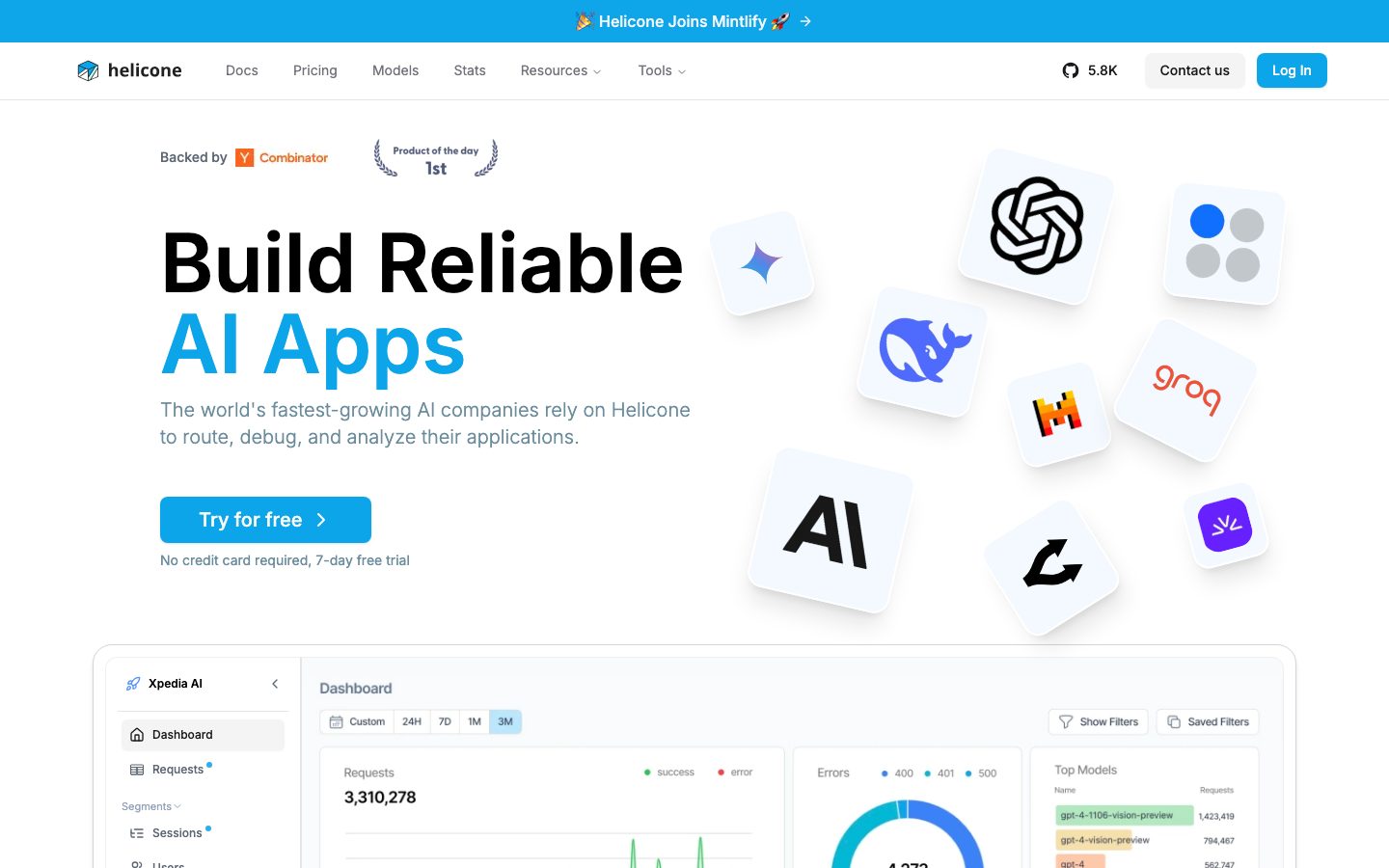
A bright, developer-tooling landing surface built on white canvas with near-black Inter headlines and a vivid blue brand accent. The system reads as fast-moving AI-infrastructure SaaS — a large weight-600 Inter hero headline, floating rounded-square logo tiles, a big shadow-elevated product dashboard mockup that anchors the fold, and a quiet slate-gray supporting palette. Brand voltage comes from the oversized headline and the in-product dashboard screenshot rather than from heavy color.
---
version: alpha
name: Helicone-design-analysis
description: "A bright, developer-tooling landing surface built on white canvas with near-black Inter headlines and a vivid blue brand accent. The system reads as fast-moving AI-infrastructure SaaS — a large weight-600 Inter hero headline, floating rounded-square logo tiles, a big shadow-elevated product dashboard mockup that anchors the fold, and a quiet slate-gray supporting palette. Brand voltage comes from the oversized headline and the in-product dashboard screenshot rather than from heavy color."
colors:
  primary: "#09090b"
  ink: "#111827"
  ink-strong: "#18181b"
  slate: "#334155"
  body: "#5d6673"
  muted: "#94a3b8"
  muted-soft: "#9ca3af"
  on-primary: "#71717a"
  hairline: "#e5e7eb"
  hairline-strong: "#d1d5db"
  neutral-light: "#cccccc"
  neutral-light-alt: "#d4d4d4"
  surface-soft: "#f3f4f6"
  surface-tint: "#f2f9fc"
  surface-blue: "#e2f1fd"
  canvas: "#ffffff"
  code-blue: "#569cd6"
  code-azure: "#9cdcfe"
  code-rust: "#ce9178"
  badge-producthunt: "#ff6154"

typography:
  display:
    fontFamily: "Inter, sans-serif"
    fontSize: 84px
    fontWeight: 600
    lineHeight: 1.0
    letterSpacing: normal
  body:
    fontFamily: "Inter, sans-serif"
    fontSize: 16px
    fontWeight: 500
    lineHeight: 1.5
    letterSpacing: normal
  button:
    fontFamily: "Inter, sans-serif"
    fontSize: 14px
    fontWeight: 400
    lineHeight: 1.429
    letterSpacing: normal

rounded:
  sm: 6px
  md: 8px
  lg: 12px
  xl: 16px
  xxl: 20px
  xxxl: 24px
  full: 9999px

spacing:
  xxs: 4px
  xs: 8px
  sm: 10px
  md: 12px
  lg: 16px
  xl: 24px
  xxl: 40px
  xxxl: 64px
  section: 96px

components:
  top-nav:
    backgroundColor: "{colors.canvas}"
    textColor: "{colors.primary}"
    typography: "{typography.button}"
    height: 64px
  nav-link:
    backgroundColor: transparent
    textColor: "{colors.primary}"
    typography: "{typography.button}"
  button-primary:
    backgroundColor: "{colors.canvas}"
    textColor: "{colors.on-primary}"
    typography: "{typography.button}"
    rounded: "{rounded.sm}"
    padding: 8px 16px
  button-secondary:
    backgroundColor: "{colors.canvas}"
    textColor: "{colors.ink}"
    typography: "{typography.button}"
    rounded: "{rounded.sm}"
    padding: 8px 16px
  hero-heading:
    backgroundColor: transparent
    textColor: "{colors.primary}"
    typography: "{typography.display}"
  hero-subtext:
    backgroundColor: transparent
    textColor: "{colors.body}"
    typography: "{typography.body}"
  logo-tile:
    backgroundColor: "{colors.surface-tint}"
    textColor: "{colors.ink}"
    rounded: "{rounded.xl}"
  product-mockup-card:
    backgroundColor: "{colors.canvas}"
    textColor: "{colors.ink}"
    rounded: "{rounded.xl}"
    padding: 16px
  dashboard-panel:
    backgroundColor: "{colors.canvas}"
    textColor: "{colors.body}"
    rounded: "{rounded.lg}"
    padding: 12px
  award-badge:
    backgroundColor: transparent
    textColor: "{colors.body}"
    typography: "{typography.button}"
  footer:
    backgroundColor: "{colors.canvas}"
    textColor: "{colors.body}"
    typography: "{typography.button}"
    padding: 64px

---

## Overview

Helicone's marketing surface is a bright developer-tooling landing page — white canvas (`{colors.canvas}` — #ffffff) with a single oversized near-black Inter headline (`{colors.primary}` — #09090b) and a vivid blue brand accent that splits the hero headline into two color zones ("Build Reliable" in near-black, "AI Apps" in blue). The system reads as fast-moving AI-infrastructure SaaS: minimal chrome, a quiet slate-gray supporting palette, and a large shadow-elevated product dashboard mockup that anchors the fold.

Type is single-family **Inter** across the whole surface. The hero headline runs at a very large 84px weight-600 with a tight line-height of 1.0, while body copy and navigation sit at modest 14–16px. There is no display/body family split — Inter does everything, and the hierarchy is carried by size and weight alone.

Brand voltage comes from two non-typographic sources: **floating rounded-square logo tiles** (the constellation of AI-provider logos — OpenAI, Groq, Mistral, etc. — set on light blue-tinted tiles, `{colors.surface-tint}` — #f2f9fc) and the **large product-mockup dashboard card** that sits half-out-of-fold with a strong drop shadow. Helicone shows the actual product chrome at scale rather than painting marketing illustrations of it.

The supporting palette is a near-monochrome slate ramp — body text in `{colors.body}` (#5d6673), secondary text in `{colors.muted}` (#94a3b8), and hairlines in `{colors.hairline}` (#e5e7eb). Several of the captured accents (`{colors.code-blue}`, `{colors.code-azure}`, `{colors.code-rust}`) are VS Code-style syntax tones that appear inside code/product fragments, not in the page chrome.

**Key Characteristics:**
- White canvas with a single oversized 84px Inter weight-600 hero headline. Hierarchy is size-driven, not family-driven.
- Two-tone headline: near-black (`{colors.primary}` — #09090b) plus a blue brand accent on the second line (the exact blue was not captured — see Known Gaps).
- Floating rounded-square logo tiles on light blue-tinted surfaces (`{colors.surface-tint}` — #f2f9fc), rounded `{rounded.xl}` (16px), scattered across the hero's right half.
- A large shadow-elevated product-mockup card (`{component.product-mockup-card}`) showing the actual Helicone dashboard, anchoring the bottom of the fold.
- Quiet slate-gray supporting palette — body `{colors.body}`, muted `{colors.muted}`, hairline `{colors.hairline}`.
- Buttons are small and compact — `{rounded.sm}` (6px), 8px × 16px padding, Inter 14px / 400.
- Generous `{spacing.section}` (96px) vertical rhythm between bands.
- Border radius is hierarchical: `{rounded.sm}` (6px) for buttons, `{rounded.lg}` (12px) for inner dashboard panels, `{rounded.xl}` (16px) for logo tiles and the product-mockup card, `{rounded.full}` for pills/avatars.

## Colors

### Brand & Accent
- **Primary / Ink** (`{colors.primary}` — #09090b): The darkest tone — the hero headline's first line, nav text, and primary copy emphasis. This is the system's "black."
- **Ink** (`{colors.ink}` — #111827) and **Ink Strong** (`{colors.ink-strong}` — #18181b): Near-black variants used for secondary headings and dense UI labels inside the dashboard mockup.
- **Slate** (`{colors.slate}` — #334155): A high-frequency mid-slate used for strong supporting text and dark UI accents.
- **Product Hunt Badge** (`{colors.badge-producthunt}` — #ff6154): The orange-red of the "Product of the Day" award flourish — appears only in the small award badge near the headline.

### Code / Syntax Accents
A small set of VS Code-style syntax tones appears inside code snippets and product fragments — never in page chrome:
- **Code Blue** (`{colors.code-blue}` — #569cd6), **Code Azure** (`{colors.code-azure}` — #9cdcfe), **Code Rust** (`{colors.code-rust}` — #ce9178). These are content colors carried by embedded code/product UI.

### Surface
- **Canvas** (`{colors.canvas}` — #ffffff): The default page floor and card surface.
- **Surface Soft** (`{colors.surface-soft}` — #f3f4f6): Soft section fills and subtle dividers.
- **Surface Tint** (`{colors.surface-tint}` — #f2f9fc): The pale blue-tinted fill on the floating logo tiles.
- **Surface Blue** (`{colors.surface-blue}` — #e2f1fd): A slightly stronger blue-tint surface for highlighted UI fragments.
- **Hairline** (`{colors.hairline}` — #e5e7eb): The 1px border tone on light surfaces — card outlines, dividers.
- **Hairline Strong** (`{colors.hairline-strong}` — #d1d5db): A stronger divider/border tone.
- **Neutral Light** (`{colors.neutral-light}` — #cccccc) and **Neutral Light Alt** (`{colors.neutral-light-alt}` — #d4d4d4): Low-contrast neutrals used inside the product mockup chrome.

### Text
- **Body** (`{colors.body}` — #5d6673): The dominant running-text color (highest frequency in the system).
- **Muted** (`{colors.muted}` — #94a3b8): Secondary text — sub-labels, captions.
- **Muted Soft** (`{colors.muted-soft}` — #9ca3af): Tertiary text — fine print, footnotes.
- **On Primary** (`{colors.on-primary}` — #71717a): The measured button label color (the captured CTA renders white-with-gray text — see Components).

## Typography

### Font Family
The system runs a single family — **Inter** (captured as `__Inter_f367f3`, the Next.js font-loader hash for Inter) — across headlines, body, navigation, and buttons. Inter is open-source, so no substitution is required; the fallback stack walks `Inter, -apple-system, BlinkMacSystemFont, "Segoe UI", Roboto, sans-serif`.

There is no display/body family split. Hierarchy comes entirely from size and weight: a single very large weight-600 headline against modest weight-400/500 supporting type.

### Hierarchy

| Token | Size | Weight | Line Height | Letter Spacing | Use |
|---|---|---|---|---|---|
| `{typography.display}` | 84px | 600 | 1.0 | normal | Hero headline ("Build Reliable / AI Apps") — Inter |
| `{typography.body}` | 16px | 500 | 1.5 | normal | Body copy, hero sub-text, supporting paragraphs |
| `{typography.button}` | 14px | 400 | 1.429 | normal | Button labels, nav links, footer links |

### Principles
The hero headline is the brand voice — 84px Inter at weight 600 with a tight 1.0 line-height makes the two-line headline feel dense and confident. Body copy stays at a comfortable 16px / weight 500 with 1.5 line-height. Buttons and nav drop to 14px / weight 400 — quiet, compact, developer-tool-restrained.

Only three type roles were measured. Intermediate heading sizes (section titles, card headings) were not captured and are documented in Known Gaps.

### Note on Font Substitutes
No licensed/custom typefaces are used — Inter is open-source and ships directly. No substitution required.

## Layout

### Spacing System
- **Base unit:** 4px (with an irregular 10px step also present).
- **Tokens:** `{spacing.xxs}` 4px · `{spacing.xs}` 8px · `{spacing.sm}` 10px · `{spacing.md}` 12px · `{spacing.lg}` 16px · `{spacing.xl}` 24px · `{spacing.xxl}` 40px · `{spacing.xxxl}` 64px · `{spacing.section}` 96px.
- **Most common steps:** `{spacing.xs}` (8px, by far the highest frequency) and `{spacing.md}` (12px) dominate component-internal spacing — this is a tight, compact spacing rhythm.
- **Section padding:** `{spacing.section}` (96px) and `{spacing.xxxl}` (64px) for major vertical band separation.

### Grid & Container
- **Hero band:** A two-column split — headline + sub-text + CTA on the left, the floating logo-tile constellation on the right.
- **Product mockup:** A full-width shadow-elevated dashboard card anchored at the bottom of the fold, breaking out of the hero band.
- **Footer:** A 4-column link list (Integrations / Blogs / Learn More / Connect).

### Whitespace Philosophy
Helicone uses generous outer whitespace (96px band rhythm) against tight inner spacing (8–12px). The result is a page that feels airy at the macro scale but dense and engineered at the component scale — appropriate for a developer-infrastructure product.

## Elevation & Depth

| Level | Treatment | Use |
|---|---|---|
| Flat | No shadow, no border | Body sections, top nav, hero text |
| Hairline | 1px `{colors.hairline}` border | Inner dashboard panels, dividers |
| Subtle | `0 1px 2px rgba(0,0,0,0.05)` | Small chips and low-emphasis cards |
| Soft | `0 1px 3px rgba(0,0,0,0.1), 0 1px 2px -1px rgba(0,0,0,0.1)` | Logo tiles, secondary cards |
| Medium | `0 4px 6px -1px rgba(0,0,0,0.1), 0 2px 4px -2px rgba(0,0,0,0.1)` | Elevated UI fragments |
| Strong | `0 20px 25px -5px rgba(0,0,0,0.1), 0 8px 10px -6px rgba(0,0,0,0.1)` | The product-mockup dashboard card — the most-used shadow in the system (9 occurrences) |

The elevation philosophy is **soft and layered** — the marquee product-mockup card uses a large, diffuse drop shadow (the "Strong" level) to lift it off the canvas, while logo tiles use lighter shadows to float in scattered positions. No neumorphism, no glass — just standard layered drop shadows.

### Decorative Depth
- The floating logo tiles each carry their own soft shadow, scattered at slight rotations across the hero's right half to create a casual "constellation" feel.
- The product-mockup card carries the strongest shadow and overlaps the band boundary, anchoring the bottom of the fold.

## Shapes

### Border Radius Scale

| Token | Value | Use |
|---|---|---|
| `{rounded.sm}` | 6px | Buttons (measured), small chips |
| `{rounded.md}` | 8px | Inputs, small interactive surfaces |
| `{rounded.lg}` | 12px | Inner dashboard panels |
| `{rounded.xl}` | 16px | Logo tiles, the product-mockup card (most frequent radius, 25 occurrences) |
| `{rounded.xxl}` | 20px | Occasional larger container |
| `{rounded.xxxl}` | 24px | Large feature containers |
| `{rounded.full}` | 9999px | Pills, avatars, circular elements |

### Geometry
Logo tiles are rounded squares at `{rounded.xl}` (16px), scattered at slight rotations. The product-mockup dashboard card shares the 16px radius. Buttons are tighter at `{rounded.sm}` (6px). The 16px radius is the system's signature shape — it appears on every floating tile and the marquee card.

## Components

### Top Navigation

**`top-nav`** — White nav bar at the top of the page, 64px tall (derived from the `{spacing.xxxl}` band rhythm). Carries the lowercase "helicone" wordmark + cube logo at left, a horizontal menu (Docs, Pricing, Models, Stats, Resources, Tools) center, and a right cluster with a GitHub star count, "Contact us" `{component.button-secondary}`, and a "Log In" CTA. Menu items render in `{typography.button}` (Inter 14px / 400).

**`nav-link`** — Inline nav menu items. Transparent background, `{colors.primary}` text, `{typography.button}`.

### Buttons

**`button-primary`** — The measured CTA. Background `{colors.canvas}`, text `{colors.on-primary}` (#71717a), type `{typography.button}` (Inter 14px / 400), rounded `{rounded.sm}` (6px), padding 8px × 16px. NOTE: the analyzer captured a white/gray-text button — the hero's bright-blue "Try for free" CTA color was not captured (see Known Gaps); this entry documents the measured values faithfully.

**`button-secondary`** — White button with hairline outline (the "Contact us" pattern). Background `{colors.canvas}`, text `{colors.ink}`, rounded `{rounded.sm}`, padding 8px × 16px.

### Hero

**`hero-heading`** — The oversized two-line headline. Transparent background, `{colors.primary}` text on the first line, type `{typography.display}` (Inter 84px / 600 / line-height 1.0). The second line carries the blue brand accent (color not captured — see Known Gaps).

**`hero-subtext`** — Supporting paragraph below the headline. Transparent background, `{colors.body}` text, `{typography.body}` (Inter 16px / 500).

### Cards & Containers

**`logo-tile`** — The floating AI-provider logo tiles. Background `{colors.surface-tint}` (#f2f9fc), rounded `{rounded.xl}` (16px), soft drop shadow, scattered at slight rotations across the hero's right half. Each holds a single provider mark (OpenAI, Groq, Mistral, etc.).

**`product-mockup-card`** — The marquee dashboard screenshot card anchoring the bottom of the fold. Background `{colors.canvas}`, rounded `{rounded.xl}` (16px), internal padding `{spacing.lg}` (16px), the system's strongest drop shadow. Shows the actual Helicone dashboard chrome — sidebar nav, request charts, error donuts, top-models table — at scale.

**`dashboard-panel`** — Inner panels within the product-mockup card (Requests, Errors, Top Models, Costs, Latency). Background `{colors.canvas}`, `{colors.body}` text, rounded `{rounded.lg}` (12px), padding `{spacing.md}` (12px), hairline borders. These carry product chrome with their own internal syntax-tone accents.

### Badges

**`award-badge`** — The "Backed by Y Combinator" and "Product of the Day — 1st" flourishes near the headline. Transparent background, `{colors.body}` text, `{typography.button}`. The Product Hunt mark uses `{colors.badge-producthunt}` (#ff6154).

### Footer

**`footer`** — White footer closing the page. Background `{colors.canvas}`, text `{colors.body}`, `{typography.button}`, vertical padding `{spacing.xxxl}` (64px). 4-column link list (Integrations / Blogs / Learn More / Connect) with the copyright line at the bottom-left. Unlike many SaaS sites, Helicone keeps its footer on white canvas rather than inverting to dark.

## Do's and Don'ts

### Do
- Keep the hero headline oversized — 84px Inter weight-600 with a tight 1.0 line-height. The headline IS the brand statement.
- Use the two-tone headline treatment (near-black + blue accent) to split the message into two zones.
- Scatter `{component.logo-tile}` tiles on `{colors.surface-tint}` at slight rotations — the casual constellation is signature.
- Anchor the fold with the `{component.product-mockup-card}` using the strong layered shadow. Show the real dashboard, not an illustration of it.
- Keep buttons small and compact — `{rounded.sm}` (6px), 8×16 padding, Inter 14px / 400.
- Keep the supporting palette monochrome-slate. Reserve the code-tone accents (`{colors.code-blue}`, `{colors.code-azure}`, `{colors.code-rust}`) for embedded code/product fragments only.
- Run Inter everywhere — no second family.

### Don't
- Don't introduce a second type family. Helicone's hierarchy is size-and-weight only.
- Don't push the syntax tones (`{colors.code-blue}` etc.) into page chrome — they belong inside code blocks and product UI.
- Don't bold display weight beyond 600. Inter at 600 carries the confident-not-shouting voice.
- Don't invert the footer to dark — Helicone closes the page on white canvas.
- Don't add hover-state styling beyond the documented default/active states.
- Don't use radius larger than `{rounded.xxxl}` (24px) on cards — 16px is the system's primary shape.

## Responsive Behavior

### Breakpoints

| Name | Width | Key Changes |
|---|---|---|
| Mobile | < 768px | Hamburger nav; hero headline scales down sharply from 84px; logo tiles reduce in count/size; product-mockup card scales proportionally; footer columns stack |
| Tablet | 768–1024px | Nav tightens; hero two-column split may stack; logo constellation compresses |
| Desktop | 1024–1440px | Full hero two-column split with headline left + logo constellation right; full-width product-mockup card |
| Wide | > 1440px | Same as desktop with more outer breathing room |

### Touch Targets
- `{component.button-primary}` at 8×16 padding — compact; effective tap height stays near the 32–36px range. Mobile builds should increase padding to meet 44px guidance.
- Nav links use `{typography.button}` (14px) with surrounding padding to extend tap area.

### Collapsing Strategy
- Top nav collapses to a hamburger at mobile widths.
- The hero's two-column split stacks to single-column — headline + sub-text + CTA first, then the logo constellation.
- The product-mockup card scales proportionally; its inner dashboard panels remain legible at the card's reduced scale (confirmed by the full-page mobile capture).
- Footer's 4 columns wrap to fewer columns on narrow viewports.

### Image Behavior
- Logo tiles retain their square aspect and 16px radius at all breakpoints.
- The product-mockup dashboard screenshot retains native aspect ratio; the surrounding card resizes.

## Iteration Guide

1. Focus on ONE component at a time. Reference its YAML key directly (`{component.product-mockup-card}`, `{component.logo-tile}`).
2. Variants of an existing component (`-active`, `-disabled`, `-secondary`) live as separate entries in `components:`.
3. Use `{token.refs}` everywhere — never inline hex.
4. Never document hover. Default and Active/Pressed states only.
5. The hero headline stays Inter 84px / 600 with line-height 1.0. Don't dilute the single-family hierarchy.
6. Keep the strong drop shadow scarce — it belongs to the product-mockup card. Logo tiles use lighter shadows.
7. When in doubt about emphasis: bigger Inter before bolder Inter.

## Known Gaps

- **The brand blue is not captured.** The hero's vivid blue ("AI Apps" headline accent, the "Try for free" CTA fill, and the announcement bar) was not measured in analysis.json — the captured button renders white-with-gray text (`{component.button-primary}`). The blue accent is documented from screenshot ground-truth only; its exact hex must be sampled before it can become a token. The blue announcement bar at the very top of the page is omitted from components for the same reason.
- Only three type roles (h1/body/button) were measured. Intermediate heading sizes (section titles, card headings, pricing-tier labels) and any pricing-page typography were not captured.
- The pricing page was captured but no pricing-specific components (tier cards, comparison tables, toggles) were extracted into analysis.json.
- The `{colors.code-blue}` / `{colors.code-azure}` / `{colors.code-rust}` tones are inferred to belong to embedded code/product fragments based on their VS Code-default values; exact in-context usage was not mapped.
- Letter-spacing was reported as `normal` for all roles — no negative tracking values were measured even though the large headline may carry tightened tracking visually.
- Animation/transition timings (logo-tile float, chart rendering inside the dashboard mockup) are out of scope.
- Form inputs, validation states, and any authenticated product surfaces (the actual Helicone dashboard) are the product, not the marketing surface, and are out of scope.

<!-- Documented by duply · real-world design systems as ready-to-use DESIGN.md for AI coding agents · https://duply.ai/helicone/design-md -->
Color Palette
Accent
Neutrals
Typography
display84px · 600 · 1
The quick brown fox jumpsbody16px · 500 · 1.5
The quick brown fox jumpsbutton14px · 400 · 1.429
The quick brown fox jumpsSpacing & Shape
Spacing
| Name | Value | Preview |
|---|---|---|
| xxs | 4px | |
| xs | 8px | |
| sm | 10px | |
| md | 12px | |
| lg | 16px | |
| xl | 24px | |
| xxl | 40px | |
| xxxl | 64px | |
| section | 96px |
Border Radius
| Name | Value | Preview |
|---|---|---|
| sm | 6px | |
| md | 8px | |
| lg | 12px | |
| xl | 16px | |
| xxl | 20px | |
| xxxl | 24px | |
| full | 9999px |
More like this


---
version: alpha
name: Helicone-design-analysis
description: "A bright, developer-tooling landing surface built on white canvas with near-black Inter headlines and a vivid blue brand accent. The system reads as fast-moving AI-infrastructure SaaS — a large weight-600 Inter hero headline, floating rounded-square logo tiles, a big shadow-elevated product dashboard mockup that anchors the fold, and a quiet slate-gray supporting palette. Brand voltage comes from the oversized headline and the in-product dashboard screenshot rather than from heavy color."
colors:
  primary: "#09090b"
  ink: "#111827"
  ink-strong: "#18181b"
  slate: "#334155"
  body: "#5d6673"
  muted: "#94a3b8"
  muted-soft: "#9ca3af"
  on-primary: "#71717a"
  hairline: "#e5e7eb"
  hairline-strong: "#d1d5db"
  neutral-light: "#cccccc"
  neutral-light-alt: "#d4d4d4"
  surface-soft: "#f3f4f6"
  surface-tint: "#f2f9fc"
  surface-blue: "#e2f1fd"
  canvas: "#ffffff"
  code-blue: "#569cd6"
  code-azure: "#9cdcfe"
  code-rust: "#ce9178"
  badge-producthunt: "#ff6154"

typography:
  display:
    fontFamily: "Inter, sans-serif"
    fontSize: 84px
    fontWeight: 600
    lineHeight: 1.0
    letterSpacing: normal
  body:
    fontFamily: "Inter, sans-serif"
    fontSize: 16px
    fontWeight: 500
    lineHeight: 1.5
    letterSpacing: normal
  button:
    fontFamily: "Inter, sans-serif"
    fontSize: 14px
    fontWeight: 400
    lineHeight: 1.429
    letterSpacing: normal

rounded:
  sm: 6px
  md: 8px
  lg: 12px
  xl: 16px
  xxl: 20px
  xxxl: 24px
  full: 9999px

spacing:
  xxs: 4px
  xs: 8px
  sm: 10px
  md: 12px
  lg: 16px
  xl: 24px
  xxl: 40px
  xxxl: 64px
  section: 96px

components:
  top-nav:
    backgroundColor: "{colors.canvas}"
    textColor: "{colors.primary}"
    typography: "{typography.button}"
    height: 64px
  nav-link:
    backgroundColor: transparent
    textColor: "{colors.primary}"
    typography: "{typography.button}"
  button-primary:
    backgroundColor: "{colors.canvas}"
    textColor: "{colors.on-primary}"
    typography: "{typography.button}"
    rounded: "{rounded.sm}"
    padding: 8px 16px
  button-secondary:
    backgroundColor: "{colors.canvas}"
    textColor: "{colors.ink}"
    typography: "{typography.button}"
    rounded: "{rounded.sm}"
    padding: 8px 16px
  hero-heading:
    backgroundColor: transparent
    textColor: "{colors.primary}"
    typography: "{typography.display}"
  hero-subtext:
    backgroundColor: transparent
    textColor: "{colors.body}"
    typography: "{typography.body}"
  logo-tile:
    backgroundColor: "{colors.surface-tint}"
    textColor: "{colors.ink}"
    rounded: "{rounded.xl}"
  product-mockup-card:
    backgroundColor: "{colors.canvas}"
    textColor: "{colors.ink}"
    rounded: "{rounded.xl}"
    padding: 16px
  dashboard-panel:
    backgroundColor: "{colors.canvas}"
    textColor: "{colors.body}"
    rounded: "{rounded.lg}"
    padding: 12px
  award-badge:
    backgroundColor: transparent
    textColor: "{colors.body}"
    typography: "{typography.button}"
  footer:
    backgroundColor: "{colors.canvas}"
    textColor: "{colors.body}"
    typography: "{typography.button}"
    padding: 64px

---

## Overview

Helicone's marketing surface is a bright developer-tooling landing page — white canvas (`{colors.canvas}` — #ffffff) with a single oversized near-black Inter headline (`{colors.primary}` — #09090b) and a vivid blue brand accent that splits the hero headline into two color zones ("Build Reliable" in near-black, "AI Apps" in blue). The system reads as fast-moving AI-infrastructure SaaS: minimal chrome, a quiet slate-gray supporting palette, and a large shadow-elevated product dashboard mockup that anchors the fold.

Type is single-family **Inter** across the whole surface. The hero headline runs at a very large 84px weight-600 with a tight line-height of 1.0, while body copy and navigation sit at modest 14–16px. There is no display/body family split — Inter does everything, and the hierarchy is carried by size and weight alone.

Brand voltage comes from two non-typographic sources: **floating rounded-square logo tiles** (the constellation of AI-provider logos — OpenAI, Groq, Mistral, etc. — set on light blue-tinted tiles, `{colors.surface-tint}` — #f2f9fc) and the **large product-mockup dashboard card** that sits half-out-of-fold with a strong drop shadow. Helicone shows the actual product chrome at scale rather than painting marketing illustrations of it.

The supporting palette is a near-monochrome slate ramp — body text in `{colors.body}` (#5d6673), secondary text in `{colors.muted}` (#94a3b8), and hairlines in `{colors.hairline}` (#e5e7eb). Several of the captured accents (`{colors.code-blue}`, `{colors.code-azure}`, `{colors.code-rust}`) are VS Code-style syntax tones that appear inside code/product fragments, not in the page chrome.

**Key Characteristics:**
- White canvas with a single oversized 84px Inter weight-600 hero headline. Hierarchy is size-driven, not family-driven.
- Two-tone headline: near-black (`{colors.primary}` — #09090b) plus a blue brand accent on the second line (the exact blue was not captured — see Known Gaps).
- Floating rounded-square logo tiles on light blue-tinted surfaces (`{colors.surface-tint}` — #f2f9fc), rounded `{rounded.xl}` (16px), scattered across the hero's right half.
- A large shadow-elevated product-mockup card (`{component.product-mockup-card}`) showing the actual Helicone dashboard, anchoring the bottom of the fold.
- Quiet slate-gray supporting palette — body `{colors.body}`, muted `{colors.muted}`, hairline `{colors.hairline}`.
- Buttons are small and compact — `{rounded.sm}` (6px), 8px × 16px padding, Inter 14px / 400.
- Generous `{spacing.section}` (96px) vertical rhythm between bands.
- Border radius is hierarchical: `{rounded.sm}` (6px) for buttons, `{rounded.lg}` (12px) for inner dashboard panels, `{rounded.xl}` (16px) for logo tiles and the product-mockup card, `{rounded.full}` for pills/avatars.

## Colors

### Brand & Accent
- **Primary / Ink** (`{colors.primary}` — #09090b): The darkest tone — the hero headline's first line, nav text, and primary copy emphasis. This is the system's "black."
- **Ink** (`{colors.ink}` — #111827) and **Ink Strong** (`{colors.ink-strong}` — #18181b): Near-black variants used for secondary headings and dense UI labels inside the dashboard mockup.
- **Slate** (`{colors.slate}` — #334155): A high-frequency mid-slate used for strong supporting text and dark UI accents.
- **Product Hunt Badge** (`{colors.badge-producthunt}` — #ff6154): The orange-red of the "Product of the Day" award flourish — appears only in the small award badge near the headline.

### Code / Syntax Accents
A small set of VS Code-style syntax tones appears inside code snippets and product fragments — never in page chrome:
- **Code Blue** (`{colors.code-blue}` — #569cd6), **Code Azure** (`{colors.code-azure}` — #9cdcfe), **Code Rust** (`{colors.code-rust}` — #ce9178). These are content colors carried by embedded code/product UI.

### Surface
- **Canvas** (`{colors.canvas}` — #ffffff): The default page floor and card surface.
- **Surface Soft** (`{colors.surface-soft}` — #f3f4f6): Soft section fills and subtle dividers.
- **Surface Tint** (`{colors.surface-tint}` — #f2f9fc): The pale blue-tinted fill on the floating logo tiles.
- **Surface Blue** (`{colors.surface-blue}` — #e2f1fd): A slightly stronger blue-tint surface for highlighted UI fragments.
- **Hairline** (`{colors.hairline}` — #e5e7eb): The 1px border tone on light surfaces — card outlines, dividers.
- **Hairline Strong** (`{colors.hairline-strong}` — #d1d5db): A stronger divider/border tone.
- **Neutral Light** (`{colors.neutral-light}` — #cccccc) and **Neutral Light Alt** (`{colors.neutral-light-alt}` — #d4d4d4): Low-contrast neutrals used inside the product mockup chrome.

### Text
- **Body** (`{colors.body}` — #5d6673): The dominant running-text color (highest frequency in the system).
- **Muted** (`{colors.muted}` — #94a3b8): Secondary text — sub-labels, captions.
- **Muted Soft** (`{colors.muted-soft}` — #9ca3af): Tertiary text — fine print, footnotes.
- **On Primary** (`{colors.on-primary}` — #71717a): The measured button label color (the captured CTA renders white-with-gray text — see Components).

## Typography

### Font Family
The system runs a single family — **Inter** (captured as `__Inter_f367f3`, the Next.js font-loader hash for Inter) — across headlines, body, navigation, and buttons. Inter is open-source, so no substitution is required; the fallback stack walks `Inter, -apple-system, BlinkMacSystemFont, "Segoe UI", Roboto, sans-serif`.

There is no display/body family split. Hierarchy comes entirely from size and weight: a single very large weight-600 headline against modest weight-400/500 supporting type.

### Hierarchy

| Token | Size | Weight | Line Height | Letter Spacing | Use |
|---|---|---|---|---|---|
| `{typography.display}` | 84px | 600 | 1.0 | normal | Hero headline ("Build Reliable / AI Apps") — Inter |
| `{typography.body}` | 16px | 500 | 1.5 | normal | Body copy, hero sub-text, supporting paragraphs |
| `{typography.button}` | 14px | 400 | 1.429 | normal | Button labels, nav links, footer links |

### Principles
The hero headline is the brand voice — 84px Inter at weight 600 with a tight 1.0 line-height makes the two-line headline feel dense and confident. Body copy stays at a comfortable 16px / weight 500 with 1.5 line-height. Buttons and nav drop to 14px / weight 400 — quiet, compact, developer-tool-restrained.

Only three type roles were measured. Intermediate heading sizes (section titles, card headings) were not captured and are documented in Known Gaps.

### Note on Font Substitutes
No licensed/custom typefaces are used — Inter is open-source and ships directly. No substitution required.

## Layout

### Spacing System
- **Base unit:** 4px (with an irregular 10px step also present).
- **Tokens:** `{spacing.xxs}` 4px · `{spacing.xs}` 8px · `{spacing.sm}` 10px · `{spacing.md}` 12px · `{spacing.lg}` 16px · `{spacing.xl}` 24px · `{spacing.xxl}` 40px · `{spacing.xxxl}` 64px · `{spacing.section}` 96px.
- **Most common steps:** `{spacing.xs}` (8px, by far the highest frequency) and `{spacing.md}` (12px) dominate component-internal spacing — this is a tight, compact spacing rhythm.
- **Section padding:** `{spacing.section}` (96px) and `{spacing.xxxl}` (64px) for major vertical band separation.

### Grid & Container
- **Hero band:** A two-column split — headline + sub-text + CTA on the left, the floating logo-tile constellation on the right.
- **Product mockup:** A full-width shadow-elevated dashboard card anchored at the bottom of the fold, breaking out of the hero band.
- **Footer:** A 4-column link list (Integrations / Blogs / Learn More / Connect).

### Whitespace Philosophy
Helicone uses generous outer whitespace (96px band rhythm) against tight inner spacing (8–12px). The result is a page that feels airy at the macro scale but dense and engineered at the component scale — appropriate for a developer-infrastructure product.

## Elevation & Depth

| Level | Treatment | Use |
|---|---|---|
| Flat | No shadow, no border | Body sections, top nav, hero text |
| Hairline | 1px `{colors.hairline}` border | Inner dashboard panels, dividers |
| Subtle | `0 1px 2px rgba(0,0,0,0.05)` | Small chips and low-emphasis cards |
| Soft | `0 1px 3px rgba(0,0,0,0.1), 0 1px 2px -1px rgba(0,0,0,0.1)` | Logo tiles, secondary cards |
| Medium | `0 4px 6px -1px rgba(0,0,0,0.1), 0 2px 4px -2px rgba(0,0,0,0.1)` | Elevated UI fragments |
| Strong | `0 20px 25px -5px rgba(0,0,0,0.1), 0 8px 10px -6px rgba(0,0,0,0.1)` | The product-mockup dashboard card — the most-used shadow in the system (9 occurrences) |

The elevation philosophy is **soft and layered** — the marquee product-mockup card uses a large, diffuse drop shadow (the "Strong" level) to lift it off the canvas, while logo tiles use lighter shadows to float in scattered positions. No neumorphism, no glass — just standard layered drop shadows.

### Decorative Depth
- The floating logo tiles each carry their own soft shadow, scattered at slight rotations across the hero's right half to create a casual "constellation" feel.
- The product-mockup card carries the strongest shadow and overlaps the band boundary, anchoring the bottom of the fold.

## Shapes

### Border Radius Scale

| Token | Value | Use |
|---|---|---|
| `{rounded.sm}` | 6px | Buttons (measured), small chips |
| `{rounded.md}` | 8px | Inputs, small interactive surfaces |
| `{rounded.lg}` | 12px | Inner dashboard panels |
| `{rounded.xl}` | 16px | Logo tiles, the product-mockup card (most frequent radius, 25 occurrences) |
| `{rounded.xxl}` | 20px | Occasional larger container |
| `{rounded.xxxl}` | 24px | Large feature containers |
| `{rounded.full}` | 9999px | Pills, avatars, circular elements |

### Geometry
Logo tiles are rounded squares at `{rounded.xl}` (16px), scattered at slight rotations. The product-mockup dashboard card shares the 16px radius. Buttons are tighter at `{rounded.sm}` (6px). The 16px radius is the system's signature shape — it appears on every floating tile and the marquee card.

## Components

### Top Navigation

**`top-nav`** — White nav bar at the top of the page, 64px tall (derived from the `{spacing.xxxl}` band rhythm). Carries the lowercase "helicone" wordmark + cube logo at left, a horizontal menu (Docs, Pricing, Models, Stats, Resources, Tools) center, and a right cluster with a GitHub star count, "Contact us" `{component.button-secondary}`, and a "Log In" CTA. Menu items render in `{typography.button}` (Inter 14px / 400).

**`nav-link`** — Inline nav menu items. Transparent background, `{colors.primary}` text, `{typography.button}`.

### Buttons

**`button-primary`** — The measured CTA. Background `{colors.canvas}`, text `{colors.on-primary}` (#71717a), type `{typography.button}` (Inter 14px / 400), rounded `{rounded.sm}` (6px), padding 8px × 16px. NOTE: the analyzer captured a white/gray-text button — the hero's bright-blue "Try for free" CTA color was not captured (see Known Gaps); this entry documents the measured values faithfully.

**`button-secondary`** — White button with hairline outline (the "Contact us" pattern). Background `{colors.canvas}`, text `{colors.ink}`, rounded `{rounded.sm}`, padding 8px × 16px.

### Hero

**`hero-heading`** — The oversized two-line headline. Transparent background, `{colors.primary}` text on the first line, type `{typography.display}` (Inter 84px / 600 / line-height 1.0). The second line carries the blue brand accent (color not captured — see Known Gaps).

**`hero-subtext`** — Supporting paragraph below the headline. Transparent background, `{colors.body}` text, `{typography.body}` (Inter 16px / 500).

### Cards & Containers

**`logo-tile`** — The floating AI-provider logo tiles. Background `{colors.surface-tint}` (#f2f9fc), rounded `{rounded.xl}` (16px), soft drop shadow, scattered at slight rotations across the hero's right half. Each holds a single provider mark (OpenAI, Groq, Mistral, etc.).

**`product-mockup-card`** — The marquee dashboard screenshot card anchoring the bottom of the fold. Background `{colors.canvas}`, rounded `{rounded.xl}` (16px), internal padding `{spacing.lg}` (16px), the system's strongest drop shadow. Shows the actual Helicone dashboard chrome — sidebar nav, request charts, error donuts, top-models table — at scale.

**`dashboard-panel`** — Inner panels within the product-mockup card (Requests, Errors, Top Models, Costs, Latency). Background `{colors.canvas}`, `{colors.body}` text, rounded `{rounded.lg}` (12px), padding `{spacing.md}` (12px), hairline borders. These carry product chrome with their own internal syntax-tone accents.

### Badges

**`award-badge`** — The "Backed by Y Combinator" and "Product of the Day — 1st" flourishes near the headline. Transparent background, `{colors.body}` text, `{typography.button}`. The Product Hunt mark uses `{colors.badge-producthunt}` (#ff6154).

### Footer

**`footer`** — White footer closing the page. Background `{colors.canvas}`, text `{colors.body}`, `{typography.button}`, vertical padding `{spacing.xxxl}` (64px). 4-column link list (Integrations / Blogs / Learn More / Connect) with the copyright line at the bottom-left. Unlike many SaaS sites, Helicone keeps its footer on white canvas rather than inverting to dark.

## Do's and Don'ts

### Do
- Keep the hero headline oversized — 84px Inter weight-600 with a tight 1.0 line-height. The headline IS the brand statement.
- Use the two-tone headline treatment (near-black + blue accent) to split the message into two zones.
- Scatter `{component.logo-tile}` tiles on `{colors.surface-tint}` at slight rotations — the casual constellation is signature.
- Anchor the fold with the `{component.product-mockup-card}` using the strong layered shadow. Show the real dashboard, not an illustration of it.
- Keep buttons small and compact — `{rounded.sm}` (6px), 8×16 padding, Inter 14px / 400.
- Keep the supporting palette monochrome-slate. Reserve the code-tone accents (`{colors.code-blue}`, `{colors.code-azure}`, `{colors.code-rust}`) for embedded code/product fragments only.
- Run Inter everywhere — no second family.

### Don't
- Don't introduce a second type family. Helicone's hierarchy is size-and-weight only.
- Don't push the syntax tones (`{colors.code-blue}` etc.) into page chrome — they belong inside code blocks and product UI.
- Don't bold display weight beyond 600. Inter at 600 carries the confident-not-shouting voice.
- Don't invert the footer to dark — Helicone closes the page on white canvas.
- Don't add hover-state styling beyond the documented default/active states.
- Don't use radius larger than `{rounded.xxxl}` (24px) on cards — 16px is the system's primary shape.

## Responsive Behavior

### Breakpoints

| Name | Width | Key Changes |
|---|---|---|
| Mobile | < 768px | Hamburger nav; hero headline scales down sharply from 84px; logo tiles reduce in count/size; product-mockup card scales proportionally; footer columns stack |
| Tablet | 768–1024px | Nav tightens; hero two-column split may stack; logo constellation compresses |
| Desktop | 1024–1440px | Full hero two-column split with headline left + logo constellation right; full-width product-mockup card |
| Wide | > 1440px | Same as desktop with more outer breathing room |

### Touch Targets
- `{component.button-primary}` at 8×16 padding — compact; effective tap height stays near the 32–36px range. Mobile builds should increase padding to meet 44px guidance.
- Nav links use `{typography.button}` (14px) with surrounding padding to extend tap area.

### Collapsing Strategy
- Top nav collapses to a hamburger at mobile widths.
- The hero's two-column split stacks to single-column — headline + sub-text + CTA first, then the logo constellation.
- The product-mockup card scales proportionally; its inner dashboard panels remain legible at the card's reduced scale (confirmed by the full-page mobile capture).
- Footer's 4 columns wrap to fewer columns on narrow viewports.

### Image Behavior
- Logo tiles retain their square aspect and 16px radius at all breakpoints.
- The product-mockup dashboard screenshot retains native aspect ratio; the surrounding card resizes.

## Iteration Guide

1. Focus on ONE component at a time. Reference its YAML key directly (`{component.product-mockup-card}`, `{component.logo-tile}`).
2. Variants of an existing component (`-active`, `-disabled`, `-secondary`) live as separate entries in `components:`.
3. Use `{token.refs}` everywhere — never inline hex.
4. Never document hover. Default and Active/Pressed states only.
5. The hero headline stays Inter 84px / 600 with line-height 1.0. Don't dilute the single-family hierarchy.
6. Keep the strong drop shadow scarce — it belongs to the product-mockup card. Logo tiles use lighter shadows.
7. When in doubt about emphasis: bigger Inter before bolder Inter.

## Known Gaps

- **The brand blue is not captured.** The hero's vivid blue ("AI Apps" headline accent, the "Try for free" CTA fill, and the announcement bar) was not measured in analysis.json — the captured button renders white-with-gray text (`{component.button-primary}`). The blue accent is documented from screenshot ground-truth only; its exact hex must be sampled before it can become a token. The blue announcement bar at the very top of the page is omitted from components for the same reason.
- Only three type roles (h1/body/button) were measured. Intermediate heading sizes (section titles, card headings, pricing-tier labels) and any pricing-page typography were not captured.
- The pricing page was captured but no pricing-specific components (tier cards, comparison tables, toggles) were extracted into analysis.json.
- The `{colors.code-blue}` / `{colors.code-azure}` / `{colors.code-rust}` tones are inferred to belong to embedded code/product fragments based on their VS Code-default values; exact in-context usage was not mapped.
- Letter-spacing was reported as `normal` for all roles — no negative tracking values were measured even though the large headline may carry tightened tracking visually.
- Animation/transition timings (logo-tile float, chart rendering inside the dashboard mockup) are out of scope.
- Form inputs, validation states, and any authenticated product surfaces (the actual Helicone dashboard) are the product, not the marketing surface, and are out of scope.

<!-- Documented by duply · real-world design systems as ready-to-use DESIGN.md for AI coding agents · https://duply.ai/helicone/design-md -->