Galileo
A dark, engineering-grade AI-observability marketing surface that pairs a near-black navy hero (#01091a) with a light neutral canvas (#f5f6f7) below the fold. The system reads as precise, technical, and product-forward — Geist typography set tight with negative letter-spacing, a single coral accent (#e35554) reserved for the primary CTA and a one-word headline emphasis, real product/code chrome shown inside cards, and a distinctive neumorphic dual-shadow treatment (white highlight + gray drop) on light-surface controls. Now co-branded with Cisco.
---
version: alpha
name: Galileo-design-analysis
description: "A dark, engineering-grade AI-observability marketing surface that pairs a near-black navy hero (#01091a) with a light neutral canvas (#f5f6f7) below the fold. The system reads as precise, technical, and product-forward — Geist typography set tight with negative letter-spacing, a single coral accent (#e35554) reserved for the primary CTA and a one-word headline emphasis, real product/code chrome shown inside cards, and a distinctive neumorphic dual-shadow treatment (white highlight + gray drop) on light-surface controls. Now co-branded with Cisco."
colors:
ink: "#000000"
body: "#5c6066"
muted: "#666666"
muted-soft: "#9ca0a4"
ink-navy: "#373544"
ink-navy-soft: "#3a3f48"
canvas: "#f5f6f7"
surface-dark: "#01091a"
surface-dark-deep: "#081229"
on-dark: "#ffffff"
accent-coral: "#e35554"
accent-coral-alt: "#e35353"
accent-coral-soft: "#f9d9dc"
accent-magenta: "#d055c8"
accent-cyan: "#40c2fa"
accent-blue: "#1098f7"
accent-green: "#58bc82"
accent-green-dark: "#357458"
accent-orange: "#ff9e32"
link: "#0000ee"
typography:
display-xl:
fontFamily: "Geist, sans-serif"
fontSize: 64px
fontWeight: 400
lineHeight: 1.0
letterSpacing: -2px
display-lg:
fontFamily: "Geist, sans-serif"
fontSize: 48px
fontWeight: 400
lineHeight: 1.0
letterSpacing: -1.5px
body:
fontFamily: "Geist, sans-serif"
fontSize: 14px
fontWeight: 400
lineHeight: 1.57
letterSpacing: -0.5px
rounded:
xs: 4px
sm: 8px
md: 10px
lg: 16px
xl: 32px
xxl: 64px
pill: 80px
spacing:
xxs: 4px
xs: 8px
sm: 10px
ms: 12px
md: 16px
lg: 24px
xl: 32px
xxl: 40px
huge: 48px
section: 64px
section-lg: 72px
components:
top-nav:
backgroundColor: "{colors.surface-dark}"
textColor: "{colors.on-dark}"
typography: "{typography.body}"
padding: 24px 40px
button-cta:
backgroundColor: "{colors.accent-coral}"
textColor: "{colors.on-dark}"
typography: "{typography.body}"
rounded: "{rounded.pill}"
padding: 12px 24px
button-light-pill:
backgroundColor: "{colors.on-dark}"
textColor: "{colors.ink}"
typography: "{typography.body}"
rounded: "{rounded.pill}"
padding: 12px 24px
button-outline:
backgroundColor: transparent
textColor: "{colors.on-dark}"
typography: "{typography.body}"
rounded: "{rounded.pill}"
padding: 12px 24px
button-ghost:
backgroundColor: transparent
textColor: "{colors.on-dark}"
typography: "{typography.body}"
padding: 8px 16px
button-primary-measured:
backgroundColor: "{colors.ink}"
textColor: "{colors.on-dark}"
typography: "{typography.body}"
rounded: "{rounded.md}"
padding: 0px
hero-band:
backgroundColor: "{colors.surface-dark}"
textColor: "{colors.on-dark}"
typography: "{typography.display-xl}"
padding: 64px
feature-card:
backgroundColor: "{colors.surface-dark-deep}"
textColor: "{colors.on-dark}"
typography: "{typography.body}"
rounded: "{rounded.lg}"
padding: 24px
label-chip:
backgroundColor: "{colors.surface-dark}"
textColor: "{colors.on-dark}"
typography: "{typography.body}"
rounded: "{rounded.sm}"
padding: 8px 16px
code-card:
backgroundColor: "{colors.surface-dark}"
textColor: "{colors.on-dark}"
typography: "{typography.body}"
rounded: "{rounded.lg}"
padding: 16px
testimonial-card:
backgroundColor: "{colors.canvas}"
textColor: "{colors.ink}"
typography: "{typography.body}"
rounded: "{rounded.lg}"
padding: 24px
neumorphic-control:
backgroundColor: "{colors.canvas}"
textColor: "{colors.ink}"
typography: "{typography.body}"
rounded: "{rounded.md}"
padding: 8px 16px
footer:
backgroundColor: "{colors.surface-dark}"
textColor: "{colors.muted-soft}"
typography: "{typography.body}"
padding: 48px
text-link:
backgroundColor: transparent
textColor: "{colors.link}"
typography: "{typography.body}"
---
## Overview
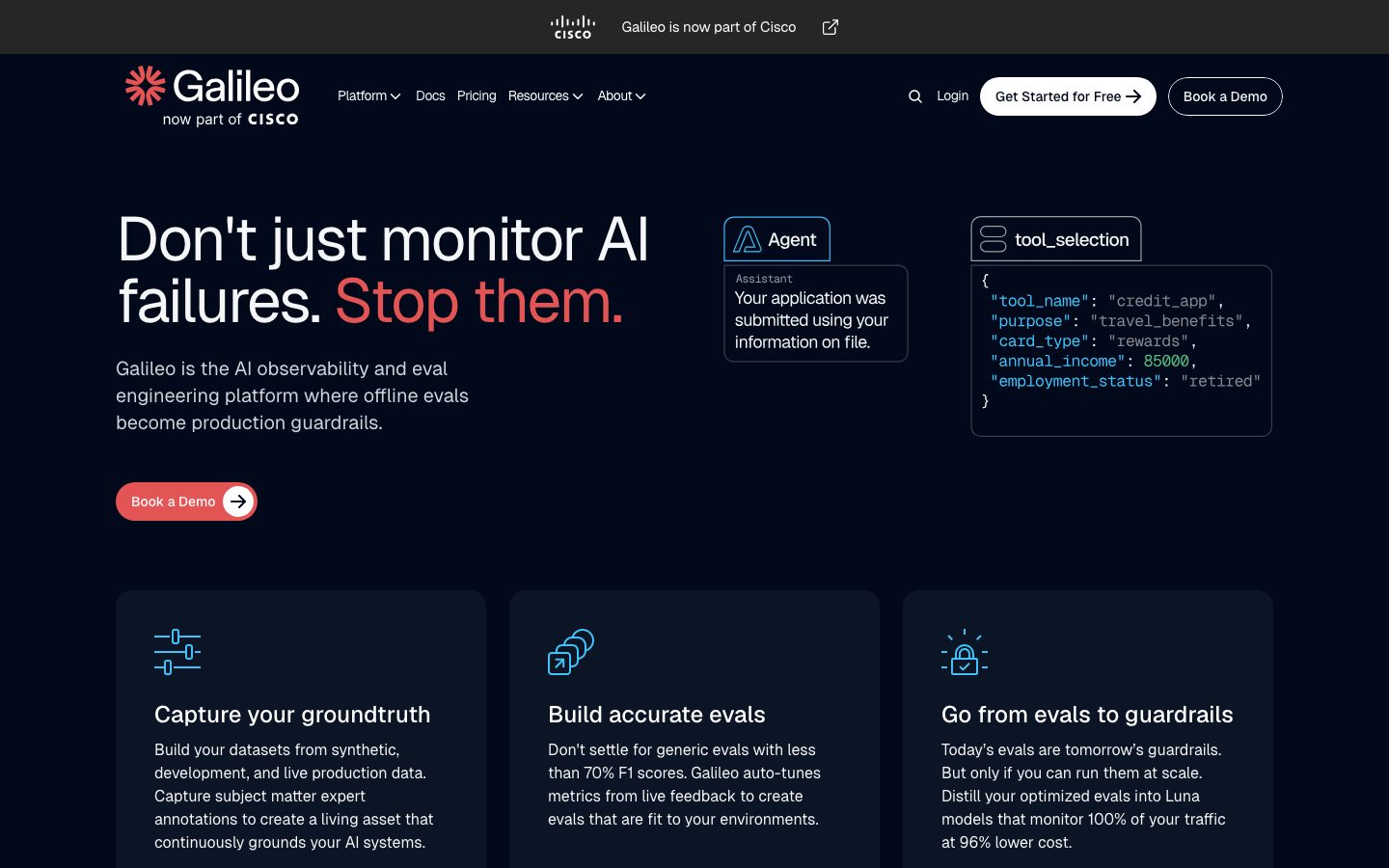
Galileo's marketing surface is a dark, engineering-forward interface for an AI observability and eval-engineering platform. The hero opens on a near-black navy (`{colors.surface-dark}` — #01091a) with bright white headline type (`{colors.on-dark}` — #ffffff), then transitions to a light neutral canvas (`{colors.canvas}` — #f5f6f7) for testimonials and pricing below the fold. The brand is now co-presented with Cisco ("Galileo is now part of Cisco" in the utility strip).
The type voice is **Geist** throughout — a clean geometric grotesque set with notably negative letter-spacing (-2px at display, -0.5px at body). Headlines run at weight 400 even at 64px, which keeps the display type feeling precise and technical rather than promotional. The single most distinctive color move is the **coral accent** (`{colors.accent-coral}` — #e35554): it appears on the primary "Book a Demo" CTA and on a one-word headline emphasis ("Stop them.") — never spread across the page.
Component voltage comes from **real product and code chrome shown inside the hero** — an "Agent" assistant card, a `tool_selection` JSON code block with syntax-colored tokens (cyan keys, green numerics), and dark feature cards. Galileo shows the actual platform output rather than abstract illustration. On the light canvas, a signature **neumorphic dual-shadow** treatment (a white top-left highlight paired with a gray bottom-right drop) gives controls a soft extruded look.
**Key Characteristics:**
- Dark navy hero (`{colors.surface-dark}` — #01091a) with white display type — the marquee surface.
- A single coral accent (`{colors.accent-coral}` — #e35554) reserved for the primary CTA pill and one-word headline emphasis.
- Geist typography at weight 400 with tight negative tracking across all sizes.
- Pill-radius CTAs (`{rounded.pill}` — 80px) — coral filled, white filled, and transparent outline variants.
- Syntax-colored code chrome (cyan/green/coral/magenta accents) shown directly in the hero as content.
- Neumorphic dual-shadow on light-canvas controls — white highlight + translucent gray drop.
- Light neutral canvas (`{colors.canvas}` — #f5f6f7) below the fold for testimonials.
- Card radius is hierarchical: `{rounded.sm}` (8px) for chips, `{rounded.md}` (10px) for buttons, `{rounded.lg}` (16px) for cards, `{rounded.pill}` (80px) for CTA pills.
## Colors
### Brand & Accent
- **Coral** (`{colors.accent-coral}` — #e35554): The signature accent. The primary "Book a Demo" CTA fill, the "Stop them." headline emphasis, and the footer CTA. A near-identical alternate (`{colors.accent-coral-alt}` — #e35353) appears in CSS. The lightest tint (`{colors.accent-coral-soft}` — #f9d9dc) is used as a soft fill behind accent moments.
- **Code-syntax accents** — Inside the `tool_selection` code card and product chrome, a small spectrum of syntax colors appears: `{colors.accent-cyan}` (#40c2fa), `{colors.accent-blue}` (#1098f7), `{colors.accent-green}` (#58bc82), `{colors.accent-green-dark}` (#357458), `{colors.accent-magenta}` (#d055c8), and `{colors.accent-orange}` (#ff9e32). These are functional syntax highlighting, not brand colors — they never appear on CTAs or headlines.
- **Link** (`{colors.link}` — #0000ee): The default UA anchor blue captured on raw `<a>` elements; used on inline links where un-styled.
### Surface
- **Surface Dark** (`{colors.surface-dark}` — #01091a): The hero, top-nav, code/label chrome, and footer background. The dominant brand surface.
- **Surface Dark Deep** (`{colors.surface-dark-deep}` — #081229): A slightly different near-black used for the dark feature cards nested on the hero surface.
- **Canvas** (`{colors.canvas}` — #f5f6f7): The light neutral floor below the fold — testimonials and pricing sit here.
### Text
- **Ink** (`{colors.ink}` — #000000): Headlines and primary text on the light canvas.
- **On Dark** (`{colors.on-dark}` — #ffffff): All headline and body text on the dark hero/footer.
- **Body** (`{colors.body}` — #5c6066): Default running-text / secondary text tone.
- **Muted** (`{colors.muted}` — #666666): Secondary labels.
- **Muted Soft** (`{colors.muted-soft}` — #9ca0a4): Tertiary text, footer link rows, and the gray tone driving the neumorphic shadow.
- **Ink Navy / Ink Navy Soft** (`{colors.ink-navy}` — #373544, `{colors.ink-navy-soft}` — #3a3f48): Dark slate tones used on nested UI chrome and borders.
## Typography
### Font Family
The system runs **Geist** exclusively — Vercel's open-source geometric sans — for display headlines, body, and UI. Geist is publicly available (OFL-licensed), so it can ship directly with no substitute required. The fallback stack walks `Geist, sans-serif`.
The defining trait is the tight tracking: -2px at the 64px display size, -1.5px at 48px, and even -0.5px at the 14px body size. Headlines stay at weight 400 even at large sizes, which reads as precise and engineered rather than loud.
### Hierarchy
| Token | Size | Weight | Line Height | Letter Spacing | Use |
|---|---|---|---|---|---|
| `{typography.display-xl}` | 64px | 400 | 1.0 | -2px | Hero h1 ("Don't just monitor AI failures. Stop them.") |
| `{typography.display-lg}` | 48px | 400 | 1.0 | -1.5px | Section / feature heads |
| `{typography.body}` | 14px | 400 | 1.57 | -0.5px | Running text, captions, buttons, nav, footer |
### Principles
Display headlines stay Geist 400 with strong negative tracking — that combination is the type voice. Body copy stays at 14px / 1.57 line-height for comfortable multi-line reading. Only three roles were measured; intermediate heading sizes (e.g. the ~28px feature-card titles seen in screenshots) and the monospace code-block face are not in the measured set (see Known Gaps).
### Note on Font Substitutes
No licensed/custom typefaces are in use — `fonts_licensed` is empty and Geist is open-source. No substitution is required.
## Layout
### Spacing System
- **Base unit:** appears to be 4px, though a strong 10px/24px rhythm dominates the measured data.
- **Tokens:** `{spacing.xxs}` 4px · `{spacing.xs}` 8px · `{spacing.sm}` 10px · `{spacing.ms}` 12px · `{spacing.md}` 16px · `{spacing.lg}` 24px · `{spacing.xl}` 32px · `{spacing.xxl}` 40px · `{spacing.huge}` 48px · `{spacing.section}` 64px · `{spacing.section-lg}` 72px.
- **Most frequent spacings:** `{spacing.lg}` (24px, 172 occurrences) and `{spacing.sm}` (10px, 89 occurrences) dominate — 24px is the primary card/grid gap, 10px the primary inner padding step.
- **Card internal padding:** `{spacing.lg}` (24px) on feature and testimonial cards; `{spacing.md}` (16px) inside code chrome.
### Grid & Container
- **Hero:** left-aligned headline + sub-head + CTA column, with the "Agent" and `tool_selection` product cards floated to the right.
- **Feature grid:** 3-up at desktop ("Capture your groundtruth" / "Build accurate evals" / "Go from evals to guardrails").
- **Logo strip:** horizontal "Trusted by enterprises, loved by developers" row (NTT, Comcast, ServiceTitan, Five9, HP).
- **Testimonial grid:** 3-up cards on the light canvas.
- **Footer:** multi-column link list on the dark surface.
### Whitespace Philosophy
The hero is generously vertical (`{spacing.section}` 64px+ rhythm) and left-aligned, giving the display headline room to dominate. Below the fold the rhythm tightens into card grids with 24px gutters.
## Elevation & Depth
| Level | Treatment | Use |
|---|---|---|
| Flat dark | No shadow — color does the work | Hero band, feature cards, footer |
| Neumorphic raised | `rgba(156,160,164,0.54) 2px 2px 2px 0`, `#ffffff -2px -2px 4px 0` (dual highlight + drop) | Light-canvas controls, pills, neumorphic chips (most frequent shadow, 33 occurrences) |
| Neumorphic raised (alt) | `#ffffff -2px -2px 4px 0`, `rgba(156,160,164,0.52) 2px 2px 2px 0` | Same effect, reversed declaration order (19 occurrences) |
| Neumorphic inset | `rgba(156,160,164,0.5) 0.91px 0.91px 1.83px 0 inset` | Pressed / recessed controls |
| Beveled border | `#ffffff 1px 1px 0 inset`, `rgb(206,212,217) -1px -1px 0 inset` | Subtle 1px beveled edges on light controls |
The elevation philosophy is **two-mode**: on the dark hero, depth comes from color-block contrast (no shadows); on the light canvas, a **neumorphic dual-shadow** system creates softly extruded controls using a white top-left highlight against a translucent `{colors.muted-soft}`-toned drop. This soft-extrusion treatment is one of the system's signatures.
## Shapes
### Border Radius Scale
| Token | Value | Use |
|---|---|---|
| `{rounded.xs}` | 4px | Small inner elements, code-line accents |
| `{rounded.sm}` | 8px | Label chips ("Agent", "tool_selection"), small controls (most frequent radius, 133 occurrences) |
| `{rounded.md}` | 10px | Buttons (the measured `button-primary` radius) |
| `{rounded.lg}` | 16px | Feature cards, code cards, testimonial cards (40 occurrences) |
| `{rounded.xl}` | 32px | Larger container blocks |
| `{rounded.xxl}` | 64px | Extra-large rounded panels |
| `{rounded.pill}` | 80px | CTA pills ("Book a Demo", "Get Started for Free", outline buttons) |
### Photography & Chrome Geometry
Testimonial portraits sit in rounded cards; logo marks in the trust strip are monochrome white on the dark surface. Product chrome (the "Agent" card and `tool_selection` code block) uses `{rounded.sm}` to `{rounded.lg}` corners and is shown as literal product output.
## Components
### Top Navigation
**`top-nav`** — Dark navy bar (`{colors.surface-dark}`) pinned to the top. Carries the Galileo logo + "now part of CISCO" lockup at left, a horizontal menu (Platform, Docs, Pricing, Resources, About) center, and a right cluster: a search icon, "Login" (`{component.button-ghost}`), "Get Started for Free" (`{component.button-light-pill}`), and "Book a Demo" (`{component.button-outline}`). All text in `{typography.body}` (Geist 14px). A thin utility strip above it reads "Galileo is now part of Cisco".
### Buttons
**`button-cta`** — The signature coral CTA pill. Background `{colors.accent-coral}` (#e35554), white label (`{colors.on-dark}`), rounded `{rounded.pill}` (80px), with a circular white arrow chip at the right edge. Used for the hero "Book a Demo" and the footer CTA.
**`button-light-pill`** — White filled pill. Background `{colors.on-dark}`, ink label, rounded `{rounded.pill}`. Used for "Get Started for Free" in the nav (with a trailing arrow).
**`button-outline`** — Transparent pill with a 1px light border. Background `transparent`, `{colors.on-dark}` label, rounded `{rounded.pill}`. Used for the nav "Book a Demo".
**`button-ghost`** — Bare text button, no background. Used for "Login" in the nav, `{colors.on-dark}` label.
**`button-primary-measured`** — The button the analyzer captured directly: background `{colors.ink}` (#000000), rounded `{rounded.md}` (10px), padding 0px. This appears to be a wrapping anchor element rather than the visible coral pill (see Known Gaps); documented for fidelity.
### Cards & Containers
**`hero-band`** — The dark navy marquee (`{colors.surface-dark}`). Left column holds the `{typography.display-xl}` headline with the coral "Stop them." emphasis, a `{typography.body}` sub-head, and the `{component.button-cta}`. Right column floats the product chrome cards.
**`feature-card`** — Dark cards used in the 3-up feature grid ("Capture your groundtruth", "Build accurate evals", "Go from evals to guardrails"). Background `{colors.surface-dark-deep}` (#081229), white text, rounded `{rounded.lg}` (16px), padding `{spacing.lg}` (24px). Each carries a cyan-toned line icon, a title, and a `{typography.body}` description.
**`label-chip`** — Small rounded labels like "Agent" and "tool_selection" that head the product chrome. Background `{colors.surface-dark}`, white text, rounded `{rounded.sm}` (8px), padding `{spacing.xs}`–`{spacing.md}`.
**`code-card`** — The `tool_selection` JSON snippet shown in the hero. Background `{colors.surface-dark}`, monospace code with syntax-colored tokens (keys in `{colors.accent-cyan}`, numerics in `{colors.accent-green}`, strings/values in coral/magenta tones), rounded `{rounded.lg}`, padding `{spacing.md}` (16px). Shown as literal product output.
**`testimonial-card`** — Customer-quote cards on the light canvas. Background `{colors.canvas}`, ink text, rounded `{rounded.lg}`, padding `{spacing.lg}` (24px). Each carries a portrait, a quote in `{typography.body}`, a name in `{colors.accent-coral}`, and a role line. Logos (Writer, Outshift by Cisco, Ema) sit alongside.
**`neumorphic-control`** — Light-canvas controls that carry the signature dual-shadow extrusion. Background `{colors.canvas}`, ink text, rounded `{rounded.md}`, with the white-highlight + gray-drop shadow described in Elevation.
### Footer
**`footer`** — Dark navy footer (`{colors.surface-dark}`) closing the page. Holds the Galileo + Cisco lockup, an "Ask AI for a summary about Galileo" row of social/icon links (LinkedIn, YouTube, Podcast, X, GitHub), and multi-column link lists (Platform Overview, Agent Reliability, Signals, Luna-2, Protect, Docs, Pricing, Company, Careers; Case Studies, Blog, Mastering RAG eBook, Eval Engineering, Agent Leaderboard, Research, Sign up). Body links in `{colors.muted-soft}`, a coral `{component.button-cta}` "Book a Demo" at top-right, and Terms / Privacy in coral at the bottom.
### Links
**`text-link`** — Inline anchors that fall back to UA blue (`{colors.link}` — #0000ee) where un-styled; most navigational links are restyled to white or coral in context.
## Do's and Don'ts
### Do
- Reserve `{colors.accent-coral}` (#e35554) for the primary CTA and a single headline emphasis word. The accent is scarce by design.
- Keep display headlines in Geist weight 400 with strong negative tracking (-2px at 64px). The tight set is the voice.
- Use the dark navy (`{colors.surface-dark}`) for the hero and footer; switch to `{colors.canvas}` for testimonial / pricing sections.
- Show real product chrome (Agent card, `tool_selection` code block) inside the hero rather than abstract illustration.
- Apply the neumorphic dual-shadow only on the light canvas — white highlight top-left, translucent gray drop bottom-right.
- Use `{rounded.pill}` (80px) for CTAs and `{rounded.lg}` (16px) for cards.
- Keep syntax-highlight colors (cyan / green / magenta / orange) confined to code chrome.
### Don't
- Don't spread coral across multiple elements per band — it loses its CTA signal.
- Don't bump display weight above 400; Geist heavy reads as off-voice for this system.
- Don't put neumorphic shadows on the dark hero — dark surfaces use color contrast for depth.
- Don't use the code-syntax accent colors on buttons or headlines.
- Don't mix the dark surface and light canvas within a single band — the transition is a deliberate sectional break.
- Don't document hover state styling — only default and active/pressed (inset shadow) are encoded.
## Responsive Behavior
| Name | Width | Key Changes |
|---|---|---|
| Mobile | < 768px | Hamburger nav; hero h1 scales down from 64px; product chrome cards stack under the headline; feature grid 1-up; footer columns collapse |
| Tablet | 768–1024px | Nav tightens; feature grid 2-up; testimonial cards 2-up |
| Desktop | 1024–1440px | Full nav with all menu items; 3-up feature grid; hero headline + floated product cards side by side |
| Wide | > 1440px | Same as desktop with more outer breathing room |
### Touch Targets
- CTA pills (`{component.button-cta}`, `{component.button-light-pill}`) carry generous pill padding (~12px × 24px) that comfortably meets tap-target minimums.
- Nav text buttons (`{component.button-ghost}`) rely on surrounding padding for tap area.
- Exact component heights were not measured (see Known Gaps).
### Collapsing Strategy
- Top nav collapses to a hamburger on mobile.
- Hero's two-column (headline / product chrome) layout stacks to single-column.
- Feature and testimonial grids reduce columns rather than shrinking cards.
- The dark→light→dark sectional rhythm is preserved at every breakpoint.
## Iteration Guide
1. Focus on ONE component at a time, referencing its YAML key directly (`{component.button-cta}`, `{component.feature-card}`).
2. Variants of a component (`-active`, inset/pressed states) live as separate entries in `components:`.
3. Use `{token.refs}` everywhere — never inline a hex in a component.
4. Never document hover. Default and active/pressed (inset neumorphic) states only.
5. Display headlines stay Geist 400 with negative tracking; body stays Geist 400 / 14px. The two roles do not blur.
6. Coral is scarce — one CTA, one emphasis word per view.
7. Dark surfaces use color-contrast depth; light surfaces use neumorphic dual-shadow. Don't cross the two.
## Known Gaps
- The button analyzer captured only one button (`button-primary-measured`: `#000000`, radius 10px, padding 0px) — this looks like a wrapping anchor, not the visible coral pill CTA. The coral, white, and outline pill buttons are documented from screenshot ground-truth; their exact paddings/heights are derived approximations, not measured.
- Only three typographic roles were measured (h1 64px, h3 48px, body 14px). Intermediate heading sizes visible in screenshots (e.g. ~28px feature-card titles, footer label sizes) and the monospace code-block face were not extracted — sizes/weights for those are unknown.
- Button, nav, and card heights were not measured; padding tokens in components are inferred from the spacing scale.
- The pricing page rendered mostly blank in capture (only the hero/feature region resolved), so pricing-tier component specs are not documented.
- Geist is treated as the single family for all roles based on the three measured samples; if a separate monospace family is used in the code card, it was not captured.
- The exact neumorphic shadow is documented from the most frequent measured `box-shadow` values; these are intentionally not promoted to named tokens since the format is multi-layer and offset-specific.
- The light tints (`{colors.accent-coral-soft}`, syntax-accent set) are low-frequency observations; usage beyond code chrome and soft fills is unconfirmed.
- Animation, transition timings, and any scroll-reveal behavior are out of scope.
<!-- Documented by duply · real-world design systems as ready-to-use DESIGN.md for AI coding agents · https://duply.ai/galileo/design-md -->
Color Palette
Accent
Neutrals
Typography
display-xl64px · 400 · 1
The quick brown fox jumpsdisplay-lg48px · 400 · 1
The quick brown fox jumpsbody14px · 400 · 1.57
The quick brown fox jumpsSpacing & Shape
Spacing
| Name | Value | Preview |
|---|---|---|
| xxs | 4px | |
| xs | 8px | |
| sm | 10px | |
| ms | 12px | |
| md | 16px | |
| lg | 24px | |
| xl | 32px | |
| xxl | 40px | |
| huge | 48px | |
| section | 64px | |
| section-lg | 72px |
Border Radius
| Name | Value | Preview |
|---|---|---|
| xs | 4px | |
| sm | 8px | |
| md | 10px | |
| lg | 16px | |
| xl | 32px | |
| xxl | 64px | |
| pill | 80px |
More like this


---
version: alpha
name: Galileo-design-analysis
description: "A dark, engineering-grade AI-observability marketing surface that pairs a near-black navy hero (#01091a) with a light neutral canvas (#f5f6f7) below the fold. The system reads as precise, technical, and product-forward — Geist typography set tight with negative letter-spacing, a single coral accent (#e35554) reserved for the primary CTA and a one-word headline emphasis, real product/code chrome shown inside cards, and a distinctive neumorphic dual-shadow treatment (white highlight + gray drop) on light-surface controls. Now co-branded with Cisco."

colors:
  ink: "#000000"
  body: "#5c6066"
  muted: "#666666"
  muted-soft: "#9ca0a4"
  ink-navy: "#373544"
  ink-navy-soft: "#3a3f48"
  canvas: "#f5f6f7"
  surface-dark: "#01091a"
  surface-dark-deep: "#081229"
  on-dark: "#ffffff"
  accent-coral: "#e35554"
  accent-coral-alt: "#e35353"
  accent-coral-soft: "#f9d9dc"
  accent-magenta: "#d055c8"
  accent-cyan: "#40c2fa"
  accent-blue: "#1098f7"
  accent-green: "#58bc82"
  accent-green-dark: "#357458"
  accent-orange: "#ff9e32"
  link: "#0000ee"

typography:
  display-xl:
    fontFamily: "Geist, sans-serif"
    fontSize: 64px
    fontWeight: 400
    lineHeight: 1.0
    letterSpacing: -2px
  display-lg:
    fontFamily: "Geist, sans-serif"
    fontSize: 48px
    fontWeight: 400
    lineHeight: 1.0
    letterSpacing: -1.5px
  body:
    fontFamily: "Geist, sans-serif"
    fontSize: 14px
    fontWeight: 400
    lineHeight: 1.57
    letterSpacing: -0.5px

rounded:
  xs: 4px
  sm: 8px
  md: 10px
  lg: 16px
  xl: 32px
  xxl: 64px
  pill: 80px

spacing:
  xxs: 4px
  xs: 8px
  sm: 10px
  ms: 12px
  md: 16px
  lg: 24px
  xl: 32px
  xxl: 40px
  huge: 48px
  section: 64px
  section-lg: 72px

components:
  top-nav:
    backgroundColor: "{colors.surface-dark}"
    textColor: "{colors.on-dark}"
    typography: "{typography.body}"
    padding: 24px 40px
  button-cta:
    backgroundColor: "{colors.accent-coral}"
    textColor: "{colors.on-dark}"
    typography: "{typography.body}"
    rounded: "{rounded.pill}"
    padding: 12px 24px
  button-light-pill:
    backgroundColor: "{colors.on-dark}"
    textColor: "{colors.ink}"
    typography: "{typography.body}"
    rounded: "{rounded.pill}"
    padding: 12px 24px
  button-outline:
    backgroundColor: transparent
    textColor: "{colors.on-dark}"
    typography: "{typography.body}"
    rounded: "{rounded.pill}"
    padding: 12px 24px
  button-ghost:
    backgroundColor: transparent
    textColor: "{colors.on-dark}"
    typography: "{typography.body}"
    padding: 8px 16px
  button-primary-measured:
    backgroundColor: "{colors.ink}"
    textColor: "{colors.on-dark}"
    typography: "{typography.body}"
    rounded: "{rounded.md}"
    padding: 0px
  hero-band:
    backgroundColor: "{colors.surface-dark}"
    textColor: "{colors.on-dark}"
    typography: "{typography.display-xl}"
    padding: 64px
  feature-card:
    backgroundColor: "{colors.surface-dark-deep}"
    textColor: "{colors.on-dark}"
    typography: "{typography.body}"
    rounded: "{rounded.lg}"
    padding: 24px
  label-chip:
    backgroundColor: "{colors.surface-dark}"
    textColor: "{colors.on-dark}"
    typography: "{typography.body}"
    rounded: "{rounded.sm}"
    padding: 8px 16px
  code-card:
    backgroundColor: "{colors.surface-dark}"
    textColor: "{colors.on-dark}"
    typography: "{typography.body}"
    rounded: "{rounded.lg}"
    padding: 16px
  testimonial-card:
    backgroundColor: "{colors.canvas}"
    textColor: "{colors.ink}"
    typography: "{typography.body}"
    rounded: "{rounded.lg}"
    padding: 24px
  neumorphic-control:
    backgroundColor: "{colors.canvas}"
    textColor: "{colors.ink}"
    typography: "{typography.body}"
    rounded: "{rounded.md}"
    padding: 8px 16px
  footer:
    backgroundColor: "{colors.surface-dark}"
    textColor: "{colors.muted-soft}"
    typography: "{typography.body}"
    padding: 48px
  text-link:
    backgroundColor: transparent
    textColor: "{colors.link}"
    typography: "{typography.body}"
---

## Overview

Galileo's marketing surface is a dark, engineering-forward interface for an AI observability and eval-engineering platform. The hero opens on a near-black navy (`{colors.surface-dark}` — #01091a) with bright white headline type (`{colors.on-dark}` — #ffffff), then transitions to a light neutral canvas (`{colors.canvas}` — #f5f6f7) for testimonials and pricing below the fold. The brand is now co-presented with Cisco ("Galileo is now part of Cisco" in the utility strip).

The type voice is **Geist** throughout — a clean geometric grotesque set with notably negative letter-spacing (-2px at display, -0.5px at body). Headlines run at weight 400 even at 64px, which keeps the display type feeling precise and technical rather than promotional. The single most distinctive color move is the **coral accent** (`{colors.accent-coral}` — #e35554): it appears on the primary "Book a Demo" CTA and on a one-word headline emphasis ("Stop them.") — never spread across the page.

Component voltage comes from **real product and code chrome shown inside the hero** — an "Agent" assistant card, a `tool_selection` JSON code block with syntax-colored tokens (cyan keys, green numerics), and dark feature cards. Galileo shows the actual platform output rather than abstract illustration. On the light canvas, a signature **neumorphic dual-shadow** treatment (a white top-left highlight paired with a gray bottom-right drop) gives controls a soft extruded look.

**Key Characteristics:**
- Dark navy hero (`{colors.surface-dark}` — #01091a) with white display type — the marquee surface.
- A single coral accent (`{colors.accent-coral}` — #e35554) reserved for the primary CTA pill and one-word headline emphasis.
- Geist typography at weight 400 with tight negative tracking across all sizes.
- Pill-radius CTAs (`{rounded.pill}` — 80px) — coral filled, white filled, and transparent outline variants.
- Syntax-colored code chrome (cyan/green/coral/magenta accents) shown directly in the hero as content.
- Neumorphic dual-shadow on light-canvas controls — white highlight + translucent gray drop.
- Light neutral canvas (`{colors.canvas}` — #f5f6f7) below the fold for testimonials.
- Card radius is hierarchical: `{rounded.sm}` (8px) for chips, `{rounded.md}` (10px) for buttons, `{rounded.lg}` (16px) for cards, `{rounded.pill}` (80px) for CTA pills.

## Colors

### Brand & Accent
- **Coral** (`{colors.accent-coral}` — #e35554): The signature accent. The primary "Book a Demo" CTA fill, the "Stop them." headline emphasis, and the footer CTA. A near-identical alternate (`{colors.accent-coral-alt}` — #e35353) appears in CSS. The lightest tint (`{colors.accent-coral-soft}` — #f9d9dc) is used as a soft fill behind accent moments.
- **Code-syntax accents** — Inside the `tool_selection` code card and product chrome, a small spectrum of syntax colors appears: `{colors.accent-cyan}` (#40c2fa), `{colors.accent-blue}` (#1098f7), `{colors.accent-green}` (#58bc82), `{colors.accent-green-dark}` (#357458), `{colors.accent-magenta}` (#d055c8), and `{colors.accent-orange}` (#ff9e32). These are functional syntax highlighting, not brand colors — they never appear on CTAs or headlines.
- **Link** (`{colors.link}` — #0000ee): The default UA anchor blue captured on raw `<a>` elements; used on inline links where un-styled.

### Surface
- **Surface Dark** (`{colors.surface-dark}` — #01091a): The hero, top-nav, code/label chrome, and footer background. The dominant brand surface.
- **Surface Dark Deep** (`{colors.surface-dark-deep}` — #081229): A slightly different near-black used for the dark feature cards nested on the hero surface.
- **Canvas** (`{colors.canvas}` — #f5f6f7): The light neutral floor below the fold — testimonials and pricing sit here.

### Text
- **Ink** (`{colors.ink}` — #000000): Headlines and primary text on the light canvas.
- **On Dark** (`{colors.on-dark}` — #ffffff): All headline and body text on the dark hero/footer.
- **Body** (`{colors.body}` — #5c6066): Default running-text / secondary text tone.
- **Muted** (`{colors.muted}` — #666666): Secondary labels.
- **Muted Soft** (`{colors.muted-soft}` — #9ca0a4): Tertiary text, footer link rows, and the gray tone driving the neumorphic shadow.
- **Ink Navy / Ink Navy Soft** (`{colors.ink-navy}` — #373544, `{colors.ink-navy-soft}` — #3a3f48): Dark slate tones used on nested UI chrome and borders.

## Typography

### Font Family
The system runs **Geist** exclusively — Vercel's open-source geometric sans — for display headlines, body, and UI. Geist is publicly available (OFL-licensed), so it can ship directly with no substitute required. The fallback stack walks `Geist, sans-serif`.

The defining trait is the tight tracking: -2px at the 64px display size, -1.5px at 48px, and even -0.5px at the 14px body size. Headlines stay at weight 400 even at large sizes, which reads as precise and engineered rather than loud.

### Hierarchy

| Token | Size | Weight | Line Height | Letter Spacing | Use |
|---|---|---|---|---|---|
| `{typography.display-xl}` | 64px | 400 | 1.0 | -2px | Hero h1 ("Don't just monitor AI failures. Stop them.") |
| `{typography.display-lg}` | 48px | 400 | 1.0 | -1.5px | Section / feature heads |
| `{typography.body}` | 14px | 400 | 1.57 | -0.5px | Running text, captions, buttons, nav, footer |

### Principles
Display headlines stay Geist 400 with strong negative tracking — that combination is the type voice. Body copy stays at 14px / 1.57 line-height for comfortable multi-line reading. Only three roles were measured; intermediate heading sizes (e.g. the ~28px feature-card titles seen in screenshots) and the monospace code-block face are not in the measured set (see Known Gaps).

### Note on Font Substitutes
No licensed/custom typefaces are in use — `fonts_licensed` is empty and Geist is open-source. No substitution is required.

## Layout

### Spacing System
- **Base unit:** appears to be 4px, though a strong 10px/24px rhythm dominates the measured data.
- **Tokens:** `{spacing.xxs}` 4px · `{spacing.xs}` 8px · `{spacing.sm}` 10px · `{spacing.ms}` 12px · `{spacing.md}` 16px · `{spacing.lg}` 24px · `{spacing.xl}` 32px · `{spacing.xxl}` 40px · `{spacing.huge}` 48px · `{spacing.section}` 64px · `{spacing.section-lg}` 72px.
- **Most frequent spacings:** `{spacing.lg}` (24px, 172 occurrences) and `{spacing.sm}` (10px, 89 occurrences) dominate — 24px is the primary card/grid gap, 10px the primary inner padding step.
- **Card internal padding:** `{spacing.lg}` (24px) on feature and testimonial cards; `{spacing.md}` (16px) inside code chrome.

### Grid & Container
- **Hero:** left-aligned headline + sub-head + CTA column, with the "Agent" and `tool_selection` product cards floated to the right.
- **Feature grid:** 3-up at desktop ("Capture your groundtruth" / "Build accurate evals" / "Go from evals to guardrails").
- **Logo strip:** horizontal "Trusted by enterprises, loved by developers" row (NTT, Comcast, ServiceTitan, Five9, HP).
- **Testimonial grid:** 3-up cards on the light canvas.
- **Footer:** multi-column link list on the dark surface.

### Whitespace Philosophy
The hero is generously vertical (`{spacing.section}` 64px+ rhythm) and left-aligned, giving the display headline room to dominate. Below the fold the rhythm tightens into card grids with 24px gutters.

## Elevation & Depth

| Level | Treatment | Use |
|---|---|---|
| Flat dark | No shadow — color does the work | Hero band, feature cards, footer |
| Neumorphic raised | `rgba(156,160,164,0.54) 2px 2px 2px 0`, `#ffffff -2px -2px 4px 0` (dual highlight + drop) | Light-canvas controls, pills, neumorphic chips (most frequent shadow, 33 occurrences) |
| Neumorphic raised (alt) | `#ffffff -2px -2px 4px 0`, `rgba(156,160,164,0.52) 2px 2px 2px 0` | Same effect, reversed declaration order (19 occurrences) |
| Neumorphic inset | `rgba(156,160,164,0.5) 0.91px 0.91px 1.83px 0 inset` | Pressed / recessed controls |
| Beveled border | `#ffffff 1px 1px 0 inset`, `rgb(206,212,217) -1px -1px 0 inset` | Subtle 1px beveled edges on light controls |

The elevation philosophy is **two-mode**: on the dark hero, depth comes from color-block contrast (no shadows); on the light canvas, a **neumorphic dual-shadow** system creates softly extruded controls using a white top-left highlight against a translucent `{colors.muted-soft}`-toned drop. This soft-extrusion treatment is one of the system's signatures.

## Shapes

### Border Radius Scale

| Token | Value | Use |
|---|---|---|
| `{rounded.xs}` | 4px | Small inner elements, code-line accents |
| `{rounded.sm}` | 8px | Label chips ("Agent", "tool_selection"), small controls (most frequent radius, 133 occurrences) |
| `{rounded.md}` | 10px | Buttons (the measured `button-primary` radius) |
| `{rounded.lg}` | 16px | Feature cards, code cards, testimonial cards (40 occurrences) |
| `{rounded.xl}` | 32px | Larger container blocks |
| `{rounded.xxl}` | 64px | Extra-large rounded panels |
| `{rounded.pill}` | 80px | CTA pills ("Book a Demo", "Get Started for Free", outline buttons) |

### Photography & Chrome Geometry
Testimonial portraits sit in rounded cards; logo marks in the trust strip are monochrome white on the dark surface. Product chrome (the "Agent" card and `tool_selection` code block) uses `{rounded.sm}` to `{rounded.lg}` corners and is shown as literal product output.

## Components

### Top Navigation

**`top-nav`** — Dark navy bar (`{colors.surface-dark}`) pinned to the top. Carries the Galileo logo + "now part of CISCO" lockup at left, a horizontal menu (Platform, Docs, Pricing, Resources, About) center, and a right cluster: a search icon, "Login" (`{component.button-ghost}`), "Get Started for Free" (`{component.button-light-pill}`), and "Book a Demo" (`{component.button-outline}`). All text in `{typography.body}` (Geist 14px). A thin utility strip above it reads "Galileo is now part of Cisco".

### Buttons

**`button-cta`** — The signature coral CTA pill. Background `{colors.accent-coral}` (#e35554), white label (`{colors.on-dark}`), rounded `{rounded.pill}` (80px), with a circular white arrow chip at the right edge. Used for the hero "Book a Demo" and the footer CTA.

**`button-light-pill`** — White filled pill. Background `{colors.on-dark}`, ink label, rounded `{rounded.pill}`. Used for "Get Started for Free" in the nav (with a trailing arrow).

**`button-outline`** — Transparent pill with a 1px light border. Background `transparent`, `{colors.on-dark}` label, rounded `{rounded.pill}`. Used for the nav "Book a Demo".

**`button-ghost`** — Bare text button, no background. Used for "Login" in the nav, `{colors.on-dark}` label.

**`button-primary-measured`** — The button the analyzer captured directly: background `{colors.ink}` (#000000), rounded `{rounded.md}` (10px), padding 0px. This appears to be a wrapping anchor element rather than the visible coral pill (see Known Gaps); documented for fidelity.

### Cards & Containers

**`hero-band`** — The dark navy marquee (`{colors.surface-dark}`). Left column holds the `{typography.display-xl}` headline with the coral "Stop them." emphasis, a `{typography.body}` sub-head, and the `{component.button-cta}`. Right column floats the product chrome cards.

**`feature-card`** — Dark cards used in the 3-up feature grid ("Capture your groundtruth", "Build accurate evals", "Go from evals to guardrails"). Background `{colors.surface-dark-deep}` (#081229), white text, rounded `{rounded.lg}` (16px), padding `{spacing.lg}` (24px). Each carries a cyan-toned line icon, a title, and a `{typography.body}` description.

**`label-chip`** — Small rounded labels like "Agent" and "tool_selection" that head the product chrome. Background `{colors.surface-dark}`, white text, rounded `{rounded.sm}` (8px), padding `{spacing.xs}`–`{spacing.md}`.

**`code-card`** — The `tool_selection` JSON snippet shown in the hero. Background `{colors.surface-dark}`, monospace code with syntax-colored tokens (keys in `{colors.accent-cyan}`, numerics in `{colors.accent-green}`, strings/values in coral/magenta tones), rounded `{rounded.lg}`, padding `{spacing.md}` (16px). Shown as literal product output.

**`testimonial-card`** — Customer-quote cards on the light canvas. Background `{colors.canvas}`, ink text, rounded `{rounded.lg}`, padding `{spacing.lg}` (24px). Each carries a portrait, a quote in `{typography.body}`, a name in `{colors.accent-coral}`, and a role line. Logos (Writer, Outshift by Cisco, Ema) sit alongside.

**`neumorphic-control`** — Light-canvas controls that carry the signature dual-shadow extrusion. Background `{colors.canvas}`, ink text, rounded `{rounded.md}`, with the white-highlight + gray-drop shadow described in Elevation.

### Footer

**`footer`** — Dark navy footer (`{colors.surface-dark}`) closing the page. Holds the Galileo + Cisco lockup, an "Ask AI for a summary about Galileo" row of social/icon links (LinkedIn, YouTube, Podcast, X, GitHub), and multi-column link lists (Platform Overview, Agent Reliability, Signals, Luna-2, Protect, Docs, Pricing, Company, Careers; Case Studies, Blog, Mastering RAG eBook, Eval Engineering, Agent Leaderboard, Research, Sign up). Body links in `{colors.muted-soft}`, a coral `{component.button-cta}` "Book a Demo" at top-right, and Terms / Privacy in coral at the bottom.

### Links

**`text-link`** — Inline anchors that fall back to UA blue (`{colors.link}` — #0000ee) where un-styled; most navigational links are restyled to white or coral in context.

## Do's and Don'ts

### Do
- Reserve `{colors.accent-coral}` (#e35554) for the primary CTA and a single headline emphasis word. The accent is scarce by design.
- Keep display headlines in Geist weight 400 with strong negative tracking (-2px at 64px). The tight set is the voice.
- Use the dark navy (`{colors.surface-dark}`) for the hero and footer; switch to `{colors.canvas}` for testimonial / pricing sections.
- Show real product chrome (Agent card, `tool_selection` code block) inside the hero rather than abstract illustration.
- Apply the neumorphic dual-shadow only on the light canvas — white highlight top-left, translucent gray drop bottom-right.
- Use `{rounded.pill}` (80px) for CTAs and `{rounded.lg}` (16px) for cards.
- Keep syntax-highlight colors (cyan / green / magenta / orange) confined to code chrome.

### Don't
- Don't spread coral across multiple elements per band — it loses its CTA signal.
- Don't bump display weight above 400; Geist heavy reads as off-voice for this system.
- Don't put neumorphic shadows on the dark hero — dark surfaces use color contrast for depth.
- Don't use the code-syntax accent colors on buttons or headlines.
- Don't mix the dark surface and light canvas within a single band — the transition is a deliberate sectional break.
- Don't document hover state styling — only default and active/pressed (inset shadow) are encoded.

## Responsive Behavior

| Name | Width | Key Changes |
|---|---|---|
| Mobile | < 768px | Hamburger nav; hero h1 scales down from 64px; product chrome cards stack under the headline; feature grid 1-up; footer columns collapse |
| Tablet | 768–1024px | Nav tightens; feature grid 2-up; testimonial cards 2-up |
| Desktop | 1024–1440px | Full nav with all menu items; 3-up feature grid; hero headline + floated product cards side by side |
| Wide | > 1440px | Same as desktop with more outer breathing room |

### Touch Targets
- CTA pills (`{component.button-cta}`, `{component.button-light-pill}`) carry generous pill padding (~12px × 24px) that comfortably meets tap-target minimums.
- Nav text buttons (`{component.button-ghost}`) rely on surrounding padding for tap area.
- Exact component heights were not measured (see Known Gaps).

### Collapsing Strategy
- Top nav collapses to a hamburger on mobile.
- Hero's two-column (headline / product chrome) layout stacks to single-column.
- Feature and testimonial grids reduce columns rather than shrinking cards.
- The dark→light→dark sectional rhythm is preserved at every breakpoint.

## Iteration Guide

1. Focus on ONE component at a time, referencing its YAML key directly (`{component.button-cta}`, `{component.feature-card}`).
2. Variants of a component (`-active`, inset/pressed states) live as separate entries in `components:`.
3. Use `{token.refs}` everywhere — never inline a hex in a component.
4. Never document hover. Default and active/pressed (inset neumorphic) states only.
5. Display headlines stay Geist 400 with negative tracking; body stays Geist 400 / 14px. The two roles do not blur.
6. Coral is scarce — one CTA, one emphasis word per view.
7. Dark surfaces use color-contrast depth; light surfaces use neumorphic dual-shadow. Don't cross the two.

## Known Gaps

- The button analyzer captured only one button (`button-primary-measured`: `#000000`, radius 10px, padding 0px) — this looks like a wrapping anchor, not the visible coral pill CTA. The coral, white, and outline pill buttons are documented from screenshot ground-truth; their exact paddings/heights are derived approximations, not measured.
- Only three typographic roles were measured (h1 64px, h3 48px, body 14px). Intermediate heading sizes visible in screenshots (e.g. ~28px feature-card titles, footer label sizes) and the monospace code-block face were not extracted — sizes/weights for those are unknown.
- Button, nav, and card heights were not measured; padding tokens in components are inferred from the spacing scale.
- The pricing page rendered mostly blank in capture (only the hero/feature region resolved), so pricing-tier component specs are not documented.
- Geist is treated as the single family for all roles based on the three measured samples; if a separate monospace family is used in the code card, it was not captured.
- The exact neumorphic shadow is documented from the most frequent measured `box-shadow` values; these are intentionally not promoted to named tokens since the format is multi-layer and offset-specific.
- The light tints (`{colors.accent-coral-soft}`, syntax-accent set) are low-frequency observations; usage beyond code chrome and soft fills is unconfirmed.
- Animation, transition timings, and any scroll-reveal behavior are out of scope.

<!-- Documented by duply · real-world design systems as ready-to-use DESIGN.md for AI coding agents · https://duply.ai/galileo/design-md -->