Bauplanlabs
A developer-platform marketing surface for an AI data-pipeline product, built on a warm off-white canvas (#f7f7f7) with near-black ink, a single bold Satoshi typeface across the whole hierarchy, and a primary/secondary CTA pair (dark pill + white outline pill). Brand voltage comes from a small RGB-dot accent set (teal/sky/yellow/red) used as tiny markers and colorful card-edge frames, plus a deep dark code section that grounds the lower page with One-Dark-style syntax fragments. The system reads as precise, engineering-first, and confidently minimal.
---
version: alpha
name: Bauplanlabs-design-analysis
description: A developer-platform marketing surface for an AI data-pipeline product, built on a warm off-white canvas (#f7f7f7) with near-black ink, a single bold Satoshi typeface across the whole hierarchy, and a primary/secondary CTA pair (dark pill + white outline pill). Brand voltage comes from a small RGB-dot accent set (teal/sky/yellow/red) used as tiny markers and colorful card-edge frames, plus a deep dark code section that grounds the lower page with One-Dark-style syntax fragments. The system reads as precise, engineering-first, and confidently minimal.
colors:
ink: "#262626"
black: "#000000"
canvas: "#f7f7f7"
surface-soft: "#fafafa"
surface-card: "#ffffff"
surface-dark: "#222222"
surface-dark-alt: "#2f2f2f"
surface-dark-soft: "#333333"
on-dark: "#ffffff"
muted: "#9b9b9b"
hairline: "#dddddd"
hairline-soft: "#cccccc"
border-cool: "#ccd0d5"
code-gray: "#abb2bf"
accent-teal: "#00b1a6"
accent-sky: "#61bae9"
accent-blue: "#00a3ff"
accent-azure: "#3898ec"
accent-yellow: "#ffe979"
accent-gold: "#ffd600"
accent-red: "#ff3950"
typography:
h1:
fontFamily: "Satoshi, Inter, sans-serif"
fontSize: 49.6px
fontWeight: 700
lineHeight: 1.3
letterSpacing: 0
h2:
fontFamily: "Satoshi, Inter, sans-serif"
fontSize: 32px
fontWeight: 700
lineHeight: 1.4
letterSpacing: 0
h4:
fontFamily: "Satoshi, Inter, sans-serif"
fontSize: 19.2px
fontWeight: 700
lineHeight: 1.25
letterSpacing: 0
h3:
fontFamily: "Satoshi, Inter, sans-serif"
fontSize: 17.6px
fontWeight: 500
lineHeight: 1.4
letterSpacing: 0
body:
fontFamily: "Satoshi, Inter, sans-serif"
fontSize: 16px
fontWeight: 300
lineHeight: 1.4
letterSpacing: 0
button:
fontFamily: "Satoshi, Inter, sans-serif"
fontSize: 16px
fontWeight: 700
lineHeight: 1.4
letterSpacing: 0
rounded:
sm: 8px
md: 10px
lg: 15px
xl: 20px
pill: 100px
spacing:
xxs: 4px
xs: 8px
sm: 12px
md: 16px
lg: 24px
xl: 32px
xxl: 48px
xxxl: 64px
section: 96px
components:
top-announcement-bar:
backgroundColor: "{colors.black}"
textColor: "{colors.on-dark}"
typography: "{typography.body}"
padding: 4px 16px
top-nav:
backgroundColor: "{colors.canvas}"
textColor: "{colors.ink}"
typography: "{typography.h3}"
padding: 16px 24px
button-primary:
backgroundColor: "{colors.ink}"
textColor: "{colors.on-dark}"
typography: "{typography.button}"
rounded: "{rounded.sm}"
padding: 12px 20px
button-primary-active:
backgroundColor: "{colors.black}"
textColor: "{colors.on-dark}"
rounded: "{rounded.sm}"
button-secondary:
backgroundColor: "{colors.canvas}"
textColor: "{colors.ink}"
typography: "{typography.button}"
rounded: "{rounded.sm}"
padding: 12px 20px
text-link:
backgroundColor: transparent
textColor: "{colors.ink}"
typography: "{typography.button}"
card:
backgroundColor: "{colors.surface-card}"
textColor: "{colors.ink}"
typography: "{typography.body}"
rounded: "{rounded.xl}"
padding: 32px
feature-card:
backgroundColor: "{colors.surface-card}"
textColor: "{colors.ink}"
typography: "{typography.h3}"
rounded: "{rounded.lg}"
padding: 24px
index-badge:
backgroundColor: "{colors.canvas}"
textColor: "{colors.ink}"
typography: "{typography.body}"
rounded: "{rounded.pill}"
padding: 4px 16px
logo-strip:
backgroundColor: "{colors.canvas}"
textColor: "{colors.ink}"
padding: 32px 24px
feature-band-soft:
backgroundColor: "{colors.surface-soft}"
textColor: "{colors.ink}"
typography: "{typography.body}"
rounded: "{rounded.xl}"
padding: 48px
dark-section:
backgroundColor: "{colors.surface-dark}"
textColor: "{colors.on-dark}"
typography: "{typography.body}"
padding: 64px
code-block:
backgroundColor: "{colors.surface-dark-soft}"
textColor: "{colors.code-gray}"
typography: "{typography.body}"
rounded: "{rounded.md}"
padding: 16px
blog-card:
backgroundColor: "{colors.surface-card}"
textColor: "{colors.ink}"
typography: "{typography.body}"
rounded: "{rounded.lg}"
padding: 24px
faq-row:
backgroundColor: "{colors.canvas}"
textColor: "{colors.ink}"
typography: "{typography.h3}"
padding: 16px 0
footer:
backgroundColor: "{colors.surface-dark}"
textColor: "{colors.on-dark}"
typography: "{typography.body}"
padding: 48px
---
## Overview
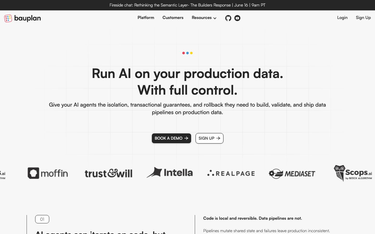
Bauplan Labs' landing page is an engineering-first developer-platform surface — a warm off-white canvas (`{colors.canvas}` — #f7f7f7) carrying near-black ink (`{colors.ink}` — #262626), one bold display typeface (**Satoshi**) used across the entire hierarchy, and a precise primary/secondary CTA pair. The page reads as confident and minimal: a big centered hero headline, a logo trust-strip, alternating feature bands, and a deep dark code section near the bottom that grounds the page with real syntax fragments.
The type voice is single-family by design: **Satoshi** runs everything from the 49.6px hero h1 down to 16px body. Hierarchy comes from weight (700 for headlines and buttons, 500 for sub-headings, 300 for body) and size — not from a second typeface. The light 300-weight body against heavy 700 headlines is the system's core contrast move.
Brand voltage is deliberately scarce. A tiny **RGB-dot motif** (`{colors.accent-red}`, `{colors.accent-blue}`, `{colors.accent-yellow}`) sits above the hero headline as three small dots, and the same accent family reappears as colorful card-edge frames around product mockups (teal/sky/yellow/red borders) and as a blue glow on code panels. Otherwise the palette is grayscale.
The lower page flips to a dark surface (`{colors.surface-dark}` — #222222) holding One-Dark-style code blocks (`{colors.code-gray}` — #abb2bf syntax text). This dark code section and the dark footer are the system's only inverted surfaces; everything above stays off-white-with-white-cards.
**Key Characteristics:**
- Warm off-white canvas (`{colors.canvas}` — #f7f7f7) rather than pure white — the page floor is intentionally soft.
- Single typeface (Satoshi) across the whole hierarchy; contrast is built from weight (700 / 500 / 300) and size, not font pairing.
- Primary CTA is a near-black pill in `{colors.ink}` with white label; secondary CTA is an outlined off-white pill — both with arrow glyphs.
- White content cards (`{colors.surface-card}`) at `{rounded.xl}` (20px) with a soft drop shadow float on the off-white canvas.
- A small RGB-dot accent set (teal/sky/yellow/blue/red/gold) used only as tiny markers, card-edge frames, and a blue code-panel glow — never on CTAs.
- A deep dark code section (`{colors.surface-dark}` — #222222) with One-Dark-style syntax color (`{colors.code-gray}`) anchoring the lower page.
- Pill-radius index badges (the "01" marker) at `{rounded.pill}` (100px) introduce numbered feature sections.
- Radius is hierarchical: `{rounded.sm}` (8px) buttons, `{rounded.md}` (10px) code panels, `{rounded.lg}` (15px) feature cards, `{rounded.xl}` (20px) hero/content cards, `{rounded.pill}` badges.
## Colors
### Brand & Accent
Bauplan is a near-grayscale brand; color appears only as small punctuation.
- **Accent Teal** (`{colors.accent-teal}` — #00b1a6): The brand's primary accent — appears in logo, dot motifs, and card-edge frames.
- **Accent Sky / Blue** (`{colors.accent-sky}` — #61bae9, `{colors.accent-blue}` — #00a3ff, `{colors.accent-azure}` — #3898ec): The blue family — used on colorful card-frame edges and as the blue glow on code panels (`rgb(0,163,255) 0px 2px 13px -3px`).
- **Accent Yellow / Gold** (`{colors.accent-yellow}` — #ffe979, `{colors.accent-gold}` — #ffd600): The yellow dot in the RGB-dot motif and yellow card-edge frames.
- **Accent Red** (`{colors.accent-red}` — #ff3950): The red dot in the RGB-dot motif and red card-edge frames.
### Surface
- **Canvas** (`{colors.canvas}` — #f7f7f7): The warm off-white page floor.
- **Surface Soft** (`{colors.surface-soft}` — #fafafa): Slightly lighter band background for the feature-grid section.
- **Surface Card** (`{colors.surface-card}` — #ffffff): White content cards floating on canvas.
- **Surface Dark** (`{colors.surface-dark}` — #222222): The dark code section and footer background.
- **Surface Dark Alt / Soft** (`{colors.surface-dark-alt}` — #2f2f2f, `{colors.surface-dark-soft}` — #333333): Nested dark panels — including code-block backgrounds inside the dark section.
- **Black** (`{colors.black}` — #000000): The top announcement bar, and the pressed/active darkest state.
### Text
- **Ink** (`{colors.ink}` — #262626): All headlines and primary text.
- **Muted** (`{colors.muted}` — #9b9b9b): Secondary text, captions, fine-print.
- **On Dark** (`{colors.on-dark}` — #ffffff): Text on the announcement bar, dark section, and footer. (Measured as the "muted" role — it is the low-contrast/inverted text tone, i.e. white on dark surfaces.)
- **Code Gray** (`{colors.code-gray}` — #abb2bf): One-Dark-style base syntax color inside code blocks.
### Hairlines & Borders
- **Hairline** (`{colors.hairline}` — #dddddd): Default 1px divider on light surfaces.
- **Hairline Soft** (`{colors.hairline-soft}` — #cccccc): Softer divider / outline tone.
- **Border Cool** (`{colors.border-cool}` — #ccd0d5): A cool-gray border tone used on outlined elements.
## Typography
### Font Family
The system runs a **single typeface — Satoshi** — across the entire hierarchy. There is no secondary text face. Satoshi is a geometric-grotesk sans (originally distributed via Fontshare). Hierarchy is constructed from weight and size alone: 700 for headlines and buttons, 500 for sub-heads, 300 for body copy. The fallback stack walks `Inter, sans-serif`.
### Hierarchy
| Token | Size | Weight | Line Height | Letter Spacing | Use |
|---|---|---|---|---|---|
| `{typography.h1}` | 49.6px | 700 | 1.3 | 0 | Hero headline ("Run AI on your production data. With full control.") |
| `{typography.h2}` | 32px | 700 | 1.4 | 0 | Section heads |
| `{typography.h4}` | 19.2px | 700 | 1.25 | 0 | Bold sub-heads / emphasized labels |
| `{typography.h3}` | 17.6px | 500 | 1.4 | 0 | Sub-headings, nav links, feature-card titles |
| `{typography.body}` | 16px | 300 | 1.4 | 0 | Default running text — note the light 300 weight |
| `{typography.button}` | 16px | 700 | 1.4 | 0 | CTA labels |
### Principles
The light 300-weight body against the heavy 700 headlines is the signature contrast — keep body copy at 300, never bump it to 400+. Note that h4 (19.2px / 700) is visually heavier than h3 (17.6px / 500) despite both being sub-headline roles: h4 is the bold-label role, h3 the lighter sub-heading role. Don't swap their weights. Headlines and buttons share weight 700; the difference between them is size.
### Note on Font Substitutes
Satoshi was not flagged as licensed in this capture (`fonts_licensed: []`) and is freely available via Fontshare. If Satoshi cannot be shipped, **Inter** (declared as the fallback) is a serviceable substitute, though it is humanist rather than geometric — at weight 700 for headlines and 300 for body it preserves the weight-driven hierarchy. **General Sans** (also Fontshare) is a closer geometric match.
## Layout
### Spacing System
- **Base unit:** 4px.
- **Tokens:** `{spacing.xxs}` 4px · `{spacing.xs}` 8px · `{spacing.sm}` 12px · `{spacing.md}` 16px (the most frequent — 63 occurrences) · `{spacing.lg}` 24px · `{spacing.xl}` 32px · `{spacing.xxl}` 48px · `{spacing.xxxl}` 64px · `{spacing.section}` 96px.
- **Dominant rhythm:** 16px is the workhorse gap/padding value; 32px and 24px are the secondary structural steps.
- **Section padding:** Large bands use `{spacing.xxxl}` (64px) to `{spacing.section}` (96px) vertical rhythm.
Note: the capture also surfaced several off-grid values (5, 6, 10, 11, 18, 20px) likely from a Webflow base; the canonical scale above is the 4px-aligned set.
### Grid & Container
- **Hero:** Single centered column — headline, sub-head, dual-CTA row stacked and centered.
- **Logo strip:** Single horizontal row of 6 customer logos below the hero.
- **Feature bands:** Alternating two-column splits (text + product mockup card) and 4-up feature-card grids.
- **Dark code section:** Two-column split — explanatory text alongside code blocks.
- **Blog/footer:** 3-up blog-card grid; multi-column footer link list on dark surface.
### Whitespace Philosophy
The page uses generous vertical breathing room with a centered hero and clearly separated bands. The off-white canvas keeps the white cards distinct without heavy borders. Content stays scannable: each band carries a single headline plus supporting cards, never dense lists.
## Elevation & Depth
| Level | Treatment | Use |
|---|---|---|
| Flat | No shadow, on `{colors.canvas}` | Hero, nav, logo strip, section text |
| Soft card shadow | `rgba(0,0,0,0.2) 0px 2px 7px 0px` | White content cards, hero artifact cards |
| Subtle shadow | `rgba(0,0,0,0.2) 0px 1px 4px 0px` | Smaller cards, feature tiles, blog cards |
| Blue code glow | `rgb(0,163,255) 0px 2px 13px -3px` | Code panels inside the dark section — a colored glow accent |
| Dark inversion | `{colors.surface-dark}` block, no shadow | Code section + footer — color contrast does the depth work |
The elevation philosophy is **soft and modern** — low-alpha grey drop shadows on floating white cards, with one signature colored (blue) glow reserved for code panels. No heavy shadows, no neumorphism.
### Decorative Depth
- Product mockup cards carry colorful edge-frames (teal/sky/yellow/red) that read as a layered border behind the white panel — a chromatic flourish that doesn't break the grayscale body.
- The three RGB dots above the hero headline (`{colors.accent-red}`, `{colors.accent-blue}`, `{colors.accent-yellow}`) act as a tiny brand marker.
## Shapes
### Border Radius Scale
| Token | Value | Use |
|---|---|---|
| `{rounded.sm}` | 8px | CTA buttons |
| `{rounded.md}` | 10px | Code panels, smaller tiles (most frequent radius — 27 occurrences) |
| `{rounded.lg}` | 15px | Feature cards, blog cards (23 occurrences) |
| `{rounded.xl}` | 20px | Hero / large content cards |
| `{rounded.pill}` | 100px | Index badges ("01"), pill markers |
### Photography / Artifact Geometry
Product mockup artifacts sit inside cards with their own internal chrome and colored edge-frames. Customer logos in the trust strip render as flat monochrome marks on the canvas. Code blocks use `{rounded.md}` (10px) corners.
## Components
### Top Bar & Navigation
**`top-announcement-bar`** — A full-width black bar (`{colors.black}`) pinned above the nav carrying a single event line ("Fireside chat… June 16 | 9am PT") in white. Compact 4px vertical padding.
**`top-nav`** — Off-white nav (`{colors.canvas}`) with the bauplan wordmark + logo at left, center menu (Platform, Customers, Resources▾, GitHub, YouTube icons), and a right cluster with "Login" text-link and "Sign Up". Menu items in `{typography.h3}` (Satoshi 17.6px / 500).
### Buttons
**`button-primary`** — The primary CTA ("BOOK A DEMO →"). Near-black pill in `{colors.ink}` (#262626 — measured), white label in `{typography.button}` (Satoshi 16px / 700), rounded `{rounded.sm}` (8px), with a trailing arrow glyph. Padding is derived (12px × 20px) — the captured padding value was malformed and is not reliable. Active state `button-primary-active` deepens to `{colors.black}`.
**`button-secondary`** — Outlined CTA ("SIGN UP →"). Off-white `{colors.canvas}` fill with a 1px hairline outline, `{colors.ink}` label, same radius and trailing arrow as primary.
**`text-link`** — Inline navigation/CTA link ("Login", "Sign Up", "READ MORE") in `{colors.ink}`, `{typography.button}` weight.
### Cards & Containers
**`card`** — The base white content card. Background `{colors.surface-card}` (#ffffff), rounded `{rounded.xl}` (20px), shadow `rgba(0,0,0,0.2) 0px 2px 7px 0px`, internal padding `{spacing.xl}` (32px). Used for the larger product-mockup containers (often wrapped by a colored edge-frame).
**`feature-card`** — Used in the 4-up feature grid ("Building data pipelines", "Safe table ingestion", etc.). Background `{colors.surface-card}`, rounded `{rounded.lg}` (15px), padding `{spacing.lg}` (24px). Carries a `{typography.h3}` title, a `{typography.body}` description, a "Learn more" `{component.text-link}`, and a small line-art diagram.
**`feature-band-soft`** — The lighter-surface band holding the 4-up feature grid. Background `{colors.surface-soft}` (#fafafa), rounded `{rounded.xl}`, generous `{spacing.xxl}` (48px) padding.
**`index-badge`** — The numbered section marker ("01"). Pill shape (`{rounded.pill}`), off-white fill with hairline outline, ink number in `{typography.body}`. Introduces numbered feature sections.
**`logo-strip`** — Single-row customer trust strip (moffin, trust&will, Intella, REALPAGE, MEDIASET, Scops.ai) on `{colors.canvas}`. Logos render as flat monochrome marks.
**`blog-card`** — Used in the 3-up "READ ALL POSTS" grid. Background `{colors.surface-card}`, rounded `{rounded.lg}`, padding `{spacing.lg}`. Carries a `{typography.h3}` post title, author line, and a "READ MORE →" `{component.text-link}`.
### Dark Section & Code
**`dark-section`** — The deep dark band near the page bottom ("Branch, inspect and merge data like code"). Background `{colors.surface-dark}` (#222222), text `{colors.on-dark}`, `{spacing.xxxl}` (64px) vertical padding. Holds explanatory text alongside code blocks.
**`code-block`** — Syntax-highlighted code panels inside the dark section. Background `{colors.surface-dark-soft}` (#333333), base text `{colors.code-gray}` (#abb2bf — One-Dark style), rounded `{rounded.md}` (10px), padding `{spacing.md}` (16px). Carries the blue glow shadow (`rgb(0,163,255) 0px 2px 13px -3px`) and a traffic-light dot row at top-left.
### FAQ & Footer
**`faq-row`** — Accordion-style FAQ rows ("What if I already have Databricks or Snowflake?"). `{colors.canvas}` background, `{typography.h3}` question label, hairline divider below each row.
**`footer`** — Dark footer (`{colors.surface-dark}`) with light text (`{colors.on-dark}`). Multi-column link list (Resources / Company / Policies) plus the San Francisco address. Padding `{spacing.xxl}` (48px). One of only two dark surfaces on the page.
## Do's and Don'ts
### Do
- Reserve `{colors.ink}` (#262626) for the primary CTA, headlines, and primary text. The button is near-black, never an accent color.
- Use Satoshi everywhere — build hierarchy with weight (700 / 500 / 300) and size, not a second typeface.
- Keep body copy at the light 300 weight against 700 headlines — that contrast is the brand's voice.
- Use the RGB-dot accents (teal/sky/yellow/red/blue) only as tiny markers, card-edge frames, and the code-panel glow.
- Float white cards (`{component.card}`) on the off-white canvas with the soft `rgba(0,0,0,0.2)` shadow — don't add borders to them.
- Pair every CTA with a trailing arrow glyph (→) — both primary and secondary do this.
- Use the dark section + footer as the only inverted surfaces; the code blocks live exclusively there.
### Don't
- Don't put accent colors on CTAs — the action layer is monochrome.
- Don't bump body weight above 300 — it collapses the weight contrast.
- Don't swap h3 (500) and h4 (700) weights — h4 is the bold-label role, h3 the lighter sub-head.
- Don't use radius beyond `{rounded.xl}` (20px) on cards except the `{rounded.pill}` badges.
- Don't add additional dark surfaces beyond the code section and footer — they're deliberate, scarce.
- Don't add hover-state styling beyond the documented primary press (darken to `{colors.black}`).
## Responsive Behavior
| Name | Width | Key Changes |
|---|---|---|
| Mobile | < 768px | Hamburger nav; hero h1 scales down; dual CTAs stack; logo strip wraps/scrolls; feature grids 1-up; code section text + code stack |
| Tablet | 768–1024px | Tightened nav; feature grids 2-up; two-column splits may stack |
| Desktop | 1024–1440px | Full nav; centered hero; 4-up feature grid; two-column dark code split |
| Wide | > 1440px | Same as desktop with more outer breathing room |
### Touch Targets
- `{component.button-primary}` and `{component.button-secondary}` use 12px × 20px padding (derived) on 16px/700 labels, giving a comfortable tap area.
- Nav links in `{typography.h3}` should retain ≥44px effective tap height on mobile.
### Collapsing Strategy
- Top nav collapses to a hamburger below tablet; the announcement bar stays full-width.
- The centered hero stays single-column at all breakpoints; CTAs stack vertically on mobile.
- Feature-card grids reduce columns (4 → 2 → 1) rather than scaling cards down.
- The dark code section stacks explanatory text above code blocks on narrow viewports.
### Image / Artifact Behavior
- Product mockup cards with colored edge-frames scale proportionally.
- Code blocks retain legibility and wrap horizontally with scroll on narrow screens.
- Customer logos in the trust strip wrap or scroll horizontally on mobile.
## Iteration Guide
1. Focus on ONE component at a time. Reference its YAML key directly (`{component.feature-card}`, `{component.code-block}`).
2. Variants of an existing component (`-active`, etc.) live as separate entries in `components:`.
3. Use `{token.refs}` everywhere — never inline a hex in a component.
4. Never document hover. Default and Active/Pressed only.
5. Keep the single-typeface discipline: Satoshi for everything, hierarchy from weight + size.
6. The dark code section and footer are the only inverted surfaces — don't add dark cards casually.
7. When emphasis is needed, go heavier in weight (700) or larger in size before reaching for an accent color.
## Known Gaps
- **Button geometry is partially derived.** The captured `button-primary` reported `radius: 0px` and a malformed padding (`0px 20px 8px 0px`) — yet the screenshots clearly show a rounded near-black pill. Radius (`{rounded.sm}`) and padding (12px × 20px) are derived from screenshot ground-truth; confirm against the live CSS.
- The "muted" color role was measured as `#ffffff`, which is actually the inverted (on-dark) text tone rather than a low-contrast gray; it is documented as `{colors.on-dark}`. A true muted-gray body tone (`{colors.muted}` — #9b9b9b) is documented separately.
- Only the landing page was captured; interior pages (Platform, Customers, Docs) may introduce additional components and surfaces.
- Exact dark-section background was inferred from the neutral set (#222222 / #2f2f2f / #333333); the precise surface vs. nested-panel mapping needs confirmation.
- Several off-grid spacing values (5, 6, 10, 11, 18, 20px) appear in the capture (likely Webflow defaults) and are excluded from the canonical 4px scale.
- Animation, transition timings, and accordion expand/collapse behavior for FAQ rows are not in scope.
- Satoshi licensing was not flagged in this capture; verify Fontshare license terms before shipping, and use the Inter/General Sans substitute path if needed.
- Form/input states (sign-up, demo booking) are not present on the captured page and are undocumented.
<!-- Documented by duply · real-world design systems as ready-to-use DESIGN.md for AI coding agents · https://duply.ai/bauplanlabs/design-md -->
Color Palette
Accent
Neutrals
Typography
h149.6px · 700 · 1.3
The quick brown fox jumpsh232px · 700 · 1.4
The quick brown fox jumpsh419.2px · 700 · 1.25
The quick brown fox jumpsh317.6px · 500 · 1.4
The quick brown fox jumpsbody16px · 300 · 1.4
The quick brown fox jumpsbutton16px · 700 · 1.4
The quick brown fox jumpsSpacing & Shape
Spacing
| Name | Value | Preview |
|---|---|---|
| xxs | 4px | |
| xs | 8px | |
| sm | 12px | |
| md | 16px | |
| lg | 24px | |
| xl | 32px | |
| xxl | 48px | |
| xxxl | 64px | |
| section | 96px |
Border Radius
| Name | Value | Preview |
|---|---|---|
| sm | 8px | |
| md | 10px | |
| lg | 15px | |
| xl | 20px | |
| pill | 100px |
More like this


---
version: alpha
name: Bauplanlabs-design-analysis
description: A developer-platform marketing surface for an AI data-pipeline product, built on a warm off-white canvas (#f7f7f7) with near-black ink, a single bold Satoshi typeface across the whole hierarchy, and a primary/secondary CTA pair (dark pill + white outline pill). Brand voltage comes from a small RGB-dot accent set (teal/sky/yellow/red) used as tiny markers and colorful card-edge frames, plus a deep dark code section that grounds the lower page with One-Dark-style syntax fragments. The system reads as precise, engineering-first, and confidently minimal.

colors:
  ink: "#262626"
  black: "#000000"
  canvas: "#f7f7f7"
  surface-soft: "#fafafa"
  surface-card: "#ffffff"
  surface-dark: "#222222"
  surface-dark-alt: "#2f2f2f"
  surface-dark-soft: "#333333"
  on-dark: "#ffffff"
  muted: "#9b9b9b"
  hairline: "#dddddd"
  hairline-soft: "#cccccc"
  border-cool: "#ccd0d5"
  code-gray: "#abb2bf"
  accent-teal: "#00b1a6"
  accent-sky: "#61bae9"
  accent-blue: "#00a3ff"
  accent-azure: "#3898ec"
  accent-yellow: "#ffe979"
  accent-gold: "#ffd600"
  accent-red: "#ff3950"

typography:
  h1:
    fontFamily: "Satoshi, Inter, sans-serif"
    fontSize: 49.6px
    fontWeight: 700
    lineHeight: 1.3
    letterSpacing: 0
  h2:
    fontFamily: "Satoshi, Inter, sans-serif"
    fontSize: 32px
    fontWeight: 700
    lineHeight: 1.4
    letterSpacing: 0
  h4:
    fontFamily: "Satoshi, Inter, sans-serif"
    fontSize: 19.2px
    fontWeight: 700
    lineHeight: 1.25
    letterSpacing: 0
  h3:
    fontFamily: "Satoshi, Inter, sans-serif"
    fontSize: 17.6px
    fontWeight: 500
    lineHeight: 1.4
    letterSpacing: 0
  body:
    fontFamily: "Satoshi, Inter, sans-serif"
    fontSize: 16px
    fontWeight: 300
    lineHeight: 1.4
    letterSpacing: 0
  button:
    fontFamily: "Satoshi, Inter, sans-serif"
    fontSize: 16px
    fontWeight: 700
    lineHeight: 1.4
    letterSpacing: 0

rounded:
  sm: 8px
  md: 10px
  lg: 15px
  xl: 20px
  pill: 100px

spacing:
  xxs: 4px
  xs: 8px
  sm: 12px
  md: 16px
  lg: 24px
  xl: 32px
  xxl: 48px
  xxxl: 64px
  section: 96px

components:
  top-announcement-bar:
    backgroundColor: "{colors.black}"
    textColor: "{colors.on-dark}"
    typography: "{typography.body}"
    padding: 4px 16px
  top-nav:
    backgroundColor: "{colors.canvas}"
    textColor: "{colors.ink}"
    typography: "{typography.h3}"
    padding: 16px 24px
  button-primary:
    backgroundColor: "{colors.ink}"
    textColor: "{colors.on-dark}"
    typography: "{typography.button}"
    rounded: "{rounded.sm}"
    padding: 12px 20px
  button-primary-active:
    backgroundColor: "{colors.black}"
    textColor: "{colors.on-dark}"
    rounded: "{rounded.sm}"
  button-secondary:
    backgroundColor: "{colors.canvas}"
    textColor: "{colors.ink}"
    typography: "{typography.button}"
    rounded: "{rounded.sm}"
    padding: 12px 20px
  text-link:
    backgroundColor: transparent
    textColor: "{colors.ink}"
    typography: "{typography.button}"
  card:
    backgroundColor: "{colors.surface-card}"
    textColor: "{colors.ink}"
    typography: "{typography.body}"
    rounded: "{rounded.xl}"
    padding: 32px
  feature-card:
    backgroundColor: "{colors.surface-card}"
    textColor: "{colors.ink}"
    typography: "{typography.h3}"
    rounded: "{rounded.lg}"
    padding: 24px
  index-badge:
    backgroundColor: "{colors.canvas}"
    textColor: "{colors.ink}"
    typography: "{typography.body}"
    rounded: "{rounded.pill}"
    padding: 4px 16px
  logo-strip:
    backgroundColor: "{colors.canvas}"
    textColor: "{colors.ink}"
    padding: 32px 24px
  feature-band-soft:
    backgroundColor: "{colors.surface-soft}"
    textColor: "{colors.ink}"
    typography: "{typography.body}"
    rounded: "{rounded.xl}"
    padding: 48px
  dark-section:
    backgroundColor: "{colors.surface-dark}"
    textColor: "{colors.on-dark}"
    typography: "{typography.body}"
    padding: 64px
  code-block:
    backgroundColor: "{colors.surface-dark-soft}"
    textColor: "{colors.code-gray}"
    typography: "{typography.body}"
    rounded: "{rounded.md}"
    padding: 16px
  blog-card:
    backgroundColor: "{colors.surface-card}"
    textColor: "{colors.ink}"
    typography: "{typography.body}"
    rounded: "{rounded.lg}"
    padding: 24px
  faq-row:
    backgroundColor: "{colors.canvas}"
    textColor: "{colors.ink}"
    typography: "{typography.h3}"
    padding: 16px 0
  footer:
    backgroundColor: "{colors.surface-dark}"
    textColor: "{colors.on-dark}"
    typography: "{typography.body}"
    padding: 48px

---

## Overview

Bauplan Labs' landing page is an engineering-first developer-platform surface — a warm off-white canvas (`{colors.canvas}` — #f7f7f7) carrying near-black ink (`{colors.ink}` — #262626), one bold display typeface (**Satoshi**) used across the entire hierarchy, and a precise primary/secondary CTA pair. The page reads as confident and minimal: a big centered hero headline, a logo trust-strip, alternating feature bands, and a deep dark code section near the bottom that grounds the page with real syntax fragments.

The type voice is single-family by design: **Satoshi** runs everything from the 49.6px hero h1 down to 16px body. Hierarchy comes from weight (700 for headlines and buttons, 500 for sub-headings, 300 for body) and size — not from a second typeface. The light 300-weight body against heavy 700 headlines is the system's core contrast move.

Brand voltage is deliberately scarce. A tiny **RGB-dot motif** (`{colors.accent-red}`, `{colors.accent-blue}`, `{colors.accent-yellow}`) sits above the hero headline as three small dots, and the same accent family reappears as colorful card-edge frames around product mockups (teal/sky/yellow/red borders) and as a blue glow on code panels. Otherwise the palette is grayscale.

The lower page flips to a dark surface (`{colors.surface-dark}` — #222222) holding One-Dark-style code blocks (`{colors.code-gray}` — #abb2bf syntax text). This dark code section and the dark footer are the system's only inverted surfaces; everything above stays off-white-with-white-cards.

**Key Characteristics:**
- Warm off-white canvas (`{colors.canvas}` — #f7f7f7) rather than pure white — the page floor is intentionally soft.
- Single typeface (Satoshi) across the whole hierarchy; contrast is built from weight (700 / 500 / 300) and size, not font pairing.
- Primary CTA is a near-black pill in `{colors.ink}` with white label; secondary CTA is an outlined off-white pill — both with arrow glyphs.
- White content cards (`{colors.surface-card}`) at `{rounded.xl}` (20px) with a soft drop shadow float on the off-white canvas.
- A small RGB-dot accent set (teal/sky/yellow/blue/red/gold) used only as tiny markers, card-edge frames, and a blue code-panel glow — never on CTAs.
- A deep dark code section (`{colors.surface-dark}` — #222222) with One-Dark-style syntax color (`{colors.code-gray}`) anchoring the lower page.
- Pill-radius index badges (the "01" marker) at `{rounded.pill}` (100px) introduce numbered feature sections.
- Radius is hierarchical: `{rounded.sm}` (8px) buttons, `{rounded.md}` (10px) code panels, `{rounded.lg}` (15px) feature cards, `{rounded.xl}` (20px) hero/content cards, `{rounded.pill}` badges.

## Colors

### Brand & Accent
Bauplan is a near-grayscale brand; color appears only as small punctuation.
- **Accent Teal** (`{colors.accent-teal}` — #00b1a6): The brand's primary accent — appears in logo, dot motifs, and card-edge frames.
- **Accent Sky / Blue** (`{colors.accent-sky}` — #61bae9, `{colors.accent-blue}` — #00a3ff, `{colors.accent-azure}` — #3898ec): The blue family — used on colorful card-frame edges and as the blue glow on code panels (`rgb(0,163,255) 0px 2px 13px -3px`).
- **Accent Yellow / Gold** (`{colors.accent-yellow}` — #ffe979, `{colors.accent-gold}` — #ffd600): The yellow dot in the RGB-dot motif and yellow card-edge frames.
- **Accent Red** (`{colors.accent-red}` — #ff3950): The red dot in the RGB-dot motif and red card-edge frames.

### Surface
- **Canvas** (`{colors.canvas}` — #f7f7f7): The warm off-white page floor.
- **Surface Soft** (`{colors.surface-soft}` — #fafafa): Slightly lighter band background for the feature-grid section.
- **Surface Card** (`{colors.surface-card}` — #ffffff): White content cards floating on canvas.
- **Surface Dark** (`{colors.surface-dark}` — #222222): The dark code section and footer background.
- **Surface Dark Alt / Soft** (`{colors.surface-dark-alt}` — #2f2f2f, `{colors.surface-dark-soft}` — #333333): Nested dark panels — including code-block backgrounds inside the dark section.
- **Black** (`{colors.black}` — #000000): The top announcement bar, and the pressed/active darkest state.

### Text
- **Ink** (`{colors.ink}` — #262626): All headlines and primary text.
- **Muted** (`{colors.muted}` — #9b9b9b): Secondary text, captions, fine-print.
- **On Dark** (`{colors.on-dark}` — #ffffff): Text on the announcement bar, dark section, and footer. (Measured as the "muted" role — it is the low-contrast/inverted text tone, i.e. white on dark surfaces.)
- **Code Gray** (`{colors.code-gray}` — #abb2bf): One-Dark-style base syntax color inside code blocks.

### Hairlines & Borders
- **Hairline** (`{colors.hairline}` — #dddddd): Default 1px divider on light surfaces.
- **Hairline Soft** (`{colors.hairline-soft}` — #cccccc): Softer divider / outline tone.
- **Border Cool** (`{colors.border-cool}` — #ccd0d5): A cool-gray border tone used on outlined elements.

## Typography

### Font Family
The system runs a **single typeface — Satoshi** — across the entire hierarchy. There is no secondary text face. Satoshi is a geometric-grotesk sans (originally distributed via Fontshare). Hierarchy is constructed from weight and size alone: 700 for headlines and buttons, 500 for sub-heads, 300 for body copy. The fallback stack walks `Inter, sans-serif`.

### Hierarchy

| Token | Size | Weight | Line Height | Letter Spacing | Use |
|---|---|---|---|---|---|
| `{typography.h1}` | 49.6px | 700 | 1.3 | 0 | Hero headline ("Run AI on your production data. With full control.") |
| `{typography.h2}` | 32px | 700 | 1.4 | 0 | Section heads |
| `{typography.h4}` | 19.2px | 700 | 1.25 | 0 | Bold sub-heads / emphasized labels |
| `{typography.h3}` | 17.6px | 500 | 1.4 | 0 | Sub-headings, nav links, feature-card titles |
| `{typography.body}` | 16px | 300 | 1.4 | 0 | Default running text — note the light 300 weight |
| `{typography.button}` | 16px | 700 | 1.4 | 0 | CTA labels |

### Principles
The light 300-weight body against the heavy 700 headlines is the signature contrast — keep body copy at 300, never bump it to 400+. Note that h4 (19.2px / 700) is visually heavier than h3 (17.6px / 500) despite both being sub-headline roles: h4 is the bold-label role, h3 the lighter sub-heading role. Don't swap their weights. Headlines and buttons share weight 700; the difference between them is size.

### Note on Font Substitutes
Satoshi was not flagged as licensed in this capture (`fonts_licensed: []`) and is freely available via Fontshare. If Satoshi cannot be shipped, **Inter** (declared as the fallback) is a serviceable substitute, though it is humanist rather than geometric — at weight 700 for headlines and 300 for body it preserves the weight-driven hierarchy. **General Sans** (also Fontshare) is a closer geometric match.

## Layout

### Spacing System
- **Base unit:** 4px.
- **Tokens:** `{spacing.xxs}` 4px · `{spacing.xs}` 8px · `{spacing.sm}` 12px · `{spacing.md}` 16px (the most frequent — 63 occurrences) · `{spacing.lg}` 24px · `{spacing.xl}` 32px · `{spacing.xxl}` 48px · `{spacing.xxxl}` 64px · `{spacing.section}` 96px.
- **Dominant rhythm:** 16px is the workhorse gap/padding value; 32px and 24px are the secondary structural steps.
- **Section padding:** Large bands use `{spacing.xxxl}` (64px) to `{spacing.section}` (96px) vertical rhythm.

Note: the capture also surfaced several off-grid values (5, 6, 10, 11, 18, 20px) likely from a Webflow base; the canonical scale above is the 4px-aligned set.

### Grid & Container
- **Hero:** Single centered column — headline, sub-head, dual-CTA row stacked and centered.
- **Logo strip:** Single horizontal row of 6 customer logos below the hero.
- **Feature bands:** Alternating two-column splits (text + product mockup card) and 4-up feature-card grids.
- **Dark code section:** Two-column split — explanatory text alongside code blocks.
- **Blog/footer:** 3-up blog-card grid; multi-column footer link list on dark surface.

### Whitespace Philosophy
The page uses generous vertical breathing room with a centered hero and clearly separated bands. The off-white canvas keeps the white cards distinct without heavy borders. Content stays scannable: each band carries a single headline plus supporting cards, never dense lists.

## Elevation & Depth

| Level | Treatment | Use |
|---|---|---|
| Flat | No shadow, on `{colors.canvas}` | Hero, nav, logo strip, section text |
| Soft card shadow | `rgba(0,0,0,0.2) 0px 2px 7px 0px` | White content cards, hero artifact cards |
| Subtle shadow | `rgba(0,0,0,0.2) 0px 1px 4px 0px` | Smaller cards, feature tiles, blog cards |
| Blue code glow | `rgb(0,163,255) 0px 2px 13px -3px` | Code panels inside the dark section — a colored glow accent |
| Dark inversion | `{colors.surface-dark}` block, no shadow | Code section + footer — color contrast does the depth work |

The elevation philosophy is **soft and modern** — low-alpha grey drop shadows on floating white cards, with one signature colored (blue) glow reserved for code panels. No heavy shadows, no neumorphism.

### Decorative Depth
- Product mockup cards carry colorful edge-frames (teal/sky/yellow/red) that read as a layered border behind the white panel — a chromatic flourish that doesn't break the grayscale body.
- The three RGB dots above the hero headline (`{colors.accent-red}`, `{colors.accent-blue}`, `{colors.accent-yellow}`) act as a tiny brand marker.

## Shapes

### Border Radius Scale

| Token | Value | Use |
|---|---|---|
| `{rounded.sm}` | 8px | CTA buttons |
| `{rounded.md}` | 10px | Code panels, smaller tiles (most frequent radius — 27 occurrences) |
| `{rounded.lg}` | 15px | Feature cards, blog cards (23 occurrences) |
| `{rounded.xl}` | 20px | Hero / large content cards |
| `{rounded.pill}` | 100px | Index badges ("01"), pill markers |

### Photography / Artifact Geometry
Product mockup artifacts sit inside cards with their own internal chrome and colored edge-frames. Customer logos in the trust strip render as flat monochrome marks on the canvas. Code blocks use `{rounded.md}` (10px) corners.

## Components

### Top Bar & Navigation

**`top-announcement-bar`** — A full-width black bar (`{colors.black}`) pinned above the nav carrying a single event line ("Fireside chat… June 16 | 9am PT") in white. Compact 4px vertical padding.

**`top-nav`** — Off-white nav (`{colors.canvas}`) with the bauplan wordmark + logo at left, center menu (Platform, Customers, Resources▾, GitHub, YouTube icons), and a right cluster with "Login" text-link and "Sign Up". Menu items in `{typography.h3}` (Satoshi 17.6px / 500).

### Buttons

**`button-primary`** — The primary CTA ("BOOK A DEMO →"). Near-black pill in `{colors.ink}` (#262626 — measured), white label in `{typography.button}` (Satoshi 16px / 700), rounded `{rounded.sm}` (8px), with a trailing arrow glyph. Padding is derived (12px × 20px) — the captured padding value was malformed and is not reliable. Active state `button-primary-active` deepens to `{colors.black}`.

**`button-secondary`** — Outlined CTA ("SIGN UP →"). Off-white `{colors.canvas}` fill with a 1px hairline outline, `{colors.ink}` label, same radius and trailing arrow as primary.

**`text-link`** — Inline navigation/CTA link ("Login", "Sign Up", "READ MORE") in `{colors.ink}`, `{typography.button}` weight.

### Cards & Containers

**`card`** — The base white content card. Background `{colors.surface-card}` (#ffffff), rounded `{rounded.xl}` (20px), shadow `rgba(0,0,0,0.2) 0px 2px 7px 0px`, internal padding `{spacing.xl}` (32px). Used for the larger product-mockup containers (often wrapped by a colored edge-frame).

**`feature-card`** — Used in the 4-up feature grid ("Building data pipelines", "Safe table ingestion", etc.). Background `{colors.surface-card}`, rounded `{rounded.lg}` (15px), padding `{spacing.lg}` (24px). Carries a `{typography.h3}` title, a `{typography.body}` description, a "Learn more" `{component.text-link}`, and a small line-art diagram.

**`feature-band-soft`** — The lighter-surface band holding the 4-up feature grid. Background `{colors.surface-soft}` (#fafafa), rounded `{rounded.xl}`, generous `{spacing.xxl}` (48px) padding.

**`index-badge`** — The numbered section marker ("01"). Pill shape (`{rounded.pill}`), off-white fill with hairline outline, ink number in `{typography.body}`. Introduces numbered feature sections.

**`logo-strip`** — Single-row customer trust strip (moffin, trust&will, Intella, REALPAGE, MEDIASET, Scops.ai) on `{colors.canvas}`. Logos render as flat monochrome marks.

**`blog-card`** — Used in the 3-up "READ ALL POSTS" grid. Background `{colors.surface-card}`, rounded `{rounded.lg}`, padding `{spacing.lg}`. Carries a `{typography.h3}` post title, author line, and a "READ MORE →" `{component.text-link}`.

### Dark Section & Code

**`dark-section`** — The deep dark band near the page bottom ("Branch, inspect and merge data like code"). Background `{colors.surface-dark}` (#222222), text `{colors.on-dark}`, `{spacing.xxxl}` (64px) vertical padding. Holds explanatory text alongside code blocks.

**`code-block`** — Syntax-highlighted code panels inside the dark section. Background `{colors.surface-dark-soft}` (#333333), base text `{colors.code-gray}` (#abb2bf — One-Dark style), rounded `{rounded.md}` (10px), padding `{spacing.md}` (16px). Carries the blue glow shadow (`rgb(0,163,255) 0px 2px 13px -3px`) and a traffic-light dot row at top-left.

### FAQ & Footer

**`faq-row`** — Accordion-style FAQ rows ("What if I already have Databricks or Snowflake?"). `{colors.canvas}` background, `{typography.h3}` question label, hairline divider below each row.

**`footer`** — Dark footer (`{colors.surface-dark}`) with light text (`{colors.on-dark}`). Multi-column link list (Resources / Company / Policies) plus the San Francisco address. Padding `{spacing.xxl}` (48px). One of only two dark surfaces on the page.

## Do's and Don'ts

### Do
- Reserve `{colors.ink}` (#262626) for the primary CTA, headlines, and primary text. The button is near-black, never an accent color.
- Use Satoshi everywhere — build hierarchy with weight (700 / 500 / 300) and size, not a second typeface.
- Keep body copy at the light 300 weight against 700 headlines — that contrast is the brand's voice.
- Use the RGB-dot accents (teal/sky/yellow/red/blue) only as tiny markers, card-edge frames, and the code-panel glow.
- Float white cards (`{component.card}`) on the off-white canvas with the soft `rgba(0,0,0,0.2)` shadow — don't add borders to them.
- Pair every CTA with a trailing arrow glyph (→) — both primary and secondary do this.
- Use the dark section + footer as the only inverted surfaces; the code blocks live exclusively there.

### Don't
- Don't put accent colors on CTAs — the action layer is monochrome.
- Don't bump body weight above 300 — it collapses the weight contrast.
- Don't swap h3 (500) and h4 (700) weights — h4 is the bold-label role, h3 the lighter sub-head.
- Don't use radius beyond `{rounded.xl}` (20px) on cards except the `{rounded.pill}` badges.
- Don't add additional dark surfaces beyond the code section and footer — they're deliberate, scarce.
- Don't add hover-state styling beyond the documented primary press (darken to `{colors.black}`).

## Responsive Behavior

| Name | Width | Key Changes |
|---|---|---|
| Mobile | < 768px | Hamburger nav; hero h1 scales down; dual CTAs stack; logo strip wraps/scrolls; feature grids 1-up; code section text + code stack |
| Tablet | 768–1024px | Tightened nav; feature grids 2-up; two-column splits may stack |
| Desktop | 1024–1440px | Full nav; centered hero; 4-up feature grid; two-column dark code split |
| Wide | > 1440px | Same as desktop with more outer breathing room |

### Touch Targets
- `{component.button-primary}` and `{component.button-secondary}` use 12px × 20px padding (derived) on 16px/700 labels, giving a comfortable tap area.
- Nav links in `{typography.h3}` should retain ≥44px effective tap height on mobile.

### Collapsing Strategy
- Top nav collapses to a hamburger below tablet; the announcement bar stays full-width.
- The centered hero stays single-column at all breakpoints; CTAs stack vertically on mobile.
- Feature-card grids reduce columns (4 → 2 → 1) rather than scaling cards down.
- The dark code section stacks explanatory text above code blocks on narrow viewports.

### Image / Artifact Behavior
- Product mockup cards with colored edge-frames scale proportionally.
- Code blocks retain legibility and wrap horizontally with scroll on narrow screens.
- Customer logos in the trust strip wrap or scroll horizontally on mobile.

## Iteration Guide

1. Focus on ONE component at a time. Reference its YAML key directly (`{component.feature-card}`, `{component.code-block}`).
2. Variants of an existing component (`-active`, etc.) live as separate entries in `components:`.
3. Use `{token.refs}` everywhere — never inline a hex in a component.
4. Never document hover. Default and Active/Pressed only.
5. Keep the single-typeface discipline: Satoshi for everything, hierarchy from weight + size.
6. The dark code section and footer are the only inverted surfaces — don't add dark cards casually.
7. When emphasis is needed, go heavier in weight (700) or larger in size before reaching for an accent color.

## Known Gaps

- **Button geometry is partially derived.** The captured `button-primary` reported `radius: 0px` and a malformed padding (`0px 20px 8px 0px`) — yet the screenshots clearly show a rounded near-black pill. Radius (`{rounded.sm}`) and padding (12px × 20px) are derived from screenshot ground-truth; confirm against the live CSS.
- The "muted" color role was measured as `#ffffff`, which is actually the inverted (on-dark) text tone rather than a low-contrast gray; it is documented as `{colors.on-dark}`. A true muted-gray body tone (`{colors.muted}` — #9b9b9b) is documented separately.
- Only the landing page was captured; interior pages (Platform, Customers, Docs) may introduce additional components and surfaces.
- Exact dark-section background was inferred from the neutral set (#222222 / #2f2f2f / #333333); the precise surface vs. nested-panel mapping needs confirmation.
- Several off-grid spacing values (5, 6, 10, 11, 18, 20px) appear in the capture (likely Webflow defaults) and are excluded from the canonical 4px scale.
- Animation, transition timings, and accordion expand/collapse behavior for FAQ rows are not in scope.
- Satoshi licensing was not flagged in this capture; verify Fontshare license terms before shipping, and use the Inter/General Sans substitute path if needed.
- Form/input states (sign-up, demo booking) are not present on the captured page and are undocumented.

<!-- Documented by duply · real-world design systems as ready-to-use DESIGN.md for AI coding agents · https://duply.ai/bauplanlabs/design-md -->