Svix
A developer-infrastructure marketing surface anchored on a deep indigo-navy canvas (#1c1c46) with white type and a single bright-blue CTA (#2c70ff). The system reads as serious, engineered, and quietly confident — a Grotesk display face at medium weight (500), tightly tracked headlines, white logo-grid and feature cards on light bands that alternate with full navy bands, and a colorful syntax-highlighted code block as the product's signature artifact. Brand voltage comes from the navy/white contrast and the embedded developer code samples rather than from heavy accent use.
---
version: alpha
name: Svix-design-analysis
description: A developer-infrastructure marketing surface anchored on a deep indigo-navy canvas (#1c1c46) with white type and a single bright-blue CTA (#2c70ff). The system reads as serious, engineered, and quietly confident — a Grotesk display face at medium weight (500), tightly tracked headlines, white logo-grid and feature cards on light bands that alternate with full navy bands, and a colorful syntax-highlighted code block as the product's signature artifact. Brand voltage comes from the navy/white contrast and the embedded developer code samples rather than from heavy accent use.
colors:
primary: "#2c70ff"
primary-soft: "#78a4ff"
accent-blue: "#3b82f6"
surface-dark: "#1c1c46"
ink: "#111827"
canvas: "#ffffff"
on-dark: "#ffffff"
body: "#374151"
body-strong: "#4b5563"
muted: "#6a6b75"
muted-soft: "#9ca3af"
hairline: "#e5e7eb"
hairline-soft: "#f3f4f6"
surface-strong: "#d1d5db"
neutral-mid: "#cccccc"
neutral-soft: "#e8e8e8"
success: "#31d46e"
syntax-purple: "#d7b4fe"
syntax-cyan: "#67cdcc"
syntax-yellow: "#f8c555"
syntax-grayblue: "#a9b7c6"
typography:
display-xl:
fontFamily: "grotesk, Space Grotesk, sans-serif"
fontSize: 64px
fontWeight: 500
lineHeight: 1.1
letterSpacing: -0.48px
title-md:
fontFamily: "grotesk, Space Grotesk, sans-serif"
fontSize: 20px
fontWeight: 500
lineHeight: 1.5
letterSpacing: -0.16px
title-sm:
fontFamily: "grotesk, Space Grotesk, sans-serif"
fontSize: 16px
fontWeight: 500
lineHeight: 1.5
letterSpacing: 0px
button:
fontFamily: "grotesk, Space Grotesk, sans-serif"
fontSize: 16px
fontWeight: 500
lineHeight: 1.5
letterSpacing: 0px
body:
fontFamily: "grotesk, Space Grotesk, sans-serif"
fontSize: 14.4px
fontWeight: 500
lineHeight: 1.5
letterSpacing: 0px
rounded:
xs: 4px
sm: 6px
md: 8px
full: 9999px
spacing:
xxs: 4px
xs: 8px
sm: 12px
md: 16px
ml: 20px
lg: 24px
xl: 32px
xxl: 48px
xxxl: 64px
section: 96px
section-lg: 128px
components:
announcement-bar:
backgroundColor: "{colors.surface-dark}"
textColor: "{colors.on-dark}"
typography: "{typography.body}"
padding: 12px 16px
top-nav:
backgroundColor: "{colors.surface-dark}"
textColor: "{colors.on-dark}"
typography: "{typography.button}"
padding: 16px 24px
button-primary:
backgroundColor: "{colors.primary}"
textColor: "{colors.on-dark}"
typography: "{typography.button}"
rounded: "{rounded.sm}"
padding: 8px 16px
button-secondary:
backgroundColor: transparent
textColor: "{colors.on-dark}"
typography: "{typography.button}"
rounded: "{rounded.sm}"
padding: 8px 16px
badge-pill:
backgroundColor: "{colors.body}"
textColor: "{colors.on-dark}"
typography: "{typography.body}"
rounded: "{rounded.sm}"
padding: 8px 16px
hero-band:
backgroundColor: "{colors.surface-dark}"
textColor: "{colors.on-dark}"
typography: "{typography.display-xl}"
padding: 96px 24px
logo-cell:
backgroundColor: "{colors.canvas}"
textColor: "{colors.body}"
typography: "{typography.title-sm}"
padding: 24px
feature-card:
backgroundColor: "{colors.canvas}"
textColor: "{colors.body}"
typography: "{typography.title-md}"
rounded: "{rounded.md}"
padding: 24px
code-block:
backgroundColor: "{colors.surface-dark}"
textColor: "{colors.on-dark}"
typography: "{typography.body}"
rounded: "{rounded.md}"
padding: 24px
testimonial-card:
backgroundColor: "{colors.canvas}"
textColor: "{colors.body}"
typography: "{typography.body}"
rounded: "{rounded.md}"
padding: 24px
input:
backgroundColor: "{colors.canvas}"
textColor: "{colors.body}"
typography: "{typography.body}"
rounded: "{rounded.sm}"
padding: 8px 12px
cta-band-dark:
backgroundColor: "{colors.surface-dark}"
textColor: "{colors.on-dark}"
typography: "{typography.display-xl}"
padding: 96px 24px
footer:
backgroundColor: "{colors.surface-dark}"
textColor: "{colors.muted-soft}"
typography: "{typography.body}"
padding: 64px 24px
---
## Overview
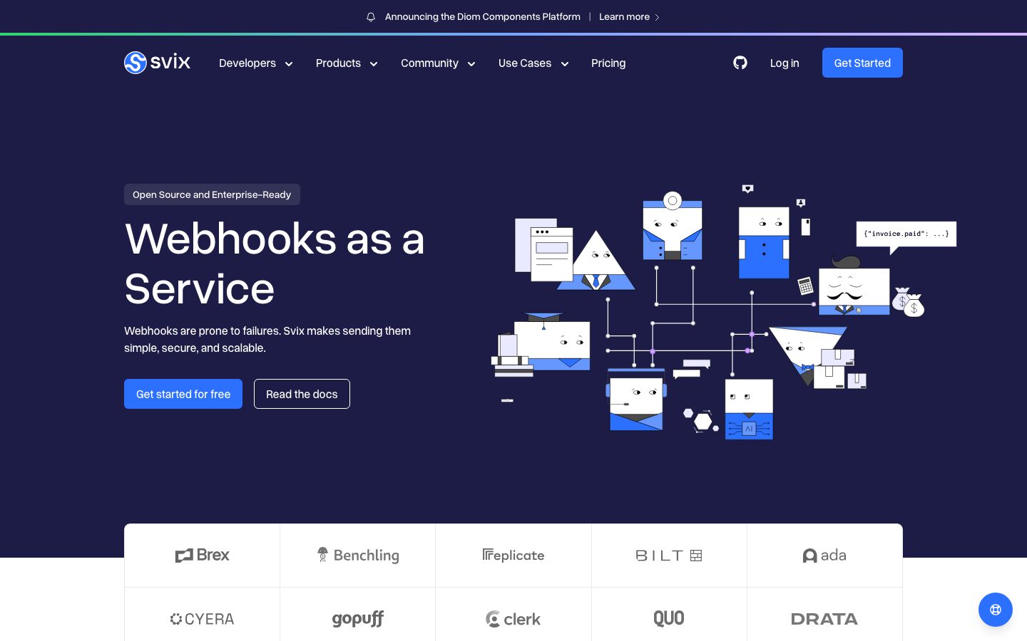
Svix's marketing surface is a developer-infrastructure interface built on a single dominant idea: a deep indigo-navy canvas (`{colors.surface-dark}` — #1c1c46) carrying white display type, punctuated by one bright-blue call-to-action (`{colors.primary}` — #2c70ff). The navy was measured as the most frequent color by a wide margin (frequency 732), confirming it as the page's structural floor — the hero, announcement bar, top nav, "Designed for developers" band, security band, and footer all sit on it.
The system alternates dark navy bands with white content bands. Logo grids, feature cards, and testimonial cards render on `{colors.canvas}` (#ffffff) with hairline separators, then the page returns to navy for the next editorial moment. This dark→light→dark rhythm is the page's primary pacing device.
Type is a single **Grotesk** family used at medium weight (500) across every role — h1 through body and buttons all measured at weight 500. There is no bold/regular split; hierarchy comes from size (64px display down to 14.4px body) and from tight negative tracking on the largest headline (-0.48px). This gives the system a calm, uniform, engineered voice — nothing shouts.
Brand voltage comes from two places: the navy/white contrast itself, and the **syntax-highlighted code block** shown inside the "Designed for developers" band — a real API snippet rendered in purple/cyan/yellow/gray-blue token colors. Svix sells webhook infrastructure, and the code sample is the product made visible.
**Key Characteristics:**
- Deep indigo-navy canvas (`{colors.surface-dark}` — #1c1c46) as the dominant structural surface — hero, nav, footer, and feature bands.
- One bright-blue primary CTA (`{colors.primary}` — #2c70ff) at `{rounded.sm}` (6px). Every other button is an outline/ghost on the navy.
- Single Grotesk family at weight 500 everywhere — hierarchy from size, not weight.
- White content bands (`{colors.canvas}`) holding logo grids, feature cards, and testimonials, alternating with navy bands.
- A colorful syntax-highlighted code block as the product's signature artifact (`{colors.syntax-purple}`, `{colors.syntax-cyan}`, `{colors.syntax-yellow}`, `{colors.syntax-grayblue}`).
- Tight radius scale: `{rounded.sm}` (6px) for buttons + inputs, `{rounded.md}` (8px) for cards, `{rounded.full}` for pills.
- A thin green→purple gradient hairline (`{colors.success}` → `{colors.syntax-purple}`) running under the announcement bar — the only decorative chroma in the chrome.
- Spacing built on an 8/16px rhythm (16px is by far the most frequent gap, frequency 185), with 96px and 128px reserved for section breaks.
## Colors
### Brand & Accent
- **Primary** (`{colors.primary}` — #2c70ff): The single bright-blue CTA color. "Get started for free", "Get Started", and "Get started for free" footer button all use it. It is the only saturated action color in the system.
- **Primary Soft** (`{colors.primary-soft}` — #78a4ff): A lighter blue used for inline links and secondary highlights on the navy surface.
- **Accent Blue** (`{colors.accent-blue}` — #3b82f6): A near-twin blue appearing on smaller accent moments and icon fills. Used sparingly.
- **Success** (`{colors.success}` — #31d46e): The green endpoint of the announcement-bar gradient hairline and small "delivered/success" status moments inside product UI fragments.
### Surface
- **Surface Dark** (`{colors.surface-dark}` — #1c1c46): The dominant page floor — hero, top nav, announcement bar, developer band, security band, CTA band, and footer.
- **Canvas** (`{colors.canvas}` — #ffffff): The light content-band floor — logo grids, feature cards, testimonials.
- **Hairline** (`{colors.hairline}` — #e5e7eb): 1px dividers in the logo grid and between light-band content.
- **Hairline Soft** (`{colors.hairline-soft}` — #f3f4f6): Barely-visible section dividers on white.
- **Surface Strong** (`{colors.surface-strong}` — #d1d5db) / **Neutral Mid** (`{colors.neutral-mid}` — #cccccc) / **Neutral Soft** (`{colors.neutral-soft}` — #e8e8e8): Light-gray border and muted-fill tones used in card outlines and disabled-state surfaces.
### Text
- **Ink** (`{colors.ink}` — #111827): The darkest text tone, used for headings on white bands.
- **On Dark** (`{colors.on-dark}` — #ffffff): All text on the navy canvas — the most-used text color (frequency 168). Headlines, nav, buttons.
- **Body** (`{colors.body}` — #374151): Default running-text on light bands.
- **Body Strong** (`{colors.body-strong}` — #4b5563): Slightly darker body emphasis.
- **Muted** (`{colors.muted}` — #6a6b75): Secondary text — sub-labels, captions (frequency 183).
- **Muted Soft** (`{colors.muted-soft}` — #9ca3af): Tertiary text — footer link rows and fine print.
### Code Syntax
A four-color set lives only inside the `{component.code-block}`:
- **Syntax Purple** (`{colors.syntax-purple}` — #d7b4fe): Keywords / function names.
- **Syntax Cyan** (`{colors.syntax-cyan}` — #67cdcc): Strings / values.
- **Syntax Yellow** (`{colors.syntax-yellow}` — #f8c555): Identifiers / properties.
- **Syntax Gray-Blue** (`{colors.syntax-grayblue}` — #a9b7c6): Punctuation / comments.
These never appear outside the code block — they are the editor's palette, not the brand's.
## Typography
### Font Family
The system runs a single **Grotesk** typeface (measured family token: `grotesk`) at weight 500 across every role. There is no separate body family — h1, h3, h2, body, and buttons all share the same Grotesk at the same weight. Hierarchy is driven entirely by size and by negative letter-spacing on the largest headline.
### Note on Font Substitutes
The analysis recorded the family as a generic `grotesk` with no specific licensed font flagged (`fonts_licensed` is empty). If the exact Grotesk used is unavailable, **Space Grotesk** (open-source, Google Fonts) at weight 500 is the closest substitute — it shares the geometric-grotesque proportions and reads correctly at the 64px display size with -0.48px tracking. **Inter** at weight 500 is a safe humanist fallback if a grotesque is not desired.
### Hierarchy
| Token | Size | Weight | Line Height | Letter Spacing | Use |
|---|---|---|---|---|---|
| `{typography.display-xl}` | 64px | 500 | 1.1 | -0.48px | Hero h1 ("Webhooks as a Service"), CTA-band headline |
| `{typography.title-md}` | 20px | 500 | 1.5 | -0.16px | h3 — feature-card titles, sub-section heads |
| `{typography.title-sm}` | 16px | 500 | 1.5 | 0 | h2 — small section labels |
| `{typography.button}` | 16px | 500 | 1.5 | 0 | Button labels, nav items |
| `{typography.body}` | 14.4px | 500 | 1.5 | 0 | Running text, captions, code, footer |
### Principles
The defining choice is uniform weight 500. Nothing in the measured type set is 400 or 700 — the system never bolds and never lightens. Emphasis is purely a size jump. This produces a deliberately even, technical voice that suits developer infrastructure. Only the 64px display headline carries meaningful negative tracking (-0.48px); the 20px h3 carries a slight -0.16px; everything else sits at normal tracking. Preserve weight 500 everywhere — pushing display to 700 would break the system's calm.
## Layout
### Spacing System
- **Base unit:** 4px, with 8px and 16px as the working rhythm (16px is the single most frequent spacing value, frequency 185).
- **Tokens:** `{spacing.xxs}` 4px · `{spacing.xs}` 8px · `{spacing.sm}` 12px · `{spacing.md}` 16px · `{spacing.ml}` 20px · `{spacing.lg}` 24px · `{spacing.xl}` 32px · `{spacing.xxl}` 48px · `{spacing.xxxl}` 64px · `{spacing.section}` 96px · `{spacing.section-lg}` 128px.
- **In-component padding:** buttons at `{spacing.xs}` (8px); cards and content cells at `{spacing.lg}` (24px).
- **Section padding:** `{spacing.section}` (96px) and `{spacing.section-lg}` (128px) for major band breaks; `{spacing.xxxl}` (64px) for the footer.
- **Gutters:** `{spacing.md}` (16px) is the default gap between grid cells and stacked elements.
### Grid & Container
- **Max content width:** ~1200px centered on marketing bands.
- **Hero band:** two-column split — h1 + sub-head + button row at left, the connected-nodes illustration at right.
- **Logo grid:** 5-up cells at desktop on the landing page, framed by `{colors.hairline}` separators.
- **Feature grid:** 3-up at desktop ("Automatic Retries / Logs and Monitoring / Security").
- **Testimonial row:** 3-up cards with a carousel control beneath.
### Whitespace Philosophy
Svix uses tight-but-orderly spacing — the 16px gap dominates, giving content bands a dense, information-rich feel appropriate to a developer audience. Major editorial breaks open up to 96px/128px so the dark→light→dark band transitions read clearly. The result is efficient, not airy.
## Elevation & Depth
| Level | Treatment | Use |
|---|---|---|
| Flat | No shadow | Navy bands, hero, footer, nav |
| Card shadow (soft) | `rgba(0,0,0,0.1) 0px 4px 6px -1px, rgba(0,0,0,0.1) 0px 2px 4px -2px` | Light-band cards lifted slightly off white |
| Card shadow (raised) | `rgba(0,0,0,0.1) 0px 10px 15px -3px, rgba(0,0,0,0.1) 0px 4px 6px -4px` | Product-UI mockup cards and the embedded portal screenshot |
| Focus ring | `rgb(96,165,250) 0px 0px 0px 3px` | Keyboard-focus outline on interactive elements (3px blue halo) |
The elevation language is standard low-alpha Tailwind-style drop shadows — soft and shallow. No glassmorphism, no heavy depth. On the navy bands, color contrast does the separating work; shadows only appear where cards sit on white.
### Decorative Depth
- A thin gradient hairline runs beneath the announcement bar — green (`{colors.success}`) blending toward purple (`{colors.syntax-purple}`) — the only chromatic flourish in the page chrome.
- The hero's connected-nodes illustration (flat geometric characters wired together) supplies depth through line-art rather than shadow.
## Shapes
### Border Radius Scale
| Token | Value | Use |
|---|---|---|
| `{rounded.xs}` | 4px | Small inline chips, code-token highlights |
| `{rounded.sm}` | 6px | Buttons and text inputs (the most common interactive radius, frequency 59) |
| `{rounded.md}` | 8px | Content cards, code block, mockup containers (frequency 53) |
| `{rounded.full}` | 9999px | Pill toggles, carousel dots, the security-band input pill |
### Photography & Illustration Geometry
The hero uses flat vector illustration (faceted figures connected by dotted wiring) rather than photography — no corner radius applies. Embedded product screenshots (the webhook management portal) sit in `{rounded.md}` (8px) containers with the raised card shadow. Partner/customer logos render as monochrome marks inside the hairline-separated grid.
## Components
### Navigation
**`announcement-bar`** — A slim navy bar pinned to the very top ("Announcing the Diom Components Platform · Learn more"). Background `{colors.surface-dark}`, white text in `{typography.body}`, with the green→purple gradient hairline running beneath it.
**`top-nav`** — Navy nav bar carrying the Svix wordmark + logo at left, primary menu (Developers, Products, Community, Use Cases, Pricing) center, and a right cluster with a GitHub icon, "Log in" text-link, and the "Get Started" `{component.button-primary}`. Items in `{typography.button}` (16px / 500), white on navy.
### Buttons
**`button-primary`** — The single saturated CTA. Background `{colors.primary}` (#2c70ff), white text, type `{typography.button}`, rounded `{rounded.sm}` (6px), padding `{spacing.xs}` (8px). Used for "Get started for free", "Get Started", and the footer CTA. Background color is derived from screenshot ground-truth (the measured component recorded text color, radius, and padding; the blue fill is confirmed visually).
**`button-secondary`** — Outline/ghost button beside the primary ("Read the docs"). Transparent background, white text, 1px light border, same `{rounded.sm}` radius and 8px padding as primary.
### Pills & Badges
**`badge-pill`** — A small chip above the hero h1 ("Open Source and Enterprise-Ready"). Renders as a darker chip on the navy surface (`{colors.body}` fill), white text in `{typography.body}`, rounded `{rounded.sm}`. Carousel dots and the security-band toggle use `{rounded.full}`.
### Bands & Cards
**`hero-band`** — Navy hero with a two-column split: badge-pill + 64px h1 + sub-paragraph + button row at left, connected-nodes illustration at right. Background `{colors.surface-dark}`, white type in `{typography.display-xl}`, vertical padding `{spacing.section}` (96px).
**`logo-cell`** — White cells in the customer-logo grid (Brex, Benchling, Replicate, BILT, ada, etc.). Background `{colors.canvas}`, monochrome logo + label in `{colors.body}`, separated by `{colors.hairline}` 1px rules. Padding `{spacing.lg}` (24px).
**`feature-card`** — Used in the "Webhooks are harder than they seem…" 3-up grid (Automatic Retries, Logs and Monitoring, Security). Background `{colors.canvas}`, small icon + `{typography.title-md}` title + `{typography.body}` description, rounded `{rounded.md}`, padding `{spacing.lg}`.
**`code-block`** — The product's signature artifact in the "Designed for developers" band. Navy background (`{colors.surface-dark}`), rounded `{rounded.md}`, padding `{spacing.lg}`, showing a real API snippet syntax-highlighted with `{colors.syntax-purple}`, `{colors.syntax-cyan}`, `{colors.syntax-yellow}`, and `{colors.syntax-grayblue}`. A bright accent border (the 3px blue focus halo) frames the active editor pane.
**`testimonial-card`** — Customer-quote cards (Brex / Guesty / Replicate) in a 3-up carousel. Background `{colors.canvas}`, quote in `{typography.body}`, name + role beneath, rounded `{rounded.md}`, padding `{spacing.lg}`.
**`cta-band-dark`** — The closing "Start sending webhooks today, no credit card required." band. Background `{colors.surface-dark}`, white display headline in `{typography.display-xl}`, centered `{component.button-primary}` beneath, padding `{spacing.section}`.
### Inputs
**`input`** — Text input. Background `{colors.canvas}`, text `{colors.body}`, type `{typography.body}`, rounded `{rounded.sm}` (6px), padding `{spacing.xs}`/`{spacing.sm}`. Focus state renders the 3px blue (#60a5fa) halo recorded in the shadow set.
### Footer
**`footer`** — Navy footer closing the page. Background `{colors.surface-dark}`, link rows in `{colors.muted-soft}` at `{typography.body}`, multi-column link list with the Svix wordmark. Vertical padding `{spacing.xxxl}` (64px).
## Do's and Don'ts
### Do
- Keep `{colors.surface-dark}` (#1c1c46) as the structural floor — it is the brand. Hero, nav, CTA band, and footer all live on it.
- Reserve `{colors.primary}` (#2c70ff) for the single most important action in any view. The blue should feel scarce.
- Set all type in the Grotesk family at weight 500. Use size, not weight, for hierarchy.
- Apply the -0.48px tracking only to the 64px display headline; keep smaller sizes at normal tracking.
- Alternate dark navy bands with white content bands — the dark→light→dark rhythm is the page's pacing.
- Confine the syntax colors (`{colors.syntax-*}`) to the code block. They are the editor palette, not brand accents.
- Use `{rounded.sm}` (6px) for buttons + inputs and `{rounded.md}` (8px) for cards consistently.
### Don't
- Don't introduce a second saturated CTA color — the system is monochrome-plus-one-blue at the action layer.
- Don't bold or lighten the type. Weight 500 is the whole system.
- Don't paint syntax-highlight colors onto buttons, badges, or backgrounds.
- Don't place feature/testimonial cards on the navy surface — they belong on white content bands with shadow.
- Don't use radii larger than `{rounded.md}` on cards; the system stays tight and technical.
- Don't add hover-state restyling beyond what's documented — focus shows the 3px blue halo; press states aren't extracted.
## Responsive Behavior
### Breakpoints
| Name | Width | Key Changes |
|---|---|---|
| Mobile | < 768px | Hamburger nav; hero two-column collapses to single column (h1 + sub + buttons, illustration below or hidden); logo grid 2-up; feature cards 1-up; footer columns stack |
| Tablet | 768–1024px | Nav tightens; hero illustration scales; logo grid 3-up; feature cards 2-up |
| Desktop | 1024–1440px | Full top-nav with all dropdowns; hero two-column; logo grid 5-up; feature cards 3-up |
| Wide | > 1440px | Same as desktop with added outer margin; content caps near 1200px |
### Touch Targets
- `{component.button-primary}` carries 8px padding around 16px label text — at the rendered scale this meets comfortable tap sizing on the CTAs; verify minimum 44px height in implementation since padding alone is modest.
- `{component.top-nav}` items use 16px type with surrounding padding for adequate tap area.
- `{component.input}` uses 6–12px padding; confirm a 40px+ height target in build.
### Collapsing Strategy
- Top nav collapses to a hamburger sheet at mobile.
- Hero's two-column split stacks to single column; the connected-nodes illustration moves below or is suppressed on the narrowest widths.
- Logo grid reduces column count (5 → 3 → 2) rather than shrinking marks.
- Feature and testimonial grids reduce columns (3 → 2 → 1).
- Navy and white bands keep their full-bleed background at every breakpoint; only inner content reflows.
### Image Behavior
- The hero vector illustration scales proportionally and may crop or hide on mobile.
- Embedded product screenshots stay in their `{rounded.md}` containers and scale with the band.
- Customer logos render as fixed-aspect monochrome marks centered in their cells.
## Iteration Guide
1. Work on ONE component at a time and reference its YAML key directly (`{component.feature-card}`, `{component.code-block}`).
2. Variants (`-active`, `-disabled`, `-focused`) become separate entries under `components:`.
3. Use `{token.refs}` everywhere — never inline a hex into a component.
4. Document only default + active/pressed states. No hover docs.
5. Type stays Grotesk weight 500 at every role; scale up before reaching for any other weight.
6. The navy surface is the brand — don't dilute it with extra dark variants.
7. When emphasis is needed: increase size, or add the single blue CTA — not a new color.
## Known Gaps
- The frequency analyzer captured only two components with full props (`button-primary`, `input`); all other component specs (nav, cards, hero, code block, footer, badge) are reconstructed from screenshot ground-truth plus the measured token sets. Exact internal paddings for those components are approximations from the spacing scale.
- `{component.button-primary}`'s background color (#2c70ff) is derived from screenshot ground-truth — the measured component recorded text color, radius, and padding but not the fill.
- The Grotesk family was recorded generically as `grotesk` with no licensed font flagged; the exact typeface name is unknown, so an open-source substitute (Space Grotesk) is documented.
- The code-block font is shown rendered but no monospace family was measured; it likely uses a separate mono face that the analyzer did not capture.
- Pricing-page-specific components (pricing tier cards, comparison tables) were not separately measured despite the page being captured; their specs are out of scope here.
- Letter-spacing for h2/body/button measured as "normal" and is recorded as 0px.
- Press/active button states, dropdown-menu styling, carousel transition timings, and form validation states were not extracted.
- The exact green→purple gradient stops on the announcement-bar hairline are inferred from `{colors.success}` and `{colors.syntax-purple}`; the precise gradient definition was not measured.
<!-- Documented by duply · real-world design systems as ready-to-use DESIGN.md for AI coding agents · https://duply.ai/svix/design-md -->
Color Palette
Accent
Neutrals
Typography
display-xl64px · 500 · 1.1
The quick brown fox jumpstitle-md20px · 500 · 1.5
The quick brown fox jumpstitle-sm16px · 500 · 1.5
The quick brown fox jumpsbutton16px · 500 · 1.5
The quick brown fox jumpsbody14.4px · 500 · 1.5
The quick brown fox jumpsSpacing & Shape
Spacing
| Name | Value | Preview |
|---|---|---|
| xxs | 4px | |
| xs | 8px | |
| sm | 12px | |
| md | 16px | |
| ml | 20px | |
| lg | 24px | |
| xl | 32px | |
| xxl | 48px | |
| xxxl | 64px | |
| section | 96px | |
| section-lg | 128px |
Border Radius
| Name | Value | Preview |
|---|---|---|
| xs | 4px | |
| sm | 6px | |
| md | 8px | |
| full | 9999px |
More like this


---
version: alpha
name: Svix-design-analysis
description: A developer-infrastructure marketing surface anchored on a deep indigo-navy canvas (#1c1c46) with white type and a single bright-blue CTA (#2c70ff). The system reads as serious, engineered, and quietly confident — a Grotesk display face at medium weight (500), tightly tracked headlines, white logo-grid and feature cards on light bands that alternate with full navy bands, and a colorful syntax-highlighted code block as the product's signature artifact. Brand voltage comes from the navy/white contrast and the embedded developer code samples rather than from heavy accent use.

colors:
  primary: "#2c70ff"
  primary-soft: "#78a4ff"
  accent-blue: "#3b82f6"
  surface-dark: "#1c1c46"
  ink: "#111827"
  canvas: "#ffffff"
  on-dark: "#ffffff"
  body: "#374151"
  body-strong: "#4b5563"
  muted: "#6a6b75"
  muted-soft: "#9ca3af"
  hairline: "#e5e7eb"
  hairline-soft: "#f3f4f6"
  surface-strong: "#d1d5db"
  neutral-mid: "#cccccc"
  neutral-soft: "#e8e8e8"
  success: "#31d46e"
  syntax-purple: "#d7b4fe"
  syntax-cyan: "#67cdcc"
  syntax-yellow: "#f8c555"
  syntax-grayblue: "#a9b7c6"

typography:
  display-xl:
    fontFamily: "grotesk, Space Grotesk, sans-serif"
    fontSize: 64px
    fontWeight: 500
    lineHeight: 1.1
    letterSpacing: -0.48px
  title-md:
    fontFamily: "grotesk, Space Grotesk, sans-serif"
    fontSize: 20px
    fontWeight: 500
    lineHeight: 1.5
    letterSpacing: -0.16px
  title-sm:
    fontFamily: "grotesk, Space Grotesk, sans-serif"
    fontSize: 16px
    fontWeight: 500
    lineHeight: 1.5
    letterSpacing: 0px
  button:
    fontFamily: "grotesk, Space Grotesk, sans-serif"
    fontSize: 16px
    fontWeight: 500
    lineHeight: 1.5
    letterSpacing: 0px
  body:
    fontFamily: "grotesk, Space Grotesk, sans-serif"
    fontSize: 14.4px
    fontWeight: 500
    lineHeight: 1.5
    letterSpacing: 0px

rounded:
  xs: 4px
  sm: 6px
  md: 8px
  full: 9999px

spacing:
  xxs: 4px
  xs: 8px
  sm: 12px
  md: 16px
  ml: 20px
  lg: 24px
  xl: 32px
  xxl: 48px
  xxxl: 64px
  section: 96px
  section-lg: 128px

components:
  announcement-bar:
    backgroundColor: "{colors.surface-dark}"
    textColor: "{colors.on-dark}"
    typography: "{typography.body}"
    padding: 12px 16px
  top-nav:
    backgroundColor: "{colors.surface-dark}"
    textColor: "{colors.on-dark}"
    typography: "{typography.button}"
    padding: 16px 24px
  button-primary:
    backgroundColor: "{colors.primary}"
    textColor: "{colors.on-dark}"
    typography: "{typography.button}"
    rounded: "{rounded.sm}"
    padding: 8px 16px
  button-secondary:
    backgroundColor: transparent
    textColor: "{colors.on-dark}"
    typography: "{typography.button}"
    rounded: "{rounded.sm}"
    padding: 8px 16px
  badge-pill:
    backgroundColor: "{colors.body}"
    textColor: "{colors.on-dark}"
    typography: "{typography.body}"
    rounded: "{rounded.sm}"
    padding: 8px 16px
  hero-band:
    backgroundColor: "{colors.surface-dark}"
    textColor: "{colors.on-dark}"
    typography: "{typography.display-xl}"
    padding: 96px 24px
  logo-cell:
    backgroundColor: "{colors.canvas}"
    textColor: "{colors.body}"
    typography: "{typography.title-sm}"
    padding: 24px
  feature-card:
    backgroundColor: "{colors.canvas}"
    textColor: "{colors.body}"
    typography: "{typography.title-md}"
    rounded: "{rounded.md}"
    padding: 24px
  code-block:
    backgroundColor: "{colors.surface-dark}"
    textColor: "{colors.on-dark}"
    typography: "{typography.body}"
    rounded: "{rounded.md}"
    padding: 24px
  testimonial-card:
    backgroundColor: "{colors.canvas}"
    textColor: "{colors.body}"
    typography: "{typography.body}"
    rounded: "{rounded.md}"
    padding: 24px
  input:
    backgroundColor: "{colors.canvas}"
    textColor: "{colors.body}"
    typography: "{typography.body}"
    rounded: "{rounded.sm}"
    padding: 8px 12px
  cta-band-dark:
    backgroundColor: "{colors.surface-dark}"
    textColor: "{colors.on-dark}"
    typography: "{typography.display-xl}"
    padding: 96px 24px
  footer:
    backgroundColor: "{colors.surface-dark}"
    textColor: "{colors.muted-soft}"
    typography: "{typography.body}"
    padding: 64px 24px
---

## Overview

Svix's marketing surface is a developer-infrastructure interface built on a single dominant idea: a deep indigo-navy canvas (`{colors.surface-dark}` — #1c1c46) carrying white display type, punctuated by one bright-blue call-to-action (`{colors.primary}` — #2c70ff). The navy was measured as the most frequent color by a wide margin (frequency 732), confirming it as the page's structural floor — the hero, announcement bar, top nav, "Designed for developers" band, security band, and footer all sit on it.

The system alternates dark navy bands with white content bands. Logo grids, feature cards, and testimonial cards render on `{colors.canvas}` (#ffffff) with hairline separators, then the page returns to navy for the next editorial moment. This dark→light→dark rhythm is the page's primary pacing device.

Type is a single **Grotesk** family used at medium weight (500) across every role — h1 through body and buttons all measured at weight 500. There is no bold/regular split; hierarchy comes from size (64px display down to 14.4px body) and from tight negative tracking on the largest headline (-0.48px). This gives the system a calm, uniform, engineered voice — nothing shouts.

Brand voltage comes from two places: the navy/white contrast itself, and the **syntax-highlighted code block** shown inside the "Designed for developers" band — a real API snippet rendered in purple/cyan/yellow/gray-blue token colors. Svix sells webhook infrastructure, and the code sample is the product made visible.

**Key Characteristics:**
- Deep indigo-navy canvas (`{colors.surface-dark}` — #1c1c46) as the dominant structural surface — hero, nav, footer, and feature bands.
- One bright-blue primary CTA (`{colors.primary}` — #2c70ff) at `{rounded.sm}` (6px). Every other button is an outline/ghost on the navy.
- Single Grotesk family at weight 500 everywhere — hierarchy from size, not weight.
- White content bands (`{colors.canvas}`) holding logo grids, feature cards, and testimonials, alternating with navy bands.
- A colorful syntax-highlighted code block as the product's signature artifact (`{colors.syntax-purple}`, `{colors.syntax-cyan}`, `{colors.syntax-yellow}`, `{colors.syntax-grayblue}`).
- Tight radius scale: `{rounded.sm}` (6px) for buttons + inputs, `{rounded.md}` (8px) for cards, `{rounded.full}` for pills.
- A thin green→purple gradient hairline (`{colors.success}` → `{colors.syntax-purple}`) running under the announcement bar — the only decorative chroma in the chrome.
- Spacing built on an 8/16px rhythm (16px is by far the most frequent gap, frequency 185), with 96px and 128px reserved for section breaks.

## Colors

### Brand & Accent
- **Primary** (`{colors.primary}` — #2c70ff): The single bright-blue CTA color. "Get started for free", "Get Started", and "Get started for free" footer button all use it. It is the only saturated action color in the system.
- **Primary Soft** (`{colors.primary-soft}` — #78a4ff): A lighter blue used for inline links and secondary highlights on the navy surface.
- **Accent Blue** (`{colors.accent-blue}` — #3b82f6): A near-twin blue appearing on smaller accent moments and icon fills. Used sparingly.
- **Success** (`{colors.success}` — #31d46e): The green endpoint of the announcement-bar gradient hairline and small "delivered/success" status moments inside product UI fragments.

### Surface
- **Surface Dark** (`{colors.surface-dark}` — #1c1c46): The dominant page floor — hero, top nav, announcement bar, developer band, security band, CTA band, and footer.
- **Canvas** (`{colors.canvas}` — #ffffff): The light content-band floor — logo grids, feature cards, testimonials.
- **Hairline** (`{colors.hairline}` — #e5e7eb): 1px dividers in the logo grid and between light-band content.
- **Hairline Soft** (`{colors.hairline-soft}` — #f3f4f6): Barely-visible section dividers on white.
- **Surface Strong** (`{colors.surface-strong}` — #d1d5db) / **Neutral Mid** (`{colors.neutral-mid}` — #cccccc) / **Neutral Soft** (`{colors.neutral-soft}` — #e8e8e8): Light-gray border and muted-fill tones used in card outlines and disabled-state surfaces.

### Text
- **Ink** (`{colors.ink}` — #111827): The darkest text tone, used for headings on white bands.
- **On Dark** (`{colors.on-dark}` — #ffffff): All text on the navy canvas — the most-used text color (frequency 168). Headlines, nav, buttons.
- **Body** (`{colors.body}` — #374151): Default running-text on light bands.
- **Body Strong** (`{colors.body-strong}` — #4b5563): Slightly darker body emphasis.
- **Muted** (`{colors.muted}` — #6a6b75): Secondary text — sub-labels, captions (frequency 183).
- **Muted Soft** (`{colors.muted-soft}` — #9ca3af): Tertiary text — footer link rows and fine print.

### Code Syntax
A four-color set lives only inside the `{component.code-block}`:
- **Syntax Purple** (`{colors.syntax-purple}` — #d7b4fe): Keywords / function names.
- **Syntax Cyan** (`{colors.syntax-cyan}` — #67cdcc): Strings / values.
- **Syntax Yellow** (`{colors.syntax-yellow}` — #f8c555): Identifiers / properties.
- **Syntax Gray-Blue** (`{colors.syntax-grayblue}` — #a9b7c6): Punctuation / comments.

These never appear outside the code block — they are the editor's palette, not the brand's.

## Typography

### Font Family
The system runs a single **Grotesk** typeface (measured family token: `grotesk`) at weight 500 across every role. There is no separate body family — h1, h3, h2, body, and buttons all share the same Grotesk at the same weight. Hierarchy is driven entirely by size and by negative letter-spacing on the largest headline.

### Note on Font Substitutes
The analysis recorded the family as a generic `grotesk` with no specific licensed font flagged (`fonts_licensed` is empty). If the exact Grotesk used is unavailable, **Space Grotesk** (open-source, Google Fonts) at weight 500 is the closest substitute — it shares the geometric-grotesque proportions and reads correctly at the 64px display size with -0.48px tracking. **Inter** at weight 500 is a safe humanist fallback if a grotesque is not desired.

### Hierarchy

| Token | Size | Weight | Line Height | Letter Spacing | Use |
|---|---|---|---|---|---|
| `{typography.display-xl}` | 64px | 500 | 1.1 | -0.48px | Hero h1 ("Webhooks as a Service"), CTA-band headline |
| `{typography.title-md}` | 20px | 500 | 1.5 | -0.16px | h3 — feature-card titles, sub-section heads |
| `{typography.title-sm}` | 16px | 500 | 1.5 | 0 | h2 — small section labels |
| `{typography.button}` | 16px | 500 | 1.5 | 0 | Button labels, nav items |
| `{typography.body}` | 14.4px | 500 | 1.5 | 0 | Running text, captions, code, footer |

### Principles
The defining choice is uniform weight 500. Nothing in the measured type set is 400 or 700 — the system never bolds and never lightens. Emphasis is purely a size jump. This produces a deliberately even, technical voice that suits developer infrastructure. Only the 64px display headline carries meaningful negative tracking (-0.48px); the 20px h3 carries a slight -0.16px; everything else sits at normal tracking. Preserve weight 500 everywhere — pushing display to 700 would break the system's calm.

## Layout

### Spacing System
- **Base unit:** 4px, with 8px and 16px as the working rhythm (16px is the single most frequent spacing value, frequency 185).
- **Tokens:** `{spacing.xxs}` 4px · `{spacing.xs}` 8px · `{spacing.sm}` 12px · `{spacing.md}` 16px · `{spacing.ml}` 20px · `{spacing.lg}` 24px · `{spacing.xl}` 32px · `{spacing.xxl}` 48px · `{spacing.xxxl}` 64px · `{spacing.section}` 96px · `{spacing.section-lg}` 128px.
- **In-component padding:** buttons at `{spacing.xs}` (8px); cards and content cells at `{spacing.lg}` (24px).
- **Section padding:** `{spacing.section}` (96px) and `{spacing.section-lg}` (128px) for major band breaks; `{spacing.xxxl}` (64px) for the footer.
- **Gutters:** `{spacing.md}` (16px) is the default gap between grid cells and stacked elements.

### Grid & Container
- **Max content width:** ~1200px centered on marketing bands.
- **Hero band:** two-column split — h1 + sub-head + button row at left, the connected-nodes illustration at right.
- **Logo grid:** 5-up cells at desktop on the landing page, framed by `{colors.hairline}` separators.
- **Feature grid:** 3-up at desktop ("Automatic Retries / Logs and Monitoring / Security").
- **Testimonial row:** 3-up cards with a carousel control beneath.

### Whitespace Philosophy
Svix uses tight-but-orderly spacing — the 16px gap dominates, giving content bands a dense, information-rich feel appropriate to a developer audience. Major editorial breaks open up to 96px/128px so the dark→light→dark band transitions read clearly. The result is efficient, not airy.

## Elevation & Depth

| Level | Treatment | Use |
|---|---|---|
| Flat | No shadow | Navy bands, hero, footer, nav |
| Card shadow (soft) | `rgba(0,0,0,0.1) 0px 4px 6px -1px, rgba(0,0,0,0.1) 0px 2px 4px -2px` | Light-band cards lifted slightly off white |
| Card shadow (raised) | `rgba(0,0,0,0.1) 0px 10px 15px -3px, rgba(0,0,0,0.1) 0px 4px 6px -4px` | Product-UI mockup cards and the embedded portal screenshot |
| Focus ring | `rgb(96,165,250) 0px 0px 0px 3px` | Keyboard-focus outline on interactive elements (3px blue halo) |

The elevation language is standard low-alpha Tailwind-style drop shadows — soft and shallow. No glassmorphism, no heavy depth. On the navy bands, color contrast does the separating work; shadows only appear where cards sit on white.

### Decorative Depth
- A thin gradient hairline runs beneath the announcement bar — green (`{colors.success}`) blending toward purple (`{colors.syntax-purple}`) — the only chromatic flourish in the page chrome.
- The hero's connected-nodes illustration (flat geometric characters wired together) supplies depth through line-art rather than shadow.

## Shapes

### Border Radius Scale

| Token | Value | Use |
|---|---|---|
| `{rounded.xs}` | 4px | Small inline chips, code-token highlights |
| `{rounded.sm}` | 6px | Buttons and text inputs (the most common interactive radius, frequency 59) |
| `{rounded.md}` | 8px | Content cards, code block, mockup containers (frequency 53) |
| `{rounded.full}` | 9999px | Pill toggles, carousel dots, the security-band input pill |

### Photography & Illustration Geometry
The hero uses flat vector illustration (faceted figures connected by dotted wiring) rather than photography — no corner radius applies. Embedded product screenshots (the webhook management portal) sit in `{rounded.md}` (8px) containers with the raised card shadow. Partner/customer logos render as monochrome marks inside the hairline-separated grid.

## Components

### Navigation

**`announcement-bar`** — A slim navy bar pinned to the very top ("Announcing the Diom Components Platform · Learn more"). Background `{colors.surface-dark}`, white text in `{typography.body}`, with the green→purple gradient hairline running beneath it.

**`top-nav`** — Navy nav bar carrying the Svix wordmark + logo at left, primary menu (Developers, Products, Community, Use Cases, Pricing) center, and a right cluster with a GitHub icon, "Log in" text-link, and the "Get Started" `{component.button-primary}`. Items in `{typography.button}` (16px / 500), white on navy.

### Buttons

**`button-primary`** — The single saturated CTA. Background `{colors.primary}` (#2c70ff), white text, type `{typography.button}`, rounded `{rounded.sm}` (6px), padding `{spacing.xs}` (8px). Used for "Get started for free", "Get Started", and the footer CTA. Background color is derived from screenshot ground-truth (the measured component recorded text color, radius, and padding; the blue fill is confirmed visually).

**`button-secondary`** — Outline/ghost button beside the primary ("Read the docs"). Transparent background, white text, 1px light border, same `{rounded.sm}` radius and 8px padding as primary.

### Pills & Badges

**`badge-pill`** — A small chip above the hero h1 ("Open Source and Enterprise-Ready"). Renders as a darker chip on the navy surface (`{colors.body}` fill), white text in `{typography.body}`, rounded `{rounded.sm}`. Carousel dots and the security-band toggle use `{rounded.full}`.

### Bands & Cards

**`hero-band`** — Navy hero with a two-column split: badge-pill + 64px h1 + sub-paragraph + button row at left, connected-nodes illustration at right. Background `{colors.surface-dark}`, white type in `{typography.display-xl}`, vertical padding `{spacing.section}` (96px).

**`logo-cell`** — White cells in the customer-logo grid (Brex, Benchling, Replicate, BILT, ada, etc.). Background `{colors.canvas}`, monochrome logo + label in `{colors.body}`, separated by `{colors.hairline}` 1px rules. Padding `{spacing.lg}` (24px).

**`feature-card`** — Used in the "Webhooks are harder than they seem…" 3-up grid (Automatic Retries, Logs and Monitoring, Security). Background `{colors.canvas}`, small icon + `{typography.title-md}` title + `{typography.body}` description, rounded `{rounded.md}`, padding `{spacing.lg}`.

**`code-block`** — The product's signature artifact in the "Designed for developers" band. Navy background (`{colors.surface-dark}`), rounded `{rounded.md}`, padding `{spacing.lg}`, showing a real API snippet syntax-highlighted with `{colors.syntax-purple}`, `{colors.syntax-cyan}`, `{colors.syntax-yellow}`, and `{colors.syntax-grayblue}`. A bright accent border (the 3px blue focus halo) frames the active editor pane.

**`testimonial-card`** — Customer-quote cards (Brex / Guesty / Replicate) in a 3-up carousel. Background `{colors.canvas}`, quote in `{typography.body}`, name + role beneath, rounded `{rounded.md}`, padding `{spacing.lg}`.

**`cta-band-dark`** — The closing "Start sending webhooks today, no credit card required." band. Background `{colors.surface-dark}`, white display headline in `{typography.display-xl}`, centered `{component.button-primary}` beneath, padding `{spacing.section}`.

### Inputs

**`input`** — Text input. Background `{colors.canvas}`, text `{colors.body}`, type `{typography.body}`, rounded `{rounded.sm}` (6px), padding `{spacing.xs}`/`{spacing.sm}`. Focus state renders the 3px blue (#60a5fa) halo recorded in the shadow set.

### Footer

**`footer`** — Navy footer closing the page. Background `{colors.surface-dark}`, link rows in `{colors.muted-soft}` at `{typography.body}`, multi-column link list with the Svix wordmark. Vertical padding `{spacing.xxxl}` (64px).

## Do's and Don'ts

### Do
- Keep `{colors.surface-dark}` (#1c1c46) as the structural floor — it is the brand. Hero, nav, CTA band, and footer all live on it.
- Reserve `{colors.primary}` (#2c70ff) for the single most important action in any view. The blue should feel scarce.
- Set all type in the Grotesk family at weight 500. Use size, not weight, for hierarchy.
- Apply the -0.48px tracking only to the 64px display headline; keep smaller sizes at normal tracking.
- Alternate dark navy bands with white content bands — the dark→light→dark rhythm is the page's pacing.
- Confine the syntax colors (`{colors.syntax-*}`) to the code block. They are the editor palette, not brand accents.
- Use `{rounded.sm}` (6px) for buttons + inputs and `{rounded.md}` (8px) for cards consistently.

### Don't
- Don't introduce a second saturated CTA color — the system is monochrome-plus-one-blue at the action layer.
- Don't bold or lighten the type. Weight 500 is the whole system.
- Don't paint syntax-highlight colors onto buttons, badges, or backgrounds.
- Don't place feature/testimonial cards on the navy surface — they belong on white content bands with shadow.
- Don't use radii larger than `{rounded.md}` on cards; the system stays tight and technical.
- Don't add hover-state restyling beyond what's documented — focus shows the 3px blue halo; press states aren't extracted.

## Responsive Behavior

### Breakpoints

| Name | Width | Key Changes |
|---|---|---|
| Mobile | < 768px | Hamburger nav; hero two-column collapses to single column (h1 + sub + buttons, illustration below or hidden); logo grid 2-up; feature cards 1-up; footer columns stack |
| Tablet | 768–1024px | Nav tightens; hero illustration scales; logo grid 3-up; feature cards 2-up |
| Desktop | 1024–1440px | Full top-nav with all dropdowns; hero two-column; logo grid 5-up; feature cards 3-up |
| Wide | > 1440px | Same as desktop with added outer margin; content caps near 1200px |

### Touch Targets
- `{component.button-primary}` carries 8px padding around 16px label text — at the rendered scale this meets comfortable tap sizing on the CTAs; verify minimum 44px height in implementation since padding alone is modest.
- `{component.top-nav}` items use 16px type with surrounding padding for adequate tap area.
- `{component.input}` uses 6–12px padding; confirm a 40px+ height target in build.

### Collapsing Strategy
- Top nav collapses to a hamburger sheet at mobile.
- Hero's two-column split stacks to single column; the connected-nodes illustration moves below or is suppressed on the narrowest widths.
- Logo grid reduces column count (5 → 3 → 2) rather than shrinking marks.
- Feature and testimonial grids reduce columns (3 → 2 → 1).
- Navy and white bands keep their full-bleed background at every breakpoint; only inner content reflows.

### Image Behavior
- The hero vector illustration scales proportionally and may crop or hide on mobile.
- Embedded product screenshots stay in their `{rounded.md}` containers and scale with the band.
- Customer logos render as fixed-aspect monochrome marks centered in their cells.

## Iteration Guide

1. Work on ONE component at a time and reference its YAML key directly (`{component.feature-card}`, `{component.code-block}`).
2. Variants (`-active`, `-disabled`, `-focused`) become separate entries under `components:`.
3. Use `{token.refs}` everywhere — never inline a hex into a component.
4. Document only default + active/pressed states. No hover docs.
5. Type stays Grotesk weight 500 at every role; scale up before reaching for any other weight.
6. The navy surface is the brand — don't dilute it with extra dark variants.
7. When emphasis is needed: increase size, or add the single blue CTA — not a new color.

## Known Gaps

- The frequency analyzer captured only two components with full props (`button-primary`, `input`); all other component specs (nav, cards, hero, code block, footer, badge) are reconstructed from screenshot ground-truth plus the measured token sets. Exact internal paddings for those components are approximations from the spacing scale.
- `{component.button-primary}`'s background color (#2c70ff) is derived from screenshot ground-truth — the measured component recorded text color, radius, and padding but not the fill.
- The Grotesk family was recorded generically as `grotesk` with no licensed font flagged; the exact typeface name is unknown, so an open-source substitute (Space Grotesk) is documented.
- The code-block font is shown rendered but no monospace family was measured; it likely uses a separate mono face that the analyzer did not capture.
- Pricing-page-specific components (pricing tier cards, comparison tables) were not separately measured despite the page being captured; their specs are out of scope here.
- Letter-spacing for h2/body/button measured as "normal" and is recorded as 0px.
- Press/active button states, dropdown-menu styling, carousel transition timings, and form validation states were not extracted.
- The exact green→purple gradient stops on the announcement-bar hairline are inferred from `{colors.success}` and `{colors.syntax-purple}`; the precise gradient definition was not measured.

<!-- Documented by duply · real-world design systems as ready-to-use DESIGN.md for AI coding agents · https://duply.ai/svix/design-md -->