Featherless
A near-monochrome developer-platform interface built on a warm off-white canvas (#fafafa) with a dark charcoal navigation/footer and a single high-voltage yellow accent (#fef47a) carrying every primary action. The system reads as engineered, minimal modern-SaaS — flat surfaces with no shadows, tight 8px-radius cards, condensed Barlow display headlines set very large with heavy negative tracking, and low-poly faceted 3D objects scattered as decorative artifacts. Brand voltage comes almost entirely from the acid-yellow CTA against charcoal and off-white.
---
version: alpha
name: Featherless-design-analysis
description: "A near-monochrome developer-platform interface built on a warm off-white canvas (#fafafa) with a dark charcoal navigation/footer and a single high-voltage yellow accent (#fef47a) carrying every primary action. The system reads as engineered, minimal modern-SaaS — flat surfaces with no shadows, tight 8px-radius cards, condensed Barlow display headlines set very large with heavy negative tracking, and low-poly faceted 3D objects scattered as decorative artifacts. Brand voltage comes almost entirely from the acid-yellow CTA against charcoal and off-white."
colors:
ink: "#141413"
ink-soft: "#333333"
on-primary: "#222222"
canvas: "#fafafa"
white: "#ffffff"
black: "#000000"
surface-dark: "#262625"
surface-darkest: "#111110"
hairline: "#cccccc"
hairline-soft: "#dddddd"
neutral-mid: "#c8c8c8"
muted: "#999999"
slate: "#5d6c7b"
accent-yellow: "#fef47a"
accent-lime: "#e1e783"
accent-orange: "#ffc86d"
accent-green: "#49d776"
accent-pink: "#f8bdf3"
accent-blue: "#3898ec"
accent-blue-strong: "#0082f3"
typography:
display:
fontFamily: "Barlow, sans-serif"
fontSize: 84px
fontWeight: 400
lineHeight: 0.95
letterSpacing: -2.52px
heading:
fontFamily: "Barlow, sans-serif"
fontSize: 48px
fontWeight: 400
lineHeight: 1.0
letterSpacing: -0.96px
subhead:
fontFamily: "Barlow, sans-serif"
fontSize: 22px
fontWeight: 400
lineHeight: 1.3
letterSpacing: 0
body:
fontFamily: "Barlow, sans-serif"
fontSize: 22px
fontWeight: 400
lineHeight: 1.3
letterSpacing: 0
button:
fontFamily: "Barlow, sans-serif"
fontSize: 16px
fontWeight: 400
lineHeight: 1.5
letterSpacing: 0
rounded:
sm: 8px
md: 12px
lg: 16px
lg-alt: 17px
pill: 1600px
spacing:
xxs: 4px
xs: 8px
sm: 12px
md: 16px
lg: 24px
components:
top-nav:
backgroundColor: "{colors.ink}"
textColor: "{colors.white}"
typography: "{typography.button}"
button-primary:
backgroundColor: "{colors.accent-yellow}"
textColor: "{colors.on-primary}"
typography: "{typography.button}"
rounded: "{rounded.sm}"
button-secondary:
backgroundColor: "{colors.canvas}"
textColor: "{colors.on-primary}"
typography: "{typography.button}"
rounded: "{rounded.sm}"
text-link:
backgroundColor: transparent
textColor: "{colors.white}"
typography: "{typography.button}"
search-input:
backgroundColor: "{colors.surface-dark}"
textColor: "{colors.muted}"
typography: "{typography.button}"
rounded: "{rounded.sm}"
card:
backgroundColor: "{colors.canvas}"
textColor: "{colors.ink}"
typography: "{typography.body}"
rounded: "{rounded.sm}"
model-card:
backgroundColor: "{colors.white}"
textColor: "{colors.ink}"
typography: "{typography.subhead}"
rounded: "{rounded.sm}"
pricing-card:
backgroundColor: "{colors.white}"
textColor: "{colors.ink}"
typography: "{typography.heading}"
rounded: "{rounded.sm}"
category-tab:
backgroundColor: transparent
textColor: "{colors.ink-soft}"
typography: "{typography.button}"
rounded: "{rounded.sm}"
category-tab-active:
backgroundColor: "{colors.white}"
textColor: "{colors.ink}"
typography: "{typography.button}"
rounded: "{rounded.sm}"
text-input:
backgroundColor: "{colors.white}"
textColor: "{colors.ink}"
typography: "{typography.body}"
rounded: "{rounded.sm}"
badge-new:
backgroundColor: "{colors.accent-green}"
textColor: "{colors.ink}"
typography: "{typography.button}"
rounded: "{rounded.sm}"
modal-card:
backgroundColor: "{colors.white}"
textColor: "{colors.ink}"
typography: "{typography.body}"
rounded: "{rounded.sm}"
footer:
backgroundColor: "{colors.ink}"
textColor: "{colors.white}"
typography: "{typography.button}"
---
## Overview
Featherless is a developer-platform marketing surface built on a warm off-white canvas (`{colors.canvas}` — #fafafa) framed by a dark charcoal navigation bar and footer (`{colors.ink}` — #141413). The system is near-monochrome: ink-on-canvas for almost everything, with a single acid-yellow accent (`{colors.accent-yellow}` — #fef47a) carrying every primary action. It reads as engineered, minimal modern-SaaS — flat surfaces, no shadows (the measured shadow set is empty), tight 8px-radius cards, and confident negative-tracked Barlow headlines set very large.
The type voice is unusual: **Barlow** runs the entire system at weight 400 — no bold. Hierarchy is built from size and negative letter-spacing rather than weight. The hero h1 lands at 84px with -2.52px tracking and a 0.95 line-height, which makes it read as tight and condensed even at normal weight. Body and sub-headings share 22px / 1.3.
Brand voltage comes from two places: the acid-yellow CTA pressed against charcoal and off-white, and **low-poly faceted 3D objects** (a gold sphere, pink cube, lime pyramid, woven cylinder) scattered as decorative artifacts across the hero and lower bands. These geometric props are the personality — the rest of the page is restrained near-monochrome.
**Key Characteristics:**
- Warm off-white canvas (`{colors.canvas}` — #fafafa) with a dark charcoal nav and footer (`{colors.ink}` — #141413). The dark bars bookend the otherwise-light page.
- Single yellow accent (`{colors.accent-yellow}` — #fef47a) on every primary CTA — "Sign up", "Subscribe", "Launch Open Claw", "View the model library". Action color is monochromatic-plus-yellow.
- Barlow at weight 400 throughout — hierarchy from size and negative tracking, never from bold weight.
- Flat depth: the measured shadow set is empty. Cards are distinguished by background tone and 8px radius, not by elevation.
- 8px is the dominant radius (`{rounded.sm}`, measured 179 times) for cards, inputs, buttons, and tabs; pill radius (`{rounded.pill}`) appears on toggles and badges.
- Low-poly 3D geometric props (gold/pink/lime faceted objects) scattered as hero and section decoration — the system's chief flourish.
- A secondary accent set (green, orange, pink, blue) appears only on small status badges, "NEW" tags, and inside the model-card art — never on primary CTAs.
## Colors
### Brand & Accent
- **Accent Yellow** (`{colors.accent-yellow}` — #fef47a): The signature action color. Every primary CTA, the "Sign up" button, "Subscribe" pricing buttons, and the cookie-banner highlight band. This acid yellow is the only saturated color used at scale.
- **Accent Lime** (`{colors.accent-lime}` — #e1e783): A softer yellow-green used on decorative geometry and occasional secondary fills.
- **Accent Green** (`{colors.accent-green}` — #49d776): Status-dot green ("Status" nav item) and small "NEW" badges on model cards.
- **Accent Orange** (`{colors.accent-orange}` — #ffc86d): Faceted 3D props and small chromatic accents.
- **Accent Pink** (`{colors.accent-pink}` — #f8bdf3): Faceted cube prop and minor accents.
- **Accent Blue** (`{colors.accent-blue}` — #3898ec) / **Accent Blue Strong** (`{colors.accent-blue-strong}` — #0082f3): Rare link/icon accents in the model and resource areas.
### Surface
- **Canvas** (`{colors.canvas}` — #fafafa): The default warm off-white page floor and the base card surface.
- **White** (`{colors.white}` — #ffffff): Modal/cookie-banner surface, model cards, and pricing cards that sit slightly brighter than canvas.
- **Ink** (`{colors.ink}` — #141413): The dark charcoal nav bar and footer background.
- **Surface Dark** (`{colors.surface-dark}` — #262625): Search-input field inside the dark nav, and nested dark UI.
- **Surface Darkest** (`{colors.surface-darkest}` — #111110): Deepest charcoal accents within the dark bars.
- **Black** (`{colors.black}` — #000000): Pure-black icon and outline tone where maximum contrast is needed.
### Text
- **Ink** (`{colors.ink}` — #141413): All headlines and primary text on light surfaces.
- **Ink Soft** (`{colors.ink-soft}` — #333333): Secondary text and inactive tab labels.
- **On Primary** (`{colors.on-primary}` — #222222): Text on the yellow CTA buttons — dark, not white.
- **Muted** (`{colors.muted}` — #999999): Placeholder text (search field) and tertiary captions.
- **Slate** (`{colors.slate}` — #5d6c7b): A cool-gray accent for muted metadata.
- **White** (`{colors.white}` — #ffffff): Text on the dark nav and footer.
### Hairline / Neutral
- **Hairline** (`{colors.hairline}` — #cccccc): The 1px border tone on light surfaces — input outlines, card dividers.
- **Hairline Soft** (`{colors.hairline-soft}` — #dddddd): A lighter divider for low-emphasis separation.
- **Neutral Mid** (`{colors.neutral-mid}` — #c8c8c8): Disabled/inactive iconography.
## Typography
### Font Family
The entire system runs **Barlow**, a low-contrast condensed grotesque (Google Fonts, open-source). It is used for display headlines, sub-headings, body copy, and buttons alike. The fallback stack is `Barlow, sans-serif`. There are no licensed/custom faces in the measured set, so no substitution is required — Barlow ships directly.
The defining trait is that **everything is weight 400**. Hierarchy is constructed entirely from size and letter-spacing, never from boldness. Display sizes carry aggressive negative tracking (-2.52px at 84px, -0.96px at 48px) that tightens the condensed letterforms into a dense, engineered headline. Sub-heading and body text drop to `normal` (0) tracking at 22px.
### Hierarchy
| Token | Size | Weight | Line Height | Letter Spacing | Use |
|---|---|---|---|---|---|
| `{typography.display}` | 84px | 400 | 0.95 | -2.52px | Hero h1 ("Test any of 30,000+ models effortlessly.") |
| `{typography.heading}` | 48px | 400 | 1.0 | -0.96px | Section heads, pricing prices ("$10.00") |
| `{typography.subhead}` | 22px | 400 | 1.3 | 0 | h3 card titles, sub-section labels |
| `{typography.body}` | 22px | 400 | 1.3 | 0 | Default running text and descriptions |
| `{typography.button}` | 16px | 400 | 1.5 | 0 | Button labels, nav links, captions |
### Principles
Never reach for bold to create emphasis — the system has no bold weight. Bigger Barlow with tighter tracking is the only emphasis lever. Display headlines must keep their negative letter-spacing; Barlow at 84px without -2.52px tracking reads loose and off-brand. Body and sub-heading share the same 22px / 1.3 metric, so the distinction between them is contextual (role and placement), not typographic.
### Note on Font Substitutes
No licensed faces were detected (`fonts_licensed` is empty). Barlow is freely available via Google Fonts and ships directly. If a closer-metric fallback is needed, **Oswald** (more condensed) or **Saira Condensed** approximate the tracking density, but Barlow's slightly humanist proportions are the intended voice.
## Layout
### Spacing System
- **Base unit:** 4px.
- **Tokens:** `{spacing.xxs}` 4px · `{spacing.xs}` 8px · `{spacing.sm}` 12px · `{spacing.md}` 16px · `{spacing.lg}` 24px.
- **Dominant rhythm:** 8px (`{spacing.xs}`, measured 217×) and 16px (`{spacing.md}`, measured 214×) are the workhorse gaps — most padding and inter-element spacing snaps to these two.
- **Card internal padding:** 16px (`{spacing.md}`) to 24px (`{spacing.lg}`) on cards and pricing tiers.
- Note: the analyzer also recorded off-grid 5px and 7px values at high frequency — see Known Gaps.
### Grid & Container
- **Top nav:** Full-width charcoal bar with the Featherless wordmark at left, horizontal menu (Models, Resources, Pricing, Chat, Status) center-left, search input + "Log in" + yellow "Sign up" cluster at right.
- **Model carousel:** Horizontal scroller of model cards with category tabs above (View all, Creative Writing, Top Language Specific, …).
- **Pricing grid:** 4-up tier cards at desktop (Basic, Premium, Agent Standard, Agent Pro).
- **Resource grid:** 2-up article/news cards near the page foot.
- **Footer:** Charcoal bar with wordmark left, link row right (Models, Pricing, Documentation, Blog, Discord, Chat, Status).
### Whitespace Philosophy
The page uses generous vertical whitespace between bands and keeps cards tight internally (8–16px). The result is an airy, scannable layout where the dark nav/footer and yellow CTAs do the visual anchoring while the off-white body recedes.
## Elevation & Depth
| Level | Treatment | Use |
|---|---|---|
| Flat | No shadow, no border | Body sections, hero, nav, footer |
| Tone-block | `{colors.white}` cards on `{colors.canvas}` | Model cards, pricing cards, modal — distinguished by a brighter surface, not a shadow |
| Hairline | 1px `{colors.hairline}` / `{colors.hairline-soft}` border | Inputs, card dividers |
The measured shadow set is **empty** — Featherless uses no drop shadows anywhere. Depth is communicated entirely by background-tone contrast (white cards sitting fractionally brighter than the off-white canvas) and by 1px hairlines. This is a deliberately flat, modern-SaaS depth model.
### Decorative Depth
The only "depth" on the page is illusory: low-poly faceted 3D objects (gold sphere, pink cube, lime/orange pyramids, woven cylinder) rendered with their own internal shading and scattered across the hero and lower bands. These are decorative art assets, not system surfaces — they carry no shadow tokens.
## Shapes
### Border Radius Scale
| Token | Value | Use |
|---|---|---|
| `{rounded.sm}` | 8px | The dominant radius — cards, inputs, buttons, category tabs, model cards, pricing cards (measured 179×) |
| `{rounded.md}` | 12px | Rare; an occasional larger card corner (measured once) |
| `{rounded.lg}` | 16px | Larger container corners (measured 5×) |
| `{rounded.lg-alt}` | 17px | A near-16px variant captured on a handful of elements |
| `{rounded.pill}` | 1600px | Fully-rounded toggles, status pills, and badges (measured 86×) — effectively a pill/full radius |
### Photography & Geometry
Model and resource cards use 8px corners. The low-poly 3D props are full-bleed transparent PNG/render assets with no clipping radius. Toggle switches (cookie-banner preferences) use the pill radius (`{rounded.pill}`).
## Components
### Top Navigation
**`top-nav`** — A full-width dark charcoal bar (`{colors.ink}` — #141413) pinned to the top of the page. Carries the Featherless wordmark + feather mark at left, a horizontal menu (Models, Resources ▾, Pricing, Chat, Status with a green `{colors.accent-green}` dot) center-left, and a right cluster with the `{component.search-input}`, a "Log in" `{component.text-link}`, and the yellow "Sign up" `{component.button-primary}`. Menu text is `{colors.white}` in `{typography.button}`.
**`search-input`** — Dark search field embedded in the nav. Background `{colors.surface-dark}` (#262625), placeholder text `{colors.muted}` (#999999), rounded `{rounded.sm}` (8px), "Search models …" placeholder with a leading magnifier icon.
### Buttons
**`button-primary`** — The signature CTA. Background `{colors.accent-yellow}` (#fef47a), text `{colors.on-primary}` (#222222 — dark, not white), type `{typography.button}` (Barlow 16px / 400), rounded `{rounded.sm}` (8px, derived — the analyzer captured a generic 0px button radius, but the visible yellow CTAs match the system's measured 8px card/input radius). Used for "Sign up", "Subscribe", "Launch Open Claw", "Get API Key", "View the model library".
**`button-secondary`** — Lower-emphasis action on the light canvas. Background `{colors.canvas}`, text `{colors.on-primary}`, 1px hairline outline, rounded `{rounded.sm}`. Used for "Save settings", "Talk to our team", "See more".
**`text-link`** — Inline plain-text actions ("Log in", "More about cookies"). No background; text `{colors.white}` on dark surfaces, `{colors.ink}` on light.
### Cards & Containers
**`card`** — Base content card. Background `{colors.canvas}` (#fafafa), rounded `{rounded.sm}` (8px), no shadow. The "One API. Every model." feature panel uses this flat tone-on-tone treatment.
**`model-card`** — The model-library cards in the hero carousel. Background `{colors.white}`, rounded `{rounded.sm}`, faceted/geometric cover art with a small category label and a `{component.badge-new}` "NEW" tag. Title in `{typography.subhead}`, metadata (downloads, stars) in `{typography.button}`.
**`pricing-card`** — Tier card in the 4-up pricing grid. Background `{colors.white}`, rounded `{rounded.sm}`. Carries the plan name in `{typography.button}` (uppercased), the price in `{typography.heading}` (e.g. "$10.00") with a "/month" suffix, a yellow `{component.button-primary}` "Subscribe", and a checklist of features in `{typography.button}`.
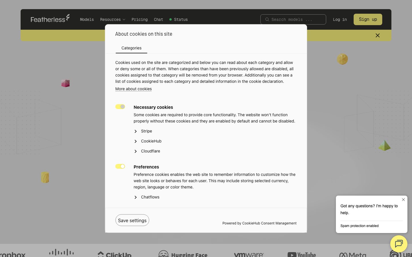
**`modal-card`** — The CookieHub consent modal and chat widget. Background `{colors.white}`, rounded `{rounded.sm}`, ink body text, pill-radius toggle switches in `{colors.accent-yellow}` for the active state.
### Inputs & Forms
**`text-input`** — Standard light-surface input. Background `{colors.white}`, text `{colors.ink}`, type `{typography.body}`, rounded `{rounded.sm}` (8px), 1px `{colors.hairline}` border.
### Tabs / Filters
**`category-tab`** + **`category-tab-active`** — The model-carousel filter row (View all, Creative Writing, Top Small Models, Trending, …). Inactive: transparent background, `{colors.ink-soft}` text. Active: `{colors.white}` background, `{colors.ink}` text, rounded `{rounded.sm}`. Both in `{typography.button}`.
### Badges
**`badge-new`** — Small "NEW" tag on model cards. Background `{colors.accent-green}` (#49d776), text `{colors.ink}`, type `{typography.button}`, rounded `{rounded.sm}`.
### Footer
**`footer`** — Dark charcoal bar (`{colors.ink}`) closing the page. Wordmark at left, horizontal link row (Models, Pricing, Documentation, Blog, Discord, Chat, Status) at right in `{colors.white}` `{typography.button}`, with a copyright line and legal links beneath. Mirrors the top nav's charcoal treatment to bookend the page.
## Do's and Don'ts
### Do
- Reserve `{colors.accent-yellow}` (#fef47a) for primary CTAs only. The yellow is the single action signal in a near-monochrome system.
- Set all type in Barlow at weight 400 and build hierarchy from size + negative letter-spacing.
- Keep display headlines at tight tracking (-2.52px at 84px, -0.96px at 48px). The condensed density is the brand voice.
- Use the 8px radius (`{rounded.sm}`) for nearly every card, input, button, and tab.
- Keep surfaces flat — distinguish cards by tone (`{colors.white}` on `{colors.canvas}`) and hairlines, never by shadow.
- Use the low-poly 3D props as the chief decorative flourish; let the rest of the page stay restrained.
- Bookend the page with the charcoal `{component.top-nav}` and `{component.footer}`.
### Don't
- Don't introduce bold weights — the system is exclusively weight 400. Use size, not boldness, for emphasis.
- Don't put the secondary accents (green, orange, pink, blue) on primary CTAs; they belong on tiny status dots, "NEW" badges, and decorative geometry only.
- Don't add drop shadows. The measured system has none — depth is tonal and flat.
- Don't put white text on the yellow CTA; its text is dark (`{colors.on-primary}` — #222222).
- Don't round cards beyond `{rounded.lg}` (16px) except for pill toggles/badges.
- Don't add hover-state styling beyond the documented default and active states.
## Responsive Behavior
| Name | Width | Key Changes |
|---|---|---|
| Mobile | < 768px | Nav collapses to a compact bar; hero h1 (84px) scales down substantially; model carousel scrolls horizontally; pricing 4-up stacks to 1-up; footer links wrap |
| Tablet | 768–1024px | Horizontal nav tightens; pricing grid drops to 2-up; resource cards 2-up |
| Desktop | 1024–1440px | Full nav with all menu items; pricing 4-up; model carousel with category tab row |
| Wide | > 1440px | Same as desktop with more outer breathing room |
### Touch Targets
- `{component.button-primary}` and `{component.button-secondary}` use `{typography.button}` (16px) with padding to clear comfortable tap sizes.
- `{component.search-input}` and `{component.text-input}` sit at standard field heights.
- Exact measured heights for buttons and inputs were not captured — see Known Gaps.
### Collapsing Strategy
- The model carousel relies on horizontal scroll with arrow controls rather than reflowing into a grid.
- Pricing tiers collapse 4 → 2 → 1; the yellow "Subscribe" CTA stays prominent at every breakpoint.
- The dark nav and footer remain full-width charcoal bars at all sizes.
### Image Behavior
- Low-poly 3D props are positioned decoratively and likely hidden or repositioned at narrow widths.
- Model and resource card cover art retains 8px corners as cards resize.
## Iteration Guide
1. Focus on ONE component at a time and reference its YAML key directly (`{component.pricing-card}`, `{component.model-card}`).
2. Variants of an existing component (`-active`, secondary, etc.) live as separate entries in `components:`.
3. Use `{token.refs}` everywhere — never inline a hex into a component prop.
4. Document default and active/pressed states only — never hover.
5. Hierarchy is size + tracking, not weight. Reach for bigger Barlow before anything else.
6. The yellow accent is scarce and deliberate — keep it on primary actions only.
7. Keep everything flat. If a card needs separation, change its tone or add a hairline, not a shadow.
## Known Gaps
- The measured `button-primary` component reported `radius: 0px` and `padding: 0px`, which conflicts with the clearly-rounded yellow CTAs in the screenshots. This is likely a generic/link-styled `<button>` capture. Button radius is documented as `{rounded.sm}` (8px, derived from the dominant card/input radius + screenshot ground-truth); exact button padding and height were not reliably measured.
- The spacing analysis recorded high-frequency off-grid values at 5px (123×) and 7px (45×) alongside the 4/8/16 grid. These were not promoted to tokens; whether they represent intentional half-steps or measurement noise is unconfirmed.
- The pill radius was measured as a literal 1600px (`{rounded.pill}`) rather than a conventional 9999px — documented as measured; it functions as a full/pill radius.
- No drop shadows were captured (`shadows` is empty). If any subtle elevation exists on hover or in interactive states, it was not measured.
- Color roles for several accents (orange, pink, blue, lime) are inferred from low frequency counts and the decorative 3D geometry; their exact application beyond badges/props is approximate.
- `fonts_licensed` is empty — Barlow is open-source, so no substitution is required, but the precise loaded weights/styles beyond 400 were not captured.
- Form validation, error, and focus states for inputs were not extracted (no sign-up or checkout flow in scope).
- Animation and transition timings (carousel scroll, modal open, chat-widget reveal) are out of scope.
<!-- Documented by duply · real-world design systems as ready-to-use DESIGN.md for AI coding agents · https://duply.ai/featherless/design-md -->
Color Palette
Accent
Neutrals
Typography
display84px · 400 · 0.95
The quick brown fox jumpsheading48px · 400 · 1
The quick brown fox jumpssubhead22px · 400 · 1.3
The quick brown fox jumpsbody22px · 400 · 1.3
The quick brown fox jumpsbutton16px · 400 · 1.5
The quick brown fox jumpsSpacing & Shape
Spacing
| Name | Value | Preview |
|---|---|---|
| xxs | 4px | |
| xs | 8px | |
| sm | 12px | |
| md | 16px | |
| lg | 24px |
Border Radius
| Name | Value | Preview |
|---|---|---|
| sm | 8px | |
| md | 12px | |
| lg | 16px | |
| lg-alt | 17px | |
| pill | 1600px |
More like this


---
version: alpha
name: Featherless-design-analysis
description: "A near-monochrome developer-platform interface built on a warm off-white canvas (#fafafa) with a dark charcoal navigation/footer and a single high-voltage yellow accent (#fef47a) carrying every primary action. The system reads as engineered, minimal modern-SaaS — flat surfaces with no shadows, tight 8px-radius cards, condensed Barlow display headlines set very large with heavy negative tracking, and low-poly faceted 3D objects scattered as decorative artifacts. Brand voltage comes almost entirely from the acid-yellow CTA against charcoal and off-white."

colors:
  ink: "#141413"
  ink-soft: "#333333"
  on-primary: "#222222"
  canvas: "#fafafa"
  white: "#ffffff"
  black: "#000000"
  surface-dark: "#262625"
  surface-darkest: "#111110"
  hairline: "#cccccc"
  hairline-soft: "#dddddd"
  neutral-mid: "#c8c8c8"
  muted: "#999999"
  slate: "#5d6c7b"
  accent-yellow: "#fef47a"
  accent-lime: "#e1e783"
  accent-orange: "#ffc86d"
  accent-green: "#49d776"
  accent-pink: "#f8bdf3"
  accent-blue: "#3898ec"
  accent-blue-strong: "#0082f3"

typography:
  display:
    fontFamily: "Barlow, sans-serif"
    fontSize: 84px
    fontWeight: 400
    lineHeight: 0.95
    letterSpacing: -2.52px
  heading:
    fontFamily: "Barlow, sans-serif"
    fontSize: 48px
    fontWeight: 400
    lineHeight: 1.0
    letterSpacing: -0.96px
  subhead:
    fontFamily: "Barlow, sans-serif"
    fontSize: 22px
    fontWeight: 400
    lineHeight: 1.3
    letterSpacing: 0
  body:
    fontFamily: "Barlow, sans-serif"
    fontSize: 22px
    fontWeight: 400
    lineHeight: 1.3
    letterSpacing: 0
  button:
    fontFamily: "Barlow, sans-serif"
    fontSize: 16px
    fontWeight: 400
    lineHeight: 1.5
    letterSpacing: 0

rounded:
  sm: 8px
  md: 12px
  lg: 16px
  lg-alt: 17px
  pill: 1600px

spacing:
  xxs: 4px
  xs: 8px
  sm: 12px
  md: 16px
  lg: 24px

components:
  top-nav:
    backgroundColor: "{colors.ink}"
    textColor: "{colors.white}"
    typography: "{typography.button}"
  button-primary:
    backgroundColor: "{colors.accent-yellow}"
    textColor: "{colors.on-primary}"
    typography: "{typography.button}"
    rounded: "{rounded.sm}"
  button-secondary:
    backgroundColor: "{colors.canvas}"
    textColor: "{colors.on-primary}"
    typography: "{typography.button}"
    rounded: "{rounded.sm}"
  text-link:
    backgroundColor: transparent
    textColor: "{colors.white}"
    typography: "{typography.button}"
  search-input:
    backgroundColor: "{colors.surface-dark}"
    textColor: "{colors.muted}"
    typography: "{typography.button}"
    rounded: "{rounded.sm}"
  card:
    backgroundColor: "{colors.canvas}"
    textColor: "{colors.ink}"
    typography: "{typography.body}"
    rounded: "{rounded.sm}"
  model-card:
    backgroundColor: "{colors.white}"
    textColor: "{colors.ink}"
    typography: "{typography.subhead}"
    rounded: "{rounded.sm}"
  pricing-card:
    backgroundColor: "{colors.white}"
    textColor: "{colors.ink}"
    typography: "{typography.heading}"
    rounded: "{rounded.sm}"
  category-tab:
    backgroundColor: transparent
    textColor: "{colors.ink-soft}"
    typography: "{typography.button}"
    rounded: "{rounded.sm}"
  category-tab-active:
    backgroundColor: "{colors.white}"
    textColor: "{colors.ink}"
    typography: "{typography.button}"
    rounded: "{rounded.sm}"
  text-input:
    backgroundColor: "{colors.white}"
    textColor: "{colors.ink}"
    typography: "{typography.body}"
    rounded: "{rounded.sm}"
  badge-new:
    backgroundColor: "{colors.accent-green}"
    textColor: "{colors.ink}"
    typography: "{typography.button}"
    rounded: "{rounded.sm}"
  modal-card:
    backgroundColor: "{colors.white}"
    textColor: "{colors.ink}"
    typography: "{typography.body}"
    rounded: "{rounded.sm}"
  footer:
    backgroundColor: "{colors.ink}"
    textColor: "{colors.white}"
    typography: "{typography.button}"
---

## Overview

Featherless is a developer-platform marketing surface built on a warm off-white canvas (`{colors.canvas}` — #fafafa) framed by a dark charcoal navigation bar and footer (`{colors.ink}` — #141413). The system is near-monochrome: ink-on-canvas for almost everything, with a single acid-yellow accent (`{colors.accent-yellow}` — #fef47a) carrying every primary action. It reads as engineered, minimal modern-SaaS — flat surfaces, no shadows (the measured shadow set is empty), tight 8px-radius cards, and confident negative-tracked Barlow headlines set very large.

The type voice is unusual: **Barlow** runs the entire system at weight 400 — no bold. Hierarchy is built from size and negative letter-spacing rather than weight. The hero h1 lands at 84px with -2.52px tracking and a 0.95 line-height, which makes it read as tight and condensed even at normal weight. Body and sub-headings share 22px / 1.3.

Brand voltage comes from two places: the acid-yellow CTA pressed against charcoal and off-white, and **low-poly faceted 3D objects** (a gold sphere, pink cube, lime pyramid, woven cylinder) scattered as decorative artifacts across the hero and lower bands. These geometric props are the personality — the rest of the page is restrained near-monochrome.

**Key Characteristics:**
- Warm off-white canvas (`{colors.canvas}` — #fafafa) with a dark charcoal nav and footer (`{colors.ink}` — #141413). The dark bars bookend the otherwise-light page.
- Single yellow accent (`{colors.accent-yellow}` — #fef47a) on every primary CTA — "Sign up", "Subscribe", "Launch Open Claw", "View the model library". Action color is monochromatic-plus-yellow.
- Barlow at weight 400 throughout — hierarchy from size and negative tracking, never from bold weight.
- Flat depth: the measured shadow set is empty. Cards are distinguished by background tone and 8px radius, not by elevation.
- 8px is the dominant radius (`{rounded.sm}`, measured 179 times) for cards, inputs, buttons, and tabs; pill radius (`{rounded.pill}`) appears on toggles and badges.
- Low-poly 3D geometric props (gold/pink/lime faceted objects) scattered as hero and section decoration — the system's chief flourish.
- A secondary accent set (green, orange, pink, blue) appears only on small status badges, "NEW" tags, and inside the model-card art — never on primary CTAs.

## Colors

### Brand & Accent
- **Accent Yellow** (`{colors.accent-yellow}` — #fef47a): The signature action color. Every primary CTA, the "Sign up" button, "Subscribe" pricing buttons, and the cookie-banner highlight band. This acid yellow is the only saturated color used at scale.
- **Accent Lime** (`{colors.accent-lime}` — #e1e783): A softer yellow-green used on decorative geometry and occasional secondary fills.
- **Accent Green** (`{colors.accent-green}` — #49d776): Status-dot green ("Status" nav item) and small "NEW" badges on model cards.
- **Accent Orange** (`{colors.accent-orange}` — #ffc86d): Faceted 3D props and small chromatic accents.
- **Accent Pink** (`{colors.accent-pink}` — #f8bdf3): Faceted cube prop and minor accents.
- **Accent Blue** (`{colors.accent-blue}` — #3898ec) / **Accent Blue Strong** (`{colors.accent-blue-strong}` — #0082f3): Rare link/icon accents in the model and resource areas.

### Surface
- **Canvas** (`{colors.canvas}` — #fafafa): The default warm off-white page floor and the base card surface.
- **White** (`{colors.white}` — #ffffff): Modal/cookie-banner surface, model cards, and pricing cards that sit slightly brighter than canvas.
- **Ink** (`{colors.ink}` — #141413): The dark charcoal nav bar and footer background.
- **Surface Dark** (`{colors.surface-dark}` — #262625): Search-input field inside the dark nav, and nested dark UI.
- **Surface Darkest** (`{colors.surface-darkest}` — #111110): Deepest charcoal accents within the dark bars.
- **Black** (`{colors.black}` — #000000): Pure-black icon and outline tone where maximum contrast is needed.

### Text
- **Ink** (`{colors.ink}` — #141413): All headlines and primary text on light surfaces.
- **Ink Soft** (`{colors.ink-soft}` — #333333): Secondary text and inactive tab labels.
- **On Primary** (`{colors.on-primary}` — #222222): Text on the yellow CTA buttons — dark, not white.
- **Muted** (`{colors.muted}` — #999999): Placeholder text (search field) and tertiary captions.
- **Slate** (`{colors.slate}` — #5d6c7b): A cool-gray accent for muted metadata.
- **White** (`{colors.white}` — #ffffff): Text on the dark nav and footer.

### Hairline / Neutral
- **Hairline** (`{colors.hairline}` — #cccccc): The 1px border tone on light surfaces — input outlines, card dividers.
- **Hairline Soft** (`{colors.hairline-soft}` — #dddddd): A lighter divider for low-emphasis separation.
- **Neutral Mid** (`{colors.neutral-mid}` — #c8c8c8): Disabled/inactive iconography.

## Typography

### Font Family
The entire system runs **Barlow**, a low-contrast condensed grotesque (Google Fonts, open-source). It is used for display headlines, sub-headings, body copy, and buttons alike. The fallback stack is `Barlow, sans-serif`. There are no licensed/custom faces in the measured set, so no substitution is required — Barlow ships directly.

The defining trait is that **everything is weight 400**. Hierarchy is constructed entirely from size and letter-spacing, never from boldness. Display sizes carry aggressive negative tracking (-2.52px at 84px, -0.96px at 48px) that tightens the condensed letterforms into a dense, engineered headline. Sub-heading and body text drop to `normal` (0) tracking at 22px.

### Hierarchy

| Token | Size | Weight | Line Height | Letter Spacing | Use |
|---|---|---|---|---|---|
| `{typography.display}` | 84px | 400 | 0.95 | -2.52px | Hero h1 ("Test any of 30,000+ models effortlessly.") |
| `{typography.heading}` | 48px | 400 | 1.0 | -0.96px | Section heads, pricing prices ("$10.00") |
| `{typography.subhead}` | 22px | 400 | 1.3 | 0 | h3 card titles, sub-section labels |
| `{typography.body}` | 22px | 400 | 1.3 | 0 | Default running text and descriptions |
| `{typography.button}` | 16px | 400 | 1.5 | 0 | Button labels, nav links, captions |

### Principles
Never reach for bold to create emphasis — the system has no bold weight. Bigger Barlow with tighter tracking is the only emphasis lever. Display headlines must keep their negative letter-spacing; Barlow at 84px without -2.52px tracking reads loose and off-brand. Body and sub-heading share the same 22px / 1.3 metric, so the distinction between them is contextual (role and placement), not typographic.

### Note on Font Substitutes
No licensed faces were detected (`fonts_licensed` is empty). Barlow is freely available via Google Fonts and ships directly. If a closer-metric fallback is needed, **Oswald** (more condensed) or **Saira Condensed** approximate the tracking density, but Barlow's slightly humanist proportions are the intended voice.

## Layout

### Spacing System
- **Base unit:** 4px.
- **Tokens:** `{spacing.xxs}` 4px · `{spacing.xs}` 8px · `{spacing.sm}` 12px · `{spacing.md}` 16px · `{spacing.lg}` 24px.
- **Dominant rhythm:** 8px (`{spacing.xs}`, measured 217×) and 16px (`{spacing.md}`, measured 214×) are the workhorse gaps — most padding and inter-element spacing snaps to these two.
- **Card internal padding:** 16px (`{spacing.md}`) to 24px (`{spacing.lg}`) on cards and pricing tiers.
- Note: the analyzer also recorded off-grid 5px and 7px values at high frequency — see Known Gaps.

### Grid & Container
- **Top nav:** Full-width charcoal bar with the Featherless wordmark at left, horizontal menu (Models, Resources, Pricing, Chat, Status) center-left, search input + "Log in" + yellow "Sign up" cluster at right.
- **Model carousel:** Horizontal scroller of model cards with category tabs above (View all, Creative Writing, Top Language Specific, …).
- **Pricing grid:** 4-up tier cards at desktop (Basic, Premium, Agent Standard, Agent Pro).
- **Resource grid:** 2-up article/news cards near the page foot.
- **Footer:** Charcoal bar with wordmark left, link row right (Models, Pricing, Documentation, Blog, Discord, Chat, Status).

### Whitespace Philosophy
The page uses generous vertical whitespace between bands and keeps cards tight internally (8–16px). The result is an airy, scannable layout where the dark nav/footer and yellow CTAs do the visual anchoring while the off-white body recedes.

## Elevation & Depth

| Level | Treatment | Use |
|---|---|---|
| Flat | No shadow, no border | Body sections, hero, nav, footer |
| Tone-block | `{colors.white}` cards on `{colors.canvas}` | Model cards, pricing cards, modal — distinguished by a brighter surface, not a shadow |
| Hairline | 1px `{colors.hairline}` / `{colors.hairline-soft}` border | Inputs, card dividers |

The measured shadow set is **empty** — Featherless uses no drop shadows anywhere. Depth is communicated entirely by background-tone contrast (white cards sitting fractionally brighter than the off-white canvas) and by 1px hairlines. This is a deliberately flat, modern-SaaS depth model.

### Decorative Depth
The only "depth" on the page is illusory: low-poly faceted 3D objects (gold sphere, pink cube, lime/orange pyramids, woven cylinder) rendered with their own internal shading and scattered across the hero and lower bands. These are decorative art assets, not system surfaces — they carry no shadow tokens.

## Shapes

### Border Radius Scale

| Token | Value | Use |
|---|---|---|
| `{rounded.sm}` | 8px | The dominant radius — cards, inputs, buttons, category tabs, model cards, pricing cards (measured 179×) |
| `{rounded.md}` | 12px | Rare; an occasional larger card corner (measured once) |
| `{rounded.lg}` | 16px | Larger container corners (measured 5×) |
| `{rounded.lg-alt}` | 17px | A near-16px variant captured on a handful of elements |
| `{rounded.pill}` | 1600px | Fully-rounded toggles, status pills, and badges (measured 86×) — effectively a pill/full radius |

### Photography & Geometry
Model and resource cards use 8px corners. The low-poly 3D props are full-bleed transparent PNG/render assets with no clipping radius. Toggle switches (cookie-banner preferences) use the pill radius (`{rounded.pill}`).

## Components

### Top Navigation

**`top-nav`** — A full-width dark charcoal bar (`{colors.ink}` — #141413) pinned to the top of the page. Carries the Featherless wordmark + feather mark at left, a horizontal menu (Models, Resources ▾, Pricing, Chat, Status with a green `{colors.accent-green}` dot) center-left, and a right cluster with the `{component.search-input}`, a "Log in" `{component.text-link}`, and the yellow "Sign up" `{component.button-primary}`. Menu text is `{colors.white}` in `{typography.button}`.

**`search-input`** — Dark search field embedded in the nav. Background `{colors.surface-dark}` (#262625), placeholder text `{colors.muted}` (#999999), rounded `{rounded.sm}` (8px), "Search models …" placeholder with a leading magnifier icon.

### Buttons

**`button-primary`** — The signature CTA. Background `{colors.accent-yellow}` (#fef47a), text `{colors.on-primary}` (#222222 — dark, not white), type `{typography.button}` (Barlow 16px / 400), rounded `{rounded.sm}` (8px, derived — the analyzer captured a generic 0px button radius, but the visible yellow CTAs match the system's measured 8px card/input radius). Used for "Sign up", "Subscribe", "Launch Open Claw", "Get API Key", "View the model library".

**`button-secondary`** — Lower-emphasis action on the light canvas. Background `{colors.canvas}`, text `{colors.on-primary}`, 1px hairline outline, rounded `{rounded.sm}`. Used for "Save settings", "Talk to our team", "See more".

**`text-link`** — Inline plain-text actions ("Log in", "More about cookies"). No background; text `{colors.white}` on dark surfaces, `{colors.ink}` on light.

### Cards & Containers

**`card`** — Base content card. Background `{colors.canvas}` (#fafafa), rounded `{rounded.sm}` (8px), no shadow. The "One API. Every model." feature panel uses this flat tone-on-tone treatment.

**`model-card`** — The model-library cards in the hero carousel. Background `{colors.white}`, rounded `{rounded.sm}`, faceted/geometric cover art with a small category label and a `{component.badge-new}` "NEW" tag. Title in `{typography.subhead}`, metadata (downloads, stars) in `{typography.button}`.

**`pricing-card`** — Tier card in the 4-up pricing grid. Background `{colors.white}`, rounded `{rounded.sm}`. Carries the plan name in `{typography.button}` (uppercased), the price in `{typography.heading}` (e.g. "$10.00") with a "/month" suffix, a yellow `{component.button-primary}` "Subscribe", and a checklist of features in `{typography.button}`.

**`modal-card`** — The CookieHub consent modal and chat widget. Background `{colors.white}`, rounded `{rounded.sm}`, ink body text, pill-radius toggle switches in `{colors.accent-yellow}` for the active state.

### Inputs & Forms

**`text-input`** — Standard light-surface input. Background `{colors.white}`, text `{colors.ink}`, type `{typography.body}`, rounded `{rounded.sm}` (8px), 1px `{colors.hairline}` border.

### Tabs / Filters

**`category-tab`** + **`category-tab-active`** — The model-carousel filter row (View all, Creative Writing, Top Small Models, Trending, …). Inactive: transparent background, `{colors.ink-soft}` text. Active: `{colors.white}` background, `{colors.ink}` text, rounded `{rounded.sm}`. Both in `{typography.button}`.

### Badges

**`badge-new`** — Small "NEW" tag on model cards. Background `{colors.accent-green}` (#49d776), text `{colors.ink}`, type `{typography.button}`, rounded `{rounded.sm}`.

### Footer

**`footer`** — Dark charcoal bar (`{colors.ink}`) closing the page. Wordmark at left, horizontal link row (Models, Pricing, Documentation, Blog, Discord, Chat, Status) at right in `{colors.white}` `{typography.button}`, with a copyright line and legal links beneath. Mirrors the top nav's charcoal treatment to bookend the page.

## Do's and Don'ts

### Do
- Reserve `{colors.accent-yellow}` (#fef47a) for primary CTAs only. The yellow is the single action signal in a near-monochrome system.
- Set all type in Barlow at weight 400 and build hierarchy from size + negative letter-spacing.
- Keep display headlines at tight tracking (-2.52px at 84px, -0.96px at 48px). The condensed density is the brand voice.
- Use the 8px radius (`{rounded.sm}`) for nearly every card, input, button, and tab.
- Keep surfaces flat — distinguish cards by tone (`{colors.white}` on `{colors.canvas}`) and hairlines, never by shadow.
- Use the low-poly 3D props as the chief decorative flourish; let the rest of the page stay restrained.
- Bookend the page with the charcoal `{component.top-nav}` and `{component.footer}`.

### Don't
- Don't introduce bold weights — the system is exclusively weight 400. Use size, not boldness, for emphasis.
- Don't put the secondary accents (green, orange, pink, blue) on primary CTAs; they belong on tiny status dots, "NEW" badges, and decorative geometry only.
- Don't add drop shadows. The measured system has none — depth is tonal and flat.
- Don't put white text on the yellow CTA; its text is dark (`{colors.on-primary}` — #222222).
- Don't round cards beyond `{rounded.lg}` (16px) except for pill toggles/badges.
- Don't add hover-state styling beyond the documented default and active states.

## Responsive Behavior

| Name | Width | Key Changes |
|---|---|---|
| Mobile | < 768px | Nav collapses to a compact bar; hero h1 (84px) scales down substantially; model carousel scrolls horizontally; pricing 4-up stacks to 1-up; footer links wrap |
| Tablet | 768–1024px | Horizontal nav tightens; pricing grid drops to 2-up; resource cards 2-up |
| Desktop | 1024–1440px | Full nav with all menu items; pricing 4-up; model carousel with category tab row |
| Wide | > 1440px | Same as desktop with more outer breathing room |

### Touch Targets
- `{component.button-primary}` and `{component.button-secondary}` use `{typography.button}` (16px) with padding to clear comfortable tap sizes.
- `{component.search-input}` and `{component.text-input}` sit at standard field heights.
- Exact measured heights for buttons and inputs were not captured — see Known Gaps.

### Collapsing Strategy
- The model carousel relies on horizontal scroll with arrow controls rather than reflowing into a grid.
- Pricing tiers collapse 4 → 2 → 1; the yellow "Subscribe" CTA stays prominent at every breakpoint.
- The dark nav and footer remain full-width charcoal bars at all sizes.

### Image Behavior
- Low-poly 3D props are positioned decoratively and likely hidden or repositioned at narrow widths.
- Model and resource card cover art retains 8px corners as cards resize.

## Iteration Guide

1. Focus on ONE component at a time and reference its YAML key directly (`{component.pricing-card}`, `{component.model-card}`).
2. Variants of an existing component (`-active`, secondary, etc.) live as separate entries in `components:`.
3. Use `{token.refs}` everywhere — never inline a hex into a component prop.
4. Document default and active/pressed states only — never hover.
5. Hierarchy is size + tracking, not weight. Reach for bigger Barlow before anything else.
6. The yellow accent is scarce and deliberate — keep it on primary actions only.
7. Keep everything flat. If a card needs separation, change its tone or add a hairline, not a shadow.

## Known Gaps

- The measured `button-primary` component reported `radius: 0px` and `padding: 0px`, which conflicts with the clearly-rounded yellow CTAs in the screenshots. This is likely a generic/link-styled `<button>` capture. Button radius is documented as `{rounded.sm}` (8px, derived from the dominant card/input radius + screenshot ground-truth); exact button padding and height were not reliably measured.
- The spacing analysis recorded high-frequency off-grid values at 5px (123×) and 7px (45×) alongside the 4/8/16 grid. These were not promoted to tokens; whether they represent intentional half-steps or measurement noise is unconfirmed.
- The pill radius was measured as a literal 1600px (`{rounded.pill}`) rather than a conventional 9999px — documented as measured; it functions as a full/pill radius.
- No drop shadows were captured (`shadows` is empty). If any subtle elevation exists on hover or in interactive states, it was not measured.
- Color roles for several accents (orange, pink, blue, lime) are inferred from low frequency counts and the decorative 3D geometry; their exact application beyond badges/props is approximate.
- `fonts_licensed` is empty — Barlow is open-source, so no substitution is required, but the precise loaded weights/styles beyond 400 were not captured.
- Form validation, error, and focus states for inputs were not extracted (no sign-up or checkout flow in scope).
- Animation and transition timings (carousel scroll, modal open, chat-widget reveal) are out of scope.

<!-- Documented by duply · real-world design systems as ready-to-use DESIGN.md for AI coding agents · https://duply.ai/featherless/design-md -->