Lightdash
A developer-first, open-source BI marketing surface built on a pure white canvas with near-black ink and a single electric-violet brand accent (#625df5) that appears mostly as decorative pixel-mosaic artwork. The system reads as precise, technical, and confident — oversized Britti Sans display headlines with very tight leading, pill-shaped buttons, soft multi-layer drop-shadowed product mockup cards, and integration logos in their native brand colors. Voltage comes from the giant condensed headlines and real product UI (dashboards, SQL/CLI panels) shown directly inside cards rather than from heavy color use.
---
version: alpha
name: Lightdash-design-analysis
description: A developer-first, open-source BI marketing surface built on a pure white canvas with near-black ink and a single electric-violet brand accent (#625df5) that appears mostly as decorative pixel-mosaic artwork. The system reads as precise, technical, and confident — oversized Britti Sans display headlines with very tight leading, pill-shaped buttons, soft multi-layer drop-shadowed product mockup cards, and integration logos in their native brand colors. Voltage comes from the giant condensed headlines and real product UI (dashboards, SQL/CLI panels) shown directly inside cards rather than from heavy color use.
colors:
ink: "#000000"
ink-strong: "#222326"
on-primary: "#272835"
body: "#36394a"
muted: "#666d80"
muted-soft: "#818898"
hairline: "#a4abb8"
canvas: "#ffffff"
surface-soft: "#eceff3"
surface-violet: "#e4e6f3"
brand: "#625df5"
link: "#0000ee"
on-dark: "#ffffff"
success: "#2eb67d"
success-soft: "#79c28f"
warning: "#ecb22e"
info: "#36c5f0"
error: "#e01e5a"
logo-google-red: "#ea4335"
logo-google-blue: "#4285f4"
logo-red-deep: "#c5221f"
typography:
display-xl:
fontFamily: "Britti Sans, Inter, sans-serif"
fontSize: 76px
fontWeight: 600
lineHeight: 0.9
letterSpacing: normal
display-lg:
fontFamily: "Britti Sans, Inter, sans-serif"
fontSize: 57px
fontWeight: 600
lineHeight: 0.95
letterSpacing: -1.44px
heading:
fontFamily: "Britti Sans, Inter, sans-serif"
fontSize: 32px
fontWeight: 400
lineHeight: 1.25
letterSpacing: -0.32px
body:
fontFamily: "Britti Sans, Inter, sans-serif"
fontSize: 16px
fontWeight: 400
lineHeight: 2.0
letterSpacing: 0.16px
rounded:
xs: 2px
sm: 6px
md: 8px
lg: 12px
xl: 16px
xxl: 26px
huge: 80px
pill: 999px
spacing:
xxs: 4px
xs: 8px
sm: 10px
md: 12px
lg: 16px
xl: 20px
xxl: 24px
xxxl: 28px
components:
announcement-bar:
backgroundColor: "{colors.ink-strong}"
textColor: "{colors.on-dark}"
typography: "{typography.body}"
padding: 16px
top-nav:
backgroundColor: "{colors.canvas}"
textColor: "{colors.ink}"
typography: "{typography.body}"
padding: 20px 24px
button-primary:
backgroundColor: "{colors.canvas}"
textColor: "{colors.on-primary}"
typography: "{typography.body}"
rounded: "{rounded.pill}"
padding: 6px 14px
button-cta-dark:
backgroundColor: "{colors.on-primary}"
textColor: "{colors.on-dark}"
typography: "{typography.body}"
rounded: "{rounded.md}"
padding: 6px 14px
button-secondary:
backgroundColor: "{colors.canvas}"
textColor: "{colors.on-primary}"
typography: "{typography.body}"
rounded: "{rounded.md}"
padding: 6px 14px
toggle-pill-group:
backgroundColor: "{colors.surface-soft}"
textColor: "{colors.muted}"
typography: "{typography.body}"
rounded: "{rounded.pill}"
padding: 6px
toggle-pill-active:
backgroundColor: "{colors.canvas}"
textColor: "{colors.on-primary}"
typography: "{typography.body}"
rounded: "{rounded.pill}"
padding: 6px 14px
dashboard-mockup-card:
backgroundColor: "{colors.canvas}"
textColor: "{colors.ink}"
rounded: "{rounded.lg}"
padding: 24px
feature-card:
backgroundColor: "{colors.canvas}"
textColor: "{colors.ink}"
typography: "{typography.heading}"
rounded: "{rounded.lg}"
padding: 20px
testimonial-card:
backgroundColor: "{colors.canvas}"
textColor: "{colors.body}"
typography: "{typography.body}"
rounded: "{rounded.lg}"
padding: 24px
avatar-circle:
backgroundColor: "{colors.surface-soft}"
textColor: "{colors.ink}"
rounded: "{rounded.pill}"
size: 48px
input:
backgroundColor: "{colors.body}"
textColor: "{colors.on-dark}"
typography: "{typography.body}"
rounded: "{rounded.xs}"
padding: 10px 12px
integration-logo:
backgroundColor: transparent
textColor: "{colors.ink}"
typography: "{typography.body}"
footer:
backgroundColor: "{colors.canvas}"
textColor: "{colors.muted}"
typography: "{typography.body}"
padding: 24px
---
## Overview
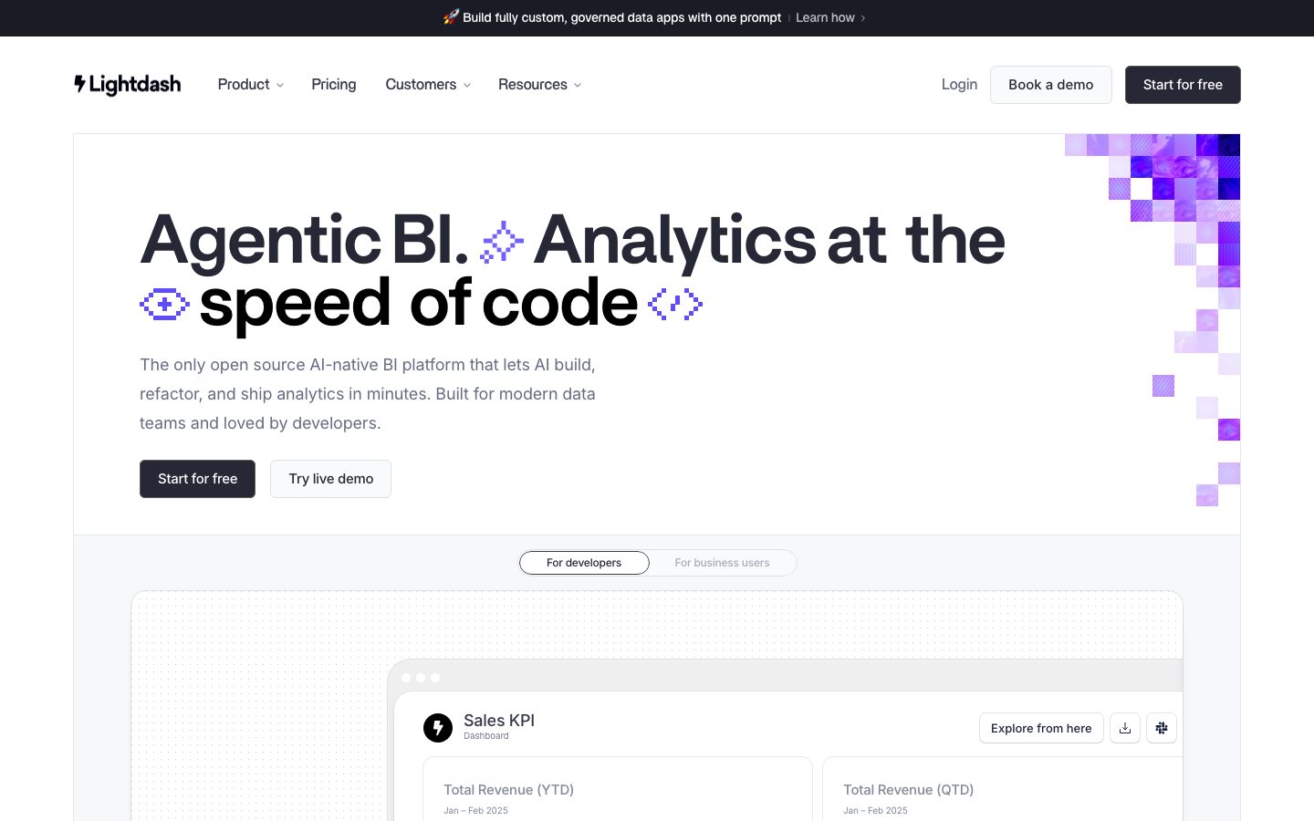
Lightdash's marketing surface is a developer-first, open-source BI interface built on a pure white canvas (`{colors.canvas}` — #ffffff) with near-black ink (`{colors.ink}` — #000000) and a single electric-violet brand accent (`{colors.brand}` — #625df5). The page reads as precise and technical — confident oversized headlines, generous line-height in body copy, and product UI shown directly (dashboards, SQL/CLI panels, KPI cards) rather than decorative illustration.
The headline voice is **Britti Sans** at semibold (600) — display headlines run very large (h2 measured at 76px) with extremely tight leading (line-height 0.9–0.95) and negative tracking. This compressed, oversized treatment is the system's primary source of brand voltage. Note: the captured face is **Britti Sans Trial**, a trial-licensed font; a production substitute is documented in the Typography section.
Color is restrained. The violet brand accent appears mostly as a decorative pixel-mosaic motif in the hero corner and section margins — it is almost never used as a button fill. The rest of the palette is a near-monochrome ramp of grays (`{colors.ink-strong}`, `{colors.body}`, `{colors.muted}`, `{colors.muted-soft}`, `{colors.hairline}`) on white. Integration and customer-logo sections carry brand colors of third-party services (Slack greens/yellows/cyans, Google red/blue) — these are logo marks, not Lightdash's own palette.
Buttons split into two shapes: a white **pill** button (`{component.button-primary}` — measured radius 999px) and a dark near-navy CTA (`{component.button-cta-dark}` — "Start for free"). Product mockup cards sit on white with soft, multi-layer drop shadows and a 1px ring, giving a floating, screenshot-in-context feeling.
**Key Characteristics:**
- Pure white canvas with near-black ink; a single violet accent (`{colors.brand}` — #625df5) used decoratively as pixel-mosaic artwork rather than as button fill.
- Oversized Britti Sans display headlines (up to 76px) with very tight leading (0.9–0.95) and negative tracking — the dominant brand signal.
- Pill-shaped buttons (`{rounded.pill}` — 999px) for the nav/utility CTAs and a dark rounded CTA for the primary "Start for free" action.
- Product UI fragments (dashboards, KPI cards, SQL/CLI terminal panels) shown directly inside soft-shadowed cards.
- Soft, layered drop shadows plus a 1px hairline ring on mockup cards for a floating effect.
- Generous body line-height (2.0) for relaxed, readable running text.
- Hierarchical radius: `{rounded.sm}`/`{rounded.md}` for small chips, `{rounded.lg}` (12px) for content cards, `{rounded.pill}` for pill buttons/toggles.
## Colors
### Brand & Accent
- **Brand** (`{colors.brand}` — #625df5): The electric-violet accent. Appears predominantly as the decorative pixel-mosaic motif in the hero corner and section edges, and on small accent moments. It is a near-monochrome brand — the violet is used sparingly and almost never as a primary button fill.
- **Link** (`{colors.link}` — #0000ee): Default browser-blue anchor color measured on raw links; used for inline text links.
### Surface
- **Canvas** (`{colors.canvas}` — #ffffff): The default page floor and most card backgrounds.
- **Surface Soft** (`{colors.surface-soft}` — #eceff3): Light gray fill for toggle-pill-group backgrounds, soft panels, and section dividers.
- **Surface Violet** (`{colors.surface-violet}` — #e4e6f3): A faint violet-tinted gray used in light decorative panels near the mosaic artwork.
### Text
- **Ink** (`{colors.ink}` — #000000): Headlines and primary text.
- **Ink Strong** (`{colors.ink-strong}` — #222326): The dark announcement bar background and deep UI elements.
- **On Primary** (`{colors.on-primary}` — #272835): Button label text on the white pill button, and the dark fill of the primary CTA.
- **Body** (`{colors.body}` — #36394a): Default running-text color (also the measured input background).
- **Muted** (`{colors.muted}` — #666d80): Secondary text — sub-headings, footer copy, inactive toggle labels.
- **Muted Soft** (`{colors.muted-soft}` — #818898): Tertiary text — captions and fine print.
- **Hairline** (`{colors.hairline}` — #a4abb8): Low-contrast borders and divider tones.
- **On Dark** (`{colors.on-dark}` — #ffffff): Text on the dark announcement bar and the dark CTA.
### Semantic
- **Success** (`{colors.success}` — #2eb67d): Positive states and metric deltas (e.g., "+7% increase").
- **Success Soft** (`{colors.success-soft}` — #79c28f): Lighter success tint.
- **Warning** (`{colors.warning}` — #ecb22e): Warning accents.
- **Info** (`{colors.info}` — #36c5f0): Informational accents.
- **Error** (`{colors.error}` — #e01e5a): Error/destructive accents.
### Third-Party Logo Marks
- `{colors.logo-google-red}` (#ea4335), `{colors.logo-google-blue}` (#4285f4), and `{colors.logo-red-deep}` (#c5221f) were measured in customer/integration logo rows. The semantic green/yellow/cyan/pink set above (#2eb67d / #ecb22e / #36c5f0 / #e01e5a) also corresponds to Slack-brand logo colors in those rows. These are external brand marks, not Lightdash's own palette — do not reuse them as UI accents.
## Typography
### Font Family
The system runs **Britti Sans** across all roles — display headlines in **Britti Sans Trial Semibold** (weight 600) and supporting text in **Britti Sans Medium** (rendered at weight 400). There is no secondary type family; weight, size, and tracking carry the entire hierarchy. The fallback stack walks `Inter, sans-serif`.
The captured face is the **Trial** cut of Britti Sans, which is licensed for evaluation only and must not ship in production.
### Hierarchy
| Token | Size | Weight | Line Height | Letter Spacing | Use |
|---|---|---|---|---|---|
| `{typography.display-xl}` | 76px | 600 | 0.9 | normal | Largest section headlines ("Agentic BI. Analytics at the speed of code") — Britti Sans Semibold |
| `{typography.display-lg}` | 57px | 600 | 0.95 | -1.44px | Hero / section h1 — Britti Sans Semibold, tight leading |
| `{typography.heading}` | 32px | 400 | 1.25 | -0.32px | Sub-section heads, card titles — Britti Sans Medium |
| `{typography.body}` | 16px | 400 | 2.0 | 0.16px | Default running text, nav, button labels, captions — Britti Sans Medium |
### Principles
The display sizes lean on extremely tight leading (0.9–0.95) and oversized scale — headlines feel architectural and compressed. Body copy contrasts this with a very loose 2.0 line-height for relaxed readability. Only four type roles were measured; nav, button, and caption text all share the single `{typography.body}` role at 16px in the measured data.
### Note on Font Substitutes
**Britti Sans Trial** is an evaluation-only license and cannot ship in production. The closest open-source substitutes are **Inter** at weight 600 (for display) and weight 500 (for body) with negative tracking applied to large headlines, or **Hanken Grotesk** as a warmer geometric alternative. Apply roughly -1.4px tracking on the largest display sizes to preserve the compressed headline signature.
## Layout
### Spacing System
- **Base unit:** 4px (the most frequent small increment; 8px and 16px dominate the measured distribution).
- **Tokens:** `{spacing.xxs}` 4px · `{spacing.xs}` 8px · `{spacing.sm}` 10px · `{spacing.md}` 12px · `{spacing.lg}` 16px · `{spacing.xl}` 20px · `{spacing.xxl}` 24px · `{spacing.xxxl}` 28px.
- **Most common gaps:** 16px (`{spacing.lg}`) and 8px (`{spacing.xs}`) are the highest-frequency spacing values — they drive inter-element rhythm.
- **Card internal padding:** ~24px (`{spacing.xxl}`) for content/mockup cards; ~20px (`{spacing.xl}`) for feature cards.
- **Button padding:** 6px vertical × 14px horizontal on pill buttons (measured).
Larger section-level vertical rhythm was not captured in the measured spacing distribution (which tops out at 28px); see Known Gaps.
### Grid & Container
- **Editorial body:** Centered single-column hero with a left-aligned headline block and decorative mosaic occupying the right margin.
- **Feature bands:** Two-column split — a sticky text/accordion column on the left, a product mockup on the right.
- **Logo rows:** Multi-column customer/integration logo grids.
- **Footer / feature grids:** 3-up at desktop.
### Whitespace Philosophy
The page uses generous whitespace around oversized headlines, letting the compressed display type dominate. Body copy is set loose (2.0 line-height) for an unhurried, technical-reading feel. Product mockups float in open space with soft shadows rather than being boxed in heavy containers.
## Elevation & Depth
| Level | Treatment | Use |
|---|---|---|
| Flat | No shadow, no border | Body sections, top nav, hero text |
| Hairline ring | `rgba(39,40,53,0.1) 0px 0px 0px 1px` | Card outlines, subtle chips |
| Ring + soft shadow | `rgba(18,18,18,0.1) 0px 1px 1px, 0px 0px 0px 1px` | Buttons, small interactive elements |
| Floating card | Multi-stop layered shadow (`0px 2px 5px` → `0px 54px 15px` at decreasing alpha) | Dashboard/product mockup cards |
| Deep float | `rgba(39,40,53,0.08)` stacked at 24/12/6/2px offsets with a 1px ring | The largest hero product mockups |
The elevation philosophy is **soft and layered** — Lightdash stacks many low-alpha shadow layers to create a smooth, diffuse float rather than a single hard drop shadow. A 1px ring (`rgba(39,40,53,0.1)`) frequently accompanies the shadow to crisp the card edge against white.
### Decorative Depth
- The violet pixel-mosaic motif (`{colors.brand}`) in the hero corner and section margins adds chromatic depth without using shadow.
- Product UI fragments inside cards carry their own native chrome (KPI panels, terminal windows with macOS traffic-light dots), shown as content.
## Shapes
### Border Radius Scale
| Token | Value | Use |
|---|---|---|
| `{rounded.xs}` | 2px | Smallest UI elements; measured input radius approaches square |
| `{rounded.sm}` | 6px | Small chips, inline controls |
| `{rounded.md}` | 8px | Buttons, small cards, dark CTA |
| `{rounded.lg}` | 12px | Content cards, mockup cards (most frequent card radius) |
| `{rounded.xl}` | 16px | Larger panels |
| `{rounded.xxl}` | 26px | Occasional large rounded container |
| `{rounded.huge}` | 80px | Very large rounded decorative shapes |
| `{rounded.pill}` | 999px | Pill buttons, toggle-pill-group, avatars |
### Photography / Mockup Geometry
Avatars in testimonial rows are circular (`{rounded.pill}`). Product mockup cards use `{rounded.lg}` (12px) corners. The decorative motif uses small hard-edged squares (the pixel mosaic) — a deliberate contrast to the rounded UI.
## Components
### Top Bar & Navigation
**`announcement-bar`** — A full-width dark bar pinned above the nav. Background `{colors.ink-strong}` (#222326), text `{colors.on-dark}`, carrying a single promotional line ("🚀 Build fully custom, governed data apps with one prompt — Learn how"). Padding ~16px.
**`top-nav`** — White nav bar below the announcement bar. Background `{colors.canvas}`, text `{colors.ink}`. Carries the Lightdash wordmark + lightning logo at left, primary menu (Product, Pricing, Customers, Resources) center, and a right cluster of "Login" text link, "Book a demo" (`{component.button-secondary}`), and "Start for free" (`{component.button-cta-dark}`). Type in `{typography.body}`.
### Buttons
**`button-primary`** — The measured pill button: background `{colors.canvas}`, text `{colors.on-primary}` (#272835), rounded `{rounded.pill}` (999px), padding 6px × 14px, type `{typography.body}`. Used for white utility actions ("Book a demo" sits in this white-pill family).
**`button-cta-dark`** — The primary dark CTA ("Start for free"). Background `{colors.on-primary}` (#272835), text `{colors.on-dark}`, rounded `{rounded.md}`, padding 6px × 14px. (Background and rounding derived from screenshot ground-truth; the measured button component captured the white-pill variant.)
**`button-secondary`** — White outlined button ("Try live demo"). Background `{colors.canvas}`, text `{colors.on-primary}`, hairline border, rounded `{rounded.md}`, same padding as the primary. (derived from screenshot)
### Toggles
**`toggle-pill-group`** — A pill-radius wrapper around segmented options ("For developers" / "For business users"). Background `{colors.surface-soft}` (#eceff3), inactive label `{colors.muted}`, internal padding ~6px, rounded `{rounded.pill}`.
**`toggle-pill-active`** — Active segment renders as a white pill: background `{colors.canvas}`, text `{colors.on-primary}`, rounded `{rounded.pill}`, with a subtle shadow inside the group.
### Cards & Containers
**`dashboard-mockup-card`** — The hero's floating product card showing the real Lightdash dashboard UI (Sales KPI, Total Revenue cards, an embedded SQL/CLI terminal panel). Background `{colors.canvas}`, rounded `{rounded.lg}` (12px), padding ~24px, with the deep multi-layer float shadow + 1px ring. Shows the actual product, not an illustration.
**`feature-card`** — Used in the two-column feature bands ("AI that operates your analytics layer", "Ship BI like you ship code"). Title in `{typography.heading}` (32px), body in `{typography.body}`, accordion-style sub-items below, paired with a "Learn about…" / "Read our docs" action. Background `{colors.canvas}`, rounded `{rounded.lg}`, padding ~20px.
**`testimonial-card`** — Customer-quote blocks. Background `{colors.canvas}`, body text `{colors.body}` in `{typography.body}`, rounded `{rounded.lg}`, padding ~24px. Includes an `{component.avatar-circle}` + name + role row.
**`avatar-circle`** — Circular avatar (`{rounded.pill}`), ~48px, holding a customer headshot in testimonial rows. Background `{colors.surface-soft}` when no photo.
### Inputs
**`input`** — The measured form input. Background `{colors.body}` (#36394a — a dark fill), text `{colors.on-dark}`, rounded `{rounded.xs}` (~2px, near-square), padding ~10px × 12px. Lightdash's measured input is a dark, sharp-cornered field — distinct from the rounded light UI elsewhere.
### Logos
**`integration-logo`** — Customer and integration logo marks (Kraken, Octopus Energy, Adobe, HYPEBEAST, Slack, Google, etc.) shown in monochrome rows or in their native brand colors. Brand-mark colors (`{colors.logo-google-red}`, `{colors.logo-google-blue}`, semantic Slack tones) belong to these marks, not the Lightdash UI.
### Footer
**`footer`** — White footer closing the page. Background `{colors.canvas}`, text `{colors.muted}` in `{typography.body}`, with link columns and the wordmark. Padding ~24px. (Lightdash keeps the footer light rather than inverting to a dark surface.)
## Do's and Don'ts
### Do
- Let oversized Britti Sans headlines (up to 76px, line-height 0.9–0.95) carry the brand. The compressed display type is the primary voltage.
- Keep the violet brand accent (`{colors.brand}`) decorative — pixel mosaics and small accents, not button fills.
- Use the dark `{component.button-cta-dark}` for the single primary action and the white `{component.button-primary}` pill for utility/secondary actions.
- Show real product UI (dashboards, KPI cards, SQL/CLI terminals) inside `{component.dashboard-mockup-card}` rather than illustrating it.
- Float mockup cards with stacked low-alpha shadows + a 1px ring for a smooth, diffuse elevation.
- Set body copy loose (line-height 2.0) for relaxed technical reading.
- Keep customer/integration logos in their own brand colors; don't recolor them with the system palette.
### Don't
- Don't ship the **Britti Sans Trial** font — substitute Inter/Hanken Grotesk in production.
- Don't fill primary CTAs with the violet brand accent; the action layer is near-monochrome.
- Don't reuse the third-party logo colors (Slack greens, Google red/blue) as UI accent colors.
- Don't use hard single-drop shadows on cards; the system stacks soft layers.
- Don't tighten body line-height to display levels — the loose 2.0 leading is intentional contrast.
- Don't add hover-state styling beyond default and pressed.
## Responsive Behavior
| Name | Width | Key Changes |
|---|---|---|
| Mobile | < 768px | Hamburger nav; hero headline scales down dramatically from 76/57px; two-column feature bands stack; logo rows wrap; mockup cards scale proportionally |
| Tablet | 768–1024px | Nav tightens; feature bands may stay two-column or stack; toggle-pill-group stays inline |
| Desktop | 1024–1440px | Full nav, two-column feature bands, 3-up logo/feature grids, hero mosaic in right margin |
| Wide | > 1440px | Same as desktop with more outer breathing room |
(Exact breakpoint values were not measured — these are conventional ranges; see Known Gaps.)
### Touch Targets
- `{component.button-primary}` / `{component.button-cta-dark}` use 6px × 14px padding on `{typography.body}` (16px) text — effective height meets comfortable tap minimums.
- `{component.toggle-pill-active}` tap area is enlarged by the surrounding `{component.toggle-pill-group}` padding.
### Collapsing Strategy
- Top nav collapses to a hamburger menu at mobile widths.
- Two-column feature bands (text + mockup) stack to single-column, text first.
- Logo grids reduce columns and wrap.
- Product mockup cards scale proportionally while keeping internal chrome legible.
### Image Behavior
- Product UI fragments retain native aspect ratios; cards resize around them.
- Avatar photos crop to circles at every breakpoint.
- The decorative pixel-mosaic motif is reduced or clipped on narrow viewports.
## Iteration Guide
1. Focus on ONE component at a time. Reference its YAML key directly (`{component.dashboard-mockup-card}`, `{component.toggle-pill-active}`).
2. Variants of an existing component (`-active`, `-dark`, `-secondary`) live as separate entries in `components:`.
3. Use `{token.refs}` everywhere — never inline hex in a component.
4. Never document hover. Default and Active/Pressed states only.
5. Display headlines stay Britti Sans (substitute Inter 600) with tight leading and negative tracking; body stays 16px with loose 2.0 leading. Don't blur the two.
6. Keep the violet accent decorative; the action layer is monochrome (dark CTA + white pill).
7. When in doubt about emphasis: bigger headline before more color.
## Known Gaps
- The measured `button-primary` captured the white-pill variant (background #ffffff, text #272835, radius 999px). The visually dominant dark "Start for free" CTA is documented as `button-cta-dark` with background and radius **derived** from screenshot ground-truth — its exact measured radius and fill were not in the component capture.
- `button-secondary` ("Try live demo") padding/border are derived from screenshots, not measured.
- **Britti Sans Trial** is an evaluation-only license; substitutes (Inter, Hanken Grotesk) are documented in Typography. The production family name is unknown.
- Only four typography roles were measured; nav, button, and caption text are mapped to the single measured `{typography.body}` role — distinct nav/button/caption sizes were not captured.
- Section-level vertical spacing was not captured (the measured spacing distribution tops out at 28px); large band rhythm is inferred from screenshots.
- The measured `input` (dark #36394a background, ~2px radius) appears to be a single field; full form/validation states (focus, error, success) were not extracted.
- Breakpoint widths are conventional assumptions, not measured.
- Several measured "accent" colors (#2eb67d, #ecb22e, #36c5f0, #e01e5a, #ea4335, #4285f4, #c5221f) correspond to third-party logo marks (Slack, Google) in customer/integration rows; their exact roles in Lightdash's own UI vs. external logos are partially inferred.
- The decorative pixel-mosaic motif uses the violet brand color but its exact tile sizes/opacities were not measured.
- Animation and transition timings are out of scope.
<!-- Documented by duply · real-world design systems as ready-to-use DESIGN.md for AI coding agents · https://duply.ai/lightdash/design-md -->
Color Palette
Accent
Neutrals
Typography
display-xl76px · 600 · 0.9
The quick brown fox jumpsdisplay-lg57px · 600 · 0.95
The quick brown fox jumpsheading32px · 400 · 1.25
The quick brown fox jumpsbody16px · 400 · 2
The quick brown fox jumpsSpacing & Shape
Spacing
| Name | Value | Preview |
|---|---|---|
| xxs | 4px | |
| xs | 8px | |
| sm | 10px | |
| md | 12px | |
| lg | 16px | |
| xl | 20px | |
| xxl | 24px | |
| xxxl | 28px |
Border Radius
| Name | Value | Preview |
|---|---|---|
| xs | 2px | |
| sm | 6px | |
| md | 8px | |
| lg | 12px | |
| xl | 16px | |
| xxl | 26px | |
| huge | 80px | |
| pill | 999px |
More like this


---
version: alpha
name: Lightdash-design-analysis
description: A developer-first, open-source BI marketing surface built on a pure white canvas with near-black ink and a single electric-violet brand accent (#625df5) that appears mostly as decorative pixel-mosaic artwork. The system reads as precise, technical, and confident — oversized Britti Sans display headlines with very tight leading, pill-shaped buttons, soft multi-layer drop-shadowed product mockup cards, and integration logos in their native brand colors. Voltage comes from the giant condensed headlines and real product UI (dashboards, SQL/CLI panels) shown directly inside cards rather than from heavy color use.

colors:
  ink: "#000000"
  ink-strong: "#222326"
  on-primary: "#272835"
  body: "#36394a"
  muted: "#666d80"
  muted-soft: "#818898"
  hairline: "#a4abb8"
  canvas: "#ffffff"
  surface-soft: "#eceff3"
  surface-violet: "#e4e6f3"
  brand: "#625df5"
  link: "#0000ee"
  on-dark: "#ffffff"
  success: "#2eb67d"
  success-soft: "#79c28f"
  warning: "#ecb22e"
  info: "#36c5f0"
  error: "#e01e5a"
  logo-google-red: "#ea4335"
  logo-google-blue: "#4285f4"
  logo-red-deep: "#c5221f"

typography:
  display-xl:
    fontFamily: "Britti Sans, Inter, sans-serif"
    fontSize: 76px
    fontWeight: 600
    lineHeight: 0.9
    letterSpacing: normal
  display-lg:
    fontFamily: "Britti Sans, Inter, sans-serif"
    fontSize: 57px
    fontWeight: 600
    lineHeight: 0.95
    letterSpacing: -1.44px
  heading:
    fontFamily: "Britti Sans, Inter, sans-serif"
    fontSize: 32px
    fontWeight: 400
    lineHeight: 1.25
    letterSpacing: -0.32px
  body:
    fontFamily: "Britti Sans, Inter, sans-serif"
    fontSize: 16px
    fontWeight: 400
    lineHeight: 2.0
    letterSpacing: 0.16px

rounded:
  xs: 2px
  sm: 6px
  md: 8px
  lg: 12px
  xl: 16px
  xxl: 26px
  huge: 80px
  pill: 999px

spacing:
  xxs: 4px
  xs: 8px
  sm: 10px
  md: 12px
  lg: 16px
  xl: 20px
  xxl: 24px
  xxxl: 28px

components:
  announcement-bar:
    backgroundColor: "{colors.ink-strong}"
    textColor: "{colors.on-dark}"
    typography: "{typography.body}"
    padding: 16px
  top-nav:
    backgroundColor: "{colors.canvas}"
    textColor: "{colors.ink}"
    typography: "{typography.body}"
    padding: 20px 24px
  button-primary:
    backgroundColor: "{colors.canvas}"
    textColor: "{colors.on-primary}"
    typography: "{typography.body}"
    rounded: "{rounded.pill}"
    padding: 6px 14px
  button-cta-dark:
    backgroundColor: "{colors.on-primary}"
    textColor: "{colors.on-dark}"
    typography: "{typography.body}"
    rounded: "{rounded.md}"
    padding: 6px 14px
  button-secondary:
    backgroundColor: "{colors.canvas}"
    textColor: "{colors.on-primary}"
    typography: "{typography.body}"
    rounded: "{rounded.md}"
    padding: 6px 14px
  toggle-pill-group:
    backgroundColor: "{colors.surface-soft}"
    textColor: "{colors.muted}"
    typography: "{typography.body}"
    rounded: "{rounded.pill}"
    padding: 6px
  toggle-pill-active:
    backgroundColor: "{colors.canvas}"
    textColor: "{colors.on-primary}"
    typography: "{typography.body}"
    rounded: "{rounded.pill}"
    padding: 6px 14px
  dashboard-mockup-card:
    backgroundColor: "{colors.canvas}"
    textColor: "{colors.ink}"
    rounded: "{rounded.lg}"
    padding: 24px
  feature-card:
    backgroundColor: "{colors.canvas}"
    textColor: "{colors.ink}"
    typography: "{typography.heading}"
    rounded: "{rounded.lg}"
    padding: 20px
  testimonial-card:
    backgroundColor: "{colors.canvas}"
    textColor: "{colors.body}"
    typography: "{typography.body}"
    rounded: "{rounded.lg}"
    padding: 24px
  avatar-circle:
    backgroundColor: "{colors.surface-soft}"
    textColor: "{colors.ink}"
    rounded: "{rounded.pill}"
    size: 48px
  input:
    backgroundColor: "{colors.body}"
    textColor: "{colors.on-dark}"
    typography: "{typography.body}"
    rounded: "{rounded.xs}"
    padding: 10px 12px
  integration-logo:
    backgroundColor: transparent
    textColor: "{colors.ink}"
    typography: "{typography.body}"
  footer:
    backgroundColor: "{colors.canvas}"
    textColor: "{colors.muted}"
    typography: "{typography.body}"
    padding: 24px

---

## Overview

Lightdash's marketing surface is a developer-first, open-source BI interface built on a pure white canvas (`{colors.canvas}` — #ffffff) with near-black ink (`{colors.ink}` — #000000) and a single electric-violet brand accent (`{colors.brand}` — #625df5). The page reads as precise and technical — confident oversized headlines, generous line-height in body copy, and product UI shown directly (dashboards, SQL/CLI panels, KPI cards) rather than decorative illustration.

The headline voice is **Britti Sans** at semibold (600) — display headlines run very large (h2 measured at 76px) with extremely tight leading (line-height 0.9–0.95) and negative tracking. This compressed, oversized treatment is the system's primary source of brand voltage. Note: the captured face is **Britti Sans Trial**, a trial-licensed font; a production substitute is documented in the Typography section.

Color is restrained. The violet brand accent appears mostly as a decorative pixel-mosaic motif in the hero corner and section margins — it is almost never used as a button fill. The rest of the palette is a near-monochrome ramp of grays (`{colors.ink-strong}`, `{colors.body}`, `{colors.muted}`, `{colors.muted-soft}`, `{colors.hairline}`) on white. Integration and customer-logo sections carry brand colors of third-party services (Slack greens/yellows/cyans, Google red/blue) — these are logo marks, not Lightdash's own palette.

Buttons split into two shapes: a white **pill** button (`{component.button-primary}` — measured radius 999px) and a dark near-navy CTA (`{component.button-cta-dark}` — "Start for free"). Product mockup cards sit on white with soft, multi-layer drop shadows and a 1px ring, giving a floating, screenshot-in-context feeling.

**Key Characteristics:**
- Pure white canvas with near-black ink; a single violet accent (`{colors.brand}` — #625df5) used decoratively as pixel-mosaic artwork rather than as button fill.
- Oversized Britti Sans display headlines (up to 76px) with very tight leading (0.9–0.95) and negative tracking — the dominant brand signal.
- Pill-shaped buttons (`{rounded.pill}` — 999px) for the nav/utility CTAs and a dark rounded CTA for the primary "Start for free" action.
- Product UI fragments (dashboards, KPI cards, SQL/CLI terminal panels) shown directly inside soft-shadowed cards.
- Soft, layered drop shadows plus a 1px hairline ring on mockup cards for a floating effect.
- Generous body line-height (2.0) for relaxed, readable running text.
- Hierarchical radius: `{rounded.sm}`/`{rounded.md}` for small chips, `{rounded.lg}` (12px) for content cards, `{rounded.pill}` for pill buttons/toggles.

## Colors

### Brand & Accent
- **Brand** (`{colors.brand}` — #625df5): The electric-violet accent. Appears predominantly as the decorative pixel-mosaic motif in the hero corner and section edges, and on small accent moments. It is a near-monochrome brand — the violet is used sparingly and almost never as a primary button fill.
- **Link** (`{colors.link}` — #0000ee): Default browser-blue anchor color measured on raw links; used for inline text links.

### Surface
- **Canvas** (`{colors.canvas}` — #ffffff): The default page floor and most card backgrounds.
- **Surface Soft** (`{colors.surface-soft}` — #eceff3): Light gray fill for toggle-pill-group backgrounds, soft panels, and section dividers.
- **Surface Violet** (`{colors.surface-violet}` — #e4e6f3): A faint violet-tinted gray used in light decorative panels near the mosaic artwork.

### Text
- **Ink** (`{colors.ink}` — #000000): Headlines and primary text.
- **Ink Strong** (`{colors.ink-strong}` — #222326): The dark announcement bar background and deep UI elements.
- **On Primary** (`{colors.on-primary}` — #272835): Button label text on the white pill button, and the dark fill of the primary CTA.
- **Body** (`{colors.body}` — #36394a): Default running-text color (also the measured input background).
- **Muted** (`{colors.muted}` — #666d80): Secondary text — sub-headings, footer copy, inactive toggle labels.
- **Muted Soft** (`{colors.muted-soft}` — #818898): Tertiary text — captions and fine print.
- **Hairline** (`{colors.hairline}` — #a4abb8): Low-contrast borders and divider tones.
- **On Dark** (`{colors.on-dark}` — #ffffff): Text on the dark announcement bar and the dark CTA.

### Semantic
- **Success** (`{colors.success}` — #2eb67d): Positive states and metric deltas (e.g., "+7% increase").
- **Success Soft** (`{colors.success-soft}` — #79c28f): Lighter success tint.
- **Warning** (`{colors.warning}` — #ecb22e): Warning accents.
- **Info** (`{colors.info}` — #36c5f0): Informational accents.
- **Error** (`{colors.error}` — #e01e5a): Error/destructive accents.

### Third-Party Logo Marks
- `{colors.logo-google-red}` (#ea4335), `{colors.logo-google-blue}` (#4285f4), and `{colors.logo-red-deep}` (#c5221f) were measured in customer/integration logo rows. The semantic green/yellow/cyan/pink set above (#2eb67d / #ecb22e / #36c5f0 / #e01e5a) also corresponds to Slack-brand logo colors in those rows. These are external brand marks, not Lightdash's own palette — do not reuse them as UI accents.

## Typography

### Font Family
The system runs **Britti Sans** across all roles — display headlines in **Britti Sans Trial Semibold** (weight 600) and supporting text in **Britti Sans Medium** (rendered at weight 400). There is no secondary type family; weight, size, and tracking carry the entire hierarchy. The fallback stack walks `Inter, sans-serif`.

The captured face is the **Trial** cut of Britti Sans, which is licensed for evaluation only and must not ship in production.

### Hierarchy

| Token | Size | Weight | Line Height | Letter Spacing | Use |
|---|---|---|---|---|---|
| `{typography.display-xl}` | 76px | 600 | 0.9 | normal | Largest section headlines ("Agentic BI. Analytics at the speed of code") — Britti Sans Semibold |
| `{typography.display-lg}` | 57px | 600 | 0.95 | -1.44px | Hero / section h1 — Britti Sans Semibold, tight leading |
| `{typography.heading}` | 32px | 400 | 1.25 | -0.32px | Sub-section heads, card titles — Britti Sans Medium |
| `{typography.body}` | 16px | 400 | 2.0 | 0.16px | Default running text, nav, button labels, captions — Britti Sans Medium |

### Principles
The display sizes lean on extremely tight leading (0.9–0.95) and oversized scale — headlines feel architectural and compressed. Body copy contrasts this with a very loose 2.0 line-height for relaxed readability. Only four type roles were measured; nav, button, and caption text all share the single `{typography.body}` role at 16px in the measured data.

### Note on Font Substitutes
**Britti Sans Trial** is an evaluation-only license and cannot ship in production. The closest open-source substitutes are **Inter** at weight 600 (for display) and weight 500 (for body) with negative tracking applied to large headlines, or **Hanken Grotesk** as a warmer geometric alternative. Apply roughly -1.4px tracking on the largest display sizes to preserve the compressed headline signature.

## Layout

### Spacing System
- **Base unit:** 4px (the most frequent small increment; 8px and 16px dominate the measured distribution).
- **Tokens:** `{spacing.xxs}` 4px · `{spacing.xs}` 8px · `{spacing.sm}` 10px · `{spacing.md}` 12px · `{spacing.lg}` 16px · `{spacing.xl}` 20px · `{spacing.xxl}` 24px · `{spacing.xxxl}` 28px.
- **Most common gaps:** 16px (`{spacing.lg}`) and 8px (`{spacing.xs}`) are the highest-frequency spacing values — they drive inter-element rhythm.
- **Card internal padding:** ~24px (`{spacing.xxl}`) for content/mockup cards; ~20px (`{spacing.xl}`) for feature cards.
- **Button padding:** 6px vertical × 14px horizontal on pill buttons (measured).

Larger section-level vertical rhythm was not captured in the measured spacing distribution (which tops out at 28px); see Known Gaps.

### Grid & Container
- **Editorial body:** Centered single-column hero with a left-aligned headline block and decorative mosaic occupying the right margin.
- **Feature bands:** Two-column split — a sticky text/accordion column on the left, a product mockup on the right.
- **Logo rows:** Multi-column customer/integration logo grids.
- **Footer / feature grids:** 3-up at desktop.

### Whitespace Philosophy
The page uses generous whitespace around oversized headlines, letting the compressed display type dominate. Body copy is set loose (2.0 line-height) for an unhurried, technical-reading feel. Product mockups float in open space with soft shadows rather than being boxed in heavy containers.

## Elevation & Depth

| Level | Treatment | Use |
|---|---|---|
| Flat | No shadow, no border | Body sections, top nav, hero text |
| Hairline ring | `rgba(39,40,53,0.1) 0px 0px 0px 1px` | Card outlines, subtle chips |
| Ring + soft shadow | `rgba(18,18,18,0.1) 0px 1px 1px, 0px 0px 0px 1px` | Buttons, small interactive elements |
| Floating card | Multi-stop layered shadow (`0px 2px 5px` → `0px 54px 15px` at decreasing alpha) | Dashboard/product mockup cards |
| Deep float | `rgba(39,40,53,0.08)` stacked at 24/12/6/2px offsets with a 1px ring | The largest hero product mockups |

The elevation philosophy is **soft and layered** — Lightdash stacks many low-alpha shadow layers to create a smooth, diffuse float rather than a single hard drop shadow. A 1px ring (`rgba(39,40,53,0.1)`) frequently accompanies the shadow to crisp the card edge against white.

### Decorative Depth
- The violet pixel-mosaic motif (`{colors.brand}`) in the hero corner and section margins adds chromatic depth without using shadow.
- Product UI fragments inside cards carry their own native chrome (KPI panels, terminal windows with macOS traffic-light dots), shown as content.

## Shapes

### Border Radius Scale

| Token | Value | Use |
|---|---|---|
| `{rounded.xs}` | 2px | Smallest UI elements; measured input radius approaches square |
| `{rounded.sm}` | 6px | Small chips, inline controls |
| `{rounded.md}` | 8px | Buttons, small cards, dark CTA |
| `{rounded.lg}` | 12px | Content cards, mockup cards (most frequent card radius) |
| `{rounded.xl}` | 16px | Larger panels |
| `{rounded.xxl}` | 26px | Occasional large rounded container |
| `{rounded.huge}` | 80px | Very large rounded decorative shapes |
| `{rounded.pill}` | 999px | Pill buttons, toggle-pill-group, avatars |

### Photography / Mockup Geometry
Avatars in testimonial rows are circular (`{rounded.pill}`). Product mockup cards use `{rounded.lg}` (12px) corners. The decorative motif uses small hard-edged squares (the pixel mosaic) — a deliberate contrast to the rounded UI.

## Components

### Top Bar & Navigation

**`announcement-bar`** — A full-width dark bar pinned above the nav. Background `{colors.ink-strong}` (#222326), text `{colors.on-dark}`, carrying a single promotional line ("🚀 Build fully custom, governed data apps with one prompt — Learn how"). Padding ~16px.

**`top-nav`** — White nav bar below the announcement bar. Background `{colors.canvas}`, text `{colors.ink}`. Carries the Lightdash wordmark + lightning logo at left, primary menu (Product, Pricing, Customers, Resources) center, and a right cluster of "Login" text link, "Book a demo" (`{component.button-secondary}`), and "Start for free" (`{component.button-cta-dark}`). Type in `{typography.body}`.

### Buttons

**`button-primary`** — The measured pill button: background `{colors.canvas}`, text `{colors.on-primary}` (#272835), rounded `{rounded.pill}` (999px), padding 6px × 14px, type `{typography.body}`. Used for white utility actions ("Book a demo" sits in this white-pill family).

**`button-cta-dark`** — The primary dark CTA ("Start for free"). Background `{colors.on-primary}` (#272835), text `{colors.on-dark}`, rounded `{rounded.md}`, padding 6px × 14px. (Background and rounding derived from screenshot ground-truth; the measured button component captured the white-pill variant.)

**`button-secondary`** — White outlined button ("Try live demo"). Background `{colors.canvas}`, text `{colors.on-primary}`, hairline border, rounded `{rounded.md}`, same padding as the primary. (derived from screenshot)

### Toggles

**`toggle-pill-group`** — A pill-radius wrapper around segmented options ("For developers" / "For business users"). Background `{colors.surface-soft}` (#eceff3), inactive label `{colors.muted}`, internal padding ~6px, rounded `{rounded.pill}`.

**`toggle-pill-active`** — Active segment renders as a white pill: background `{colors.canvas}`, text `{colors.on-primary}`, rounded `{rounded.pill}`, with a subtle shadow inside the group.

### Cards & Containers

**`dashboard-mockup-card`** — The hero's floating product card showing the real Lightdash dashboard UI (Sales KPI, Total Revenue cards, an embedded SQL/CLI terminal panel). Background `{colors.canvas}`, rounded `{rounded.lg}` (12px), padding ~24px, with the deep multi-layer float shadow + 1px ring. Shows the actual product, not an illustration.

**`feature-card`** — Used in the two-column feature bands ("AI that operates your analytics layer", "Ship BI like you ship code"). Title in `{typography.heading}` (32px), body in `{typography.body}`, accordion-style sub-items below, paired with a "Learn about…" / "Read our docs" action. Background `{colors.canvas}`, rounded `{rounded.lg}`, padding ~20px.

**`testimonial-card`** — Customer-quote blocks. Background `{colors.canvas}`, body text `{colors.body}` in `{typography.body}`, rounded `{rounded.lg}`, padding ~24px. Includes an `{component.avatar-circle}` + name + role row.

**`avatar-circle`** — Circular avatar (`{rounded.pill}`), ~48px, holding a customer headshot in testimonial rows. Background `{colors.surface-soft}` when no photo.

### Inputs

**`input`** — The measured form input. Background `{colors.body}` (#36394a — a dark fill), text `{colors.on-dark}`, rounded `{rounded.xs}` (~2px, near-square), padding ~10px × 12px. Lightdash's measured input is a dark, sharp-cornered field — distinct from the rounded light UI elsewhere.

### Logos

**`integration-logo`** — Customer and integration logo marks (Kraken, Octopus Energy, Adobe, HYPEBEAST, Slack, Google, etc.) shown in monochrome rows or in their native brand colors. Brand-mark colors (`{colors.logo-google-red}`, `{colors.logo-google-blue}`, semantic Slack tones) belong to these marks, not the Lightdash UI.

### Footer

**`footer`** — White footer closing the page. Background `{colors.canvas}`, text `{colors.muted}` in `{typography.body}`, with link columns and the wordmark. Padding ~24px. (Lightdash keeps the footer light rather than inverting to a dark surface.)

## Do's and Don'ts

### Do
- Let oversized Britti Sans headlines (up to 76px, line-height 0.9–0.95) carry the brand. The compressed display type is the primary voltage.
- Keep the violet brand accent (`{colors.brand}`) decorative — pixel mosaics and small accents, not button fills.
- Use the dark `{component.button-cta-dark}` for the single primary action and the white `{component.button-primary}` pill for utility/secondary actions.
- Show real product UI (dashboards, KPI cards, SQL/CLI terminals) inside `{component.dashboard-mockup-card}` rather than illustrating it.
- Float mockup cards with stacked low-alpha shadows + a 1px ring for a smooth, diffuse elevation.
- Set body copy loose (line-height 2.0) for relaxed technical reading.
- Keep customer/integration logos in their own brand colors; don't recolor them with the system palette.

### Don't
- Don't ship the **Britti Sans Trial** font — substitute Inter/Hanken Grotesk in production.
- Don't fill primary CTAs with the violet brand accent; the action layer is near-monochrome.
- Don't reuse the third-party logo colors (Slack greens, Google red/blue) as UI accent colors.
- Don't use hard single-drop shadows on cards; the system stacks soft layers.
- Don't tighten body line-height to display levels — the loose 2.0 leading is intentional contrast.
- Don't add hover-state styling beyond default and pressed.

## Responsive Behavior

| Name | Width | Key Changes |
|---|---|---|
| Mobile | < 768px | Hamburger nav; hero headline scales down dramatically from 76/57px; two-column feature bands stack; logo rows wrap; mockup cards scale proportionally |
| Tablet | 768–1024px | Nav tightens; feature bands may stay two-column or stack; toggle-pill-group stays inline |
| Desktop | 1024–1440px | Full nav, two-column feature bands, 3-up logo/feature grids, hero mosaic in right margin |
| Wide | > 1440px | Same as desktop with more outer breathing room |

(Exact breakpoint values were not measured — these are conventional ranges; see Known Gaps.)

### Touch Targets
- `{component.button-primary}` / `{component.button-cta-dark}` use 6px × 14px padding on `{typography.body}` (16px) text — effective height meets comfortable tap minimums.
- `{component.toggle-pill-active}` tap area is enlarged by the surrounding `{component.toggle-pill-group}` padding.

### Collapsing Strategy
- Top nav collapses to a hamburger menu at mobile widths.
- Two-column feature bands (text + mockup) stack to single-column, text first.
- Logo grids reduce columns and wrap.
- Product mockup cards scale proportionally while keeping internal chrome legible.

### Image Behavior
- Product UI fragments retain native aspect ratios; cards resize around them.
- Avatar photos crop to circles at every breakpoint.
- The decorative pixel-mosaic motif is reduced or clipped on narrow viewports.

## Iteration Guide

1. Focus on ONE component at a time. Reference its YAML key directly (`{component.dashboard-mockup-card}`, `{component.toggle-pill-active}`).
2. Variants of an existing component (`-active`, `-dark`, `-secondary`) live as separate entries in `components:`.
3. Use `{token.refs}` everywhere — never inline hex in a component.
4. Never document hover. Default and Active/Pressed states only.
5. Display headlines stay Britti Sans (substitute Inter 600) with tight leading and negative tracking; body stays 16px with loose 2.0 leading. Don't blur the two.
6. Keep the violet accent decorative; the action layer is monochrome (dark CTA + white pill).
7. When in doubt about emphasis: bigger headline before more color.

## Known Gaps

- The measured `button-primary` captured the white-pill variant (background #ffffff, text #272835, radius 999px). The visually dominant dark "Start for free" CTA is documented as `button-cta-dark` with background and radius **derived** from screenshot ground-truth — its exact measured radius and fill were not in the component capture.
- `button-secondary` ("Try live demo") padding/border are derived from screenshots, not measured.
- **Britti Sans Trial** is an evaluation-only license; substitutes (Inter, Hanken Grotesk) are documented in Typography. The production family name is unknown.
- Only four typography roles were measured; nav, button, and caption text are mapped to the single measured `{typography.body}` role — distinct nav/button/caption sizes were not captured.
- Section-level vertical spacing was not captured (the measured spacing distribution tops out at 28px); large band rhythm is inferred from screenshots.
- The measured `input` (dark #36394a background, ~2px radius) appears to be a single field; full form/validation states (focus, error, success) were not extracted.
- Breakpoint widths are conventional assumptions, not measured.
- Several measured "accent" colors (#2eb67d, #ecb22e, #36c5f0, #e01e5a, #ea4335, #4285f4, #c5221f) correspond to third-party logo marks (Slack, Google) in customer/integration rows; their exact roles in Lightdash's own UI vs. external logos are partially inferred.
- The decorative pixel-mosaic motif uses the violet brand color but its exact tile sizes/opacities were not measured.
- Animation and transition timings are out of scope.

<!-- Documented by duply · real-world design systems as ready-to-use DESIGN.md for AI coding agents · https://duply.ai/lightdash/design-md -->