Kinde
A developer-tools marketing surface built on a pure-white canvas with near-black ink, oversized Inter display headlines, and a single electric-blue accent held in reserve. The system reads as quiet, engineering-confident SaaS — enormous tight-tracked hero type, soft light-gray content/media cards (~8-16px radius), syntax-highlighted code surfaces shown as product proof, and black pill-ish primary CTAs. Brand voltage comes from scale and whitespace rather than color.
---
version: alpha
name: Kinde-design-analysis
description: A developer-tools marketing surface built on a pure-white canvas with near-black ink, oversized Inter display headlines, and a single electric-blue accent held in reserve. The system reads as quiet, engineering-confident SaaS — enormous tight-tracked hero type, soft light-gray content/media cards (~8-16px radius), syntax-highlighted code surfaces shown as product proof, and black pill-ish primary CTAs. Brand voltage comes from scale and whitespace rather than color.
colors:
ink: "#0f0f0f"
neutral-strong: "#2b2b2b"
body: "#636363"
muted: "#ababab"
neutral-soft: "#c9c9c9"
link: "#000000"
accent: "#0054f0"
canvas: "#ffffff"
surface-soft: "#f5f5f5"
surface-card: "#f6f6f6"
surface-faint: "#fafafa"
hairline: "#ebebeb"
surface-strong: "#e5e5e6"
on-dark: "#ffffff"
code-text: "#383a42"
code-magenta: "#a626a4"
code-red: "#e45649"
code-green: "#50a14f"
code-cyan: "#00adef"
code-orange: "#b76b01"
code-blue: "#4078f2"
code-teal: "#0184bc"
typography:
display-xl:
fontFamily: "Inter, sans-serif"
fontSize: 86.4px
fontWeight: 500
lineHeight: 0.928
letterSpacing: -2.592px
body-lg:
fontFamily: "Inter, sans-serif"
fontSize: 24px
fontWeight: 400
lineHeight: 1.25
letterSpacing: -0.24px
title-md:
fontFamily: "Inter, sans-serif"
fontSize: 20px
fontWeight: 500
lineHeight: 1.2
letterSpacing: -0.2px
title-sm:
fontFamily: "Inter, sans-serif"
fontSize: 18px
fontWeight: 500
lineHeight: 1.333
letterSpacing: -0.09px
button:
fontFamily: "Inter, sans-serif"
fontSize: 16px
fontWeight: 500
lineHeight: 1.5
letterSpacing: -0.08px
rounded:
xs: 5px
sm: 6px
md: 8px
lg: 10px
xl: 16px
xxl: 24px
pill: 50px
spacing:
xxs: 4px
xs: 8px
sm: 12px
md: 16px
lg: 20px
xl: 24px
xxl: 32px
xxxl: 40px
components:
top-nav:
backgroundColor: "{colors.canvas}"
textColor: "{colors.ink}"
typography: "{typography.button}"
nav-link:
backgroundColor: transparent
textColor: "{colors.ink}"
typography: "{typography.button}"
button-primary:
backgroundColor: "{colors.ink}"
textColor: "{colors.on-dark}"
typography: "{typography.button}"
rounded: "{rounded.md}"
padding: 8px 16px
button-secondary:
backgroundColor: "{colors.canvas}"
textColor: "{colors.ink}"
typography: "{typography.button}"
rounded: "{rounded.md}"
padding: 8px 16px
sign-in-link:
backgroundColor: transparent
textColor: "{colors.ink}"
typography: "{typography.button}"
hero-band:
backgroundColor: "{colors.canvas}"
textColor: "{colors.neutral-strong}"
typography: "{typography.display-xl}"
padding: 40px
media-card:
backgroundColor: "{colors.surface-soft}"
textColor: "{colors.body}"
rounded: "{rounded.xl}"
card:
backgroundColor: "{colors.surface-card}"
textColor: "{colors.ink}"
typography: "{typography.title-md}"
rounded: "{rounded.lg}"
feature-card:
backgroundColor: "{colors.canvas}"
textColor: "{colors.body}"
typography: "{typography.title-sm}"
rounded: "{rounded.md}"
padding: 20px
code-surface:
backgroundColor: "{colors.surface-soft}"
textColor: "{colors.code-text}"
rounded: "{rounded.md}"
padding: 20px
help-badge:
backgroundColor: "{colors.canvas}"
textColor: "{colors.ink}"
typography: "{typography.button}"
rounded: "{rounded.pill}"
padding: 8px 16px
footer-divider:
backgroundColor: "{colors.hairline}"
textColor: "{colors.muted}"
typography: "{typography.title-sm}"
---
## Overview
Kinde's marketing surface is a quiet, engineering-first developer-tools site — a pure-white canvas (`{colors.canvas}` — #ffffff) carrying oversized Inter display headlines in soft near-black, with one electric-blue accent (`{colors.accent}` — #0054f0) held almost entirely in reserve. The system's voltage comes from **scale and whitespace**, not color: the hero headline lands at ~86px with aggressive negative tracking (-2.592px), and everything below it is calm gray-on-white.
The dominant text tone is `{colors.neutral-strong}` (#2b2b2b — the most-measured color by a wide margin) for display headlines, falling to `{colors.ink}` (#0f0f0f) for UI text and `{colors.body}` (#636363) for running copy. The brand stays monochrome at the action layer — the primary CTA ("Start for free") is a black button (`{colors.ink}`), not a blue one.
Content lives in soft light-gray cards and media wells (`{colors.surface-soft}` — #f5f5f5 / `{colors.surface-card}` — #f6f6f6) with restrained radii (8-16px). The system shows its product as **syntax-highlighted code surfaces** — a small palette of One-Light-style code colors (`{colors.code-magenta}`, `{colors.code-green}`, `{colors.code-blue}`, etc.) appears only inside code blocks, never in marketing chrome.
**Key Characteristics:**
- White canvas with black primary CTA (`{component.button-primary}` — `{colors.ink}` background, padding 8×16px, `{rounded.md}` 8px). Buttons read as compact and confident, not loud.
- Oversized Inter display type — the hero h1 is ~86px / weight 500 / line-height 0.928 with -2.592px tracking. Tight, modern, technical.
- Single electric-blue accent (`{colors.accent}` — #0054f0) used sparingly; the brand is otherwise grayscale.
- Soft light-gray media wells (`{colors.surface-soft}`) for embedded video/product imagery; light cards (`{colors.surface-card}`) for content.
- Code-surface palette (One-Light syntax colors) shown as product proof inside code blocks.
- Spacing rhythm anchored on a 20px base (`{spacing.lg}` — by far the most-measured gap value), with 8px and 16px as the secondary increments.
- Radius is hierarchical: `{rounded.md}` (8px) for buttons + small cards, `{rounded.lg}` (10px) for content cards, `{rounded.xl}` (16px) for media wells, `{rounded.pill}` (50px) for the floating "Help" badge.
## Colors
### Brand & Accent
- **Accent** (`{colors.accent}` — #0054f0): The single electric-blue brand accent. Used sparingly on links and small highlights (258 measured instances against ~1600 for the dominant neutral). Never appears on the primary CTA.
- **Code palette** — A small One-Light-style syntax set used only inside code surfaces: `{colors.code-text}` (#383a42), `{colors.code-magenta}` (#a626a4), `{colors.code-red}` (#e45649), `{colors.code-green}` (#50a14f), `{colors.code-cyan}` (#00adef), `{colors.code-orange}` (#b76b01), `{colors.code-blue}` (#4078f2), `{colors.code-teal}` (#0184bc). These are product chrome (syntax highlighting), not marketing accents — each was measured at very low frequency (3-4 instances).
### Text
- **Neutral Strong** (`{colors.neutral-strong}` — #2b2b2b): The most-measured tone in the system. Display headlines and the dominant heading color.
- **Ink** (`{colors.ink}` — #0f0f0f): UI text, primary CTA background, dense labels.
- **Link** (`{colors.link}` — #000000): Pure-black nav and inline link color.
- **Body** (`{colors.body}` — #636363): Running paragraph copy under headlines.
- **Muted** (`{colors.muted}` — #ababab): Captions, fine-print, image labels.
- **Neutral Soft** (`{colors.neutral-soft}` — #c9c9c9): Tertiary dividers and disabled-feeling text.
- **On Dark** (`{colors.on-dark}` — #ffffff): Text on the black primary button.
### Surface
- **Canvas** (`{colors.canvas}` — #ffffff): The default page floor.
- **Surface Soft** (`{colors.surface-soft}` — #f5f5f5): Media wells, embedded video frames, code surfaces.
- **Surface Card** (`{colors.surface-card}` — #f6f6f6): Content card background.
- **Surface Faint** (`{colors.surface-faint}` — #fafafa): Barely-tinted section panels.
- **Surface Strong** (`{colors.surface-strong}` — #e5e5e6): Slightly heavier panel fills.
- **Hairline** (`{colors.hairline}` — #ebebeb): The 1px divider tone between sections.
## Typography
### Font Family
The system runs **Inter** for everything — display headlines, body copy, navigation, buttons, and labels. There is no secondary display face; hierarchy is achieved entirely through size, weight (400/500), and negative letter-spacing. The fallback stack walks `Inter, sans-serif`.
The voice is built on two moves:
- Huge weight-500 display type with aggressive negative tracking (the hero h1 is -2.592px) — technical, condensed, confident.
- Calm weight-400 body copy at a generous 24px with gentle -0.24px tracking.
### Hierarchy
| Token | Size | Weight | Line Height | Letter Spacing | Use |
|---|---|---|---|---|---|
| `{typography.display-xl}` | 86.4px | 500 | 0.928 | -2.592px | Hero h1 ("Modern auth and billing for engineers") and major section heads |
| `{typography.body-lg}` | 24px | 400 | 1.25 | -0.24px | Hero sub-head and primary running copy |
| `{typography.title-md}` | 20px | 500 | 1.2 | -0.2px | h2 — card titles, section sub-heads |
| `{typography.title-sm}` | 18px | 500 | 1.333 | -0.09px | h3 — feature labels, list headings |
| `{typography.button}` | 16px | 500 | 1.5 | -0.08px | Button labels, nav links |
### Principles
Inter weight 500 carries every heading — never 700, never 300. Display emphasis comes from scale (86px) and tight tracking, not bolder weight. Body copy sits at weight 400. The negative letter-spacing is part of the voice — display type without it would read as off-brand.
Note that the only measured heading sizes between the 86px hero and 24px body are h2 at 20px and h3 at 18px — Kinde jumps hard from giant display to small structural headings, which is why the hero dominates every page it appears on.
### Note on Font Substitutes
Inter is open-source (SIL Open Font License) and ships directly; no licensed-font substitution is required. The `fonts_licensed` set was empty in the measured analysis.
## Layout
### Spacing System
- **Base unit:** 4px.
- **Tokens:** `{spacing.xxs}` 4px · `{spacing.xs}` 8px · `{spacing.sm}` 12px · `{spacing.md}` 16px · `{spacing.lg}` 20px · `{spacing.xl}` 24px · `{spacing.xxl}` 32px · `{spacing.xxxl}` 40px.
- **Dominant gap:** `{spacing.lg}` (20px) was measured 421 times — the runaway primary increment for card padding, grid gutters, and stack spacing.
- **Secondary increments:** `{spacing.xs}` (8px, 83 instances) and `{spacing.md}` (16px, 35 instances) handle tight internal spacing.
- **Larger steps:** `{spacing.xxl}` (32px) and `{spacing.xxxl}` (40px) for band separation.
### Grid & Container
- **Editorial body:** Centered single column with a multi-up feature grid below the fold.
- **Feature grids:** 3-up for the "Built this century" auth-feature listing; 2-up for the larger "Everything you need to build" feature/media cards.
- **Hero:** Centered single-column — headline, sub-head, then a full-width media well.
### Whitespace Philosophy
Kinde leans on whitespace as the primary design device. The hero headline is enormous but the surrounding space is even more so — generous vertical padding (`{spacing.xxxl}` 40px and larger band gaps) lets the oversized type breathe. Content density stays low: every band carries one heading plus a short supporting line plus cards, never packed lists.
## Elevation & Depth
| Level | Treatment | Use |
|---|---|---|
| Flat | No shadow, no border | Body sections, top nav, hero band |
| Card surface | `{colors.surface-card}` / `{colors.surface-soft}` fill, no shadow | Content cards, media wells (the measured `card` component has `shadow: none`) |
| Soft drop | `rgba(0,0,0,0.1) 0px 2px 10px` | Light floating elements |
| Medium drop | `rgba(0,0,0,0.25) 0px 4px 15px` | Emphasized floating elements |
| Layered lift | `rgba(18,20,23,0.05) 0px -4px 12px, rgba(18,20,23,0.07) 0px 15px 24px, rgba(18,20,23,0.06) 0px 6px 12px` | The most-elevated surface (likely the floating Help badge / dropdown) |
The elevation philosophy is **soft and minimal** — most surfaces are flat color blocks with no shadow at all. The three measured shadows each appear once, reserved for genuinely floating UI like the "Help" badge and nav dropdowns.
## Shapes
### Border Radius Scale
| Token | Value | Use |
|---|---|---|
| `{rounded.xs}` | 5px | Small inline accents (rare) |
| `{rounded.sm}` | 6px | Minor controls (rare) |
| `{rounded.md}` | 8px | Standard buttons, small cards, code surfaces (the dominant radius — 54 instances) |
| `{rounded.lg}` | 10px | Content cards (`card` component measured at 10.24px — derived to 10px) |
| `{rounded.xl}` | 16px | Media wells, larger feature panels (17 instances) |
| `{rounded.xxl}` | 24px | Occasional large panel corner |
| `{rounded.pill}` | 50px | Floating "Help" badge and fully-rounded pill controls (40/47/50px cluster) |
### Media Geometry
Hero video wells and feature media use `{rounded.xl}` (16px) corners over `{colors.surface-soft}` fills. The product is shown either as embedded video/product imagery inside these wells or as syntax-highlighted code surfaces — never as decorative illustration.
## Components
### Top Navigation
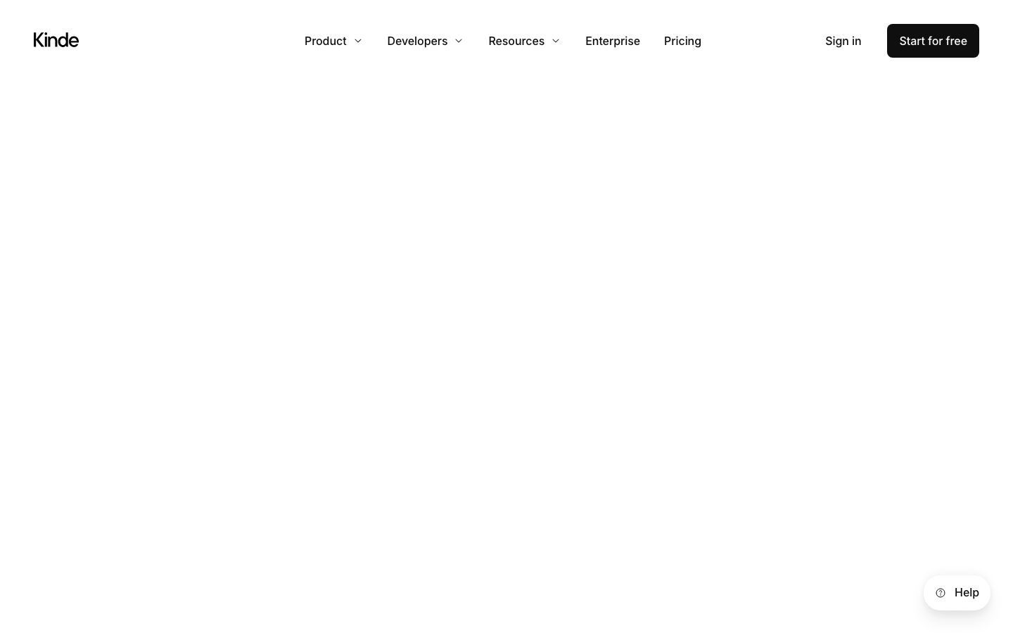
**`top-nav`** — White nav bar across the top of every page. Background `{colors.canvas}`, text `{colors.ink}`, labels in `{typography.button}` (Inter 16px / 500). Carries the lowercase "Kinde" wordmark at left, a center menu (Product, Developers, Resources with chevron dropdowns; Enterprise, Pricing as flat links), and a right cluster with a "Sign in" text-link plus the black "Start for free" `{component.button-primary}`.
**`nav-link`** — Inline nav menu item. Transparent background, `{colors.ink}` text, `{typography.button}`. Dropdown items (Product / Developers / Resources) carry a chevron affordance.
**`sign-in-link`** — Transparent text-link in `{colors.ink}` for the secondary "Sign in" action in the nav.
### Buttons
**`button-primary`** — The signature CTA ("Start for free"). Background `{colors.ink}` (#0f0f0f), text `{colors.on-dark}`, type `{typography.button}` (Inter 16px / 500), padding 8px × 16px, rounded `{rounded.md}` (8px). The system's only solid action button — and it is black, not blue.
**`button-secondary`** — The light companion CTA ("Talk to us"). Background `{colors.canvas}`, text `{colors.ink}`, same padding + radius as primary, with a hairline outline.
### Cards & Media
**`hero-band`** — Centered hero with the oversized `{typography.display-xl}` headline, a `{typography.body-lg}` sub-head, and a button row (`{component.button-primary}` + `{component.button-secondary}`). Headlines render in `{colors.neutral-strong}`. Vertical padding `{spacing.xxxl}` (40px) and larger.
**`media-card`** — A light-gray media well holding embedded product video/imagery (the hero "Add powerful auth and billing…" well and the lower feature wells). Background `{colors.surface-soft}` (#f5f5f5), rounded `{rounded.xl}` (16px), caption in `{colors.body}`.
**`card`** — Standard content card. Background `{colors.surface-card}` (#f6f6f6), rounded `{rounded.lg}` (10px — measured 10.24px, derived), no shadow. Title in `{typography.title-md}`.
**`feature-card`** — Used in the "Built this century" 3-up auth-feature grid. Background `{colors.canvas}`, title in `{typography.title-sm}` (Inter 18px / 500), description in `{colors.body}`, rounded `{rounded.md}`, padding `{spacing.lg}` (20px). Each carries a short heading, a paragraph, and a "Learn more" link.
**`code-surface`** — Syntax-highlighted code block shown as product proof. Background `{colors.surface-soft}`, base text `{colors.code-text}` (#383a42), syntax tokens drawn from the code palette (`{colors.code-magenta}`, `{colors.code-green}`, `{colors.code-blue}`, etc.), rounded `{rounded.md}`, padding `{spacing.lg}`.
### Utility
**`help-badge`** — A floating pill in the bottom-right corner ("Help" with an icon). Background `{colors.canvas}`, text `{colors.ink}`, rounded `{rounded.pill}` (50px), padding 8px × 16px, carries the layered drop shadow.
**`footer-divider`** — Section/footer divider rows using `{colors.hairline}` (#ebebeb) separators with `{colors.muted}` labels in `{typography.title-sm}`.
## Do's and Don'ts
### Do
- Reserve the solid black `{component.button-primary}` for the single primary action per band. The CTA is `{colors.ink}`, never blue.
- Let the hero headline be huge. The `{typography.display-xl}` (86px / weight 500 / -2.592px tracking) is the brand's loudest instrument.
- Apply negative letter-spacing on display and body type. Inter without the tight tracking reads as off-brand.
- Keep `{colors.accent}` (#0054f0) scarce — inline links and small highlights only.
- Show the product as `{component.code-surface}` blocks or inside `{component.media-card}` wells, not as decorative illustration.
- Anchor spacing on the 20px base (`{spacing.lg}`) for gutters and card padding.
- Keep surfaces flat — most cards carry `shadow: none`; reserve the measured shadows for genuinely floating UI.
### Don't
- Don't introduce color at the action layer. The button is black; blue stays for links.
- Don't bold display type beyond weight 500. Scale, not weight, carries emphasis.
- Don't use the code palette (`{colors.code-magenta}`, `{colors.code-green}`, etc.) anywhere except inside `{component.code-surface}` blocks — these are syntax-highlight colors, not brand accents.
- Don't exceed `{rounded.xl}` (16px) on standard cards; the pill radius (`{rounded.pill}`) is reserved for the floating Help badge.
- Don't add shadows to content cards — the system's card default is flat.
- Don't document hover states; primary press behaviour and default states only.
## Responsive Behavior
### Breakpoints
| Name | Width | Key Changes |
|---|---|---|
| Mobile | < 768px | Hamburger nav; hero h1 scales down sharply from 86px; feature grids collapse to 1-up; media wells go full-width |
| Tablet | 768–1024px | Top nav tightens; 3-up feature grids drop to 2-up; cards reflow |
| Desktop | 1024–1440px | Full horizontal nav; 3-up auth-feature grid; 2-up media/feature cards |
| Wide | > 1440px | Same as desktop with more outer breathing room |
*Breakpoint widths are inferred from standard practice — exact responsive thresholds were not in the measured analysis (see Known Gaps).*
### Touch Targets
- `{component.button-primary}` and `{component.button-secondary}` use 8×16px padding over a 16px label — effective height is compact; verify against a 44px minimum on touch surfaces.
- `{component.help-badge}` is a comfortably-sized floating pill at the bottom-right.
- Nav links sit in the standard 56-64px nav bar height range.
### Collapsing Strategy
- Top nav collapses to a hamburger on mobile; the dropdown menus (Product / Developers / Resources) open as stacked sheets.
- The hero headline scales down with the viewport while keeping its negative tracking.
- Feature grids reduce columns (3 → 2 → 1) rather than shrinking cards.
- Media wells span full content width at every breakpoint.
### Image Behavior
- Media wells (`{component.media-card}`) retain `{rounded.xl}` corners and resize proportionally.
- Embedded video/product imagery scales within the gray well; the well itself is the responsive container.
## Iteration Guide
1. Focus on ONE component at a time. Reference its YAML key directly (`{component.feature-card}`, `{component.media-card}`).
2. Variants of an existing component (`-active`, `-disabled`, `-focused`) live as separate entries in `components:`.
3. Use `{token.refs}` everywhere — never inline hex.
4. Never document hover. Default and Active/Pressed states only.
5. Display headlines stay Inter 500 with negative tracking; body stays Inter 400. Emphasis comes from scale, not weight.
6. Keep the action layer monochrome — the primary CTA is black, the accent blue stays on links.
7. When in doubt about emphasis: bigger display type before bolder or more colorful.
## Known Gaps
- The colors flagged as `accent` at frequency 3-4 (#a626a4, #e45649, #50a14f, #00adef, #b76b01, #4078f2, #0184bc) match a One-Light code-syntax theme and are interpreted as code-block tokens (derived) rather than brand accents; their exact usage map would need the code-surface DOM to confirm.
- Only two components (`button-primary`, `card`) were directly measured; `button-secondary`, `top-nav`, `media-card`, `feature-card`, `code-surface`, and `help-badge` are documented from screenshot ground-truth plus the measured token sets — their precise paddings/heights beyond the measured spacing scale are inferred.
- The `card` radius measured 10.24px and is documented as `{rounded.lg}` 10px (derived).
- Button text color (white on the black CTA) is inferred from the screenshot; the analysis reported the button's `#0f0f0f` as the fill.
- Responsive breakpoint widths and collapse thresholds were not measured; values shown are standard-practice inferences.
- Animation, transition timings, and dropdown-menu open behaviour are not in scope.
- Form/input components and pricing-table styling (the pricing page was captured but no input or table tokens were extracted) are not documented.
- The hero/feature media wells render as empty gray placeholders in the captured screenshots; the embedded product content inside them was not measured.
<!-- Documented by duply · real-world design systems as ready-to-use DESIGN.md for AI coding agents · https://duply.ai/kinde/design-md -->
Color Palette
Accent
Neutrals
Typography
display-xl86.4px · 500 · 0.928
The quick brown fox jumpsbody-lg24px · 400 · 1.25
The quick brown fox jumpstitle-md20px · 500 · 1.2
The quick brown fox jumpstitle-sm18px · 500 · 1.333
The quick brown fox jumpsbutton16px · 500 · 1.5
The quick brown fox jumpsSpacing & Shape
Spacing
| Name | Value | Preview |
|---|---|---|
| xxs | 4px | |
| xs | 8px | |
| sm | 12px | |
| md | 16px | |
| lg | 20px | |
| xl | 24px | |
| xxl | 32px | |
| xxxl | 40px |
Border Radius
| Name | Value | Preview |
|---|---|---|
| xs | 5px | |
| sm | 6px | |
| md | 8px | |
| lg | 10px | |
| xl | 16px | |
| xxl | 24px | |
| pill | 50px |
More like this


---
version: alpha
name: Kinde-design-analysis
description: A developer-tools marketing surface built on a pure-white canvas with near-black ink, oversized Inter display headlines, and a single electric-blue accent held in reserve. The system reads as quiet, engineering-confident SaaS — enormous tight-tracked hero type, soft light-gray content/media cards (~8-16px radius), syntax-highlighted code surfaces shown as product proof, and black pill-ish primary CTAs. Brand voltage comes from scale and whitespace rather than color.

colors:
  ink: "#0f0f0f"
  neutral-strong: "#2b2b2b"
  body: "#636363"
  muted: "#ababab"
  neutral-soft: "#c9c9c9"
  link: "#000000"
  accent: "#0054f0"
  canvas: "#ffffff"
  surface-soft: "#f5f5f5"
  surface-card: "#f6f6f6"
  surface-faint: "#fafafa"
  hairline: "#ebebeb"
  surface-strong: "#e5e5e6"
  on-dark: "#ffffff"
  code-text: "#383a42"
  code-magenta: "#a626a4"
  code-red: "#e45649"
  code-green: "#50a14f"
  code-cyan: "#00adef"
  code-orange: "#b76b01"
  code-blue: "#4078f2"
  code-teal: "#0184bc"

typography:
  display-xl:
    fontFamily: "Inter, sans-serif"
    fontSize: 86.4px
    fontWeight: 500
    lineHeight: 0.928
    letterSpacing: -2.592px
  body-lg:
    fontFamily: "Inter, sans-serif"
    fontSize: 24px
    fontWeight: 400
    lineHeight: 1.25
    letterSpacing: -0.24px
  title-md:
    fontFamily: "Inter, sans-serif"
    fontSize: 20px
    fontWeight: 500
    lineHeight: 1.2
    letterSpacing: -0.2px
  title-sm:
    fontFamily: "Inter, sans-serif"
    fontSize: 18px
    fontWeight: 500
    lineHeight: 1.333
    letterSpacing: -0.09px
  button:
    fontFamily: "Inter, sans-serif"
    fontSize: 16px
    fontWeight: 500
    lineHeight: 1.5
    letterSpacing: -0.08px

rounded:
  xs: 5px
  sm: 6px
  md: 8px
  lg: 10px
  xl: 16px
  xxl: 24px
  pill: 50px

spacing:
  xxs: 4px
  xs: 8px
  sm: 12px
  md: 16px
  lg: 20px
  xl: 24px
  xxl: 32px
  xxxl: 40px

components:
  top-nav:
    backgroundColor: "{colors.canvas}"
    textColor: "{colors.ink}"
    typography: "{typography.button}"
  nav-link:
    backgroundColor: transparent
    textColor: "{colors.ink}"
    typography: "{typography.button}"
  button-primary:
    backgroundColor: "{colors.ink}"
    textColor: "{colors.on-dark}"
    typography: "{typography.button}"
    rounded: "{rounded.md}"
    padding: 8px 16px
  button-secondary:
    backgroundColor: "{colors.canvas}"
    textColor: "{colors.ink}"
    typography: "{typography.button}"
    rounded: "{rounded.md}"
    padding: 8px 16px
  sign-in-link:
    backgroundColor: transparent
    textColor: "{colors.ink}"
    typography: "{typography.button}"
  hero-band:
    backgroundColor: "{colors.canvas}"
    textColor: "{colors.neutral-strong}"
    typography: "{typography.display-xl}"
    padding: 40px
  media-card:
    backgroundColor: "{colors.surface-soft}"
    textColor: "{colors.body}"
    rounded: "{rounded.xl}"
  card:
    backgroundColor: "{colors.surface-card}"
    textColor: "{colors.ink}"
    typography: "{typography.title-md}"
    rounded: "{rounded.lg}"
  feature-card:
    backgroundColor: "{colors.canvas}"
    textColor: "{colors.body}"
    typography: "{typography.title-sm}"
    rounded: "{rounded.md}"
    padding: 20px
  code-surface:
    backgroundColor: "{colors.surface-soft}"
    textColor: "{colors.code-text}"
    rounded: "{rounded.md}"
    padding: 20px
  help-badge:
    backgroundColor: "{colors.canvas}"
    textColor: "{colors.ink}"
    typography: "{typography.button}"
    rounded: "{rounded.pill}"
    padding: 8px 16px
  footer-divider:
    backgroundColor: "{colors.hairline}"
    textColor: "{colors.muted}"
    typography: "{typography.title-sm}"
---

## Overview

Kinde's marketing surface is a quiet, engineering-first developer-tools site — a pure-white canvas (`{colors.canvas}` — #ffffff) carrying oversized Inter display headlines in soft near-black, with one electric-blue accent (`{colors.accent}` — #0054f0) held almost entirely in reserve. The system's voltage comes from **scale and whitespace**, not color: the hero headline lands at ~86px with aggressive negative tracking (-2.592px), and everything below it is calm gray-on-white.

The dominant text tone is `{colors.neutral-strong}` (#2b2b2b — the most-measured color by a wide margin) for display headlines, falling to `{colors.ink}` (#0f0f0f) for UI text and `{colors.body}` (#636363) for running copy. The brand stays monochrome at the action layer — the primary CTA ("Start for free") is a black button (`{colors.ink}`), not a blue one.

Content lives in soft light-gray cards and media wells (`{colors.surface-soft}` — #f5f5f5 / `{colors.surface-card}` — #f6f6f6) with restrained radii (8-16px). The system shows its product as **syntax-highlighted code surfaces** — a small palette of One-Light-style code colors (`{colors.code-magenta}`, `{colors.code-green}`, `{colors.code-blue}`, etc.) appears only inside code blocks, never in marketing chrome.

**Key Characteristics:**
- White canvas with black primary CTA (`{component.button-primary}` — `{colors.ink}` background, padding 8×16px, `{rounded.md}` 8px). Buttons read as compact and confident, not loud.
- Oversized Inter display type — the hero h1 is ~86px / weight 500 / line-height 0.928 with -2.592px tracking. Tight, modern, technical.
- Single electric-blue accent (`{colors.accent}` — #0054f0) used sparingly; the brand is otherwise grayscale.
- Soft light-gray media wells (`{colors.surface-soft}`) for embedded video/product imagery; light cards (`{colors.surface-card}`) for content.
- Code-surface palette (One-Light syntax colors) shown as product proof inside code blocks.
- Spacing rhythm anchored on a 20px base (`{spacing.lg}` — by far the most-measured gap value), with 8px and 16px as the secondary increments.
- Radius is hierarchical: `{rounded.md}` (8px) for buttons + small cards, `{rounded.lg}` (10px) for content cards, `{rounded.xl}` (16px) for media wells, `{rounded.pill}` (50px) for the floating "Help" badge.

## Colors

### Brand & Accent
- **Accent** (`{colors.accent}` — #0054f0): The single electric-blue brand accent. Used sparingly on links and small highlights (258 measured instances against ~1600 for the dominant neutral). Never appears on the primary CTA.
- **Code palette** — A small One-Light-style syntax set used only inside code surfaces: `{colors.code-text}` (#383a42), `{colors.code-magenta}` (#a626a4), `{colors.code-red}` (#e45649), `{colors.code-green}` (#50a14f), `{colors.code-cyan}` (#00adef), `{colors.code-orange}` (#b76b01), `{colors.code-blue}` (#4078f2), `{colors.code-teal}` (#0184bc). These are product chrome (syntax highlighting), not marketing accents — each was measured at very low frequency (3-4 instances).

### Text
- **Neutral Strong** (`{colors.neutral-strong}` — #2b2b2b): The most-measured tone in the system. Display headlines and the dominant heading color.
- **Ink** (`{colors.ink}` — #0f0f0f): UI text, primary CTA background, dense labels.
- **Link** (`{colors.link}` — #000000): Pure-black nav and inline link color.
- **Body** (`{colors.body}` — #636363): Running paragraph copy under headlines.
- **Muted** (`{colors.muted}` — #ababab): Captions, fine-print, image labels.
- **Neutral Soft** (`{colors.neutral-soft}` — #c9c9c9): Tertiary dividers and disabled-feeling text.
- **On Dark** (`{colors.on-dark}` — #ffffff): Text on the black primary button.

### Surface
- **Canvas** (`{colors.canvas}` — #ffffff): The default page floor.
- **Surface Soft** (`{colors.surface-soft}` — #f5f5f5): Media wells, embedded video frames, code surfaces.
- **Surface Card** (`{colors.surface-card}` — #f6f6f6): Content card background.
- **Surface Faint** (`{colors.surface-faint}` — #fafafa): Barely-tinted section panels.
- **Surface Strong** (`{colors.surface-strong}` — #e5e5e6): Slightly heavier panel fills.
- **Hairline** (`{colors.hairline}` — #ebebeb): The 1px divider tone between sections.

## Typography

### Font Family
The system runs **Inter** for everything — display headlines, body copy, navigation, buttons, and labels. There is no secondary display face; hierarchy is achieved entirely through size, weight (400/500), and negative letter-spacing. The fallback stack walks `Inter, sans-serif`.

The voice is built on two moves:
- Huge weight-500 display type with aggressive negative tracking (the hero h1 is -2.592px) — technical, condensed, confident.
- Calm weight-400 body copy at a generous 24px with gentle -0.24px tracking.

### Hierarchy

| Token | Size | Weight | Line Height | Letter Spacing | Use |
|---|---|---|---|---|---|
| `{typography.display-xl}` | 86.4px | 500 | 0.928 | -2.592px | Hero h1 ("Modern auth and billing for engineers") and major section heads |
| `{typography.body-lg}` | 24px | 400 | 1.25 | -0.24px | Hero sub-head and primary running copy |
| `{typography.title-md}` | 20px | 500 | 1.2 | -0.2px | h2 — card titles, section sub-heads |
| `{typography.title-sm}` | 18px | 500 | 1.333 | -0.09px | h3 — feature labels, list headings |
| `{typography.button}` | 16px | 500 | 1.5 | -0.08px | Button labels, nav links |

### Principles
Inter weight 500 carries every heading — never 700, never 300. Display emphasis comes from scale (86px) and tight tracking, not bolder weight. Body copy sits at weight 400. The negative letter-spacing is part of the voice — display type without it would read as off-brand.

Note that the only measured heading sizes between the 86px hero and 24px body are h2 at 20px and h3 at 18px — Kinde jumps hard from giant display to small structural headings, which is why the hero dominates every page it appears on.

### Note on Font Substitutes
Inter is open-source (SIL Open Font License) and ships directly; no licensed-font substitution is required. The `fonts_licensed` set was empty in the measured analysis.

## Layout

### Spacing System
- **Base unit:** 4px.
- **Tokens:** `{spacing.xxs}` 4px · `{spacing.xs}` 8px · `{spacing.sm}` 12px · `{spacing.md}` 16px · `{spacing.lg}` 20px · `{spacing.xl}` 24px · `{spacing.xxl}` 32px · `{spacing.xxxl}` 40px.
- **Dominant gap:** `{spacing.lg}` (20px) was measured 421 times — the runaway primary increment for card padding, grid gutters, and stack spacing.
- **Secondary increments:** `{spacing.xs}` (8px, 83 instances) and `{spacing.md}` (16px, 35 instances) handle tight internal spacing.
- **Larger steps:** `{spacing.xxl}` (32px) and `{spacing.xxxl}` (40px) for band separation.

### Grid & Container
- **Editorial body:** Centered single column with a multi-up feature grid below the fold.
- **Feature grids:** 3-up for the "Built this century" auth-feature listing; 2-up for the larger "Everything you need to build" feature/media cards.
- **Hero:** Centered single-column — headline, sub-head, then a full-width media well.

### Whitespace Philosophy
Kinde leans on whitespace as the primary design device. The hero headline is enormous but the surrounding space is even more so — generous vertical padding (`{spacing.xxxl}` 40px and larger band gaps) lets the oversized type breathe. Content density stays low: every band carries one heading plus a short supporting line plus cards, never packed lists.

## Elevation & Depth

| Level | Treatment | Use |
|---|---|---|
| Flat | No shadow, no border | Body sections, top nav, hero band |
| Card surface | `{colors.surface-card}` / `{colors.surface-soft}` fill, no shadow | Content cards, media wells (the measured `card` component has `shadow: none`) |
| Soft drop | `rgba(0,0,0,0.1) 0px 2px 10px` | Light floating elements |
| Medium drop | `rgba(0,0,0,0.25) 0px 4px 15px` | Emphasized floating elements |
| Layered lift | `rgba(18,20,23,0.05) 0px -4px 12px, rgba(18,20,23,0.07) 0px 15px 24px, rgba(18,20,23,0.06) 0px 6px 12px` | The most-elevated surface (likely the floating Help badge / dropdown) |

The elevation philosophy is **soft and minimal** — most surfaces are flat color blocks with no shadow at all. The three measured shadows each appear once, reserved for genuinely floating UI like the "Help" badge and nav dropdowns.

## Shapes

### Border Radius Scale

| Token | Value | Use |
|---|---|---|
| `{rounded.xs}` | 5px | Small inline accents (rare) |
| `{rounded.sm}` | 6px | Minor controls (rare) |
| `{rounded.md}` | 8px | Standard buttons, small cards, code surfaces (the dominant radius — 54 instances) |
| `{rounded.lg}` | 10px | Content cards (`card` component measured at 10.24px — derived to 10px) |
| `{rounded.xl}` | 16px | Media wells, larger feature panels (17 instances) |
| `{rounded.xxl}` | 24px | Occasional large panel corner |
| `{rounded.pill}` | 50px | Floating "Help" badge and fully-rounded pill controls (40/47/50px cluster) |

### Media Geometry
Hero video wells and feature media use `{rounded.xl}` (16px) corners over `{colors.surface-soft}` fills. The product is shown either as embedded video/product imagery inside these wells or as syntax-highlighted code surfaces — never as decorative illustration.

## Components

### Top Navigation

**`top-nav`** — White nav bar across the top of every page. Background `{colors.canvas}`, text `{colors.ink}`, labels in `{typography.button}` (Inter 16px / 500). Carries the lowercase "Kinde" wordmark at left, a center menu (Product, Developers, Resources with chevron dropdowns; Enterprise, Pricing as flat links), and a right cluster with a "Sign in" text-link plus the black "Start for free" `{component.button-primary}`.

**`nav-link`** — Inline nav menu item. Transparent background, `{colors.ink}` text, `{typography.button}`. Dropdown items (Product / Developers / Resources) carry a chevron affordance.

**`sign-in-link`** — Transparent text-link in `{colors.ink}` for the secondary "Sign in" action in the nav.

### Buttons

**`button-primary`** — The signature CTA ("Start for free"). Background `{colors.ink}` (#0f0f0f), text `{colors.on-dark}`, type `{typography.button}` (Inter 16px / 500), padding 8px × 16px, rounded `{rounded.md}` (8px). The system's only solid action button — and it is black, not blue.

**`button-secondary`** — The light companion CTA ("Talk to us"). Background `{colors.canvas}`, text `{colors.ink}`, same padding + radius as primary, with a hairline outline.

### Cards & Media

**`hero-band`** — Centered hero with the oversized `{typography.display-xl}` headline, a `{typography.body-lg}` sub-head, and a button row (`{component.button-primary}` + `{component.button-secondary}`). Headlines render in `{colors.neutral-strong}`. Vertical padding `{spacing.xxxl}` (40px) and larger.

**`media-card`** — A light-gray media well holding embedded product video/imagery (the hero "Add powerful auth and billing…" well and the lower feature wells). Background `{colors.surface-soft}` (#f5f5f5), rounded `{rounded.xl}` (16px), caption in `{colors.body}`.

**`card`** — Standard content card. Background `{colors.surface-card}` (#f6f6f6), rounded `{rounded.lg}` (10px — measured 10.24px, derived), no shadow. Title in `{typography.title-md}`.

**`feature-card`** — Used in the "Built this century" 3-up auth-feature grid. Background `{colors.canvas}`, title in `{typography.title-sm}` (Inter 18px / 500), description in `{colors.body}`, rounded `{rounded.md}`, padding `{spacing.lg}` (20px). Each carries a short heading, a paragraph, and a "Learn more" link.

**`code-surface`** — Syntax-highlighted code block shown as product proof. Background `{colors.surface-soft}`, base text `{colors.code-text}` (#383a42), syntax tokens drawn from the code palette (`{colors.code-magenta}`, `{colors.code-green}`, `{colors.code-blue}`, etc.), rounded `{rounded.md}`, padding `{spacing.lg}`.

### Utility

**`help-badge`** — A floating pill in the bottom-right corner ("Help" with an icon). Background `{colors.canvas}`, text `{colors.ink}`, rounded `{rounded.pill}` (50px), padding 8px × 16px, carries the layered drop shadow.

**`footer-divider`** — Section/footer divider rows using `{colors.hairline}` (#ebebeb) separators with `{colors.muted}` labels in `{typography.title-sm}`.

## Do's and Don'ts

### Do
- Reserve the solid black `{component.button-primary}` for the single primary action per band. The CTA is `{colors.ink}`, never blue.
- Let the hero headline be huge. The `{typography.display-xl}` (86px / weight 500 / -2.592px tracking) is the brand's loudest instrument.
- Apply negative letter-spacing on display and body type. Inter without the tight tracking reads as off-brand.
- Keep `{colors.accent}` (#0054f0) scarce — inline links and small highlights only.
- Show the product as `{component.code-surface}` blocks or inside `{component.media-card}` wells, not as decorative illustration.
- Anchor spacing on the 20px base (`{spacing.lg}`) for gutters and card padding.
- Keep surfaces flat — most cards carry `shadow: none`; reserve the measured shadows for genuinely floating UI.

### Don't
- Don't introduce color at the action layer. The button is black; blue stays for links.
- Don't bold display type beyond weight 500. Scale, not weight, carries emphasis.
- Don't use the code palette (`{colors.code-magenta}`, `{colors.code-green}`, etc.) anywhere except inside `{component.code-surface}` blocks — these are syntax-highlight colors, not brand accents.
- Don't exceed `{rounded.xl}` (16px) on standard cards; the pill radius (`{rounded.pill}`) is reserved for the floating Help badge.
- Don't add shadows to content cards — the system's card default is flat.
- Don't document hover states; primary press behaviour and default states only.

## Responsive Behavior

### Breakpoints

| Name | Width | Key Changes |
|---|---|---|
| Mobile | < 768px | Hamburger nav; hero h1 scales down sharply from 86px; feature grids collapse to 1-up; media wells go full-width |
| Tablet | 768–1024px | Top nav tightens; 3-up feature grids drop to 2-up; cards reflow |
| Desktop | 1024–1440px | Full horizontal nav; 3-up auth-feature grid; 2-up media/feature cards |
| Wide | > 1440px | Same as desktop with more outer breathing room |

*Breakpoint widths are inferred from standard practice — exact responsive thresholds were not in the measured analysis (see Known Gaps).*

### Touch Targets
- `{component.button-primary}` and `{component.button-secondary}` use 8×16px padding over a 16px label — effective height is compact; verify against a 44px minimum on touch surfaces.
- `{component.help-badge}` is a comfortably-sized floating pill at the bottom-right.
- Nav links sit in the standard 56-64px nav bar height range.

### Collapsing Strategy
- Top nav collapses to a hamburger on mobile; the dropdown menus (Product / Developers / Resources) open as stacked sheets.
- The hero headline scales down with the viewport while keeping its negative tracking.
- Feature grids reduce columns (3 → 2 → 1) rather than shrinking cards.
- Media wells span full content width at every breakpoint.

### Image Behavior
- Media wells (`{component.media-card}`) retain `{rounded.xl}` corners and resize proportionally.
- Embedded video/product imagery scales within the gray well; the well itself is the responsive container.

## Iteration Guide

1. Focus on ONE component at a time. Reference its YAML key directly (`{component.feature-card}`, `{component.media-card}`).
2. Variants of an existing component (`-active`, `-disabled`, `-focused`) live as separate entries in `components:`.
3. Use `{token.refs}` everywhere — never inline hex.
4. Never document hover. Default and Active/Pressed states only.
5. Display headlines stay Inter 500 with negative tracking; body stays Inter 400. Emphasis comes from scale, not weight.
6. Keep the action layer monochrome — the primary CTA is black, the accent blue stays on links.
7. When in doubt about emphasis: bigger display type before bolder or more colorful.

## Known Gaps

- The colors flagged as `accent` at frequency 3-4 (#a626a4, #e45649, #50a14f, #00adef, #b76b01, #4078f2, #0184bc) match a One-Light code-syntax theme and are interpreted as code-block tokens (derived) rather than brand accents; their exact usage map would need the code-surface DOM to confirm.
- Only two components (`button-primary`, `card`) were directly measured; `button-secondary`, `top-nav`, `media-card`, `feature-card`, `code-surface`, and `help-badge` are documented from screenshot ground-truth plus the measured token sets — their precise paddings/heights beyond the measured spacing scale are inferred.
- The `card` radius measured 10.24px and is documented as `{rounded.lg}` 10px (derived).
- Button text color (white on the black CTA) is inferred from the screenshot; the analysis reported the button's `#0f0f0f` as the fill.
- Responsive breakpoint widths and collapse thresholds were not measured; values shown are standard-practice inferences.
- Animation, transition timings, and dropdown-menu open behaviour are not in scope.
- Form/input components and pricing-table styling (the pricing page was captured but no input or table tokens were extracted) are not documented.
- The hero/feature media wells render as empty gray placeholders in the captured screenshots; the embedded product content inside them was not measured.

<!-- Documented by duply · real-world design systems as ready-to-use DESIGN.md for AI coding agents · https://duply.ai/kinde/design-md -->