Wise
A bold, fintech-confident interface built on a white canvas with a single high-voltage lime-green primary (#9fe870) carrying near-black forest-green ink labels. The system's signature is its enormous Wise Sans display headlines — a heavy 900-weight condensed face set at ultra-tight 0.85 line-height in all-caps — paired with Inter for every supporting role. Brand voltage comes from the lime green, mint-green surfaces, fully-pill-shaped buttons, and a dark forest-green business band; product UI fragments (the live currency calculator, comparison table, card mockups) are shown directly inside white cards.
---
version: alpha
name: Wise-design-analysis
description: A bold, fintech-confident interface built on a white canvas with a single high-voltage lime-green primary (#9fe870) carrying near-black forest-green ink labels. The system's signature is its enormous Wise Sans display headlines — a heavy 900-weight condensed face set at ultra-tight 0.85 line-height in all-caps — paired with Inter for every supporting role. Brand voltage comes from the lime green, mint-green surfaces, fully-pill-shaped buttons, and a dark forest-green business band; product UI fragments (the live currency calculator, comparison table, card mockups) are shown directly inside white cards.
colors:
primary: "#9fe870"
on-primary: "#163300"
ink: "#0e0f0c"
body: "#454745"
muted: "#5d7079"
muted-soft: "#768e9c"
hairline: "#c9cbce"
canvas: "#ffffff"
black: "#000000"
surface-mint: "#e2f6d5"
surface-dark: "#21231d"
on-dark: "#ffffff"
accent-navy: "#37517e"
accent-blue: "#00a2dd"
accent-blue-deep: "#0097c7"
accent-cyan: "#008fc9"
accent-blue-darker: "#0084b3"
accent-blue-darkest: "#0081ba"
accent-yellow: "#fadc65"
accent-yellow-bright: "#ffd11a"
error: "#e74848"
typography:
display-hero:
fontFamily: "Wise Sans, Inter, sans-serif"
fontSize: 105px
fontWeight: 900
lineHeight: 0.85
letterSpacing: normal
display-section:
fontFamily: "Wise Sans, Inter, sans-serif"
fontSize: 40px
fontWeight: 900
lineHeight: 0.85
letterSpacing: normal
heading-lg:
fontFamily: "Inter, sans-serif"
fontSize: 45px
fontWeight: 600
lineHeight: 1.254
letterSpacing: -1.36px
heading-md:
fontFamily: "Inter, sans-serif"
fontSize: 24px
fontWeight: 600
lineHeight: 1.299
letterSpacing: -0.37px
heading-sm:
fontFamily: "Inter, sans-serif"
fontSize: 20px
fontWeight: 600
lineHeight: 1.4
letterSpacing: 0.1px
button:
fontFamily: "Inter, sans-serif"
fontSize: 20px
fontWeight: 600
lineHeight: 1.6
letterSpacing: -0.22px
rounded:
none: 0px
xs: 2px
sm: 8px
md: 10px
lg: 12px
xl: 16px
x2l: 19px
x3l: 28px
x4l: 38px
pill: 9999px
full: 9999px
spacing:
xxs: 4px
xs: 8px
sm: 12px
md: 16px
lg: 24px
xl: 28px
xxl: 32px
components:
button-primary:
backgroundColor: "{colors.primary}"
textColor: "{colors.on-primary}"
typography: "{typography.button}"
rounded: "{rounded.pill}"
padding: 19px 24px
button-text-link:
backgroundColor: transparent
textColor: "{colors.ink}"
typography: "{typography.button}"
nav-signup-pill:
backgroundColor: "{colors.primary}"
textColor: "{colors.on-primary}"
typography: "{typography.heading-sm}"
rounded: "{rounded.pill}"
top-nav:
backgroundColor: "{colors.canvas}"
textColor: "{colors.ink}"
typography: "{typography.heading-sm}"
hero-band:
backgroundColor: "{colors.canvas}"
textColor: "{colors.ink}"
typography: "{typography.display-hero}"
calculator-band:
backgroundColor: "{colors.surface-mint}"
textColor: "{colors.ink}"
typography: "{typography.display-section}"
calculator-card:
backgroundColor: "{colors.canvas}"
textColor: "{colors.ink}"
rounded: "{rounded.x3l}"
comparison-table-highlight:
backgroundColor: "{colors.surface-mint}"
textColor: "{colors.ink}"
rounded: "{rounded.lg}"
feature-card:
backgroundColor: "{colors.canvas}"
textColor: "{colors.ink}"
typography: "{typography.heading-md}"
rounded: "{rounded.xl}"
icon-circle-card:
backgroundColor: "{colors.surface-mint}"
textColor: "{colors.ink}"
rounded: "{rounded.full}"
business-band:
backgroundColor: "{colors.surface-dark}"
textColor: "{colors.on-dark}"
typography: "{typography.display-section}"
trust-row:
backgroundColor: "{colors.canvas}"
textColor: "{colors.body}"
typography: "{typography.heading-sm}"
input:
backgroundColor: "{colors.canvas}"
textColor: "{colors.ink}"
rounded: "{rounded.none}"
---
## Overview
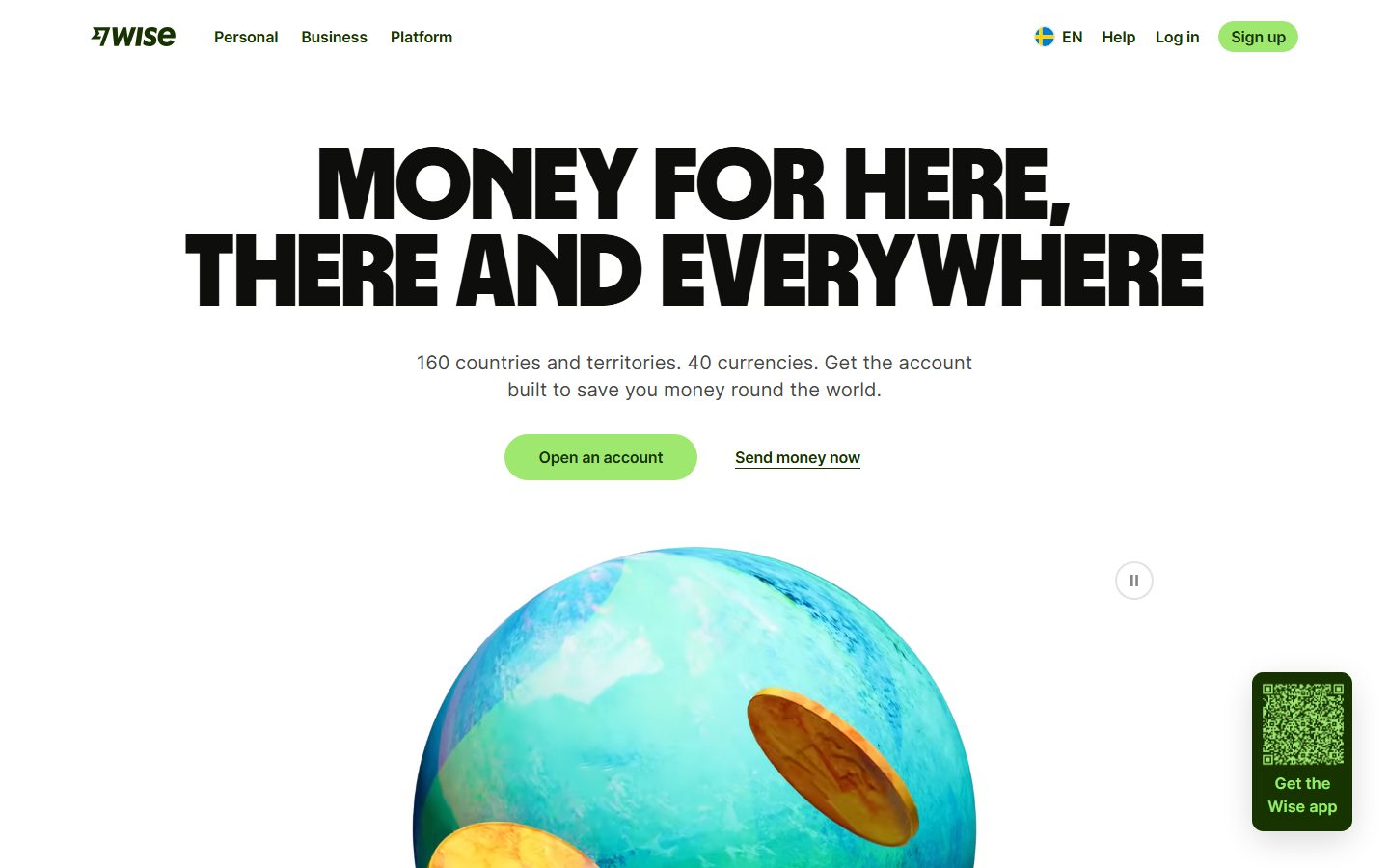
Wise's marketing surface is a bold, confident fintech interface anchored on a white canvas (`{colors.canvas}` — #ffffff) with a single high-voltage lime-green primary (`{colors.primary}` — #9fe870) whose labels run in near-black forest green (`{colors.on-primary}` — #163300). The system reads as friendly-but-serious money software: huge type, generous whitespace, fully pill-shaped buttons, and mint-green (`{colors.surface-mint}` — #e2f6d5) section bands that break up the white.
The single loudest brand signal is the **Wise Sans** display headline — a heavy 900-weight condensed face set in all-caps at an ultra-tight 0.85 line-height. At hero scale it measures ~105px (`{typography.display-hero}`); at section-head scale it drops to 40px (`{typography.display-section}`). Everything else — sub-heads, card titles, body, buttons — runs in **Inter** at weight 600 with negative letter-spacing on the larger sizes.
Component voltage comes from **live product UI shown directly inside white cards** — the currency calculator widget, the provider comparison table, and card/phone mockups are all real Wise product chrome dropped into the marketing flow rather than illustrated approximations. The mint-green band behind the calculator and the dark forest-green "Built for business too" band (`{colors.surface-dark}` — #21231d) are the system's two color set-pieces.
**Key Characteristics:**
- White canvas with a single lime-green primary CTA (`{colors.primary}` — #9fe870) carrying dark-green text (`{colors.on-primary}` — #163300). Buttons are fully pill-shaped (`{rounded.pill}`).
- Custom **Wise Sans** display face for headlines — 900 weight, all-caps, ultra-tight 0.85 line-height (substituted with Inter 900 here; see Typography).
- Mint-green surface bands (`{colors.surface-mint}` — #e2f6d5) holding the live currency calculator and comparison table.
- One dark forest-green band (`{colors.surface-dark}` — #21231d) for the business section — the only dark surface in the system.
- Real product UI fragments (calculator, comparison table, card + phone mockups) embedded inside white cards rather than marketing illustrations.
- A wide accent palette of flag/illustration blues and yellows (`{colors.accent-blue}`, `{colors.accent-navy}`, `{colors.accent-yellow}`) that appear in iconography and the globe artwork — never on CTAs.
- Hierarchical radius: pill (`{rounded.pill}`) for buttons + tags, large soft radii (`{rounded.x3l}` 28px) for the calculator card, square corners (`{rounded.none}`) for text inputs inside the calculator.
## Colors
### Brand & Action
- **Primary** (`{colors.primary}` — #9fe870): The lime-green action color. Every primary CTA ("Open an account", "Send money", "Sign up", "Get Started"), plus the small mint-fill accent shapes. This is the loudest color in the system.
- **On Primary** (`{colors.on-primary}` — #163300): The dark forest-green text that sits on lime buttons. Wise never uses white text on lime — the dark-on-light-green pairing is signature.
### Surface
- **Canvas** (`{colors.canvas}` — #ffffff): The default page floor and the background of feature cards + the calculator card.
- **Surface Mint** (`{colors.surface-mint}` — #e2f6d5): The pale-green section bands (calculator band, comparison-table highlight column, circular icon cards).
- **Surface Dark** (`{colors.surface-dark}` — #21231d): The near-black forest-green "Built for business too" band — the only dark surface in the system.
### Text
- **Ink** (`{colors.ink}` — #0e0f0c): Headlines and primary text on light surfaces.
- **Body** (`{colors.body}` — #454745): Default running-text color — the most-measured color overall.
- **Muted** (`{colors.muted}` — #5d7079): Secondary text, sub-labels.
- **Muted Soft** (`{colors.muted-soft}` — #768e9c): Tertiary text, fine print.
- **Hairline** (`{colors.hairline}` — #c9cbce): 1px divider / border tone on light surfaces.
- **On Dark** (`{colors.on-dark}` — #ffffff): Text on the dark business band.
- **Black** (`{colors.black}` — #000000): Pure black used in the all-caps display headlines and some iconography.
### Accent (Illustration & Iconography)
Wise's accent palette lives almost entirely in the globe artwork, flag pills, and small product-UI tints — not in the action layer.
- **Navy** (`{colors.accent-navy}` — #37517e): Deep illustration blue.
- **Blue family** (`{colors.accent-blue}` — #00a2dd, `{colors.accent-blue-deep}` — #0097c7, `{colors.accent-cyan}` — #008fc9, `{colors.accent-blue-darker}` — #0084b3, `{colors.accent-blue-darkest}` — #0081ba): A range of measured blues from the globe artwork and currency icons.
- **Yellow family** (`{colors.accent-yellow}` — #fadc65, `{colors.accent-yellow-bright}` — #ffd11a): Coin / highlight yellows in the hero illustration.
### Semantic
- **Error** (`{colors.error}` — #e74848): The red used for competitor figures in the comparison table and validation states.
## Typography
### Font Family
The system runs two families with a strict division of labor: **Wise Sans** for big display headlines and **Inter** for everything supporting. Wise Sans is Wise's custom heavy condensed display face — weight 900, all-caps, set extremely tight (0.85 line-height). Inter handles sub-heads, card titles, navigation, buttons, and body copy at weight 600 with negative letter-spacing on the larger sizes.
The split is functional:
- Wise Sans (900 weight, all-caps, 0.85 line-height) — hero h1 and big section headlines.
- Inter (600 weight, -1.36px to +0.1px tracking) — h2/h3/h4, buttons, nav, body.
### Hierarchy
| Token | Family | Size | Weight | Line Height | Letter Spacing | Use |
|---|---|---|---|---|---|---|
| `{typography.display-hero}` | Wise Sans | 105px | 900 | 0.85 | normal | Hero h1 ("MONEY FOR HERE, THERE AND EVERYWHERE") |
| `{typography.display-section}` | Wise Sans | 40px | 900 | 0.85 | normal | All-caps section heads ("NEVER PAY A HIDDEN FEE AGAIN", "BUILT FOR BUSINESS TOO") |
| `{typography.heading-lg}` | Inter | 45px | 600 | 1.254 | -1.36px | Sentence-case section heads ("Move your money worldwide", "Disappoint thieves") |
| `{typography.heading-md}` | Inter | 24px | 600 | 1.299 | -0.37px | Card titles ("Receive money fast", "Earn returns") |
| `{typography.heading-sm}` | Inter | 20px | 600 | 1.4 | +0.1px | Small labels, nav items, trust-row headers |
| `{typography.button}` | Inter | 20px | 600 | 1.6 | -0.22px | Button labels and inline text-link CTAs |
### Principles
The display/support boundary is strict: Wise Sans is reserved for all-caps display headlines, Inter handles everything sentence-case. Wise Sans always runs at 900 and at 0.85 line-height — the ultra-tight leading is what makes the all-caps blocks feel like a dense wall of brand voice. Never set Wise Sans loosely or below 900.
### Note on Font Substitutes
**Wise Sans** is Wise's proprietary display typeface and is not available as a public web font. The `fonts_licensed` flag was empty in the measured data, but Wise Sans is clearly custom and must not be shipped. Use a heavy condensed open-source substitute: **Inter** at weight 900 (declared in the fallback stack) is the safe default; for a closer condensed-display character, **Anton** or **Archivo Black** approximate the heavy all-caps wall. Inter is genuinely used for all non-display roles, so it ships directly.
## Layout
### Spacing System
- **Base unit:** 4px.
- **Tokens:** `{spacing.xxs}` 4px · `{spacing.xs}` 8px · `{spacing.sm}` 12px · `{spacing.md}` 16px · `{spacing.lg}` 24px · `{spacing.xl}` 28px · `{spacing.xxl}` 32px.
- **Dominant gaps:** 24px (`{spacing.lg}`) and 12px (`{spacing.sm}`) were the most-measured rhythm values, with 8px (`{spacing.xs}`) and 9px also frequent (the 9px values are derived from line-box padding inside the calculator).
- **Card internal padding:** clusters around `{spacing.lg}` (24px) for feature cards and table rows.
### Grid & Container
- **Editorial body:** Centered content with hero h1 spanning near full width above the globe illustration.
- **Feature card grids:** 3-up at desktop ("Receive money fast" / "Save on spending abroad" / "Earn returns").
- **Trust row:** 3-up icon + label columns under the hero.
- **Comparison table:** Multi-column provider comparison with the Wise column highlighted in `{colors.surface-mint}`.
### Whitespace Philosophy
Wise uses generous whitespace to let the enormous display type breathe — the hero headline dominates the viewport with the supporting sub-line and CTA row centered beneath it. Section bands alternate white and mint to pace a long scroll, with the dark business band as a single high-contrast punctuation point.
## Elevation & Depth
| Level | Treatment | Use |
|---|---|---|
| Flat | No shadow, no border | Body sections, nav, mint + dark bands |
| Hairline ring | `rgba(14, 15, 12, 0.12) 0px 0px 0px 1px` | Subtle 1px outline rings on small chips/cards |
| Input inset border | `rgb(134, 134, 133) 0px 0px 0px 1px inset` | Inset border on form controls |
| Soft card lift | `rgba(0, 0, 0, 0.08) 0px 6px 20px` | Lightly elevated feature cards |
| Floating product card | `rgba(0, 0, 0, 0.15) 0px 10px 32px, rgba(0, 0, 0, 0.04) 0px 40px 40px` | The calculator card and large product mockups |
The elevation philosophy is **soft and layered** — the marquee calculator card floats over the mint band with a deep two-layer drop shadow, while feature cards sit close to the surface with a single soft shadow. No heavy borders, no neumorphism.
### Decorative Depth
- The hero globe illustration and coin artwork carry their own rendered depth (the accent blues and yellows) — this is content, not a system token.
- The dark business band uses pure color contrast rather than shadow to read as a distinct elevated zone.
## Shapes
### Border Radius Scale
| Token | Value | Use |
|---|---|---|
| `{rounded.none}` | 0px | Text inputs inside the calculator (square corners) |
| `{rounded.xs}` | 2px | Small UI accents — the most-measured radius (subtle chip corners) |
| `{rounded.sm}` | 8px | Small interactive elements |
| `{rounded.md}` | 10px | Inner product-UI panels |
| `{rounded.lg}` | 12px | Comparison-table highlight cell, small cards |
| `{rounded.xl}` | 16px | Feature cards |
| `{rounded.x2l}` | 19px | Mid-size product-UI containers |
| `{rounded.x3l}` | 28px | The floating calculator card |
| `{rounded.x4l}` | 38px | Large rounded surface blocks |
| `{rounded.pill}` | 9999px | All CTA buttons, the "Sign up" nav pill, tag/flag pills |
| `{rounded.full}` | 9999px / 50% | Circular icon cards, the pause-control button, flag circles |
The radius system is bimodal: interactive actions and tags are fully pill-shaped (`{rounded.pill}`), while content cards use the soft large-radius family (`{rounded.x3l}` for the calculator). Text inputs are the notable exception — they render with square `{rounded.none}` corners.
### Photography & Illustration Geometry
Flag and currency icons render as perfect circles (`{rounded.full}`). The globe hero artwork and phone/card mockups sit on the white canvas without container framing. Circular mint icon cards (`{component.icon-circle-card}`) use `{rounded.full}` (measured 50%).
## Components
### Top Navigation
**`top-nav`** — White nav bar pinned to the top. Carries the Wise wordmark + logo at left, primary horizontal menu (Personal, Business, Platform) beside it, and a right-side cluster: language selector (EN), Help, Log in, and the lime "Sign up" pill. Menu items in `{typography.heading-sm}` (Inter 20px / 600), color `{colors.ink}`.
**`nav-signup-pill`** — The "Sign up" CTA in the nav. Background `{colors.primary}`, text `{colors.on-primary}`, fully pill-shaped (`{rounded.pill}`).
### Buttons
**`button-primary`** — The signature CTA. Background `{colors.primary}` (#9fe870), text `{colors.on-primary}` (#163300), type `{typography.button}` (Inter 20px / 600, -0.22px tracking), padding 19px × 24px, fully pill-shaped (`{rounded.pill}`). Used for "Open an account", "Send money", "Get Started", "Try demo".
**`button-text-link`** — Inline text-link CTA with no background — e.g. "Send money now" and "Learn how to send money" rendered as underlined links. Background transparent, text `{colors.ink}`, type `{typography.button}`.
### Bands & Surfaces
**`hero-band`** — White-canvas hero. Carries the all-caps `{typography.display-hero}` headline, a centered `{typography.heading-sm}`-scale sub-line, a CTA row (`{component.button-primary}` + `{component.button-text-link}`), and the globe + coin illustration below.
**`calculator-band`** — The mint-green section ("Send money globally for less"). Background `{colors.surface-mint}`, headline in `{typography.display-section}`. Holds the floating calculator card.
**`calculator-card`** — The marquee floating product card showing the live currency calculator (you-send / recipient-gets / fees). Background `{colors.canvas}`, rounded `{rounded.x3l}` (28px), deep two-layer drop shadow (`rgba(0,0,0,0.15) 0 10px 32px, rgba(0,0,0,0.04) 0 40px 40px`). Contains a `{component.button-primary}` "Send money" CTA.
**`comparison-table-highlight`** — The provider comparison table on the white canvas with the Wise column highlighted in `{colors.surface-mint}`, rounded `{rounded.lg}`. Competitor figures appear in `{colors.error}` (red).
**`business-band`** — The dark forest-green "BUILT FOR BUSINESS TOO" band. Background `{colors.surface-dark}` (#21231d), text `{colors.on-dark}`, headline in `{typography.display-section}`. The only dark surface in the system — uses color contrast as elevation.
### Cards
**`feature-card`** — Used in the 3-up "Do more with Wise" grid ("Receive money fast", "Save on spending abroad", "Earn returns"). Background `{colors.canvas}`, rounded `{rounded.xl}` (16px), soft single-layer shadow. Title in `{typography.heading-md}`, body below, with a `{component.button-text-link}`-style action and a mint check-row.
**`icon-circle-card`** — A circular mint icon container (`{rounded.full}`, measured 50%). Background `{colors.surface-mint}`, used for the small round feature/trust icons.
**`trust-row`** — The 3-up trust band under the hero ("Trusted by millions", "Regulated", "24/7 customer support"). Background `{colors.canvas}`, label text `{colors.body}`, headers in `{typography.heading-sm}`.
### Inputs
**`input`** — Text/amount inputs inside the calculator. Background `{colors.canvas}`, text `{colors.ink}`, square corners (`{rounded.none}` — measured 0px), with an inset 1px border (`rgb(134, 134, 133) 0 0 0 1px inset`). The square corners are the deliberate exception to the otherwise pill-heavy system.
## Do's and Don'ts
### Do
- Reserve `{colors.primary}` (#9fe870) for actions, and always pair it with `{colors.on-primary}` (#163300) dark-green text — never white text on lime.
- Use Wise Sans only for all-caps display headlines, at weight 900 and 0.85 line-height. Keep Inter for everything sentence-case.
- Make every button and tag fully pill-shaped (`{rounded.pill}`). The pill is the system's interactive signature.
- Show real product UI inside `{component.calculator-card}` and the comparison table — demonstrate the product, don't illustrate around it.
- Pace long scrolls by alternating white canvas with `{colors.surface-mint}` bands.
- Use the dark `{component.business-band}` as a single high-contrast punctuation point, not a repeated motif.
### Don't
- Don't tint primary CTAs with the accent blues or yellows — those colors belong to illustration and iconography only.
- Don't set Wise Sans loosely or below 900 weight — the dense all-caps wall is the brand voice.
- Don't round text inputs; they use square `{rounded.none}` corners against the pill-shaped buttons.
- Don't introduce additional dark surfaces beyond the business band.
- Don't add hover-state styling beyond default + pressed.
## Responsive Behavior
### Breakpoints
Exact breakpoint widths were not measured. Observed behavior from the captured landing + pricing pages:
| Name | Behavior (observed) |
|---|---|
| Mobile | Hero `{typography.display-hero}` scales down dramatically; CTA row stacks; feature grids collapse to 1-up; calculator card spans full width |
| Tablet | Feature grids reduce to 2-up; nav tightens; comparison table becomes horizontally scrollable |
| Desktop | Full horizontal nav; 3-up feature cards; full multi-column comparison table; hero headline at full ~105px scale |
### Touch Targets
- `{component.button-primary}` carries 19px × 24px padding at 20px type — a large, comfortably tappable pill.
- `{component.nav-signup-pill}` and inline `{component.button-text-link}` targets sit in the nav cluster.
- Exact minimum touch-target dimensions were not measured (see Known Gaps).
### Collapsing Strategy
- The hero headline reflows from two display lines to multiple lines on narrow viewports.
- Feature cards reduce columns rather than shrinking type.
- The comparison table — the densest component — scrolls horizontally on small screens.
- The mint and dark bands stay full-bleed at every width.
### Image Behavior
- The globe + coin hero illustration scales proportionally.
- Flag and currency icons remain circular (`{rounded.full}`) at every breakpoint.
- Phone and card mockups retain native aspect ratios while their cards resize.
## Iteration Guide
1. Focus on ONE component at a time. Reference its YAML key directly (`{component.calculator-card}`, `{component.feature-card}`).
2. Variants of an existing component (`-active`, `-disabled`) live as separate entries in `components:`.
3. Use `{token.refs}` everywhere — never inline a hex in a component.
4. Never document hover. Default and Active/Pressed states only.
5. Display headlines stay Wise Sans 900 / all-caps / 0.85 line-height. Supporting text stays Inter 600. The split does not blur.
6. Lime green is the only action color — keep the accent blues and yellows in illustration.
7. The dark business band is the only dark surface. Don't add others casually.
## Known Gaps
- **Wise Sans** is a proprietary display face and not available publicly; the `fonts_licensed` array was empty in the analysis but the substitution is documented in the Typography section regardless.
- No Inter **body-paragraph** role was measured — the only Inter sizes captured were heading/button roles (45, 24, 20px). Running body copy (e.g. the hero sub-line "160 countries and territories…") is rendered with `{typography.heading-sm}` baseline here as an approximation; a dedicated body-text token needs a fresh measurement.
- The measured "body" typography role was actually a Wise Sans 40px / 900 display headline (`{typography.display-section}`), not paragraph text — labeled accordingly.
- Footer styles were not captured in the analysis and are not documented.
- Active/pressed and focus states for buttons and inputs were not measured — only default appearance is documented.
- Exact responsive breakpoint widths and WCAG touch-target dimensions were not in the measured data; responsive notes are inferred from the two captured page renders.
- The large accent-blue family (`{colors.accent-blue}` through `{colors.accent-blue-darkest}`) and yellows derive from the globe/illustration artwork; their exact roles in UI vs. illustration could not be fully separated from frequency data alone.
- Animation and transition timings (the hero globe animation, calculator updates, the pause control) are out of scope.
<!-- Documented by duply · real-world design systems as ready-to-use DESIGN.md for AI coding agents · https://duply.ai/wise/design-md -->
Color Palette
Accent
Neutrals
Typography
display-hero105px · 900 · 0.85
The quick brown fox jumpsdisplay-section40px · 900 · 0.85
The quick brown fox jumpsheading-lg45px · 600 · 1.254
The quick brown fox jumpsheading-md24px · 600 · 1.299
The quick brown fox jumpsheading-sm20px · 600 · 1.4
The quick brown fox jumpsbutton20px · 600 · 1.6
The quick brown fox jumpsSpacing & Shape
Spacing
| Name | Value | Preview |
|---|---|---|
| xxs | 4px | |
| xs | 8px | |
| sm | 12px | |
| md | 16px | |
| lg | 24px | |
| xl | 28px | |
| xxl | 32px |
Border Radius
| Name | Value | Preview |
|---|---|---|
| none | 0px | |
| xs | 2px | |
| sm | 8px | |
| md | 10px | |
| lg | 12px | |
| xl | 16px | |
| x2l | 19px | |
| x3l | 28px | |
| x4l | 38px | |
| pill | 9999px | |
| full | 9999px |
More like this


---
version: alpha
name: Wise-design-analysis
description: A bold, fintech-confident interface built on a white canvas with a single high-voltage lime-green primary (#9fe870) carrying near-black forest-green ink labels. The system's signature is its enormous Wise Sans display headlines — a heavy 900-weight condensed face set at ultra-tight 0.85 line-height in all-caps — paired with Inter for every supporting role. Brand voltage comes from the lime green, mint-green surfaces, fully-pill-shaped buttons, and a dark forest-green business band; product UI fragments (the live currency calculator, comparison table, card mockups) are shown directly inside white cards.

colors:
  primary: "#9fe870"
  on-primary: "#163300"
  ink: "#0e0f0c"
  body: "#454745"
  muted: "#5d7079"
  muted-soft: "#768e9c"
  hairline: "#c9cbce"
  canvas: "#ffffff"
  black: "#000000"
  surface-mint: "#e2f6d5"
  surface-dark: "#21231d"
  on-dark: "#ffffff"
  accent-navy: "#37517e"
  accent-blue: "#00a2dd"
  accent-blue-deep: "#0097c7"
  accent-cyan: "#008fc9"
  accent-blue-darker: "#0084b3"
  accent-blue-darkest: "#0081ba"
  accent-yellow: "#fadc65"
  accent-yellow-bright: "#ffd11a"
  error: "#e74848"

typography:
  display-hero:
    fontFamily: "Wise Sans, Inter, sans-serif"
    fontSize: 105px
    fontWeight: 900
    lineHeight: 0.85
    letterSpacing: normal
  display-section:
    fontFamily: "Wise Sans, Inter, sans-serif"
    fontSize: 40px
    fontWeight: 900
    lineHeight: 0.85
    letterSpacing: normal
  heading-lg:
    fontFamily: "Inter, sans-serif"
    fontSize: 45px
    fontWeight: 600
    lineHeight: 1.254
    letterSpacing: -1.36px
  heading-md:
    fontFamily: "Inter, sans-serif"
    fontSize: 24px
    fontWeight: 600
    lineHeight: 1.299
    letterSpacing: -0.37px
  heading-sm:
    fontFamily: "Inter, sans-serif"
    fontSize: 20px
    fontWeight: 600
    lineHeight: 1.4
    letterSpacing: 0.1px
  button:
    fontFamily: "Inter, sans-serif"
    fontSize: 20px
    fontWeight: 600
    lineHeight: 1.6
    letterSpacing: -0.22px

rounded:
  none: 0px
  xs: 2px
  sm: 8px
  md: 10px
  lg: 12px
  xl: 16px
  x2l: 19px
  x3l: 28px
  x4l: 38px
  pill: 9999px
  full: 9999px

spacing:
  xxs: 4px
  xs: 8px
  sm: 12px
  md: 16px
  lg: 24px
  xl: 28px
  xxl: 32px

components:
  button-primary:
    backgroundColor: "{colors.primary}"
    textColor: "{colors.on-primary}"
    typography: "{typography.button}"
    rounded: "{rounded.pill}"
    padding: 19px 24px
  button-text-link:
    backgroundColor: transparent
    textColor: "{colors.ink}"
    typography: "{typography.button}"
  nav-signup-pill:
    backgroundColor: "{colors.primary}"
    textColor: "{colors.on-primary}"
    typography: "{typography.heading-sm}"
    rounded: "{rounded.pill}"
  top-nav:
    backgroundColor: "{colors.canvas}"
    textColor: "{colors.ink}"
    typography: "{typography.heading-sm}"
  hero-band:
    backgroundColor: "{colors.canvas}"
    textColor: "{colors.ink}"
    typography: "{typography.display-hero}"
  calculator-band:
    backgroundColor: "{colors.surface-mint}"
    textColor: "{colors.ink}"
    typography: "{typography.display-section}"
  calculator-card:
    backgroundColor: "{colors.canvas}"
    textColor: "{colors.ink}"
    rounded: "{rounded.x3l}"
  comparison-table-highlight:
    backgroundColor: "{colors.surface-mint}"
    textColor: "{colors.ink}"
    rounded: "{rounded.lg}"
  feature-card:
    backgroundColor: "{colors.canvas}"
    textColor: "{colors.ink}"
    typography: "{typography.heading-md}"
    rounded: "{rounded.xl}"
  icon-circle-card:
    backgroundColor: "{colors.surface-mint}"
    textColor: "{colors.ink}"
    rounded: "{rounded.full}"
  business-band:
    backgroundColor: "{colors.surface-dark}"
    textColor: "{colors.on-dark}"
    typography: "{typography.display-section}"
  trust-row:
    backgroundColor: "{colors.canvas}"
    textColor: "{colors.body}"
    typography: "{typography.heading-sm}"
  input:
    backgroundColor: "{colors.canvas}"
    textColor: "{colors.ink}"
    rounded: "{rounded.none}"
---

## Overview

Wise's marketing surface is a bold, confident fintech interface anchored on a white canvas (`{colors.canvas}` — #ffffff) with a single high-voltage lime-green primary (`{colors.primary}` — #9fe870) whose labels run in near-black forest green (`{colors.on-primary}` — #163300). The system reads as friendly-but-serious money software: huge type, generous whitespace, fully pill-shaped buttons, and mint-green (`{colors.surface-mint}` — #e2f6d5) section bands that break up the white.

The single loudest brand signal is the **Wise Sans** display headline — a heavy 900-weight condensed face set in all-caps at an ultra-tight 0.85 line-height. At hero scale it measures ~105px (`{typography.display-hero}`); at section-head scale it drops to 40px (`{typography.display-section}`). Everything else — sub-heads, card titles, body, buttons — runs in **Inter** at weight 600 with negative letter-spacing on the larger sizes.

Component voltage comes from **live product UI shown directly inside white cards** — the currency calculator widget, the provider comparison table, and card/phone mockups are all real Wise product chrome dropped into the marketing flow rather than illustrated approximations. The mint-green band behind the calculator and the dark forest-green "Built for business too" band (`{colors.surface-dark}` — #21231d) are the system's two color set-pieces.

**Key Characteristics:**
- White canvas with a single lime-green primary CTA (`{colors.primary}` — #9fe870) carrying dark-green text (`{colors.on-primary}` — #163300). Buttons are fully pill-shaped (`{rounded.pill}`).
- Custom **Wise Sans** display face for headlines — 900 weight, all-caps, ultra-tight 0.85 line-height (substituted with Inter 900 here; see Typography).
- Mint-green surface bands (`{colors.surface-mint}` — #e2f6d5) holding the live currency calculator and comparison table.
- One dark forest-green band (`{colors.surface-dark}` — #21231d) for the business section — the only dark surface in the system.
- Real product UI fragments (calculator, comparison table, card + phone mockups) embedded inside white cards rather than marketing illustrations.
- A wide accent palette of flag/illustration blues and yellows (`{colors.accent-blue}`, `{colors.accent-navy}`, `{colors.accent-yellow}`) that appear in iconography and the globe artwork — never on CTAs.
- Hierarchical radius: pill (`{rounded.pill}`) for buttons + tags, large soft radii (`{rounded.x3l}` 28px) for the calculator card, square corners (`{rounded.none}`) for text inputs inside the calculator.

## Colors

### Brand & Action
- **Primary** (`{colors.primary}` — #9fe870): The lime-green action color. Every primary CTA ("Open an account", "Send money", "Sign up", "Get Started"), plus the small mint-fill accent shapes. This is the loudest color in the system.
- **On Primary** (`{colors.on-primary}` — #163300): The dark forest-green text that sits on lime buttons. Wise never uses white text on lime — the dark-on-light-green pairing is signature.

### Surface
- **Canvas** (`{colors.canvas}` — #ffffff): The default page floor and the background of feature cards + the calculator card.
- **Surface Mint** (`{colors.surface-mint}` — #e2f6d5): The pale-green section bands (calculator band, comparison-table highlight column, circular icon cards).
- **Surface Dark** (`{colors.surface-dark}` — #21231d): The near-black forest-green "Built for business too" band — the only dark surface in the system.

### Text
- **Ink** (`{colors.ink}` — #0e0f0c): Headlines and primary text on light surfaces.
- **Body** (`{colors.body}` — #454745): Default running-text color — the most-measured color overall.
- **Muted** (`{colors.muted}` — #5d7079): Secondary text, sub-labels.
- **Muted Soft** (`{colors.muted-soft}` — #768e9c): Tertiary text, fine print.
- **Hairline** (`{colors.hairline}` — #c9cbce): 1px divider / border tone on light surfaces.
- **On Dark** (`{colors.on-dark}` — #ffffff): Text on the dark business band.
- **Black** (`{colors.black}` — #000000): Pure black used in the all-caps display headlines and some iconography.

### Accent (Illustration & Iconography)
Wise's accent palette lives almost entirely in the globe artwork, flag pills, and small product-UI tints — not in the action layer.
- **Navy** (`{colors.accent-navy}` — #37517e): Deep illustration blue.
- **Blue family** (`{colors.accent-blue}` — #00a2dd, `{colors.accent-blue-deep}` — #0097c7, `{colors.accent-cyan}` — #008fc9, `{colors.accent-blue-darker}` — #0084b3, `{colors.accent-blue-darkest}` — #0081ba): A range of measured blues from the globe artwork and currency icons.
- **Yellow family** (`{colors.accent-yellow}` — #fadc65, `{colors.accent-yellow-bright}` — #ffd11a): Coin / highlight yellows in the hero illustration.

### Semantic
- **Error** (`{colors.error}` — #e74848): The red used for competitor figures in the comparison table and validation states.

## Typography

### Font Family
The system runs two families with a strict division of labor: **Wise Sans** for big display headlines and **Inter** for everything supporting. Wise Sans is Wise's custom heavy condensed display face — weight 900, all-caps, set extremely tight (0.85 line-height). Inter handles sub-heads, card titles, navigation, buttons, and body copy at weight 600 with negative letter-spacing on the larger sizes.

The split is functional:
- Wise Sans (900 weight, all-caps, 0.85 line-height) — hero h1 and big section headlines.
- Inter (600 weight, -1.36px to +0.1px tracking) — h2/h3/h4, buttons, nav, body.

### Hierarchy

| Token | Family | Size | Weight | Line Height | Letter Spacing | Use |
|---|---|---|---|---|---|---|
| `{typography.display-hero}` | Wise Sans | 105px | 900 | 0.85 | normal | Hero h1 ("MONEY FOR HERE, THERE AND EVERYWHERE") |
| `{typography.display-section}` | Wise Sans | 40px | 900 | 0.85 | normal | All-caps section heads ("NEVER PAY A HIDDEN FEE AGAIN", "BUILT FOR BUSINESS TOO") |
| `{typography.heading-lg}` | Inter | 45px | 600 | 1.254 | -1.36px | Sentence-case section heads ("Move your money worldwide", "Disappoint thieves") |
| `{typography.heading-md}` | Inter | 24px | 600 | 1.299 | -0.37px | Card titles ("Receive money fast", "Earn returns") |
| `{typography.heading-sm}` | Inter | 20px | 600 | 1.4 | +0.1px | Small labels, nav items, trust-row headers |
| `{typography.button}` | Inter | 20px | 600 | 1.6 | -0.22px | Button labels and inline text-link CTAs |

### Principles
The display/support boundary is strict: Wise Sans is reserved for all-caps display headlines, Inter handles everything sentence-case. Wise Sans always runs at 900 and at 0.85 line-height — the ultra-tight leading is what makes the all-caps blocks feel like a dense wall of brand voice. Never set Wise Sans loosely or below 900.

### Note on Font Substitutes
**Wise Sans** is Wise's proprietary display typeface and is not available as a public web font. The `fonts_licensed` flag was empty in the measured data, but Wise Sans is clearly custom and must not be shipped. Use a heavy condensed open-source substitute: **Inter** at weight 900 (declared in the fallback stack) is the safe default; for a closer condensed-display character, **Anton** or **Archivo Black** approximate the heavy all-caps wall. Inter is genuinely used for all non-display roles, so it ships directly.

## Layout

### Spacing System
- **Base unit:** 4px.
- **Tokens:** `{spacing.xxs}` 4px · `{spacing.xs}` 8px · `{spacing.sm}` 12px · `{spacing.md}` 16px · `{spacing.lg}` 24px · `{spacing.xl}` 28px · `{spacing.xxl}` 32px.
- **Dominant gaps:** 24px (`{spacing.lg}`) and 12px (`{spacing.sm}`) were the most-measured rhythm values, with 8px (`{spacing.xs}`) and 9px also frequent (the 9px values are derived from line-box padding inside the calculator).
- **Card internal padding:** clusters around `{spacing.lg}` (24px) for feature cards and table rows.

### Grid & Container
- **Editorial body:** Centered content with hero h1 spanning near full width above the globe illustration.
- **Feature card grids:** 3-up at desktop ("Receive money fast" / "Save on spending abroad" / "Earn returns").
- **Trust row:** 3-up icon + label columns under the hero.
- **Comparison table:** Multi-column provider comparison with the Wise column highlighted in `{colors.surface-mint}`.

### Whitespace Philosophy
Wise uses generous whitespace to let the enormous display type breathe — the hero headline dominates the viewport with the supporting sub-line and CTA row centered beneath it. Section bands alternate white and mint to pace a long scroll, with the dark business band as a single high-contrast punctuation point.

## Elevation & Depth

| Level | Treatment | Use |
|---|---|---|
| Flat | No shadow, no border | Body sections, nav, mint + dark bands |
| Hairline ring | `rgba(14, 15, 12, 0.12) 0px 0px 0px 1px` | Subtle 1px outline rings on small chips/cards |
| Input inset border | `rgb(134, 134, 133) 0px 0px 0px 1px inset` | Inset border on form controls |
| Soft card lift | `rgba(0, 0, 0, 0.08) 0px 6px 20px` | Lightly elevated feature cards |
| Floating product card | `rgba(0, 0, 0, 0.15) 0px 10px 32px, rgba(0, 0, 0, 0.04) 0px 40px 40px` | The calculator card and large product mockups |

The elevation philosophy is **soft and layered** — the marquee calculator card floats over the mint band with a deep two-layer drop shadow, while feature cards sit close to the surface with a single soft shadow. No heavy borders, no neumorphism.

### Decorative Depth
- The hero globe illustration and coin artwork carry their own rendered depth (the accent blues and yellows) — this is content, not a system token.
- The dark business band uses pure color contrast rather than shadow to read as a distinct elevated zone.

## Shapes

### Border Radius Scale

| Token | Value | Use |
|---|---|---|
| `{rounded.none}` | 0px | Text inputs inside the calculator (square corners) |
| `{rounded.xs}` | 2px | Small UI accents — the most-measured radius (subtle chip corners) |
| `{rounded.sm}` | 8px | Small interactive elements |
| `{rounded.md}` | 10px | Inner product-UI panels |
| `{rounded.lg}` | 12px | Comparison-table highlight cell, small cards |
| `{rounded.xl}` | 16px | Feature cards |
| `{rounded.x2l}` | 19px | Mid-size product-UI containers |
| `{rounded.x3l}` | 28px | The floating calculator card |
| `{rounded.x4l}` | 38px | Large rounded surface blocks |
| `{rounded.pill}` | 9999px | All CTA buttons, the "Sign up" nav pill, tag/flag pills |
| `{rounded.full}` | 9999px / 50% | Circular icon cards, the pause-control button, flag circles |

The radius system is bimodal: interactive actions and tags are fully pill-shaped (`{rounded.pill}`), while content cards use the soft large-radius family (`{rounded.x3l}` for the calculator). Text inputs are the notable exception — they render with square `{rounded.none}` corners.

### Photography & Illustration Geometry
Flag and currency icons render as perfect circles (`{rounded.full}`). The globe hero artwork and phone/card mockups sit on the white canvas without container framing. Circular mint icon cards (`{component.icon-circle-card}`) use `{rounded.full}` (measured 50%).

## Components

### Top Navigation

**`top-nav`** — White nav bar pinned to the top. Carries the Wise wordmark + logo at left, primary horizontal menu (Personal, Business, Platform) beside it, and a right-side cluster: language selector (EN), Help, Log in, and the lime "Sign up" pill. Menu items in `{typography.heading-sm}` (Inter 20px / 600), color `{colors.ink}`.

**`nav-signup-pill`** — The "Sign up" CTA in the nav. Background `{colors.primary}`, text `{colors.on-primary}`, fully pill-shaped (`{rounded.pill}`).

### Buttons

**`button-primary`** — The signature CTA. Background `{colors.primary}` (#9fe870), text `{colors.on-primary}` (#163300), type `{typography.button}` (Inter 20px / 600, -0.22px tracking), padding 19px × 24px, fully pill-shaped (`{rounded.pill}`). Used for "Open an account", "Send money", "Get Started", "Try demo".

**`button-text-link`** — Inline text-link CTA with no background — e.g. "Send money now" and "Learn how to send money" rendered as underlined links. Background transparent, text `{colors.ink}`, type `{typography.button}`.

### Bands & Surfaces

**`hero-band`** — White-canvas hero. Carries the all-caps `{typography.display-hero}` headline, a centered `{typography.heading-sm}`-scale sub-line, a CTA row (`{component.button-primary}` + `{component.button-text-link}`), and the globe + coin illustration below.

**`calculator-band`** — The mint-green section ("Send money globally for less"). Background `{colors.surface-mint}`, headline in `{typography.display-section}`. Holds the floating calculator card.

**`calculator-card`** — The marquee floating product card showing the live currency calculator (you-send / recipient-gets / fees). Background `{colors.canvas}`, rounded `{rounded.x3l}` (28px), deep two-layer drop shadow (`rgba(0,0,0,0.15) 0 10px 32px, rgba(0,0,0,0.04) 0 40px 40px`). Contains a `{component.button-primary}` "Send money" CTA.

**`comparison-table-highlight`** — The provider comparison table on the white canvas with the Wise column highlighted in `{colors.surface-mint}`, rounded `{rounded.lg}`. Competitor figures appear in `{colors.error}` (red).

**`business-band`** — The dark forest-green "BUILT FOR BUSINESS TOO" band. Background `{colors.surface-dark}` (#21231d), text `{colors.on-dark}`, headline in `{typography.display-section}`. The only dark surface in the system — uses color contrast as elevation.

### Cards

**`feature-card`** — Used in the 3-up "Do more with Wise" grid ("Receive money fast", "Save on spending abroad", "Earn returns"). Background `{colors.canvas}`, rounded `{rounded.xl}` (16px), soft single-layer shadow. Title in `{typography.heading-md}`, body below, with a `{component.button-text-link}`-style action and a mint check-row.

**`icon-circle-card`** — A circular mint icon container (`{rounded.full}`, measured 50%). Background `{colors.surface-mint}`, used for the small round feature/trust icons.

**`trust-row`** — The 3-up trust band under the hero ("Trusted by millions", "Regulated", "24/7 customer support"). Background `{colors.canvas}`, label text `{colors.body}`, headers in `{typography.heading-sm}`.

### Inputs

**`input`** — Text/amount inputs inside the calculator. Background `{colors.canvas}`, text `{colors.ink}`, square corners (`{rounded.none}` — measured 0px), with an inset 1px border (`rgb(134, 134, 133) 0 0 0 1px inset`). The square corners are the deliberate exception to the otherwise pill-heavy system.

## Do's and Don'ts

### Do
- Reserve `{colors.primary}` (#9fe870) for actions, and always pair it with `{colors.on-primary}` (#163300) dark-green text — never white text on lime.
- Use Wise Sans only for all-caps display headlines, at weight 900 and 0.85 line-height. Keep Inter for everything sentence-case.
- Make every button and tag fully pill-shaped (`{rounded.pill}`). The pill is the system's interactive signature.
- Show real product UI inside `{component.calculator-card}` and the comparison table — demonstrate the product, don't illustrate around it.
- Pace long scrolls by alternating white canvas with `{colors.surface-mint}` bands.
- Use the dark `{component.business-band}` as a single high-contrast punctuation point, not a repeated motif.

### Don't
- Don't tint primary CTAs with the accent blues or yellows — those colors belong to illustration and iconography only.
- Don't set Wise Sans loosely or below 900 weight — the dense all-caps wall is the brand voice.
- Don't round text inputs; they use square `{rounded.none}` corners against the pill-shaped buttons.
- Don't introduce additional dark surfaces beyond the business band.
- Don't add hover-state styling beyond default + pressed.

## Responsive Behavior

### Breakpoints
Exact breakpoint widths were not measured. Observed behavior from the captured landing + pricing pages:

| Name | Behavior (observed) |
|---|---|
| Mobile | Hero `{typography.display-hero}` scales down dramatically; CTA row stacks; feature grids collapse to 1-up; calculator card spans full width |
| Tablet | Feature grids reduce to 2-up; nav tightens; comparison table becomes horizontally scrollable |
| Desktop | Full horizontal nav; 3-up feature cards; full multi-column comparison table; hero headline at full ~105px scale |

### Touch Targets
- `{component.button-primary}` carries 19px × 24px padding at 20px type — a large, comfortably tappable pill.
- `{component.nav-signup-pill}` and inline `{component.button-text-link}` targets sit in the nav cluster.
- Exact minimum touch-target dimensions were not measured (see Known Gaps).

### Collapsing Strategy
- The hero headline reflows from two display lines to multiple lines on narrow viewports.
- Feature cards reduce columns rather than shrinking type.
- The comparison table — the densest component — scrolls horizontally on small screens.
- The mint and dark bands stay full-bleed at every width.

### Image Behavior
- The globe + coin hero illustration scales proportionally.
- Flag and currency icons remain circular (`{rounded.full}`) at every breakpoint.
- Phone and card mockups retain native aspect ratios while their cards resize.

## Iteration Guide

1. Focus on ONE component at a time. Reference its YAML key directly (`{component.calculator-card}`, `{component.feature-card}`).
2. Variants of an existing component (`-active`, `-disabled`) live as separate entries in `components:`.
3. Use `{token.refs}` everywhere — never inline a hex in a component.
4. Never document hover. Default and Active/Pressed states only.
5. Display headlines stay Wise Sans 900 / all-caps / 0.85 line-height. Supporting text stays Inter 600. The split does not blur.
6. Lime green is the only action color — keep the accent blues and yellows in illustration.
7. The dark business band is the only dark surface. Don't add others casually.

## Known Gaps

- **Wise Sans** is a proprietary display face and not available publicly; the `fonts_licensed` array was empty in the analysis but the substitution is documented in the Typography section regardless.
- No Inter **body-paragraph** role was measured — the only Inter sizes captured were heading/button roles (45, 24, 20px). Running body copy (e.g. the hero sub-line "160 countries and territories…") is rendered with `{typography.heading-sm}` baseline here as an approximation; a dedicated body-text token needs a fresh measurement.
- The measured "body" typography role was actually a Wise Sans 40px / 900 display headline (`{typography.display-section}`), not paragraph text — labeled accordingly.
- Footer styles were not captured in the analysis and are not documented.
- Active/pressed and focus states for buttons and inputs were not measured — only default appearance is documented.
- Exact responsive breakpoint widths and WCAG touch-target dimensions were not in the measured data; responsive notes are inferred from the two captured page renders.
- The large accent-blue family (`{colors.accent-blue}` through `{colors.accent-blue-darkest}`) and yellows derive from the globe/illustration artwork; their exact roles in UI vs. illustration could not be fully separated from frequency data alone.
- Animation and transition timings (the hero globe animation, calculator updates, the pause control) are out of scope.

<!-- Documented by duply · real-world design systems as ready-to-use DESIGN.md for AI coding agents · https://duply.ai/wise/design-md -->