Revolut
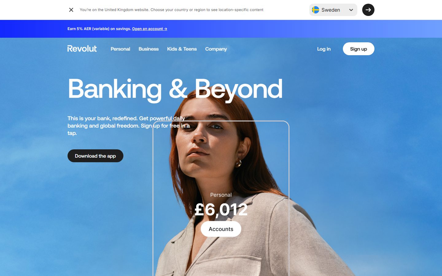
A bold fintech marketing surface built on a full-bleed sky-blue photographic hero, oversized Aeonik Pro display headlines, and pill-shaped controls. The system reads as confident, modern, and consumer-friendly — white text floating over imagery, near-black solid CTAs, soft pastel accent tints for product/feature moments, and large rounded plan cards. Brand voltage comes from the gigantic tightly-tracked display type and the photographic hero rather than from heavy chrome or shadow.
---
version: alpha
name: Revolut-design-analysis
description: A bold fintech marketing surface built on a full-bleed sky-blue photographic hero, oversized Aeonik Pro display headlines, and pill-shaped controls. The system reads as confident, modern, and consumer-friendly — white text floating over imagery, near-black solid CTAs, soft pastel accent tints for product/feature moments, and large rounded plan cards. Brand voltage comes from the gigantic tightly-tracked display type and the photographic hero rather than from heavy chrome or shadow.

colors:
  primary: "#1f1f1f"
  ink: "#1f1f1f"
  black: "#000000"
  canvas: "#ffffff"
  neutral: "#c9c9cd"
  neutral-soft: "#f7f7f7"
  muted: "#717173"
  on-ink: "#f4f4f4"
  accent-blue: "#0666eb"
  accent-blue-bright: "#0a84ff"
  accent-green: "#1ac097"
  accent-teal: "#13d1a3"
  accent-red: "#e23b4a"
  accent-orange: "#ff6112"
  tint-violet: "#f4ebfd"
  tint-pink: "#fde9f3"
  tint-orange: "#fdf2e5"
  tint-teal: "#e5f7f3"
  tint-indigo: "#e7e9fe"
  tint-blue: "#e6f0fd"
  tint-peach: "#ffece2"

typography:
  display-xl:
    fontFamily: "Aeonik Pro, Inter, sans-serif"
    fontSize: 88px
    fontWeight: 500
    lineHeight: 1.0
    letterSpacing: -2.08px
  display-lg:
    fontFamily: "Aeonik Pro, Inter, sans-serif"
    fontSize: 52px
    fontWeight: 500
    lineHeight: 1.0
    letterSpacing: -0.6px
  title:
    fontFamily: "Aeonik Pro, Inter, sans-serif"
    fontSize: 18px
    fontWeight: 400
    lineHeight: 1.333
    letterSpacing: 0
  body:
    fontFamily: "Inter, sans-serif"
    fontSize: 12px
    fontWeight: 400
    lineHeight: 1.5
    letterSpacing: 0.18px

rounded:
  md: 12px
  lg: 20px
  xl: 22px
  pill: 9999px

spacing:
  xxs: 4px
  xs: 8px
  sm: 12px
  md: 16px
  lg: 24px
  xl: 40px
  xxl: 64px
  section: 80px

components:
  promo-banner:
    backgroundColor: "{colors.accent-blue}"
    textColor: "{colors.canvas}"
    typography: "{typography.body}"
    padding: 8px
  top-nav:
    backgroundColor: transparent
    textColor: "{colors.on-ink}"
    typography: "{typography.body}"
    padding: 24px
  nav-link:
    backgroundColor: transparent
    textColor: "{colors.on-ink}"
    typography: "{typography.body}"
  button-primary:
    backgroundColor: "{colors.primary}"
    textColor: "{colors.canvas}"
    typography: "{typography.title}"
    rounded: "{rounded.md}"
    padding: 16px 24px
  button-pill-light:
    backgroundColor: "{colors.canvas}"
    textColor: "{colors.ink}"
    typography: "{typography.title}"
    rounded: "{rounded.pill}"
    padding: 8px 24px
  button-pill-dark:
    backgroundColor: "{colors.primary}"
    textColor: "{colors.canvas}"
    typography: "{typography.title}"
    rounded: "{rounded.pill}"
    padding: 16px 24px
  icon-button-circular:
    backgroundColor: "{colors.black}"
    textColor: "{colors.canvas}"
    rounded: "{rounded.pill}"
  badge-pill:
    backgroundColor: "{colors.canvas}"
    textColor: "{colors.ink}"
    typography: "{typography.body}"
    rounded: "{rounded.pill}"
    padding: 8px 24px
  country-selector:
    backgroundColor: "{colors.neutral-soft}"
    textColor: "{colors.ink}"
    typography: "{typography.body}"
    rounded: "{rounded.pill}"
    padding: 8px 16px
  hero-band:
    backgroundColor: "{colors.accent-blue}"
    textColor: "{colors.canvas}"
    typography: "{typography.display-xl}"
    padding: 80px
  plan-card:
    backgroundColor: "{colors.canvas}"
    textColor: "{colors.ink}"
    typography: "{typography.title}"
    rounded: "{rounded.lg}"
    padding: 24px
  feature-tint-card:
    backgroundColor: "{colors.tint-blue}"
    textColor: "{colors.ink}"
    typography: "{typography.title}"
    rounded: "{rounded.xl}"
    padding: 24px
  footer:
    backgroundColor: "{colors.black}"
    textColor: "{colors.on-ink}"
    typography: "{typography.body}"
    padding: 64px
---

## Overview

Revolut's marketing landing page is a bold consumer-fintech surface anchored on a full-bleed sky-blue photographic hero. The page floor is white canvas (`{colors.canvas}` — #ffffff), but the marquee hero band reads as blue (`{colors.accent-blue}` — #0666eb is the measured brand blue, and the hero photograph is a blue sky behind a portrait). Display headlines are enormous **Aeonik Pro** set at weight 500 with aggressive negative letter-spacing, which is the single loudest element of the brand voice.

Type voice is a two-family split: **Aeonik Pro** (the brand's geometric display/UI face — used for h1, h2, h3, and control labels) and **Inter** (used for small body and fine-print). Aeonik Pro h1 measures ~88px (derived from the measured 87.57px) at -2.08px tracking — tight, confident, almost-touching letterforms that define the marquee.

Component voltage comes from **pill-shaped controls** — the radius scale is dominated by `{rounded.pill}` (9999px), measured 53 times. CTAs, badges ("Personal", "Accounts"), the country selector, and the circular arrow button are all fully rounded. Solid CTAs are near-black (`{colors.primary}` — #1f1f1f); the "Sign up" CTA inverts to a white pill with ink text.

Lower bands switch to a clean white editorial canvas with logo/award strips, alternating into deep black bands (`{colors.black}` — #000000) for full-bleed product photography, and closing on a black footer. A small palette of pastel accent tints (`{colors.tint-violet}`, `{colors.tint-pink}`, `{colors.tint-teal}`, etc.) provides chromatic warmth on feature/product cards without ever touching the primary CTA.

**Key Characteristics:**
- Oversized Aeonik Pro display headlines — h1 ~88px / weight 500 / -2.08px tracking. The negative letter-spacing is the brand signature.
- Pill-everything geometry — `{rounded.pill}` (9999px) is by far the most-used radius (53 occurrences) for buttons, badges, and selectors.
- Near-black solid CTA (`{colors.primary}` — #1f1f1f) with a white-pill inversion for the highest-priority "Sign up" action.
- Full-bleed sky-blue photographic hero with white text floating directly over the image.
- A pastel accent-tint set (violet / pink / orange / teal / indigo / blue / peach) for feature cards, plus saturated accents (`{colors.accent-blue}`, `{colors.accent-green}`, `{colors.accent-red}`, `{colors.accent-orange}`) for product highlights.
- Black full-bleed bands (`{colors.black}`) carry large product photography between white editorial sections.
- Inter only appears at small sizes (12px) for body and legal fine-print; everything visible at scale is Aeonik Pro.
- A flat elevation system — no measured shadows; depth comes from color-block contrast and photography, not drop shadows.

## Colors

### Brand & Accent
- **Accent Blue** (`{colors.accent-blue}` — #0666eb): The brand blue. Drives the promo banner band ("Earn 5% AER…") and acts as the dominant hero atmosphere color.
- **Accent Blue Bright** (`{colors.accent-blue-bright}` — #0a84ff): A brighter blue used in product UI fragments and small accents.
- **Accent Green / Teal** (`{colors.accent-green}` — #1ac097, `{colors.accent-teal}` — #13d1a3): Positive / money-growth accents inside product imagery.
- **Accent Red** (`{colors.accent-red}` — #e23b4a) and **Accent Orange** (`{colors.accent-orange}` — #ff6112): Saturated highlight colors for product cards and feature moments.

### Accent Tints
A pastel set used as soft card/feature backgrounds — never on CTAs:
- `{colors.tint-violet}` (#f4ebfd), `{colors.tint-pink}` (#fde9f3), `{colors.tint-orange}` (#fdf2e5), `{colors.tint-teal}` (#e5f7f3), `{colors.tint-indigo}` (#e7e9fe), `{colors.tint-blue}` (#e6f0fd), `{colors.tint-peach}` (#ffece2). These provide warmth on feature cards and product callouts at low saturation.

### Surface
- **Canvas** (`{colors.canvas}` — #ffffff): The default page floor and the white-pill button surface.
- **Neutral Soft** (`{colors.neutral-soft}` — #f7f7f7): The country-selector pill background and very-soft section fills.
- **Neutral** (`{colors.neutral}` — #c9c9cd): Hairline/border and disabled tone.
- **Black** (`{colors.black}` — #000000): Full-bleed product-photography bands and the footer background.

### Text
- **Ink** (`{colors.ink}` — #1f1f1f): All headlines and primary text on light surfaces; also the solid-CTA fill color.
- **Muted** (`{colors.muted}` — #717173): Secondary text and fine-print on light surfaces.
- **On Ink** (`{colors.on-ink}` — #f4f4f4): Near-white text used for nav links and footer text over dark/photographic surfaces.
- **Canvas as text** (`{colors.canvas}` — #ffffff): White text on the blue hero and on dark CTAs.

## Typography

### Font Family
The system runs **Aeonik Pro** for display and UI labels and **Inter** for small body copy. Aeonik Pro is a commercial geometric sans (licensed, not freely redistributable) — it carries every headline and control label. Inter handles 12px body and legal fine-print. The fallback stack walks `Inter, sans-serif` for both.

The split is functional:
- Aeonik Pro (display + titles + control labels, weight 400–500, negative tracking on large sizes) — h1, h2, h3, buttons
- Inter (small body + fine-print, weight 400, +0.18px tracking) — paragraphs, legal copy

### Hierarchy

| Token | Size | Weight | Line Height | Letter Spacing | Use |
|---|---|---|---|---|---|
| `{typography.display-xl}` | 88px | 500 | 1.0 | -2.08px | Hero h1 ("Banking & Beyond") — Aeonik Pro (size derived from measured 87.57px) |
| `{typography.display-lg}` | 52px | 500 | 1.0 | -0.6px | Section heads — Aeonik Pro (size derived from measured 51.79px) |
| `{typography.title}` | 18px | 400 | 1.333 | 0 | Sub-heads, card titles, control labels — Aeonik Pro (h3) |
| `{typography.body}` | 12px | 400 | 1.5 | 0.18px | Body, captions, legal fine-print, nav links — Inter |

### Principles
Aeonik Pro is the brand voice — every headline and visible label uses it. The defining trait is the tight negative letter-spacing on display sizes (-2.08px at h1, -0.6px at h2); without it the marquee reads as off-brand. Display weight stays at 500 (medium), not bold — the size carries the emphasis, not the weight.

Inter is restricted to small text. There is a large size gap between the 88/52px display tier and the 18px title and 12px body — the system has no measured mid-body size, so editorial running text is sparse and headline-dominant.

### Note on Font Substitutes
**Aeonik Pro is a licensed commercial typeface and cannot be shipped freely.** For an open-source substitute, use **Inter** at weight 500 with roughly -0.04em letter-spacing on display sizes to approximate Aeonik's geometric forms and tight tracking. **Space Grotesk** (weight 500) is another close geometric alternative for the display tier. Inter (already in the stack) covers the body role natively.

## Layout

### Spacing System
- **Base unit:** 4px (measured 4, 8, 12, 16, 24 form a clear 4px-multiple spine; 8px is by far the most frequent at 111 occurrences).
- **Tokens:** `{spacing.xxs}` 4px · `{spacing.xs}` 8px · `{spacing.sm}` 12px · `{spacing.md}` 16px · `{spacing.lg}` 24px · `{spacing.xl}` 40px · `{spacing.xxl}` 64px · `{spacing.section}` 80px.
- **Tightest rhythm:** `{spacing.xs}` (8px) dominates inner padding/gaps.
- **Card internal padding:** `{spacing.lg}` (24px) for plan cards and feature cards.
- **Section padding:** `{spacing.section}` (80px) and `{spacing.xxl}` (64px) between major bands.

### Grid & Container
- **Hero band:** Left-aligned h1 + sub-head + CTA over a full-bleed photographic background with a centered portrait/card.
- **Award / logo strips:** Multi-column horizontal rows of partner logos and badges, centered.
- **Plan grid:** "Choose your plan" renders as a card grid — 3-up for the top tiers (Standard / Plus / Premium), 2-up for the lower tiers (Metal / Ultra).
- **Footer:** Multi-column link list across the page width.

### Whitespace Philosophy
Revolut leans on large display type and full-bleed photography rather than dense layout. Bands alternate white editorial canvas → black product photography → white → black footer, and the 80px/64px section rhythm gives each band room. Small content (logo strips, fine-print) is tightly packed at 8px gaps, while marquee bands breathe.

## Elevation & Depth

| Level | Treatment | Use |
|---|---|---|
| Flat | No shadow, no border | Body sections, hero text, nav |
| Color-block | Solid surface contrast (`{colors.black}` band vs `{colors.canvas}`) | Product-photography bands, footer |
| Photographic | Full-bleed imagery carries its own depth | Hero portrait, product bands |
| Pill controls | Solid fills (`{colors.primary}` / `{colors.canvas}`) with no shadow | CTAs, badges, selectors |

No drop shadows were measured (`shadows: []`). The elevation philosophy is **flat with high-contrast color blocks** — depth comes from alternating white and black full-bleed bands and from photography, not from shadow tokens. Any subtle elevation on the floating hero badges ("Personal £6,012", "Accounts") is rendered by the white pill on the photograph, not a measured shadow.

### Decorative Depth
- The hero composition layers white text and white-outline card frames over a photographic portrait — depth is purely photographic.
- Pastel accent tints provide chromatic differentiation between feature cards without using elevation.

## Shapes

### Border Radius Scale

| Token | Value | Use |
|---|---|---|
| `{rounded.md}` | 12px | Solid CTA buttons (measured button radius), small containers |
| `{rounded.lg}` | 20px | Plan cards, content containers |
| `{rounded.xl}` | 22px | Larger feature / product cards |
| `{rounded.pill}` | 9999px | Buttons, badges, country selector, circular icon button — the dominant radius (53 occurrences) |

### Photography Geometry
The hero uses a full-bleed photograph behind a portrait, with a rounded-corner card frame overlaid. Plan and feature cards use `{rounded.lg}` (20px) to `{rounded.xl}` (22px) corners. Floating hero badges and CTAs use `{rounded.pill}` for a fully-rounded silhouette.

## Components

### Navigation & Banner

**`promo-banner`** — A blue promo strip pinned above the nav ("Earn 5% AER (variable) on savings. Open an account →"). Background `{colors.accent-blue}` (#0666eb), white text in `{typography.body}`, with an underlined inline link. Sits below a thin white country-context bar.

**`top-nav`** — Transparent navigation overlaid on the blue hero. Carries the "Revolut" wordmark at left, primary menu (Personal, Business, Kids & Teens, Company) center, and "Log in" + "Sign up" at right. Links render in `{colors.on-ink}` (near-white) over the photographic hero.

**`nav-link`** — Inline nav menu item, transparent background, `{colors.on-ink}` text, `{typography.body}`.

**`country-selector`** — A pill selector in the top context bar ("🇸🇪 Sweden ▾"). Background `{colors.neutral-soft}` (#f7f7f7), ink text, rounded `{rounded.pill}`, padding 8px × 16px.

**`icon-button-circular`** — A solid black circular button with a white arrow (top-right of the context bar). Background `{colors.black}`, white icon, rounded `{rounded.pill}`.

### Buttons

**`button-primary`** — The measured solid CTA. Background `{colors.primary}` (#1f1f1f), white text, type `{typography.title}`, rounded `{rounded.md}` (12px — the measured button radius). Padding (16px × 24px) is derived from the measured spacing scale; the raw measurement reported 0px padding (see Known Gaps).

**`button-pill-dark`** — The "Download the app" CTA. Near-black fill (`{colors.primary}`), white text, fully rounded `{rounded.pill}`, padding 16px × 24px. This is the most prominent hero action and renders as a pill rather than the 12px-radius `button-primary`.

**`button-pill-light`** — The "Sign up" CTA in the nav. Inverts to a white fill (`{colors.canvas}`) with ink text, rounded `{rounded.pill}`, padding 8px × 24px. The white pill is the highest-priority action signal over the blue hero.

### Badges & Cards

**`badge-pill`** — Floating hero status pills ("Personal", "Accounts £6,012"). White fill (`{colors.canvas}`), ink text, `{typography.body}`, rounded `{rounded.pill}`, padding 8px × 24px. Used as overlay chips on the hero photograph.

**`plan-card`** — Pricing tier cards in "Choose your plan" (Standard / Plus / Premium / Metal / Ultra). Background `{colors.canvas}`, ink text, plan name + price in `{typography.title}`, rounded `{rounded.lg}` (20px), padding `{spacing.lg}` (24px). Each card carries a name, price ("Free", "£3.99/month", etc.), a short description, and an arrow link.

**`feature-tint-card`** — A pastel-backed feature/product card. Background uses one of the accent tints (`{colors.tint-blue}` shown as default; swap to `{colors.tint-violet}`, `{colors.tint-pink}`, `{colors.tint-teal}`, etc.), ink text, rounded `{rounded.xl}` (22px), padding `{spacing.lg}` (24px). Provides chromatic differentiation between feature claims.

**`hero-band`** — The marquee. Blue/photographic background, left-aligned h1 in `{typography.display-xl}`, a short sub-paragraph, and the `{component.button-pill-dark}` CTA. Vertical padding `{spacing.section}` (80px). White text floats over the portrait image.

### Footer

**`footer`** — Black footer closing the page. Background `{colors.black}` (#000000), text `{colors.on-ink}` (near-white), `{typography.body}`, multi-column link list (Global Finances, Help, Security & Protection, Plans, Accounts, Smart Spending). Vertical padding `{spacing.xxl}` (64px).

## Do's and Don'ts

### Do
- Set hero headlines in Aeonik Pro at full size (~88px) with the measured -2.08px tracking. The tight letter-spacing is the brand signature.
- Keep solid CTAs near-black (`{colors.primary}` — #1f1f1f). Invert to a white pill (`{colors.canvas}`) for the single highest-priority action.
- Default to pill geometry (`{rounded.pill}`) for buttons, badges, and selectors — it is the dominant measured radius.
- Reserve the pastel tints (`{colors.tint-*}`) for feature/product cards only; never put a tint on a primary CTA.
- Alternate white editorial bands with black full-bleed product-photography bands for pacing.
- Let photography and color-block contrast carry depth — the system has no shadow tokens.
- Restrict Inter to small body and fine-print; keep everything visible at scale in Aeonik Pro.

### Don't
- Don't bold display type beyond weight 500 — size, not weight, carries the emphasis.
- Don't drop the negative letter-spacing on display sizes; un-tracked Aeonik Pro reads as off-brand.
- Don't add drop shadows to cards or buttons — the system is flat.
- Don't use saturated accents (`{colors.accent-blue}`, `{colors.accent-red}`, `{colors.accent-orange}`) on primary CTAs; reserve them for product imagery and highlights.
- Don't use Inter for headlines or visible labels — that role belongs to Aeonik Pro.
- Don't document hover states — solid CTA and active/pressed only.

## Responsive Behavior

### Breakpoints
The analysis captured a single desktop landing page; breakpoint behavior below is inferred from the layout structure and marked accordingly.

| Name | Width | Key Changes (inferred) |
|---|---|---|
| Mobile | < 768px | Nav collapses to hamburger; hero h1 scales down from ~88px; hero stacks text above image; plan grid 1-up; footer columns stack |
| Tablet | 768–1024px | Nav tightens; plan grid 2-up; logo/award strips wrap |
| Desktop | 1024–1440px | Full hero with left-text / right-portrait composition; plan grid 3-up + 2-up |
| Wide | > 1440px | Same as desktop with more outer breathing room |

### Touch Targets
- `{component.button-pill-dark}` and `{component.button-pill-light}` carry 16px/8px vertical padding plus 24px horizontal — adequate tap area at desktop.
- `{component.icon-button-circular}` and `{component.country-selector}` are pill/circular controls in the top bar.
- Exact mobile touch-target sizing was not measured (see Known Gaps).

### Collapsing Strategy
- Hero text/image composition is expected to stack to a single column on mobile.
- Plan cards collapse 3-up → 2-up → 1-up.
- Logo and award strips wrap to fewer columns.
- Footer link columns stack vertically.

### Image Behavior
- The hero photograph is full-bleed and is expected to re-crop on narrower viewports while keeping the portrait centered.
- Product-photography black bands scale proportionally.

## Iteration Guide

1. Focus on ONE component at a time. Reference its YAML key directly (`{component.button-pill-dark}`, `{component.plan-card}`).
2. Variants of an existing component live as separate entries in `components:` (e.g., `button-pill-light` vs `button-pill-dark`).
3. Use `{token.refs}` everywhere — never inline a hex in a component.
4. Never document hover. Default and Active/Pressed states only.
5. Display headlines stay Aeonik Pro 500 with negative letter-spacing. Body stays Inter 400. The split does not blur.
6. Pill is the default control geometry; use 12–22px radii only for cards/containers.
7. When in doubt about emphasis: bigger Aeonik Pro before bolder Aeonik Pro.

## Known Gaps

- The frequency analyzer captured only ONE button (`button-primary`) with `color: #1f1f1f`, `radius: 12px`, `padding: 0px`. The 0px padding is clearly a measurement artifact (the visible CTAs have substantial padding); button padding values are derived from the measured spacing scale and screenshot ground-truth. The prominent pill-shaped CTAs ("Sign up", "Download the app") are documented from screenshots — the system's dominant `{rounded.pill}` radius (53 occurrences) confirms pill geometry.
- **Aeonik Pro is a licensed commercial typeface** (not flagged in `fonts_licensed`, but it is not freely redistributable). It cannot be shipped; open-source substitutes are documented in the Typography section.
- Display font sizes are reported at sub-pixel precision (87.57px, 51.79px); the token values (88px, 52px) are rounded/derived.
- Only the landing page was captured. The black full-bleed product-photography bands (large empty regions in the screenshot) contain media/video that was not extracted — their internal component specs are unknown.
- No shadow tokens were measured; the flat-with-color-blocks elevation model is inferred from the absence of shadows and confirmed by screenshots.
- The accent-tint set (violet / pink / orange / teal / indigo / blue / peach) is documented from measured CSS frequency; exact per-card assignment of each tint was not captured.
- Mid-range body typography (between 18px titles and 12px Inter body) was not measured — editorial running text sizing is a gap.
- Responsive breakpoints, touch-target sizes, and animation/transition timings were not captured and are inferred.

<!-- Documented by duply · real-world design systems as ready-to-use DESIGN.md for AI coding agents · https://duply.ai/revolut/design-md -->
Color Palette
Accent
Neutrals
Typography
display-xl88px · 500 · 1
The quick brown fox jumpsdisplay-lg52px · 500 · 1
The quick brown fox jumpstitle18px · 400 · 1.333
The quick brown fox jumpsbody12px · 400 · 1.5
The quick brown fox jumpsSpacing & Shape
Spacing
| Name | Value | Preview |
|---|---|---|
| xxs | 4px | |
| xs | 8px | |
| sm | 12px | |
| md | 16px | |
| lg | 24px | |
| xl | 40px | |
| xxl | 64px | |
| section | 80px |
Border Radius
| Name | Value | Preview |
|---|---|---|
| md | 12px | |
| lg | 20px | |
| xl | 22px | |
| pill | 9999px |
More like this


---
version: alpha
name: Revolut-design-analysis
description: A bold fintech marketing surface built on a full-bleed sky-blue photographic hero, oversized Aeonik Pro display headlines, and pill-shaped controls. The system reads as confident, modern, and consumer-friendly — white text floating over imagery, near-black solid CTAs, soft pastel accent tints for product/feature moments, and large rounded plan cards. Brand voltage comes from the gigantic tightly-tracked display type and the photographic hero rather than from heavy chrome or shadow.

colors:
  primary: "#1f1f1f"
  ink: "#1f1f1f"
  black: "#000000"
  canvas: "#ffffff"
  neutral: "#c9c9cd"
  neutral-soft: "#f7f7f7"
  muted: "#717173"
  on-ink: "#f4f4f4"
  accent-blue: "#0666eb"
  accent-blue-bright: "#0a84ff"
  accent-green: "#1ac097"
  accent-teal: "#13d1a3"
  accent-red: "#e23b4a"
  accent-orange: "#ff6112"
  tint-violet: "#f4ebfd"
  tint-pink: "#fde9f3"
  tint-orange: "#fdf2e5"
  tint-teal: "#e5f7f3"
  tint-indigo: "#e7e9fe"
  tint-blue: "#e6f0fd"
  tint-peach: "#ffece2"

typography:
  display-xl:
    fontFamily: "Aeonik Pro, Inter, sans-serif"
    fontSize: 88px
    fontWeight: 500
    lineHeight: 1.0
    letterSpacing: -2.08px
  display-lg:
    fontFamily: "Aeonik Pro, Inter, sans-serif"
    fontSize: 52px
    fontWeight: 500
    lineHeight: 1.0
    letterSpacing: -0.6px
  title:
    fontFamily: "Aeonik Pro, Inter, sans-serif"
    fontSize: 18px
    fontWeight: 400
    lineHeight: 1.333
    letterSpacing: 0
  body:
    fontFamily: "Inter, sans-serif"
    fontSize: 12px
    fontWeight: 400
    lineHeight: 1.5
    letterSpacing: 0.18px

rounded:
  md: 12px
  lg: 20px
  xl: 22px
  pill: 9999px

spacing:
  xxs: 4px
  xs: 8px
  sm: 12px
  md: 16px
  lg: 24px
  xl: 40px
  xxl: 64px
  section: 80px

components:
  promo-banner:
    backgroundColor: "{colors.accent-blue}"
    textColor: "{colors.canvas}"
    typography: "{typography.body}"
    padding: 8px
  top-nav:
    backgroundColor: transparent
    textColor: "{colors.on-ink}"
    typography: "{typography.body}"
    padding: 24px
  nav-link:
    backgroundColor: transparent
    textColor: "{colors.on-ink}"
    typography: "{typography.body}"
  button-primary:
    backgroundColor: "{colors.primary}"
    textColor: "{colors.canvas}"
    typography: "{typography.title}"
    rounded: "{rounded.md}"
    padding: 16px 24px
  button-pill-light:
    backgroundColor: "{colors.canvas}"
    textColor: "{colors.ink}"
    typography: "{typography.title}"
    rounded: "{rounded.pill}"
    padding: 8px 24px
  button-pill-dark:
    backgroundColor: "{colors.primary}"
    textColor: "{colors.canvas}"
    typography: "{typography.title}"
    rounded: "{rounded.pill}"
    padding: 16px 24px
  icon-button-circular:
    backgroundColor: "{colors.black}"
    textColor: "{colors.canvas}"
    rounded: "{rounded.pill}"
  badge-pill:
    backgroundColor: "{colors.canvas}"
    textColor: "{colors.ink}"
    typography: "{typography.body}"
    rounded: "{rounded.pill}"
    padding: 8px 24px
  country-selector:
    backgroundColor: "{colors.neutral-soft}"
    textColor: "{colors.ink}"
    typography: "{typography.body}"
    rounded: "{rounded.pill}"
    padding: 8px 16px
  hero-band:
    backgroundColor: "{colors.accent-blue}"
    textColor: "{colors.canvas}"
    typography: "{typography.display-xl}"
    padding: 80px
  plan-card:
    backgroundColor: "{colors.canvas}"
    textColor: "{colors.ink}"
    typography: "{typography.title}"
    rounded: "{rounded.lg}"
    padding: 24px
  feature-tint-card:
    backgroundColor: "{colors.tint-blue}"
    textColor: "{colors.ink}"
    typography: "{typography.title}"
    rounded: "{rounded.xl}"
    padding: 24px
  footer:
    backgroundColor: "{colors.black}"
    textColor: "{colors.on-ink}"
    typography: "{typography.body}"
    padding: 64px
---

## Overview

Revolut's marketing landing page is a bold consumer-fintech surface anchored on a full-bleed sky-blue photographic hero. The page floor is white canvas (`{colors.canvas}` — #ffffff), but the marquee hero band reads as blue (`{colors.accent-blue}` — #0666eb is the measured brand blue, and the hero photograph is a blue sky behind a portrait). Display headlines are enormous **Aeonik Pro** set at weight 500 with aggressive negative letter-spacing, which is the single loudest element of the brand voice.

Type voice is a two-family split: **Aeonik Pro** (the brand's geometric display/UI face — used for h1, h2, h3, and control labels) and **Inter** (used for small body and fine-print). Aeonik Pro h1 measures ~88px (derived from the measured 87.57px) at -2.08px tracking — tight, confident, almost-touching letterforms that define the marquee.

Component voltage comes from **pill-shaped controls** — the radius scale is dominated by `{rounded.pill}` (9999px), measured 53 times. CTAs, badges ("Personal", "Accounts"), the country selector, and the circular arrow button are all fully rounded. Solid CTAs are near-black (`{colors.primary}` — #1f1f1f); the "Sign up" CTA inverts to a white pill with ink text.

Lower bands switch to a clean white editorial canvas with logo/award strips, alternating into deep black bands (`{colors.black}` — #000000) for full-bleed product photography, and closing on a black footer. A small palette of pastel accent tints (`{colors.tint-violet}`, `{colors.tint-pink}`, `{colors.tint-teal}`, etc.) provides chromatic warmth on feature/product cards without ever touching the primary CTA.

**Key Characteristics:**
- Oversized Aeonik Pro display headlines — h1 ~88px / weight 500 / -2.08px tracking. The negative letter-spacing is the brand signature.
- Pill-everything geometry — `{rounded.pill}` (9999px) is by far the most-used radius (53 occurrences) for buttons, badges, and selectors.
- Near-black solid CTA (`{colors.primary}` — #1f1f1f) with a white-pill inversion for the highest-priority "Sign up" action.
- Full-bleed sky-blue photographic hero with white text floating directly over the image.
- A pastel accent-tint set (violet / pink / orange / teal / indigo / blue / peach) for feature cards, plus saturated accents (`{colors.accent-blue}`, `{colors.accent-green}`, `{colors.accent-red}`, `{colors.accent-orange}`) for product highlights.
- Black full-bleed bands (`{colors.black}`) carry large product photography between white editorial sections.
- Inter only appears at small sizes (12px) for body and legal fine-print; everything visible at scale is Aeonik Pro.
- A flat elevation system — no measured shadows; depth comes from color-block contrast and photography, not drop shadows.

## Colors

### Brand & Accent
- **Accent Blue** (`{colors.accent-blue}` — #0666eb): The brand blue. Drives the promo banner band ("Earn 5% AER…") and acts as the dominant hero atmosphere color.
- **Accent Blue Bright** (`{colors.accent-blue-bright}` — #0a84ff): A brighter blue used in product UI fragments and small accents.
- **Accent Green / Teal** (`{colors.accent-green}` — #1ac097, `{colors.accent-teal}` — #13d1a3): Positive / money-growth accents inside product imagery.
- **Accent Red** (`{colors.accent-red}` — #e23b4a) and **Accent Orange** (`{colors.accent-orange}` — #ff6112): Saturated highlight colors for product cards and feature moments.

### Accent Tints
A pastel set used as soft card/feature backgrounds — never on CTAs:
- `{colors.tint-violet}` (#f4ebfd), `{colors.tint-pink}` (#fde9f3), `{colors.tint-orange}` (#fdf2e5), `{colors.tint-teal}` (#e5f7f3), `{colors.tint-indigo}` (#e7e9fe), `{colors.tint-blue}` (#e6f0fd), `{colors.tint-peach}` (#ffece2). These provide warmth on feature cards and product callouts at low saturation.

### Surface
- **Canvas** (`{colors.canvas}` — #ffffff): The default page floor and the white-pill button surface.
- **Neutral Soft** (`{colors.neutral-soft}` — #f7f7f7): The country-selector pill background and very-soft section fills.
- **Neutral** (`{colors.neutral}` — #c9c9cd): Hairline/border and disabled tone.
- **Black** (`{colors.black}` — #000000): Full-bleed product-photography bands and the footer background.

### Text
- **Ink** (`{colors.ink}` — #1f1f1f): All headlines and primary text on light surfaces; also the solid-CTA fill color.
- **Muted** (`{colors.muted}` — #717173): Secondary text and fine-print on light surfaces.
- **On Ink** (`{colors.on-ink}` — #f4f4f4): Near-white text used for nav links and footer text over dark/photographic surfaces.
- **Canvas as text** (`{colors.canvas}` — #ffffff): White text on the blue hero and on dark CTAs.

## Typography

### Font Family
The system runs **Aeonik Pro** for display and UI labels and **Inter** for small body copy. Aeonik Pro is a commercial geometric sans (licensed, not freely redistributable) — it carries every headline and control label. Inter handles 12px body and legal fine-print. The fallback stack walks `Inter, sans-serif` for both.

The split is functional:
- Aeonik Pro (display + titles + control labels, weight 400–500, negative tracking on large sizes) — h1, h2, h3, buttons
- Inter (small body + fine-print, weight 400, +0.18px tracking) — paragraphs, legal copy

### Hierarchy

| Token | Size | Weight | Line Height | Letter Spacing | Use |
|---|---|---|---|---|---|
| `{typography.display-xl}` | 88px | 500 | 1.0 | -2.08px | Hero h1 ("Banking & Beyond") — Aeonik Pro (size derived from measured 87.57px) |
| `{typography.display-lg}` | 52px | 500 | 1.0 | -0.6px | Section heads — Aeonik Pro (size derived from measured 51.79px) |
| `{typography.title}` | 18px | 400 | 1.333 | 0 | Sub-heads, card titles, control labels — Aeonik Pro (h3) |
| `{typography.body}` | 12px | 400 | 1.5 | 0.18px | Body, captions, legal fine-print, nav links — Inter |

### Principles
Aeonik Pro is the brand voice — every headline and visible label uses it. The defining trait is the tight negative letter-spacing on display sizes (-2.08px at h1, -0.6px at h2); without it the marquee reads as off-brand. Display weight stays at 500 (medium), not bold — the size carries the emphasis, not the weight.

Inter is restricted to small text. There is a large size gap between the 88/52px display tier and the 18px title and 12px body — the system has no measured mid-body size, so editorial running text is sparse and headline-dominant.

### Note on Font Substitutes
**Aeonik Pro is a licensed commercial typeface and cannot be shipped freely.** For an open-source substitute, use **Inter** at weight 500 with roughly -0.04em letter-spacing on display sizes to approximate Aeonik's geometric forms and tight tracking. **Space Grotesk** (weight 500) is another close geometric alternative for the display tier. Inter (already in the stack) covers the body role natively.

## Layout

### Spacing System
- **Base unit:** 4px (measured 4, 8, 12, 16, 24 form a clear 4px-multiple spine; 8px is by far the most frequent at 111 occurrences).
- **Tokens:** `{spacing.xxs}` 4px · `{spacing.xs}` 8px · `{spacing.sm}` 12px · `{spacing.md}` 16px · `{spacing.lg}` 24px · `{spacing.xl}` 40px · `{spacing.xxl}` 64px · `{spacing.section}` 80px.
- **Tightest rhythm:** `{spacing.xs}` (8px) dominates inner padding/gaps.
- **Card internal padding:** `{spacing.lg}` (24px) for plan cards and feature cards.
- **Section padding:** `{spacing.section}` (80px) and `{spacing.xxl}` (64px) between major bands.

### Grid & Container
- **Hero band:** Left-aligned h1 + sub-head + CTA over a full-bleed photographic background with a centered portrait/card.
- **Award / logo strips:** Multi-column horizontal rows of partner logos and badges, centered.
- **Plan grid:** "Choose your plan" renders as a card grid — 3-up for the top tiers (Standard / Plus / Premium), 2-up for the lower tiers (Metal / Ultra).
- **Footer:** Multi-column link list across the page width.

### Whitespace Philosophy
Revolut leans on large display type and full-bleed photography rather than dense layout. Bands alternate white editorial canvas → black product photography → white → black footer, and the 80px/64px section rhythm gives each band room. Small content (logo strips, fine-print) is tightly packed at 8px gaps, while marquee bands breathe.

## Elevation & Depth

| Level | Treatment | Use |
|---|---|---|
| Flat | No shadow, no border | Body sections, hero text, nav |
| Color-block | Solid surface contrast (`{colors.black}` band vs `{colors.canvas}`) | Product-photography bands, footer |
| Photographic | Full-bleed imagery carries its own depth | Hero portrait, product bands |
| Pill controls | Solid fills (`{colors.primary}` / `{colors.canvas}`) with no shadow | CTAs, badges, selectors |

No drop shadows were measured (`shadows: []`). The elevation philosophy is **flat with high-contrast color blocks** — depth comes from alternating white and black full-bleed bands and from photography, not from shadow tokens. Any subtle elevation on the floating hero badges ("Personal £6,012", "Accounts") is rendered by the white pill on the photograph, not a measured shadow.

### Decorative Depth
- The hero composition layers white text and white-outline card frames over a photographic portrait — depth is purely photographic.
- Pastel accent tints provide chromatic differentiation between feature cards without using elevation.

## Shapes

### Border Radius Scale

| Token | Value | Use |
|---|---|---|
| `{rounded.md}` | 12px | Solid CTA buttons (measured button radius), small containers |
| `{rounded.lg}` | 20px | Plan cards, content containers |
| `{rounded.xl}` | 22px | Larger feature / product cards |
| `{rounded.pill}` | 9999px | Buttons, badges, country selector, circular icon button — the dominant radius (53 occurrences) |

### Photography Geometry
The hero uses a full-bleed photograph behind a portrait, with a rounded-corner card frame overlaid. Plan and feature cards use `{rounded.lg}` (20px) to `{rounded.xl}` (22px) corners. Floating hero badges and CTAs use `{rounded.pill}` for a fully-rounded silhouette.

## Components

### Navigation & Banner

**`promo-banner`** — A blue promo strip pinned above the nav ("Earn 5% AER (variable) on savings. Open an account →"). Background `{colors.accent-blue}` (#0666eb), white text in `{typography.body}`, with an underlined inline link. Sits below a thin white country-context bar.

**`top-nav`** — Transparent navigation overlaid on the blue hero. Carries the "Revolut" wordmark at left, primary menu (Personal, Business, Kids & Teens, Company) center, and "Log in" + "Sign up" at right. Links render in `{colors.on-ink}` (near-white) over the photographic hero.

**`nav-link`** — Inline nav menu item, transparent background, `{colors.on-ink}` text, `{typography.body}`.

**`country-selector`** — A pill selector in the top context bar ("🇸🇪 Sweden ▾"). Background `{colors.neutral-soft}` (#f7f7f7), ink text, rounded `{rounded.pill}`, padding 8px × 16px.

**`icon-button-circular`** — A solid black circular button with a white arrow (top-right of the context bar). Background `{colors.black}`, white icon, rounded `{rounded.pill}`.

### Buttons

**`button-primary`** — The measured solid CTA. Background `{colors.primary}` (#1f1f1f), white text, type `{typography.title}`, rounded `{rounded.md}` (12px — the measured button radius). Padding (16px × 24px) is derived from the measured spacing scale; the raw measurement reported 0px padding (see Known Gaps).

**`button-pill-dark`** — The "Download the app" CTA. Near-black fill (`{colors.primary}`), white text, fully rounded `{rounded.pill}`, padding 16px × 24px. This is the most prominent hero action and renders as a pill rather than the 12px-radius `button-primary`.

**`button-pill-light`** — The "Sign up" CTA in the nav. Inverts to a white fill (`{colors.canvas}`) with ink text, rounded `{rounded.pill}`, padding 8px × 24px. The white pill is the highest-priority action signal over the blue hero.

### Badges & Cards

**`badge-pill`** — Floating hero status pills ("Personal", "Accounts £6,012"). White fill (`{colors.canvas}`), ink text, `{typography.body}`, rounded `{rounded.pill}`, padding 8px × 24px. Used as overlay chips on the hero photograph.

**`plan-card`** — Pricing tier cards in "Choose your plan" (Standard / Plus / Premium / Metal / Ultra). Background `{colors.canvas}`, ink text, plan name + price in `{typography.title}`, rounded `{rounded.lg}` (20px), padding `{spacing.lg}` (24px). Each card carries a name, price ("Free", "£3.99/month", etc.), a short description, and an arrow link.

**`feature-tint-card`** — A pastel-backed feature/product card. Background uses one of the accent tints (`{colors.tint-blue}` shown as default; swap to `{colors.tint-violet}`, `{colors.tint-pink}`, `{colors.tint-teal}`, etc.), ink text, rounded `{rounded.xl}` (22px), padding `{spacing.lg}` (24px). Provides chromatic differentiation between feature claims.

**`hero-band`** — The marquee. Blue/photographic background, left-aligned h1 in `{typography.display-xl}`, a short sub-paragraph, and the `{component.button-pill-dark}` CTA. Vertical padding `{spacing.section}` (80px). White text floats over the portrait image.

### Footer

**`footer`** — Black footer closing the page. Background `{colors.black}` (#000000), text `{colors.on-ink}` (near-white), `{typography.body}`, multi-column link list (Global Finances, Help, Security & Protection, Plans, Accounts, Smart Spending). Vertical padding `{spacing.xxl}` (64px).

## Do's and Don'ts

### Do
- Set hero headlines in Aeonik Pro at full size (~88px) with the measured -2.08px tracking. The tight letter-spacing is the brand signature.
- Keep solid CTAs near-black (`{colors.primary}` — #1f1f1f). Invert to a white pill (`{colors.canvas}`) for the single highest-priority action.
- Default to pill geometry (`{rounded.pill}`) for buttons, badges, and selectors — it is the dominant measured radius.
- Reserve the pastel tints (`{colors.tint-*}`) for feature/product cards only; never put a tint on a primary CTA.
- Alternate white editorial bands with black full-bleed product-photography bands for pacing.
- Let photography and color-block contrast carry depth — the system has no shadow tokens.
- Restrict Inter to small body and fine-print; keep everything visible at scale in Aeonik Pro.

### Don't
- Don't bold display type beyond weight 500 — size, not weight, carries the emphasis.
- Don't drop the negative letter-spacing on display sizes; un-tracked Aeonik Pro reads as off-brand.
- Don't add drop shadows to cards or buttons — the system is flat.
- Don't use saturated accents (`{colors.accent-blue}`, `{colors.accent-red}`, `{colors.accent-orange}`) on primary CTAs; reserve them for product imagery and highlights.
- Don't use Inter for headlines or visible labels — that role belongs to Aeonik Pro.
- Don't document hover states — solid CTA and active/pressed only.

## Responsive Behavior

### Breakpoints
The analysis captured a single desktop landing page; breakpoint behavior below is inferred from the layout structure and marked accordingly.

| Name | Width | Key Changes (inferred) |
|---|---|---|
| Mobile | < 768px | Nav collapses to hamburger; hero h1 scales down from ~88px; hero stacks text above image; plan grid 1-up; footer columns stack |
| Tablet | 768–1024px | Nav tightens; plan grid 2-up; logo/award strips wrap |
| Desktop | 1024–1440px | Full hero with left-text / right-portrait composition; plan grid 3-up + 2-up |
| Wide | > 1440px | Same as desktop with more outer breathing room |

### Touch Targets
- `{component.button-pill-dark}` and `{component.button-pill-light}` carry 16px/8px vertical padding plus 24px horizontal — adequate tap area at desktop.
- `{component.icon-button-circular}` and `{component.country-selector}` are pill/circular controls in the top bar.
- Exact mobile touch-target sizing was not measured (see Known Gaps).

### Collapsing Strategy
- Hero text/image composition is expected to stack to a single column on mobile.
- Plan cards collapse 3-up → 2-up → 1-up.
- Logo and award strips wrap to fewer columns.
- Footer link columns stack vertically.

### Image Behavior
- The hero photograph is full-bleed and is expected to re-crop on narrower viewports while keeping the portrait centered.
- Product-photography black bands scale proportionally.

## Iteration Guide

1. Focus on ONE component at a time. Reference its YAML key directly (`{component.button-pill-dark}`, `{component.plan-card}`).
2. Variants of an existing component live as separate entries in `components:` (e.g., `button-pill-light` vs `button-pill-dark`).
3. Use `{token.refs}` everywhere — never inline a hex in a component.
4. Never document hover. Default and Active/Pressed states only.
5. Display headlines stay Aeonik Pro 500 with negative letter-spacing. Body stays Inter 400. The split does not blur.
6. Pill is the default control geometry; use 12–22px radii only for cards/containers.
7. When in doubt about emphasis: bigger Aeonik Pro before bolder Aeonik Pro.

## Known Gaps

- The frequency analyzer captured only ONE button (`button-primary`) with `color: #1f1f1f`, `radius: 12px`, `padding: 0px`. The 0px padding is clearly a measurement artifact (the visible CTAs have substantial padding); button padding values are derived from the measured spacing scale and screenshot ground-truth. The prominent pill-shaped CTAs ("Sign up", "Download the app") are documented from screenshots — the system's dominant `{rounded.pill}` radius (53 occurrences) confirms pill geometry.
- **Aeonik Pro is a licensed commercial typeface** (not flagged in `fonts_licensed`, but it is not freely redistributable). It cannot be shipped; open-source substitutes are documented in the Typography section.
- Display font sizes are reported at sub-pixel precision (87.57px, 51.79px); the token values (88px, 52px) are rounded/derived.
- Only the landing page was captured. The black full-bleed product-photography bands (large empty regions in the screenshot) contain media/video that was not extracted — their internal component specs are unknown.
- No shadow tokens were measured; the flat-with-color-blocks elevation model is inferred from the absence of shadows and confirmed by screenshots.
- The accent-tint set (violet / pink / orange / teal / indigo / blue / peach) is documented from measured CSS frequency; exact per-card assignment of each tint was not captured.
- Mid-range body typography (between 18px titles and 12px Inter body) was not measured — editorial running text sizing is a gap.
- Responsive breakpoints, touch-target sizes, and animation/transition timings were not captured and are inferred.

<!-- Documented by duply · real-world design systems as ready-to-use DESIGN.md for AI coding agents · https://duply.ai/revolut/design-md -->