ElevenLabs
A calm, research-lab marketing surface built on a warm near-white canvas with pure-black pill CTAs and a light Waldenburg display headline. The system reads as quietly premium AI infrastructure — generous whitespace, warm sand-gray cards, pill-shaped segmented controls, and vivid gradient orbs as the only chromatic voltage. Almost everything is monochrome ink-on-warm-white; saturation lives entirely in product artwork.
---
version: alpha
name: ElevenLabs-design-analysis
description: A calm, research-lab marketing surface built on a warm near-white canvas with pure-black pill CTAs and a light Waldenburg display headline. The system reads as quietly premium AI infrastructure — generous whitespace, warm sand-gray cards, pill-shaped segmented controls, and vivid gradient orbs as the only chromatic voltage. Almost everything is monochrome ink-on-warm-white; saturation lives entirely in product artwork.
colors:
primary: "#000000"
ink: "#000000"
ink-blue-black: "#090f15"
body: "#57534e"
muted: "#777169"
neutral: "#a59f97"
neutral-soft: "#9ca3af"
canvas: "#fdfcfc"
surface: "#ffffff"
surface-warm: "#f5f3f1"
surface-warm-soft: "#faf9f8"
surface-warm-alt: "#edebe8"
surface-warm-alt2: "#ebe8e4"
hairline: "#d7d2cc"
sand: "#e8dcc8"
on-primary: "#ffffff"
accent-blue: "#2b7fff"
accent-blue-dark: "#0a59d2"
accent-blue-deep: "#052f70"
accent-red: "#f41a2f"
accent-red-deep: "#b22e20"
accent-magenta: "#b743c6"
typography:
display:
fontFamily: "Waldenburg, Inter, sans-serif"
fontSize: 48px
fontWeight: 300
lineHeight: 1.083
letterSpacing: "-0.96px"
heading-md:
fontFamily: "Inter, sans-serif"
fontSize: 16px
fontWeight: 500
lineHeight: 1.5
letterSpacing: "0.16px"
heading-sm:
fontFamily: "Inter, sans-serif"
fontSize: 16px
fontWeight: 400
lineHeight: 1.5
letterSpacing: "0.16px"
body:
fontFamily: "Inter, sans-serif"
fontSize: 16px
fontWeight: 400
lineHeight: 1.5
letterSpacing: "0.16px"
body-sm:
fontFamily: "Inter, sans-serif"
fontSize: 15px
fontWeight: 400
lineHeight: 1.467
letterSpacing: "0.15px"
button:
fontFamily: "Inter, sans-serif"
fontSize: 14px
fontWeight: 400
lineHeight: 1.429
letterSpacing: "normal"
rounded:
none: 0px
xs: 2px
sm: 4px
md: 8px
lg: 16px
button: 18px
xl: 20px
pill: 9999px
spacing:
xxs: 4px
xs: 6px
sm: 8px
md: 12px
lg: 16px
xl: 20px
xxl: 24px
xxxl: 28px
components:
top-nav:
backgroundColor: "{colors.canvas}"
textColor: "{colors.ink}"
typography: "{typography.button}"
button-primary:
backgroundColor: "{colors.primary}"
textColor: "{colors.on-primary}"
typography: "{typography.button}"
rounded: "{rounded.button}"
padding: 8px 12px
button-secondary:
backgroundColor: "{colors.surface}"
textColor: "{colors.ink}"
typography: "{typography.button}"
rounded: "{rounded.button}"
padding: 8px 12px
segmented-control:
backgroundColor: "{colors.surface-warm}"
textColor: "{colors.muted}"
typography: "{typography.heading-md}"
rounded: "{rounded.pill}"
padding: 6px
segmented-control-active:
backgroundColor: "{colors.surface}"
textColor: "{colors.ink}"
typography: "{typography.heading-md}"
rounded: "{rounded.pill}"
padding: 8px 16px
pill-tag:
backgroundColor: "{colors.surface}"
textColor: "{colors.ink}"
typography: "{typography.button}"
rounded: "{rounded.pill}"
padding: 8px 12px
card:
backgroundColor: "{colors.surface}"
textColor: "{colors.ink}"
typography: "{typography.heading-md}"
rounded: "{rounded.lg}"
feature-card:
backgroundColor: "{colors.surface-warm}"
textColor: "{colors.ink}"
typography: "{typography.heading-md}"
rounded: "{rounded.xl}"
padding: 28px
feature-card-soft:
backgroundColor: "{colors.surface-warm-soft}"
textColor: "{colors.body}"
typography: "{typography.body-sm}"
rounded: "{rounded.lg}"
padding: 20px
code-block:
backgroundColor: "{colors.surface}"
textColor: "{colors.ink}"
typography: "{typography.body-sm}"
rounded: "{rounded.lg}"
padding: 20px
input:
backgroundColor: "{colors.surface}"
textColor: "{colors.ink}"
typography: "{typography.body}"
rounded: "{rounded.none}"
logo-tile:
backgroundColor: "{colors.surface-warm-soft}"
textColor: "{colors.muted}"
rounded: "{rounded.lg}"
---
## Overview
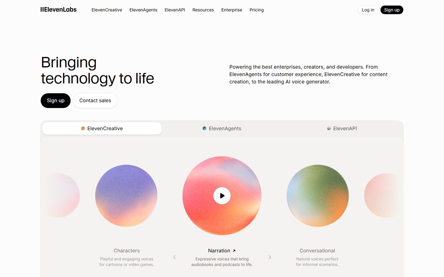
ElevenLabs' marketing surface is a calm, research-lab interface — a warm near-white canvas (`{colors.canvas}` — #fdfcfc) carrying pure-black pill CTAs (`{colors.primary}` — #000000), a light-weight **Waldenburg** display headline, and Inter for everything else. The system reads as quietly premium AI infrastructure: lots of whitespace, soft warm-gray cards, and almost no chrome competing for attention. The brand confidence comes from restraint — a near-monochrome editorial frame that lets vivid gradient orbs (the product artwork) supply all the saturation.
The headline voice is unusual for SaaS: the hero h1 ("Bringing technology to life") is set in **Waldenburg at weight 300** with tight negative tracking (-0.96px) — a light, almost editorial display tone rather than a bold marketing shout. Everything below the headline drops to Inter at 400–500 weight, 16px, with a faint positive letter-spacing (0.16px). The contrast between the airy display and the small steady body type is the system's signature.
Component voltage is delivered through **gradient orbs and embedded product UI** — the carousel of grainy colored spheres (purple, coral-orange, olive-green) and small dashboard screenshots sit inside warm-gray cards. The chrome itself stays monochrome; the color is content.
Interactive surfaces lean on pills: the primary CTA, the secondary CTA, the `ElevenCreative / ElevenAgents / ElevenAPI` segmented control, and small feature tags are all pill-radius (`{rounded.pill}`). Cards use a softer 16–20px radius, and the rare input is fully square (`{rounded.none}`).
**Key Characteristics:**
- Warm near-white canvas (`{colors.canvas}` — #fdfcfc) with a slightly cooler white card surface (`{colors.surface}` — #ffffff). The two whites are deliberately close — the warmth is what reads as "ElevenLabs" rather than generic SaaS white.
- Pure-black pill CTA (`{colors.primary}` — #000000) at `{rounded.button}` (18px), small padding (8×12px), Inter 14px / 400 label. Confident but compact, never oversized.
- Light Waldenburg display headline (weight 300, -0.96px tracking) — a licensed/custom face substituted here with Inter. The 300 weight is the brand's editorial signature.
- Pill-shaped segmented control (`{component.segmented-control}`) with a white active pill (`{component.segmented-control-active}`) floating on a warm-gray track — the product-mode switcher between ElevenCreative / ElevenAgents / ElevenAPI.
- Warm sand-gray feature cards (`{colors.surface-warm}` — #f5f3f1) holding product artwork; the chrome is monochrome and color lives only in embedded gradient orbs and screenshots.
- Saturated accents (`{colors.accent-blue}` #2b7fff, `{colors.accent-red}` #f41a2f, `{colors.accent-magenta}` #b743c6) appear almost exclusively inside product imagery and analytics chips — never on primary CTAs.
- Hierarchical radius: `{rounded.sm}` (4px) for small chips/dividers, `{rounded.lg}` (16px) for cards, `{rounded.xl}` (20px) for larger feature cards, `{rounded.button}` (18px) and `{rounded.pill}` for interactive elements.
- Soft, low-alpha shadows and 0.5px inset hairlines define cards rather than heavy elevation.
## Colors
### Brand & Action
- **Primary / Ink** (`{colors.primary}` / `{colors.ink}` — #000000): The action and headline color. Every primary CTA, the wordmark, hero display, and high-contrast text use pure black. The system has no colored primary button.
- **Ink Blue-Black** (`{colors.ink-blue-black}` — #090f15): A near-black used in darker product imagery and deep UI fragments.
### Accents (product imagery & chips)
ElevenLabs is monochrome at the chrome layer — these saturated values appear inside gradient orbs, analytics charts, and small status chips, never on CTAs:
- **Accent Blue** (`{colors.accent-blue}` — #2b7fff), **Accent Blue Dark** (`{colors.accent-blue-dark}` — #0a59d2), **Accent Blue Deep** (`{colors.accent-blue-deep}` — #052f70): analytics lines, links, the ElevenAgents accent.
- **Accent Red** (`{colors.accent-red}` — #f41a2f) and **Accent Red Deep** (`{colors.accent-red-deep}` — #b22e20): waveform/recording artwork and warning moments.
- **Accent Magenta** (`{colors.accent-magenta}` — #b743c6): gradient-orb and feature artwork.
- **Sand** (`{colors.sand}` — #e8dcc8): warm decorative fill in artwork and tinted card edges.
### Surface
- **Canvas** (`{colors.canvas}` — #fdfcfc): The warm page floor.
- **Surface** (`{colors.surface}` — #ffffff): Card, code-block, active-pill, and input surface.
- **Surface Warm** (`{colors.surface-warm}` — #f5f3f1): Feature-card background and the segmented-control track.
- **Surface Warm Soft** (`{colors.surface-warm-soft}` — #faf9f8): The lightest warm fill — logo tiles and very-soft inner cards.
- **Surface Warm Alt** (`{colors.surface-warm-alt}` — #edebe8) and **Alt 2** (`{colors.surface-warm-alt2}` — #ebe8e4): Subtle alternating section/card tints.
- **Hairline** (`{colors.hairline}` — #d7d2cc): The warm 1px divider tone.
### Text
- **Ink** (`{colors.ink}` — #000000): Headlines and primary text.
- **Body** (`{colors.body}` — #57534e): Default running-text on warm canvas.
- **Muted** (`{colors.muted}` — #777169): Secondary text — sub-headings, captions, inactive tabs.
- **Neutral** (`{colors.neutral}` — #a59f97) and **Neutral Soft** (`{colors.neutral-soft}` — #9ca3af): Tertiary text, placeholder, faint labels under carousel orbs.
- **On Primary** (`{colors.on-primary}` — #ffffff): Text on the black CTA.
## Typography
### Font Family
The system pairs **Waldenburg** (display headlines) with **Inter** (everything else). Waldenburg is a commercial/custom geometric grotesque used here only for the hero h1 — at weight 300 with negative tracking, it gives the brand its airy editorial tone. Inter handles all sub-headings, body, navigation, buttons, captions, and code labels at 400–500 weight with a faint positive letter-spacing (~0.15–0.16px).
The split is strict:
- Waldenburg (display, weight 300, -0.96px tracking) — hero h1 only
- Inter (UI + body, 400–500 weight, ~0.16px tracking) — headings, paragraphs, labels, buttons
### Hierarchy
| Token | Size | Weight | Line Height | Letter Spacing | Use |
|---|---|---|---|---|---|
| `{typography.display}` | 48px | 300 | 1.083 | -0.96px | Hero h1 ("Bringing technology to life") — Waldenburg |
| `{typography.heading-md}` | 16px | 500 | 1.5 | 0.16px | Section/card titles (h3), active tab labels — Inter |
| `{typography.heading-sm}` | 16px | 400 | 1.5 | 0.16px | Sub-headings (h2) — Inter |
| `{typography.body}` | 16px | 400 | 1.5 | 0.16px | Default running-text — Inter |
| `{typography.body-sm}` | 15px | 400 | 1.467 | 0.15px | Dense supporting text (h4), code labels — Inter |
| `{typography.button}` | 14px | 400 | 1.429 | normal | Button + nav-link labels — Inter |
### Principles
The measured type scale is unusually flat — display at 48px then almost everything else at 15–16px. Hierarchy is carried by **weight and color**, not size: titles step from Inter 400 to Inter 500, secondary copy drops to `{colors.muted}`. The only true display moment is the Waldenburg h1; keep it light (300), never bold. Body type keeps the faint 0.16px positive tracking — it reads as precise and engineered.
### Note on Font Substitutes
**Waldenburg is a licensed/custom typeface and is not shipped here.** Although the analyzer's `fonts_licensed` list was empty, Waldenburg is a commercial face and must be substituted. Use **Inter** at weight 300 with ~-0.02em tracking as the documented fallback (preserving the light-display signature), or **Söhne Light** / **Neue Haas Grotesk Light** as closer geometric-grotesque alternatives if licensed. Never claim to ship Waldenburg.
## Layout
### Spacing System
- **Base unit:** loosely 4px, but the measured rhythm is irregular (6px and 9px were the most frequent gaps).
- **Tokens:** `{spacing.xxs}` 4px · `{spacing.xs}` 6px · `{spacing.sm}` 8px · `{spacing.md}` 12px · `{spacing.lg}` 16px · `{spacing.xl}` 20px · `{spacing.xxl}` 24px · `{spacing.xxxl}` 28px.
- **Card internal padding:** ~28px (`{spacing.xxxl}`) on larger feature cards; ~20px (`{spacing.xl}`) on soft inner cards and code blocks.
- **Tight component gaps:** 6–9px dominate inside pills, tab groups, and button label/icon clusters.
### Grid & Container
- **Hero:** a left/right split — Waldenburg h1 + CTA pills on the left, a supporting body paragraph on the right (a ~6/4 editorial split rather than a centered hero).
- **Carousel band:** a horizontal row of gradient orbs inside a single large warm card, with a centered play affordance and chevron controls.
- **Feature bands:** two-up product split (ElevenCreative / ElevenAgents), then 4-up small feature-card grids beneath each.
- **Logo wall:** multi-column trusted-by grid in faint `{colors.muted}` marks.
- **Code bands:** two-up split — copy on the left, a white code block on the right.
### Whitespace Philosophy
The page breathes generously between bands. Each section leads with a light Waldenburg or Inter-500 headline and a short muted paragraph, then a single large artifact (orb carousel, dashboard screenshot, code block). Density never builds — the calm spacing is the premium signal.
## Elevation & Depth
| Level | Treatment | Use |
|---|---|---|
| Flat | No shadow, on warm canvas | Body sections, top nav, logo wall |
| Inset hairline | `0 0 0 0.5px rgba(0,0,0,0.075)` inset / `0 0 0 0.5px rgba(0,0,0,0.1)` inset | Pills, segmented-control pills, small chips — a hairline ring instead of a border |
| Soft card | `0 0 0 1px rgba(0,0,0,0.06)`, `0 1px 2px`, `0 2px 4px rgba(0,0,0,0.04)` | Standard content cards, code blocks |
| Floating pill | `0 0 1px rgba(0,0,0,0.4)`, `0 2px 4px rgba(0,0,0,0.04)` | The white active pill inside the segmented control |
Elevation is uniformly **soft and low-alpha** — most "borders" are actually 0.5px inset shadows rather than solid strokes, which keeps edges crisp on the warm canvas without a visible hairline color. No heavy drop shadows, no glassmorphism.
### Decorative Depth
- Gradient orbs (purple, coral, olive, sand) are grainy/noisy spheres that carry their own internal lighting — the only saturated depth in the system, used as the hero carousel content.
- Embedded dashboard screenshots retain their native product shadows; these are content, not system tokens.
## Shapes
### Border Radius Scale
| Token | Value | Use |
|---|---|---|
| `{rounded.none}` | 0px | Inputs (the measured input is fully square) |
| `{rounded.xs}` | 2px | Tiny accents, dividers |
| `{rounded.sm}` | 4px | Small chips, inner tiles (the most frequent non-pill radius) |
| `{rounded.md}` | 8px | Medium chips, nested elements |
| `{rounded.lg}` | 16px | Standard cards, code blocks |
| `{rounded.button}` | 18px | Primary + secondary CTAs |
| `{rounded.xl}` | 20px | Larger feature cards (second most frequent radius) |
| `{rounded.pill}` | 9999px | Pill CTAs, segmented control, feature tags (the single most frequent radius) |
### Imagery Geometry
Gradient orbs are perfect circles. Product screenshots and feature cards round to `{rounded.lg}`–`{rounded.xl}`. The dominance of `{rounded.pill}` (the most-measured radius) makes the pill the system's defining shape — controls are pills, surfaces are soft rectangles.
## Components
### Top Navigation
**`top-nav`** — Warm-canvas nav bar carrying the `‖ElevenLabs` wordmark at left, a center menu (ElevenCreative, ElevenAgents, ElevenAPI, Resources, Enterprise, Pricing) in `{typography.button}`, and a right cluster with a `{component.button-secondary}` "Log in" and a `{component.button-primary}` "Sign up". Background `{colors.canvas}`, text `{colors.ink}`, flat (no shadow).
### Buttons
**`button-primary`** — The signature CTA. Background `{colors.primary}` (#000000), text `{colors.on-primary}`, type `{typography.button}` (Inter 14px / 400), padding 8×12px, rounded `{rounded.button}` (18px → reads as a pill at this height). Used for "Sign up" everywhere.
**`button-secondary`** — White companion CTA ("Contact sales", "Log in", "Read all stories"). Background `{colors.surface}`, text `{colors.ink}`, an inset hairline ring for the border, same padding + radius as primary.
### Tabs / Controls
**`segmented-control`** — The product-mode switcher (ElevenCreative / ElevenAgents / ElevenAPI). Pill-radius track in `{colors.surface-warm}`, inactive labels in `{colors.muted}` (`{typography.heading-md}`), small colored dot per mode. Internal padding ~6px.
**`segmented-control-active`** — The selected segment renders as a white pill (`{colors.surface}`) with `{colors.ink}` text and a floating soft shadow inside the track, rounded `{rounded.pill}`.
**`pill-tag`** — Small capability pills under the hero carousel ("AI Voice Generator", "Text to Speech", "Music", "Speech to Text", "Voice Cloning", "Dubbing"). Background `{colors.surface}`, text `{colors.ink}`, type `{typography.button}`, rounded `{rounded.pill}`, padding 8×12px, with an inset hairline ring.
### Cards & Containers
**`card`** — Generic white content card. Background `{colors.surface}`, rounded `{rounded.lg}` (16px), soft card shadow. Holds dashboard screenshots and product UI fragments.
**`feature-card`** — Warm sand-gray feature card holding artwork (the all-in-one editor, omnichannel-agents chat, etc.). Background `{colors.surface-warm}` (#f5f3f1), text `{colors.ink}`, title in `{typography.heading-md}`, rounded `{rounded.xl}` (20px), internal padding ~28px.
**`feature-card-soft`** — The lighter 4-up sub-feature cards ("Music", "SFX", "Voices", "Image & Video", "Testing", "Guardrails", "Workflows"). Background `{colors.surface-warm-soft}` (#faf9f8), body text in `{colors.body}` (`{typography.body-sm}`), rounded `{rounded.lg}`, padding ~20px. Carries a small mono icon, title, and short description.
**`logo-tile`** — Trusted-by logo cell. Background `{colors.surface-warm-soft}`, marks rendered in `{colors.muted}`, rounded `{rounded.lg}`.
### Code & Inputs
**`code-block`** — White API-example panel ("import { ElevenLabsClient } …"). Background `{colors.surface}`, text `{colors.ink}`, type `{typography.body-sm}` (the system uses Inter for code labels rather than a mono face per measurement), rounded `{rounded.lg}`, padding ~20px, soft card shadow.
**`input`** — Standard input. Background `{colors.surface}`, text `{colors.ink}`, type `{typography.body}`, rounded `{rounded.none}` (0px — the measured input is fully square, a deliberate counterpoint to the pill controls).
## Do's and Don'ts
### Do
- Reserve `{colors.primary}` (#000000) for primary CTAs and the Waldenburg headline. The brand button is black, never colored.
- Keep the hero headline light — Waldenburg (or Inter) at weight 300 with negative tracking. The airy display is the brand voice.
- Let color live in artwork — gradient orbs, screenshots, analytics chips. Keep the surrounding chrome monochrome warm-white.
- Use the two warm whites deliberately: `{colors.canvas}` (#fdfcfc) for the page, `{colors.surface}` (#ffffff) for floating cards. The warmth is the brand.
- Use pills for all interactive controls (`{component.button-primary}`, `{component.pill-tag}`, `{component.segmented-control}`) and softer 16–20px radii for content surfaces.
- Prefer 0.5px inset hairline rings over solid borders — it matches the system's measured edge treatment.
### Don't
- Don't put accent colors (`{colors.accent-blue}`, `{colors.accent-red}`, `{colors.accent-magenta}`) on CTAs or backgrounds — they belong inside imagery and chips only.
- Don't bold the display headline. Waldenburg at 300 is the point; heavy weight reads as off-brand.
- Don't introduce a large type scale between display and body — hierarchy is carried by weight (Inter 400 → 500) and color (`{colors.ink}` → `{colors.muted}`), not many sizes.
- Don't round inputs — the measured input is square (`{rounded.none}`) against the pill controls.
- Don't add heavy drop shadows. The system stays soft, low-alpha, hairline-defined.
## Responsive Behavior
### Breakpoints
| Name | Width | Key Changes |
|---|---|---|
| Mobile | < 768px | Nav collapses; hero h1 wraps to two lines; CTA pills stack; orb carousel shows fewer orbs with chevrons; feature grids 1-up; code blocks scroll horizontally |
| Tablet | 768–1024px | Horizontal nav tightens; two-up feature splits hold; 4-up sub-feature cards drop to 2-up |
| Desktop | 1024–1440px | Full nav, hero left/right split, orb carousel full-width, 4-up sub-feature grids |
| Wide | > 1440px | Same as desktop with larger outer margins; content stays centered |
### Touch Targets
- `{component.button-primary}` / `{component.button-secondary}` are compact (8×12px padding) — at hero scale the pill silhouette gives a comfortable tap area; verify minimum 44px height on mobile.
- `{component.segmented-control}` segments and `{component.pill-tag}` chips need adequate hit padding on mobile (the 6px internal padding is tight for touch).
### Collapsing Strategy
- The hero's left/right text split stacks to single column on mobile (headline + CTAs first, then the supporting paragraph).
- The orb carousel reduces visible orbs and relies on the chevron controls.
- Feature splits collapse from two-up to one-up; sub-feature cards step 4 → 2 → 1.
- Code blocks scroll horizontally rather than reflow.
### Image Behavior
- Gradient orbs stay circular and scale proportionally.
- Embedded dashboard screenshots retain aspect ratio inside resizing cards.
## Iteration Guide
1. Focus on ONE component at a time, referencing its YAML key (`{component.feature-card}`, `{component.segmented-control-active}`).
2. State variants (`-active`, `-secondary`, `-soft`) live as separate `components:` entries.
3. Use `{token.refs}` everywhere — never inline a hex in a component.
4. Document only default and active/pressed states — no hover docs.
5. Keep the display headline light (Waldenburg/Inter 300, negative tracking); keep body Inter 400–500 with ~0.16px tracking. The split does not blur.
6. Keep saturation inside artwork. The chrome stays monochrome warm-white.
7. When in doubt about emphasis: shift weight and color before adding a new type size.
## Known Gaps
- **Waldenburg is licensed/custom** but was NOT flagged in the analyzer's `fonts_licensed` array (which was empty). It is documented with an open-source substitute (Inter 300) regardless; the exact licensed face is not shipped.
- The spacing rhythm is irregular — 6px and 9px were the most frequent measured gaps, not a clean 8px grid. Tokens are normalized approximations of the measured values; verify against production CSS.
- Only three components (`button-primary`, `card`, `input`) were captured by the analyzer; the segmented control, pill tags, feature cards, code block, and logo tiles are documented from screenshot ground-truth plus measured tokens.
- Button height is inferred from padding + line-height; the absolute pixel height was not measured.
- The pricing page was captured but no pricing-specific tokens (tier cards, toggles, tables) were extracted — those surfaces are out of scope here.
- Semantic state colors (success/warning/error) were not isolated; the red and blue accents observed appear in product artwork and may not map to systemic semantic roles.
- No measured dark surfaces, though screenshots show dark product imagery and a dark research/dubbing band — those are content artwork, not confirmed system surface tokens.
- Animation and transition timings (orb carousel, play button, tab switching) are not in scope.
<!-- Documented by duply · real-world design systems as ready-to-use DESIGN.md for AI coding agents · https://duply.ai/elevenlabs/design-md -->
Color Palette
Accent
Neutrals
Typography
display48px · 300 · 1.083
The quick brown fox jumpsheading-md16px · 500 · 1.5
The quick brown fox jumpsheading-sm16px · 400 · 1.5
The quick brown fox jumpsbody16px · 400 · 1.5
The quick brown fox jumpsbody-sm15px · 400 · 1.467
The quick brown fox jumpsbutton14px · 400 · 1.429
The quick brown fox jumpsSpacing & Shape
Spacing
| Name | Value | Preview |
|---|---|---|
| xxs | 4px | |
| xs | 6px | |
| sm | 8px | |
| md | 12px | |
| lg | 16px | |
| xl | 20px | |
| xxl | 24px | |
| xxxl | 28px |
Border Radius
| Name | Value | Preview |
|---|---|---|
| none | 0px | |
| xs | 2px | |
| sm | 4px | |
| md | 8px | |
| lg | 16px | |
| button | 18px | |
| xl | 20px | |
| pill | 9999px |
More like this


---
version: alpha
name: ElevenLabs-design-analysis
description: A calm, research-lab marketing surface built on a warm near-white canvas with pure-black pill CTAs and a light Waldenburg display headline. The system reads as quietly premium AI infrastructure — generous whitespace, warm sand-gray cards, pill-shaped segmented controls, and vivid gradient orbs as the only chromatic voltage. Almost everything is monochrome ink-on-warm-white; saturation lives entirely in product artwork.
colors:
  primary: "#000000"
  ink: "#000000"
  ink-blue-black: "#090f15"
  body: "#57534e"
  muted: "#777169"
  neutral: "#a59f97"
  neutral-soft: "#9ca3af"
  canvas: "#fdfcfc"
  surface: "#ffffff"
  surface-warm: "#f5f3f1"
  surface-warm-soft: "#faf9f8"
  surface-warm-alt: "#edebe8"
  surface-warm-alt2: "#ebe8e4"
  hairline: "#d7d2cc"
  sand: "#e8dcc8"
  on-primary: "#ffffff"
  accent-blue: "#2b7fff"
  accent-blue-dark: "#0a59d2"
  accent-blue-deep: "#052f70"
  accent-red: "#f41a2f"
  accent-red-deep: "#b22e20"
  accent-magenta: "#b743c6"
typography:
  display:
    fontFamily: "Waldenburg, Inter, sans-serif"
    fontSize: 48px
    fontWeight: 300
    lineHeight: 1.083
    letterSpacing: "-0.96px"
  heading-md:
    fontFamily: "Inter, sans-serif"
    fontSize: 16px
    fontWeight: 500
    lineHeight: 1.5
    letterSpacing: "0.16px"
  heading-sm:
    fontFamily: "Inter, sans-serif"
    fontSize: 16px
    fontWeight: 400
    lineHeight: 1.5
    letterSpacing: "0.16px"
  body:
    fontFamily: "Inter, sans-serif"
    fontSize: 16px
    fontWeight: 400
    lineHeight: 1.5
    letterSpacing: "0.16px"
  body-sm:
    fontFamily: "Inter, sans-serif"
    fontSize: 15px
    fontWeight: 400
    lineHeight: 1.467
    letterSpacing: "0.15px"
  button:
    fontFamily: "Inter, sans-serif"
    fontSize: 14px
    fontWeight: 400
    lineHeight: 1.429
    letterSpacing: "normal"
rounded:
  none: 0px
  xs: 2px
  sm: 4px
  md: 8px
  lg: 16px
  button: 18px
  xl: 20px
  pill: 9999px
spacing:
  xxs: 4px
  xs: 6px
  sm: 8px
  md: 12px
  lg: 16px
  xl: 20px
  xxl: 24px
  xxxl: 28px
components:
  top-nav:
    backgroundColor: "{colors.canvas}"
    textColor: "{colors.ink}"
    typography: "{typography.button}"
  button-primary:
    backgroundColor: "{colors.primary}"
    textColor: "{colors.on-primary}"
    typography: "{typography.button}"
    rounded: "{rounded.button}"
    padding: 8px 12px
  button-secondary:
    backgroundColor: "{colors.surface}"
    textColor: "{colors.ink}"
    typography: "{typography.button}"
    rounded: "{rounded.button}"
    padding: 8px 12px
  segmented-control:
    backgroundColor: "{colors.surface-warm}"
    textColor: "{colors.muted}"
    typography: "{typography.heading-md}"
    rounded: "{rounded.pill}"
    padding: 6px
  segmented-control-active:
    backgroundColor: "{colors.surface}"
    textColor: "{colors.ink}"
    typography: "{typography.heading-md}"
    rounded: "{rounded.pill}"
    padding: 8px 16px
  pill-tag:
    backgroundColor: "{colors.surface}"
    textColor: "{colors.ink}"
    typography: "{typography.button}"
    rounded: "{rounded.pill}"
    padding: 8px 12px
  card:
    backgroundColor: "{colors.surface}"
    textColor: "{colors.ink}"
    typography: "{typography.heading-md}"
    rounded: "{rounded.lg}"
  feature-card:
    backgroundColor: "{colors.surface-warm}"
    textColor: "{colors.ink}"
    typography: "{typography.heading-md}"
    rounded: "{rounded.xl}"
    padding: 28px
  feature-card-soft:
    backgroundColor: "{colors.surface-warm-soft}"
    textColor: "{colors.body}"
    typography: "{typography.body-sm}"
    rounded: "{rounded.lg}"
    padding: 20px
  code-block:
    backgroundColor: "{colors.surface}"
    textColor: "{colors.ink}"
    typography: "{typography.body-sm}"
    rounded: "{rounded.lg}"
    padding: 20px
  input:
    backgroundColor: "{colors.surface}"
    textColor: "{colors.ink}"
    typography: "{typography.body}"
    rounded: "{rounded.none}"
  logo-tile:
    backgroundColor: "{colors.surface-warm-soft}"
    textColor: "{colors.muted}"
    rounded: "{rounded.lg}"
---

## Overview

ElevenLabs' marketing surface is a calm, research-lab interface — a warm near-white canvas (`{colors.canvas}` — #fdfcfc) carrying pure-black pill CTAs (`{colors.primary}` — #000000), a light-weight **Waldenburg** display headline, and Inter for everything else. The system reads as quietly premium AI infrastructure: lots of whitespace, soft warm-gray cards, and almost no chrome competing for attention. The brand confidence comes from restraint — a near-monochrome editorial frame that lets vivid gradient orbs (the product artwork) supply all the saturation.

The headline voice is unusual for SaaS: the hero h1 ("Bringing technology to life") is set in **Waldenburg at weight 300** with tight negative tracking (-0.96px) — a light, almost editorial display tone rather than a bold marketing shout. Everything below the headline drops to Inter at 400–500 weight, 16px, with a faint positive letter-spacing (0.16px). The contrast between the airy display and the small steady body type is the system's signature.

Component voltage is delivered through **gradient orbs and embedded product UI** — the carousel of grainy colored spheres (purple, coral-orange, olive-green) and small dashboard screenshots sit inside warm-gray cards. The chrome itself stays monochrome; the color is content.

Interactive surfaces lean on pills: the primary CTA, the secondary CTA, the `ElevenCreative / ElevenAgents / ElevenAPI` segmented control, and small feature tags are all pill-radius (`{rounded.pill}`). Cards use a softer 16–20px radius, and the rare input is fully square (`{rounded.none}`).

**Key Characteristics:**
- Warm near-white canvas (`{colors.canvas}` — #fdfcfc) with a slightly cooler white card surface (`{colors.surface}` — #ffffff). The two whites are deliberately close — the warmth is what reads as "ElevenLabs" rather than generic SaaS white.
- Pure-black pill CTA (`{colors.primary}` — #000000) at `{rounded.button}` (18px), small padding (8×12px), Inter 14px / 400 label. Confident but compact, never oversized.
- Light Waldenburg display headline (weight 300, -0.96px tracking) — a licensed/custom face substituted here with Inter. The 300 weight is the brand's editorial signature.
- Pill-shaped segmented control (`{component.segmented-control}`) with a white active pill (`{component.segmented-control-active}`) floating on a warm-gray track — the product-mode switcher between ElevenCreative / ElevenAgents / ElevenAPI.
- Warm sand-gray feature cards (`{colors.surface-warm}` — #f5f3f1) holding product artwork; the chrome is monochrome and color lives only in embedded gradient orbs and screenshots.
- Saturated accents (`{colors.accent-blue}` #2b7fff, `{colors.accent-red}` #f41a2f, `{colors.accent-magenta}` #b743c6) appear almost exclusively inside product imagery and analytics chips — never on primary CTAs.
- Hierarchical radius: `{rounded.sm}` (4px) for small chips/dividers, `{rounded.lg}` (16px) for cards, `{rounded.xl}` (20px) for larger feature cards, `{rounded.button}` (18px) and `{rounded.pill}` for interactive elements.
- Soft, low-alpha shadows and 0.5px inset hairlines define cards rather than heavy elevation.

## Colors

### Brand & Action
- **Primary / Ink** (`{colors.primary}` / `{colors.ink}` — #000000): The action and headline color. Every primary CTA, the wordmark, hero display, and high-contrast text use pure black. The system has no colored primary button.
- **Ink Blue-Black** (`{colors.ink-blue-black}` — #090f15): A near-black used in darker product imagery and deep UI fragments.

### Accents (product imagery & chips)
ElevenLabs is monochrome at the chrome layer — these saturated values appear inside gradient orbs, analytics charts, and small status chips, never on CTAs:
- **Accent Blue** (`{colors.accent-blue}` — #2b7fff), **Accent Blue Dark** (`{colors.accent-blue-dark}` — #0a59d2), **Accent Blue Deep** (`{colors.accent-blue-deep}` — #052f70): analytics lines, links, the ElevenAgents accent.
- **Accent Red** (`{colors.accent-red}` — #f41a2f) and **Accent Red Deep** (`{colors.accent-red-deep}` — #b22e20): waveform/recording artwork and warning moments.
- **Accent Magenta** (`{colors.accent-magenta}` — #b743c6): gradient-orb and feature artwork.
- **Sand** (`{colors.sand}` — #e8dcc8): warm decorative fill in artwork and tinted card edges.

### Surface
- **Canvas** (`{colors.canvas}` — #fdfcfc): The warm page floor.
- **Surface** (`{colors.surface}` — #ffffff): Card, code-block, active-pill, and input surface.
- **Surface Warm** (`{colors.surface-warm}` — #f5f3f1): Feature-card background and the segmented-control track.
- **Surface Warm Soft** (`{colors.surface-warm-soft}` — #faf9f8): The lightest warm fill — logo tiles and very-soft inner cards.
- **Surface Warm Alt** (`{colors.surface-warm-alt}` — #edebe8) and **Alt 2** (`{colors.surface-warm-alt2}` — #ebe8e4): Subtle alternating section/card tints.
- **Hairline** (`{colors.hairline}` — #d7d2cc): The warm 1px divider tone.

### Text
- **Ink** (`{colors.ink}` — #000000): Headlines and primary text.
- **Body** (`{colors.body}` — #57534e): Default running-text on warm canvas.
- **Muted** (`{colors.muted}` — #777169): Secondary text — sub-headings, captions, inactive tabs.
- **Neutral** (`{colors.neutral}` — #a59f97) and **Neutral Soft** (`{colors.neutral-soft}` — #9ca3af): Tertiary text, placeholder, faint labels under carousel orbs.
- **On Primary** (`{colors.on-primary}` — #ffffff): Text on the black CTA.

## Typography

### Font Family
The system pairs **Waldenburg** (display headlines) with **Inter** (everything else). Waldenburg is a commercial/custom geometric grotesque used here only for the hero h1 — at weight 300 with negative tracking, it gives the brand its airy editorial tone. Inter handles all sub-headings, body, navigation, buttons, captions, and code labels at 400–500 weight with a faint positive letter-spacing (~0.15–0.16px).

The split is strict:
- Waldenburg (display, weight 300, -0.96px tracking) — hero h1 only
- Inter (UI + body, 400–500 weight, ~0.16px tracking) — headings, paragraphs, labels, buttons

### Hierarchy

| Token | Size | Weight | Line Height | Letter Spacing | Use |
|---|---|---|---|---|---|
| `{typography.display}` | 48px | 300 | 1.083 | -0.96px | Hero h1 ("Bringing technology to life") — Waldenburg |
| `{typography.heading-md}` | 16px | 500 | 1.5 | 0.16px | Section/card titles (h3), active tab labels — Inter |
| `{typography.heading-sm}` | 16px | 400 | 1.5 | 0.16px | Sub-headings (h2) — Inter |
| `{typography.body}` | 16px | 400 | 1.5 | 0.16px | Default running-text — Inter |
| `{typography.body-sm}` | 15px | 400 | 1.467 | 0.15px | Dense supporting text (h4), code labels — Inter |
| `{typography.button}` | 14px | 400 | 1.429 | normal | Button + nav-link labels — Inter |

### Principles
The measured type scale is unusually flat — display at 48px then almost everything else at 15–16px. Hierarchy is carried by **weight and color**, not size: titles step from Inter 400 to Inter 500, secondary copy drops to `{colors.muted}`. The only true display moment is the Waldenburg h1; keep it light (300), never bold. Body type keeps the faint 0.16px positive tracking — it reads as precise and engineered.

### Note on Font Substitutes
**Waldenburg is a licensed/custom typeface and is not shipped here.** Although the analyzer's `fonts_licensed` list was empty, Waldenburg is a commercial face and must be substituted. Use **Inter** at weight 300 with ~-0.02em tracking as the documented fallback (preserving the light-display signature), or **Söhne Light** / **Neue Haas Grotesk Light** as closer geometric-grotesque alternatives if licensed. Never claim to ship Waldenburg.

## Layout

### Spacing System
- **Base unit:** loosely 4px, but the measured rhythm is irregular (6px and 9px were the most frequent gaps).
- **Tokens:** `{spacing.xxs}` 4px · `{spacing.xs}` 6px · `{spacing.sm}` 8px · `{spacing.md}` 12px · `{spacing.lg}` 16px · `{spacing.xl}` 20px · `{spacing.xxl}` 24px · `{spacing.xxxl}` 28px.
- **Card internal padding:** ~28px (`{spacing.xxxl}`) on larger feature cards; ~20px (`{spacing.xl}`) on soft inner cards and code blocks.
- **Tight component gaps:** 6–9px dominate inside pills, tab groups, and button label/icon clusters.

### Grid & Container
- **Hero:** a left/right split — Waldenburg h1 + CTA pills on the left, a supporting body paragraph on the right (a ~6/4 editorial split rather than a centered hero).
- **Carousel band:** a horizontal row of gradient orbs inside a single large warm card, with a centered play affordance and chevron controls.
- **Feature bands:** two-up product split (ElevenCreative / ElevenAgents), then 4-up small feature-card grids beneath each.
- **Logo wall:** multi-column trusted-by grid in faint `{colors.muted}` marks.
- **Code bands:** two-up split — copy on the left, a white code block on the right.

### Whitespace Philosophy
The page breathes generously between bands. Each section leads with a light Waldenburg or Inter-500 headline and a short muted paragraph, then a single large artifact (orb carousel, dashboard screenshot, code block). Density never builds — the calm spacing is the premium signal.

## Elevation & Depth

| Level | Treatment | Use |
|---|---|---|
| Flat | No shadow, on warm canvas | Body sections, top nav, logo wall |
| Inset hairline | `0 0 0 0.5px rgba(0,0,0,0.075)` inset / `0 0 0 0.5px rgba(0,0,0,0.1)` inset | Pills, segmented-control pills, small chips — a hairline ring instead of a border |
| Soft card | `0 0 0 1px rgba(0,0,0,0.06)`, `0 1px 2px`, `0 2px 4px rgba(0,0,0,0.04)` | Standard content cards, code blocks |
| Floating pill | `0 0 1px rgba(0,0,0,0.4)`, `0 2px 4px rgba(0,0,0,0.04)` | The white active pill inside the segmented control |

Elevation is uniformly **soft and low-alpha** — most "borders" are actually 0.5px inset shadows rather than solid strokes, which keeps edges crisp on the warm canvas without a visible hairline color. No heavy drop shadows, no glassmorphism.

### Decorative Depth
- Gradient orbs (purple, coral, olive, sand) are grainy/noisy spheres that carry their own internal lighting — the only saturated depth in the system, used as the hero carousel content.
- Embedded dashboard screenshots retain their native product shadows; these are content, not system tokens.

## Shapes

### Border Radius Scale

| Token | Value | Use |
|---|---|---|
| `{rounded.none}` | 0px | Inputs (the measured input is fully square) |
| `{rounded.xs}` | 2px | Tiny accents, dividers |
| `{rounded.sm}` | 4px | Small chips, inner tiles (the most frequent non-pill radius) |
| `{rounded.md}` | 8px | Medium chips, nested elements |
| `{rounded.lg}` | 16px | Standard cards, code blocks |
| `{rounded.button}` | 18px | Primary + secondary CTAs |
| `{rounded.xl}` | 20px | Larger feature cards (second most frequent radius) |
| `{rounded.pill}` | 9999px | Pill CTAs, segmented control, feature tags (the single most frequent radius) |

### Imagery Geometry
Gradient orbs are perfect circles. Product screenshots and feature cards round to `{rounded.lg}`–`{rounded.xl}`. The dominance of `{rounded.pill}` (the most-measured radius) makes the pill the system's defining shape — controls are pills, surfaces are soft rectangles.

## Components

### Top Navigation

**`top-nav`** — Warm-canvas nav bar carrying the `‖ElevenLabs` wordmark at left, a center menu (ElevenCreative, ElevenAgents, ElevenAPI, Resources, Enterprise, Pricing) in `{typography.button}`, and a right cluster with a `{component.button-secondary}` "Log in" and a `{component.button-primary}` "Sign up". Background `{colors.canvas}`, text `{colors.ink}`, flat (no shadow).

### Buttons

**`button-primary`** — The signature CTA. Background `{colors.primary}` (#000000), text `{colors.on-primary}`, type `{typography.button}` (Inter 14px / 400), padding 8×12px, rounded `{rounded.button}` (18px → reads as a pill at this height). Used for "Sign up" everywhere.

**`button-secondary`** — White companion CTA ("Contact sales", "Log in", "Read all stories"). Background `{colors.surface}`, text `{colors.ink}`, an inset hairline ring for the border, same padding + radius as primary.

### Tabs / Controls

**`segmented-control`** — The product-mode switcher (ElevenCreative / ElevenAgents / ElevenAPI). Pill-radius track in `{colors.surface-warm}`, inactive labels in `{colors.muted}` (`{typography.heading-md}`), small colored dot per mode. Internal padding ~6px.

**`segmented-control-active`** — The selected segment renders as a white pill (`{colors.surface}`) with `{colors.ink}` text and a floating soft shadow inside the track, rounded `{rounded.pill}`.

**`pill-tag`** — Small capability pills under the hero carousel ("AI Voice Generator", "Text to Speech", "Music", "Speech to Text", "Voice Cloning", "Dubbing"). Background `{colors.surface}`, text `{colors.ink}`, type `{typography.button}`, rounded `{rounded.pill}`, padding 8×12px, with an inset hairline ring.

### Cards & Containers

**`card`** — Generic white content card. Background `{colors.surface}`, rounded `{rounded.lg}` (16px), soft card shadow. Holds dashboard screenshots and product UI fragments.

**`feature-card`** — Warm sand-gray feature card holding artwork (the all-in-one editor, omnichannel-agents chat, etc.). Background `{colors.surface-warm}` (#f5f3f1), text `{colors.ink}`, title in `{typography.heading-md}`, rounded `{rounded.xl}` (20px), internal padding ~28px.

**`feature-card-soft`** — The lighter 4-up sub-feature cards ("Music", "SFX", "Voices", "Image & Video", "Testing", "Guardrails", "Workflows"). Background `{colors.surface-warm-soft}` (#faf9f8), body text in `{colors.body}` (`{typography.body-sm}`), rounded `{rounded.lg}`, padding ~20px. Carries a small mono icon, title, and short description.

**`logo-tile`** — Trusted-by logo cell. Background `{colors.surface-warm-soft}`, marks rendered in `{colors.muted}`, rounded `{rounded.lg}`.

### Code & Inputs

**`code-block`** — White API-example panel ("import { ElevenLabsClient } …"). Background `{colors.surface}`, text `{colors.ink}`, type `{typography.body-sm}` (the system uses Inter for code labels rather than a mono face per measurement), rounded `{rounded.lg}`, padding ~20px, soft card shadow.

**`input`** — Standard input. Background `{colors.surface}`, text `{colors.ink}`, type `{typography.body}`, rounded `{rounded.none}` (0px — the measured input is fully square, a deliberate counterpoint to the pill controls).

## Do's and Don'ts

### Do
- Reserve `{colors.primary}` (#000000) for primary CTAs and the Waldenburg headline. The brand button is black, never colored.
- Keep the hero headline light — Waldenburg (or Inter) at weight 300 with negative tracking. The airy display is the brand voice.
- Let color live in artwork — gradient orbs, screenshots, analytics chips. Keep the surrounding chrome monochrome warm-white.
- Use the two warm whites deliberately: `{colors.canvas}` (#fdfcfc) for the page, `{colors.surface}` (#ffffff) for floating cards. The warmth is the brand.
- Use pills for all interactive controls (`{component.button-primary}`, `{component.pill-tag}`, `{component.segmented-control}`) and softer 16–20px radii for content surfaces.
- Prefer 0.5px inset hairline rings over solid borders — it matches the system's measured edge treatment.

### Don't
- Don't put accent colors (`{colors.accent-blue}`, `{colors.accent-red}`, `{colors.accent-magenta}`) on CTAs or backgrounds — they belong inside imagery and chips only.
- Don't bold the display headline. Waldenburg at 300 is the point; heavy weight reads as off-brand.
- Don't introduce a large type scale between display and body — hierarchy is carried by weight (Inter 400 → 500) and color (`{colors.ink}` → `{colors.muted}`), not many sizes.
- Don't round inputs — the measured input is square (`{rounded.none}`) against the pill controls.
- Don't add heavy drop shadows. The system stays soft, low-alpha, hairline-defined.

## Responsive Behavior

### Breakpoints

| Name | Width | Key Changes |
|---|---|---|
| Mobile | < 768px | Nav collapses; hero h1 wraps to two lines; CTA pills stack; orb carousel shows fewer orbs with chevrons; feature grids 1-up; code blocks scroll horizontally |
| Tablet | 768–1024px | Horizontal nav tightens; two-up feature splits hold; 4-up sub-feature cards drop to 2-up |
| Desktop | 1024–1440px | Full nav, hero left/right split, orb carousel full-width, 4-up sub-feature grids |
| Wide | > 1440px | Same as desktop with larger outer margins; content stays centered |

### Touch Targets
- `{component.button-primary}` / `{component.button-secondary}` are compact (8×12px padding) — at hero scale the pill silhouette gives a comfortable tap area; verify minimum 44px height on mobile.
- `{component.segmented-control}` segments and `{component.pill-tag}` chips need adequate hit padding on mobile (the 6px internal padding is tight for touch).

### Collapsing Strategy
- The hero's left/right text split stacks to single column on mobile (headline + CTAs first, then the supporting paragraph).
- The orb carousel reduces visible orbs and relies on the chevron controls.
- Feature splits collapse from two-up to one-up; sub-feature cards step 4 → 2 → 1.
- Code blocks scroll horizontally rather than reflow.

### Image Behavior
- Gradient orbs stay circular and scale proportionally.
- Embedded dashboard screenshots retain aspect ratio inside resizing cards.

## Iteration Guide

1. Focus on ONE component at a time, referencing its YAML key (`{component.feature-card}`, `{component.segmented-control-active}`).
2. State variants (`-active`, `-secondary`, `-soft`) live as separate `components:` entries.
3. Use `{token.refs}` everywhere — never inline a hex in a component.
4. Document only default and active/pressed states — no hover docs.
5. Keep the display headline light (Waldenburg/Inter 300, negative tracking); keep body Inter 400–500 with ~0.16px tracking. The split does not blur.
6. Keep saturation inside artwork. The chrome stays monochrome warm-white.
7. When in doubt about emphasis: shift weight and color before adding a new type size.

## Known Gaps

- **Waldenburg is licensed/custom** but was NOT flagged in the analyzer's `fonts_licensed` array (which was empty). It is documented with an open-source substitute (Inter 300) regardless; the exact licensed face is not shipped.
- The spacing rhythm is irregular — 6px and 9px were the most frequent measured gaps, not a clean 8px grid. Tokens are normalized approximations of the measured values; verify against production CSS.
- Only three components (`button-primary`, `card`, `input`) were captured by the analyzer; the segmented control, pill tags, feature cards, code block, and logo tiles are documented from screenshot ground-truth plus measured tokens.
- Button height is inferred from padding + line-height; the absolute pixel height was not measured.
- The pricing page was captured but no pricing-specific tokens (tier cards, toggles, tables) were extracted — those surfaces are out of scope here.
- Semantic state colors (success/warning/error) were not isolated; the red and blue accents observed appear in product artwork and may not map to systemic semantic roles.
- No measured dark surfaces, though screenshots show dark product imagery and a dark research/dubbing band — those are content artwork, not confirmed system surface tokens.
- Animation and transition timings (orb carousel, play button, tab switching) are not in scope.

<!-- Documented by duply · real-world design systems as ready-to-use DESIGN.md for AI coding agents · https://duply.ai/elevenlabs/design-md -->