Capacities
A bright, calm knowledge-tool marketing surface built on pure white canvas with a single near-black primary CTA and Inter typography throughout. The system reads as friendly modern productivity software — large tight-tracked Inter display headlines, soft-rounded cards (12–16px), faint barely-there drop shadows, and floating product-UI label chips scattered around the hero. Brand voltage comes from heavy Inter display type and the in-context product mockup rather than from saturated color; accent hues appear only as third-party integration brand marks.
---
version: alpha
name: Capacities-design-analysis
description: "A bright, calm knowledge-tool marketing surface built on pure white canvas with a single near-black primary CTA and Inter typography throughout. The system reads as friendly modern productivity software — large tight-tracked Inter display headlines, soft-rounded cards (12–16px), faint barely-there drop shadows, and floating product-UI label chips scattered around the hero. Brand voltage comes from heavy Inter display type and the in-context product mockup rather than from saturated color; accent hues appear only as third-party integration brand marks."
colors:
canvas: "#ffffff"
ink: "#000000"
primary: "#000000"
on-primary: "#ffffff"
accent-whatsapp: "#25d366"
accent-telegram: "#0088cc"
accent-discord: "#5865f2"
accent-todoist: "#e44332"
typography:
display:
fontFamily: "Inter, sans-serif"
fontSize: 64px
fontWeight: 700
lineHeight: 1.05
letterSpacing: -1.92px
heading:
fontFamily: "Inter, sans-serif"
fontSize: 36px
fontWeight: 700
lineHeight: 1.25
letterSpacing: -0.9px
title:
fontFamily: "Inter, sans-serif"
fontSize: 18px
fontWeight: 600
lineHeight: 1.556
letterSpacing: -0.45px
body:
fontFamily: "Inter, sans-serif"
fontSize: 14px
fontWeight: 600
lineHeight: 1.429
letterSpacing: normal
button:
fontFamily: "Inter, sans-serif"
fontSize: 14px
fontWeight: 500
lineHeight: 1.429
letterSpacing: normal
rounded:
xs: 4px
sm: 6px
md: 8px
lg: 12px
xl: 16px
xxl: 20px
huge: 24px
pill: 9999px
spacing:
xxs: 4px
xs: 8px
sm: 12px
md: 16px
lg: 24px
xl: 32px
xxl: 48px
section: 56px
components:
button-primary:
backgroundColor: "{colors.primary}"
textColor: "{colors.on-primary}"
typography: "{typography.button}"
rounded: "{rounded.md}"
padding: 8px 12px
button-text:
backgroundColor: transparent
textColor: "{colors.ink}"
typography: "{typography.button}"
nav-bar:
backgroundColor: "{colors.canvas}"
textColor: "{colors.ink}"
typography: "{typography.button}"
badge-pill:
backgroundColor: "{colors.canvas}"
textColor: "{colors.ink}"
typography: "{typography.body}"
rounded: "{rounded.pill}"
padding: 8px 12px
floating-tag:
backgroundColor: "{colors.canvas}"
textColor: "{colors.ink}"
typography: "{typography.body}"
rounded: "{rounded.lg}"
padding: 8px 12px
feature-card:
backgroundColor: "{colors.canvas}"
textColor: "{colors.ink}"
typography: "{typography.title}"
rounded: "{rounded.lg}"
padding: 24px
testimonial-card:
backgroundColor: "{colors.canvas}"
textColor: "{colors.ink}"
typography: "{typography.body}"
rounded: "{rounded.xl}"
padding: 24px
stat-card:
backgroundColor: "{colors.canvas}"
textColor: "{colors.ink}"
typography: "{typography.heading}"
rounded: "{rounded.xl}"
padding: 24px
product-mockup-card:
backgroundColor: "{colors.canvas}"
textColor: "{colors.ink}"
rounded: "{rounded.xl}"
padding: 16px
footer:
backgroundColor: "{colors.canvas}"
textColor: "{colors.ink}"
typography: "{typography.body}"
padding: 56px
---
## Overview
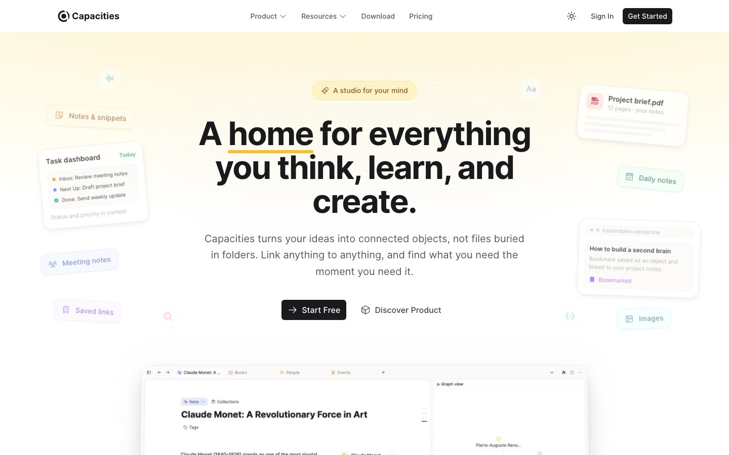
Capacities' marketing surface is a bright, calm knowledge-tool interface — pure white canvas (`{colors.canvas}` — #ffffff) carrying one near-black primary CTA (`{colors.primary}` — #000000), all typography set in **Inter**, and the product shown directly inside a large in-context mockup card. The system reads as friendly modern productivity software: lots of air, soft-rounded cards, barely-there drop shadows, and floating product-UI "label chips" (Notes & snippets, Daily notes, Meeting notes, Saved links) scattered around the hero to suggest the connected-objects model.
Type voice is single-family: **Inter** does everything. The hierarchy is driven by size and weight contrast rather than a second display face — a 64px / weight-700 headline with tight -1.92px tracking anchors the hero, dropping to a 36px / 700 section heading, an 18px / 600 sub-title, and a compact 14px body. The negative letter-spacing on the large sizes is the signature: it makes the headlines feel dense and confident.
Color is deliberately quiet. The action layer is monochrome — black CTA on white. The only saturated hues in the system (`{colors.accent-whatsapp}` #25d366, `{colors.accent-telegram}` #0088cc, `{colors.accent-discord}` #5865f2, `{colors.accent-todoist}` #e44332) are third-party **integration brand marks**, not Capacities' own palette. They appear as small product/integration icons, never on buttons or headings.
**Key Characteristics:**
- Pure white canvas with a single near-black CTA (`{colors.primary}` — #000000), rounded `{rounded.md}` (8px) with compact 8×12px padding and a medium-weight Inter label.
- One typeface — Inter — across display, headings, body, and buttons. Hierarchy comes from size + weight + negative tracking, not a second family.
- Floating product-UI label chips around the hero (`{component.floating-tag}`) — small rounded cards naming object types, used to dramatize the "everything becomes a connected object" idea.
- A large in-context product mockup card (`{component.product-mockup-card}`) showing the actual Capacities editor + graph view at the base of the hero.
- Faint, restrained elevation — the heaviest common shadow is a 4px/12px blur at ~8% black; most cards sit at a 1–2px / 4% whisper.
- Hierarchical radius: `{rounded.md}` (8px) for buttons, `{rounded.lg}`–`{rounded.xl}` (12–16px) for cards, `{rounded.pill}` for badge chips.
- Accent color is reserved for integration brand marks only; the brand itself is monochrome.
## Colors
### Brand & Action
- **Primary / Ink** (`{colors.primary}` / `{colors.ink}` — #000000): The single action and text color. The "Start Free" / "Get Started" CTA is near-black, and headlines/body text render in the same ink. Capacities runs a monochrome action layer.
- **On Primary** (`{colors.on-primary}` — #ffffff): White label text on the black CTA.
### Canvas
- **Canvas** (`{colors.canvas}` — #ffffff): The universal page floor. Every band, card, and the nav sit on white. The faint section tints and the warm cream hero wash visible in screenshots were not measured (see Known Gaps).
### Integration Accents
These four saturated hues are **third-party integration brand colors**, surfaced on small product/integration icons — not part of Capacities' own action palette:
- **WhatsApp Green** (`{colors.accent-whatsapp}` — #25d366)
- **Telegram Blue** (`{colors.accent-telegram}` — #0088cc)
- **Discord Blurple** (`{colors.accent-discord}` — #5865f2)
- **Todoist Red** (`{colors.accent-todoist}` — #e44332)
Each appears at low frequency (3 occurrences measured) and never on a CTA or headline. Keep them confined to integration/icon contexts.
## Typography
### Font Family
The system runs **Inter** for everything — display headlines, section headings, sub-titles, body copy, and buttons. There is no secondary display face; the brand voice comes entirely from Inter's weight range and tight negative tracking at large sizes. A reasonable fallback stack is `Inter, -apple-system, BlinkMacSystemFont, "Segoe UI", Roboto, sans-serif`. Inter is open-source, so no substitute is required.
### Hierarchy
| Token | Size | Weight | Line Height | Letter Spacing | Use |
|---|---|---|---|---|---|
| `{typography.display}` | 64px | 700 | 1.05 | -1.92px | Hero h1 ("A home for everything you think, learn, and create.") |
| `{typography.heading}` | 36px | 700 | 1.25 | -0.9px | Section heads ("Your best thinking keeps slipping away") |
| `{typography.title}` | 18px | 600 | 1.556 | -0.45px | Card titles, sub-headings, step labels |
| `{typography.body}` | 14px | 600 | 1.429 | normal | Running text, card descriptions, nav links |
| `{typography.button}` | 14px | 500 | 1.429 | normal | CTA and text-button labels |
### Principles
Hierarchy is size-and-weight driven. The two large roles (`display`, `heading`) carry heavy 700 weight with negative tracking that tightens the headline into a dense, confident block; the supporting roles (`title`, `body`) sit at 600 with little or no tracking. Note the body role is measured at weight **600**, not 400 — Capacities runs a slightly heavier-than-usual body weight, which keeps small 14px copy crisp on white. Buttons are the only role that drops to weight 500.
Keep the negative letter-spacing tied to size: -1.92px belongs to the 64px display, -0.9px to the 36px heading, -0.45px to the 18px title. Body and button tracking stay at the browser default (`normal`).
### Note on Font Substitutes
No licensed/custom typefaces were detected (`fonts_licensed` is empty). Inter is fully open-source and ships as-is — no substitution needed.
## Layout
### Spacing System
- **Base unit:** 4px (the most granular measured value; 6px and 8px are the highest-frequency steps).
- **Tokens:** `{spacing.xxs}` 4px · `{spacing.xs}` 8px · `{spacing.sm}` 12px · `{spacing.md}` 16px · `{spacing.lg}` 24px · `{spacing.xl}` 32px · `{spacing.xxl}` 48px · `{spacing.section}` 56px.
- **Additional measured steps** (6, 10, 14, 20, 28, 40, 60px) appear in component padding and gaps but are not promoted to named tokens — see Known Gaps.
- **Card internal padding:** `{spacing.lg}` (24px) for feature, testimonial, and stat cards.
- **Button padding:** 8px × 12px (`{spacing.xs}` × `{spacing.sm}`).
### Grid & Container
- **Editorial body:** Centered single-column hero with the headline and CTA stacked, the product mockup card below, and decorative floating tags arranged in the left/right margins.
- **Feature grids:** 3-up problem cards ("Notes everywhere", "Your knowledge doesn't connect", "Organizing has become the work") and 2-up benefit cards on the product narrative band.
- **Stat row:** 3-up metric cards (4.8 rating / 50,000+ workers / 10,000+ community).
- **Testimonial grids:** Multi-column quote cards.
### Whitespace Philosophy
Capacities leans on generous whitespace and a calm centered rhythm. Major bands are separated by roughly `{spacing.section}` (56px)-class vertical gaps, and the hero gives the headline wide breathing room with decorative chips floating in the margins rather than dense content. The result reads as quiet and focused — appropriate for a "studio for your mind" thinking tool.
## Elevation & Depth
| Level | Treatment | Use |
|---|---|---|
| Flat | No shadow | Nav bar, body sections on white |
| Whisper | `rgba(0,0,0,0.04) 0px 1px 2px` | Default card/chip resting shadow (most common, 27 occurrences) |
| Soft | `rgba(0,0,0,0.05) 0px 1px 2px` / `rgba(0,0,0,0.05) 0px 2px 4px` | Slightly raised cards |
| Lifted | `rgba(0,0,0,0.08) 0px 4px 12px` | Elevated cards, the product mockup container |
| Floating | `rgba(0,0,0,0.1) 0px 20px 25px -5px` | Rare peak elevation (1 occurrence) — large floating panel |
The elevation philosophy is **soft and barely-there**. The system never uses a heavy or colored shadow — even the peak floating level stays at 10% black. Depth is achieved through stacked light shadows and white-on-white card separation, keeping the surface airy.
### Decorative Depth
- Floating product-UI label chips around the hero carry the whisper shadow, making them appear to hover slightly off the canvas.
- The hero product mockup card uses the Lifted shadow to read as the focal artifact.
## Shapes
### Border Radius Scale
| Token | Value | Use |
|---|---|---|
| `{rounded.xs}` | 4px | Rare — small inline accents (1 occurrence) |
| `{rounded.sm}` | 6px | Small controls, inner chips |
| `{rounded.md}` | 8px | Primary CTA buttons |
| `{rounded.lg}` | 12px | Content cards, floating tags (most common card radius, 29 occurrences) |
| `{rounded.xl}` | 16px | Larger cards, product mockup container, testimonial/stat cards |
| `{rounded.xxl}` | 20px | Large feature panels |
| `{rounded.huge}` | 24px | Largest panels (rare) |
| `{rounded.pill}` | 9999px | Badge chips ("A studio for your mind"), fully-rounded elements — *derived* from a measured ~3.3e7px radius that resolves to a pill/full shape |
### Photography & Mockup Geometry
The hero product mockup uses `{rounded.xl}` (16px) corners. Floating label chips use `{rounded.lg}` (12px). The "A studio for your mind" eyebrow badge uses the `{rounded.pill}` shape.
## Components
### Navigation
**`nav-bar`** — White top bar on `{colors.canvas}`. Carries the Capacities wordmark + circular logo mark at left; a center menu (Product, Resources, Download, Pricing) in `{typography.button}`; and a right cluster with a theme toggle, a "Sign in" `{component.button-text}`, and a "Get Started" `{component.button-primary}`. Sits flat with no shadow.
### Buttons
**`button-primary`** — The signature CTA. Background `{colors.primary}` (#000000), label `{colors.on-primary}`, type `{typography.button}` (Inter 14px / 500), rounded `{rounded.md}` (8px), padding 8px × 12px. Used as "Start Free" and "Get Started". A small leading arrow/icon often precedes the label.
**`button-text`** — Inline text button with no background (transparent). Ink-colored label in `{typography.button}`. Used for "Sign in" and the secondary "Discover Product" action beside the hero CTA.
### Chips & Badges
**`badge-pill`** — A fully-rounded eyebrow chip ("A studio for your mind") sitting above the hero headline. Background `{colors.canvas}`, ink text, type `{typography.body}`, rounded `{rounded.pill}`, padding 8px × 12px, with the whisper shadow.
**`floating-tag`** — Small rounded label cards scattered in the hero margins (Notes & snippets, Daily notes, Meeting notes, Saved links, Images). Background `{colors.canvas}`, ink text, type `{typography.body}`, rounded `{rounded.lg}` (12px), padding 8px × 12px, whisper shadow. These dramatize the "everything is a connected object" model — each one carries a small leading icon. Their pastel tints visible in screenshots were not measured (see Known Gaps).
### Cards & Containers
**`product-mockup-card`** — The large in-context product artifact at the base of the hero, showing the actual Capacities editor (note view + graph view). Background `{colors.canvas}`, rounded `{rounded.xl}` (16px), padding `{spacing.md}` (16px), Lifted shadow. The product chrome inside is shown directly rather than illustrated.
**`feature-card`** — Used in the 3-up problem grid and the 2-up benefit grid. Background `{colors.canvas}`, rounded `{rounded.lg}` (12px), padding `{spacing.lg}` (24px). Carries a small icon, an `{typography.title}` headline, and `{typography.body}` description.
**`stat-card`** — Metric card in the social-proof row (4.8 rating, 50,000+ workers, 10,000+ community). Background `{colors.canvas}`, rounded `{rounded.xl}` (16px), padding `{spacing.lg}` (24px). The headline figure renders in `{typography.heading}` with a label below in `{typography.body}`.
**`testimonial-card`** — Customer-quote card in the review grid. Background `{colors.canvas}`, rounded `{rounded.xl}` (16px), padding `{spacing.lg}` (24px), type `{typography.body}`. Carries the quote plus a small name/role row.
### Footer
**`footer`** — Closing band on `{colors.canvas}` with ink text, type `{typography.body}`, vertical padding ~56px. Carries link columns and the wordmark. Unlike many systems, Capacities keeps its footer on white — the page never inverts to a dark surface.
## Do's and Don'ts
### Do
- Keep the action layer monochrome — `{colors.primary}` (#000000) on white is the only CTA treatment.
- Set everything in Inter. Drive hierarchy with size + weight + negative tracking, not a second face.
- Apply the size-bound negative letter-spacing (-1.92px at 64px, -0.9px at 36px, -0.45px at 18px). The dense tracking is the headline voice.
- Reserve the four accent hues for integration/brand-mark icons only.
- Use floating-tags and the product mockup to show the connected-objects model in-context rather than describing it abstractly.
- Keep shadows in the whisper-to-lifted range; let white-on-white separation and tiny blurs do the depth work.
- Use `{rounded.lg}`–`{rounded.xl}` for cards and `{rounded.pill}` for eyebrow chips.
### Don't
- Don't put accent color on buttons or headlines — Capacities' brand is monochrome at the action layer.
- Don't introduce a heavy or colored shadow; the peak measured shadow is only 10% black.
- Don't add a second typeface — the system is single-family Inter.
- Don't drop body copy below weight 600; the measured body weight is intentionally heavier than default for crispness on white.
- Don't invert the footer to a dark surface — the page stays on white end-to-end.
- Don't document hover styling beyond default and pressed states.
## Responsive Behavior
### Breakpoints
The captures span landing, pricing, and product pages at desktop and a narrow (mobile-class) width. Exact breakpoint pixel values were not measured; the following is inferred from the captured layouts.
| Name | Width (inferred) | Key Changes |
|---|---|---|
| Mobile | narrow | Nav collapses; hero headline scales down from 64px; floating tags reduce/reflow; multi-up grids stack to 1-up; product mockup scales proportionally |
| Desktop | wide | Full horizontal nav; 64px hero display; 3-up problem/stat grids and 2-up benefit grids; floating tags arranged in hero margins |
### Touch Targets
- `{component.button-primary}` uses 8×12px padding on a 14px label — effective height is comfortably tappable but compact; verify it clears 44px at mobile.
- Nav links and `{component.button-text}` rely on surrounding padding for tap area.
### Collapsing Strategy
- Feature, stat, and testimonial grids reduce column count rather than shrinking cards.
- The hero's decorative floating tags thin out at narrow widths so the headline and CTA stay dominant.
- The product mockup card scales proportionally to keep the editor/graph legible.
## Iteration Guide
1. Focus on ONE component at a time. Reference its YAML key directly (`{component.feature-card}`, `{component.product-mockup-card}`).
2. Variants of an existing component (`-active`, `-disabled`) live as separate entries in `components:`.
3. Use `{token.refs}` everywhere — never inline a hex.
4. Never document hover. Default and Active/Pressed states only (no pressed state was measured for the CTA — add it as a separate entry once observed).
5. Headlines stay Inter 700 with size-bound negative tracking; body stays Inter 600. The single-family discipline does not blur.
6. Accent hues stay on integration marks only — keep the action layer black-on-white.
7. When in doubt about emphasis: bigger Inter before more color.
## Known Gaps
- **Text grays not measured.** Body copy and secondary text appear in a muted gray in screenshots, but only pure `#000000` was captured for ink. All text tokens resolve to `{colors.ink}`; a true body-gray and muted-gray would need extraction.
- **Hero gradient + accent tints not measured.** The warm cream/yellow hero wash and the yellow underline accent under "home" are visible in the reference but absent from the measured palette — not tokenized here.
- **Floating-tag pastel tints not measured.** The label chips carry soft per-type pastel backgrounds/borders in screenshots; only `{colors.canvas}` was measured, so they are documented on white.
- **Section background tints not measured.** Several narrative bands (problem grid, "What if your notes worked like your mind?") sit on a faint gray; no surface-soft hex was captured.
- **CTA pressed/active and disabled states not measured** — only the default `{component.button-primary}` was extracted.
- **Spacing steps 6, 10, 14, 20, 28, 40, 60px** were measured but not promoted to named tokens; a fuller scale audit would confirm whether these are intentional steps or one-offs.
- **The `card` component reported a ~3.3e7px radius** (effectively pill/full) with `shadow: none`; it is mapped to `{rounded.pill}` as a *derived* value and likely corresponds to the eyebrow badge chip.
- **Breakpoint pixel values, animation, and transition timings** are out of scope and not captured.
- **Pricing and product page component specifics** beyond shared shells were not individually extracted.
<!-- Documented by duply · real-world design systems as ready-to-use DESIGN.md for AI coding agents · https://duply.ai/capacities/design-md -->
Color Palette
Accent
Neutrals
Typography
display64px · 700 · 1.05
The quick brown fox jumpsheading36px · 700 · 1.25
The quick brown fox jumpstitle18px · 600 · 1.556
The quick brown fox jumpsbody14px · 600 · 1.429
The quick brown fox jumpsbutton14px · 500 · 1.429
The quick brown fox jumpsSpacing & Shape
Spacing
| Name | Value | Preview |
|---|---|---|
| xxs | 4px | |
| xs | 8px | |
| sm | 12px | |
| md | 16px | |
| lg | 24px | |
| xl | 32px | |
| xxl | 48px | |
| section | 56px |
Border Radius
| Name | Value | Preview |
|---|---|---|
| xs | 4px | |
| sm | 6px | |
| md | 8px | |
| lg | 12px | |
| xl | 16px | |
| xxl | 20px | |
| huge | 24px | |
| pill | 9999px |
More like this


---
version: alpha
name: Capacities-design-analysis
description: "A bright, calm knowledge-tool marketing surface built on pure white canvas with a single near-black primary CTA and Inter typography throughout. The system reads as friendly modern productivity software — large tight-tracked Inter display headlines, soft-rounded cards (12–16px), faint barely-there drop shadows, and floating product-UI label chips scattered around the hero. Brand voltage comes from heavy Inter display type and the in-context product mockup rather than from saturated color; accent hues appear only as third-party integration brand marks."
colors:
  canvas: "#ffffff"
  ink: "#000000"
  primary: "#000000"
  on-primary: "#ffffff"
  accent-whatsapp: "#25d366"
  accent-telegram: "#0088cc"
  accent-discord: "#5865f2"
  accent-todoist: "#e44332"
typography:
  display:
    fontFamily: "Inter, sans-serif"
    fontSize: 64px
    fontWeight: 700
    lineHeight: 1.05
    letterSpacing: -1.92px
  heading:
    fontFamily: "Inter, sans-serif"
    fontSize: 36px
    fontWeight: 700
    lineHeight: 1.25
    letterSpacing: -0.9px
  title:
    fontFamily: "Inter, sans-serif"
    fontSize: 18px
    fontWeight: 600
    lineHeight: 1.556
    letterSpacing: -0.45px
  body:
    fontFamily: "Inter, sans-serif"
    fontSize: 14px
    fontWeight: 600
    lineHeight: 1.429
    letterSpacing: normal
  button:
    fontFamily: "Inter, sans-serif"
    fontSize: 14px
    fontWeight: 500
    lineHeight: 1.429
    letterSpacing: normal
rounded:
  xs: 4px
  sm: 6px
  md: 8px
  lg: 12px
  xl: 16px
  xxl: 20px
  huge: 24px
  pill: 9999px
spacing:
  xxs: 4px
  xs: 8px
  sm: 12px
  md: 16px
  lg: 24px
  xl: 32px
  xxl: 48px
  section: 56px
components:
  button-primary:
    backgroundColor: "{colors.primary}"
    textColor: "{colors.on-primary}"
    typography: "{typography.button}"
    rounded: "{rounded.md}"
    padding: 8px 12px
  button-text:
    backgroundColor: transparent
    textColor: "{colors.ink}"
    typography: "{typography.button}"
  nav-bar:
    backgroundColor: "{colors.canvas}"
    textColor: "{colors.ink}"
    typography: "{typography.button}"
  badge-pill:
    backgroundColor: "{colors.canvas}"
    textColor: "{colors.ink}"
    typography: "{typography.body}"
    rounded: "{rounded.pill}"
    padding: 8px 12px
  floating-tag:
    backgroundColor: "{colors.canvas}"
    textColor: "{colors.ink}"
    typography: "{typography.body}"
    rounded: "{rounded.lg}"
    padding: 8px 12px
  feature-card:
    backgroundColor: "{colors.canvas}"
    textColor: "{colors.ink}"
    typography: "{typography.title}"
    rounded: "{rounded.lg}"
    padding: 24px
  testimonial-card:
    backgroundColor: "{colors.canvas}"
    textColor: "{colors.ink}"
    typography: "{typography.body}"
    rounded: "{rounded.xl}"
    padding: 24px
  stat-card:
    backgroundColor: "{colors.canvas}"
    textColor: "{colors.ink}"
    typography: "{typography.heading}"
    rounded: "{rounded.xl}"
    padding: 24px
  product-mockup-card:
    backgroundColor: "{colors.canvas}"
    textColor: "{colors.ink}"
    rounded: "{rounded.xl}"
    padding: 16px
  footer:
    backgroundColor: "{colors.canvas}"
    textColor: "{colors.ink}"
    typography: "{typography.body}"
    padding: 56px
---

## Overview

Capacities' marketing surface is a bright, calm knowledge-tool interface — pure white canvas (`{colors.canvas}` — #ffffff) carrying one near-black primary CTA (`{colors.primary}` — #000000), all typography set in **Inter**, and the product shown directly inside a large in-context mockup card. The system reads as friendly modern productivity software: lots of air, soft-rounded cards, barely-there drop shadows, and floating product-UI "label chips" (Notes & snippets, Daily notes, Meeting notes, Saved links) scattered around the hero to suggest the connected-objects model.

Type voice is single-family: **Inter** does everything. The hierarchy is driven by size and weight contrast rather than a second display face — a 64px / weight-700 headline with tight -1.92px tracking anchors the hero, dropping to a 36px / 700 section heading, an 18px / 600 sub-title, and a compact 14px body. The negative letter-spacing on the large sizes is the signature: it makes the headlines feel dense and confident.

Color is deliberately quiet. The action layer is monochrome — black CTA on white. The only saturated hues in the system (`{colors.accent-whatsapp}` #25d366, `{colors.accent-telegram}` #0088cc, `{colors.accent-discord}` #5865f2, `{colors.accent-todoist}` #e44332) are third-party **integration brand marks**, not Capacities' own palette. They appear as small product/integration icons, never on buttons or headings.

**Key Characteristics:**
- Pure white canvas with a single near-black CTA (`{colors.primary}` — #000000), rounded `{rounded.md}` (8px) with compact 8×12px padding and a medium-weight Inter label.
- One typeface — Inter — across display, headings, body, and buttons. Hierarchy comes from size + weight + negative tracking, not a second family.
- Floating product-UI label chips around the hero (`{component.floating-tag}`) — small rounded cards naming object types, used to dramatize the "everything becomes a connected object" idea.
- A large in-context product mockup card (`{component.product-mockup-card}`) showing the actual Capacities editor + graph view at the base of the hero.
- Faint, restrained elevation — the heaviest common shadow is a 4px/12px blur at ~8% black; most cards sit at a 1–2px / 4% whisper.
- Hierarchical radius: `{rounded.md}` (8px) for buttons, `{rounded.lg}`–`{rounded.xl}` (12–16px) for cards, `{rounded.pill}` for badge chips.
- Accent color is reserved for integration brand marks only; the brand itself is monochrome.

## Colors

### Brand & Action
- **Primary / Ink** (`{colors.primary}` / `{colors.ink}` — #000000): The single action and text color. The "Start Free" / "Get Started" CTA is near-black, and headlines/body text render in the same ink. Capacities runs a monochrome action layer.
- **On Primary** (`{colors.on-primary}` — #ffffff): White label text on the black CTA.

### Canvas
- **Canvas** (`{colors.canvas}` — #ffffff): The universal page floor. Every band, card, and the nav sit on white. The faint section tints and the warm cream hero wash visible in screenshots were not measured (see Known Gaps).

### Integration Accents
These four saturated hues are **third-party integration brand colors**, surfaced on small product/integration icons — not part of Capacities' own action palette:
- **WhatsApp Green** (`{colors.accent-whatsapp}` — #25d366)
- **Telegram Blue** (`{colors.accent-telegram}` — #0088cc)
- **Discord Blurple** (`{colors.accent-discord}` — #5865f2)
- **Todoist Red** (`{colors.accent-todoist}` — #e44332)

Each appears at low frequency (3 occurrences measured) and never on a CTA or headline. Keep them confined to integration/icon contexts.

## Typography

### Font Family
The system runs **Inter** for everything — display headlines, section headings, sub-titles, body copy, and buttons. There is no secondary display face; the brand voice comes entirely from Inter's weight range and tight negative tracking at large sizes. A reasonable fallback stack is `Inter, -apple-system, BlinkMacSystemFont, "Segoe UI", Roboto, sans-serif`. Inter is open-source, so no substitute is required.

### Hierarchy

| Token | Size | Weight | Line Height | Letter Spacing | Use |
|---|---|---|---|---|---|
| `{typography.display}` | 64px | 700 | 1.05 | -1.92px | Hero h1 ("A home for everything you think, learn, and create.") |
| `{typography.heading}` | 36px | 700 | 1.25 | -0.9px | Section heads ("Your best thinking keeps slipping away") |
| `{typography.title}` | 18px | 600 | 1.556 | -0.45px | Card titles, sub-headings, step labels |
| `{typography.body}` | 14px | 600 | 1.429 | normal | Running text, card descriptions, nav links |
| `{typography.button}` | 14px | 500 | 1.429 | normal | CTA and text-button labels |

### Principles
Hierarchy is size-and-weight driven. The two large roles (`display`, `heading`) carry heavy 700 weight with negative tracking that tightens the headline into a dense, confident block; the supporting roles (`title`, `body`) sit at 600 with little or no tracking. Note the body role is measured at weight **600**, not 400 — Capacities runs a slightly heavier-than-usual body weight, which keeps small 14px copy crisp on white. Buttons are the only role that drops to weight 500.

Keep the negative letter-spacing tied to size: -1.92px belongs to the 64px display, -0.9px to the 36px heading, -0.45px to the 18px title. Body and button tracking stay at the browser default (`normal`).

### Note on Font Substitutes
No licensed/custom typefaces were detected (`fonts_licensed` is empty). Inter is fully open-source and ships as-is — no substitution needed.

## Layout

### Spacing System
- **Base unit:** 4px (the most granular measured value; 6px and 8px are the highest-frequency steps).
- **Tokens:** `{spacing.xxs}` 4px · `{spacing.xs}` 8px · `{spacing.sm}` 12px · `{spacing.md}` 16px · `{spacing.lg}` 24px · `{spacing.xl}` 32px · `{spacing.xxl}` 48px · `{spacing.section}` 56px.
- **Additional measured steps** (6, 10, 14, 20, 28, 40, 60px) appear in component padding and gaps but are not promoted to named tokens — see Known Gaps.
- **Card internal padding:** `{spacing.lg}` (24px) for feature, testimonial, and stat cards.
- **Button padding:** 8px × 12px (`{spacing.xs}` × `{spacing.sm}`).

### Grid & Container
- **Editorial body:** Centered single-column hero with the headline and CTA stacked, the product mockup card below, and decorative floating tags arranged in the left/right margins.
- **Feature grids:** 3-up problem cards ("Notes everywhere", "Your knowledge doesn't connect", "Organizing has become the work") and 2-up benefit cards on the product narrative band.
- **Stat row:** 3-up metric cards (4.8 rating / 50,000+ workers / 10,000+ community).
- **Testimonial grids:** Multi-column quote cards.

### Whitespace Philosophy
Capacities leans on generous whitespace and a calm centered rhythm. Major bands are separated by roughly `{spacing.section}` (56px)-class vertical gaps, and the hero gives the headline wide breathing room with decorative chips floating in the margins rather than dense content. The result reads as quiet and focused — appropriate for a "studio for your mind" thinking tool.

## Elevation & Depth

| Level | Treatment | Use |
|---|---|---|
| Flat | No shadow | Nav bar, body sections on white |
| Whisper | `rgba(0,0,0,0.04) 0px 1px 2px` | Default card/chip resting shadow (most common, 27 occurrences) |
| Soft | `rgba(0,0,0,0.05) 0px 1px 2px` / `rgba(0,0,0,0.05) 0px 2px 4px` | Slightly raised cards |
| Lifted | `rgba(0,0,0,0.08) 0px 4px 12px` | Elevated cards, the product mockup container |
| Floating | `rgba(0,0,0,0.1) 0px 20px 25px -5px` | Rare peak elevation (1 occurrence) — large floating panel |

The elevation philosophy is **soft and barely-there**. The system never uses a heavy or colored shadow — even the peak floating level stays at 10% black. Depth is achieved through stacked light shadows and white-on-white card separation, keeping the surface airy.

### Decorative Depth
- Floating product-UI label chips around the hero carry the whisper shadow, making them appear to hover slightly off the canvas.
- The hero product mockup card uses the Lifted shadow to read as the focal artifact.

## Shapes

### Border Radius Scale

| Token | Value | Use |
|---|---|---|
| `{rounded.xs}` | 4px | Rare — small inline accents (1 occurrence) |
| `{rounded.sm}` | 6px | Small controls, inner chips |
| `{rounded.md}` | 8px | Primary CTA buttons |
| `{rounded.lg}` | 12px | Content cards, floating tags (most common card radius, 29 occurrences) |
| `{rounded.xl}` | 16px | Larger cards, product mockup container, testimonial/stat cards |
| `{rounded.xxl}` | 20px | Large feature panels |
| `{rounded.huge}` | 24px | Largest panels (rare) |
| `{rounded.pill}` | 9999px | Badge chips ("A studio for your mind"), fully-rounded elements — *derived* from a measured ~3.3e7px radius that resolves to a pill/full shape |

### Photography & Mockup Geometry
The hero product mockup uses `{rounded.xl}` (16px) corners. Floating label chips use `{rounded.lg}` (12px). The "A studio for your mind" eyebrow badge uses the `{rounded.pill}` shape.

## Components

### Navigation

**`nav-bar`** — White top bar on `{colors.canvas}`. Carries the Capacities wordmark + circular logo mark at left; a center menu (Product, Resources, Download, Pricing) in `{typography.button}`; and a right cluster with a theme toggle, a "Sign in" `{component.button-text}`, and a "Get Started" `{component.button-primary}`. Sits flat with no shadow.

### Buttons

**`button-primary`** — The signature CTA. Background `{colors.primary}` (#000000), label `{colors.on-primary}`, type `{typography.button}` (Inter 14px / 500), rounded `{rounded.md}` (8px), padding 8px × 12px. Used as "Start Free" and "Get Started". A small leading arrow/icon often precedes the label.

**`button-text`** — Inline text button with no background (transparent). Ink-colored label in `{typography.button}`. Used for "Sign in" and the secondary "Discover Product" action beside the hero CTA.

### Chips & Badges

**`badge-pill`** — A fully-rounded eyebrow chip ("A studio for your mind") sitting above the hero headline. Background `{colors.canvas}`, ink text, type `{typography.body}`, rounded `{rounded.pill}`, padding 8px × 12px, with the whisper shadow.

**`floating-tag`** — Small rounded label cards scattered in the hero margins (Notes & snippets, Daily notes, Meeting notes, Saved links, Images). Background `{colors.canvas}`, ink text, type `{typography.body}`, rounded `{rounded.lg}` (12px), padding 8px × 12px, whisper shadow. These dramatize the "everything is a connected object" model — each one carries a small leading icon. Their pastel tints visible in screenshots were not measured (see Known Gaps).

### Cards & Containers

**`product-mockup-card`** — The large in-context product artifact at the base of the hero, showing the actual Capacities editor (note view + graph view). Background `{colors.canvas}`, rounded `{rounded.xl}` (16px), padding `{spacing.md}` (16px), Lifted shadow. The product chrome inside is shown directly rather than illustrated.

**`feature-card`** — Used in the 3-up problem grid and the 2-up benefit grid. Background `{colors.canvas}`, rounded `{rounded.lg}` (12px), padding `{spacing.lg}` (24px). Carries a small icon, an `{typography.title}` headline, and `{typography.body}` description.

**`stat-card`** — Metric card in the social-proof row (4.8 rating, 50,000+ workers, 10,000+ community). Background `{colors.canvas}`, rounded `{rounded.xl}` (16px), padding `{spacing.lg}` (24px). The headline figure renders in `{typography.heading}` with a label below in `{typography.body}`.

**`testimonial-card`** — Customer-quote card in the review grid. Background `{colors.canvas}`, rounded `{rounded.xl}` (16px), padding `{spacing.lg}` (24px), type `{typography.body}`. Carries the quote plus a small name/role row.

### Footer

**`footer`** — Closing band on `{colors.canvas}` with ink text, type `{typography.body}`, vertical padding ~56px. Carries link columns and the wordmark. Unlike many systems, Capacities keeps its footer on white — the page never inverts to a dark surface.

## Do's and Don'ts

### Do
- Keep the action layer monochrome — `{colors.primary}` (#000000) on white is the only CTA treatment.
- Set everything in Inter. Drive hierarchy with size + weight + negative tracking, not a second face.
- Apply the size-bound negative letter-spacing (-1.92px at 64px, -0.9px at 36px, -0.45px at 18px). The dense tracking is the headline voice.
- Reserve the four accent hues for integration/brand-mark icons only.
- Use floating-tags and the product mockup to show the connected-objects model in-context rather than describing it abstractly.
- Keep shadows in the whisper-to-lifted range; let white-on-white separation and tiny blurs do the depth work.
- Use `{rounded.lg}`–`{rounded.xl}` for cards and `{rounded.pill}` for eyebrow chips.

### Don't
- Don't put accent color on buttons or headlines — Capacities' brand is monochrome at the action layer.
- Don't introduce a heavy or colored shadow; the peak measured shadow is only 10% black.
- Don't add a second typeface — the system is single-family Inter.
- Don't drop body copy below weight 600; the measured body weight is intentionally heavier than default for crispness on white.
- Don't invert the footer to a dark surface — the page stays on white end-to-end.
- Don't document hover styling beyond default and pressed states.

## Responsive Behavior

### Breakpoints
The captures span landing, pricing, and product pages at desktop and a narrow (mobile-class) width. Exact breakpoint pixel values were not measured; the following is inferred from the captured layouts.

| Name | Width (inferred) | Key Changes |
|---|---|---|
| Mobile | narrow | Nav collapses; hero headline scales down from 64px; floating tags reduce/reflow; multi-up grids stack to 1-up; product mockup scales proportionally |
| Desktop | wide | Full horizontal nav; 64px hero display; 3-up problem/stat grids and 2-up benefit grids; floating tags arranged in hero margins |

### Touch Targets
- `{component.button-primary}` uses 8×12px padding on a 14px label — effective height is comfortably tappable but compact; verify it clears 44px at mobile.
- Nav links and `{component.button-text}` rely on surrounding padding for tap area.

### Collapsing Strategy
- Feature, stat, and testimonial grids reduce column count rather than shrinking cards.
- The hero's decorative floating tags thin out at narrow widths so the headline and CTA stay dominant.
- The product mockup card scales proportionally to keep the editor/graph legible.

## Iteration Guide

1. Focus on ONE component at a time. Reference its YAML key directly (`{component.feature-card}`, `{component.product-mockup-card}`).
2. Variants of an existing component (`-active`, `-disabled`) live as separate entries in `components:`.
3. Use `{token.refs}` everywhere — never inline a hex.
4. Never document hover. Default and Active/Pressed states only (no pressed state was measured for the CTA — add it as a separate entry once observed).
5. Headlines stay Inter 700 with size-bound negative tracking; body stays Inter 600. The single-family discipline does not blur.
6. Accent hues stay on integration marks only — keep the action layer black-on-white.
7. When in doubt about emphasis: bigger Inter before more color.

## Known Gaps

- **Text grays not measured.** Body copy and secondary text appear in a muted gray in screenshots, but only pure `#000000` was captured for ink. All text tokens resolve to `{colors.ink}`; a true body-gray and muted-gray would need extraction.
- **Hero gradient + accent tints not measured.** The warm cream/yellow hero wash and the yellow underline accent under "home" are visible in the reference but absent from the measured palette — not tokenized here.
- **Floating-tag pastel tints not measured.** The label chips carry soft per-type pastel backgrounds/borders in screenshots; only `{colors.canvas}` was measured, so they are documented on white.
- **Section background tints not measured.** Several narrative bands (problem grid, "What if your notes worked like your mind?") sit on a faint gray; no surface-soft hex was captured.
- **CTA pressed/active and disabled states not measured** — only the default `{component.button-primary}` was extracted.
- **Spacing steps 6, 10, 14, 20, 28, 40, 60px** were measured but not promoted to named tokens; a fuller scale audit would confirm whether these are intentional steps or one-offs.
- **The `card` component reported a ~3.3e7px radius** (effectively pill/full) with `shadow: none`; it is mapped to `{rounded.pill}` as a *derived* value and likely corresponds to the eyebrow badge chip.
- **Breakpoint pixel values, animation, and transition timings** are out of scope and not captured.
- **Pricing and product page component specifics** beyond shared shells were not individually extracted.

<!-- Documented by duply · real-world design systems as ready-to-use DESIGN.md for AI coding agents · https://duply.ai/capacities/design-md -->