Amie
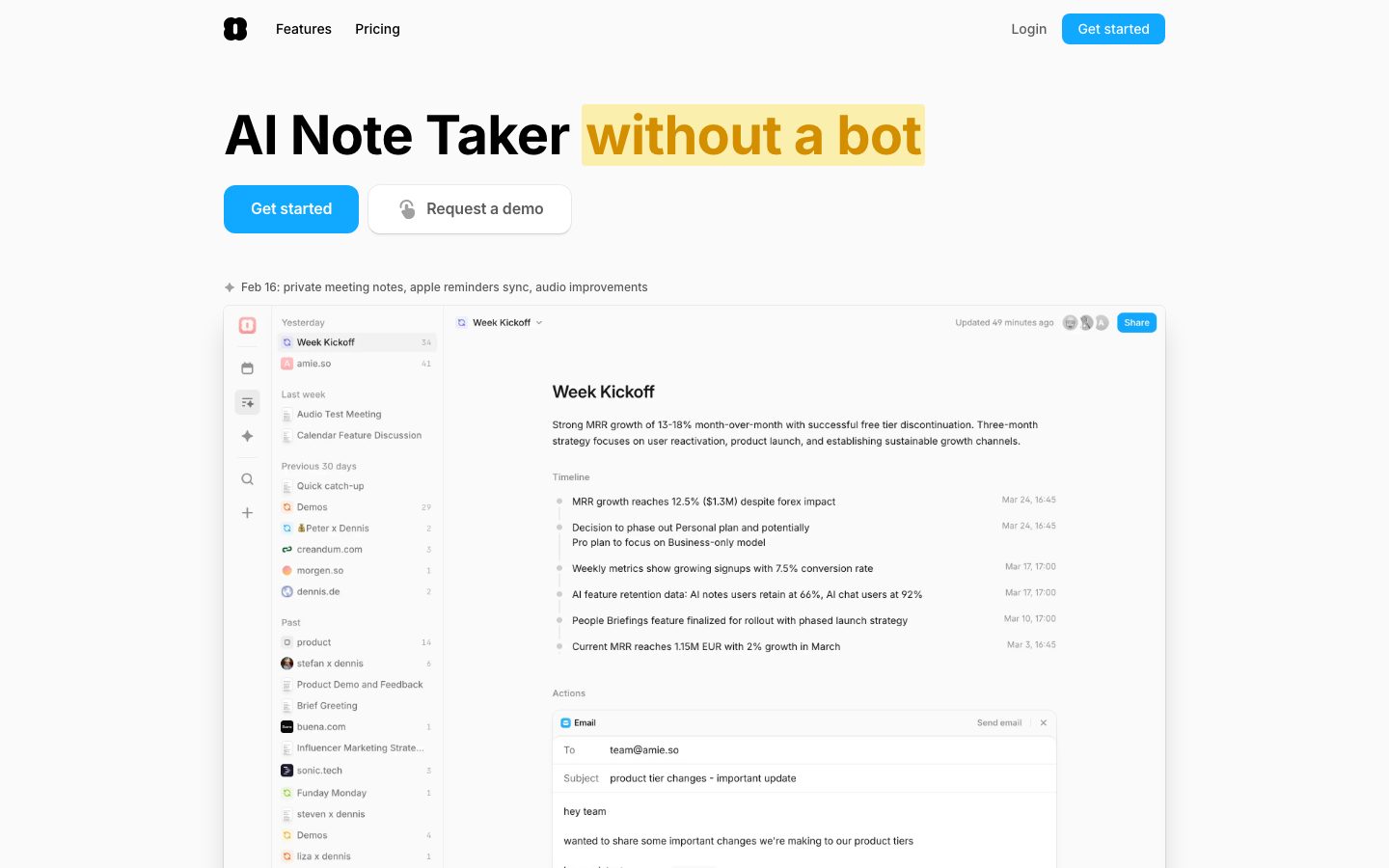
A bright, near-monochrome productivity-app marketing surface built on an off-white canvas (#fafafa) with crisp black ink, a single electric-blue primary CTA, and Inter throughout. The system reads as fast, clean, and product-forward — large bold headlines, light-gray hairline-bordered cards, and real product UI (note editor, meeting summaries, email composer) embedded directly inside the marketing flow. Brand voltage comes from the blue "Get started" button and a green accent used on small section labels and status indicators, set against an otherwise grayscale field.
---
version: alpha
name: Amie-design-analysis
description: A bright, near-monochrome productivity-app marketing surface built on an off-white canvas (#fafafa) with crisp black ink, a single electric-blue primary CTA, and Inter throughout. The system reads as fast, clean, and product-forward — large bold headlines, light-gray hairline-bordered cards, and real product UI (note editor, meeting summaries, email composer) embedded directly inside the marketing flow. Brand voltage comes from the blue "Get started" button and a green accent used on small section labels and status indicators, set against an otherwise grayscale field.
colors:
  ink: "#000000"
  muted: "#5c5c5c"
  neutral: "#a0a0a0"
  hairline: "#cdcdcd"
  hairline-soft: "#ebebeb"
  surface-mist: "#ececf1"
  canvas: "#fafafa"
  surface: "#ffffff"
  on-accent: "#ffffff"
  accent-blue: "#11a8ff"
  accent-blue-deep: "#2e93ff"
  accent-green: "#01ca45"
  accent-green-deep: "#10a142"
  accent-green-soft: "#ccf4da"
  ui-ink-navy: "#0c131a"
  ui-indigo: "#0f124a"
  ui-indigo-bright: "#3543bb"
  ui-steel: "#152e47"
  ui-maroon: "#72100a"
  ui-red: "#c11b11"
  ui-orange: "#f6673c"
typography:
  display:
    fontFamily: "Inter, sans-serif"
    fontSize: 40px
    fontWeight: 700
    lineHeight: 1.36
    letterSpacing: -0.5px
  heading:
    fontFamily: "Inter, sans-serif"
    fontSize: 20px
    fontWeight: 600
    lineHeight: 1.4
    letterSpacing: -0.003px
  body:
    fontFamily: "Inter, sans-serif"
    fontSize: 16px
    fontWeight: 400
    lineHeight: 1.75
    letterSpacing: -0.003px
  button:
    fontFamily: "Inter, sans-serif"
    fontSize: 14px
    fontWeight: 500
    lineHeight: 1.0
    letterSpacing: normal
rounded:
  xs: 4px
  sm: 6px
  md: 8px
  lg: 12px
  xl: 16px
  xxl: 32px
  full: 9999px
spacing:
  xxs: 4px
  xs: 6px
  sm: 8px
  md: 12px
  lg: 16px
  xl: 20px
  xxl: 24px
  xxxl: 32px
  huge: 48px
  mega: 80px
components:
  top-nav:
    backgroundColor: "{colors.canvas}"
    textColor: "{colors.ink}"
    typography: "{typography.button}"
  button-primary:
    backgroundColor: "{colors.accent-blue}"
    textColor: "{colors.on-accent}"
    typography: "{typography.button}"
    rounded: "{rounded.md}"
    padding: 6px 10px
  button-primary-active:
    backgroundColor: "{colors.accent-blue-deep}"
    textColor: "{colors.on-accent}"
    rounded: "{rounded.md}"
  button-secondary:
    backgroundColor: "{colors.surface}"
    textColor: "{colors.muted}"
    typography: "{typography.button}"
    rounded: "{rounded.md}"
    padding: 6px 10px
  button-logo:
    backgroundColor: "{colors.ink}"
    textColor: "{colors.on-accent}"
    rounded: "{rounded.md}"
  nav-link:
    backgroundColor: transparent
    textColor: "{colors.ink}"
    typography: "{typography.button}"
  section-label:
    backgroundColor: transparent
    textColor: "{colors.accent-green}"
    typography: "{typography.button}"
  app-screenshot-frame:
    backgroundColor: "{colors.surface}"
    textColor: "{colors.ink}"
    rounded: "{rounded.xxl}"
  product-ui-card:
    backgroundColor: "{colors.surface}"
    textColor: "{colors.ink}"
    rounded: "{rounded.lg}"
  testimonial-card:
    backgroundColor: "{colors.surface}"
    textColor: "{colors.ink}"
    typography: "{typography.body}"
    rounded: "{rounded.lg}"
    padding: 16px
  step-card:
    backgroundColor: "{colors.surface}"
    textColor: "{colors.ink}"
    typography: "{typography.body}"
    rounded: "{rounded.lg}"
    padding: 20px
  badge-pill:
    backgroundColor: "{colors.surface-mist}"
    textColor: "{colors.muted}"
    typography: "{typography.button}"
    rounded: "{rounded.full}"
    padding: 6px 12px
  share-button:
    backgroundColor: "{colors.accent-blue}"
    textColor: "{colors.on-accent}"
    typography: "{typography.button}"
    rounded: "{rounded.md}"
    padding: 6px 10px
  text-input:
    backgroundColor: "{colors.surface}"
    textColor: "{colors.ink}"
    typography: "{typography.body}"
    rounded: "{rounded.md}"
  status-indicator:
    backgroundColor: "{colors.accent-green-soft}"
    textColor: "{colors.accent-green-deep}"
    typography: "{typography.button}"
    rounded: "{rounded.full}"
---

## Overview

Amie's marketing surface is a bright, near-monochrome productivity-app interface — an off-white canvas (`{colors.canvas}` — #fafafa) carrying crisp black ink (`{colors.ink}` — #000000), a single electric-blue primary CTA (`{colors.accent-blue}` — #11a8ff), and Inter for every piece of type. The system reads as fast and product-forward: big bold headlines, light cards bordered by faint hairline shadows, and large screenshots of the actual app dropped directly into the page.

The defining move is **product-as-hero**. Instead of marketing illustrations, Amie shows its real product chrome — the note editor with a "Week Kickoff" summary, a meeting-summary panel with action items, an email composer, a notch overlay on a phone — embedded inside rounded white frames. The marketing copy wraps around live product UI rather than describing it.

Type is monolithic: **Inter only**, across display headlines (700 weight, 40px), section headings (600 weight, 20px), body copy (400 weight, 16px with a generous 1.75 line-height), and 14px/500 button labels. There is no secondary display face — the contrast comes from weight and size, not from a typeface switch.

Color voltage is tightly rationed. The field is grayscale (black ink, `{colors.muted}` #5c5c5c secondary text, `{colors.neutral}` #a0a0a0 tertiary, and a ladder of hairline grays), broken only by two accents: blue on the primary CTA and Share buttons, and green (`{colors.accent-green}` — #01ca45) on small section labels and status pills. A wider palette of saturated tones (navy, indigo, maroon, orange, red) appears only inside the embedded product UI and favicon tiles — it is content chrome, not system color.

**Key Characteristics:**
- Off-white canvas (`{colors.canvas}` — #fafafa) under pure-black ink (`{colors.ink}` — #000000). The whole field is grayscale by default.
- One electric-blue CTA (`{colors.accent-blue}` — #11a8ff) on `{rounded.md}` (8px) corners, tight 6px×10px padding — the only loud action color.
- Inter everywhere; hierarchy is built with weight (400/500/600/700) and size, not with a display typeface.
- Real product UI embedded inside large white frames (`{component.app-screenshot-frame}`, `{rounded.xxl}` — 32px) rather than marketing illustration.
- Cards and frames are flat white (`{colors.surface}` — #ffffff) lifted only by 1px inset hairline shadows and very soft drop shadows.
- Green accent (`{colors.accent-green}`) reserved for small section labels ("Meeting Notes", "AI Chat") and status indicators.
- Radius is hierarchical: `{rounded.md}` (8px) for buttons, `{rounded.lg}` (12px) for content cards, `{rounded.xxl}` (32px) for the big product frames, `{rounded.full}` for pills and avatars.

## Colors

### Brand & Accent
- **Accent Blue** (`{colors.accent-blue}` — #11a8ff): The single primary action color — the "Get started" CTA, the in-product "Share" button. Pressed/active state derives to `{colors.accent-blue-deep}` (#2e93ff) — derived, since no explicit active token was measured but the deeper blue appears in the same family.
- **Accent Green** (`{colors.accent-green}` — #01ca45): Small section eyebrow labels ("Meeting Notes", "AI Chat") and positive status. `{colors.accent-green-deep}` (#10a142) is the slightly darker text-on-tint variant; `{colors.accent-green-soft}` (#ccf4da) is the pale fill behind green status pills.

### Surface
- **Canvas** (`{colors.canvas}` — #fafafa): The default page floor — a near-white off-white.
- **Surface** (`{colors.surface}` — #ffffff): Cards, product frames, inputs, and buttons-on-white.
- **Surface Mist** (`{colors.surface-mist}` — #ececf1): Soft gray fill behind neutral pills and toggle groups.

### Text
- **Ink** (`{colors.ink}` — #000000): All headlines and primary text. The highest-frequency color in the system.
- **Muted** (`{colors.muted}` — #5c5c5c): Body and secondary text.
- **Neutral** (`{colors.neutral}` — #a0a0a0): Tertiary text — timestamps, metadata, disabled-feeling labels.
- **On Accent** (`{colors.on-accent}` — #ffffff): Text on blue buttons and the black logo tile.

### Hairlines
- **Hairline** (`{colors.hairline}` — #cdcdcd): The 1px divider/border tone on light surfaces.
- **Hairline Soft** (`{colors.hairline-soft}` — #ebebeb): A barely-visible divider between elements that share the canvas.

### Product-UI Accents (content chrome, not system color)
The saturated set — `{colors.ui-ink-navy}` (#0c131a), `{colors.ui-indigo}` (#0f124a), `{colors.ui-indigo-bright}` (#3543bb), `{colors.ui-steel}` (#152e47), `{colors.ui-maroon}` (#72100a), `{colors.ui-red}` (#c11b11), `{colors.ui-orange}` (#f6673c) — was measured at low frequency (4 each) and originates inside embedded product screenshots, favicon tiles, and avatar fills. Treat these as content, never as system surface or action colors.

## Typography

### Font Family
The entire system runs **Inter**. There is no second face. Fallback stack walks `Inter, sans-serif` (extend with `-apple-system, BlinkMacSystemFont, "Segoe UI", Roboto, sans-serif` in production). No licensed or custom typeface was flagged, so no substitution is required.

Hierarchy is expressed through weight and size:
- 700 — display headlines
- 600 — section headings
- 500 — buttons and UI labels
- 400 — body copy (with a notably loose 1.75 line-height)

### Hierarchy

| Token | Size | Weight | Line Height | Letter Spacing | Use |
|---|---|---|---|---|---|
| `{typography.display}` | 40px | 700 | 1.36 | -0.5px | Section headlines ("Summarize any meeting, without a bot") |
| `{typography.heading}` | 20px | 600 | 1.4 | -0.003px | Sub-headings, card titles, in-product note titles |
| `{typography.body}` | 16px | 400 | 1.75 | -0.003px | Running text, descriptions, testimonials |
| `{typography.button}` | 14px | 500 | 1.0 | normal | Button labels, nav links, eyebrow labels, pills |

### Principles
Weight does the work. The jump from 400 body to 700 display is the primary hierarchy signal; the negative -0.5px tracking on display tightens the bold headlines so they read crisp at large size. Body copy sits at a deliberately airy 1.75 line-height — generous breathing room that keeps long marketing paragraphs easy to scan. Never inflate body weight past 400 or button labels past 500.

### Note on Font Substitutes
None required — Inter is open-source (SIL Open Font License) and ships directly. If Inter is unavailable, the system tolerates a humanist-sans fallback at matching weights, but Inter is the intended and shipped face.

## Layout

### Spacing System
- **Base unit:** 4px.
- **Tokens:** `{spacing.xxs}` 4px · `{spacing.xs}` 6px · `{spacing.sm}` 8px · `{spacing.md}` 12px · `{spacing.lg}` 16px · `{spacing.xl}` 20px · `{spacing.xxl}` 24px · `{spacing.xxxl}` 32px · `{spacing.huge}` 48px · `{spacing.mega}` 80px.
- **Most frequent steps:** 8px (`{spacing.sm}`) and 12px (`{spacing.md}`) dominate component-internal spacing; 16px and 20px handle gaps between elements; 32px and 80px handle band-level rhythm.
- **Card internal padding:** ~16px for testimonial cards, ~20px for step cards (measured component padding).

### Grid & Container
- **Hero:** centered, single-column — large headline, button row, release-note line, then a wide product-screenshot frame spanning the content width.
- **Feature bands:** alternating prose + embedded product UI, stacked vertically.
- **Testimonials:** 2-up cards on desktop.
- **"What you can achieve" / pricing-style band:** 3-up step cards.

### Whitespace Philosophy
The page leans on whitespace and the off-white canvas to keep a calm, fast-reading rhythm. Band separation is created by vertical spacing (32–80px steps) rather than by background-color changes — almost everything sits on the same `{colors.canvas}`, with the product frames and cards providing the only visual blocks.

## Elevation & Depth

| Level | Treatment | Use |
|---|---|---|
| Flat | No shadow, on `{colors.canvas}` | Body text bands, nav |
| Hairline inset | `rgba(0,0,0,0.05) 0 0 0 1px inset` | Buttons, pills, inputs — a faint 1px inset outline (most common shadow, freq 9) |
| Hairline inset strong | `rgba(0,0,0,0.1) 0 0 0 1px inset` | Higher-contrast bordered controls |
| Soft card lift | `rgba(0,0,0,0.06) 0 0 0 1px, 0 1px 1px -0.5px, 0 3px 3px -1.5px` | Cards and product frames — a layered low-alpha drop shadow (freq 7) |
| Subtle drop | `rgba(0,0,0,0.1) 0 1px 3px 0, 0 1px 2px -1px` | Elevated tiles, floating UI elements (freq 3) |

The elevation philosophy is **soft and grayscale** — depth comes from faint 1px inset borders and low-alpha stacked shadows, never from heavy or colored shadow. No neumorphism, no glassmorphism.

### Decorative Depth
The embedded product screenshots carry their own internal shadows (note panels, email composer, dropdowns) — these belong to the product chrome shown as content, not to the marketing system's elevation tokens.

## Shapes

### Border Radius Scale

| Token | Value | Use |
|---|---|---|
| `{rounded.xs}` | 4px | Small inner UI elements, tiny tiles |
| `{rounded.sm}` | 6px | Small inline controls |
| `{rounded.md}` | 8px | Buttons, inputs, Share button |
| `{rounded.lg}` | 12px | Content cards, testimonial cards, step cards (most common card radius, freq 29) |
| `{rounded.xl}` | 16px | Occasional larger card (rare, freq 1) |
| `{rounded.xxl}` | 32px | Large product-screenshot frames |
| `{rounded.full}` | 9999px | Pills, badges, avatars, toggle groups |

### Photography / Product Geometry
The large app screenshots sit inside `{rounded.xxl}` (32px) white frames. Avatars and provider/favicon tiles inside product UI use `{rounded.full}` or small `{rounded.xs}` corners. The phone mockup in the "no more bot in your calls" band retains its native device corners.

## Components

### Top Navigation

**`top-nav`** — Transparent bar over `{colors.canvas}`. Left: the black squircle **`button-logo`** tile (`{colors.ink}` background, `{rounded.md}`) holding the Amie mark. Center-left: "Features", "Pricing" as `{component.nav-link}` (ink, `{typography.button}`). Right: "Login" `{component.nav-link}` and a `{component.button-primary}` ("Get started").

### Buttons

**`button-primary`** — The signature CTA. Background `{colors.accent-blue}` (#11a8ff), text `{colors.on-accent}`, type `{typography.button}` (Inter 14px/500), rounded `{rounded.md}` (8px), padding 6px×10px. Pressed state `button-primary-active` shifts to `{colors.accent-blue-deep}` (#2e93ff) — derived.

**`button-secondary`** — "Request a demo" outlined white button. Background `{colors.surface}`, text `{colors.muted}`, faint hairline inset shadow, same `{rounded.md}` radius and 6px×10px padding as primary. Carries a small leading icon.

**`button-logo`** — The black squircle brand tile. Background `{colors.ink}`, white mark, `{rounded.md}`.

**`share-button`** — The in-product "Share" pill/button shown in the note editor and summary panels. Background `{colors.accent-blue}`, text `{colors.on-accent}`, `{rounded.md}`, padding 6px×10px.

### Cards & Frames

**`app-screenshot-frame`** — The marquee component: a large white frame (`{colors.surface}`, `{rounded.xxl}` — 32px) wrapping a full screenshot of the Amie app (note editor, sidebar, summary timeline, email composer). Lifted by the soft layered card shadow. This is how Amie shows the product instead of illustrating it.

**`product-ui-card`** — Smaller white panels rendering specific product fragments (meeting summary with tabs, action-items list, transcript view). Background `{colors.surface}`, `{rounded.lg}` (12px), soft card shadow.

**`testimonial-card`** — Customer quote card. Background `{colors.surface}`, `{rounded.lg}`, padding ~16px, body in `{typography.body}`. Top row carries a star rating, an avatar tile, name and role (name in ink, role in `{colors.muted}`).

**`step-card`** — Used in the "What you can achieve with Amie in just 7 days" 3-up band ("Start recording", "Get organized", "Automate your workflows"). Background `{colors.surface}`, `{rounded.lg}`, padding ~20px, heading in `{typography.heading}`, checklist body in `{typography.body}`.

### Labels, Pills & Status

**`section-label`** — Small green eyebrow text above section headings ("Meeting Notes", "AI Chat"). Transparent background, text `{colors.accent-green}`, `{typography.button}`.

**`badge-pill`** — Neutral rounded label (e.g. the "Today / Day 3 / Day 7" toggle chips, release-note tag). Background `{colors.surface-mist}`, text `{colors.muted}`, `{typography.button}`, `{rounded.full}`, padding 6px×12px.

**`status-indicator`** — Small positive status pill seen in product UI. Background `{colors.accent-green-soft}` (#ccf4da), text `{colors.accent-green-deep}`, `{rounded.full}`.

### Inputs

**`text-input`** — The email composer fields ("To", "Subject") inside the product frame. Background `{colors.surface}`, text `{colors.ink}`, type `{typography.body}`, `{rounded.md}`, hairline inset border.

## Do's and Don'ts

### Do
- Keep the field grayscale and reserve `{colors.accent-blue}` for the single primary action per band.
- Use green (`{colors.accent-green}`) only for tiny section labels and positive status — never as a button fill.
- Build hierarchy with Inter weight (700 → 600 → 500 → 400), not with a second typeface.
- Show real product UI inside `{component.app-screenshot-frame}` rather than painting illustrations of features.
- Keep body copy at the airy 1.75 line-height — it's part of the calm, readable voice.
- Lift cards with faint hairline inset borders and low-alpha stacked shadows; let `{colors.canvas}` stay the constant floor.
- Use `{rounded.xxl}` (32px) only on the big product frames; `{rounded.lg}` (12px) on content cards.

### Don't
- Don't introduce the saturated product-UI tones (navy, indigo, maroon, orange, red) as system surface or action colors — they're content chrome.
- Don't add a second display typeface; Inter carries the whole system.
- Don't use heavy or colored drop shadows — depth stays soft and grayscale.
- Don't switch band backgrounds away from `{colors.canvas}`; separation comes from spacing and cards.
- Don't put more than one blue CTA in a single decision moment.
- Don't document hover states — default and active/pressed only.

## Responsive Behavior

### Breakpoints

| Name | Width | Key Changes |
|---|---|---|
| Mobile | < 768px | Nav collapses to logo + primary CTA; hero headline scales down; product frame fits viewport width; testimonial and step cards stack 1-up |
| Tablet | 768–1024px | Two-up testimonial cards; step cards may wrap 2-up; product frames scale proportionally |
| Desktop | 1024–1440px | Full nav; 3-up step cards; 2-up testimonials; full-width product frames |
| Wide | > 1440px | Same as desktop with more outer breathing room; content stays centered |

### Touch Targets
- `{component.button-primary}` uses 6px×10px padding around a 14px label; ensure the rendered tap area reaches 44px in production (the measured padding alone is below the WCAG target).
- `{component.nav-link}` items need adequate surrounding spacing to meet tap-area minimums.

### Collapsing Strategy
- Multi-up card grids reduce column count (3 → 2 → 1) rather than shrinking cards.
- The large `{component.app-screenshot-frame}` scales proportionally and must keep the embedded product UI legible at mobile width; crop or simplify the captured screenshot if needed.
- Hero stacks headline → button row → release-note line → product frame top to bottom.

### Image Behavior
- Product screenshots inside frames retain native aspect ratio and resize with the frame.
- Avatar and favicon tiles crop to their native radii at every breakpoint.

## Iteration Guide

1. Focus on ONE component at a time and reference its YAML key directly (`{component.app-screenshot-frame}`, `{component.step-card}`).
2. Variants of an existing component (`-active`, `-secondary`) live as separate entries in `components:`.
3. Use `{token.refs}` everywhere — never inline a hex in a component.
4. Document default and active/pressed states only — never hover.
5. Hierarchy is weight-and-size in Inter; when in doubt, go heavier/bigger before reaching for color.
6. Keep blue scarce (one CTA per decision) and green smaller still (labels/status only).
7. The off-white canvas is the constant — add cards and frames, not new background colors.

## Known Gaps

- The hero headline ("AI Note Taker without a bot") renders far larger than the measured 40px `display` token (visually ~64px); the exact hero size was not captured, so `{typography.display}` documents the largest measured heading (h4, 40px). A dedicated hero/display-xl size is a gap.
- The yellow/gold highlight behind "without a bot" in the hero was not present in the measured color set — its exact hex is unknown and intentionally omitted rather than guessed.
- Only `button` was captured by the component extractor (color #000000, radius 8px, padding 6px×10px). The measured `#000000` reflects the black logo tile / icon button; the blue primary CTA's color is sourced from the measured palette + screenshot ground-truth. All other components are documented from screenshots mapped to measured tokens.
- `button-primary-active` (#2e93ff) is derived from the deeper blue in the measured palette, not an explicitly measured pressed state.
- Button and control heights were not measured; padding values are reported, but exact target heights are a gap.
- The saturated product-UI accents (navy/indigo/maroon/orange/red) were measured at low frequency from embedded screenshots; their roles as content chrome are inferred, and exact usage may shift with product UI updates.
- Animation, transition timings, and scroll behavior are out of scope.
- Form validation, error, and success states beyond the static email-composer `text-input` were not captured.
- Pricing-page-specific components were not separately measured beyond shared tokens; the pricing tier card spec is a gap.

<!-- Documented by duply · real-world design systems as ready-to-use DESIGN.md for AI coding agents · https://duply.ai/amie/design-md -->
Color Palette
Accent
Neutrals
Typography
display40px · 700 · 1.36
The quick brown fox jumpsheading20px · 600 · 1.4
The quick brown fox jumpsbody16px · 400 · 1.75
The quick brown fox jumpsbutton14px · 500 · 1
The quick brown fox jumpsSpacing & Shape
Spacing
| Name | Value | Preview |
|---|---|---|
| xxs | 4px | |
| xs | 6px | |
| sm | 8px | |
| md | 12px | |
| lg | 16px | |
| xl | 20px | |
| xxl | 24px | |
| xxxl | 32px | |
| huge | 48px | |
| mega | 80px |
Border Radius
| Name | Value | Preview |
|---|---|---|
| xs | 4px | |
| sm | 6px | |
| md | 8px | |
| lg | 12px | |
| xl | 16px | |
| xxl | 32px | |
| full | 9999px |
More like this


---
version: alpha
name: Amie-design-analysis
description: A bright, near-monochrome productivity-app marketing surface built on an off-white canvas (#fafafa) with crisp black ink, a single electric-blue primary CTA, and Inter throughout. The system reads as fast, clean, and product-forward — large bold headlines, light-gray hairline-bordered cards, and real product UI (note editor, meeting summaries, email composer) embedded directly inside the marketing flow. Brand voltage comes from the blue "Get started" button and a green accent used on small section labels and status indicators, set against an otherwise grayscale field.
colors:
  ink: "#000000"
  muted: "#5c5c5c"
  neutral: "#a0a0a0"
  hairline: "#cdcdcd"
  hairline-soft: "#ebebeb"
  surface-mist: "#ececf1"
  canvas: "#fafafa"
  surface: "#ffffff"
  on-accent: "#ffffff"
  accent-blue: "#11a8ff"
  accent-blue-deep: "#2e93ff"
  accent-green: "#01ca45"
  accent-green-deep: "#10a142"
  accent-green-soft: "#ccf4da"
  ui-ink-navy: "#0c131a"
  ui-indigo: "#0f124a"
  ui-indigo-bright: "#3543bb"
  ui-steel: "#152e47"
  ui-maroon: "#72100a"
  ui-red: "#c11b11"
  ui-orange: "#f6673c"
typography:
  display:
    fontFamily: "Inter, sans-serif"
    fontSize: 40px
    fontWeight: 700
    lineHeight: 1.36
    letterSpacing: -0.5px
  heading:
    fontFamily: "Inter, sans-serif"
    fontSize: 20px
    fontWeight: 600
    lineHeight: 1.4
    letterSpacing: -0.003px
  body:
    fontFamily: "Inter, sans-serif"
    fontSize: 16px
    fontWeight: 400
    lineHeight: 1.75
    letterSpacing: -0.003px
  button:
    fontFamily: "Inter, sans-serif"
    fontSize: 14px
    fontWeight: 500
    lineHeight: 1.0
    letterSpacing: normal
rounded:
  xs: 4px
  sm: 6px
  md: 8px
  lg: 12px
  xl: 16px
  xxl: 32px
  full: 9999px
spacing:
  xxs: 4px
  xs: 6px
  sm: 8px
  md: 12px
  lg: 16px
  xl: 20px
  xxl: 24px
  xxxl: 32px
  huge: 48px
  mega: 80px
components:
  top-nav:
    backgroundColor: "{colors.canvas}"
    textColor: "{colors.ink}"
    typography: "{typography.button}"
  button-primary:
    backgroundColor: "{colors.accent-blue}"
    textColor: "{colors.on-accent}"
    typography: "{typography.button}"
    rounded: "{rounded.md}"
    padding: 6px 10px
  button-primary-active:
    backgroundColor: "{colors.accent-blue-deep}"
    textColor: "{colors.on-accent}"
    rounded: "{rounded.md}"
  button-secondary:
    backgroundColor: "{colors.surface}"
    textColor: "{colors.muted}"
    typography: "{typography.button}"
    rounded: "{rounded.md}"
    padding: 6px 10px
  button-logo:
    backgroundColor: "{colors.ink}"
    textColor: "{colors.on-accent}"
    rounded: "{rounded.md}"
  nav-link:
    backgroundColor: transparent
    textColor: "{colors.ink}"
    typography: "{typography.button}"
  section-label:
    backgroundColor: transparent
    textColor: "{colors.accent-green}"
    typography: "{typography.button}"
  app-screenshot-frame:
    backgroundColor: "{colors.surface}"
    textColor: "{colors.ink}"
    rounded: "{rounded.xxl}"
  product-ui-card:
    backgroundColor: "{colors.surface}"
    textColor: "{colors.ink}"
    rounded: "{rounded.lg}"
  testimonial-card:
    backgroundColor: "{colors.surface}"
    textColor: "{colors.ink}"
    typography: "{typography.body}"
    rounded: "{rounded.lg}"
    padding: 16px
  step-card:
    backgroundColor: "{colors.surface}"
    textColor: "{colors.ink}"
    typography: "{typography.body}"
    rounded: "{rounded.lg}"
    padding: 20px
  badge-pill:
    backgroundColor: "{colors.surface-mist}"
    textColor: "{colors.muted}"
    typography: "{typography.button}"
    rounded: "{rounded.full}"
    padding: 6px 12px
  share-button:
    backgroundColor: "{colors.accent-blue}"
    textColor: "{colors.on-accent}"
    typography: "{typography.button}"
    rounded: "{rounded.md}"
    padding: 6px 10px
  text-input:
    backgroundColor: "{colors.surface}"
    textColor: "{colors.ink}"
    typography: "{typography.body}"
    rounded: "{rounded.md}"
  status-indicator:
    backgroundColor: "{colors.accent-green-soft}"
    textColor: "{colors.accent-green-deep}"
    typography: "{typography.button}"
    rounded: "{rounded.full}"
---

## Overview

Amie's marketing surface is a bright, near-monochrome productivity-app interface — an off-white canvas (`{colors.canvas}` — #fafafa) carrying crisp black ink (`{colors.ink}` — #000000), a single electric-blue primary CTA (`{colors.accent-blue}` — #11a8ff), and Inter for every piece of type. The system reads as fast and product-forward: big bold headlines, light cards bordered by faint hairline shadows, and large screenshots of the actual app dropped directly into the page.

The defining move is **product-as-hero**. Instead of marketing illustrations, Amie shows its real product chrome — the note editor with a "Week Kickoff" summary, a meeting-summary panel with action items, an email composer, a notch overlay on a phone — embedded inside rounded white frames. The marketing copy wraps around live product UI rather than describing it.

Type is monolithic: **Inter only**, across display headlines (700 weight, 40px), section headings (600 weight, 20px), body copy (400 weight, 16px with a generous 1.75 line-height), and 14px/500 button labels. There is no secondary display face — the contrast comes from weight and size, not from a typeface switch.

Color voltage is tightly rationed. The field is grayscale (black ink, `{colors.muted}` #5c5c5c secondary text, `{colors.neutral}` #a0a0a0 tertiary, and a ladder of hairline grays), broken only by two accents: blue on the primary CTA and Share buttons, and green (`{colors.accent-green}` — #01ca45) on small section labels and status pills. A wider palette of saturated tones (navy, indigo, maroon, orange, red) appears only inside the embedded product UI and favicon tiles — it is content chrome, not system color.

**Key Characteristics:**
- Off-white canvas (`{colors.canvas}` — #fafafa) under pure-black ink (`{colors.ink}` — #000000). The whole field is grayscale by default.
- One electric-blue CTA (`{colors.accent-blue}` — #11a8ff) on `{rounded.md}` (8px) corners, tight 6px×10px padding — the only loud action color.
- Inter everywhere; hierarchy is built with weight (400/500/600/700) and size, not with a display typeface.
- Real product UI embedded inside large white frames (`{component.app-screenshot-frame}`, `{rounded.xxl}` — 32px) rather than marketing illustration.
- Cards and frames are flat white (`{colors.surface}` — #ffffff) lifted only by 1px inset hairline shadows and very soft drop shadows.
- Green accent (`{colors.accent-green}`) reserved for small section labels ("Meeting Notes", "AI Chat") and status indicators.
- Radius is hierarchical: `{rounded.md}` (8px) for buttons, `{rounded.lg}` (12px) for content cards, `{rounded.xxl}` (32px) for the big product frames, `{rounded.full}` for pills and avatars.

## Colors

### Brand & Accent
- **Accent Blue** (`{colors.accent-blue}` — #11a8ff): The single primary action color — the "Get started" CTA, the in-product "Share" button. Pressed/active state derives to `{colors.accent-blue-deep}` (#2e93ff) — derived, since no explicit active token was measured but the deeper blue appears in the same family.
- **Accent Green** (`{colors.accent-green}` — #01ca45): Small section eyebrow labels ("Meeting Notes", "AI Chat") and positive status. `{colors.accent-green-deep}` (#10a142) is the slightly darker text-on-tint variant; `{colors.accent-green-soft}` (#ccf4da) is the pale fill behind green status pills.

### Surface
- **Canvas** (`{colors.canvas}` — #fafafa): The default page floor — a near-white off-white.
- **Surface** (`{colors.surface}` — #ffffff): Cards, product frames, inputs, and buttons-on-white.
- **Surface Mist** (`{colors.surface-mist}` — #ececf1): Soft gray fill behind neutral pills and toggle groups.

### Text
- **Ink** (`{colors.ink}` — #000000): All headlines and primary text. The highest-frequency color in the system.
- **Muted** (`{colors.muted}` — #5c5c5c): Body and secondary text.
- **Neutral** (`{colors.neutral}` — #a0a0a0): Tertiary text — timestamps, metadata, disabled-feeling labels.
- **On Accent** (`{colors.on-accent}` — #ffffff): Text on blue buttons and the black logo tile.

### Hairlines
- **Hairline** (`{colors.hairline}` — #cdcdcd): The 1px divider/border tone on light surfaces.
- **Hairline Soft** (`{colors.hairline-soft}` — #ebebeb): A barely-visible divider between elements that share the canvas.

### Product-UI Accents (content chrome, not system color)
The saturated set — `{colors.ui-ink-navy}` (#0c131a), `{colors.ui-indigo}` (#0f124a), `{colors.ui-indigo-bright}` (#3543bb), `{colors.ui-steel}` (#152e47), `{colors.ui-maroon}` (#72100a), `{colors.ui-red}` (#c11b11), `{colors.ui-orange}` (#f6673c) — was measured at low frequency (4 each) and originates inside embedded product screenshots, favicon tiles, and avatar fills. Treat these as content, never as system surface or action colors.

## Typography

### Font Family
The entire system runs **Inter**. There is no second face. Fallback stack walks `Inter, sans-serif` (extend with `-apple-system, BlinkMacSystemFont, "Segoe UI", Roboto, sans-serif` in production). No licensed or custom typeface was flagged, so no substitution is required.

Hierarchy is expressed through weight and size:
- 700 — display headlines
- 600 — section headings
- 500 — buttons and UI labels
- 400 — body copy (with a notably loose 1.75 line-height)

### Hierarchy

| Token | Size | Weight | Line Height | Letter Spacing | Use |
|---|---|---|---|---|---|
| `{typography.display}` | 40px | 700 | 1.36 | -0.5px | Section headlines ("Summarize any meeting, without a bot") |
| `{typography.heading}` | 20px | 600 | 1.4 | -0.003px | Sub-headings, card titles, in-product note titles |
| `{typography.body}` | 16px | 400 | 1.75 | -0.003px | Running text, descriptions, testimonials |
| `{typography.button}` | 14px | 500 | 1.0 | normal | Button labels, nav links, eyebrow labels, pills |

### Principles
Weight does the work. The jump from 400 body to 700 display is the primary hierarchy signal; the negative -0.5px tracking on display tightens the bold headlines so they read crisp at large size. Body copy sits at a deliberately airy 1.75 line-height — generous breathing room that keeps long marketing paragraphs easy to scan. Never inflate body weight past 400 or button labels past 500.

### Note on Font Substitutes
None required — Inter is open-source (SIL Open Font License) and ships directly. If Inter is unavailable, the system tolerates a humanist-sans fallback at matching weights, but Inter is the intended and shipped face.

## Layout

### Spacing System
- **Base unit:** 4px.
- **Tokens:** `{spacing.xxs}` 4px · `{spacing.xs}` 6px · `{spacing.sm}` 8px · `{spacing.md}` 12px · `{spacing.lg}` 16px · `{spacing.xl}` 20px · `{spacing.xxl}` 24px · `{spacing.xxxl}` 32px · `{spacing.huge}` 48px · `{spacing.mega}` 80px.
- **Most frequent steps:** 8px (`{spacing.sm}`) and 12px (`{spacing.md}`) dominate component-internal spacing; 16px and 20px handle gaps between elements; 32px and 80px handle band-level rhythm.
- **Card internal padding:** ~16px for testimonial cards, ~20px for step cards (measured component padding).

### Grid & Container
- **Hero:** centered, single-column — large headline, button row, release-note line, then a wide product-screenshot frame spanning the content width.
- **Feature bands:** alternating prose + embedded product UI, stacked vertically.
- **Testimonials:** 2-up cards on desktop.
- **"What you can achieve" / pricing-style band:** 3-up step cards.

### Whitespace Philosophy
The page leans on whitespace and the off-white canvas to keep a calm, fast-reading rhythm. Band separation is created by vertical spacing (32–80px steps) rather than by background-color changes — almost everything sits on the same `{colors.canvas}`, with the product frames and cards providing the only visual blocks.

## Elevation & Depth

| Level | Treatment | Use |
|---|---|---|
| Flat | No shadow, on `{colors.canvas}` | Body text bands, nav |
| Hairline inset | `rgba(0,0,0,0.05) 0 0 0 1px inset` | Buttons, pills, inputs — a faint 1px inset outline (most common shadow, freq 9) |
| Hairline inset strong | `rgba(0,0,0,0.1) 0 0 0 1px inset` | Higher-contrast bordered controls |
| Soft card lift | `rgba(0,0,0,0.06) 0 0 0 1px, 0 1px 1px -0.5px, 0 3px 3px -1.5px` | Cards and product frames — a layered low-alpha drop shadow (freq 7) |
| Subtle drop | `rgba(0,0,0,0.1) 0 1px 3px 0, 0 1px 2px -1px` | Elevated tiles, floating UI elements (freq 3) |

The elevation philosophy is **soft and grayscale** — depth comes from faint 1px inset borders and low-alpha stacked shadows, never from heavy or colored shadow. No neumorphism, no glassmorphism.

### Decorative Depth
The embedded product screenshots carry their own internal shadows (note panels, email composer, dropdowns) — these belong to the product chrome shown as content, not to the marketing system's elevation tokens.

## Shapes

### Border Radius Scale

| Token | Value | Use |
|---|---|---|
| `{rounded.xs}` | 4px | Small inner UI elements, tiny tiles |
| `{rounded.sm}` | 6px | Small inline controls |
| `{rounded.md}` | 8px | Buttons, inputs, Share button |
| `{rounded.lg}` | 12px | Content cards, testimonial cards, step cards (most common card radius, freq 29) |
| `{rounded.xl}` | 16px | Occasional larger card (rare, freq 1) |
| `{rounded.xxl}` | 32px | Large product-screenshot frames |
| `{rounded.full}` | 9999px | Pills, badges, avatars, toggle groups |

### Photography / Product Geometry
The large app screenshots sit inside `{rounded.xxl}` (32px) white frames. Avatars and provider/favicon tiles inside product UI use `{rounded.full}` or small `{rounded.xs}` corners. The phone mockup in the "no more bot in your calls" band retains its native device corners.

## Components

### Top Navigation

**`top-nav`** — Transparent bar over `{colors.canvas}`. Left: the black squircle **`button-logo`** tile (`{colors.ink}` background, `{rounded.md}`) holding the Amie mark. Center-left: "Features", "Pricing" as `{component.nav-link}` (ink, `{typography.button}`). Right: "Login" `{component.nav-link}` and a `{component.button-primary}` ("Get started").

### Buttons

**`button-primary`** — The signature CTA. Background `{colors.accent-blue}` (#11a8ff), text `{colors.on-accent}`, type `{typography.button}` (Inter 14px/500), rounded `{rounded.md}` (8px), padding 6px×10px. Pressed state `button-primary-active` shifts to `{colors.accent-blue-deep}` (#2e93ff) — derived.

**`button-secondary`** — "Request a demo" outlined white button. Background `{colors.surface}`, text `{colors.muted}`, faint hairline inset shadow, same `{rounded.md}` radius and 6px×10px padding as primary. Carries a small leading icon.

**`button-logo`** — The black squircle brand tile. Background `{colors.ink}`, white mark, `{rounded.md}`.

**`share-button`** — The in-product "Share" pill/button shown in the note editor and summary panels. Background `{colors.accent-blue}`, text `{colors.on-accent}`, `{rounded.md}`, padding 6px×10px.

### Cards & Frames

**`app-screenshot-frame`** — The marquee component: a large white frame (`{colors.surface}`, `{rounded.xxl}` — 32px) wrapping a full screenshot of the Amie app (note editor, sidebar, summary timeline, email composer). Lifted by the soft layered card shadow. This is how Amie shows the product instead of illustrating it.

**`product-ui-card`** — Smaller white panels rendering specific product fragments (meeting summary with tabs, action-items list, transcript view). Background `{colors.surface}`, `{rounded.lg}` (12px), soft card shadow.

**`testimonial-card`** — Customer quote card. Background `{colors.surface}`, `{rounded.lg}`, padding ~16px, body in `{typography.body}`. Top row carries a star rating, an avatar tile, name and role (name in ink, role in `{colors.muted}`).

**`step-card`** — Used in the "What you can achieve with Amie in just 7 days" 3-up band ("Start recording", "Get organized", "Automate your workflows"). Background `{colors.surface}`, `{rounded.lg}`, padding ~20px, heading in `{typography.heading}`, checklist body in `{typography.body}`.

### Labels, Pills & Status

**`section-label`** — Small green eyebrow text above section headings ("Meeting Notes", "AI Chat"). Transparent background, text `{colors.accent-green}`, `{typography.button}`.

**`badge-pill`** — Neutral rounded label (e.g. the "Today / Day 3 / Day 7" toggle chips, release-note tag). Background `{colors.surface-mist}`, text `{colors.muted}`, `{typography.button}`, `{rounded.full}`, padding 6px×12px.

**`status-indicator`** — Small positive status pill seen in product UI. Background `{colors.accent-green-soft}` (#ccf4da), text `{colors.accent-green-deep}`, `{rounded.full}`.

### Inputs

**`text-input`** — The email composer fields ("To", "Subject") inside the product frame. Background `{colors.surface}`, text `{colors.ink}`, type `{typography.body}`, `{rounded.md}`, hairline inset border.

## Do's and Don'ts

### Do
- Keep the field grayscale and reserve `{colors.accent-blue}` for the single primary action per band.
- Use green (`{colors.accent-green}`) only for tiny section labels and positive status — never as a button fill.
- Build hierarchy with Inter weight (700 → 600 → 500 → 400), not with a second typeface.
- Show real product UI inside `{component.app-screenshot-frame}` rather than painting illustrations of features.
- Keep body copy at the airy 1.75 line-height — it's part of the calm, readable voice.
- Lift cards with faint hairline inset borders and low-alpha stacked shadows; let `{colors.canvas}` stay the constant floor.
- Use `{rounded.xxl}` (32px) only on the big product frames; `{rounded.lg}` (12px) on content cards.

### Don't
- Don't introduce the saturated product-UI tones (navy, indigo, maroon, orange, red) as system surface or action colors — they're content chrome.
- Don't add a second display typeface; Inter carries the whole system.
- Don't use heavy or colored drop shadows — depth stays soft and grayscale.
- Don't switch band backgrounds away from `{colors.canvas}`; separation comes from spacing and cards.
- Don't put more than one blue CTA in a single decision moment.
- Don't document hover states — default and active/pressed only.

## Responsive Behavior

### Breakpoints

| Name | Width | Key Changes |
|---|---|---|
| Mobile | < 768px | Nav collapses to logo + primary CTA; hero headline scales down; product frame fits viewport width; testimonial and step cards stack 1-up |
| Tablet | 768–1024px | Two-up testimonial cards; step cards may wrap 2-up; product frames scale proportionally |
| Desktop | 1024–1440px | Full nav; 3-up step cards; 2-up testimonials; full-width product frames |
| Wide | > 1440px | Same as desktop with more outer breathing room; content stays centered |

### Touch Targets
- `{component.button-primary}` uses 6px×10px padding around a 14px label; ensure the rendered tap area reaches 44px in production (the measured padding alone is below the WCAG target).
- `{component.nav-link}` items need adequate surrounding spacing to meet tap-area minimums.

### Collapsing Strategy
- Multi-up card grids reduce column count (3 → 2 → 1) rather than shrinking cards.
- The large `{component.app-screenshot-frame}` scales proportionally and must keep the embedded product UI legible at mobile width; crop or simplify the captured screenshot if needed.
- Hero stacks headline → button row → release-note line → product frame top to bottom.

### Image Behavior
- Product screenshots inside frames retain native aspect ratio and resize with the frame.
- Avatar and favicon tiles crop to their native radii at every breakpoint.

## Iteration Guide

1. Focus on ONE component at a time and reference its YAML key directly (`{component.app-screenshot-frame}`, `{component.step-card}`).
2. Variants of an existing component (`-active`, `-secondary`) live as separate entries in `components:`.
3. Use `{token.refs}` everywhere — never inline a hex in a component.
4. Document default and active/pressed states only — never hover.
5. Hierarchy is weight-and-size in Inter; when in doubt, go heavier/bigger before reaching for color.
6. Keep blue scarce (one CTA per decision) and green smaller still (labels/status only).
7. The off-white canvas is the constant — add cards and frames, not new background colors.

## Known Gaps

- The hero headline ("AI Note Taker without a bot") renders far larger than the measured 40px `display` token (visually ~64px); the exact hero size was not captured, so `{typography.display}` documents the largest measured heading (h4, 40px). A dedicated hero/display-xl size is a gap.
- The yellow/gold highlight behind "without a bot" in the hero was not present in the measured color set — its exact hex is unknown and intentionally omitted rather than guessed.
- Only `button` was captured by the component extractor (color #000000, radius 8px, padding 6px×10px). The measured `#000000` reflects the black logo tile / icon button; the blue primary CTA's color is sourced from the measured palette + screenshot ground-truth. All other components are documented from screenshots mapped to measured tokens.
- `button-primary-active` (#2e93ff) is derived from the deeper blue in the measured palette, not an explicitly measured pressed state.
- Button and control heights were not measured; padding values are reported, but exact target heights are a gap.
- The saturated product-UI accents (navy/indigo/maroon/orange/red) were measured at low frequency from embedded screenshots; their roles as content chrome are inferred, and exact usage may shift with product UI updates.
- Animation, transition timings, and scroll behavior are out of scope.
- Form validation, error, and success states beyond the static email-composer `text-input` were not captured.
- Pricing-page-specific components were not separately measured beyond shared tokens; the pricing tier card spec is a gap.

<!-- Documented by duply · real-world design systems as ready-to-use DESIGN.md for AI coding agents · https://duply.ai/amie/design-md -->