Ramp
A high-contrast, fintech-utility marketing surface anchored on white canvas (#ffffff) and true black (#000000) with a single electric lime-chartreuse accent (#e7f056) reserved for the primary CTA. The system reads as confident, precise, and engineering-forward — oversized Lausanne neo-grotesque headlines set tight at weight 400, warm off-white product cards (#f4f2f0) holding real product UI fragments, near-zero radii (4–12px), and a flat, shadowless depth model. Brand voltage comes almost entirely from the lime CTA against an otherwise monochrome, near-typographic layout.
---
version: alpha
name: Ramp-design-analysis
description: A high-contrast, fintech-utility marketing surface anchored on white canvas (#ffffff) and true black (#000000) with a single electric lime-chartreuse accent (#e7f056) reserved for the primary CTA. The system reads as confident, precise, and engineering-forward — oversized Lausanne neo-grotesque headlines set tight at weight 400, warm off-white product cards (#f4f2f0) holding real product UI fragments, near-zero radii (4–12px), and a flat, shadowless depth model. Brand voltage comes almost entirely from the lime CTA against an otherwise monochrome, near-typographic layout.
colors:
accent-lime: "#e7f056"
canvas: "#ffffff"
ink: "#000000"
ink-warm: "#1c1b17"
ink-soft: "#232222"
ink-strong: "#212121"
slate: "#4a5568"
surface-warm: "#f4f2f0"
surface-blue: "#f2f5f9"
surface-blue-soft: "#e4ebf6"
surface-green-soft: "#e4f2e7"
blue: "#5683d2"
blue-deep: "#001b4a"
blue-light: "#b2c7eb"
green: "#18a957"
green-soft: "#5ab570"
orange: "#e96516"
hairline: "#d2cecb"
hairline-soft: "#dadada"
hairline-softer: "#e1e1e1"
on-dark: "#ffffff"
typography:
display-xl:
fontFamily: "Lausanne, Inter, Helvetica, Arial, sans-serif"
fontSize: 64px
fontWeight: 400
lineHeight: 1.0
letterSpacing: "-0.01px"
display-lg:
fontFamily: "Lausanne, Inter, Helvetica, Arial, sans-serif"
fontSize: 40px
fontWeight: 400
lineHeight: 1.05
letterSpacing: "-0.005px"
title:
fontFamily: "Lausanne, Inter, Helvetica, Arial, sans-serif"
fontSize: 24px
fontWeight: 400
lineHeight: 1.167
letterSpacing: "0"
body:
fontFamily: "Lausanne, Inter, Helvetica, Arial, sans-serif"
fontSize: 14px
fontWeight: 400
lineHeight: 1.429
letterSpacing: "0"
button:
fontFamily: "Inter, Helvetica, Arial, sans-serif"
fontSize: 14px
fontWeight: 400
lineHeight: 1.4
letterSpacing: "0"
rounded:
sm: 4px
md: 6px
input: 10px
lg: 12px
spacing:
xxs: 4px
xs: 8px
sm: 12px
md: 16px
lg: 24px
xl: 32px
xxl: 48px
xxxl: 64px
section: 128px
components:
announcement-bar:
backgroundColor: "{colors.ink}"
textColor: "{colors.on-dark}"
typography: "{typography.body}"
padding: 12px 24px
top-nav:
backgroundColor: "{colors.canvas}"
textColor: "{colors.ink}"
typography: "{typography.body}"
padding: 16px 24px
nav-link:
backgroundColor: transparent
textColor: "{colors.ink}"
typography: "{typography.body}"
button-primary:
backgroundColor: "{colors.accent-lime}"
textColor: "{colors.ink}"
typography: "{typography.button}"
rounded: "{rounded.md}"
padding: 12px 24px
button-text:
backgroundColor: transparent
textColor: "{colors.ink}"
typography: "{typography.body}"
email-input:
backgroundColor: "{colors.canvas}"
textColor: "{colors.slate}"
typography: "{typography.body}"
rounded: "{rounded.md}"
padding: 12px 16px
input:
backgroundColor: "{colors.canvas}"
textColor: "{colors.slate}"
typography: "{typography.body}"
rounded: "{rounded.input}"
padding: 12px 16px
card:
backgroundColor: "{colors.canvas}"
textColor: "{colors.ink}"
rounded: "{rounded.sm}"
feature-card:
backgroundColor: "{colors.surface-warm}"
textColor: "{colors.ink}"
typography: "{typography.title}"
rounded: "{rounded.lg}"
padding: 24px
logo-cell:
backgroundColor: "{colors.canvas}"
textColor: "{colors.slate}"
rounded: "{rounded.sm}"
padding: 24px
stats-bar:
backgroundColor: "{colors.canvas}"
textColor: "{colors.ink}"
typography: "{typography.body}"
padding: 12px 24px
---
## Overview
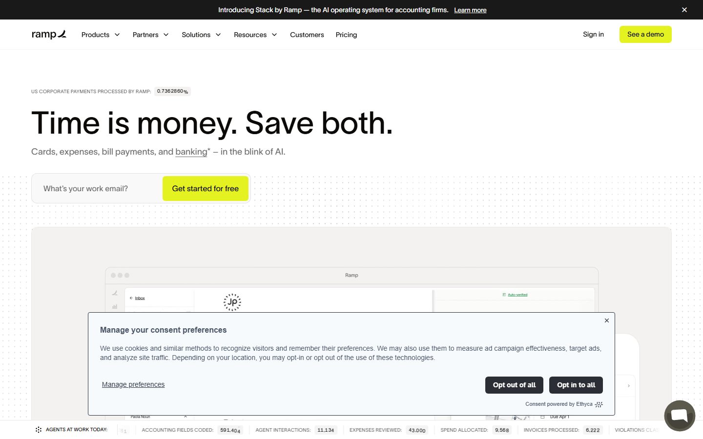
Ramp's marketing surface is a high-contrast, engineering-forward fintech interface — white canvas (`{colors.canvas}` — #ffffff) and true black (`{colors.ink}` — #000000) carrying nearly all the weight, with a single electric lime-chartreuse accent (`{colors.accent-lime}` — #e7f056) reserved almost exclusively for the primary CTA. The page reads as confident and utilitarian: oversized headlines, generous whitespace, and a single obvious action per band.
The type voice is dominated by **Lausanne** — a Swiss neo-grotesque set at weight 400 even at display scale (64px h1), with very tight negative letter-spacing and a 1.0 line-height on the largest headline. Ramp deliberately avoids bold display weight; the hierarchy comes from size and tightness, not weight. UI labels and buttons drop to **Inter** at 14px.
Component voltage comes from **real product UI fragments shown inside warm off-white cards** (`{colors.surface-warm}` — #f4f2f0) — the Ramp card, the accounting automation table, the Cash & Treasury panel — embedded directly in the marketing flow rather than illustrated. The chromatic accents beyond lime (blues, greens, an orange) appear almost entirely inside those product fragments and data-rich diagrams, not in the page chrome.
The system is intentionally flat — radii are small (4–12px), shadows are essentially absent, and depth is communicated through surface-color contrast and hairlines rather than elevation.
**Key Characteristics:**
- White canvas with a single lime CTA (`{colors.accent-lime}` — #e7f056). The lime is scarce and loud — it is the only saturated color in the page chrome.
- Lausanne neo-grotesque headlines at weight 400 with tight negative tracking — hierarchy from size, not weight. Lausanne is a licensed typeface; an open-source substitute is documented below.
- Warm off-white product cards (`{colors.surface-warm}` — #f4f2f0) holding real product UI fragments rather than marketing illustrations.
- Black announcement bar (`{colors.ink}`) pinned to the very top and a black-ink stats bar pinned to the bottom of the hero — true-black framing of an otherwise white page.
- Small radii (`{rounded.sm}` 4px on cards, `{rounded.lg}` 12px on feature cards, `{rounded.input}` 10px on inputs) — the system never reads as soft consumer-app.
- Flat depth: shadows are essentially absent (a single faint inset white glow was the only measured shadow). Contrast and hairlines do the elevation work.
- Spacing rhythm scales to `{spacing.section}` (128px) between major bands.
## Colors
### Brand & Accent
- **Accent Lime** (`{colors.accent-lime}` — #e7f056): The signature brand color and the single loud note in the system. Reserved for the primary CTA ("See a demo", "Get started for free", "Make the switch"). It is never used for body text or large surfaces.
- **Product Accents** — a measured set used almost entirely inside product UI fragments and data diagrams, never on page chrome: `{colors.blue}` (#5683d2), `{colors.blue-deep}` (#001b4a), `{colors.blue-light}` (#b2c7eb), `{colors.green}` (#18a957), `{colors.green-soft}` (#5ab570), `{colors.orange}` (#e96516). These appear on status pills, charts, and avatars inside embedded product screens.
### Surface
- **Canvas** (`{colors.canvas}` — #ffffff): The default page floor and most component backgrounds.
- **Surface Warm** (`{colors.surface-warm}` — #f4f2f0): The warm off-white used for feature cards and product-fragment containers — the system's primary "card" tone.
- **Surface Blue** (`{colors.surface-blue}` — #f2f5f9) / **Surface Blue Soft** (`{colors.surface-blue-soft}` — #e4ebf6): Cool tinted surfaces used behind banking/treasury product panels and blue-themed data zones.
- **Surface Green Soft** (`{colors.surface-green-soft}` — #e4f2e7): A pale green tint used behind success/verified states inside product fragments.
### Text
- **Ink** (`{colors.ink}` — #000000): All display headlines and primary text.
- **Ink Warm / Ink Soft / Ink Strong** (`{colors.ink-warm}` — #1c1b17, `{colors.ink-soft}` — #232222, `{colors.ink-strong}` — #212121): Near-black warm and neutral variants used for secondary headings and dense text — measured but functionally interchangeable with ink at most sizes.
- **Slate** (`{colors.slate}` — #4a5568): The measured button/input text color — used for input placeholder text and muted UI labels.
- **On Dark** (`{colors.on-dark}` — #ffffff): Text on the black announcement bar and dark surfaces.
### Hairline / Neutral
- **Hairline** (`{colors.hairline}` — #d2cecb): The warm 1px divider tone matching the warm surface family.
- **Hairline Soft** (`{colors.hairline-soft}` — #dadada) / **Hairline Softer** (`{colors.hairline-softer}` — #e1e1e1): Cooler neutral dividers and grid lines (e.g., the logo grid and card outlines).
## Typography
### Font Family
The system runs **Lausanne** for everything editorial — display headlines, sub-headlines, titles, and body — and drops to **Inter** for button labels and dense UI. Lausanne is a Swiss neo-grotesque; Ramp uses it at weight 400 across all sizes, leaning on size and tight tracking rather than weight for hierarchy.
### Note on Font Substitutes
**Lausanne is a commercial, licensed typeface** (it was not flagged in `fonts_licensed`, but it is not an open web font and must not be self-hosted without a license). For open-source delivery, substitute **Inter** at weight 400 with roughly -0.01em tracking on display sizes, or **Hanken Grotesk** / **Neue Montreal**-style grotesks where available. The substitution preserves the neo-grotesque, low-contrast, tight-tracking signature; Inter's slightly more humanist forms are the main divergence. The fallback stack here is `Lausanne, Inter, Helvetica, Arial, sans-serif`.
### Hierarchy
| Token | Size | Weight | Line Height | Letter Spacing | Use |
|---|---|---|---|---|---|
| `{typography.display-xl}` | 64px | 400 | 1.0 | -0.01px | Homepage h1 ("Time is money. Save both.") |
| `{typography.display-lg}` | 40px | 400 | 1.05 | -0.005px | Section heads ("One platform for your entire back office.") |
| `{typography.title}` | 24px | 400 | 1.167 | 0 | Card titles, sub-section heads |
| `{typography.body}` | 14px | 400 | 1.429 | 0 | Running text, nav links, captions |
| `{typography.button}` | 14px | 400 | 1.4 | 0 | Button labels — Inter |
### Principles
Display weight stays at 400 — never bold. Ramp's hierarchy is built from scale (64 → 40 → 24 → 14) and tight negative tracking on the two largest sizes, not from weight escalation. Body, nav, and captions all share the 14px Lausanne body role; the contrast between a 64px headline and 14px body is the system's primary editorial tension. Button labels are the only place the family switches to Inter.
## Layout
### Spacing System
- **Base unit:** 4px.
- **Tokens:** `{spacing.xxs}` 4px · `{spacing.xs}` 8px · `{spacing.sm}` 12px · `{spacing.md}` 16px · `{spacing.lg}` 24px · `{spacing.xl}` 32px · `{spacing.xxl}` 48px · `{spacing.xxxl}` 64px · `{spacing.section}` 128px.
- **Most-frequent steps:** 24px (`{spacing.lg}`) and 8px (`{spacing.xs}`) dominate the measured data — 24px is the default card/grid gutter, 8px the default inline gap.
- **Section padding:** the largest measured value, 128px (`{spacing.section}`), marks the vertical rhythm between major bands; 64px (`{spacing.xxxl}`) handles sub-band separation.
- **Off-grid measured values** of 6px, 7px, 20px, and 36px appear at low frequency — treat these as incidental rather than canonical tokens.
### Grid & Container
- **Editorial body:** Single wide container; the hero is left-aligned full-bleed text with the product mockup below.
- **Feature cards:** A mixed grid — a 2-up row of large cards over a 3-up row of smaller cards ("Cards & Expenses", "Procure to pay", "Accounting automation", "Banking", "200+ Integrations").
- **Logo grid:** Multi-column customer-logo grid with hairline dividers (`{colors.hairline-softer}`).
### Whitespace Philosophy
Ramp uses generous vertical whitespace (section rhythm up to 128px) paired with dense, left-aligned headline blocks. The result reads as precise and confident — large empty zones around a single oversized statement, then product evidence below.
## Elevation & Depth
| Level | Treatment | Use |
|---|---|---|
| Flat | No shadow, no border | Body sections, hero, top nav |
| Hairline | 1px `{colors.hairline}` / `{colors.hairline-softer}` border | Card outlines, logo-grid dividers, input borders |
| Surface contrast | `{colors.surface-warm}` block on white canvas | Feature cards, product-fragment containers |
| Inset glow | `rgba(255,255,255,0.6) 0 0 2px inset` (the only measured shadow) | A subtle inner highlight on a single elevated element |
| Black framing | `{colors.ink}` bars | The announcement bar (top) and hero stats bar (bottom) frame the white page with true black |
The elevation philosophy is **flat and contrast-driven**. Depth comes from surface-color shifts and hairlines, not from drop shadows. No neumorphism, no glassmorphism, essentially no drop shadows in the measured set.
### Decorative Depth
- Product UI fragments embedded inside feature cards carry their own native chrome (tables, status pills, balance panels) — these are product screenshots shown as content, not system elevation tokens.
- The black Ramp card visual in the "Cards & Expenses" feature card is a product photograph, not a styled component surface.
## Shapes
### Border Radius Scale
| Token | Value | Use |
|---|---|---|
| `{rounded.sm}` | 4px | Cards, logo cells — the default tight radius |
| `{rounded.md}` | 6px | Buttons, small interactive controls |
| `{rounded.input}` | 10px | Text inputs (measured directly on input) |
| `{rounded.lg}` | 12px | Feature cards, larger content containers |
The system stays tight — nothing rounds beyond 12px. Small radii reinforce the precise, utility-software character.
### Photography & Product Geometry
Product UI fragments and the Ramp card photograph retain their native chrome and corner radii. Feature-card containers wrap them at `{rounded.lg}` (12px).
## Components
### Framing Bars
**`announcement-bar`** — Full-width black bar pinned to the very top of the page ("Introducing Stack by Ramp — the AI operating system for accounting firms. Learn more"). Background `{colors.ink}`, text `{colors.on-dark}`, body type, with an inline underlined link and a dismiss "×" at the right.
**`stats-bar`** — A thin live-metrics bar pinned to the bottom of the hero ("AGENTS AT WORK TODAY", "ACCOUNTING FIELDS CODED", "EXPENSES REVIEWED", etc.) showing rolling numeric counters. Background `{colors.canvas}`, ink text, with small uppercase labels and tabular figures.
### Navigation
**`top-nav`** — White nav bar below the announcement bar. Carries the lowercase "ramp" wordmark at left, primary menu (Products, Partners, Solutions, Resources, Customers, Pricing) center, and a right cluster with a "Sign in" `{component.button-text}` and a "See a demo" `{component.button-primary}`. Menu items use `{typography.body}`.
**`nav-link`** — Inline nav menu item in `{colors.ink}`, body type, several with dropdown carets.
### Buttons
**`button-primary`** — The signature lime CTA. Background `{colors.accent-lime}` (#e7f056), text `{colors.ink}`, type `{typography.button}` (Inter 14px / 400), rounded `{rounded.md}`. Padding 12px × 24px is derived from the spacing scale (the raw measured padding string was malformed — see Known Gaps). Used for "See a demo", "Get started for free", and "Make the switch".
**`button-text`** — Inline text button with no background ("Sign in", inline "Learn more" / "Read their story →" links). Background transparent, text `{colors.ink}`, body type.
### Inputs & Forms
**`email-input`** — The hero work-email capture field paired inline with the lime CTA ("What's your work email?" + "Get started for free"). Background `{colors.canvas}`, placeholder text `{colors.slate}`, rounded `{rounded.md}`, body type.
**`input`** — Standard text input. Background `{colors.canvas}`, text `{colors.slate}`, rounded `{rounded.input}` (10px, measured directly), body type. Hairline border in `{colors.hairline-soft}`.
### Cards & Containers
**`card`** — The base container primitive. Background `{colors.canvas}`, rounded `{rounded.sm}` (4px), no shadow. Used for tight content blocks and product-fragment frames.
**`feature-card`** — The marketing feature tile used in the "One platform for your entire back office" grid. Background `{colors.surface-warm}` (#f4f2f0), rounded `{rounded.lg}` (12px), internal padding `{spacing.lg}` (24px). Carries a `{typography.title}` headline, a short caption, an up-right arrow affordance, and a real product UI fragment (the Ramp card, the accounting table, the Cash & Treasury panel) embedded in the lower zone.
**`logo-cell`** — A single cell in the customer-logo grid ("Join 70,000 of the world's most ambitious companies"). Background `{colors.canvas}`, hairline dividers in `{colors.hairline-softer}`, padding `{spacing.lg}` (24px), logos rendered in `{colors.slate}`.
## Do's and Don'ts
### Do
- Reserve `{colors.accent-lime}` (#e7f056) for the primary CTA only. Its scarcity is what makes it loud.
- Set display headlines in Lausanne (or its substitute) at weight 400 with tight negative tracking. Build hierarchy from size, not bold weight.
- Use `{component.feature-card}` (warm off-white) to hold real product UI fragments — show the actual product, don't illustrate it.
- Keep radii tight (4–12px). The small-radius language signals precise utility software.
- Frame the page with true black (`{colors.ink}`) at top (announcement bar) and bottom (stats bar) while keeping the body white.
- Use surface-color contrast and hairlines for depth instead of drop shadows.
### Don't
- Don't bold display type. Lausanne at weight 400 is the voice; heavier weights read as off-brand.
- Don't spread the lime accent across surfaces or body text — it belongs on the CTA.
- Don't introduce drop shadows or soft elevation; the system is deliberately flat.
- Don't round corners beyond `{rounded.lg}` (12px) — large radii break the precise character.
- Don't pull the product-fragment accent colors (blues, greens, orange) into page chrome; they live inside embedded product UI.
- Don't add hover-state styling beyond default + pressed.
## Responsive Behavior
### Breakpoints
| Name | Width | Key Changes |
|---|---|---|
| Mobile | < 768px | Hamburger nav; hero h1 scales down from 64px; email-input + CTA stack; feature grid 1-up; logo grid wraps to fewer columns |
| Tablet | 768–1024px | Top nav tightens; feature grid reduces to 2-up; large hero text remains left-aligned |
| Desktop | 1024–1440px | Full horizontal nav; mixed 2-up/3-up feature grid; full-scale 64px h1 |
| Wide | > 1440px | Same as desktop with more outer breathing room |
### Touch Targets
- `{component.button-primary}` carries comfortable 12px × 24px padding (derived) giving a 40px+ effective tap target.
- `{component.email-input}` and `{component.input}` sit at input-height with 12px vertical padding.
- Exact touch-target heights were not measured directly — see Known Gaps.
### Collapsing Strategy
- Top nav collapses to a hamburger on mobile.
- The hero email-capture row (input + lime button) stacks vertically on narrow screens.
- Feature cards reduce columns (3 → 2 → 1) rather than scaling down their embedded product fragments.
- The logo grid reflows to fewer columns; the bottom stats bar wraps or scrolls horizontally.
### Image Behavior
- Embedded product UI fragments keep native aspect ratios; their feature-card containers resize around them.
- The Ramp card photograph scales proportionally inside its card.
## Iteration Guide
1. Focus on ONE component at a time. Reference its YAML key directly (`{component.feature-card}`, `{component.button-primary}`).
2. Variants (`-active`, `-disabled`, `-focused`) live as separate entries in `components:`.
3. Use `{token.refs}` everywhere — never inline hex.
4. Never document hover. Default and Active/Pressed states only.
5. Display headlines stay Lausanne 400 with tight tracking. Body stays 14px. The size jump carries the hierarchy.
6. The lime accent is scarce by design — adding a second saturated chrome color breaks the system.
7. When in doubt about emphasis: bigger Lausanne before bolder Lausanne.
## Known Gaps
- **Button radius & padding conflict:** the measured `button-primary` reported `radius: 0px` and a malformed padding string (`"8px 8px 0px 0px"`), and its measured `color` was `#4a5568` (slate). The visible CTAs in the screenshots are lime with rounded corners and dark text. `button-primary` is documented from screenshot ground-truth: backgroundColor `{colors.accent-lime}`, textColor `{colors.ink}`, radius `{rounded.md}`, padding 12px × 24px (derived from the spacing scale). The slate `#4a5568` is retained as the measured input/label text token.
- **Active/pressed and focus states** for buttons and inputs were not captured — only default styling is documented.
- **Eyebrow / uppercase label style** (e.g., "US CORPORATE PAYMENTS PROCESSED BY RAMP") is visible in screenshots but was not measured as a distinct typography role; it likely derives from the 14px body role at reduced size with tracking.
- **Footer** styling was not captured in the measured set (the bottom of long-scroll pages was occluded by a consent dialog in the landing capture).
- **Lausanne** is a licensed commercial typeface; it must be substituted with an open-source grotesk (Inter / Hanken Grotesk) for delivery — it cannot be self-hosted without a license.
- **Off-grid spacing values** (6px, 7px, 20px, 36px) appeared at low frequency and are excluded from the canonical spacing scale; they may be incidental or component-specific.
- **Product-fragment accent colors** (blues, greens, orange) are documented from frequency analysis; their exact roles inside the live product UI are out of scope for this marketing-surface entry.
- **Animation and transition timings** (rolling stat counters, card reveals) were not measured.
<!-- Documented by duply · real-world design systems as ready-to-use DESIGN.md for AI coding agents · https://duply.ai/ramp/design-md -->
Color Palette
Accent
Neutrals
Typography
display-xl64px · 400 · 1
The quick brown fox jumpsdisplay-lg40px · 400 · 1.05
The quick brown fox jumpstitle24px · 400 · 1.167
The quick brown fox jumpsbody14px · 400 · 1.429
The quick brown fox jumpsbutton14px · 400 · 1.4
The quick brown fox jumpsSpacing & Shape
Spacing
| Name | Value | Preview |
|---|---|---|
| xxs | 4px | |
| xs | 8px | |
| sm | 12px | |
| md | 16px | |
| lg | 24px | |
| xl | 32px | |
| xxl | 48px | |
| xxxl | 64px | |
| section | 128px |
Border Radius
| Name | Value | Preview |
|---|---|---|
| sm | 4px | |
| md | 6px | |
| input | 10px | |
| lg | 12px |
More like this


---
version: alpha
name: Ramp-design-analysis
description: A high-contrast, fintech-utility marketing surface anchored on white canvas (#ffffff) and true black (#000000) with a single electric lime-chartreuse accent (#e7f056) reserved for the primary CTA. The system reads as confident, precise, and engineering-forward — oversized Lausanne neo-grotesque headlines set tight at weight 400, warm off-white product cards (#f4f2f0) holding real product UI fragments, near-zero radii (4–12px), and a flat, shadowless depth model. Brand voltage comes almost entirely from the lime CTA against an otherwise monochrome, near-typographic layout.

colors:
  accent-lime: "#e7f056"
  canvas: "#ffffff"
  ink: "#000000"
  ink-warm: "#1c1b17"
  ink-soft: "#232222"
  ink-strong: "#212121"
  slate: "#4a5568"
  surface-warm: "#f4f2f0"
  surface-blue: "#f2f5f9"
  surface-blue-soft: "#e4ebf6"
  surface-green-soft: "#e4f2e7"
  blue: "#5683d2"
  blue-deep: "#001b4a"
  blue-light: "#b2c7eb"
  green: "#18a957"
  green-soft: "#5ab570"
  orange: "#e96516"
  hairline: "#d2cecb"
  hairline-soft: "#dadada"
  hairline-softer: "#e1e1e1"
  on-dark: "#ffffff"

typography:
  display-xl:
    fontFamily: "Lausanne, Inter, Helvetica, Arial, sans-serif"
    fontSize: 64px
    fontWeight: 400
    lineHeight: 1.0
    letterSpacing: "-0.01px"
  display-lg:
    fontFamily: "Lausanne, Inter, Helvetica, Arial, sans-serif"
    fontSize: 40px
    fontWeight: 400
    lineHeight: 1.05
    letterSpacing: "-0.005px"
  title:
    fontFamily: "Lausanne, Inter, Helvetica, Arial, sans-serif"
    fontSize: 24px
    fontWeight: 400
    lineHeight: 1.167
    letterSpacing: "0"
  body:
    fontFamily: "Lausanne, Inter, Helvetica, Arial, sans-serif"
    fontSize: 14px
    fontWeight: 400
    lineHeight: 1.429
    letterSpacing: "0"
  button:
    fontFamily: "Inter, Helvetica, Arial, sans-serif"
    fontSize: 14px
    fontWeight: 400
    lineHeight: 1.4
    letterSpacing: "0"

rounded:
  sm: 4px
  md: 6px
  input: 10px
  lg: 12px

spacing:
  xxs: 4px
  xs: 8px
  sm: 12px
  md: 16px
  lg: 24px
  xl: 32px
  xxl: 48px
  xxxl: 64px
  section: 128px

components:
  announcement-bar:
    backgroundColor: "{colors.ink}"
    textColor: "{colors.on-dark}"
    typography: "{typography.body}"
    padding: 12px 24px
  top-nav:
    backgroundColor: "{colors.canvas}"
    textColor: "{colors.ink}"
    typography: "{typography.body}"
    padding: 16px 24px
  nav-link:
    backgroundColor: transparent
    textColor: "{colors.ink}"
    typography: "{typography.body}"
  button-primary:
    backgroundColor: "{colors.accent-lime}"
    textColor: "{colors.ink}"
    typography: "{typography.button}"
    rounded: "{rounded.md}"
    padding: 12px 24px
  button-text:
    backgroundColor: transparent
    textColor: "{colors.ink}"
    typography: "{typography.body}"
  email-input:
    backgroundColor: "{colors.canvas}"
    textColor: "{colors.slate}"
    typography: "{typography.body}"
    rounded: "{rounded.md}"
    padding: 12px 16px
  input:
    backgroundColor: "{colors.canvas}"
    textColor: "{colors.slate}"
    typography: "{typography.body}"
    rounded: "{rounded.input}"
    padding: 12px 16px
  card:
    backgroundColor: "{colors.canvas}"
    textColor: "{colors.ink}"
    rounded: "{rounded.sm}"
  feature-card:
    backgroundColor: "{colors.surface-warm}"
    textColor: "{colors.ink}"
    typography: "{typography.title}"
    rounded: "{rounded.lg}"
    padding: 24px
  logo-cell:
    backgroundColor: "{colors.canvas}"
    textColor: "{colors.slate}"
    rounded: "{rounded.sm}"
    padding: 24px
  stats-bar:
    backgroundColor: "{colors.canvas}"
    textColor: "{colors.ink}"
    typography: "{typography.body}"
    padding: 12px 24px
---

## Overview

Ramp's marketing surface is a high-contrast, engineering-forward fintech interface — white canvas (`{colors.canvas}` — #ffffff) and true black (`{colors.ink}` — #000000) carrying nearly all the weight, with a single electric lime-chartreuse accent (`{colors.accent-lime}` — #e7f056) reserved almost exclusively for the primary CTA. The page reads as confident and utilitarian: oversized headlines, generous whitespace, and a single obvious action per band.

The type voice is dominated by **Lausanne** — a Swiss neo-grotesque set at weight 400 even at display scale (64px h1), with very tight negative letter-spacing and a 1.0 line-height on the largest headline. Ramp deliberately avoids bold display weight; the hierarchy comes from size and tightness, not weight. UI labels and buttons drop to **Inter** at 14px.

Component voltage comes from **real product UI fragments shown inside warm off-white cards** (`{colors.surface-warm}` — #f4f2f0) — the Ramp card, the accounting automation table, the Cash & Treasury panel — embedded directly in the marketing flow rather than illustrated. The chromatic accents beyond lime (blues, greens, an orange) appear almost entirely inside those product fragments and data-rich diagrams, not in the page chrome.

The system is intentionally flat — radii are small (4–12px), shadows are essentially absent, and depth is communicated through surface-color contrast and hairlines rather than elevation.

**Key Characteristics:**
- White canvas with a single lime CTA (`{colors.accent-lime}` — #e7f056). The lime is scarce and loud — it is the only saturated color in the page chrome.
- Lausanne neo-grotesque headlines at weight 400 with tight negative tracking — hierarchy from size, not weight. Lausanne is a licensed typeface; an open-source substitute is documented below.
- Warm off-white product cards (`{colors.surface-warm}` — #f4f2f0) holding real product UI fragments rather than marketing illustrations.
- Black announcement bar (`{colors.ink}`) pinned to the very top and a black-ink stats bar pinned to the bottom of the hero — true-black framing of an otherwise white page.
- Small radii (`{rounded.sm}` 4px on cards, `{rounded.lg}` 12px on feature cards, `{rounded.input}` 10px on inputs) — the system never reads as soft consumer-app.
- Flat depth: shadows are essentially absent (a single faint inset white glow was the only measured shadow). Contrast and hairlines do the elevation work.
- Spacing rhythm scales to `{spacing.section}` (128px) between major bands.

## Colors

### Brand & Accent
- **Accent Lime** (`{colors.accent-lime}` — #e7f056): The signature brand color and the single loud note in the system. Reserved for the primary CTA ("See a demo", "Get started for free", "Make the switch"). It is never used for body text or large surfaces.
- **Product Accents** — a measured set used almost entirely inside product UI fragments and data diagrams, never on page chrome: `{colors.blue}` (#5683d2), `{colors.blue-deep}` (#001b4a), `{colors.blue-light}` (#b2c7eb), `{colors.green}` (#18a957), `{colors.green-soft}` (#5ab570), `{colors.orange}` (#e96516). These appear on status pills, charts, and avatars inside embedded product screens.

### Surface
- **Canvas** (`{colors.canvas}` — #ffffff): The default page floor and most component backgrounds.
- **Surface Warm** (`{colors.surface-warm}` — #f4f2f0): The warm off-white used for feature cards and product-fragment containers — the system's primary "card" tone.
- **Surface Blue** (`{colors.surface-blue}` — #f2f5f9) / **Surface Blue Soft** (`{colors.surface-blue-soft}` — #e4ebf6): Cool tinted surfaces used behind banking/treasury product panels and blue-themed data zones.
- **Surface Green Soft** (`{colors.surface-green-soft}` — #e4f2e7): A pale green tint used behind success/verified states inside product fragments.

### Text
- **Ink** (`{colors.ink}` — #000000): All display headlines and primary text.
- **Ink Warm / Ink Soft / Ink Strong** (`{colors.ink-warm}` — #1c1b17, `{colors.ink-soft}` — #232222, `{colors.ink-strong}` — #212121): Near-black warm and neutral variants used for secondary headings and dense text — measured but functionally interchangeable with ink at most sizes.
- **Slate** (`{colors.slate}` — #4a5568): The measured button/input text color — used for input placeholder text and muted UI labels.
- **On Dark** (`{colors.on-dark}` — #ffffff): Text on the black announcement bar and dark surfaces.

### Hairline / Neutral
- **Hairline** (`{colors.hairline}` — #d2cecb): The warm 1px divider tone matching the warm surface family.
- **Hairline Soft** (`{colors.hairline-soft}` — #dadada) / **Hairline Softer** (`{colors.hairline-softer}` — #e1e1e1): Cooler neutral dividers and grid lines (e.g., the logo grid and card outlines).

## Typography

### Font Family
The system runs **Lausanne** for everything editorial — display headlines, sub-headlines, titles, and body — and drops to **Inter** for button labels and dense UI. Lausanne is a Swiss neo-grotesque; Ramp uses it at weight 400 across all sizes, leaning on size and tight tracking rather than weight for hierarchy.

### Note on Font Substitutes
**Lausanne is a commercial, licensed typeface** (it was not flagged in `fonts_licensed`, but it is not an open web font and must not be self-hosted without a license). For open-source delivery, substitute **Inter** at weight 400 with roughly -0.01em tracking on display sizes, or **Hanken Grotesk** / **Neue Montreal**-style grotesks where available. The substitution preserves the neo-grotesque, low-contrast, tight-tracking signature; Inter's slightly more humanist forms are the main divergence. The fallback stack here is `Lausanne, Inter, Helvetica, Arial, sans-serif`.

### Hierarchy

| Token | Size | Weight | Line Height | Letter Spacing | Use |
|---|---|---|---|---|---|
| `{typography.display-xl}` | 64px | 400 | 1.0 | -0.01px | Homepage h1 ("Time is money. Save both.") |
| `{typography.display-lg}` | 40px | 400 | 1.05 | -0.005px | Section heads ("One platform for your entire back office.") |
| `{typography.title}` | 24px | 400 | 1.167 | 0 | Card titles, sub-section heads |
| `{typography.body}` | 14px | 400 | 1.429 | 0 | Running text, nav links, captions |
| `{typography.button}` | 14px | 400 | 1.4 | 0 | Button labels — Inter |

### Principles
Display weight stays at 400 — never bold. Ramp's hierarchy is built from scale (64 → 40 → 24 → 14) and tight negative tracking on the two largest sizes, not from weight escalation. Body, nav, and captions all share the 14px Lausanne body role; the contrast between a 64px headline and 14px body is the system's primary editorial tension. Button labels are the only place the family switches to Inter.

## Layout

### Spacing System
- **Base unit:** 4px.
- **Tokens:** `{spacing.xxs}` 4px · `{spacing.xs}` 8px · `{spacing.sm}` 12px · `{spacing.md}` 16px · `{spacing.lg}` 24px · `{spacing.xl}` 32px · `{spacing.xxl}` 48px · `{spacing.xxxl}` 64px · `{spacing.section}` 128px.
- **Most-frequent steps:** 24px (`{spacing.lg}`) and 8px (`{spacing.xs}`) dominate the measured data — 24px is the default card/grid gutter, 8px the default inline gap.
- **Section padding:** the largest measured value, 128px (`{spacing.section}`), marks the vertical rhythm between major bands; 64px (`{spacing.xxxl}`) handles sub-band separation.
- **Off-grid measured values** of 6px, 7px, 20px, and 36px appear at low frequency — treat these as incidental rather than canonical tokens.

### Grid & Container
- **Editorial body:** Single wide container; the hero is left-aligned full-bleed text with the product mockup below.
- **Feature cards:** A mixed grid — a 2-up row of large cards over a 3-up row of smaller cards ("Cards & Expenses", "Procure to pay", "Accounting automation", "Banking", "200+ Integrations").
- **Logo grid:** Multi-column customer-logo grid with hairline dividers (`{colors.hairline-softer}`).

### Whitespace Philosophy
Ramp uses generous vertical whitespace (section rhythm up to 128px) paired with dense, left-aligned headline blocks. The result reads as precise and confident — large empty zones around a single oversized statement, then product evidence below.

## Elevation & Depth

| Level | Treatment | Use |
|---|---|---|
| Flat | No shadow, no border | Body sections, hero, top nav |
| Hairline | 1px `{colors.hairline}` / `{colors.hairline-softer}` border | Card outlines, logo-grid dividers, input borders |
| Surface contrast | `{colors.surface-warm}` block on white canvas | Feature cards, product-fragment containers |
| Inset glow | `rgba(255,255,255,0.6) 0 0 2px inset` (the only measured shadow) | A subtle inner highlight on a single elevated element |
| Black framing | `{colors.ink}` bars | The announcement bar (top) and hero stats bar (bottom) frame the white page with true black |

The elevation philosophy is **flat and contrast-driven**. Depth comes from surface-color shifts and hairlines, not from drop shadows. No neumorphism, no glassmorphism, essentially no drop shadows in the measured set.

### Decorative Depth
- Product UI fragments embedded inside feature cards carry their own native chrome (tables, status pills, balance panels) — these are product screenshots shown as content, not system elevation tokens.
- The black Ramp card visual in the "Cards & Expenses" feature card is a product photograph, not a styled component surface.

## Shapes

### Border Radius Scale

| Token | Value | Use |
|---|---|---|
| `{rounded.sm}` | 4px | Cards, logo cells — the default tight radius |
| `{rounded.md}` | 6px | Buttons, small interactive controls |
| `{rounded.input}` | 10px | Text inputs (measured directly on input) |
| `{rounded.lg}` | 12px | Feature cards, larger content containers |

The system stays tight — nothing rounds beyond 12px. Small radii reinforce the precise, utility-software character.

### Photography & Product Geometry
Product UI fragments and the Ramp card photograph retain their native chrome and corner radii. Feature-card containers wrap them at `{rounded.lg}` (12px).

## Components

### Framing Bars

**`announcement-bar`** — Full-width black bar pinned to the very top of the page ("Introducing Stack by Ramp — the AI operating system for accounting firms. Learn more"). Background `{colors.ink}`, text `{colors.on-dark}`, body type, with an inline underlined link and a dismiss "×" at the right.

**`stats-bar`** — A thin live-metrics bar pinned to the bottom of the hero ("AGENTS AT WORK TODAY", "ACCOUNTING FIELDS CODED", "EXPENSES REVIEWED", etc.) showing rolling numeric counters. Background `{colors.canvas}`, ink text, with small uppercase labels and tabular figures.

### Navigation

**`top-nav`** — White nav bar below the announcement bar. Carries the lowercase "ramp" wordmark at left, primary menu (Products, Partners, Solutions, Resources, Customers, Pricing) center, and a right cluster with a "Sign in" `{component.button-text}` and a "See a demo" `{component.button-primary}`. Menu items use `{typography.body}`.

**`nav-link`** — Inline nav menu item in `{colors.ink}`, body type, several with dropdown carets.

### Buttons

**`button-primary`** — The signature lime CTA. Background `{colors.accent-lime}` (#e7f056), text `{colors.ink}`, type `{typography.button}` (Inter 14px / 400), rounded `{rounded.md}`. Padding 12px × 24px is derived from the spacing scale (the raw measured padding string was malformed — see Known Gaps). Used for "See a demo", "Get started for free", and "Make the switch".

**`button-text`** — Inline text button with no background ("Sign in", inline "Learn more" / "Read their story →" links). Background transparent, text `{colors.ink}`, body type.

### Inputs & Forms

**`email-input`** — The hero work-email capture field paired inline with the lime CTA ("What's your work email?" + "Get started for free"). Background `{colors.canvas}`, placeholder text `{colors.slate}`, rounded `{rounded.md}`, body type.

**`input`** — Standard text input. Background `{colors.canvas}`, text `{colors.slate}`, rounded `{rounded.input}` (10px, measured directly), body type. Hairline border in `{colors.hairline-soft}`.

### Cards & Containers

**`card`** — The base container primitive. Background `{colors.canvas}`, rounded `{rounded.sm}` (4px), no shadow. Used for tight content blocks and product-fragment frames.

**`feature-card`** — The marketing feature tile used in the "One platform for your entire back office" grid. Background `{colors.surface-warm}` (#f4f2f0), rounded `{rounded.lg}` (12px), internal padding `{spacing.lg}` (24px). Carries a `{typography.title}` headline, a short caption, an up-right arrow affordance, and a real product UI fragment (the Ramp card, the accounting table, the Cash & Treasury panel) embedded in the lower zone.

**`logo-cell`** — A single cell in the customer-logo grid ("Join 70,000 of the world's most ambitious companies"). Background `{colors.canvas}`, hairline dividers in `{colors.hairline-softer}`, padding `{spacing.lg}` (24px), logos rendered in `{colors.slate}`.

## Do's and Don'ts

### Do
- Reserve `{colors.accent-lime}` (#e7f056) for the primary CTA only. Its scarcity is what makes it loud.
- Set display headlines in Lausanne (or its substitute) at weight 400 with tight negative tracking. Build hierarchy from size, not bold weight.
- Use `{component.feature-card}` (warm off-white) to hold real product UI fragments — show the actual product, don't illustrate it.
- Keep radii tight (4–12px). The small-radius language signals precise utility software.
- Frame the page with true black (`{colors.ink}`) at top (announcement bar) and bottom (stats bar) while keeping the body white.
- Use surface-color contrast and hairlines for depth instead of drop shadows.

### Don't
- Don't bold display type. Lausanne at weight 400 is the voice; heavier weights read as off-brand.
- Don't spread the lime accent across surfaces or body text — it belongs on the CTA.
- Don't introduce drop shadows or soft elevation; the system is deliberately flat.
- Don't round corners beyond `{rounded.lg}` (12px) — large radii break the precise character.
- Don't pull the product-fragment accent colors (blues, greens, orange) into page chrome; they live inside embedded product UI.
- Don't add hover-state styling beyond default + pressed.

## Responsive Behavior

### Breakpoints

| Name | Width | Key Changes |
|---|---|---|
| Mobile | < 768px | Hamburger nav; hero h1 scales down from 64px; email-input + CTA stack; feature grid 1-up; logo grid wraps to fewer columns |
| Tablet | 768–1024px | Top nav tightens; feature grid reduces to 2-up; large hero text remains left-aligned |
| Desktop | 1024–1440px | Full horizontal nav; mixed 2-up/3-up feature grid; full-scale 64px h1 |
| Wide | > 1440px | Same as desktop with more outer breathing room |

### Touch Targets
- `{component.button-primary}` carries comfortable 12px × 24px padding (derived) giving a 40px+ effective tap target.
- `{component.email-input}` and `{component.input}` sit at input-height with 12px vertical padding.
- Exact touch-target heights were not measured directly — see Known Gaps.

### Collapsing Strategy
- Top nav collapses to a hamburger on mobile.
- The hero email-capture row (input + lime button) stacks vertically on narrow screens.
- Feature cards reduce columns (3 → 2 → 1) rather than scaling down their embedded product fragments.
- The logo grid reflows to fewer columns; the bottom stats bar wraps or scrolls horizontally.

### Image Behavior
- Embedded product UI fragments keep native aspect ratios; their feature-card containers resize around them.
- The Ramp card photograph scales proportionally inside its card.

## Iteration Guide

1. Focus on ONE component at a time. Reference its YAML key directly (`{component.feature-card}`, `{component.button-primary}`).
2. Variants (`-active`, `-disabled`, `-focused`) live as separate entries in `components:`.
3. Use `{token.refs}` everywhere — never inline hex.
4. Never document hover. Default and Active/Pressed states only.
5. Display headlines stay Lausanne 400 with tight tracking. Body stays 14px. The size jump carries the hierarchy.
6. The lime accent is scarce by design — adding a second saturated chrome color breaks the system.
7. When in doubt about emphasis: bigger Lausanne before bolder Lausanne.

## Known Gaps

- **Button radius & padding conflict:** the measured `button-primary` reported `radius: 0px` and a malformed padding string (`"8px 8px 0px 0px"`), and its measured `color` was `#4a5568` (slate). The visible CTAs in the screenshots are lime with rounded corners and dark text. `button-primary` is documented from screenshot ground-truth: backgroundColor `{colors.accent-lime}`, textColor `{colors.ink}`, radius `{rounded.md}`, padding 12px × 24px (derived from the spacing scale). The slate `#4a5568` is retained as the measured input/label text token.
- **Active/pressed and focus states** for buttons and inputs were not captured — only default styling is documented.
- **Eyebrow / uppercase label style** (e.g., "US CORPORATE PAYMENTS PROCESSED BY RAMP") is visible in screenshots but was not measured as a distinct typography role; it likely derives from the 14px body role at reduced size with tracking.
- **Footer** styling was not captured in the measured set (the bottom of long-scroll pages was occluded by a consent dialog in the landing capture).
- **Lausanne** is a licensed commercial typeface; it must be substituted with an open-source grotesk (Inter / Hanken Grotesk) for delivery — it cannot be self-hosted without a license.
- **Off-grid spacing values** (6px, 7px, 20px, 36px) appeared at low frequency and are excluded from the canonical spacing scale; they may be incidental or component-specific.
- **Product-fragment accent colors** (blues, greens, orange) are documented from frequency analysis; their exact roles inside the live product UI are out of scope for this marketing-surface entry.
- **Animation and transition timings** (rolling stat counters, card reveals) were not measured.

<!-- Documented by duply · real-world design systems as ready-to-use DESIGN.md for AI coding agents · https://duply.ai/ramp/design-md -->