ConduitPay
A bold fintech landing surface built on white canvas with oversized Founders Grotesk display headlines, an electric blue primary action color, and a high-voltage mint-green section that anchors the brand. The system alternates white, light-gray, deep-navy, black, and green full-bleed bands to pace a long-scroll page, pairing pill-shaped CTAs with circular arrow buttons. Voltage comes from scale (128px headlines) and color-block band switching rather than decoration.
---
version: alpha
name: ConduitPay-design-analysis
description: "A bold fintech landing surface built on white canvas with oversized Founders Grotesk display headlines, an electric blue primary action color, and a high-voltage mint-green section that anchors the brand. The system alternates white, light-gray, deep-navy, black, and green full-bleed bands to pace a long-scroll page, pairing pill-shaped CTAs with circular arrow buttons. Voltage comes from scale (128px headlines) and color-block band switching rather than decoration."
colors:
primary: "#0445f5"
accent-green: "#18ff9b"
ink: "#232323"
muted: "#333333"
body-navy: "#1b2859"
canvas: "#ffffff"
surface-soft: "#fafafa"
surface-light: "#f1f1f1"
surface-dark: "#222222"
surface-black: "#000000"
hairline: "#ebebeb"
hairline-soft: "#eeeeee"
border: "#cccccc"
border-soft: "#dddddd"
link: "#0000ee"
on-primary: "#ffffff"
accent-cream: "#f6efe5"
accent-gold: "#a29a65"
accent-red: "#ad1a1a"
accent-pale-blue: "#dae1ed"
accent-olive: "#302d1c"
typography:
display-hero:
fontFamily: "Founders Grotesk, Space Grotesk, Arial, sans-serif"
fontSize: 128px
fontWeight: 400
lineHeight: 0.875
letterSpacing: normal
display-xl:
fontFamily: "Founders Grotesk, Space Grotesk, Arial, sans-serif"
fontSize: 96px
fontWeight: 400
lineHeight: 1.0
letterSpacing: normal
display-lg:
fontFamily: "Founders Grotesk, Space Grotesk, Arial, sans-serif"
fontSize: 64px
fontWeight: 400
lineHeight: 1.1
letterSpacing: normal
display-sm:
fontFamily: "Founders Grotesk, Space Grotesk, Arial, sans-serif"
fontSize: 32px
fontWeight: 400
lineHeight: 1.0
letterSpacing: normal
body:
fontFamily: "DM Sans, sans-serif"
fontSize: 22.4px
fontWeight: 400
lineHeight: 1.1
letterSpacing: normal
button:
fontFamily: "Arial, sans-serif"
fontSize: 14px
fontWeight: 400
lineHeight: 1.429
letterSpacing: normal
rounded:
sm: 6px
md: 13px
lg: 14px
xl: 20px
xxl: 32px
pill: 160px
spacing:
xxs: 4px
xs: 8px
sm: 12px
md: 16px
lg: 24px
xl: 32px
xxl: 48px
huge: 64px
giant: 80px
components:
top-nav:
backgroundColor: "{colors.canvas}"
textColor: "{colors.ink}"
typography: "{typography.button}"
padding: 16px 64px
nav-link:
backgroundColor: transparent
textColor: "{colors.ink}"
typography: "{typography.button}"
button-primary:
backgroundColor: "{colors.primary}"
textColor: "{colors.on-primary}"
typography: "{typography.button}"
rounded: "{rounded.pill}"
padding: 16px 24px
button-icon-circular:
backgroundColor: "{colors.primary}"
textColor: "{colors.on-primary}"
rounded: "{rounded.pill}"
size: 48px
text-link:
backgroundColor: transparent
textColor: "{colors.body-navy}"
typography: "{typography.button}"
hero-band:
backgroundColor: "{colors.canvas}"
textColor: "{colors.ink}"
typography: "{typography.display-hero}"
padding: 64px
client-logo-strip:
backgroundColor: "{colors.canvas}"
textColor: "{colors.primary}"
typography: "{typography.button}"
padding: 24px 64px
feature-card-dark:
backgroundColor: "{colors.surface-black}"
textColor: "{colors.on-primary}"
typography: "{typography.display-sm}"
rounded: "{rounded.xl}"
padding: 32px
feature-card-navy:
backgroundColor: "{colors.body-navy}"
textColor: "{colors.on-primary}"
typography: "{typography.display-sm}"
rounded: "{rounded.xl}"
padding: 32px
feature-card-light:
backgroundColor: "{colors.surface-light}"
textColor: "{colors.ink}"
typography: "{typography.body}"
rounded: "{rounded.lg}"
padding: 24px
rail-tile:
backgroundColor: "{colors.surface-dark}"
textColor: "{colors.on-primary}"
typography: "{typography.button}"
rounded: "{rounded.md}"
padding: 16px
code-block:
backgroundColor: "{colors.body-navy}"
textColor: "{colors.accent-green}"
typography: "{typography.button}"
rounded: "{rounded.lg}"
padding: 24px
green-band:
backgroundColor: "{colors.accent-green}"
textColor: "{colors.ink}"
typography: "{typography.display-lg}"
padding: 64px
cta-band-navy:
backgroundColor: "{colors.primary}"
textColor: "{colors.on-primary}"
typography: "{typography.display-lg}"
padding: 64px
footer:
backgroundColor: "{colors.surface-black}"
textColor: "{colors.border}"
typography: "{typography.button}"
padding: 64px
---
## Overview
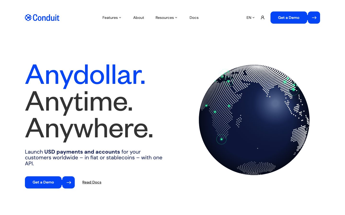
ConduitPay's landing surface is a bold, color-block fintech interface — a white canvas (`{colors.canvas}` — #ffffff) carrying oversized Founders Grotesk display headlines, an electric blue primary action color (`{colors.primary}` — #0445f5), and a single high-voltage mint-green band (`{colors.accent-green}` — #18ff9b) that anchors the brand's energy. The page reads as confident infrastructure software: enormous type, generous whitespace at the top, and dense full-bleed bands that alternate surface modes to pace the long scroll.
The display voice is **Founders Grotesk** at weight 400 across every heading — the hero stacks "Anydollar. Anytime. Anywhere." at 128px with a tight 0.875 line-height, so the three lines lock together as a single typographic block. The first word renders in `{colors.primary}` blue, the rest in `{colors.ink}` near-black, establishing the two-tone display rhythm used throughout. Body copy switches to **DM Sans** at 22.4px.
Color-block band switching is the system's signature move. White hero → white client-logo strip → mint-green feature band with black cards → white network band → light-gray developer band → navy two-product band → black rail-grid band → green-accented business band → navy onboarding band → green CTA band → black footer. Each band fully changes surface color rather than relying on shadows or borders — the analyzer captured **zero shadows**, so depth comes entirely from color contrast.
**Key Characteristics:**
- White canvas with electric blue primary CTA (`{colors.primary}` — #0445f5). The "Get a Demo" button is a pill (`{rounded.pill}` — 160px) paired with a separate circular arrow button in the same blue.
- Founders Grotesk display type at weight 400 across all heading sizes — 128px hero, 96px, 64px, 32px. A licensed Klim Type Foundry face; substituted with Space Grotesk here (see Typography).
- Two-tone headline treatment — first phrase in `{colors.primary}` blue, remainder in `{colors.ink}` (#232323).
- Full-bleed color-block bands: white, light-gray (`{colors.surface-light}` — #f1f1f1), deep navy (`{colors.body-navy}` — #1b2859), black (`{colors.surface-black}` — #000000), and electric green (`{colors.accent-green}` — #18ff9b).
- Flat depth — no shadows captured. Cards are distinguished by background color and radius alone.
- Hierarchical radius: `{rounded.md}` (13px) for small rail tiles, `{rounded.lg}` (14px) and `{rounded.xl}` (20px) for content cards, `{rounded.pill}` (160px) for buttons and circular icon buttons.
- Mint green is reserved for full bands and code-snippet syntax accents (`{colors.accent-green}` on `{colors.body-navy}` in the code block) — it is the brand's electric signal.
## Colors
### Brand & Accent
- **Primary** (`{colors.primary}` — #0445f5): The electric blue action color. All primary CTAs, the circular arrow button, the first phrase of two-tone headlines, and the navy CTA band. The dominant brand color.
- **Accent Green** (`{colors.accent-green}` — #18ff9b): The high-voltage mint band background, plus syntax-highlight accents inside the code block and section subheads on dark bands. Used as a full-bleed surface, never as a button fill.
- **Link** (`{colors.link}` — #0000ee): Default browser-blue captured on raw anchor elements; appears on unstyled inline links.
### Surface
- **Canvas** (`{colors.canvas}` — #ffffff): The default page floor and hero background.
- **Surface Soft** (`{colors.surface-soft}` — #fafafa): A barely-tinted near-white used for subtle section separation.
- **Surface Light** (`{colors.surface-light}` — #f1f1f1): The light-gray developer-orchestration band and light feature cards.
- **Surface Dark** (`{colors.surface-dark}` — #222222): Rail-tile backgrounds inside the dark network-rails band.
- **Surface Black** (`{colors.surface-black}` — #000000): The dark rails band, black feature cards on the green section, and the footer.
- **Body Navy** (`{colors.body-navy}` — #1b2859): The deep-navy two-product card band, code-block background, navy onboarding band, and the brand's navy body-text color.
### Text
- **Ink** (`{colors.ink}` — #232323): All display headlines and primary heading text on light surfaces.
- **Muted** (`{colors.muted}` — #333333): Secondary running text on light surfaces.
- **Body Navy** (`{colors.body-navy}` — #1b2859): Paragraph copy under the hero and other deep-blue body text.
- **On Primary** (`{colors.on-primary}` — #ffffff): Text on blue buttons, dark cards, navy bands, and the footer.
### Borders & Neutrals
- **Hairline** (`{colors.hairline}` — #ebebeb): 1px divider tone on light surfaces.
- **Hairline Soft** (`{colors.hairline-soft}` — #eeeeee): Even fainter divider between white sections.
- **Border** (`{colors.border}` — #cccccc): Footer text/link tone and stronger 1px borders.
- **Border Soft** (`{colors.border-soft}` — #dddddd): Soft outline alternative.
### Incidental Accents
These low-frequency colors were measured but appear only in embedded illustrations, the dotted globe, or imported content — not in the core UI palette:
- `{colors.accent-cream}` (#f6efe5), `{colors.accent-gold}` (#a29a65), `{colors.accent-red}` (#ad1a1a), `{colors.accent-pale-blue}` (#dae1ed), `{colors.accent-olive}` (#302d1c). Use with caution — these are not part of the primary system voice.
## Typography
### Font Family
The system runs **Founders Grotesk** for every display headline and **DM Sans** for body copy. Founders Grotesk is a licensed neo-grotesque from Klim Type Foundry — it is not available as a free web font and should not be self-hosted without a license. Founders Grotesk runs at weight 400 across all heading sizes; the scale (128px → 32px) carries the hierarchy rather than weight changes. DM Sans (open-source, Google Fonts) handles body text at 22.4px.
The measured button font resolved to **Arial 14px** — this is almost certainly a fallback that loaded before the intended UI face; treat button labels as a small uppercase/regular sans and confirm against ground truth (see Known Gaps).
### Hierarchy
| Token | Size | Weight | Line Height | Letter Spacing | Use |
|---|---|---|---|---|---|
| `{typography.display-hero}` | 128px | 400 | 0.875 | normal | Hero h1 stack ("Anydollar. Anytime. Anywhere.") — Founders Grotesk |
| `{typography.display-xl}` | 96px | 400 | 1.0 | normal | Largest secondary display (h4 role) — Founders Grotesk |
| `{typography.display-lg}` | 64px | 400 | 1.1 | normal | Section heads ("Send, receive and hold any form of USD", CTA band) — Founders Grotesk |
| `{typography.display-sm}` | 32px | 400 | 1.0 | normal | Card titles, sub-section heads — Founders Grotesk |
| `{typography.body}` | 22.4px | 400 | 1.1 | normal | Running body copy, card descriptions — DM Sans |
| `{typography.button}` | 14px | 400 | 1.429 | normal | Button labels, nav links, fine print — measured as Arial fallback |
### Principles
Hierarchy is driven by **scale, not weight** — every heading is weight 400, so the jump from 128px to 32px does all the work. Keep the tight line-heights on display sizes (0.875 on the hero) so multi-line headline stacks read as a single block. Body copy stays DM Sans; never set body in Founders Grotesk and never set a headline in DM Sans.
### Note on Font Substitutes
**Founders Grotesk is licensed** and cannot be shipped freely. The closest open-source substitute is **Space Grotesk** (Google Fonts), which was itself derived from Founders Grotesk and preserves the neo-grotesque proportions and tight display feel — use it at weight 400 to match. **Inter** or **Archivo** are usable secondary fallbacks but read more humanist. The fallback stack here is `Founders Grotesk, Space Grotesk, Arial, sans-serif`. DM Sans is open-source and ships as-is.
## Layout
### Spacing System
- **Base unit:** 4px (the most-used values are 8px and 16px; 16px appeared 63 times, 24px 38 times).
- **Tokens:** `{spacing.xxs}` 4px · `{spacing.xs}` 8px · `{spacing.sm}` 12px · `{spacing.md}` 16px · `{spacing.lg}` 24px · `{spacing.xl}` 32px · `{spacing.xxl}` 48px · `{spacing.huge}` 64px · `{spacing.giant}` 80px.
- **Card internal padding:** `{spacing.xl}` (32px) for dark and navy feature cards; `{spacing.lg}` (24px) for lighter cards and the code block.
- **Band padding:** `{spacing.huge}` (64px) is the dominant vertical band rhythm.
- **Inner gutters:** `{spacing.md}` (16px) is the default gap inside grids and tile rows.
### Grid & Container
- **Hero:** Two-column split — headline + sub-copy + button row on the left, the dotted-globe illustration on the right.
- **Feature bands:** Two-up dark cards (the green "Send, receive and hold" band) and four-up columns (the "Built on the most robust banking network" band).
- **Rail grid:** Multi-column grid of small rail tiles (Fedwire, SWIFT, PIX, SEPA, etc.) at ~4-up on the black band.
- **Two-product band:** Two-up cards — navy "Global USD API" beside lighter "No-Code Treasury Dashboard".
- **Footer:** Multi-column link list at desktop on the black surface.
### Whitespace Philosophy
The top of the page is airy — the 128px hero gets enormous breathing room — while the mid-page bands pack feature cards densely inside full-bleed color blocks. The rhythm alternates open white sections with saturated color bands so the long scroll never feels monotonous.
## Elevation & Depth
| Level | Treatment | Use |
|---|---|---|
| Flat | No shadow, no border | All bands, hero, footer (analyzer captured **zero shadows**) |
| Color-block | Full-bleed background color change | Green band, navy band, black band, light-gray band |
| Card-on-band | Darker/lighter card color against the band behind it | Black cards on green band, navy/light cards on white band |
The elevation philosophy is **purely chromatic** — there are no measured shadows anywhere in the system. Depth and grouping are communicated entirely by surface-color contrast: black cards float on the green band, navy cards float on white, light-gray cards float on white. When a section needs emphasis, it switches its entire background color rather than lifting an element with a shadow.
### Decorative Depth
- The hero's dotted-sphere globe is an illustration artifact with internal gradient shading; it is content, not a system token.
- The code-block panel (`{component.code-block}`) uses `{colors.accent-green}` syntax highlighting on `{colors.body-navy}` to evoke a developer terminal — a deliberate chromatic, not shadow-based, accent.
## Shapes
### Border Radius Scale
| Token | Value | Use |
|---|---|---|
| `{rounded.sm}` | 6px | Small inline chips and minor controls |
| `{rounded.md}` | 13px | Rail tiles in the dark rails band; default button radius (measured ~12.8px) |
| `{rounded.lg}` | 14px | Light feature cards, code block |
| `{rounded.xl}` | 20px | Larger dark/navy feature cards |
| `{rounded.xxl}` | 32px | Largest rounded containers / band-edge cards |
| `{rounded.pill}` | 160px | Pill-shaped CTA buttons and circular arrow buttons |
### Photography & Illustration Geometry
The hero globe is a circular dotted-map illustration sitting flush in the right column. Card corners follow the radius scale above; the most prominent feature cards use `{rounded.xl}` (20px). Note that the analyzer's generic "card" selector returned a 0px radius (derived from a non-rounded wrapper element); rounded card corners visible in the screenshots correspond to the 13/14/20px radii captured elsewhere.
## Components
### Navigation
**`top-nav`** — White top bar pinned across the page. Carries the "Conduit" wordmark + logo at left, a center menu (Features ▾, About, Resources ▾, Docs), and a right cluster with a language selector (EN ▾), an account icon, the `{component.button-primary}` "Get a Demo" pill, and a `{component.button-icon-circular}` arrow. Background `{colors.canvas}`, text `{colors.ink}`, labels in `{typography.button}`.
**`nav-link`** — Inline menu items, transparent background, `{colors.ink}` text in `{typography.button}`.
### Buttons
**`button-primary`** — The signature pill CTA ("Get a Demo"). Background `{colors.primary}` (#0445f5), text `{colors.on-primary}`, type `{typography.button}`, rounded `{rounded.pill}`. Padding derived (~16px × 24px) from screenshot proportions. (The analyzer returned an unreliable measurement — white-on-white with 0 padding — corrected here from ground truth; see Known Gaps.)
**`button-icon-circular`** — A 48px circular blue button holding a white right-arrow, paired immediately to the right of the primary pill. Background `{colors.primary}`, icon `{colors.on-primary}`, rounded `{rounded.pill}`. The pill + circle pairing is a signature interactive unit, used in the nav, hero, and CTA bands.
**`text-link`** — Underlined inline link ("Read Docs"), transparent background, `{colors.body-navy}` text in `{typography.button}`.
### Bands & Cards
**`hero-band`** — White-canvas hero with the 128px two-tone headline stack on the left, a navy `{typography.body}` sub-paragraph, the pill + circle button pair, and the dotted-globe illustration on the right. Vertical padding `{spacing.huge}` (64px).
**`client-logo-strip`** — A thin white band of partner logos beneath the hero, with a small `{colors.primary}` "Our Clients" label in `{typography.button}`.
**`green-band`** — Full-bleed `{colors.accent-green}` (#18ff9b) section ("Send, receive and hold any form of USD"). Headline in `{colors.ink}` `{typography.display-lg}`, padding `{spacing.huge}`. Houses black feature cards.
**`feature-card-dark`** — Black cards (`{colors.surface-black}`) sitting on the green band. White text, card titles in `{typography.display-sm}`, rounded `{rounded.xl}` (20px), padding `{spacing.xl}` (32px). Carry a small caps label, a title, and a list of bullet items.
**`feature-card-navy`** — Deep-navy cards (`{colors.body-navy}`) used in the "Two products. One unrivaled network." band. White text, rounded `{rounded.xl}`, padding `{spacing.xl}`. The navy fill is the "featured" product signal.
**`feature-card-light`** — Light-gray cards (`{colors.surface-light}`) for the lower-density business-model and guide grids. `{colors.ink}` text in `{typography.body}`, rounded `{rounded.lg}` (14px), padding `{spacing.lg}` (24px).
**`rail-tile`** — Small tiles in the black rails band ("Fedwire", "SWIFT", "PIX", "SEPA Instant", "USDC", "USDT"…). Background `{colors.surface-dark}` (#222222), white text, rail name + speed label in `{typography.button}`, rounded `{rounded.md}` (13px), padding `{spacing.md}` (16px). Green section heads ("One integration. Every rail you need.") sit above in `{colors.accent-green}`.
**`code-block`** — Developer terminal panel in the "USD orchestration for developers" band. Background `{colors.body-navy}` (#1b2859), syntax in `{colors.accent-green}`, rounded `{rounded.lg}`, padding `{spacing.lg}`.
### CTA & Footer
**`cta-band-navy`** — Reuses `{colors.primary}` as a full-bleed band for the "Onboard customers from 100+ countries" section; white headline in `{typography.display-lg}`, padding `{spacing.huge}`.
**`green-band`** (closing CTA) — The pre-footer "Welcome to the new money movement." section on `{colors.accent-green}`, with a black `{component.button-primary}`-style pill + arrow.
**`footer`** — Black footer (`{colors.surface-black}`) closing the page. Text and links in `{colors.border}` (#cccccc), columns (Guides / Support / Documentation / Blog / Trust and About / Careers / Press / Contact) in `{typography.button}`. Carries the "Anydollar. Anytime. Anywhere." tagline and legal/footer fine print. Padding `{spacing.huge}` (64px).
## Do's and Don'ts
### Do
- Reserve `{colors.primary}` (#0445f5) for primary CTAs, circular arrow buttons, and the first phrase of two-tone headlines.
- Drive headline hierarchy with **scale, not weight** — every heading is Founders Grotesk 400; size carries the rank.
- Keep tight display line-heights (0.875 on the hero) so multi-line headline stacks lock into a block.
- Pair the pill CTA with the circular arrow button — it's a signature unit.
- Switch the entire band background color to create separation; the system has no shadows.
- Use `{colors.accent-green}` as a full-bleed band and as code-syntax accent — its electric voltage is reserved for those moments.
- Set body copy in DM Sans at 22.4px; keep it distinct from the Founders Grotesk display voice.
### Don't
- Don't use `{colors.accent-green}` as a button fill — it lives on bands and accents, not actions.
- Don't bold the display type beyond weight 400; the system never changes heading weight.
- Don't add drop shadows to lift cards — depth is chromatic only.
- Don't set headlines in DM Sans or body copy in Founders Grotesk.
- Don't ship Founders Grotesk without a license — use the Space Grotesk substitute.
- Don't repeat the same surface color in two consecutive bands; the page's rhythm depends on alternation (white → green → white → navy → black → green → black).
## Responsive Behavior
| Name | Width | Key Changes |
|---|---|---|
| Mobile | < 768px | Hamburger nav; hero headline scales down from 128px; globe stacks below or shrinks; two-up cards collapse to 1-up; rail grid stacks |
| Tablet | 768–1024px | Top nav tightens; feature grids 2-up; rail tiles 2-up |
| Desktop | 1024–1440px | Full nav, two-column hero, 2-up feature cards, ~4-up rail grid |
| Wide | > 1440px | Same as desktop with more outer margin; content stays centered |
### Touch Targets
- `{component.button-icon-circular}` measures ~48px diameter — meets the 44px minimum.
- `{component.button-primary}` pill comfortably exceeds 44px height with its padding.
- Note: exact responsive breakpoints were not measured (only the landing page at one viewport was captured) — values above are derived from screenshot ground truth.
### Collapsing Strategy
- The two-column hero collapses to a single column on mobile — headline + sub-copy + buttons first, globe after.
- Feature-card grids reduce columns (2-up → 1-up) rather than scaling card content.
- Full-bleed color bands persist at every breakpoint; the band-switching rhythm is the layout's backbone.
- Rail tiles wrap from a 4-up grid down to 2-up and 1-up.
### Image Behavior
- The dotted globe scales proportionally and stays legible on smaller screens.
- The code-block panel may shift below its heading on narrow viewports.
## Iteration Guide
1. Focus on ONE component at a time. Reference its YAML key directly (`{component.feature-card-dark}`, `{component.rail-tile}`).
2. Variants of a component (`-dark`, `-navy`, `-light`) live as separate entries in `components:`.
3. Use `{token.refs}` everywhere — never inline a hex in a component.
4. Never document hover. Default and Active/Pressed states only.
5. Headlines stay Founders Grotesk 400; hierarchy comes from size, not weight.
6. Depth is chromatic — don't introduce shadows; switch surface colors instead.
7. When in doubt about emphasis: bigger Founders Grotesk before any weight change.
## Known Gaps
- **`button-primary` measurement is unreliable** — the analyzer returned `background: #ffffff, color: #ffffff, padding: 0px, radius: 12.8px`, which renders as invisible white-on-white. The blue fill (`{colors.primary}`), white label, and pill radius are corrected from screenshot ground truth; exact padding is derived.
- **Button font resolved to Arial 14px** — almost certainly a fallback that loaded before the intended UI face. The true label font should be confirmed (likely DM Sans or Founders Grotesk).
- **Founders Grotesk is licensed** (Klim Type Foundry) and not freely available; the Space Grotesk substitute is documented in Typography.
- **`card` radius captured as 0px** — the generic card selector matched a non-rounded wrapper; rounded card corners visible in screenshots map to the 13/14/20px radii captured elsewhere.
- **No shadows captured** — the system appears genuinely flat, but subtle shadows on individual cards (if any) were not detected.
- **Letter-spacing reported as `normal`** for all roles — no explicit tracking values were measured; the large display type may carry slight optical tracking not captured.
- **Only the landing page at one viewport was captured** — responsive breakpoints, hover/active states, form inputs, and interior pages are out of scope and inferred from screenshot ground truth.
- **Incidental accent colors** (`{colors.accent-cream}`, `{colors.accent-gold}`, `{colors.accent-red}`, `{colors.accent-pale-blue}`, `{colors.accent-olive}`) are low-frequency and likely originate from embedded illustrations rather than the core UI palette; their roles are unconfirmed.
- **Two display sizes (h1 128px, h4 96px) coexist** — the relationship between the hero (h1) and the 96px h4 role was not disambiguated; treat `display-xl` as a secondary large display until confirmed.
<!-- Documented by duply · real-world design systems as ready-to-use DESIGN.md for AI coding agents · https://duply.ai/conduitpay/design-md -->
Color Palette
Accent
Neutrals
Typography
display-hero128px · 400 · 0.875
The quick brown fox jumpsdisplay-xl96px · 400 · 1
The quick brown fox jumpsdisplay-lg64px · 400 · 1.1
The quick brown fox jumpsdisplay-sm32px · 400 · 1
The quick brown fox jumpsbody22.4px · 400 · 1.1
The quick brown fox jumpsbutton14px · 400 · 1.429
The quick brown fox jumpsSpacing & Shape
Spacing
| Name | Value | Preview |
|---|---|---|
| xxs | 4px | |
| xs | 8px | |
| sm | 12px | |
| md | 16px | |
| lg | 24px | |
| xl | 32px | |
| xxl | 48px | |
| huge | 64px | |
| giant | 80px |
Border Radius
| Name | Value | Preview |
|---|---|---|
| sm | 6px | |
| md | 13px | |
| lg | 14px | |
| xl | 20px | |
| xxl | 32px | |
| pill | 160px |
More like this


---
version: alpha
name: ConduitPay-design-analysis
description: "A bold fintech landing surface built on white canvas with oversized Founders Grotesk display headlines, an electric blue primary action color, and a high-voltage mint-green section that anchors the brand. The system alternates white, light-gray, deep-navy, black, and green full-bleed bands to pace a long-scroll page, pairing pill-shaped CTAs with circular arrow buttons. Voltage comes from scale (128px headlines) and color-block band switching rather than decoration."

colors:
  primary: "#0445f5"
  accent-green: "#18ff9b"
  ink: "#232323"
  muted: "#333333"
  body-navy: "#1b2859"
  canvas: "#ffffff"
  surface-soft: "#fafafa"
  surface-light: "#f1f1f1"
  surface-dark: "#222222"
  surface-black: "#000000"
  hairline: "#ebebeb"
  hairline-soft: "#eeeeee"
  border: "#cccccc"
  border-soft: "#dddddd"
  link: "#0000ee"
  on-primary: "#ffffff"
  accent-cream: "#f6efe5"
  accent-gold: "#a29a65"
  accent-red: "#ad1a1a"
  accent-pale-blue: "#dae1ed"
  accent-olive: "#302d1c"

typography:
  display-hero:
    fontFamily: "Founders Grotesk, Space Grotesk, Arial, sans-serif"
    fontSize: 128px
    fontWeight: 400
    lineHeight: 0.875
    letterSpacing: normal
  display-xl:
    fontFamily: "Founders Grotesk, Space Grotesk, Arial, sans-serif"
    fontSize: 96px
    fontWeight: 400
    lineHeight: 1.0
    letterSpacing: normal
  display-lg:
    fontFamily: "Founders Grotesk, Space Grotesk, Arial, sans-serif"
    fontSize: 64px
    fontWeight: 400
    lineHeight: 1.1
    letterSpacing: normal
  display-sm:
    fontFamily: "Founders Grotesk, Space Grotesk, Arial, sans-serif"
    fontSize: 32px
    fontWeight: 400
    lineHeight: 1.0
    letterSpacing: normal
  body:
    fontFamily: "DM Sans, sans-serif"
    fontSize: 22.4px
    fontWeight: 400
    lineHeight: 1.1
    letterSpacing: normal
  button:
    fontFamily: "Arial, sans-serif"
    fontSize: 14px
    fontWeight: 400
    lineHeight: 1.429
    letterSpacing: normal

rounded:
  sm: 6px
  md: 13px
  lg: 14px
  xl: 20px
  xxl: 32px
  pill: 160px

spacing:
  xxs: 4px
  xs: 8px
  sm: 12px
  md: 16px
  lg: 24px
  xl: 32px
  xxl: 48px
  huge: 64px
  giant: 80px

components:
  top-nav:
    backgroundColor: "{colors.canvas}"
    textColor: "{colors.ink}"
    typography: "{typography.button}"
    padding: 16px 64px
  nav-link:
    backgroundColor: transparent
    textColor: "{colors.ink}"
    typography: "{typography.button}"
  button-primary:
    backgroundColor: "{colors.primary}"
    textColor: "{colors.on-primary}"
    typography: "{typography.button}"
    rounded: "{rounded.pill}"
    padding: 16px 24px
  button-icon-circular:
    backgroundColor: "{colors.primary}"
    textColor: "{colors.on-primary}"
    rounded: "{rounded.pill}"
    size: 48px
  text-link:
    backgroundColor: transparent
    textColor: "{colors.body-navy}"
    typography: "{typography.button}"
  hero-band:
    backgroundColor: "{colors.canvas}"
    textColor: "{colors.ink}"
    typography: "{typography.display-hero}"
    padding: 64px
  client-logo-strip:
    backgroundColor: "{colors.canvas}"
    textColor: "{colors.primary}"
    typography: "{typography.button}"
    padding: 24px 64px
  feature-card-dark:
    backgroundColor: "{colors.surface-black}"
    textColor: "{colors.on-primary}"
    typography: "{typography.display-sm}"
    rounded: "{rounded.xl}"
    padding: 32px
  feature-card-navy:
    backgroundColor: "{colors.body-navy}"
    textColor: "{colors.on-primary}"
    typography: "{typography.display-sm}"
    rounded: "{rounded.xl}"
    padding: 32px
  feature-card-light:
    backgroundColor: "{colors.surface-light}"
    textColor: "{colors.ink}"
    typography: "{typography.body}"
    rounded: "{rounded.lg}"
    padding: 24px
  rail-tile:
    backgroundColor: "{colors.surface-dark}"
    textColor: "{colors.on-primary}"
    typography: "{typography.button}"
    rounded: "{rounded.md}"
    padding: 16px
  code-block:
    backgroundColor: "{colors.body-navy}"
    textColor: "{colors.accent-green}"
    typography: "{typography.button}"
    rounded: "{rounded.lg}"
    padding: 24px
  green-band:
    backgroundColor: "{colors.accent-green}"
    textColor: "{colors.ink}"
    typography: "{typography.display-lg}"
    padding: 64px
  cta-band-navy:
    backgroundColor: "{colors.primary}"
    textColor: "{colors.on-primary}"
    typography: "{typography.display-lg}"
    padding: 64px
  footer:
    backgroundColor: "{colors.surface-black}"
    textColor: "{colors.border}"
    typography: "{typography.button}"
    padding: 64px
---

## Overview

ConduitPay's landing surface is a bold, color-block fintech interface — a white canvas (`{colors.canvas}` — #ffffff) carrying oversized Founders Grotesk display headlines, an electric blue primary action color (`{colors.primary}` — #0445f5), and a single high-voltage mint-green band (`{colors.accent-green}` — #18ff9b) that anchors the brand's energy. The page reads as confident infrastructure software: enormous type, generous whitespace at the top, and dense full-bleed bands that alternate surface modes to pace the long scroll.

The display voice is **Founders Grotesk** at weight 400 across every heading — the hero stacks "Anydollar. Anytime. Anywhere." at 128px with a tight 0.875 line-height, so the three lines lock together as a single typographic block. The first word renders in `{colors.primary}` blue, the rest in `{colors.ink}` near-black, establishing the two-tone display rhythm used throughout. Body copy switches to **DM Sans** at 22.4px.

Color-block band switching is the system's signature move. White hero → white client-logo strip → mint-green feature band with black cards → white network band → light-gray developer band → navy two-product band → black rail-grid band → green-accented business band → navy onboarding band → green CTA band → black footer. Each band fully changes surface color rather than relying on shadows or borders — the analyzer captured **zero shadows**, so depth comes entirely from color contrast.

**Key Characteristics:**
- White canvas with electric blue primary CTA (`{colors.primary}` — #0445f5). The "Get a Demo" button is a pill (`{rounded.pill}` — 160px) paired with a separate circular arrow button in the same blue.
- Founders Grotesk display type at weight 400 across all heading sizes — 128px hero, 96px, 64px, 32px. A licensed Klim Type Foundry face; substituted with Space Grotesk here (see Typography).
- Two-tone headline treatment — first phrase in `{colors.primary}` blue, remainder in `{colors.ink}` (#232323).
- Full-bleed color-block bands: white, light-gray (`{colors.surface-light}` — #f1f1f1), deep navy (`{colors.body-navy}` — #1b2859), black (`{colors.surface-black}` — #000000), and electric green (`{colors.accent-green}` — #18ff9b).
- Flat depth — no shadows captured. Cards are distinguished by background color and radius alone.
- Hierarchical radius: `{rounded.md}` (13px) for small rail tiles, `{rounded.lg}` (14px) and `{rounded.xl}` (20px) for content cards, `{rounded.pill}` (160px) for buttons and circular icon buttons.
- Mint green is reserved for full bands and code-snippet syntax accents (`{colors.accent-green}` on `{colors.body-navy}` in the code block) — it is the brand's electric signal.

## Colors

### Brand & Accent
- **Primary** (`{colors.primary}` — #0445f5): The electric blue action color. All primary CTAs, the circular arrow button, the first phrase of two-tone headlines, and the navy CTA band. The dominant brand color.
- **Accent Green** (`{colors.accent-green}` — #18ff9b): The high-voltage mint band background, plus syntax-highlight accents inside the code block and section subheads on dark bands. Used as a full-bleed surface, never as a button fill.
- **Link** (`{colors.link}` — #0000ee): Default browser-blue captured on raw anchor elements; appears on unstyled inline links.

### Surface
- **Canvas** (`{colors.canvas}` — #ffffff): The default page floor and hero background.
- **Surface Soft** (`{colors.surface-soft}` — #fafafa): A barely-tinted near-white used for subtle section separation.
- **Surface Light** (`{colors.surface-light}` — #f1f1f1): The light-gray developer-orchestration band and light feature cards.
- **Surface Dark** (`{colors.surface-dark}` — #222222): Rail-tile backgrounds inside the dark network-rails band.
- **Surface Black** (`{colors.surface-black}` — #000000): The dark rails band, black feature cards on the green section, and the footer.
- **Body Navy** (`{colors.body-navy}` — #1b2859): The deep-navy two-product card band, code-block background, navy onboarding band, and the brand's navy body-text color.

### Text
- **Ink** (`{colors.ink}` — #232323): All display headlines and primary heading text on light surfaces.
- **Muted** (`{colors.muted}` — #333333): Secondary running text on light surfaces.
- **Body Navy** (`{colors.body-navy}` — #1b2859): Paragraph copy under the hero and other deep-blue body text.
- **On Primary** (`{colors.on-primary}` — #ffffff): Text on blue buttons, dark cards, navy bands, and the footer.

### Borders & Neutrals
- **Hairline** (`{colors.hairline}` — #ebebeb): 1px divider tone on light surfaces.
- **Hairline Soft** (`{colors.hairline-soft}` — #eeeeee): Even fainter divider between white sections.
- **Border** (`{colors.border}` — #cccccc): Footer text/link tone and stronger 1px borders.
- **Border Soft** (`{colors.border-soft}` — #dddddd): Soft outline alternative.

### Incidental Accents
These low-frequency colors were measured but appear only in embedded illustrations, the dotted globe, or imported content — not in the core UI palette:
- `{colors.accent-cream}` (#f6efe5), `{colors.accent-gold}` (#a29a65), `{colors.accent-red}` (#ad1a1a), `{colors.accent-pale-blue}` (#dae1ed), `{colors.accent-olive}` (#302d1c). Use with caution — these are not part of the primary system voice.

## Typography

### Font Family
The system runs **Founders Grotesk** for every display headline and **DM Sans** for body copy. Founders Grotesk is a licensed neo-grotesque from Klim Type Foundry — it is not available as a free web font and should not be self-hosted without a license. Founders Grotesk runs at weight 400 across all heading sizes; the scale (128px → 32px) carries the hierarchy rather than weight changes. DM Sans (open-source, Google Fonts) handles body text at 22.4px.

The measured button font resolved to **Arial 14px** — this is almost certainly a fallback that loaded before the intended UI face; treat button labels as a small uppercase/regular sans and confirm against ground truth (see Known Gaps).

### Hierarchy

| Token | Size | Weight | Line Height | Letter Spacing | Use |
|---|---|---|---|---|---|
| `{typography.display-hero}` | 128px | 400 | 0.875 | normal | Hero h1 stack ("Anydollar. Anytime. Anywhere.") — Founders Grotesk |
| `{typography.display-xl}` | 96px | 400 | 1.0 | normal | Largest secondary display (h4 role) — Founders Grotesk |
| `{typography.display-lg}` | 64px | 400 | 1.1 | normal | Section heads ("Send, receive and hold any form of USD", CTA band) — Founders Grotesk |
| `{typography.display-sm}` | 32px | 400 | 1.0 | normal | Card titles, sub-section heads — Founders Grotesk |
| `{typography.body}` | 22.4px | 400 | 1.1 | normal | Running body copy, card descriptions — DM Sans |
| `{typography.button}` | 14px | 400 | 1.429 | normal | Button labels, nav links, fine print — measured as Arial fallback |

### Principles
Hierarchy is driven by **scale, not weight** — every heading is weight 400, so the jump from 128px to 32px does all the work. Keep the tight line-heights on display sizes (0.875 on the hero) so multi-line headline stacks read as a single block. Body copy stays DM Sans; never set body in Founders Grotesk and never set a headline in DM Sans.

### Note on Font Substitutes
**Founders Grotesk is licensed** and cannot be shipped freely. The closest open-source substitute is **Space Grotesk** (Google Fonts), which was itself derived from Founders Grotesk and preserves the neo-grotesque proportions and tight display feel — use it at weight 400 to match. **Inter** or **Archivo** are usable secondary fallbacks but read more humanist. The fallback stack here is `Founders Grotesk, Space Grotesk, Arial, sans-serif`. DM Sans is open-source and ships as-is.

## Layout

### Spacing System
- **Base unit:** 4px (the most-used values are 8px and 16px; 16px appeared 63 times, 24px 38 times).
- **Tokens:** `{spacing.xxs}` 4px · `{spacing.xs}` 8px · `{spacing.sm}` 12px · `{spacing.md}` 16px · `{spacing.lg}` 24px · `{spacing.xl}` 32px · `{spacing.xxl}` 48px · `{spacing.huge}` 64px · `{spacing.giant}` 80px.
- **Card internal padding:** `{spacing.xl}` (32px) for dark and navy feature cards; `{spacing.lg}` (24px) for lighter cards and the code block.
- **Band padding:** `{spacing.huge}` (64px) is the dominant vertical band rhythm.
- **Inner gutters:** `{spacing.md}` (16px) is the default gap inside grids and tile rows.

### Grid & Container
- **Hero:** Two-column split — headline + sub-copy + button row on the left, the dotted-globe illustration on the right.
- **Feature bands:** Two-up dark cards (the green "Send, receive and hold" band) and four-up columns (the "Built on the most robust banking network" band).
- **Rail grid:** Multi-column grid of small rail tiles (Fedwire, SWIFT, PIX, SEPA, etc.) at ~4-up on the black band.
- **Two-product band:** Two-up cards — navy "Global USD API" beside lighter "No-Code Treasury Dashboard".
- **Footer:** Multi-column link list at desktop on the black surface.

### Whitespace Philosophy
The top of the page is airy — the 128px hero gets enormous breathing room — while the mid-page bands pack feature cards densely inside full-bleed color blocks. The rhythm alternates open white sections with saturated color bands so the long scroll never feels monotonous.

## Elevation & Depth

| Level | Treatment | Use |
|---|---|---|
| Flat | No shadow, no border | All bands, hero, footer (analyzer captured **zero shadows**) |
| Color-block | Full-bleed background color change | Green band, navy band, black band, light-gray band |
| Card-on-band | Darker/lighter card color against the band behind it | Black cards on green band, navy/light cards on white band |

The elevation philosophy is **purely chromatic** — there are no measured shadows anywhere in the system. Depth and grouping are communicated entirely by surface-color contrast: black cards float on the green band, navy cards float on white, light-gray cards float on white. When a section needs emphasis, it switches its entire background color rather than lifting an element with a shadow.

### Decorative Depth
- The hero's dotted-sphere globe is an illustration artifact with internal gradient shading; it is content, not a system token.
- The code-block panel (`{component.code-block}`) uses `{colors.accent-green}` syntax highlighting on `{colors.body-navy}` to evoke a developer terminal — a deliberate chromatic, not shadow-based, accent.

## Shapes

### Border Radius Scale

| Token | Value | Use |
|---|---|---|
| `{rounded.sm}` | 6px | Small inline chips and minor controls |
| `{rounded.md}` | 13px | Rail tiles in the dark rails band; default button radius (measured ~12.8px) |
| `{rounded.lg}` | 14px | Light feature cards, code block |
| `{rounded.xl}` | 20px | Larger dark/navy feature cards |
| `{rounded.xxl}` | 32px | Largest rounded containers / band-edge cards |
| `{rounded.pill}` | 160px | Pill-shaped CTA buttons and circular arrow buttons |

### Photography & Illustration Geometry
The hero globe is a circular dotted-map illustration sitting flush in the right column. Card corners follow the radius scale above; the most prominent feature cards use `{rounded.xl}` (20px). Note that the analyzer's generic "card" selector returned a 0px radius (derived from a non-rounded wrapper element); rounded card corners visible in the screenshots correspond to the 13/14/20px radii captured elsewhere.

## Components

### Navigation

**`top-nav`** — White top bar pinned across the page. Carries the "Conduit" wordmark + logo at left, a center menu (Features ▾, About, Resources ▾, Docs), and a right cluster with a language selector (EN ▾), an account icon, the `{component.button-primary}` "Get a Demo" pill, and a `{component.button-icon-circular}` arrow. Background `{colors.canvas}`, text `{colors.ink}`, labels in `{typography.button}`.

**`nav-link`** — Inline menu items, transparent background, `{colors.ink}` text in `{typography.button}`.

### Buttons

**`button-primary`** — The signature pill CTA ("Get a Demo"). Background `{colors.primary}` (#0445f5), text `{colors.on-primary}`, type `{typography.button}`, rounded `{rounded.pill}`. Padding derived (~16px × 24px) from screenshot proportions. (The analyzer returned an unreliable measurement — white-on-white with 0 padding — corrected here from ground truth; see Known Gaps.)

**`button-icon-circular`** — A 48px circular blue button holding a white right-arrow, paired immediately to the right of the primary pill. Background `{colors.primary}`, icon `{colors.on-primary}`, rounded `{rounded.pill}`. The pill + circle pairing is a signature interactive unit, used in the nav, hero, and CTA bands.

**`text-link`** — Underlined inline link ("Read Docs"), transparent background, `{colors.body-navy}` text in `{typography.button}`.

### Bands & Cards

**`hero-band`** — White-canvas hero with the 128px two-tone headline stack on the left, a navy `{typography.body}` sub-paragraph, the pill + circle button pair, and the dotted-globe illustration on the right. Vertical padding `{spacing.huge}` (64px).

**`client-logo-strip`** — A thin white band of partner logos beneath the hero, with a small `{colors.primary}` "Our Clients" label in `{typography.button}`.

**`green-band`** — Full-bleed `{colors.accent-green}` (#18ff9b) section ("Send, receive and hold any form of USD"). Headline in `{colors.ink}` `{typography.display-lg}`, padding `{spacing.huge}`. Houses black feature cards.

**`feature-card-dark`** — Black cards (`{colors.surface-black}`) sitting on the green band. White text, card titles in `{typography.display-sm}`, rounded `{rounded.xl}` (20px), padding `{spacing.xl}` (32px). Carry a small caps label, a title, and a list of bullet items.

**`feature-card-navy`** — Deep-navy cards (`{colors.body-navy}`) used in the "Two products. One unrivaled network." band. White text, rounded `{rounded.xl}`, padding `{spacing.xl}`. The navy fill is the "featured" product signal.

**`feature-card-light`** — Light-gray cards (`{colors.surface-light}`) for the lower-density business-model and guide grids. `{colors.ink}` text in `{typography.body}`, rounded `{rounded.lg}` (14px), padding `{spacing.lg}` (24px).

**`rail-tile`** — Small tiles in the black rails band ("Fedwire", "SWIFT", "PIX", "SEPA Instant", "USDC", "USDT"…). Background `{colors.surface-dark}` (#222222), white text, rail name + speed label in `{typography.button}`, rounded `{rounded.md}` (13px), padding `{spacing.md}` (16px). Green section heads ("One integration. Every rail you need.") sit above in `{colors.accent-green}`.

**`code-block`** — Developer terminal panel in the "USD orchestration for developers" band. Background `{colors.body-navy}` (#1b2859), syntax in `{colors.accent-green}`, rounded `{rounded.lg}`, padding `{spacing.lg}`.

### CTA & Footer

**`cta-band-navy`** — Reuses `{colors.primary}` as a full-bleed band for the "Onboard customers from 100+ countries" section; white headline in `{typography.display-lg}`, padding `{spacing.huge}`.

**`green-band`** (closing CTA) — The pre-footer "Welcome to the new money movement." section on `{colors.accent-green}`, with a black `{component.button-primary}`-style pill + arrow.

**`footer`** — Black footer (`{colors.surface-black}`) closing the page. Text and links in `{colors.border}` (#cccccc), columns (Guides / Support / Documentation / Blog / Trust and About / Careers / Press / Contact) in `{typography.button}`. Carries the "Anydollar. Anytime. Anywhere." tagline and legal/footer fine print. Padding `{spacing.huge}` (64px).

## Do's and Don'ts

### Do
- Reserve `{colors.primary}` (#0445f5) for primary CTAs, circular arrow buttons, and the first phrase of two-tone headlines.
- Drive headline hierarchy with **scale, not weight** — every heading is Founders Grotesk 400; size carries the rank.
- Keep tight display line-heights (0.875 on the hero) so multi-line headline stacks lock into a block.
- Pair the pill CTA with the circular arrow button — it's a signature unit.
- Switch the entire band background color to create separation; the system has no shadows.
- Use `{colors.accent-green}` as a full-bleed band and as code-syntax accent — its electric voltage is reserved for those moments.
- Set body copy in DM Sans at 22.4px; keep it distinct from the Founders Grotesk display voice.

### Don't
- Don't use `{colors.accent-green}` as a button fill — it lives on bands and accents, not actions.
- Don't bold the display type beyond weight 400; the system never changes heading weight.
- Don't add drop shadows to lift cards — depth is chromatic only.
- Don't set headlines in DM Sans or body copy in Founders Grotesk.
- Don't ship Founders Grotesk without a license — use the Space Grotesk substitute.
- Don't repeat the same surface color in two consecutive bands; the page's rhythm depends on alternation (white → green → white → navy → black → green → black).

## Responsive Behavior

| Name | Width | Key Changes |
|---|---|---|
| Mobile | < 768px | Hamburger nav; hero headline scales down from 128px; globe stacks below or shrinks; two-up cards collapse to 1-up; rail grid stacks |
| Tablet | 768–1024px | Top nav tightens; feature grids 2-up; rail tiles 2-up |
| Desktop | 1024–1440px | Full nav, two-column hero, 2-up feature cards, ~4-up rail grid |
| Wide | > 1440px | Same as desktop with more outer margin; content stays centered |

### Touch Targets
- `{component.button-icon-circular}` measures ~48px diameter — meets the 44px minimum.
- `{component.button-primary}` pill comfortably exceeds 44px height with its padding.
- Note: exact responsive breakpoints were not measured (only the landing page at one viewport was captured) — values above are derived from screenshot ground truth.

### Collapsing Strategy
- The two-column hero collapses to a single column on mobile — headline + sub-copy + buttons first, globe after.
- Feature-card grids reduce columns (2-up → 1-up) rather than scaling card content.
- Full-bleed color bands persist at every breakpoint; the band-switching rhythm is the layout's backbone.
- Rail tiles wrap from a 4-up grid down to 2-up and 1-up.

### Image Behavior
- The dotted globe scales proportionally and stays legible on smaller screens.
- The code-block panel may shift below its heading on narrow viewports.

## Iteration Guide

1. Focus on ONE component at a time. Reference its YAML key directly (`{component.feature-card-dark}`, `{component.rail-tile}`).
2. Variants of a component (`-dark`, `-navy`, `-light`) live as separate entries in `components:`.
3. Use `{token.refs}` everywhere — never inline a hex in a component.
4. Never document hover. Default and Active/Pressed states only.
5. Headlines stay Founders Grotesk 400; hierarchy comes from size, not weight.
6. Depth is chromatic — don't introduce shadows; switch surface colors instead.
7. When in doubt about emphasis: bigger Founders Grotesk before any weight change.

## Known Gaps

- **`button-primary` measurement is unreliable** — the analyzer returned `background: #ffffff, color: #ffffff, padding: 0px, radius: 12.8px`, which renders as invisible white-on-white. The blue fill (`{colors.primary}`), white label, and pill radius are corrected from screenshot ground truth; exact padding is derived.
- **Button font resolved to Arial 14px** — almost certainly a fallback that loaded before the intended UI face. The true label font should be confirmed (likely DM Sans or Founders Grotesk).
- **Founders Grotesk is licensed** (Klim Type Foundry) and not freely available; the Space Grotesk substitute is documented in Typography.
- **`card` radius captured as 0px** — the generic card selector matched a non-rounded wrapper; rounded card corners visible in screenshots map to the 13/14/20px radii captured elsewhere.
- **No shadows captured** — the system appears genuinely flat, but subtle shadows on individual cards (if any) were not detected.
- **Letter-spacing reported as `normal`** for all roles — no explicit tracking values were measured; the large display type may carry slight optical tracking not captured.
- **Only the landing page at one viewport was captured** — responsive breakpoints, hover/active states, form inputs, and interior pages are out of scope and inferred from screenshot ground truth.
- **Incidental accent colors** (`{colors.accent-cream}`, `{colors.accent-gold}`, `{colors.accent-red}`, `{colors.accent-pale-blue}`, `{colors.accent-olive}`) are low-frequency and likely originate from embedded illustrations rather than the core UI palette; their roles are unconfirmed.
- **Two display sizes (h1 128px, h4 96px) coexist** — the relationship between the hero (h1) and the 96px h4 role was not disambiguated; treat `display-xl` as a secondary large display until confirmed.

<!-- Documented by duply · real-world design systems as ready-to-use DESIGN.md for AI coding agents · https://duply.ai/conduitpay/design-md -->