
Gumroad
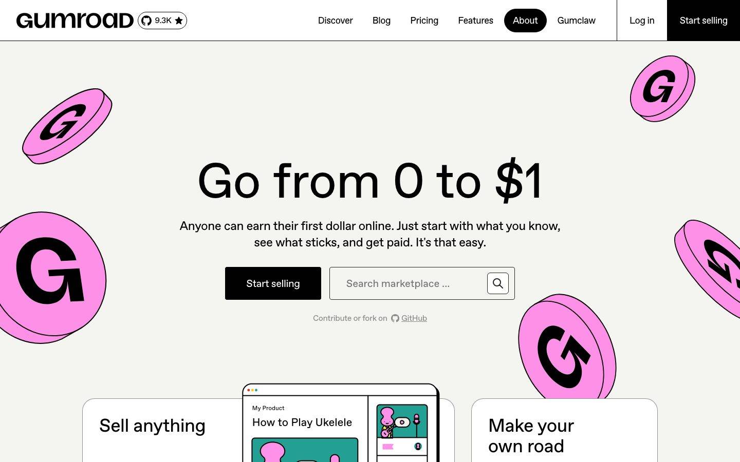
A loud, flat, neo-brutalist creator-commerce interface built on a warm off-white canvas (#f4f4f0) with pure-black ink, hard black outlines, and a signature hot-pink coin motif. The system rejects shadow-based depth entirely — depth comes from 1px black borders and bold flat color-blocking. Display type is enormous ABC Favorit at weight 400, and brand voltage comes from the tumbling pink "G" coins and a wide accent palette borrowed from product/integration branding.
Works withClaude CodeCursorCodexGemini CLICopilotv0LovableBoltWindsurfReplit
---
version: alpha
name: Gumroad-design-analysis
description: "A loud, flat, neo-brutalist creator-commerce interface built on a warm off-white canvas (#f4f4f0) with pure-black ink, hard black outlines, and a signature hot-pink coin motif. The system rejects shadow-based depth entirely — depth comes from 1px black borders and bold flat color-blocking. Display type is enormous ABC Favorit at weight 400, and brand voltage comes from the tumbling pink \"G\" coins and a wide accent palette borrowed from product/integration branding."

colors:
  ink: "#000000"
  primary: "#ffffff"
  canvas: "#f4f4f0"
  neutral-900: "#242423"
  neutral-100: "#f0f0f0"
  neutral-500: "#8a8a85"
  accent-pink: "#ff90e8"
  accent-yellow: "#ffc900"
  accent-lime: "#f1f333"
  accent-navy: "#00457c"
  accent-violet: "#625bf6"
  accent-blue: "#4087fc"
  accent-indigo: "#4267b2"
  accent-cornflower: "#5383ec"
  accent-periwinkle: "#7289da"
  accent-lavender: "#90a8ed"
  accent-orange: "#f3a642"
  accent-red: "#dc341e"
  accent-teal: "#23a094"
  accent-teal-deep: "#142f40"

typography:
  display:
    fontFamily: "ABC Favorit, Inter, sans-serif"
    fontSize: 96px
    fontWeight: 400
    lineHeight: 1.0
    letterSpacing: -0.0042em
  heading:
    fontFamily: "ABC Favorit, Inter, sans-serif"
    fontSize: 48px
    fontWeight: 400
    lineHeight: 1.25
    letterSpacing: -0.0083em
  title:
    fontFamily: "ABC Favorit, Inter, sans-serif"
    fontSize: 18px
    fontWeight: 700
    lineHeight: 1.556
    letterSpacing: -0.0222em
  body:
    fontFamily: "ABC Favorit, Inter, sans-serif"
    fontSize: 16px
    fontWeight: 400
    lineHeight: 1.5
    letterSpacing: -0.025em

rounded:
  sm: 4px
  md: 6px
  lg: 16px
  xl: 24px

spacing:
  xxs: 4px
  xs: 8px
  sm: 12px
  md: 16px
  lg: 24px
  xl: 32px
  xxl: 40px
  huge: 64px
  section: 96px
  jumbo: 128px

components:
  top-nav:
    backgroundColor: "{colors.canvas}"
    textColor: "{colors.ink}"
    typography: "{typography.body}"
  nav-link:
    backgroundColor: transparent
    textColor: "{colors.ink}"
    typography: "{typography.body}"
  nav-link-active:
    backgroundColor: "{colors.ink}"
    textColor: "{colors.primary}"
    typography: "{typography.body}"
  button-primary:
    backgroundColor: "{colors.primary}"
    textColor: "{colors.ink}"
    typography: "{typography.title}"
    rounded: "{rounded.md}"
    padding: 8px
  button-dark:
    backgroundColor: "{colors.ink}"
    textColor: "{colors.primary}"
    typography: "{typography.title}"
    rounded: "{rounded.md}"
    padding: 8px
  hero-band:
    backgroundColor: "{colors.canvas}"
    textColor: "{colors.ink}"
    typography: "{typography.display}"
    padding: 96px
  search-input:
    backgroundColor: "{colors.canvas}"
    textColor: "{colors.ink}"
    typography: "{typography.body}"
    rounded: "{rounded.sm}"
  input:
    backgroundColor: "{colors.canvas}"
    textColor: "{colors.ink}"
    typography: "{typography.body}"
    rounded: "{rounded.sm}"
  product-card:
    backgroundColor: "{colors.primary}"
    textColor: "{colors.ink}"
    typography: "{typography.heading}"
    rounded: "{rounded.xl}"
    padding: 32px
  badge-star:
    backgroundColor: "{colors.primary}"
    textColor: "{colors.ink}"
    typography: "{typography.body}"
    rounded: "{rounded.lg}"
---

## Overview

Gumroad's marketing surface is a loud, flat, neo-brutalist creator-commerce interface. The canvas is a warm off-white (`{colors.canvas}` — #f4f4f0) rather than pure white, and every element sits on it with hard black ink (`{colors.ink}` — #000000). The defining gesture is a set of tumbling hot-pink "G" coins (`{colors.accent-pink}` — #ff90e8) scattered around an enormous ABC Favorit display headline. The system is unapologetically maximal about type scale and unapologetically minimal about depth: the measured analysis returned **zero shadows**. Depth is done entirely with flat color and 1px black outlines.

Type voice is single-family: **ABC Favorit** carries every role, from the 96px `{typography.display}` headline down to 16px `{typography.body}`. Weight stays at 400 for display and body, jumping to 700 only for the small `{typography.title}` (h3) label. Negative letter-spacing runs throughout (-0.0042em to -0.025em) — the type sits tight and confident.

Brand voltage comes from two places: the **pink coin motif** and a **wide accent palette** (yellow, lime, violet, several blues, orange, red, teal). Many of those accents read as product/integration branding colors rather than core UI tones — the core UI itself is almost entirely off-white + black + pink.

**Key Characteristics:**
- Warm off-white canvas (`{colors.canvas}` — #f4f4f0), never pure white. Pure white (`{colors.primary}` — #ffffff) is reserved for cards and button fills.
- Pure black ink (`{colors.ink}` — #000000) for all type and outlines. The system is high-contrast and flat.
- Enormous ABC Favorit display headline at 96px / weight 400. The type is the hero.
- Signature hot-pink "G" coins (`{colors.accent-pink}` — #ff90e8) tumbling through the hero as decorative brand furniture.
- No shadows (measured: 0). Depth is done with 1px black borders and flat color-blocking (neo-brutalist).
- Two button treatments: light (`{component.button-primary}` — white fill / black text) and dark (`{component.button-dark}` — black fill / white text), both at `{rounded.md}` (6px).
- Hierarchical radius: `{rounded.sm}` (4px) inputs, `{rounded.md}` (6px) buttons, `{rounded.lg}` (16px) small badges, `{rounded.xl}` (24px) content cards.

## Colors

### Brand & Accent
- **Accent Pink** (`{colors.accent-pink}` — #ff90e8): The signature Gumroad hot pink. Powers the tumbling "G" coins in the hero and the brand's overall identity. This is the one accent that reads as core-brand rather than decorative.
- **Accent Yellow** (`{colors.accent-yellow}` — #ffc900) and **Accent Lime** (`{colors.accent-lime}` — #f1f333): Bright warm accents used in illustration and product-tile fills.
- **Accent Orange** (`{colors.accent-orange}` — #f3a642) and **Accent Red** (`{colors.accent-red}` — #dc341e): Warm accents for illustration blocks.
- **Accent Teal** (`{colors.accent-teal}` — #23a094) and **Accent Teal Deep** (`{colors.accent-teal-deep}` — #142f40): Cool accents seen in product mockup illustrations.
- **Blue family** — `{colors.accent-navy}` (#00457c), `{colors.accent-blue}` (#4087fc), `{colors.accent-indigo}` (#4267b2), `{colors.accent-cornflower}` (#5383ec), `{colors.accent-periwinkle}` (#7289da), `{colors.accent-lavender}` (#90a8ed): A broad blue-to-lavender spread. These frequencies most likely originate from integration/logo tiles (the periwinkle and indigo match common social-brand hues) rather than core UI — treat them as illustration/logo colors, not primary UI accents.
- **Accent Violet** (`{colors.accent-violet}` — #625bf6): A saturated indigo-violet used in accent moments.

### Surface
- **Canvas** (`{colors.canvas}` — #f4f4f0): The warm off-white page floor. Also used as the fill for input fields.
- **Primary / White** (`{colors.primary}` — #ffffff): Pure white — used for content card fills and light-button backgrounds. Distinct from the warmer canvas.
- **Neutral 100** (`{colors.neutral-100}` — #f0f0f0): A soft neutral divider / secondary surface.

### Text
- **Ink** (`{colors.ink}` — #000000): All headlines, body text, and 1px outlines.
- **Neutral 900** (`{colors.neutral-900}` — #242423): A near-black used for secondary heavy text.
- **Neutral 500** (`{colors.neutral-500}` — #8a8a85): Muted text — the "Contribute or fork on GitHub" caption tone and placeholder text.

### Semantic
No dedicated semantic success/warning/error tokens were measured. `{colors.accent-red}` (#dc341e) is the closest measured red but appears as an illustration color, not a validated error token — see Known Gaps.

## Typography

### Font Family
The system runs a single typeface: **ABC Favorit** across every role. ABC Favorit (by Dinamo) is a commercial/licensed grotesque — it is not a free web font. If it is unavailable, **Inter** is the documented open-source substitute; it shares the neo-grotesque skeleton, though Favorit's slightly quirkier terminals will not be reproduced exactly. Apply tight negative tracking (roughly -0.02em) on the substitute to preserve Gumroad's dense type color. **Space Grotesk** at weight 400 is a second alternative with a closer display personality.

The role split is by size + weight rather than by family:
- Display + heading + body run weight 400.
- The small `{typography.title}` (h3) role runs weight 700 — the only bold in the system.

### Hierarchy

| Token | Size | Weight | Line Height | Letter Spacing | Use |
|---|---|---|---|---|---|
| `{typography.display}` | 96px | 400 | 1.0 | -0.0042em | Hero h1 ("Go from 0 to $1") |
| `{typography.heading}` | 48px | 400 | 1.25 | -0.0083em | Section heads, product-card titles ("Sell anything", "Make your own road") |
| `{typography.title}` | 18px | 700 | 1.556 | -0.0222em | Small bold labels (h3) — the only bold role |
| `{typography.body}` | 16px | 400 | 1.5 | -0.025em | Running text, nav links, captions |

### Principles
The scale is deliberately extreme — a 96px display headline dropping straight to 16px body with only a 48px heading between. Emphasis comes from size, not weight: display and body share weight 400, so the massive headline reads as calm-but-huge rather than shouting. Only the small h3 label goes bold (700). Keep the tight negative tracking everywhere — Gumroad's type color depends on it.

## Layout

### Spacing System
- **Base unit:** 4px.
- **Tokens:** `{spacing.xxs}` 4px · `{spacing.xs}` 8px · `{spacing.sm}` 12px · `{spacing.md}` 16px · `{spacing.lg}` 24px · `{spacing.xl}` 32px · `{spacing.xxl}` 40px · `{spacing.huge}` 64px · `{spacing.section}` 96px · `{spacing.jumbo}` 128px.
- **Dominant rhythm:** 8px, 12px, and 16px are by far the most frequent (119 / 104 / 131 occurrences) — the fine-grained internal spacing of nav, buttons, and inputs.
- **Section rhythm:** `{spacing.section}` (96px) and `{spacing.jumbo}` (128px) handle the large vertical gaps between marketing bands.
- Note: measured spacing also included non-token one-offs (6px, 36px, 48px, 56px, 58px, 115px). These are treated as incidental, not part of the canonical scale — see Known Gaps.

### Grid & Container
- Hero content is centered, with product cards ("Sell anything" / "Make your own road") flanking a central product-preview browser mockup at the base of the fold.
- The decorative pink coins are absolutely positioned outside the content column and bleed off the viewport edges.

### Whitespace Philosophy
Despite the maximal type, the hero uses generous vertical whitespace — the 96px headline sits in a wide field of off-white with the pink coins providing rhythm. Internal component spacing is tight (8–16px); band spacing is large (96–128px). The contrast between tight components and large bands is part of the confident-flat feel.

## Elevation & Depth

| Level | Treatment | Use |
|---|---|---|
| Flat | No shadow, no border | Body text, hero type on canvas |
| Hard outline | 1px `{colors.ink}` border (derived from screenshot ground-truth) | Product cards, browser mockup, buttons — the neo-brutalist depth cue |
| Flat color-block | Solid accent or white fill on canvas | Product cards, coin illustrations |

The measured analysis returned **zero box-shadows**. Gumroad is a deliberately shadow-free, neo-brutalist system: depth is communicated by hard 1px black outlines and flat color-block contrast, never by blur or elevation. The 1px black border treatment is documented from screenshot ground-truth (the outline color resolves to the measured `{colors.ink}`); its exact width was not captured.

### Decorative Depth
- The pink "G" coins are drawn with a flat 3D "tumbling coin" illustration style (a pink face + darker pink edge) — the only pseudo-dimensional element, and it's illustration, not UI chrome.
- Product-preview mockups (the "How to Play Ukelele" browser card) carry their own flat illustration chrome — shown as content, not system elevation.

## Shapes

### Border Radius Scale

| Token | Value | Use |
|---|---|---|
| `{rounded.sm}` | 4px | Text / search inputs |
| `{rounded.md}` | 6px | Buttons |
| `{rounded.lg}` | 16px | Small badges / pill-ish chips |
| `{rounded.xl}` | 24px | Content cards (product cards) |

Radius is modest across the board — nothing approaches pill/full. The largest radius (24px) belongs to the big product cards, keeping corners soft but the overall silhouette rectilinear and grounded.

### Illustration Geometry
The pink coins are circular illustrations rotated in flat 3D. Product cards use `{rounded.xl}` (24px) corners with hard black outlines. The browser-mockup preview card retains its own native window chrome (traffic-light dots, rounded top corners).

## Components

### Navigation

**`top-nav`** — Off-white nav bar on `{colors.canvas}`, carrying the "Gumroad" wordmark + a GitHub star count chip at left, the primary menu (Discover, Blog, Pricing, Features, About, Gumclaw) center, and a "Log in" link + "Start selling" dark button at the right. Menu items use `{typography.body}`.

**`nav-link`** — Inline nav item, transparent background, `{colors.ink}` text.

**`nav-link-active`** — The active nav item inverts to a black block: `{colors.ink}` fill, `{colors.primary}` text (seen on "About" in the reference). The inverted pill is the active-state signal.

### Buttons

**`button-primary`** — The light button. Background `{colors.primary}` (#ffffff), text `{colors.ink}`, rounded `{rounded.md}` (6px), padding `{spacing.xs}` (8px). Measured directly from the button computed styles.

**`button-dark`** — The dark button ("Start selling"). Background `{colors.ink}`, text `{colors.primary}`, rounded `{rounded.md}` (6px). Documented from screenshot ground-truth; its colors resolve to measured tokens, but its exact padding was not captured separately from the light button.

### Inputs & Forms

**`search-input`** — The "Search marketplace …" field in the hero. Background `{colors.canvas}` (#f4f4f0), text `{colors.ink}`, placeholder in `{colors.neutral-500}`, rounded `{rounded.sm}` (4px), with a search-icon affordance at the right and a 1px black outline (derived from screenshot).

**`input`** — Generic text input. Background `{colors.canvas}`, rounded `{rounded.sm}` (4px). Measured directly.

### Cards

**`product-card`** — The large flanking cards ("Sell anything", "Make your own road"). Background `{colors.primary}` (#ffffff), title in `{typography.heading}` (48px), rounded `{rounded.xl}` (24px), padding `{spacing.xl}` (32px), 1px black outline (derived). These cards hold illustration and product mockups.

### Badges

**`badge-star`** — The GitHub star-count chip beside the wordmark (⭐ 9.3K). Background `{colors.primary}`, text `{colors.ink}`, rounded `{rounded.lg}` (16px), `{typography.body}`.

## Do's and Don'ts

### Do
- Use the warm off-white `{colors.canvas}` (#f4f4f0) as the page floor — never pure white for the background. Reserve pure white (`{colors.primary}`) for cards and light buttons.
- Keep depth flat: 1px black outlines and solid color-blocks, never shadows. The measured system has zero shadows.
- Let ABC Favorit do the work at huge sizes (96px display). Emphasis is size, not weight — display and body both sit at 400.
- Reserve `{colors.accent-pink}` (#ff90e8) as the core brand accent (the coins). Treat the blue/lime/orange palette as illustration and integration-logo color.
- Keep tight negative letter-spacing on all type.
- Use `{component.nav-link-active}` (black inverted block) to signal the current nav item.

### Don't
- Don't add box-shadows or glassmorphism. It breaks the neo-brutalist flat language.
- Don't bold the display or body type — weight 400 is the voice. Only the small h3 label goes 700.
- Don't scatter the many blue accents into core UI; they read as logo/illustration color, not brand accents.
- Don't round beyond `{rounded.xl}` (24px). Corners stay modest and rectilinear.
- Don't document hover states — light and dark buttons and the active nav block are the only encoded states.

## Responsive Behavior

Responsive breakpoints were not captured in the measured analysis. The following is inferred from the single desktop capture and marked as such.

### Breakpoints (inferred — not measured)
- The desktop hero centers a 96px display headline with pink coins bleeding off both edges.
- On narrower viewports the 96px display would need to scale down substantially to fit; the flanking product cards would likely stack under the hero.

### Touch Targets
- `{component.button-primary}` padding is only 8px around `{typography.title}` text — a compact target; the effective tap area depends on the label width, which was not measured against a 44px minimum.

### Collapsing Strategy
Not measured — see Known Gaps. The decorative coin field would presumably reduce in count or move off-canvas on mobile to keep the headline legible.

## Iteration Guide

1. Focus on ONE component at a time. Reference its YAML key directly (`{component.product-card}`, `{component.button-dark}`).
2. Variants of an existing component (`-active`, dark/light) live as separate entries in `components:`.
3. Use `{token.refs}` everywhere — never inline hex.
4. Never document hover. Light/dark and the active nav block are the only states.
5. Keep the system flat — no shadows. Add depth with 1px `{colors.ink}` outlines.
6. Display headlines stay ABC Favorit 400 at huge sizes. Emphasize with size, not weight.
7. When adding accents, ask whether the color is core-brand (pink) or illustration/logo (the blues) before promoting it into UI.

## Known Gaps

- **ABC Favorit is a commercial/licensed typeface** and was not flagged in `fonts_licensed`, but it is not a free web font. Inter (or Space Grotesk) is documented as the open-source substitute; the exact Favorit terminals will not be reproduced.
- **Button ambiguity:** the analyzer measured `button-primary` as white fill / black text with 6px radius and 8px padding, but the prominent hero + nav CTA ("Start selling") is rendered black fill / white text. Both are documented (`button-primary` light, `button-dark` dark); the dark button's exact padding was not separately captured.
- **1px black outline** — the neo-brutalist border treatment is visible in screenshots and its color resolves to `{colors.ink}`, but the exact border width was not measured.
- **The wide blue accent palette** (#00457c, #4087fc, #4267b2, #5383ec, #7289da, #90a8ed) most likely originates from integration/social-logo tiles rather than core UI; roles are named by hue but their UI usage is unconfirmed.
- **No semantic tokens** (success / warning / error) were measured; `{colors.accent-red}` appears as illustration color, not a validated error state.
- **Shadows: none measured** — confirmed flat, but any faint elevation on interactive states could not be verified.
- **Non-token spacing one-offs** (6, 36, 48, 56, 58, 115px) were measured but excluded from the canonical scale; their intent is unconfirmed.
- **Responsive breakpoints, touch-target sizing, and mobile collapse behavior** were not captured — only a desktop landing view was analyzed.
- **Animation / transition timings** (coin motion, hover reveals) are out of scope.

<!-- Documented by Duply · real-world design systems as ready-to-use DESIGN.md for AI coding agents · https://duply.ai/gumroad/design-md -->
Color Palette
Accent
Neutrals
Typography
display96px · 400 · 1
The quick brown fox jumpsheading48px · 400 · 1.25
The quick brown fox jumpstitle18px · 700 · 1.556
The quick brown fox jumpsbody16px · 400 · 1.5
The quick brown fox jumpsSpacing & Shape
Spacing
| Name | Value | Preview |
|---|---|---|
| xxs | 4px | |
| xs | 8px | |
| sm | 12px | |
| md | 16px | |
| lg | 24px | |
| xl | 32px | |
| xxl | 40px | |
| huge | 64px | |
| section | 96px | |
| jumbo | 128px |
Border Radius
| Name | Value | Preview |
|---|---|---|
| sm | 4px | |
| md | 6px | |
| lg | 16px | |
| xl | 24px |
FAQ
- What colors does Gumroad use?
- Gumroad's core palette includes #000000, #ffffff, #f4f4f0, #242423, #f0f0f0. The full color set with usage roles (canvas, ink, surfaces, accent, semantic) is documented in the Gumroad DESIGN.md.
- What font does Gumroad use?
- Gumroad's primary typeface is ABC Favorit. The complete type scale (sizes, weights, line-height and letter-spacing per role), with an open substitute where the original is licensed, is documented in the DESIGN.md.
- What is the Gumroad design system?
- A loud, flat, neo-brutalist creator-commerce interface built on a warm off-white canvas (#f4f4f0) with pure-black ink, hard black outlines, and a signature hot-pink coin motif. The system rejects shadow-based depth entirely — depth comes from 1px black borders and bold flat color-blocking. Display
Get this as a working kit
Gumroad Launch Kit + DESIGN.md
$299$225
One-time payment
- A complete production-stack template, styled like Gumroad, fully built and wired.
- One-time payment and the codebase is yours. No platform fees, no subscription.
Open it with Claude Code, Cursor, or any coding agent and build in plain language, then ship a complete web app.
- Your private DESIGN.md
- Marketing pages, blog, SEO & legal
- Email capture, newsletter & contact
- Accept payments (Stripe)
- Analytics (GA4 + PostHog)
- One-click deploy
- Auth, login & roles
- A full app dashboard, when you grow
More like this
---
version: alpha
name: Gumroad-design-analysis
description: "A loud, flat, neo-brutalist creator-commerce interface built on a warm off-white canvas (#f4f4f0) with pure-black ink, hard black outlines, and a signature hot-pink coin motif. The system rejects shadow-based depth entirely — depth comes from 1px black borders and bold flat color-blocking. Display type is enormous ABC Favorit at weight 400, and brand voltage comes from the tumbling pink \"G\" coins and a wide accent palette borrowed from product/integration branding."

colors:
  ink: "#000000"
  primary: "#ffffff"
  canvas: "#f4f4f0"
  neutral-900: "#242423"
  neutral-100: "#f0f0f0"
  neutral-500: "#8a8a85"
  accent-pink: "#ff90e8"
  accent-yellow: "#ffc900"
  accent-lime: "#f1f333"
  accent-navy: "#00457c"
  accent-violet: "#625bf6"
  accent-blue: "#4087fc"
  accent-indigo: "#4267b2"
  accent-cornflower: "#5383ec"
  accent-periwinkle: "#7289da"
  accent-lavender: "#90a8ed"
  accent-orange: "#f3a642"
  accent-red: "#dc341e"
  accent-teal: "#23a094"
  accent-teal-deep: "#142f40"

typography:
  display:
    fontFamily: "ABC Favorit, Inter, sans-serif"
    fontSize: 96px
    fontWeight: 400
    lineHeight: 1.0
    letterSpacing: -0.0042em
  heading:
    fontFamily: "ABC Favorit, Inter, sans-serif"
    fontSize: 48px
    fontWeight: 400
    lineHeight: 1.25
    letterSpacing: -0.0083em
  title:
    fontFamily: "ABC Favorit, Inter, sans-serif"
    fontSize: 18px
    fontWeight: 700
    lineHeight: 1.556
    letterSpacing: -0.0222em
  body:
    fontFamily: "ABC Favorit, Inter, sans-serif"
    fontSize: 16px
    fontWeight: 400
    lineHeight: 1.5
    letterSpacing: -0.025em

rounded:
  sm: 4px
  md: 6px
  lg: 16px
  xl: 24px

spacing:
  xxs: 4px
  xs: 8px
  sm: 12px
  md: 16px
  lg: 24px
  xl: 32px
  xxl: 40px
  huge: 64px
  section: 96px
  jumbo: 128px

components:
  top-nav:
    backgroundColor: "{colors.canvas}"
    textColor: "{colors.ink}"
    typography: "{typography.body}"
  nav-link:
    backgroundColor: transparent
    textColor: "{colors.ink}"
    typography: "{typography.body}"
  nav-link-active:
    backgroundColor: "{colors.ink}"
    textColor: "{colors.primary}"
    typography: "{typography.body}"
  button-primary:
    backgroundColor: "{colors.primary}"
    textColor: "{colors.ink}"
    typography: "{typography.title}"
    rounded: "{rounded.md}"
    padding: 8px
  button-dark:
    backgroundColor: "{colors.ink}"
    textColor: "{colors.primary}"
    typography: "{typography.title}"
    rounded: "{rounded.md}"
    padding: 8px
  hero-band:
    backgroundColor: "{colors.canvas}"
    textColor: "{colors.ink}"
    typography: "{typography.display}"
    padding: 96px
  search-input:
    backgroundColor: "{colors.canvas}"
    textColor: "{colors.ink}"
    typography: "{typography.body}"
    rounded: "{rounded.sm}"
  input:
    backgroundColor: "{colors.canvas}"
    textColor: "{colors.ink}"
    typography: "{typography.body}"
    rounded: "{rounded.sm}"
  product-card:
    backgroundColor: "{colors.primary}"
    textColor: "{colors.ink}"
    typography: "{typography.heading}"
    rounded: "{rounded.xl}"
    padding: 32px
  badge-star:
    backgroundColor: "{colors.primary}"
    textColor: "{colors.ink}"
    typography: "{typography.body}"
    rounded: "{rounded.lg}"
---

## Overview

Gumroad's marketing surface is a loud, flat, neo-brutalist creator-commerce interface. The canvas is a warm off-white (`{colors.canvas}` — #f4f4f0) rather than pure white, and every element sits on it with hard black ink (`{colors.ink}` — #000000). The defining gesture is a set of tumbling hot-pink "G" coins (`{colors.accent-pink}` — #ff90e8) scattered around an enormous ABC Favorit display headline. The system is unapologetically maximal about type scale and unapologetically minimal about depth: the measured analysis returned **zero shadows**. Depth is done entirely with flat color and 1px black outlines.

Type voice is single-family: **ABC Favorit** carries every role, from the 96px `{typography.display}` headline down to 16px `{typography.body}`. Weight stays at 400 for display and body, jumping to 700 only for the small `{typography.title}` (h3) label. Negative letter-spacing runs throughout (-0.0042em to -0.025em) — the type sits tight and confident.

Brand voltage comes from two places: the **pink coin motif** and a **wide accent palette** (yellow, lime, violet, several blues, orange, red, teal). Many of those accents read as product/integration branding colors rather than core UI tones — the core UI itself is almost entirely off-white + black + pink.

**Key Characteristics:**
- Warm off-white canvas (`{colors.canvas}` — #f4f4f0), never pure white. Pure white (`{colors.primary}` — #ffffff) is reserved for cards and button fills.
- Pure black ink (`{colors.ink}` — #000000) for all type and outlines. The system is high-contrast and flat.
- Enormous ABC Favorit display headline at 96px / weight 400. The type is the hero.
- Signature hot-pink "G" coins (`{colors.accent-pink}` — #ff90e8) tumbling through the hero as decorative brand furniture.
- No shadows (measured: 0). Depth is done with 1px black borders and flat color-blocking (neo-brutalist).
- Two button treatments: light (`{component.button-primary}` — white fill / black text) and dark (`{component.button-dark}` — black fill / white text), both at `{rounded.md}` (6px).
- Hierarchical radius: `{rounded.sm}` (4px) inputs, `{rounded.md}` (6px) buttons, `{rounded.lg}` (16px) small badges, `{rounded.xl}` (24px) content cards.

## Colors

### Brand & Accent
- **Accent Pink** (`{colors.accent-pink}` — #ff90e8): The signature Gumroad hot pink. Powers the tumbling "G" coins in the hero and the brand's overall identity. This is the one accent that reads as core-brand rather than decorative.
- **Accent Yellow** (`{colors.accent-yellow}` — #ffc900) and **Accent Lime** (`{colors.accent-lime}` — #f1f333): Bright warm accents used in illustration and product-tile fills.
- **Accent Orange** (`{colors.accent-orange}` — #f3a642) and **Accent Red** (`{colors.accent-red}` — #dc341e): Warm accents for illustration blocks.
- **Accent Teal** (`{colors.accent-teal}` — #23a094) and **Accent Teal Deep** (`{colors.accent-teal-deep}` — #142f40): Cool accents seen in product mockup illustrations.
- **Blue family** — `{colors.accent-navy}` (#00457c), `{colors.accent-blue}` (#4087fc), `{colors.accent-indigo}` (#4267b2), `{colors.accent-cornflower}` (#5383ec), `{colors.accent-periwinkle}` (#7289da), `{colors.accent-lavender}` (#90a8ed): A broad blue-to-lavender spread. These frequencies most likely originate from integration/logo tiles (the periwinkle and indigo match common social-brand hues) rather than core UI — treat them as illustration/logo colors, not primary UI accents.
- **Accent Violet** (`{colors.accent-violet}` — #625bf6): A saturated indigo-violet used in accent moments.

### Surface
- **Canvas** (`{colors.canvas}` — #f4f4f0): The warm off-white page floor. Also used as the fill for input fields.
- **Primary / White** (`{colors.primary}` — #ffffff): Pure white — used for content card fills and light-button backgrounds. Distinct from the warmer canvas.
- **Neutral 100** (`{colors.neutral-100}` — #f0f0f0): A soft neutral divider / secondary surface.

### Text
- **Ink** (`{colors.ink}` — #000000): All headlines, body text, and 1px outlines.
- **Neutral 900** (`{colors.neutral-900}` — #242423): A near-black used for secondary heavy text.
- **Neutral 500** (`{colors.neutral-500}` — #8a8a85): Muted text — the "Contribute or fork on GitHub" caption tone and placeholder text.

### Semantic
No dedicated semantic success/warning/error tokens were measured. `{colors.accent-red}` (#dc341e) is the closest measured red but appears as an illustration color, not a validated error token — see Known Gaps.

## Typography

### Font Family
The system runs a single typeface: **ABC Favorit** across every role. ABC Favorit (by Dinamo) is a commercial/licensed grotesque — it is not a free web font. If it is unavailable, **Inter** is the documented open-source substitute; it shares the neo-grotesque skeleton, though Favorit's slightly quirkier terminals will not be reproduced exactly. Apply tight negative tracking (roughly -0.02em) on the substitute to preserve Gumroad's dense type color. **Space Grotesk** at weight 400 is a second alternative with a closer display personality.

The role split is by size + weight rather than by family:
- Display + heading + body run weight 400.
- The small `{typography.title}` (h3) role runs weight 700 — the only bold in the system.

### Hierarchy

| Token | Size | Weight | Line Height | Letter Spacing | Use |
|---|---|---|---|---|---|
| `{typography.display}` | 96px | 400 | 1.0 | -0.0042em | Hero h1 ("Go from 0 to $1") |
| `{typography.heading}` | 48px | 400 | 1.25 | -0.0083em | Section heads, product-card titles ("Sell anything", "Make your own road") |
| `{typography.title}` | 18px | 700 | 1.556 | -0.0222em | Small bold labels (h3) — the only bold role |
| `{typography.body}` | 16px | 400 | 1.5 | -0.025em | Running text, nav links, captions |

### Principles
The scale is deliberately extreme — a 96px display headline dropping straight to 16px body with only a 48px heading between. Emphasis comes from size, not weight: display and body share weight 400, so the massive headline reads as calm-but-huge rather than shouting. Only the small h3 label goes bold (700). Keep the tight negative tracking everywhere — Gumroad's type color depends on it.

## Layout

### Spacing System
- **Base unit:** 4px.
- **Tokens:** `{spacing.xxs}` 4px · `{spacing.xs}` 8px · `{spacing.sm}` 12px · `{spacing.md}` 16px · `{spacing.lg}` 24px · `{spacing.xl}` 32px · `{spacing.xxl}` 40px · `{spacing.huge}` 64px · `{spacing.section}` 96px · `{spacing.jumbo}` 128px.
- **Dominant rhythm:** 8px, 12px, and 16px are by far the most frequent (119 / 104 / 131 occurrences) — the fine-grained internal spacing of nav, buttons, and inputs.
- **Section rhythm:** `{spacing.section}` (96px) and `{spacing.jumbo}` (128px) handle the large vertical gaps between marketing bands.
- Note: measured spacing also included non-token one-offs (6px, 36px, 48px, 56px, 58px, 115px). These are treated as incidental, not part of the canonical scale — see Known Gaps.

### Grid & Container
- Hero content is centered, with product cards ("Sell anything" / "Make your own road") flanking a central product-preview browser mockup at the base of the fold.
- The decorative pink coins are absolutely positioned outside the content column and bleed off the viewport edges.

### Whitespace Philosophy
Despite the maximal type, the hero uses generous vertical whitespace — the 96px headline sits in a wide field of off-white with the pink coins providing rhythm. Internal component spacing is tight (8–16px); band spacing is large (96–128px). The contrast between tight components and large bands is part of the confident-flat feel.

## Elevation & Depth

| Level | Treatment | Use |
|---|---|---|
| Flat | No shadow, no border | Body text, hero type on canvas |
| Hard outline | 1px `{colors.ink}` border (derived from screenshot ground-truth) | Product cards, browser mockup, buttons — the neo-brutalist depth cue |
| Flat color-block | Solid accent or white fill on canvas | Product cards, coin illustrations |

The measured analysis returned **zero box-shadows**. Gumroad is a deliberately shadow-free, neo-brutalist system: depth is communicated by hard 1px black outlines and flat color-block contrast, never by blur or elevation. The 1px black border treatment is documented from screenshot ground-truth (the outline color resolves to the measured `{colors.ink}`); its exact width was not captured.

### Decorative Depth
- The pink "G" coins are drawn with a flat 3D "tumbling coin" illustration style (a pink face + darker pink edge) — the only pseudo-dimensional element, and it's illustration, not UI chrome.
- Product-preview mockups (the "How to Play Ukelele" browser card) carry their own flat illustration chrome — shown as content, not system elevation.

## Shapes

### Border Radius Scale

| Token | Value | Use |
|---|---|---|
| `{rounded.sm}` | 4px | Text / search inputs |
| `{rounded.md}` | 6px | Buttons |
| `{rounded.lg}` | 16px | Small badges / pill-ish chips |
| `{rounded.xl}` | 24px | Content cards (product cards) |

Radius is modest across the board — nothing approaches pill/full. The largest radius (24px) belongs to the big product cards, keeping corners soft but the overall silhouette rectilinear and grounded.

### Illustration Geometry
The pink coins are circular illustrations rotated in flat 3D. Product cards use `{rounded.xl}` (24px) corners with hard black outlines. The browser-mockup preview card retains its own native window chrome (traffic-light dots, rounded top corners).

## Components

### Navigation

**`top-nav`** — Off-white nav bar on `{colors.canvas}`, carrying the "Gumroad" wordmark + a GitHub star count chip at left, the primary menu (Discover, Blog, Pricing, Features, About, Gumclaw) center, and a "Log in" link + "Start selling" dark button at the right. Menu items use `{typography.body}`.

**`nav-link`** — Inline nav item, transparent background, `{colors.ink}` text.

**`nav-link-active`** — The active nav item inverts to a black block: `{colors.ink}` fill, `{colors.primary}` text (seen on "About" in the reference). The inverted pill is the active-state signal.

### Buttons

**`button-primary`** — The light button. Background `{colors.primary}` (#ffffff), text `{colors.ink}`, rounded `{rounded.md}` (6px), padding `{spacing.xs}` (8px). Measured directly from the button computed styles.

**`button-dark`** — The dark button ("Start selling"). Background `{colors.ink}`, text `{colors.primary}`, rounded `{rounded.md}` (6px). Documented from screenshot ground-truth; its colors resolve to measured tokens, but its exact padding was not captured separately from the light button.

### Inputs & Forms

**`search-input`** — The "Search marketplace …" field in the hero. Background `{colors.canvas}` (#f4f4f0), text `{colors.ink}`, placeholder in `{colors.neutral-500}`, rounded `{rounded.sm}` (4px), with a search-icon affordance at the right and a 1px black outline (derived from screenshot).

**`input`** — Generic text input. Background `{colors.canvas}`, rounded `{rounded.sm}` (4px). Measured directly.

### Cards

**`product-card`** — The large flanking cards ("Sell anything", "Make your own road"). Background `{colors.primary}` (#ffffff), title in `{typography.heading}` (48px), rounded `{rounded.xl}` (24px), padding `{spacing.xl}` (32px), 1px black outline (derived). These cards hold illustration and product mockups.

### Badges

**`badge-star`** — The GitHub star-count chip beside the wordmark (⭐ 9.3K). Background `{colors.primary}`, text `{colors.ink}`, rounded `{rounded.lg}` (16px), `{typography.body}`.

## Do's and Don'ts

### Do
- Use the warm off-white `{colors.canvas}` (#f4f4f0) as the page floor — never pure white for the background. Reserve pure white (`{colors.primary}`) for cards and light buttons.
- Keep depth flat: 1px black outlines and solid color-blocks, never shadows. The measured system has zero shadows.
- Let ABC Favorit do the work at huge sizes (96px display). Emphasis is size, not weight — display and body both sit at 400.
- Reserve `{colors.accent-pink}` (#ff90e8) as the core brand accent (the coins). Treat the blue/lime/orange palette as illustration and integration-logo color.
- Keep tight negative letter-spacing on all type.
- Use `{component.nav-link-active}` (black inverted block) to signal the current nav item.

### Don't
- Don't add box-shadows or glassmorphism. It breaks the neo-brutalist flat language.
- Don't bold the display or body type — weight 400 is the voice. Only the small h3 label goes 700.
- Don't scatter the many blue accents into core UI; they read as logo/illustration color, not brand accents.
- Don't round beyond `{rounded.xl}` (24px). Corners stay modest and rectilinear.
- Don't document hover states — light and dark buttons and the active nav block are the only encoded states.

## Responsive Behavior

Responsive breakpoints were not captured in the measured analysis. The following is inferred from the single desktop capture and marked as such.

### Breakpoints (inferred — not measured)
- The desktop hero centers a 96px display headline with pink coins bleeding off both edges.
- On narrower viewports the 96px display would need to scale down substantially to fit; the flanking product cards would likely stack under the hero.

### Touch Targets
- `{component.button-primary}` padding is only 8px around `{typography.title}` text — a compact target; the effective tap area depends on the label width, which was not measured against a 44px minimum.

### Collapsing Strategy
Not measured — see Known Gaps. The decorative coin field would presumably reduce in count or move off-canvas on mobile to keep the headline legible.

## Iteration Guide

1. Focus on ONE component at a time. Reference its YAML key directly (`{component.product-card}`, `{component.button-dark}`).
2. Variants of an existing component (`-active`, dark/light) live as separate entries in `components:`.
3. Use `{token.refs}` everywhere — never inline hex.
4. Never document hover. Light/dark and the active nav block are the only states.
5. Keep the system flat — no shadows. Add depth with 1px `{colors.ink}` outlines.
6. Display headlines stay ABC Favorit 400 at huge sizes. Emphasize with size, not weight.
7. When adding accents, ask whether the color is core-brand (pink) or illustration/logo (the blues) before promoting it into UI.

## Known Gaps

- **ABC Favorit is a commercial/licensed typeface** and was not flagged in `fonts_licensed`, but it is not a free web font. Inter (or Space Grotesk) is documented as the open-source substitute; the exact Favorit terminals will not be reproduced.
- **Button ambiguity:** the analyzer measured `button-primary` as white fill / black text with 6px radius and 8px padding, but the prominent hero + nav CTA ("Start selling") is rendered black fill / white text. Both are documented (`button-primary` light, `button-dark` dark); the dark button's exact padding was not separately captured.
- **1px black outline** — the neo-brutalist border treatment is visible in screenshots and its color resolves to `{colors.ink}`, but the exact border width was not measured.
- **The wide blue accent palette** (#00457c, #4087fc, #4267b2, #5383ec, #7289da, #90a8ed) most likely originates from integration/social-logo tiles rather than core UI; roles are named by hue but their UI usage is unconfirmed.
- **No semantic tokens** (success / warning / error) were measured; `{colors.accent-red}` appears as illustration color, not a validated error state.
- **Shadows: none measured** — confirmed flat, but any faint elevation on interactive states could not be verified.
- **Non-token spacing one-offs** (6, 36, 48, 56, 58, 115px) were measured but excluded from the canonical scale; their intent is unconfirmed.
- **Responsive breakpoints, touch-target sizing, and mobile collapse behavior** were not captured — only a desktop landing view was analyzed.
- **Animation / transition timings** (coin motion, hover reveals) are out of scope.

<!-- Documented by Duply · real-world design systems as ready-to-use DESIGN.md for AI coding agents · https://duply.ai/gumroad/design-md -->