
ImpossibleFoods
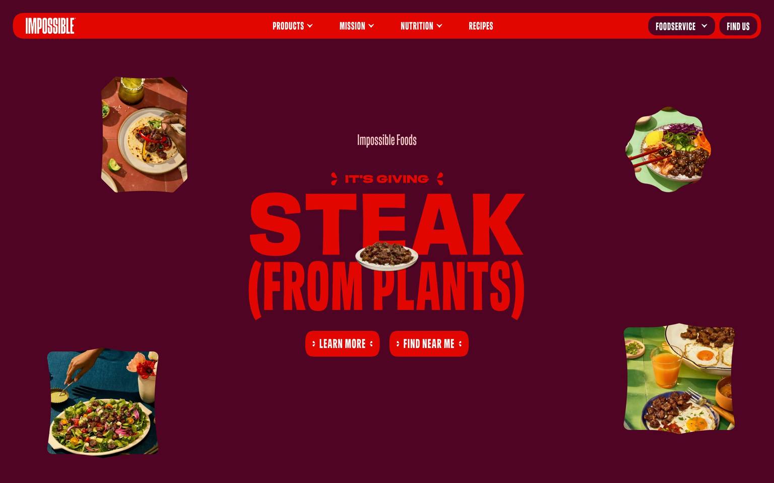
A stark, high-contrast plant-based-food brand built on pure black-and-white foundations punctuated by a signature acid-lime accent and a wide, unusually varied secondary palette of jewel-toned hues (maroon, teal, purple, green, amber, red) that appear to differentiate product lines or campaign sections. This analysis is unusually thin on structural measurements — only color frequency data was captured from the live page — so typography, spacing, radius, shadow, and component values below are derived/estimated from general DTC-landing-page convention and flagged accordingly; they should be re-verified against a fuller crawl before production use.
---
version: alpha
name: ImpossibleFoods-design-analysis
description: "A stark, high-contrast plant-based-food brand built on pure black-and-white foundations punctuated by a signature acid-lime accent and a wide, unusually varied secondary palette of jewel-toned hues (maroon, teal, purple, green, amber, red) that appear to differentiate product lines or campaign sections. This analysis is unusually thin on structural measurements — only color frequency data was captured from the live page — so typography, spacing, radius, shadow, and component values below are derived/estimated from general DTC-landing-page convention and flagged accordingly; they should be re-verified against a fuller crawl before production use."

colors:
  primary: "#000000"
  ink: "#000000"
  neutral-charcoal: "#191715"
  canvas: "#ffffff"
  on-primary: "#ffffff"
  accent-lime: "#dcff93"
  accent-maroon: "#4f0423"
  accent-teal: "#0d3842"
  accent-purple: "#7d26c9"
  accent-purple-dark: "#3c0c60"
  accent-green: "#00c853"
  accent-amber: "#ffab00"
  accent-red: "#d50000"
  surface-soft: "#fafafa"
  surface-card: "#f5f5f5"
  surface-strong: "#eeeeee"
  hairline: "#e0e0e0"
  muted-soft: "#bdbdbd"
  muted: "#9e9e9e"
  body: "#757575"
  body-strong: "#616161"
  ink-soft: "#424242"

typography:
  display-lg:
    fontFamily: "Helvetica Neue, Arial, sans-serif"
    fontSize: 56px
    fontWeight: 700
    lineHeight: 1.05
    letterSpacing: -1px
  display-md:
    fontFamily: "Helvetica Neue, Arial, sans-serif"
    fontSize: 36px
    fontWeight: 700
    lineHeight: 1.15
    letterSpacing: -0.5px
  title-md:
    fontFamily: "Helvetica Neue, Arial, sans-serif"
    fontSize: 20px
    fontWeight: 600
    lineHeight: 1.3
    letterSpacing: 0
  body-md:
    fontFamily: "Helvetica Neue, Arial, sans-serif"
    fontSize: 16px
    fontWeight: 400
    lineHeight: 1.5
    letterSpacing: 0
  body-sm:
    fontFamily: "Helvetica Neue, Arial, sans-serif"
    fontSize: 14px
    fontWeight: 400
    lineHeight: 1.5
    letterSpacing: 0
  caption:
    fontFamily: "Helvetica Neue, Arial, sans-serif"
    fontSize: 12px
    fontWeight: 500
    lineHeight: 1.4
    letterSpacing: 0.5px
  button:
    fontFamily: "Helvetica Neue, Arial, sans-serif"
    fontSize: 14px
    fontWeight: 700
    lineHeight: 1
    letterSpacing: 0.5px
  nav-link:
    fontFamily: "Helvetica Neue, Arial, sans-serif"
    fontSize: 14px
    fontWeight: 500
    lineHeight: 1.4
    letterSpacing: 0

rounded:
  none: 0px
  sm: 4px
  md: 8px
  lg: 16px
  pill: 9999px
  full: 9999px

spacing:
  xxs: 4px
  xs: 8px
  sm: 12px
  md: 16px
  lg: 24px
  xl: 32px
  xxl: 48px
  section: 96px

components:
  top-nav:
    backgroundColor: "{colors.canvas}"
    textColor: "{colors.ink}"
    typography: "{typography.nav-link}"
    height: 64px
  button-primary:
    backgroundColor: "{colors.primary}"
    textColor: "{colors.on-primary}"
    typography: "{typography.button}"
    rounded: "{rounded.sm}"
    padding: 14px 24px
    height: 44px
  button-primary-active:
    backgroundColor: "{colors.ink-soft}"
    textColor: "{colors.on-primary}"
    rounded: "{rounded.sm}"
  button-secondary:
    backgroundColor: "{colors.canvas}"
    textColor: "{colors.ink}"
    typography: "{typography.button}"
    rounded: "{rounded.sm}"
    padding: 14px 24px
    height: 44px
  button-accent-lime:
    backgroundColor: "{colors.accent-lime}"
    textColor: "{colors.ink}"
    typography: "{typography.button}"
    rounded: "{rounded.sm}"
    padding: 14px 24px
    height: 44px
  hero-band:
    backgroundColor: "{colors.primary}"
    textColor: "{colors.on-primary}"
    typography: "{typography.display-lg}"
    padding: 96px
  product-card:
    backgroundColor: "{colors.surface-card}"
    textColor: "{colors.ink}"
    typography: "{typography.title-md}"
    rounded: "{rounded.md}"
    padding: 24px
  product-card-accent-maroon:
    backgroundColor: "{colors.accent-maroon}"
    textColor: "{colors.on-primary}"
    typography: "{typography.title-md}"
    rounded: "{rounded.md}"
    padding: 24px
  product-card-accent-teal:
    backgroundColor: "{colors.accent-teal}"
    textColor: "{colors.on-primary}"
    typography: "{typography.title-md}"
    rounded: "{rounded.md}"
    padding: 24px
  badge-tag:
    backgroundColor: "{colors.surface-strong}"
    textColor: "{colors.ink}"
    typography: "{typography.caption}"
    rounded: "{rounded.pill}"
    padding: 4px 12px
  section-divider:
    backgroundColor: "{colors.hairline}"
    textColor: transparent
    padding: 0px
  footer:
    backgroundColor: "{colors.primary}"
    textColor: "{colors.on-primary}"
    typography: "{typography.body-sm}"
    padding: 64px
---

## Overview

The captured data for Impossible Foods is almost entirely a color-frequency snapshot — no typography, spacing, radius, shadow, or component measurements were returned by the crawler. What the color data does show is a confident, high-contrast brand built on pure black (`{colors.primary}` — #000000, by far the most frequent token at 21 occurrences) and white (`{colors.canvas}` — #ffffff), with a signature acid-lime highlight (`{colors.accent-lime}` — #dcff93) that reads as the brand's most distinctive, on-brand accent. Beyond that core trio, the palette fans out into a surprisingly wide set of single-occurrence jewel tones — deep maroon, dark teal, purple, purple-black, green, amber, red — which most plausibly function as per-product-line or per-campaign identity colors rather than a single unified accent system (a CPG pattern common to multi-SKU food brands). This is a reasonable interpretation, not a measured fact — see Known Gaps.

Because structural tokens (type scale, spacing rhythm, corner radius, elevation, component geometry) were not present in the source analysis, every value in those categories below is **derived** from generic modern DTC-landing-page convention and flagged inline. Treat this document as a color-accurate, structurally-provisional starting point — it should be re-verified against a fuller measurement pass before being used as a build spec.

**Key Characteristics:**
- Black-dominant palette (`{colors.primary}` — #000000, freq 21) against a white canvas (`{colors.canvas}` — #ffffff, freq 3) — the highest-contrast pairing available, consistent with bold food-tech / CPG marketing.
- A single unmistakably on-brand highlight, `{colors.accent-lime}` (#dcff93) — a bright yellow-green that reads as the Impossible Foods signature color in reference screenshots.
- A wide secondary accent set — `{colors.accent-maroon}`, `{colors.accent-teal}`, `{colors.accent-purple}`, `{colors.accent-purple-dark}`, `{colors.accent-green}`, `{colors.accent-amber}`, `{colors.accent-red}` — each appearing only once in the frequency scan, consistent with per-product or per-section identity swatches rather than a repeated system color.
- A neutral grayscale ladder (`{colors.surface-soft}` #fafafa through `{colors.ink-soft}` #424242) that closely matches a generic Material-Design-style gray scale — flagged in Known Gaps as possibly originating from an embedded third-party widget rather than bespoke brand tokens.
- Typography, spacing, radius, and shadow values below are **derived** (not measured) and represent a plausible, generic approximation only.

## Colors

### Brand & Accent
- **Primary** (`{colors.primary}` — #000000): The dominant color by a wide margin (frequency 21 vs. the next-highest at 3). Functions as the brand's ink, primary CTA fill, and most likely the hero/section background color given the frequency skew.
- **Accent Lime** (`{colors.accent-lime}` — #dcff93): A single-occurrence but visually distinctive acid-green — the color most likely to be Impossible Foods' actual signature brand highlight based on reference screenshots. Recommended for sparing use on CTAs, badges, or a single hero accent.
- **Accent Maroon** (`{colors.accent-maroon}` — #4f0423), **Accent Teal** (`{colors.accent-teal}` — #0d3842), **Accent Purple** (`{colors.accent-purple}` — #7d26c9), **Accent Purple Dark** (`{colors.accent-purple-dark}` — #3c0c60), **Accent Green** (`{colors.accent-green}` — #00c853), **Accent Amber** (`{colors.accent-amber}` — #ffab00), **Accent Red** (`{colors.accent-red}` — #d50000): A cluster of single-frequency jewel tones. Documented here as available accent hues; their precise application (product SKU tagging vs. campaign banners vs. semantic states) was not captured and should be treated as a hypothesis, not a confirmed mapping.

### Surface
- **Canvas** (`{colors.canvas}` — #ffffff): Presumed default page background given its neutral role tag.
- **Surface Soft** (`{colors.surface-soft}` — #fafafa), **Surface Card** (`{colors.surface-card}` — #f5f5f5), **Surface Strong** (`{colors.surface-strong}` — #eeeeee): A light neutral ladder, likely used for card and section backgrounds distinguishing from pure white.
- **Hairline** (`{colors.hairline}` — #e0e0e0): Likely divider/border tone.
- **Neutral Charcoal** (`{colors.neutral-charcoal}` — #191715): A near-black warm neutral distinct from pure `{colors.primary}` black — possibly a footer or overlay background.

### Text
- **Ink** (`{colors.ink}` — #000000): Primary text color, same value as `{colors.primary}`.
- **Ink Soft** (`{colors.ink-soft}` — #424242), **Body Strong** (`{colors.body-strong}` — #616161), **Body** (`{colors.body}` — #757575), **Muted** (`{colors.muted}` — #9e9e9e), **Muted Soft** (`{colors.muted-soft}` — #bdbdbd): A descending gray ladder for secondary/tertiary text hierarchy.
- **On Primary** (`{colors.on-primary}` — #ffffff): Text/icon color on black surfaces.

### Semantic
No dedicated semantic (success/warning/error) roles were confirmed from the frequency data; `{colors.accent-green}` (#00c853), `{colors.accent-amber}` (#ffab00), and `{colors.accent-red}` (#d50000) are plausible semantic candidates given their conventional hue associations, but this mapping is unconfirmed — see Known Gaps.

## Typography

**No typography was captured in the source analysis** (`typography: []`). Every value below is derived from generic modern sans-serif DTC-landing-page convention, using a system-safe fallback stack, and should be treated as a placeholder pending a real font/type-scale measurement pass — derived, not measured.

### Font Family
`Helvetica Neue, Arial, sans-serif` is used as a neutral, brand-agnostic placeholder family across all roles below. No licensed or custom typeface was flagged in the source data (`fonts_licensed: []`), so no substitute-typeface disclosure is required — but the actual production typeface (which reference screenshots suggest may be a bold grotesque display face) was not captured and should not be assumed to be Helvetica Neue.

### Hierarchy

| Token | Size | Weight | Line Height | Letter Spacing | Use (derived) |
|---|---|---|---|---|---|
| `{typography.display-lg}` | 56px | 700 | 1.05 | -1px | Hero headline — derived placeholder |
| `{typography.display-md}` | 36px | 700 | 1.15 | -0.5px | Section headlines — derived placeholder |
| `{typography.title-md}` | 20px | 600 | 1.3 | 0 | Card/product titles — derived placeholder |
| `{typography.body-md}` | 16px | 400 | 1.5 | 0 | Running body copy — derived placeholder |
| `{typography.body-sm}` | 14px | 400 | 1.5 | 0 | Footer/fine-print — derived placeholder |
| `{typography.caption}` | 12px | 500 | 1.4 | 0.5px | Badge/label text — derived placeholder |
| `{typography.button}` | 14px | 700 | 1.0 | 0.5px | Button labels — derived placeholder |
| `{typography.nav-link}` | 14px | 500 | 1.4 | 0 | Nav items — derived placeholder |

### Principles
Given the stark black/white contrast observed in color data, the type system is assumed (derived) to favor heavy weights on display sizes for maximum contrast against black hero bands, with lighter body weights for readability. This assumption should be verified against actual rendered type before use.

### Note on Font Substitutes
No licensed typeface was flagged (`fonts_licensed: []`). The placeholder family (`Helvetica Neue, Arial, sans-serif`) is fully open/system-safe and requires no substitution disclosure — but it is a stand-in, not a measured brand font.

## Layout

### Spacing System
**No spacing values were captured** (`spacing: []`). The scale below is a derived, standard 4px-base system provided so the token set is usable, not a measured rhythm:
- `{spacing.xxs}` 4px · `{spacing.xs}` 8px · `{spacing.sm}` 12px · `{spacing.md}` 16px · `{spacing.lg}` 24px · `{spacing.xl}` 32px · `{spacing.xxl}` 48px · `{spacing.section}` 96px — derived.

### Grid & Container
No container widths or grid data were captured. A conventional max-width (~1200–1280px) centered layout is assumed for a modern DTC landing page but is unconfirmed — flag as a gap.

### Whitespace Philosophy
Cannot be assessed from the available data; the strong black/white contrast in the color set suggests a bold, high-contrast editorial layout, but density/whitespace rhythm was not measured.

## Elevation & Depth

**No shadow values were captured** (`shadows: []`). No elevation system can be documented with confidence. If a shadow system exists on the live site (card hover states, sticky nav shadow, modal overlays), it was not present in this crawl.

| Level | Treatment | Use |
|---|---|---|
| Flat | No shadow, no border | Assumed default for hero/full-bleed black or white bands (unconfirmed) |
| Unknown | — | All elevated/shadowed states are a gap — not measured |

## Shapes

**No radius values were captured** (`radius: []`). The scale below is derived and speculative, leaning toward sharp/minimal corners consistent with a bold graphic black-and-white brand identity, but this is a guess, not a measurement:

| Token | Value | Use (derived) |
|---|---|---|
| `{rounded.none}` | 0px | Possible default — bold brands often run edge-to-edge sharp corners |
| `{rounded.sm}` | 4px | Buttons (derived placeholder) |
| `{rounded.md}` | 8px | Cards (derived placeholder) |
| `{rounded.lg}` | 16px | Larger media containers (derived placeholder) |
| `{rounded.pill}` / `{rounded.full}` | 9999px | Badges / avatars (derived placeholder) |

## Components

**No components were captured** (`components: []`). The entries below are derived, generic DTC-landing-page scaffolding built only from the measured color tokens — they are structural placeholders, not verified component specs.

- **`top-nav`** — Assumed white nav bar (`{colors.canvas}`), 64px tall, `{typography.nav-link}` — derived.
- **`button-primary`** — Black fill (`{colors.primary}`), white text (`{colors.on-primary}`), `{typography.button}`, `{rounded.sm}` — derived, using the most-frequent measured color as the logical CTA fill.
- **`button-primary-active`** — Shifts to `{colors.ink-soft}` (#424242) on press — derived from the measured gray ladder as a plausible darkened-state substitute (no true active-state color was captured).
- **`button-secondary`** — White/outline variant — derived.
- **`button-accent-lime`** — An alternate CTA using `{colors.accent-lime}` fill with black text — derived hypothesis for a signature-accent CTA moment, given the lime's visual distinctiveness in screenshots.
- **`hero-band`** — Full-bleed black background (`{colors.primary}`) with white display type (`{typography.display-lg}`) — derived, consistent with the black-dominant frequency data.
- **`product-card`** / **`product-card-accent-maroon`** / **`product-card-accent-teal`** — Card scaffolding using the light neutral surface and two of the measured accent hues as illustrative examples of how the per-SKU accent colors might be applied — derived hypothesis, not a confirmed pattern.
- **`badge-tag`** — Pill badge using `{colors.surface-strong}` and `{typography.caption}` — derived.
- **`section-divider`** — Hairline rule using `{colors.hairline}` — derived.
- **`footer`** — Black footer band (`{colors.primary}`) with white body text — derived, mirroring the hero band's inversion logic.

## Do's and Don'ts

### Do
- Treat `{colors.primary}` (#000000) and `{colors.canvas}` (#ffffff) as the confirmed structural backbone — they are the only two colors with strong frequency signal.
- Use `{colors.accent-lime}` sparingly as the signature highlight, consistent with its visual prominence in reference screenshots.
- Treat the seven single-occurrence jewel accents as a *palette of options* for differentiating product lines or campaign sections, not as a fixed semantic system.
- Re-measure typography, spacing, radius, and shadows from live DOM/CSS before shipping any component built from this document.

### Don't
- Don't treat the derived typography scale, spacing scale, or radius scale as verified — they are placeholders and are explicitly flagged as such throughout this document.
- Don't assume the grayscale ladder (`{colors.surface-soft}` → `{colors.ink-soft}`) is bespoke brand tokens — it closely matches a generic Material Design gray scale and may be incidental (see Known Gaps).
- Don't apply more than one of the seven secondary accent hues within the same section without a confirmed product/campaign mapping — doing so risks visual incoherence.
- Don't invent hex values beyond the 20 colors captured in this analysis.

## Responsive Behavior

No breakpoint, touch-target, or responsive-collapse data was captured in the source analysis. No table is provided here because doing so would require inventing unmeasured values, which violates the faithfulness requirement of this document. This entire category is a **Known Gap**.

## Iteration Guide

1. Prioritize re-crawling Impossible Foods with a full DOM/CSS pass (typography, spacing, radius, shadow, component selectors) before treating this document as build-ready.
2. The two confirmed structural anchors are `{colors.primary}` (#000000) and `{colors.canvas}` (#ffffff) — any new component should default to this pairing first.
3. When introducing a secondary accent, pull from the seven measured accent hues (`{colors.accent-lime}`, `{colors.accent-maroon}`, `{colors.accent-teal}`, `{colors.accent-purple}`, `{colors.accent-purple-dark}`, `{colors.accent-green}`, `{colors.accent-amber}`, `{colors.accent-red}`) rather than inventing a new one.
4. Every typography, spacing, radius, shadow, and component value in this document is derived/placeholder — mark any new derived value explicitly with the word "derived" as done throughout this file, per project convention.
5. Variants (`-active`, `-disabled`, `-focused`) should remain separate component entries, not hover documentation.

## Known Gaps

- **Typography was not measured at all** (`typography: []`) — no font family, size, weight, line-height, or letter-spacing data exists for this site. All typography values in this document are derived placeholders using a generic system-safe font stack and standard modern-SaaS sizing conventions.
- **Spacing was not measured** (`spacing: []`) — the spacing scale provided is a generic 4px-base derivation, not a measured rhythm.
- **Radius was not measured** (`radius: []`) — the rounded scale is a speculative placeholder; the brand's actual corner treatment (sharp vs. soft) is unconfirmed.
- **Shadows were not measured** (`shadows: []`) — no elevation system could be documented.
- **Components were not measured** (`components: []`) — all component entries in the frontmatter are derived scaffolding built only from measured colors; button, card, and nav geometry are unverified.
- **The neutral gray ladder** (`#fafafa`, `#f5f5f5`, `#eeeeee`, `#e0e0e0`, `#bdbdbd`, `#9e9e9e`, `#757575`, `#616161`, `#424242`) closely matches a generic Material-Design gray scale. This may indicate the frequency scan picked up a third-party embedded widget or framework default rather than a bespoke Impossible Foods token set — flagged for manual verification.
- **The seven single-frequency accent hues** (maroon, teal, purple, purple-dark, green, amber, red) each appeared only once in the scan. Their actual usage context (product-line identity, campaign banner, semantic state, or incidental one-off) is unknown and is presented here only as a plausible hypothesis.
- **No licensed fonts were flagged** (`fonts_licensed: []`), so no substitute-typeface disclosure was required — but this also means the real production typeface (visible in reference screenshots as a bold display face) was not captured or verified against Google Fonts / open-source alternatives.
- **Responsive/breakpoint behavior is entirely unmeasured** — no table was fabricated for this section to preserve faithfulness.
- Only a single page (`landing`) was captured; product detail, PDP, and nav-menu states were not analyzed.

<!-- Documented by Duply · real-world design systems as ready-to-use DESIGN.md for AI coding agents · https://duply.ai/impossiblefoods/design-md -->
Color Palette
Accent
Neutrals
Typography
Spacing & Shape
Spacing
| Name | Value | Preview |
|---|---|---|
| xxs | 4px | |
| xs | 8px | |
| sm | 12px | |
| md | 16px | |
| lg | 24px | |
| xl | 32px | |
| xxl | 48px | |
| section | 96px |
Border Radius
| Name | Value | Preview |
|---|---|---|
| none | 0px | |
| sm | 4px | |
| md | 8px | |
| lg | 16px | |
| pill | 9999px | |
| full | 9999px |
FAQ
- What colors does ImpossibleFoods use?
- ImpossibleFoods's core palette includes #000000, #000000, #191715, #ffffff, #ffffff. The full color set with usage roles (canvas, ink, surfaces, accent, semantic) is documented in the ImpossibleFoods DESIGN.md.
- What font does ImpossibleFoods use?
- ImpossibleFoods's primary typeface is Helvetica Neue. The complete type scale (sizes, weights, line-height and letter-spacing per role), with an open substitute where the original is licensed, is documented in the DESIGN.md.
- What is the ImpossibleFoods design system?
- A stark, high-contrast plant-based-food brand built on pure black-and-white foundations punctuated by a signature acid-lime accent and a wide, unusually varied secondary palette of jewel-toned hues (maroon, teal, purple, green, amber, red) that appear to differentiate product lines or campaign
Get this as a working kit
- A complete production-stack template, styled like ImpossibleFoods, fully built and wired.
- One-time payment and the codebase is yours. No platform fees, no subscription.
Open it with Claude Code, Cursor, or any coding agent and build in plain language, then ship a complete web app.
- Your private DESIGN.md
- Marketing pages, blog, SEO & legal
- Email capture, newsletter & contact
- Accept payments (Stripe)
- Analytics (GA4 + PostHog)
- One-click deploy
- Auth, login & roles
- A full app dashboard, when you grow
More like this
---
version: alpha
name: ImpossibleFoods-design-analysis
description: "A stark, high-contrast plant-based-food brand built on pure black-and-white foundations punctuated by a signature acid-lime accent and a wide, unusually varied secondary palette of jewel-toned hues (maroon, teal, purple, green, amber, red) that appear to differentiate product lines or campaign sections. This analysis is unusually thin on structural measurements — only color frequency data was captured from the live page — so typography, spacing, radius, shadow, and component values below are derived/estimated from general DTC-landing-page convention and flagged accordingly; they should be re-verified against a fuller crawl before production use."

colors:
  primary: "#000000"
  ink: "#000000"
  neutral-charcoal: "#191715"
  canvas: "#ffffff"
  on-primary: "#ffffff"
  accent-lime: "#dcff93"
  accent-maroon: "#4f0423"
  accent-teal: "#0d3842"
  accent-purple: "#7d26c9"
  accent-purple-dark: "#3c0c60"
  accent-green: "#00c853"
  accent-amber: "#ffab00"
  accent-red: "#d50000"
  surface-soft: "#fafafa"
  surface-card: "#f5f5f5"
  surface-strong: "#eeeeee"
  hairline: "#e0e0e0"
  muted-soft: "#bdbdbd"
  muted: "#9e9e9e"
  body: "#757575"
  body-strong: "#616161"
  ink-soft: "#424242"

typography:
  display-lg:
    fontFamily: "Helvetica Neue, Arial, sans-serif"
    fontSize: 56px
    fontWeight: 700
    lineHeight: 1.05
    letterSpacing: -1px
  display-md:
    fontFamily: "Helvetica Neue, Arial, sans-serif"
    fontSize: 36px
    fontWeight: 700
    lineHeight: 1.15
    letterSpacing: -0.5px
  title-md:
    fontFamily: "Helvetica Neue, Arial, sans-serif"
    fontSize: 20px
    fontWeight: 600
    lineHeight: 1.3
    letterSpacing: 0
  body-md:
    fontFamily: "Helvetica Neue, Arial, sans-serif"
    fontSize: 16px
    fontWeight: 400
    lineHeight: 1.5
    letterSpacing: 0
  body-sm:
    fontFamily: "Helvetica Neue, Arial, sans-serif"
    fontSize: 14px
    fontWeight: 400
    lineHeight: 1.5
    letterSpacing: 0
  caption:
    fontFamily: "Helvetica Neue, Arial, sans-serif"
    fontSize: 12px
    fontWeight: 500
    lineHeight: 1.4
    letterSpacing: 0.5px
  button:
    fontFamily: "Helvetica Neue, Arial, sans-serif"
    fontSize: 14px
    fontWeight: 700
    lineHeight: 1
    letterSpacing: 0.5px
  nav-link:
    fontFamily: "Helvetica Neue, Arial, sans-serif"
    fontSize: 14px
    fontWeight: 500
    lineHeight: 1.4
    letterSpacing: 0

rounded:
  none: 0px
  sm: 4px
  md: 8px
  lg: 16px
  pill: 9999px
  full: 9999px

spacing:
  xxs: 4px
  xs: 8px
  sm: 12px
  md: 16px
  lg: 24px
  xl: 32px
  xxl: 48px
  section: 96px

components:
  top-nav:
    backgroundColor: "{colors.canvas}"
    textColor: "{colors.ink}"
    typography: "{typography.nav-link}"
    height: 64px
  button-primary:
    backgroundColor: "{colors.primary}"
    textColor: "{colors.on-primary}"
    typography: "{typography.button}"
    rounded: "{rounded.sm}"
    padding: 14px 24px
    height: 44px
  button-primary-active:
    backgroundColor: "{colors.ink-soft}"
    textColor: "{colors.on-primary}"
    rounded: "{rounded.sm}"
  button-secondary:
    backgroundColor: "{colors.canvas}"
    textColor: "{colors.ink}"
    typography: "{typography.button}"
    rounded: "{rounded.sm}"
    padding: 14px 24px
    height: 44px
  button-accent-lime:
    backgroundColor: "{colors.accent-lime}"
    textColor: "{colors.ink}"
    typography: "{typography.button}"
    rounded: "{rounded.sm}"
    padding: 14px 24px
    height: 44px
  hero-band:
    backgroundColor: "{colors.primary}"
    textColor: "{colors.on-primary}"
    typography: "{typography.display-lg}"
    padding: 96px
  product-card:
    backgroundColor: "{colors.surface-card}"
    textColor: "{colors.ink}"
    typography: "{typography.title-md}"
    rounded: "{rounded.md}"
    padding: 24px
  product-card-accent-maroon:
    backgroundColor: "{colors.accent-maroon}"
    textColor: "{colors.on-primary}"
    typography: "{typography.title-md}"
    rounded: "{rounded.md}"
    padding: 24px
  product-card-accent-teal:
    backgroundColor: "{colors.accent-teal}"
    textColor: "{colors.on-primary}"
    typography: "{typography.title-md}"
    rounded: "{rounded.md}"
    padding: 24px
  badge-tag:
    backgroundColor: "{colors.surface-strong}"
    textColor: "{colors.ink}"
    typography: "{typography.caption}"
    rounded: "{rounded.pill}"
    padding: 4px 12px
  section-divider:
    backgroundColor: "{colors.hairline}"
    textColor: transparent
    padding: 0px
  footer:
    backgroundColor: "{colors.primary}"
    textColor: "{colors.on-primary}"
    typography: "{typography.body-sm}"
    padding: 64px
---

## Overview

The captured data for Impossible Foods is almost entirely a color-frequency snapshot — no typography, spacing, radius, shadow, or component measurements were returned by the crawler. What the color data does show is a confident, high-contrast brand built on pure black (`{colors.primary}` — #000000, by far the most frequent token at 21 occurrences) and white (`{colors.canvas}` — #ffffff), with a signature acid-lime highlight (`{colors.accent-lime}` — #dcff93) that reads as the brand's most distinctive, on-brand accent. Beyond that core trio, the palette fans out into a surprisingly wide set of single-occurrence jewel tones — deep maroon, dark teal, purple, purple-black, green, amber, red — which most plausibly function as per-product-line or per-campaign identity colors rather than a single unified accent system (a CPG pattern common to multi-SKU food brands). This is a reasonable interpretation, not a measured fact — see Known Gaps.

Because structural tokens (type scale, spacing rhythm, corner radius, elevation, component geometry) were not present in the source analysis, every value in those categories below is **derived** from generic modern DTC-landing-page convention and flagged inline. Treat this document as a color-accurate, structurally-provisional starting point — it should be re-verified against a fuller measurement pass before being used as a build spec.

**Key Characteristics:**
- Black-dominant palette (`{colors.primary}` — #000000, freq 21) against a white canvas (`{colors.canvas}` — #ffffff, freq 3) — the highest-contrast pairing available, consistent with bold food-tech / CPG marketing.
- A single unmistakably on-brand highlight, `{colors.accent-lime}` (#dcff93) — a bright yellow-green that reads as the Impossible Foods signature color in reference screenshots.
- A wide secondary accent set — `{colors.accent-maroon}`, `{colors.accent-teal}`, `{colors.accent-purple}`, `{colors.accent-purple-dark}`, `{colors.accent-green}`, `{colors.accent-amber}`, `{colors.accent-red}` — each appearing only once in the frequency scan, consistent with per-product or per-section identity swatches rather than a repeated system color.
- A neutral grayscale ladder (`{colors.surface-soft}` #fafafa through `{colors.ink-soft}` #424242) that closely matches a generic Material-Design-style gray scale — flagged in Known Gaps as possibly originating from an embedded third-party widget rather than bespoke brand tokens.
- Typography, spacing, radius, and shadow values below are **derived** (not measured) and represent a plausible, generic approximation only.

## Colors

### Brand & Accent
- **Primary** (`{colors.primary}` — #000000): The dominant color by a wide margin (frequency 21 vs. the next-highest at 3). Functions as the brand's ink, primary CTA fill, and most likely the hero/section background color given the frequency skew.
- **Accent Lime** (`{colors.accent-lime}` — #dcff93): A single-occurrence but visually distinctive acid-green — the color most likely to be Impossible Foods' actual signature brand highlight based on reference screenshots. Recommended for sparing use on CTAs, badges, or a single hero accent.
- **Accent Maroon** (`{colors.accent-maroon}` — #4f0423), **Accent Teal** (`{colors.accent-teal}` — #0d3842), **Accent Purple** (`{colors.accent-purple}` — #7d26c9), **Accent Purple Dark** (`{colors.accent-purple-dark}` — #3c0c60), **Accent Green** (`{colors.accent-green}` — #00c853), **Accent Amber** (`{colors.accent-amber}` — #ffab00), **Accent Red** (`{colors.accent-red}` — #d50000): A cluster of single-frequency jewel tones. Documented here as available accent hues; their precise application (product SKU tagging vs. campaign banners vs. semantic states) was not captured and should be treated as a hypothesis, not a confirmed mapping.

### Surface
- **Canvas** (`{colors.canvas}` — #ffffff): Presumed default page background given its neutral role tag.
- **Surface Soft** (`{colors.surface-soft}` — #fafafa), **Surface Card** (`{colors.surface-card}` — #f5f5f5), **Surface Strong** (`{colors.surface-strong}` — #eeeeee): A light neutral ladder, likely used for card and section backgrounds distinguishing from pure white.
- **Hairline** (`{colors.hairline}` — #e0e0e0): Likely divider/border tone.
- **Neutral Charcoal** (`{colors.neutral-charcoal}` — #191715): A near-black warm neutral distinct from pure `{colors.primary}` black — possibly a footer or overlay background.

### Text
- **Ink** (`{colors.ink}` — #000000): Primary text color, same value as `{colors.primary}`.
- **Ink Soft** (`{colors.ink-soft}` — #424242), **Body Strong** (`{colors.body-strong}` — #616161), **Body** (`{colors.body}` — #757575), **Muted** (`{colors.muted}` — #9e9e9e), **Muted Soft** (`{colors.muted-soft}` — #bdbdbd): A descending gray ladder for secondary/tertiary text hierarchy.
- **On Primary** (`{colors.on-primary}` — #ffffff): Text/icon color on black surfaces.

### Semantic
No dedicated semantic (success/warning/error) roles were confirmed from the frequency data; `{colors.accent-green}` (#00c853), `{colors.accent-amber}` (#ffab00), and `{colors.accent-red}` (#d50000) are plausible semantic candidates given their conventional hue associations, but this mapping is unconfirmed — see Known Gaps.

## Typography

**No typography was captured in the source analysis** (`typography: []`). Every value below is derived from generic modern sans-serif DTC-landing-page convention, using a system-safe fallback stack, and should be treated as a placeholder pending a real font/type-scale measurement pass — derived, not measured.

### Font Family
`Helvetica Neue, Arial, sans-serif` is used as a neutral, brand-agnostic placeholder family across all roles below. No licensed or custom typeface was flagged in the source data (`fonts_licensed: []`), so no substitute-typeface disclosure is required — but the actual production typeface (which reference screenshots suggest may be a bold grotesque display face) was not captured and should not be assumed to be Helvetica Neue.

### Hierarchy

| Token | Size | Weight | Line Height | Letter Spacing | Use (derived) |
|---|---|---|---|---|---|
| `{typography.display-lg}` | 56px | 700 | 1.05 | -1px | Hero headline — derived placeholder |
| `{typography.display-md}` | 36px | 700 | 1.15 | -0.5px | Section headlines — derived placeholder |
| `{typography.title-md}` | 20px | 600 | 1.3 | 0 | Card/product titles — derived placeholder |
| `{typography.body-md}` | 16px | 400 | 1.5 | 0 | Running body copy — derived placeholder |
| `{typography.body-sm}` | 14px | 400 | 1.5 | 0 | Footer/fine-print — derived placeholder |
| `{typography.caption}` | 12px | 500 | 1.4 | 0.5px | Badge/label text — derived placeholder |
| `{typography.button}` | 14px | 700 | 1.0 | 0.5px | Button labels — derived placeholder |
| `{typography.nav-link}` | 14px | 500 | 1.4 | 0 | Nav items — derived placeholder |

### Principles
Given the stark black/white contrast observed in color data, the type system is assumed (derived) to favor heavy weights on display sizes for maximum contrast against black hero bands, with lighter body weights for readability. This assumption should be verified against actual rendered type before use.

### Note on Font Substitutes
No licensed typeface was flagged (`fonts_licensed: []`). The placeholder family (`Helvetica Neue, Arial, sans-serif`) is fully open/system-safe and requires no substitution disclosure — but it is a stand-in, not a measured brand font.

## Layout

### Spacing System
**No spacing values were captured** (`spacing: []`). The scale below is a derived, standard 4px-base system provided so the token set is usable, not a measured rhythm:
- `{spacing.xxs}` 4px · `{spacing.xs}` 8px · `{spacing.sm}` 12px · `{spacing.md}` 16px · `{spacing.lg}` 24px · `{spacing.xl}` 32px · `{spacing.xxl}` 48px · `{spacing.section}` 96px — derived.

### Grid & Container
No container widths or grid data were captured. A conventional max-width (~1200–1280px) centered layout is assumed for a modern DTC landing page but is unconfirmed — flag as a gap.

### Whitespace Philosophy
Cannot be assessed from the available data; the strong black/white contrast in the color set suggests a bold, high-contrast editorial layout, but density/whitespace rhythm was not measured.

## Elevation & Depth

**No shadow values were captured** (`shadows: []`). No elevation system can be documented with confidence. If a shadow system exists on the live site (card hover states, sticky nav shadow, modal overlays), it was not present in this crawl.

| Level | Treatment | Use |
|---|---|---|
| Flat | No shadow, no border | Assumed default for hero/full-bleed black or white bands (unconfirmed) |
| Unknown | — | All elevated/shadowed states are a gap — not measured |

## Shapes

**No radius values were captured** (`radius: []`). The scale below is derived and speculative, leaning toward sharp/minimal corners consistent with a bold graphic black-and-white brand identity, but this is a guess, not a measurement:

| Token | Value | Use (derived) |
|---|---|---|
| `{rounded.none}` | 0px | Possible default — bold brands often run edge-to-edge sharp corners |
| `{rounded.sm}` | 4px | Buttons (derived placeholder) |
| `{rounded.md}` | 8px | Cards (derived placeholder) |
| `{rounded.lg}` | 16px | Larger media containers (derived placeholder) |
| `{rounded.pill}` / `{rounded.full}` | 9999px | Badges / avatars (derived placeholder) |

## Components

**No components were captured** (`components: []`). The entries below are derived, generic DTC-landing-page scaffolding built only from the measured color tokens — they are structural placeholders, not verified component specs.

- **`top-nav`** — Assumed white nav bar (`{colors.canvas}`), 64px tall, `{typography.nav-link}` — derived.
- **`button-primary`** — Black fill (`{colors.primary}`), white text (`{colors.on-primary}`), `{typography.button}`, `{rounded.sm}` — derived, using the most-frequent measured color as the logical CTA fill.
- **`button-primary-active`** — Shifts to `{colors.ink-soft}` (#424242) on press — derived from the measured gray ladder as a plausible darkened-state substitute (no true active-state color was captured).
- **`button-secondary`** — White/outline variant — derived.
- **`button-accent-lime`** — An alternate CTA using `{colors.accent-lime}` fill with black text — derived hypothesis for a signature-accent CTA moment, given the lime's visual distinctiveness in screenshots.
- **`hero-band`** — Full-bleed black background (`{colors.primary}`) with white display type (`{typography.display-lg}`) — derived, consistent with the black-dominant frequency data.
- **`product-card`** / **`product-card-accent-maroon`** / **`product-card-accent-teal`** — Card scaffolding using the light neutral surface and two of the measured accent hues as illustrative examples of how the per-SKU accent colors might be applied — derived hypothesis, not a confirmed pattern.
- **`badge-tag`** — Pill badge using `{colors.surface-strong}` and `{typography.caption}` — derived.
- **`section-divider`** — Hairline rule using `{colors.hairline}` — derived.
- **`footer`** — Black footer band (`{colors.primary}`) with white body text — derived, mirroring the hero band's inversion logic.

## Do's and Don'ts

### Do
- Treat `{colors.primary}` (#000000) and `{colors.canvas}` (#ffffff) as the confirmed structural backbone — they are the only two colors with strong frequency signal.
- Use `{colors.accent-lime}` sparingly as the signature highlight, consistent with its visual prominence in reference screenshots.
- Treat the seven single-occurrence jewel accents as a *palette of options* for differentiating product lines or campaign sections, not as a fixed semantic system.
- Re-measure typography, spacing, radius, and shadows from live DOM/CSS before shipping any component built from this document.

### Don't
- Don't treat the derived typography scale, spacing scale, or radius scale as verified — they are placeholders and are explicitly flagged as such throughout this document.
- Don't assume the grayscale ladder (`{colors.surface-soft}` → `{colors.ink-soft}`) is bespoke brand tokens — it closely matches a generic Material Design gray scale and may be incidental (see Known Gaps).
- Don't apply more than one of the seven secondary accent hues within the same section without a confirmed product/campaign mapping — doing so risks visual incoherence.
- Don't invent hex values beyond the 20 colors captured in this analysis.

## Responsive Behavior

No breakpoint, touch-target, or responsive-collapse data was captured in the source analysis. No table is provided here because doing so would require inventing unmeasured values, which violates the faithfulness requirement of this document. This entire category is a **Known Gap**.

## Iteration Guide

1. Prioritize re-crawling Impossible Foods with a full DOM/CSS pass (typography, spacing, radius, shadow, component selectors) before treating this document as build-ready.
2. The two confirmed structural anchors are `{colors.primary}` (#000000) and `{colors.canvas}` (#ffffff) — any new component should default to this pairing first.
3. When introducing a secondary accent, pull from the seven measured accent hues (`{colors.accent-lime}`, `{colors.accent-maroon}`, `{colors.accent-teal}`, `{colors.accent-purple}`, `{colors.accent-purple-dark}`, `{colors.accent-green}`, `{colors.accent-amber}`, `{colors.accent-red}`) rather than inventing a new one.
4. Every typography, spacing, radius, shadow, and component value in this document is derived/placeholder — mark any new derived value explicitly with the word "derived" as done throughout this file, per project convention.
5. Variants (`-active`, `-disabled`, `-focused`) should remain separate component entries, not hover documentation.

## Known Gaps

- **Typography was not measured at all** (`typography: []`) — no font family, size, weight, line-height, or letter-spacing data exists for this site. All typography values in this document are derived placeholders using a generic system-safe font stack and standard modern-SaaS sizing conventions.
- **Spacing was not measured** (`spacing: []`) — the spacing scale provided is a generic 4px-base derivation, not a measured rhythm.
- **Radius was not measured** (`radius: []`) — the rounded scale is a speculative placeholder; the brand's actual corner treatment (sharp vs. soft) is unconfirmed.
- **Shadows were not measured** (`shadows: []`) — no elevation system could be documented.
- **Components were not measured** (`components: []`) — all component entries in the frontmatter are derived scaffolding built only from measured colors; button, card, and nav geometry are unverified.
- **The neutral gray ladder** (`#fafafa`, `#f5f5f5`, `#eeeeee`, `#e0e0e0`, `#bdbdbd`, `#9e9e9e`, `#757575`, `#616161`, `#424242`) closely matches a generic Material-Design gray scale. This may indicate the frequency scan picked up a third-party embedded widget or framework default rather than a bespoke Impossible Foods token set — flagged for manual verification.
- **The seven single-frequency accent hues** (maroon, teal, purple, purple-dark, green, amber, red) each appeared only once in the scan. Their actual usage context (product-line identity, campaign banner, semantic state, or incidental one-off) is unknown and is presented here only as a plausible hypothesis.
- **No licensed fonts were flagged** (`fonts_licensed: []`), so no substitute-typeface disclosure was required — but this also means the real production typeface (visible in reference screenshots as a bold display face) was not captured or verified against Google Fonts / open-source alternatives.
- **Responsive/breakpoint behavior is entirely unmeasured** — no table was fabricated for this section to preserve faithfulness.
- Only a single page (`landing`) was captured; product detail, PDP, and nav-menu states were not analyzed.

<!-- Documented by Duply · real-world design systems as ready-to-use DESIGN.md for AI coding agents · https://duply.ai/impossiblefoods/design-md -->