
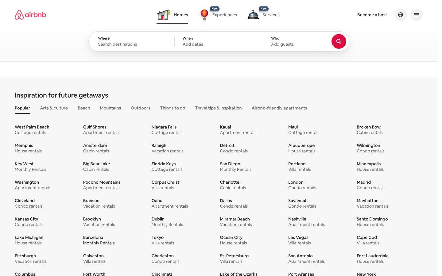
Airbnb
A warm, travel-marketplace interface built on a white canvas with near-black ink text and a single signature coral-pink accent (Rausch, #ff385c) reserved almost entirely for the search-submit button. The system reads as friendly, spacious, and utilitarian — a pill-shaped multi-segment search bar as the hero interactive element, custom Airbnb Cereal typography, generous city-link directories, and fully rounded (pill/circle) interactive shapes. Brand voltage comes from the coral search button and the pill search geometry rather than from decorative color.
Works withClaude CodeCursorCodexGemini CLICopilotv0LovableBoltWindsurfReplit
---
version: alpha
name: Airbnb-design-analysis
description: "A warm, travel-marketplace interface built on a white canvas with near-black ink text and a single signature coral-pink accent (Rausch, #ff385c) reserved almost entirely for the search-submit button. The system reads as friendly, spacious, and utilitarian — a pill-shaped multi-segment search bar as the hero interactive element, custom Airbnb Cereal typography, generous city-link directories, and fully rounded (pill/circle) interactive shapes. Brand voltage comes from the coral search button and the pill search geometry rather than from decorative color."

colors:
  primary: "#ff385c"
  primary-strong: "#e61e4d"
  ink: "#222222"
  ink-strong: "#1b1b1b"
  black: "#000000"
  neutral-strong: "#313131"
  body: "#6a6a6a"
  canvas: "#ffffff"
  surface-soft: "#f7f7f7"
  surface-muted: "#efefef"
  hairline: "#dddddd"
  hairline-soft: "#ebebeb"
  accent-magenta: "#e31c5f"
  accent-magenta-deep: "#d70466"
  accent-berry: "#bd1e59"
  accent-plum: "#92174d"
  accent-violet: "#460479"
  accent-rust: "#c13515"
  accent-rust-deep: "#b32505"
  accent-coral: "#e74d2e"
  on-primary: "#ffffff"

typography:
  h1:
    fontFamily: "Airbnb Cereal VF, Circular, sans-serif"
    fontSize: 28px
    fontWeight: 700
    lineHeight: 1.43
    letterSpacing: normal
  h2:
    fontFamily: "Airbnb Cereal VF, Circular, sans-serif"
    fontSize: 22px
    fontWeight: 500
    lineHeight: 1.182
    letterSpacing: -0.02em
  h3:
    fontFamily: "Airbnb Cereal VF, Circular, sans-serif"
    fontSize: 14px
    fontWeight: 500
    lineHeight: 1.286
    letterSpacing: normal
  button:
    fontFamily: "Airbnb Cereal VF, Circular, sans-serif"
    fontSize: 14px
    fontWeight: 400
    lineHeight: 1.43
    letterSpacing: normal

rounded:
  xs: 3px
  sm: 4px
  md: 8px
  lg: 10px
  xl: 20px
  pill: 32px
  round: 50px
  full: 100px

spacing:
  xxs: 4px
  xs: 8px
  sm: 11px
  md: 16px
  lg: 24px
  xl: 32px
  xxl: 48px

components:
  top-nav:
    backgroundColor: "{colors.canvas}"
    textColor: "{colors.ink}"
    typography: "{typography.button}"
    padding: 16px
  nav-tab:
    backgroundColor: transparent
    textColor: "{colors.body}"
    typography: "{typography.h3}"
    padding: 8px 16px
  nav-tab-active:
    backgroundColor: transparent
    textColor: "{colors.ink}"
    typography: "{typography.h3}"
    padding: 8px 16px
  button-primary:
    backgroundColor: transparent
    textColor: "{colors.ink}"
    typography: "{typography.button}"
    rounded: "{rounded.pill}"
    padding: 11px 16px
  icon-button-circular:
    backgroundColor: "{colors.canvas}"
    textColor: "{colors.ink}"
    rounded: "{rounded.full}"
    size: 40px
  search-bar:
    backgroundColor: "{colors.canvas}"
    textColor: "{colors.ink}"
    rounded: "{rounded.pill}"
    padding: 8px
  search-field:
    backgroundColor: transparent
    textColor: "{colors.ink}"
    typography: "{typography.h3}"
    rounded: "{rounded.sm}"
    padding: 11px 24px
  search-field-placeholder:
    backgroundColor: transparent
    textColor: "{colors.body}"
    typography: "{typography.button}"
  search-submit-button:
    backgroundColor: "{colors.primary}"
    textColor: "{colors.on-primary}"
    rounded: "{rounded.full}"
    size: 48px
  category-tab:
    backgroundColor: transparent
    textColor: "{colors.body}"
    typography: "{typography.h3}"
    padding: 8px 16px
  category-tab-active:
    backgroundColor: transparent
    textColor: "{colors.ink}"
    typography: "{typography.h3}"
    padding: 8px 16px
  directory-link:
    backgroundColor: transparent
    textColor: "{colors.ink}"
    typography: "{typography.h3}"
  directory-link-sub:
    backgroundColor: transparent
    textColor: "{colors.body}"
    typography: "{typography.button}"
  footer:
    backgroundColor: "{colors.canvas}"
    textColor: "{colors.body}"
    typography: "{typography.button}"
    padding: 48px
  footer-heading:
    backgroundColor: transparent
    textColor: "{colors.ink}"
    typography: "{typography.h3}"
  footer-link:
    backgroundColor: transparent
    textColor: "{colors.body}"
    typography: "{typography.button}"
---

## Overview

Airbnb's landing surface is a warm, utilitarian travel-marketplace interface — white canvas (`{colors.canvas}` — #ffffff) with near-black ink text (`{colors.ink}` — #222222) and one signature coral-pink accent (`{colors.primary}` — #ff385c) reserved almost entirely for the circular search-submit button. The system is spacious and quiet: the page is mostly white space, a single pill-shaped search bar, and a large directory of city links. Color is used sparingly — the brand voltage comes from geometry (pills and circles) and the coral search button rather than from decorative color fields.

Type runs entirely on **Airbnb Cereal VF**, the brand's proprietary variable typeface, across all four measured roles (h1, h2, h3, button). Weights stay low — h1 at 700 is the heaviest, while h2 and h3 sit at 500 and button labels at 400. Only h2 carries negative letter-spacing (-0.02em); everything else is normal tracking. The type voice is friendly and understated, never shouty.

The hero interactive element is the **multi-segment search bar** — a fully-rounded pill (`{rounded.pill}` — 32px) split into "Where / When / Who" fields, closed by a coral circular submit button (`{colors.primary}`). This is the single most recognizable component in the system and the primary reason the coral appears at all.

Below the fold, the page becomes a dense but airy **directory of destination links** ("Inspiration for future getaways") — a two-line link pattern (city name in `{colors.ink}`, rental type in `{colors.body}`) laid out in a 6-up desktop grid. The footer stays white (not dark), organized into three link columns.

**Key Characteristics:**
- White canvas with near-black ink (`{colors.ink}` — #222222). The interface is quiet and text-forward, mostly white space.
- A single coral-pink brand accent (`{colors.primary}` — #ff385c) reserved for the circular search-submit button. Airbnb's palette also carries a measured gradient family (magenta / berry / plum / violet / rust / coral) used in the brand mark and promotional gradients.
- Custom `Airbnb Cereal VF` typeface across all text (substituted here with Circular / system sans). Low weights — 700 max, mostly 400–500.
- Pill and circle geometry everywhere: the search bar is a `{rounded.pill}` (32px), the submit button and icon buttons are `{rounded.full}` (100px) circles.
- The multi-segment search bar (Where / When / Who) is the hero component — a white pill with subtle drop shadow, closed by the coral submit circle.
- A dense destination-link directory with a two-line pattern (bold ink city name + muted rental type) in a 6-up desktop grid.
- Nav tabs (Homes / Experiences / Services) sit centered in the top nav with small emoji-style icons; the active tab carries an underline indicator.
- Footer stays on white canvas — no dark inversion — organized into Support / Hosting / Airbnb columns.

## Colors

### Brand & Accent
- **Primary** (`{colors.primary}` — #ff385c): Airbnb's signature "Rausch" coral-pink. On this page it appears almost exclusively on the circular search-submit button. Press/emphasis shifts toward `{colors.primary-strong}` (#e61e4d).
- **Gradient family** — A measured set of hues used in the brand mark and promotional gradients rather than on UI chrome: `{colors.accent-magenta}` (#e31c5f), `{colors.accent-magenta-deep}` (#d70466), `{colors.accent-berry}` (#bd1e59), `{colors.accent-plum}` (#92174d), `{colors.accent-violet}` (#460479), `{colors.accent-rust}` (#c13515), `{colors.accent-rust-deep}` (#b32505), `{colors.accent-coral}` (#e74d2e). These form the coral→magenta→plum gradient signature of the logo and are not applied to buttons or text on the landing surface.

### Surface
- **Canvas** (`{colors.canvas}` — #ffffff): The default page floor and footer background.
- **Surface Soft** (`{colors.surface-soft}` — #f7f7f7): Soft section fills / hovered rows.
- **Surface Muted** (`{colors.surface-muted}` — #efefef): Icon-button fills, muted chips.

### Text
- **Ink** (`{colors.ink}` — #222222): All headlines, city names, primary text.
- **Ink Strong** (`{colors.ink-strong}` — #1b1b1b) / **Black** (`{colors.black}` — #000000) / **Neutral Strong** (`{colors.neutral-strong}` — #313131): Deeper near-black tones used on icons and heavy labels.
- **Body** (`{colors.body}` — #6a6a6a): Secondary text — rental-type sub-labels, footer links, field placeholders.
- **On Primary** (`{colors.on-primary}` — #ffffff): The search icon on the coral submit button.

### Lines
- **Hairline** (`{colors.hairline}` — #dddddd): 1px dividers, search-bar segment separators, borders on icon buttons.
- **Hairline Soft** (`{colors.hairline-soft}` — #ebebeb): Barely-visible section dividers on the white canvas.

## Typography

### Font Family
The system runs entirely on **Airbnb Cereal VF**, Airbnb's proprietary variable typeface. Every measured role — h1, h2, h3, button — uses it. The face is a rounded, friendly geometric sans with low-contrast strokes; the brand keeps weights conservative (400–700) and tracking near-neutral.

### Note on Font Substitutes
**Airbnb Cereal is a proprietary/licensed typeface and cannot be shipped or self-hosted publicly.** For an open-source substitute, use **Nunito Sans** or **Manrope** — both share the rounded-geometric, low-contrast character. **Inter** at matched weights is a safe fallback where a neutral grotesque is acceptable. Preserve the weight discipline (700 for h1, 500 for h2/h3, 400 for buttons) and apply -0.02em tracking only on the h2 role.

### Hierarchy

| Token | Size | Weight | Line Height | Letter Spacing | Use |
|---|---|---|---|---|---|
| `{typography.h1}` | 28px | 700 | 1.43 | normal | Page-level headline |
| `{typography.h2}` | 22px | 500 | 1.182 | -0.02em | Section heads ("Inspiration for future getaways") |
| `{typography.h3}` | 14px | 500 | 1.286 | normal | Field labels, city-link names, footer headings, tab labels |
| `{typography.button}` | 14px | 400 | 1.43 | normal | Button labels, nav links, footer links, sub-labels |

### Principles
Airbnb Cereal carries the entire type system — there is no secondary typeface in the measured set. Hierarchy is driven mostly by size and the ink/body color split, not by dramatic weight jumps: the difference between a section head and a body link is 22px/500 vs. 14px/400. Keep weights restrained — the brand voice is friendly and legible, never bold-for-boldness. Only the h2 section head carries negative tracking; do not add tracking elsewhere.

## Layout

### Spacing System
- **Base unit:** 4px, with a common 8/11/16 rhythm (11px appears frequently — measured — as the vertical padding inside search-bar fields and text buttons).
- **Tokens:** `{spacing.xxs}` 4px · `{spacing.xs}` 8px · `{spacing.sm}` 11px · `{spacing.md}` 16px · `{spacing.lg}` 24px · `{spacing.xl}` 32px · `{spacing.xxl}` 48px.
- **Field padding:** `{spacing.sm}` (11px) vertical inside search fields; `{spacing.lg}` (24px) horizontal within segments.
- **Section padding:** `{spacing.xxl}` (48px) — the dominant large-gap value between major bands and around the footer.
- **Directory link gutters:** `{spacing.md}` (16px) between the two link lines and across grid rows.

### Grid & Container
- **Max content width:** ~1280px centered on the landing page.
- **Top nav:** Three-zone layout — logo left, centered nav-tab cluster (Homes / Experiences / Services), utility cluster right (Become a host, globe, hamburger).
- **Search bar:** Centered horizontal pill, split into three equal-ish segments plus the trailing coral submit circle.
- **Destination directory:** 6-up column grid at desktop, each cell a two-line link (city + rental type).
- **Footer:** 3-column link list (Support / Hosting / Airbnb) with a bottom utility row (copyright, language, currency, social icons).

### Whitespace Philosophy
The landing page is deliberately sparse above the fold — a nav bar, a floating search pill, and generous empty canvas. Density arrives only in the destination directory, which packs many links but keeps them airy through the 16px line rhythm and quiet muted sub-labels. The result reads as calm and functional rather than promotional.

## Elevation & Depth

| Level | Treatment | Use |
|---|---|---|
| Flat | No shadow, no border | Body sections, footer, directory links |
| Hairline | 1px `{colors.hairline}` border | Icon buttons, search-bar segment dividers |
| Floating pill / dropdown | `rgba(0,0,0,0.02) 0px 0px 0px 1px, rgba(0,0,0,0.1) 0px 8px 24px 0px` (measured) | The search bar and popover menus lift off the canvas with a soft, wide 24px-blur shadow plus a 1px hairline ring |
| Toggle control | Layered inset shadow `rgba(60,77,107,0.25) 0px 0.95px 1.9px, rgba(60,77,107,0.25) 0px 3.8px 5.7px, rgb(0,28,64) 0px 0px 2px 0.5px inset, rgb(215,235,255) 0px -1px 3px inset` (measured) | Small switch/toggle controls (e.g., the Privacy Choices opt-out toggle) |

Elevation is soft and modern — a single wide low-alpha drop shadow lifts the search bar and dropdowns off the white canvas. There is no heavy shadowing, no neumorphism. The search bar's shadow is the primary depth cue on the whole page.

## Shapes

### Border Radius Scale

| Token | Value | Use |
|---|---|---|
| `{rounded.xs}` | 3px | Minimal — small inline accents |
| `{rounded.sm}` | 4px | Most common radius (measured, dominant) — small controls, field hit areas, chips |
| `{rounded.md}` | 8px | Cards, popover containers |
| `{rounded.lg}` | 10px | Slightly larger containers |
| `{rounded.xl}` | 20px | Large rounded containers |
| `{rounded.pill}` | 32px | The search-bar pill and pill-shaped text buttons |
| `{rounded.round}` | 50px | Rounded button / medium circular control |
| `{rounded.full}` | 100px | The coral search-submit circle, icon buttons (globe / hamburger) — full circles |

### Geometry Notes
The system leans heavily on rounding: the search bar is a full pill, the submit button and utility icons are perfect circles, and even the smallest controls default to 4px. Note the `input` element itself was measured at `radius: 0px` (search fields inside the pill have no individual radius — the enclosing pill provides the rounding). Sharp corners appear only inside the search-bar's inner fields.

## Components

### Navigation

**`top-nav`** — White top bar. Logo (coral Airbnb "Bélo" mark) at left, centered nav-tab cluster, utility cluster at right. Background `{colors.canvas}`, text `{colors.ink}`, `{typography.button}`, padding `{spacing.md}` (16px).

**`nav-tab`** / **`nav-tab-active`** — Centered category tabs (Homes / Experiences / Services), each with a small emoji-style icon above the label. Inactive: `{colors.body}` text. Active: `{colors.ink}` text with an underline indicator. `{typography.h3}`, padding 8px × 16px.

**`icon-button-circular`** — 40px circular utility button (globe/language selector and hamburger menu). Background `{colors.canvas}`, 1px `{colors.hairline}` border, ink icon, `{rounded.full}`.

**`button-primary`** — The "Become a host" text button in the top nav. Transparent background, `{colors.ink}` text, `{typography.button}`, `{rounded.pill}` (32px, measured), padding 11px × 16px. Renders as a rounded text link rather than a filled button.

### Search

**`search-bar`** — The hero component. A white pill (`{rounded.pill}` — 32px) floating on the canvas with the measured soft drop shadow. Background `{colors.canvas}`, internal padding `{spacing.xs}` (8px). Split into Where / When / Who segments divided by 1px `{colors.hairline}` separators, closed by the coral submit circle.

**`search-field`** — An individual search segment. Transparent background, `{colors.ink}` value text, `{typography.h3}` for the bold label ("Where"), padding 11px × 24px. Internal field radius is 0 (the pill supplies rounding).

**`search-field-placeholder`** — Placeholder / prompt text inside a field ("Search destinations", "Add dates", "Add guests"). Transparent, `{colors.body}` text, `{typography.button}`.

**`search-submit-button`** — The signature coral circle. Background `{colors.primary}` (#ff385c), white magnifier icon (`{colors.on-primary}`), `{rounded.full}`, ~48px diameter. The only saturated color on the default landing surface.

### Directory

**`category-tab`** / **`category-tab-active`** — Filter tabs above the directory (Popular / Arts & culture / Beach / Mountains …). Inactive: transparent, `{colors.body}` text. Active: `{colors.ink}` text with underline. `{typography.h3}`, padding 8px × 16px.

**`directory-link`** — City name (top line) in `{colors.ink}`, `{typography.h3}`. Transparent background.

**`directory-link-sub`** — Rental-type label (second line, e.g., "Cottage rentals") in `{colors.body}`, `{typography.button}`. The two lines together form one clickable destination cell in the 6-up grid.

### Footer

**`footer`** — White-canvas footer (no dark inversion). Background `{colors.canvas}`, body text `{colors.body}`, `{typography.button}`, padding `{spacing.xxl}` (48px). Three link columns plus a bottom utility row (copyright, language, currency, social icons).

**`footer-heading`** — Column heading (Support / Hosting / Airbnb) in `{colors.ink}`, `{typography.h3}`.

**`footer-link`** — Individual footer link in `{colors.body}`, `{typography.button}`.

## Do's and Don'ts

### Do
- Reserve `{colors.primary}` (#ff385c) for the search-submit button and primary brand moments. On the landing surface it is nearly the only saturated color — keep it scarce.
- Keep the search bar as a full pill (`{rounded.pill}`) with the measured soft drop shadow. This is the system's signature component and its main depth cue.
- Use the two-line directory pattern — ink city name (`{typography.h3}`) over muted rental type (`{colors.body}` + `{typography.button}`).
- Keep type on Airbnb Cereal (or the documented open substitute) at restrained weights — 700 for h1, 500 for h2/h3, 400 for buttons.
- Use full circles (`{rounded.full}`) for the submit button and utility icons; use 4px (`{rounded.sm}`) for small inner controls.
- Keep the footer on white canvas — Airbnb does not invert to a dark footer.

### Don't
- Don't spread the coral or the gradient hues across body chrome, tabs, or footer links — the palette is near-monochrome outside the search button and brand mark.
- Don't over-bold the type. Airbnb Cereal at 700 is the ceiling; body and buttons stay at 400.
- Don't add tracking to text other than the h2 section head (-0.02em).
- Don't ship the licensed Airbnb Cereal font — substitute Nunito Sans / Manrope / Inter.
- Don't add heavy shadows. The single soft wide drop shadow on the search bar and dropdowns is the whole elevation vocabulary.
- Don't document hover state styling beyond default and active/pressed.

## Responsive Behavior

### Breakpoints

| Name | Width | Key Changes |
|---|---|---|
| Mobile | < 768px | Top nav collapses; search bar becomes a single compact pill trigger; directory grid drops to 1–2 columns; footer columns stack |
| Tablet | 768–1024px | Nav-tab cluster tightens; search bar stays a pill; directory grid ~3-up |
| Desktop | 1024–1440px | Full three-zone nav; full multi-segment search bar; directory 6-up |
| Wide | > 1440px | Same as desktop; content caps at ~1280px with more outer breathing room |

### Touch Targets
- `{component.search-submit-button}` at ~48px — comfortably above the 44px minimum.
- `{component.icon-button-circular}` at 40px — near-minimum, the full-circle silhouette compensates.
- `{component.search-field}` uses 11px vertical padding, giving a comfortable tappable segment height inside the pill.
- Directory links stack with 16px rhythm, keeping each two-line cell tappable.

### Collapsing Strategy
- The multi-segment search bar collapses to a single compact search trigger on mobile that expands into the full field flow on tap.
- The destination directory reduces column count (6 → ~3 → 1–2) rather than shrinking type.
- Footer's three link columns stack vertically; the bottom utility row wraps.
- Centered nav tabs collapse behind the hamburger `{component.icon-button-circular}` at small widths.

### Image Behavior
- The landing capture is text-and-search-forward with no hero photography in the measured surface; imagery (listing cards, category photos) is not present on this page and is out of scope.

## Iteration Guide

1. Focus on ONE component at a time. Reference its YAML key directly (`{component.search-bar}`, `{component.search-submit-button}`).
2. Variants of an existing component (`-active`, `-placeholder`) live as separate entries in `components:`.
3. Use `{token.refs}` everywhere — never inline hex.
4. Never document hover. Default and Active/Pressed states only.
5. Keep the coral (`{colors.primary}`) scarce — it belongs on the search submit and brand mark, not on general chrome.
6. Type stays on Airbnb Cereal (or substitute) at restrained weights; hierarchy comes from size + the ink/body split, not from heavier weights.
7. When adding surfaces, keep them white — the system does not use a dark footer or dark cards.

## Known Gaps

- **Airbnb Cereal VF is proprietary** and cannot be shipped publicly; `fonts_licensed` was empty in the analysis, but the face is a known licensed custom typeface — substitutes are documented in the Typography section.
- Only four typographic roles (h1, h2, h3, button) were measured. Body-copy, caption, and any small-print roles are inferred from the h3/button pair and may need confirmation.
- The `button-primary` component was measured with `color: #222222`, `radius: 32px`, `padding: 0px` — it renders as a rounded text link ("Become a host"); a filled primary CTA style (if any) was not captured on this surface.
- The `input` element measured `radius: 0px` — search fields have no individual rounding and rely on the enclosing pill; other form-input states (focus, error) are not extracted.
- The measured gradient family (`accent-magenta` through `accent-coral`) is assigned to the brand mark / promotional gradient by inference; exact per-stop application (logo vs. hero gradient) was not directly captured.
- No listing/photo cards, category carousels, or map surfaces appear on the captured landing page — those component specs are out of scope.
- Animation and transition timings (search-bar expansion, dropdown reveal) are not in scope.
- Active/pressed color shifts for the coral submit button (`{colors.primary-strong}`) are derived from the measured gradient neighbor and were not directly captured as an interaction state.

<!-- Documented by Duply · real-world design systems as ready-to-use DESIGN.md for AI coding agents · https://duply.ai/airbnb/design-md -->
Color Palette
Accent
Neutrals
Typography
h128px · 700 · 1.43
The quick brown fox jumpsh222px · 500 · 1.182
The quick brown fox jumpsh314px · 500 · 1.286
The quick brown fox jumpsbutton14px · 400 · 1.43
The quick brown fox jumpsSpacing & Shape
Spacing
| Name | Value | Preview |
|---|---|---|
| xxs | 4px | |
| xs | 8px | |
| sm | 11px | |
| md | 16px | |
| lg | 24px | |
| xl | 32px | |
| xxl | 48px |
Border Radius
| Name | Value | Preview |
|---|---|---|
| xs | 3px | |
| sm | 4px | |
| md | 8px | |
| lg | 10px | |
| xl | 20px | |
| pill | 32px | |
| round | 50px | |
| full | 100px |
FAQ
- What colors does Airbnb use?
- Airbnb's core palette includes #ff385c, #e61e4d, #222222, #1b1b1b, #000000. The full color set with usage roles (canvas, ink, surfaces, accent, semantic) is documented in the Airbnb DESIGN.md.
- What font does Airbnb use?
- Airbnb's primary typeface is Airbnb Cereal VF. The complete type scale (sizes, weights, line-height and letter-spacing per role), with an open substitute where the original is licensed, is documented in the DESIGN.md.
- What is the Airbnb design system?
- A warm, travel-marketplace interface built on a white canvas with near-black ink text and a single signature coral-pink accent (Rausch, #ff385c) reserved almost entirely for the search-submit button. The system reads as friendly, spacious, and utilitarian — a pill-shaped multi-segment search bar as
Get this as a working kit
Airbnb Launch Kit + DESIGN.md
$299$225
One-time payment
- A complete production-stack template, styled like Airbnb, fully built and wired.
- One-time payment and the codebase is yours. No platform fees, no subscription.
Open it with Claude Code, Cursor, or any coding agent and build in plain language, then ship a complete web app.
- Your private DESIGN.md
- Marketing pages, blog, SEO & legal
- Email capture, newsletter & contact
- Accept payments (Stripe)
- Analytics (GA4 + PostHog)
- One-click deploy
- Auth, login & roles
- A full app dashboard, when you grow
More like this
---
version: alpha
name: Airbnb-design-analysis
description: "A warm, travel-marketplace interface built on a white canvas with near-black ink text and a single signature coral-pink accent (Rausch, #ff385c) reserved almost entirely for the search-submit button. The system reads as friendly, spacious, and utilitarian — a pill-shaped multi-segment search bar as the hero interactive element, custom Airbnb Cereal typography, generous city-link directories, and fully rounded (pill/circle) interactive shapes. Brand voltage comes from the coral search button and the pill search geometry rather than from decorative color."

colors:
  primary: "#ff385c"
  primary-strong: "#e61e4d"
  ink: "#222222"
  ink-strong: "#1b1b1b"
  black: "#000000"
  neutral-strong: "#313131"
  body: "#6a6a6a"
  canvas: "#ffffff"
  surface-soft: "#f7f7f7"
  surface-muted: "#efefef"
  hairline: "#dddddd"
  hairline-soft: "#ebebeb"
  accent-magenta: "#e31c5f"
  accent-magenta-deep: "#d70466"
  accent-berry: "#bd1e59"
  accent-plum: "#92174d"
  accent-violet: "#460479"
  accent-rust: "#c13515"
  accent-rust-deep: "#b32505"
  accent-coral: "#e74d2e"
  on-primary: "#ffffff"

typography:
  h1:
    fontFamily: "Airbnb Cereal VF, Circular, sans-serif"
    fontSize: 28px
    fontWeight: 700
    lineHeight: 1.43
    letterSpacing: normal
  h2:
    fontFamily: "Airbnb Cereal VF, Circular, sans-serif"
    fontSize: 22px
    fontWeight: 500
    lineHeight: 1.182
    letterSpacing: -0.02em
  h3:
    fontFamily: "Airbnb Cereal VF, Circular, sans-serif"
    fontSize: 14px
    fontWeight: 500
    lineHeight: 1.286
    letterSpacing: normal
  button:
    fontFamily: "Airbnb Cereal VF, Circular, sans-serif"
    fontSize: 14px
    fontWeight: 400
    lineHeight: 1.43
    letterSpacing: normal

rounded:
  xs: 3px
  sm: 4px
  md: 8px
  lg: 10px
  xl: 20px
  pill: 32px
  round: 50px
  full: 100px

spacing:
  xxs: 4px
  xs: 8px
  sm: 11px
  md: 16px
  lg: 24px
  xl: 32px
  xxl: 48px

components:
  top-nav:
    backgroundColor: "{colors.canvas}"
    textColor: "{colors.ink}"
    typography: "{typography.button}"
    padding: 16px
  nav-tab:
    backgroundColor: transparent
    textColor: "{colors.body}"
    typography: "{typography.h3}"
    padding: 8px 16px
  nav-tab-active:
    backgroundColor: transparent
    textColor: "{colors.ink}"
    typography: "{typography.h3}"
    padding: 8px 16px
  button-primary:
    backgroundColor: transparent
    textColor: "{colors.ink}"
    typography: "{typography.button}"
    rounded: "{rounded.pill}"
    padding: 11px 16px
  icon-button-circular:
    backgroundColor: "{colors.canvas}"
    textColor: "{colors.ink}"
    rounded: "{rounded.full}"
    size: 40px
  search-bar:
    backgroundColor: "{colors.canvas}"
    textColor: "{colors.ink}"
    rounded: "{rounded.pill}"
    padding: 8px
  search-field:
    backgroundColor: transparent
    textColor: "{colors.ink}"
    typography: "{typography.h3}"
    rounded: "{rounded.sm}"
    padding: 11px 24px
  search-field-placeholder:
    backgroundColor: transparent
    textColor: "{colors.body}"
    typography: "{typography.button}"
  search-submit-button:
    backgroundColor: "{colors.primary}"
    textColor: "{colors.on-primary}"
    rounded: "{rounded.full}"
    size: 48px
  category-tab:
    backgroundColor: transparent
    textColor: "{colors.body}"
    typography: "{typography.h3}"
    padding: 8px 16px
  category-tab-active:
    backgroundColor: transparent
    textColor: "{colors.ink}"
    typography: "{typography.h3}"
    padding: 8px 16px
  directory-link:
    backgroundColor: transparent
    textColor: "{colors.ink}"
    typography: "{typography.h3}"
  directory-link-sub:
    backgroundColor: transparent
    textColor: "{colors.body}"
    typography: "{typography.button}"
  footer:
    backgroundColor: "{colors.canvas}"
    textColor: "{colors.body}"
    typography: "{typography.button}"
    padding: 48px
  footer-heading:
    backgroundColor: transparent
    textColor: "{colors.ink}"
    typography: "{typography.h3}"
  footer-link:
    backgroundColor: transparent
    textColor: "{colors.body}"
    typography: "{typography.button}"
---

## Overview

Airbnb's landing surface is a warm, utilitarian travel-marketplace interface — white canvas (`{colors.canvas}` — #ffffff) with near-black ink text (`{colors.ink}` — #222222) and one signature coral-pink accent (`{colors.primary}` — #ff385c) reserved almost entirely for the circular search-submit button. The system is spacious and quiet: the page is mostly white space, a single pill-shaped search bar, and a large directory of city links. Color is used sparingly — the brand voltage comes from geometry (pills and circles) and the coral search button rather than from decorative color fields.

Type runs entirely on **Airbnb Cereal VF**, the brand's proprietary variable typeface, across all four measured roles (h1, h2, h3, button). Weights stay low — h1 at 700 is the heaviest, while h2 and h3 sit at 500 and button labels at 400. Only h2 carries negative letter-spacing (-0.02em); everything else is normal tracking. The type voice is friendly and understated, never shouty.

The hero interactive element is the **multi-segment search bar** — a fully-rounded pill (`{rounded.pill}` — 32px) split into "Where / When / Who" fields, closed by a coral circular submit button (`{colors.primary}`). This is the single most recognizable component in the system and the primary reason the coral appears at all.

Below the fold, the page becomes a dense but airy **directory of destination links** ("Inspiration for future getaways") — a two-line link pattern (city name in `{colors.ink}`, rental type in `{colors.body}`) laid out in a 6-up desktop grid. The footer stays white (not dark), organized into three link columns.

**Key Characteristics:**
- White canvas with near-black ink (`{colors.ink}` — #222222). The interface is quiet and text-forward, mostly white space.
- A single coral-pink brand accent (`{colors.primary}` — #ff385c) reserved for the circular search-submit button. Airbnb's palette also carries a measured gradient family (magenta / berry / plum / violet / rust / coral) used in the brand mark and promotional gradients.
- Custom `Airbnb Cereal VF` typeface across all text (substituted here with Circular / system sans). Low weights — 700 max, mostly 400–500.
- Pill and circle geometry everywhere: the search bar is a `{rounded.pill}` (32px), the submit button and icon buttons are `{rounded.full}` (100px) circles.
- The multi-segment search bar (Where / When / Who) is the hero component — a white pill with subtle drop shadow, closed by the coral submit circle.
- A dense destination-link directory with a two-line pattern (bold ink city name + muted rental type) in a 6-up desktop grid.
- Nav tabs (Homes / Experiences / Services) sit centered in the top nav with small emoji-style icons; the active tab carries an underline indicator.
- Footer stays on white canvas — no dark inversion — organized into Support / Hosting / Airbnb columns.

## Colors

### Brand & Accent
- **Primary** (`{colors.primary}` — #ff385c): Airbnb's signature "Rausch" coral-pink. On this page it appears almost exclusively on the circular search-submit button. Press/emphasis shifts toward `{colors.primary-strong}` (#e61e4d).
- **Gradient family** — A measured set of hues used in the brand mark and promotional gradients rather than on UI chrome: `{colors.accent-magenta}` (#e31c5f), `{colors.accent-magenta-deep}` (#d70466), `{colors.accent-berry}` (#bd1e59), `{colors.accent-plum}` (#92174d), `{colors.accent-violet}` (#460479), `{colors.accent-rust}` (#c13515), `{colors.accent-rust-deep}` (#b32505), `{colors.accent-coral}` (#e74d2e). These form the coral→magenta→plum gradient signature of the logo and are not applied to buttons or text on the landing surface.

### Surface
- **Canvas** (`{colors.canvas}` — #ffffff): The default page floor and footer background.
- **Surface Soft** (`{colors.surface-soft}` — #f7f7f7): Soft section fills / hovered rows.
- **Surface Muted** (`{colors.surface-muted}` — #efefef): Icon-button fills, muted chips.

### Text
- **Ink** (`{colors.ink}` — #222222): All headlines, city names, primary text.
- **Ink Strong** (`{colors.ink-strong}` — #1b1b1b) / **Black** (`{colors.black}` — #000000) / **Neutral Strong** (`{colors.neutral-strong}` — #313131): Deeper near-black tones used on icons and heavy labels.
- **Body** (`{colors.body}` — #6a6a6a): Secondary text — rental-type sub-labels, footer links, field placeholders.
- **On Primary** (`{colors.on-primary}` — #ffffff): The search icon on the coral submit button.

### Lines
- **Hairline** (`{colors.hairline}` — #dddddd): 1px dividers, search-bar segment separators, borders on icon buttons.
- **Hairline Soft** (`{colors.hairline-soft}` — #ebebeb): Barely-visible section dividers on the white canvas.

## Typography

### Font Family
The system runs entirely on **Airbnb Cereal VF**, Airbnb's proprietary variable typeface. Every measured role — h1, h2, h3, button — uses it. The face is a rounded, friendly geometric sans with low-contrast strokes; the brand keeps weights conservative (400–700) and tracking near-neutral.

### Note on Font Substitutes
**Airbnb Cereal is a proprietary/licensed typeface and cannot be shipped or self-hosted publicly.** For an open-source substitute, use **Nunito Sans** or **Manrope** — both share the rounded-geometric, low-contrast character. **Inter** at matched weights is a safe fallback where a neutral grotesque is acceptable. Preserve the weight discipline (700 for h1, 500 for h2/h3, 400 for buttons) and apply -0.02em tracking only on the h2 role.

### Hierarchy

| Token | Size | Weight | Line Height | Letter Spacing | Use |
|---|---|---|---|---|---|
| `{typography.h1}` | 28px | 700 | 1.43 | normal | Page-level headline |
| `{typography.h2}` | 22px | 500 | 1.182 | -0.02em | Section heads ("Inspiration for future getaways") |
| `{typography.h3}` | 14px | 500 | 1.286 | normal | Field labels, city-link names, footer headings, tab labels |
| `{typography.button}` | 14px | 400 | 1.43 | normal | Button labels, nav links, footer links, sub-labels |

### Principles
Airbnb Cereal carries the entire type system — there is no secondary typeface in the measured set. Hierarchy is driven mostly by size and the ink/body color split, not by dramatic weight jumps: the difference between a section head and a body link is 22px/500 vs. 14px/400. Keep weights restrained — the brand voice is friendly and legible, never bold-for-boldness. Only the h2 section head carries negative tracking; do not add tracking elsewhere.

## Layout

### Spacing System
- **Base unit:** 4px, with a common 8/11/16 rhythm (11px appears frequently — measured — as the vertical padding inside search-bar fields and text buttons).
- **Tokens:** `{spacing.xxs}` 4px · `{spacing.xs}` 8px · `{spacing.sm}` 11px · `{spacing.md}` 16px · `{spacing.lg}` 24px · `{spacing.xl}` 32px · `{spacing.xxl}` 48px.
- **Field padding:** `{spacing.sm}` (11px) vertical inside search fields; `{spacing.lg}` (24px) horizontal within segments.
- **Section padding:** `{spacing.xxl}` (48px) — the dominant large-gap value between major bands and around the footer.
- **Directory link gutters:** `{spacing.md}` (16px) between the two link lines and across grid rows.

### Grid & Container
- **Max content width:** ~1280px centered on the landing page.
- **Top nav:** Three-zone layout — logo left, centered nav-tab cluster (Homes / Experiences / Services), utility cluster right (Become a host, globe, hamburger).
- **Search bar:** Centered horizontal pill, split into three equal-ish segments plus the trailing coral submit circle.
- **Destination directory:** 6-up column grid at desktop, each cell a two-line link (city + rental type).
- **Footer:** 3-column link list (Support / Hosting / Airbnb) with a bottom utility row (copyright, language, currency, social icons).

### Whitespace Philosophy
The landing page is deliberately sparse above the fold — a nav bar, a floating search pill, and generous empty canvas. Density arrives only in the destination directory, which packs many links but keeps them airy through the 16px line rhythm and quiet muted sub-labels. The result reads as calm and functional rather than promotional.

## Elevation & Depth

| Level | Treatment | Use |
|---|---|---|
| Flat | No shadow, no border | Body sections, footer, directory links |
| Hairline | 1px `{colors.hairline}` border | Icon buttons, search-bar segment dividers |
| Floating pill / dropdown | `rgba(0,0,0,0.02) 0px 0px 0px 1px, rgba(0,0,0,0.1) 0px 8px 24px 0px` (measured) | The search bar and popover menus lift off the canvas with a soft, wide 24px-blur shadow plus a 1px hairline ring |
| Toggle control | Layered inset shadow `rgba(60,77,107,0.25) 0px 0.95px 1.9px, rgba(60,77,107,0.25) 0px 3.8px 5.7px, rgb(0,28,64) 0px 0px 2px 0.5px inset, rgb(215,235,255) 0px -1px 3px inset` (measured) | Small switch/toggle controls (e.g., the Privacy Choices opt-out toggle) |

Elevation is soft and modern — a single wide low-alpha drop shadow lifts the search bar and dropdowns off the white canvas. There is no heavy shadowing, no neumorphism. The search bar's shadow is the primary depth cue on the whole page.

## Shapes

### Border Radius Scale

| Token | Value | Use |
|---|---|---|
| `{rounded.xs}` | 3px | Minimal — small inline accents |
| `{rounded.sm}` | 4px | Most common radius (measured, dominant) — small controls, field hit areas, chips |
| `{rounded.md}` | 8px | Cards, popover containers |
| `{rounded.lg}` | 10px | Slightly larger containers |
| `{rounded.xl}` | 20px | Large rounded containers |
| `{rounded.pill}` | 32px | The search-bar pill and pill-shaped text buttons |
| `{rounded.round}` | 50px | Rounded button / medium circular control |
| `{rounded.full}` | 100px | The coral search-submit circle, icon buttons (globe / hamburger) — full circles |

### Geometry Notes
The system leans heavily on rounding: the search bar is a full pill, the submit button and utility icons are perfect circles, and even the smallest controls default to 4px. Note the `input` element itself was measured at `radius: 0px` (search fields inside the pill have no individual radius — the enclosing pill provides the rounding). Sharp corners appear only inside the search-bar's inner fields.

## Components

### Navigation

**`top-nav`** — White top bar. Logo (coral Airbnb "Bélo" mark) at left, centered nav-tab cluster, utility cluster at right. Background `{colors.canvas}`, text `{colors.ink}`, `{typography.button}`, padding `{spacing.md}` (16px).

**`nav-tab`** / **`nav-tab-active`** — Centered category tabs (Homes / Experiences / Services), each with a small emoji-style icon above the label. Inactive: `{colors.body}` text. Active: `{colors.ink}` text with an underline indicator. `{typography.h3}`, padding 8px × 16px.

**`icon-button-circular`** — 40px circular utility button (globe/language selector and hamburger menu). Background `{colors.canvas}`, 1px `{colors.hairline}` border, ink icon, `{rounded.full}`.

**`button-primary`** — The "Become a host" text button in the top nav. Transparent background, `{colors.ink}` text, `{typography.button}`, `{rounded.pill}` (32px, measured), padding 11px × 16px. Renders as a rounded text link rather than a filled button.

### Search

**`search-bar`** — The hero component. A white pill (`{rounded.pill}` — 32px) floating on the canvas with the measured soft drop shadow. Background `{colors.canvas}`, internal padding `{spacing.xs}` (8px). Split into Where / When / Who segments divided by 1px `{colors.hairline}` separators, closed by the coral submit circle.

**`search-field`** — An individual search segment. Transparent background, `{colors.ink}` value text, `{typography.h3}` for the bold label ("Where"), padding 11px × 24px. Internal field radius is 0 (the pill supplies rounding).

**`search-field-placeholder`** — Placeholder / prompt text inside a field ("Search destinations", "Add dates", "Add guests"). Transparent, `{colors.body}` text, `{typography.button}`.

**`search-submit-button`** — The signature coral circle. Background `{colors.primary}` (#ff385c), white magnifier icon (`{colors.on-primary}`), `{rounded.full}`, ~48px diameter. The only saturated color on the default landing surface.

### Directory

**`category-tab`** / **`category-tab-active`** — Filter tabs above the directory (Popular / Arts & culture / Beach / Mountains …). Inactive: transparent, `{colors.body}` text. Active: `{colors.ink}` text with underline. `{typography.h3}`, padding 8px × 16px.

**`directory-link`** — City name (top line) in `{colors.ink}`, `{typography.h3}`. Transparent background.

**`directory-link-sub`** — Rental-type label (second line, e.g., "Cottage rentals") in `{colors.body}`, `{typography.button}`. The two lines together form one clickable destination cell in the 6-up grid.

### Footer

**`footer`** — White-canvas footer (no dark inversion). Background `{colors.canvas}`, body text `{colors.body}`, `{typography.button}`, padding `{spacing.xxl}` (48px). Three link columns plus a bottom utility row (copyright, language, currency, social icons).

**`footer-heading`** — Column heading (Support / Hosting / Airbnb) in `{colors.ink}`, `{typography.h3}`.

**`footer-link`** — Individual footer link in `{colors.body}`, `{typography.button}`.

## Do's and Don'ts

### Do
- Reserve `{colors.primary}` (#ff385c) for the search-submit button and primary brand moments. On the landing surface it is nearly the only saturated color — keep it scarce.
- Keep the search bar as a full pill (`{rounded.pill}`) with the measured soft drop shadow. This is the system's signature component and its main depth cue.
- Use the two-line directory pattern — ink city name (`{typography.h3}`) over muted rental type (`{colors.body}` + `{typography.button}`).
- Keep type on Airbnb Cereal (or the documented open substitute) at restrained weights — 700 for h1, 500 for h2/h3, 400 for buttons.
- Use full circles (`{rounded.full}`) for the submit button and utility icons; use 4px (`{rounded.sm}`) for small inner controls.
- Keep the footer on white canvas — Airbnb does not invert to a dark footer.

### Don't
- Don't spread the coral or the gradient hues across body chrome, tabs, or footer links — the palette is near-monochrome outside the search button and brand mark.
- Don't over-bold the type. Airbnb Cereal at 700 is the ceiling; body and buttons stay at 400.
- Don't add tracking to text other than the h2 section head (-0.02em).
- Don't ship the licensed Airbnb Cereal font — substitute Nunito Sans / Manrope / Inter.
- Don't add heavy shadows. The single soft wide drop shadow on the search bar and dropdowns is the whole elevation vocabulary.
- Don't document hover state styling beyond default and active/pressed.

## Responsive Behavior

### Breakpoints

| Name | Width | Key Changes |
|---|---|---|
| Mobile | < 768px | Top nav collapses; search bar becomes a single compact pill trigger; directory grid drops to 1–2 columns; footer columns stack |
| Tablet | 768–1024px | Nav-tab cluster tightens; search bar stays a pill; directory grid ~3-up |
| Desktop | 1024–1440px | Full three-zone nav; full multi-segment search bar; directory 6-up |
| Wide | > 1440px | Same as desktop; content caps at ~1280px with more outer breathing room |

### Touch Targets
- `{component.search-submit-button}` at ~48px — comfortably above the 44px minimum.
- `{component.icon-button-circular}` at 40px — near-minimum, the full-circle silhouette compensates.
- `{component.search-field}` uses 11px vertical padding, giving a comfortable tappable segment height inside the pill.
- Directory links stack with 16px rhythm, keeping each two-line cell tappable.

### Collapsing Strategy
- The multi-segment search bar collapses to a single compact search trigger on mobile that expands into the full field flow on tap.
- The destination directory reduces column count (6 → ~3 → 1–2) rather than shrinking type.
- Footer's three link columns stack vertically; the bottom utility row wraps.
- Centered nav tabs collapse behind the hamburger `{component.icon-button-circular}` at small widths.

### Image Behavior
- The landing capture is text-and-search-forward with no hero photography in the measured surface; imagery (listing cards, category photos) is not present on this page and is out of scope.

## Iteration Guide

1. Focus on ONE component at a time. Reference its YAML key directly (`{component.search-bar}`, `{component.search-submit-button}`).
2. Variants of an existing component (`-active`, `-placeholder`) live as separate entries in `components:`.
3. Use `{token.refs}` everywhere — never inline hex.
4. Never document hover. Default and Active/Pressed states only.
5. Keep the coral (`{colors.primary}`) scarce — it belongs on the search submit and brand mark, not on general chrome.
6. Type stays on Airbnb Cereal (or substitute) at restrained weights; hierarchy comes from size + the ink/body split, not from heavier weights.
7. When adding surfaces, keep them white — the system does not use a dark footer or dark cards.

## Known Gaps

- **Airbnb Cereal VF is proprietary** and cannot be shipped publicly; `fonts_licensed` was empty in the analysis, but the face is a known licensed custom typeface — substitutes are documented in the Typography section.
- Only four typographic roles (h1, h2, h3, button) were measured. Body-copy, caption, and any small-print roles are inferred from the h3/button pair and may need confirmation.
- The `button-primary` component was measured with `color: #222222`, `radius: 32px`, `padding: 0px` — it renders as a rounded text link ("Become a host"); a filled primary CTA style (if any) was not captured on this surface.
- The `input` element measured `radius: 0px` — search fields have no individual rounding and rely on the enclosing pill; other form-input states (focus, error) are not extracted.
- The measured gradient family (`accent-magenta` through `accent-coral`) is assigned to the brand mark / promotional gradient by inference; exact per-stop application (logo vs. hero gradient) was not directly captured.
- No listing/photo cards, category carousels, or map surfaces appear on the captured landing page — those component specs are out of scope.
- Animation and transition timings (search-bar expansion, dropdown reveal) are not in scope.
- Active/pressed color shifts for the coral submit button (`{colors.primary-strong}`) are derived from the measured gradient neighbor and were not directly captured as an interaction state.

<!-- Documented by Duply · real-world design systems as ready-to-use DESIGN.md for AI coding agents · https://duply.ai/airbnb/design-md -->