
Sweetgreen
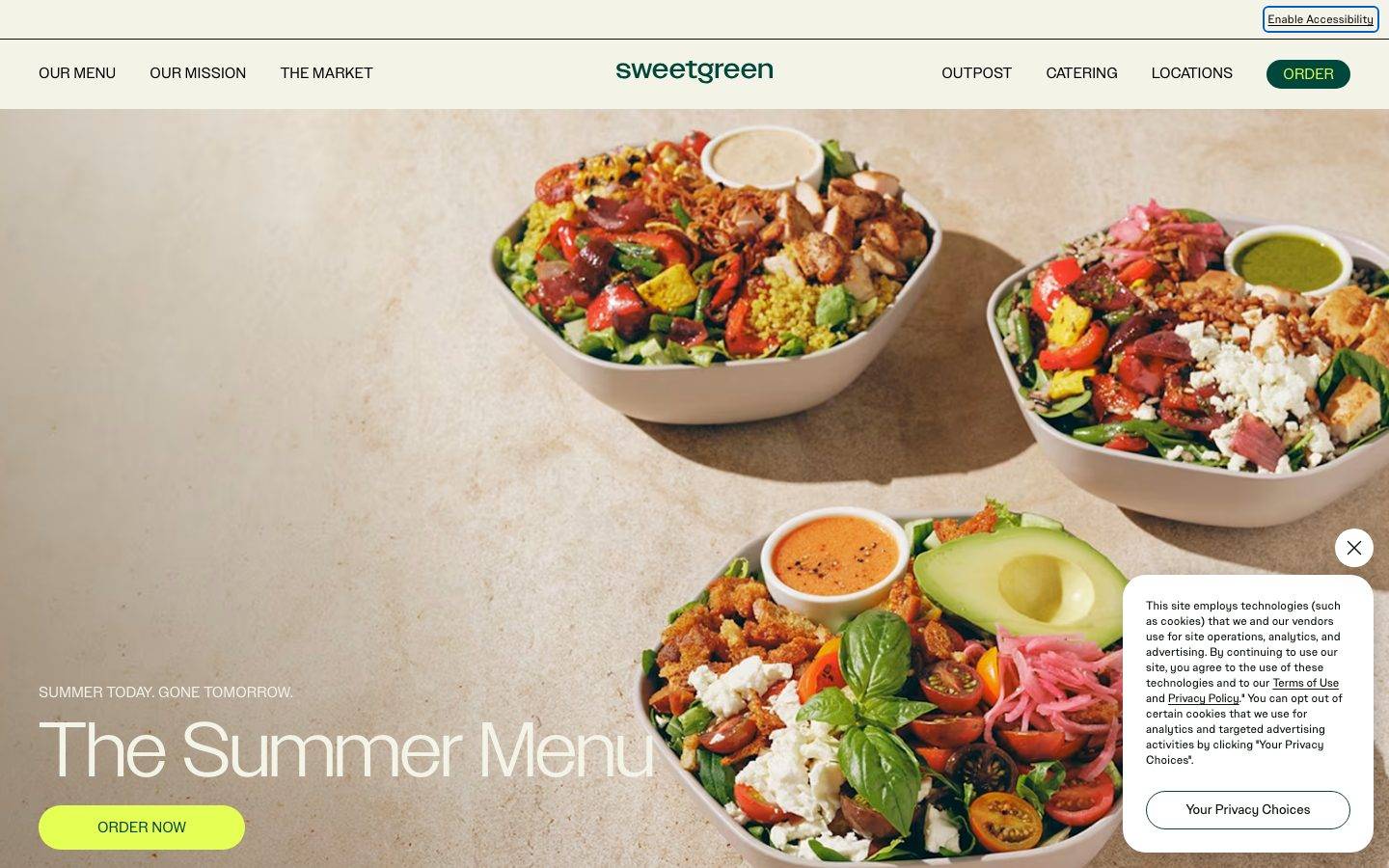
A warm, food-forward restaurant marketing surface built on cream and sage tonal bands, deep-green sweetgreen brand type, and full-bleed bowl photography. The system reads as fresh, earthy, and confidently minimal — near-square edges on primary buttons and cards, bright chartreuse-lime CTAs punctuating the muted natural palette, and generous editorial section bands (sage, tan, cream) that pace a long-scroll landing page. Brand voltage comes from the SweetSansText grotesque wordmark and the lime "ORDER NOW" pill rather than from heavy ornament.
Works withClaude CodeCursorCodexGemini CLICopilotv0LovableBoltWindsurfReplit
---
version: alpha
name: Sweetgreen-design-analysis
description: "A warm, food-forward restaurant marketing surface built on cream and sage tonal bands, deep-green sweetgreen brand type, and full-bleed bowl photography. The system reads as fresh, earthy, and confidently minimal — near-square edges on primary buttons and cards, bright chartreuse-lime CTAs punctuating the muted natural palette, and generous editorial section bands (sage, tan, cream) that pace a long-scroll landing page. Brand voltage comes from the SweetSansText grotesque wordmark and the lime \"ORDER NOW\" pill rather than from heavy ornament."

colors:
  primary: "#00473c"
  primary-soft: "#2d6b52"
  ink: "#000000"
  on-primary: "#0e150e"
  canvas: "#ffffff"
  cream: "#f4f3e7"
  surface-sage: "#d8e5d6"
  surface-tan: "#e8dcc6"
  accent-lime: "#e6ff55"
  accent-sage: "#a9c1a9"
  accent-berry: "#a61846"
  accent-peach: "#f9dfce"
  accent-cyan: "#d6e9e9"
  accent-navy: "#203e70"
  accent-rust: "#a72700"
  muted: "#484d48"
  muted-soft: "#8c8c82"
  hairline: "#bdbdb1"

typography:
  heading:
    fontFamily: "SweetSansText, Helvetica Neue, Arial, sans-serif"
    fontSize: 24px
    fontWeight: 400
    lineHeight: 1.2
    letterSpacing: 0.03em
  label:
    fontFamily: "SweetSansText, Helvetica Neue, Arial, sans-serif"
    fontSize: 16px
    fontWeight: 400
    lineHeight: 1.0
    letterSpacing: normal
  body:
    fontFamily: "SweetSansText, Helvetica Neue, Arial, sans-serif"
    fontSize: 16px
    fontWeight: 400
    lineHeight: 1.0
    letterSpacing: normal
  button:
    fontFamily: "SweetSansText, Helvetica Neue, Arial, sans-serif"
    fontSize: 16px
    fontWeight: 400
    lineHeight: 1.0
    letterSpacing: normal

rounded:
  none: 0px
  sm: 4px
  md: 8px
  lg: 10px
  xl: 20px
  xxl: 24px
  pill: 1000px

spacing:
  xxs: 4px
  xs: 8px
  sm: 12px
  md: 16px
  lg: 20px
  xl: 24px
  xxl: 32px
  section: 40px

components:
  top-nav:
    backgroundColor: "{colors.cream}"
    textColor: "{colors.ink}"
    typography: "{typography.label}"
    padding: 24px
  nav-order-button:
    backgroundColor: "{colors.primary}"
    textColor: "{colors.cream}"
    typography: "{typography.button}"
    rounded: "{rounded.pill}"
    padding: 6px 12px
  button-primary:
    backgroundColor: "{colors.cream}"
    textColor: "{colors.on-primary}"
    typography: "{typography.button}"
    rounded: "{rounded.none}"
    padding: 6px 12px
  cta-button-lime:
    backgroundColor: "{colors.accent-lime}"
    textColor: "{colors.on-primary}"
    typography: "{typography.button}"
    rounded: "{rounded.pill}"
    padding: 6px 12px
  privacy-choices-button:
    backgroundColor: "{colors.canvas}"
    textColor: "{colors.ink}"
    typography: "{typography.button}"
    rounded: "{rounded.pill}"
  card:
    backgroundColor: "{colors.canvas}"
    textColor: "{colors.ink}"
    rounded: "{rounded.none}"
  input:
    backgroundColor: "{colors.canvas}"
    textColor: "{colors.ink}"
    typography: "{typography.body}"
    rounded: "{rounded.lg}"
  section-band-sage:
    backgroundColor: "{colors.surface-sage}"
    textColor: "{colors.ink}"
    typography: "{typography.heading}"
    padding: 40px
  section-band-tan:
    backgroundColor: "{colors.surface-tan}"
    textColor: "{colors.ink}"
    typography: "{typography.heading}"
    padding: 40px
  cookie-dialog:
    backgroundColor: "{colors.canvas}"
    textColor: "{colors.ink}"
    typography: "{typography.body}"
    rounded: "{rounded.xl}"
    shadow: "rgba(14, 21, 14, 0.4) 3px 3px 32px -10px"
  footer:
    backgroundColor: "{colors.surface-sage}"
    textColor: "{colors.ink}"
    typography: "{typography.body}"
    padding: 40px
---

## Overview

Sweetgreen's landing page is a warm, food-forward restaurant marketing surface. The palette is anchored on natural, edible tones — a cream floor (`{colors.cream}` — #f4f3e7), deep sweetgreen brand green (`{colors.primary}` — #00473c) for the wordmark and the nav "ORDER" pill, and full-bleed hero photography of salad bowls. The system reads as fresh, earthy, and confidently minimal: no heavy shadows, no ornament, just tonal color bands pacing a long-scroll page.

Type runs entirely on **SweetSansText**, Sweetgreen's grotesque brand typeface, at a single weight (400). The measured hierarchy is compact — a 24px heading with slight positive tracking (0.03em) and 16px label/body/button roles. The oversized display headline seen in the hero ("The Summer Menu") was not captured in the measurement pass and is documented as a Known Gap.

Brand voltage comes from two places: the **deep-green wordmark + nav order pill** and the **bright chartreuse-lime CTA** (`{colors.accent-lime}` — #e6ff55) used on the hero "ORDER NOW" button. The lime is the single loudest color in an otherwise muted, natural palette — it draws the eye straight to the primary action.

Structurally, the page below the hero alternates full-width **section bands** — pale sage (`{colors.surface-sage}` — #d8e5d6) for "sweetgreen for work" and warm tan (`{colors.surface-tan}` — #e8dcc6) for "in the lab" — closing on a sage footer. The bands do the pacing work that shadows and borders would in a more corporate system.

**Key Characteristics:**
- Cream canvas (`{colors.cream}`) with deep-green brand type (`{colors.primary}`). The wordmark and nav "ORDER" pill are near-black green, not blue.
- Single typeface — SweetSansText grotesque at weight 400 throughout. Compact hierarchy; the voice comes from the letterforms, not weight contrast.
- Bright lime CTA (`{colors.accent-lime}`) — the one loud color, reserved for the primary hero action.
- Near-square geometry — measured primary button and card both use `{rounded.none}` (0px). Radius contrast comes from the pill buttons (`{rounded.pill}`) and inputs (`{rounded.lg}` 10px).
- Tonal section bands — sage and tan full-width blocks pace the long scroll; each band carries an uppercase eyebrow label + a large heading.
- Full-bleed food photography as the hero surface; the imagery is the hero, type overlays at the lower-left.
- Soft, sparse elevation — only two measured shadows, both low-alpha, used on floating dialogs.

## Colors

### Brand & Accent
- **Primary** (`{colors.primary}` — #00473c): Sweetgreen's signature deep green. The wordmark, the nav "ORDER" pill background, and heading accents. The core brand color.
- **Primary Soft** (`{colors.primary-soft}` — #2d6b52): A medium green used for secondary green moments and lighter brand tints.
- **Accent Lime** (`{colors.accent-lime}` — #e6ff55): The bright chartreuse CTA color — the loudest hue in the palette, reserved for the hero "ORDER NOW" pill.
- **Accent Sage** (`{colors.accent-sage}` — #a9c1a9): A muted mid-sage used in decorative fills and iconography.
- **Accent Berry** (`{colors.accent-berry}` — #a61846), **Accent Peach** (`{colors.accent-peach}` — #f9dfce), **Accent Cyan** (`{colors.accent-cyan}` — #d6e9e9), **Accent Navy** (`{colors.accent-navy}` — #203e70), **Accent Rust** (`{colors.accent-rust}` — #a72700): A small food-toned accent set observed at low frequency — used sparingly in menu-item and marketing accents, never on primary actions.

### Surface
- **Cream** (`{colors.cream}` — #f4f3e7): The primary warm page floor and nav background; also the measured `{component.button-primary}` fill and the light text color over dark photography.
- **Canvas** (`{colors.canvas}` — #ffffff): Pure-white surface for dialogs, inputs, and cards.
- **Surface Sage** (`{colors.surface-sage}` — #d8e5d6): The pale-sage section band ("sweetgreen for work") and footer background.
- **Surface Tan** (`{colors.surface-tan}` — #e8dcc6): The warm-tan section band ("in the lab").

### Text
- **Ink** (`{colors.ink}` — #000000): The dominant black used for links and body/nav text (highest measured frequency).
- **On Primary** (`{colors.on-primary}` — #0e150e): The near-black label color on light buttons (cream and lime CTAs).
- **Cream** (`{colors.cream}`): Doubles as light text over the dark hero photography and on the green nav pill.
- **Muted** (`{colors.muted}` — #484d48): Dark gray-green secondary text.
- **Muted Soft** (`{colors.muted-soft}` — #8c8c82): Warm-gray tertiary text and fine print.
- **Hairline** (`{colors.hairline}` — #bdbdb1): Light warm-gray dividers and borders.

## Typography

### Font Family
The entire system runs on **SweetSansText** — Sweetgreen's custom grotesque brand typeface. All measured roles use weight 400; there is no weight-contrast hierarchy, so emphasis comes from size and from the letterforms themselves. SweetSansText is a proprietary/custom face and is **not** available as a public web font.

The fallback stack walks `Helvetica Neue, Arial, sans-serif` — a neo-grotesque baseline that preserves the geometry when the brand face is unavailable.

### Hierarchy

| Token | Size | Weight | Line Height | Letter Spacing | Use |
|---|---|---|---|---|---|
| `{typography.heading}` | 24px | 400 | 1.2 | 0.03em | Section headings (h2) — "All the ways we keep your workplace working" |
| `{typography.label}` | 16px | 400 | 1.0 | normal | Eyebrow labels + small headings (measured h1) — "SUMMER TODAY. GONE TOMORROW." |
| `{typography.body}` | 16px | 400 | 1.0 | normal | Running body copy, footer links |
| `{typography.button}` | 16px | 400 | 1.0 | normal | Button and CTA labels |

### Principles
The type system is deliberately flat — one family, one weight, a narrow size range. The 0.03em positive tracking on `{typography.heading}` is the one typographic flourish; everything else runs at normal spacing. The large hero display type ("The Summer Menu") is clearly a larger cut of SweetSansText than any measured role, but its exact size/weight/tracking was not captured (see Known Gaps).

### Note on Font Substitutes
SweetSansText is a proprietary Sweetgreen typeface and cannot be shipped. **Helvetica Neue** (or **Arial** as the universal fallback) at weight 400 is the documented substitute in the stack. For a closer open-source match, **Inter** or **Archivo** at weight 400 preserve the neo-grotesque character; apply ~0.03em tracking on the heading role to match.

## Layout

### Spacing System
- **Base unit:** 8px (highest-frequency measured value at freq 36), with a 4px sub-step.
- **Tokens:** `{spacing.xxs}` 4px · `{spacing.xs}` 8px · `{spacing.sm}` 12px · `{spacing.md}` 16px · `{spacing.lg}` 20px · `{spacing.xl}` 24px · `{spacing.xxl}` 32px · `{spacing.section}` 40px.
- **Section band padding:** `{spacing.section}` (40px) — the vertical rhythm inside the sage/tan editorial bands and footer.
- **Component padding:** measured buttons run 6px × 12px (a tight `~{spacing.sm}` horizontal); nav padding sits at `{spacing.xl}` (24px).

### Grid & Container
- **Hero:** full-bleed background photography with content (eyebrow + display headline + lime CTA) anchored lower-left.
- **Section bands:** full-width color blocks; text content sits in a left-aligned column roughly on the left half of the band.
- **Footer:** multi-column link list (About Us / Social Media / Support + Services / Legal) on a sage surface.

### Whitespace Philosophy
Sweetgreen relies on **full-width tonal bands** rather than card grids to structure the page. Each band gets generous internal breathing room (40px), and the switch of background tone (sage → tan → cream → sage footer) does the sectioning work. The result reads as calm and editorial, letting the food photography carry the visual weight.

## Elevation & Depth

| Level | Treatment | Use |
|---|---|---|
| Flat | No shadow, no border | Section bands, nav, cards (measured `shadow: none`) |
| Floating dialog | `rgba(14, 21, 14, 0.4) 3px 3px 32px -10px` | The cookie / privacy dialog floating over the hero |
| Subtle ring | `rgba(0, 0, 0, 0.4) 0px 0px 3px 0px` | Small focus/outline emphasis on interactive elements |

The elevation philosophy is **near-flat**. Cards carry no shadow (measured `shadow: none`, `radius: 0px`). The only real depth in the system is the low-alpha drop shadow on the floating privacy dialog. Color-band contrast, not shadow, creates spatial hierarchy.

## Shapes

### Border Radius Scale

| Token | Value | Use |
|---|---|---|
| `{rounded.none}` | 0px | Primary button and cards — measured square corners |
| `{rounded.sm}` | 4px | Small inline elements |
| `{rounded.md}` | 8px | Minor rounded elements |
| `{rounded.lg}` | 10px | Text inputs (measured) |
| `{rounded.xl}` | 20px | Floating dialogs / rounded containers (most frequent measured radius) |
| `{rounded.xxl}` | 24px | Larger rounded containers |
| `{rounded.pill}` | 1000px | Pill buttons — the nav "ORDER" and hero "ORDER NOW" CTAs |

There is a deliberate two-mode geometry: measured content buttons and cards are perfectly square (`{rounded.none}`), while the marquee CTAs are full pills (`{rounded.pill}`). Containers and dialogs use the mid-range 20px (`{rounded.xl}`).

### Photography Geometry
Hero food photography is full-bleed (no radius) and fills the top of the page. The bowls sit on a warm neutral surface that blends into the cream canvas, letting the imagery run edge-to-edge without a framing border.

## Components

### Navigation

**`top-nav`** — Horizontal cream nav bar. Background `{colors.cream}`, left cluster (OUR MENU / OUR MISSION / THE MARKET), centered "sweetgreen" wordmark in `{colors.primary}`, right cluster (OUTPOST / CATERING / LOCATIONS) plus the green order pill. Labels in `{typography.label}` (SweetSansText 16px / 400). Padding `{spacing.xl}` (24px).

**`nav-order-button`** — The persistent "ORDER" pill in the nav. Background `{colors.primary}` (#00473c), text `{colors.cream}`, `{rounded.pill}`. Padding 6px × 12px and pill radius are derived from the measured button footprint plus screenshot ground-truth.

### Buttons

**`button-primary`** — The measured primary button. Background `{colors.cream}` (#f4f3e7), text `{colors.on-primary}` (#0e150e), `{rounded.none}` (square corners), padding 6px × 12px, type `{typography.button}`. Note the measured square corners contrast with the pill CTAs.

**`cta-button-lime`** — The hero "ORDER NOW" pill. Background `{colors.accent-lime}` (#e6ff55), text `{colors.on-primary}`, `{rounded.pill}`, padding 6px × 12px. The single loudest element on the page — reserved for the top marketing action.

**`privacy-choices-button`** — The "Your Privacy Choices" button inside the cookie dialog. White background `{colors.canvas}`, text `{colors.ink}`, `{rounded.pill}`, type `{typography.button}`.

### Cards & Containers

**`card`** — Measured content card. Background `{colors.canvas}`, `{rounded.none}` (square), `shadow: none`. Sweetgreen's cards are flat, borderless blocks.

**`section-band-sage`** — Full-width sage editorial band ("sweetgreen for work"). Background `{colors.surface-sage}` (#d8e5d6), text `{colors.ink}`, heading in `{typography.heading}`, padding `{spacing.section}` (40px). Carries an uppercase eyebrow label + a large heading + body copy.

**`section-band-tan`** — Full-width warm-tan band ("in the lab"). Background `{colors.surface-tan}` (#e8dcc6), same internal structure as the sage band. Alternating tone paces the scroll.

**`cookie-dialog`** — Floating privacy/cookie notice over the hero. Background `{colors.canvas}`, text `{colors.ink}`, body in `{typography.body}`, `{rounded.xl}` (20px), drop shadow `rgba(14, 21, 14, 0.4) 3px 3px 32px -10px`.

### Inputs & Forms

**`input`** — Measured text input. Background `{colors.canvas}`, text `{colors.ink}`, type `{typography.body}`, `{rounded.lg}` (10px) — the only softly-rounded rectangular element in the measured set.

### Footer

**`footer`** — Sage-surfaced footer that closes the page. Background `{colors.surface-sage}`, text `{colors.ink}`, body in `{typography.body}`, padding `{spacing.section}` (40px). Multi-column link list (About Us / Social Media / Support + Services / Legal) with the copyright and trademark lines at right.

## Do's and Don'ts

### Do
- Reserve `{colors.accent-lime}` (#e6ff55) for the single primary marketing CTA. It is the loudest color and should mark exactly one action per view.
- Use `{colors.primary}` (#00473c) for the wordmark and the persistent nav order pill.
- Pace long pages with alternating tonal bands — `{component.section-band-sage}` then `{component.section-band-tan}` — rather than adding card borders or shadows.
- Keep type in SweetSansText weight 400; let size and the 0.03em heading tracking carry hierarchy.
- Keep content cards flat and square (`{rounded.none}`, `shadow: none`) as measured.
- Let food photography run full-bleed as the hero surface.

### Don't
- Don't apply the lime accent to multiple buttons or to body/nav elements — its power is scarcity.
- Don't add shadow to `{component.card}`; the measured card is flat.
- Don't bold or restyle SweetSansText into a heavier weight — the system is single-weight.
- Don't mix rounded and square inconsistently: pills for the marquee CTAs, square for content buttons/cards, 10px for inputs.
- Don't claim to ship SweetSansText — use the documented grotesque substitute when the brand face is unavailable.

## Responsive Behavior

| Name | Width | Key Changes |
|---|---|---|
| Mobile | < 768px | Nav collapses; hero photography and headline stack; section bands become full-width single columns; footer columns wrap |
| Tablet | 768–1024px | Nav tightens; section bands keep left-aligned content column; photography scales proportionally |
| Desktop | 1024–1440px | Full horizontal nav with centered wordmark; full-bleed hero; alternating tonal bands at full width |
| Wide | > 1440px | Same as desktop with additional outer breathing room around the content column |

### Touch Targets
- `{component.cta-button-lime}` and `{component.nav-order-button}` are pills with 6px × 12px measured padding; effective tap area should be padded to meet 44px minimums on touch.
- `{component.input}` uses `{rounded.lg}` (10px); height was not measured (see Known Gaps).

### Collapsing Strategy
- Full-bleed hero photography retains its focal bowls while cropping at the edges on narrow viewports.
- Section bands reflow to single-column text stacks; the tonal background persists as the sectioning device.
- Footer link columns wrap from a multi-column row to stacked groups.

### Image Behavior
- Hero and section imagery is full-bleed and crops rather than letterboxes on smaller screens.
- The floating cookie dialog repositions within the hero on narrower viewports.

## Iteration Guide

1. Focus on ONE component at a time. Reference its YAML key directly (`{component.cta-button-lime}`, `{component.section-band-sage}`).
2. Variants live as separate `components:` entries; do not fork inline.
3. Use `{token.refs}` everywhere — never inline a hex in a component.
4. Document only default and active/pressed states — no hover docs.
5. Keep the two-mode geometry explicit: pills for marquee CTAs, `{rounded.none}` for content buttons/cards.
6. The lime accent marks one action per view; escalate size before adding a second loud element.
7. When adding sections, alternate `{colors.surface-sage}` and `{colors.surface-tan}` bands to preserve the scroll rhythm.

## Known Gaps

- Only the **landing** page was captured; menu, ordering, locations, and account surfaces are out of scope.
- The large hero display headline ("The Summer Menu") is visibly a much larger cut of SweetSansText than any measured typography role — its exact size, weight, line-height, and tracking were not captured. It is not represented in the token set.
- **SweetSansText** is a proprietary Sweetgreen typeface (not flagged in `fonts_licensed`, but confirmed custom); an open-source/system substitute is documented in the Typography section.
- The measured `button-primary` returns a **cream fill with square corners** (`{rounded.none}`), which conflicts with the visible pill CTAs in the screenshots. The pill CTAs (`nav-order-button`, `cta-button-lime`) are documented from screenshot ground-truth; their radius (`{rounded.pill}`) and padding are **derived** from the measured button footprint.
- Button and input heights were not measured — padding values are recorded but explicit height tokens are absent.
- The accent set (`{colors.accent-berry}`, `{colors.accent-peach}`, `{colors.accent-cyan}`, `{colors.accent-navy}`, `{colors.accent-rust}`) appears at low frequency; their precise usage contexts were not isolated in the capture.
- Two low-frequency neutrals (#555555, #b2b2b2) were measured once each and omitted from the token set as noise.
- Animation, transition timings, and interactive states beyond default are not in scope.

<!-- Documented by Duply · real-world design systems as ready-to-use DESIGN.md for AI coding agents · https://duply.ai/sweetgreen/design-md -->
Color Palette
Accent
Neutrals
Typography
heading24px · 400 · 1.2
The quick brown fox jumpslabel16px · 400 · 1
The quick brown fox jumpsbody16px · 400 · 1
The quick brown fox jumpsbutton16px · 400 · 1
The quick brown fox jumpsSpacing & Shape
Spacing
| Name | Value | Preview |
|---|---|---|
| xxs | 4px | |
| xs | 8px | |
| sm | 12px | |
| md | 16px | |
| lg | 20px | |
| xl | 24px | |
| xxl | 32px | |
| section | 40px |
Border Radius
| Name | Value | Preview |
|---|---|---|
| none | 0px | |
| sm | 4px | |
| md | 8px | |
| lg | 10px | |
| xl | 20px | |
| xxl | 24px | |
| pill | 1000px |
FAQ
- What colors does Sweetgreen use?
- Sweetgreen's core palette includes #00473c, #2d6b52, #000000, #0e150e, #ffffff. The full color set with usage roles (canvas, ink, surfaces, accent, semantic) is documented in the Sweetgreen DESIGN.md.
- What font does Sweetgreen use?
- Sweetgreen's primary typeface is SweetSansText. The complete type scale (sizes, weights, line-height and letter-spacing per role), with an open substitute where the original is licensed, is documented in the DESIGN.md.
- What is the Sweetgreen design system?
- A warm, food-forward restaurant marketing surface built on cream and sage tonal bands, deep-green sweetgreen brand type, and full-bleed bowl photography. The system reads as fresh, earthy, and confidently minimal — near-square edges on primary buttons and cards, bright chartreuse-lime CTAs
Get this as a working kit
Sweetgreen Launch Kit + DESIGN.md
$299$225
One-time payment
- A complete production-stack template, styled like Sweetgreen, fully built and wired.
- One-time payment and the codebase is yours. No platform fees, no subscription.
Open it with Claude Code, Cursor, or any coding agent and build in plain language, then ship a complete web app.
- Your private DESIGN.md
- Marketing pages, blog, SEO & legal
- Email capture, newsletter & contact
- Accept payments (Stripe)
- Analytics (GA4 + PostHog)
- One-click deploy
- Auth, login & roles
- A full app dashboard, when you grow
More like this
---
version: alpha
name: Sweetgreen-design-analysis
description: "A warm, food-forward restaurant marketing surface built on cream and sage tonal bands, deep-green sweetgreen brand type, and full-bleed bowl photography. The system reads as fresh, earthy, and confidently minimal — near-square edges on primary buttons and cards, bright chartreuse-lime CTAs punctuating the muted natural palette, and generous editorial section bands (sage, tan, cream) that pace a long-scroll landing page. Brand voltage comes from the SweetSansText grotesque wordmark and the lime \"ORDER NOW\" pill rather than from heavy ornament."

colors:
  primary: "#00473c"
  primary-soft: "#2d6b52"
  ink: "#000000"
  on-primary: "#0e150e"
  canvas: "#ffffff"
  cream: "#f4f3e7"
  surface-sage: "#d8e5d6"
  surface-tan: "#e8dcc6"
  accent-lime: "#e6ff55"
  accent-sage: "#a9c1a9"
  accent-berry: "#a61846"
  accent-peach: "#f9dfce"
  accent-cyan: "#d6e9e9"
  accent-navy: "#203e70"
  accent-rust: "#a72700"
  muted: "#484d48"
  muted-soft: "#8c8c82"
  hairline: "#bdbdb1"

typography:
  heading:
    fontFamily: "SweetSansText, Helvetica Neue, Arial, sans-serif"
    fontSize: 24px
    fontWeight: 400
    lineHeight: 1.2
    letterSpacing: 0.03em
  label:
    fontFamily: "SweetSansText, Helvetica Neue, Arial, sans-serif"
    fontSize: 16px
    fontWeight: 400
    lineHeight: 1.0
    letterSpacing: normal
  body:
    fontFamily: "SweetSansText, Helvetica Neue, Arial, sans-serif"
    fontSize: 16px
    fontWeight: 400
    lineHeight: 1.0
    letterSpacing: normal
  button:
    fontFamily: "SweetSansText, Helvetica Neue, Arial, sans-serif"
    fontSize: 16px
    fontWeight: 400
    lineHeight: 1.0
    letterSpacing: normal

rounded:
  none: 0px
  sm: 4px
  md: 8px
  lg: 10px
  xl: 20px
  xxl: 24px
  pill: 1000px

spacing:
  xxs: 4px
  xs: 8px
  sm: 12px
  md: 16px
  lg: 20px
  xl: 24px
  xxl: 32px
  section: 40px

components:
  top-nav:
    backgroundColor: "{colors.cream}"
    textColor: "{colors.ink}"
    typography: "{typography.label}"
    padding: 24px
  nav-order-button:
    backgroundColor: "{colors.primary}"
    textColor: "{colors.cream}"
    typography: "{typography.button}"
    rounded: "{rounded.pill}"
    padding: 6px 12px
  button-primary:
    backgroundColor: "{colors.cream}"
    textColor: "{colors.on-primary}"
    typography: "{typography.button}"
    rounded: "{rounded.none}"
    padding: 6px 12px
  cta-button-lime:
    backgroundColor: "{colors.accent-lime}"
    textColor: "{colors.on-primary}"
    typography: "{typography.button}"
    rounded: "{rounded.pill}"
    padding: 6px 12px
  privacy-choices-button:
    backgroundColor: "{colors.canvas}"
    textColor: "{colors.ink}"
    typography: "{typography.button}"
    rounded: "{rounded.pill}"
  card:
    backgroundColor: "{colors.canvas}"
    textColor: "{colors.ink}"
    rounded: "{rounded.none}"
  input:
    backgroundColor: "{colors.canvas}"
    textColor: "{colors.ink}"
    typography: "{typography.body}"
    rounded: "{rounded.lg}"
  section-band-sage:
    backgroundColor: "{colors.surface-sage}"
    textColor: "{colors.ink}"
    typography: "{typography.heading}"
    padding: 40px
  section-band-tan:
    backgroundColor: "{colors.surface-tan}"
    textColor: "{colors.ink}"
    typography: "{typography.heading}"
    padding: 40px
  cookie-dialog:
    backgroundColor: "{colors.canvas}"
    textColor: "{colors.ink}"
    typography: "{typography.body}"
    rounded: "{rounded.xl}"
    shadow: "rgba(14, 21, 14, 0.4) 3px 3px 32px -10px"
  footer:
    backgroundColor: "{colors.surface-sage}"
    textColor: "{colors.ink}"
    typography: "{typography.body}"
    padding: 40px
---

## Overview

Sweetgreen's landing page is a warm, food-forward restaurant marketing surface. The palette is anchored on natural, edible tones — a cream floor (`{colors.cream}` — #f4f3e7), deep sweetgreen brand green (`{colors.primary}` — #00473c) for the wordmark and the nav "ORDER" pill, and full-bleed hero photography of salad bowls. The system reads as fresh, earthy, and confidently minimal: no heavy shadows, no ornament, just tonal color bands pacing a long-scroll page.

Type runs entirely on **SweetSansText**, Sweetgreen's grotesque brand typeface, at a single weight (400). The measured hierarchy is compact — a 24px heading with slight positive tracking (0.03em) and 16px label/body/button roles. The oversized display headline seen in the hero ("The Summer Menu") was not captured in the measurement pass and is documented as a Known Gap.

Brand voltage comes from two places: the **deep-green wordmark + nav order pill** and the **bright chartreuse-lime CTA** (`{colors.accent-lime}` — #e6ff55) used on the hero "ORDER NOW" button. The lime is the single loudest color in an otherwise muted, natural palette — it draws the eye straight to the primary action.

Structurally, the page below the hero alternates full-width **section bands** — pale sage (`{colors.surface-sage}` — #d8e5d6) for "sweetgreen for work" and warm tan (`{colors.surface-tan}` — #e8dcc6) for "in the lab" — closing on a sage footer. The bands do the pacing work that shadows and borders would in a more corporate system.

**Key Characteristics:**
- Cream canvas (`{colors.cream}`) with deep-green brand type (`{colors.primary}`). The wordmark and nav "ORDER" pill are near-black green, not blue.
- Single typeface — SweetSansText grotesque at weight 400 throughout. Compact hierarchy; the voice comes from the letterforms, not weight contrast.
- Bright lime CTA (`{colors.accent-lime}`) — the one loud color, reserved for the primary hero action.
- Near-square geometry — measured primary button and card both use `{rounded.none}` (0px). Radius contrast comes from the pill buttons (`{rounded.pill}`) and inputs (`{rounded.lg}` 10px).
- Tonal section bands — sage and tan full-width blocks pace the long scroll; each band carries an uppercase eyebrow label + a large heading.
- Full-bleed food photography as the hero surface; the imagery is the hero, type overlays at the lower-left.
- Soft, sparse elevation — only two measured shadows, both low-alpha, used on floating dialogs.

## Colors

### Brand & Accent
- **Primary** (`{colors.primary}` — #00473c): Sweetgreen's signature deep green. The wordmark, the nav "ORDER" pill background, and heading accents. The core brand color.
- **Primary Soft** (`{colors.primary-soft}` — #2d6b52): A medium green used for secondary green moments and lighter brand tints.
- **Accent Lime** (`{colors.accent-lime}` — #e6ff55): The bright chartreuse CTA color — the loudest hue in the palette, reserved for the hero "ORDER NOW" pill.
- **Accent Sage** (`{colors.accent-sage}` — #a9c1a9): A muted mid-sage used in decorative fills and iconography.
- **Accent Berry** (`{colors.accent-berry}` — #a61846), **Accent Peach** (`{colors.accent-peach}` — #f9dfce), **Accent Cyan** (`{colors.accent-cyan}` — #d6e9e9), **Accent Navy** (`{colors.accent-navy}` — #203e70), **Accent Rust** (`{colors.accent-rust}` — #a72700): A small food-toned accent set observed at low frequency — used sparingly in menu-item and marketing accents, never on primary actions.

### Surface
- **Cream** (`{colors.cream}` — #f4f3e7): The primary warm page floor and nav background; also the measured `{component.button-primary}` fill and the light text color over dark photography.
- **Canvas** (`{colors.canvas}` — #ffffff): Pure-white surface for dialogs, inputs, and cards.
- **Surface Sage** (`{colors.surface-sage}` — #d8e5d6): The pale-sage section band ("sweetgreen for work") and footer background.
- **Surface Tan** (`{colors.surface-tan}` — #e8dcc6): The warm-tan section band ("in the lab").

### Text
- **Ink** (`{colors.ink}` — #000000): The dominant black used for links and body/nav text (highest measured frequency).
- **On Primary** (`{colors.on-primary}` — #0e150e): The near-black label color on light buttons (cream and lime CTAs).
- **Cream** (`{colors.cream}`): Doubles as light text over the dark hero photography and on the green nav pill.
- **Muted** (`{colors.muted}` — #484d48): Dark gray-green secondary text.
- **Muted Soft** (`{colors.muted-soft}` — #8c8c82): Warm-gray tertiary text and fine print.
- **Hairline** (`{colors.hairline}` — #bdbdb1): Light warm-gray dividers and borders.

## Typography

### Font Family
The entire system runs on **SweetSansText** — Sweetgreen's custom grotesque brand typeface. All measured roles use weight 400; there is no weight-contrast hierarchy, so emphasis comes from size and from the letterforms themselves. SweetSansText is a proprietary/custom face and is **not** available as a public web font.

The fallback stack walks `Helvetica Neue, Arial, sans-serif` — a neo-grotesque baseline that preserves the geometry when the brand face is unavailable.

### Hierarchy

| Token | Size | Weight | Line Height | Letter Spacing | Use |
|---|---|---|---|---|---|
| `{typography.heading}` | 24px | 400 | 1.2 | 0.03em | Section headings (h2) — "All the ways we keep your workplace working" |
| `{typography.label}` | 16px | 400 | 1.0 | normal | Eyebrow labels + small headings (measured h1) — "SUMMER TODAY. GONE TOMORROW." |
| `{typography.body}` | 16px | 400 | 1.0 | normal | Running body copy, footer links |
| `{typography.button}` | 16px | 400 | 1.0 | normal | Button and CTA labels |

### Principles
The type system is deliberately flat — one family, one weight, a narrow size range. The 0.03em positive tracking on `{typography.heading}` is the one typographic flourish; everything else runs at normal spacing. The large hero display type ("The Summer Menu") is clearly a larger cut of SweetSansText than any measured role, but its exact size/weight/tracking was not captured (see Known Gaps).

### Note on Font Substitutes
SweetSansText is a proprietary Sweetgreen typeface and cannot be shipped. **Helvetica Neue** (or **Arial** as the universal fallback) at weight 400 is the documented substitute in the stack. For a closer open-source match, **Inter** or **Archivo** at weight 400 preserve the neo-grotesque character; apply ~0.03em tracking on the heading role to match.

## Layout

### Spacing System
- **Base unit:** 8px (highest-frequency measured value at freq 36), with a 4px sub-step.
- **Tokens:** `{spacing.xxs}` 4px · `{spacing.xs}` 8px · `{spacing.sm}` 12px · `{spacing.md}` 16px · `{spacing.lg}` 20px · `{spacing.xl}` 24px · `{spacing.xxl}` 32px · `{spacing.section}` 40px.
- **Section band padding:** `{spacing.section}` (40px) — the vertical rhythm inside the sage/tan editorial bands and footer.
- **Component padding:** measured buttons run 6px × 12px (a tight `~{spacing.sm}` horizontal); nav padding sits at `{spacing.xl}` (24px).

### Grid & Container
- **Hero:** full-bleed background photography with content (eyebrow + display headline + lime CTA) anchored lower-left.
- **Section bands:** full-width color blocks; text content sits in a left-aligned column roughly on the left half of the band.
- **Footer:** multi-column link list (About Us / Social Media / Support + Services / Legal) on a sage surface.

### Whitespace Philosophy
Sweetgreen relies on **full-width tonal bands** rather than card grids to structure the page. Each band gets generous internal breathing room (40px), and the switch of background tone (sage → tan → cream → sage footer) does the sectioning work. The result reads as calm and editorial, letting the food photography carry the visual weight.

## Elevation & Depth

| Level | Treatment | Use |
|---|---|---|
| Flat | No shadow, no border | Section bands, nav, cards (measured `shadow: none`) |
| Floating dialog | `rgba(14, 21, 14, 0.4) 3px 3px 32px -10px` | The cookie / privacy dialog floating over the hero |
| Subtle ring | `rgba(0, 0, 0, 0.4) 0px 0px 3px 0px` | Small focus/outline emphasis on interactive elements |

The elevation philosophy is **near-flat**. Cards carry no shadow (measured `shadow: none`, `radius: 0px`). The only real depth in the system is the low-alpha drop shadow on the floating privacy dialog. Color-band contrast, not shadow, creates spatial hierarchy.

## Shapes

### Border Radius Scale

| Token | Value | Use |
|---|---|---|
| `{rounded.none}` | 0px | Primary button and cards — measured square corners |
| `{rounded.sm}` | 4px | Small inline elements |
| `{rounded.md}` | 8px | Minor rounded elements |
| `{rounded.lg}` | 10px | Text inputs (measured) |
| `{rounded.xl}` | 20px | Floating dialogs / rounded containers (most frequent measured radius) |
| `{rounded.xxl}` | 24px | Larger rounded containers |
| `{rounded.pill}` | 1000px | Pill buttons — the nav "ORDER" and hero "ORDER NOW" CTAs |

There is a deliberate two-mode geometry: measured content buttons and cards are perfectly square (`{rounded.none}`), while the marquee CTAs are full pills (`{rounded.pill}`). Containers and dialogs use the mid-range 20px (`{rounded.xl}`).

### Photography Geometry
Hero food photography is full-bleed (no radius) and fills the top of the page. The bowls sit on a warm neutral surface that blends into the cream canvas, letting the imagery run edge-to-edge without a framing border.

## Components

### Navigation

**`top-nav`** — Horizontal cream nav bar. Background `{colors.cream}`, left cluster (OUR MENU / OUR MISSION / THE MARKET), centered "sweetgreen" wordmark in `{colors.primary}`, right cluster (OUTPOST / CATERING / LOCATIONS) plus the green order pill. Labels in `{typography.label}` (SweetSansText 16px / 400). Padding `{spacing.xl}` (24px).

**`nav-order-button`** — The persistent "ORDER" pill in the nav. Background `{colors.primary}` (#00473c), text `{colors.cream}`, `{rounded.pill}`. Padding 6px × 12px and pill radius are derived from the measured button footprint plus screenshot ground-truth.

### Buttons

**`button-primary`** — The measured primary button. Background `{colors.cream}` (#f4f3e7), text `{colors.on-primary}` (#0e150e), `{rounded.none}` (square corners), padding 6px × 12px, type `{typography.button}`. Note the measured square corners contrast with the pill CTAs.

**`cta-button-lime`** — The hero "ORDER NOW" pill. Background `{colors.accent-lime}` (#e6ff55), text `{colors.on-primary}`, `{rounded.pill}`, padding 6px × 12px. The single loudest element on the page — reserved for the top marketing action.

**`privacy-choices-button`** — The "Your Privacy Choices" button inside the cookie dialog. White background `{colors.canvas}`, text `{colors.ink}`, `{rounded.pill}`, type `{typography.button}`.

### Cards & Containers

**`card`** — Measured content card. Background `{colors.canvas}`, `{rounded.none}` (square), `shadow: none`. Sweetgreen's cards are flat, borderless blocks.

**`section-band-sage`** — Full-width sage editorial band ("sweetgreen for work"). Background `{colors.surface-sage}` (#d8e5d6), text `{colors.ink}`, heading in `{typography.heading}`, padding `{spacing.section}` (40px). Carries an uppercase eyebrow label + a large heading + body copy.

**`section-band-tan`** — Full-width warm-tan band ("in the lab"). Background `{colors.surface-tan}` (#e8dcc6), same internal structure as the sage band. Alternating tone paces the scroll.

**`cookie-dialog`** — Floating privacy/cookie notice over the hero. Background `{colors.canvas}`, text `{colors.ink}`, body in `{typography.body}`, `{rounded.xl}` (20px), drop shadow `rgba(14, 21, 14, 0.4) 3px 3px 32px -10px`.

### Inputs & Forms

**`input`** — Measured text input. Background `{colors.canvas}`, text `{colors.ink}`, type `{typography.body}`, `{rounded.lg}` (10px) — the only softly-rounded rectangular element in the measured set.

### Footer

**`footer`** — Sage-surfaced footer that closes the page. Background `{colors.surface-sage}`, text `{colors.ink}`, body in `{typography.body}`, padding `{spacing.section}` (40px). Multi-column link list (About Us / Social Media / Support + Services / Legal) with the copyright and trademark lines at right.

## Do's and Don'ts

### Do
- Reserve `{colors.accent-lime}` (#e6ff55) for the single primary marketing CTA. It is the loudest color and should mark exactly one action per view.
- Use `{colors.primary}` (#00473c) for the wordmark and the persistent nav order pill.
- Pace long pages with alternating tonal bands — `{component.section-band-sage}` then `{component.section-band-tan}` — rather than adding card borders or shadows.
- Keep type in SweetSansText weight 400; let size and the 0.03em heading tracking carry hierarchy.
- Keep content cards flat and square (`{rounded.none}`, `shadow: none`) as measured.
- Let food photography run full-bleed as the hero surface.

### Don't
- Don't apply the lime accent to multiple buttons or to body/nav elements — its power is scarcity.
- Don't add shadow to `{component.card}`; the measured card is flat.
- Don't bold or restyle SweetSansText into a heavier weight — the system is single-weight.
- Don't mix rounded and square inconsistently: pills for the marquee CTAs, square for content buttons/cards, 10px for inputs.
- Don't claim to ship SweetSansText — use the documented grotesque substitute when the brand face is unavailable.

## Responsive Behavior

| Name | Width | Key Changes |
|---|---|---|
| Mobile | < 768px | Nav collapses; hero photography and headline stack; section bands become full-width single columns; footer columns wrap |
| Tablet | 768–1024px | Nav tightens; section bands keep left-aligned content column; photography scales proportionally |
| Desktop | 1024–1440px | Full horizontal nav with centered wordmark; full-bleed hero; alternating tonal bands at full width |
| Wide | > 1440px | Same as desktop with additional outer breathing room around the content column |

### Touch Targets
- `{component.cta-button-lime}` and `{component.nav-order-button}` are pills with 6px × 12px measured padding; effective tap area should be padded to meet 44px minimums on touch.
- `{component.input}` uses `{rounded.lg}` (10px); height was not measured (see Known Gaps).

### Collapsing Strategy
- Full-bleed hero photography retains its focal bowls while cropping at the edges on narrow viewports.
- Section bands reflow to single-column text stacks; the tonal background persists as the sectioning device.
- Footer link columns wrap from a multi-column row to stacked groups.

### Image Behavior
- Hero and section imagery is full-bleed and crops rather than letterboxes on smaller screens.
- The floating cookie dialog repositions within the hero on narrower viewports.

## Iteration Guide

1. Focus on ONE component at a time. Reference its YAML key directly (`{component.cta-button-lime}`, `{component.section-band-sage}`).
2. Variants live as separate `components:` entries; do not fork inline.
3. Use `{token.refs}` everywhere — never inline a hex in a component.
4. Document only default and active/pressed states — no hover docs.
5. Keep the two-mode geometry explicit: pills for marquee CTAs, `{rounded.none}` for content buttons/cards.
6. The lime accent marks one action per view; escalate size before adding a second loud element.
7. When adding sections, alternate `{colors.surface-sage}` and `{colors.surface-tan}` bands to preserve the scroll rhythm.

## Known Gaps

- Only the **landing** page was captured; menu, ordering, locations, and account surfaces are out of scope.
- The large hero display headline ("The Summer Menu") is visibly a much larger cut of SweetSansText than any measured typography role — its exact size, weight, line-height, and tracking were not captured. It is not represented in the token set.
- **SweetSansText** is a proprietary Sweetgreen typeface (not flagged in `fonts_licensed`, but confirmed custom); an open-source/system substitute is documented in the Typography section.
- The measured `button-primary` returns a **cream fill with square corners** (`{rounded.none}`), which conflicts with the visible pill CTAs in the screenshots. The pill CTAs (`nav-order-button`, `cta-button-lime`) are documented from screenshot ground-truth; their radius (`{rounded.pill}`) and padding are **derived** from the measured button footprint.
- Button and input heights were not measured — padding values are recorded but explicit height tokens are absent.
- The accent set (`{colors.accent-berry}`, `{colors.accent-peach}`, `{colors.accent-cyan}`, `{colors.accent-navy}`, `{colors.accent-rust}`) appears at low frequency; their precise usage contexts were not isolated in the capture.
- Two low-frequency neutrals (#555555, #b2b2b2) were measured once each and omitted from the token set as noise.
- Animation, transition timings, and interactive states beyond default are not in scope.

<!-- Documented by Duply · real-world design systems as ready-to-use DESIGN.md for AI coding agents · https://duply.ai/sweetgreen/design-md -->