
Telescope
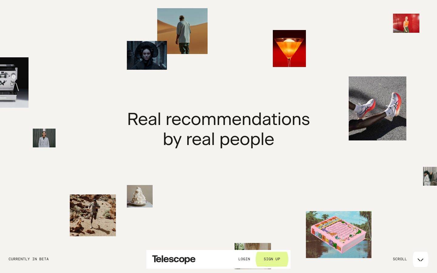
A minimal, editorial discovery interface built on a warm off-white canvas (#f4f3f0) with near-black ink, a large Beausite neo-grotesque headline, and DM Mono uppercase micro-labels. The landing page reads as a gallery — scattered photographic image tiles float around a single centered headline, with a floating white nav pill anchoring the bottom. Brand voltage is quiet and typographic: a lime SIGN UP chip is the only chromatic action, everything else is monochrome canvas + tracked mono captions. Corners are effectively square (0–2px), there are no shadows, and whitespace does almost all of the compositional work.
---
version: alpha
name: Telescope-design-analysis
description: "A minimal, editorial discovery interface built on a warm off-white canvas (#f4f3f0) with near-black ink, a large Beausite neo-grotesque headline, and DM Mono uppercase micro-labels. The landing page reads as a gallery — scattered photographic image tiles float around a single centered headline, with a floating white nav pill anchoring the bottom. Brand voltage is quiet and typographic: a lime SIGN UP chip is the only chromatic action, everything else is monochrome canvas + tracked mono captions. Corners are effectively square (0–2px), there are no shadows, and whitespace does almost all of the compositional work."

colors:
  ink: "#1a1915"
  ink-strong: "#000000"
  muted: "#82868e"
  muted-soft: "#9ca3af"
  hairline: "#cfcdc7"
  canvas: "#f4f3f0"
  surface: "#ffffff"
  accent-lime: "#e3f794"
  accent-red: "#d80000"
  accent-blue: "#0671ff"

typography:
  display:
    fontFamily: "Beausite, Inter, sans-serif"
    fontSize: 57px
    fontWeight: 400
    lineHeight: 1.15
    letterSpacing: "-0.0067em"
  heading:
    fontFamily: "Beausite, Inter, sans-serif"
    fontSize: 19px
    fontWeight: 400
    lineHeight: 1.15
    letterSpacing: "-0.02em"
  body:
    fontFamily: "Beausite, Inter, sans-serif"
    fontSize: 19px
    fontWeight: 400
    lineHeight: 1.15
    letterSpacing: "-0.02em"
  caption-uppercase:
    fontFamily: "DM Mono, ui-monospace, monospace"
    fontSize: 12.35px
    fontWeight: 400
    lineHeight: 1.1
    letterSpacing: "0.03em"

rounded:
  none: 0px
  sm: 2px

spacing:
  xxs: 5px
  xs: 10px
  sm: 14px
  md: 19px
  lg: 28px
  xl: 48px
  xxl: 71px
  section: 144px

components:
  top-nav:
    backgroundColor: "{colors.surface}"
    textColor: "{colors.ink}"
    typography: "{typography.caption-uppercase}"
    rounded: "{rounded.sm}"
  wordmark:
    backgroundColor: transparent
    textColor: "{colors.ink}"
    typography: "{typography.heading}"
  button-primary:
    backgroundColor: "{colors.accent-lime}"
    textColor: "{colors.ink}"
    typography: "{typography.caption-uppercase}"
    rounded: "{rounded.none}"
    padding: 0px 6.65px
  button-login:
    backgroundColor: transparent
    textColor: "{colors.ink}"
    typography: "{typography.caption-uppercase}"
    rounded: "{rounded.none}"
  hero-heading:
    backgroundColor: transparent
    textColor: "{colors.ink}"
    typography: "{typography.display}"
  body-paragraph:
    backgroundColor: transparent
    textColor: "{colors.muted}"
    typography: "{typography.body}"
  image-tile:
    backgroundColor: "{colors.surface}"
    rounded: "{rounded.none}"
  card:
    backgroundColor: "{colors.surface}"
    rounded: "{rounded.none}"
  input:
    backgroundColor: "{colors.canvas}"
    textColor: "{colors.ink}"
    typography: "{typography.body}"
    rounded: "{rounded.none}"
  collection-label:
    backgroundColor: transparent
    textColor: "{colors.muted}"
    typography: "{typography.caption-uppercase}"
---

## Overview

Telescope's landing surface is a quiet, gallery-style editorial interface. The whole page sits on a warm off-white canvas (`{colors.canvas}` — #f4f3f0), with near-black ink (`{colors.ink}` — #1a1915) for type. The composition is deliberately sparse: a single large centered headline ("Real recommendations by real people") set in **Beausite** at 57px, surrounded by scattered photographic image tiles that float at varying sizes across the viewport. There is no card scaffolding, no dividers, no shadows — whitespace carries the layout.

The type system is a two-voice split: **Beausite** (a neo-grotesque, weight 400, negative tracking) for the display headline and body copy, and **DM Mono** (weight 400, positive tracking, rendered uppercase) for every micro-label — "CURRENTLY IN BETA", "LOGIN", "SIGN UP", "SCROLL", "RESTAURANT". The mono captions give the page its tech-editorial texture; the Beausite headline gives it presence.

Brand voltage is intentionally minimal. The only chromatic action on the page is the lime **SIGN UP** chip (`{colors.accent-lime}` — #e3f794), which sits inside a floating white nav pill (`{colors.surface}` — #ffffff) pinned to the bottom of the viewport. A small set of accent hues (`{colors.accent-red}`, `{colors.accent-blue}`) appear rarely — mostly as artifacts within the scattered imagery, not as UI color.

Corners are effectively square. The measured radius is 2px on some elements and 0px on the core components — this is a hard-edged, magazine-grid aesthetic, not a soft-rounded SaaS one.

**Key Characteristics:**
- Warm off-white canvas (`{colors.canvas}` — #f4f3f0) as the universal page floor; white (`{colors.surface}`) reserved for the floating nav pill and image-tile mounts.
- Beausite neo-grotesque display headline at 57px, weight 400, with tight negative letter-spacing (-0.0067em) — restrained, not bombastic.
- DM Mono uppercase micro-labels (`{typography.caption-uppercase}`, 12.35px, +0.03em) for all navigation and metadata text.
- A single chromatic action: the lime `{component.button-primary}` (#e3f794) SIGN UP chip. Everything else is monochrome.
- Scattered photographic image tiles as the hero "content" — no illustration, no card chrome, no shadow. The photos ARE the design.
- Effectively square corners: `{rounded.none}` (0px) on core components, `{rounded.sm}` (2px) as the maximum measured radius.
- No shadows anywhere — the system is entirely flat.
- Floating white nav pill (`{component.top-nav}`) pinned to the bottom of the landing viewport carrying wordmark + LOGIN + SIGN UP.

## Colors

### Accent & Action
- **Accent Lime** (`{colors.accent-lime}` — #e3f794): The single action color — the SIGN UP chip. It is the only saturated UI moment on the page. Text on it stays `{colors.ink}`.
- **Accent Red** (`{colors.accent-red}` — #d80000): A rare accent (measured twice); appears as small highlight/imagery moments, not as core UI.
- **Accent Blue** (`{colors.accent-blue}` — #0671ff): A rare accent (measured twice); reads as a link/interaction hue but is used sparingly.

### Surface
- **Canvas** (`{colors.canvas}` — #f4f3f0): The warm off-white page floor covering the entire landing view.
- **Surface** (`{colors.surface}` — #ffffff): The floating nav pill and image-tile mounts.

### Text
- **Ink** (`{colors.ink}` — #1a1915): The dominant text color — the headline, wordmark, and all primary type. A warm near-black, not pure black.
- **Ink Strong** (`{colors.ink-strong}` — #000000): Pure black, measured once; treat as an edge/imagery tone rather than a text token.
- **Muted** (`{colors.muted}` — #82868e): Secondary text — the intro paragraph ("Telescope is a new platform to discover…"), collection labels, and metadata.
- **Muted Soft** (`{colors.muted-soft}` — #9ca3af): Tertiary text — the faintest captions and fine-print.
- **Hairline** (`{colors.hairline}` — #cfcdc7): The subtle divider / border tone against the warm canvas.

## Typography

### Font Family
The system runs **Beausite** for the display headline and body copy, and **DM Mono** for every micro-label. Beausite is a neo-grotesque sans (weight 400) with tight negative tracking. DM Mono is an open-source monospace (Google Fonts) used at weight 400 with positive tracking, rendered uppercase for labels.

The split is functional:
- Beausite (display + body, 400 weight, negative tracking) — headline, intro paragraph, collection titles.
- DM Mono (labels + UI, 400 weight, +0.03em, uppercase) — nav, buttons, metadata, "SCROLL".

### Hierarchy

| Token | Size | Weight | Line Height | Letter Spacing | Use |
|---|---|---|---|---|---|
| `{typography.display}` | 57px | 400 | 1.15 | -0.0067em | Hero headline ("Real recommendations by real people") — Beausite |
| `{typography.heading}` | 19px | 400 | 1.15 | -0.02em | Wordmark, collection titles, sub-headings — Beausite |
| `{typography.body}` | 19px | 400 | 1.15 | -0.02em | Intro paragraph, running body copy — Beausite |
| `{typography.caption-uppercase}` | 12.35px | 400 | 1.1 | +0.03em | Uppercase mono micro-labels — LOGIN, SIGN UP, SCROLL, CURRENTLY IN BETA, RESTAURANT — DM Mono |

### Principles
Beausite stays at weight 400 everywhere — the display headline gains presence from size (57px), not from bold weight. The negative tracking is part of the voice; Beausite set loose reads as off-brand. DM Mono is always uppercase and always tracked (+0.03em); it is the counterweight that gives the sparse page its editorial-tech texture. Never set body copy in DM Mono, and never set labels in Beausite.

### Note on Font Substitutes
**Beausite** is a commercial typeface (Fatype) and is not available as an open web font — it must not be bundled. A usable open-source substitute is **Inter** at weight 400 with roughly -0.01em letter-spacing, which approximates the neo-grotesque proportions and tight tracking; **Hanken Grotesk** is a close alternative. **DM Mono** is open-source (Google Fonts / SIL OFL) and can ship as-is.

## Layout

### Spacing System
- **Base rhythm:** measured spacing is irregular; the highest-frequency step is `{spacing.xs}` (10px), followed by `{spacing.md}` (19px).
- **Tokens:** `{spacing.xxs}` 5px · `{spacing.xs}` 10px · `{spacing.sm}` 14px · `{spacing.md}` 19px · `{spacing.lg}` 28px · `{spacing.xl}` 48px · `{spacing.xxl}` 71px · `{spacing.section}` 144px.
- **Micro-spacing:** `{spacing.xxs}`–`{spacing.sm}` (5–14px) inside labels, chips, and the nav pill.
- **Component gaps:** `{spacing.md}` (19px) is the common gap between grouped elements.
- **Large gutters:** `{spacing.xl}` (48px) and `{spacing.xxl}` (71px) separate the scattered image tiles from the centered headline.
- **Section rhythm:** `{spacing.section}` (144px) marks the largest measured vertical breaks between the landing scenes.

### Grid & Container
- **Composition:** Not a rigid column grid — the landing is a free-scatter layout where photographic tiles are positioned at varying x/y offsets around a centered headline block.
- **Centered headline:** The hero headline is optically centered in the viewport; image tiles anchor to the edges and mid-field.
- **Nav pill:** Horizontally centered, pinned to the bottom of the viewport, with the wordmark left, LOGIN + SIGN UP right.

### Whitespace Philosophy
Whitespace is the primary compositional tool. The scattered tiles read as a gallery precisely because they float in generous negative space, and the large 144px section breaks let each scene breathe. The system is deliberately under-filled — sparseness is the aesthetic, not an accident.

## Elevation & Depth

| Level | Treatment | Use |
|---|---|---|
| Flat | No shadow, no border | Canvas, headline, image tiles, nav pill |

The measured shadow set is empty — the system is entirely flat. Depth, where it exists, comes from the scattered image tiles overlapping and sitting at different scales, not from elevation tokens. There are no drop shadows, no borders on the core surfaces, and no glass/neumorphic treatments.

### Decorative Depth
- The floating nav pill reads as "above" the canvas purely through its white fill (`{colors.surface}`) against the warm off-white (`{colors.canvas}`) — a color-contrast lift, not a shadow.
- Photographic tiles carry their own imagery; any depth within them is content, not a system token.

## Shapes

### Border Radius Scale

| Token | Value | Use |
|---|---|---|
| `{rounded.none}` | 0px | Core components — buttons, cards, image tiles, inputs. The system is hard-edged. |
| `{rounded.sm}` | 2px | The maximum measured radius; a barely-there softening on the nav pill / small chips. |

### Photography Geometry
Image tiles are rectangular with square corners (`{rounded.none}`), shown at native aspect ratios and varying scales across the scatter field. There is no circular avatar treatment on the captured landing page.

## Components

### Navigation

**`top-nav`** — A floating white nav pill pinned to the bottom-center of the landing viewport. Background `{colors.surface}` (#ffffff), rounded `{rounded.sm}` (2px). Carries the **Telescope** wordmark at left, and LOGIN + SIGN UP at right. Labels use `{typography.caption-uppercase}` (DM Mono, uppercase, tracked). The pill lifts off the canvas via white-on-off-white contrast — no shadow.

**`wordmark`** — The "Telescope" logotype in `{colors.ink}`, set in `{typography.heading}` (Beausite 19px). Anchors the left of the nav pill.

### Buttons

**`button-primary`** — The SIGN UP chip and the only chromatic action on the page. Background `{colors.accent-lime}` (#e3f794), text `{colors.ink}`, type `{typography.caption-uppercase}` (DM Mono uppercase), rounded `{rounded.none}` (0px), padding 0px × 6.65px (derived from the measured button padding). Square corners, flat.

**`button-login`** — The LOGIN control — text-only, no fill. Background transparent, text `{colors.ink}`, type `{typography.caption-uppercase}`, rounded `{rounded.none}`.

### Content

**`hero-heading`** — The centered display headline ("Real recommendations by real people"). Background transparent, text `{colors.ink}`, type `{typography.display}` (Beausite 57px / 400 / -0.0067em). The compositional anchor of the landing scene.

**`body-paragraph`** — Running intro copy ("Telescope is a new platform to discover the best recommendations…"). Background transparent, text `{colors.muted}` (#82868e — the paragraph reads as a muted gray, not full ink), type `{typography.body}` (Beausite 19px).

**`image-tile`** — A rectangular photographic tile floated in the scatter field. Background `{colors.surface}` (mount), rounded `{rounded.none}`, no shadow. Rendered at native aspect ratios and varying sizes.

**`card`** — Generic content container mounting collection/recommendation entries. Background `{colors.surface}` (#ffffff), rounded `{rounded.none}`, no shadow.

**`collection-label`** — Small metadata labels ("Collection", "RESTAURANT", "SEVENTH", counts). Background transparent, text `{colors.muted}`, type `{typography.caption-uppercase}`.

### Inputs

**`input`** — Text input surface. Background `{colors.canvas}` (#f4f3f0 — a warm off-white fill), text `{colors.ink}`, type `{typography.body}`, rounded `{rounded.none}`. No border/shadow measured; the fill differentiates the field from the surrounding surface.

## Do's and Don'ts

### Do
- Keep the canvas warm off-white (`{colors.canvas}` — #f4f3f0), not pure white. The warmth is part of the editorial feel.
- Reserve `{colors.accent-lime}` for the single primary action (SIGN UP). One chromatic moment per view.
- Set every micro-label in DM Mono uppercase with +0.03em tracking (`{typography.caption-uppercase}`). It is the system's texture.
- Let the display headline gain presence from size (57px), not weight — Beausite stays at 400.
- Keep corners square (`{rounded.none}`); allow at most 2px (`{rounded.sm}`) softening on the nav pill.
- Use generous whitespace and the 144px section rhythm to let scattered image tiles breathe.
- Keep the interface flat — no shadows. Depth comes from white-on-off-white and photo scale.

### Don't
- Don't add drop shadows to cards, tiles, or the nav pill — the measured system has zero shadows.
- Don't bold Beausite for emphasis; scale up instead.
- Don't set body copy or headlines in DM Mono, and don't set labels in Beausite.
- Don't introduce large rounded radii — anything beyond 2px reads as off-brand for this hard-edged grid.
- Don't scatter the accent colors (`{colors.accent-red}`, `{colors.accent-blue}`) across UI; they are rare, imagery-adjacent moments, not action colors.
- Don't fill the canvas — the sparse, gallery-like negative space is the design.

## Responsive Behavior

The reference screenshots show a desktop landing view plus a tall full-scroll composite. Precise breakpoint values were not measured, so the following describes observed intent rather than confirmed tokens.

### Breakpoints

| Name | Width | Key Changes |
|---|---|---|
| Desktop | (observed) | Full scatter field with headline centered; image tiles at edges and mid-field; nav pill pinned bottom-center |
| Mobile | (not measured) | Scatter field expected to collapse toward a tighter stack; headline scales down from 57px; nav pill spans width |

### Touch Targets
- `{component.button-primary}` (SIGN UP) padding is tight (0px × 6.65px measured); on touch it would need a larger effective hit area than the visual chip.
- Nav-pill labels (`{typography.caption-uppercase}` at 12.35px) are small; tap padding should be expanded on mobile.

### Collapsing Strategy
- The free-scatter tile layout would need to reflow into a stacked or tighter arrangement on narrow viewports; exact rules were not captured.
- The bottom nav pill remains the persistent anchor across scroll.

### Image Behavior
- Image tiles retain native aspect ratios and scale proportionally; corners stay square (`{rounded.none}`).

## Iteration Guide

1. Focus on ONE component at a time. Reference its YAML key directly (`{component.button-primary}`, `{component.top-nav}`).
2. Variants of an existing component live as separate entries in `components:`.
3. Use `{token.refs}` everywhere — never inline hex.
4. Never document hover. Default and Active/Pressed states only.
5. The lime SIGN UP chip is the only chromatic action — keep the rest monochrome.
6. Keep corners square; keep the interface flat (no shadows).
7. When in doubt about emphasis: bigger Beausite before bolder Beausite.

## Known Gaps

- **Beausite is a commercial typeface** and was not flagged in `fonts_licensed`, but it cannot legally ship as a web font; an open-source substitute (Inter / Hanken Grotesk) is documented in the Typography section. Exact Beausite cut (Classic / Grand / Fit) was not identified.
- Only the landing page was captured; interior collection, profile, and booking surfaces are out of scope.
- Button padding was measured as an unusual `0px 6.65px`; the vertical hit area and any min-height were not captured — the value is carried through as measured.
- No hover, focus, active, or disabled states were measured for any control; only default states are documented.
- The scatter-layout grid has no measured column system; responsive breakpoints and mobile reflow rules are inferred, not confirmed.
- Accent hues `{colors.accent-red}` (#d80000) and `{colors.accent-blue}` (#0671ff) appeared at very low frequency (twice each) and may be imagery-derived rather than deliberate UI tokens.
- Near-black neutrals `#2f2f2f`, `#222222`, and `#000000` (`{colors.ink-strong}`) each appeared once and likely originate from photographic tiles rather than the UI palette.
- No shadow, animation, or transition timings were measured (empty shadow set); motion behavior of the scatter field and scroll is out of scope.

<!-- Documented by Duply · real-world design systems as ready-to-use DESIGN.md for AI coding agents · https://duply.ai/telescope/design-md -->
Color Palette
Accent
Neutrals
Typography
Spacing & Shape
Spacing
| Name | Value | Preview |
|---|---|---|
| xxs | 5px | |
| xs | 10px | |
| sm | 14px | |
| md | 19px | |
| lg | 28px | |
| xl | 48px | |
| xxl | 71px | |
| section | 144px |
Border Radius
| Name | Value | Preview |
|---|---|---|
| none | 0px | |
| sm | 2px |
FAQ
- What colors does Telescope use?
- Telescope's core palette includes #1a1915, #000000, #82868e, #9ca3af, #cfcdc7. The full color set with usage roles (canvas, ink, surfaces, accent, semantic) is documented in the Telescope DESIGN.md.
- What font does Telescope use?
- Telescope's primary typeface is Beausite. The complete type scale (sizes, weights, line-height and letter-spacing per role), with an open substitute where the original is licensed, is documented in the DESIGN.md.
- What is the Telescope design system?
- A minimal, editorial discovery interface built on a warm off-white canvas (#f4f3f0) with near-black ink, a large Beausite neo-grotesque headline, and DM Mono uppercase micro-labels. The landing page reads as a gallery — scattered photographic image tiles float around a single centered headline
Get this as a working kit
- A complete production-stack template, styled like Telescope, fully built and wired.
- One-time payment and the codebase is yours. No platform fees, no subscription.
Open it with Claude Code, Cursor, or any coding agent and build in plain language, then ship a complete web app.
- Your private DESIGN.md
- Marketing pages, blog, SEO & legal
- Email capture, newsletter & contact
- Accept payments (Stripe)
- Analytics (GA4 + PostHog)
- One-click deploy
- Auth, login & roles
- A full app dashboard, when you grow
More like this
---
version: alpha
name: Telescope-design-analysis
description: "A minimal, editorial discovery interface built on a warm off-white canvas (#f4f3f0) with near-black ink, a large Beausite neo-grotesque headline, and DM Mono uppercase micro-labels. The landing page reads as a gallery — scattered photographic image tiles float around a single centered headline, with a floating white nav pill anchoring the bottom. Brand voltage is quiet and typographic: a lime SIGN UP chip is the only chromatic action, everything else is monochrome canvas + tracked mono captions. Corners are effectively square (0–2px), there are no shadows, and whitespace does almost all of the compositional work."

colors:
  ink: "#1a1915"
  ink-strong: "#000000"
  muted: "#82868e"
  muted-soft: "#9ca3af"
  hairline: "#cfcdc7"
  canvas: "#f4f3f0"
  surface: "#ffffff"
  accent-lime: "#e3f794"
  accent-red: "#d80000"
  accent-blue: "#0671ff"

typography:
  display:
    fontFamily: "Beausite, Inter, sans-serif"
    fontSize: 57px
    fontWeight: 400
    lineHeight: 1.15
    letterSpacing: "-0.0067em"
  heading:
    fontFamily: "Beausite, Inter, sans-serif"
    fontSize: 19px
    fontWeight: 400
    lineHeight: 1.15
    letterSpacing: "-0.02em"
  body:
    fontFamily: "Beausite, Inter, sans-serif"
    fontSize: 19px
    fontWeight: 400
    lineHeight: 1.15
    letterSpacing: "-0.02em"
  caption-uppercase:
    fontFamily: "DM Mono, ui-monospace, monospace"
    fontSize: 12.35px
    fontWeight: 400
    lineHeight: 1.1
    letterSpacing: "0.03em"

rounded:
  none: 0px
  sm: 2px

spacing:
  xxs: 5px
  xs: 10px
  sm: 14px
  md: 19px
  lg: 28px
  xl: 48px
  xxl: 71px
  section: 144px

components:
  top-nav:
    backgroundColor: "{colors.surface}"
    textColor: "{colors.ink}"
    typography: "{typography.caption-uppercase}"
    rounded: "{rounded.sm}"
  wordmark:
    backgroundColor: transparent
    textColor: "{colors.ink}"
    typography: "{typography.heading}"
  button-primary:
    backgroundColor: "{colors.accent-lime}"
    textColor: "{colors.ink}"
    typography: "{typography.caption-uppercase}"
    rounded: "{rounded.none}"
    padding: 0px 6.65px
  button-login:
    backgroundColor: transparent
    textColor: "{colors.ink}"
    typography: "{typography.caption-uppercase}"
    rounded: "{rounded.none}"
  hero-heading:
    backgroundColor: transparent
    textColor: "{colors.ink}"
    typography: "{typography.display}"
  body-paragraph:
    backgroundColor: transparent
    textColor: "{colors.muted}"
    typography: "{typography.body}"
  image-tile:
    backgroundColor: "{colors.surface}"
    rounded: "{rounded.none}"
  card:
    backgroundColor: "{colors.surface}"
    rounded: "{rounded.none}"
  input:
    backgroundColor: "{colors.canvas}"
    textColor: "{colors.ink}"
    typography: "{typography.body}"
    rounded: "{rounded.none}"
  collection-label:
    backgroundColor: transparent
    textColor: "{colors.muted}"
    typography: "{typography.caption-uppercase}"
---

## Overview

Telescope's landing surface is a quiet, gallery-style editorial interface. The whole page sits on a warm off-white canvas (`{colors.canvas}` — #f4f3f0), with near-black ink (`{colors.ink}` — #1a1915) for type. The composition is deliberately sparse: a single large centered headline ("Real recommendations by real people") set in **Beausite** at 57px, surrounded by scattered photographic image tiles that float at varying sizes across the viewport. There is no card scaffolding, no dividers, no shadows — whitespace carries the layout.

The type system is a two-voice split: **Beausite** (a neo-grotesque, weight 400, negative tracking) for the display headline and body copy, and **DM Mono** (weight 400, positive tracking, rendered uppercase) for every micro-label — "CURRENTLY IN BETA", "LOGIN", "SIGN UP", "SCROLL", "RESTAURANT". The mono captions give the page its tech-editorial texture; the Beausite headline gives it presence.

Brand voltage is intentionally minimal. The only chromatic action on the page is the lime **SIGN UP** chip (`{colors.accent-lime}` — #e3f794), which sits inside a floating white nav pill (`{colors.surface}` — #ffffff) pinned to the bottom of the viewport. A small set of accent hues (`{colors.accent-red}`, `{colors.accent-blue}`) appear rarely — mostly as artifacts within the scattered imagery, not as UI color.

Corners are effectively square. The measured radius is 2px on some elements and 0px on the core components — this is a hard-edged, magazine-grid aesthetic, not a soft-rounded SaaS one.

**Key Characteristics:**
- Warm off-white canvas (`{colors.canvas}` — #f4f3f0) as the universal page floor; white (`{colors.surface}`) reserved for the floating nav pill and image-tile mounts.
- Beausite neo-grotesque display headline at 57px, weight 400, with tight negative letter-spacing (-0.0067em) — restrained, not bombastic.
- DM Mono uppercase micro-labels (`{typography.caption-uppercase}`, 12.35px, +0.03em) for all navigation and metadata text.
- A single chromatic action: the lime `{component.button-primary}` (#e3f794) SIGN UP chip. Everything else is monochrome.
- Scattered photographic image tiles as the hero "content" — no illustration, no card chrome, no shadow. The photos ARE the design.
- Effectively square corners: `{rounded.none}` (0px) on core components, `{rounded.sm}` (2px) as the maximum measured radius.
- No shadows anywhere — the system is entirely flat.
- Floating white nav pill (`{component.top-nav}`) pinned to the bottom of the landing viewport carrying wordmark + LOGIN + SIGN UP.

## Colors

### Accent & Action
- **Accent Lime** (`{colors.accent-lime}` — #e3f794): The single action color — the SIGN UP chip. It is the only saturated UI moment on the page. Text on it stays `{colors.ink}`.
- **Accent Red** (`{colors.accent-red}` — #d80000): A rare accent (measured twice); appears as small highlight/imagery moments, not as core UI.
- **Accent Blue** (`{colors.accent-blue}` — #0671ff): A rare accent (measured twice); reads as a link/interaction hue but is used sparingly.

### Surface
- **Canvas** (`{colors.canvas}` — #f4f3f0): The warm off-white page floor covering the entire landing view.
- **Surface** (`{colors.surface}` — #ffffff): The floating nav pill and image-tile mounts.

### Text
- **Ink** (`{colors.ink}` — #1a1915): The dominant text color — the headline, wordmark, and all primary type. A warm near-black, not pure black.
- **Ink Strong** (`{colors.ink-strong}` — #000000): Pure black, measured once; treat as an edge/imagery tone rather than a text token.
- **Muted** (`{colors.muted}` — #82868e): Secondary text — the intro paragraph ("Telescope is a new platform to discover…"), collection labels, and metadata.
- **Muted Soft** (`{colors.muted-soft}` — #9ca3af): Tertiary text — the faintest captions and fine-print.
- **Hairline** (`{colors.hairline}` — #cfcdc7): The subtle divider / border tone against the warm canvas.

## Typography

### Font Family
The system runs **Beausite** for the display headline and body copy, and **DM Mono** for every micro-label. Beausite is a neo-grotesque sans (weight 400) with tight negative tracking. DM Mono is an open-source monospace (Google Fonts) used at weight 400 with positive tracking, rendered uppercase for labels.

The split is functional:
- Beausite (display + body, 400 weight, negative tracking) — headline, intro paragraph, collection titles.
- DM Mono (labels + UI, 400 weight, +0.03em, uppercase) — nav, buttons, metadata, "SCROLL".

### Hierarchy

| Token | Size | Weight | Line Height | Letter Spacing | Use |
|---|---|---|---|---|---|
| `{typography.display}` | 57px | 400 | 1.15 | -0.0067em | Hero headline ("Real recommendations by real people") — Beausite |
| `{typography.heading}` | 19px | 400 | 1.15 | -0.02em | Wordmark, collection titles, sub-headings — Beausite |
| `{typography.body}` | 19px | 400 | 1.15 | -0.02em | Intro paragraph, running body copy — Beausite |
| `{typography.caption-uppercase}` | 12.35px | 400 | 1.1 | +0.03em | Uppercase mono micro-labels — LOGIN, SIGN UP, SCROLL, CURRENTLY IN BETA, RESTAURANT — DM Mono |

### Principles
Beausite stays at weight 400 everywhere — the display headline gains presence from size (57px), not from bold weight. The negative tracking is part of the voice; Beausite set loose reads as off-brand. DM Mono is always uppercase and always tracked (+0.03em); it is the counterweight that gives the sparse page its editorial-tech texture. Never set body copy in DM Mono, and never set labels in Beausite.

### Note on Font Substitutes
**Beausite** is a commercial typeface (Fatype) and is not available as an open web font — it must not be bundled. A usable open-source substitute is **Inter** at weight 400 with roughly -0.01em letter-spacing, which approximates the neo-grotesque proportions and tight tracking; **Hanken Grotesk** is a close alternative. **DM Mono** is open-source (Google Fonts / SIL OFL) and can ship as-is.

## Layout

### Spacing System
- **Base rhythm:** measured spacing is irregular; the highest-frequency step is `{spacing.xs}` (10px), followed by `{spacing.md}` (19px).
- **Tokens:** `{spacing.xxs}` 5px · `{spacing.xs}` 10px · `{spacing.sm}` 14px · `{spacing.md}` 19px · `{spacing.lg}` 28px · `{spacing.xl}` 48px · `{spacing.xxl}` 71px · `{spacing.section}` 144px.
- **Micro-spacing:** `{spacing.xxs}`–`{spacing.sm}` (5–14px) inside labels, chips, and the nav pill.
- **Component gaps:** `{spacing.md}` (19px) is the common gap between grouped elements.
- **Large gutters:** `{spacing.xl}` (48px) and `{spacing.xxl}` (71px) separate the scattered image tiles from the centered headline.
- **Section rhythm:** `{spacing.section}` (144px) marks the largest measured vertical breaks between the landing scenes.

### Grid & Container
- **Composition:** Not a rigid column grid — the landing is a free-scatter layout where photographic tiles are positioned at varying x/y offsets around a centered headline block.
- **Centered headline:** The hero headline is optically centered in the viewport; image tiles anchor to the edges and mid-field.
- **Nav pill:** Horizontally centered, pinned to the bottom of the viewport, with the wordmark left, LOGIN + SIGN UP right.

### Whitespace Philosophy
Whitespace is the primary compositional tool. The scattered tiles read as a gallery precisely because they float in generous negative space, and the large 144px section breaks let each scene breathe. The system is deliberately under-filled — sparseness is the aesthetic, not an accident.

## Elevation & Depth

| Level | Treatment | Use |
|---|---|---|
| Flat | No shadow, no border | Canvas, headline, image tiles, nav pill |

The measured shadow set is empty — the system is entirely flat. Depth, where it exists, comes from the scattered image tiles overlapping and sitting at different scales, not from elevation tokens. There are no drop shadows, no borders on the core surfaces, and no glass/neumorphic treatments.

### Decorative Depth
- The floating nav pill reads as "above" the canvas purely through its white fill (`{colors.surface}`) against the warm off-white (`{colors.canvas}`) — a color-contrast lift, not a shadow.
- Photographic tiles carry their own imagery; any depth within them is content, not a system token.

## Shapes

### Border Radius Scale

| Token | Value | Use |
|---|---|---|
| `{rounded.none}` | 0px | Core components — buttons, cards, image tiles, inputs. The system is hard-edged. |
| `{rounded.sm}` | 2px | The maximum measured radius; a barely-there softening on the nav pill / small chips. |

### Photography Geometry
Image tiles are rectangular with square corners (`{rounded.none}`), shown at native aspect ratios and varying scales across the scatter field. There is no circular avatar treatment on the captured landing page.

## Components

### Navigation

**`top-nav`** — A floating white nav pill pinned to the bottom-center of the landing viewport. Background `{colors.surface}` (#ffffff), rounded `{rounded.sm}` (2px). Carries the **Telescope** wordmark at left, and LOGIN + SIGN UP at right. Labels use `{typography.caption-uppercase}` (DM Mono, uppercase, tracked). The pill lifts off the canvas via white-on-off-white contrast — no shadow.

**`wordmark`** — The "Telescope" logotype in `{colors.ink}`, set in `{typography.heading}` (Beausite 19px). Anchors the left of the nav pill.

### Buttons

**`button-primary`** — The SIGN UP chip and the only chromatic action on the page. Background `{colors.accent-lime}` (#e3f794), text `{colors.ink}`, type `{typography.caption-uppercase}` (DM Mono uppercase), rounded `{rounded.none}` (0px), padding 0px × 6.65px (derived from the measured button padding). Square corners, flat.

**`button-login`** — The LOGIN control — text-only, no fill. Background transparent, text `{colors.ink}`, type `{typography.caption-uppercase}`, rounded `{rounded.none}`.

### Content

**`hero-heading`** — The centered display headline ("Real recommendations by real people"). Background transparent, text `{colors.ink}`, type `{typography.display}` (Beausite 57px / 400 / -0.0067em). The compositional anchor of the landing scene.

**`body-paragraph`** — Running intro copy ("Telescope is a new platform to discover the best recommendations…"). Background transparent, text `{colors.muted}` (#82868e — the paragraph reads as a muted gray, not full ink), type `{typography.body}` (Beausite 19px).

**`image-tile`** — A rectangular photographic tile floated in the scatter field. Background `{colors.surface}` (mount), rounded `{rounded.none}`, no shadow. Rendered at native aspect ratios and varying sizes.

**`card`** — Generic content container mounting collection/recommendation entries. Background `{colors.surface}` (#ffffff), rounded `{rounded.none}`, no shadow.

**`collection-label`** — Small metadata labels ("Collection", "RESTAURANT", "SEVENTH", counts). Background transparent, text `{colors.muted}`, type `{typography.caption-uppercase}`.

### Inputs

**`input`** — Text input surface. Background `{colors.canvas}` (#f4f3f0 — a warm off-white fill), text `{colors.ink}`, type `{typography.body}`, rounded `{rounded.none}`. No border/shadow measured; the fill differentiates the field from the surrounding surface.

## Do's and Don'ts

### Do
- Keep the canvas warm off-white (`{colors.canvas}` — #f4f3f0), not pure white. The warmth is part of the editorial feel.
- Reserve `{colors.accent-lime}` for the single primary action (SIGN UP). One chromatic moment per view.
- Set every micro-label in DM Mono uppercase with +0.03em tracking (`{typography.caption-uppercase}`). It is the system's texture.
- Let the display headline gain presence from size (57px), not weight — Beausite stays at 400.
- Keep corners square (`{rounded.none}`); allow at most 2px (`{rounded.sm}`) softening on the nav pill.
- Use generous whitespace and the 144px section rhythm to let scattered image tiles breathe.
- Keep the interface flat — no shadows. Depth comes from white-on-off-white and photo scale.

### Don't
- Don't add drop shadows to cards, tiles, or the nav pill — the measured system has zero shadows.
- Don't bold Beausite for emphasis; scale up instead.
- Don't set body copy or headlines in DM Mono, and don't set labels in Beausite.
- Don't introduce large rounded radii — anything beyond 2px reads as off-brand for this hard-edged grid.
- Don't scatter the accent colors (`{colors.accent-red}`, `{colors.accent-blue}`) across UI; they are rare, imagery-adjacent moments, not action colors.
- Don't fill the canvas — the sparse, gallery-like negative space is the design.

## Responsive Behavior

The reference screenshots show a desktop landing view plus a tall full-scroll composite. Precise breakpoint values were not measured, so the following describes observed intent rather than confirmed tokens.

### Breakpoints

| Name | Width | Key Changes |
|---|---|---|
| Desktop | (observed) | Full scatter field with headline centered; image tiles at edges and mid-field; nav pill pinned bottom-center |
| Mobile | (not measured) | Scatter field expected to collapse toward a tighter stack; headline scales down from 57px; nav pill spans width |

### Touch Targets
- `{component.button-primary}` (SIGN UP) padding is tight (0px × 6.65px measured); on touch it would need a larger effective hit area than the visual chip.
- Nav-pill labels (`{typography.caption-uppercase}` at 12.35px) are small; tap padding should be expanded on mobile.

### Collapsing Strategy
- The free-scatter tile layout would need to reflow into a stacked or tighter arrangement on narrow viewports; exact rules were not captured.
- The bottom nav pill remains the persistent anchor across scroll.

### Image Behavior
- Image tiles retain native aspect ratios and scale proportionally; corners stay square (`{rounded.none}`).

## Iteration Guide

1. Focus on ONE component at a time. Reference its YAML key directly (`{component.button-primary}`, `{component.top-nav}`).
2. Variants of an existing component live as separate entries in `components:`.
3. Use `{token.refs}` everywhere — never inline hex.
4. Never document hover. Default and Active/Pressed states only.
5. The lime SIGN UP chip is the only chromatic action — keep the rest monochrome.
6. Keep corners square; keep the interface flat (no shadows).
7. When in doubt about emphasis: bigger Beausite before bolder Beausite.

## Known Gaps

- **Beausite is a commercial typeface** and was not flagged in `fonts_licensed`, but it cannot legally ship as a web font; an open-source substitute (Inter / Hanken Grotesk) is documented in the Typography section. Exact Beausite cut (Classic / Grand / Fit) was not identified.
- Only the landing page was captured; interior collection, profile, and booking surfaces are out of scope.
- Button padding was measured as an unusual `0px 6.65px`; the vertical hit area and any min-height were not captured — the value is carried through as measured.
- No hover, focus, active, or disabled states were measured for any control; only default states are documented.
- The scatter-layout grid has no measured column system; responsive breakpoints and mobile reflow rules are inferred, not confirmed.
- Accent hues `{colors.accent-red}` (#d80000) and `{colors.accent-blue}` (#0671ff) appeared at very low frequency (twice each) and may be imagery-derived rather than deliberate UI tokens.
- Near-black neutrals `#2f2f2f`, `#222222`, and `#000000` (`{colors.ink-strong}`) each appeared once and likely originate from photographic tiles rather than the UI palette.
- No shadow, animation, or transition timings were measured (empty shadow set); motion behavior of the scatter field and scroll is out of scope.

<!-- Documented by Duply · real-world design systems as ready-to-use DESIGN.md for AI coding agents · https://duply.ai/telescope/design-md -->