Substack
A reader-first publishing interface built on a white canvas with warm cream surfaces, a single hot red-orange brand accent for every call-to-action, and a serif display face (Cahuenga) that gives the product its editorial, "magazine-meets-app" voice. The system is quiet and content-forward — a left rail of navigation, a centered feed of posts, and a right rail of sign-up affordances — punctuated by orange CTAs and soft 12px-rounded cards. Brand voltage comes almost entirely from the red-orange accent and the serif headline, not from color variety.
---
version: alpha
name: Substack-design-analysis
description: A reader-first publishing interface built on a white canvas with warm cream surfaces, a single hot red-orange brand accent for every call-to-action, and a serif display face (Cahuenga) that gives the product its editorial, "magazine-meets-app" voice. The system is quiet and content-forward — a left rail of navigation, a centered feed of posts, and a right rail of sign-up affordances — punctuated by orange CTAs and soft 12px-rounded cards. Brand voltage comes almost entirely from the red-orange accent and the serif headline, not from color variety.
colors:
canvas: "#ffffff"
cream: "#fffdf9"
surface-cream: "#f6f4ef"
surface-cream-alt: "#f3efe8"
ink: "#363737"
ink-deep: "#161613"
ink-darker: "#22221e"
ink-black: "#000000"
body: "#2b2b27"
muted: "#7d858b"
muted-soft: "#777777"
muted-cool: "#a3a7aa"
neutral: "#bebdb8"
hairline: "#c8c8c8"
accent: "#f2312c"
link: "#005591"
success: "#1bc47d"
on-accent: "#ffffff"
typography:
display:
fontFamily: "Cahuenga, Georgia, serif"
fontSize: 32px
fontWeight: 500
lineHeight: 1.24
letterSpacing: normal
heading:
fontFamily: "SF Pro Display, -apple-system, BlinkMacSystemFont, sans-serif"
fontSize: 20px
fontWeight: 800
lineHeight: 1.2
letterSpacing: normal
label:
fontFamily: "SF Pro Display, -apple-system, BlinkMacSystemFont, sans-serif"
fontSize: 16px
fontWeight: 500
lineHeight: 1.2
letterSpacing: normal
rounded:
md: 8px
lg: 12px
spacing:
xxs: 4px
xs: 8px
sm: 12px
md: 16px
lg: 20px
xl: 24px
xxl: 40px
components:
button-primary:
backgroundColor: "{colors.accent}"
textColor: "{colors.on-accent}"
typography: "{typography.label}"
rounded: "{rounded.lg}"
button-secondary:
backgroundColor: "{colors.canvas}"
textColor: "{colors.ink}"
typography: "{typography.label}"
rounded: "{rounded.lg}"
subscribe-link:
backgroundColor: transparent
textColor: "{colors.accent}"
typography: "{typography.label}"
create-button:
backgroundColor: "{colors.accent}"
textColor: "{colors.on-accent}"
typography: "{typography.label}"
rounded: "{rounded.lg}"
search-input:
backgroundColor: "{colors.canvas}"
textColor: "{colors.ink}"
typography: "{typography.label}"
rounded: "{rounded.lg}"
text-input:
backgroundColor: "{colors.canvas}"
textColor: "{colors.ink}"
typography: "{typography.label}"
rounded: "{rounded.lg}"
sidebar-nav:
backgroundColor: "{colors.canvas}"
textColor: "{colors.ink}"
typography: "{typography.label}"
signup-card:
backgroundColor: "{colors.canvas}"
textColor: "{colors.ink}"
typography: "{typography.heading}"
rounded: "{rounded.lg}"
promo-card:
backgroundColor: "{colors.surface-cream}"
textColor: "{colors.ink}"
typography: "{typography.display}"
rounded: "{rounded.lg}"
feed-post-card:
backgroundColor: "{colors.canvas}"
textColor: "{colors.ink}"
typography: "{typography.label}"
rounded: "{rounded.lg}"
post-media:
backgroundColor: "{colors.canvas}"
textColor: "{colors.ink}"
rounded: "{rounded.md}"
---
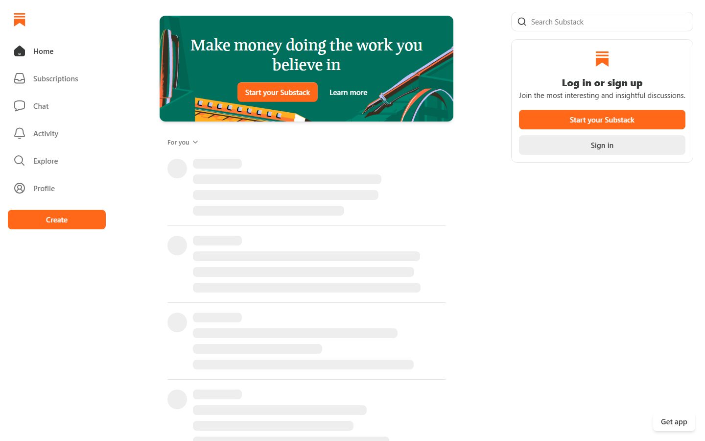
## Overview
Substack's logged-in landing surface is a **reader-first, three-column app shell** — a left navigation rail, a centered feed of posts, and a right rail carrying search and a sign-up card. The whole interface sits on a white canvas (`{colors.canvas}` — #ffffff) with warm cream accents (`{colors.cream}` — #fffdf9, `{colors.surface-cream}` — #f6f4ef) for promotional cards, and almost all text rendered in a soft near-black (`{colors.ink}` — #363737) rather than pure black.
The brand voice comes from two places: the **red-orange accent** (`{colors.accent}` — #f2312c) that paints every primary CTA ("Start your Substack", "Create", "Subscribe"), and the **Cahuenga serif display face** that sets headlines like "Make money doing the work you believe in". This serif-over-app pairing is what makes Substack feel editorial rather than purely SaaS — the product chrome is plain system sans (SF Pro Display), but the headline moments lean literary.
Everything is content-forward and low-chrome: soft 12px-rounded cards (`{rounded.lg}`), thin hairline dividers between posts, and generous but not lavish spacing. There is no dark mode surface and no heavy shadow language — depth is carried by a single faint inset border on buttons and a soft drop shadow on a couple of elevated elements.
**Key Characteristics:**
- White canvas with a single hot accent — `{colors.accent}` (#f2312c) is the only saturated color and is reserved for CTAs and interactive emphasis.
- Serif display headlines (`Cahuenga`, weight 500, 32px) over a sans system UI (`SF Pro Display`). The serif is the brand's editorial signature.
- Warm cream promotional cards (`{colors.surface-cream}` — #f6f4ef) break up the white feed without introducing a second hue.
- Soft text — primary text is `{colors.ink}` (#363737), not #000000; secondary text steps down to `{colors.muted}` (#7d858b).
- 12px corner radius (`{rounded.lg}`) on buttons, inputs, and cards; 8px (`{rounded.md}`) on inline media thumbnails.
- Three-column shell: left nav rail, centered post feed, right sign-up rail.
- Almost no shadow — depth is a 1px inset hairline on buttons plus an occasional soft drop shadow.
## Colors
### Brand & Accent
- **Accent** (`{colors.accent}` — #f2312c): The single saturated brand color — a hot red-orange. Used on every primary CTA ("Start your Substack", "Create"), on "Subscribe" links, and on the wordmark/logo mark. This is the only high-voltage color in the system.
- **Link** (`{colors.link}` — #005591): A muted blue used for inline hyperlinks inside post bodies (e.g., linked publication and author names in the feed).
- **Success** (`{colors.success}` — #1bc47d): A green used sparingly for positive/confirmation states in product UI.
### Surface
- **Canvas** (`{colors.canvas}` — #ffffff): The default page floor and the fill of nav, feed, cards, and inputs.
- **Cream** (`{colors.cream}` — #fffdf9): A barely-warm off-white used on the largest soft surfaces.
- **Surface Cream** (`{colors.surface-cream}` — #f6f4ef): The warm card fill behind in-feed promotional cards ("You made it, you own it").
- **Surface Cream Alt** (`{colors.surface-cream-alt}` — #f3efe8): A slightly deeper cream tone for nested or alternate warm surfaces.
### Text
- **Ink** (`{colors.ink}` — #363737): The primary text color — a soft near-black used for body and most headings.
- **Ink Deep** (`{colors.ink-deep}` — #161613) / **Ink Darker** (`{colors.ink-darker}` — #22221e) / **Body** (`{colors.body}` — #2b2b27): Deeper near-black tones used on the most emphatic headlines and dark type.
- **Ink Black** (`{colors.ink-black}` — #000000): True black, used minimally for maximum-contrast glyphs.
- **Muted** (`{colors.muted}` — #7d858b): Secondary text — timestamps, sub-labels, meta rows.
- **Muted Soft** (`{colors.muted-soft}` — #777777) / **Muted Cool** (`{colors.muted-cool}` — #a3a7aa): Tertiary text and disabled/placeholder tones.
- **On Accent** (`{colors.on-accent}` — #ffffff): Text on orange CTAs.
### Lines & Neutrals
- **Neutral** (`{colors.neutral}` — #bebdb8): A warm gray used on skeleton-loader placeholder bars and muted iconography.
- **Hairline** (`{colors.hairline}` — #c8c8c8): The 1px divider tone between feed posts and on input borders.
## Typography
### Font Family
The system pairs two faces. **Cahuenga** — a serif display face — carries the editorial headline moments (hero headlines, promo card titles). **SF Pro Display** — Apple's system sans — carries the UI: nav labels, post meta, buttons, and most running text. The contrast between a literary serif and a neutral system sans is the core of Substack's "publishing platform, not a dashboard" feel.
The split is functional:
- Cahuenga (serif, weight 500, 32px, line-height 1.24) — display headlines and promo titles.
- SF Pro Display (sans, weight 800 at 20px for headings; lighter weights for labels) — all UI text and body.
### Hierarchy
| Token | Size | Weight | Line Height | Letter Spacing | Use |
|---|---|---|---|---|---|
| `{typography.display}` | 32px | 500 | 1.24 | normal | Hero & promo card headlines ("Make money doing the work you believe in") — Cahuenga serif |
| `{typography.heading}` | 20px | 800 | 1.2 | normal | Card / section headings ("Log in or sign up") — SF Pro Display |
| `{typography.label}` | 16px | 500 | 1.2 | normal | Nav labels, button text, meta rows, body — SF Pro Display — **derived** from screenshot ground-truth; size/weight not directly measured |
### Principles
Keep the serif for editorial headline moments only — display headlines and promotional card titles. Everything functional (navigation, buttons, post bodies, meta) stays in SF Pro Display. Never set running UI text in Cahuenga, and never set an editorial headline in the system sans — the contrast is the brand.
### Note on Font Substitutes
**Cahuenga** is a custom/licensed serif display face and is not freely available as a web font; substitute **Spectral** or **Source Serif 4** at a medium weight to preserve the literary, slightly contrasty character. **SF Pro Display** is Apple's system font and is not licensed for general web embedding; the `-apple-system, BlinkMacSystemFont` stack uses it natively on Apple devices and falls back gracefully — **Inter** is the closest cross-platform substitute for the UI sans.
## Layout
### Spacing System
- **Base unit:** 4px (the most frequent measured increments are 8px and 16px).
- **Tokens:** `{spacing.xxs}` 4px · `{spacing.xs}` 8px · `{spacing.sm}` 12px · `{spacing.md}` 16px · `{spacing.lg}` 20px · `{spacing.xl}` 24px · `{spacing.xxl}` 40px.
- **Most common rhythm:** `{spacing.xs}` (8px) and `{spacing.md}` (16px) dominate — tight intra-component padding and gaps.
- **Card / section padding:** `{spacing.xl}` (24px) and `{spacing.xxl}` (40px) on the larger promo and sign-up cards.
### Grid & Container
- **Three-column shell:** fixed-width left nav rail, a centered post feed of moderate width, and a fixed-width right rail (search + sign-up card). The feed is the dominant column.
- The left rail collapses to an icon-only or hidden state on narrow viewports (see Responsive Behavior).
- The hero promo banner spans the feed column width and pins above the "For you" feed.
### Whitespace Philosophy
Substack uses calm, content-forward spacing — posts are separated by thin hairline rules and modest vertical gaps rather than large empty bands. The feed reads like a quiet timeline; promotional cards are interleaved at intervals to break the rhythm without shouting.
## Elevation & Depth
| Level | Treatment | Use |
|---|---|---|
| Flat | No shadow, no border | Feed posts, nav rail, page canvas |
| Hairline divider | 1px `{colors.hairline}` rule | Between posts in the feed |
| Inset button edge | `rgba(255,255,255,0.2) 0 1px 0 inset, rgba(0,0,0,0.1) 0 -1px 0 inset` | The subtle top-highlight / bottom-shadow on buttons (measured) |
| Soft drop shadow | `rgba(0,0,0,0.1) 0 4px 6px -1px, rgba(0,0,0,0.06) 0 2px 4px -1px` | Occasional elevated elements (measured) |
The elevation philosophy is **minimal**: depth is communicated through a single inset edge on buttons and a soft, low-alpha drop shadow on a couple of floating elements. There is no layered shadow scale, no glassmorphism, and no dark elevated surface.
## Shapes
### Border Radius Scale
| Token | Value | Use |
|---|---|---|
| `{rounded.md}` | 8px | Inline post media thumbnails, smaller embedded images |
| `{rounded.lg}` | 12px | Buttons, inputs, sign-up card, promo cards, hero banner |
### Photography Geometry
In-feed images and media use the `{rounded.md}` (8px) corner treatment; larger card containers and the hero banner use `{rounded.lg}` (12px). Author avatars are circular (observed in screenshots; exact size not measured — see Known Gaps).
## Components
### Navigation
**`sidebar-nav`** — The left navigation rail. Background `{colors.canvas}`, labels in `{colors.ink}` set in `{typography.label}`. Carries the Substack mark at top and a vertical menu (Home, Subscriptions, Chat, Activity, Explore, Profile) with leading line-icons. The orange **`create-button`** anchors the bottom of the rail.
**`create-button`** — Primary creation CTA pinned in the left rail. Background `{colors.accent}` (#f2312c), text `{colors.on-accent}`, rounded `{rounded.lg}`, label in `{typography.label}`.
### Buttons
**`button-primary`** — The signature orange CTA ("Start your Substack"). Background `{colors.accent}`, text `{colors.on-accent}`, rounded `{rounded.lg}` (12px), label in `{typography.label}`. Carries the measured inset edge shadow. *(Documented from screenshot ground-truth; the automated button capture returned a white-fill secondary — see Known Gaps.)*
**`button-secondary`** — The light "Sign in" button. Background `{colors.canvas}` (#ffffff — measured), text `{colors.ink}` (#363737 — measured), rounded `{rounded.lg}` (12px — measured). Used for the lower-priority action beneath the primary CTA in the sign-up card.
**`subscribe-link`** — The inline "Subscribe" affordance on each feed post. Transparent background, text `{colors.accent}`, set in `{typography.label}`. A text-style action rather than a filled button.
### Inputs & Forms
**`search-input`** — The "Search Substack" field in the right rail. Background `{colors.canvas}`, text `{colors.ink}`, rounded `{rounded.lg}` (12px), with a leading magnifier glyph.
**`text-input`** — Generic text input. Background `{colors.canvas}` (measured), rounded `{rounded.lg}` (12px — measured). Matches the search field's treatment.
### Cards & Containers
**`signup-card`** — The right-rail "Log in or sign up" card. Background `{colors.canvas}`, rounded `{rounded.lg}`, heading "Log in or sign up" in `{typography.heading}`, a `{colors.muted}` sub-line, and a stacked pair of `{component.button-primary}` + `{component.button-secondary}`.
**`promo-card`** — In-feed promotional card ("You made it, you own it", "Great discussions"). Background `{colors.surface-cream}` (#f6f4ef), rounded `{rounded.lg}`, with a serif headline in `{typography.display}`, supporting copy in `{colors.ink}`, and an orange `{component.button-primary}` plus a "Learn more" link.
**`feed-post-card`** — The repeating timeline unit. Background `{colors.canvas}`, rounded `{rounded.lg}`. Carries a header row (avatar + author name + timestamp + `{component.subscribe-link}`), a title/body in `{typography.label}`, optional `{component.post-media}`, and an action row (like / comment / restack / share counts) in `{colors.muted}`. Posts are separated by 1px `{colors.hairline}` rules.
**`post-media`** — Embedded image or media block inside a feed post. Background `{colors.canvas}`, rounded `{rounded.md}` (8px).
## Do's and Don'ts
### Do
- Reserve `{colors.accent}` (#f2312c) for primary actions and interactive emphasis only — it is the one saturated color in the system.
- Use Cahuenga serif for editorial headline moments (`{typography.display}`) and SF Pro Display for all UI.
- Set primary text in `{colors.ink}` (#363737), not pure black — the soft near-black is part of the calm voice.
- Use `{colors.surface-cream}` promo cards to interleave CTAs into the feed without introducing a second hue.
- Keep corner radius to the two-step scale: `{rounded.lg}` (12px) for cards/buttons/inputs, `{rounded.md}` (8px) for inline media.
- Separate feed posts with thin `{colors.hairline}` rules rather than shadows or boxes.
### Don't
- Don't introduce additional saturated brand colors — the system is monochrome plus one orange.
- Don't set running UI text or post bodies in the Cahuenga serif; keep the serif for headlines.
- Don't add heavy or layered shadows — the system uses only a faint inset edge and one soft drop shadow.
- Don't paint promo cards in pure white when they sit inside the white feed — use `{colors.surface-cream}` so they read as distinct.
- Don't use pure black (`{colors.ink-black}`) for large bodies of text; reserve it for maximum-contrast glyphs.
## Responsive Behavior
### Breakpoints
Exact breakpoint widths were not measured. From the captured landing layout, the structure implies:
| Name | Behavior (inferred) |
|---|---|
| Desktop | Full three-column shell: left nav rail + centered feed + right sign-up/search rail |
| Tablet | Right rail likely drops or narrows; feed widens; left rail may collapse to icons |
| Mobile | Single-column feed; left nav collapses to a top bar / bottom bar; sign-up affordances move inline |
### Touch Targets
- Buttons and inputs use a 12px (`{rounded.lg}`) radius; exact heights were not measured — see Known Gaps.
- Nav rows in `{component.sidebar-nav}` pair an icon with a label for a comfortable horizontal tap area.
### Collapsing Strategy
- The right rail (search + sign-up card) is the first column to drop on narrower viewports.
- The left nav rail collapses to icon-only or a bottom navigation bar on mobile (a persistent "Get app" affordance is visible at the bottom of the captured page).
- The feed remains the single dominant column at every width.
*(Responsive rules are inferred from a single desktop capture; treat as provisional.)*
## Iteration Guide
1. Focus on ONE component at a time and reference its YAML key directly (`{component.feed-post-card}`, `{component.signup-card}`).
2. Variants live as separate `components:` entries (e.g., `button-secondary` is its own entry, not a state of `button-primary`).
3. Use `{token.refs}` everywhere — never inline a hex in a component.
4. Document default and active/pressed states only — no hover documentation.
5. Headlines stay Cahuenga serif; UI stays SF Pro Display. Keep the serif/sans boundary strict.
6. The orange accent is scarce by design — when adding emphasis, prefer weight and serif scale over more color.
## Known Gaps
- The automated typographic scan captured only two roles (`h3`/Cahuenga and `h4`/SF Pro Display). Body, caption, button-label, and nav-label type sizes/weights were not directly measured; `{typography.label}` is **derived** from screenshot ground-truth and should be confirmed.
- The measured `button-primary` returned a white fill (#ffffff) with ink text and 0px padding — this is almost certainly the secondary "Sign in" button or an unstyled wrapper. The true orange primary CTA is documented from screenshot ground-truth; its exact padding and height were not captured.
- The green hero promo banner ("Make money doing the work you believe in") uses a teal/green background that was NOT present in the measured color palette — it is therefore not tokenized here. Its exact hex must be measured before use.
- Exact component heights (buttons, inputs, nav rows) and avatar dimensions were not measured.
- Breakpoint widths and responsive collapsing rules are inferred from a single desktop capture, not measured.
- Active/pressed and focus states for buttons and inputs were not captured.
- The accent CTA reads as a warmer orange in screenshots than the measured brand value (`{colors.accent}` — #f2312c); the measured value is used here. If a distinct CTA orange exists, it must be measured separately.
- Low-frequency spacing increments (6px, 10px) were observed but not promoted to named tokens; the 4px base scale is assumed.
<!-- Documented by duply · real-world design systems as ready-to-use DESIGN.md for AI coding agents · https://duply.ai/substack/design-md -->
Color Palette
Accent
Neutrals
Typography
display32px · 500 · 1.24
The quick brown fox jumpsheading20px · 800 · 1.2
The quick brown fox jumpslabel16px · 500 · 1.2
The quick brown fox jumpsSpacing & Shape
Spacing
| Name | Value | Preview |
|---|---|---|
| xxs | 4px | |
| xs | 8px | |
| sm | 12px | |
| md | 16px | |
| lg | 20px | |
| xl | 24px | |
| xxl | 40px |
Border Radius
| Name | Value | Preview |
|---|---|---|
| md | 8px | |
| lg | 12px |
More like this


---
version: alpha
name: Substack-design-analysis
description: A reader-first publishing interface built on a white canvas with warm cream surfaces, a single hot red-orange brand accent for every call-to-action, and a serif display face (Cahuenga) that gives the product its editorial, "magazine-meets-app" voice. The system is quiet and content-forward — a left rail of navigation, a centered feed of posts, and a right rail of sign-up affordances — punctuated by orange CTAs and soft 12px-rounded cards. Brand voltage comes almost entirely from the red-orange accent and the serif headline, not from color variety.

colors:
  canvas: "#ffffff"
  cream: "#fffdf9"
  surface-cream: "#f6f4ef"
  surface-cream-alt: "#f3efe8"
  ink: "#363737"
  ink-deep: "#161613"
  ink-darker: "#22221e"
  ink-black: "#000000"
  body: "#2b2b27"
  muted: "#7d858b"
  muted-soft: "#777777"
  muted-cool: "#a3a7aa"
  neutral: "#bebdb8"
  hairline: "#c8c8c8"
  accent: "#f2312c"
  link: "#005591"
  success: "#1bc47d"
  on-accent: "#ffffff"

typography:
  display:
    fontFamily: "Cahuenga, Georgia, serif"
    fontSize: 32px
    fontWeight: 500
    lineHeight: 1.24
    letterSpacing: normal
  heading:
    fontFamily: "SF Pro Display, -apple-system, BlinkMacSystemFont, sans-serif"
    fontSize: 20px
    fontWeight: 800
    lineHeight: 1.2
    letterSpacing: normal
  label:
    fontFamily: "SF Pro Display, -apple-system, BlinkMacSystemFont, sans-serif"
    fontSize: 16px
    fontWeight: 500
    lineHeight: 1.2
    letterSpacing: normal

rounded:
  md: 8px
  lg: 12px

spacing:
  xxs: 4px
  xs: 8px
  sm: 12px
  md: 16px
  lg: 20px
  xl: 24px
  xxl: 40px

components:
  button-primary:
    backgroundColor: "{colors.accent}"
    textColor: "{colors.on-accent}"
    typography: "{typography.label}"
    rounded: "{rounded.lg}"
  button-secondary:
    backgroundColor: "{colors.canvas}"
    textColor: "{colors.ink}"
    typography: "{typography.label}"
    rounded: "{rounded.lg}"
  subscribe-link:
    backgroundColor: transparent
    textColor: "{colors.accent}"
    typography: "{typography.label}"
  create-button:
    backgroundColor: "{colors.accent}"
    textColor: "{colors.on-accent}"
    typography: "{typography.label}"
    rounded: "{rounded.lg}"
  search-input:
    backgroundColor: "{colors.canvas}"
    textColor: "{colors.ink}"
    typography: "{typography.label}"
    rounded: "{rounded.lg}"
  text-input:
    backgroundColor: "{colors.canvas}"
    textColor: "{colors.ink}"
    typography: "{typography.label}"
    rounded: "{rounded.lg}"
  sidebar-nav:
    backgroundColor: "{colors.canvas}"
    textColor: "{colors.ink}"
    typography: "{typography.label}"
  signup-card:
    backgroundColor: "{colors.canvas}"
    textColor: "{colors.ink}"
    typography: "{typography.heading}"
    rounded: "{rounded.lg}"
  promo-card:
    backgroundColor: "{colors.surface-cream}"
    textColor: "{colors.ink}"
    typography: "{typography.display}"
    rounded: "{rounded.lg}"
  feed-post-card:
    backgroundColor: "{colors.canvas}"
    textColor: "{colors.ink}"
    typography: "{typography.label}"
    rounded: "{rounded.lg}"
  post-media:
    backgroundColor: "{colors.canvas}"
    textColor: "{colors.ink}"
    rounded: "{rounded.md}"

---

## Overview

Substack's logged-in landing surface is a **reader-first, three-column app shell** — a left navigation rail, a centered feed of posts, and a right rail carrying search and a sign-up card. The whole interface sits on a white canvas (`{colors.canvas}` — #ffffff) with warm cream accents (`{colors.cream}` — #fffdf9, `{colors.surface-cream}` — #f6f4ef) for promotional cards, and almost all text rendered in a soft near-black (`{colors.ink}` — #363737) rather than pure black.

The brand voice comes from two places: the **red-orange accent** (`{colors.accent}` — #f2312c) that paints every primary CTA ("Start your Substack", "Create", "Subscribe"), and the **Cahuenga serif display face** that sets headlines like "Make money doing the work you believe in". This serif-over-app pairing is what makes Substack feel editorial rather than purely SaaS — the product chrome is plain system sans (SF Pro Display), but the headline moments lean literary.

Everything is content-forward and low-chrome: soft 12px-rounded cards (`{rounded.lg}`), thin hairline dividers between posts, and generous but not lavish spacing. There is no dark mode surface and no heavy shadow language — depth is carried by a single faint inset border on buttons and a soft drop shadow on a couple of elevated elements.

**Key Characteristics:**
- White canvas with a single hot accent — `{colors.accent}` (#f2312c) is the only saturated color and is reserved for CTAs and interactive emphasis.
- Serif display headlines (`Cahuenga`, weight 500, 32px) over a sans system UI (`SF Pro Display`). The serif is the brand's editorial signature.
- Warm cream promotional cards (`{colors.surface-cream}` — #f6f4ef) break up the white feed without introducing a second hue.
- Soft text — primary text is `{colors.ink}` (#363737), not #000000; secondary text steps down to `{colors.muted}` (#7d858b).
- 12px corner radius (`{rounded.lg}`) on buttons, inputs, and cards; 8px (`{rounded.md}`) on inline media thumbnails.
- Three-column shell: left nav rail, centered post feed, right sign-up rail.
- Almost no shadow — depth is a 1px inset hairline on buttons plus an occasional soft drop shadow.

## Colors

### Brand & Accent
- **Accent** (`{colors.accent}` — #f2312c): The single saturated brand color — a hot red-orange. Used on every primary CTA ("Start your Substack", "Create"), on "Subscribe" links, and on the wordmark/logo mark. This is the only high-voltage color in the system.
- **Link** (`{colors.link}` — #005591): A muted blue used for inline hyperlinks inside post bodies (e.g., linked publication and author names in the feed).
- **Success** (`{colors.success}` — #1bc47d): A green used sparingly for positive/confirmation states in product UI.

### Surface
- **Canvas** (`{colors.canvas}` — #ffffff): The default page floor and the fill of nav, feed, cards, and inputs.
- **Cream** (`{colors.cream}` — #fffdf9): A barely-warm off-white used on the largest soft surfaces.
- **Surface Cream** (`{colors.surface-cream}` — #f6f4ef): The warm card fill behind in-feed promotional cards ("You made it, you own it").
- **Surface Cream Alt** (`{colors.surface-cream-alt}` — #f3efe8): A slightly deeper cream tone for nested or alternate warm surfaces.

### Text
- **Ink** (`{colors.ink}` — #363737): The primary text color — a soft near-black used for body and most headings.
- **Ink Deep** (`{colors.ink-deep}` — #161613) / **Ink Darker** (`{colors.ink-darker}` — #22221e) / **Body** (`{colors.body}` — #2b2b27): Deeper near-black tones used on the most emphatic headlines and dark type.
- **Ink Black** (`{colors.ink-black}` — #000000): True black, used minimally for maximum-contrast glyphs.
- **Muted** (`{colors.muted}` — #7d858b): Secondary text — timestamps, sub-labels, meta rows.
- **Muted Soft** (`{colors.muted-soft}` — #777777) / **Muted Cool** (`{colors.muted-cool}` — #a3a7aa): Tertiary text and disabled/placeholder tones.
- **On Accent** (`{colors.on-accent}` — #ffffff): Text on orange CTAs.

### Lines & Neutrals
- **Neutral** (`{colors.neutral}` — #bebdb8): A warm gray used on skeleton-loader placeholder bars and muted iconography.
- **Hairline** (`{colors.hairline}` — #c8c8c8): The 1px divider tone between feed posts and on input borders.

## Typography

### Font Family
The system pairs two faces. **Cahuenga** — a serif display face — carries the editorial headline moments (hero headlines, promo card titles). **SF Pro Display** — Apple's system sans — carries the UI: nav labels, post meta, buttons, and most running text. The contrast between a literary serif and a neutral system sans is the core of Substack's "publishing platform, not a dashboard" feel.

The split is functional:
- Cahuenga (serif, weight 500, 32px, line-height 1.24) — display headlines and promo titles.
- SF Pro Display (sans, weight 800 at 20px for headings; lighter weights for labels) — all UI text and body.

### Hierarchy

| Token | Size | Weight | Line Height | Letter Spacing | Use |
|---|---|---|---|---|---|
| `{typography.display}` | 32px | 500 | 1.24 | normal | Hero & promo card headlines ("Make money doing the work you believe in") — Cahuenga serif |
| `{typography.heading}` | 20px | 800 | 1.2 | normal | Card / section headings ("Log in or sign up") — SF Pro Display |
| `{typography.label}` | 16px | 500 | 1.2 | normal | Nav labels, button text, meta rows, body — SF Pro Display — **derived** from screenshot ground-truth; size/weight not directly measured |

### Principles
Keep the serif for editorial headline moments only — display headlines and promotional card titles. Everything functional (navigation, buttons, post bodies, meta) stays in SF Pro Display. Never set running UI text in Cahuenga, and never set an editorial headline in the system sans — the contrast is the brand.

### Note on Font Substitutes
**Cahuenga** is a custom/licensed serif display face and is not freely available as a web font; substitute **Spectral** or **Source Serif 4** at a medium weight to preserve the literary, slightly contrasty character. **SF Pro Display** is Apple's system font and is not licensed for general web embedding; the `-apple-system, BlinkMacSystemFont` stack uses it natively on Apple devices and falls back gracefully — **Inter** is the closest cross-platform substitute for the UI sans.

## Layout

### Spacing System
- **Base unit:** 4px (the most frequent measured increments are 8px and 16px).
- **Tokens:** `{spacing.xxs}` 4px · `{spacing.xs}` 8px · `{spacing.sm}` 12px · `{spacing.md}` 16px · `{spacing.lg}` 20px · `{spacing.xl}` 24px · `{spacing.xxl}` 40px.
- **Most common rhythm:** `{spacing.xs}` (8px) and `{spacing.md}` (16px) dominate — tight intra-component padding and gaps.
- **Card / section padding:** `{spacing.xl}` (24px) and `{spacing.xxl}` (40px) on the larger promo and sign-up cards.

### Grid & Container
- **Three-column shell:** fixed-width left nav rail, a centered post feed of moderate width, and a fixed-width right rail (search + sign-up card). The feed is the dominant column.
- The left rail collapses to an icon-only or hidden state on narrow viewports (see Responsive Behavior).
- The hero promo banner spans the feed column width and pins above the "For you" feed.

### Whitespace Philosophy
Substack uses calm, content-forward spacing — posts are separated by thin hairline rules and modest vertical gaps rather than large empty bands. The feed reads like a quiet timeline; promotional cards are interleaved at intervals to break the rhythm without shouting.

## Elevation & Depth

| Level | Treatment | Use |
|---|---|---|
| Flat | No shadow, no border | Feed posts, nav rail, page canvas |
| Hairline divider | 1px `{colors.hairline}` rule | Between posts in the feed |
| Inset button edge | `rgba(255,255,255,0.2) 0 1px 0 inset, rgba(0,0,0,0.1) 0 -1px 0 inset` | The subtle top-highlight / bottom-shadow on buttons (measured) |
| Soft drop shadow | `rgba(0,0,0,0.1) 0 4px 6px -1px, rgba(0,0,0,0.06) 0 2px 4px -1px` | Occasional elevated elements (measured) |

The elevation philosophy is **minimal**: depth is communicated through a single inset edge on buttons and a soft, low-alpha drop shadow on a couple of floating elements. There is no layered shadow scale, no glassmorphism, and no dark elevated surface.

## Shapes

### Border Radius Scale

| Token | Value | Use |
|---|---|---|
| `{rounded.md}` | 8px | Inline post media thumbnails, smaller embedded images |
| `{rounded.lg}` | 12px | Buttons, inputs, sign-up card, promo cards, hero banner |

### Photography Geometry
In-feed images and media use the `{rounded.md}` (8px) corner treatment; larger card containers and the hero banner use `{rounded.lg}` (12px). Author avatars are circular (observed in screenshots; exact size not measured — see Known Gaps).

## Components

### Navigation

**`sidebar-nav`** — The left navigation rail. Background `{colors.canvas}`, labels in `{colors.ink}` set in `{typography.label}`. Carries the Substack mark at top and a vertical menu (Home, Subscriptions, Chat, Activity, Explore, Profile) with leading line-icons. The orange **`create-button`** anchors the bottom of the rail.

**`create-button`** — Primary creation CTA pinned in the left rail. Background `{colors.accent}` (#f2312c), text `{colors.on-accent}`, rounded `{rounded.lg}`, label in `{typography.label}`.

### Buttons

**`button-primary`** — The signature orange CTA ("Start your Substack"). Background `{colors.accent}`, text `{colors.on-accent}`, rounded `{rounded.lg}` (12px), label in `{typography.label}`. Carries the measured inset edge shadow. *(Documented from screenshot ground-truth; the automated button capture returned a white-fill secondary — see Known Gaps.)*

**`button-secondary`** — The light "Sign in" button. Background `{colors.canvas}` (#ffffff — measured), text `{colors.ink}` (#363737 — measured), rounded `{rounded.lg}` (12px — measured). Used for the lower-priority action beneath the primary CTA in the sign-up card.

**`subscribe-link`** — The inline "Subscribe" affordance on each feed post. Transparent background, text `{colors.accent}`, set in `{typography.label}`. A text-style action rather than a filled button.

### Inputs & Forms

**`search-input`** — The "Search Substack" field in the right rail. Background `{colors.canvas}`, text `{colors.ink}`, rounded `{rounded.lg}` (12px), with a leading magnifier glyph.

**`text-input`** — Generic text input. Background `{colors.canvas}` (measured), rounded `{rounded.lg}` (12px — measured). Matches the search field's treatment.

### Cards & Containers

**`signup-card`** — The right-rail "Log in or sign up" card. Background `{colors.canvas}`, rounded `{rounded.lg}`, heading "Log in or sign up" in `{typography.heading}`, a `{colors.muted}` sub-line, and a stacked pair of `{component.button-primary}` + `{component.button-secondary}`.

**`promo-card`** — In-feed promotional card ("You made it, you own it", "Great discussions"). Background `{colors.surface-cream}` (#f6f4ef), rounded `{rounded.lg}`, with a serif headline in `{typography.display}`, supporting copy in `{colors.ink}`, and an orange `{component.button-primary}` plus a "Learn more" link.

**`feed-post-card`** — The repeating timeline unit. Background `{colors.canvas}`, rounded `{rounded.lg}`. Carries a header row (avatar + author name + timestamp + `{component.subscribe-link}`), a title/body in `{typography.label}`, optional `{component.post-media}`, and an action row (like / comment / restack / share counts) in `{colors.muted}`. Posts are separated by 1px `{colors.hairline}` rules.

**`post-media`** — Embedded image or media block inside a feed post. Background `{colors.canvas}`, rounded `{rounded.md}` (8px).

## Do's and Don'ts

### Do
- Reserve `{colors.accent}` (#f2312c) for primary actions and interactive emphasis only — it is the one saturated color in the system.
- Use Cahuenga serif for editorial headline moments (`{typography.display}`) and SF Pro Display for all UI.
- Set primary text in `{colors.ink}` (#363737), not pure black — the soft near-black is part of the calm voice.
- Use `{colors.surface-cream}` promo cards to interleave CTAs into the feed without introducing a second hue.
- Keep corner radius to the two-step scale: `{rounded.lg}` (12px) for cards/buttons/inputs, `{rounded.md}` (8px) for inline media.
- Separate feed posts with thin `{colors.hairline}` rules rather than shadows or boxes.

### Don't
- Don't introduce additional saturated brand colors — the system is monochrome plus one orange.
- Don't set running UI text or post bodies in the Cahuenga serif; keep the serif for headlines.
- Don't add heavy or layered shadows — the system uses only a faint inset edge and one soft drop shadow.
- Don't paint promo cards in pure white when they sit inside the white feed — use `{colors.surface-cream}` so they read as distinct.
- Don't use pure black (`{colors.ink-black}`) for large bodies of text; reserve it for maximum-contrast glyphs.

## Responsive Behavior

### Breakpoints
Exact breakpoint widths were not measured. From the captured landing layout, the structure implies:

| Name | Behavior (inferred) |
|---|---|
| Desktop | Full three-column shell: left nav rail + centered feed + right sign-up/search rail |
| Tablet | Right rail likely drops or narrows; feed widens; left rail may collapse to icons |
| Mobile | Single-column feed; left nav collapses to a top bar / bottom bar; sign-up affordances move inline |

### Touch Targets
- Buttons and inputs use a 12px (`{rounded.lg}`) radius; exact heights were not measured — see Known Gaps.
- Nav rows in `{component.sidebar-nav}` pair an icon with a label for a comfortable horizontal tap area.

### Collapsing Strategy
- The right rail (search + sign-up card) is the first column to drop on narrower viewports.
- The left nav rail collapses to icon-only or a bottom navigation bar on mobile (a persistent "Get app" affordance is visible at the bottom of the captured page).
- The feed remains the single dominant column at every width.

*(Responsive rules are inferred from a single desktop capture; treat as provisional.)*

## Iteration Guide

1. Focus on ONE component at a time and reference its YAML key directly (`{component.feed-post-card}`, `{component.signup-card}`).
2. Variants live as separate `components:` entries (e.g., `button-secondary` is its own entry, not a state of `button-primary`).
3. Use `{token.refs}` everywhere — never inline a hex in a component.
4. Document default and active/pressed states only — no hover documentation.
5. Headlines stay Cahuenga serif; UI stays SF Pro Display. Keep the serif/sans boundary strict.
6. The orange accent is scarce by design — when adding emphasis, prefer weight and serif scale over more color.

## Known Gaps

- The automated typographic scan captured only two roles (`h3`/Cahuenga and `h4`/SF Pro Display). Body, caption, button-label, and nav-label type sizes/weights were not directly measured; `{typography.label}` is **derived** from screenshot ground-truth and should be confirmed.
- The measured `button-primary` returned a white fill (#ffffff) with ink text and 0px padding — this is almost certainly the secondary "Sign in" button or an unstyled wrapper. The true orange primary CTA is documented from screenshot ground-truth; its exact padding and height were not captured.
- The green hero promo banner ("Make money doing the work you believe in") uses a teal/green background that was NOT present in the measured color palette — it is therefore not tokenized here. Its exact hex must be measured before use.
- Exact component heights (buttons, inputs, nav rows) and avatar dimensions were not measured.
- Breakpoint widths and responsive collapsing rules are inferred from a single desktop capture, not measured.
- Active/pressed and focus states for buttons and inputs were not captured.
- The accent CTA reads as a warmer orange in screenshots than the measured brand value (`{colors.accent}` — #f2312c); the measured value is used here. If a distinct CTA orange exists, it must be measured separately.
- Low-frequency spacing increments (6px, 10px) were observed but not promoted to named tokens; the 4px base scale is assumed.

<!-- Documented by duply · real-world design systems as ready-to-use DESIGN.md for AI coding agents · https://duply.ai/substack/design-md -->