
Exhibition-Magazine
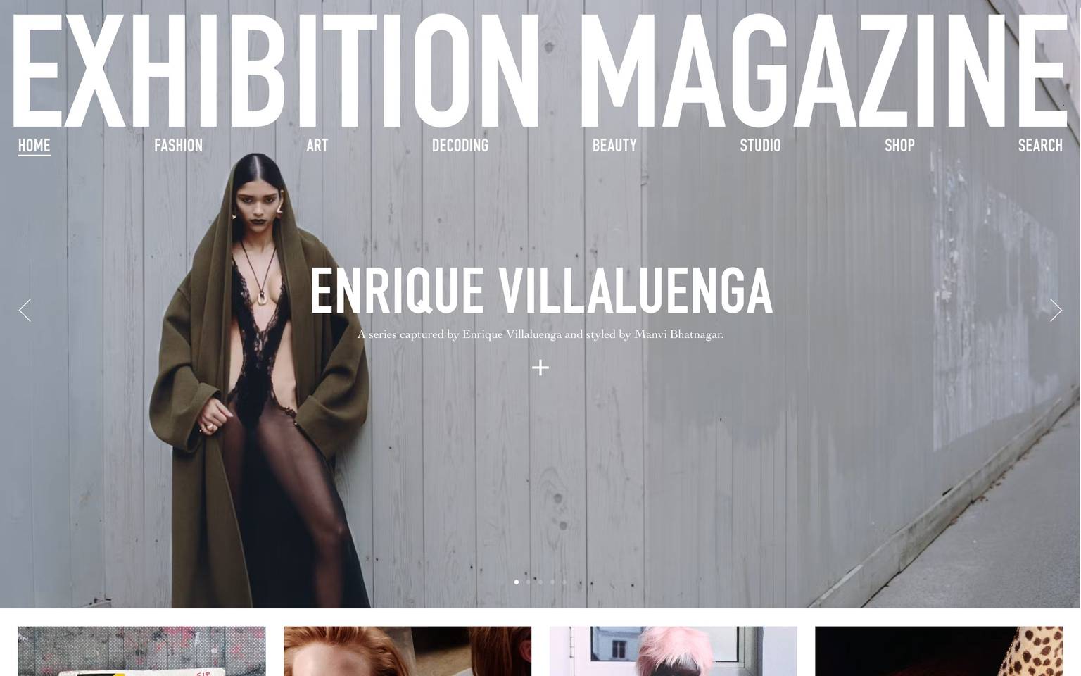
An editorial, fashion-magazine interface built on a stark black-on-white palette with oversized condensed DIN display type used as raw structure. The system reads as a printed publication translated to screen — a giant tracked masthead, full-bleed photography carousels, hard-edged (zero-radius) cards and inputs, a small serif (Cochin) for running captions, and black utility bands (cookie notice, footer) that frame the page. Brand voltage comes almost entirely from scale and monochrome contrast rather than color.
Works withClaude CodeCursorCodexGemini CLICopilotv0LovableBoltWindsurfReplit
---
version: alpha
name: Exhibition-Magazine-design-analysis
description: "An editorial, fashion-magazine interface built on a stark black-on-white palette with oversized condensed DIN display type used as raw structure. The system reads as a printed publication translated to screen — a giant tracked masthead, full-bleed photography carousels, hard-edged (zero-radius) cards and inputs, a small serif (Cochin) for running captions, and black utility bands (cookie notice, footer) that frame the page. Brand voltage comes almost entirely from scale and monochrome contrast rather than color."
colors:
  primary: "#000000"
  ink: "#000000"
  ink-soft: "#333333"
  canvas: "#ffffff"
  muted: "#a8a8a8"
  muted-soft: "#999999"
  hairline: "#cfcfcf"
  slate-mist: "#c0ccda"
  slate-deep: "#3c4858"
  slate-muted: "#687484"
  slate-soft: "#8492a6"
  surface-mist: "#eff2f7"
  accent-blue: "#0092ff"
  accent-red: "#ff4949"
  accent-green: "#13ce66"
typography:
  display:
    fontFamily: "DIN, Oswald, sans-serif"
    fontSize: 100px
    fontWeight: 400
    lineHeight: 1.0
    letterSpacing: normal
  heading:
    fontFamily: "DIN, Oswald, sans-serif"
    fontSize: 52px
    fontWeight: 400
    lineHeight: 0.75
    letterSpacing: -0.0062em
  body-display:
    fontFamily: "DIN, Oswald, sans-serif"
    fontSize: 90px
    fontWeight: 400
    lineHeight: 1.0
    letterSpacing: -0.0036em
  button:
    fontFamily: "Cochin, EB Garamond, serif"
    fontSize: 16px
    fontWeight: 400
    lineHeight: 1.5
    letterSpacing: normal
rounded:
  none: 0px
  sm: 3px
spacing:
  xxs: 4px
  xs: 8px
  sm: 12px
  md: 16px
  lg: 24px
  xl: 32px
  xxl: 40px
  section: 100px
  margin-lg: 356px
  margin-xl: 440px
components:
  button-primary:
    backgroundColor: "{colors.primary}"
    textColor: "{colors.canvas}"
    typography: "{typography.button}"
    rounded: "{rounded.none}"
  text-input:
    backgroundColor: "{colors.canvas}"
    textColor: "{colors.muted}"
    typography: "{typography.button}"
    rounded: "{rounded.none}"
  newsletter-modal:
    backgroundColor: "{colors.canvas}"
    textColor: "{colors.ink}"
    typography: "{typography.display}"
    rounded: "{rounded.none}"
  article-card:
    backgroundColor: "{colors.canvas}"
    textColor: "{colors.ink}"
    typography: "{typography.button}"
    rounded: "{rounded.none}"
  hero-carousel:
    backgroundColor: "{colors.ink}"
    textColor: "{colors.canvas}"
    typography: "{typography.body-display}"
    rounded: "{rounded.none}"
  top-nav:
    backgroundColor: transparent
    textColor: "{colors.ink}"
    rounded: "{rounded.none}"
  load-more-link:
    backgroundColor: transparent
    textColor: "{colors.ink}"
    typography: "{typography.display}"
  cookie-banner:
    backgroundColor: "{colors.ink}"
    textColor: "{colors.canvas}"
    rounded: "{rounded.none}"
  footer:
    backgroundColor: "{colors.ink}"
    textColor: "{colors.canvas}"
    rounded: "{rounded.none}"
---

## Overview

Exhibition Magazine's landing surface is an editorial, fashion-publication interface built almost entirely on two colors — `{colors.ink}` (#000000) and `{colors.canvas}` (#ffffff). The system behaves like a printed magazine translated to the browser: an enormous condensed **DIN** masthead ("EXHIBITION MAGAZINE") spans the full width edge to edge, a full-bleed photography carousel sits below the nav, and article thumbnails run in a hard-edged 4-up grid. There is no rounding, no shadow, and no chrome — the page is structured by scale, whitespace, and black-and-white contrast.

Type voice splits into two families: **DIN** (a condensed geometric sans, used at very large sizes for the masthead, section titles, and article headlines) and **Cochin** (an old-style serif, used for captions, the newsletter body copy, and the SEND button label). The pairing is deliberately editorial — a loud condensed sans headline against a quiet serif caption is a classic magazine device.

Color beyond black and white is almost absent from the visible surface. The measured palette carries a set of slate-blue and semantic accents (`{colors.accent-blue}`, `{colors.accent-red}`, `{colors.accent-green}`, and the `slate-*` family) that appear to be framework/UI-kit defaults rather than actively painted brand color; the photography supplies the only chromatic energy on screen.

Utility bands invert to solid black: the "THIS WEBSITE USES COOKIES" bar and the footer both use `{colors.ink}` backgrounds with `{colors.canvas}` text, framing the white editorial body top and bottom.

**Key Characteristics:**
- Monochrome by design — `{colors.ink}` on `{colors.canvas}`. Color arrives through photography, not through UI.
- Oversized condensed **DIN** display type as raw structure — a 100px masthead and 52px article headlines carry the entire hierarchy.
- Zero border radius everywhere measured — buttons, cards, and inputs all render at `{rounded.none}` (0px). One stray `{rounded.sm}` (3px) exists but is not a system pattern.
- No elevation — the shadows array is empty. Cards are flat white with hard edges; the carousel and grid separate by photography and whitespace alone.
- Serif captions in **Cochin** — the "A series captured by…" descriptions and newsletter body use the serif, a magazine caption convention.
- Black utility bands (cookie banner, footer) invert to `{colors.ink}` and close the page.
- The centered `newsletter-modal` overlay sits on top of the hero — white panel, giant DIN "STAY UPDATED" head, serif sub-line, hard-edged email input, and a solid black SEND button.

## Colors

### Brand & Action
- **Primary / Ink** (`{colors.primary}` / `{colors.ink}` — #000000): The single action + text color. The SEND button, all headlines, nav labels, and body text render in pure black. This is a near-monochrome brand.
- **Canvas** (`{colors.canvas}` — #ffffff): The default editorial floor and the text color on all black surfaces.

### Accents (measured, low-frequency)
- **Accent Blue** (`{colors.accent-blue}` — #0092ff): Measured in the stylesheet at low frequency; reads as a default link/interactive blue rather than an actively painted brand hue.
- **Accent Red** (`{colors.accent-red}` — #ff4949): Low-frequency accent, likely error/validation or a UI-kit default.
- **Accent Green** (`{colors.accent-green}` — #13ce66): Low-frequency accent, likely a success/validation default.
- **Slate family** (`{colors.slate-mist}` — #c0ccda, `{colors.slate-deep}` — #3c4858, `{colors.slate-muted}` — #687484, `{colors.slate-soft}` — #8492a6, `{colors.surface-mist}` — #eff2f7): A cool blue-grey ramp measured in CSS. These are the palette of a common UI framework and are not visibly used on the editorial surface — documented for completeness (see Known Gaps).

### Neutrals & Text
- **Ink Soft** (`{colors.ink-soft}` — #333333): A near-black used for secondary text weight.
- **Muted** (`{colors.muted}` — #a8a8a8): The placeholder-grey tone — e.g. the "Email address" input placeholder and the ghosted masthead over photography.
- **Muted Soft** (`{colors.muted-soft}` — #999999): Tertiary grey.
- **Hairline** (`{colors.hairline}` — #cfcfcf): The lightest grey — input borders and fine dividers.

## Typography

### Font Family
The system runs **DIN** for all display and headline type and **Cochin** for serif captions and the button label. DIN is a condensed geometric sans (used uppercase for the masthead, nav, article titles, and section heads); Cochin is an old-style serif (used for the newsletter body copy, article descriptions, and the SEND label). The pairing — loud condensed sans display against a quiet serif caption — is a classic editorial magazine device.

- DIN (400 weight, uppercase, large): masthead, section titles, article headlines, "LOAD MORE CONTENT"
- Cochin (400 weight, serif): captions, newsletter body, button label

### Hierarchy

| Token | Size | Weight | Line Height | Letter Spacing | Use |
|---|---|---|---|---|---|
| `{typography.display}` | 100px | 400 | 1.0 | normal | The "EXHIBITION MAGAZINE" masthead / largest section heads ("STAY UPDATED") — DIN |
| `{typography.body-display}` | 90px | 400 | 1.0 | -0.0036em | Full-bleed carousel headline overlays — DIN (measured as the "body_text" role) |
| `{typography.heading}` | 52px | 400 | 0.75 | -0.0062em | Article headlines / mid-scale display heads — DIN |
| `{typography.button}` | 16px | 400 | 1.5 | normal | SEND button label, serif captions, newsletter body — Cochin |

### Principles
Scale is the hierarchy. There is no bold weight in play — everything measured is weight 400. Emphasis comes from size (100px vs 52px vs 16px) and from the sans/serif contrast, not from weight changes. DIN is always the loud voice; Cochin is always the quiet caption. Do not blur the two.

Note the tight line-heights: `{typography.heading}` at 0.75 and the display roles at 1.0 pack headline lines close together, reinforcing the dense, printed-page feel.

### Note on Font Substitutes
**DIN** and **Cochin** are commercial typefaces and cannot be shipped as public web fonts. For DIN, substitute **Oswald** (condensed, geometric) or **Barlow Condensed** at weight 400 — both preserve the tall condensed silhouette that carries the masthead. For Cochin, substitute **EB Garamond** or **Cormorant Garamond** — old-style serifs with a similar quiet, high-contrast caption voice. The substitutes preserve the sans/serif split and the 400-weight discipline; DIN's exact stroke geometry will differ.

## Layout

### Spacing System
- **Base unit:** 4px.
- **Small tokens:** `{spacing.xxs}` 4px · `{spacing.xs}` 8px · `{spacing.sm}` 12px · `{spacing.md}` 16px · `{spacing.lg}` 24px · `{spacing.xl}` 32px · `{spacing.xxl}` 40px. These handle component-internal padding and grid gutters.
- **Section rhythm:** `{spacing.section}` (100px) for major vertical separation between editorial bands.
- **Large margins:** `{spacing.margin-lg}` (356px) and `{spacing.margin-xl}` (440px) — measured as high-frequency large offsets, consistent with wide centered columns / the vertical whitespace beneath the article grid before the footer.

### Grid & Container
- **Masthead:** full-width, edge-to-edge — the "EXHIBITION MAGAZINE" title bleeds to both margins.
- **Article thumbnail grid:** 4-up at desktop (the "IN THE BOOK CLUB / VICTOR JACQUES / IBRAHIM ELHINAID / MARC SHELLY" row).
- **Hero carousel:** full-bleed single image with prev/next chevrons and dot pagination.
- **Feature band:** a single full-bleed photograph ("FRANCESCO SCOTTI") with a centered caption.

### Whitespace Philosophy
Whitespace is generous and vertical — large empty gaps (the 356/440px measured margins) separate the article grid from the "LOAD MORE CONTENT" link and footer. The page reads like a magazine spread: dense image blocks punctuated by wide breathing room, with the type doing the structural work.

## Elevation & Depth

| Level | Treatment | Use |
|---|---|---|
| Flat | No shadow, no border | Cards, buttons, inputs, carousel, footer — the entire system |

The shadows array is empty — this is a strictly flat system. There is no drop shadow, no card elevation, and no glass or blur. Depth is expressed only through:
- **Full-bleed photography** stacked against flat white bands.
- **The newsletter modal** floating over the hero — separation is by the white panel over the dimmed photograph, not by shadow.
- **Black utility bands** (cookie banner, footer) that use color inversion, not elevation, to sit "in front of" the reader.

## Shapes

### Border Radius Scale

| Token | Value | Use |
|---|---|---|
| `{rounded.none}` | 0px | Everything — buttons, cards, inputs, modal, bands. The system is hard-edged. |
| `{rounded.sm}` | 3px | A single measured occurrence; not an established pattern. |

The editorial voice is defined partly by the absence of rounding — every measured component (`button-primary`, `card`, `input`) reports 0px radius. Sharp corners reinforce the printed-page, gallery aesthetic.

### Photography Geometry
Images run as hard-edged rectangles at native aspect ratios — full-bleed 16:9-ish hero and feature bands, and near-square thumbnails in the 4-up article grid. No image is masked, rounded, or shadowed.

## Components

### Navigation

**`top-nav`** — A transparent horizontal nav sitting directly beneath the masthead, overlaid on the hero photograph. Labels (HOME, FASHION, ART, DECODING, BEAUTY, STUDIO, SHOP, SEARCH) render in condensed uppercase DIN, `{colors.ink}` on the light masthead area. The active item ("HOME") is underlined. Background is `transparent` — the nav floats over the image.

### Buttons & Links

**`button-primary`** — The SEND button in the newsletter modal. Solid `{colors.primary}` (#000000) background, `{colors.canvas}` text, serif label in `{typography.button}` (Cochin 16px), rounded `{rounded.none}` (0px). Hard-edged black block — the only filled button on the surface.

**`load-more-link`** — The "LOAD MORE CONTENT" underlined text link near the page bottom. Transparent background, `{colors.ink}` text, large DIN display type (`{typography.display}` scale). Rendered as an underlined text action rather than a filled button.

### Inputs & Forms

**`text-input`** — The "Email address" field inside the newsletter modal. `{colors.canvas}` background, placeholder in `{colors.muted}` (#a8a8a8), 1px `{colors.hairline}` border, rounded `{rounded.none}` (0px). Serif placeholder type (`{typography.button}`).

### Cards & Media

**`article-card`** — The 4-up thumbnail cards (IN THE BOOK CLUB, VICTOR JACQUES, etc.). `{colors.canvas}` background, no shadow, rounded `{rounded.none}` (0px). Structure: a hard-edged photograph on top, a DIN uppercase headline below, and a `{typography.button}` (Cochin serif) one-line description. Cards separate by gutter whitespace, not by border or shadow.

**`hero-carousel`** — The full-bleed photography carousel below the nav. `{colors.ink}` backdrop behind the image, `{colors.canvas}` overlay text in large DIN (`{typography.body-display}` scale), prev/next chevrons at the horizontal edges, and centered dot pagination. Rounded `{rounded.none}`.

**`newsletter-modal`** — The centered "STAY UPDATED" overlay. `{colors.canvas}` panel, `{colors.ink}` text, giant DIN heading (`{typography.display}` scale), serif sub-line and body in `{typography.button}` (Cochin), an embedded `text-input`, a `button-primary`, and a close (×) glyph at top-right. Rounded `{rounded.none}`, no shadow — separation is by the white panel over the dimmed hero.

### Utility Bands

**`cookie-banner`** — The "THIS WEBSITE USES COOKIES" bar pinned near the bottom. `{colors.ink}` background, `{colors.canvas}` text, with underlined "ACCEPT" and "LEARN MORE" text links. Full-width, hard-edged.

**`footer`** — The closing black band. `{colors.ink}` background, `{colors.canvas}` text. Left column carries CONTRIBUTORS / LEGAL · PRIVACY POLICY / ONLINE SHOP / ABOUT; right column carries INSTAGRAM / TIKTOK / LINKEDIN. Below sits an oversized DIN "UNCOVER CRAFT ISSUE" underlined link and the "EXHIBITION" wordmark. Rounded `{rounded.none}`.

## Do's and Don'ts

### Do
- Keep the surface monochrome — `{colors.ink}` on `{colors.canvas}`. Let photography carry all the color.
- Use oversized condensed DIN as structure. Let scale, not weight, create hierarchy — everything is weight 400.
- Pair DIN display heads with Cochin serif captions. The sans/serif contrast is the editorial voice.
- Keep every corner hard (`{rounded.none}`). Sharp edges are part of the gallery/print aesthetic.
- Stay flat — no shadows. Separate elements with whitespace and photography.
- Invert to solid black (`{colors.ink}`) for utility bands (cookie notice, footer) to frame the white editorial body.

### Don't
- Don't introduce filled color buttons or colored backgrounds on the editorial body — the SEND button is black, and that is the palette.
- Don't bold the DIN display type — the system has no bold weight; make headlines bigger, not heavier.
- Don't round cards, inputs, or buttons. The one 3px radius measured is an artifact, not a pattern.
- Don't add drop shadows or card elevation — the system is deliberately flat.
- Don't set body/caption copy in DIN or headlines in Cochin — the two families do not swap roles.
- Don't rely on the `slate-*` / semantic accents as brand color; treat them as UI defaults until confirmed in use.

## Responsive Behavior

### Breakpoints
No breakpoint values were measured. From the captured desktop landing page, the observed structure is a full-width masthead, an 8-item horizontal nav, a full-bleed hero carousel, and a 4-up article grid. Mobile/tablet behavior is inferred, not measured (see Known Gaps).

| Name | Width | Key Changes (inferred) |
|---|---|---|
| Mobile | small | Masthead scales down but stays full-width; nav likely collapses; article grid drops to 1-up; carousel stays full-bleed |
| Tablet | mid | Article grid likely 2-up; nav tightens |
| Desktop | large | Full 8-item nav; 4-up article grid; full-bleed hero + feature bands |

### Touch Targets
- `button-primary` (SEND) and `text-input` sizes were not measured beyond radius; tap-area adequacy is unconfirmed.
- Carousel chevrons and dot pagination are small on desktop; touch sizing not measured.

### Collapsing Strategy
- The masthead is the dominant responsive element — as a full-bleed word it must scale to viewport width; exact mobile treatment is not captured.
- The 4-up article grid is the most likely candidate to reflow to 2-up / 1-up.
- Utility bands (cookie banner, footer) run full-width at all sizes.

### Image Behavior
- Hero and feature photographs are full-bleed and scale with the viewport at native aspect ratio.
- Article thumbnails crop to consistent near-square rectangles.

## Iteration Guide

1. Focus on ONE component at a time. Reference its YAML key directly (`{component.article-card}`, `{component.newsletter-modal}`).
2. Variants of a component (`-active`, `-disabled`) live as separate entries in `components:`.
3. Use `{token.refs}` everywhere — never inline a hex.
4. Never document hover. Default and Active/Pressed states only.
5. Hierarchy is scale, not weight. Bigger DIN before any weight change (there is no bold in the system).
6. Keep the palette monochrome; introduce accent color only after confirming it is painted on the surface, not a framework default.
7. Keep radius at `{rounded.none}` and elevation flat — these absences define the brand.

## Known Gaps

- **Body text size is a measurement artifact.** The measured `body_text` role reports DIN at 90px — this is the full-bleed carousel/masthead overlay, not paragraph copy. The true running-body size (the Cochin captions and newsletter copy) was captured only via the 16px "button" role; a dedicated small serif body role could not be isolated.
- **Nav, footer, and caption typography** were not measured as distinct roles; their exact size/weight/tracking are unknown. Components referencing `{typography.button}` for these are best-available approximations.
- **DIN and Cochin are commercial typefaces** — open-source substitutes (Oswald/Barlow Condensed; EB Garamond/Cormorant) are documented in Typography; the licensed faces are not shipped.
- **The slate-blue palette** (`#c0ccda`, `#3c4858`, `#687484`, `#8492a6`, `#eff2f7`) and the semantic accents (`#0092ff`, `#ff4949`, `#13ce66`) were measured in CSS but are not clearly visible on the editorial surface; they resemble UI-framework defaults and their intended use is unconfirmed.
- **Button padding measured 0px** — clearly an extraction artifact (the SEND button visibly has internal padding); actual padding was omitted rather than guessed.
- **No shadows and only one 3px radius** were captured — the flat, hard-edged reading is confident, but any hover-elevation or focus-ring treatment is not in the data.
- **Responsive breakpoints, animation/transition timings, and carousel behavior** were not measured; only the desktop landing page was captured.
- **Form validation, focus, and error states** were not extracted — the newsletter input has only a default state documented.

<!-- Documented by Duply · real-world design systems as ready-to-use DESIGN.md for AI coding agents · https://duply.ai/exhibition-magazine/design-md -->
Color Palette
Accent
Neutrals
Typography
display100px · 400 · 1
The quick brown fox jumpsheading52px · 400 · 0.75
The quick brown fox jumpsbody-display90px · 400 · 1
The quick brown fox jumpsbutton16px · 400 · 1.5
The quick brown fox jumpsSpacing & Shape
Spacing
| Name | Value | Preview |
|---|---|---|
| xxs | 4px | |
| xs | 8px | |
| sm | 12px | |
| md | 16px | |
| lg | 24px | |
| xl | 32px | |
| xxl | 40px | |
| section | 100px | |
| margin-lg | 356px | |
| margin-xl | 440px |
Border Radius
| Name | Value | Preview |
|---|---|---|
| none | 0px | |
| sm | 3px |
FAQ
- What colors does Exhibition-Magazine use?
- Exhibition-Magazine's core palette includes #000000, #000000, #333333, #ffffff, #a8a8a8. The full color set with usage roles (canvas, ink, surfaces, accent, semantic) is documented in the Exhibition-Magazine DESIGN.md.
- What font does Exhibition-Magazine use?
- Exhibition-Magazine's primary typeface is DIN. The complete type scale (sizes, weights, line-height and letter-spacing per role), with an open substitute where the original is licensed, is documented in the DESIGN.md.
- What is the Exhibition-Magazine design system?
- An editorial, fashion-magazine interface built on a stark black-on-white palette with oversized condensed DIN display type used as raw structure. The system reads as a printed publication translated to screen — a giant tracked masthead, full-bleed photography carousels, hard-edged (zero-radius)
Get this as a working kit
Exhibition-Magazine Launch Kit + DESIGN.md
$299$225
One-time payment
- A complete production-stack template, styled like Exhibition-Magazine, fully built and wired.
- One-time payment and the codebase is yours. No platform fees, no subscription.
Open it with Claude Code, Cursor, or any coding agent and build in plain language, then ship a complete web app.
- Your private DESIGN.md
- Marketing pages, blog, SEO & legal
- Email capture, newsletter & contact
- Accept payments (Stripe)
- Analytics (GA4 + PostHog)
- One-click deploy
- Auth, login & roles
- A full app dashboard, when you grow
More like this
---
version: alpha
name: Exhibition-Magazine-design-analysis
description: "An editorial, fashion-magazine interface built on a stark black-on-white palette with oversized condensed DIN display type used as raw structure. The system reads as a printed publication translated to screen — a giant tracked masthead, full-bleed photography carousels, hard-edged (zero-radius) cards and inputs, a small serif (Cochin) for running captions, and black utility bands (cookie notice, footer) that frame the page. Brand voltage comes almost entirely from scale and monochrome contrast rather than color."
colors:
  primary: "#000000"
  ink: "#000000"
  ink-soft: "#333333"
  canvas: "#ffffff"
  muted: "#a8a8a8"
  muted-soft: "#999999"
  hairline: "#cfcfcf"
  slate-mist: "#c0ccda"
  slate-deep: "#3c4858"
  slate-muted: "#687484"
  slate-soft: "#8492a6"
  surface-mist: "#eff2f7"
  accent-blue: "#0092ff"
  accent-red: "#ff4949"
  accent-green: "#13ce66"
typography:
  display:
    fontFamily: "DIN, Oswald, sans-serif"
    fontSize: 100px
    fontWeight: 400
    lineHeight: 1.0
    letterSpacing: normal
  heading:
    fontFamily: "DIN, Oswald, sans-serif"
    fontSize: 52px
    fontWeight: 400
    lineHeight: 0.75
    letterSpacing: -0.0062em
  body-display:
    fontFamily: "DIN, Oswald, sans-serif"
    fontSize: 90px
    fontWeight: 400
    lineHeight: 1.0
    letterSpacing: -0.0036em
  button:
    fontFamily: "Cochin, EB Garamond, serif"
    fontSize: 16px
    fontWeight: 400
    lineHeight: 1.5
    letterSpacing: normal
rounded:
  none: 0px
  sm: 3px
spacing:
  xxs: 4px
  xs: 8px
  sm: 12px
  md: 16px
  lg: 24px
  xl: 32px
  xxl: 40px
  section: 100px
  margin-lg: 356px
  margin-xl: 440px
components:
  button-primary:
    backgroundColor: "{colors.primary}"
    textColor: "{colors.canvas}"
    typography: "{typography.button}"
    rounded: "{rounded.none}"
  text-input:
    backgroundColor: "{colors.canvas}"
    textColor: "{colors.muted}"
    typography: "{typography.button}"
    rounded: "{rounded.none}"
  newsletter-modal:
    backgroundColor: "{colors.canvas}"
    textColor: "{colors.ink}"
    typography: "{typography.display}"
    rounded: "{rounded.none}"
  article-card:
    backgroundColor: "{colors.canvas}"
    textColor: "{colors.ink}"
    typography: "{typography.button}"
    rounded: "{rounded.none}"
  hero-carousel:
    backgroundColor: "{colors.ink}"
    textColor: "{colors.canvas}"
    typography: "{typography.body-display}"
    rounded: "{rounded.none}"
  top-nav:
    backgroundColor: transparent
    textColor: "{colors.ink}"
    rounded: "{rounded.none}"
  load-more-link:
    backgroundColor: transparent
    textColor: "{colors.ink}"
    typography: "{typography.display}"
  cookie-banner:
    backgroundColor: "{colors.ink}"
    textColor: "{colors.canvas}"
    rounded: "{rounded.none}"
  footer:
    backgroundColor: "{colors.ink}"
    textColor: "{colors.canvas}"
    rounded: "{rounded.none}"
---

## Overview

Exhibition Magazine's landing surface is an editorial, fashion-publication interface built almost entirely on two colors — `{colors.ink}` (#000000) and `{colors.canvas}` (#ffffff). The system behaves like a printed magazine translated to the browser: an enormous condensed **DIN** masthead ("EXHIBITION MAGAZINE") spans the full width edge to edge, a full-bleed photography carousel sits below the nav, and article thumbnails run in a hard-edged 4-up grid. There is no rounding, no shadow, and no chrome — the page is structured by scale, whitespace, and black-and-white contrast.

Type voice splits into two families: **DIN** (a condensed geometric sans, used at very large sizes for the masthead, section titles, and article headlines) and **Cochin** (an old-style serif, used for captions, the newsletter body copy, and the SEND button label). The pairing is deliberately editorial — a loud condensed sans headline against a quiet serif caption is a classic magazine device.

Color beyond black and white is almost absent from the visible surface. The measured palette carries a set of slate-blue and semantic accents (`{colors.accent-blue}`, `{colors.accent-red}`, `{colors.accent-green}`, and the `slate-*` family) that appear to be framework/UI-kit defaults rather than actively painted brand color; the photography supplies the only chromatic energy on screen.

Utility bands invert to solid black: the "THIS WEBSITE USES COOKIES" bar and the footer both use `{colors.ink}` backgrounds with `{colors.canvas}` text, framing the white editorial body top and bottom.

**Key Characteristics:**
- Monochrome by design — `{colors.ink}` on `{colors.canvas}`. Color arrives through photography, not through UI.
- Oversized condensed **DIN** display type as raw structure — a 100px masthead and 52px article headlines carry the entire hierarchy.
- Zero border radius everywhere measured — buttons, cards, and inputs all render at `{rounded.none}` (0px). One stray `{rounded.sm}` (3px) exists but is not a system pattern.
- No elevation — the shadows array is empty. Cards are flat white with hard edges; the carousel and grid separate by photography and whitespace alone.
- Serif captions in **Cochin** — the "A series captured by…" descriptions and newsletter body use the serif, a magazine caption convention.
- Black utility bands (cookie banner, footer) invert to `{colors.ink}` and close the page.
- The centered `newsletter-modal` overlay sits on top of the hero — white panel, giant DIN "STAY UPDATED" head, serif sub-line, hard-edged email input, and a solid black SEND button.

## Colors

### Brand & Action
- **Primary / Ink** (`{colors.primary}` / `{colors.ink}` — #000000): The single action + text color. The SEND button, all headlines, nav labels, and body text render in pure black. This is a near-monochrome brand.
- **Canvas** (`{colors.canvas}` — #ffffff): The default editorial floor and the text color on all black surfaces.

### Accents (measured, low-frequency)
- **Accent Blue** (`{colors.accent-blue}` — #0092ff): Measured in the stylesheet at low frequency; reads as a default link/interactive blue rather than an actively painted brand hue.
- **Accent Red** (`{colors.accent-red}` — #ff4949): Low-frequency accent, likely error/validation or a UI-kit default.
- **Accent Green** (`{colors.accent-green}` — #13ce66): Low-frequency accent, likely a success/validation default.
- **Slate family** (`{colors.slate-mist}` — #c0ccda, `{colors.slate-deep}` — #3c4858, `{colors.slate-muted}` — #687484, `{colors.slate-soft}` — #8492a6, `{colors.surface-mist}` — #eff2f7): A cool blue-grey ramp measured in CSS. These are the palette of a common UI framework and are not visibly used on the editorial surface — documented for completeness (see Known Gaps).

### Neutrals & Text
- **Ink Soft** (`{colors.ink-soft}` — #333333): A near-black used for secondary text weight.
- **Muted** (`{colors.muted}` — #a8a8a8): The placeholder-grey tone — e.g. the "Email address" input placeholder and the ghosted masthead over photography.
- **Muted Soft** (`{colors.muted-soft}` — #999999): Tertiary grey.
- **Hairline** (`{colors.hairline}` — #cfcfcf): The lightest grey — input borders and fine dividers.

## Typography

### Font Family
The system runs **DIN** for all display and headline type and **Cochin** for serif captions and the button label. DIN is a condensed geometric sans (used uppercase for the masthead, nav, article titles, and section heads); Cochin is an old-style serif (used for the newsletter body copy, article descriptions, and the SEND label). The pairing — loud condensed sans display against a quiet serif caption — is a classic editorial magazine device.

- DIN (400 weight, uppercase, large): masthead, section titles, article headlines, "LOAD MORE CONTENT"
- Cochin (400 weight, serif): captions, newsletter body, button label

### Hierarchy

| Token | Size | Weight | Line Height | Letter Spacing | Use |
|---|---|---|---|---|---|
| `{typography.display}` | 100px | 400 | 1.0 | normal | The "EXHIBITION MAGAZINE" masthead / largest section heads ("STAY UPDATED") — DIN |
| `{typography.body-display}` | 90px | 400 | 1.0 | -0.0036em | Full-bleed carousel headline overlays — DIN (measured as the "body_text" role) |
| `{typography.heading}` | 52px | 400 | 0.75 | -0.0062em | Article headlines / mid-scale display heads — DIN |
| `{typography.button}` | 16px | 400 | 1.5 | normal | SEND button label, serif captions, newsletter body — Cochin |

### Principles
Scale is the hierarchy. There is no bold weight in play — everything measured is weight 400. Emphasis comes from size (100px vs 52px vs 16px) and from the sans/serif contrast, not from weight changes. DIN is always the loud voice; Cochin is always the quiet caption. Do not blur the two.

Note the tight line-heights: `{typography.heading}` at 0.75 and the display roles at 1.0 pack headline lines close together, reinforcing the dense, printed-page feel.

### Note on Font Substitutes
**DIN** and **Cochin** are commercial typefaces and cannot be shipped as public web fonts. For DIN, substitute **Oswald** (condensed, geometric) or **Barlow Condensed** at weight 400 — both preserve the tall condensed silhouette that carries the masthead. For Cochin, substitute **EB Garamond** or **Cormorant Garamond** — old-style serifs with a similar quiet, high-contrast caption voice. The substitutes preserve the sans/serif split and the 400-weight discipline; DIN's exact stroke geometry will differ.

## Layout

### Spacing System
- **Base unit:** 4px.
- **Small tokens:** `{spacing.xxs}` 4px · `{spacing.xs}` 8px · `{spacing.sm}` 12px · `{spacing.md}` 16px · `{spacing.lg}` 24px · `{spacing.xl}` 32px · `{spacing.xxl}` 40px. These handle component-internal padding and grid gutters.
- **Section rhythm:** `{spacing.section}` (100px) for major vertical separation between editorial bands.
- **Large margins:** `{spacing.margin-lg}` (356px) and `{spacing.margin-xl}` (440px) — measured as high-frequency large offsets, consistent with wide centered columns / the vertical whitespace beneath the article grid before the footer.

### Grid & Container
- **Masthead:** full-width, edge-to-edge — the "EXHIBITION MAGAZINE" title bleeds to both margins.
- **Article thumbnail grid:** 4-up at desktop (the "IN THE BOOK CLUB / VICTOR JACQUES / IBRAHIM ELHINAID / MARC SHELLY" row).
- **Hero carousel:** full-bleed single image with prev/next chevrons and dot pagination.
- **Feature band:** a single full-bleed photograph ("FRANCESCO SCOTTI") with a centered caption.

### Whitespace Philosophy
Whitespace is generous and vertical — large empty gaps (the 356/440px measured margins) separate the article grid from the "LOAD MORE CONTENT" link and footer. The page reads like a magazine spread: dense image blocks punctuated by wide breathing room, with the type doing the structural work.

## Elevation & Depth

| Level | Treatment | Use |
|---|---|---|
| Flat | No shadow, no border | Cards, buttons, inputs, carousel, footer — the entire system |

The shadows array is empty — this is a strictly flat system. There is no drop shadow, no card elevation, and no glass or blur. Depth is expressed only through:
- **Full-bleed photography** stacked against flat white bands.
- **The newsletter modal** floating over the hero — separation is by the white panel over the dimmed photograph, not by shadow.
- **Black utility bands** (cookie banner, footer) that use color inversion, not elevation, to sit "in front of" the reader.

## Shapes

### Border Radius Scale

| Token | Value | Use |
|---|---|---|
| `{rounded.none}` | 0px | Everything — buttons, cards, inputs, modal, bands. The system is hard-edged. |
| `{rounded.sm}` | 3px | A single measured occurrence; not an established pattern. |

The editorial voice is defined partly by the absence of rounding — every measured component (`button-primary`, `card`, `input`) reports 0px radius. Sharp corners reinforce the printed-page, gallery aesthetic.

### Photography Geometry
Images run as hard-edged rectangles at native aspect ratios — full-bleed 16:9-ish hero and feature bands, and near-square thumbnails in the 4-up article grid. No image is masked, rounded, or shadowed.

## Components

### Navigation

**`top-nav`** — A transparent horizontal nav sitting directly beneath the masthead, overlaid on the hero photograph. Labels (HOME, FASHION, ART, DECODING, BEAUTY, STUDIO, SHOP, SEARCH) render in condensed uppercase DIN, `{colors.ink}` on the light masthead area. The active item ("HOME") is underlined. Background is `transparent` — the nav floats over the image.

### Buttons & Links

**`button-primary`** — The SEND button in the newsletter modal. Solid `{colors.primary}` (#000000) background, `{colors.canvas}` text, serif label in `{typography.button}` (Cochin 16px), rounded `{rounded.none}` (0px). Hard-edged black block — the only filled button on the surface.

**`load-more-link`** — The "LOAD MORE CONTENT" underlined text link near the page bottom. Transparent background, `{colors.ink}` text, large DIN display type (`{typography.display}` scale). Rendered as an underlined text action rather than a filled button.

### Inputs & Forms

**`text-input`** — The "Email address" field inside the newsletter modal. `{colors.canvas}` background, placeholder in `{colors.muted}` (#a8a8a8), 1px `{colors.hairline}` border, rounded `{rounded.none}` (0px). Serif placeholder type (`{typography.button}`).

### Cards & Media

**`article-card`** — The 4-up thumbnail cards (IN THE BOOK CLUB, VICTOR JACQUES, etc.). `{colors.canvas}` background, no shadow, rounded `{rounded.none}` (0px). Structure: a hard-edged photograph on top, a DIN uppercase headline below, and a `{typography.button}` (Cochin serif) one-line description. Cards separate by gutter whitespace, not by border or shadow.

**`hero-carousel`** — The full-bleed photography carousel below the nav. `{colors.ink}` backdrop behind the image, `{colors.canvas}` overlay text in large DIN (`{typography.body-display}` scale), prev/next chevrons at the horizontal edges, and centered dot pagination. Rounded `{rounded.none}`.

**`newsletter-modal`** — The centered "STAY UPDATED" overlay. `{colors.canvas}` panel, `{colors.ink}` text, giant DIN heading (`{typography.display}` scale), serif sub-line and body in `{typography.button}` (Cochin), an embedded `text-input`, a `button-primary`, and a close (×) glyph at top-right. Rounded `{rounded.none}`, no shadow — separation is by the white panel over the dimmed hero.

### Utility Bands

**`cookie-banner`** — The "THIS WEBSITE USES COOKIES" bar pinned near the bottom. `{colors.ink}` background, `{colors.canvas}` text, with underlined "ACCEPT" and "LEARN MORE" text links. Full-width, hard-edged.

**`footer`** — The closing black band. `{colors.ink}` background, `{colors.canvas}` text. Left column carries CONTRIBUTORS / LEGAL · PRIVACY POLICY / ONLINE SHOP / ABOUT; right column carries INSTAGRAM / TIKTOK / LINKEDIN. Below sits an oversized DIN "UNCOVER CRAFT ISSUE" underlined link and the "EXHIBITION" wordmark. Rounded `{rounded.none}`.

## Do's and Don'ts

### Do
- Keep the surface monochrome — `{colors.ink}` on `{colors.canvas}`. Let photography carry all the color.
- Use oversized condensed DIN as structure. Let scale, not weight, create hierarchy — everything is weight 400.
- Pair DIN display heads with Cochin serif captions. The sans/serif contrast is the editorial voice.
- Keep every corner hard (`{rounded.none}`). Sharp edges are part of the gallery/print aesthetic.
- Stay flat — no shadows. Separate elements with whitespace and photography.
- Invert to solid black (`{colors.ink}`) for utility bands (cookie notice, footer) to frame the white editorial body.

### Don't
- Don't introduce filled color buttons or colored backgrounds on the editorial body — the SEND button is black, and that is the palette.
- Don't bold the DIN display type — the system has no bold weight; make headlines bigger, not heavier.
- Don't round cards, inputs, or buttons. The one 3px radius measured is an artifact, not a pattern.
- Don't add drop shadows or card elevation — the system is deliberately flat.
- Don't set body/caption copy in DIN or headlines in Cochin — the two families do not swap roles.
- Don't rely on the `slate-*` / semantic accents as brand color; treat them as UI defaults until confirmed in use.

## Responsive Behavior

### Breakpoints
No breakpoint values were measured. From the captured desktop landing page, the observed structure is a full-width masthead, an 8-item horizontal nav, a full-bleed hero carousel, and a 4-up article grid. Mobile/tablet behavior is inferred, not measured (see Known Gaps).

| Name | Width | Key Changes (inferred) |
|---|---|---|
| Mobile | small | Masthead scales down but stays full-width; nav likely collapses; article grid drops to 1-up; carousel stays full-bleed |
| Tablet | mid | Article grid likely 2-up; nav tightens |
| Desktop | large | Full 8-item nav; 4-up article grid; full-bleed hero + feature bands |

### Touch Targets
- `button-primary` (SEND) and `text-input` sizes were not measured beyond radius; tap-area adequacy is unconfirmed.
- Carousel chevrons and dot pagination are small on desktop; touch sizing not measured.

### Collapsing Strategy
- The masthead is the dominant responsive element — as a full-bleed word it must scale to viewport width; exact mobile treatment is not captured.
- The 4-up article grid is the most likely candidate to reflow to 2-up / 1-up.
- Utility bands (cookie banner, footer) run full-width at all sizes.

### Image Behavior
- Hero and feature photographs are full-bleed and scale with the viewport at native aspect ratio.
- Article thumbnails crop to consistent near-square rectangles.

## Iteration Guide

1. Focus on ONE component at a time. Reference its YAML key directly (`{component.article-card}`, `{component.newsletter-modal}`).
2. Variants of a component (`-active`, `-disabled`) live as separate entries in `components:`.
3. Use `{token.refs}` everywhere — never inline a hex.
4. Never document hover. Default and Active/Pressed states only.
5. Hierarchy is scale, not weight. Bigger DIN before any weight change (there is no bold in the system).
6. Keep the palette monochrome; introduce accent color only after confirming it is painted on the surface, not a framework default.
7. Keep radius at `{rounded.none}` and elevation flat — these absences define the brand.

## Known Gaps

- **Body text size is a measurement artifact.** The measured `body_text` role reports DIN at 90px — this is the full-bleed carousel/masthead overlay, not paragraph copy. The true running-body size (the Cochin captions and newsletter copy) was captured only via the 16px "button" role; a dedicated small serif body role could not be isolated.
- **Nav, footer, and caption typography** were not measured as distinct roles; their exact size/weight/tracking are unknown. Components referencing `{typography.button}` for these are best-available approximations.
- **DIN and Cochin are commercial typefaces** — open-source substitutes (Oswald/Barlow Condensed; EB Garamond/Cormorant) are documented in Typography; the licensed faces are not shipped.
- **The slate-blue palette** (`#c0ccda`, `#3c4858`, `#687484`, `#8492a6`, `#eff2f7`) and the semantic accents (`#0092ff`, `#ff4949`, `#13ce66`) were measured in CSS but are not clearly visible on the editorial surface; they resemble UI-framework defaults and their intended use is unconfirmed.
- **Button padding measured 0px** — clearly an extraction artifact (the SEND button visibly has internal padding); actual padding was omitted rather than guessed.
- **No shadows and only one 3px radius** were captured — the flat, hard-edged reading is confident, but any hover-elevation or focus-ring treatment is not in the data.
- **Responsive breakpoints, animation/transition timings, and carousel behavior** were not measured; only the desktop landing page was captured.
- **Form validation, focus, and error states** were not extracted — the newsletter input has only a default state documented.

<!-- Documented by Duply · real-world design systems as ready-to-use DESIGN.md for AI coding agents · https://duply.ai/exhibition-magazine/design-md -->