
Monocle
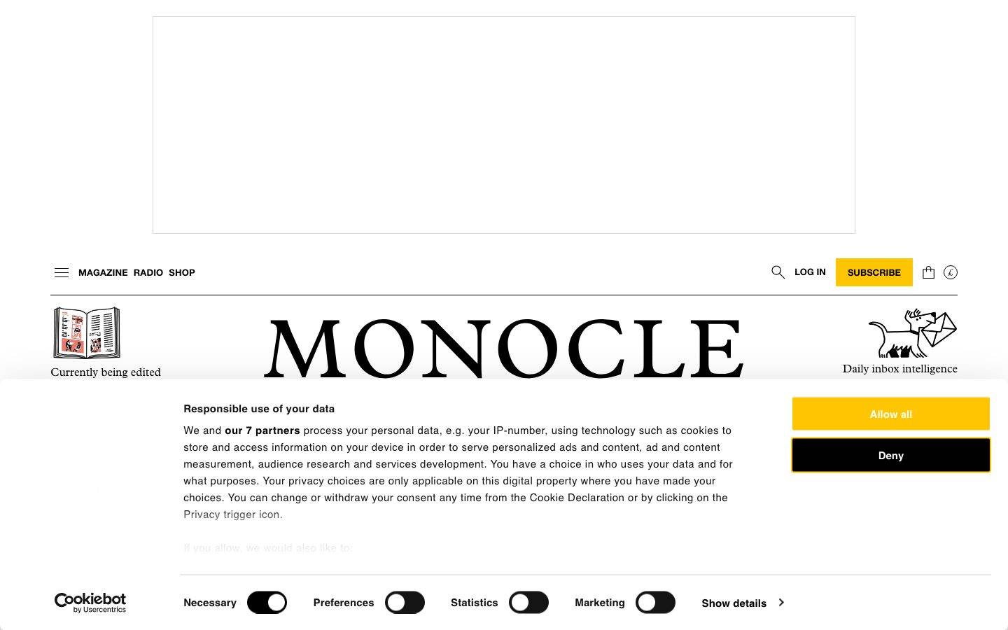
An editorial, print-derived interface for Monocle's magazine, radio, and shop — near-black serif type (Plantin) set on a stark white canvas, with sharp-cornered cards and images that read like a newspaper page rather than a web app. Brand voltage comes from a single saturated yellow (#ffc500) reserved for Subscribe/CTA moments and from sky-cyan category blocks (city guides), against an otherwise strictly monochrome, hairline-ruled layout.
Works withClaude CodeCursorCodexGemini CLICopilotv0LovableBoltWindsurfReplit
---
version: alpha
name: Monocle-design-analysis
description: "An editorial, print-derived interface for Monocle's magazine, radio, and shop — near-black serif type (Plantin) set on a stark white canvas, with sharp-cornered cards and images that read like a newspaper page rather than a web app. Brand voltage comes from a single saturated yellow (#ffc500) reserved for Subscribe/CTA moments and from sky-cyan category blocks (city guides), against an otherwise strictly monochrome, hairline-ruled layout."

colors:
  primary: "#ffc500"
  ink: "#000000"
  link: "#141414"
  canvas: "#ffffff"
  on-primary: "#ffffff"
  neutral: "#6e6e6e"
  neutral-strong: "#444444"
  neutral-soft: "#949494"
  neutral-mute: "#b3b3b3"
  hairline: "#d9d9d9"
  hairline-soft: "#dddddd"
  surface-soft: "#f0f0f0"
  surface-softer: "#eeeeee"
  accent-cyan: "#00bbff"
  accent-cyan-soft: "#64d5ff"
  accent-blue: "#0757fe"
  accent-orange: "#ff9900"

typography:
  display:
    fontFamily: "Plantin, Georgia, 'Times New Roman', serif"
    fontSize: 32px
    fontWeight: 400
    lineHeight: 1.5
    letterSpacing: normal
  heading:
    fontFamily: "Plantin, Georgia, 'Times New Roman', serif"
    fontSize: 32px
    fontWeight: 400
    lineHeight: 1.2
    letterSpacing: normal
  subhead:
    fontFamily: "Plantin, Georgia, 'Times New Roman', serif"
    fontSize: 20px
    fontWeight: 400
    lineHeight: 1.25
    letterSpacing: normal
  title:
    fontFamily: "Plantin, Georgia, 'Times New Roman', serif"
    fontSize: 18px
    fontWeight: 700
    lineHeight: 1.3
    letterSpacing: normal
  body:
    fontFamily: "Plantin, Georgia, 'Times New Roman', serif"
    fontSize: 16px
    fontWeight: 400
    lineHeight: 1.5
    letterSpacing: normal
  button:
    fontFamily: "system-ui, -apple-system, 'Segoe UI', Roboto, sans-serif"
    fontSize: 15px
    fontWeight: 600
    lineHeight: 1.15
    letterSpacing: normal

rounded:
  sharp: 0px
  xs: 4px
  sm: 8px
  lg: 32px

spacing:
  xxs: 4px
  xs: 8px
  sm: 12px
  md: 16px
  lg: 24px
  xl: 32px
  xxl: 40px

components:
  button-primary:
    backgroundColor: "{colors.primary}"
    textColor: "{colors.on-primary}"
    typography: "{typography.button}"
    rounded: "{rounded.xs}"
    padding: 15px
  button-dark:
    backgroundColor: "{colors.ink}"
    textColor: "{colors.canvas}"
    typography: "{typography.button}"
    rounded: "{rounded.xs}"
    padding: 15px
  top-nav:
    backgroundColor: "{colors.canvas}"
    textColor: "{colors.ink}"
    typography: "{typography.button}"
  card:
    backgroundColor: "{colors.canvas}"
    textColor: "{colors.ink}"
    typography: "{typography.body}"
    rounded: "{rounded.sharp}"
  product-card:
    backgroundColor: "{colors.canvas}"
    textColor: "{colors.ink}"
    typography: "{typography.body}"
    rounded: "{rounded.sharp}"
  city-guide-card:
    backgroundColor: "{colors.accent-cyan}"
    textColor: "{colors.ink}"
    typography: "{typography.subhead}"
    rounded: "{rounded.sharp}"
    padding: 16px
  radio-band:
    backgroundColor: "{colors.ink}"
    textColor: "{colors.canvas}"
    typography: "{typography.body}"
    padding: 24px
  input:
    backgroundColor: "{colors.canvas}"
    textColor: "{colors.ink}"
    typography: "{typography.body}"
    rounded: "{rounded.sharp}"
---

## Overview

Monocle's site reads like a printed magazine translated to screen: a stark white canvas (`{colors.canvas}` — #ffffff), near-black serif type (`{colors.ink}` — #000000) set in **Plantin**, and thin `{colors.hairline}` (#d9d9d9) rules separating column-grid content blocks. There is almost no chrome — no drop shadows on content, no rounded cards, no gradients. The layout's discipline is its identity: editorial hierarchy, generous white space, and sharp-cornered image blocks arranged in newspaper-style columns.

The type voice is single-family and serif-dominant. **Plantin** carries the display headline (32px), section heads, sub-heads (20px), bold titles (18px/700), and body copy (16px) alike — the entire editorial surface is one serif family at different sizes and weights. Only interface controls (buttons) drop to a **sans-serif** at 15px/600, marking the boundary between "read this" (serif) and "do this" (sans).

Brand voltage is deliberately scarce. A single saturated yellow (`{colors.primary}` — #ffc500) is reserved for the Subscribe button and CTA moments. A secondary sky-cyan (`{colors.accent-cyan}` — #00bbff) fills the City Guides category blocks. Everything else stays monochrome — black type, gray metadata (`{colors.neutral}` — #6e6e6e), and hairline dividers.

**Key Characteristics:**
- Plantin serif across the whole editorial surface — display, heads, body — no sans-serif in reading contexts.
- Stark white canvas with near-black ink; gray (`{colors.neutral}` — #6e6e6e) for metadata and secondary text.
- Sharp corners everywhere — cards and inputs measure `{rounded.sharp}` (0px). The only radius in content is the tiny `{rounded.xs}` (~4px, derived from the button's measured 3.75px).
- Hairline rules (`{colors.hairline}` — #d9d9d9) as 1px "borders" rendered via box-shadow ring — the newspaper column divider translated to web.
- Yellow CTA (`{colors.primary}` — #ffc500) reserved for Subscribe / Allow-all moments — a scarce, high-voltage accent.
- Sky-cyan (`{colors.accent-cyan}` — #00bbff) category blocks for City Guides — the one place saturated color fills an area.
- Dark inverted band (`{colors.ink}` background) for the "Latest from Monocle Radio" strip — the only near-black surface on the page.
- Base spacing rhythm on a 4/8/16 grid, with 32px between denser editorial blocks.

## Colors

### Brand & Accent
- **Primary** (`{colors.primary}` — #ffc500): Monocle's signature yellow. Reserved for the Subscribe button, "Allow all" in the cookie banner, and other high-priority CTA moments. Text on it is measured as `{colors.on-primary}` (#ffffff).
- **Accent Cyan** (`{colors.accent-cyan}` — #00bbff) / **Accent Cyan Soft** (`{colors.accent-cyan-soft}` — #64d5ff): The City Guides category blocks fill with this sky-cyan. It's the only saturated color used as a filled surface rather than a control.
- **Accent Blue** (`{colors.accent-blue}` — #0757fe) / **Accent Orange** (`{colors.accent-orange}` — #ff9900): Low-frequency accents observed in the CSS — likely link/highlight and category flags. Used sparingly; not part of the core CTA vocabulary.

### Text
- **Ink** (`{colors.ink}` — #000000): All headlines and primary editorial text — the most frequent measured color.
- **Link** (`{colors.link}` — #141414): The near-black anchor color — links stay monochrome, not blue.
- **Neutral** (`{colors.neutral}` — #6e6e6e): Metadata, kickers, secondary captions ("2 MIN READ", column roles).
- **Neutral Strong** (`{colors.neutral-strong}` — #444444) / **Neutral Soft** (`{colors.neutral-soft}` — #949494) / **Neutral Mute** (`{colors.neutral-mute}` — #b3b3b3): Tertiary gray steps for fine print, disabled states, and de-emphasized labels.

### Surface & Line
- **Canvas** (`{colors.canvas}` — #ffffff): The universal page floor.
- **Surface Soft** (`{colors.surface-soft}` — #f0f0f0) / **Surface Softer** (`{colors.surface-softer}` — #eeeeee): Faint gray fills for occasional block backgrounds and placeholder zones.
- **Hairline** (`{colors.hairline}` — #d9d9d9): The 1px divider tone — rendered as a box-shadow ring around cards and between column blocks.
- **Hairline Soft** (`{colors.hairline-soft}` — #dddddd): A slightly lighter divider used between low-contrast rows.

## Typography

### Font Family
The system runs **Plantin** — a classic Monotype serif with strong editorial pedigree — for the entire reading surface: display headlines, section heads, sub-heads, bold titles, and body copy. Interface buttons drop to a generic **sans-serif** at 15px/600. The serif/sans split maps cleanly to "content vs. control."

### Hierarchy

| Token | Size | Weight | Line Height | Letter Spacing | Use |
|---|---|---|---|---|---|
| `{typography.display}` | 32px | 400 | 1.5 | normal | Page-level h1 headlines — Plantin |
| `{typography.heading}` | 32px | 400 | 1.2 | normal | Section heads (h2), tighter leading — Plantin |
| `{typography.subhead}` | 20px | 400 | 1.25 | normal | Sub-heads (h3), city-guide block titles — Plantin |
| `{typography.title}` | 18px | 700 | 1.3 | normal | Bold list titles / labels (h4) — Plantin bold |
| `{typography.body}` | 16px | 400 | 1.5 | normal | Running text, standfirsts, captions — Plantin |
| `{typography.button}` | 15px | 600 | 1.15 | normal | Button + nav control labels — sans-serif |

### Principles
Plantin is the voice of the brand — every reading context is serif. The h1 and h2 share a 32px size but differ in leading (1.5 vs 1.2), letting an airy hero headline and a tight section head coexist at the same scale. Weight stays at 400 for reading type; 700 appears only on the h4/title role for compact emphasis. Never set body copy or headlines in the sans-serif — that face belongs to buttons and controls only.

### Note on Font Substitutes
**Plantin** is a commercially licensed Monotype typeface and cannot be assumed available as a free web font. Where Plantin is unavailable, **Georgia** or a serif such as **PT Serif** / **Source Serif 4** is a workable substitute that preserves the classic-serif editorial character; the fallback stack here walks `Georgia, "Times New Roman", serif`. The Monocle wordmark logotype itself is a fixed brand asset (rendered art), not body type, and should not be reproduced with a substitute face.

## Layout

### Spacing System
- **Base unit:** 4px.
- **Tokens:** `{spacing.xxs}` 4px · `{spacing.xs}` 8px · `{spacing.sm}` 12px · `{spacing.md}` 16px · `{spacing.lg}` 24px · `{spacing.xl}` 32px · `{spacing.xxl}` 40px.
- **Dominant rhythm:** 4px (most frequent), 8px, and 16px carry the bulk of intra-block spacing; 32px separates denser editorial blocks.
- **Note:** Off-grid values of 25px and 34px were also measured (see Known Gaps) — likely legacy or content-derived spacing not normalized into the token scale.

### Grid & Container
- **Multi-column editorial grid** — the landing page runs a newspaper-style layout with 3–4 content columns separated by hairline rules.
- **Section bands** (Radio, Quality of Life, City Guides, Shop) each span full width and stack vertically, separated by heavy top rules.
- Precise container max-width and column counts were not extracted (see Known Gaps).

### Whitespace Philosophy
Monocle's whitespace is print-editorial: tight column gutters (8/16px) with generous vertical separation between thematic bands. The density stays high — many stories per band — but each column keeps its own quiet margin, mirroring a magazine spread rather than a spacious marketing page.

## Elevation & Depth

| Level | Treatment | Use |
|---|---|---|
| Flat | No shadow, no border | Body sections, editorial columns, most cards |
| Hairline ring | `rgb(217, 217, 217) 0px 0px 0px 1px` (a 1px `{colors.hairline}` ring) | Card / control outlines, subtle block separation |
| Deep drop | `rgba(0, 0, 0, 0.3) 0px 30px 70px 0px` | A single strong lift — used on an overlay / modal-scale element (e.g. lightbox or promoted panel) |

The elevation philosophy is essentially flat. The system leans on hairline rules and pure color-block contrast (the dark radio band, the cyan city-guide blocks) instead of shadow. The one deep drop shadow is a rare, deliberate lift for an overlay-scale surface — not a general card treatment.

## Shapes

### Border Radius Scale

| Token | Value | Use |
|---|---|---|
| `{rounded.sharp}` | 0px | Cards and inputs — the default. Monocle's content geometry is square-cornered. |
| `{rounded.xs}` | 4px | Buttons (measured at 3.75px, treated as 4px — derived). |
| `{rounded.sm}` | 8px | Occasional secondary controls / chips. |
| `{rounded.lg}` | 32px | Rare — large pill/rounded elements (low frequency). |

### Photography Geometry
Images sit in sharp-cornered rectangular blocks — no rounded photo corners. Product shots and editorial imagery fill their grid cells edge-to-edge; the magazine-page aesthetic keeps everything rectilinear.

## Components

### Navigation

**`top-nav`** — White nav bar carrying the Monocle wordmark centered, with "MAGAZINE / RADIO / SHOP" and a hamburger at left, and a search icon, "LOG IN" text link, yellow "SUBSCRIBE" button, cart, and currency selector at right. Background `{colors.canvas}`, control labels in `{typography.button}` (sans-serif 15px/600), text `{colors.ink}`. Height was not measured (see Known Gaps).

### Buttons

**`button-primary`** — The signature yellow CTA (Subscribe / Allow-all). Background `{colors.primary}` (#ffc500), text `{colors.on-primary}` (#ffffff as measured), typography `{typography.button}`, padding 15px, rounded `{rounded.xs}` (~4px, derived from the measured 3.75px).

**`button-dark`** — The near-black alternate action (e.g. "Deny" in the cookie banner). Background `{colors.ink}`, text `{colors.canvas}`, same typography, padding, and radius as `button-primary`.

### Cards & Containers

**`card`** — The base editorial content block. Background `{colors.canvas}`, text `{colors.ink}`, body copy in `{typography.body}`, rounded `{rounded.sharp}` (0px), no shadow. Separation comes from hairline rules, not borders or elevation.

**`product-card`** — Shop item block ("Trolley tote – brown", "Double-strap sandals"). Background `{colors.canvas}`, image at top, product title in `{typography.body}`, price below (with £ prefix). Sharp corners, no shadow.

**`city-guide-card`** — Filled sky-cyan category block for City Guides (Los Angeles, Singapore, Stockholm, Helsinki). Background `{colors.accent-cyan}` (#00bbff), text `{colors.ink}`, title in `{typography.subhead}`, padding `{spacing.md}` (16px), sharp corners. The one place a saturated fill defines a surface.

**`radio-band`** — The inverted "Latest from Monocle Radio" strip. Background `{colors.ink}`, text `{colors.canvas}`, body in `{typography.body}`, padding `{spacing.lg}` (24px). The only dark surface band on the page — color inversion signals a distinct content mode.

### Inputs & Forms

**`input`** — Text input. Background `{colors.canvas}`, text `{colors.ink}`, typography `{typography.body}`, rounded `{rounded.sharp}` (0px). Square-cornered like the cards; a hairline ring provides the border.

## Do's and Don'ts

### Do
- Set all reading type (headlines, standfirsts, body) in Plantin serif. Reserve the sans-serif strictly for buttons and controls.
- Reserve `{colors.primary}` (#ffc500) for Subscribe / primary CTAs. Its scarcity is what makes it read as "the action."
- Keep content corners sharp (`{rounded.sharp}`). Square blocks are the magazine-page signature.
- Use hairline rules (`{colors.hairline}`) to separate columns and bands rather than shadows or heavy borders.
- Fill City Guide blocks with `{colors.accent-cyan}`; keep everything else monochrome.
- Use the dark `radio-band` inversion to mark the Radio content mode.
- Keep metadata and kickers in `{colors.neutral}` (#6e6e6e), never black — the gray/black split carries editorial hierarchy.

### Don't
- Don't set body copy or headlines in sans-serif — that face belongs to controls only.
- Don't round content cards or images; the system is square-cornered.
- Don't scatter yellow across secondary elements — one CTA color, used rarely.
- Don't add drop shadows to cards. The deep `rgba(0,0,0,0.3)` shadow is reserved for overlay-scale surfaces only.
- Don't introduce blue link coloring — Monocle keeps links near-black (`{colors.link}`).
- Don't repeat the cyan fill outside category blocks; it's a signal, not decoration.

## Responsive Behavior

Responsive breakpoints were not directly measured; the following is inferred from the multi-column editorial layout and standard practice (treat as guidance, not measured spec).

### Breakpoints (inferred)

| Name | Width | Key Changes |
|---|---|---|
| Mobile | < 768px | Hamburger nav; multi-column editorial grid collapses to single column; product and city-guide grids stack 1-up |
| Tablet | 768–1024px | Nav tightens; editorial columns reduce to 2-up; category grids 2-up |
| Desktop | > 1024px | Full 3–4 column newspaper grid; wordmark centered in nav |

### Touch Targets
- `button-primary` uses 15px padding around a 15px/600 label — a comfortable tap target.
- Nav control labels are compact; exact hit-area sizing was not measured.

### Collapsing Strategy
- The multi-column editorial grid reduces column count rather than shrinking type.
- Category bands (Radio, Quality of Life, City Guides, Shop) stack vertically and preserve their heavy top rules at every width.
- Hairline column dividers drop as columns collapse to a single stream on mobile.

## Iteration Guide

1. Focus on ONE component at a time. Reference its YAML key directly (`{component.city-guide-card}`, `{component.radio-band}`).
2. Variants (`-dark`, disabled, focused) live as separate entries in `components:`.
3. Use `{token.refs}` everywhere — never inline hex.
4. Never document hover. Default and Active/Pressed states only.
5. Keep the serif/sans boundary strict: Plantin for reading, sans-serif for controls.
6. Yellow is scarce by design — before adding it, confirm the element is a true primary action.
7. Prefer hairline rules and color-block contrast over shadow for separation.

## Known Gaps

- **Plantin licensing:** Plantin is a commercial Monotype typeface and was not flagged in `fonts_licensed`, but it cannot be shipped freely; an open-source serif substitute is documented in the Typography section.
- **Button text contrast:** `button-primary` measured white text (#ffffff) on yellow (#ffc500) — a low-contrast pairing captured as-is; a darker `{colors.ink}` label may be preferable and should be confirmed against ground truth.
- **Nav dimensions:** Top-nav height, container max-width, exact column counts, and gutter widths were not extracted.
- **Off-grid spacing:** Values of 25px, 34px, 22px, 30px, and 20px were measured but not normalized into the token scale — origin (legacy CSS vs. content) unconfirmed.
- **Accent usage:** `{colors.accent-blue}`, `{colors.accent-orange}`, and additional low-frequency hues (#0000ee, #1ea0c3) appear in the CSS but their precise roles (links, category flags) were not isolated.
- **Cookie/consent UI:** The Cookiebot banner in the screenshots is a third-party overlay, not a Monocle-authored component; its styles are excluded from the token set.
- **Shop / product page detail:** Beyond the product-card grid, the full product detail template (add-to-cart, gallery, spec tables) was not fully extracted.
- **Animation & transitions:** Carousel arrows, band scrolling, and hover reveals are visible but their timings are out of scope.

<!-- Documented by Duply · real-world design systems as ready-to-use DESIGN.md for AI coding agents · https://duply.ai/monocle/design-md -->
Color Palette
Accent
Neutrals
Typography
display32px · 400 · 1.5
The quick brown fox jumpsheading32px · 400 · 1.2
The quick brown fox jumpssubhead20px · 400 · 1.25
The quick brown fox jumpstitle18px · 700 · 1.3
The quick brown fox jumpsbody16px · 400 · 1.5
The quick brown fox jumpsbutton15px · 600 · 1.15
The quick brown fox jumpsSpacing & Shape
Spacing
| Name | Value | Preview |
|---|---|---|
| xxs | 4px | |
| xs | 8px | |
| sm | 12px | |
| md | 16px | |
| lg | 24px | |
| xl | 32px | |
| xxl | 40px |
Border Radius
| Name | Value | Preview |
|---|---|---|
| sharp | 0px | |
| xs | 4px | |
| sm | 8px | |
| lg | 32px |
FAQ
- What colors does Monocle use?
- Monocle's core palette includes #ffc500, #000000, #141414, #ffffff, #ffffff. The full color set with usage roles (canvas, ink, surfaces, accent, semantic) is documented in the Monocle DESIGN.md.
- What font does Monocle use?
- Monocle's primary typeface is Plantin. The complete type scale (sizes, weights, line-height and letter-spacing per role), with an open substitute where the original is licensed, is documented in the DESIGN.md.
- What is the Monocle design system?
- An editorial, print-derived interface for Monocle's magazine, radio, and shop — near-black serif type (Plantin) set on a stark white canvas, with sharp-cornered cards and images that read like a newspaper page rather than a web app. Brand voltage comes from a single saturated yellow (#ffc500)
Get this as a working kit
Monocle Launch Kit + DESIGN.md
$299$225
One-time payment
- A complete production-stack template, styled like Monocle, fully built and wired.
- One-time payment and the codebase is yours. No platform fees, no subscription.
Open it with Claude Code, Cursor, or any coding agent and build in plain language, then ship a complete web app.
- Your private DESIGN.md
- Marketing pages, blog, SEO & legal
- Email capture, newsletter & contact
- Accept payments (Stripe)
- Analytics (GA4 + PostHog)
- One-click deploy
- Auth, login & roles
- A full app dashboard, when you grow
More like this
---
version: alpha
name: Monocle-design-analysis
description: "An editorial, print-derived interface for Monocle's magazine, radio, and shop — near-black serif type (Plantin) set on a stark white canvas, with sharp-cornered cards and images that read like a newspaper page rather than a web app. Brand voltage comes from a single saturated yellow (#ffc500) reserved for Subscribe/CTA moments and from sky-cyan category blocks (city guides), against an otherwise strictly monochrome, hairline-ruled layout."

colors:
  primary: "#ffc500"
  ink: "#000000"
  link: "#141414"
  canvas: "#ffffff"
  on-primary: "#ffffff"
  neutral: "#6e6e6e"
  neutral-strong: "#444444"
  neutral-soft: "#949494"
  neutral-mute: "#b3b3b3"
  hairline: "#d9d9d9"
  hairline-soft: "#dddddd"
  surface-soft: "#f0f0f0"
  surface-softer: "#eeeeee"
  accent-cyan: "#00bbff"
  accent-cyan-soft: "#64d5ff"
  accent-blue: "#0757fe"
  accent-orange: "#ff9900"

typography:
  display:
    fontFamily: "Plantin, Georgia, 'Times New Roman', serif"
    fontSize: 32px
    fontWeight: 400
    lineHeight: 1.5
    letterSpacing: normal
  heading:
    fontFamily: "Plantin, Georgia, 'Times New Roman', serif"
    fontSize: 32px
    fontWeight: 400
    lineHeight: 1.2
    letterSpacing: normal
  subhead:
    fontFamily: "Plantin, Georgia, 'Times New Roman', serif"
    fontSize: 20px
    fontWeight: 400
    lineHeight: 1.25
    letterSpacing: normal
  title:
    fontFamily: "Plantin, Georgia, 'Times New Roman', serif"
    fontSize: 18px
    fontWeight: 700
    lineHeight: 1.3
    letterSpacing: normal
  body:
    fontFamily: "Plantin, Georgia, 'Times New Roman', serif"
    fontSize: 16px
    fontWeight: 400
    lineHeight: 1.5
    letterSpacing: normal
  button:
    fontFamily: "system-ui, -apple-system, 'Segoe UI', Roboto, sans-serif"
    fontSize: 15px
    fontWeight: 600
    lineHeight: 1.15
    letterSpacing: normal

rounded:
  sharp: 0px
  xs: 4px
  sm: 8px
  lg: 32px

spacing:
  xxs: 4px
  xs: 8px
  sm: 12px
  md: 16px
  lg: 24px
  xl: 32px
  xxl: 40px

components:
  button-primary:
    backgroundColor: "{colors.primary}"
    textColor: "{colors.on-primary}"
    typography: "{typography.button}"
    rounded: "{rounded.xs}"
    padding: 15px
  button-dark:
    backgroundColor: "{colors.ink}"
    textColor: "{colors.canvas}"
    typography: "{typography.button}"
    rounded: "{rounded.xs}"
    padding: 15px
  top-nav:
    backgroundColor: "{colors.canvas}"
    textColor: "{colors.ink}"
    typography: "{typography.button}"
  card:
    backgroundColor: "{colors.canvas}"
    textColor: "{colors.ink}"
    typography: "{typography.body}"
    rounded: "{rounded.sharp}"
  product-card:
    backgroundColor: "{colors.canvas}"
    textColor: "{colors.ink}"
    typography: "{typography.body}"
    rounded: "{rounded.sharp}"
  city-guide-card:
    backgroundColor: "{colors.accent-cyan}"
    textColor: "{colors.ink}"
    typography: "{typography.subhead}"
    rounded: "{rounded.sharp}"
    padding: 16px
  radio-band:
    backgroundColor: "{colors.ink}"
    textColor: "{colors.canvas}"
    typography: "{typography.body}"
    padding: 24px
  input:
    backgroundColor: "{colors.canvas}"
    textColor: "{colors.ink}"
    typography: "{typography.body}"
    rounded: "{rounded.sharp}"
---

## Overview

Monocle's site reads like a printed magazine translated to screen: a stark white canvas (`{colors.canvas}` — #ffffff), near-black serif type (`{colors.ink}` — #000000) set in **Plantin**, and thin `{colors.hairline}` (#d9d9d9) rules separating column-grid content blocks. There is almost no chrome — no drop shadows on content, no rounded cards, no gradients. The layout's discipline is its identity: editorial hierarchy, generous white space, and sharp-cornered image blocks arranged in newspaper-style columns.

The type voice is single-family and serif-dominant. **Plantin** carries the display headline (32px), section heads, sub-heads (20px), bold titles (18px/700), and body copy (16px) alike — the entire editorial surface is one serif family at different sizes and weights. Only interface controls (buttons) drop to a **sans-serif** at 15px/600, marking the boundary between "read this" (serif) and "do this" (sans).

Brand voltage is deliberately scarce. A single saturated yellow (`{colors.primary}` — #ffc500) is reserved for the Subscribe button and CTA moments. A secondary sky-cyan (`{colors.accent-cyan}` — #00bbff) fills the City Guides category blocks. Everything else stays monochrome — black type, gray metadata (`{colors.neutral}` — #6e6e6e), and hairline dividers.

**Key Characteristics:**
- Plantin serif across the whole editorial surface — display, heads, body — no sans-serif in reading contexts.
- Stark white canvas with near-black ink; gray (`{colors.neutral}` — #6e6e6e) for metadata and secondary text.
- Sharp corners everywhere — cards and inputs measure `{rounded.sharp}` (0px). The only radius in content is the tiny `{rounded.xs}` (~4px, derived from the button's measured 3.75px).
- Hairline rules (`{colors.hairline}` — #d9d9d9) as 1px "borders" rendered via box-shadow ring — the newspaper column divider translated to web.
- Yellow CTA (`{colors.primary}` — #ffc500) reserved for Subscribe / Allow-all moments — a scarce, high-voltage accent.
- Sky-cyan (`{colors.accent-cyan}` — #00bbff) category blocks for City Guides — the one place saturated color fills an area.
- Dark inverted band (`{colors.ink}` background) for the "Latest from Monocle Radio" strip — the only near-black surface on the page.
- Base spacing rhythm on a 4/8/16 grid, with 32px between denser editorial blocks.

## Colors

### Brand & Accent
- **Primary** (`{colors.primary}` — #ffc500): Monocle's signature yellow. Reserved for the Subscribe button, "Allow all" in the cookie banner, and other high-priority CTA moments. Text on it is measured as `{colors.on-primary}` (#ffffff).
- **Accent Cyan** (`{colors.accent-cyan}` — #00bbff) / **Accent Cyan Soft** (`{colors.accent-cyan-soft}` — #64d5ff): The City Guides category blocks fill with this sky-cyan. It's the only saturated color used as a filled surface rather than a control.
- **Accent Blue** (`{colors.accent-blue}` — #0757fe) / **Accent Orange** (`{colors.accent-orange}` — #ff9900): Low-frequency accents observed in the CSS — likely link/highlight and category flags. Used sparingly; not part of the core CTA vocabulary.

### Text
- **Ink** (`{colors.ink}` — #000000): All headlines and primary editorial text — the most frequent measured color.
- **Link** (`{colors.link}` — #141414): The near-black anchor color — links stay monochrome, not blue.
- **Neutral** (`{colors.neutral}` — #6e6e6e): Metadata, kickers, secondary captions ("2 MIN READ", column roles).
- **Neutral Strong** (`{colors.neutral-strong}` — #444444) / **Neutral Soft** (`{colors.neutral-soft}` — #949494) / **Neutral Mute** (`{colors.neutral-mute}` — #b3b3b3): Tertiary gray steps for fine print, disabled states, and de-emphasized labels.

### Surface & Line
- **Canvas** (`{colors.canvas}` — #ffffff): The universal page floor.
- **Surface Soft** (`{colors.surface-soft}` — #f0f0f0) / **Surface Softer** (`{colors.surface-softer}` — #eeeeee): Faint gray fills for occasional block backgrounds and placeholder zones.
- **Hairline** (`{colors.hairline}` — #d9d9d9): The 1px divider tone — rendered as a box-shadow ring around cards and between column blocks.
- **Hairline Soft** (`{colors.hairline-soft}` — #dddddd): A slightly lighter divider used between low-contrast rows.

## Typography

### Font Family
The system runs **Plantin** — a classic Monotype serif with strong editorial pedigree — for the entire reading surface: display headlines, section heads, sub-heads, bold titles, and body copy. Interface buttons drop to a generic **sans-serif** at 15px/600. The serif/sans split maps cleanly to "content vs. control."

### Hierarchy

| Token | Size | Weight | Line Height | Letter Spacing | Use |
|---|---|---|---|---|---|
| `{typography.display}` | 32px | 400 | 1.5 | normal | Page-level h1 headlines — Plantin |
| `{typography.heading}` | 32px | 400 | 1.2 | normal | Section heads (h2), tighter leading — Plantin |
| `{typography.subhead}` | 20px | 400 | 1.25 | normal | Sub-heads (h3), city-guide block titles — Plantin |
| `{typography.title}` | 18px | 700 | 1.3 | normal | Bold list titles / labels (h4) — Plantin bold |
| `{typography.body}` | 16px | 400 | 1.5 | normal | Running text, standfirsts, captions — Plantin |
| `{typography.button}` | 15px | 600 | 1.15 | normal | Button + nav control labels — sans-serif |

### Principles
Plantin is the voice of the brand — every reading context is serif. The h1 and h2 share a 32px size but differ in leading (1.5 vs 1.2), letting an airy hero headline and a tight section head coexist at the same scale. Weight stays at 400 for reading type; 700 appears only on the h4/title role for compact emphasis. Never set body copy or headlines in the sans-serif — that face belongs to buttons and controls only.

### Note on Font Substitutes
**Plantin** is a commercially licensed Monotype typeface and cannot be assumed available as a free web font. Where Plantin is unavailable, **Georgia** or a serif such as **PT Serif** / **Source Serif 4** is a workable substitute that preserves the classic-serif editorial character; the fallback stack here walks `Georgia, "Times New Roman", serif`. The Monocle wordmark logotype itself is a fixed brand asset (rendered art), not body type, and should not be reproduced with a substitute face.

## Layout

### Spacing System
- **Base unit:** 4px.
- **Tokens:** `{spacing.xxs}` 4px · `{spacing.xs}` 8px · `{spacing.sm}` 12px · `{spacing.md}` 16px · `{spacing.lg}` 24px · `{spacing.xl}` 32px · `{spacing.xxl}` 40px.
- **Dominant rhythm:** 4px (most frequent), 8px, and 16px carry the bulk of intra-block spacing; 32px separates denser editorial blocks.
- **Note:** Off-grid values of 25px and 34px were also measured (see Known Gaps) — likely legacy or content-derived spacing not normalized into the token scale.

### Grid & Container
- **Multi-column editorial grid** — the landing page runs a newspaper-style layout with 3–4 content columns separated by hairline rules.
- **Section bands** (Radio, Quality of Life, City Guides, Shop) each span full width and stack vertically, separated by heavy top rules.
- Precise container max-width and column counts were not extracted (see Known Gaps).

### Whitespace Philosophy
Monocle's whitespace is print-editorial: tight column gutters (8/16px) with generous vertical separation between thematic bands. The density stays high — many stories per band — but each column keeps its own quiet margin, mirroring a magazine spread rather than a spacious marketing page.

## Elevation & Depth

| Level | Treatment | Use |
|---|---|---|
| Flat | No shadow, no border | Body sections, editorial columns, most cards |
| Hairline ring | `rgb(217, 217, 217) 0px 0px 0px 1px` (a 1px `{colors.hairline}` ring) | Card / control outlines, subtle block separation |
| Deep drop | `rgba(0, 0, 0, 0.3) 0px 30px 70px 0px` | A single strong lift — used on an overlay / modal-scale element (e.g. lightbox or promoted panel) |

The elevation philosophy is essentially flat. The system leans on hairline rules and pure color-block contrast (the dark radio band, the cyan city-guide blocks) instead of shadow. The one deep drop shadow is a rare, deliberate lift for an overlay-scale surface — not a general card treatment.

## Shapes

### Border Radius Scale

| Token | Value | Use |
|---|---|---|
| `{rounded.sharp}` | 0px | Cards and inputs — the default. Monocle's content geometry is square-cornered. |
| `{rounded.xs}` | 4px | Buttons (measured at 3.75px, treated as 4px — derived). |
| `{rounded.sm}` | 8px | Occasional secondary controls / chips. |
| `{rounded.lg}` | 32px | Rare — large pill/rounded elements (low frequency). |

### Photography Geometry
Images sit in sharp-cornered rectangular blocks — no rounded photo corners. Product shots and editorial imagery fill their grid cells edge-to-edge; the magazine-page aesthetic keeps everything rectilinear.

## Components

### Navigation

**`top-nav`** — White nav bar carrying the Monocle wordmark centered, with "MAGAZINE / RADIO / SHOP" and a hamburger at left, and a search icon, "LOG IN" text link, yellow "SUBSCRIBE" button, cart, and currency selector at right. Background `{colors.canvas}`, control labels in `{typography.button}` (sans-serif 15px/600), text `{colors.ink}`. Height was not measured (see Known Gaps).

### Buttons

**`button-primary`** — The signature yellow CTA (Subscribe / Allow-all). Background `{colors.primary}` (#ffc500), text `{colors.on-primary}` (#ffffff as measured), typography `{typography.button}`, padding 15px, rounded `{rounded.xs}` (~4px, derived from the measured 3.75px).

**`button-dark`** — The near-black alternate action (e.g. "Deny" in the cookie banner). Background `{colors.ink}`, text `{colors.canvas}`, same typography, padding, and radius as `button-primary`.

### Cards & Containers

**`card`** — The base editorial content block. Background `{colors.canvas}`, text `{colors.ink}`, body copy in `{typography.body}`, rounded `{rounded.sharp}` (0px), no shadow. Separation comes from hairline rules, not borders or elevation.

**`product-card`** — Shop item block ("Trolley tote – brown", "Double-strap sandals"). Background `{colors.canvas}`, image at top, product title in `{typography.body}`, price below (with £ prefix). Sharp corners, no shadow.

**`city-guide-card`** — Filled sky-cyan category block for City Guides (Los Angeles, Singapore, Stockholm, Helsinki). Background `{colors.accent-cyan}` (#00bbff), text `{colors.ink}`, title in `{typography.subhead}`, padding `{spacing.md}` (16px), sharp corners. The one place a saturated fill defines a surface.

**`radio-band`** — The inverted "Latest from Monocle Radio" strip. Background `{colors.ink}`, text `{colors.canvas}`, body in `{typography.body}`, padding `{spacing.lg}` (24px). The only dark surface band on the page — color inversion signals a distinct content mode.

### Inputs & Forms

**`input`** — Text input. Background `{colors.canvas}`, text `{colors.ink}`, typography `{typography.body}`, rounded `{rounded.sharp}` (0px). Square-cornered like the cards; a hairline ring provides the border.

## Do's and Don'ts

### Do
- Set all reading type (headlines, standfirsts, body) in Plantin serif. Reserve the sans-serif strictly for buttons and controls.
- Reserve `{colors.primary}` (#ffc500) for Subscribe / primary CTAs. Its scarcity is what makes it read as "the action."
- Keep content corners sharp (`{rounded.sharp}`). Square blocks are the magazine-page signature.
- Use hairline rules (`{colors.hairline}`) to separate columns and bands rather than shadows or heavy borders.
- Fill City Guide blocks with `{colors.accent-cyan}`; keep everything else monochrome.
- Use the dark `radio-band` inversion to mark the Radio content mode.
- Keep metadata and kickers in `{colors.neutral}` (#6e6e6e), never black — the gray/black split carries editorial hierarchy.

### Don't
- Don't set body copy or headlines in sans-serif — that face belongs to controls only.
- Don't round content cards or images; the system is square-cornered.
- Don't scatter yellow across secondary elements — one CTA color, used rarely.
- Don't add drop shadows to cards. The deep `rgba(0,0,0,0.3)` shadow is reserved for overlay-scale surfaces only.
- Don't introduce blue link coloring — Monocle keeps links near-black (`{colors.link}`).
- Don't repeat the cyan fill outside category blocks; it's a signal, not decoration.

## Responsive Behavior

Responsive breakpoints were not directly measured; the following is inferred from the multi-column editorial layout and standard practice (treat as guidance, not measured spec).

### Breakpoints (inferred)

| Name | Width | Key Changes |
|---|---|---|
| Mobile | < 768px | Hamburger nav; multi-column editorial grid collapses to single column; product and city-guide grids stack 1-up |
| Tablet | 768–1024px | Nav tightens; editorial columns reduce to 2-up; category grids 2-up |
| Desktop | > 1024px | Full 3–4 column newspaper grid; wordmark centered in nav |

### Touch Targets
- `button-primary` uses 15px padding around a 15px/600 label — a comfortable tap target.
- Nav control labels are compact; exact hit-area sizing was not measured.

### Collapsing Strategy
- The multi-column editorial grid reduces column count rather than shrinking type.
- Category bands (Radio, Quality of Life, City Guides, Shop) stack vertically and preserve their heavy top rules at every width.
- Hairline column dividers drop as columns collapse to a single stream on mobile.

## Iteration Guide

1. Focus on ONE component at a time. Reference its YAML key directly (`{component.city-guide-card}`, `{component.radio-band}`).
2. Variants (`-dark`, disabled, focused) live as separate entries in `components:`.
3. Use `{token.refs}` everywhere — never inline hex.
4. Never document hover. Default and Active/Pressed states only.
5. Keep the serif/sans boundary strict: Plantin for reading, sans-serif for controls.
6. Yellow is scarce by design — before adding it, confirm the element is a true primary action.
7. Prefer hairline rules and color-block contrast over shadow for separation.

## Known Gaps

- **Plantin licensing:** Plantin is a commercial Monotype typeface and was not flagged in `fonts_licensed`, but it cannot be shipped freely; an open-source serif substitute is documented in the Typography section.
- **Button text contrast:** `button-primary` measured white text (#ffffff) on yellow (#ffc500) — a low-contrast pairing captured as-is; a darker `{colors.ink}` label may be preferable and should be confirmed against ground truth.
- **Nav dimensions:** Top-nav height, container max-width, exact column counts, and gutter widths were not extracted.
- **Off-grid spacing:** Values of 25px, 34px, 22px, 30px, and 20px were measured but not normalized into the token scale — origin (legacy CSS vs. content) unconfirmed.
- **Accent usage:** `{colors.accent-blue}`, `{colors.accent-orange}`, and additional low-frequency hues (#0000ee, #1ea0c3) appear in the CSS but their precise roles (links, category flags) were not isolated.
- **Cookie/consent UI:** The Cookiebot banner in the screenshots is a third-party overlay, not a Monocle-authored component; its styles are excluded from the token set.
- **Shop / product page detail:** Beyond the product-card grid, the full product detail template (add-to-cart, gallery, spec tables) was not fully extracted.
- **Animation & transitions:** Carousel arrows, band scrolling, and hover reveals are visible but their timings are out of scope.

<!-- Documented by Duply · real-world design systems as ready-to-use DESIGN.md for AI coding agents · https://duply.ai/monocle/design-md -->