
SoundCloud
A dark-canvas, music-first marketing interface built on near-black (#121212) with white Söhne display typography set at heavy weights and negative tracking. The system reads as bold, editorial, and street-culture-forward — oversized all-caps display headlines, pill-shaped white and black buttons, album-art thumbnails, and SoundCloud's signature orange used sparingly as a brand spark rather than a primary action color. Voltage comes from scale (65px display type) and photography, not from a colorful palette.
Works withClaude CodeCursorCodexGemini CLICopilotv0LovableBoltWindsurfReplit
---
version: alpha
name: SoundCloud-design-analysis
description: "A dark-canvas, music-first marketing interface built on near-black (#121212) with white Söhne display typography set at heavy weights and negative tracking. The system reads as bold, editorial, and street-culture-forward — oversized all-caps display headlines, pill-shaped white and black buttons, album-art thumbnails, and SoundCloud's signature orange used sparingly as a brand spark rather than a primary action color. Voltage comes from scale (65px display type) and photography, not from a colorful palette."
colors:
  ink: "#ffffff"
  canvas: "#121212"
  black: "#000000"
  accent-blue: "#699fff"
  accent-blue-deep: "#044dd2"
  accent-orange: "#ff5500"
  accent-crimson: "#d61348"
  muted: "#999999"
  muted-strong: "#666666"
  disabled: "#cccccc"
  surface-input: "#303030"
  surface-white: "#f3f3f3"
typography:
  display:
    fontFamily: "Söhne, Inter, sans-serif"
    fontSize: 65px
    fontWeight: 800
    lineHeight: 0.85
    letterSpacing: -0.02em
  heading:
    fontFamily: "Söhne, Inter, sans-serif"
    fontSize: 28px
    fontWeight: 600
    lineHeight: 1.286
    letterSpacing: normal
  body:
    fontFamily: "Söhne, Inter, sans-serif"
    fontSize: 19px
    fontWeight: 600
    lineHeight: 1.1
    letterSpacing: -0.01em
  button:
    fontFamily: "Söhne, Inter, sans-serif"
    fontSize: 14px
    fontWeight: 600
    lineHeight: 1.429
    letterSpacing: normal
rounded:
  xs: 3px
  sm: 4px
  lg: 12px
  pill: 9999px
spacing:
  xxs: 4px
  xs: 6px
  sm: 8px
  md: 12px
  lg: 16px
  xl: 24px
components:
  top-nav:
    backgroundColor: transparent
    textColor: "{colors.ink}"
    typography: "{typography.button}"
  promo-banner:
    backgroundColor: "{colors.surface-input}"
    textColor: "{colors.ink}"
    typography: "{typography.button}"
  button-pill-light:
    backgroundColor: "{colors.surface-white}"
    textColor: "{colors.canvas}"
    typography: "{typography.button}"
    rounded: "{rounded.pill}"
  button-pill-dark:
    backgroundColor: "{colors.black}"
    textColor: "{colors.ink}"
    typography: "{typography.button}"
    rounded: "{rounded.pill}"
  button-text-link:
    backgroundColor: transparent
    textColor: "{colors.ink}"
    typography: "{typography.button}"
  link-inline:
    backgroundColor: transparent
    textColor: "{colors.accent-blue}"
    typography: "{typography.button}"
  search-input:
    backgroundColor: "{colors.surface-input}"
    textColor: "{colors.muted}"
    typography: "{typography.body}"
    rounded: "{rounded.pill}"
  input:
    backgroundColor: "{colors.surface-input}"
    textColor: "{colors.ink}"
    typography: "{typography.button}"
    rounded: "{rounded.xs}"
  hero-carousel-card:
    backgroundColor: "{colors.canvas}"
    textColor: "{colors.ink}"
    typography: "{typography.display}"
    rounded: "{rounded.lg}"
  track-card:
    backgroundColor: "{colors.canvas}"
    textColor: "{colors.ink}"
    typography: "{typography.button}"
    rounded: "{rounded.sm}"
  player-bar:
    backgroundColor: "{colors.surface-input}"
    textColor: "{colors.ink}"
    typography: "{typography.button}"
  footer:
    backgroundColor: "{colors.canvas}"
    textColor: "{colors.muted}"
    typography: "{typography.button}"
---

## Overview

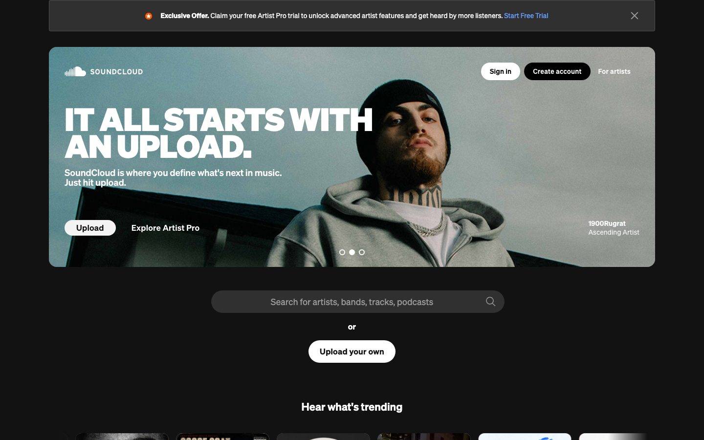
SoundCloud's landing surface is a dark, music-first marketing interface anchored on near-black canvas (`{colors.canvas}` — #121212) with white Söhne typography (`{colors.ink}` — #ffffff). The system reads as bold and editorial — oversized all-caps display headlines set in Söhne 800 with tight leading, album-art photography filling the hero and trending rows, and pill-shaped buttons for every action. It's the visual language of street/rap culture applied to a SaaS marketing page: confident, loud, image-heavy.

Type voltage is the whole story. The hero headline ("IT ALL STARTS WITH AN UPLOAD.") and section heads ("NEVER STOP LISTENING", "CALLING ALL CREATORS") run at `{typography.display}` — 65px, weight 800, line-height 0.85 (nearly solid), letter-spacing -0.02em. This ultra-tight, ultra-heavy display treatment is the signature. Supporting copy sits in `{typography.body}` at 19px weight 600, still heavier than most marketing body text, keeping the whole page dense and assertive.

Color is deliberately restrained. The palette is essentially monochrome — white ink on near-black canvas — with SoundCloud's signature orange (`{colors.accent-orange}` — #ff5500) appearing only as a small brand spark (the promo-banner badge, the illustrated phone graphic) and a blue link tone (`{colors.accent-blue}` — #699fff) on inline links like "Start Free Trial". The brand does not use orange on primary CTAs; actions are black-and-white pills.

**Key Characteristics:**
- Dark canvas (`{colors.canvas}` — #121212) across the entire page. There is no light-surface mode; even the footer stays on canvas.
- Oversized all-caps display type — Söhne 800 at 65px with 0.85 line-height and -0.02em tracking. Scale carries the hierarchy, not color.
- Pill buttons in two modes: white pill (`{component.button-pill-light}` — "Sign in", "Upload your own", "Find out more") and black pill (`{component.button-pill-dark}` — "Create account"). Both use `{rounded.pill}`.
- Orange (`{colors.accent-orange}` — #ff5500) as a scarce brand spark, never as a CTA fill.
- Blue (`{colors.accent-blue}` — #699fff) reserved for inline text links.
- Album-art thumbnails in the trending row and hero photography drive the visual energy — the product content is the decoration.
- Radius is bimodal: `{rounded.sm}` (4px) for track thumbnails and small chrome, `{rounded.lg}` (12px) for the hero carousel card, `{rounded.pill}` for buttons and the search field.
- A single hairline treatment: a 1px inset border at 10% canvas alpha (derived from the measured `rgba(18,18,18,0.1) 0 0 0 1px inset` shadow) outlines subtle surfaces.

## Colors

### Brand & Accent
- **Accent Orange** (`{colors.accent-orange}` — #ff5500): SoundCloud's signature brand orange. Appears as a scarce spark — the promo-banner star badge and the illustrated phone/headphones graphic in the "NEVER STOP LISTENING" band. Never used as a button fill or CTA.
- **Accent Blue** (`{colors.accent-blue}` — #699fff): The highest-frequency accent (measured 145). Used on inline text links such as "Start Free Trial" in the promo banner.
- **Accent Blue Deep** (`{colors.accent-blue-deep}` — #044dd2): A deeper blue measured in the palette; appears in illustration/product artwork rather than UI chrome.
- **Accent Crimson** (`{colors.accent-crimson}` — #d61348): A low-frequency red/magenta measured in artwork accents.

### Surface
- **Canvas** (`{colors.canvas}` — #121212): The universal page floor. Every band, including the footer, sits on this near-black.
- **Black** (`{colors.black}` — #000000): The "Create account" pill background — a true black that reads slightly darker than the canvas.
- **Surface Input** (`{colors.surface-input}` — #303030): The search field / input background and the promo-banner and player-bar chrome — a lifted dark gray.
- **Surface White** (`{colors.surface-white}` — #f3f3f3): The white pill button surface for light buttons.

### Text
- **Ink** (`{colors.ink}` — #ffffff): All display headlines, body copy, and light-button labels.
- **Muted** (`{colors.muted}` — #999999): Secondary text and input placeholders ("Search for artists, bands, tracks, podcasts"). This is the measured `button.color` / on-primary role.
- **Muted Strong** (`{colors.muted-strong}` — #666666): Tertiary text — footer links, fine print.
- **Disabled** (`{colors.disabled}` — #cccccc): A light gray measured at low frequency; use for disabled / de-emphasized inline states.

## Typography

### Font Family
The system runs **Söhne** (a licensed grotesque from Klim Type Foundry) for everything — display, headings, body, and buttons. Söhne is not available as a free web font; the documented open-source substitute is **Inter**. Inter's grotesque proportions approximate Söhne reasonably at weight 600–800, though Söhne's tighter apertures give SoundCloud its distinctive editorial feel. The full stack is `Söhne, Inter, sans-serif`.

SoundCloud uses a single typeface across all roles — differentiation comes from weight (600 → 800) and size, not from a display/body font split.

### Hierarchy

| Token | Size | Weight | Line Height | Letter Spacing | Use |
|---|---|---|---|---|---|
| `{typography.display}` | 65px | 800 | 0.85 | -0.02em | Hero + section headlines ("IT ALL STARTS WITH AN UPLOAD.", "NEVER STOP LISTENING", "CALLING ALL CREATORS") |
| `{typography.heading}` | 28px | 600 | 1.286 | normal | Section sub-heads ("Hear what's trending") |
| `{typography.body}` | 19px | 600 | 1.1 | -0.01em | Hero sub-copy, descriptive paragraphs, search placeholder |
| `{typography.button}` | 14px | 600 | 1.429 | normal | Button labels, nav items, footer links |

### Principles
The display style is the brand voice: Söhne 800, all-caps, line-height 0.85 (headlines nearly touch), -0.02em tracking. This ultra-tight, ultra-heavy setting is what makes the page feel like a music-magazine cover rather than a SaaS site. Never loosen the display leading — the compression is intentional.

Note that even the "body" role is weight 600 — SoundCloud runs no light or regular weight in the measured set. The page stays uniformly bold. Reserve the 800 weight for display headlines only.

### Note on Font Substitutes
Söhne is licensed and cannot be shipped freely. Use **Inter** at weight 800 with -0.02em tracking to approximate the display headline; the weight + negative tracking preserve the signature even though Inter's letterforms are more open than Söhne's. **Manrope** at weight 800 is a secondary alternative. Do not claim to serve Söhne without a license.

## Layout

### Spacing System
- **Base unit:** effectively a 6/12 rhythm (the two highest-frequency measured values are 12px at 119 and 6px at 77).
- **Tokens:** `{spacing.xxs}` 4px · `{spacing.xs}` 6px · `{spacing.sm}` 8px · `{spacing.md}` 12px · `{spacing.lg}` 16px · `{spacing.xl}` 24px.
- **Dominant gaps:** `{spacing.md}` (12px) is the workhorse gap for button/nav clusters; `{spacing.xs}` (6px) and `{spacing.sm}` (8px) handle tight inner padding.
- **Larger section spacing** (values like 20, 24, 25, 30px measured at low frequency) governs the vertical breaks between marketing bands; only `{spacing.xl}` (24px) is frequent enough to token confidently.

### Grid & Container
- **Hero:** a full-width rounded carousel card (`{component.hero-carousel-card}`) with the headline + button row over left-anchored photography; a slide-dot indicator sits centered near the bottom.
- **Trending row:** a horizontal scroll rail of `{component.track-card}` album-art thumbnails, roughly 6-up at desktop.
- **Split bands:** the "CALLING ALL CREATORS" band uses a 2-column split (photo left, headline + copy + button right).
- **Footer:** a centered social-icon row above a single wrapping link line and a language selector.

### Whitespace Philosophy
The page is dense and image-forward. Whitespace is used between major bands to separate the hero, search, trending rail, app-download band, and creator band — but within each band the tight display leading and heavy weights keep everything compact and assertive.

## Elevation & Depth

| Level | Treatment | Use |
|---|---|---|
| Flat | No shadow, no border | Body sections, footer, headlines on canvas |
| Hairline inset | `rgba(18, 18, 18, 0.1) 0 0 0 1px inset` (measured) | Subtle 1px inset outline on lifted surfaces / inputs |
| Photographic card | Album-art or hero photo fills the surface | Hero carousel card, track thumbnails |

The elevation model is essentially flat. The only measured depth cue is a single 1px inset border at 10% canvas alpha — SoundCloud relies on the dark canvas plus photography for depth, not on drop shadows.

### Decorative Depth
- The illustrated phone-headphones-chain graphic in the "NEVER STOP LISTENING" band carries the orange (`{colors.accent-orange}`) and purple tones — a decorative collage that adds chromatic energy without introducing UI-level color.
- Album-art thumbnails in the trending rail bring their own color; the trending row is the most colorful zone of an otherwise monochrome page.

## Shapes

### Border Radius Scale

| Token | Value | Use |
|---|---|---|
| `{rounded.xs}` | 3px | Text input corners (measured on `input`) |
| `{rounded.sm}` | 4px | Track-card thumbnails and small chrome (highest-frequency radius, measured 76×) |
| `{rounded.lg}` | 12px | Hero carousel card (measured 44×) |
| `{rounded.pill}` | 9999px | All pill buttons and the search field |

### Photography Geometry
Hero photography fills the `{rounded.lg}` (12px) carousel card. Track thumbnails use `{rounded.sm}` (4px) squares. Buttons and the search field are fully `{rounded.pill}`. The bimodal radius system — sharp-ish 4px on content, fully round on actions — keeps interactive elements clearly distinct from media.

## Components

### Navigation & Banner

**`top-nav`** — Transparent nav overlaid on the hero carousel. SoundCloud wordmark + cloud logo at left; right cluster holds `{component.button-pill-light}` ("Sign in"), `{component.button-pill-dark}` ("Create account"), and a `{component.button-text-link}` ("For artists"). Labels in `{typography.button}`.

**`promo-banner`** — A full-width bar pinned above the hero on `{colors.surface-input}` (#303030). Carries an orange star badge, bold offer copy in `{colors.ink}`, an inline `{component.link-inline}` ("Start Free Trial") in `{colors.accent-blue}`, and a dismiss "×" at right.

### Buttons & Links

**`button-pill-light`** — The primary light action. Background `{colors.surface-white}`, text `{colors.canvas}`, type `{typography.button}`, fully `{rounded.pill}`. Used for "Sign in", "Upload", "Upload your own", "Explore trending playlists", and "Find out more".

**`button-pill-dark`** — The dark action pill. Background `{colors.black}`, text `{colors.ink}`, fully `{rounded.pill}`. Used for "Create account". The black-on-dark pill sits quietly next to the white pill — the pairing gives the nav a two-tone action set without introducing accent color.

**`button-text-link`** — Bare text button in `{colors.ink}`, no background. Used for "For artists" and "Explore Artist Pro".

**`link-inline`** — Inline text link in `{colors.accent-blue}` (#699fff). Used for banner and body links like "Start Free Trial".

### Inputs

**`search-input`** — The large centered search field beneath the hero. Background `{colors.surface-input}`, placeholder text `{colors.muted}`, type `{typography.body}`, fully `{rounded.pill}`, with a magnifier icon at right.

**`input`** — Standard text input measured at background `{colors.surface-input}` (#303030) and `{rounded.xs}` (3px) corners. The generic form-field baseline.

### Content Cards

**`hero-carousel-card`** — The marquee component: a full-width rounded card (`{rounded.lg}` — 12px) holding hero photography, the `{typography.display}` headline, sub-copy, an action row, and a centered slide-dot indicator. Slides advance through multiple artist stories.

**`track-card`** — Album-art thumbnails in the "Hear what's trending" rail. Square artwork at `{rounded.sm}` (4px) with track title in `{typography.button}` and artist name in `{colors.muted}` below.

### Player & Footer

**`player-bar`** — A dark playback bar (`{colors.surface-input}`) that appears over the trending rail on interaction, with transport controls (previous, play, next, shuffle, repeat) and a volume control in `{colors.ink}`.

**`footer`** — Sits on `{colors.canvas}` (no color shift). A centered social-icon row (X, Discord, TikTok, YouTube, Facebook, Instagram) above a single wrapping link line in `{colors.muted-strong}` (`{typography.button}`), a language selector, and the SoundCloud wordmark centered at the bottom.

## Do's and Don'ts

### Do
- Keep the entire page on `{colors.canvas}` (#121212). There is no light mode — the dark canvas is the brand.
- Use `{typography.display}` (Söhne 800, 0.85 line-height, -0.02em) for every marketing headline. Scale + weight carry the hierarchy.
- Set display headlines in all-caps with tight leading so multi-line heads nearly touch. The compression is the signature.
- Reserve `{colors.accent-orange}` (#ff5500) for scarce brand sparks (badges, illustration) — never as a button fill.
- Keep actions monochrome: white pill (`{component.button-pill-light}`) + black pill (`{component.button-pill-dark}`).
- Use `{colors.accent-blue}` only for inline text links.
- Let album-art and photography carry the color; the UI chrome stays black-and-white.

### Don't
- Don't loosen display line-height above ~0.85 — the tight leading is the brand voice.
- Don't introduce a light-surface section; the whole page (including footer) stays on canvas.
- Don't put SoundCloud orange on a CTA. Actions are pills, not orange.
- Don't add drop shadows — the system's only depth cue is a 1px inset hairline at 10% alpha.
- Don't mix radius modes on one element — content is 4px, actions are pill.
- Don't run body copy in a light weight; the measured system is uniformly 600+.
- Don't document hover styling — default and active/pressed only.

## Responsive Behavior

### Breakpoints
Only the desktop landing page was captured, so breakpoint behavior is inferred from layout structure rather than measured.

| Name | Width | Key Changes (inferred) |
|---|---|---|
| Mobile | < 768px | Nav likely collapses to logo + condensed actions; hero display type scales down from 65px; trending rail stays horizontally scrollable; split bands stack |
| Tablet | 768–1024px | Two-column creator band may compress; trending rail shows fewer cards |
| Desktop | > 1024px | Full nav, full-width hero carousel card, ~6-up trending rail |

### Touch Targets
- Pill buttons (`{component.button-pill-light}` / `{component.button-pill-dark}`) provide generous rounded tap areas.
- The `{component.search-input}` is a large full-width pill — an easy target.
- Carousel slide-dots and player transport controls are small; exact tap sizes were not measured.

### Collapsing Strategy
- The trending row is a horizontal scroll rail — it reduces visible cards rather than reflowing.
- The hero carousel advances between artist slides via the centered dot indicator.
- The creator split band (photo + copy) is a candidate to stack on narrow viewports.

### Image Behavior
- Hero photography fills the `{rounded.lg}` carousel card and crops to the visible slide.
- Track thumbnails crop to `{rounded.sm}` squares.

## Iteration Guide

1. Focus on ONE component at a time; reference its YAML key directly (`{component.hero-carousel-card}`, `{component.button-pill-dark}`).
2. Variants (`-active`, `-disabled`) live as separate entries in `components:`.
3. Use `{token.refs}` everywhere — never inline a hex in a component.
4. Never document hover. Default and active/pressed only.
5. Display headlines stay Söhne 800, all-caps, 0.85 leading, -0.02em. The compression does not relax.
6. Keep the canvas dark and the actions monochrome. Orange is a spark, not a CTA.
7. When in doubt about emphasis: bigger display type before more color.

## Known Gaps

- **Söhne is a licensed typeface** (Klim Type Foundry) and cannot be shipped freely; Inter is documented as the open-source substitute in Typography.
- The measured `button-primary` component reports `color: #999999, radius: 0px, padding: 0px` — these values appear to be a generic/reset capture (likely a bare `<button>` element) and do NOT reflect the rendered pill buttons visible in the screenshots. Pill button specs (surface, pill radius, dark label) are documented from screenshot ground-truth.
- Many measured "accent" colors (#846170, #70929c, #e6846e, #33691e, #003bb3, #5a45fd, #6f5b37, #8e8485) are album-art / photography sampling artifacts from the trending rail and hero, not brand tokens; only the recurring brand hues (orange, blue) were promoted.
- Only the landing page was captured — responsive breakpoints, interior product surfaces, and the actual player/track pages are out of scope and inferred where noted.
- Section-level vertical spacing beyond `{spacing.xl}` (24px) was measured only at very low frequency (20/25/30px); a formal section-spacing token is not asserted.
- Active/pressed and disabled button states were not measured; only default states are documented.
- Animation and carousel transition timings were not captured.
- Exact touch-target dimensions for slide-dots, player transport controls, and social icons were not measured.

<!-- Documented by Duply · real-world design systems as ready-to-use DESIGN.md for AI coding agents · https://duply.ai/soundcloud/design-md -->
Color Palette
Accent
Neutrals
Typography
display65px · 800 · 0.85
The quick brown fox jumpsheading28px · 600 · 1.286
The quick brown fox jumpsbody19px · 600 · 1.1
The quick brown fox jumpsbutton14px · 600 · 1.429
The quick brown fox jumpsSpacing & Shape
Spacing
| Name | Value | Preview |
|---|---|---|
| xxs | 4px | |
| xs | 6px | |
| sm | 8px | |
| md | 12px | |
| lg | 16px | |
| xl | 24px |
Border Radius
| Name | Value | Preview |
|---|---|---|
| xs | 3px | |
| sm | 4px | |
| lg | 12px | |
| pill | 9999px |
FAQ
- What colors does SoundCloud use?
- SoundCloud's core palette includes #ffffff, #121212, #000000, #699fff, #044dd2. The full color set with usage roles (canvas, ink, surfaces, accent, semantic) is documented in the SoundCloud DESIGN.md.
- What font does SoundCloud use?
- SoundCloud's primary typeface is Söhne. The complete type scale (sizes, weights, line-height and letter-spacing per role), with an open substitute where the original is licensed, is documented in the DESIGN.md.
- What is the SoundCloud design system?
- A dark-canvas, music-first marketing interface built on near-black (#121212) with white Söhne display typography set at heavy weights and negative tracking. The system reads as bold, editorial, and street-culture-forward — oversized all-caps display headlines, pill-shaped white and black buttons
Get this as a working kit
SoundCloud Launch Kit + DESIGN.md
$299$225
One-time payment
- A complete production-stack template, styled like SoundCloud, fully built and wired.
- One-time payment and the codebase is yours. No platform fees, no subscription.
Open it with Claude Code, Cursor, or any coding agent and build in plain language, then ship a complete web app.
- Your private DESIGN.md
- Marketing pages, blog, SEO & legal
- Email capture, newsletter & contact
- Accept payments (Stripe)
- Analytics (GA4 + PostHog)
- One-click deploy
- Auth, login & roles
- A full app dashboard, when you grow
More like this

---
version: alpha
name: SoundCloud-design-analysis
description: "A dark-canvas, music-first marketing interface built on near-black (#121212) with white Söhne display typography set at heavy weights and negative tracking. The system reads as bold, editorial, and street-culture-forward — oversized all-caps display headlines, pill-shaped white and black buttons, album-art thumbnails, and SoundCloud's signature orange used sparingly as a brand spark rather than a primary action color. Voltage comes from scale (65px display type) and photography, not from a colorful palette."
colors:
  ink: "#ffffff"
  canvas: "#121212"
  black: "#000000"
  accent-blue: "#699fff"
  accent-blue-deep: "#044dd2"
  accent-orange: "#ff5500"
  accent-crimson: "#d61348"
  muted: "#999999"
  muted-strong: "#666666"
  disabled: "#cccccc"
  surface-input: "#303030"
  surface-white: "#f3f3f3"
typography:
  display:
    fontFamily: "Söhne, Inter, sans-serif"
    fontSize: 65px
    fontWeight: 800
    lineHeight: 0.85
    letterSpacing: -0.02em
  heading:
    fontFamily: "Söhne, Inter, sans-serif"
    fontSize: 28px
    fontWeight: 600
    lineHeight: 1.286
    letterSpacing: normal
  body:
    fontFamily: "Söhne, Inter, sans-serif"
    fontSize: 19px
    fontWeight: 600
    lineHeight: 1.1
    letterSpacing: -0.01em
  button:
    fontFamily: "Söhne, Inter, sans-serif"
    fontSize: 14px
    fontWeight: 600
    lineHeight: 1.429
    letterSpacing: normal
rounded:
  xs: 3px
  sm: 4px
  lg: 12px
  pill: 9999px
spacing:
  xxs: 4px
  xs: 6px
  sm: 8px
  md: 12px
  lg: 16px
  xl: 24px
components:
  top-nav:
    backgroundColor: transparent
    textColor: "{colors.ink}"
    typography: "{typography.button}"
  promo-banner:
    backgroundColor: "{colors.surface-input}"
    textColor: "{colors.ink}"
    typography: "{typography.button}"
  button-pill-light:
    backgroundColor: "{colors.surface-white}"
    textColor: "{colors.canvas}"
    typography: "{typography.button}"
    rounded: "{rounded.pill}"
  button-pill-dark:
    backgroundColor: "{colors.black}"
    textColor: "{colors.ink}"
    typography: "{typography.button}"
    rounded: "{rounded.pill}"
  button-text-link:
    backgroundColor: transparent
    textColor: "{colors.ink}"
    typography: "{typography.button}"
  link-inline:
    backgroundColor: transparent
    textColor: "{colors.accent-blue}"
    typography: "{typography.button}"
  search-input:
    backgroundColor: "{colors.surface-input}"
    textColor: "{colors.muted}"
    typography: "{typography.body}"
    rounded: "{rounded.pill}"
  input:
    backgroundColor: "{colors.surface-input}"
    textColor: "{colors.ink}"
    typography: "{typography.button}"
    rounded: "{rounded.xs}"
  hero-carousel-card:
    backgroundColor: "{colors.canvas}"
    textColor: "{colors.ink}"
    typography: "{typography.display}"
    rounded: "{rounded.lg}"
  track-card:
    backgroundColor: "{colors.canvas}"
    textColor: "{colors.ink}"
    typography: "{typography.button}"
    rounded: "{rounded.sm}"
  player-bar:
    backgroundColor: "{colors.surface-input}"
    textColor: "{colors.ink}"
    typography: "{typography.button}"
  footer:
    backgroundColor: "{colors.canvas}"
    textColor: "{colors.muted}"
    typography: "{typography.button}"
---

## Overview

SoundCloud's landing surface is a dark, music-first marketing interface anchored on near-black canvas (`{colors.canvas}` — #121212) with white Söhne typography (`{colors.ink}` — #ffffff). The system reads as bold and editorial — oversized all-caps display headlines set in Söhne 800 with tight leading, album-art photography filling the hero and trending rows, and pill-shaped buttons for every action. It's the visual language of street/rap culture applied to a SaaS marketing page: confident, loud, image-heavy.

Type voltage is the whole story. The hero headline ("IT ALL STARTS WITH AN UPLOAD.") and section heads ("NEVER STOP LISTENING", "CALLING ALL CREATORS") run at `{typography.display}` — 65px, weight 800, line-height 0.85 (nearly solid), letter-spacing -0.02em. This ultra-tight, ultra-heavy display treatment is the signature. Supporting copy sits in `{typography.body}` at 19px weight 600, still heavier than most marketing body text, keeping the whole page dense and assertive.

Color is deliberately restrained. The palette is essentially monochrome — white ink on near-black canvas — with SoundCloud's signature orange (`{colors.accent-orange}` — #ff5500) appearing only as a small brand spark (the promo-banner badge, the illustrated phone graphic) and a blue link tone (`{colors.accent-blue}` — #699fff) on inline links like "Start Free Trial". The brand does not use orange on primary CTAs; actions are black-and-white pills.

**Key Characteristics:**
- Dark canvas (`{colors.canvas}` — #121212) across the entire page. There is no light-surface mode; even the footer stays on canvas.
- Oversized all-caps display type — Söhne 800 at 65px with 0.85 line-height and -0.02em tracking. Scale carries the hierarchy, not color.
- Pill buttons in two modes: white pill (`{component.button-pill-light}` — "Sign in", "Upload your own", "Find out more") and black pill (`{component.button-pill-dark}` — "Create account"). Both use `{rounded.pill}`.
- Orange (`{colors.accent-orange}` — #ff5500) as a scarce brand spark, never as a CTA fill.
- Blue (`{colors.accent-blue}` — #699fff) reserved for inline text links.
- Album-art thumbnails in the trending row and hero photography drive the visual energy — the product content is the decoration.
- Radius is bimodal: `{rounded.sm}` (4px) for track thumbnails and small chrome, `{rounded.lg}` (12px) for the hero carousel card, `{rounded.pill}` for buttons and the search field.
- A single hairline treatment: a 1px inset border at 10% canvas alpha (derived from the measured `rgba(18,18,18,0.1) 0 0 0 1px inset` shadow) outlines subtle surfaces.

## Colors

### Brand & Accent
- **Accent Orange** (`{colors.accent-orange}` — #ff5500): SoundCloud's signature brand orange. Appears as a scarce spark — the promo-banner star badge and the illustrated phone/headphones graphic in the "NEVER STOP LISTENING" band. Never used as a button fill or CTA.
- **Accent Blue** (`{colors.accent-blue}` — #699fff): The highest-frequency accent (measured 145). Used on inline text links such as "Start Free Trial" in the promo banner.
- **Accent Blue Deep** (`{colors.accent-blue-deep}` — #044dd2): A deeper blue measured in the palette; appears in illustration/product artwork rather than UI chrome.
- **Accent Crimson** (`{colors.accent-crimson}` — #d61348): A low-frequency red/magenta measured in artwork accents.

### Surface
- **Canvas** (`{colors.canvas}` — #121212): The universal page floor. Every band, including the footer, sits on this near-black.
- **Black** (`{colors.black}` — #000000): The "Create account" pill background — a true black that reads slightly darker than the canvas.
- **Surface Input** (`{colors.surface-input}` — #303030): The search field / input background and the promo-banner and player-bar chrome — a lifted dark gray.
- **Surface White** (`{colors.surface-white}` — #f3f3f3): The white pill button surface for light buttons.

### Text
- **Ink** (`{colors.ink}` — #ffffff): All display headlines, body copy, and light-button labels.
- **Muted** (`{colors.muted}` — #999999): Secondary text and input placeholders ("Search for artists, bands, tracks, podcasts"). This is the measured `button.color` / on-primary role.
- **Muted Strong** (`{colors.muted-strong}` — #666666): Tertiary text — footer links, fine print.
- **Disabled** (`{colors.disabled}` — #cccccc): A light gray measured at low frequency; use for disabled / de-emphasized inline states.

## Typography

### Font Family
The system runs **Söhne** (a licensed grotesque from Klim Type Foundry) for everything — display, headings, body, and buttons. Söhne is not available as a free web font; the documented open-source substitute is **Inter**. Inter's grotesque proportions approximate Söhne reasonably at weight 600–800, though Söhne's tighter apertures give SoundCloud its distinctive editorial feel. The full stack is `Söhne, Inter, sans-serif`.

SoundCloud uses a single typeface across all roles — differentiation comes from weight (600 → 800) and size, not from a display/body font split.

### Hierarchy

| Token | Size | Weight | Line Height | Letter Spacing | Use |
|---|---|---|---|---|---|
| `{typography.display}` | 65px | 800 | 0.85 | -0.02em | Hero + section headlines ("IT ALL STARTS WITH AN UPLOAD.", "NEVER STOP LISTENING", "CALLING ALL CREATORS") |
| `{typography.heading}` | 28px | 600 | 1.286 | normal | Section sub-heads ("Hear what's trending") |
| `{typography.body}` | 19px | 600 | 1.1 | -0.01em | Hero sub-copy, descriptive paragraphs, search placeholder |
| `{typography.button}` | 14px | 600 | 1.429 | normal | Button labels, nav items, footer links |

### Principles
The display style is the brand voice: Söhne 800, all-caps, line-height 0.85 (headlines nearly touch), -0.02em tracking. This ultra-tight, ultra-heavy setting is what makes the page feel like a music-magazine cover rather than a SaaS site. Never loosen the display leading — the compression is intentional.

Note that even the "body" role is weight 600 — SoundCloud runs no light or regular weight in the measured set. The page stays uniformly bold. Reserve the 800 weight for display headlines only.

### Note on Font Substitutes
Söhne is licensed and cannot be shipped freely. Use **Inter** at weight 800 with -0.02em tracking to approximate the display headline; the weight + negative tracking preserve the signature even though Inter's letterforms are more open than Söhne's. **Manrope** at weight 800 is a secondary alternative. Do not claim to serve Söhne without a license.

## Layout

### Spacing System
- **Base unit:** effectively a 6/12 rhythm (the two highest-frequency measured values are 12px at 119 and 6px at 77).
- **Tokens:** `{spacing.xxs}` 4px · `{spacing.xs}` 6px · `{spacing.sm}` 8px · `{spacing.md}` 12px · `{spacing.lg}` 16px · `{spacing.xl}` 24px.
- **Dominant gaps:** `{spacing.md}` (12px) is the workhorse gap for button/nav clusters; `{spacing.xs}` (6px) and `{spacing.sm}` (8px) handle tight inner padding.
- **Larger section spacing** (values like 20, 24, 25, 30px measured at low frequency) governs the vertical breaks between marketing bands; only `{spacing.xl}` (24px) is frequent enough to token confidently.

### Grid & Container
- **Hero:** a full-width rounded carousel card (`{component.hero-carousel-card}`) with the headline + button row over left-anchored photography; a slide-dot indicator sits centered near the bottom.
- **Trending row:** a horizontal scroll rail of `{component.track-card}` album-art thumbnails, roughly 6-up at desktop.
- **Split bands:** the "CALLING ALL CREATORS" band uses a 2-column split (photo left, headline + copy + button right).
- **Footer:** a centered social-icon row above a single wrapping link line and a language selector.

### Whitespace Philosophy
The page is dense and image-forward. Whitespace is used between major bands to separate the hero, search, trending rail, app-download band, and creator band — but within each band the tight display leading and heavy weights keep everything compact and assertive.

## Elevation & Depth

| Level | Treatment | Use |
|---|---|---|
| Flat | No shadow, no border | Body sections, footer, headlines on canvas |
| Hairline inset | `rgba(18, 18, 18, 0.1) 0 0 0 1px inset` (measured) | Subtle 1px inset outline on lifted surfaces / inputs |
| Photographic card | Album-art or hero photo fills the surface | Hero carousel card, track thumbnails |

The elevation model is essentially flat. The only measured depth cue is a single 1px inset border at 10% canvas alpha — SoundCloud relies on the dark canvas plus photography for depth, not on drop shadows.

### Decorative Depth
- The illustrated phone-headphones-chain graphic in the "NEVER STOP LISTENING" band carries the orange (`{colors.accent-orange}`) and purple tones — a decorative collage that adds chromatic energy without introducing UI-level color.
- Album-art thumbnails in the trending rail bring their own color; the trending row is the most colorful zone of an otherwise monochrome page.

## Shapes

### Border Radius Scale

| Token | Value | Use |
|---|---|---|
| `{rounded.xs}` | 3px | Text input corners (measured on `input`) |
| `{rounded.sm}` | 4px | Track-card thumbnails and small chrome (highest-frequency radius, measured 76×) |
| `{rounded.lg}` | 12px | Hero carousel card (measured 44×) |
| `{rounded.pill}` | 9999px | All pill buttons and the search field |

### Photography Geometry
Hero photography fills the `{rounded.lg}` (12px) carousel card. Track thumbnails use `{rounded.sm}` (4px) squares. Buttons and the search field are fully `{rounded.pill}`. The bimodal radius system — sharp-ish 4px on content, fully round on actions — keeps interactive elements clearly distinct from media.

## Components

### Navigation & Banner

**`top-nav`** — Transparent nav overlaid on the hero carousel. SoundCloud wordmark + cloud logo at left; right cluster holds `{component.button-pill-light}` ("Sign in"), `{component.button-pill-dark}` ("Create account"), and a `{component.button-text-link}` ("For artists"). Labels in `{typography.button}`.

**`promo-banner`** — A full-width bar pinned above the hero on `{colors.surface-input}` (#303030). Carries an orange star badge, bold offer copy in `{colors.ink}`, an inline `{component.link-inline}` ("Start Free Trial") in `{colors.accent-blue}`, and a dismiss "×" at right.

### Buttons & Links

**`button-pill-light`** — The primary light action. Background `{colors.surface-white}`, text `{colors.canvas}`, type `{typography.button}`, fully `{rounded.pill}`. Used for "Sign in", "Upload", "Upload your own", "Explore trending playlists", and "Find out more".

**`button-pill-dark`** — The dark action pill. Background `{colors.black}`, text `{colors.ink}`, fully `{rounded.pill}`. Used for "Create account". The black-on-dark pill sits quietly next to the white pill — the pairing gives the nav a two-tone action set without introducing accent color.

**`button-text-link`** — Bare text button in `{colors.ink}`, no background. Used for "For artists" and "Explore Artist Pro".

**`link-inline`** — Inline text link in `{colors.accent-blue}` (#699fff). Used for banner and body links like "Start Free Trial".

### Inputs

**`search-input`** — The large centered search field beneath the hero. Background `{colors.surface-input}`, placeholder text `{colors.muted}`, type `{typography.body}`, fully `{rounded.pill}`, with a magnifier icon at right.

**`input`** — Standard text input measured at background `{colors.surface-input}` (#303030) and `{rounded.xs}` (3px) corners. The generic form-field baseline.

### Content Cards

**`hero-carousel-card`** — The marquee component: a full-width rounded card (`{rounded.lg}` — 12px) holding hero photography, the `{typography.display}` headline, sub-copy, an action row, and a centered slide-dot indicator. Slides advance through multiple artist stories.

**`track-card`** — Album-art thumbnails in the "Hear what's trending" rail. Square artwork at `{rounded.sm}` (4px) with track title in `{typography.button}` and artist name in `{colors.muted}` below.

### Player & Footer

**`player-bar`** — A dark playback bar (`{colors.surface-input}`) that appears over the trending rail on interaction, with transport controls (previous, play, next, shuffle, repeat) and a volume control in `{colors.ink}`.

**`footer`** — Sits on `{colors.canvas}` (no color shift). A centered social-icon row (X, Discord, TikTok, YouTube, Facebook, Instagram) above a single wrapping link line in `{colors.muted-strong}` (`{typography.button}`), a language selector, and the SoundCloud wordmark centered at the bottom.

## Do's and Don'ts

### Do
- Keep the entire page on `{colors.canvas}` (#121212). There is no light mode — the dark canvas is the brand.
- Use `{typography.display}` (Söhne 800, 0.85 line-height, -0.02em) for every marketing headline. Scale + weight carry the hierarchy.
- Set display headlines in all-caps with tight leading so multi-line heads nearly touch. The compression is the signature.
- Reserve `{colors.accent-orange}` (#ff5500) for scarce brand sparks (badges, illustration) — never as a button fill.
- Keep actions monochrome: white pill (`{component.button-pill-light}`) + black pill (`{component.button-pill-dark}`).
- Use `{colors.accent-blue}` only for inline text links.
- Let album-art and photography carry the color; the UI chrome stays black-and-white.

### Don't
- Don't loosen display line-height above ~0.85 — the tight leading is the brand voice.
- Don't introduce a light-surface section; the whole page (including footer) stays on canvas.
- Don't put SoundCloud orange on a CTA. Actions are pills, not orange.
- Don't add drop shadows — the system's only depth cue is a 1px inset hairline at 10% alpha.
- Don't mix radius modes on one element — content is 4px, actions are pill.
- Don't run body copy in a light weight; the measured system is uniformly 600+.
- Don't document hover styling — default and active/pressed only.

## Responsive Behavior

### Breakpoints
Only the desktop landing page was captured, so breakpoint behavior is inferred from layout structure rather than measured.

| Name | Width | Key Changes (inferred) |
|---|---|---|
| Mobile | < 768px | Nav likely collapses to logo + condensed actions; hero display type scales down from 65px; trending rail stays horizontally scrollable; split bands stack |
| Tablet | 768–1024px | Two-column creator band may compress; trending rail shows fewer cards |
| Desktop | > 1024px | Full nav, full-width hero carousel card, ~6-up trending rail |

### Touch Targets
- Pill buttons (`{component.button-pill-light}` / `{component.button-pill-dark}`) provide generous rounded tap areas.
- The `{component.search-input}` is a large full-width pill — an easy target.
- Carousel slide-dots and player transport controls are small; exact tap sizes were not measured.

### Collapsing Strategy
- The trending row is a horizontal scroll rail — it reduces visible cards rather than reflowing.
- The hero carousel advances between artist slides via the centered dot indicator.
- The creator split band (photo + copy) is a candidate to stack on narrow viewports.

### Image Behavior
- Hero photography fills the `{rounded.lg}` carousel card and crops to the visible slide.
- Track thumbnails crop to `{rounded.sm}` squares.

## Iteration Guide

1. Focus on ONE component at a time; reference its YAML key directly (`{component.hero-carousel-card}`, `{component.button-pill-dark}`).
2. Variants (`-active`, `-disabled`) live as separate entries in `components:`.
3. Use `{token.refs}` everywhere — never inline a hex in a component.
4. Never document hover. Default and active/pressed only.
5. Display headlines stay Söhne 800, all-caps, 0.85 leading, -0.02em. The compression does not relax.
6. Keep the canvas dark and the actions monochrome. Orange is a spark, not a CTA.
7. When in doubt about emphasis: bigger display type before more color.

## Known Gaps

- **Söhne is a licensed typeface** (Klim Type Foundry) and cannot be shipped freely; Inter is documented as the open-source substitute in Typography.
- The measured `button-primary` component reports `color: #999999, radius: 0px, padding: 0px` — these values appear to be a generic/reset capture (likely a bare `<button>` element) and do NOT reflect the rendered pill buttons visible in the screenshots. Pill button specs (surface, pill radius, dark label) are documented from screenshot ground-truth.
- Many measured "accent" colors (#846170, #70929c, #e6846e, #33691e, #003bb3, #5a45fd, #6f5b37, #8e8485) are album-art / photography sampling artifacts from the trending rail and hero, not brand tokens; only the recurring brand hues (orange, blue) were promoted.
- Only the landing page was captured — responsive breakpoints, interior product surfaces, and the actual player/track pages are out of scope and inferred where noted.
- Section-level vertical spacing beyond `{spacing.xl}` (24px) was measured only at very low frequency (20/25/30px); a formal section-spacing token is not asserted.
- Active/pressed and disabled button states were not measured; only default states are documented.
- Animation and carousel transition timings were not captured.
- Exact touch-target dimensions for slide-dots, player transport controls, and social icons were not measured.

<!-- Documented by Duply · real-world design systems as ready-to-use DESIGN.md for AI coding agents · https://duply.ai/soundcloud/design-md -->