Scale
A bold, AI-infrastructure-first interface built on a stark white-and-black contrast system, anchored by the Aeonik display typeface at very large sizes with tight negative tracking. The system reads as serious, editorial, and confidently engineered — full-bleed cinematic imagery (oil rigs, ultrasound scans, brain MRI fragments) sits behind oversized light-weight headlines, while pure-black full-bleed sections and dark cards (24px radius) close the composition. Brand voltage comes from scale (116px Aeonik h1), a near-monochrome palette, and a sparse set of muted pastel accents drawn from imagery rather than from a saturated brand color.
---
version: alpha
name: Scale-design-analysis
description: A bold, AI-infrastructure-first interface built on a stark white-and-black contrast system, anchored by the Aeonik display typeface at very large sizes with tight negative tracking. The system reads as serious, editorial, and confidently engineered — full-bleed cinematic imagery (oil rigs, ultrasound scans, brain MRI fragments) sits behind oversized light-weight headlines, while pure-black full-bleed sections and dark cards (24px radius) close the composition. Brand voltage comes from scale (116px Aeonik h1), a near-monochrome palette, and a sparse set of muted pastel accents drawn from imagery rather than from a saturated brand color.
colors:
ink: "#000000"
ink-deep: "#101828"
surface-dark: "#101010"
neutral-900: "#212121"
neutral-800: "#323232"
neutral-600: "#575757"
neutral-500: "#6a7282"
neutral-400: "#929292"
neutral-300: "#c7c7c7"
hairline: "#e5e7eb"
surface-soft: "#eaeaea"
surface-softest: "#f2f2f2"
canvas: "#ffffff"
on-primary: "#ffffff"
on-dark: "#ffffff"
body: "#72ce7b"
accent-blue: "#006adc"
accent-sky: "#86bff2"
accent-periwinkle: "#7b8fdd"
accent-lilac: "#d1aad7"
accent-orchid: "#c88bc4"
accent-tan: "#a8927c"
typography:
h1:
fontFamily: "Aeonik, Inter, sans-serif"
fontSize: 116px
fontWeight: 400
lineHeight: 1.0
letterSpacing: -1.16px
h2:
fontFamily: "Aeonik, Inter, sans-serif"
fontSize: 64px
fontWeight: 400
lineHeight: 1.05
letterSpacing: -0.64px
h3:
fontFamily: "Aeonik, Inter, sans-serif"
fontSize: 24px
fontWeight: 500
lineHeight: 1.5
letterSpacing: -0.24px
body:
fontFamily: "Aeonik, Inter, sans-serif"
fontSize: 32px
fontWeight: 400
lineHeight: 1.188
letterSpacing: -0.32px
button:
fontFamily: "Aeonik, Inter, sans-serif"
fontSize: 14px
fontWeight: 400
lineHeight: 1.0
letterSpacing: normal
rounded:
xs: 4px
sm: 6px
md: 8px
lg: 12px
xl: 16px
xxl: 24px
xxxl: 32px
spacing:
xxs: 4px
xs: 8px
sm: 12px
md: 16px
base: 20px
lg: 24px
xl: 32px
xxl: 48px
xxxl: 64px
section: 96px
components:
top-nav:
backgroundColor: "{colors.canvas}"
textColor: "{colors.ink}"
typography: "{typography.button}"
padding: 16px 32px
button-primary:
backgroundColor: "{colors.ink}"
textColor: "{colors.on-primary}"
typography: "{typography.button}"
rounded: "{rounded.md}"
padding: 12px 20px
button-secondary:
backgroundColor: "{colors.canvas}"
textColor: "{colors.ink}"
typography: "{typography.button}"
rounded: "{rounded.md}"
padding: 12px 20px
nav-link:
backgroundColor: transparent
textColor: "{colors.ink}"
typography: "{typography.button}"
hero-band:
backgroundColor: "{colors.ink}"
textColor: "{colors.on-dark}"
typography: "{typography.h1}"
padding: 96px
card-dark:
backgroundColor: "{colors.ink}"
textColor: "{colors.on-dark}"
rounded: "{rounded.xxl}"
padding: 48px
card-soft:
backgroundColor: "{colors.surface-soft}"
textColor: "{colors.ink}"
rounded: "{rounded.xl}"
padding: 32px
section-light:
backgroundColor: "{colors.surface-soft}"
textColor: "{colors.ink}"
typography: "{typography.h2}"
padding: 96px
carousel-arrow:
backgroundColor: "{colors.canvas}"
textColor: "{colors.ink}"
rounded: "{rounded.md}"
padding: 8px
---
## Overview
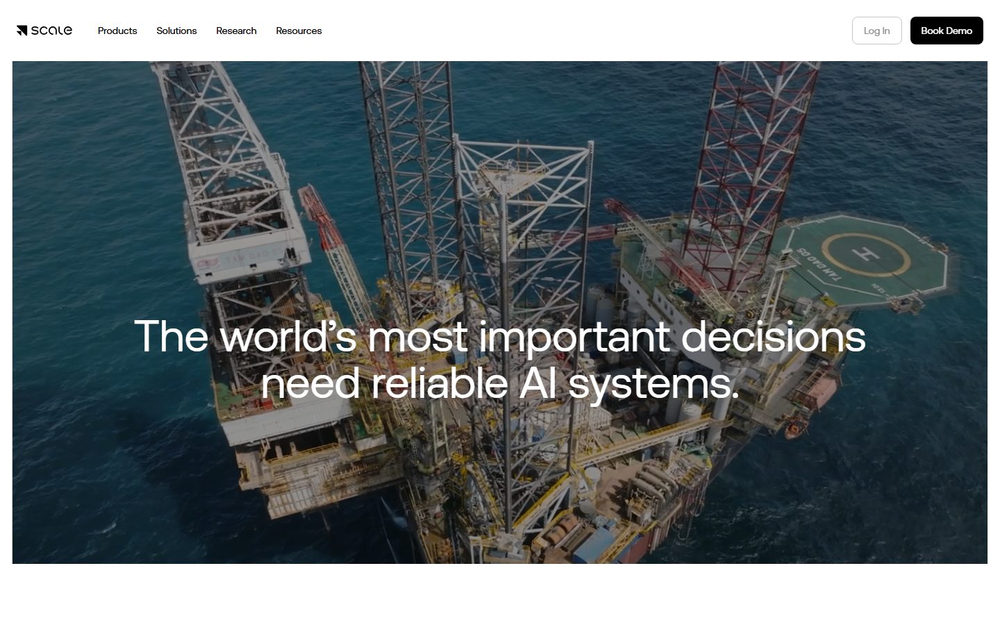
Scale's landing surface is a high-contrast, AI-infrastructure interface that alternates between pure white canvas (`{colors.canvas}` — #ffffff) and pure black (`{colors.ink}` — #000000). It reads as serious and editorial — large cinematic imagery (offshore oil rigs, medical ultrasound scans, brain MRI fragments) sits full-bleed behind oversized, light-weight Aeonik headlines. The composition is engineered to feel weighty and authoritative: huge type, deep blacks, and very few decorative flourishes.
The type voice is a single family carried across every role: **Aeonik**, used at weight 400 for almost everything and 500 only for the h3 step. The drama comes entirely from scale — the homepage h1 measures 116px with -1.16px tracking, set tight and lower-case-feeling against a photographic background. Negative letter-spacing runs through every role (-0.24px to -1.16px), which is core to the brand's precise, modern character.
Component voltage comes from **scale and contrast, not color**. Scale is near-monochrome: black ink, white canvas, and a graded neutral ramp (`{colors.neutral-400}` through `{colors.surface-softest}`). The only chromatic moments are a sparse set of muted pastel accents (`{colors.accent-sky}`, `{colors.accent-lilac}`, `{colors.accent-tan}`, etc.) that appear to be sampled from product imagery and gradient panels rather than used as a saturated brand color — the lone "real" UI accent is `{colors.accent-blue}` (#006adc).
Dark full-bleed sections and `{colors.ink}`-backed cards with a generous `{rounded.xxl}` (24px) radius punctuate the long scroll, closing the page the way a black footer would in a lighter system.
**Key Characteristics:**
- Pure black / pure white contrast system — `{colors.ink}` (#000000) and `{colors.canvas}` (#ffffff) do the heavy lifting; no soft off-white in the primary roles.
- Oversized Aeonik headlines (h1 at 116px / weight 400) with consistent negative tracking — the brand voice is scale, not weight.
- Full-bleed cinematic imagery behind hero headlines (oil rig, ultrasound) — the page reads as photographic editorial.
- Dark cards with `{rounded.xxl}` (24px) radius (`{component.card-dark}`) — the most rounded element in the system, used for product/feature panels on black sections.
- A graded neutral ramp (`{colors.neutral-900}` → `{colors.surface-softest}`) carries most secondary text and dividers.
- Muted pastel accents sampled from imagery — never used on CTAs; the only interactive accent is `{colors.accent-blue}`.
- Black primary CTA ("Book Demo") paired with an outlined white secondary CTA ("Log In") in the top nav.
- Border radius is hierarchical: `{rounded.md}` (8px) and `{rounded.xl}` (16px) dominate UI surfaces; `{rounded.xxl}` (24px) is reserved for the marquee dark cards.
## Colors
### Brand & Action
- **Ink** (`{colors.ink}` — #000000): The dominant action and structural color. Primary CTA background, headline text on light, the floor of all dark sections and dark cards. Scale's most-used color (frequency 779 on h3 alone).
- **Canvas** (`{colors.canvas}` — #ffffff): The default light page floor and the background of the outlined secondary CTA.
- **Accent Blue** (`{colors.accent-blue}` — #006adc): The only saturated interactive accent — used sparingly on links and small UI moments.
### Pastel Accents (image-sampled)
A muted, desaturated pastel set that appears on gradient panels, imagery overlays, and small decorative moments — never on CTAs:
- **Sky** (`{colors.accent-sky}` — #86bff2)
- **Periwinkle** (`{colors.accent-periwinkle}` — #7b8fdd)
- **Lilac** (`{colors.accent-lilac}` — #d1aad7)
- **Orchid** (`{colors.accent-orchid}` — #c88bc4)
- **Tan** (`{colors.accent-tan}` — #a8927c): Visible on the "Real Research" wordmark accent in the light AI section.
### Surface
- **Surface Dark** (`{colors.surface-dark}` — #101010): A near-black used on dark sections where a touch of lift from pure #000 is wanted.
- **Surface Soft** (`{colors.surface-soft}` — #eaeaea): Light-gray section background (the "Artificial Intelligence / Real Research" band) and soft cards.
- **Surface Softest** (`{colors.surface-softest}` — #f2f2f2): The lightest gray divider / panel tone.
- **Hairline** (`{colors.hairline}` — #e5e7eb): 1px border tone on light surfaces.
### Text & Neutral Ramp
- **Neutral 900** (`{colors.neutral-900}` — #212121), **Neutral 800** (`{colors.neutral-800}` — #323232), **Neutral 600** (`{colors.neutral-600}` — #575757), **Neutral 500** (`{colors.neutral-500}` — #6a7282), **Neutral 400** (`{colors.neutral-400}` — #929292), **Neutral 300** (`{colors.neutral-300}` — #c7c7c7): A six-step gray ramp carrying secondary headings, body, captions, and dividers from darkest to lightest.
- **Ink Deep** (`{colors.ink-deep}` — #101828): A blue-black used on certain dark text/labels.
- **Body** (`{colors.body}` — #72ce7b): Measured as the computed `p.color` value (frequency 646). This green reads as a measurement artifact / scoped paragraph color rather than the global body tone — see Known Gaps. It is documented faithfully but should not be applied as default running-text color; use the neutral ramp for body copy.
- **On Primary / On Dark** (`{colors.on-primary}` / `{colors.on-dark}` — #ffffff): Text on the black CTA and on all dark sections.
## Typography
### Font Family
The system runs a single typeface across every role: **Aeonik**, GT-style geometric grotesque used at weight 400 for display + body and weight 500 only at the h3 step. The fallback stack walks `Inter, sans-serif`. There is no separate body or mono family — Scale's hierarchy is built purely from size, weight (400 vs 500), and negative tracking.
### Hierarchy
| Token | Size | Weight | Line Height | Letter Spacing | Use |
|---|---|---|---|---|---|
| `{typography.h1}` | 116px | 400 | 1.0 | -1.16px | Hero headline ("The world's most important decisions need reliable AI systems.") |
| `{typography.body}` | 32px | 400 | 1.188 | -0.32px | Large editorial body / lead paragraphs |
| `{typography.h2}` | 64px | 400 | 1.05 | -0.64px | Section heads |
| `{typography.h3}` | 24px | 500 | 1.5 | -0.24px | Sub-section heads, card titles (the only weight-500 role) |
| `{typography.button}` | 14px | 400 | 1.0 | normal | Buttons + nav links |
### Principles
Aeonik at weight 400 is the brand voice — the hierarchy is driven by dramatic size jumps (116 → 64 → 32 → 24 → 14), not by weight changes. The single exception is h3, which steps to weight 500 to hold its own at a smaller size. Negative letter-spacing is mandatory on the display + body roles (-0.24px to -1.16px); Aeonik set with default tracking reads as off-brand. Note the inverted size relationship between `body` (32px) and `h3` (24px) — Scale uses oversized editorial body copy that is larger than some sub-heads.
### Note on Font Substitutes
**Aeonik** is a commercial typeface from CoType Foundry and is not freely available as a web font. If Aeonik cannot be licensed, **Inter** at weight 400/500 with roughly -0.01em tracking is a serviceable substitute that preserves the neutral-geometric character; **Söhne** or **Neue Haas Grotesk** are closer paid alternatives. Never ship a build that claims to embed Aeonik without a license — the frontmatter stack falls back to Inter for exactly this reason.
## Layout
### Spacing System
- **Base unit:** 4px.
- **Tokens:** `{spacing.xxs}` 4px · `{spacing.xs}` 8px · `{spacing.sm}` 12px · `{spacing.md}` 16px · `{spacing.base}` 20px · `{spacing.lg}` 24px · `{spacing.xl}` 32px · `{spacing.xxl}` 48px · `{spacing.xxxl}` 64px · `{spacing.section}` 96px.
- **Most-used steps:** 32px (frequency 90), 16px (73), 48px (47), 12px (48) — the system leans on 16/32/48 for the bulk of its rhythm.
- **Section padding:** `{spacing.section}` (96px) for major band separation; `{spacing.xxxl}` (64px) as a secondary large step.
- **Card internal padding:** `{spacing.xxl}` (48px) on dark cards; `{spacing.xl}` (32px) on soft cards.
### Grid & Container
- **Hero:** full-bleed image band with centered headline; content max width is generous (headline spans most of the viewport).
- **Section bands:** alternating full-bleed dark and light bands, each holding a single centered headline + supporting artifact.
- **Carousel rows:** "Proven across every industry" uses a horizontal card row with prev/next arrow controls at the right.
### Whitespace Philosophy
Scale uses very large vertical whitespace — the dark mid-page section runs tall and near-empty around its embedded ultrasound/MRI artifacts, letting imagery breathe. The rhythm is editorial and cinematic: each band does one thing, with 96px-class separation, oversized type, and lots of negative space.
## Elevation & Depth
| Level | Treatment | Use |
|---|---|---|
| Flat | No shadow, no border (`rgba(0,0,0,0) 0 0 0 0`) | Most surfaces — the default is flat |
| Inset hairline | `rgb(255,255,255) 0 0 0 1px inset` | White 1px inset ring on certain dark elements (e.g. outlined controls on dark) |
| Subtle drop | `rgba(0,0,0,0.1) 0 1px 3px, rgba(0,0,0,0.1) 0 1px 2px` | Light elevation on a small number of floating UI elements |
Scale's elevation philosophy is **near-flat**. The overwhelming majority of measured surfaces carry no shadow at all; depth is created by color-block contrast (black vs white) and by full-bleed imagery rather than by shadows. Only two shadow treatments appear in the measured set — a white inset ring and a faint two-layer drop.
### Decorative Depth
- Full-bleed photographic backgrounds (oil rig, ocean) carry their own depth and act as the hero's "elevation."
- Embedded product/scan imagery on the dark mid-page section (ultrasound, brain MRI with annotation boxes) sits as content with its own internal contrast — not a system shadow token.
## Shapes
### Border Radius Scale
| Token | Value | Use |
|---|---|---|
| `{rounded.xs}` | 4px | Smallest UI accents (frequency 3) |
| `{rounded.sm}` | 6px | Small controls, chips (frequency 22 — common) |
| `{rounded.md}` | 8px | Buttons, small cards (frequency 16) |
| `{rounded.lg}` | 12px | Mid cards (frequency 8) |
| `{rounded.xl}` | 16px | Dominant card / panel radius (frequency 61 — the most-used radius) |
| `{rounded.xxl}` | 24px | Marquee dark cards (`{component.card-dark}`) |
| `{rounded.xxxl}` | 32px | Largest panels (frequency 1) |
The system's workhorse radius is `{rounded.xl}` (16px) by a wide margin, with `{rounded.sm}` (6px) for small controls. The 24px `{rounded.xxl}` is reserved for the larger dark feature cards.
### Photography Geometry
Hero imagery is full-bleed and edge-to-edge (no radius). Embedded artifact panels inside dark sections use rounded corners (`{rounded.xl}` / `{rounded.xxl}`). Most cards round at 16px.
## Components
### Top Navigation
**`top-nav`** — White nav bar at the top of the page. Background `{colors.canvas}`, ink-colored content. Carries the Scale wordmark + arrow logo at left, a primary horizontal menu (Products, Solutions, Research, Resources) center-left, and a right-side cluster of `{component.button-secondary}` ("Log In", outlined) + `{component.button-primary}` ("Book Demo", solid black). Menu items use `{typography.button}` (Aeonik 14px / 400).
**`nav-link`** — Inline nav menu item, transparent background, `{colors.ink}` text, `{typography.button}`.
### Buttons
**`button-primary`** — The signature solid CTA ("Book Demo"). Background `{colors.ink}` (#000000), text `{colors.on-primary}` (#ffffff), type `{typography.button}` (Aeonik 14px / 400). The frequency analyzer reported `radius: 0px / padding: 0px` on the raw button node; the rendered chip is clearly rounded with internal padding in the screenshot, so `{rounded.md}` (8px) and 12px × 20px padding are **derived** from screenshot ground-truth — see Known Gaps.
**`button-secondary`** — Outlined light CTA ("Log In"). Background `{colors.canvas}`, text `{colors.ink}`, 1px `{colors.hairline}` border, `{rounded.md}` radius (derived, matching primary), same padding footprint as primary.
### Cards & Sections
**`hero-band`** — Full-bleed hero with a cinematic photographic background and a centered `{typography.h1}` headline in `{colors.on-dark}`. Background floor is `{colors.ink}` behind the image. Vertical padding `{spacing.section}` (96px).
**`card-dark`** — The marquee dark feature card used on black mid-page sections (holding product/scan artifacts). Background `{colors.ink}` (#000000), text `{colors.on-dark}`, rounded `{rounded.xxl}` (24px), no shadow, internal padding `{spacing.xxl}` (48px). This is the most-rounded surface in the system.
**`card-soft`** — Light panel card used inside the gray "Artificial Intelligence / Real Research" band and the industry carousel. Background `{colors.surface-soft}` (#eaeaea), text `{colors.ink}`, rounded `{rounded.xl}` (16px), padding `{spacing.xl}` (32px).
**`section-light`** — Light-gray editorial band. Background `{colors.surface-soft}`, centered `{typography.h2}` headline, vertical padding `{spacing.section}` (96px). Carries the "Real Research" accent word in `{colors.accent-tan}` and a "Get Started" `{component.button-secondary}`.
### Controls
**`carousel-arrow`** — Prev/next control on the "Proven across every industry" card row. Background `{colors.canvas}`, ink-colored icon, rounded `{rounded.md}`, 8px padding. Two arrows sit at the right edge of the section header.
## Do's and Don'ts
### Do
- Reserve `{colors.ink}` (#000000) for primary CTAs, headlines on light, and dark-section floors. Scale's button is pure black, never blue.
- Use Aeonik at weight 400 and build hierarchy through size — let the 116px h1 do the dramatic work.
- Apply negative letter-spacing on every display + body role (-0.24px to -1.16px). Aeonik with default tracking reads as off-brand.
- Use full-bleed cinematic imagery behind hero headlines — the photographic editorial feel is core to the brand.
- Keep accents muted and image-sampled. The pastel set (`{colors.accent-sky}`, `{colors.accent-lilac}`, `{colors.accent-tan}`, etc.) belongs on gradient panels and wordmark accents, never on CTAs.
- Reserve `{rounded.xxl}` (24px) for the marquee dark cards; use `{rounded.xl}` (16px) as the default card radius.
- Alternate light and dark full-bleed bands to pace the long scroll.
### Don't
- Don't saturate the palette. The only saturated UI accent is `{colors.accent-blue}` (#006adc); everything else stays monochrome or muted pastel.
- Don't bold the display type. The system is weight 400 throughout (500 only at h3) — bold headlines read as off-brand.
- Don't apply `{colors.body}` (#72ce7b) as a global body color — it is a scoped/artifact measurement; use the neutral ramp for running text.
- Don't add shadows to cards. The system is near-flat; depth comes from black/white contrast and imagery.
- Don't round the hero imagery — it stays full-bleed and edge-to-edge.
- Don't add hover state styling beyond default + pressed.
## Responsive Behavior
### Breakpoints
The single captured page is the desktop landing view, so breakpoint behavior is inferred from layout structure rather than measured at multiple widths.
| Name | Width | Key Changes (inferred) |
|---|---|---|
| Mobile | < 768px | Nav collapses to a menu trigger; hero h1 scales down dramatically from 116px; full-bleed bands stack; carousel becomes swipeable |
| Tablet | 768–1024px | Nav tightens; section headlines scale down; cards reduce to 1–2 up |
| Desktop | 1024–1440px | Full nav with all four menu items; oversized 116px h1; multi-card carousel rows |
| Wide | > 1440px | Same as desktop with more outer margin |
### Touch Targets
- `{component.button-primary}` / `{component.button-secondary}` carry enough padding for comfortable tapping (derived padding 12px × 20px).
- `{component.carousel-arrow}` at 8px padding around an icon — pair with adequate hit area on touch.
- Exact mobile touch-target sizing is not measured — see Known Gaps.
### Collapsing Strategy
- Top nav collapses to a menu trigger on small screens (inferred).
- Full-bleed hero and dark sections stack vertically; the 116px h1 must scale down substantially to fit narrow viewports.
- The industry carousel ("Proven across every industry") becomes swipeable, with arrow controls likely hidden or relocated.
### Image Behavior
- Hero and section imagery stays full-bleed at every breakpoint, cropping rather than letterboxing.
- Embedded artifact panels (ultrasound, MRI) retain their card framing and scale proportionally.
## Iteration Guide
1. Focus on ONE component at a time. Reference its YAML key directly (`{component.card-dark}`, `{component.button-primary}`).
2. Variants of an existing component live as separate entries in `components:`.
3. Use `{token.refs}` everywhere — never inline a hex in a component.
4. Never document hover. Default and Active/Pressed states only.
5. Hierarchy is size-driven Aeonik 400 with negative tracking — bigger before bolder.
6. Keep the palette monochrome at the action layer; pastels stay decorative.
7. The dark full-bleed band and `{component.card-dark}` are the system's punctuation — use them deliberately, not casually.
## Known Gaps
- The `{colors.body}` token (#72ce7b, frequency 646) was captured from `computed:p.color` but is green — inconsistent with the visibly black/gray body text in the screenshots. This is almost certainly a scoped paragraph color or measurement artifact; it is documented faithfully but should not be used as the global body color.
- `{component.button-primary}` measured `radius: 0px` and `padding: 0px` on the raw node, but the rendered "Book Demo" chip is clearly rounded with internal padding. The `{rounded.md}` radius and 12px × 20px padding are **derived** from screenshot ground-truth and should be confirmed against the live CSS.
- Only the desktop landing page was captured; tablet/mobile breakpoints, nav collapse, and touch-target sizing are inferred, not measured.
- **Aeonik** is a commercial typeface; license status was not flagged in the analysis (`fonts_licensed: []`) but it is not a free web font — an open substitute (Inter) is documented in Typography.
- The muted pastel accents (`{colors.accent-sky}`, `{colors.accent-lilac}`, `{colors.accent-orchid}`, `{colors.accent-periwinkle}`, `{colors.accent-tan}`) appear to be image/gradient-sampled; their exact usage rules and whether any are true brand tokens are not confirmed.
- Animation and transition timings (carousel motion, scroll reveals, video hero playback) are out of scope.
- Form, input, and validation component specs were not present on the captured landing page.
- Footer specification was not captured; the dark full-bleed sections appear to serve the page-closing role, but a dedicated footer was not measured.
<!-- Documented by duply · real-world design systems as ready-to-use DESIGN.md for AI coding agents · https://duply.ai/scale/design-md -->
Color Palette
Accent
Neutrals
Typography
h1116px · 400 · 1
The quick brown fox jumpsh264px · 400 · 1.05
The quick brown fox jumpsh324px · 500 · 1.5
The quick brown fox jumpsbody32px · 400 · 1.188
The quick brown fox jumpsbutton14px · 400 · 1
The quick brown fox jumpsSpacing & Shape
Spacing
| Name | Value | Preview |
|---|---|---|
| xxs | 4px | |
| xs | 8px | |
| sm | 12px | |
| md | 16px | |
| base | 20px | |
| lg | 24px | |
| xl | 32px | |
| xxl | 48px | |
| xxxl | 64px | |
| section | 96px |
Border Radius
| Name | Value | Preview |
|---|---|---|
| xs | 4px | |
| sm | 6px | |
| md | 8px | |
| lg | 12px | |
| xl | 16px | |
| xxl | 24px | |
| xxxl | 32px |
More like this


---
version: alpha
name: Scale-design-analysis
description: A bold, AI-infrastructure-first interface built on a stark white-and-black contrast system, anchored by the Aeonik display typeface at very large sizes with tight negative tracking. The system reads as serious, editorial, and confidently engineered — full-bleed cinematic imagery (oil rigs, ultrasound scans, brain MRI fragments) sits behind oversized light-weight headlines, while pure-black full-bleed sections and dark cards (24px radius) close the composition. Brand voltage comes from scale (116px Aeonik h1), a near-monochrome palette, and a sparse set of muted pastel accents drawn from imagery rather than from a saturated brand color.

colors:
  ink: "#000000"
  ink-deep: "#101828"
  surface-dark: "#101010"
  neutral-900: "#212121"
  neutral-800: "#323232"
  neutral-600: "#575757"
  neutral-500: "#6a7282"
  neutral-400: "#929292"
  neutral-300: "#c7c7c7"
  hairline: "#e5e7eb"
  surface-soft: "#eaeaea"
  surface-softest: "#f2f2f2"
  canvas: "#ffffff"
  on-primary: "#ffffff"
  on-dark: "#ffffff"
  body: "#72ce7b"
  accent-blue: "#006adc"
  accent-sky: "#86bff2"
  accent-periwinkle: "#7b8fdd"
  accent-lilac: "#d1aad7"
  accent-orchid: "#c88bc4"
  accent-tan: "#a8927c"

typography:
  h1:
    fontFamily: "Aeonik, Inter, sans-serif"
    fontSize: 116px
    fontWeight: 400
    lineHeight: 1.0
    letterSpacing: -1.16px
  h2:
    fontFamily: "Aeonik, Inter, sans-serif"
    fontSize: 64px
    fontWeight: 400
    lineHeight: 1.05
    letterSpacing: -0.64px
  h3:
    fontFamily: "Aeonik, Inter, sans-serif"
    fontSize: 24px
    fontWeight: 500
    lineHeight: 1.5
    letterSpacing: -0.24px
  body:
    fontFamily: "Aeonik, Inter, sans-serif"
    fontSize: 32px
    fontWeight: 400
    lineHeight: 1.188
    letterSpacing: -0.32px
  button:
    fontFamily: "Aeonik, Inter, sans-serif"
    fontSize: 14px
    fontWeight: 400
    lineHeight: 1.0
    letterSpacing: normal

rounded:
  xs: 4px
  sm: 6px
  md: 8px
  lg: 12px
  xl: 16px
  xxl: 24px
  xxxl: 32px

spacing:
  xxs: 4px
  xs: 8px
  sm: 12px
  md: 16px
  base: 20px
  lg: 24px
  xl: 32px
  xxl: 48px
  xxxl: 64px
  section: 96px

components:
  top-nav:
    backgroundColor: "{colors.canvas}"
    textColor: "{colors.ink}"
    typography: "{typography.button}"
    padding: 16px 32px
  button-primary:
    backgroundColor: "{colors.ink}"
    textColor: "{colors.on-primary}"
    typography: "{typography.button}"
    rounded: "{rounded.md}"
    padding: 12px 20px
  button-secondary:
    backgroundColor: "{colors.canvas}"
    textColor: "{colors.ink}"
    typography: "{typography.button}"
    rounded: "{rounded.md}"
    padding: 12px 20px
  nav-link:
    backgroundColor: transparent
    textColor: "{colors.ink}"
    typography: "{typography.button}"
  hero-band:
    backgroundColor: "{colors.ink}"
    textColor: "{colors.on-dark}"
    typography: "{typography.h1}"
    padding: 96px
  card-dark:
    backgroundColor: "{colors.ink}"
    textColor: "{colors.on-dark}"
    rounded: "{rounded.xxl}"
    padding: 48px
  card-soft:
    backgroundColor: "{colors.surface-soft}"
    textColor: "{colors.ink}"
    rounded: "{rounded.xl}"
    padding: 32px
  section-light:
    backgroundColor: "{colors.surface-soft}"
    textColor: "{colors.ink}"
    typography: "{typography.h2}"
    padding: 96px
  carousel-arrow:
    backgroundColor: "{colors.canvas}"
    textColor: "{colors.ink}"
    rounded: "{rounded.md}"
    padding: 8px
---

## Overview

Scale's landing surface is a high-contrast, AI-infrastructure interface that alternates between pure white canvas (`{colors.canvas}` — #ffffff) and pure black (`{colors.ink}` — #000000). It reads as serious and editorial — large cinematic imagery (offshore oil rigs, medical ultrasound scans, brain MRI fragments) sits full-bleed behind oversized, light-weight Aeonik headlines. The composition is engineered to feel weighty and authoritative: huge type, deep blacks, and very few decorative flourishes.

The type voice is a single family carried across every role: **Aeonik**, used at weight 400 for almost everything and 500 only for the h3 step. The drama comes entirely from scale — the homepage h1 measures 116px with -1.16px tracking, set tight and lower-case-feeling against a photographic background. Negative letter-spacing runs through every role (-0.24px to -1.16px), which is core to the brand's precise, modern character.

Component voltage comes from **scale and contrast, not color**. Scale is near-monochrome: black ink, white canvas, and a graded neutral ramp (`{colors.neutral-400}` through `{colors.surface-softest}`). The only chromatic moments are a sparse set of muted pastel accents (`{colors.accent-sky}`, `{colors.accent-lilac}`, `{colors.accent-tan}`, etc.) that appear to be sampled from product imagery and gradient panels rather than used as a saturated brand color — the lone "real" UI accent is `{colors.accent-blue}` (#006adc).

Dark full-bleed sections and `{colors.ink}`-backed cards with a generous `{rounded.xxl}` (24px) radius punctuate the long scroll, closing the page the way a black footer would in a lighter system.

**Key Characteristics:**
- Pure black / pure white contrast system — `{colors.ink}` (#000000) and `{colors.canvas}` (#ffffff) do the heavy lifting; no soft off-white in the primary roles.
- Oversized Aeonik headlines (h1 at 116px / weight 400) with consistent negative tracking — the brand voice is scale, not weight.
- Full-bleed cinematic imagery behind hero headlines (oil rig, ultrasound) — the page reads as photographic editorial.
- Dark cards with `{rounded.xxl}` (24px) radius (`{component.card-dark}`) — the most rounded element in the system, used for product/feature panels on black sections.
- A graded neutral ramp (`{colors.neutral-900}` → `{colors.surface-softest}`) carries most secondary text and dividers.
- Muted pastel accents sampled from imagery — never used on CTAs; the only interactive accent is `{colors.accent-blue}`.
- Black primary CTA ("Book Demo") paired with an outlined white secondary CTA ("Log In") in the top nav.
- Border radius is hierarchical: `{rounded.md}` (8px) and `{rounded.xl}` (16px) dominate UI surfaces; `{rounded.xxl}` (24px) is reserved for the marquee dark cards.

## Colors

### Brand & Action
- **Ink** (`{colors.ink}` — #000000): The dominant action and structural color. Primary CTA background, headline text on light, the floor of all dark sections and dark cards. Scale's most-used color (frequency 779 on h3 alone).
- **Canvas** (`{colors.canvas}` — #ffffff): The default light page floor and the background of the outlined secondary CTA.
- **Accent Blue** (`{colors.accent-blue}` — #006adc): The only saturated interactive accent — used sparingly on links and small UI moments.

### Pastel Accents (image-sampled)
A muted, desaturated pastel set that appears on gradient panels, imagery overlays, and small decorative moments — never on CTAs:
- **Sky** (`{colors.accent-sky}` — #86bff2)
- **Periwinkle** (`{colors.accent-periwinkle}` — #7b8fdd)
- **Lilac** (`{colors.accent-lilac}` — #d1aad7)
- **Orchid** (`{colors.accent-orchid}` — #c88bc4)
- **Tan** (`{colors.accent-tan}` — #a8927c): Visible on the "Real Research" wordmark accent in the light AI section.

### Surface
- **Surface Dark** (`{colors.surface-dark}` — #101010): A near-black used on dark sections where a touch of lift from pure #000 is wanted.
- **Surface Soft** (`{colors.surface-soft}` — #eaeaea): Light-gray section background (the "Artificial Intelligence / Real Research" band) and soft cards.
- **Surface Softest** (`{colors.surface-softest}` — #f2f2f2): The lightest gray divider / panel tone.
- **Hairline** (`{colors.hairline}` — #e5e7eb): 1px border tone on light surfaces.

### Text & Neutral Ramp
- **Neutral 900** (`{colors.neutral-900}` — #212121), **Neutral 800** (`{colors.neutral-800}` — #323232), **Neutral 600** (`{colors.neutral-600}` — #575757), **Neutral 500** (`{colors.neutral-500}` — #6a7282), **Neutral 400** (`{colors.neutral-400}` — #929292), **Neutral 300** (`{colors.neutral-300}` — #c7c7c7): A six-step gray ramp carrying secondary headings, body, captions, and dividers from darkest to lightest.
- **Ink Deep** (`{colors.ink-deep}` — #101828): A blue-black used on certain dark text/labels.
- **Body** (`{colors.body}` — #72ce7b): Measured as the computed `p.color` value (frequency 646). This green reads as a measurement artifact / scoped paragraph color rather than the global body tone — see Known Gaps. It is documented faithfully but should not be applied as default running-text color; use the neutral ramp for body copy.
- **On Primary / On Dark** (`{colors.on-primary}` / `{colors.on-dark}` — #ffffff): Text on the black CTA and on all dark sections.

## Typography

### Font Family
The system runs a single typeface across every role: **Aeonik**, GT-style geometric grotesque used at weight 400 for display + body and weight 500 only at the h3 step. The fallback stack walks `Inter, sans-serif`. There is no separate body or mono family — Scale's hierarchy is built purely from size, weight (400 vs 500), and negative tracking.

### Hierarchy

| Token | Size | Weight | Line Height | Letter Spacing | Use |
|---|---|---|---|---|---|
| `{typography.h1}` | 116px | 400 | 1.0 | -1.16px | Hero headline ("The world's most important decisions need reliable AI systems.") |
| `{typography.body}` | 32px | 400 | 1.188 | -0.32px | Large editorial body / lead paragraphs |
| `{typography.h2}` | 64px | 400 | 1.05 | -0.64px | Section heads |
| `{typography.h3}` | 24px | 500 | 1.5 | -0.24px | Sub-section heads, card titles (the only weight-500 role) |
| `{typography.button}` | 14px | 400 | 1.0 | normal | Buttons + nav links |

### Principles
Aeonik at weight 400 is the brand voice — the hierarchy is driven by dramatic size jumps (116 → 64 → 32 → 24 → 14), not by weight changes. The single exception is h3, which steps to weight 500 to hold its own at a smaller size. Negative letter-spacing is mandatory on the display + body roles (-0.24px to -1.16px); Aeonik set with default tracking reads as off-brand. Note the inverted size relationship between `body` (32px) and `h3` (24px) — Scale uses oversized editorial body copy that is larger than some sub-heads.

### Note on Font Substitutes
**Aeonik** is a commercial typeface from CoType Foundry and is not freely available as a web font. If Aeonik cannot be licensed, **Inter** at weight 400/500 with roughly -0.01em tracking is a serviceable substitute that preserves the neutral-geometric character; **Söhne** or **Neue Haas Grotesk** are closer paid alternatives. Never ship a build that claims to embed Aeonik without a license — the frontmatter stack falls back to Inter for exactly this reason.

## Layout

### Spacing System
- **Base unit:** 4px.
- **Tokens:** `{spacing.xxs}` 4px · `{spacing.xs}` 8px · `{spacing.sm}` 12px · `{spacing.md}` 16px · `{spacing.base}` 20px · `{spacing.lg}` 24px · `{spacing.xl}` 32px · `{spacing.xxl}` 48px · `{spacing.xxxl}` 64px · `{spacing.section}` 96px.
- **Most-used steps:** 32px (frequency 90), 16px (73), 48px (47), 12px (48) — the system leans on 16/32/48 for the bulk of its rhythm.
- **Section padding:** `{spacing.section}` (96px) for major band separation; `{spacing.xxxl}` (64px) as a secondary large step.
- **Card internal padding:** `{spacing.xxl}` (48px) on dark cards; `{spacing.xl}` (32px) on soft cards.

### Grid & Container
- **Hero:** full-bleed image band with centered headline; content max width is generous (headline spans most of the viewport).
- **Section bands:** alternating full-bleed dark and light bands, each holding a single centered headline + supporting artifact.
- **Carousel rows:** "Proven across every industry" uses a horizontal card row with prev/next arrow controls at the right.

### Whitespace Philosophy
Scale uses very large vertical whitespace — the dark mid-page section runs tall and near-empty around its embedded ultrasound/MRI artifacts, letting imagery breathe. The rhythm is editorial and cinematic: each band does one thing, with 96px-class separation, oversized type, and lots of negative space.

## Elevation & Depth

| Level | Treatment | Use |
|---|---|---|
| Flat | No shadow, no border (`rgba(0,0,0,0) 0 0 0 0`) | Most surfaces — the default is flat |
| Inset hairline | `rgb(255,255,255) 0 0 0 1px inset` | White 1px inset ring on certain dark elements (e.g. outlined controls on dark) |
| Subtle drop | `rgba(0,0,0,0.1) 0 1px 3px, rgba(0,0,0,0.1) 0 1px 2px` | Light elevation on a small number of floating UI elements |

Scale's elevation philosophy is **near-flat**. The overwhelming majority of measured surfaces carry no shadow at all; depth is created by color-block contrast (black vs white) and by full-bleed imagery rather than by shadows. Only two shadow treatments appear in the measured set — a white inset ring and a faint two-layer drop.

### Decorative Depth
- Full-bleed photographic backgrounds (oil rig, ocean) carry their own depth and act as the hero's "elevation."
- Embedded product/scan imagery on the dark mid-page section (ultrasound, brain MRI with annotation boxes) sits as content with its own internal contrast — not a system shadow token.

## Shapes

### Border Radius Scale

| Token | Value | Use |
|---|---|---|
| `{rounded.xs}` | 4px | Smallest UI accents (frequency 3) |
| `{rounded.sm}` | 6px | Small controls, chips (frequency 22 — common) |
| `{rounded.md}` | 8px | Buttons, small cards (frequency 16) |
| `{rounded.lg}` | 12px | Mid cards (frequency 8) |
| `{rounded.xl}` | 16px | Dominant card / panel radius (frequency 61 — the most-used radius) |
| `{rounded.xxl}` | 24px | Marquee dark cards (`{component.card-dark}`) |
| `{rounded.xxxl}` | 32px | Largest panels (frequency 1) |

The system's workhorse radius is `{rounded.xl}` (16px) by a wide margin, with `{rounded.sm}` (6px) for small controls. The 24px `{rounded.xxl}` is reserved for the larger dark feature cards.

### Photography Geometry
Hero imagery is full-bleed and edge-to-edge (no radius). Embedded artifact panels inside dark sections use rounded corners (`{rounded.xl}` / `{rounded.xxl}`). Most cards round at 16px.

## Components

### Top Navigation

**`top-nav`** — White nav bar at the top of the page. Background `{colors.canvas}`, ink-colored content. Carries the Scale wordmark + arrow logo at left, a primary horizontal menu (Products, Solutions, Research, Resources) center-left, and a right-side cluster of `{component.button-secondary}` ("Log In", outlined) + `{component.button-primary}` ("Book Demo", solid black). Menu items use `{typography.button}` (Aeonik 14px / 400).

**`nav-link`** — Inline nav menu item, transparent background, `{colors.ink}` text, `{typography.button}`.

### Buttons

**`button-primary`** — The signature solid CTA ("Book Demo"). Background `{colors.ink}` (#000000), text `{colors.on-primary}` (#ffffff), type `{typography.button}` (Aeonik 14px / 400). The frequency analyzer reported `radius: 0px / padding: 0px` on the raw button node; the rendered chip is clearly rounded with internal padding in the screenshot, so `{rounded.md}` (8px) and 12px × 20px padding are **derived** from screenshot ground-truth — see Known Gaps.

**`button-secondary`** — Outlined light CTA ("Log In"). Background `{colors.canvas}`, text `{colors.ink}`, 1px `{colors.hairline}` border, `{rounded.md}` radius (derived, matching primary), same padding footprint as primary.

### Cards & Sections

**`hero-band`** — Full-bleed hero with a cinematic photographic background and a centered `{typography.h1}` headline in `{colors.on-dark}`. Background floor is `{colors.ink}` behind the image. Vertical padding `{spacing.section}` (96px).

**`card-dark`** — The marquee dark feature card used on black mid-page sections (holding product/scan artifacts). Background `{colors.ink}` (#000000), text `{colors.on-dark}`, rounded `{rounded.xxl}` (24px), no shadow, internal padding `{spacing.xxl}` (48px). This is the most-rounded surface in the system.

**`card-soft`** — Light panel card used inside the gray "Artificial Intelligence / Real Research" band and the industry carousel. Background `{colors.surface-soft}` (#eaeaea), text `{colors.ink}`, rounded `{rounded.xl}` (16px), padding `{spacing.xl}` (32px).

**`section-light`** — Light-gray editorial band. Background `{colors.surface-soft}`, centered `{typography.h2}` headline, vertical padding `{spacing.section}` (96px). Carries the "Real Research" accent word in `{colors.accent-tan}` and a "Get Started" `{component.button-secondary}`.

### Controls

**`carousel-arrow`** — Prev/next control on the "Proven across every industry" card row. Background `{colors.canvas}`, ink-colored icon, rounded `{rounded.md}`, 8px padding. Two arrows sit at the right edge of the section header.

## Do's and Don'ts

### Do
- Reserve `{colors.ink}` (#000000) for primary CTAs, headlines on light, and dark-section floors. Scale's button is pure black, never blue.
- Use Aeonik at weight 400 and build hierarchy through size — let the 116px h1 do the dramatic work.
- Apply negative letter-spacing on every display + body role (-0.24px to -1.16px). Aeonik with default tracking reads as off-brand.
- Use full-bleed cinematic imagery behind hero headlines — the photographic editorial feel is core to the brand.
- Keep accents muted and image-sampled. The pastel set (`{colors.accent-sky}`, `{colors.accent-lilac}`, `{colors.accent-tan}`, etc.) belongs on gradient panels and wordmark accents, never on CTAs.
- Reserve `{rounded.xxl}` (24px) for the marquee dark cards; use `{rounded.xl}` (16px) as the default card radius.
- Alternate light and dark full-bleed bands to pace the long scroll.

### Don't
- Don't saturate the palette. The only saturated UI accent is `{colors.accent-blue}` (#006adc); everything else stays monochrome or muted pastel.
- Don't bold the display type. The system is weight 400 throughout (500 only at h3) — bold headlines read as off-brand.
- Don't apply `{colors.body}` (#72ce7b) as a global body color — it is a scoped/artifact measurement; use the neutral ramp for running text.
- Don't add shadows to cards. The system is near-flat; depth comes from black/white contrast and imagery.
- Don't round the hero imagery — it stays full-bleed and edge-to-edge.
- Don't add hover state styling beyond default + pressed.

## Responsive Behavior

### Breakpoints
The single captured page is the desktop landing view, so breakpoint behavior is inferred from layout structure rather than measured at multiple widths.

| Name | Width | Key Changes (inferred) |
|---|---|---|
| Mobile | < 768px | Nav collapses to a menu trigger; hero h1 scales down dramatically from 116px; full-bleed bands stack; carousel becomes swipeable |
| Tablet | 768–1024px | Nav tightens; section headlines scale down; cards reduce to 1–2 up |
| Desktop | 1024–1440px | Full nav with all four menu items; oversized 116px h1; multi-card carousel rows |
| Wide | > 1440px | Same as desktop with more outer margin |

### Touch Targets
- `{component.button-primary}` / `{component.button-secondary}` carry enough padding for comfortable tapping (derived padding 12px × 20px).
- `{component.carousel-arrow}` at 8px padding around an icon — pair with adequate hit area on touch.
- Exact mobile touch-target sizing is not measured — see Known Gaps.

### Collapsing Strategy
- Top nav collapses to a menu trigger on small screens (inferred).
- Full-bleed hero and dark sections stack vertically; the 116px h1 must scale down substantially to fit narrow viewports.
- The industry carousel ("Proven across every industry") becomes swipeable, with arrow controls likely hidden or relocated.

### Image Behavior
- Hero and section imagery stays full-bleed at every breakpoint, cropping rather than letterboxing.
- Embedded artifact panels (ultrasound, MRI) retain their card framing and scale proportionally.

## Iteration Guide

1. Focus on ONE component at a time. Reference its YAML key directly (`{component.card-dark}`, `{component.button-primary}`).
2. Variants of an existing component live as separate entries in `components:`.
3. Use `{token.refs}` everywhere — never inline a hex in a component.
4. Never document hover. Default and Active/Pressed states only.
5. Hierarchy is size-driven Aeonik 400 with negative tracking — bigger before bolder.
6. Keep the palette monochrome at the action layer; pastels stay decorative.
7. The dark full-bleed band and `{component.card-dark}` are the system's punctuation — use them deliberately, not casually.

## Known Gaps

- The `{colors.body}` token (#72ce7b, frequency 646) was captured from `computed:p.color` but is green — inconsistent with the visibly black/gray body text in the screenshots. This is almost certainly a scoped paragraph color or measurement artifact; it is documented faithfully but should not be used as the global body color.
- `{component.button-primary}` measured `radius: 0px` and `padding: 0px` on the raw node, but the rendered "Book Demo" chip is clearly rounded with internal padding. The `{rounded.md}` radius and 12px × 20px padding are **derived** from screenshot ground-truth and should be confirmed against the live CSS.
- Only the desktop landing page was captured; tablet/mobile breakpoints, nav collapse, and touch-target sizing are inferred, not measured.
- **Aeonik** is a commercial typeface; license status was not flagged in the analysis (`fonts_licensed: []`) but it is not a free web font — an open substitute (Inter) is documented in Typography.
- The muted pastel accents (`{colors.accent-sky}`, `{colors.accent-lilac}`, `{colors.accent-orchid}`, `{colors.accent-periwinkle}`, `{colors.accent-tan}`) appear to be image/gradient-sampled; their exact usage rules and whether any are true brand tokens are not confirmed.
- Animation and transition timings (carousel motion, scroll reveals, video hero playback) are out of scope.
- Form, input, and validation component specs were not present on the captured landing page.
- Footer specification was not captured; the dark full-bleed sections appear to serve the page-closing role, but a dedicated footer was not measured.

<!-- Documented by duply · real-world design systems as ready-to-use DESIGN.md for AI coding agents · https://duply.ai/scale/design-md -->