
GenieStudio
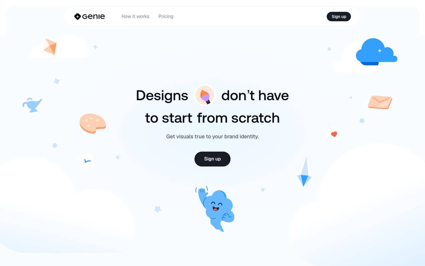
A light, playful AI-design-tool landing surface built on a white-to-sky-tint canvas, floating cloud and 3D sticker illustrations, and a near-black pill CTA. The system reads as friendly, airy SaaS — Aeonik display headlines set large with tight tracking, Geist body copy, generous rounded geometry (16–32px cards, pill nav), and soft blue-tinted shadows that make hero artifacts feel like they float. Brand voltage comes from the pastel-and-sky illustration set and the single dark Sign-up button rather than from saturated UI color.
Works withClaude CodeCursorCodexGemini CLICopilotv0LovableBoltWindsurfReplit
---
version: alpha
name: GenieStudio-design-analysis
description: "A light, playful AI-design-tool landing surface built on a white-to-sky-tint canvas, floating cloud and 3D sticker illustrations, and a near-black pill CTA. The system reads as friendly, airy SaaS — Aeonik display headlines set large with tight tracking, Geist body copy, generous rounded geometry (16–32px cards, pill nav), and soft blue-tinted shadows that make hero artifacts feel like they float. Brand voltage comes from the pastel-and-sky illustration set and the single dark Sign-up button rather than from saturated UI color."

colors:
  primary: "#181d27"
  ink: "#0a0d12"
  body: "#535862"
  muted: "#93979f"
  canvas: "#ffffff"
  on-primary: "#ffffff"
  surface-soft: "#f9fafb"
  surface-alt: "#f6f7f8"
  surface-cool: "#fafdff"
  surface-faint: "#fcfcfd"
  surface-blue-tint: "#f0f8ff"
  surface-violet-tint: "#f9f5ff"
  surface-lilac: "#f1e6ff"
  hairline: "#eef0f1"
  accent-blue: "#0099ff"
  accent-sky: "#4fbeff"
  accent-blue-soft: "#cce7ff"
  accent-purple: "#9552e0"
  accent-violet: "#bb80ff"
  accent-orange: "#f26110"
  accent-amber: "#bb9915"

typography:
  display-xl:
    fontFamily: "Aeonik, Inter, sans-serif"
    fontSize: 72px
    fontWeight: 500
    lineHeight: 1.111
    letterSpacing: -0.02em
  display-lg:
    fontFamily: "Aeonik, Inter, sans-serif"
    fontSize: 48px
    fontWeight: 500
    lineHeight: 1.167
    letterSpacing: normal
  body:
    fontFamily: "Geist, sans-serif"
    fontSize: 18px
    fontWeight: 500
    lineHeight: 1.333
    letterSpacing: -0.01em
  button:
    fontFamily: "Geist, sans-serif"
    fontSize: 14px
    fontWeight: 600
    lineHeight: 1.143
    letterSpacing: -0.01em

rounded:
  xs: 4px
  sm: 8px
  md: 16px
  lg: 24px
  xl: 32px
  pill: 90px

spacing:
  xxs: 4px
  xs: 8px
  sm: 12px
  md: 16px
  ml: 20px
  lg: 24px
  xl: 32px
  xxl: 40px
  huge: 48px
  section: 56px

components:
  button-primary:
    backgroundColor: "{colors.primary}"
    textColor: "{colors.on-primary}"
    typography: "{typography.button}"
    rounded: "{rounded.md}"
    padding: 8px 16px
  top-nav:
    backgroundColor: "{colors.canvas}"
    textColor: "{colors.muted}"
    typography: "{typography.button}"
    rounded: "{rounded.pill}"
    padding: 8px 16px
  nav-link:
    backgroundColor: transparent
    textColor: "{colors.muted}"
    typography: "{typography.button}"
  hero-band:
    backgroundColor: "{colors.surface-blue-tint}"
    textColor: "{colors.ink}"
    typography: "{typography.display-xl}"
    padding: 56px
  card:
    backgroundColor: "{colors.canvas}"
    textColor: "{colors.ink}"
    rounded: "{rounded.xs}"
  product-mockup-card:
    backgroundColor: "{colors.canvas}"
    textColor: "{colors.ink}"
    rounded: "{rounded.xl}"
    padding: 24px
  swatch-circle:
    backgroundColor: "{colors.surface-blue-tint}"
    textColor: "{colors.ink}"
    rounded: "{rounded.pill}"
---

## Overview

GenieStudio's landing surface is a light, playful AI-design-tool interface — a white canvas (`{colors.canvas}` — #ffffff) that fades into soft blue and violet tints (`{colors.surface-blue-tint}` — #f0f8ff, `{colors.surface-violet-tint}` — #f9f5ff) behind floating cloud illustrations and 3D-sticker artifacts (a genie lamp, paint palette, envelope, waving cloud mascot). The tone is friendly, airy, and confident — a single near-black pill CTA (`{colors.primary}` — #181d27) anchors the composition against an otherwise pastel scene.

Type voice splits into two families: **Aeonik** (the display face — used for the big hero headline at weight 500 with tight -0.02em tracking) and **Geist** (Vercel's open-source UI face — used for body copy and buttons). The hero headline is set very large (`{typography.display-xl}` — 72px) with an inline sticker icon breaking the line, giving the page a toy-like editorial rhythm rather than a dense product grid.

Brand voltage comes from the **illustration set** — sky-blue clouds, a smiling cloud mascot, pastel stars and sparkles — plus the tinted-canvas gradients, not from saturated UI chrome. The measured accent palette (blue `{colors.accent-blue}`, purple `{colors.accent-purple}`, orange `{colors.accent-orange}`, amber `{colors.accent-amber}`) lives almost entirely inside those sticker illustrations and the product-mockup screenshot, never on primary UI.

**Key Characteristics:**
- White/tinted canvas with one dark pill CTA (`{colors.primary}` — #181d27), `{rounded.md}` (16px), Geist 600 label. It is the only high-contrast interactive element on the page.
- Aeonik display headline at 72px / weight 500 / -0.02em tracking. Aeonik is a commercial typeface — an open-source substitute is documented in Typography.
- Floating cloud + 3D-sticker illustrations layered over blue-to-violet tinted gradients. The illustration set carries all the chromatic energy.
- Soft blue-cast drop shadow (`rgba(4, 69, 144, 0.08) 0px 14px 20px 4px`) makes the product-mockup card and floating artifacts feel weightless.
- Pill-shaped top nav container (`{rounded.pill}` — 90px) floating on the tinted hero band.
- Rounded geometry throughout: `{rounded.md}` (16px) for buttons, `{rounded.xl}` (32px) for the product-mockup card — the two most-measured radii.
- Muted, low-contrast supporting text (`{colors.body}` — #535862 for paragraphs, `{colors.muted}` — #93979f for nav links) keeps the scene quiet around the loud illustrations.

## Colors

### Brand & Action
- **Primary** (`{colors.primary}` — #181d27): The single dark action color — the "Sign up" pill CTA background. Near-black with a blue-slate cast.
- **Ink** (`{colors.ink}` — #0a0d12): Headline text — maximum contrast against canvas.

### Accent (illustration set)
These saturated hues were measured almost exclusively inside the 3D-sticker and mascot illustrations and the product-mockup screenshot — not on functional UI.
- **Accent Blue** (`{colors.accent-blue}` — #0099ff) and **Accent Sky** (`{colors.accent-sky}` — #4fbeff): The cloud mascot and sky illustrations. The dominant brand hue.
- **Accent Blue Soft** (`{colors.accent-blue-soft}` — #cce7ff): Pale blue used in cloud fills and tint edges.
- **Accent Purple** (`{colors.accent-purple}` — #9552e0) and **Accent Violet** (`{colors.accent-violet}` — #bb80ff): The paint-palette / brand-color sticker moments.
- **Accent Orange** (`{colors.accent-orange}` — #f26110): The paper-plane / palette highlights.
- **Accent Amber** (`{colors.accent-amber}` — #bb9915): A small warm accent in the sticker set.

### Surface
- **Canvas** (`{colors.canvas}` — #ffffff): The default page floor and card fill.
- **Surface Soft** (`{colors.surface-soft}` — #f9fafb), **Surface Alt** (`{colors.surface-alt}` — #f6f7f8), **Surface Cool** (`{colors.surface-cool}` — #fafdff), **Surface Faint** (`{colors.surface-faint}` — #fcfcfd): Near-white section and panel tints used for the barely-there gradient transitions.
- **Surface Blue Tint** (`{colors.surface-blue-tint}` — #f0f8ff): The hero-band sky wash behind the headline.
- **Surface Violet Tint** (`{colors.surface-violet-tint}` — #f9f5ff) and **Surface Lilac** (`{colors.surface-lilac}` — #f1e6ff): The lower-page violet gradient behind the product mockup.
- **Hairline** (`{colors.hairline}` — #eef0f1): The faint 1px divider / border tone on light surfaces.

### Text
- **Ink** (`{colors.ink}` — #0a0d12): Headlines.
- **Body** (`{colors.body}` — #535862): Running paragraph text ("Get visuals true to your brand identity.").
- **Muted** (`{colors.muted}` — #93979f): Nav links ("How it works", "Pricing") — the lowest-contrast text role.
- **On Primary** (`{colors.on-primary}` — #ffffff): Label text on the dark CTA.

## Typography

### Font Family
The system runs **Aeonik** for display headlines and **Geist** for body + UI. Aeonik is a commercial geometric grotesque used at weight 500 with tight negative tracking; Geist is Vercel's open-source neo-grotesque used at weight 500–600 for paragraphs and buttons.

The split is functional:
- Aeonik (display, weight 500, -0.02em to normal tracking) — the hero headline and section heads.
- Geist (body + UI, weight 500–600, -0.01em tracking) — paragraphs, nav links, button labels.

### Hierarchy

| Token | Size | Weight | Line Height | Letter Spacing | Use |
|---|---|---|---|---|---|
| `{typography.display-xl}` | 72px | 500 | 1.111 | -0.02em | Hero headline ("Designs don't have to start from scratch") — measured as h2, Aeonik |
| `{typography.display-lg}` | 48px | 500 | 1.167 | normal | h1 and h3 section heads (both measured at 48px) — Aeonik |
| `{typography.body}` | 18px | 500 | 1.333 | -0.01em | Sub-headline and running body copy — Geist |
| `{typography.button}` | 14px | 600 | 1.143 | -0.01em | Button labels and nav links — Geist |

Note: the measured document uses the larger 72px size on the `h2` element (the visible hero headline) while `h1` and `h3` both measure 48px — an unusual inversion captured faithfully from the analysis rather than corrected.

### Principles
Aeonik at weight 500 with -0.02em tracking is the brand's editorial voice — used only for large headlines. Geist handles everything supporting. Keep body copy quiet and muted (`{colors.body}`) so the illustrations carry the visual energy.

### Note on Font Substitutes
**Aeonik is a commercial typeface** (Cotype foundry) and cannot be shipped as an open web font. Substitute with **Inter** at weight 500 with -0.02em letter-spacing, or **Space Grotesk** at weight 500 for a closer geometric-grotesque character; both preserve the weight + tight-tracking signature. **Geist** is open-source (SIL OFL, Vercel) and can be used directly — fall back to `Inter, sans-serif` if unavailable.

## Layout

### Spacing System
- **Base unit:** 4px.
- **Tokens:** `{spacing.xxs}` 4px · `{spacing.xs}` 8px · `{spacing.sm}` 12px · `{spacing.md}` 16px · `{spacing.ml}` 20px · `{spacing.lg}` 24px · `{spacing.xl}` 32px · `{spacing.xxl}` 40px · `{spacing.huge}` 48px · `{spacing.section}` 56px.
- **Most-used steps:** 40px (`{spacing.xxl}`, highest frequency), 24px (`{spacing.lg}`), and 12px (`{spacing.sm}`) — the dominant rhythm for gaps and section padding.
- **Button padding:** 8px × 16px (`{spacing.xs}` × `{spacing.md}`) — measured on the primary CTA.

### Grid & Container
- **Hero:** Single centered column — headline, sub-line, and CTA stacked and center-aligned, with illustration stickers scattered in the surrounding margins.
- **Product mockup:** A single large isometric app-screenshot card centered in the lower violet band.
- **Swatch row:** A horizontal row of 5 pastel color circles ("Start with style. Not a blank canvas.").

### Whitespace Philosophy
The page is deliberately airy — long vertical gaps between the hero and the product mockup let the floating illustrations breathe. Content is sparse and centered; whitespace and illustration placement do the compositional work rather than dense grids.

## Elevation & Depth

| Level | Treatment | Use |
|---|---|---|
| Flat | No shadow | Canvas sections, hero text |
| Floating card | `rgba(4, 69, 144, 0.08) 0px 14px 20px 4px` | The product-mockup card and floating artifacts — a soft blue-cast shadow giving weightless lift |
| Button ring | `rgba(10,13,18,0.8) 0px 1px 2px 0px, rgb(10,13,18) 0px 0px 0px 1px` | The dark CTA's subtle 1px dark ring + drop |
| Faint chip | `rgb(244,245,246) 0px 1px 1px 0px` | Very subtle raise on small light chips |
| Inset highlight | `rgb(128,187,255) 0px 4px 2px 0px inset` | A blue inset glow on an interactive/hero element |

The elevation philosophy is **soft and blue-tinted** — shadows carry a slight blue cast (`rgba(4, 69, 144, 0.08)`) rather than neutral gray, reinforcing the sky/cloud theme and making artifacts feel like they float above the tinted canvas.

### Decorative Depth
- The 3D-sticker illustrations (genie lamp, palette, envelope, cloud mascot) carry their own rendered highlights and shadows as artwork — not system tokens.
- Tinted-canvas gradients (blue → violet down the page) create atmospheric depth without hard edges.

## Shapes

### Border Radius Scale

| Token | Value | Use |
|---|---|---|
| `{rounded.xs}` | 4px | Small chips and the base `card` element (measured radius 0–4px range) |
| `{rounded.sm}` | 8px | Small inner elements, list rows |
| `{rounded.md}` | 16px | Primary CTA button, medium panels (most-used mid radius) |
| `{rounded.lg}` | 24px | Larger panels |
| `{rounded.xl}` | 32px | The product-mockup card and large surfaces (highest-frequency large radius) |
| `{rounded.pill}` | 90px | The floating pill nav container and fully-rounded chips/swatch circles |

### Geometry Notes
The measured `card` component reports radius 0px with no shadow — a raw/reset container. The visible rounded surfaces (product mockup, nav pill) use the larger 16–32px and 90px radii. Pastel swatch circles are fully rounded (`{rounded.pill}`).

## Components

### Navigation

**`top-nav`** — A floating pill-shaped nav bar over the tinted hero band. Background `{colors.canvas}`, rounded `{rounded.pill}` (90px), padding 8px × 16px. Carries the "Genie" wordmark + diamond logo at left, `{component.nav-link}` items ("How it works", "Pricing") center-left in `{colors.muted}`, and a `{component.button-primary}` "Sign up" pill at right.

**`nav-link`** — Inline nav item, transparent background, `{colors.muted}` (#93979f) text, `{typography.button}`. The low-contrast tone keeps navigation quiet.

### Buttons

**`button-primary`** — The signature (and only) CTA. Background `{colors.primary}` (#181d27), text `{colors.on-primary}` (#ffffff), typography `{typography.button}` (Geist 14px / 600), rounded `{rounded.md}` (16px), padding 8px × 16px. Appears twice: compact in the nav and larger/centered in the hero. Carries a subtle dark ring shadow (see Elevation).

### Cards & Containers

**`hero-band`** — Centered hero on the blue-tinted wash. Background `{colors.surface-blue-tint}` (#f0f8ff), headline in `{typography.display-xl}`, sub-line in `{typography.body}`, and a centered `{component.button-primary}`. Sticker illustrations float in the margins. Vertical padding around `{spacing.section}` (56px).

**`card`** — The measured base container: background `{colors.canvas}`, rounded `{rounded.xs}` (0–4px measured), no shadow. A raw reset container that visible surfaces build on.

**`product-mockup-card`** — The large isometric app screenshot in the lower violet band. Background `{colors.canvas}`, rounded `{rounded.xl}` (32px), padding `{spacing.lg}` (24px), lifted by the soft blue-cast floating shadow. Shows the actual Genie editor UI (sidebar, canvas, panels) at scale — the product shown as content.

**`swatch-circle`** — Pastel color circles in the "Start with style" row. Fully rounded (`{rounded.pill}`). The five fills read as a pastel set (peach, blue, green, lilac, yellow) — exact per-swatch hex values were not individually measured (see Known Gaps); the token defaults to `{colors.surface-blue-tint}`.

## Do's and Don'ts

### Do
- Reserve `{colors.primary}` (#181d27) for the "Sign up" CTA. It is the only dark, high-contrast element — keep it scarce and singular.
- Set the hero headline in Aeonik (or Inter/Space Grotesk substitute) at large size with -0.02em tracking. The tight tracking is part of the voice.
- Let illustrations and tinted gradients carry the color energy — keep functional UI near-monochrome.
- Use the soft blue-cast shadow (`rgba(4, 69, 144, 0.08)`) on floating artifacts and the product mockup to preserve the weightless feel.
- Keep supporting text muted (`{colors.body}`, `{colors.muted}`) so it recedes behind the illustrations.
- Use `{rounded.xl}` (32px) for large surfaces and `{rounded.pill}` for the nav container — generous rounding is the geometry signature.

### Don't
- Don't apply the saturated accent hues (`{colors.accent-blue}`, `{colors.accent-purple}`, `{colors.accent-orange}`) to buttons or functional chrome — they belong to the illustration set.
- Don't add a second high-contrast dark button. One dark CTA per view.
- Don't use hard neutral shadows — the system's shadows carry a deliberate blue cast.
- Don't set body copy in Aeonik or headlines in Geist. Keep the two families in their lanes.
- Don't tighten the airy vertical spacing — the long gaps between hero and mockup are intentional.

## Responsive Behavior

The site was captured at desktop and a tall full-page render; explicit breakpoints were not measured. Observed structure implies:

| Name | Width | Key Changes (inferred) |
|---|---|---|
| Mobile | < 768px | Hero headline scales down from 72px; nav pill likely collapses; single-column stack maintained |
| Tablet | 768–1024px | Centered single-column layout holds; illustration density reduces |
| Desktop | > 1024px | Full floating-sticker scene around the centered hero; product mockup at full isometric scale |

### Touch Targets
- `{component.button-primary}` uses 8px × 16px padding on a 14px label — the hero instance is larger; verify a ≥44px effective tap height on mobile.

### Collapsing Strategy
- Centered single-column hero naturally reflows on narrow viewports.
- Decorative sticker illustrations should be reduced or hidden on mobile to avoid crowding the headline.

*(Responsive values above are inferred, not measured — see Known Gaps.)*

## Iteration Guide

1. Focus on ONE component at a time. Reference its YAML key directly (`{component.button-primary}`, `{component.product-mockup-card}`).
2. Variants of an existing component (`-active`, `-disabled`) live as separate entries in `components:`.
3. Use `{token.refs}` everywhere — never inline hex.
4. Never document hover. Default and Active/Pressed states only.
5. Keep the accent hues in illustrations; keep UI near-monochrome with the one dark CTA.
6. Headlines stay Aeonik (or substitute) weight 500 with tight tracking; body stays Geist. The pairing does not blur.
7. When adding surfaces, prefer the near-white tints (`{colors.surface-soft}` … `{colors.surface-violet-tint}`) and generous rounding over new colors.

## Known Gaps

- **Aeonik is a commercial typeface** and cannot be shipped as-is; the analysis did not flag it in `fonts_licensed`, but it is treated as licensed and a substitute (Inter / Space Grotesk) is documented in Typography.
- The measured typography shows `h2` (72px) larger than `h1` (48px) — captured faithfully; confirm intended semantic hierarchy before implementing.
- The five pastel swatch-circle fills ("Start with style" row) were not individually color-sampled; only the illustration/tint accents were measured. Exact per-swatch hex values are a gap.
- Only `button-primary` and a raw `card` were captured as components; secondary buttons, inputs, footer, and form states were not measured (the page is illustration-heavy with sparse UI).
- Active/pressed, focus, and disabled states for the CTA were not extracted.
- Breakpoints, touch-target sizing, and collapsing behavior are inferred from two static captures, not measured.
- Animation/transition timings (floating stickers, mascot, gradient shifts) are not in scope.
- The product-mockup card shows the actual Genie editor UI as artwork; its internal spec is out of scope.

<!-- Documented by Duply · real-world design systems as ready-to-use DESIGN.md for AI coding agents · https://duply.ai/geniestudio/design-md -->
Color Palette
Accent
Neutrals
Typography
display-xl72px · 500 · 1.111
The quick brown fox jumpsdisplay-lg48px · 500 · 1.167
The quick brown fox jumpsbody18px · 500 · 1.333
The quick brown fox jumpsbutton14px · 600 · 1.143
The quick brown fox jumpsSpacing & Shape
Spacing
| Name | Value | Preview |
|---|---|---|
| xxs | 4px | |
| xs | 8px | |
| sm | 12px | |
| md | 16px | |
| ml | 20px | |
| lg | 24px | |
| xl | 32px | |
| xxl | 40px | |
| huge | 48px | |
| section | 56px |
Border Radius
| Name | Value | Preview |
|---|---|---|
| xs | 4px | |
| sm | 8px | |
| md | 16px | |
| lg | 24px | |
| xl | 32px | |
| pill | 90px |
FAQ
- What colors does GenieStudio use?
- GenieStudio's core palette includes #181d27, #0a0d12, #535862, #93979f, #ffffff. The full color set with usage roles (canvas, ink, surfaces, accent, semantic) is documented in the GenieStudio DESIGN.md.
- What font does GenieStudio use?
- GenieStudio's primary typeface is Aeonik. The complete type scale (sizes, weights, line-height and letter-spacing per role), with an open substitute where the original is licensed, is documented in the DESIGN.md.
- What is the GenieStudio design system?
- A light, playful AI-design-tool landing surface built on a white-to-sky-tint canvas, floating cloud and 3D sticker illustrations, and a near-black pill CTA. The system reads as friendly, airy SaaS — Aeonik display headlines set large with tight tracking, Geist body copy, generous rounded geometry
Get this as a working kit
GenieStudio Launch Kit + DESIGN.md
$299$225
One-time payment
- A complete production-stack template, styled like GenieStudio, fully built and wired.
- One-time payment and the codebase is yours. No platform fees, no subscription.
Open it with Claude Code, Cursor, or any coding agent and build in plain language, then ship a complete web app.
- Your private DESIGN.md
- Marketing pages, blog, SEO & legal
- Email capture, newsletter & contact
- Accept payments (Stripe)
- Analytics (GA4 + PostHog)
- One-click deploy
- Auth, login & roles
- A full app dashboard, when you grow
More like this

---
version: alpha
name: GenieStudio-design-analysis
description: "A light, playful AI-design-tool landing surface built on a white-to-sky-tint canvas, floating cloud and 3D sticker illustrations, and a near-black pill CTA. The system reads as friendly, airy SaaS — Aeonik display headlines set large with tight tracking, Geist body copy, generous rounded geometry (16–32px cards, pill nav), and soft blue-tinted shadows that make hero artifacts feel like they float. Brand voltage comes from the pastel-and-sky illustration set and the single dark Sign-up button rather than from saturated UI color."

colors:
  primary: "#181d27"
  ink: "#0a0d12"
  body: "#535862"
  muted: "#93979f"
  canvas: "#ffffff"
  on-primary: "#ffffff"
  surface-soft: "#f9fafb"
  surface-alt: "#f6f7f8"
  surface-cool: "#fafdff"
  surface-faint: "#fcfcfd"
  surface-blue-tint: "#f0f8ff"
  surface-violet-tint: "#f9f5ff"
  surface-lilac: "#f1e6ff"
  hairline: "#eef0f1"
  accent-blue: "#0099ff"
  accent-sky: "#4fbeff"
  accent-blue-soft: "#cce7ff"
  accent-purple: "#9552e0"
  accent-violet: "#bb80ff"
  accent-orange: "#f26110"
  accent-amber: "#bb9915"

typography:
  display-xl:
    fontFamily: "Aeonik, Inter, sans-serif"
    fontSize: 72px
    fontWeight: 500
    lineHeight: 1.111
    letterSpacing: -0.02em
  display-lg:
    fontFamily: "Aeonik, Inter, sans-serif"
    fontSize: 48px
    fontWeight: 500
    lineHeight: 1.167
    letterSpacing: normal
  body:
    fontFamily: "Geist, sans-serif"
    fontSize: 18px
    fontWeight: 500
    lineHeight: 1.333
    letterSpacing: -0.01em
  button:
    fontFamily: "Geist, sans-serif"
    fontSize: 14px
    fontWeight: 600
    lineHeight: 1.143
    letterSpacing: -0.01em

rounded:
  xs: 4px
  sm: 8px
  md: 16px
  lg: 24px
  xl: 32px
  pill: 90px

spacing:
  xxs: 4px
  xs: 8px
  sm: 12px
  md: 16px
  ml: 20px
  lg: 24px
  xl: 32px
  xxl: 40px
  huge: 48px
  section: 56px

components:
  button-primary:
    backgroundColor: "{colors.primary}"
    textColor: "{colors.on-primary}"
    typography: "{typography.button}"
    rounded: "{rounded.md}"
    padding: 8px 16px
  top-nav:
    backgroundColor: "{colors.canvas}"
    textColor: "{colors.muted}"
    typography: "{typography.button}"
    rounded: "{rounded.pill}"
    padding: 8px 16px
  nav-link:
    backgroundColor: transparent
    textColor: "{colors.muted}"
    typography: "{typography.button}"
  hero-band:
    backgroundColor: "{colors.surface-blue-tint}"
    textColor: "{colors.ink}"
    typography: "{typography.display-xl}"
    padding: 56px
  card:
    backgroundColor: "{colors.canvas}"
    textColor: "{colors.ink}"
    rounded: "{rounded.xs}"
  product-mockup-card:
    backgroundColor: "{colors.canvas}"
    textColor: "{colors.ink}"
    rounded: "{rounded.xl}"
    padding: 24px
  swatch-circle:
    backgroundColor: "{colors.surface-blue-tint}"
    textColor: "{colors.ink}"
    rounded: "{rounded.pill}"
---

## Overview

GenieStudio's landing surface is a light, playful AI-design-tool interface — a white canvas (`{colors.canvas}` — #ffffff) that fades into soft blue and violet tints (`{colors.surface-blue-tint}` — #f0f8ff, `{colors.surface-violet-tint}` — #f9f5ff) behind floating cloud illustrations and 3D-sticker artifacts (a genie lamp, paint palette, envelope, waving cloud mascot). The tone is friendly, airy, and confident — a single near-black pill CTA (`{colors.primary}` — #181d27) anchors the composition against an otherwise pastel scene.

Type voice splits into two families: **Aeonik** (the display face — used for the big hero headline at weight 500 with tight -0.02em tracking) and **Geist** (Vercel's open-source UI face — used for body copy and buttons). The hero headline is set very large (`{typography.display-xl}` — 72px) with an inline sticker icon breaking the line, giving the page a toy-like editorial rhythm rather than a dense product grid.

Brand voltage comes from the **illustration set** — sky-blue clouds, a smiling cloud mascot, pastel stars and sparkles — plus the tinted-canvas gradients, not from saturated UI chrome. The measured accent palette (blue `{colors.accent-blue}`, purple `{colors.accent-purple}`, orange `{colors.accent-orange}`, amber `{colors.accent-amber}`) lives almost entirely inside those sticker illustrations and the product-mockup screenshot, never on primary UI.

**Key Characteristics:**
- White/tinted canvas with one dark pill CTA (`{colors.primary}` — #181d27), `{rounded.md}` (16px), Geist 600 label. It is the only high-contrast interactive element on the page.
- Aeonik display headline at 72px / weight 500 / -0.02em tracking. Aeonik is a commercial typeface — an open-source substitute is documented in Typography.
- Floating cloud + 3D-sticker illustrations layered over blue-to-violet tinted gradients. The illustration set carries all the chromatic energy.
- Soft blue-cast drop shadow (`rgba(4, 69, 144, 0.08) 0px 14px 20px 4px`) makes the product-mockup card and floating artifacts feel weightless.
- Pill-shaped top nav container (`{rounded.pill}` — 90px) floating on the tinted hero band.
- Rounded geometry throughout: `{rounded.md}` (16px) for buttons, `{rounded.xl}` (32px) for the product-mockup card — the two most-measured radii.
- Muted, low-contrast supporting text (`{colors.body}` — #535862 for paragraphs, `{colors.muted}` — #93979f for nav links) keeps the scene quiet around the loud illustrations.

## Colors

### Brand & Action
- **Primary** (`{colors.primary}` — #181d27): The single dark action color — the "Sign up" pill CTA background. Near-black with a blue-slate cast.
- **Ink** (`{colors.ink}` — #0a0d12): Headline text — maximum contrast against canvas.

### Accent (illustration set)
These saturated hues were measured almost exclusively inside the 3D-sticker and mascot illustrations and the product-mockup screenshot — not on functional UI.
- **Accent Blue** (`{colors.accent-blue}` — #0099ff) and **Accent Sky** (`{colors.accent-sky}` — #4fbeff): The cloud mascot and sky illustrations. The dominant brand hue.
- **Accent Blue Soft** (`{colors.accent-blue-soft}` — #cce7ff): Pale blue used in cloud fills and tint edges.
- **Accent Purple** (`{colors.accent-purple}` — #9552e0) and **Accent Violet** (`{colors.accent-violet}` — #bb80ff): The paint-palette / brand-color sticker moments.
- **Accent Orange** (`{colors.accent-orange}` — #f26110): The paper-plane / palette highlights.
- **Accent Amber** (`{colors.accent-amber}` — #bb9915): A small warm accent in the sticker set.

### Surface
- **Canvas** (`{colors.canvas}` — #ffffff): The default page floor and card fill.
- **Surface Soft** (`{colors.surface-soft}` — #f9fafb), **Surface Alt** (`{colors.surface-alt}` — #f6f7f8), **Surface Cool** (`{colors.surface-cool}` — #fafdff), **Surface Faint** (`{colors.surface-faint}` — #fcfcfd): Near-white section and panel tints used for the barely-there gradient transitions.
- **Surface Blue Tint** (`{colors.surface-blue-tint}` — #f0f8ff): The hero-band sky wash behind the headline.
- **Surface Violet Tint** (`{colors.surface-violet-tint}` — #f9f5ff) and **Surface Lilac** (`{colors.surface-lilac}` — #f1e6ff): The lower-page violet gradient behind the product mockup.
- **Hairline** (`{colors.hairline}` — #eef0f1): The faint 1px divider / border tone on light surfaces.

### Text
- **Ink** (`{colors.ink}` — #0a0d12): Headlines.
- **Body** (`{colors.body}` — #535862): Running paragraph text ("Get visuals true to your brand identity.").
- **Muted** (`{colors.muted}` — #93979f): Nav links ("How it works", "Pricing") — the lowest-contrast text role.
- **On Primary** (`{colors.on-primary}` — #ffffff): Label text on the dark CTA.

## Typography

### Font Family
The system runs **Aeonik** for display headlines and **Geist** for body + UI. Aeonik is a commercial geometric grotesque used at weight 500 with tight negative tracking; Geist is Vercel's open-source neo-grotesque used at weight 500–600 for paragraphs and buttons.

The split is functional:
- Aeonik (display, weight 500, -0.02em to normal tracking) — the hero headline and section heads.
- Geist (body + UI, weight 500–600, -0.01em tracking) — paragraphs, nav links, button labels.

### Hierarchy

| Token | Size | Weight | Line Height | Letter Spacing | Use |
|---|---|---|---|---|---|
| `{typography.display-xl}` | 72px | 500 | 1.111 | -0.02em | Hero headline ("Designs don't have to start from scratch") — measured as h2, Aeonik |
| `{typography.display-lg}` | 48px | 500 | 1.167 | normal | h1 and h3 section heads (both measured at 48px) — Aeonik |
| `{typography.body}` | 18px | 500 | 1.333 | -0.01em | Sub-headline and running body copy — Geist |
| `{typography.button}` | 14px | 600 | 1.143 | -0.01em | Button labels and nav links — Geist |

Note: the measured document uses the larger 72px size on the `h2` element (the visible hero headline) while `h1` and `h3` both measure 48px — an unusual inversion captured faithfully from the analysis rather than corrected.

### Principles
Aeonik at weight 500 with -0.02em tracking is the brand's editorial voice — used only for large headlines. Geist handles everything supporting. Keep body copy quiet and muted (`{colors.body}`) so the illustrations carry the visual energy.

### Note on Font Substitutes
**Aeonik is a commercial typeface** (Cotype foundry) and cannot be shipped as an open web font. Substitute with **Inter** at weight 500 with -0.02em letter-spacing, or **Space Grotesk** at weight 500 for a closer geometric-grotesque character; both preserve the weight + tight-tracking signature. **Geist** is open-source (SIL OFL, Vercel) and can be used directly — fall back to `Inter, sans-serif` if unavailable.

## Layout

### Spacing System
- **Base unit:** 4px.
- **Tokens:** `{spacing.xxs}` 4px · `{spacing.xs}` 8px · `{spacing.sm}` 12px · `{spacing.md}` 16px · `{spacing.ml}` 20px · `{spacing.lg}` 24px · `{spacing.xl}` 32px · `{spacing.xxl}` 40px · `{spacing.huge}` 48px · `{spacing.section}` 56px.
- **Most-used steps:** 40px (`{spacing.xxl}`, highest frequency), 24px (`{spacing.lg}`), and 12px (`{spacing.sm}`) — the dominant rhythm for gaps and section padding.
- **Button padding:** 8px × 16px (`{spacing.xs}` × `{spacing.md}`) — measured on the primary CTA.

### Grid & Container
- **Hero:** Single centered column — headline, sub-line, and CTA stacked and center-aligned, with illustration stickers scattered in the surrounding margins.
- **Product mockup:** A single large isometric app-screenshot card centered in the lower violet band.
- **Swatch row:** A horizontal row of 5 pastel color circles ("Start with style. Not a blank canvas.").

### Whitespace Philosophy
The page is deliberately airy — long vertical gaps between the hero and the product mockup let the floating illustrations breathe. Content is sparse and centered; whitespace and illustration placement do the compositional work rather than dense grids.

## Elevation & Depth

| Level | Treatment | Use |
|---|---|---|
| Flat | No shadow | Canvas sections, hero text |
| Floating card | `rgba(4, 69, 144, 0.08) 0px 14px 20px 4px` | The product-mockup card and floating artifacts — a soft blue-cast shadow giving weightless lift |
| Button ring | `rgba(10,13,18,0.8) 0px 1px 2px 0px, rgb(10,13,18) 0px 0px 0px 1px` | The dark CTA's subtle 1px dark ring + drop |
| Faint chip | `rgb(244,245,246) 0px 1px 1px 0px` | Very subtle raise on small light chips |
| Inset highlight | `rgb(128,187,255) 0px 4px 2px 0px inset` | A blue inset glow on an interactive/hero element |

The elevation philosophy is **soft and blue-tinted** — shadows carry a slight blue cast (`rgba(4, 69, 144, 0.08)`) rather than neutral gray, reinforcing the sky/cloud theme and making artifacts feel like they float above the tinted canvas.

### Decorative Depth
- The 3D-sticker illustrations (genie lamp, palette, envelope, cloud mascot) carry their own rendered highlights and shadows as artwork — not system tokens.
- Tinted-canvas gradients (blue → violet down the page) create atmospheric depth without hard edges.

## Shapes

### Border Radius Scale

| Token | Value | Use |
|---|---|---|
| `{rounded.xs}` | 4px | Small chips and the base `card` element (measured radius 0–4px range) |
| `{rounded.sm}` | 8px | Small inner elements, list rows |
| `{rounded.md}` | 16px | Primary CTA button, medium panels (most-used mid radius) |
| `{rounded.lg}` | 24px | Larger panels |
| `{rounded.xl}` | 32px | The product-mockup card and large surfaces (highest-frequency large radius) |
| `{rounded.pill}` | 90px | The floating pill nav container and fully-rounded chips/swatch circles |

### Geometry Notes
The measured `card` component reports radius 0px with no shadow — a raw/reset container. The visible rounded surfaces (product mockup, nav pill) use the larger 16–32px and 90px radii. Pastel swatch circles are fully rounded (`{rounded.pill}`).

## Components

### Navigation

**`top-nav`** — A floating pill-shaped nav bar over the tinted hero band. Background `{colors.canvas}`, rounded `{rounded.pill}` (90px), padding 8px × 16px. Carries the "Genie" wordmark + diamond logo at left, `{component.nav-link}` items ("How it works", "Pricing") center-left in `{colors.muted}`, and a `{component.button-primary}` "Sign up" pill at right.

**`nav-link`** — Inline nav item, transparent background, `{colors.muted}` (#93979f) text, `{typography.button}`. The low-contrast tone keeps navigation quiet.

### Buttons

**`button-primary`** — The signature (and only) CTA. Background `{colors.primary}` (#181d27), text `{colors.on-primary}` (#ffffff), typography `{typography.button}` (Geist 14px / 600), rounded `{rounded.md}` (16px), padding 8px × 16px. Appears twice: compact in the nav and larger/centered in the hero. Carries a subtle dark ring shadow (see Elevation).

### Cards & Containers

**`hero-band`** — Centered hero on the blue-tinted wash. Background `{colors.surface-blue-tint}` (#f0f8ff), headline in `{typography.display-xl}`, sub-line in `{typography.body}`, and a centered `{component.button-primary}`. Sticker illustrations float in the margins. Vertical padding around `{spacing.section}` (56px).

**`card`** — The measured base container: background `{colors.canvas}`, rounded `{rounded.xs}` (0–4px measured), no shadow. A raw reset container that visible surfaces build on.

**`product-mockup-card`** — The large isometric app screenshot in the lower violet band. Background `{colors.canvas}`, rounded `{rounded.xl}` (32px), padding `{spacing.lg}` (24px), lifted by the soft blue-cast floating shadow. Shows the actual Genie editor UI (sidebar, canvas, panels) at scale — the product shown as content.

**`swatch-circle`** — Pastel color circles in the "Start with style" row. Fully rounded (`{rounded.pill}`). The five fills read as a pastel set (peach, blue, green, lilac, yellow) — exact per-swatch hex values were not individually measured (see Known Gaps); the token defaults to `{colors.surface-blue-tint}`.

## Do's and Don'ts

### Do
- Reserve `{colors.primary}` (#181d27) for the "Sign up" CTA. It is the only dark, high-contrast element — keep it scarce and singular.
- Set the hero headline in Aeonik (or Inter/Space Grotesk substitute) at large size with -0.02em tracking. The tight tracking is part of the voice.
- Let illustrations and tinted gradients carry the color energy — keep functional UI near-monochrome.
- Use the soft blue-cast shadow (`rgba(4, 69, 144, 0.08)`) on floating artifacts and the product mockup to preserve the weightless feel.
- Keep supporting text muted (`{colors.body}`, `{colors.muted}`) so it recedes behind the illustrations.
- Use `{rounded.xl}` (32px) for large surfaces and `{rounded.pill}` for the nav container — generous rounding is the geometry signature.

### Don't
- Don't apply the saturated accent hues (`{colors.accent-blue}`, `{colors.accent-purple}`, `{colors.accent-orange}`) to buttons or functional chrome — they belong to the illustration set.
- Don't add a second high-contrast dark button. One dark CTA per view.
- Don't use hard neutral shadows — the system's shadows carry a deliberate blue cast.
- Don't set body copy in Aeonik or headlines in Geist. Keep the two families in their lanes.
- Don't tighten the airy vertical spacing — the long gaps between hero and mockup are intentional.

## Responsive Behavior

The site was captured at desktop and a tall full-page render; explicit breakpoints were not measured. Observed structure implies:

| Name | Width | Key Changes (inferred) |
|---|---|---|
| Mobile | < 768px | Hero headline scales down from 72px; nav pill likely collapses; single-column stack maintained |
| Tablet | 768–1024px | Centered single-column layout holds; illustration density reduces |
| Desktop | > 1024px | Full floating-sticker scene around the centered hero; product mockup at full isometric scale |

### Touch Targets
- `{component.button-primary}` uses 8px × 16px padding on a 14px label — the hero instance is larger; verify a ≥44px effective tap height on mobile.

### Collapsing Strategy
- Centered single-column hero naturally reflows on narrow viewports.
- Decorative sticker illustrations should be reduced or hidden on mobile to avoid crowding the headline.

*(Responsive values above are inferred, not measured — see Known Gaps.)*

## Iteration Guide

1. Focus on ONE component at a time. Reference its YAML key directly (`{component.button-primary}`, `{component.product-mockup-card}`).
2. Variants of an existing component (`-active`, `-disabled`) live as separate entries in `components:`.
3. Use `{token.refs}` everywhere — never inline hex.
4. Never document hover. Default and Active/Pressed states only.
5. Keep the accent hues in illustrations; keep UI near-monochrome with the one dark CTA.
6. Headlines stay Aeonik (or substitute) weight 500 with tight tracking; body stays Geist. The pairing does not blur.
7. When adding surfaces, prefer the near-white tints (`{colors.surface-soft}` … `{colors.surface-violet-tint}`) and generous rounding over new colors.

## Known Gaps

- **Aeonik is a commercial typeface** and cannot be shipped as-is; the analysis did not flag it in `fonts_licensed`, but it is treated as licensed and a substitute (Inter / Space Grotesk) is documented in Typography.
- The measured typography shows `h2` (72px) larger than `h1` (48px) — captured faithfully; confirm intended semantic hierarchy before implementing.
- The five pastel swatch-circle fills ("Start with style" row) were not individually color-sampled; only the illustration/tint accents were measured. Exact per-swatch hex values are a gap.
- Only `button-primary` and a raw `card` were captured as components; secondary buttons, inputs, footer, and form states were not measured (the page is illustration-heavy with sparse UI).
- Active/pressed, focus, and disabled states for the CTA were not extracted.
- Breakpoints, touch-target sizing, and collapsing behavior are inferred from two static captures, not measured.
- Animation/transition timings (floating stickers, mascot, gradient shifts) are not in scope.
- The product-mockup card shows the actual Genie editor UI as artwork; its internal spec is out of scope.

<!-- Documented by Duply · real-world design systems as ready-to-use DESIGN.md for AI coding agents · https://duply.ai/geniestudio/design-md -->