LMNT
A serene, near-monochrome marketing surface for an AI text-to-speech product, built on a warm off-white canvas (#efece6) with feather-light Montserrat type. The system reads as calm, premium, and minimal — an oversized 96px weight-300 hero headline, almost no chrome, a single hand-drawn circular CTA, and a trio of soft brand accent words (blue, teal, purple) that supply the only chromatic voltage. Everything else stays ink-on-canvas with enormous whitespace.
---
version: alpha
name: LMNT-design-analysis
description: "A serene, near-monochrome marketing surface for an AI text-to-speech product, built on a warm off-white canvas (#efece6) with feather-light Montserrat type. The system reads as calm, premium, and minimal — an oversized 96px weight-300 hero headline, almost no chrome, a single hand-drawn circular CTA, and a trio of soft brand accent words (blue, teal, purple) that supply the only chromatic voltage. Everything else stays ink-on-canvas with enormous whitespace."
colors:
ink: "#403d3c"
muted: "#847e7b"
canvas: "#efece6"
canvas-shade: "#d4cabb"
surface-white: "#ffffff"
surface-soft: "#f8fafc"
surface-soft-alt: "#f1f5f9"
dark: "#21262e"
dark-alt: "#20252c"
neutral-gray: "#9ca3af"
hairline: "#e5e7eb"
black: "#000000"
accent-blue: "#008bc0"
accent-teal: "#01bea8"
accent-purple: "#7a63ab"
accent-blue-soft: "#bfdbfe"
accent-purple-soft: "#e9d5ff"
error: "#ef4444"
warning: "#eab308"
success: "#22c55e"
typography:
display:
fontFamily: "Montserrat, sans-serif"
fontSize: 96px
fontWeight: 300
lineHeight: 1.0
letterSpacing: normal
title:
fontFamily: "Montserrat, sans-serif"
fontSize: 30px
fontWeight: 300
lineHeight: 1.2
letterSpacing: normal
subtitle:
fontFamily: "Montserrat, sans-serif"
fontSize: 16px
fontWeight: 300
lineHeight: 1.5
letterSpacing: normal
body:
fontFamily: "Montserrat, sans-serif"
fontSize: 16px
fontWeight: 300
lineHeight: 1.5
letterSpacing: normal
button:
fontFamily: "Montserrat, sans-serif"
fontSize: 14px
fontWeight: 500
lineHeight: 1.429
letterSpacing: normal
rounded:
sm: 6px
md: 12px
lg: 16px
full: 9999px
spacing:
xxs: 8px
xs: 12px
sm: 16px
md: 24px
lg: 32px
xl: 48px
xxl: 64px
xxxl: 80px
section: 96px
section-lg: 128px
components:
top-nav:
backgroundColor: "{colors.canvas}"
textColor: "{colors.ink}"
typography: "{typography.button}"
padding: 32px
nav-link:
backgroundColor: transparent
textColor: "{colors.muted}"
typography: "{typography.button}"
button-pill:
backgroundColor: transparent
textColor: "{colors.ink}"
typography: "{typography.button}"
rounded: "{rounded.full}"
padding: 0px 12px
button-primary:
backgroundColor: "{colors.canvas}"
textColor: "{colors.ink}"
typography: "{typography.button}"
rounded: "{rounded.full}"
padding: 0px 12px
button-circular-cta:
backgroundColor: "{colors.surface-soft}"
textColor: "{colors.ink}"
typography: "{typography.button}"
rounded: "{rounded.full}"
text-link:
backgroundColor: transparent
textColor: "{colors.ink}"
typography: "{typography.button}"
card:
backgroundColor: "{colors.surface-soft}"
textColor: "{colors.ink}"
rounded: "{rounded.full}"
input:
backgroundColor: "{colors.surface-white}"
textColor: "{colors.ink}"
typography: "{typography.body}"
rounded: "{rounded.sm}"
footer:
backgroundColor: "{colors.canvas}"
textColor: "{colors.muted}"
typography: "{typography.subtitle}"
padding: 64px
---
## Overview
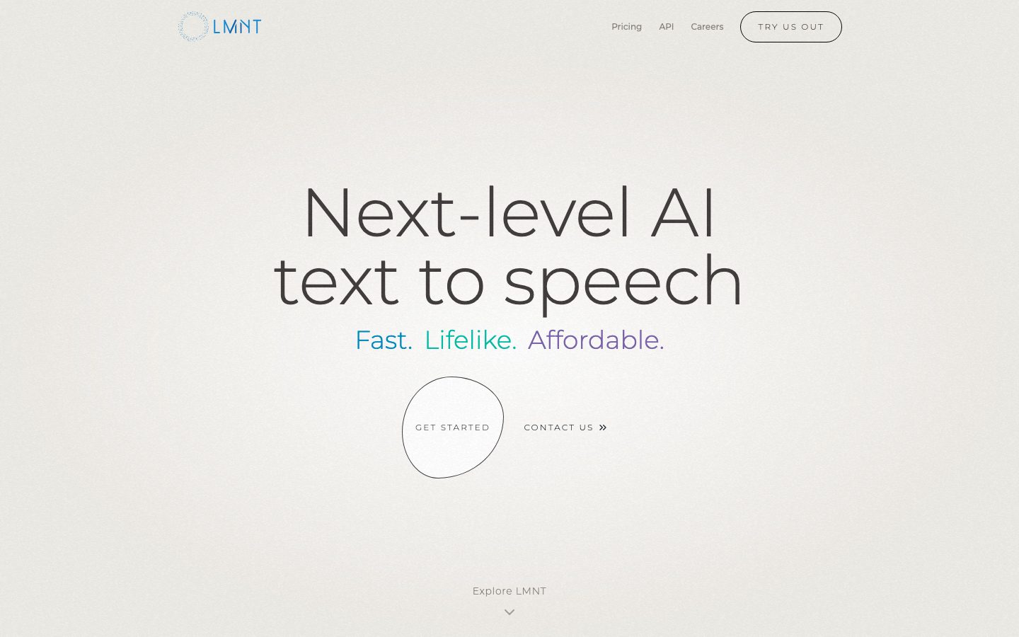
LMNT's marketing surface is a study in restraint. The page floor is a warm off-white canvas (`{colors.canvas}` — #efece6) — not pure white, but a soft paper tone that reads as calm and premium. Against it, ink-toned text (`{colors.ink}` — #403d3c) carries the entire message at feather-light Montserrat weight 300. There is almost no chrome: no cards stacked into grids, no shadows competing for attention, just an oversized headline floating in enormous whitespace.
The single typographic gesture is the hero — a 96px weight-300 "Next-level AI text to speech" headline (`{typography.display}`) that fills the optical center of the viewport. Below it, the only chromatic voltage in the entire system: a three-word tagline where "Fast." renders in `{colors.accent-blue}` (#008bc0), "Lifelike." in `{colors.accent-teal}` (#01bea8), and "Affordable." in `{colors.accent-purple}` (#7a63ab). These three accents are the brand. Everything else stays monochrome ink-on-canvas.
The signature interactive element is the **circular CTA** — a hand-drawn-feeling, slightly irregular circle (`{component.button-circular-cta}`) holding "GET STARTED", paired with a "CONTACT US »" text link. It is the only filled shape on the hero and the most distinctive component in the system.
The page uses immense vertical breathing room — measured spacing tokens climb to `{spacing.section-lg}` (128px), and the screenshots show long empty stretches between bands. The footer (`{component.footer}`) stays on the same canvas tone, organized into four quiet link columns (GET STARTED / FOLLOW US / COMPANY / TERMS) — there is no dark surface anywhere; the page never inverts.
**Key Characteristics:**
- Warm off-white canvas (`{colors.canvas}` — #efece6) as the universal floor — never pure white at the page level.
- Feather-light Montserrat weight 300 across display, headings, and body — the lightness IS the brand voice.
- Oversized 96px hero headline (`{typography.display}`) with line-height 1.0, floating in deliberate whitespace.
- A three-color accent tagline (blue / teal / purple) is the sole source of color — used once, as the tagline only.
- Pill and circular silhouettes: `{rounded.full}` (9999px) dominates — the top-nav "TRY US OUT" button, the hand-drawn circular "GET STARTED" CTA, and badges all use full rounding.
- Minimal elevation — measured shadows exist but are soft and rare (`0px 4px 6px -1px rgba(0,0,0,0.1)`).
- No dark surfaces; the footer stays on canvas tone with muted text (`{colors.muted}` — #847e7b).
## Colors
### Brand & Accent
LMNT is a near-monochrome brand. Color appears in exactly one place on the marketing surface — the hero tagline trio:
- **Accent Blue** (`{colors.accent-blue}` — #008bc0): The word "Fast." Also the wordmark/logo tint.
- **Accent Teal** (`{colors.accent-teal}` — #01bea8): The word "Lifelike."
- **Accent Purple** (`{colors.accent-purple}` — #7a63ab): The word "Affordable."
Two softer tints were measured and are likely used inside the wordmark dot-ring or hover/highlight states: `{colors.accent-blue-soft}` (#bfdbfe) and `{colors.accent-purple-soft}` (#e9d5ff).
### Surface
- **Canvas** (`{colors.canvas}` — #efece6): The universal page floor — a warm off-white paper tone.
- **Canvas Shade** (`{colors.canvas-shade}` — #d4cabb): A slightly deeper warm neutral used for subtle dividers / shaded panels.
- **Surface White** (`{colors.surface-white}` — #ffffff): Pure white, used inside inputs and form chrome.
- **Surface Soft** (`{colors.surface-soft}` — #f8fafc) and **Surface Soft Alt** (`{colors.surface-soft-alt}` — #f1f5f9): Cool near-white tones for the circular CTA fill and soft interior panels.
- **Hairline** (`{colors.hairline}` — #e5e7eb): The 1px divider/border tone seen in the footer rule lines and layout grid.
- **Dark** (`{colors.dark}` — #21262e) and **Dark Alt** (`{colors.dark-alt}` — #20252c): Deep near-black accents — used sparingly (likely the wordmark text or small icon glyphs); not used as section surfaces.
### Text
- **Ink** (`{colors.ink}` — #403d3c): All headlines and primary text — a warm dark gray, softer than pure black.
- **Muted** (`{colors.muted}` — #847e7b): Secondary text — nav links, footer body, fine print, "Explore LMNT" hint.
- **Neutral Gray** (`{colors.neutral-gray}` — #9ca3af): Tertiary text — column labels, captions.
- **Black** (`{colors.black}` — #000000): Reserved for high-contrast glyphs; rarely used directly on text.
### Semantic
- **Success** (`{colors.success}` — #22c55e): Confirmation states / status indicators (e.g., SOC-2 badge).
- **Warning** (`{colors.warning}` — #eab308): Warning states.
- **Error** (`{colors.error}` — #ef4444): Validation errors.
These three were measured at frequency 1 each — they are likely product/status colors rather than marketing-surface colors.
## Typography
### Font Family
The system runs **Montserrat** for everything — display, headings, body, and buttons. There is no secondary face. Montserrat is an open-source Google Font (no licensed/custom typeface was flagged), so it can be shipped directly with a fallback stack of `Montserrat, "Helvetica Neue", Arial, sans-serif`.
The defining trait is weight: nearly everything is **weight 300 (Light)**. Only buttons step up to **weight 500 (Medium)**. The lightness is intentional and is the core of the brand voice — large light Montserrat reads as airy, modern, and confident.
### Hierarchy
| Token | Size | Weight | Line Height | Letter Spacing | Use |
|---|---|---|---|---|---|
| `{typography.display}` | 96px | 300 | 1.0 | normal | Hero h1 ("Next-level AI text to speech") |
| `{typography.title}` | 30px | 300 | 1.2 | normal | Section sub-headlines (h3) |
| `{typography.subtitle}` | 16px | 300 | 1.5 | normal | Secondary headings (h2), tagline scale |
| `{typography.body}` | 16px | 300 | 1.5 | normal | Default running text |
| `{typography.button}` | 14px | 500 | 1.429 | normal | Button labels, nav links |
### Principles
Weight 300 is the voice. The hero at 96px / line-height 1.0 reads as a single tight block — that ultra-light large-scale treatment is the brand's signature. Buttons and nav links are the only places that step to weight 500, and they shrink to 14px — small, quiet, uppercase-tracked labels (see the screenshots: "TRY US OUT", "GET STARTED", "CONTACT US") that defer to the headline.
Note that the measured h2 and body both sit at 16px / weight 300 — the system distinguishes hierarchy through size and whitespace far more than through weight contrast.
### Note on Font Substitutes
No licensed typeface was flagged. Montserrat is freely available and should be shipped directly. If a fallback is needed, **Inter** at weight 300 is a usable approximation, though its humanist forms differ from Montserrat's geometric character.
## Layout
### Spacing System
- **Base unit:** 8px (the most frequent measured value alongside 16px).
- **Tokens:** `{spacing.xxs}` 8px · `{spacing.xs}` 12px · `{spacing.sm}` 16px · `{spacing.md}` 24px · `{spacing.lg}` 32px · `{spacing.xl}` 48px · `{spacing.xxl}` 64px · `{spacing.xxxl}` 80px · `{spacing.section}` 96px · `{spacing.section-lg}` 128px.
- **Most-used increments:** 16px and 8px (highest frequency), with 32px as the common block gap.
- **Section rhythm:** Large bands separated by `{spacing.section}` (96px) to `{spacing.section-lg}` (128px) — the screenshots show extended empty vertical stretches between the hero and footer.
A few additional values were measured (20px, 28px, 40px, 112px) at low frequency — treat these as occasional one-offs rather than primary tokens (see Known Gaps).
### Grid & Container
- The hero is centered single-column: wordmark + nav at top, oversized headline mid-page, circular CTA below.
- The footer organizes into a 4-column link list (GET STARTED / FOLLOW US / COMPANY / TERMS) sitting low on the canvas.
- Faint hairline rules (`{colors.hairline}`) define layout-grid edges visible in the long pricing/landing scroll.
### Whitespace Philosophy
Whitespace is the dominant design element. The page uses far more empty space than content — the hero floats in the optical center with vast margins above and below, and the screenshots show whole viewport-heights of empty canvas between bands. This is a deliberate "calm premium" rhythm: never crowd, let the single light headline command the page.
## Elevation & Depth
| Level | Treatment | Use |
|---|---|---|
| Flat | No shadow, no border | Canvas sections, hero, footer (the default) |
| Hairline | 1px `{colors.hairline}` rule | Footer dividers, layout-grid edges |
| Soft drop shadow | `0px 4px 6px -1px rgba(0,0,0,0.1), 0px 2px 4px -2px rgba(0,0,0,0.1)` | Elevated UI fragments / small panels (measured, frequency 2) |
| Inset shadow | `0px 2px 8px 0px rgba(0,0,0,0.1) inset` | Pressed / recessed input or control (measured, frequency 1) |
The elevation philosophy is **nearly flat**. The system overwhelmingly relies on the canvas tone and whitespace rather than shadow. The measured drop shadow is soft and low-alpha; the inset shadow suggests a recessed input field. No heavy shadows, no glassmorphism, no dark elevation surfaces.
### Decorative Depth
- The circular "GET STARTED" CTA reads as a hand-drawn, slightly irregular outline rather than a geometrically perfect circle — depth comes from the irregular line, not from shadow.
- The wordmark uses a fine dotted ring around the "O", adding a delicate texture detail without elevation.
## Shapes
### Border Radius Scale
| Token | Value | Use |
|---|---|---|
| `{rounded.sm}` | 6px | Text inputs / form fields |
| `{rounded.md}` | 12px | Occasional small panel (measured, frequency 1) |
| `{rounded.lg}` | 16px | Occasional larger panel (measured, frequency 1) |
| `{rounded.full}` | 9999px | Pill buttons, the circular CTA, badges — the dominant radius (frequency 11) |
### Shape Geometry
`{rounded.full}` dominates the measured radii (11 of 18 occurrences). The top-nav "TRY US OUT" button is a pill; the "GET STARTED" CTA is a full circle; badges and small indicators are pills. Inputs are the exception, using a tighter `{rounded.sm}` (6px). The blocky 12/16px radii appear only once each — treat them as rare.
## Components
### Top Navigation
**`top-nav`** — A minimal bar on the canvas (`{colors.canvas}`) with the LMNT wordmark + dotted-ring logo at left (tinted `{colors.accent-blue}`), three quiet `{component.nav-link}` items center-right (Pricing, API, Careers) in `{colors.muted}`, and a `{component.button-pill}` "TRY US OUT" at far right. Generous `{spacing.lg}` (32px) padding. No background fill, no shadow — it sits directly on the canvas.
**`nav-link`** — Inline text nav item in `{typography.button}` (Montserrat 14px / 500), color `{colors.muted}`. Transparent background.
### Buttons
**`button-pill`** — The top-nav "TRY US OUT" button. Transparent fill with a 1px outline, text `{colors.ink}`, type `{typography.button}`, fully rounded `{rounded.full}`, padding 0px × 12px.
**`button-primary`** — The measured default button: background `{colors.canvas}` (#efece6), text `{colors.ink}` (#403d3c), type `{typography.button}`, rounded `{rounded.full}`, padding 0px × 12px. Effectively an outline/ghost button on the canvas — LMNT has no solid high-contrast CTA; emphasis comes from shape and placement, not from a filled color block.
**`button-circular-cta`** — The signature hero CTA. A large circle (radius `{rounded.full}`) with a soft `{colors.surface-soft}` interior and a hand-drawn-feeling outline, holding "GET STARTED" centered in `{typography.button}` (`{colors.ink}`). Paired to its right with a "CONTACT US »" `{component.text-link}`. This is the most distinctive component in the system.
**`text-link`** — Inline text link in `{colors.ink}`, type `{typography.button}`. Used for "CONTACT US »" and footer links (footer links render in `{colors.muted}`).
### Containers
**`card`** — The measured card primitive uses `{rounded.full}` and no shadow — this corresponds to the circular CTA blob rather than a rectangular content card. The system does not use a conventional rectangular card grid on the marketing surface; content floats directly on the canvas.
### Inputs & Forms
**`input`** — Text input with background `{colors.surface-white}` (#ffffff), text `{colors.ink}`, type `{typography.body}`, rounded `{rounded.sm}` (6px). The only component with a tight radius — distinct from the system's otherwise pill-heavy geometry. An inset shadow (measured) may appear on focus/recessed state.
### Footer
**`footer`** — A quiet, low footer on the same `{colors.canvas}` tone (the page never inverts to dark). Four columns of `{component.text-link}` items (GET STARTED / FOLLOW US / COMPANY / TERMS) in `{colors.muted}`, with column labels in `{colors.neutral-gray}`. Carries the "© 2026 LMNT" copyright and a "SOC-2 Type II" status badge. Vertical padding ~64px (`{spacing.xxl}`). Hairline rules (`{colors.hairline}`) separate it from the body above.
## Do's and Don'ts
### Do
- Keep the canvas warm off-white (`{colors.canvas}` — #efece6). Never default to pure white at the page level.
- Set display and body type in Montserrat weight 300. The lightness is the brand.
- Reserve the accent trio (`{colors.accent-blue}` / `{colors.accent-teal}` / `{colors.accent-purple}`) for the tagline only. Color appears once, deliberately.
- Use `{rounded.full}` for buttons and the circular CTA. The pill/circle silhouette is the system's shape voice.
- Lean on whitespace for hierarchy — `{spacing.section}` (96px) to `{spacing.section-lg}` (128px) between bands.
- Keep buttons as ghost/outline shapes on the canvas; emphasis comes from placement and the hand-drawn circle, not from a solid color block.
### Don't
- Don't introduce a dark section or inverted footer — the page stays on canvas tone throughout.
- Don't bold the display type past weight 300. Heavy Montserrat breaks the calm voice.
- Don't spread the accent colors beyond the tagline; the brand is monochrome at the chrome layer.
- Don't add heavy shadows. Measured elevation is soft and rare — stay nearly flat.
- Don't give inputs a pill radius; they use `{rounded.sm}` (6px), unlike the rest of the system.
- Don't crowd content — the design depends on generous empty canvas.
## Responsive Behavior
### Breakpoints
The capture provides desktop (~1400px landing) plus a tall full-page render; explicit breakpoint values were not measured. Inferred behavior:
| Name | Width | Key Changes (inferred — derived) |
|---|---|---|
| Mobile | < 768px | Hero display scales down from 96px; nav likely collapses; footer columns stack |
| Tablet | 768–1024px | Nav stays inline but tightens; hero remains centered single-column |
| Desktop | > 1024px | Full nav, 96px hero, 4-column footer |
These responsive details are derived/inferred, not measured — see Known Gaps.
### Touch Targets
- `{component.button-pill}` and `{component.button-circular-cta}` use generous rounded silhouettes; the circular CTA is large and comfortably exceeds 44px.
- `{component.nav-link}` items at 14px may sit below ideal tap size on mobile — verify against a mobile capture.
### Collapsing Strategy
- Hero stays single-column centered at every width; the headline scales rather than reflowing.
- Footer 4-column link list collapses toward stacked columns on narrow viewports (inferred).
### Image Behavior
- The marketing surface is text-and-shape driven; no photographic content was measured. The wordmark dotted-ring logo scales as a vector.
## Iteration Guide
1. Focus on ONE component at a time. Reference its YAML key directly (`{component.button-circular-cta}`, `{component.input}`).
2. Variants (`-active`, `-disabled`, `-focused`) should be added as separate entries in `components:` when measured.
3. Use `{token.refs}` everywhere — never inline a hex into a component.
4. Never document hover. Default and Active/Pressed states only.
5. Display and body stay Montserrat 300; only buttons/nav step to weight 500. Don't blur that line.
6. The accent trio is a scarce, deliberate signal — keep it confined to the tagline.
7. When in doubt about emphasis: more whitespace before more weight.
## Known Gaps
- **Active/pressed and disabled button states** were not captured — only the default `{component.button-primary}` was measured. Variants need a state-interaction capture to confirm.
- **Responsive breakpoints** are inferred/derived from a single desktop capture; no mobile or tablet render was measured. The breakpoint table values are not ground-truth.
- The measured `{component.button-primary}` background equals the canvas tone (#efece6), implying a ghost/outline treatment, but the **outline stroke color and width were not measured** — documented from screenshot ground-truth.
- The **semantic colors** (`{colors.error}`, `{colors.warning}`, `{colors.success}`) and softer accent tints (`{colors.accent-blue-soft}`, `{colors.accent-purple-soft}`) were each measured at very low frequency (1–2); their exact application (product UI vs. marketing) is unconfirmed.
- Low-frequency spacing values (20px, 28px, 40px, 112px) were measured but not promoted to primary tokens — their roles are ambiguous.
- The **pricing page** was captured but most of its content rendered as empty canvas with only layout-grid hairlines visible; pricing-specific components (tier cards, tables) could not be extracted.
- **Animation and transition timings** (the "Explore LMNT" scroll hint, CTA interactions) are out of scope.
- The hand-drawn irregular circle of the CTA is a custom illustrated asset; its exact geometry is not a reproducible token.
<!-- Documented by duply · real-world design systems as ready-to-use DESIGN.md for AI coding agents · https://duply.ai/lmnt/design-md -->
Color Palette
Accent
Neutrals
Typography
display96px · 300 · 1
The quick brown fox jumpstitle30px · 300 · 1.2
The quick brown fox jumpssubtitle16px · 300 · 1.5
The quick brown fox jumpsbody16px · 300 · 1.5
The quick brown fox jumpsbutton14px · 500 · 1.429
The quick brown fox jumpsSpacing & Shape
Spacing
| Name | Value | Preview |
|---|---|---|
| xxs | 8px | |
| xs | 12px | |
| sm | 16px | |
| md | 24px | |
| lg | 32px | |
| xl | 48px | |
| xxl | 64px | |
| xxxl | 80px | |
| section | 96px | |
| section-lg | 128px |
Border Radius
| Name | Value | Preview |
|---|---|---|
| sm | 6px | |
| md | 12px | |
| lg | 16px | |
| full | 9999px |
More like this


---
version: alpha
name: LMNT-design-analysis
description: "A serene, near-monochrome marketing surface for an AI text-to-speech product, built on a warm off-white canvas (#efece6) with feather-light Montserrat type. The system reads as calm, premium, and minimal — an oversized 96px weight-300 hero headline, almost no chrome, a single hand-drawn circular CTA, and a trio of soft brand accent words (blue, teal, purple) that supply the only chromatic voltage. Everything else stays ink-on-canvas with enormous whitespace."

colors:
  ink: "#403d3c"
  muted: "#847e7b"
  canvas: "#efece6"
  canvas-shade: "#d4cabb"
  surface-white: "#ffffff"
  surface-soft: "#f8fafc"
  surface-soft-alt: "#f1f5f9"
  dark: "#21262e"
  dark-alt: "#20252c"
  neutral-gray: "#9ca3af"
  hairline: "#e5e7eb"
  black: "#000000"
  accent-blue: "#008bc0"
  accent-teal: "#01bea8"
  accent-purple: "#7a63ab"
  accent-blue-soft: "#bfdbfe"
  accent-purple-soft: "#e9d5ff"
  error: "#ef4444"
  warning: "#eab308"
  success: "#22c55e"

typography:
  display:
    fontFamily: "Montserrat, sans-serif"
    fontSize: 96px
    fontWeight: 300
    lineHeight: 1.0
    letterSpacing: normal
  title:
    fontFamily: "Montserrat, sans-serif"
    fontSize: 30px
    fontWeight: 300
    lineHeight: 1.2
    letterSpacing: normal
  subtitle:
    fontFamily: "Montserrat, sans-serif"
    fontSize: 16px
    fontWeight: 300
    lineHeight: 1.5
    letterSpacing: normal
  body:
    fontFamily: "Montserrat, sans-serif"
    fontSize: 16px
    fontWeight: 300
    lineHeight: 1.5
    letterSpacing: normal
  button:
    fontFamily: "Montserrat, sans-serif"
    fontSize: 14px
    fontWeight: 500
    lineHeight: 1.429
    letterSpacing: normal

rounded:
  sm: 6px
  md: 12px
  lg: 16px
  full: 9999px

spacing:
  xxs: 8px
  xs: 12px
  sm: 16px
  md: 24px
  lg: 32px
  xl: 48px
  xxl: 64px
  xxxl: 80px
  section: 96px
  section-lg: 128px

components:
  top-nav:
    backgroundColor: "{colors.canvas}"
    textColor: "{colors.ink}"
    typography: "{typography.button}"
    padding: 32px
  nav-link:
    backgroundColor: transparent
    textColor: "{colors.muted}"
    typography: "{typography.button}"
  button-pill:
    backgroundColor: transparent
    textColor: "{colors.ink}"
    typography: "{typography.button}"
    rounded: "{rounded.full}"
    padding: 0px 12px
  button-primary:
    backgroundColor: "{colors.canvas}"
    textColor: "{colors.ink}"
    typography: "{typography.button}"
    rounded: "{rounded.full}"
    padding: 0px 12px
  button-circular-cta:
    backgroundColor: "{colors.surface-soft}"
    textColor: "{colors.ink}"
    typography: "{typography.button}"
    rounded: "{rounded.full}"
  text-link:
    backgroundColor: transparent
    textColor: "{colors.ink}"
    typography: "{typography.button}"
  card:
    backgroundColor: "{colors.surface-soft}"
    textColor: "{colors.ink}"
    rounded: "{rounded.full}"
  input:
    backgroundColor: "{colors.surface-white}"
    textColor: "{colors.ink}"
    typography: "{typography.body}"
    rounded: "{rounded.sm}"
  footer:
    backgroundColor: "{colors.canvas}"
    textColor: "{colors.muted}"
    typography: "{typography.subtitle}"
    padding: 64px
---

## Overview

LMNT's marketing surface is a study in restraint. The page floor is a warm off-white canvas (`{colors.canvas}` — #efece6) — not pure white, but a soft paper tone that reads as calm and premium. Against it, ink-toned text (`{colors.ink}` — #403d3c) carries the entire message at feather-light Montserrat weight 300. There is almost no chrome: no cards stacked into grids, no shadows competing for attention, just an oversized headline floating in enormous whitespace.

The single typographic gesture is the hero — a 96px weight-300 "Next-level AI text to speech" headline (`{typography.display}`) that fills the optical center of the viewport. Below it, the only chromatic voltage in the entire system: a three-word tagline where "Fast." renders in `{colors.accent-blue}` (#008bc0), "Lifelike." in `{colors.accent-teal}` (#01bea8), and "Affordable." in `{colors.accent-purple}` (#7a63ab). These three accents are the brand. Everything else stays monochrome ink-on-canvas.

The signature interactive element is the **circular CTA** — a hand-drawn-feeling, slightly irregular circle (`{component.button-circular-cta}`) holding "GET STARTED", paired with a "CONTACT US »" text link. It is the only filled shape on the hero and the most distinctive component in the system.

The page uses immense vertical breathing room — measured spacing tokens climb to `{spacing.section-lg}` (128px), and the screenshots show long empty stretches between bands. The footer (`{component.footer}`) stays on the same canvas tone, organized into four quiet link columns (GET STARTED / FOLLOW US / COMPANY / TERMS) — there is no dark surface anywhere; the page never inverts.

**Key Characteristics:**
- Warm off-white canvas (`{colors.canvas}` — #efece6) as the universal floor — never pure white at the page level.
- Feather-light Montserrat weight 300 across display, headings, and body — the lightness IS the brand voice.
- Oversized 96px hero headline (`{typography.display}`) with line-height 1.0, floating in deliberate whitespace.
- A three-color accent tagline (blue / teal / purple) is the sole source of color — used once, as the tagline only.
- Pill and circular silhouettes: `{rounded.full}` (9999px) dominates — the top-nav "TRY US OUT" button, the hand-drawn circular "GET STARTED" CTA, and badges all use full rounding.
- Minimal elevation — measured shadows exist but are soft and rare (`0px 4px 6px -1px rgba(0,0,0,0.1)`).
- No dark surfaces; the footer stays on canvas tone with muted text (`{colors.muted}` — #847e7b).

## Colors

### Brand & Accent
LMNT is a near-monochrome brand. Color appears in exactly one place on the marketing surface — the hero tagline trio:
- **Accent Blue** (`{colors.accent-blue}` — #008bc0): The word "Fast." Also the wordmark/logo tint.
- **Accent Teal** (`{colors.accent-teal}` — #01bea8): The word "Lifelike."
- **Accent Purple** (`{colors.accent-purple}` — #7a63ab): The word "Affordable."

Two softer tints were measured and are likely used inside the wordmark dot-ring or hover/highlight states: `{colors.accent-blue-soft}` (#bfdbfe) and `{colors.accent-purple-soft}` (#e9d5ff).

### Surface
- **Canvas** (`{colors.canvas}` — #efece6): The universal page floor — a warm off-white paper tone.
- **Canvas Shade** (`{colors.canvas-shade}` — #d4cabb): A slightly deeper warm neutral used for subtle dividers / shaded panels.
- **Surface White** (`{colors.surface-white}` — #ffffff): Pure white, used inside inputs and form chrome.
- **Surface Soft** (`{colors.surface-soft}` — #f8fafc) and **Surface Soft Alt** (`{colors.surface-soft-alt}` — #f1f5f9): Cool near-white tones for the circular CTA fill and soft interior panels.
- **Hairline** (`{colors.hairline}` — #e5e7eb): The 1px divider/border tone seen in the footer rule lines and layout grid.
- **Dark** (`{colors.dark}` — #21262e) and **Dark Alt** (`{colors.dark-alt}` — #20252c): Deep near-black accents — used sparingly (likely the wordmark text or small icon glyphs); not used as section surfaces.

### Text
- **Ink** (`{colors.ink}` — #403d3c): All headlines and primary text — a warm dark gray, softer than pure black.
- **Muted** (`{colors.muted}` — #847e7b): Secondary text — nav links, footer body, fine print, "Explore LMNT" hint.
- **Neutral Gray** (`{colors.neutral-gray}` — #9ca3af): Tertiary text — column labels, captions.
- **Black** (`{colors.black}` — #000000): Reserved for high-contrast glyphs; rarely used directly on text.

### Semantic
- **Success** (`{colors.success}` — #22c55e): Confirmation states / status indicators (e.g., SOC-2 badge).
- **Warning** (`{colors.warning}` — #eab308): Warning states.
- **Error** (`{colors.error}` — #ef4444): Validation errors.

These three were measured at frequency 1 each — they are likely product/status colors rather than marketing-surface colors.

## Typography

### Font Family
The system runs **Montserrat** for everything — display, headings, body, and buttons. There is no secondary face. Montserrat is an open-source Google Font (no licensed/custom typeface was flagged), so it can be shipped directly with a fallback stack of `Montserrat, "Helvetica Neue", Arial, sans-serif`.

The defining trait is weight: nearly everything is **weight 300 (Light)**. Only buttons step up to **weight 500 (Medium)**. The lightness is intentional and is the core of the brand voice — large light Montserrat reads as airy, modern, and confident.

### Hierarchy

| Token | Size | Weight | Line Height | Letter Spacing | Use |
|---|---|---|---|---|---|
| `{typography.display}` | 96px | 300 | 1.0 | normal | Hero h1 ("Next-level AI text to speech") |
| `{typography.title}` | 30px | 300 | 1.2 | normal | Section sub-headlines (h3) |
| `{typography.subtitle}` | 16px | 300 | 1.5 | normal | Secondary headings (h2), tagline scale |
| `{typography.body}` | 16px | 300 | 1.5 | normal | Default running text |
| `{typography.button}` | 14px | 500 | 1.429 | normal | Button labels, nav links |

### Principles
Weight 300 is the voice. The hero at 96px / line-height 1.0 reads as a single tight block — that ultra-light large-scale treatment is the brand's signature. Buttons and nav links are the only places that step to weight 500, and they shrink to 14px — small, quiet, uppercase-tracked labels (see the screenshots: "TRY US OUT", "GET STARTED", "CONTACT US") that defer to the headline.

Note that the measured h2 and body both sit at 16px / weight 300 — the system distinguishes hierarchy through size and whitespace far more than through weight contrast.

### Note on Font Substitutes
No licensed typeface was flagged. Montserrat is freely available and should be shipped directly. If a fallback is needed, **Inter** at weight 300 is a usable approximation, though its humanist forms differ from Montserrat's geometric character.

## Layout

### Spacing System
- **Base unit:** 8px (the most frequent measured value alongside 16px).
- **Tokens:** `{spacing.xxs}` 8px · `{spacing.xs}` 12px · `{spacing.sm}` 16px · `{spacing.md}` 24px · `{spacing.lg}` 32px · `{spacing.xl}` 48px · `{spacing.xxl}` 64px · `{spacing.xxxl}` 80px · `{spacing.section}` 96px · `{spacing.section-lg}` 128px.
- **Most-used increments:** 16px and 8px (highest frequency), with 32px as the common block gap.
- **Section rhythm:** Large bands separated by `{spacing.section}` (96px) to `{spacing.section-lg}` (128px) — the screenshots show extended empty vertical stretches between the hero and footer.

A few additional values were measured (20px, 28px, 40px, 112px) at low frequency — treat these as occasional one-offs rather than primary tokens (see Known Gaps).

### Grid & Container
- The hero is centered single-column: wordmark + nav at top, oversized headline mid-page, circular CTA below.
- The footer organizes into a 4-column link list (GET STARTED / FOLLOW US / COMPANY / TERMS) sitting low on the canvas.
- Faint hairline rules (`{colors.hairline}`) define layout-grid edges visible in the long pricing/landing scroll.

### Whitespace Philosophy
Whitespace is the dominant design element. The page uses far more empty space than content — the hero floats in the optical center with vast margins above and below, and the screenshots show whole viewport-heights of empty canvas between bands. This is a deliberate "calm premium" rhythm: never crowd, let the single light headline command the page.

## Elevation & Depth

| Level | Treatment | Use |
|---|---|---|
| Flat | No shadow, no border | Canvas sections, hero, footer (the default) |
| Hairline | 1px `{colors.hairline}` rule | Footer dividers, layout-grid edges |
| Soft drop shadow | `0px 4px 6px -1px rgba(0,0,0,0.1), 0px 2px 4px -2px rgba(0,0,0,0.1)` | Elevated UI fragments / small panels (measured, frequency 2) |
| Inset shadow | `0px 2px 8px 0px rgba(0,0,0,0.1) inset` | Pressed / recessed input or control (measured, frequency 1) |

The elevation philosophy is **nearly flat**. The system overwhelmingly relies on the canvas tone and whitespace rather than shadow. The measured drop shadow is soft and low-alpha; the inset shadow suggests a recessed input field. No heavy shadows, no glassmorphism, no dark elevation surfaces.

### Decorative Depth
- The circular "GET STARTED" CTA reads as a hand-drawn, slightly irregular outline rather than a geometrically perfect circle — depth comes from the irregular line, not from shadow.
- The wordmark uses a fine dotted ring around the "O", adding a delicate texture detail without elevation.

## Shapes

### Border Radius Scale

| Token | Value | Use |
|---|---|---|
| `{rounded.sm}` | 6px | Text inputs / form fields |
| `{rounded.md}` | 12px | Occasional small panel (measured, frequency 1) |
| `{rounded.lg}` | 16px | Occasional larger panel (measured, frequency 1) |
| `{rounded.full}` | 9999px | Pill buttons, the circular CTA, badges — the dominant radius (frequency 11) |

### Shape Geometry
`{rounded.full}` dominates the measured radii (11 of 18 occurrences). The top-nav "TRY US OUT" button is a pill; the "GET STARTED" CTA is a full circle; badges and small indicators are pills. Inputs are the exception, using a tighter `{rounded.sm}` (6px). The blocky 12/16px radii appear only once each — treat them as rare.

## Components

### Top Navigation

**`top-nav`** — A minimal bar on the canvas (`{colors.canvas}`) with the LMNT wordmark + dotted-ring logo at left (tinted `{colors.accent-blue}`), three quiet `{component.nav-link}` items center-right (Pricing, API, Careers) in `{colors.muted}`, and a `{component.button-pill}` "TRY US OUT" at far right. Generous `{spacing.lg}` (32px) padding. No background fill, no shadow — it sits directly on the canvas.

**`nav-link`** — Inline text nav item in `{typography.button}` (Montserrat 14px / 500), color `{colors.muted}`. Transparent background.

### Buttons

**`button-pill`** — The top-nav "TRY US OUT" button. Transparent fill with a 1px outline, text `{colors.ink}`, type `{typography.button}`, fully rounded `{rounded.full}`, padding 0px × 12px.

**`button-primary`** — The measured default button: background `{colors.canvas}` (#efece6), text `{colors.ink}` (#403d3c), type `{typography.button}`, rounded `{rounded.full}`, padding 0px × 12px. Effectively an outline/ghost button on the canvas — LMNT has no solid high-contrast CTA; emphasis comes from shape and placement, not from a filled color block.

**`button-circular-cta`** — The signature hero CTA. A large circle (radius `{rounded.full}`) with a soft `{colors.surface-soft}` interior and a hand-drawn-feeling outline, holding "GET STARTED" centered in `{typography.button}` (`{colors.ink}`). Paired to its right with a "CONTACT US »" `{component.text-link}`. This is the most distinctive component in the system.

**`text-link`** — Inline text link in `{colors.ink}`, type `{typography.button}`. Used for "CONTACT US »" and footer links (footer links render in `{colors.muted}`).

### Containers

**`card`** — The measured card primitive uses `{rounded.full}` and no shadow — this corresponds to the circular CTA blob rather than a rectangular content card. The system does not use a conventional rectangular card grid on the marketing surface; content floats directly on the canvas.

### Inputs & Forms

**`input`** — Text input with background `{colors.surface-white}` (#ffffff), text `{colors.ink}`, type `{typography.body}`, rounded `{rounded.sm}` (6px). The only component with a tight radius — distinct from the system's otherwise pill-heavy geometry. An inset shadow (measured) may appear on focus/recessed state.

### Footer

**`footer`** — A quiet, low footer on the same `{colors.canvas}` tone (the page never inverts to dark). Four columns of `{component.text-link}` items (GET STARTED / FOLLOW US / COMPANY / TERMS) in `{colors.muted}`, with column labels in `{colors.neutral-gray}`. Carries the "© 2026 LMNT" copyright and a "SOC-2 Type II" status badge. Vertical padding ~64px (`{spacing.xxl}`). Hairline rules (`{colors.hairline}`) separate it from the body above.

## Do's and Don'ts

### Do
- Keep the canvas warm off-white (`{colors.canvas}` — #efece6). Never default to pure white at the page level.
- Set display and body type in Montserrat weight 300. The lightness is the brand.
- Reserve the accent trio (`{colors.accent-blue}` / `{colors.accent-teal}` / `{colors.accent-purple}`) for the tagline only. Color appears once, deliberately.
- Use `{rounded.full}` for buttons and the circular CTA. The pill/circle silhouette is the system's shape voice.
- Lean on whitespace for hierarchy — `{spacing.section}` (96px) to `{spacing.section-lg}` (128px) between bands.
- Keep buttons as ghost/outline shapes on the canvas; emphasis comes from placement and the hand-drawn circle, not from a solid color block.

### Don't
- Don't introduce a dark section or inverted footer — the page stays on canvas tone throughout.
- Don't bold the display type past weight 300. Heavy Montserrat breaks the calm voice.
- Don't spread the accent colors beyond the tagline; the brand is monochrome at the chrome layer.
- Don't add heavy shadows. Measured elevation is soft and rare — stay nearly flat.
- Don't give inputs a pill radius; they use `{rounded.sm}` (6px), unlike the rest of the system.
- Don't crowd content — the design depends on generous empty canvas.

## Responsive Behavior

### Breakpoints
The capture provides desktop (~1400px landing) plus a tall full-page render; explicit breakpoint values were not measured. Inferred behavior:

| Name | Width | Key Changes (inferred — derived) |
|---|---|---|
| Mobile | < 768px | Hero display scales down from 96px; nav likely collapses; footer columns stack |
| Tablet | 768–1024px | Nav stays inline but tightens; hero remains centered single-column |
| Desktop | > 1024px | Full nav, 96px hero, 4-column footer |

These responsive details are derived/inferred, not measured — see Known Gaps.

### Touch Targets
- `{component.button-pill}` and `{component.button-circular-cta}` use generous rounded silhouettes; the circular CTA is large and comfortably exceeds 44px.
- `{component.nav-link}` items at 14px may sit below ideal tap size on mobile — verify against a mobile capture.

### Collapsing Strategy
- Hero stays single-column centered at every width; the headline scales rather than reflowing.
- Footer 4-column link list collapses toward stacked columns on narrow viewports (inferred).

### Image Behavior
- The marketing surface is text-and-shape driven; no photographic content was measured. The wordmark dotted-ring logo scales as a vector.

## Iteration Guide

1. Focus on ONE component at a time. Reference its YAML key directly (`{component.button-circular-cta}`, `{component.input}`).
2. Variants (`-active`, `-disabled`, `-focused`) should be added as separate entries in `components:` when measured.
3. Use `{token.refs}` everywhere — never inline a hex into a component.
4. Never document hover. Default and Active/Pressed states only.
5. Display and body stay Montserrat 300; only buttons/nav step to weight 500. Don't blur that line.
6. The accent trio is a scarce, deliberate signal — keep it confined to the tagline.
7. When in doubt about emphasis: more whitespace before more weight.

## Known Gaps

- **Active/pressed and disabled button states** were not captured — only the default `{component.button-primary}` was measured. Variants need a state-interaction capture to confirm.
- **Responsive breakpoints** are inferred/derived from a single desktop capture; no mobile or tablet render was measured. The breakpoint table values are not ground-truth.
- The measured `{component.button-primary}` background equals the canvas tone (#efece6), implying a ghost/outline treatment, but the **outline stroke color and width were not measured** — documented from screenshot ground-truth.
- The **semantic colors** (`{colors.error}`, `{colors.warning}`, `{colors.success}`) and softer accent tints (`{colors.accent-blue-soft}`, `{colors.accent-purple-soft}`) were each measured at very low frequency (1–2); their exact application (product UI vs. marketing) is unconfirmed.
- Low-frequency spacing values (20px, 28px, 40px, 112px) were measured but not promoted to primary tokens — their roles are ambiguous.
- The **pricing page** was captured but most of its content rendered as empty canvas with only layout-grid hairlines visible; pricing-specific components (tier cards, tables) could not be extracted.
- **Animation and transition timings** (the "Explore LMNT" scroll hint, CTA interactions) are out of scope.
- The hand-drawn irregular circle of the CTA is a custom illustrated asset; its exact geometry is not a reproducible token.

<!-- Documented by duply · real-world design systems as ready-to-use DESIGN.md for AI coding agents · https://duply.ai/lmnt/design-md -->