Cosmos
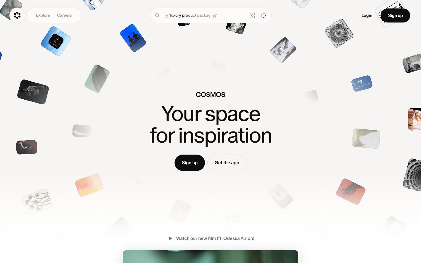
A serene, gallery-like creative-inspiration interface built on a warm off-white canvas (#f7f5f3) with pure-black pill CTAs and a custom cosmosOracle display face. The personality comes from a softly-floating field of rounded image tiles (16px radius) scattered around a centered, light-weight headline — the product (visual inspiration) literally surrounds the message. Near-monochrome and quiet, with a single soft drop shadow doing all the elevation work.
---
version: alpha
name: Cosmos-design-analysis
description: "A serene, gallery-like creative-inspiration interface built on a warm off-white canvas (#f7f5f3) with pure-black pill CTAs and a custom cosmosOracle display face. The personality comes from a softly-floating field of rounded image tiles (16px radius) scattered around a centered, light-weight headline — the product (visual inspiration) literally surrounds the message. Near-monochrome and quiet, with a single soft drop shadow doing all the elevation work."

colors:
  primary: "#000000"
  ink: "#000000"
  ink-soft: "#1d1717"
  surface-dark: "#191919"
  surface-dark-alt: "#232323"
  muted: "#383838"
  muted-soft: "#414141"
  on-dark: "#ffffff"
  white: "#ffffff"
  canvas: "#f7f5f3"
  surface: "#f8f8f7"
  surface-alt: "#f5f5f5"
  surface-warm: "#e8e6e4"
  border-strong: "#d0d0d0"
  hairline: "#e0e0e0"
  accent-blue: "#3982f7"
  accent-wine: "#190306"
  spectrum-red: "#ff0000"
  spectrum-yellow: "#ffff00"
  spectrum-green: "#00ff00"
  spectrum-cyan: "#00ffff"
  spectrum-blue: "#0000ff"

typography:
  display-xl:
    fontFamily: "cosmosOracle, Spectral, Georgia, serif"
    fontSize: 74px
    fontWeight: 350
    lineHeight: 1.0
    letterSpacing: -3.7px
  display-lg:
    fontFamily: "cosmosOracle, Spectral, Georgia, serif"
    fontSize: 66px
    fontWeight: 400
    lineHeight: 1.08
    letterSpacing: -2.64px
  body:
    fontFamily: "cosmosOracle, Spectral, Georgia, serif"
    fontSize: 16px
    fontWeight: 500
    lineHeight: 1.25
    letterSpacing: -0.32px
  button:
    fontFamily: "cosmosOracle, Spectral, Georgia, serif"
    fontSize: 14px
    fontWeight: 500
    lineHeight: 1.286
    letterSpacing: -0.28px

rounded:
  none: 0px
  sm: 11px
  md: 12px
  lg: 16px
  xl: 19px
  pill: 9999px

spacing:
  xxs: 4px
  xs: 8px
  sm: 11px
  md: 16px
  lg: 20px
  xl: 24px
  xxl: 32px
  section: 48px
  hero: 72px

components:
  top-nav:
    backgroundColor: transparent
    textColor: "{colors.ink}"
    typography: "{typography.button}"
    padding: 16px 24px
  nav-pill-group:
    backgroundColor: "{colors.surface}"
    textColor: "{colors.muted}"
    typography: "{typography.button}"
    rounded: "{rounded.pill}"
    padding: 16px 24px
  search-bar:
    backgroundColor: "{colors.white}"
    textColor: "{colors.muted}"
    typography: "{typography.body}"
    rounded: "{rounded.pill}"
    padding: 16px 24px
  button-primary:
    backgroundColor: "{colors.primary}"
    textColor: "{colors.on-dark}"
    typography: "{typography.button}"
    rounded: "{rounded.pill}"
    padding: 16px 24px
  button-secondary:
    backgroundColor: "{colors.white}"
    textColor: "{colors.ink}"
    typography: "{typography.button}"
    rounded: "{rounded.pill}"
    padding: 16px 24px
  button-cta-large:
    backgroundColor: "{colors.primary}"
    textColor: "{colors.on-dark}"
    typography: "{typography.display-lg}"
    rounded: "{rounded.pill}"
    padding: 24px 48px
  text-link:
    backgroundColor: transparent
    textColor: "{colors.ink}"
    typography: "{typography.button}"
  media-tile:
    backgroundColor: "{colors.surface-warm}"
    textColor: "{colors.ink}"
    rounded: "{rounded.lg}"
  video-card:
    backgroundColor: "{colors.surface-warm}"
    textColor: "{colors.ink}"
    rounded: "{rounded.lg}"
  footer:
    backgroundColor: "{colors.canvas}"
    textColor: "{colors.muted}"
    typography: "{typography.body}"
    padding: 24px

---

## Overview

Cosmos's landing surface is a quiet, gallery-like creative-inspiration interface. The page floor is a warm off-white canvas (`{colors.canvas}` — #f7f5f3), and the entire hero is a softly-floating field of small, rounded image tiles (`{component.media-tile}`, `{rounded.lg}` — 16px) scattered around a centered, light-weight serif headline. The product — visual inspiration — literally surrounds the message rather than being shown in a framed mockup.

The voice is near-monochrome and restrained: pure black (`{colors.primary}` — #000000) for ink and primary CTAs, warm whites for surfaces, and almost no chromatic accent in the chrome. The only sustained color comes from the photographic tiles themselves, which carry the full spectrum of user-uploaded imagery. A measured blue (`{colors.accent-blue}` — #3982f7) and a small spectrum swatch set (`{colors.spectrum-red}` … `{colors.spectrum-blue}`) appear inside product/picker fragments, never in the marketing chrome.

Type voice is a single custom family — **cosmosOracle** — used across every role from the 74px display headline down to the 14px button label. Headlines run light (weight 350–400) with aggressive negative tracking (-3.7px at display-xl), giving a refined, editorial, slightly literary tone. There is no second typeface; hierarchy is built from size and weight alone.

**Key Characteristics:**
- Warm off-white canvas (`{colors.canvas}` — #f7f5f3) instead of pure white — softer and gallery-toned.
- Black pill CTAs (`{component.button-primary}`, `{rounded.pill}`) — fully rounded, not the 8px corners of typical SaaS.
- Light-weight custom serif display type (cosmosOracle, weight 350) with heavy negative letter-spacing.
- A scattered field of rounded image tiles (`{component.media-tile}`, `{rounded.lg}` — 16px) as the hero's primary visual device; the 16px radius dominates the whole page (measured on 97 elements).
- Centered, single-column hero composition: wordmark, headline, two-button CTA row, then a "Watch our new film" link and a soft-shadowed video card.
- One soft, wide drop shadow (`rgba(0,0,0,0.15) 0px 6px 44px`) carries all elevation — there are no hairline-bordered cards.
- A giant outlined "COSMOS" wordmark closes the page at the very bottom of the footer.

## Colors

### Brand & Ink
- **Primary / Ink** (`{colors.primary}` / `{colors.ink}` — #000000): The dominant action and text color. All primary CTAs, the headline, and the wordmark are pure black.
- **Ink Soft** (`{colors.ink-soft}` — #1d1717): A warm near-black used on secondary text masses.
- **Muted** (`{colors.muted}` — #383838) and **Muted Soft** (`{colors.muted-soft}` — #414141): Secondary and tertiary text — nav labels, search placeholder, footer links.

### Surfaces
- **Canvas** (`{colors.canvas}` — #f7f5f3): The warm off-white page floor and footer background.
- **Surface** (`{colors.surface}` — #f8f8f7) and **Surface Alt** (`{colors.surface-alt}` — #f5f5f5): Subtle panel tints for the nav pill group and pre-footer band.
- **Surface Warm** (`{colors.surface-warm}` — #e8e6e4): The neutral fill behind media tiles and the video card before imagery loads.
- **White** (`{colors.white}` — #ffffff): The search-bar fill and secondary button fill.
- **Surface Dark / Surface Dark Alt** (`{colors.surface-dark}` — #191919 / `{colors.surface-dark-alt}` — #232323): Dark tones observed in tile imagery and inverted small chrome.

### Borders
- **Hairline** (`{colors.hairline}` — #e0e0e0): The faint 1px divider tone.
- **Border Strong** (`{colors.border-strong}` — #d0d0d0): Slightly heavier outline for the secondary button / large CTA outline.

### Accent & Spectrum
- **Accent Blue** (`{colors.accent-blue}` — #3982f7): Appears inside product/picker chrome, not in marketing CTAs.
- **Accent Wine** (`{colors.accent-wine}` — #190306): A very dark warm accent observed in tile/UI fragments.
- **Spectrum set** (`{colors.spectrum-red}` #ff0000, `{colors.spectrum-yellow}` #ffff00, `{colors.spectrum-green}` #00ff00, `{colors.spectrum-cyan}` #00ffff, `{colors.spectrum-blue}` #0000ff): Pure RGB primaries measured at low frequency — almost certainly from a color-picker / spectrum widget or decorative gradient tiles, not part of the chrome palette. Documented for completeness; do not use them as brand colors.

## Typography

### Font Family
The system runs a single custom typeface, **cosmosOracle**, across every role — display headlines, body, and button labels. It is a refined, light-weight display face with strong negative tracking on large sizes, reading as editorial and slightly literary. There is no secondary family; the entire hierarchy is built from size and weight within one face.

### Note on Font Substitutes
cosmosOracle is a custom/proprietary face and is not available as a public web font. The fallback stack here uses **Spectral** (an open-source transitional serif from Google Fonts) and Georgia as substitutes — both preserve the light-weight, refined, slightly-condensed character of the headline. Tune Spectral to weight 300–400 with negative letter-spacing to approximate the display sizes. The exact serif-vs-sans classification of cosmosOracle could not be confirmed from screenshots (see Known Gaps); if it is humanist sans, substitute **Inter** at weight 300 instead.

### Hierarchy

| Token | Size | Weight | Line Height | Letter Spacing | Use |
|---|---|---|---|---|---|
| `{typography.display-xl}` | 74px | 350 | 1.0 | -3.7px | Hero headline ("Your space for inspiration") |
| `{typography.display-lg}` | 66px | 400 | 1.08 | -2.64px | Large CTA label, giant footer wordmark |
| `{typography.body}` | 16px | 500 | 1.25 | -0.32px | Running text, search placeholder, footer links |
| `{typography.button}` | 14px | 500 | 1.286 | -0.28px | Button labels, nav links |

### Principles
Hierarchy is achieved through scale, not family changes. Display sizes lean light (350–400) with heavy negative tracking, while functional text (body, button) steps up to weight 500 with much smaller negative tracking. The negative letter-spacing scales with size — roughly -0.05em across the board — and is part of the brand's tight, refined voice. Never set the headline at a heavy weight; the lightness is the signature.

## Layout

### Spacing System
- **Base unit:** 4px.
- **Tokens:** `{spacing.xxs}` 4px · `{spacing.xs}` 8px · `{spacing.sm}` 11px · `{spacing.md}` 16px · `{spacing.lg}` 20px · `{spacing.xl}` 24px · `{spacing.xxl}` 32px · `{spacing.section}` 48px · `{spacing.hero}` 72px.
- **Most-frequent rhythm:** 4px (14×), 24px (14×), 16px (13×), and 20px (13×) dominate — small component padding and gaps cluster around these values.
- **Larger gaps:** 30, 32, 48, 54, 60, 72px appear sparingly to separate the hero from the video card and the pre-footer CTA band.

### Grid & Container
- **Composition:** The hero is a single centered column — wordmark, headline, CTA row, film link, video card — stacked vertically and horizontally centered.
- **Floating tile field:** Media tiles are absolutely positioned around the centered content rather than placed in a grid; they create a full-bleed scattered surround.
- **Footer:** A horizontal row of social/legal links (Instagram, TikTok, X, Substack / Careers, Terms, Privacy) flanking a centered logo mark, closed by the oversized COSMOS wordmark.

### Whitespace Philosophy
The page uses generous vertical air around a small, centered content block. The negative space is intentional — it lets the scattered image tiles breathe and reads as a calm gallery wall rather than a dense marketing page.

## Elevation & Depth

| Level | Treatment | Use |
|---|---|---|
| Flat | No shadow, no border | Canvas, nav, headline, tiles at rest |
| Soft float | `rgba(0,0,0,0.15) 0px 6px 44px` plus a faint `rgba(0,0,0,0.03)` layer | The video card and lifted/elevated elements |

The single measured shadow is wide and soft — a large blur (44px) at low alpha — producing a gentle "floating above the canvas" effect rather than a crisp drop. There are no hairline-bordered cards in the system; elevation is either absent or this one soft shadow.

### Decorative Depth
- The scattered media tiles carry implied depth through scale variance and slight rotation (visible in the screenshots) — smaller, blurrier tiles read as farther away. This parallax-like field is the system's primary depth device, not box-shadows.

## Shapes

### Border Radius Scale

| Token | Value | Use |
|---|---|---|
| `{rounded.none}` | 0px | Inputs (the search field's inner control measured 0px radius) |
| `{rounded.sm}` | 11px | Small inner controls / occasional tiles |
| `{rounded.md}` | 12px | Secondary rounded panels |
| `{rounded.lg}` | 16px | The dominant radius — media tiles and the video card (measured on 97 elements) |
| `{rounded.xl}` | 19px | Occasional larger rounded container |
| `{rounded.pill}` | 9999px | All pill buttons, nav pill group, and search bar (derived from a measured ~3.35e7px radius, i.e. fully-rounded) |

### Geometry
The visual signature is **16px-rounded rectangles for imagery** combined with **fully-rounded pills for interactive chrome**. The pill radius value is derived: the button and search-bar elements measured an effectively infinite radius (3.35544e+07px), which resolves to a standard `9999px` pill. Media tiles retain native image aspect ratios at small scale inside the 16px corners.

## Components

### Navigation

**`top-nav`** — Transparent bar across the top of the hero. Left: the circular Cosmos logo mark beside a `{component.nav-pill-group}`. Center: the `{component.search-bar}`. Right: a "Login" `{component.text-link}` and a "Sign up" `{component.button-primary}`. Labels use `{typography.button}`.

**`nav-pill-group`** — A soft pill-shaped container (`{colors.surface}` fill, `{rounded.pill}`) holding the "Explore" and "Careers" nav links in `{colors.muted}`. Padding derived around 16px × 24px.

**`search-bar`** — Centered pill search input. White fill (`{colors.white}`), `{rounded.pill}`, placeholder ("Try 'luxury product packaging'") in `{colors.muted}` using `{typography.body}`. Carries a leading search glyph and trailing scan/spectrum icons. Note: the inner input control measured `{rounded.none}` (0px) — the rounded silhouette comes from the wrapper.

### Buttons

**`button-primary`** — The signature CTA. Black fill (`{colors.primary}`), white text (`{colors.on-dark}`), `{typography.button}`, fully-rounded `{rounded.pill}`. Used for "Sign up" in both the nav and hero. Padding is derived (~16px × 24px) — the measured padding came back as 0px (measurement noise), so values are approximated from screenshots.

**`button-secondary`** — White pill with a strong outline. Fill `{colors.white}`, text `{colors.ink}`, border `{colors.border-strong}`, `{rounded.pill}`. Used for "Get the app" beside the primary CTA.

**`button-cta-large`** — The oversized pre-footer "Sign up for Cosmos" pill. Black fill (`{colors.primary}`), white text, headline-scale label in `{typography.display-lg}`, `{rounded.pill}`, generous padding (derived ~24px × 48px).

**`text-link`** — Plain inline link ("Login", "Download the app", footer links). No background, `{colors.ink}` or `{colors.muted}` text, `{typography.button}` / `{typography.body}`.

### Content & Media

**`media-tile`** — The scattered floating image tiles that fill the hero. Rounded `{rounded.lg}` (16px), neutral `{colors.surface-warm}` placeholder fill behind the photographic content. Tiles vary in size, rotation, and blur to create depth; they are the system's central visual device.

**`video-card`** — The "Watch our new film" thumbnail below the hero. Rounded `{rounded.lg}` (16px), `{colors.surface-warm}` base, lifted with the soft float shadow (`rgba(0,0,0,0.15) 0px 6px 44px`). Carries a centered play/logo glyph overlay.

### Footer

**`footer`** — Sits on the `{colors.canvas}` floor. A horizontal link row (Instagram · TikTok · X · Substack on the left; Careers · Terms · Privacy on the right) flanking a centered logo mark, in `{colors.muted}` using `{typography.body}`. Padding around `{spacing.xl}` (24px). Closed by an oversized outlined "COSMOS" wordmark spanning the full width in `{colors.ink}`.

## Do's and Don'ts

### Do
- Keep the canvas warm off-white (`{colors.canvas}` — #f7f5f3), not pure white. The warmth is part of the gallery tone.
- Use fully-rounded `{rounded.pill}` for every interactive chrome element (buttons, nav group, search bar).
- Use `{rounded.lg}` (16px) for all imagery — tiles and the video card. It is the dominant radius across the page.
- Keep headlines light (cosmosOracle weight 350–400) with heavy negative tracking. The lightness is the brand voice.
- Let imagery carry all the color. The chrome stays near-monochrome black-on-warm-white.
- Use the single soft wide shadow for the rare lifted element; otherwise stay flat.

### Don't
- Don't introduce hairline-bordered cards — the system uses scattered tiles and one soft shadow, not framed cards.
- Don't set the headline at a bold weight; it would break the refined, literary tone.
- Don't use `{colors.accent-blue}` or the spectrum primaries in marketing chrome — they belong to product/picker UI only.
- Don't switch typefaces for hierarchy — stay within cosmosOracle and change size/weight instead.
- Don't square off the buttons; the pill silhouette is the system's interactive signature.
- Don't document hover states — default and active/pressed only.

## Responsive Behavior

### Breakpoints
The capture covers a single landing page at desktop and a tall full-page render. Exact breakpoint widths were not measured, so the guidance below is derived from the two captured renders.

| Name | Width | Key Changes (derived) |
|---|---|---|
| Mobile | < 768px | Nav compresses; headline scales down from 74px; tile field thins to avoid crowding; CTAs stack |
| Tablet | 768–1024px | Centered column holds; fewer scattered tiles; search bar narrows |
| Desktop | > 1024px | Full scattered tile field; centered hero with two-button CTA row; full nav |

### Touch Targets
- `{component.button-primary}` and `{component.button-secondary}` render as pills with derived ~16px vertical padding — comfortably above 40px tall at the measured button type size.
- `{component.search-bar}` is a full-width pill, easily tappable.
- Exact touch-target dimensions were not measured (see Known Gaps).

### Collapsing Strategy
- The centered single-column hero is naturally responsive — content stays centered while the surrounding tile field thins on narrow viewports.
- Media tiles reduce in count rather than shrinking to illegibility.
- The oversized footer COSMOS wordmark scales with viewport width.

### Image Behavior
- Media tiles retain native aspect ratios inside `{rounded.lg}` corners.
- The video card scales proportionally and keeps its soft float shadow.

## Iteration Guide

1. Focus on ONE component at a time and reference its YAML key (`{component.media-tile}`, `{component.button-primary}`).
2. Variants live as separate entries in `components:` (e.g., a `-active`/pressed CTA).
3. Use `{token.refs}` everywhere — never inline a hex in a component.
4. Never document hover. Default and Active/Pressed states only.
5. Keep the chrome monochrome; new color should arrive through imagery, not new accent tokens.
6. Default radius for imagery is `{rounded.lg}` (16px); default radius for interactive chrome is `{rounded.pill}`.
7. When emphasizing, scale cosmosOracle up before adding weight — the headline stays light.

## Known Gaps

- The classification of **cosmosOracle** (serif vs. humanist sans) could not be confirmed from screenshots; the substitute stack (Spectral / Georgia) assumes a light transitional serif. If it is sans, substitute Inter at weight 300. cosmosOracle itself is custom and not publicly available.
- Button and card padding came back as `0px` and card/button radius as `3.35544e+07px` from the analyzer — clearly measurement noise. Pill radius is documented as derived `9999px`; component padding values are derived from screenshots and should be confirmed against production CSS.
- Only the landing page was captured; interior product surfaces (the actual Cosmos board/grid app, sign-up flow, settings) are out of scope.
- The full color palette includes pure RGB primaries (`{colors.spectrum-red}` … `{colors.spectrum-blue}`) at low frequency — their exact source (color picker, gradient tiles, or decorative imagery) is unconfirmed.
- Exact responsive breakpoints, touch-target dimensions, and animation/transition timings (the floating-tile motion, hero parallax) were not measured.
- Only one box-shadow value was captured; additional elevation levels, if any, are undocumented.
- Form/input states (focus, error, filled) beyond the default search bar were not extracted.

<!-- Documented by duply · real-world design systems as ready-to-use DESIGN.md for AI coding agents · https://duply.ai/cosmos/design-md -->
Color Palette
Accent
Neutrals
Typography
display-xl74px · 350 · 1
The quick brown fox jumpsdisplay-lg66px · 400 · 1.08
The quick brown fox jumpsbody16px · 500 · 1.25
The quick brown fox jumpsbutton14px · 500 · 1.286
The quick brown fox jumpsSpacing & Shape
Spacing
| Name | Value | Preview |
|---|---|---|
| xxs | 4px | |
| xs | 8px | |
| sm | 11px | |
| md | 16px | |
| lg | 20px | |
| xl | 24px | |
| xxl | 32px | |
| section | 48px | |
| hero | 72px |
Border Radius
| Name | Value | Preview |
|---|---|---|
| none | 0px | |
| sm | 11px | |
| md | 12px | |
| lg | 16px | |
| xl | 19px | |
| pill | 9999px |
More like this


---
version: alpha
name: Cosmos-design-analysis
description: "A serene, gallery-like creative-inspiration interface built on a warm off-white canvas (#f7f5f3) with pure-black pill CTAs and a custom cosmosOracle display face. The personality comes from a softly-floating field of rounded image tiles (16px radius) scattered around a centered, light-weight headline — the product (visual inspiration) literally surrounds the message. Near-monochrome and quiet, with a single soft drop shadow doing all the elevation work."

colors:
  primary: "#000000"
  ink: "#000000"
  ink-soft: "#1d1717"
  surface-dark: "#191919"
  surface-dark-alt: "#232323"
  muted: "#383838"
  muted-soft: "#414141"
  on-dark: "#ffffff"
  white: "#ffffff"
  canvas: "#f7f5f3"
  surface: "#f8f8f7"
  surface-alt: "#f5f5f5"
  surface-warm: "#e8e6e4"
  border-strong: "#d0d0d0"
  hairline: "#e0e0e0"
  accent-blue: "#3982f7"
  accent-wine: "#190306"
  spectrum-red: "#ff0000"
  spectrum-yellow: "#ffff00"
  spectrum-green: "#00ff00"
  spectrum-cyan: "#00ffff"
  spectrum-blue: "#0000ff"

typography:
  display-xl:
    fontFamily: "cosmosOracle, Spectral, Georgia, serif"
    fontSize: 74px
    fontWeight: 350
    lineHeight: 1.0
    letterSpacing: -3.7px
  display-lg:
    fontFamily: "cosmosOracle, Spectral, Georgia, serif"
    fontSize: 66px
    fontWeight: 400
    lineHeight: 1.08
    letterSpacing: -2.64px
  body:
    fontFamily: "cosmosOracle, Spectral, Georgia, serif"
    fontSize: 16px
    fontWeight: 500
    lineHeight: 1.25
    letterSpacing: -0.32px
  button:
    fontFamily: "cosmosOracle, Spectral, Georgia, serif"
    fontSize: 14px
    fontWeight: 500
    lineHeight: 1.286
    letterSpacing: -0.28px

rounded:
  none: 0px
  sm: 11px
  md: 12px
  lg: 16px
  xl: 19px
  pill: 9999px

spacing:
  xxs: 4px
  xs: 8px
  sm: 11px
  md: 16px
  lg: 20px
  xl: 24px
  xxl: 32px
  section: 48px
  hero: 72px

components:
  top-nav:
    backgroundColor: transparent
    textColor: "{colors.ink}"
    typography: "{typography.button}"
    padding: 16px 24px
  nav-pill-group:
    backgroundColor: "{colors.surface}"
    textColor: "{colors.muted}"
    typography: "{typography.button}"
    rounded: "{rounded.pill}"
    padding: 16px 24px
  search-bar:
    backgroundColor: "{colors.white}"
    textColor: "{colors.muted}"
    typography: "{typography.body}"
    rounded: "{rounded.pill}"
    padding: 16px 24px
  button-primary:
    backgroundColor: "{colors.primary}"
    textColor: "{colors.on-dark}"
    typography: "{typography.button}"
    rounded: "{rounded.pill}"
    padding: 16px 24px
  button-secondary:
    backgroundColor: "{colors.white}"
    textColor: "{colors.ink}"
    typography: "{typography.button}"
    rounded: "{rounded.pill}"
    padding: 16px 24px
  button-cta-large:
    backgroundColor: "{colors.primary}"
    textColor: "{colors.on-dark}"
    typography: "{typography.display-lg}"
    rounded: "{rounded.pill}"
    padding: 24px 48px
  text-link:
    backgroundColor: transparent
    textColor: "{colors.ink}"
    typography: "{typography.button}"
  media-tile:
    backgroundColor: "{colors.surface-warm}"
    textColor: "{colors.ink}"
    rounded: "{rounded.lg}"
  video-card:
    backgroundColor: "{colors.surface-warm}"
    textColor: "{colors.ink}"
    rounded: "{rounded.lg}"
  footer:
    backgroundColor: "{colors.canvas}"
    textColor: "{colors.muted}"
    typography: "{typography.body}"
    padding: 24px

---

## Overview

Cosmos's landing surface is a quiet, gallery-like creative-inspiration interface. The page floor is a warm off-white canvas (`{colors.canvas}` — #f7f5f3), and the entire hero is a softly-floating field of small, rounded image tiles (`{component.media-tile}`, `{rounded.lg}` — 16px) scattered around a centered, light-weight serif headline. The product — visual inspiration — literally surrounds the message rather than being shown in a framed mockup.

The voice is near-monochrome and restrained: pure black (`{colors.primary}` — #000000) for ink and primary CTAs, warm whites for surfaces, and almost no chromatic accent in the chrome. The only sustained color comes from the photographic tiles themselves, which carry the full spectrum of user-uploaded imagery. A measured blue (`{colors.accent-blue}` — #3982f7) and a small spectrum swatch set (`{colors.spectrum-red}` … `{colors.spectrum-blue}`) appear inside product/picker fragments, never in the marketing chrome.

Type voice is a single custom family — **cosmosOracle** — used across every role from the 74px display headline down to the 14px button label. Headlines run light (weight 350–400) with aggressive negative tracking (-3.7px at display-xl), giving a refined, editorial, slightly literary tone. There is no second typeface; hierarchy is built from size and weight alone.

**Key Characteristics:**
- Warm off-white canvas (`{colors.canvas}` — #f7f5f3) instead of pure white — softer and gallery-toned.
- Black pill CTAs (`{component.button-primary}`, `{rounded.pill}`) — fully rounded, not the 8px corners of typical SaaS.
- Light-weight custom serif display type (cosmosOracle, weight 350) with heavy negative letter-spacing.
- A scattered field of rounded image tiles (`{component.media-tile}`, `{rounded.lg}` — 16px) as the hero's primary visual device; the 16px radius dominates the whole page (measured on 97 elements).
- Centered, single-column hero composition: wordmark, headline, two-button CTA row, then a "Watch our new film" link and a soft-shadowed video card.
- One soft, wide drop shadow (`rgba(0,0,0,0.15) 0px 6px 44px`) carries all elevation — there are no hairline-bordered cards.
- A giant outlined "COSMOS" wordmark closes the page at the very bottom of the footer.

## Colors

### Brand & Ink
- **Primary / Ink** (`{colors.primary}` / `{colors.ink}` — #000000): The dominant action and text color. All primary CTAs, the headline, and the wordmark are pure black.
- **Ink Soft** (`{colors.ink-soft}` — #1d1717): A warm near-black used on secondary text masses.
- **Muted** (`{colors.muted}` — #383838) and **Muted Soft** (`{colors.muted-soft}` — #414141): Secondary and tertiary text — nav labels, search placeholder, footer links.

### Surfaces
- **Canvas** (`{colors.canvas}` — #f7f5f3): The warm off-white page floor and footer background.
- **Surface** (`{colors.surface}` — #f8f8f7) and **Surface Alt** (`{colors.surface-alt}` — #f5f5f5): Subtle panel tints for the nav pill group and pre-footer band.
- **Surface Warm** (`{colors.surface-warm}` — #e8e6e4): The neutral fill behind media tiles and the video card before imagery loads.
- **White** (`{colors.white}` — #ffffff): The search-bar fill and secondary button fill.
- **Surface Dark / Surface Dark Alt** (`{colors.surface-dark}` — #191919 / `{colors.surface-dark-alt}` — #232323): Dark tones observed in tile imagery and inverted small chrome.

### Borders
- **Hairline** (`{colors.hairline}` — #e0e0e0): The faint 1px divider tone.
- **Border Strong** (`{colors.border-strong}` — #d0d0d0): Slightly heavier outline for the secondary button / large CTA outline.

### Accent & Spectrum
- **Accent Blue** (`{colors.accent-blue}` — #3982f7): Appears inside product/picker chrome, not in marketing CTAs.
- **Accent Wine** (`{colors.accent-wine}` — #190306): A very dark warm accent observed in tile/UI fragments.
- **Spectrum set** (`{colors.spectrum-red}` #ff0000, `{colors.spectrum-yellow}` #ffff00, `{colors.spectrum-green}` #00ff00, `{colors.spectrum-cyan}` #00ffff, `{colors.spectrum-blue}` #0000ff): Pure RGB primaries measured at low frequency — almost certainly from a color-picker / spectrum widget or decorative gradient tiles, not part of the chrome palette. Documented for completeness; do not use them as brand colors.

## Typography

### Font Family
The system runs a single custom typeface, **cosmosOracle**, across every role — display headlines, body, and button labels. It is a refined, light-weight display face with strong negative tracking on large sizes, reading as editorial and slightly literary. There is no secondary family; the entire hierarchy is built from size and weight within one face.

### Note on Font Substitutes
cosmosOracle is a custom/proprietary face and is not available as a public web font. The fallback stack here uses **Spectral** (an open-source transitional serif from Google Fonts) and Georgia as substitutes — both preserve the light-weight, refined, slightly-condensed character of the headline. Tune Spectral to weight 300–400 with negative letter-spacing to approximate the display sizes. The exact serif-vs-sans classification of cosmosOracle could not be confirmed from screenshots (see Known Gaps); if it is humanist sans, substitute **Inter** at weight 300 instead.

### Hierarchy

| Token | Size | Weight | Line Height | Letter Spacing | Use |
|---|---|---|---|---|---|
| `{typography.display-xl}` | 74px | 350 | 1.0 | -3.7px | Hero headline ("Your space for inspiration") |
| `{typography.display-lg}` | 66px | 400 | 1.08 | -2.64px | Large CTA label, giant footer wordmark |
| `{typography.body}` | 16px | 500 | 1.25 | -0.32px | Running text, search placeholder, footer links |
| `{typography.button}` | 14px | 500 | 1.286 | -0.28px | Button labels, nav links |

### Principles
Hierarchy is achieved through scale, not family changes. Display sizes lean light (350–400) with heavy negative tracking, while functional text (body, button) steps up to weight 500 with much smaller negative tracking. The negative letter-spacing scales with size — roughly -0.05em across the board — and is part of the brand's tight, refined voice. Never set the headline at a heavy weight; the lightness is the signature.

## Layout

### Spacing System
- **Base unit:** 4px.
- **Tokens:** `{spacing.xxs}` 4px · `{spacing.xs}` 8px · `{spacing.sm}` 11px · `{spacing.md}` 16px · `{spacing.lg}` 20px · `{spacing.xl}` 24px · `{spacing.xxl}` 32px · `{spacing.section}` 48px · `{spacing.hero}` 72px.
- **Most-frequent rhythm:** 4px (14×), 24px (14×), 16px (13×), and 20px (13×) dominate — small component padding and gaps cluster around these values.
- **Larger gaps:** 30, 32, 48, 54, 60, 72px appear sparingly to separate the hero from the video card and the pre-footer CTA band.

### Grid & Container
- **Composition:** The hero is a single centered column — wordmark, headline, CTA row, film link, video card — stacked vertically and horizontally centered.
- **Floating tile field:** Media tiles are absolutely positioned around the centered content rather than placed in a grid; they create a full-bleed scattered surround.
- **Footer:** A horizontal row of social/legal links (Instagram, TikTok, X, Substack / Careers, Terms, Privacy) flanking a centered logo mark, closed by the oversized COSMOS wordmark.

### Whitespace Philosophy
The page uses generous vertical air around a small, centered content block. The negative space is intentional — it lets the scattered image tiles breathe and reads as a calm gallery wall rather than a dense marketing page.

## Elevation & Depth

| Level | Treatment | Use |
|---|---|---|
| Flat | No shadow, no border | Canvas, nav, headline, tiles at rest |
| Soft float | `rgba(0,0,0,0.15) 0px 6px 44px` plus a faint `rgba(0,0,0,0.03)` layer | The video card and lifted/elevated elements |

The single measured shadow is wide and soft — a large blur (44px) at low alpha — producing a gentle "floating above the canvas" effect rather than a crisp drop. There are no hairline-bordered cards in the system; elevation is either absent or this one soft shadow.

### Decorative Depth
- The scattered media tiles carry implied depth through scale variance and slight rotation (visible in the screenshots) — smaller, blurrier tiles read as farther away. This parallax-like field is the system's primary depth device, not box-shadows.

## Shapes

### Border Radius Scale

| Token | Value | Use |
|---|---|---|
| `{rounded.none}` | 0px | Inputs (the search field's inner control measured 0px radius) |
| `{rounded.sm}` | 11px | Small inner controls / occasional tiles |
| `{rounded.md}` | 12px | Secondary rounded panels |
| `{rounded.lg}` | 16px | The dominant radius — media tiles and the video card (measured on 97 elements) |
| `{rounded.xl}` | 19px | Occasional larger rounded container |
| `{rounded.pill}` | 9999px | All pill buttons, nav pill group, and search bar (derived from a measured ~3.35e7px radius, i.e. fully-rounded) |

### Geometry
The visual signature is **16px-rounded rectangles for imagery** combined with **fully-rounded pills for interactive chrome**. The pill radius value is derived: the button and search-bar elements measured an effectively infinite radius (3.35544e+07px), which resolves to a standard `9999px` pill. Media tiles retain native image aspect ratios at small scale inside the 16px corners.

## Components

### Navigation

**`top-nav`** — Transparent bar across the top of the hero. Left: the circular Cosmos logo mark beside a `{component.nav-pill-group}`. Center: the `{component.search-bar}`. Right: a "Login" `{component.text-link}` and a "Sign up" `{component.button-primary}`. Labels use `{typography.button}`.

**`nav-pill-group`** — A soft pill-shaped container (`{colors.surface}` fill, `{rounded.pill}`) holding the "Explore" and "Careers" nav links in `{colors.muted}`. Padding derived around 16px × 24px.

**`search-bar`** — Centered pill search input. White fill (`{colors.white}`), `{rounded.pill}`, placeholder ("Try 'luxury product packaging'") in `{colors.muted}` using `{typography.body}`. Carries a leading search glyph and trailing scan/spectrum icons. Note: the inner input control measured `{rounded.none}` (0px) — the rounded silhouette comes from the wrapper.

### Buttons

**`button-primary`** — The signature CTA. Black fill (`{colors.primary}`), white text (`{colors.on-dark}`), `{typography.button}`, fully-rounded `{rounded.pill}`. Used for "Sign up" in both the nav and hero. Padding is derived (~16px × 24px) — the measured padding came back as 0px (measurement noise), so values are approximated from screenshots.

**`button-secondary`** — White pill with a strong outline. Fill `{colors.white}`, text `{colors.ink}`, border `{colors.border-strong}`, `{rounded.pill}`. Used for "Get the app" beside the primary CTA.

**`button-cta-large`** — The oversized pre-footer "Sign up for Cosmos" pill. Black fill (`{colors.primary}`), white text, headline-scale label in `{typography.display-lg}`, `{rounded.pill}`, generous padding (derived ~24px × 48px).

**`text-link`** — Plain inline link ("Login", "Download the app", footer links). No background, `{colors.ink}` or `{colors.muted}` text, `{typography.button}` / `{typography.body}`.

### Content & Media

**`media-tile`** — The scattered floating image tiles that fill the hero. Rounded `{rounded.lg}` (16px), neutral `{colors.surface-warm}` placeholder fill behind the photographic content. Tiles vary in size, rotation, and blur to create depth; they are the system's central visual device.

**`video-card`** — The "Watch our new film" thumbnail below the hero. Rounded `{rounded.lg}` (16px), `{colors.surface-warm}` base, lifted with the soft float shadow (`rgba(0,0,0,0.15) 0px 6px 44px`). Carries a centered play/logo glyph overlay.

### Footer

**`footer`** — Sits on the `{colors.canvas}` floor. A horizontal link row (Instagram · TikTok · X · Substack on the left; Careers · Terms · Privacy on the right) flanking a centered logo mark, in `{colors.muted}` using `{typography.body}`. Padding around `{spacing.xl}` (24px). Closed by an oversized outlined "COSMOS" wordmark spanning the full width in `{colors.ink}`.

## Do's and Don'ts

### Do
- Keep the canvas warm off-white (`{colors.canvas}` — #f7f5f3), not pure white. The warmth is part of the gallery tone.
- Use fully-rounded `{rounded.pill}` for every interactive chrome element (buttons, nav group, search bar).
- Use `{rounded.lg}` (16px) for all imagery — tiles and the video card. It is the dominant radius across the page.
- Keep headlines light (cosmosOracle weight 350–400) with heavy negative tracking. The lightness is the brand voice.
- Let imagery carry all the color. The chrome stays near-monochrome black-on-warm-white.
- Use the single soft wide shadow for the rare lifted element; otherwise stay flat.

### Don't
- Don't introduce hairline-bordered cards — the system uses scattered tiles and one soft shadow, not framed cards.
- Don't set the headline at a bold weight; it would break the refined, literary tone.
- Don't use `{colors.accent-blue}` or the spectrum primaries in marketing chrome — they belong to product/picker UI only.
- Don't switch typefaces for hierarchy — stay within cosmosOracle and change size/weight instead.
- Don't square off the buttons; the pill silhouette is the system's interactive signature.
- Don't document hover states — default and active/pressed only.

## Responsive Behavior

### Breakpoints
The capture covers a single landing page at desktop and a tall full-page render. Exact breakpoint widths were not measured, so the guidance below is derived from the two captured renders.

| Name | Width | Key Changes (derived) |
|---|---|---|
| Mobile | < 768px | Nav compresses; headline scales down from 74px; tile field thins to avoid crowding; CTAs stack |
| Tablet | 768–1024px | Centered column holds; fewer scattered tiles; search bar narrows |
| Desktop | > 1024px | Full scattered tile field; centered hero with two-button CTA row; full nav |

### Touch Targets
- `{component.button-primary}` and `{component.button-secondary}` render as pills with derived ~16px vertical padding — comfortably above 40px tall at the measured button type size.
- `{component.search-bar}` is a full-width pill, easily tappable.
- Exact touch-target dimensions were not measured (see Known Gaps).

### Collapsing Strategy
- The centered single-column hero is naturally responsive — content stays centered while the surrounding tile field thins on narrow viewports.
- Media tiles reduce in count rather than shrinking to illegibility.
- The oversized footer COSMOS wordmark scales with viewport width.

### Image Behavior
- Media tiles retain native aspect ratios inside `{rounded.lg}` corners.
- The video card scales proportionally and keeps its soft float shadow.

## Iteration Guide

1. Focus on ONE component at a time and reference its YAML key (`{component.media-tile}`, `{component.button-primary}`).
2. Variants live as separate entries in `components:` (e.g., a `-active`/pressed CTA).
3. Use `{token.refs}` everywhere — never inline a hex in a component.
4. Never document hover. Default and Active/Pressed states only.
5. Keep the chrome monochrome; new color should arrive through imagery, not new accent tokens.
6. Default radius for imagery is `{rounded.lg}` (16px); default radius for interactive chrome is `{rounded.pill}`.
7. When emphasizing, scale cosmosOracle up before adding weight — the headline stays light.

## Known Gaps

- The classification of **cosmosOracle** (serif vs. humanist sans) could not be confirmed from screenshots; the substitute stack (Spectral / Georgia) assumes a light transitional serif. If it is sans, substitute Inter at weight 300. cosmosOracle itself is custom and not publicly available.
- Button and card padding came back as `0px` and card/button radius as `3.35544e+07px` from the analyzer — clearly measurement noise. Pill radius is documented as derived `9999px`; component padding values are derived from screenshots and should be confirmed against production CSS.
- Only the landing page was captured; interior product surfaces (the actual Cosmos board/grid app, sign-up flow, settings) are out of scope.
- The full color palette includes pure RGB primaries (`{colors.spectrum-red}` … `{colors.spectrum-blue}`) at low frequency — their exact source (color picker, gradient tiles, or decorative imagery) is unconfirmed.
- Exact responsive breakpoints, touch-target dimensions, and animation/transition timings (the floating-tile motion, hero parallax) were not measured.
- Only one box-shadow value was captured; additional elevation levels, if any, are undocumented.
- Form/input states (focus, error, filled) beyond the default search bar were not extracted.

<!-- Documented by duply · real-world design systems as ready-to-use DESIGN.md for AI coding agents · https://duply.ai/cosmos/design-md -->