Lusion
A high-craft 3D-studio portfolio built on a pale lavender-white wash with pure-black ink type and a single electric-blue brand accent. The system reads as minimal, gallery-like, and motion-first — a large dark rounded media stage dominates the viewport, framed by neutral Aeonik type set entirely at weight 400, pill-shaped nav buttons, and a restrained set of saturated 3D-render accent colors (electric blue, cyan, lime) that come from the rendered artwork rather than from UI chrome.
---
version: alpha
name: Lusion-design-analysis
description: A high-craft 3D-studio portfolio built on a pale lavender-white wash with pure-black ink type and a single electric-blue brand accent. The system reads as minimal, gallery-like, and motion-first — a large dark rounded media stage dominates the viewport, framed by neutral Aeonik type set entirely at weight 400, pill-shaped nav buttons, and a restrained set of saturated 3D-render accent colors (electric blue, cyan, lime) that come from the rendered artwork rather than from UI chrome.
colors:
ink: "#000000"
ink-900: "#111111"
ink-soft: "#2b2e3a"
canvas: "#ffffff"
surface-muted: "#f0f1fa"
surface-pale: "#e4e6ef"
surface-dark: "#121416"
neutral-700: "#34393f"
muted: "#999999"
accent-blue: "#1a2ffb"
accent-blue-deep: "#0016ec"
accent-blue-alt: "#071bdf"
accent-cyan: "#00ffff"
accent-cyan-deep: "#00cccc"
accent-lime: "#c1ff00"
accent-violet: "#8832f7"
accent-magenta: "#ff00ff"
accent-red: "#e90000"
accent-coral: "#ff4c41"
typography:
display:
fontFamily: "Aeonik, Space Grotesk, Inter, sans-serif"
fontSize: 144px
fontWeight: 400
lineHeight: 1.0
letterSpacing: -2.88px
heading-lg:
fontFamily: "Aeonik, Space Grotesk, Inter, sans-serif"
fontSize: 38px
fontWeight: 400
lineHeight: 1.15
letterSpacing: 0
heading-md:
fontFamily: "Aeonik, Space Grotesk, Inter, sans-serif"
fontSize: 36px
fontWeight: 400
lineHeight: 1.1
letterSpacing: 0
heading-sm:
fontFamily: "Aeonik, Space Grotesk, Inter, sans-serif"
fontSize: 21.6px
fontWeight: 400
lineHeight: 1.4
letterSpacing: 0
button:
fontFamily: "Aeonik, Space Grotesk, Inter, sans-serif"
fontSize: 14px
fontWeight: 400
lineHeight: 1.15
letterSpacing: 0
rounded:
none: 0px
xs: 3px
sm: 10px
md: 15px
lg: 16px
xl: 18px
pill-sm: 76px
pill-md: 88px
pill: 100px
spacing:
xxs: 5px
xs: 9px
sm: 14px
md: 16px
lg: 19px
xl: 23px
xxl: 26px
huge: 29px
components:
top-nav:
backgroundColor: transparent
textColor: "{colors.ink}"
typography: "{typography.button}"
wordmark:
backgroundColor: transparent
textColor: "{colors.ink}"
typography: "{typography.heading-sm}"
button-cta-dark:
backgroundColor: "{colors.surface-dark}"
textColor: "{colors.canvas}"
typography: "{typography.button}"
rounded: "{rounded.pill}"
button-menu-light:
backgroundColor: "{colors.surface-muted}"
textColor: "{colors.ink}"
typography: "{typography.button}"
rounded: "{rounded.pill}"
button-icon-circular:
backgroundColor: "{colors.surface-pale}"
textColor: "{colors.ink}"
rounded: "{rounded.pill}"
button-primary:
backgroundColor: transparent
textColor: "{colors.ink}"
typography: "{typography.button}"
rounded: "{rounded.none}"
padding: 0px
hero-media-card:
backgroundColor: "{colors.surface-dark}"
textColor: "{colors.canvas}"
rounded: "{rounded.md}"
display-headline:
backgroundColor: transparent
textColor: "{colors.ink}"
typography: "{typography.display}"
input:
backgroundColor: "{colors.surface-muted}"
textColor: "{colors.ink}"
typography: "{typography.button}"
rounded: "{rounded.xl}"
---
## Overview
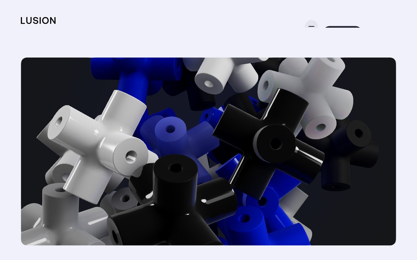
Lusion's landing page is a high-craft 3D-studio portfolio whose entire job is to frame a single piece of motion artwork. The chrome is intentionally minimal: a pale lavender-white wash (`{colors.surface-muted}` — #f0f1fa) holds a large dark rounded media stage (`{colors.surface-dark}` — #121416) that fills most of the viewport, with pure-black Aeonik type (`{colors.ink}` — #000000) and a small cluster of pill buttons riding above it. The interface gets out of the way so the rendered 3D scene — interlocking blue, black, and white connector shapes — does the talking.
Type is unusually uniform: every measured role is **Aeonik at weight 400**. There is no bold-vs-regular hierarchy — emphasis comes entirely from *size*, not weight. The headline scale jumps from a 21.6px sub-line straight up to a 144px display cut with tight -2.88px tracking. This is a studio that trusts whitespace, scale, and motion rather than typographic weight to carry rank.
Color is split into two worlds. The **UI palette** is near-monochrome: black ink, white/lavender surfaces, a near-black `{colors.surface-dark}` for the media stage and the "Let's Talk" pill. The **render palette** — electric blue (`{colors.accent-blue}` — #1a2ffb), cyan (`{colors.accent-cyan}` — #00ffff), lime (`{colors.accent-lime}` — #c1ff00), and several other saturated hues — lives inside the 3D artwork rather than in the chrome. These accents are pulled from the rendered scene, not painted onto buttons or links.
**Key Characteristics:**
- Pale lavender canvas wash (`{colors.surface-muted}` — #f0f1fa) framing a single dark rounded media stage (`{colors.surface-dark}` — #121416) at `{rounded.md}` (15px).
- All type is Aeonik weight 400 — hierarchy is by size only, never by weight.
- A 144px display headline (`{typography.display}`) with -2.88px letter-spacing is the page's typographic centerpiece.
- Pill-shaped nav buttons at `{rounded.pill}` (100px): a dark "Let's Talk" CTA (`{component.button-cta-dark}`) and a light "Menu" pill (`{component.button-menu-light}`), plus a circular icon toggle (`{component.button-icon-circular}`).
- Near-monochrome UI; saturated color (blue/cyan/lime/violet/magenta) appears inside the 3D render, not on chrome.
- A single soft drop shadow (`rgba(0,0,0,0.04)` at 6px/10px and 2px/4px) used on floating pill controls.
- Rounded geometry is bimodal: small content radii (`{rounded.xs}`–`{rounded.lg}`, 3–16px) for cards/media, and very large pill radii (`{rounded.pill-sm}`–`{rounded.pill}`, 76–100px) for buttons.
## Colors
### Brand & Accent
Lusion's chrome is monochrome; its color comes from the rendered 3D scene. These accents were measured from the page but appear predominantly inside the artwork and brand moments, not on interactive chrome.
- **Accent Blue** (`{colors.accent-blue}` — #1a2ffb): The signature electric blue — the most frequent accent (measured frequency 7). The dominant non-neutral hue in the hero render.
- **Accent Blue Deep** (`{colors.accent-blue-deep}` — #0016ec) and **Accent Blue Alt** (`{colors.accent-blue-alt}` — #071bdf): Darker variants of the brand blue used in shaded faces of the 3D shapes.
- **Accent Cyan** (`{colors.accent-cyan}` — #00ffff) and **Accent Cyan Deep** (`{colors.accent-cyan-deep}` — #00cccc): Bright secondary accents.
- **Accent Lime** (`{colors.accent-lime}` — #c1ff00): A high-voltage chartreuse used sparingly.
- **Accent Violet** (`{colors.accent-violet}` — #8832f7), **Accent Magenta** (`{colors.accent-magenta}` — #ff00ff), **Accent Red** (`{colors.accent-red}` — #e90000), **Accent Coral** (`{colors.accent-coral}` — #ff4c41): Low-frequency render accents (each measured at frequency 1). Reserve for artwork, never for UI surfaces.
### Surface
- **Surface Muted** (`{colors.surface-muted}` — #f0f1fa): The visible page wash — a pale lavender that frames the media stage. Also the input-field background.
- **Surface Pale** (`{colors.surface-pale}` — #e4e6ef): A slightly deeper neutral surface — circular icon-button fills, soft dividers.
- **Surface Dark** (`{colors.surface-dark}` — #121416): The hero media stage and the dark "Let's Talk" pill. The only dark surface in the system.
- **Canvas** (`{colors.canvas}` — #ffffff): The measured body background floor (the lavender wash sits over it).
### Text
- **Ink** (`{colors.ink}` — #000000): All headlines, the wordmark, and primary text — maximum-contrast black.
- **Ink 900** (`{colors.ink-900}` — #111111) and **Ink Soft** (`{colors.ink-soft}` — #2b2e3a): Near-black variants for secondary text and dark UI fills.
- **Neutral 700** (`{colors.neutral-700}` — #34393f): A dark gray for tertiary text / iconography.
- **Muted** (`{colors.muted}` — #999999): Low-emphasis labels and fine print.
## Typography
### Font Family
The system runs **Aeonik** — a commercial grotesque from CoType Foundry — for every measured role, always at weight 400. Aeonik is not a free web font; the fallback stack here substitutes **Space Grotesk** (an open-source geometric grotesque with similar proportions) and then **Inter**. See "Note on Font Substitutes."
The defining trait is uniform weight: there is no bold tier. The studio expresses hierarchy through dramatic size contrast — a 21.6px sub-line next to a 144px display cut — and through whitespace, not through weight changes.
### Hierarchy
| Token | Size | Weight | Line Height | Letter Spacing | Use |
|---|---|---|---|---|---|
| `{typography.display}` | 144px | 400 | 1.0 | -2.88px | Marquee display headline (h4) — the page's typographic centerpiece |
| `{typography.heading-lg}` | 38px | 400 | 1.15 | 0 | Largest section heading (h3) |
| `{typography.heading-md}` | 36px | 400 | 1.1 | 0 | Primary running headline (h1) — e.g. "We create 3D visual storytelling…" |
| `{typography.heading-sm}` | 21.6px | 400 | 1.4 | 0 | Sub-lines, intro text, wordmark scale (h2) |
| `{typography.button}` | 14px | 400 | 1.15 | 0 | Pill-button labels, nav items |
### Principles
Weight stays at 400 everywhere — never go bold to add emphasis. Increase size or add space instead. The only role carrying intentional tracking is `{typography.display}` at -2.88px (roughly -0.02em); the large cut needs tightening to hold together. All smaller roles use normal tracking.
Note the measured oddity: h3 (38px) is slightly larger than h1 (36px). Treat these as near-peers in the heading band; the document uses `heading-lg`/`heading-md` to preserve both measured values rather than collapse them.
### Note on Font Substitutes
Aeonik is licensed/commercial and should not be self-hosted without a license. **Space Grotesk** (weight 400) is the recommended open-source substitute — a similar neo-grotesque with comparable x-height and geometric character. **Inter** at weight 400 is an acceptable secondary fallback. When substituting, keep the -2.88px tracking on the 144px display role to preserve the headline's tightness.
## Layout
### Spacing System
- **Base rhythm:** The measured spacing values are dense and small, clustering around a ~4–5px sub-grid: `{spacing.xxs}` 5px · `{spacing.xs}` 9px · `{spacing.sm}` 14px · `{spacing.md}` 16px · `{spacing.lg}` 19px · `{spacing.xl}` 23px · `{spacing.xxl}` 26px · `{spacing.huge}` 29px.
- **Most frequent unit:** 19px (`{spacing.lg}`, measured frequency 10) — the workhorse gap, used between control clusters and inside the nav row.
- **Control padding:** Pill buttons and the nav row use the 14–26px band for internal padding and inter-element gaps.
No large section-scale spacing (48px+) was captured — the analysis covered a single above-the-fold landing view dominated by the media stage. Macro vertical rhythm is a Known Gap.
### Grid & Container
- The hero is a single full-bleed media stage (`{component.hero-media-card}`) inset from the lavender wash by a consistent margin, occupying the majority of the viewport.
- The top bar is a three-zone row: wordmark left, headline center, control cluster right (icon toggle + "Let's Talk" + "Menu").
- Footer-edge utility row carries `SCROLL TO EXPLORE` centered with `+`/`×` corner marks.
### Whitespace Philosophy
The composition is gallery-like: a generous lavender frame surrounds the dark artwork stage, and chrome is pushed to the extreme edges so nothing competes with the render. Whitespace is the primary structural device.
## Elevation & Depth
| Level | Treatment | Use |
|---|---|---|
| Flat | No shadow — sits directly on the lavender wash | Wordmark, headline, utility row |
| Soft float | `rgba(0,0,0,0.04) 0px 6px 10px 0px, rgba(0,0,0,0.04) 0px 2px 4px 0px` | Floating pill controls — "Let's Talk", "Menu", circular toggle (measured frequency 3) |
| Stage | Dark surface (`{colors.surface-dark}`), large rounded corners, no shadow | The hero media card — depth comes from the rendered 3D scene's own lighting, not a UI shadow |
The elevation philosophy is barely-there: a single ultra-low-alpha (0.04) double shadow lifts the pill controls just off the lavender background. The media stage relies on the artwork's internal 3D shading for depth, not on a container shadow.
### Decorative Depth
All visual depth in the hero comes from inside the render — specular highlights and cast shadows on the interlocking connector shapes. This is product/artwork chrome, not a system token.
## Shapes
### Border Radius Scale
| Token | Value | Use |
|---|---|---|
| `{rounded.none}` | 0px | Text-style `button-primary` (measured radius 0) |
| `{rounded.xs}` | 3px | Small inline accents |
| `{rounded.sm}` | 10px | Small cards / minor containers |
| `{rounded.md}` | 15px | The hero media stage (most frequent content radius, measured frequency 10) |
| `{rounded.lg}` | 16px | Cards |
| `{rounded.xl}` | 18px | Input fields |
| `{rounded.pill-sm}` | 76px | Larger pill controls |
| `{rounded.pill-md}` | 88px | Larger pill controls |
| `{rounded.pill}` | 100px | Nav pill buttons + circular icon toggle (most frequent pill radius) |
Radius is clearly bimodal: content surfaces stay in the 3–18px range, while interactive buttons jump to 76–100px (effectively fully pill/circular). There is no mid-range curvature — a control is either subtly-rounded content or a full pill.
### Photography / Media Geometry
The single media stage uses `{rounded.md}` (15px) corners. The rendered artwork inside is full-bleed within that rounded frame.
## Components
### Navigation
**`top-nav`** — Transparent bar over the lavender wash. Three zones: the `{component.wordmark}` at far left, the running headline center, and a control cluster at far right. Labels in `{typography.button}` (Aeonik 14px / 400). No background, no border.
**`wordmark`** — The "LUSION" lettermark at top-left, set in `{colors.ink}` at roughly `{typography.heading-sm}` scale. Transparent background.
### Buttons
**`button-cta-dark`** — The "Let's Talk •" primary CTA. Background `{colors.surface-dark}` (#121416), label `{colors.canvas}`, type `{typography.button}`, fully pill at `{rounded.pill}` (100px). Carries the soft float shadow.
**`button-menu-light`** — The "Menu ••" pill. Background `{colors.surface-muted}` (#f0f1fa), label `{colors.ink}`, type `{typography.button}`, `{rounded.pill}`. Soft float shadow.
**`button-icon-circular`** — The small circular toggle (minus/expand glyph) left of the CTA cluster. Background `{colors.surface-pale}` (#e4e6ef), icon in `{colors.ink}`, fully circular via `{rounded.pill}`. Soft float shadow.
**`button-primary`** — The measured base button: text-style, transparent background, `{colors.ink}` label, `{typography.button}`, radius `{rounded.none}` (0px), padding 0. Used for inline text actions that aren't wrapped in a pill (e.g., utility-row links).
### Media & Headline
**`hero-media-card`** — The dominant component: a large dark rounded stage holding the 3D render. Background `{colors.surface-dark}` (#121416), corners `{rounded.md}` (15px). No UI shadow — the render's own lighting carries depth. Fills most of the viewport, inset by the lavender frame.
**`display-headline`** — The marquee headline ("We create 3D visual storytelling and int…"). Transparent background, `{colors.ink}` text, `{typography.display}` (Aeonik 144px / 400, -2.88px tracking) at full scale, or `{typography.heading-md}` (36px) at the in-flow nav scale. The 144px cut is the page's typographic anchor.
### Inputs
**`input`** — Text field. Background `{colors.surface-muted}` (#f0f1fa), text `{colors.ink}`, type `{typography.button}`, corners `{rounded.xl}` (18px). The lavender fill (no visible border) is the system's field treatment.
## Do's and Don'ts
### Do
- Keep all type at Aeonik weight 400 — express hierarchy through size and whitespace, never through bold.
- Reserve the 144px `{typography.display}` cut for one headline per view; keep its -2.88px tracking when substituting fonts.
- Frame the dark media stage (`{component.hero-media-card}`) generously in the lavender wash — let it breathe.
- Use full pill radii (`{rounded.pill}`, 100px) for all interactive buttons and the circular toggle.
- Keep saturated color (blue/cyan/lime/violet) inside the rendered artwork; let the chrome stay monochrome.
- Apply the single soft 0.04-alpha shadow only to floating pill controls.
### Don't
- Don't paint accent colors onto buttons, links, or surfaces — the UI is near-monochrome by design.
- Don't introduce a bold weight to emphasize — go bigger, not heavier.
- Don't use mid-range button radii; controls are either pill (76–100px) or text-flat (0px), nothing between.
- Don't add a container shadow to the media stage — its depth comes from the render's lighting.
- Don't put dark surfaces anywhere except the media stage and the "Let's Talk" pill.
## Responsive Behavior
The capture is a single desktop landing view, so responsive rules are inferred from structure rather than measured at multiple breakpoints.
### Breakpoints (inferred)
| Name | Width | Key Changes (inferred) |
|---|---|---|
| Mobile | < 768px | Three-zone nav collapses — wordmark + condensed control cluster; the running headline drops below; media stage goes near-full-width with reduced inset |
| Tablet | 768–1024px | Nav stays horizontal; media stage retains `{rounded.md}` corners with a tighter lavender frame |
| Desktop | > 1024px | Full three-zone nav with centered headline; media stage dominates the viewport (as captured) |
### Touch Targets
- Pill buttons (`{component.button-cta-dark}`, `{component.button-menu-light}`) have generous horizontal padding and full pill height — comfortably above 44px.
- `{component.button-icon-circular}` is a circular control; ensure its diameter meets the 44px minimum on touch.
### Collapsing Strategy
- The media stage scales proportionally and keeps its 15px corners at every width.
- The center headline is the first element to reflow/drop on narrow viewports.
Exact breakpoint values, mobile nav (hamburger/sheet) behavior, and media-stage aspect-ratio rules are not measured — see Known Gaps.
## Iteration Guide
1. Focus on ONE component at a time and reference its YAML key (`{component.hero-media-card}`, `{component.button-cta-dark}`).
2. Variants (`-active`, `-disabled`, `-focused`) live as separate entries in `components:`.
3. Use `{token.refs}` everywhere — never inline a hex into a component.
4. Never document hover. Default and Active/Pressed states only.
5. Keep type at weight 400; reach for size before weight when adding emphasis.
6. Keep accents inside the artwork; the chrome stays monochrome.
7. When in doubt, add whitespace around the media stage rather than adding chrome.
## Known Gaps
- Aeonik is a commercial typeface (CoType Foundry) and was not flagged in `fonts_licensed`, but it is not freely licensable for self-hosting; an open-source substitute (Space Grotesk) is documented in Typography. Confirm licensing before shipping.
- The measured body background is `{colors.canvas}` (#ffffff), but the visible page wash in the screenshots is the lavender `{colors.surface-muted}` (#f0f1fa). The true page floor is treated as the lavender wash; this discrepancy should be verified against the live CSS.
- No body / paragraph text role was measured — only headings and the button label. A running-body token needs a content-heavy page to extract.
- The measured h3 (38px) is larger than h1 (36px); both values are preserved as near-peer heading roles rather than reconciled.
- No large-scale section spacing (>29px) was captured; the macro vertical rhythm between page bands is unknown.
- Only one page (landing, above-the-fold) was captured — interior layouts, project grids, and the full menu surface are out of scope.
- Animation and transition timings (the studio's signature is motion) are not captured by static analysis and are a major undocumented dimension of this brand.
- Responsive breakpoints and mobile navigation behavior are inferred, not measured.
- The full accent palette (lime, violet, magenta, red, coral) was measured at very low frequency and originates in the rendered 3D artwork; exact usage rules and any seasonal shifts are unconfirmed.
<!-- Documented by duply · real-world design systems as ready-to-use DESIGN.md for AI coding agents · https://duply.ai/lusion/design-md -->
Color Palette
Accent
Neutrals
Typography
display144px · 400 · 1
The quick brown fox jumpsheading-lg38px · 400 · 1.15
The quick brown fox jumpsheading-md36px · 400 · 1.1
The quick brown fox jumpsheading-sm21.6px · 400 · 1.4
The quick brown fox jumpsbutton14px · 400 · 1.15
The quick brown fox jumpsSpacing & Shape
Spacing
| Name | Value | Preview |
|---|---|---|
| xxs | 5px | |
| xs | 9px | |
| sm | 14px | |
| md | 16px | |
| lg | 19px | |
| xl | 23px | |
| xxl | 26px | |
| huge | 29px |
Border Radius
| Name | Value | Preview |
|---|---|---|
| none | 0px | |
| xs | 3px | |
| sm | 10px | |
| md | 15px | |
| lg | 16px | |
| xl | 18px | |
| pill-sm | 76px | |
| pill-md | 88px | |
| pill | 100px |
More like this


---
version: alpha
name: Lusion-design-analysis
description: A high-craft 3D-studio portfolio built on a pale lavender-white wash with pure-black ink type and a single electric-blue brand accent. The system reads as minimal, gallery-like, and motion-first — a large dark rounded media stage dominates the viewport, framed by neutral Aeonik type set entirely at weight 400, pill-shaped nav buttons, and a restrained set of saturated 3D-render accent colors (electric blue, cyan, lime) that come from the rendered artwork rather than from UI chrome.
colors:
  ink: "#000000"
  ink-900: "#111111"
  ink-soft: "#2b2e3a"
  canvas: "#ffffff"
  surface-muted: "#f0f1fa"
  surface-pale: "#e4e6ef"
  surface-dark: "#121416"
  neutral-700: "#34393f"
  muted: "#999999"
  accent-blue: "#1a2ffb"
  accent-blue-deep: "#0016ec"
  accent-blue-alt: "#071bdf"
  accent-cyan: "#00ffff"
  accent-cyan-deep: "#00cccc"
  accent-lime: "#c1ff00"
  accent-violet: "#8832f7"
  accent-magenta: "#ff00ff"
  accent-red: "#e90000"
  accent-coral: "#ff4c41"
typography:
  display:
    fontFamily: "Aeonik, Space Grotesk, Inter, sans-serif"
    fontSize: 144px
    fontWeight: 400
    lineHeight: 1.0
    letterSpacing: -2.88px
  heading-lg:
    fontFamily: "Aeonik, Space Grotesk, Inter, sans-serif"
    fontSize: 38px
    fontWeight: 400
    lineHeight: 1.15
    letterSpacing: 0
  heading-md:
    fontFamily: "Aeonik, Space Grotesk, Inter, sans-serif"
    fontSize: 36px
    fontWeight: 400
    lineHeight: 1.1
    letterSpacing: 0
  heading-sm:
    fontFamily: "Aeonik, Space Grotesk, Inter, sans-serif"
    fontSize: 21.6px
    fontWeight: 400
    lineHeight: 1.4
    letterSpacing: 0
  button:
    fontFamily: "Aeonik, Space Grotesk, Inter, sans-serif"
    fontSize: 14px
    fontWeight: 400
    lineHeight: 1.15
    letterSpacing: 0
rounded:
  none: 0px
  xs: 3px
  sm: 10px
  md: 15px
  lg: 16px
  xl: 18px
  pill-sm: 76px
  pill-md: 88px
  pill: 100px
spacing:
  xxs: 5px
  xs: 9px
  sm: 14px
  md: 16px
  lg: 19px
  xl: 23px
  xxl: 26px
  huge: 29px
components:
  top-nav:
    backgroundColor: transparent
    textColor: "{colors.ink}"
    typography: "{typography.button}"
  wordmark:
    backgroundColor: transparent
    textColor: "{colors.ink}"
    typography: "{typography.heading-sm}"
  button-cta-dark:
    backgroundColor: "{colors.surface-dark}"
    textColor: "{colors.canvas}"
    typography: "{typography.button}"
    rounded: "{rounded.pill}"
  button-menu-light:
    backgroundColor: "{colors.surface-muted}"
    textColor: "{colors.ink}"
    typography: "{typography.button}"
    rounded: "{rounded.pill}"
  button-icon-circular:
    backgroundColor: "{colors.surface-pale}"
    textColor: "{colors.ink}"
    rounded: "{rounded.pill}"
  button-primary:
    backgroundColor: transparent
    textColor: "{colors.ink}"
    typography: "{typography.button}"
    rounded: "{rounded.none}"
    padding: 0px
  hero-media-card:
    backgroundColor: "{colors.surface-dark}"
    textColor: "{colors.canvas}"
    rounded: "{rounded.md}"
  display-headline:
    backgroundColor: transparent
    textColor: "{colors.ink}"
    typography: "{typography.display}"
  input:
    backgroundColor: "{colors.surface-muted}"
    textColor: "{colors.ink}"
    typography: "{typography.button}"
    rounded: "{rounded.xl}"
---

## Overview

Lusion's landing page is a high-craft 3D-studio portfolio whose entire job is to frame a single piece of motion artwork. The chrome is intentionally minimal: a pale lavender-white wash (`{colors.surface-muted}` — #f0f1fa) holds a large dark rounded media stage (`{colors.surface-dark}` — #121416) that fills most of the viewport, with pure-black Aeonik type (`{colors.ink}` — #000000) and a small cluster of pill buttons riding above it. The interface gets out of the way so the rendered 3D scene — interlocking blue, black, and white connector shapes — does the talking.

Type is unusually uniform: every measured role is **Aeonik at weight 400**. There is no bold-vs-regular hierarchy — emphasis comes entirely from *size*, not weight. The headline scale jumps from a 21.6px sub-line straight up to a 144px display cut with tight -2.88px tracking. This is a studio that trusts whitespace, scale, and motion rather than typographic weight to carry rank.

Color is split into two worlds. The **UI palette** is near-monochrome: black ink, white/lavender surfaces, a near-black `{colors.surface-dark}` for the media stage and the "Let's Talk" pill. The **render palette** — electric blue (`{colors.accent-blue}` — #1a2ffb), cyan (`{colors.accent-cyan}` — #00ffff), lime (`{colors.accent-lime}` — #c1ff00), and several other saturated hues — lives inside the 3D artwork rather than in the chrome. These accents are pulled from the rendered scene, not painted onto buttons or links.

**Key Characteristics:**
- Pale lavender canvas wash (`{colors.surface-muted}` — #f0f1fa) framing a single dark rounded media stage (`{colors.surface-dark}` — #121416) at `{rounded.md}` (15px).
- All type is Aeonik weight 400 — hierarchy is by size only, never by weight.
- A 144px display headline (`{typography.display}`) with -2.88px letter-spacing is the page's typographic centerpiece.
- Pill-shaped nav buttons at `{rounded.pill}` (100px): a dark "Let's Talk" CTA (`{component.button-cta-dark}`) and a light "Menu" pill (`{component.button-menu-light}`), plus a circular icon toggle (`{component.button-icon-circular}`).
- Near-monochrome UI; saturated color (blue/cyan/lime/violet/magenta) appears inside the 3D render, not on chrome.
- A single soft drop shadow (`rgba(0,0,0,0.04)` at 6px/10px and 2px/4px) used on floating pill controls.
- Rounded geometry is bimodal: small content radii (`{rounded.xs}`–`{rounded.lg}`, 3–16px) for cards/media, and very large pill radii (`{rounded.pill-sm}`–`{rounded.pill}`, 76–100px) for buttons.

## Colors

### Brand & Accent
Lusion's chrome is monochrome; its color comes from the rendered 3D scene. These accents were measured from the page but appear predominantly inside the artwork and brand moments, not on interactive chrome.
- **Accent Blue** (`{colors.accent-blue}` — #1a2ffb): The signature electric blue — the most frequent accent (measured frequency 7). The dominant non-neutral hue in the hero render.
- **Accent Blue Deep** (`{colors.accent-blue-deep}` — #0016ec) and **Accent Blue Alt** (`{colors.accent-blue-alt}` — #071bdf): Darker variants of the brand blue used in shaded faces of the 3D shapes.
- **Accent Cyan** (`{colors.accent-cyan}` — #00ffff) and **Accent Cyan Deep** (`{colors.accent-cyan-deep}` — #00cccc): Bright secondary accents.
- **Accent Lime** (`{colors.accent-lime}` — #c1ff00): A high-voltage chartreuse used sparingly.
- **Accent Violet** (`{colors.accent-violet}` — #8832f7), **Accent Magenta** (`{colors.accent-magenta}` — #ff00ff), **Accent Red** (`{colors.accent-red}` — #e90000), **Accent Coral** (`{colors.accent-coral}` — #ff4c41): Low-frequency render accents (each measured at frequency 1). Reserve for artwork, never for UI surfaces.

### Surface
- **Surface Muted** (`{colors.surface-muted}` — #f0f1fa): The visible page wash — a pale lavender that frames the media stage. Also the input-field background.
- **Surface Pale** (`{colors.surface-pale}` — #e4e6ef): A slightly deeper neutral surface — circular icon-button fills, soft dividers.
- **Surface Dark** (`{colors.surface-dark}` — #121416): The hero media stage and the dark "Let's Talk" pill. The only dark surface in the system.
- **Canvas** (`{colors.canvas}` — #ffffff): The measured body background floor (the lavender wash sits over it).

### Text
- **Ink** (`{colors.ink}` — #000000): All headlines, the wordmark, and primary text — maximum-contrast black.
- **Ink 900** (`{colors.ink-900}` — #111111) and **Ink Soft** (`{colors.ink-soft}` — #2b2e3a): Near-black variants for secondary text and dark UI fills.
- **Neutral 700** (`{colors.neutral-700}` — #34393f): A dark gray for tertiary text / iconography.
- **Muted** (`{colors.muted}` — #999999): Low-emphasis labels and fine print.

## Typography

### Font Family
The system runs **Aeonik** — a commercial grotesque from CoType Foundry — for every measured role, always at weight 400. Aeonik is not a free web font; the fallback stack here substitutes **Space Grotesk** (an open-source geometric grotesque with similar proportions) and then **Inter**. See "Note on Font Substitutes."

The defining trait is uniform weight: there is no bold tier. The studio expresses hierarchy through dramatic size contrast — a 21.6px sub-line next to a 144px display cut — and through whitespace, not through weight changes.

### Hierarchy

| Token | Size | Weight | Line Height | Letter Spacing | Use |
|---|---|---|---|---|---|
| `{typography.display}` | 144px | 400 | 1.0 | -2.88px | Marquee display headline (h4) — the page's typographic centerpiece |
| `{typography.heading-lg}` | 38px | 400 | 1.15 | 0 | Largest section heading (h3) |
| `{typography.heading-md}` | 36px | 400 | 1.1 | 0 | Primary running headline (h1) — e.g. "We create 3D visual storytelling…" |
| `{typography.heading-sm}` | 21.6px | 400 | 1.4 | 0 | Sub-lines, intro text, wordmark scale (h2) |
| `{typography.button}` | 14px | 400 | 1.15 | 0 | Pill-button labels, nav items |

### Principles
Weight stays at 400 everywhere — never go bold to add emphasis. Increase size or add space instead. The only role carrying intentional tracking is `{typography.display}` at -2.88px (roughly -0.02em); the large cut needs tightening to hold together. All smaller roles use normal tracking.

Note the measured oddity: h3 (38px) is slightly larger than h1 (36px). Treat these as near-peers in the heading band; the document uses `heading-lg`/`heading-md` to preserve both measured values rather than collapse them.

### Note on Font Substitutes
Aeonik is licensed/commercial and should not be self-hosted without a license. **Space Grotesk** (weight 400) is the recommended open-source substitute — a similar neo-grotesque with comparable x-height and geometric character. **Inter** at weight 400 is an acceptable secondary fallback. When substituting, keep the -2.88px tracking on the 144px display role to preserve the headline's tightness.

## Layout

### Spacing System
- **Base rhythm:** The measured spacing values are dense and small, clustering around a ~4–5px sub-grid: `{spacing.xxs}` 5px · `{spacing.xs}` 9px · `{spacing.sm}` 14px · `{spacing.md}` 16px · `{spacing.lg}` 19px · `{spacing.xl}` 23px · `{spacing.xxl}` 26px · `{spacing.huge}` 29px.
- **Most frequent unit:** 19px (`{spacing.lg}`, measured frequency 10) — the workhorse gap, used between control clusters and inside the nav row.
- **Control padding:** Pill buttons and the nav row use the 14–26px band for internal padding and inter-element gaps.

No large section-scale spacing (48px+) was captured — the analysis covered a single above-the-fold landing view dominated by the media stage. Macro vertical rhythm is a Known Gap.

### Grid & Container
- The hero is a single full-bleed media stage (`{component.hero-media-card}`) inset from the lavender wash by a consistent margin, occupying the majority of the viewport.
- The top bar is a three-zone row: wordmark left, headline center, control cluster right (icon toggle + "Let's Talk" + "Menu").
- Footer-edge utility row carries `SCROLL TO EXPLORE` centered with `+`/`×` corner marks.

### Whitespace Philosophy
The composition is gallery-like: a generous lavender frame surrounds the dark artwork stage, and chrome is pushed to the extreme edges so nothing competes with the render. Whitespace is the primary structural device.

## Elevation & Depth

| Level | Treatment | Use |
|---|---|---|
| Flat | No shadow — sits directly on the lavender wash | Wordmark, headline, utility row |
| Soft float | `rgba(0,0,0,0.04) 0px 6px 10px 0px, rgba(0,0,0,0.04) 0px 2px 4px 0px` | Floating pill controls — "Let's Talk", "Menu", circular toggle (measured frequency 3) |
| Stage | Dark surface (`{colors.surface-dark}`), large rounded corners, no shadow | The hero media card — depth comes from the rendered 3D scene's own lighting, not a UI shadow |

The elevation philosophy is barely-there: a single ultra-low-alpha (0.04) double shadow lifts the pill controls just off the lavender background. The media stage relies on the artwork's internal 3D shading for depth, not on a container shadow.

### Decorative Depth
All visual depth in the hero comes from inside the render — specular highlights and cast shadows on the interlocking connector shapes. This is product/artwork chrome, not a system token.

## Shapes

### Border Radius Scale

| Token | Value | Use |
|---|---|---|
| `{rounded.none}` | 0px | Text-style `button-primary` (measured radius 0) |
| `{rounded.xs}` | 3px | Small inline accents |
| `{rounded.sm}` | 10px | Small cards / minor containers |
| `{rounded.md}` | 15px | The hero media stage (most frequent content radius, measured frequency 10) |
| `{rounded.lg}` | 16px | Cards |
| `{rounded.xl}` | 18px | Input fields |
| `{rounded.pill-sm}` | 76px | Larger pill controls |
| `{rounded.pill-md}` | 88px | Larger pill controls |
| `{rounded.pill}` | 100px | Nav pill buttons + circular icon toggle (most frequent pill radius) |

Radius is clearly bimodal: content surfaces stay in the 3–18px range, while interactive buttons jump to 76–100px (effectively fully pill/circular). There is no mid-range curvature — a control is either subtly-rounded content or a full pill.

### Photography / Media Geometry
The single media stage uses `{rounded.md}` (15px) corners. The rendered artwork inside is full-bleed within that rounded frame.

## Components

### Navigation

**`top-nav`** — Transparent bar over the lavender wash. Three zones: the `{component.wordmark}` at far left, the running headline center, and a control cluster at far right. Labels in `{typography.button}` (Aeonik 14px / 400). No background, no border.

**`wordmark`** — The "LUSION" lettermark at top-left, set in `{colors.ink}` at roughly `{typography.heading-sm}` scale. Transparent background.

### Buttons

**`button-cta-dark`** — The "Let's Talk •" primary CTA. Background `{colors.surface-dark}` (#121416), label `{colors.canvas}`, type `{typography.button}`, fully pill at `{rounded.pill}` (100px). Carries the soft float shadow.

**`button-menu-light`** — The "Menu ••" pill. Background `{colors.surface-muted}` (#f0f1fa), label `{colors.ink}`, type `{typography.button}`, `{rounded.pill}`. Soft float shadow.

**`button-icon-circular`** — The small circular toggle (minus/expand glyph) left of the CTA cluster. Background `{colors.surface-pale}` (#e4e6ef), icon in `{colors.ink}`, fully circular via `{rounded.pill}`. Soft float shadow.

**`button-primary`** — The measured base button: text-style, transparent background, `{colors.ink}` label, `{typography.button}`, radius `{rounded.none}` (0px), padding 0. Used for inline text actions that aren't wrapped in a pill (e.g., utility-row links).

### Media & Headline

**`hero-media-card`** — The dominant component: a large dark rounded stage holding the 3D render. Background `{colors.surface-dark}` (#121416), corners `{rounded.md}` (15px). No UI shadow — the render's own lighting carries depth. Fills most of the viewport, inset by the lavender frame.

**`display-headline`** — The marquee headline ("We create 3D visual storytelling and int…"). Transparent background, `{colors.ink}` text, `{typography.display}` (Aeonik 144px / 400, -2.88px tracking) at full scale, or `{typography.heading-md}` (36px) at the in-flow nav scale. The 144px cut is the page's typographic anchor.

### Inputs

**`input`** — Text field. Background `{colors.surface-muted}` (#f0f1fa), text `{colors.ink}`, type `{typography.button}`, corners `{rounded.xl}` (18px). The lavender fill (no visible border) is the system's field treatment.

## Do's and Don'ts

### Do
- Keep all type at Aeonik weight 400 — express hierarchy through size and whitespace, never through bold.
- Reserve the 144px `{typography.display}` cut for one headline per view; keep its -2.88px tracking when substituting fonts.
- Frame the dark media stage (`{component.hero-media-card}`) generously in the lavender wash — let it breathe.
- Use full pill radii (`{rounded.pill}`, 100px) for all interactive buttons and the circular toggle.
- Keep saturated color (blue/cyan/lime/violet) inside the rendered artwork; let the chrome stay monochrome.
- Apply the single soft 0.04-alpha shadow only to floating pill controls.

### Don't
- Don't paint accent colors onto buttons, links, or surfaces — the UI is near-monochrome by design.
- Don't introduce a bold weight to emphasize — go bigger, not heavier.
- Don't use mid-range button radii; controls are either pill (76–100px) or text-flat (0px), nothing between.
- Don't add a container shadow to the media stage — its depth comes from the render's lighting.
- Don't put dark surfaces anywhere except the media stage and the "Let's Talk" pill.

## Responsive Behavior

The capture is a single desktop landing view, so responsive rules are inferred from structure rather than measured at multiple breakpoints.

### Breakpoints (inferred)

| Name | Width | Key Changes (inferred) |
|---|---|---|
| Mobile | < 768px | Three-zone nav collapses — wordmark + condensed control cluster; the running headline drops below; media stage goes near-full-width with reduced inset |
| Tablet | 768–1024px | Nav stays horizontal; media stage retains `{rounded.md}` corners with a tighter lavender frame |
| Desktop | > 1024px | Full three-zone nav with centered headline; media stage dominates the viewport (as captured) |

### Touch Targets
- Pill buttons (`{component.button-cta-dark}`, `{component.button-menu-light}`) have generous horizontal padding and full pill height — comfortably above 44px.
- `{component.button-icon-circular}` is a circular control; ensure its diameter meets the 44px minimum on touch.

### Collapsing Strategy
- The media stage scales proportionally and keeps its 15px corners at every width.
- The center headline is the first element to reflow/drop on narrow viewports.

Exact breakpoint values, mobile nav (hamburger/sheet) behavior, and media-stage aspect-ratio rules are not measured — see Known Gaps.

## Iteration Guide

1. Focus on ONE component at a time and reference its YAML key (`{component.hero-media-card}`, `{component.button-cta-dark}`).
2. Variants (`-active`, `-disabled`, `-focused`) live as separate entries in `components:`.
3. Use `{token.refs}` everywhere — never inline a hex into a component.
4. Never document hover. Default and Active/Pressed states only.
5. Keep type at weight 400; reach for size before weight when adding emphasis.
6. Keep accents inside the artwork; the chrome stays monochrome.
7. When in doubt, add whitespace around the media stage rather than adding chrome.

## Known Gaps

- Aeonik is a commercial typeface (CoType Foundry) and was not flagged in `fonts_licensed`, but it is not freely licensable for self-hosting; an open-source substitute (Space Grotesk) is documented in Typography. Confirm licensing before shipping.
- The measured body background is `{colors.canvas}` (#ffffff), but the visible page wash in the screenshots is the lavender `{colors.surface-muted}` (#f0f1fa). The true page floor is treated as the lavender wash; this discrepancy should be verified against the live CSS.
- No body / paragraph text role was measured — only headings and the button label. A running-body token needs a content-heavy page to extract.
- The measured h3 (38px) is larger than h1 (36px); both values are preserved as near-peer heading roles rather than reconciled.
- No large-scale section spacing (>29px) was captured; the macro vertical rhythm between page bands is unknown.
- Only one page (landing, above-the-fold) was captured — interior layouts, project grids, and the full menu surface are out of scope.
- Animation and transition timings (the studio's signature is motion) are not captured by static analysis and are a major undocumented dimension of this brand.
- Responsive breakpoints and mobile navigation behavior are inferred, not measured.
- The full accent palette (lime, violet, magenta, red, coral) was measured at very low frequency and originates in the rendered 3D artwork; exact usage rules and any seasonal shifts are unconfirmed.

<!-- Documented by duply · real-world design systems as ready-to-use DESIGN.md for AI coding agents · https://duply.ai/lusion/design-md -->