OpenAI
A radically minimal, near-monochrome interface built on pure white canvas with pure-black ink and the custom OpenAI Sans typeface. The landing surface centers a ChatGPT-style prompt box as the hero ("What can I help with?"), surrounded by generous whitespace, soft pill-shaped controls, and a quiet editorial grid of content cards below. Brand voltage is reserved almost entirely for the colorful gradient artwork inside cards — the chrome itself stays black-on-white, functional, and restrained.
---
version: alpha
name: OpenAI-design-analysis
description: A radically minimal, near-monochrome interface built on pure white canvas with pure-black ink and the custom OpenAI Sans typeface. The landing surface centers a ChatGPT-style prompt box as the hero ("What can I help with?"), surrounded by generous whitespace, soft pill-shaped controls, and a quiet editorial grid of content cards below. Brand voltage is reserved almost entirely for the colorful gradient artwork inside cards — the chrome itself stays black-on-white, functional, and restrained.
colors:
ink: "#000000"
ink-soft: "#1f1f1f"
ink-softer: "#171717"
canvas: "#ffffff"
surface-soft: "#fafafa"
surface-card: "#f5f5f5"
hairline: "#e5e7eb"
hairline-strong: "#d1d5db"
muted: "#707070"
muted-soft: "#8f8f8f"
muted-strong: "#666666"
surface-dark: "#202123"
surface-navy: "#1e263b"
surface-deep: "#15202b"
accent: "#5e5085"
accent-lilac: "#c2b4e9"
accent-blue: "#d8e8ff"
accent-sky: "#2e88bd"
accent-green: "#57be65"
accent-orange: "#ca3f00"
on-ink: "#ffffff"
typography:
heading:
fontFamily: "OpenAI Sans, Inter, sans-serif"
fontSize: 22px
fontWeight: 500
lineHeight: 1.26
letterSpacing: -0.22px
body:
fontFamily: "OpenAI Sans, Inter, sans-serif"
fontSize: 14px
fontWeight: 500
lineHeight: 1.4
letterSpacing: normal
button:
fontFamily: "OpenAI Sans, Inter, sans-serif"
fontSize: 17px
fontWeight: 400
lineHeight: 1.647
letterSpacing: -0.17px
rounded:
xs: 4px
sm: 6px
lg: 24px
xl: 40px
pill: 9999px
spacing:
xxs: 4px
xs: 8px
sm: 12px
md: 16px
lg: 24px
xl: 32px
xxl: 40px
xxxl: 48px
section: 120px
components:
top-nav:
backgroundColor: "{colors.canvas}"
textColor: "{colors.ink}"
typography: "{typography.body}"
padding: 32px
button-primary:
backgroundColor: "{colors.ink}"
textColor: "{colors.on-ink}"
typography: "{typography.button}"
rounded: "{rounded.pill}"
padding: 12px 24px
button-secondary:
backgroundColor: "{colors.surface-card}"
textColor: "{colors.ink}"
typography: "{typography.button}"
rounded: "{rounded.pill}"
padding: 12px 24px
search-icon-button:
backgroundColor: transparent
textColor: "{colors.ink}"
rounded: "{rounded.pill}"
prompt-input:
backgroundColor: "{colors.canvas}"
textColor: "{colors.ink}"
typography: "{typography.body}"
rounded: "{rounded.lg}"
padding: 24px
prompt-send-button:
backgroundColor: "{colors.surface-card}"
textColor: "{colors.ink}"
rounded: "{rounded.pill}"
size: 32px
suggestion-pill:
backgroundColor: "{colors.canvas}"
textColor: "{colors.muted-strong}"
typography: "{typography.body}"
rounded: "{rounded.pill}"
padding: 12px 16px
content-card:
backgroundColor: "{colors.surface-card}"
textColor: "{colors.ink}"
typography: "{typography.body}"
rounded: "{rounded.sm}"
padding: 16px
story-card:
backgroundColor: "{colors.surface-card}"
textColor: "{colors.ink}"
typography: "{typography.body}"
rounded: "{rounded.sm}"
cta-band:
backgroundColor: "{colors.surface-soft}"
textColor: "{colors.ink}"
typography: "{typography.heading}"
padding: 120px
download-button:
backgroundColor: "{colors.surface-card}"
textColor: "{colors.ink}"
typography: "{typography.body}"
rounded: "{rounded.pill}"
padding: 8px 16px
footer:
backgroundColor: "{colors.canvas}"
textColor: "{colors.muted}"
typography: "{typography.body}"
padding: 32px
---
## Overview
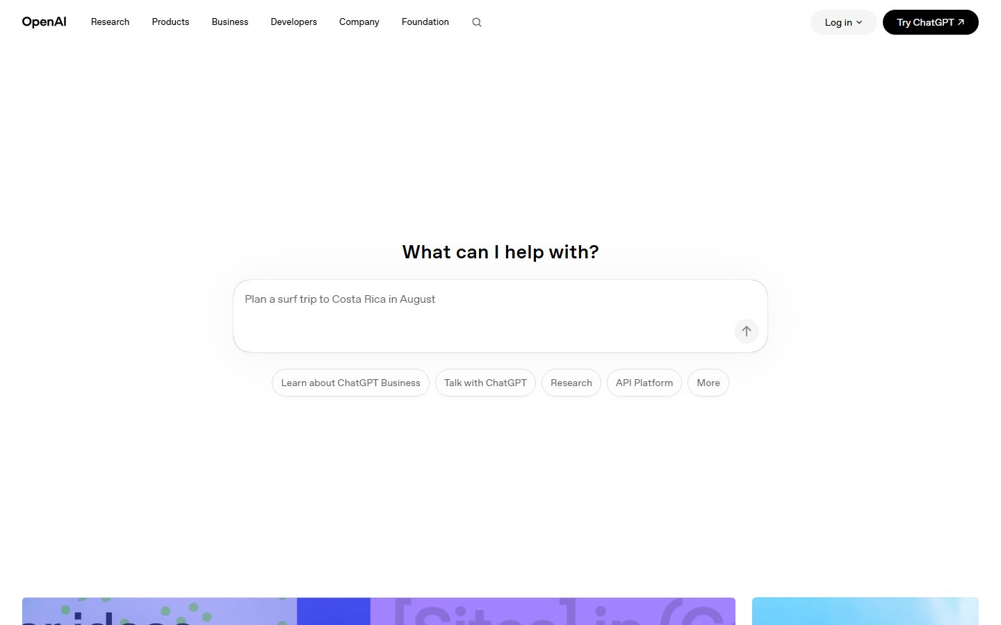
OpenAI's landing surface is a study in restraint: pure white canvas (`{colors.canvas}` — #ffffff) with pure-black ink (`{colors.ink}` — #000000), set in the custom **OpenAI Sans** typeface. There is almost no chrome color — the interface reads as a calm, functional tool rather than a marketing brochure. The page opens with an enormous block of whitespace, then drops a single centered prompt box ("What can I help with?") that mirrors the ChatGPT product itself, and only then unfolds a quiet editorial grid of news, stories, and research cards.
The defining gesture is **the product-as-hero**: rather than a headline-and-CTA hero band, OpenAI places a working-looking prompt input (`{component.prompt-input}`) dead-center with a row of soft suggestion pills beneath it. The marketing page literally looks like the app.
Color voltage lives almost entirely inside the imagery — the colorful gradient thumbnails on content cards (lilac `{colors.accent-lilac}`, sky `{colors.accent-sky}`, green `{colors.accent-green}`, orange `{colors.accent-orange}`) provide the only saturation on the page. The chrome stays black-on-white. Primary CTAs ("Try ChatGPT") are solid-black pills (`{colors.ink}`); secondary controls ("Log in", suggestion chips) are light-gray or outlined pills.
**Key Characteristics:**
- Pure white canvas with pure-black ink (`{colors.ink}` — #000000). No off-black, no tinted neutrals in the primary chrome.
- Custom **OpenAI Sans** typeface throughout (substituted with Inter here). Medium weight (500) for headings and body, regular (400) for buttons, with subtle negative letter-spacing.
- Pill geometry everywhere: `{rounded.pill}` (9999px) on the primary CTA, the "Log in" button, the prompt send button, and all suggestion chips. Pills are the system's signature shape.
- The prompt box (`{component.prompt-input}`) is the hero — a large soft-cornered (`{rounded.lg}` — 24px) input replacing the conventional headline hero.
- Editorial content grid below the fold: news cards, story cards, research cards — each a small gradient/photo thumbnail with a label and timestamp, on `{colors.surface-card}` (#f5f5f5).
- Color appears only inside imagery — the accent palette (`{colors.accent}`, `{colors.accent-lilac}`, `{colors.accent-sky}`, `{colors.accent-green}`, `{colors.accent-orange}`) is sampled from card artwork, never applied to chrome.
- Very soft elevation: the only shadows measured are near-invisible (`rgba(0,0,0,0.02)` and `rgba(0,0,0,0.04)` at 3–6px blur). The page relies on whitespace, not depth.
- Large vertical rhythm — `{spacing.section}` (120px) between major bands gives the page its airy, unhurried pacing.
## Colors
### Brand & Action
- **Ink** (`{colors.ink}` — #000000): The dominant chrome color. Primary CTA fills, headlines, body text, logo, nav links. OpenAI commits to true black, not a softened near-black.
- **Ink Soft** (`{colors.ink-soft}` — #1f1f1f) and **Ink Softer** (`{colors.ink-softer}` — #171717): Slightly lifted blacks observed on dark UI fragments and hover/pressed surfaces.
### Accent (imagery-only)
OpenAI's accents are sampled almost exclusively from gradient card artwork, never applied to chrome:
- **Accent** (`{colors.accent}` — #5e5085): A muted violet, the most frequent accent — appears in the lilac/purple hero gradient artwork.
- **Accent Lilac** (`{colors.accent-lilac}` — #c2b4e9): Pale lavender card gradients.
- **Accent Blue** (`{colors.accent-blue}` — #d8e8ff): Soft sky-blue card fills.
- **Accent Sky** (`{colors.accent-sky}` — #2e88bd): Saturated blue in story imagery.
- **Accent Green** (`{colors.accent-green}` — #57be65): Green gradient thumbnails.
- **Accent Orange** (`{colors.accent-orange}` — #ca3f00): Warm orange in product imagery (e.g. the GPT release card).
### Surface
- **Canvas** (`{colors.canvas}` — #ffffff): The page floor.
- **Surface Soft** (`{colors.surface-soft}` — #fafafa): The pre-footer CTA band ("Get started with ChatGPT").
- **Surface Card** (`{colors.surface-card}` — #f5f5f5): Content-card placeholders, the "Log in" pill, the prompt send button, download button.
- **Surface Dark** (`{colors.surface-dark}` — #202123), **Surface Navy** (`{colors.surface-navy}` — #1e263b), **Surface Deep** (`{colors.surface-deep}` — #15202b): Dark tones observed inside product-UI fragments and dark imagery — not used as page chrome.
### Text & Hairlines
- **Muted** (`{colors.muted}` — #707070): Secondary text and footer links.
- **Muted Soft** (`{colors.muted-soft}` — #8f8f8f): Tertiary text, placeholder copy.
- **Muted Strong** (`{colors.muted-strong}` — #666666): Suggestion-pill label text.
- **Hairline** (`{colors.hairline}` — #e5e7eb): 1px borders on suggestion pills and the prompt box.
- **Hairline Strong** (`{colors.hairline-strong}` — #d1d5db): A slightly darker border tone for emphasis.
- **On Ink** (`{colors.on-ink}` — #ffffff): Text on the black primary CTA.
## Typography
### Font Family
The system runs **OpenAI Sans** — OpenAI's custom corporate typeface — across all three measured roles (heading, body, button). It is a clean geometric-humanist sans with subtle negative tracking on display and button sizes. The fallback stack walks `Inter, sans-serif`.
OpenAI Sans is proprietary and not distributed as a public web font. Where it is unavailable, **Inter** at the matching weights (500 for headings/body, 400 for buttons) with the measured negative letter-spacing is the documented substitute. **Söhne** or **Aktiv Grotesk** are closer commercial analogues if licensing permits.
### Hierarchy
| Token | Size | Weight | Line Height | Letter Spacing | Use |
|---|---|---|---|---|---|
| `{typography.heading}` | 22px | 500 | 1.26 | -0.22px | Section heads ("What can I help with?", "Recent news", "Stories", card titles) |
| `{typography.body}` | 14px | 500 | 1.4 | normal | Running text, nav links, card labels, metadata, footer links |
| `{typography.button}` | 17px | 400 | 1.647 | -0.17px | Button + CTA labels ("Try ChatGPT", "Log in") |
### Principles
The type system is intentionally shallow — only three measured roles. Headings stay at medium weight 500 (never bold 700) with a slight negative track that gives OpenAI Sans its precise, quiet confidence. The button role drops to weight 400, making CTAs feel calm rather than shouty. Body text is set unusually small (14px) at weight 500, which reads as crisp and dense in the editorial grid.
The hierarchy is carried by **size and whitespace, not weight or color** — headings rely on scale and the surrounding void to stand apart, consistent with the overall minimal voice.
## Layout
### Spacing System
- **Base unit:** 4px.
- **Tokens:** `{spacing.xxs}` 4px · `{spacing.xs}` 8px · `{spacing.sm}` 12px · `{spacing.md}` 16px · `{spacing.lg}` 24px · `{spacing.xl}` 32px · `{spacing.xxl}` 40px · `{spacing.xxxl}` 48px · `{spacing.section}` 120px.
- **Most-used step:** 16px (`{spacing.md}`) is the dominant gap/padding value, followed by 32px (`{spacing.xl}`).
- **Section rhythm:** `{spacing.section}` (120px) separates major editorial bands; a 112px step (derived — measured once, treated as a near-equal sibling of section) appears in the same role.
- **Card internal padding:** `{spacing.md}` (16px) inside content cards.
### Grid & Container
- **Hero:** A single centered column — prompt box capped at a comfortable reading width, suggestion pills wrapping beneath it. No multi-column hero.
- **Editorial grids:** Content cards run 2-up (news), 3-up (stories, research, business) at desktop.
- **Footer:** Multi-column link list (Research / Products / Business / Company / More) at desktop.
### Whitespace Philosophy
OpenAI uses whitespace as the primary design material. The hero sits in a vast empty field — roughly a full viewport of breathing room above and below the prompt box. The 120px section rhythm keeps the editorial grid unhurried. The result is calm, premium, and tool-like: the void does the work that color and ornament do elsewhere.
## Elevation & Depth
| Level | Treatment | Use |
|---|---|---|
| Flat | No shadow, no border | Body sections, nav, CTA bands |
| Hairline | 1px `{colors.hairline}` border | Suggestion pills, prompt box outline |
| Whisper shadow | `rgba(0,0,0,0.02) 0px 4px 6px` | The prompt box and a handful of floating controls |
| Soft shadow | `rgba(0,0,0,0.04) 0px 3px 6px` | Occasional elevated card states |
The elevation philosophy is **almost-no-elevation**. The two measured shadows are barely perceptible — alpha 0.02–0.04 at 3–6px blur. OpenAI separates surfaces with whitespace and 1px hairlines rather than drop shadows. There is no neumorphism, no glassmorphism, no heavy card lift.
### Decorative Depth
- The only visual richness is the gradient/photo artwork inside content cards — these carry their own internal color and imagery but no system shadow.
- The prompt box gets the page's single notable (if faint) shadow, gently lifting it off the canvas to signal "this is interactive."
## Shapes
### Border Radius Scale
| Token | Value | Use |
|---|---|---|
| `{rounded.xs}` | 4px | Small inline accents (rare) |
| `{rounded.sm}` | 6px | Content-card thumbnails and card containers (the most frequent radius) |
| `{rounded.lg}` | 24px | The hero prompt box |
| `{rounded.xl}` | 40px | Larger rounded containers / soft panels |
| `{rounded.pill}` | 9999px | Primary CTA, "Log in" button, suggestion chips, send button, download button |
The system has two clear radius personalities: **gently-rounded rectangles** (6px) for content cards, and **full pills** (9999px) for every interactive control. The 24px and 40px radii bridge the two for larger soft panels like the prompt box.
### Photography & Imagery Geometry
Card thumbnails use the 6px `{rounded.sm}` radius. Story imagery is full-bleed within its card. The colorful gradient artwork is the only place chromatic saturation enters the page.
## Components
### Navigation
**`top-nav`** — White nav bar across the top. `{colors.canvas}` background, `{colors.ink}` text in `{typography.body}` (OpenAI Sans 14px / 500). Left: the "OpenAI" wordmark. Center: primary menu (Research, Products, Business, Developers, Company, Foundation) plus a search-icon button. Right cluster: a "Log in" `{component.button-secondary}` pill and a "Try ChatGPT" `{component.button-primary}` pill. Horizontal padding `{spacing.xl}` (32px).
**`search-icon-button`** — Transparent icon button in `{colors.ink}`, `{rounded.pill}`. Opens search.
### Buttons
**`button-primary`** — The signature solid-black pill ("Try ChatGPT ↗"). Background `{colors.ink}` (#000000), text `{colors.on-ink}`, type `{typography.button}` (OpenAI Sans 17px / 400), rounded `{rounded.pill}` (9999px), padding ~12px × 24px.
**`button-secondary`** — The light companion pill ("Log in ⌄"). Background `{colors.surface-card}` (#f5f5f5), text `{colors.ink}`, same pill radius and type as primary.
**`download-button`** — Small light pill in the pre-footer CTA band ("Download"). Background `{colors.surface-card}`, text `{colors.ink}`, `{rounded.pill}`, padding `{spacing.xs}` × `{spacing.md}`.
### Hero & Prompt
**`prompt-input`** — The page's hero element: a large soft-cornered input ("Plan a surf trip to Costa Rica in August"). Background `{colors.canvas}`, 1px `{colors.hairline}` border, placeholder text in `{colors.muted-soft}`, rounded `{rounded.lg}` (24px), internal padding `{spacing.lg}` (24px). Carries the page's single faint whisper shadow. A circular send button sits at its bottom-right.
**`prompt-send-button`** — A 32px circular button (`{rounded.pill}`) in the prompt box's corner. Background `{colors.surface-card}`, ink-colored up-arrow icon.
**`suggestion-pill`** — Outlined chips beneath the prompt ("Learn about ChatGPT Business", "Talk with ChatGPT", "Research", "API Platform", "More"). Background `{colors.canvas}`, 1px `{colors.hairline}` border, text `{colors.muted-strong}` in `{typography.body}`, rounded `{rounded.pill}`, padding `{spacing.sm}` × `{spacing.md}`.
### Content Cards
**`content-card`** — Used in the "Recent news" and product grids. A small gradient/photo thumbnail (`{rounded.sm}`) paired with a label (Company / Safety / Product), a title in `{typography.heading}` or `{typography.body}`, and a timestamp in `{colors.muted}`. Card surface `{colors.surface-card}`, padding `{spacing.md}` (16px).
**`story-card`** — Used in the "Stories" and "Latest research" grids. A larger full-bleed image atop a caption block (title + category + date). Rounded `{rounded.sm}`, surface `{colors.surface-card}` for placeholder states.
### CTA & Footer
**`cta-band`** — The pre-footer "Get started with ChatGPT" band. Background `{colors.surface-soft}` (#fafafa), centered heading in `{typography.heading}`, a `{component.download-button}` below. Generous vertical padding `{spacing.section}` (120px).
**`footer`** — White footer with multi-column link lists (Research / Products / Business / Company / More) plus a social-icon row and copyright line. Background `{colors.canvas}`, link text in `{colors.muted}` at `{typography.body}`, padding `{spacing.xl}` (32px). A language selector ("English / United States") sits at bottom-right.
## Do's and Don'ts
### Do
- Keep the chrome black-on-white. Reserve all color for imagery inside cards. The accent palette (`{colors.accent}`, `{colors.accent-lilac}`, etc.) belongs in artwork, never on buttons or text.
- Use OpenAI Sans (or Inter substitute) at weight 500 for headings/body, 400 for buttons. Never reach for 700.
- Make every interactive control a pill (`{rounded.pill}`). Buttons, chips, the send button — all full-radius.
- Lead with the product. The prompt box IS the hero — don't bury it under a marketing headline band.
- Use whitespace as the separator. Lean on `{spacing.section}` (120px) rhythm, not borders or shadows.
- Keep the primary CTA solid black (`{colors.ink}`) and the secondary light gray (`{colors.surface-card}`) — the two-pill pairing is the system's signature.
- Use the soft 6px (`{rounded.sm}`) radius for content cards and full pills for controls — the two-radius split keeps the system coherent.
### Don't
- Don't tint the chrome. The page is true-black-on-true-white; off-blacks and tinted grays are for dark UI fragments only.
- Don't add heavy elevation. The measured shadows top out at 0.04 alpha — anything stronger reads as off-brand.
- Don't introduce a third button shape. Square or sharply-cornered buttons break the pill language.
- Don't crowd the hero. The prompt box needs its surrounding void; tightening the whitespace destroys the calm.
- Don't apply accent colors to text or CTAs. Saturation stays inside imagery.
- Don't add hover-state documentation beyond default and pressed — the system stays quiet.
## Responsive Behavior
### Breakpoints
| Name | Width | Key Changes |
|---|---|---|
| Mobile | < 768px | Nav collapses to wordmark + menu trigger; prompt box goes full-width with reduced side margins; suggestion pills wrap to multiple rows; content grids stack 1-up; footer columns stack |
| Tablet | 768–1024px | Horizontal nav tightens; content grids 2-up; prompt box stays centered |
| Desktop | 1024–1440px | Full nav with all menu items + dual CTA pills; news 2-up, stories/research 3-up |
| Wide | > 1440px | Same as desktop with more outer whitespace; centered content keeps a comfortable max width |
### Touch Targets
- `{component.button-primary}` and `{component.button-secondary}` pills meet comfortable tap sizes via ~12px × 24px padding.
- `{component.prompt-send-button}` is 32px — slightly under the 44px guideline; the surrounding prompt box compensates.
- `{component.suggestion-pill}` padding (`{spacing.sm}` × `{spacing.md}`) plus pill height yields an adequate tap area.
### Collapsing Strategy
- The centered prompt-box hero remains the focal point at every breakpoint, scaling width while keeping its `{rounded.lg}` corners.
- Suggestion pills wrap rather than truncate.
- Content and story grids reduce column count (3 → 2 → 1) rather than shrinking thumbnails illegibly.
- Footer link columns reflow from a multi-column row to stacked groups on mobile.
### Image Behavior
- Card gradient/photo thumbnails retain their `{rounded.sm}` corners and aspect ratios while the cards resize.
- Story imagery stays full-bleed within its card across breakpoints.
## Iteration Guide
1. Focus on ONE component at a time. Reference its YAML key directly (`{component.prompt-input}`, `{component.content-card}`).
2. Variants of an existing component (`-active`, `-disabled`, `-focused`) live as separate entries in `components:`.
3. Use `{token.refs}` everywhere — never inline a hex into a component.
4. Never document hover. Default and Active/Pressed states only.
5. Keep chrome monochrome; color lives in imagery. If you reach for an accent on a button, stop.
6. Pills for controls, 6px for cards — preserve the two-radius split.
7. When in doubt about emphasis: add whitespace before adding weight or color.
## Known Gaps
- The component probe reported `button-primary`, `card`, and `input` with `radius: 0px` and `padding: 0px` — these are measurement artifacts (the probe sampled wrapper elements rather than the styled inner pill/box). Button, card, and input radii are documented from screenshot ground-truth against the measured radius scale (pills at `{rounded.pill}`, cards at `{rounded.sm}`, prompt box at `{rounded.lg}`). Exact paddings beyond the measured spacing steps are derived.
- **OpenAI Sans** is a proprietary corporate typeface not available as a public web font; the `fonts_licensed` array was empty in the analysis, but a substitute (Inter / Söhne / Aktiv Grotesk) is documented in the Typography section regardless.
- Only three typographic roles were measured (heading 22px, body 14px, button 17px). The large hero headline and any display-scale type were not captured as distinct tokens — additional sizes would need direct measurement.
- The accent palette is sampled from card gradient artwork; exact hex values may shift as featured imagery rotates, and the mapping of each accent to a specific UI role is observational.
- Dark surfaces (`{colors.surface-dark}`, `{colors.surface-navy}`, `{colors.surface-deep}`) appear inside embedded product-UI fragments and dark imagery, not as page chrome — their component usage is out of scope.
- Animation, transition, and prompt-box interaction timings are not in scope.
- Form/input focus, error, and disabled states were not extracted and would need a live interaction to confirm.
- Only the landing page was captured; interior product, pricing, and documentation surfaces may introduce tokens not represented here.
<!-- Documented by duply · real-world design systems as ready-to-use DESIGN.md for AI coding agents · https://duply.ai/openai/design-md -->
Color Palette
Accent
Neutrals
Typography
heading22px · 500 · 1.26
The quick brown fox jumpsbody14px · 500 · 1.4
The quick brown fox jumpsbutton17px · 400 · 1.647
The quick brown fox jumpsSpacing & Shape
Spacing
| Name | Value | Preview |
|---|---|---|
| xxs | 4px | |
| xs | 8px | |
| sm | 12px | |
| md | 16px | |
| lg | 24px | |
| xl | 32px | |
| xxl | 40px | |
| xxxl | 48px | |
| section | 120px |
Border Radius
| Name | Value | Preview |
|---|---|---|
| xs | 4px | |
| sm | 6px | |
| lg | 24px | |
| xl | 40px | |
| pill | 9999px |
More like this


---
version: alpha
name: OpenAI-design-analysis
description: A radically minimal, near-monochrome interface built on pure white canvas with pure-black ink and the custom OpenAI Sans typeface. The landing surface centers a ChatGPT-style prompt box as the hero ("What can I help with?"), surrounded by generous whitespace, soft pill-shaped controls, and a quiet editorial grid of content cards below. Brand voltage is reserved almost entirely for the colorful gradient artwork inside cards — the chrome itself stays black-on-white, functional, and restrained.

colors:
  ink: "#000000"
  ink-soft: "#1f1f1f"
  ink-softer: "#171717"
  canvas: "#ffffff"
  surface-soft: "#fafafa"
  surface-card: "#f5f5f5"
  hairline: "#e5e7eb"
  hairline-strong: "#d1d5db"
  muted: "#707070"
  muted-soft: "#8f8f8f"
  muted-strong: "#666666"
  surface-dark: "#202123"
  surface-navy: "#1e263b"
  surface-deep: "#15202b"
  accent: "#5e5085"
  accent-lilac: "#c2b4e9"
  accent-blue: "#d8e8ff"
  accent-sky: "#2e88bd"
  accent-green: "#57be65"
  accent-orange: "#ca3f00"
  on-ink: "#ffffff"

typography:
  heading:
    fontFamily: "OpenAI Sans, Inter, sans-serif"
    fontSize: 22px
    fontWeight: 500
    lineHeight: 1.26
    letterSpacing: -0.22px
  body:
    fontFamily: "OpenAI Sans, Inter, sans-serif"
    fontSize: 14px
    fontWeight: 500
    lineHeight: 1.4
    letterSpacing: normal
  button:
    fontFamily: "OpenAI Sans, Inter, sans-serif"
    fontSize: 17px
    fontWeight: 400
    lineHeight: 1.647
    letterSpacing: -0.17px

rounded:
  xs: 4px
  sm: 6px
  lg: 24px
  xl: 40px
  pill: 9999px

spacing:
  xxs: 4px
  xs: 8px
  sm: 12px
  md: 16px
  lg: 24px
  xl: 32px
  xxl: 40px
  xxxl: 48px
  section: 120px

components:
  top-nav:
    backgroundColor: "{colors.canvas}"
    textColor: "{colors.ink}"
    typography: "{typography.body}"
    padding: 32px
  button-primary:
    backgroundColor: "{colors.ink}"
    textColor: "{colors.on-ink}"
    typography: "{typography.button}"
    rounded: "{rounded.pill}"
    padding: 12px 24px
  button-secondary:
    backgroundColor: "{colors.surface-card}"
    textColor: "{colors.ink}"
    typography: "{typography.button}"
    rounded: "{rounded.pill}"
    padding: 12px 24px
  search-icon-button:
    backgroundColor: transparent
    textColor: "{colors.ink}"
    rounded: "{rounded.pill}"
  prompt-input:
    backgroundColor: "{colors.canvas}"
    textColor: "{colors.ink}"
    typography: "{typography.body}"
    rounded: "{rounded.lg}"
    padding: 24px
  prompt-send-button:
    backgroundColor: "{colors.surface-card}"
    textColor: "{colors.ink}"
    rounded: "{rounded.pill}"
    size: 32px
  suggestion-pill:
    backgroundColor: "{colors.canvas}"
    textColor: "{colors.muted-strong}"
    typography: "{typography.body}"
    rounded: "{rounded.pill}"
    padding: 12px 16px
  content-card:
    backgroundColor: "{colors.surface-card}"
    textColor: "{colors.ink}"
    typography: "{typography.body}"
    rounded: "{rounded.sm}"
    padding: 16px
  story-card:
    backgroundColor: "{colors.surface-card}"
    textColor: "{colors.ink}"
    typography: "{typography.body}"
    rounded: "{rounded.sm}"
  cta-band:
    backgroundColor: "{colors.surface-soft}"
    textColor: "{colors.ink}"
    typography: "{typography.heading}"
    padding: 120px
  download-button:
    backgroundColor: "{colors.surface-card}"
    textColor: "{colors.ink}"
    typography: "{typography.body}"
    rounded: "{rounded.pill}"
    padding: 8px 16px
  footer:
    backgroundColor: "{colors.canvas}"
    textColor: "{colors.muted}"
    typography: "{typography.body}"
    padding: 32px
---

## Overview

OpenAI's landing surface is a study in restraint: pure white canvas (`{colors.canvas}` — #ffffff) with pure-black ink (`{colors.ink}` — #000000), set in the custom **OpenAI Sans** typeface. There is almost no chrome color — the interface reads as a calm, functional tool rather than a marketing brochure. The page opens with an enormous block of whitespace, then drops a single centered prompt box ("What can I help with?") that mirrors the ChatGPT product itself, and only then unfolds a quiet editorial grid of news, stories, and research cards.

The defining gesture is **the product-as-hero**: rather than a headline-and-CTA hero band, OpenAI places a working-looking prompt input (`{component.prompt-input}`) dead-center with a row of soft suggestion pills beneath it. The marketing page literally looks like the app.

Color voltage lives almost entirely inside the imagery — the colorful gradient thumbnails on content cards (lilac `{colors.accent-lilac}`, sky `{colors.accent-sky}`, green `{colors.accent-green}`, orange `{colors.accent-orange}`) provide the only saturation on the page. The chrome stays black-on-white. Primary CTAs ("Try ChatGPT") are solid-black pills (`{colors.ink}`); secondary controls ("Log in", suggestion chips) are light-gray or outlined pills.

**Key Characteristics:**
- Pure white canvas with pure-black ink (`{colors.ink}` — #000000). No off-black, no tinted neutrals in the primary chrome.
- Custom **OpenAI Sans** typeface throughout (substituted with Inter here). Medium weight (500) for headings and body, regular (400) for buttons, with subtle negative letter-spacing.
- Pill geometry everywhere: `{rounded.pill}` (9999px) on the primary CTA, the "Log in" button, the prompt send button, and all suggestion chips. Pills are the system's signature shape.
- The prompt box (`{component.prompt-input}`) is the hero — a large soft-cornered (`{rounded.lg}` — 24px) input replacing the conventional headline hero.
- Editorial content grid below the fold: news cards, story cards, research cards — each a small gradient/photo thumbnail with a label and timestamp, on `{colors.surface-card}` (#f5f5f5).
- Color appears only inside imagery — the accent palette (`{colors.accent}`, `{colors.accent-lilac}`, `{colors.accent-sky}`, `{colors.accent-green}`, `{colors.accent-orange}`) is sampled from card artwork, never applied to chrome.
- Very soft elevation: the only shadows measured are near-invisible (`rgba(0,0,0,0.02)` and `rgba(0,0,0,0.04)` at 3–6px blur). The page relies on whitespace, not depth.
- Large vertical rhythm — `{spacing.section}` (120px) between major bands gives the page its airy, unhurried pacing.

## Colors

### Brand & Action
- **Ink** (`{colors.ink}` — #000000): The dominant chrome color. Primary CTA fills, headlines, body text, logo, nav links. OpenAI commits to true black, not a softened near-black.
- **Ink Soft** (`{colors.ink-soft}` — #1f1f1f) and **Ink Softer** (`{colors.ink-softer}` — #171717): Slightly lifted blacks observed on dark UI fragments and hover/pressed surfaces.

### Accent (imagery-only)
OpenAI's accents are sampled almost exclusively from gradient card artwork, never applied to chrome:
- **Accent** (`{colors.accent}` — #5e5085): A muted violet, the most frequent accent — appears in the lilac/purple hero gradient artwork.
- **Accent Lilac** (`{colors.accent-lilac}` — #c2b4e9): Pale lavender card gradients.
- **Accent Blue** (`{colors.accent-blue}` — #d8e8ff): Soft sky-blue card fills.
- **Accent Sky** (`{colors.accent-sky}` — #2e88bd): Saturated blue in story imagery.
- **Accent Green** (`{colors.accent-green}` — #57be65): Green gradient thumbnails.
- **Accent Orange** (`{colors.accent-orange}` — #ca3f00): Warm orange in product imagery (e.g. the GPT release card).

### Surface
- **Canvas** (`{colors.canvas}` — #ffffff): The page floor.
- **Surface Soft** (`{colors.surface-soft}` — #fafafa): The pre-footer CTA band ("Get started with ChatGPT").
- **Surface Card** (`{colors.surface-card}` — #f5f5f5): Content-card placeholders, the "Log in" pill, the prompt send button, download button.
- **Surface Dark** (`{colors.surface-dark}` — #202123), **Surface Navy** (`{colors.surface-navy}` — #1e263b), **Surface Deep** (`{colors.surface-deep}` — #15202b): Dark tones observed inside product-UI fragments and dark imagery — not used as page chrome.

### Text & Hairlines
- **Muted** (`{colors.muted}` — #707070): Secondary text and footer links.
- **Muted Soft** (`{colors.muted-soft}` — #8f8f8f): Tertiary text, placeholder copy.
- **Muted Strong** (`{colors.muted-strong}` — #666666): Suggestion-pill label text.
- **Hairline** (`{colors.hairline}` — #e5e7eb): 1px borders on suggestion pills and the prompt box.
- **Hairline Strong** (`{colors.hairline-strong}` — #d1d5db): A slightly darker border tone for emphasis.
- **On Ink** (`{colors.on-ink}` — #ffffff): Text on the black primary CTA.

## Typography

### Font Family
The system runs **OpenAI Sans** — OpenAI's custom corporate typeface — across all three measured roles (heading, body, button). It is a clean geometric-humanist sans with subtle negative tracking on display and button sizes. The fallback stack walks `Inter, sans-serif`.

OpenAI Sans is proprietary and not distributed as a public web font. Where it is unavailable, **Inter** at the matching weights (500 for headings/body, 400 for buttons) with the measured negative letter-spacing is the documented substitute. **Söhne** or **Aktiv Grotesk** are closer commercial analogues if licensing permits.

### Hierarchy

| Token | Size | Weight | Line Height | Letter Spacing | Use |
|---|---|---|---|---|---|
| `{typography.heading}` | 22px | 500 | 1.26 | -0.22px | Section heads ("What can I help with?", "Recent news", "Stories", card titles) |
| `{typography.body}` | 14px | 500 | 1.4 | normal | Running text, nav links, card labels, metadata, footer links |
| `{typography.button}` | 17px | 400 | 1.647 | -0.17px | Button + CTA labels ("Try ChatGPT", "Log in") |

### Principles
The type system is intentionally shallow — only three measured roles. Headings stay at medium weight 500 (never bold 700) with a slight negative track that gives OpenAI Sans its precise, quiet confidence. The button role drops to weight 400, making CTAs feel calm rather than shouty. Body text is set unusually small (14px) at weight 500, which reads as crisp and dense in the editorial grid.

The hierarchy is carried by **size and whitespace, not weight or color** — headings rely on scale and the surrounding void to stand apart, consistent with the overall minimal voice.

## Layout

### Spacing System
- **Base unit:** 4px.
- **Tokens:** `{spacing.xxs}` 4px · `{spacing.xs}` 8px · `{spacing.sm}` 12px · `{spacing.md}` 16px · `{spacing.lg}` 24px · `{spacing.xl}` 32px · `{spacing.xxl}` 40px · `{spacing.xxxl}` 48px · `{spacing.section}` 120px.
- **Most-used step:** 16px (`{spacing.md}`) is the dominant gap/padding value, followed by 32px (`{spacing.xl}`).
- **Section rhythm:** `{spacing.section}` (120px) separates major editorial bands; a 112px step (derived — measured once, treated as a near-equal sibling of section) appears in the same role.
- **Card internal padding:** `{spacing.md}` (16px) inside content cards.

### Grid & Container
- **Hero:** A single centered column — prompt box capped at a comfortable reading width, suggestion pills wrapping beneath it. No multi-column hero.
- **Editorial grids:** Content cards run 2-up (news), 3-up (stories, research, business) at desktop.
- **Footer:** Multi-column link list (Research / Products / Business / Company / More) at desktop.

### Whitespace Philosophy
OpenAI uses whitespace as the primary design material. The hero sits in a vast empty field — roughly a full viewport of breathing room above and below the prompt box. The 120px section rhythm keeps the editorial grid unhurried. The result is calm, premium, and tool-like: the void does the work that color and ornament do elsewhere.

## Elevation & Depth

| Level | Treatment | Use |
|---|---|---|
| Flat | No shadow, no border | Body sections, nav, CTA bands |
| Hairline | 1px `{colors.hairline}` border | Suggestion pills, prompt box outline |
| Whisper shadow | `rgba(0,0,0,0.02) 0px 4px 6px` | The prompt box and a handful of floating controls |
| Soft shadow | `rgba(0,0,0,0.04) 0px 3px 6px` | Occasional elevated card states |

The elevation philosophy is **almost-no-elevation**. The two measured shadows are barely perceptible — alpha 0.02–0.04 at 3–6px blur. OpenAI separates surfaces with whitespace and 1px hairlines rather than drop shadows. There is no neumorphism, no glassmorphism, no heavy card lift.

### Decorative Depth
- The only visual richness is the gradient/photo artwork inside content cards — these carry their own internal color and imagery but no system shadow.
- The prompt box gets the page's single notable (if faint) shadow, gently lifting it off the canvas to signal "this is interactive."

## Shapes

### Border Radius Scale

| Token | Value | Use |
|---|---|---|
| `{rounded.xs}` | 4px | Small inline accents (rare) |
| `{rounded.sm}` | 6px | Content-card thumbnails and card containers (the most frequent radius) |
| `{rounded.lg}` | 24px | The hero prompt box |
| `{rounded.xl}` | 40px | Larger rounded containers / soft panels |
| `{rounded.pill}` | 9999px | Primary CTA, "Log in" button, suggestion chips, send button, download button |

The system has two clear radius personalities: **gently-rounded rectangles** (6px) for content cards, and **full pills** (9999px) for every interactive control. The 24px and 40px radii bridge the two for larger soft panels like the prompt box.

### Photography & Imagery Geometry
Card thumbnails use the 6px `{rounded.sm}` radius. Story imagery is full-bleed within its card. The colorful gradient artwork is the only place chromatic saturation enters the page.

## Components

### Navigation

**`top-nav`** — White nav bar across the top. `{colors.canvas}` background, `{colors.ink}` text in `{typography.body}` (OpenAI Sans 14px / 500). Left: the "OpenAI" wordmark. Center: primary menu (Research, Products, Business, Developers, Company, Foundation) plus a search-icon button. Right cluster: a "Log in" `{component.button-secondary}` pill and a "Try ChatGPT" `{component.button-primary}` pill. Horizontal padding `{spacing.xl}` (32px).

**`search-icon-button`** — Transparent icon button in `{colors.ink}`, `{rounded.pill}`. Opens search.

### Buttons

**`button-primary`** — The signature solid-black pill ("Try ChatGPT ↗"). Background `{colors.ink}` (#000000), text `{colors.on-ink}`, type `{typography.button}` (OpenAI Sans 17px / 400), rounded `{rounded.pill}` (9999px), padding ~12px × 24px.

**`button-secondary`** — The light companion pill ("Log in ⌄"). Background `{colors.surface-card}` (#f5f5f5), text `{colors.ink}`, same pill radius and type as primary.

**`download-button`** — Small light pill in the pre-footer CTA band ("Download"). Background `{colors.surface-card}`, text `{colors.ink}`, `{rounded.pill}`, padding `{spacing.xs}` × `{spacing.md}`.

### Hero & Prompt

**`prompt-input`** — The page's hero element: a large soft-cornered input ("Plan a surf trip to Costa Rica in August"). Background `{colors.canvas}`, 1px `{colors.hairline}` border, placeholder text in `{colors.muted-soft}`, rounded `{rounded.lg}` (24px), internal padding `{spacing.lg}` (24px). Carries the page's single faint whisper shadow. A circular send button sits at its bottom-right.

**`prompt-send-button`** — A 32px circular button (`{rounded.pill}`) in the prompt box's corner. Background `{colors.surface-card}`, ink-colored up-arrow icon.

**`suggestion-pill`** — Outlined chips beneath the prompt ("Learn about ChatGPT Business", "Talk with ChatGPT", "Research", "API Platform", "More"). Background `{colors.canvas}`, 1px `{colors.hairline}` border, text `{colors.muted-strong}` in `{typography.body}`, rounded `{rounded.pill}`, padding `{spacing.sm}` × `{spacing.md}`.

### Content Cards

**`content-card`** — Used in the "Recent news" and product grids. A small gradient/photo thumbnail (`{rounded.sm}`) paired with a label (Company / Safety / Product), a title in `{typography.heading}` or `{typography.body}`, and a timestamp in `{colors.muted}`. Card surface `{colors.surface-card}`, padding `{spacing.md}` (16px).

**`story-card`** — Used in the "Stories" and "Latest research" grids. A larger full-bleed image atop a caption block (title + category + date). Rounded `{rounded.sm}`, surface `{colors.surface-card}` for placeholder states.

### CTA & Footer

**`cta-band`** — The pre-footer "Get started with ChatGPT" band. Background `{colors.surface-soft}` (#fafafa), centered heading in `{typography.heading}`, a `{component.download-button}` below. Generous vertical padding `{spacing.section}` (120px).

**`footer`** — White footer with multi-column link lists (Research / Products / Business / Company / More) plus a social-icon row and copyright line. Background `{colors.canvas}`, link text in `{colors.muted}` at `{typography.body}`, padding `{spacing.xl}` (32px). A language selector ("English / United States") sits at bottom-right.

## Do's and Don'ts

### Do
- Keep the chrome black-on-white. Reserve all color for imagery inside cards. The accent palette (`{colors.accent}`, `{colors.accent-lilac}`, etc.) belongs in artwork, never on buttons or text.
- Use OpenAI Sans (or Inter substitute) at weight 500 for headings/body, 400 for buttons. Never reach for 700.
- Make every interactive control a pill (`{rounded.pill}`). Buttons, chips, the send button — all full-radius.
- Lead with the product. The prompt box IS the hero — don't bury it under a marketing headline band.
- Use whitespace as the separator. Lean on `{spacing.section}` (120px) rhythm, not borders or shadows.
- Keep the primary CTA solid black (`{colors.ink}`) and the secondary light gray (`{colors.surface-card}`) — the two-pill pairing is the system's signature.
- Use the soft 6px (`{rounded.sm}`) radius for content cards and full pills for controls — the two-radius split keeps the system coherent.

### Don't
- Don't tint the chrome. The page is true-black-on-true-white; off-blacks and tinted grays are for dark UI fragments only.
- Don't add heavy elevation. The measured shadows top out at 0.04 alpha — anything stronger reads as off-brand.
- Don't introduce a third button shape. Square or sharply-cornered buttons break the pill language.
- Don't crowd the hero. The prompt box needs its surrounding void; tightening the whitespace destroys the calm.
- Don't apply accent colors to text or CTAs. Saturation stays inside imagery.
- Don't add hover-state documentation beyond default and pressed — the system stays quiet.

## Responsive Behavior

### Breakpoints

| Name | Width | Key Changes |
|---|---|---|
| Mobile | < 768px | Nav collapses to wordmark + menu trigger; prompt box goes full-width with reduced side margins; suggestion pills wrap to multiple rows; content grids stack 1-up; footer columns stack |
| Tablet | 768–1024px | Horizontal nav tightens; content grids 2-up; prompt box stays centered |
| Desktop | 1024–1440px | Full nav with all menu items + dual CTA pills; news 2-up, stories/research 3-up |
| Wide | > 1440px | Same as desktop with more outer whitespace; centered content keeps a comfortable max width |

### Touch Targets
- `{component.button-primary}` and `{component.button-secondary}` pills meet comfortable tap sizes via ~12px × 24px padding.
- `{component.prompt-send-button}` is 32px — slightly under the 44px guideline; the surrounding prompt box compensates.
- `{component.suggestion-pill}` padding (`{spacing.sm}` × `{spacing.md}`) plus pill height yields an adequate tap area.

### Collapsing Strategy
- The centered prompt-box hero remains the focal point at every breakpoint, scaling width while keeping its `{rounded.lg}` corners.
- Suggestion pills wrap rather than truncate.
- Content and story grids reduce column count (3 → 2 → 1) rather than shrinking thumbnails illegibly.
- Footer link columns reflow from a multi-column row to stacked groups on mobile.

### Image Behavior
- Card gradient/photo thumbnails retain their `{rounded.sm}` corners and aspect ratios while the cards resize.
- Story imagery stays full-bleed within its card across breakpoints.

## Iteration Guide

1. Focus on ONE component at a time. Reference its YAML key directly (`{component.prompt-input}`, `{component.content-card}`).
2. Variants of an existing component (`-active`, `-disabled`, `-focused`) live as separate entries in `components:`.
3. Use `{token.refs}` everywhere — never inline a hex into a component.
4. Never document hover. Default and Active/Pressed states only.
5. Keep chrome monochrome; color lives in imagery. If you reach for an accent on a button, stop.
6. Pills for controls, 6px for cards — preserve the two-radius split.
7. When in doubt about emphasis: add whitespace before adding weight or color.

## Known Gaps

- The component probe reported `button-primary`, `card`, and `input` with `radius: 0px` and `padding: 0px` — these are measurement artifacts (the probe sampled wrapper elements rather than the styled inner pill/box). Button, card, and input radii are documented from screenshot ground-truth against the measured radius scale (pills at `{rounded.pill}`, cards at `{rounded.sm}`, prompt box at `{rounded.lg}`). Exact paddings beyond the measured spacing steps are derived.
- **OpenAI Sans** is a proprietary corporate typeface not available as a public web font; the `fonts_licensed` array was empty in the analysis, but a substitute (Inter / Söhne / Aktiv Grotesk) is documented in the Typography section regardless.
- Only three typographic roles were measured (heading 22px, body 14px, button 17px). The large hero headline and any display-scale type were not captured as distinct tokens — additional sizes would need direct measurement.
- The accent palette is sampled from card gradient artwork; exact hex values may shift as featured imagery rotates, and the mapping of each accent to a specific UI role is observational.
- Dark surfaces (`{colors.surface-dark}`, `{colors.surface-navy}`, `{colors.surface-deep}`) appear inside embedded product-UI fragments and dark imagery, not as page chrome — their component usage is out of scope.
- Animation, transition, and prompt-box interaction timings are not in scope.
- Form/input focus, error, and disabled states were not extracted and would need a live interaction to confirm.
- Only the landing page was captured; interior product, pricing, and documentation surfaces may introduce tokens not represented here.

<!-- Documented by duply · real-world design systems as ready-to-use DESIGN.md for AI coding agents · https://duply.ai/openai/design-md -->