SanaLabs
A stark, editorial enterprise-AI interface built on white canvas with pure-black pill CTAs and the custom Sana Sans typeface. The system reads as precise and gallery-like — oversized tight-tracked display headlines, hard-edged (0-radius) light-gray content cards, full-bleed photographic and product-screenshot bands, and a restrained near-monochrome palette punctuated by a small set of saturated accents (red, orange, blues, cyan, pinks) that surface inside product UI and editorial tiles rather than on chrome.
---
version: alpha
name: SanaLabs-design-analysis
description: A stark, editorial enterprise-AI interface built on white canvas with pure-black pill CTAs and the custom Sana Sans typeface. The system reads as precise and gallery-like — oversized tight-tracked display headlines, hard-edged (0-radius) light-gray content cards, full-bleed photographic and product-screenshot bands, and a restrained near-monochrome palette punctuated by a small set of saturated accents (red, orange, blues, cyan, pinks) that surface inside product UI and editorial tiles rather than on chrome.
colors:
primary: "#000000"
ink: "#000000"
body: "#090909"
link: "#0a0a0a"
neutral-strong: "#0e0e0e"
neutral-mid: "#333333"
muted: "#6b7280"
muted-violet: "#68677e"
canvas: "#ffffff"
surface: "#efefed"
surface-soft: "#f5f5f5"
hairline: "#e6e6e6"
on-primary: "#ffffff"
accent-red: "#fa0019"
accent-orange: "#ff5102"
accent-blue-bright: "#0057f3"
accent-blue: "#3458b8"
accent-blue-deep: "#004c9a"
accent-cyan: "#6acde3"
accent-violet: "#8b7bd0"
accent-pink: "#e7c1db"
accent-magenta: "#ff8cfd"
typography:
h1:
fontFamily: "Sana Sans, Inter, sans-serif"
fontSize: 83.2px
fontWeight: 400
lineHeight: 0.95
letterSpacing: -2.496px
h2:
fontFamily: "Sana Sans, Inter, sans-serif"
fontSize: 48px
fontWeight: 500
lineHeight: 1.0
letterSpacing: -0.96px
body:
fontFamily: "Sana Sans, Inter, sans-serif"
fontSize: 16px
fontWeight: 400
lineHeight: 1.4
letterSpacing: -0.16px
button:
fontFamily: "Sana Sans, Inter, sans-serif"
fontSize: 14px
fontWeight: 400
lineHeight: 1.4
letterSpacing: normal
rounded:
sharp: 0px
sm: 6px
md: 10px
lg: 16px
xl: 24px
xxl: 32px
pill: 36px
spacing:
xxs: 4px
xs: 8px
sm: 12px
md: 16px
lg: 24px
xl: 32px
xxl: 40px
xxxl: 48px
section: 64px
components:
top-nav:
backgroundColor: "{colors.canvas}"
textColor: "{colors.ink}"
typography: "{typography.button}"
button-primary:
backgroundColor: "{colors.primary}"
textColor: "{colors.on-primary}"
typography: "{typography.button}"
rounded: "{rounded.pill}"
padding: 4px 8px 0px 16px
button-secondary:
backgroundColor: "{colors.canvas}"
textColor: "{colors.ink}"
typography: "{typography.button}"
rounded: "{rounded.pill}"
button-accent:
backgroundColor: "{colors.accent-orange}"
textColor: "{colors.on-primary}"
typography: "{typography.button}"
rounded: "{rounded.pill}"
card:
backgroundColor: "{colors.surface}"
textColor: "{colors.ink}"
rounded: "{rounded.sharp}"
feature-icon-cell:
backgroundColor: transparent
textColor: "{colors.ink}"
typography: "{typography.body}"
testimonial-band:
backgroundColor: "{colors.neutral-strong}"
textColor: "{colors.on-primary}"
typography: "{typography.h2}"
rounded: "{rounded.sharp}"
product-screenshot-band:
backgroundColor: "{colors.surface-soft}"
textColor: "{colors.ink}"
rounded: "{rounded.sharp}"
input:
backgroundColor: "{colors.canvas}"
textColor: "{colors.ink}"
typography: "{typography.body}"
rounded: "{rounded.sharp}"
footer:
backgroundColor: "{colors.canvas}"
textColor: "{colors.muted}"
typography: "{typography.body}"
padding: 64px
---
## Overview
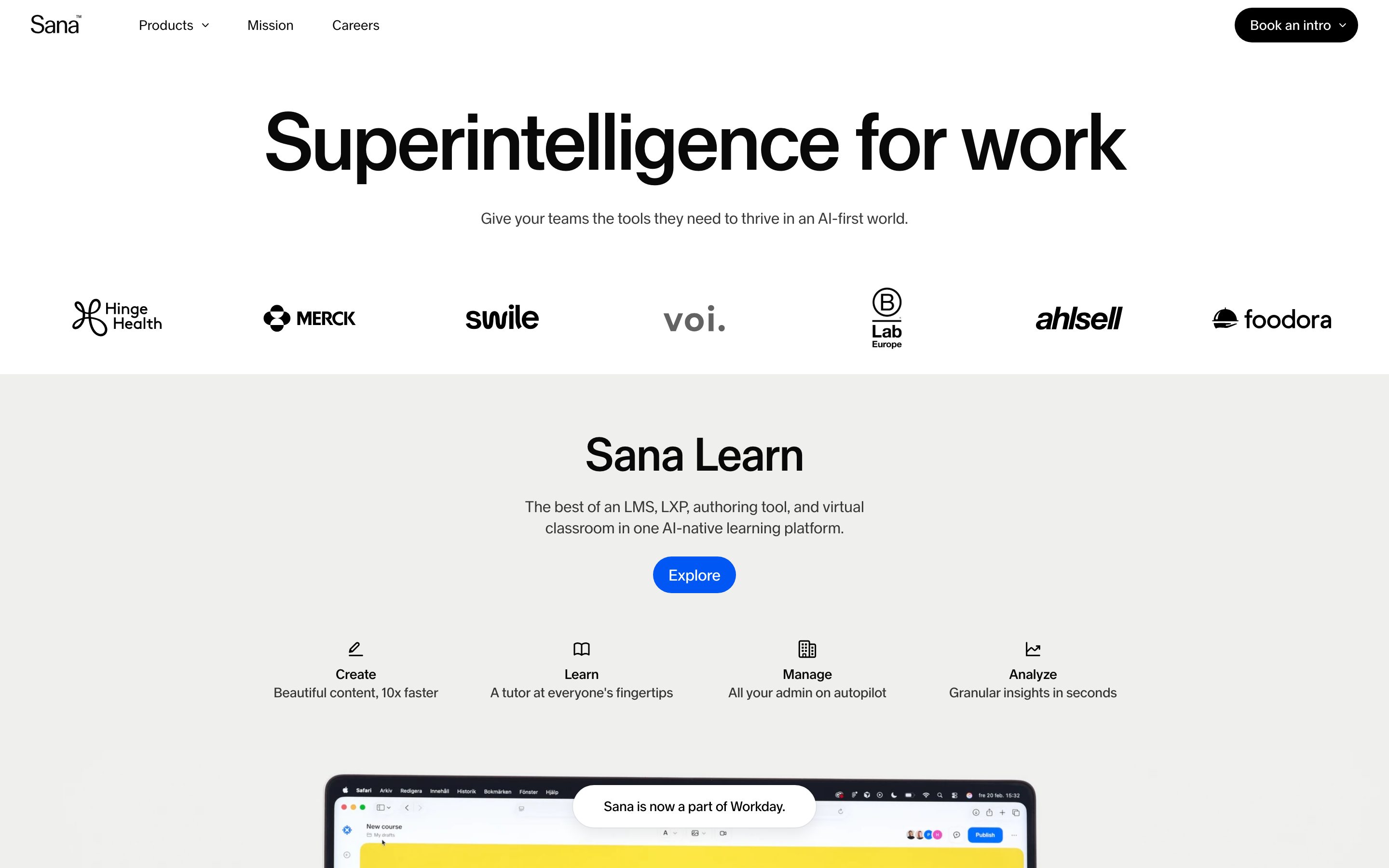
Sana Labs' marketing surface is a stark, editorial enterprise-AI interface — white canvas (`{colors.canvas}` — #ffffff) carrying pure-black pill CTAs (`{colors.primary}` — #000000) and the custom **Sana Sans** typeface. The system reads like a confident gallery wall: oversized tight-tracked display headlines, hard-edged (0-radius) light-gray content cards, and full-bleed photographic / product-screenshot bands that alternate against the white floor.
The type voice is single-family and minimal. Everything — from the 83px hero h1 down to the 14px button label — runs in **Sana Sans**, a custom display-and-text face. Display sizes use aggressive negative letter-spacing (h1 at -2.496px, h2 at -0.96px) and a light-to-medium weight (400–500), giving headlines a precise, slightly condensed, modern-Swedish editorial feel rather than a bold marketing shout.
Brand voltage comes from two places: the **black pill button** (the system's one strong piece of chrome, with its generous `{rounded.pill}` 36px radius) and a small set of saturated accents — red (`{colors.accent-red}` — #fa0019), orange (`{colors.accent-orange}` — #ff5102), several blues, cyan, and pinks — that appear almost exclusively inside product screenshots, event tiles, and editorial imagery, never on system chrome.
Surfaces are deliberately flat and square. The content card (`{component.card}`) sits on a warm light gray (`{colors.surface}` — #efefed) with **0px radius** and no shadow — the hard corner is itself the design signal, contrasting against the soft 36px pill of the CTA.
**Key Characteristics:**
- White canvas with a pure-black pill primary CTA (`{colors.primary}` — #000000) at `{rounded.pill}` (36px). The button is the only strongly-rounded element in the system.
- Custom **Sana Sans** typeface across all roles (substituted with Inter here). Display sizes carry heavy negative letter-spacing — geometric, precise, editorial.
- Hard-edged content cards (`{rounded.sharp}` — 0px) on a warm light gray (`{colors.surface}` — #efefed). The square corner contrasts the rounded button.
- Near-monochrome palette (black ink, warm grays, white) punctuated by saturated accents that live inside imagery and product UI, not on chrome.
- Full-bleed editorial bands: a photographic hero artifact (laptop on stacked books), a dark testimonial band, and a portrait product band alternate with the white canvas.
- Section rhythm at `{spacing.section}` (64px) with generous outer breathing room.
- Subtle ring-plus-drop elevation on floating UI (`rgba(0,0,0,0.05) 0 0 0 1px, rgba(0,0,0,0.08) 0 8px 16px`) — used sparingly, mostly on overlay UI.
## Colors
### Brand & Action
- **Primary / Ink** (`{colors.primary}` / `{colors.ink}` — #000000): The dominant action and headline color. All primary pill CTAs and h2 headlines.
- **On Primary** (`{colors.on-primary}` — #ffffff): Text/icons on black buttons and dark bands.
### Accents
Sana is a near-monochrome brand; accents are saturated but scarce, appearing inside product screenshots, event tiles, and editorial moments rather than on buttons or nav.
- **Accent Red** (`{colors.accent-red}` — #fa0019): The highest-energy accent; small editorial highlights.
- **Accent Orange** (`{colors.accent-orange}` — #ff5102): Used on the "Explore" button inside the Sana product band (`{component.button-accent}`).
- **Accent Blues** (`{colors.accent-blue-bright}` — #0057f3, `{colors.accent-blue}` — #3458b8, `{colors.accent-blue-deep}` — #004c9a): Product-UI and editorial tile accents.
- **Accent Cyan** (`{colors.accent-cyan}` — #6acde3), **Accent Violet** (`{colors.accent-violet}` — #8b7bd0), **Accent Pink** (`{colors.accent-pink}` — #e7c1db), **Accent Magenta** (`{colors.accent-magenta}` — #ff8cfd): The pastel/saturated event-tile and imagery set.
### Text
- **Body** (`{colors.body}` — #090909): Default running-text — a near-black that sits just off the pure-black ink.
- **Link** (`{colors.link}` — #0a0a0a): Inline links, kept monochrome.
- **Neutral Strong** (`{colors.neutral-strong}` — #0e0e0e): Dark band backgrounds (testimonial band).
- **Neutral Mid** (`{colors.neutral-mid}` — #333333): Secondary dark text.
- **Muted** (`{colors.muted}` — #6b7280): Footer links, secondary labels, fine print.
- **Muted Violet** (`{colors.muted-violet}` — #68677e): Tertiary text / timestamps observed on event tiles.
### Surface
- **Canvas** (`{colors.canvas}` — #ffffff): The page floor.
- **Surface** (`{colors.surface}` — #efefed): Warm light-gray content-card background.
- **Surface Soft** (`{colors.surface-soft}` — #f5f5f5): The softest section dividers / product-band backing.
- **Hairline** (`{colors.hairline}` — #e6e6e6): 1px divider tone on light surfaces.
## Typography
### Font Family
The system runs a single custom typeface, **Sana Sans**, across every role — display headlines, body copy, navigation, and buttons. Sana Sans is a proprietary display-and-text face; it is not flagged in `fonts_licensed`, but as a custom non-public webfont it must be substituted in any reproduction. The fallback stack here is `Sana Sans, Inter, sans-serif`.
The voice is defined by negative letter-spacing on display sizes and a restrained weight range (400 body / 400 hero / 500 h2) — never heavy-bold. This gives headlines a precise, slightly condensed, editorial character.
### Hierarchy
| Token | Size | Weight | Line Height | Letter Spacing | Use |
|---|---|---|---|---|---|
| `{typography.h1}` | 83.2px | 400 | 0.95 | -2.496px | Hero headline ("Superintelligence for work") |
| `{typography.h2}` | 48px | 500 | 1.0 | -0.96px | Section heads ("Sana", "Sana AI Summit") |
| `{typography.body}` | 16px | 400 | 1.4 | -0.16px | Running text, descriptions, footer links |
| `{typography.button}` | 14px | 400 | 1.4 | normal | Button labels, nav items |
### Principles
Display headlines stay light-to-medium weight (400–500) — never bold. The negative tracking (-2.496px at hero scale, -0.96px at section scale) is part of the brand voice; Sana Sans set with default tracking reads as off-brand. Body copy carries a slight -0.16px tracking for optical tightness at 16px. The single-family approach means hierarchy is carried entirely by size, weight, and letter-spacing — not by family contrast.
### Note on Font Substitutes
Sana Sans is a custom typeface and not available as a public webfont. **Inter** is the closest open-source substitute and is used in the fallback stack — set display sizes at weight 400–500 with tight negative tracking (roughly -0.03em) to approximate the signature. **Helvetica Now** or **Neue Haas Grotesk** are closer geometric-grotesque matches if licensing allows, but Inter preserves the weight + tracking discipline in open distribution.
## Layout
### Spacing System
- **Base unit:** 4px.
- **Tokens:** `{spacing.xxs}` 4px · `{spacing.xs}` 8px · `{spacing.sm}` 12px · `{spacing.md}` 16px · `{spacing.lg}` 24px · `{spacing.xl}` 32px · `{spacing.xxl}` 40px · `{spacing.xxxl}` 48px · `{spacing.section}` 64px.
- **Most-used increments:** 12px and 11px (button/icon-cell internal gaps), 16px and 32px (block padding), 40px and 64px (band separation). The 11px and 10px measured values are treated as approximations of the 12px step.
- **Section rhythm:** `{spacing.section}` (64px) between major editorial bands.
### Grid & Container
- **Centered editorial column** with generous outer margins; the hero headline runs near-full-width.
- **Feature-icon row:** 4-up at desktop (Find / Act / Build / Automate), each a `{component.feature-icon-cell}` with icon + label + short description.
- **Footer:** multi-column link list (Sana / Sana Learn / Company) at desktop.
### Whitespace Philosophy
Sana uses gallery-grade whitespace — large empty margins around the hero headline and between bands. The composition lets oversized display type and full-bleed imagery breathe rather than packing dense content. The result reads as premium, editorial, and confident.
## Elevation & Depth
| Level | Treatment | Use |
|---|---|---|
| Flat | No shadow, no border | Body sections, content cards, nav |
| Square card | `{colors.surface}` background, 0px radius, no shadow | Content cards — the flat hard-edged surface IS the treatment |
| Ring + soft drop | `rgba(0, 0, 0, 0.05) 0 0 0 1px, rgba(0, 0, 0, 0.08) 0 8px 16px` | Floating / overlay UI, elevated tiles (measured, 4 occurrences) |
| Ring + soft drop (warm) | `rgba(10, 10, 10, 0.05) 0 0 0 1px, rgba(10, 10, 10, 0.08) 0 8px 16px` | A warm-toned variant of the same elevation (1 occurrence) |
| Photographic band | Full-bleed image with its own depth | Hero artifact, testimonial portrait, product portrait |
The elevation philosophy is **flat-first**. Most surfaces carry no shadow at all; when depth is needed it's the subtle 1px-ring-plus-8px-drop combination, never heavy. Depth in the marketing flow comes primarily from full-bleed photography rather than from shadowed UI.
## Shapes
### Border Radius Scale
| Token | Value | Use |
|---|---|---|
| `{rounded.sharp}` | 0px | Content cards (`{component.card}`), inputs — the system's signature hard corner |
| `{rounded.sm}` | 6px | Small inline elements / chips (most-frequent measured radius) |
| `{rounded.md}` | 10px | Small tiles / nested UI |
| `{rounded.lg}` | 16px | Mid-size tiles / image frames |
| `{rounded.xl}` | 24px | Larger framed media |
| `{rounded.xxl}` | 32px | Large rounded containers |
| `{rounded.pill}` | 36px | Pill buttons — primary, secondary, and accent CTAs |
The defining contrast is **0px square cards versus 36px pill buttons**. Cards and inputs are perfectly hard-edged; only the buttons round, and they round fully. The 15px and 18px radii were measured at single occurrences and are treated as one-off media frames, not system tokens.
### Photography Geometry
The marketing flow leans heavily on full-bleed photography — a laptop perched on stacked books, a portrait of a person holding a tablet, a dark Spotify testimonial portrait. Event tiles in the "Sana AI Summit" band are square-cropped with saturated overlays. Most photographic frames sit flush (0px) or with small radii.
## Components
### Top Navigation
**`top-nav`** — White nav bar across the top. Carries the Sana wordmark at left, a small horizontal menu (Products, About, Careers) center-left, and a single black pill CTA ("Book a demo" / `{component.button-primary}`) at the far right. Menu items in `{typography.button}` (Sana Sans 14px / 400). Background `{colors.canvas}`, flat.
### Buttons
**`button-primary`** — The signature CTA. Background `{colors.primary}` (#000000), text `{colors.on-primary}`, type `{typography.button}` (14px / 400), rounded `{rounded.pill}` (36px), padding 4px 8px 0px 16px (the asymmetric padding accommodates a trailing icon chip). Used for "Book a demo", "Relive Sana AI Summit".
**`button-secondary`** — A white pill used on dark photographic bands ("Watch video"). Background `{colors.canvas}`, text `{colors.ink}`, rounded `{rounded.pill}`. Padding derived from the primary button's measured padding.
**`button-accent`** — The orange "Explore" pill in the Sana product band. Background `{colors.accent-orange}` (#ff5102), text `{colors.on-primary}`, rounded `{rounded.pill}`. The only chrome that carries an accent color — derived from screenshot mapping to the measured accent.
### Cards & Containers
**`card`** — The square content card. Background `{colors.surface}` (#efefed), rounded `{rounded.sharp}` (0px), no shadow. The flat hard corner is the deliberate signal.
**`feature-icon-cell`** — A 4-up row cell (Find / Act / Build / Automate). Transparent background, small icon at top, a `{typography.body}` bold label, and a short two-line description in `{colors.muted}`. No card chrome — these sit directly on canvas.
**`testimonial-band`** — A full-bleed dark band carrying a customer portrait and quote (the Spotify testimonial). Background `{colors.neutral-strong}` (#0e0e0e), text `{colors.on-primary}`, large quote in `{typography.h2}`, with an attribution line and a `{component.button-secondary}` ("Watch video"). Rounded `{rounded.sharp}`.
**`product-screenshot-band`** — A light band showing actual product UI / portrait imagery (person holding a tablet running Sana). Background `{colors.surface-soft}` (#f5f5f5), rounded `{rounded.sharp}`. Sana shows real product context inside its marketing bands rather than abstract illustration.
### Inputs & Forms
**`input`** — Square text input. Background `{colors.canvas}`, text `{colors.ink}`, type `{typography.body}`, rounded `{rounded.sharp}` (0px). The hard corner matches the card system. Used in the footer newsletter subscribe field.
### Footer
**`footer`** — White footer that closes the page. Background `{colors.canvas}`, link text `{colors.muted}` (#6b7280). Multi-column link list (Sana / Sana Learn / Company), a newsletter subscribe `{component.input}`, social links, and a "© Sana Labs AB / A Workday company" line. Vertical padding 64px (`{spacing.section}`).
## Do's and Don'ts
### Do
- Reserve `{colors.primary}` (#000000) for primary CTAs and h2 headlines. The button is near-black, never an accent color (except the deliberate orange `{component.button-accent}`).
- Use Sana Sans for every text role — the system is single-family. Carry the negative letter-spacing on display sizes.
- Keep cards and inputs hard-edged at `{rounded.sharp}` (0px). The square corner against the 36px pill button is the system's core contrast.
- Let accents (`{colors.accent-red}`, `{colors.accent-cyan}`, etc.) live inside imagery, product UI, and event tiles — not on chrome.
- Use full-bleed photography to carry depth and energy; keep the surrounding UI flat.
- Maintain gallery-grade whitespace around the oversized hero headline.
### Don't
- Don't bold display type beyond weight 500. Sana headlines are light-to-medium and tightly tracked, not heavy.
- Don't round cards or inputs. Only buttons round, and they round fully to `{rounded.pill}`.
- Don't scatter accent colors onto buttons or nav (the single orange "Explore" is the documented exception).
- Don't add heavy drop shadows. Depth is either flat or the subtle 1px-ring-plus-8px-drop.
- Don't set Sana Sans with default tracking — the negative letter-spacing is part of the voice.
- Don't document hover states — default and active/pressed only.
## Responsive Behavior
### Breakpoints
Specific breakpoint pixel values were not measured. The following describes observed desktop layout and the expected collapse strategy; treat the named widths as conventional defaults (derived).
| Name | Width | Key Changes |
|---|---|---|
| Mobile | < 768px | Hamburger nav; hero h1 scales down from 83px; feature-icon row stacks 1-up; bands stack full-width; footer columns wrap to 1-up |
| Tablet | 768–1024px | Tighter nav; feature-icon row 2-up; bands remain full-bleed |
| Desktop | 1024–1440px | Full nav with all menu items; 4-up feature-icon row; multi-column footer |
| Wide | > 1440px | Same as desktop with larger outer margins |
### Touch Targets
- `{component.button-primary}` is a pill with 4px / 8px / 16px padding around a 14px label — exact rendered height not measured; ensure it meets a 44px minimum tap target on touch.
- `{component.input}` height not measured.
### Collapsing Strategy
- Top nav collapses to a hamburger on mobile.
- The 4-up feature-icon row reduces columns (4 → 2 → 1) rather than shrinking cells.
- Full-bleed photographic bands (hero artifact, testimonial, product portrait) stay full-width and scale proportionally.
- Footer link columns wrap to fewer columns; the newsletter input goes full-width.
### Image Behavior
- Hero, testimonial, and product photographs are full-bleed and scale proportionally.
- Event tiles in the Summit band retain square crops with saturated overlays.
## Iteration Guide
1. Focus on ONE component at a time. Reference its YAML key directly (`{component.card}`, `{component.button-primary}`).
2. Variants of an existing component (`-secondary`, `-accent`) live as separate entries in `components:`.
3. Use `{token.refs}` everywhere — never inline hex in components.
4. Never document hover. Default and active/pressed states only.
5. Display type stays Sana Sans, weight ≤ 500, with negative tracking. Body stays 400. Single family — no family contrast.
6. Keep the 0px-card / 36px-pill contrast intact; it is the system's structural signature.
7. When emphasis is needed: bigger Sana Sans before bolder Sana Sans.
## Known Gaps
- **Sana Sans is a custom, non-public typeface.** It is not flagged in `fonts_licensed` in the analysis, but it cannot be shipped publicly; Inter (and Neue Haas Grotesk / Helvetica Now as closer paid alternatives) are documented substitutes in the Typography section.
- Only four type roles were measured (h1, h2, body, button). Intermediate heading sizes (h3/h4), caption, and code styles were not captured.
- Button rendered height, input height, and exact internal padding for secondary/accent buttons were not measured — `{component.button-secondary}` and `{component.button-accent}` padding is derived from the primary button.
- The blue/violet gradient "Accept" button visible in screenshots belongs to a third-party cookie-consent overlay, not Sana's design system — it is intentionally excluded from the token set.
- Breakpoint pixel values and responsive collapse behavior are derived from convention and screenshot inspection, not measured.
- The accent palette (red, orange, blues, cyan, pinks) was captured at low frequency (3–6 occurrences each) and appears primarily inside imagery/product UI; exact usage rules per accent are inferred.
- The 15px and 18px radii (single occurrences) were not promoted to tokens; they appear to be one-off media frames.
- Animation, transition timings, and form validation/error states were not extracted.
- Only two pages were captured (landing, pricing); deeper product and pricing-table components are out of scope.
<!-- Documented by duply · real-world design systems as ready-to-use DESIGN.md for AI coding agents · https://duply.ai/sanalabs/design-md -->
Color Palette
Accent
Neutrals
Typography
h183.2px · 400 · 0.95
The quick brown fox jumpsh248px · 500 · 1
The quick brown fox jumpsbody16px · 400 · 1.4
The quick brown fox jumpsbutton14px · 400 · 1.4
The quick brown fox jumpsSpacing & Shape
Spacing
| Name | Value | Preview |
|---|---|---|
| xxs | 4px | |
| xs | 8px | |
| sm | 12px | |
| md | 16px | |
| lg | 24px | |
| xl | 32px | |
| xxl | 40px | |
| xxxl | 48px | |
| section | 64px |
Border Radius
| Name | Value | Preview |
|---|---|---|
| sharp | 0px | |
| sm | 6px | |
| md | 10px | |
| lg | 16px | |
| xl | 24px | |
| xxl | 32px | |
| pill | 36px |
More like this


---
version: alpha
name: SanaLabs-design-analysis
description: A stark, editorial enterprise-AI interface built on white canvas with pure-black pill CTAs and the custom Sana Sans typeface. The system reads as precise and gallery-like — oversized tight-tracked display headlines, hard-edged (0-radius) light-gray content cards, full-bleed photographic and product-screenshot bands, and a restrained near-monochrome palette punctuated by a small set of saturated accents (red, orange, blues, cyan, pinks) that surface inside product UI and editorial tiles rather than on chrome.

colors:
  primary: "#000000"
  ink: "#000000"
  body: "#090909"
  link: "#0a0a0a"
  neutral-strong: "#0e0e0e"
  neutral-mid: "#333333"
  muted: "#6b7280"
  muted-violet: "#68677e"
  canvas: "#ffffff"
  surface: "#efefed"
  surface-soft: "#f5f5f5"
  hairline: "#e6e6e6"
  on-primary: "#ffffff"
  accent-red: "#fa0019"
  accent-orange: "#ff5102"
  accent-blue-bright: "#0057f3"
  accent-blue: "#3458b8"
  accent-blue-deep: "#004c9a"
  accent-cyan: "#6acde3"
  accent-violet: "#8b7bd0"
  accent-pink: "#e7c1db"
  accent-magenta: "#ff8cfd"

typography:
  h1:
    fontFamily: "Sana Sans, Inter, sans-serif"
    fontSize: 83.2px
    fontWeight: 400
    lineHeight: 0.95
    letterSpacing: -2.496px
  h2:
    fontFamily: "Sana Sans, Inter, sans-serif"
    fontSize: 48px
    fontWeight: 500
    lineHeight: 1.0
    letterSpacing: -0.96px
  body:
    fontFamily: "Sana Sans, Inter, sans-serif"
    fontSize: 16px
    fontWeight: 400
    lineHeight: 1.4
    letterSpacing: -0.16px
  button:
    fontFamily: "Sana Sans, Inter, sans-serif"
    fontSize: 14px
    fontWeight: 400
    lineHeight: 1.4
    letterSpacing: normal

rounded:
  sharp: 0px
  sm: 6px
  md: 10px
  lg: 16px
  xl: 24px
  xxl: 32px
  pill: 36px

spacing:
  xxs: 4px
  xs: 8px
  sm: 12px
  md: 16px
  lg: 24px
  xl: 32px
  xxl: 40px
  xxxl: 48px
  section: 64px

components:
  top-nav:
    backgroundColor: "{colors.canvas}"
    textColor: "{colors.ink}"
    typography: "{typography.button}"
  button-primary:
    backgroundColor: "{colors.primary}"
    textColor: "{colors.on-primary}"
    typography: "{typography.button}"
    rounded: "{rounded.pill}"
    padding: 4px 8px 0px 16px
  button-secondary:
    backgroundColor: "{colors.canvas}"
    textColor: "{colors.ink}"
    typography: "{typography.button}"
    rounded: "{rounded.pill}"
  button-accent:
    backgroundColor: "{colors.accent-orange}"
    textColor: "{colors.on-primary}"
    typography: "{typography.button}"
    rounded: "{rounded.pill}"
  card:
    backgroundColor: "{colors.surface}"
    textColor: "{colors.ink}"
    rounded: "{rounded.sharp}"
  feature-icon-cell:
    backgroundColor: transparent
    textColor: "{colors.ink}"
    typography: "{typography.body}"
  testimonial-band:
    backgroundColor: "{colors.neutral-strong}"
    textColor: "{colors.on-primary}"
    typography: "{typography.h2}"
    rounded: "{rounded.sharp}"
  product-screenshot-band:
    backgroundColor: "{colors.surface-soft}"
    textColor: "{colors.ink}"
    rounded: "{rounded.sharp}"
  input:
    backgroundColor: "{colors.canvas}"
    textColor: "{colors.ink}"
    typography: "{typography.body}"
    rounded: "{rounded.sharp}"
  footer:
    backgroundColor: "{colors.canvas}"
    textColor: "{colors.muted}"
    typography: "{typography.body}"
    padding: 64px

---

## Overview

Sana Labs' marketing surface is a stark, editorial enterprise-AI interface — white canvas (`{colors.canvas}` — #ffffff) carrying pure-black pill CTAs (`{colors.primary}` — #000000) and the custom **Sana Sans** typeface. The system reads like a confident gallery wall: oversized tight-tracked display headlines, hard-edged (0-radius) light-gray content cards, and full-bleed photographic / product-screenshot bands that alternate against the white floor.

The type voice is single-family and minimal. Everything — from the 83px hero h1 down to the 14px button label — runs in **Sana Sans**, a custom display-and-text face. Display sizes use aggressive negative letter-spacing (h1 at -2.496px, h2 at -0.96px) and a light-to-medium weight (400–500), giving headlines a precise, slightly condensed, modern-Swedish editorial feel rather than a bold marketing shout.

Brand voltage comes from two places: the **black pill button** (the system's one strong piece of chrome, with its generous `{rounded.pill}` 36px radius) and a small set of saturated accents — red (`{colors.accent-red}` — #fa0019), orange (`{colors.accent-orange}` — #ff5102), several blues, cyan, and pinks — that appear almost exclusively inside product screenshots, event tiles, and editorial imagery, never on system chrome.

Surfaces are deliberately flat and square. The content card (`{component.card}`) sits on a warm light gray (`{colors.surface}` — #efefed) with **0px radius** and no shadow — the hard corner is itself the design signal, contrasting against the soft 36px pill of the CTA.

**Key Characteristics:**
- White canvas with a pure-black pill primary CTA (`{colors.primary}` — #000000) at `{rounded.pill}` (36px). The button is the only strongly-rounded element in the system.
- Custom **Sana Sans** typeface across all roles (substituted with Inter here). Display sizes carry heavy negative letter-spacing — geometric, precise, editorial.
- Hard-edged content cards (`{rounded.sharp}` — 0px) on a warm light gray (`{colors.surface}` — #efefed). The square corner contrasts the rounded button.
- Near-monochrome palette (black ink, warm grays, white) punctuated by saturated accents that live inside imagery and product UI, not on chrome.
- Full-bleed editorial bands: a photographic hero artifact (laptop on stacked books), a dark testimonial band, and a portrait product band alternate with the white canvas.
- Section rhythm at `{spacing.section}` (64px) with generous outer breathing room.
- Subtle ring-plus-drop elevation on floating UI (`rgba(0,0,0,0.05) 0 0 0 1px, rgba(0,0,0,0.08) 0 8px 16px`) — used sparingly, mostly on overlay UI.

## Colors

### Brand & Action
- **Primary / Ink** (`{colors.primary}` / `{colors.ink}` — #000000): The dominant action and headline color. All primary pill CTAs and h2 headlines.
- **On Primary** (`{colors.on-primary}` — #ffffff): Text/icons on black buttons and dark bands.

### Accents
Sana is a near-monochrome brand; accents are saturated but scarce, appearing inside product screenshots, event tiles, and editorial moments rather than on buttons or nav.
- **Accent Red** (`{colors.accent-red}` — #fa0019): The highest-energy accent; small editorial highlights.
- **Accent Orange** (`{colors.accent-orange}` — #ff5102): Used on the "Explore" button inside the Sana product band (`{component.button-accent}`).
- **Accent Blues** (`{colors.accent-blue-bright}` — #0057f3, `{colors.accent-blue}` — #3458b8, `{colors.accent-blue-deep}` — #004c9a): Product-UI and editorial tile accents.
- **Accent Cyan** (`{colors.accent-cyan}` — #6acde3), **Accent Violet** (`{colors.accent-violet}` — #8b7bd0), **Accent Pink** (`{colors.accent-pink}` — #e7c1db), **Accent Magenta** (`{colors.accent-magenta}` — #ff8cfd): The pastel/saturated event-tile and imagery set.

### Text
- **Body** (`{colors.body}` — #090909): Default running-text — a near-black that sits just off the pure-black ink.
- **Link** (`{colors.link}` — #0a0a0a): Inline links, kept monochrome.
- **Neutral Strong** (`{colors.neutral-strong}` — #0e0e0e): Dark band backgrounds (testimonial band).
- **Neutral Mid** (`{colors.neutral-mid}` — #333333): Secondary dark text.
- **Muted** (`{colors.muted}` — #6b7280): Footer links, secondary labels, fine print.
- **Muted Violet** (`{colors.muted-violet}` — #68677e): Tertiary text / timestamps observed on event tiles.

### Surface
- **Canvas** (`{colors.canvas}` — #ffffff): The page floor.
- **Surface** (`{colors.surface}` — #efefed): Warm light-gray content-card background.
- **Surface Soft** (`{colors.surface-soft}` — #f5f5f5): The softest section dividers / product-band backing.
- **Hairline** (`{colors.hairline}` — #e6e6e6): 1px divider tone on light surfaces.

## Typography

### Font Family
The system runs a single custom typeface, **Sana Sans**, across every role — display headlines, body copy, navigation, and buttons. Sana Sans is a proprietary display-and-text face; it is not flagged in `fonts_licensed`, but as a custom non-public webfont it must be substituted in any reproduction. The fallback stack here is `Sana Sans, Inter, sans-serif`.

The voice is defined by negative letter-spacing on display sizes and a restrained weight range (400 body / 400 hero / 500 h2) — never heavy-bold. This gives headlines a precise, slightly condensed, editorial character.

### Hierarchy

| Token | Size | Weight | Line Height | Letter Spacing | Use |
|---|---|---|---|---|---|
| `{typography.h1}` | 83.2px | 400 | 0.95 | -2.496px | Hero headline ("Superintelligence for work") |
| `{typography.h2}` | 48px | 500 | 1.0 | -0.96px | Section heads ("Sana", "Sana AI Summit") |
| `{typography.body}` | 16px | 400 | 1.4 | -0.16px | Running text, descriptions, footer links |
| `{typography.button}` | 14px | 400 | 1.4 | normal | Button labels, nav items |

### Principles
Display headlines stay light-to-medium weight (400–500) — never bold. The negative tracking (-2.496px at hero scale, -0.96px at section scale) is part of the brand voice; Sana Sans set with default tracking reads as off-brand. Body copy carries a slight -0.16px tracking for optical tightness at 16px. The single-family approach means hierarchy is carried entirely by size, weight, and letter-spacing — not by family contrast.

### Note on Font Substitutes
Sana Sans is a custom typeface and not available as a public webfont. **Inter** is the closest open-source substitute and is used in the fallback stack — set display sizes at weight 400–500 with tight negative tracking (roughly -0.03em) to approximate the signature. **Helvetica Now** or **Neue Haas Grotesk** are closer geometric-grotesque matches if licensing allows, but Inter preserves the weight + tracking discipline in open distribution.

## Layout

### Spacing System
- **Base unit:** 4px.
- **Tokens:** `{spacing.xxs}` 4px · `{spacing.xs}` 8px · `{spacing.sm}` 12px · `{spacing.md}` 16px · `{spacing.lg}` 24px · `{spacing.xl}` 32px · `{spacing.xxl}` 40px · `{spacing.xxxl}` 48px · `{spacing.section}` 64px.
- **Most-used increments:** 12px and 11px (button/icon-cell internal gaps), 16px and 32px (block padding), 40px and 64px (band separation). The 11px and 10px measured values are treated as approximations of the 12px step.
- **Section rhythm:** `{spacing.section}` (64px) between major editorial bands.

### Grid & Container
- **Centered editorial column** with generous outer margins; the hero headline runs near-full-width.
- **Feature-icon row:** 4-up at desktop (Find / Act / Build / Automate), each a `{component.feature-icon-cell}` with icon + label + short description.
- **Footer:** multi-column link list (Sana / Sana Learn / Company) at desktop.

### Whitespace Philosophy
Sana uses gallery-grade whitespace — large empty margins around the hero headline and between bands. The composition lets oversized display type and full-bleed imagery breathe rather than packing dense content. The result reads as premium, editorial, and confident.

## Elevation & Depth

| Level | Treatment | Use |
|---|---|---|
| Flat | No shadow, no border | Body sections, content cards, nav |
| Square card | `{colors.surface}` background, 0px radius, no shadow | Content cards — the flat hard-edged surface IS the treatment |
| Ring + soft drop | `rgba(0, 0, 0, 0.05) 0 0 0 1px, rgba(0, 0, 0, 0.08) 0 8px 16px` | Floating / overlay UI, elevated tiles (measured, 4 occurrences) |
| Ring + soft drop (warm) | `rgba(10, 10, 10, 0.05) 0 0 0 1px, rgba(10, 10, 10, 0.08) 0 8px 16px` | A warm-toned variant of the same elevation (1 occurrence) |
| Photographic band | Full-bleed image with its own depth | Hero artifact, testimonial portrait, product portrait |

The elevation philosophy is **flat-first**. Most surfaces carry no shadow at all; when depth is needed it's the subtle 1px-ring-plus-8px-drop combination, never heavy. Depth in the marketing flow comes primarily from full-bleed photography rather than from shadowed UI.

## Shapes

### Border Radius Scale

| Token | Value | Use |
|---|---|---|
| `{rounded.sharp}` | 0px | Content cards (`{component.card}`), inputs — the system's signature hard corner |
| `{rounded.sm}` | 6px | Small inline elements / chips (most-frequent measured radius) |
| `{rounded.md}` | 10px | Small tiles / nested UI |
| `{rounded.lg}` | 16px | Mid-size tiles / image frames |
| `{rounded.xl}` | 24px | Larger framed media |
| `{rounded.xxl}` | 32px | Large rounded containers |
| `{rounded.pill}` | 36px | Pill buttons — primary, secondary, and accent CTAs |

The defining contrast is **0px square cards versus 36px pill buttons**. Cards and inputs are perfectly hard-edged; only the buttons round, and they round fully. The 15px and 18px radii were measured at single occurrences and are treated as one-off media frames, not system tokens.

### Photography Geometry
The marketing flow leans heavily on full-bleed photography — a laptop perched on stacked books, a portrait of a person holding a tablet, a dark Spotify testimonial portrait. Event tiles in the "Sana AI Summit" band are square-cropped with saturated overlays. Most photographic frames sit flush (0px) or with small radii.

## Components

### Top Navigation

**`top-nav`** — White nav bar across the top. Carries the Sana wordmark at left, a small horizontal menu (Products, About, Careers) center-left, and a single black pill CTA ("Book a demo" / `{component.button-primary}`) at the far right. Menu items in `{typography.button}` (Sana Sans 14px / 400). Background `{colors.canvas}`, flat.

### Buttons

**`button-primary`** — The signature CTA. Background `{colors.primary}` (#000000), text `{colors.on-primary}`, type `{typography.button}` (14px / 400), rounded `{rounded.pill}` (36px), padding 4px 8px 0px 16px (the asymmetric padding accommodates a trailing icon chip). Used for "Book a demo", "Relive Sana AI Summit".

**`button-secondary`** — A white pill used on dark photographic bands ("Watch video"). Background `{colors.canvas}`, text `{colors.ink}`, rounded `{rounded.pill}`. Padding derived from the primary button's measured padding.

**`button-accent`** — The orange "Explore" pill in the Sana product band. Background `{colors.accent-orange}` (#ff5102), text `{colors.on-primary}`, rounded `{rounded.pill}`. The only chrome that carries an accent color — derived from screenshot mapping to the measured accent.

### Cards & Containers

**`card`** — The square content card. Background `{colors.surface}` (#efefed), rounded `{rounded.sharp}` (0px), no shadow. The flat hard corner is the deliberate signal.

**`feature-icon-cell`** — A 4-up row cell (Find / Act / Build / Automate). Transparent background, small icon at top, a `{typography.body}` bold label, and a short two-line description in `{colors.muted}`. No card chrome — these sit directly on canvas.

**`testimonial-band`** — A full-bleed dark band carrying a customer portrait and quote (the Spotify testimonial). Background `{colors.neutral-strong}` (#0e0e0e), text `{colors.on-primary}`, large quote in `{typography.h2}`, with an attribution line and a `{component.button-secondary}` ("Watch video"). Rounded `{rounded.sharp}`.

**`product-screenshot-band`** — A light band showing actual product UI / portrait imagery (person holding a tablet running Sana). Background `{colors.surface-soft}` (#f5f5f5), rounded `{rounded.sharp}`. Sana shows real product context inside its marketing bands rather than abstract illustration.

### Inputs & Forms

**`input`** — Square text input. Background `{colors.canvas}`, text `{colors.ink}`, type `{typography.body}`, rounded `{rounded.sharp}` (0px). The hard corner matches the card system. Used in the footer newsletter subscribe field.

### Footer

**`footer`** — White footer that closes the page. Background `{colors.canvas}`, link text `{colors.muted}` (#6b7280). Multi-column link list (Sana / Sana Learn / Company), a newsletter subscribe `{component.input}`, social links, and a "© Sana Labs AB / A Workday company" line. Vertical padding 64px (`{spacing.section}`).

## Do's and Don'ts

### Do
- Reserve `{colors.primary}` (#000000) for primary CTAs and h2 headlines. The button is near-black, never an accent color (except the deliberate orange `{component.button-accent}`).
- Use Sana Sans for every text role — the system is single-family. Carry the negative letter-spacing on display sizes.
- Keep cards and inputs hard-edged at `{rounded.sharp}` (0px). The square corner against the 36px pill button is the system's core contrast.
- Let accents (`{colors.accent-red}`, `{colors.accent-cyan}`, etc.) live inside imagery, product UI, and event tiles — not on chrome.
- Use full-bleed photography to carry depth and energy; keep the surrounding UI flat.
- Maintain gallery-grade whitespace around the oversized hero headline.

### Don't
- Don't bold display type beyond weight 500. Sana headlines are light-to-medium and tightly tracked, not heavy.
- Don't round cards or inputs. Only buttons round, and they round fully to `{rounded.pill}`.
- Don't scatter accent colors onto buttons or nav (the single orange "Explore" is the documented exception).
- Don't add heavy drop shadows. Depth is either flat or the subtle 1px-ring-plus-8px-drop.
- Don't set Sana Sans with default tracking — the negative letter-spacing is part of the voice.
- Don't document hover states — default and active/pressed only.

## Responsive Behavior

### Breakpoints
Specific breakpoint pixel values were not measured. The following describes observed desktop layout and the expected collapse strategy; treat the named widths as conventional defaults (derived).

| Name | Width | Key Changes |
|---|---|---|
| Mobile | < 768px | Hamburger nav; hero h1 scales down from 83px; feature-icon row stacks 1-up; bands stack full-width; footer columns wrap to 1-up |
| Tablet | 768–1024px | Tighter nav; feature-icon row 2-up; bands remain full-bleed |
| Desktop | 1024–1440px | Full nav with all menu items; 4-up feature-icon row; multi-column footer |
| Wide | > 1440px | Same as desktop with larger outer margins |

### Touch Targets
- `{component.button-primary}` is a pill with 4px / 8px / 16px padding around a 14px label — exact rendered height not measured; ensure it meets a 44px minimum tap target on touch.
- `{component.input}` height not measured.

### Collapsing Strategy
- Top nav collapses to a hamburger on mobile.
- The 4-up feature-icon row reduces columns (4 → 2 → 1) rather than shrinking cells.
- Full-bleed photographic bands (hero artifact, testimonial, product portrait) stay full-width and scale proportionally.
- Footer link columns wrap to fewer columns; the newsletter input goes full-width.

### Image Behavior
- Hero, testimonial, and product photographs are full-bleed and scale proportionally.
- Event tiles in the Summit band retain square crops with saturated overlays.

## Iteration Guide

1. Focus on ONE component at a time. Reference its YAML key directly (`{component.card}`, `{component.button-primary}`).
2. Variants of an existing component (`-secondary`, `-accent`) live as separate entries in `components:`.
3. Use `{token.refs}` everywhere — never inline hex in components.
4. Never document hover. Default and active/pressed states only.
5. Display type stays Sana Sans, weight ≤ 500, with negative tracking. Body stays 400. Single family — no family contrast.
6. Keep the 0px-card / 36px-pill contrast intact; it is the system's structural signature.
7. When emphasis is needed: bigger Sana Sans before bolder Sana Sans.

## Known Gaps

- **Sana Sans is a custom, non-public typeface.** It is not flagged in `fonts_licensed` in the analysis, but it cannot be shipped publicly; Inter (and Neue Haas Grotesk / Helvetica Now as closer paid alternatives) are documented substitutes in the Typography section.
- Only four type roles were measured (h1, h2, body, button). Intermediate heading sizes (h3/h4), caption, and code styles were not captured.
- Button rendered height, input height, and exact internal padding for secondary/accent buttons were not measured — `{component.button-secondary}` and `{component.button-accent}` padding is derived from the primary button.
- The blue/violet gradient "Accept" button visible in screenshots belongs to a third-party cookie-consent overlay, not Sana's design system — it is intentionally excluded from the token set.
- Breakpoint pixel values and responsive collapse behavior are derived from convention and screenshot inspection, not measured.
- The accent palette (red, orange, blues, cyan, pinks) was captured at low frequency (3–6 occurrences each) and appears primarily inside imagery/product UI; exact usage rules per accent are inferred.
- The 15px and 18px radii (single occurrences) were not promoted to tokens; they appear to be one-off media frames.
- Animation, transition timings, and form validation/error states were not extracted.
- Only two pages were captured (landing, pricing); deeper product and pricing-table components are out of scope.

<!-- Documented by duply · real-world design systems as ready-to-use DESIGN.md for AI coding agents · https://duply.ai/sanalabs/design-md -->