Midday
A quiet, editorial fintech interface built on a pure white canvas with near-black ink, anchored by an oversized Hedvig Letters Serif display headline and a single solid-black CTA. The system reads as calm, premium, and confident — generous whitespace, square-cornered surfaces, pill-shaped announcement badges, and a dark product-screenshot frame that lets the actual app UI carry the visual weight. Brand voltage comes from the large serif headline and the restraint of an almost entirely monochrome palette.
---
version: alpha
name: Midday-design-analysis
description: A quiet, editorial fintech interface built on a pure white canvas with near-black ink, anchored by an oversized Hedvig Letters Serif display headline and a single solid-black CTA. The system reads as calm, premium, and confident — generous whitespace, square-cornered surfaces, pill-shaped announcement badges, and a dark product-screenshot frame that lets the actual app UI carry the visual weight. Brand voltage comes from the large serif headline and the restraint of an almost entirely monochrome palette.
colors:
ink: "#121212"
canvas: "#ffffff"
muted: "#616161"
on-dark: "#ffffff"
neutral: "#e6e4e0"
neutral-soft: "#fafafa"
neutral-mid: "#dbdad7"
surface-dark: "#18181b"
black: "#000000"
accent-green: "#4caf50"
accent-green-bright: "#22c55e"
accent-blue: "#2196f3"
accent-blue-strong: "#1976d2"
accent-orange: "#ff9800"
accent-violet: "#9c27b0"
typography:
display:
fontFamily: "Hedvig Letters Serif, Georgia, serif"
fontSize: 72px
fontWeight: 400
lineHeight: 1.0
letterSpacing: -1.8px
title:
fontFamily: "Hedvig Letters Serif, Georgia, serif"
fontSize: 24px
fontWeight: 400
lineHeight: 1.333
letterSpacing: 0
body:
fontFamily: "Hedvig Letters Sans, Inter, sans-serif"
fontSize: 18px
fontWeight: 400
lineHeight: 1.556
letterSpacing: 0
label:
fontFamily: "Hedvig Letters Sans, Inter, sans-serif"
fontSize: 14px
fontWeight: 400
lineHeight: 1.5
letterSpacing: 0
button:
fontFamily: "Hedvig Letters Sans, Inter, sans-serif"
fontSize: 14px
fontWeight: 400
lineHeight: 1.429
letterSpacing: 0
rounded:
none: 0px
md: 8px
pill: 9999px
full: 9999px
spacing:
xxs: 4px
xs: 6px
sm: 8px
base: 12px
md: 16px
lg: 24px
xl: 32px
xxl: 64px
section: 96px
hero: 192px
components:
announcement-bar:
backgroundColor: "{colors.canvas}"
textColor: "{colors.ink}"
typography: "{typography.label}"
padding: 16px
top-nav:
backgroundColor: "{colors.canvas}"
textColor: "{colors.ink}"
typography: "{typography.label}"
padding: 16px 24px
nav-link:
backgroundColor: transparent
textColor: "{colors.muted}"
typography: "{typography.label}"
announcement-pill:
backgroundColor: "{colors.canvas}"
textColor: "{colors.muted}"
typography: "{typography.label}"
rounded: "{rounded.pill}"
padding: 8px 16px
button-primary:
backgroundColor: "{colors.ink}"
textColor: "{colors.on-dark}"
typography: "{typography.button}"
rounded: "{rounded.none}"
padding: 8px 12px
hero-band:
backgroundColor: "{colors.canvas}"
textColor: "{colors.ink}"
typography: "{typography.display}"
padding: 96px
product-screenshot-frame:
backgroundColor: "{colors.surface-dark}"
textColor: "{colors.on-dark}"
rounded: "{rounded.none}"
feature-icon-card:
backgroundColor: "{colors.canvas}"
textColor: "{colors.ink}"
typography: "{typography.label}"
rounded: "{rounded.none}"
padding: 24px
stat-card:
backgroundColor: "{colors.neutral-soft}"
textColor: "{colors.ink}"
typography: "{typography.body}"
rounded: "{rounded.none}"
padding: 16px
checklist-panel:
backgroundColor: "{colors.neutral}"
textColor: "{colors.ink}"
typography: "{typography.body}"
rounded: "{rounded.none}"
padding: 24px
testimonial-card:
backgroundColor: "{colors.canvas}"
textColor: "{colors.ink}"
typography: "{typography.label}"
rounded: "{rounded.none}"
padding: 16px
icon-tile:
backgroundColor: "{colors.neutral}"
textColor: "{colors.ink}"
rounded: "{rounded.md}"
size: 40px
footer:
backgroundColor: "{colors.canvas}"
textColor: "{colors.muted}"
typography: "{typography.label}"
padding: 64px
---
## Overview
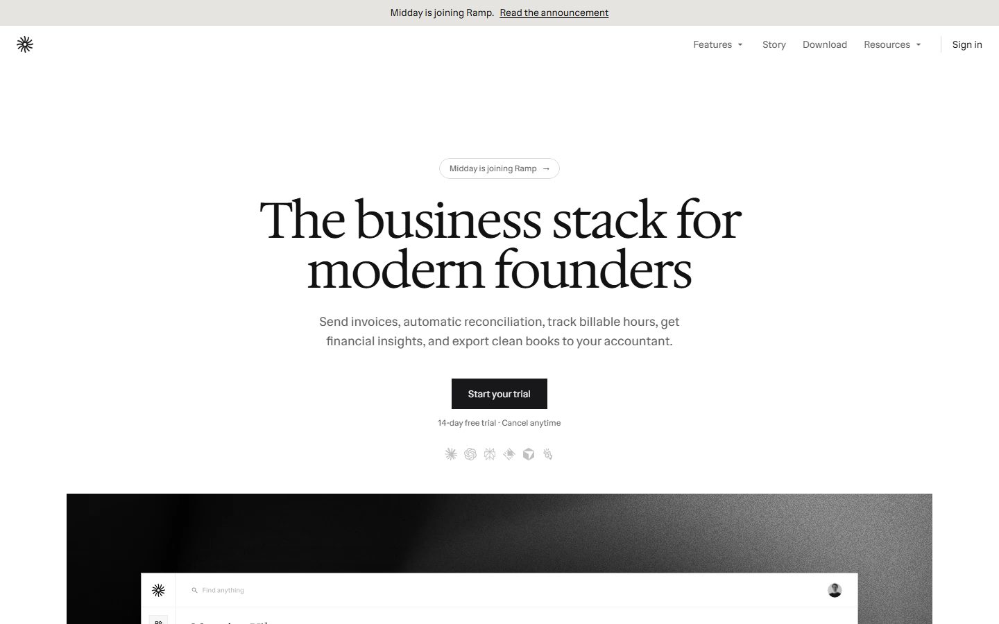
Midday's marketing surface is a quiet, editorial fintech interface — a pure white canvas (`{colors.canvas}` — #ffffff) carrying near-black ink (`{colors.ink}` — #121212), with almost no chromatic decoration above the fold. The page is anchored by a single oversized **Hedvig Letters Serif** display headline ("The business stack for modern founders") at 72px, a one-line muted sub-head, and a single solid-black CTA. The result reads as calm, premium, and self-assured: the product, not the marketing chrome, does the talking.
Type voice splits into two members of the same superfamily: **Hedvig Letters Serif** (the editorial display + h2 voice) and **Hedvig Letters Sans** (body, labels, buttons, nav). Both run at weight 400 — Midday never bolds. Brand voltage comes from scale and serif contrast, not weight or color: a 72px serif headline against 18px sans body is the entire hierarchy story.
The signature visual artifact is the **dark product-screenshot frame** (`{colors.surface-dark}` — #18181b) directly below the hero — a near-black band that shows the actual Midday app (the "Morning Viktor" dashboard) at full fidelity. This dark frame is the only large dark surface on the page; everything else stays white-with-light-gray-panels.
**Key Characteristics:**
- Pure white canvas (`{colors.canvas}`) with near-black ink (`{colors.ink}` — #121212). The palette is almost entirely monochrome; accent hues appear only inside product-UI fragments.
- Oversized **Hedvig Letters Serif** display headline at 72px / weight 400 / -1.8px tracking — the single loudest element on the page.
- Solid-black primary CTA ("Start your trial") with **square corners** (`{rounded.none}` — 0px). Sharp corners are a deliberate signature — Midday rounds almost nothing except pills and icon tiles.
- Pill-shaped announcement badge ("Midday is joining Ramp →") in `{rounded.pill}` — one of the only rounded shapes in the system.
- Dark product-screenshot frame (`{colors.surface-dark}` — #18181b) below the hero, letting real app UI carry visual weight.
- Light-gray utility panels (`{colors.neutral}` — #e6e4e0, `{colors.neutral-soft}` — #fafafa) for stat blocks and the pre-accounting checklist.
- Everything at weight 400 — Midday never bolds for emphasis; it scales type instead.
- A giant decorative "midday" wordmark anchors the very bottom of the page in outline ink.
## Colors
### Brand & Ink
- **Ink** (`{colors.ink}` — #121212): The dominant text color — display headlines, h2 titles, primary CTA background, nav labels. This is the brand's near-black.
- **Black** (`{colors.black}` — #000000): A pure-black used sparingly inside product chrome and fine borders.
- **Muted** (`{colors.muted}` — #616161): Secondary text — sub-heads, nav links, captions, footer body. The single most-used non-ink text tone.
### Surface & Neutral
- **Canvas** (`{colors.canvas}` — #ffffff): The default page floor and the surface for nav, hero, feature cards, and footer.
- **Neutral** (`{colors.neutral}` — #e6e4e0): A warm light-gray used for the pre-accounting checklist panel, icon tiles, and soft section fills.
- **Neutral Soft** (`{colors.neutral-soft}` — #fafafa): A barely-there gray for stat-card backgrounds and zebra rows.
- **Neutral Mid** (`{colors.neutral-mid}` — #dbdad7): A slightly deeper warm gray used on dividers and hairline edges.
- **Surface Dark** (`{colors.surface-dark}` — #18181b): The dark product-screenshot frame below the hero — the only large dark surface on the page.
- **On Dark** (`{colors.on-dark}` — #ffffff): Text/label color on the black CTA and inside the dark frame.
### Accent (product-UI only)
Midday's accents appear almost exclusively inside the embedded product screenshots — status dots, charts, category tags — never on marketing CTAs:
- **Accent Green** (`{colors.accent-green}` — #4caf50) and **Accent Green Bright** (`{colors.accent-green-bright}` — #22c55e): Positive/operational status indicators; #22c55e also seeds the focus-ring shadow.
- **Accent Blue** (`{colors.accent-blue}` — #2196f3) and **Accent Blue Strong** (`{colors.accent-blue-strong}` — #1976d2): Informational tags and links inside product UI.
- **Accent Orange** (`{colors.accent-orange}` — #ff9800): Warning/pending categories.
- **Accent Violet** (`{colors.accent-violet}` — #9c27b0): A rare category tag inside the transactions view.
These hues are low-frequency (1–12 occurrences each) and signal "this is the live product," not brand accent. Keep them out of marketing CTAs.
## Typography
### Font Family
The system runs the **Hedvig Letters** superfamily: **Hedvig Letters Serif** for display + h2 editorial voice, and **Hedvig Letters Sans** for body, labels, buttons, and navigation. Both are open-source typefaces (Google Fonts), so they ship as-is — `fonts_licensed` was empty, meaning no licensed/custom face needs substitution. Recommended fallback stacks: `Georgia, serif` for the serif role and `Inter, sans-serif` for the sans role.
The split is functional and strict:
- Hedvig Letters Serif (weight 400, negative tracking on display) — h1 hero headline and h2 section titles.
- Hedvig Letters Sans (weight 400, normal tracking) — paragraphs, labels, buttons, nav.
### Hierarchy
| Token | Size | Weight | Line Height | Letter Spacing | Use |
|---|---|---|---|---|---|
| `{typography.display}` | 72px | 400 | 1.0 | -1.8px | Hero h1 ("The business stack for modern founders") — Hedvig Letters Serif |
| `{typography.title}` | 24px | 400 | 1.333 | 0 | Section h2 heads ("How it works", "Less admin. More focus.") — Hedvig Letters Serif |
| `{typography.body}` | 18px | 400 | 1.556 | 0 | Default running text, hero sub-head — Hedvig Letters Sans |
| `{typography.label}` | 14px | 400 | 1.5 | 0 | h3 micro-labels, nav links, captions, footer — Hedvig Letters Sans |
| `{typography.button}` | 14px | 400 | 1.429 | 0 | CTA button label — Hedvig Letters Sans |
### Principles
Everything is weight 400 — there is no bold in the measured type system. Emphasis comes from **size and serif-vs-sans contrast**, never from weight. The 72px serif display against 18px sans body is the whole hierarchy. Keep the serif for headlines only; keep body/labels/buttons in the sans. The display headline's -1.8px tracking is part of the voice — the serif without negative tracking reads looser and off-brand.
### Note on Font Substitutes
Both Hedvig Letters faces are open-source and ship directly — no proprietary substitution is required. If the family is unavailable in a given environment, **Georgia** (serif role) and **Inter** (sans role) are the documented fallbacks, though they lose the distinctive editorial character of Hedvig's high-contrast serif.
## Layout
### Spacing System
- **Base unit:** measured spacing clusters around a 2px grid; the dominant steps are 6px, 8px, and 12px.
- **Tokens:** `{spacing.xxs}` 4px · `{spacing.xs}` 6px · `{spacing.sm}` 8px · `{spacing.base}` 12px · `{spacing.md}` 16px · `{spacing.lg}` 24px · `{spacing.xl}` 32px · `{spacing.xxl}` 64px · `{spacing.section}` 96px · `{spacing.hero}` 192px.
- **Tightest rhythm:** 6/8/12px dominate inline padding (icon gaps, button padding, pill padding).
- **Section padding:** `{spacing.section}` (96px) between major editorial bands; `{spacing.hero}` (192px) of breathing room appears around the hero zone.
- **Card internal padding:** `{spacing.lg}` (24px) for feature/checklist panels; `{spacing.md}` (16px) for stat and testimonial cards.
### Grid & Container
- **Centered editorial column:** the hero is center-aligned — headline, sub-head, CTA, and a row of integration icons all stack on the vertical centerline.
- **Feature grid:** the "Everything you need" band uses a 4-up icon-card grid at desktop.
- **Stat band:** the "Less admin. More focus." block uses a multi-column stat-card grid with one oversized "4–6 hours" outcome cell.
- **Footer:** multi-column link list (Features / Product / Company / Resources) at desktop.
### Whitespace Philosophy
Midday uses very generous whitespace — the hero floats in near-empty space with up to `{spacing.hero}` (192px) of vertical breathing room. The page is calibrated for calm scanning: one big serif statement, one supporting line, one action, then the product itself. Density only appears inside the embedded app screenshots.
## Elevation & Depth
| Level | Treatment | Use |
|---|---|---|
| Flat | No shadow, no border | Body sections, nav, hero, footer — the default |
| Hairline | 1px `{colors.neutral-mid}` / `{colors.neutral}` edge | Card outlines, dividers, integration rows |
| Light panel | `{colors.neutral}` / `{colors.neutral-soft}` fill, no shadow | Stat cards, checklist panel — color-block contrast does the lifting |
| Dark frame | `{colors.surface-dark}` (#18181b) fill | The product-screenshot band — the single large dark element |
| Focus ring | `rgba(34, 197, 94, 0.29) 0 0 0 2.21884px` | Input/interactive focus state — a soft green-tinted ring (derived from `{colors.accent-green-bright}`) |
The elevation philosophy is **flat and editorial** — no drop shadows anywhere on marketing surfaces. The only measured shadow in the entire system is the green focus ring. Depth is created by color-block contrast (light gray panels, the dark screenshot frame) rather than shadow.
### Decorative Depth
- The dark product-screenshot frame carries its own internal app chrome (cards, charts, tables) — these are product UI shown as content, not system tokens.
- The page closes with a giant outline "midday" wordmark rendered in ink at the very bottom — a flat typographic flourish, not an elevated element.
## Shapes
### Border Radius Scale
| Token | Value | Use |
|---|---|---|
| `{rounded.none}` | 0px | The default — CTA button, cards, stat panels, the product-screenshot frame. Square corners are the system signature. |
| `{rounded.md}` | 8px | Small icon tiles in the feature grid |
| `{rounded.pill}` | 9999px | Announcement badge ("Midday is joining Ramp →") |
| `{rounded.full}` | 9999px | Avatars and circular icon dots inside product UI |
Radius is essentially binary: **square by default, fully round for pills/avatars**, with a single 8px step for small icon tiles. The frequency data confirms this — 189 elements use the 9999px pill/circle radius (avatars, dots, the announcement badge) and 18 use the 8px tile radius; the marquee surfaces (button, cards, frame) measured 0px.
### Photography Geometry
The product-screenshot frame and embedded app UI keep square corners (`{rounded.none}`). Avatar photos inside testimonials and the dashboard render as perfect circles (`{rounded.full}`). Integration logos sit in small square/8px tiles.
## Components
### Announcement & Navigation
**`announcement-bar`** — A slim full-width strip pinned above the nav: "Midday is joining Ramp. Read the announcement." Background `{colors.canvas}`, ink text in `{typography.label}`, with an underlined inline link. Padding `{spacing.md}` (16px).
**`top-nav`** — White nav bar with the Midday starburst mark at left, a center-right menu (Features, Story, Download, Resources), and a "Sign in" link at far right. Background `{colors.canvas}`, labels in `{typography.label}` (Hedvig Letters Sans 14px). Padding 16px × 24px.
**`nav-link`** — Inline menu item, transparent background, `{colors.muted}` text in `{typography.label}`. Dropdown carets on "Features" and "Resources".
**`announcement-pill`** — The rounded hero badge ("Midday is joining Ramp →"). Background `{colors.canvas}` with a hairline outline, `{colors.muted}` text in `{typography.label}`, rounded `{rounded.pill}`, padding 8px × 16px. One of the only rounded shapes in the system.
### Buttons
**`button-primary`** — The single signature CTA ("Start your trial"). Background `{colors.ink}` (near-black — derived from the screenshot; the analyzer captured the button label color `{colors.muted}` and square `{rounded.none}` corners but not its solid-black fill), text `{colors.on-dark}`, type `{typography.button}` (Hedvig Letters Sans 14px / 400), rounded `{rounded.none}` (0px — square corners), padding 8px × 12px. Below it sits a `{typography.label}` micro-caption: "14-day free trial · Cancel anytime."
### Cards & Surfaces
**`hero-band`** — Center-aligned hero on `{colors.canvas}`: announcement pill, 72px `{typography.display}` headline, an 18px `{typography.body}` sub-head, the `{component.button-primary}`, the trial caption, and a row of monochrome integration icons. Vertical padding up to `{spacing.hero}` (192px).
**`product-screenshot-frame`** — The dark band directly below the hero showing the live "Morning Viktor" dashboard. Background `{colors.surface-dark}` (#18181b), square corners (`{rounded.none}`), no shadow. The frame holds full-fidelity product UI — this is the system's only large dark surface and its primary visual payload.
**`feature-icon-card`** — Used in the 4-up "Everything you need to run your business" grid (Invoicing, Transactions, Inbox, Time tracking, Customers, Files, Exports, AI integrations). Background `{colors.canvas}`, a small `{component.icon-tile}` at top, a `{typography.label}` title and a muted one-line description. Square corners, padding `{spacing.lg}` (24px).
**`icon-tile`** — Small 40px square feature-grid icon container. Background `{colors.neutral}`, rounded `{rounded.md}` (8px) — the rare softened corner in the system.
**`stat-card`** — Used in the "Less admin. More focus." band (e.g., "Chasing receipts — 45 minutes per week"). Background `{colors.neutral-soft}`, ink heading + muted body in `{typography.body}`, square corners, padding `{spacing.md}` (16px). The band culminates in an oversized "4–6 hours" outcome cell set in serif display scale.
**`checklist-panel`** — The "Ready for accounting, without extra work" panel listing reconciliation guarantees with check marks. Background `{colors.neutral}` (#e6e4e0), `{typography.body}` rows, square corners, padding `{spacing.lg}` (24px).
**`testimonial-card`** — Used in the "Built alongside our users" 4-up grid. Background `{colors.canvas}`, a country micro-label + name + role in `{typography.label}`, and a quote. Square corners, padding `{spacing.md}` (16px), preceded by a 5-star rating row.
### Footer
**`footer`** — White footer (Midday does NOT invert to dark here) carrying multi-column link lists (Features / Product / Company / Resources), a "Run your company. Not the admin." line, compliance badges (GDPR, SOC2), a dark-mode toggle, and a system-status indicator. Background `{colors.canvas}`, `{colors.muted}` text in `{typography.label}`, padding `{spacing.xxl}` (64px). The page then closes with a giant outline "midday" wordmark.
## Do's and Don'ts
### Do
- Reserve scale, not weight, for emphasis. Everything is weight 400 — make the headline bigger, never bolder.
- Use Hedvig Letters Serif for the hero headline and h2 titles; keep body, labels, and buttons in Hedvig Letters Sans.
- Keep the primary CTA solid `{colors.ink}` with square corners (`{rounded.none}`). The black-square button is the brand's single action signal.
- Apply the -1.8px tracking on the display headline. The high-contrast serif at 72px is the brand voice.
- Let the dark product-screenshot frame (`{colors.surface-dark}`) carry the visual weight. Show the real app, don't illustrate around it.
- Use light-gray panels (`{colors.neutral}`, `{colors.neutral-soft}`) for stat and checklist blocks — color-block contrast, never drop shadows.
- Keep accent hues (green/blue/orange/violet) inside product-UI fragments only.
### Don't
- Don't bold anything — there is no bold weight in the system.
- Don't round the marketing surfaces beyond pills and the 8px icon tile. Square corners are deliberate; rounding the CTA or cards reads as generic SaaS.
- Don't put accent colors on the CTA or headlines. The marketing layer is monochrome.
- Don't add drop shadows. The only measured shadow is the green focus ring; depth comes from color blocks.
- Don't invert the footer to dark — the dark surface is reserved for the single product-screenshot frame.
- Don't repeat dark surfaces. There is exactly one large dark band on the page.
## Responsive Behavior
The analysis captured a single desktop landing-page render, so breakpoints below are derived from layout structure and standard practice, not measured device captures.
### Breakpoints (derived)
| Name | Width | Key Changes |
|---|---|---|
| Mobile | < 768px | Nav collapses to a menu; hero display scales down from 72px; feature grid 4-up → 1-up; stat/testimonial grids stack 1-up; footer columns wrap |
| Tablet | 768–1024px | Feature grid 4-up → 2-up; stat cards 2-up; nav tightens |
| Desktop | 1024–1440px | Full nav; 4-up feature grid; multi-column stat + testimonial grids |
| Wide | > 1440px | Same as desktop with more outer margin; centered editorial column caps width |
### Touch Targets
- `{component.button-primary}` padding (8px × 12px) is tight; touch builds should pad the tap area toward 44px height.
- `{component.nav-link}` items rely on surrounding spacing for tap area.
- `{component.icon-tile}` is 40px — close to but slightly under the 44px touch guideline.
### Collapsing Strategy
- The hero stays center-aligned and stacks naturally; the display headline scales down on narrow viewports.
- Feature and testimonial grids reduce column count rather than shrinking cards.
- The dark product-screenshot frame scales proportionally while keeping the dashboard legible.
### Image Behavior
- The product-screenshot frame keeps its square corners at every width.
- Avatar and dashboard dots stay circular (`{rounded.full}`).
- Integration logos sit in fixed small tiles that wrap to multiple rows on narrow screens.
## Iteration Guide
1. Focus on ONE component at a time. Reference its YAML key directly (`{component.button-primary}`, `{component.product-screenshot-frame}`).
2. Variants of an existing component live as separate entries in `components:`.
3. Use `{token.refs}` everywhere — never inline a hex in a component.
4. Never document hover. Default and Active/Pressed states only.
5. Emphasis is scale, not weight — the type system is single-weight (400). Bigger serif before bolder anything.
6. Square is the default corner. Only pills, avatars, and the 8px icon tile round.
7. The dark surface is scarce — reserve `{colors.surface-dark}` for the product frame.
## Known Gaps
- Only ONE page (the desktop landing page) was captured. Interior pages (Story, Pricing, Download), responsive breakpoints, and dark-mode (a toggle is visible in the footer) are not measured.
- The `button-primary` measurement captured a label color of `{colors.muted}` (#616161) and a 0px radius, but NOT the solid-black fill clearly visible in the screenshot — the documented `{colors.ink}` background and `{colors.on-dark}` text are derived from screenshot ground-truth. Active/pressed button states were not extracted.
- Only one shadow was measured (a green-tinted focus ring); other focus/active/error states for inputs and links are unknown.
- Accent hex values (green/blue/orange/violet) are low-frequency and read as product-UI palette; they may be Tailwind-style defaults rather than brand tokens — exact brand mapping is unconfirmed.
- The dark-mode color set is not captured; the footer toggle implies a full alternate theme exists that is out of scope here.
- Animation and transition timings (announcement bar, dropdown menus, screenshot reveal) are not in scope.
- Exact container max-width and grid column counts are inferred from the screenshot, not measured.
- The decorative oversized "midday" outline wordmark at page bottom is observed but its precise type treatment (stroke width, fill) was not measured.
<!-- Documented by duply · real-world design systems as ready-to-use DESIGN.md for AI coding agents · https://duply.ai/midday/design-md -->
Color Palette
Accent
Neutrals
Typography
display72px · 400 · 1
The quick brown fox jumpstitle24px · 400 · 1.333
The quick brown fox jumpsbody18px · 400 · 1.556
The quick brown fox jumpslabel14px · 400 · 1.5
The quick brown fox jumpsbutton14px · 400 · 1.429
The quick brown fox jumpsSpacing & Shape
Spacing
| Name | Value | Preview |
|---|---|---|
| xxs | 4px | |
| xs | 6px | |
| sm | 8px | |
| base | 12px | |
| md | 16px | |
| lg | 24px | |
| xl | 32px | |
| xxl | 64px | |
| section | 96px | |
| hero | 192px |
Border Radius
| Name | Value | Preview |
|---|---|---|
| none | 0px | |
| md | 8px | |
| pill | 9999px | |
| full | 9999px |
More like this


---
version: alpha
name: Midday-design-analysis
description: A quiet, editorial fintech interface built on a pure white canvas with near-black ink, anchored by an oversized Hedvig Letters Serif display headline and a single solid-black CTA. The system reads as calm, premium, and confident — generous whitespace, square-cornered surfaces, pill-shaped announcement badges, and a dark product-screenshot frame that lets the actual app UI carry the visual weight. Brand voltage comes from the large serif headline and the restraint of an almost entirely monochrome palette.
colors:
  ink: "#121212"
  canvas: "#ffffff"
  muted: "#616161"
  on-dark: "#ffffff"
  neutral: "#e6e4e0"
  neutral-soft: "#fafafa"
  neutral-mid: "#dbdad7"
  surface-dark: "#18181b"
  black: "#000000"
  accent-green: "#4caf50"
  accent-green-bright: "#22c55e"
  accent-blue: "#2196f3"
  accent-blue-strong: "#1976d2"
  accent-orange: "#ff9800"
  accent-violet: "#9c27b0"
typography:
  display:
    fontFamily: "Hedvig Letters Serif, Georgia, serif"
    fontSize: 72px
    fontWeight: 400
    lineHeight: 1.0
    letterSpacing: -1.8px
  title:
    fontFamily: "Hedvig Letters Serif, Georgia, serif"
    fontSize: 24px
    fontWeight: 400
    lineHeight: 1.333
    letterSpacing: 0
  body:
    fontFamily: "Hedvig Letters Sans, Inter, sans-serif"
    fontSize: 18px
    fontWeight: 400
    lineHeight: 1.556
    letterSpacing: 0
  label:
    fontFamily: "Hedvig Letters Sans, Inter, sans-serif"
    fontSize: 14px
    fontWeight: 400
    lineHeight: 1.5
    letterSpacing: 0
  button:
    fontFamily: "Hedvig Letters Sans, Inter, sans-serif"
    fontSize: 14px
    fontWeight: 400
    lineHeight: 1.429
    letterSpacing: 0
rounded:
  none: 0px
  md: 8px
  pill: 9999px
  full: 9999px
spacing:
  xxs: 4px
  xs: 6px
  sm: 8px
  base: 12px
  md: 16px
  lg: 24px
  xl: 32px
  xxl: 64px
  section: 96px
  hero: 192px
components:
  announcement-bar:
    backgroundColor: "{colors.canvas}"
    textColor: "{colors.ink}"
    typography: "{typography.label}"
    padding: 16px
  top-nav:
    backgroundColor: "{colors.canvas}"
    textColor: "{colors.ink}"
    typography: "{typography.label}"
    padding: 16px 24px
  nav-link:
    backgroundColor: transparent
    textColor: "{colors.muted}"
    typography: "{typography.label}"
  announcement-pill:
    backgroundColor: "{colors.canvas}"
    textColor: "{colors.muted}"
    typography: "{typography.label}"
    rounded: "{rounded.pill}"
    padding: 8px 16px
  button-primary:
    backgroundColor: "{colors.ink}"
    textColor: "{colors.on-dark}"
    typography: "{typography.button}"
    rounded: "{rounded.none}"
    padding: 8px 12px
  hero-band:
    backgroundColor: "{colors.canvas}"
    textColor: "{colors.ink}"
    typography: "{typography.display}"
    padding: 96px
  product-screenshot-frame:
    backgroundColor: "{colors.surface-dark}"
    textColor: "{colors.on-dark}"
    rounded: "{rounded.none}"
  feature-icon-card:
    backgroundColor: "{colors.canvas}"
    textColor: "{colors.ink}"
    typography: "{typography.label}"
    rounded: "{rounded.none}"
    padding: 24px
  stat-card:
    backgroundColor: "{colors.neutral-soft}"
    textColor: "{colors.ink}"
    typography: "{typography.body}"
    rounded: "{rounded.none}"
    padding: 16px
  checklist-panel:
    backgroundColor: "{colors.neutral}"
    textColor: "{colors.ink}"
    typography: "{typography.body}"
    rounded: "{rounded.none}"
    padding: 24px
  testimonial-card:
    backgroundColor: "{colors.canvas}"
    textColor: "{colors.ink}"
    typography: "{typography.label}"
    rounded: "{rounded.none}"
    padding: 16px
  icon-tile:
    backgroundColor: "{colors.neutral}"
    textColor: "{colors.ink}"
    rounded: "{rounded.md}"
    size: 40px
  footer:
    backgroundColor: "{colors.canvas}"
    textColor: "{colors.muted}"
    typography: "{typography.label}"
    padding: 64px
---

## Overview

Midday's marketing surface is a quiet, editorial fintech interface — a pure white canvas (`{colors.canvas}` — #ffffff) carrying near-black ink (`{colors.ink}` — #121212), with almost no chromatic decoration above the fold. The page is anchored by a single oversized **Hedvig Letters Serif** display headline ("The business stack for modern founders") at 72px, a one-line muted sub-head, and a single solid-black CTA. The result reads as calm, premium, and self-assured: the product, not the marketing chrome, does the talking.

Type voice splits into two members of the same superfamily: **Hedvig Letters Serif** (the editorial display + h2 voice) and **Hedvig Letters Sans** (body, labels, buttons, nav). Both run at weight 400 — Midday never bolds. Brand voltage comes from scale and serif contrast, not weight or color: a 72px serif headline against 18px sans body is the entire hierarchy story.

The signature visual artifact is the **dark product-screenshot frame** (`{colors.surface-dark}` — #18181b) directly below the hero — a near-black band that shows the actual Midday app (the "Morning Viktor" dashboard) at full fidelity. This dark frame is the only large dark surface on the page; everything else stays white-with-light-gray-panels.

**Key Characteristics:**
- Pure white canvas (`{colors.canvas}`) with near-black ink (`{colors.ink}` — #121212). The palette is almost entirely monochrome; accent hues appear only inside product-UI fragments.
- Oversized **Hedvig Letters Serif** display headline at 72px / weight 400 / -1.8px tracking — the single loudest element on the page.
- Solid-black primary CTA ("Start your trial") with **square corners** (`{rounded.none}` — 0px). Sharp corners are a deliberate signature — Midday rounds almost nothing except pills and icon tiles.
- Pill-shaped announcement badge ("Midday is joining Ramp →") in `{rounded.pill}` — one of the only rounded shapes in the system.
- Dark product-screenshot frame (`{colors.surface-dark}` — #18181b) below the hero, letting real app UI carry visual weight.
- Light-gray utility panels (`{colors.neutral}` — #e6e4e0, `{colors.neutral-soft}` — #fafafa) for stat blocks and the pre-accounting checklist.
- Everything at weight 400 — Midday never bolds for emphasis; it scales type instead.
- A giant decorative "midday" wordmark anchors the very bottom of the page in outline ink.

## Colors

### Brand & Ink
- **Ink** (`{colors.ink}` — #121212): The dominant text color — display headlines, h2 titles, primary CTA background, nav labels. This is the brand's near-black.
- **Black** (`{colors.black}` — #000000): A pure-black used sparingly inside product chrome and fine borders.
- **Muted** (`{colors.muted}` — #616161): Secondary text — sub-heads, nav links, captions, footer body. The single most-used non-ink text tone.

### Surface & Neutral
- **Canvas** (`{colors.canvas}` — #ffffff): The default page floor and the surface for nav, hero, feature cards, and footer.
- **Neutral** (`{colors.neutral}` — #e6e4e0): A warm light-gray used for the pre-accounting checklist panel, icon tiles, and soft section fills.
- **Neutral Soft** (`{colors.neutral-soft}` — #fafafa): A barely-there gray for stat-card backgrounds and zebra rows.
- **Neutral Mid** (`{colors.neutral-mid}` — #dbdad7): A slightly deeper warm gray used on dividers and hairline edges.
- **Surface Dark** (`{colors.surface-dark}` — #18181b): The dark product-screenshot frame below the hero — the only large dark surface on the page.
- **On Dark** (`{colors.on-dark}` — #ffffff): Text/label color on the black CTA and inside the dark frame.

### Accent (product-UI only)
Midday's accents appear almost exclusively inside the embedded product screenshots — status dots, charts, category tags — never on marketing CTAs:
- **Accent Green** (`{colors.accent-green}` — #4caf50) and **Accent Green Bright** (`{colors.accent-green-bright}` — #22c55e): Positive/operational status indicators; #22c55e also seeds the focus-ring shadow.
- **Accent Blue** (`{colors.accent-blue}` — #2196f3) and **Accent Blue Strong** (`{colors.accent-blue-strong}` — #1976d2): Informational tags and links inside product UI.
- **Accent Orange** (`{colors.accent-orange}` — #ff9800): Warning/pending categories.
- **Accent Violet** (`{colors.accent-violet}` — #9c27b0): A rare category tag inside the transactions view.

These hues are low-frequency (1–12 occurrences each) and signal "this is the live product," not brand accent. Keep them out of marketing CTAs.

## Typography

### Font Family
The system runs the **Hedvig Letters** superfamily: **Hedvig Letters Serif** for display + h2 editorial voice, and **Hedvig Letters Sans** for body, labels, buttons, and navigation. Both are open-source typefaces (Google Fonts), so they ship as-is — `fonts_licensed` was empty, meaning no licensed/custom face needs substitution. Recommended fallback stacks: `Georgia, serif` for the serif role and `Inter, sans-serif` for the sans role.

The split is functional and strict:
- Hedvig Letters Serif (weight 400, negative tracking on display) — h1 hero headline and h2 section titles.
- Hedvig Letters Sans (weight 400, normal tracking) — paragraphs, labels, buttons, nav.

### Hierarchy

| Token | Size | Weight | Line Height | Letter Spacing | Use |
|---|---|---|---|---|---|
| `{typography.display}` | 72px | 400 | 1.0 | -1.8px | Hero h1 ("The business stack for modern founders") — Hedvig Letters Serif |
| `{typography.title}` | 24px | 400 | 1.333 | 0 | Section h2 heads ("How it works", "Less admin. More focus.") — Hedvig Letters Serif |
| `{typography.body}` | 18px | 400 | 1.556 | 0 | Default running text, hero sub-head — Hedvig Letters Sans |
| `{typography.label}` | 14px | 400 | 1.5 | 0 | h3 micro-labels, nav links, captions, footer — Hedvig Letters Sans |
| `{typography.button}` | 14px | 400 | 1.429 | 0 | CTA button label — Hedvig Letters Sans |

### Principles
Everything is weight 400 — there is no bold in the measured type system. Emphasis comes from **size and serif-vs-sans contrast**, never from weight. The 72px serif display against 18px sans body is the whole hierarchy. Keep the serif for headlines only; keep body/labels/buttons in the sans. The display headline's -1.8px tracking is part of the voice — the serif without negative tracking reads looser and off-brand.

### Note on Font Substitutes
Both Hedvig Letters faces are open-source and ship directly — no proprietary substitution is required. If the family is unavailable in a given environment, **Georgia** (serif role) and **Inter** (sans role) are the documented fallbacks, though they lose the distinctive editorial character of Hedvig's high-contrast serif.

## Layout

### Spacing System
- **Base unit:** measured spacing clusters around a 2px grid; the dominant steps are 6px, 8px, and 12px.
- **Tokens:** `{spacing.xxs}` 4px · `{spacing.xs}` 6px · `{spacing.sm}` 8px · `{spacing.base}` 12px · `{spacing.md}` 16px · `{spacing.lg}` 24px · `{spacing.xl}` 32px · `{spacing.xxl}` 64px · `{spacing.section}` 96px · `{spacing.hero}` 192px.
- **Tightest rhythm:** 6/8/12px dominate inline padding (icon gaps, button padding, pill padding).
- **Section padding:** `{spacing.section}` (96px) between major editorial bands; `{spacing.hero}` (192px) of breathing room appears around the hero zone.
- **Card internal padding:** `{spacing.lg}` (24px) for feature/checklist panels; `{spacing.md}` (16px) for stat and testimonial cards.

### Grid & Container
- **Centered editorial column:** the hero is center-aligned — headline, sub-head, CTA, and a row of integration icons all stack on the vertical centerline.
- **Feature grid:** the "Everything you need" band uses a 4-up icon-card grid at desktop.
- **Stat band:** the "Less admin. More focus." block uses a multi-column stat-card grid with one oversized "4–6 hours" outcome cell.
- **Footer:** multi-column link list (Features / Product / Company / Resources) at desktop.

### Whitespace Philosophy
Midday uses very generous whitespace — the hero floats in near-empty space with up to `{spacing.hero}` (192px) of vertical breathing room. The page is calibrated for calm scanning: one big serif statement, one supporting line, one action, then the product itself. Density only appears inside the embedded app screenshots.

## Elevation & Depth

| Level | Treatment | Use |
|---|---|---|
| Flat | No shadow, no border | Body sections, nav, hero, footer — the default |
| Hairline | 1px `{colors.neutral-mid}` / `{colors.neutral}` edge | Card outlines, dividers, integration rows |
| Light panel | `{colors.neutral}` / `{colors.neutral-soft}` fill, no shadow | Stat cards, checklist panel — color-block contrast does the lifting |
| Dark frame | `{colors.surface-dark}` (#18181b) fill | The product-screenshot band — the single large dark element |
| Focus ring | `rgba(34, 197, 94, 0.29) 0 0 0 2.21884px` | Input/interactive focus state — a soft green-tinted ring (derived from `{colors.accent-green-bright}`) |

The elevation philosophy is **flat and editorial** — no drop shadows anywhere on marketing surfaces. The only measured shadow in the entire system is the green focus ring. Depth is created by color-block contrast (light gray panels, the dark screenshot frame) rather than shadow.

### Decorative Depth
- The dark product-screenshot frame carries its own internal app chrome (cards, charts, tables) — these are product UI shown as content, not system tokens.
- The page closes with a giant outline "midday" wordmark rendered in ink at the very bottom — a flat typographic flourish, not an elevated element.

## Shapes

### Border Radius Scale

| Token | Value | Use |
|---|---|---|
| `{rounded.none}` | 0px | The default — CTA button, cards, stat panels, the product-screenshot frame. Square corners are the system signature. |
| `{rounded.md}` | 8px | Small icon tiles in the feature grid |
| `{rounded.pill}` | 9999px | Announcement badge ("Midday is joining Ramp →") |
| `{rounded.full}` | 9999px | Avatars and circular icon dots inside product UI |

Radius is essentially binary: **square by default, fully round for pills/avatars**, with a single 8px step for small icon tiles. The frequency data confirms this — 189 elements use the 9999px pill/circle radius (avatars, dots, the announcement badge) and 18 use the 8px tile radius; the marquee surfaces (button, cards, frame) measured 0px.

### Photography Geometry
The product-screenshot frame and embedded app UI keep square corners (`{rounded.none}`). Avatar photos inside testimonials and the dashboard render as perfect circles (`{rounded.full}`). Integration logos sit in small square/8px tiles.

## Components

### Announcement & Navigation

**`announcement-bar`** — A slim full-width strip pinned above the nav: "Midday is joining Ramp. Read the announcement." Background `{colors.canvas}`, ink text in `{typography.label}`, with an underlined inline link. Padding `{spacing.md}` (16px).

**`top-nav`** — White nav bar with the Midday starburst mark at left, a center-right menu (Features, Story, Download, Resources), and a "Sign in" link at far right. Background `{colors.canvas}`, labels in `{typography.label}` (Hedvig Letters Sans 14px). Padding 16px × 24px.

**`nav-link`** — Inline menu item, transparent background, `{colors.muted}` text in `{typography.label}`. Dropdown carets on "Features" and "Resources".

**`announcement-pill`** — The rounded hero badge ("Midday is joining Ramp →"). Background `{colors.canvas}` with a hairline outline, `{colors.muted}` text in `{typography.label}`, rounded `{rounded.pill}`, padding 8px × 16px. One of the only rounded shapes in the system.

### Buttons

**`button-primary`** — The single signature CTA ("Start your trial"). Background `{colors.ink}` (near-black — derived from the screenshot; the analyzer captured the button label color `{colors.muted}` and square `{rounded.none}` corners but not its solid-black fill), text `{colors.on-dark}`, type `{typography.button}` (Hedvig Letters Sans 14px / 400), rounded `{rounded.none}` (0px — square corners), padding 8px × 12px. Below it sits a `{typography.label}` micro-caption: "14-day free trial · Cancel anytime."

### Cards & Surfaces

**`hero-band`** — Center-aligned hero on `{colors.canvas}`: announcement pill, 72px `{typography.display}` headline, an 18px `{typography.body}` sub-head, the `{component.button-primary}`, the trial caption, and a row of monochrome integration icons. Vertical padding up to `{spacing.hero}` (192px).

**`product-screenshot-frame`** — The dark band directly below the hero showing the live "Morning Viktor" dashboard. Background `{colors.surface-dark}` (#18181b), square corners (`{rounded.none}`), no shadow. The frame holds full-fidelity product UI — this is the system's only large dark surface and its primary visual payload.

**`feature-icon-card`** — Used in the 4-up "Everything you need to run your business" grid (Invoicing, Transactions, Inbox, Time tracking, Customers, Files, Exports, AI integrations). Background `{colors.canvas}`, a small `{component.icon-tile}` at top, a `{typography.label}` title and a muted one-line description. Square corners, padding `{spacing.lg}` (24px).

**`icon-tile`** — Small 40px square feature-grid icon container. Background `{colors.neutral}`, rounded `{rounded.md}` (8px) — the rare softened corner in the system.

**`stat-card`** — Used in the "Less admin. More focus." band (e.g., "Chasing receipts — 45 minutes per week"). Background `{colors.neutral-soft}`, ink heading + muted body in `{typography.body}`, square corners, padding `{spacing.md}` (16px). The band culminates in an oversized "4–6 hours" outcome cell set in serif display scale.

**`checklist-panel`** — The "Ready for accounting, without extra work" panel listing reconciliation guarantees with check marks. Background `{colors.neutral}` (#e6e4e0), `{typography.body}` rows, square corners, padding `{spacing.lg}` (24px).

**`testimonial-card`** — Used in the "Built alongside our users" 4-up grid. Background `{colors.canvas}`, a country micro-label + name + role in `{typography.label}`, and a quote. Square corners, padding `{spacing.md}` (16px), preceded by a 5-star rating row.

### Footer

**`footer`** — White footer (Midday does NOT invert to dark here) carrying multi-column link lists (Features / Product / Company / Resources), a "Run your company. Not the admin." line, compliance badges (GDPR, SOC2), a dark-mode toggle, and a system-status indicator. Background `{colors.canvas}`, `{colors.muted}` text in `{typography.label}`, padding `{spacing.xxl}` (64px). The page then closes with a giant outline "midday" wordmark.

## Do's and Don'ts

### Do
- Reserve scale, not weight, for emphasis. Everything is weight 400 — make the headline bigger, never bolder.
- Use Hedvig Letters Serif for the hero headline and h2 titles; keep body, labels, and buttons in Hedvig Letters Sans.
- Keep the primary CTA solid `{colors.ink}` with square corners (`{rounded.none}`). The black-square button is the brand's single action signal.
- Apply the -1.8px tracking on the display headline. The high-contrast serif at 72px is the brand voice.
- Let the dark product-screenshot frame (`{colors.surface-dark}`) carry the visual weight. Show the real app, don't illustrate around it.
- Use light-gray panels (`{colors.neutral}`, `{colors.neutral-soft}`) for stat and checklist blocks — color-block contrast, never drop shadows.
- Keep accent hues (green/blue/orange/violet) inside product-UI fragments only.

### Don't
- Don't bold anything — there is no bold weight in the system.
- Don't round the marketing surfaces beyond pills and the 8px icon tile. Square corners are deliberate; rounding the CTA or cards reads as generic SaaS.
- Don't put accent colors on the CTA or headlines. The marketing layer is monochrome.
- Don't add drop shadows. The only measured shadow is the green focus ring; depth comes from color blocks.
- Don't invert the footer to dark — the dark surface is reserved for the single product-screenshot frame.
- Don't repeat dark surfaces. There is exactly one large dark band on the page.

## Responsive Behavior

The analysis captured a single desktop landing-page render, so breakpoints below are derived from layout structure and standard practice, not measured device captures.

### Breakpoints (derived)

| Name | Width | Key Changes |
|---|---|---|
| Mobile | < 768px | Nav collapses to a menu; hero display scales down from 72px; feature grid 4-up → 1-up; stat/testimonial grids stack 1-up; footer columns wrap |
| Tablet | 768–1024px | Feature grid 4-up → 2-up; stat cards 2-up; nav tightens |
| Desktop | 1024–1440px | Full nav; 4-up feature grid; multi-column stat + testimonial grids |
| Wide | > 1440px | Same as desktop with more outer margin; centered editorial column caps width |

### Touch Targets
- `{component.button-primary}` padding (8px × 12px) is tight; touch builds should pad the tap area toward 44px height.
- `{component.nav-link}` items rely on surrounding spacing for tap area.
- `{component.icon-tile}` is 40px — close to but slightly under the 44px touch guideline.

### Collapsing Strategy
- The hero stays center-aligned and stacks naturally; the display headline scales down on narrow viewports.
- Feature and testimonial grids reduce column count rather than shrinking cards.
- The dark product-screenshot frame scales proportionally while keeping the dashboard legible.

### Image Behavior
- The product-screenshot frame keeps its square corners at every width.
- Avatar and dashboard dots stay circular (`{rounded.full}`).
- Integration logos sit in fixed small tiles that wrap to multiple rows on narrow screens.

## Iteration Guide

1. Focus on ONE component at a time. Reference its YAML key directly (`{component.button-primary}`, `{component.product-screenshot-frame}`).
2. Variants of an existing component live as separate entries in `components:`.
3. Use `{token.refs}` everywhere — never inline a hex in a component.
4. Never document hover. Default and Active/Pressed states only.
5. Emphasis is scale, not weight — the type system is single-weight (400). Bigger serif before bolder anything.
6. Square is the default corner. Only pills, avatars, and the 8px icon tile round.
7. The dark surface is scarce — reserve `{colors.surface-dark}` for the product frame.

## Known Gaps

- Only ONE page (the desktop landing page) was captured. Interior pages (Story, Pricing, Download), responsive breakpoints, and dark-mode (a toggle is visible in the footer) are not measured.
- The `button-primary` measurement captured a label color of `{colors.muted}` (#616161) and a 0px radius, but NOT the solid-black fill clearly visible in the screenshot — the documented `{colors.ink}` background and `{colors.on-dark}` text are derived from screenshot ground-truth. Active/pressed button states were not extracted.
- Only one shadow was measured (a green-tinted focus ring); other focus/active/error states for inputs and links are unknown.
- Accent hex values (green/blue/orange/violet) are low-frequency and read as product-UI palette; they may be Tailwind-style defaults rather than brand tokens — exact brand mapping is unconfirmed.
- The dark-mode color set is not captured; the footer toggle implies a full alternate theme exists that is out of scope here.
- Animation and transition timings (announcement bar, dropdown menus, screenshot reveal) are not in scope.
- Exact container max-width and grid column counts are inferred from the screenshot, not measured.
- The decorative oversized "midday" outline wordmark at page bottom is observed but its precise type treatment (stroke width, fill) was not measured.

<!-- Documented by duply · real-world design systems as ready-to-use DESIGN.md for AI coding agents · https://duply.ai/midday/design-md -->