JoinArc
A restrained, fintech-editorial interface for Arc's cash-management product — warm off-white and pure-white canvases, near-black ink, and a single muted teal (#206d69) reserved for primary CTAs. The system reads as serious, institutional, and quietly premium — light-weight GT America display headlines (weight 300 at 64px), product-dashboard screenshots shown inside soft floating cards, alternating cream/white/near-black bands, and small pill tags labelling each feature. Brand voltage comes from the thin display type and the realistic product UI, not from saturated color.
---
version: alpha
name: JoinArc-design-analysis
description: "A restrained, fintech-editorial interface for Arc's cash-management product — warm off-white and pure-white canvases, near-black ink, and a single muted teal (#206d69) reserved for primary CTAs. The system reads as serious, institutional, and quietly premium — light-weight GT America display headlines (weight 300 at 64px), product-dashboard screenshots shown inside soft floating cards, alternating cream/white/near-black bands, and small pill tags labelling each feature. Brand voltage comes from the thin display type and the realistic product UI, not from saturated color."
colors:
primary: "#206d69"
accent-green: "#11a080"
accent-mint: "#70e0b4"
accent-blue: "#68b9d9"
accent-gold: "#cbb46c"
accent-gold-dark: "#a89355"
link: "#0000ee"
error: "#f53737"
ink: "#1e1e1c"
black: "#000000"
body: "#53524b"
body-strong: "#3d3c38"
muted: "#c1c0ba"
canvas: "#ffffff"
surface-cream: "#f1f0ec"
surface-soft: "#f3f3f3"
surface-soft-alt: "#eaeae8"
surface-dark: "#0c0c0d"
hairline: "#e3dede"
on-primary: "#ffffff"
on-dark: "#fafaf9"
typography:
display:
fontFamily: "GT America, Inter, sans-serif"
fontSize: 64px
fontWeight: 300
lineHeight: 1.1
letterSpacing: -0.96px
heading:
fontFamily: "GT America, Inter, sans-serif"
fontSize: 30px
fontWeight: 400
lineHeight: 1.15
letterSpacing: -0.45px
body:
fontFamily: "GT America, Inter, sans-serif"
fontSize: 16px
fontWeight: 500
lineHeight: 1.25
letterSpacing: normal
button:
fontFamily: "GT America, Inter, sans-serif"
fontSize: 30px
fontWeight: 400
lineHeight: 1.15
letterSpacing: -0.45px
rounded:
none: 0px
xs: 4px
sm: 6px
md: 8px
lg: 10px
xl: 16px
xxl: 20px
spacing:
xxs: 4px
xs: 8px
sm: 12px
md: 16px
lg: 24px
xl: 30px
xxl: 32px
components:
top-nav:
backgroundColor: "{colors.canvas}"
textColor: "{colors.ink}"
typography: "{typography.body}"
nav-link:
backgroundColor: transparent
textColor: "{colors.ink}"
typography: "{typography.body}"
button-primary:
backgroundColor: "{colors.primary}"
textColor: "{colors.on-primary}"
typography: "{typography.body}"
rounded: "{rounded.none}"
button-secondary:
backgroundColor: "{colors.canvas}"
textColor: "{colors.ink}"
typography: "{typography.body}"
rounded: "{rounded.xs}"
text-link:
backgroundColor: transparent
textColor: "{colors.link}"
typography: "{typography.body}"
text-input:
backgroundColor: "{colors.canvas}"
textColor: "{colors.ink}"
typography: "{typography.body}"
rounded: "{rounded.xs}"
hero-band:
backgroundColor: "{colors.surface-cream}"
textColor: "{colors.ink}"
typography: "{typography.display}"
padding: 32px
product-mockup-card:
backgroundColor: "{colors.canvas}"
textColor: "{colors.ink}"
rounded: "{rounded.xl}"
feature-card-light:
backgroundColor: "{colors.surface-soft}"
textColor: "{colors.ink}"
typography: "{typography.heading}"
rounded: "{rounded.xl}"
padding: 32px
feature-card-dark:
backgroundColor: "{colors.surface-dark}"
textColor: "{colors.on-dark}"
typography: "{typography.heading}"
rounded: "{rounded.xl}"
padding: 32px
cta-band-dark:
backgroundColor: "{colors.surface-dark}"
textColor: "{colors.on-dark}"
typography: "{typography.heading}"
padding: 32px
badge-pill:
backgroundColor: "{colors.surface-soft-alt}"
textColor: "{colors.body}"
typography: "{typography.body}"
rounded: "{rounded.xxl}"
newsletter-input:
backgroundColor: "{colors.canvas}"
textColor: "{colors.ink}"
typography: "{typography.body}"
rounded: "{rounded.xs}"
footer:
backgroundColor: "{colors.canvas}"
textColor: "{colors.body}"
typography: "{typography.body}"
padding: 32px
---
## Overview
Arc's marketing surface is a restrained, institutional fintech interface — warm off-white (`{colors.surface-cream}` — #f1f0ec) and pure-white (`{colors.canvas}` — #ffffff) canvases anchored by near-black ink (`{colors.ink}` — #1e1e1c), with a single muted teal (`{colors.primary}` — #206d69) reserved exclusively for primary CTAs. The system reads as serious and quietly premium: financial software for technology companies that wants to project trust rather than energy.
Type voice runs entirely on **GT America** — a grotesque sans used at every level. The brand signature is its *weight*: the h1 sits at 64px in a thin weight 300 with tight -0.96px tracking, while body copy is a heavier 16px / 500. The contrast between airy display type and solid body text is the whole typographic system — there is no second typeface.
Component voltage comes from **realistic product-dashboard screenshots shown inside soft floating cards** — the hero displays the actual Arc account dashboard (total-assets balance, accounts list, transaction table) on a card lifted by a very large, very soft layered drop shadow. Arc shows the product chrome itself rather than illustrating it.
The page alternates surface modes for rhythm: cream hero → white product band → light-gray feature card → near-black feature card → a full near-black CTA band (`{colors.surface-dark}` — #0c0c0d) → white footer. The dark bands are the only saturated visual moments in an otherwise pale, paper-like layout.
**Key Characteristics:**
- Pale paper canvases — cream (`{colors.surface-cream}`) and white (`{colors.canvas}`) — never gradients or saturated color fields above the fold.
- Thin display headlines (`{typography.display}` — GT America 64px / weight 300, -0.96px tracking). The light weight is the brand's defining gesture.
- A single muted teal primary CTA (`{colors.primary}` — #206d69) used for "Get started" and "Join Newsletter". Secondary actions ("Book a demo", "Log in") stay neutral.
- Product-dashboard screenshots inside `{component.product-mockup-card}` lifted by a soft, broadly-diffused layered shadow.
- Small pill tags (`{component.badge-pill}`) labelling each feature block ("CFO Agent", "Debt Raise").
- Near-black bands (`{colors.surface-dark}` — #0c0c0d) used for the "Secure financing" feature card and the closing CTA band — the system's only dark surfaces.
- Tight, varied border-radius scale — inputs at 4px, mockup/feature cards at 16px, pill tags at ~20px. Primary buttons measured with square 0px corners.
- Default-blue links (`{colors.link}` — #0000ee) appear only in the dense legal/footnote copy — the rest of the page keeps links monochrome.
## Colors
### Brand & Accent
- **Primary** (`{colors.primary}` — #206d69): The single muted-teal action color. All primary CTAs ("Get started", "Join Newsletter"). The brand's only deliberate hue at the action layer.
- **Accent Green** (`{colors.accent-green}` — #11a080) / **Accent Mint** (`{colors.accent-mint}` — #70e0b4): Brighter greens that appear inside product UI fragments (progress bars, balance chips, charts) — not used on marketing CTAs.
- **Accent Blue** (`{colors.accent-blue}` — #68b9d9): A soft blue appearing inside dashboard chrome / charts.
- **Accent Gold** (`{colors.accent-gold}` — #cbb46c) and **Accent Gold Dark** (`{colors.accent-gold-dark}` — #a89355): A muted gold pair used as small accents (rewards / earnings chips inside the product mockup).
- **Link** (`{colors.link}` — #0000ee): Browser-default blue used for inline links in the legal/footnote text blocks only.
### Surface
- **Canvas** (`{colors.canvas}` — #ffffff): The default white page floor and the product-mockup-card background.
- **Surface Cream** (`{colors.surface-cream}` — #f1f0ec): The hero band's warm off-white floor.
- **Surface Soft** (`{colors.surface-soft}` — #f3f3f3) and **Surface Soft Alt** (`{colors.surface-soft-alt}` — #eaeae8): Light-gray feature-card and pill-tag backgrounds.
- **Surface Dark** (`{colors.surface-dark}` — #0c0c0d): The near-black band used for the financing feature card and the closing CTA band — the only dark surfaces in the system.
- **Hairline** (`{colors.hairline}` — #e3dede): The faint 1px divider tone on light surfaces (footer rules, card edges).
### Text
- **Ink** (`{colors.ink}` — #1e1e1c): All headlines and primary text.
- **Black** (`{colors.black}` — #000000): The most-frequent measured neutral — used in logo, hard rules, and dense black UI elements.
- **Body** (`{colors.body}` — #53524b): Default running-text and footer link color.
- **Body Strong** (`{colors.body-strong}` — #3d3c38): A slightly darker body tone for emphasized supporting copy.
- **Muted** (`{colors.muted}` — #c1c0ba): Tertiary text — fine-print, placeholders.
- **On Primary** (`{colors.on-primary}` — #ffffff): Text on teal CTAs.
- **On Dark** (`{colors.on-dark}` — #fafaf9): Off-white text on the near-black bands.
### Semantic
- **Error** (`{colors.error}` — #f53737): The only measured semantic signal — validation / alert red.
## Typography
### Font Family
The system runs entirely on **GT America** (Grilli Type's grotesque sans) for display, headings, body, and buttons — there is no second face. GT America is a licensed commercial typeface and is **not** shipped as a free web font; an open-source substitute is documented below. The fallback stack walks `Inter, sans-serif`.
The voice is carried by weight contrast rather than family contrast:
- Display headlines — GT America weight **300** at 64px, -0.96px tracking (airy, editorial)
- Body — GT America weight **500** at 16px (solid, legible)
### Hierarchy
| Token | Size | Weight | Line Height | Letter Spacing | Use |
|---|---|---|---|---|---|
| `{typography.display}` | 64px | 300 | 1.1 | -0.96px | Hero h1 ("Intelligent cash management for technology companies") |
| `{typography.heading}` | 30px | 400 | 1.15 | -0.45px | Section / feature-card headings ("Put financial analysis on autopilot") |
| `{typography.body}` | 16px | 500 | 1.25 | normal | Running text, nav links, buttons, footer links |
| `{typography.button}` | 30px | 400 | 1.15 | -0.45px | Large CTA label as measured (see Known Gaps) |
### Principles
The thin display weight (300) is the brand. Headlines must stay light and tightly tracked — bolding the h1 would break the institutional-but-airy character. Body copy carries the opposite gesture: weight 500 keeps small text crisp on warm paper backgrounds. The single-family discipline means hierarchy is built purely from size + weight + tracking, never from a contrasting typeface.
### Note on Font Substitutes
GT America is licensed and cannot be redistributed. **Inter** is the closest open-source substitute — at weight 300 with -0.015em tracking it approximates the thin display headline, and at weight 500 it matches the body. **Neue Haas Grotesk Text** (where licensed) or **Helvetica Neue** are visually closer grotesques if available, but Inter is the safe shippable default.
## Layout
### Spacing System
- **Base unit:** 4px; the dominant rhythm value is 16px (`{spacing.md}`), by far the most frequent measured gap.
- **Tokens:** `{spacing.xxs}` 4px · `{spacing.xs}` 8px · `{spacing.sm}` 12px · `{spacing.md}` 16px · `{spacing.lg}` 24px · `{spacing.xl}` 30px · `{spacing.xxl}` 32px.
- **Card / section padding:** `{spacing.xxl}` (32px) and `{spacing.xl}` (30px) are the dominant block-padding values for feature cards and bands.
- **Tight clusters:** 4–12px gaps inside form rows, tag pills, and nav clusters.
### Grid & Container
- **Editorial body:** Centered single-column hero (headline + sub-line + button row stacked and centered), with the product mockup below.
- **Feature blocks:** Two-column split — a product UI fragment / chart on the left, a tag + heading + body + "Learn more" link on the right.
- **Footer:** 4-column link list (For Companies / Company / Resources) plus a newsletter sign-up column at right; a separate "For Lenders" sub-group sits under the first column.
### Whitespace Philosophy
Arc uses generous vertical whitespace between bands and lets the thin headlines breathe. The hero centers a single message on a cream field with no competing elements; feature cards are widely separated. The pacing is deliberate and unhurried — appropriate for a product asking for financial trust.
## Elevation & Depth
| Level | Treatment | Use |
|---|---|---|
| Flat | No shadow, no border | Editorial bands, footer, dark CTA band |
| Hairline ring | `rgba(0,0,0,0.067) 0 0 0 1px` (1px ring) | Inputs, small UI chips, subtle card outlines |
| Soft float | Large layered shadow — `rgba(0,0,0,0.03) 0 100px 80px`, `rgba(0,0,0,0.024) 0 41.8px 33.4px`, `rgba(0,0,0,0.02) 0 22.3px 17.9px`, `rgba(0,0,0,0.016) 0 12.5px 10px` (and further tiers) | The hero product-mockup-card |
The elevation philosophy is **soft and atmospheric** — the product dashboard hovers above the cream canvas on a very broad, very low-alpha multi-layer shadow that reads as ambient light rather than a hard drop. Everything else stays flat or uses a faint 1px ring. No heavy shadows, no glassmorphism.
### Decorative Depth
- The dashboard screenshot inside `{component.product-mockup-card}` carries its own internal product chrome (cards, table rows, balance chips) — these are content, not system tokens.
- The near-black feature card and CTA band use color-block contrast for emphasis instead of shadow.
## Shapes
### Border Radius Scale
| Token | Value | Use |
|---|---|---|
| `{rounded.none}` | 0px | Primary buttons (as measured — square corners) |
| `{rounded.xs}` | 4px | Text inputs, newsletter field, small UI chips (most frequent radius) |
| `{rounded.sm}` | 6px | Minor UI elements |
| `{rounded.md}` | 8px | Secondary buttons, small cards |
| `{rounded.lg}` | 10px | Mid-size cards / chips |
| `{rounded.xl}` | 16px | Product-mockup card, feature cards |
| `{rounded.xxl}` | 20px | Pill tags ("CFO Agent", "Debt Raise") |
### Photography / Geometry
Product screenshots inside cards retain native chrome and aspect ratios; the containing card uses `{rounded.xl}` (16px) corners. There is no avatar / circular-photo system measured on the marketing surface.
## Components
### Navigation
**`top-nav`** — White nav bar pinned to the top of every page. `{colors.canvas}` background, carries the lowercase "arc" wordmark at left, a center menu (Products, Company, Pricing) in `{typography.body}` (GT America 16px / 500), and a right-side cluster with a "Log in" `{component.nav-link}` and a "Get started" button. Menu items render in `{colors.ink}`.
**`nav-link`** — Inline text link, no background. `{colors.ink}` text, `{typography.body}`. Used for "Log in" and footer column links (in `{colors.body}`).
### Buttons
**`button-primary`** — The signature CTA. Background `{colors.primary}` (#206d69, derived as the brand action color from screenshots; the hex is measured), text `{colors.on-primary}` (#ffffff, measured from `button.color`), `{typography.body}`. Corners measured at 0px → `{rounded.none}`. Used for "Get started", "Book a demo" (primary variant), and "Join Newsletter".
**`button-secondary`** — Neutral / outline action on light surfaces. Background `{colors.canvas}`, text `{colors.ink}`, `{rounded.xs}` (4px). Used for lower-emphasis actions paired beside the teal primary.
**`text-link`** — Inline link in legal / footnote copy. `{colors.link}` (#0000ee) text, `{typography.body}`, underlined. Appears only in the dense disclosure blocks; the rest of the page keeps links monochrome.
### Inputs & Forms
**`text-input`** — Standard form field. Background `{colors.canvas}`, text `{colors.ink}`, `{typography.body}`, `{rounded.xs}` (4px). Carries the faint 1px ring (`rgba(0,0,0,0.067) 0 0 0 1px`) as its border.
**`newsletter-input`** — The footer "Your email" field feeding the teal "Join Newsletter" `{component.button-primary}`. Background `{colors.canvas}`, `{rounded.xs}`, `{typography.body}`.
### Cards & Bands
**`hero-band`** — Centered cream hero. Background `{colors.surface-cream}` (#f1f0ec), `{typography.display}` for the h1, sub-line in `{colors.body}`, and a centered button row (teal primary + neutral secondary). Block padding `{spacing.xxl}` (32px).
**`product-mockup-card`** — The hero's marquee artifact: the actual Arc account dashboard (total-assets balance, accounts list, transactions table, relationship-manager panel) shown on a white card. Background `{colors.canvas}`, `{rounded.xl}` (16px), lifted by the large soft layered float shadow.
**`feature-card-light`** — Light feature block ("Put financial analysis on autopilot"). Background `{colors.surface-soft}` (#f3f3f3), heading in `{typography.heading}`, a `{component.badge-pill}` tag ("CFO Agent"), body in `{typography.body}`, and a "Learn more" link. `{rounded.xl}`, padding `{spacing.xxl}`.
**`feature-card-dark`** — Dark feature block ("Secure the right financing faster"). Background `{colors.surface-dark}` (#0c0c0d), text `{colors.on-dark}`, "Debt Raise" badge, a financing-range UI fragment on the left. `{rounded.xl}`, padding `{spacing.xxl}`.
**`cta-band-dark`** — The full-width closing CTA ("Get access to the cash management experience built for scale."). Background `{colors.surface-dark}`, heading in `{typography.heading}`, sub-line in `{colors.on-dark}`, and a teal "Get started" `{component.button-primary}`. Block padding `{spacing.xxl}`.
### Tags
**`badge-pill`** — Small pill label marking each feature block ("CFO Agent", "Debt Raise"). Background `{colors.surface-soft-alt}` (#eaeae8), text `{colors.body}`, `{typography.body}`, `{rounded.xxl}` (20px).
### Footer
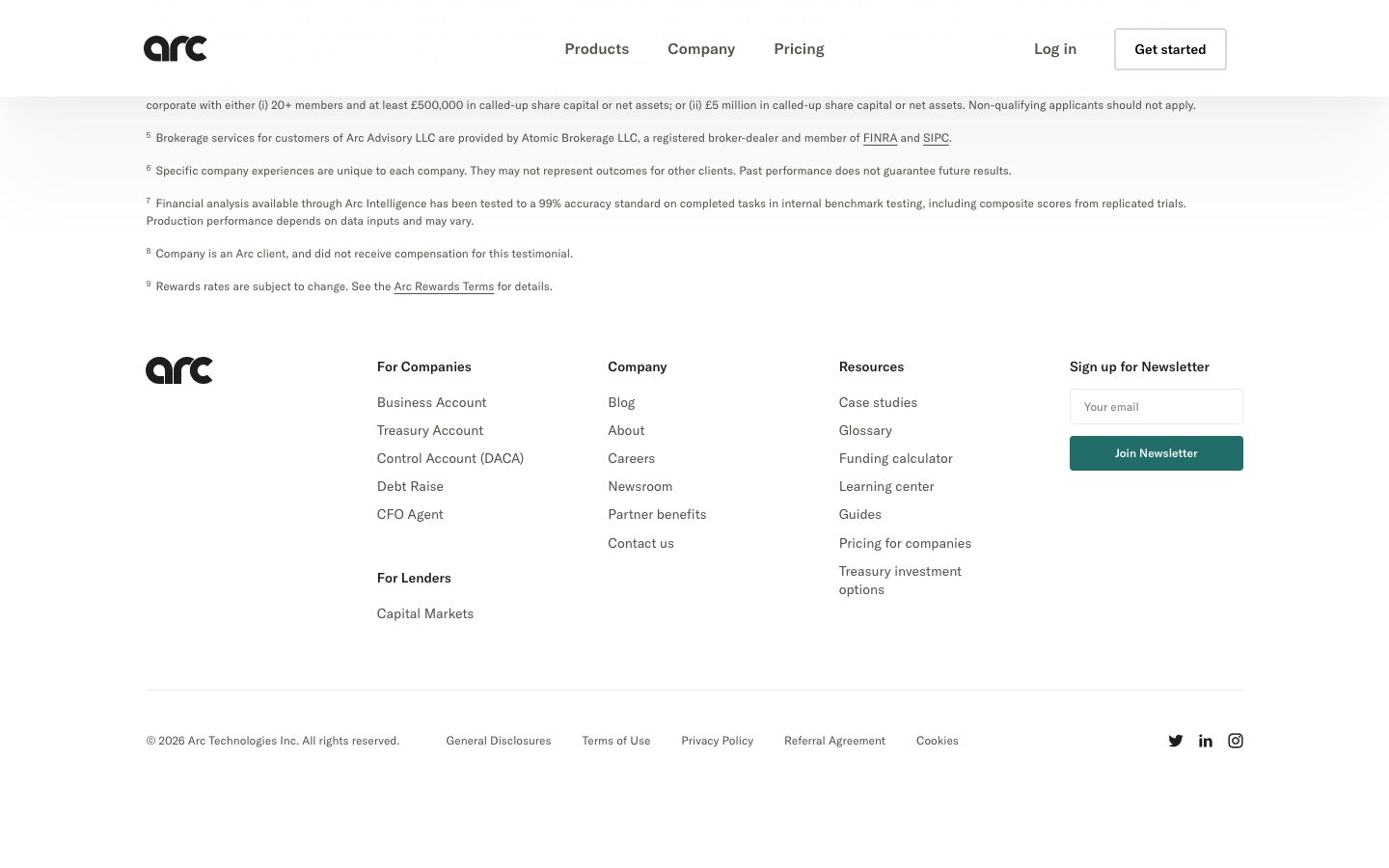
**`footer`** — White footer that closes the page. Background `{colors.canvas}`, link text `{colors.body}` in `{typography.body}`. Carries the "arc" wordmark, a 4-column link list (For Companies / For Lenders / Company / Resources), and a newsletter sign-up column (`{component.newsletter-input}` + teal "Join Newsletter" button). A hairline rule (`{colors.hairline}`) separates the link grid from the copyright + social row. Block padding `{spacing.xxl}`.
## Do's and Don'ts
### Do
- Reserve `{colors.primary}` (#206d69) for primary CTAs only. The teal is the system's single deliberate hue.
- Keep display headlines thin — GT America weight 300 at 64px with -0.96px tracking. The lightness is the brand.
- Set body copy at weight 500 — the heavier body against thin headlines is the typographic contrast that carries the system.
- Show real product dashboard chrome inside `{component.product-mockup-card}` lifted by the soft layered float shadow. Don't illustrate the product when you can display it.
- Use `{component.badge-pill}` tags to label each feature block; pair them with a `{typography.heading}` headline and a "Learn more" link.
- Alternate surface modes band-to-band (cream → white → light-gray → near-black) for editorial rhythm.
- Use the near-black bands (`{colors.surface-dark}`) sparingly — for the financing feature card and the closing CTA only.
### Don't
- Don't bold the display headline. GT America at heavier weights breaks the airy, institutional voice.
- Don't introduce saturated color at the action layer beyond the muted teal — the brighter greens, mint, blue, and gold belong inside product UI fragments, not on marketing CTAs.
- Don't use the default-blue link color (`{colors.link}`) outside the legal/footnote blocks.
- Don't add a second typeface — hierarchy is size + weight + tracking only.
- Don't apply heavy hard drop shadows; the product card floats on a broad, low-alpha multi-layer shadow.
- Don't document hover states — primary buttons are teal at rest; no other state is encoded.
## Responsive Behavior
The site was captured at desktop widths only; the following is partly inferred from layout structure and is flagged in Known Gaps.
### Breakpoints
| Name | Width | Key Changes (inferred) |
|---|---|---|
| Mobile | < 768px | Nav collapses; hero h1 scales down from 64px; product mockup card scales proportionally; feature blocks stack to single column; footer columns wrap to 1–2 up |
| Tablet | 768–1024px | Center nav tightens; two-column feature blocks may stack; footer 4-col → 2-col |
| Desktop | > 1024px | Full center nav; two-column feature blocks; 4-column footer + newsletter column |
### Touch Targets
- `{component.button-primary}` and `{component.text-input}` heights were not measured; padding tokens (`{spacing.md}`–`{spacing.xxl}`) suggest comfortable tap areas but exact heights are a gap.
### Collapsing Strategy
- Hero stays centered and single-column at all widths; the product mockup card reflows below the headline cluster.
- Feature blocks reduce from two columns to stacked single column on narrow viewports.
- Footer link grid collapses from 4 columns toward 1–2 up; the newsletter form stacks below the link lists.
### Image Behavior
- The product dashboard screenshot scales proportionally; its internal chrome must remain legible at smaller sizes.
## Iteration Guide
1. Focus on ONE component at a time and reference its YAML key directly (`{component.feature-card-dark}`, `{component.product-mockup-card}`).
2. Variants of a component live as separate entries in `components:` — keep the light and dark feature cards distinct.
3. Use `{token.refs}` everywhere — never inline a hex in a component.
4. Never document hover. Default and Active/Pressed states only.
5. Display headlines stay GT America weight 300; body stays weight 500. The weight contrast does not blur.
6. The teal `{colors.primary}` is the only action hue — don't promote a product-UI green to CTA status.
7. The near-black bands are scarce signals — don't add more dark surfaces casually.
## Known Gaps
- The button typography role was measured at 30px / weight 400 (`computed:button`), which appears to reflect a large display-style CTA rather than a standard small button label. Standard nav/footer buttons in the screenshots read closer to `{typography.body}` (16px); the measured value is preserved verbatim and the smaller label size is unconfirmed.
- `button-primary` was measured with radius `0px` (`{rounded.none}`) and `padding 0px`, yet screenshots show the teal CTAs with slight rounding and internal padding — the measured outer element likely excludes padding. Treat exact button radius/padding as unconfirmed.
- The teal-as-primary mapping is derived from screenshot ground-truth; the hex (#206d69) is measured but its role assignment to CTAs is interpreted.
- GT America is a licensed commercial typeface (not flagged in `fonts_licensed`, which was empty, but confirmed by name); the Inter substitute is documented and should ship in its place.
- Responsive breakpoints, touch-target heights, and component dimensions (button height, input height, container max-width) were not captured at mobile/tablet widths and are inferred.
- Animation and transition timings are out of scope.
- Form validation, focus, and error states beyond the base `{component.text-input}` were not extracted; `{colors.error}` (#f53737) is the only measured semantic color.
- The full accent set (mint, blue, gold, accent-green) was measured but appears only inside product-dashboard chrome; their exact roles in the product UI are out of marketing-surface scope.
<!-- Documented by duply · real-world design systems as ready-to-use DESIGN.md for AI coding agents · https://duply.ai/joinarc/design-md -->
Color Palette
Accent
Neutrals
Typography
display64px · 300 · 1.1
The quick brown fox jumpsheading30px · 400 · 1.15
The quick brown fox jumpsbody16px · 500 · 1.25
The quick brown fox jumpsbutton30px · 400 · 1.15
The quick brown fox jumpsSpacing & Shape
Spacing
| Name | Value | Preview |
|---|---|---|
| xxs | 4px | |
| xs | 8px | |
| sm | 12px | |
| md | 16px | |
| lg | 24px | |
| xl | 30px | |
| xxl | 32px |
Border Radius
| Name | Value | Preview |
|---|---|---|
| none | 0px | |
| xs | 4px | |
| sm | 6px | |
| md | 8px | |
| lg | 10px | |
| xl | 16px | |
| xxl | 20px |
More like this


---
version: alpha
name: JoinArc-design-analysis
description: "A restrained, fintech-editorial interface for Arc's cash-management product — warm off-white and pure-white canvases, near-black ink, and a single muted teal (#206d69) reserved for primary CTAs. The system reads as serious, institutional, and quietly premium — light-weight GT America display headlines (weight 300 at 64px), product-dashboard screenshots shown inside soft floating cards, alternating cream/white/near-black bands, and small pill tags labelling each feature. Brand voltage comes from the thin display type and the realistic product UI, not from saturated color."

colors:
  primary: "#206d69"
  accent-green: "#11a080"
  accent-mint: "#70e0b4"
  accent-blue: "#68b9d9"
  accent-gold: "#cbb46c"
  accent-gold-dark: "#a89355"
  link: "#0000ee"
  error: "#f53737"
  ink: "#1e1e1c"
  black: "#000000"
  body: "#53524b"
  body-strong: "#3d3c38"
  muted: "#c1c0ba"
  canvas: "#ffffff"
  surface-cream: "#f1f0ec"
  surface-soft: "#f3f3f3"
  surface-soft-alt: "#eaeae8"
  surface-dark: "#0c0c0d"
  hairline: "#e3dede"
  on-primary: "#ffffff"
  on-dark: "#fafaf9"

typography:
  display:
    fontFamily: "GT America, Inter, sans-serif"
    fontSize: 64px
    fontWeight: 300
    lineHeight: 1.1
    letterSpacing: -0.96px
  heading:
    fontFamily: "GT America, Inter, sans-serif"
    fontSize: 30px
    fontWeight: 400
    lineHeight: 1.15
    letterSpacing: -0.45px
  body:
    fontFamily: "GT America, Inter, sans-serif"
    fontSize: 16px
    fontWeight: 500
    lineHeight: 1.25
    letterSpacing: normal
  button:
    fontFamily: "GT America, Inter, sans-serif"
    fontSize: 30px
    fontWeight: 400
    lineHeight: 1.15
    letterSpacing: -0.45px

rounded:
  none: 0px
  xs: 4px
  sm: 6px
  md: 8px
  lg: 10px
  xl: 16px
  xxl: 20px

spacing:
  xxs: 4px
  xs: 8px
  sm: 12px
  md: 16px
  lg: 24px
  xl: 30px
  xxl: 32px

components:
  top-nav:
    backgroundColor: "{colors.canvas}"
    textColor: "{colors.ink}"
    typography: "{typography.body}"
  nav-link:
    backgroundColor: transparent
    textColor: "{colors.ink}"
    typography: "{typography.body}"
  button-primary:
    backgroundColor: "{colors.primary}"
    textColor: "{colors.on-primary}"
    typography: "{typography.body}"
    rounded: "{rounded.none}"
  button-secondary:
    backgroundColor: "{colors.canvas}"
    textColor: "{colors.ink}"
    typography: "{typography.body}"
    rounded: "{rounded.xs}"
  text-link:
    backgroundColor: transparent
    textColor: "{colors.link}"
    typography: "{typography.body}"
  text-input:
    backgroundColor: "{colors.canvas}"
    textColor: "{colors.ink}"
    typography: "{typography.body}"
    rounded: "{rounded.xs}"
  hero-band:
    backgroundColor: "{colors.surface-cream}"
    textColor: "{colors.ink}"
    typography: "{typography.display}"
    padding: 32px
  product-mockup-card:
    backgroundColor: "{colors.canvas}"
    textColor: "{colors.ink}"
    rounded: "{rounded.xl}"
  feature-card-light:
    backgroundColor: "{colors.surface-soft}"
    textColor: "{colors.ink}"
    typography: "{typography.heading}"
    rounded: "{rounded.xl}"
    padding: 32px
  feature-card-dark:
    backgroundColor: "{colors.surface-dark}"
    textColor: "{colors.on-dark}"
    typography: "{typography.heading}"
    rounded: "{rounded.xl}"
    padding: 32px
  cta-band-dark:
    backgroundColor: "{colors.surface-dark}"
    textColor: "{colors.on-dark}"
    typography: "{typography.heading}"
    padding: 32px
  badge-pill:
    backgroundColor: "{colors.surface-soft-alt}"
    textColor: "{colors.body}"
    typography: "{typography.body}"
    rounded: "{rounded.xxl}"
  newsletter-input:
    backgroundColor: "{colors.canvas}"
    textColor: "{colors.ink}"
    typography: "{typography.body}"
    rounded: "{rounded.xs}"
  footer:
    backgroundColor: "{colors.canvas}"
    textColor: "{colors.body}"
    typography: "{typography.body}"
    padding: 32px
---

## Overview

Arc's marketing surface is a restrained, institutional fintech interface — warm off-white (`{colors.surface-cream}` — #f1f0ec) and pure-white (`{colors.canvas}` — #ffffff) canvases anchored by near-black ink (`{colors.ink}` — #1e1e1c), with a single muted teal (`{colors.primary}` — #206d69) reserved exclusively for primary CTAs. The system reads as serious and quietly premium: financial software for technology companies that wants to project trust rather than energy.

Type voice runs entirely on **GT America** — a grotesque sans used at every level. The brand signature is its *weight*: the h1 sits at 64px in a thin weight 300 with tight -0.96px tracking, while body copy is a heavier 16px / 500. The contrast between airy display type and solid body text is the whole typographic system — there is no second typeface.

Component voltage comes from **realistic product-dashboard screenshots shown inside soft floating cards** — the hero displays the actual Arc account dashboard (total-assets balance, accounts list, transaction table) on a card lifted by a very large, very soft layered drop shadow. Arc shows the product chrome itself rather than illustrating it.

The page alternates surface modes for rhythm: cream hero → white product band → light-gray feature card → near-black feature card → a full near-black CTA band (`{colors.surface-dark}` — #0c0c0d) → white footer. The dark bands are the only saturated visual moments in an otherwise pale, paper-like layout.

**Key Characteristics:**
- Pale paper canvases — cream (`{colors.surface-cream}`) and white (`{colors.canvas}`) — never gradients or saturated color fields above the fold.
- Thin display headlines (`{typography.display}` — GT America 64px / weight 300, -0.96px tracking). The light weight is the brand's defining gesture.
- A single muted teal primary CTA (`{colors.primary}` — #206d69) used for "Get started" and "Join Newsletter". Secondary actions ("Book a demo", "Log in") stay neutral.
- Product-dashboard screenshots inside `{component.product-mockup-card}` lifted by a soft, broadly-diffused layered shadow.
- Small pill tags (`{component.badge-pill}`) labelling each feature block ("CFO Agent", "Debt Raise").
- Near-black bands (`{colors.surface-dark}` — #0c0c0d) used for the "Secure financing" feature card and the closing CTA band — the system's only dark surfaces.
- Tight, varied border-radius scale — inputs at 4px, mockup/feature cards at 16px, pill tags at ~20px. Primary buttons measured with square 0px corners.
- Default-blue links (`{colors.link}` — #0000ee) appear only in the dense legal/footnote copy — the rest of the page keeps links monochrome.

## Colors

### Brand & Accent
- **Primary** (`{colors.primary}` — #206d69): The single muted-teal action color. All primary CTAs ("Get started", "Join Newsletter"). The brand's only deliberate hue at the action layer.
- **Accent Green** (`{colors.accent-green}` — #11a080) / **Accent Mint** (`{colors.accent-mint}` — #70e0b4): Brighter greens that appear inside product UI fragments (progress bars, balance chips, charts) — not used on marketing CTAs.
- **Accent Blue** (`{colors.accent-blue}` — #68b9d9): A soft blue appearing inside dashboard chrome / charts.
- **Accent Gold** (`{colors.accent-gold}` — #cbb46c) and **Accent Gold Dark** (`{colors.accent-gold-dark}` — #a89355): A muted gold pair used as small accents (rewards / earnings chips inside the product mockup).
- **Link** (`{colors.link}` — #0000ee): Browser-default blue used for inline links in the legal/footnote text blocks only.

### Surface
- **Canvas** (`{colors.canvas}` — #ffffff): The default white page floor and the product-mockup-card background.
- **Surface Cream** (`{colors.surface-cream}` — #f1f0ec): The hero band's warm off-white floor.
- **Surface Soft** (`{colors.surface-soft}` — #f3f3f3) and **Surface Soft Alt** (`{colors.surface-soft-alt}` — #eaeae8): Light-gray feature-card and pill-tag backgrounds.
- **Surface Dark** (`{colors.surface-dark}` — #0c0c0d): The near-black band used for the financing feature card and the closing CTA band — the only dark surfaces in the system.
- **Hairline** (`{colors.hairline}` — #e3dede): The faint 1px divider tone on light surfaces (footer rules, card edges).

### Text
- **Ink** (`{colors.ink}` — #1e1e1c): All headlines and primary text.
- **Black** (`{colors.black}` — #000000): The most-frequent measured neutral — used in logo, hard rules, and dense black UI elements.
- **Body** (`{colors.body}` — #53524b): Default running-text and footer link color.
- **Body Strong** (`{colors.body-strong}` — #3d3c38): A slightly darker body tone for emphasized supporting copy.
- **Muted** (`{colors.muted}` — #c1c0ba): Tertiary text — fine-print, placeholders.
- **On Primary** (`{colors.on-primary}` — #ffffff): Text on teal CTAs.
- **On Dark** (`{colors.on-dark}` — #fafaf9): Off-white text on the near-black bands.

### Semantic
- **Error** (`{colors.error}` — #f53737): The only measured semantic signal — validation / alert red.

## Typography

### Font Family
The system runs entirely on **GT America** (Grilli Type's grotesque sans) for display, headings, body, and buttons — there is no second face. GT America is a licensed commercial typeface and is **not** shipped as a free web font; an open-source substitute is documented below. The fallback stack walks `Inter, sans-serif`.

The voice is carried by weight contrast rather than family contrast:
- Display headlines — GT America weight **300** at 64px, -0.96px tracking (airy, editorial)
- Body — GT America weight **500** at 16px (solid, legible)

### Hierarchy

| Token | Size | Weight | Line Height | Letter Spacing | Use |
|---|---|---|---|---|---|
| `{typography.display}` | 64px | 300 | 1.1 | -0.96px | Hero h1 ("Intelligent cash management for technology companies") |
| `{typography.heading}` | 30px | 400 | 1.15 | -0.45px | Section / feature-card headings ("Put financial analysis on autopilot") |
| `{typography.body}` | 16px | 500 | 1.25 | normal | Running text, nav links, buttons, footer links |
| `{typography.button}` | 30px | 400 | 1.15 | -0.45px | Large CTA label as measured (see Known Gaps) |

### Principles
The thin display weight (300) is the brand. Headlines must stay light and tightly tracked — bolding the h1 would break the institutional-but-airy character. Body copy carries the opposite gesture: weight 500 keeps small text crisp on warm paper backgrounds. The single-family discipline means hierarchy is built purely from size + weight + tracking, never from a contrasting typeface.

### Note on Font Substitutes
GT America is licensed and cannot be redistributed. **Inter** is the closest open-source substitute — at weight 300 with -0.015em tracking it approximates the thin display headline, and at weight 500 it matches the body. **Neue Haas Grotesk Text** (where licensed) or **Helvetica Neue** are visually closer grotesques if available, but Inter is the safe shippable default.

## Layout

### Spacing System
- **Base unit:** 4px; the dominant rhythm value is 16px (`{spacing.md}`), by far the most frequent measured gap.
- **Tokens:** `{spacing.xxs}` 4px · `{spacing.xs}` 8px · `{spacing.sm}` 12px · `{spacing.md}` 16px · `{spacing.lg}` 24px · `{spacing.xl}` 30px · `{spacing.xxl}` 32px.
- **Card / section padding:** `{spacing.xxl}` (32px) and `{spacing.xl}` (30px) are the dominant block-padding values for feature cards and bands.
- **Tight clusters:** 4–12px gaps inside form rows, tag pills, and nav clusters.

### Grid & Container
- **Editorial body:** Centered single-column hero (headline + sub-line + button row stacked and centered), with the product mockup below.
- **Feature blocks:** Two-column split — a product UI fragment / chart on the left, a tag + heading + body + "Learn more" link on the right.
- **Footer:** 4-column link list (For Companies / Company / Resources) plus a newsletter sign-up column at right; a separate "For Lenders" sub-group sits under the first column.

### Whitespace Philosophy
Arc uses generous vertical whitespace between bands and lets the thin headlines breathe. The hero centers a single message on a cream field with no competing elements; feature cards are widely separated. The pacing is deliberate and unhurried — appropriate for a product asking for financial trust.

## Elevation & Depth

| Level | Treatment | Use |
|---|---|---|
| Flat | No shadow, no border | Editorial bands, footer, dark CTA band |
| Hairline ring | `rgba(0,0,0,0.067) 0 0 0 1px` (1px ring) | Inputs, small UI chips, subtle card outlines |
| Soft float | Large layered shadow — `rgba(0,0,0,0.03) 0 100px 80px`, `rgba(0,0,0,0.024) 0 41.8px 33.4px`, `rgba(0,0,0,0.02) 0 22.3px 17.9px`, `rgba(0,0,0,0.016) 0 12.5px 10px` (and further tiers) | The hero product-mockup-card |

The elevation philosophy is **soft and atmospheric** — the product dashboard hovers above the cream canvas on a very broad, very low-alpha multi-layer shadow that reads as ambient light rather than a hard drop. Everything else stays flat or uses a faint 1px ring. No heavy shadows, no glassmorphism.

### Decorative Depth
- The dashboard screenshot inside `{component.product-mockup-card}` carries its own internal product chrome (cards, table rows, balance chips) — these are content, not system tokens.
- The near-black feature card and CTA band use color-block contrast for emphasis instead of shadow.

## Shapes

### Border Radius Scale

| Token | Value | Use |
|---|---|---|
| `{rounded.none}` | 0px | Primary buttons (as measured — square corners) |
| `{rounded.xs}` | 4px | Text inputs, newsletter field, small UI chips (most frequent radius) |
| `{rounded.sm}` | 6px | Minor UI elements |
| `{rounded.md}` | 8px | Secondary buttons, small cards |
| `{rounded.lg}` | 10px | Mid-size cards / chips |
| `{rounded.xl}` | 16px | Product-mockup card, feature cards |
| `{rounded.xxl}` | 20px | Pill tags ("CFO Agent", "Debt Raise") |

### Photography / Geometry
Product screenshots inside cards retain native chrome and aspect ratios; the containing card uses `{rounded.xl}` (16px) corners. There is no avatar / circular-photo system measured on the marketing surface.

## Components

### Navigation

**`top-nav`** — White nav bar pinned to the top of every page. `{colors.canvas}` background, carries the lowercase "arc" wordmark at left, a center menu (Products, Company, Pricing) in `{typography.body}` (GT America 16px / 500), and a right-side cluster with a "Log in" `{component.nav-link}` and a "Get started" button. Menu items render in `{colors.ink}`.

**`nav-link`** — Inline text link, no background. `{colors.ink}` text, `{typography.body}`. Used for "Log in" and footer column links (in `{colors.body}`).

### Buttons

**`button-primary`** — The signature CTA. Background `{colors.primary}` (#206d69, derived as the brand action color from screenshots; the hex is measured), text `{colors.on-primary}` (#ffffff, measured from `button.color`), `{typography.body}`. Corners measured at 0px → `{rounded.none}`. Used for "Get started", "Book a demo" (primary variant), and "Join Newsletter".

**`button-secondary`** — Neutral / outline action on light surfaces. Background `{colors.canvas}`, text `{colors.ink}`, `{rounded.xs}` (4px). Used for lower-emphasis actions paired beside the teal primary.

**`text-link`** — Inline link in legal / footnote copy. `{colors.link}` (#0000ee) text, `{typography.body}`, underlined. Appears only in the dense disclosure blocks; the rest of the page keeps links monochrome.

### Inputs & Forms

**`text-input`** — Standard form field. Background `{colors.canvas}`, text `{colors.ink}`, `{typography.body}`, `{rounded.xs}` (4px). Carries the faint 1px ring (`rgba(0,0,0,0.067) 0 0 0 1px`) as its border.

**`newsletter-input`** — The footer "Your email" field feeding the teal "Join Newsletter" `{component.button-primary}`. Background `{colors.canvas}`, `{rounded.xs}`, `{typography.body}`.

### Cards & Bands

**`hero-band`** — Centered cream hero. Background `{colors.surface-cream}` (#f1f0ec), `{typography.display}` for the h1, sub-line in `{colors.body}`, and a centered button row (teal primary + neutral secondary). Block padding `{spacing.xxl}` (32px).

**`product-mockup-card`** — The hero's marquee artifact: the actual Arc account dashboard (total-assets balance, accounts list, transactions table, relationship-manager panel) shown on a white card. Background `{colors.canvas}`, `{rounded.xl}` (16px), lifted by the large soft layered float shadow.

**`feature-card-light`** — Light feature block ("Put financial analysis on autopilot"). Background `{colors.surface-soft}` (#f3f3f3), heading in `{typography.heading}`, a `{component.badge-pill}` tag ("CFO Agent"), body in `{typography.body}`, and a "Learn more" link. `{rounded.xl}`, padding `{spacing.xxl}`.

**`feature-card-dark`** — Dark feature block ("Secure the right financing faster"). Background `{colors.surface-dark}` (#0c0c0d), text `{colors.on-dark}`, "Debt Raise" badge, a financing-range UI fragment on the left. `{rounded.xl}`, padding `{spacing.xxl}`.

**`cta-band-dark`** — The full-width closing CTA ("Get access to the cash management experience built for scale."). Background `{colors.surface-dark}`, heading in `{typography.heading}`, sub-line in `{colors.on-dark}`, and a teal "Get started" `{component.button-primary}`. Block padding `{spacing.xxl}`.

### Tags

**`badge-pill`** — Small pill label marking each feature block ("CFO Agent", "Debt Raise"). Background `{colors.surface-soft-alt}` (#eaeae8), text `{colors.body}`, `{typography.body}`, `{rounded.xxl}` (20px).

### Footer

**`footer`** — White footer that closes the page. Background `{colors.canvas}`, link text `{colors.body}` in `{typography.body}`. Carries the "arc" wordmark, a 4-column link list (For Companies / For Lenders / Company / Resources), and a newsletter sign-up column (`{component.newsletter-input}` + teal "Join Newsletter" button). A hairline rule (`{colors.hairline}`) separates the link grid from the copyright + social row. Block padding `{spacing.xxl}`.

## Do's and Don'ts

### Do
- Reserve `{colors.primary}` (#206d69) for primary CTAs only. The teal is the system's single deliberate hue.
- Keep display headlines thin — GT America weight 300 at 64px with -0.96px tracking. The lightness is the brand.
- Set body copy at weight 500 — the heavier body against thin headlines is the typographic contrast that carries the system.
- Show real product dashboard chrome inside `{component.product-mockup-card}` lifted by the soft layered float shadow. Don't illustrate the product when you can display it.
- Use `{component.badge-pill}` tags to label each feature block; pair them with a `{typography.heading}` headline and a "Learn more" link.
- Alternate surface modes band-to-band (cream → white → light-gray → near-black) for editorial rhythm.
- Use the near-black bands (`{colors.surface-dark}`) sparingly — for the financing feature card and the closing CTA only.

### Don't
- Don't bold the display headline. GT America at heavier weights breaks the airy, institutional voice.
- Don't introduce saturated color at the action layer beyond the muted teal — the brighter greens, mint, blue, and gold belong inside product UI fragments, not on marketing CTAs.
- Don't use the default-blue link color (`{colors.link}`) outside the legal/footnote blocks.
- Don't add a second typeface — hierarchy is size + weight + tracking only.
- Don't apply heavy hard drop shadows; the product card floats on a broad, low-alpha multi-layer shadow.
- Don't document hover states — primary buttons are teal at rest; no other state is encoded.

## Responsive Behavior

The site was captured at desktop widths only; the following is partly inferred from layout structure and is flagged in Known Gaps.

### Breakpoints

| Name | Width | Key Changes (inferred) |
|---|---|---|
| Mobile | < 768px | Nav collapses; hero h1 scales down from 64px; product mockup card scales proportionally; feature blocks stack to single column; footer columns wrap to 1–2 up |
| Tablet | 768–1024px | Center nav tightens; two-column feature blocks may stack; footer 4-col → 2-col |
| Desktop | > 1024px | Full center nav; two-column feature blocks; 4-column footer + newsletter column |

### Touch Targets
- `{component.button-primary}` and `{component.text-input}` heights were not measured; padding tokens (`{spacing.md}`–`{spacing.xxl}`) suggest comfortable tap areas but exact heights are a gap.

### Collapsing Strategy
- Hero stays centered and single-column at all widths; the product mockup card reflows below the headline cluster.
- Feature blocks reduce from two columns to stacked single column on narrow viewports.
- Footer link grid collapses from 4 columns toward 1–2 up; the newsletter form stacks below the link lists.

### Image Behavior
- The product dashboard screenshot scales proportionally; its internal chrome must remain legible at smaller sizes.

## Iteration Guide

1. Focus on ONE component at a time and reference its YAML key directly (`{component.feature-card-dark}`, `{component.product-mockup-card}`).
2. Variants of a component live as separate entries in `components:` — keep the light and dark feature cards distinct.
3. Use `{token.refs}` everywhere — never inline a hex in a component.
4. Never document hover. Default and Active/Pressed states only.
5. Display headlines stay GT America weight 300; body stays weight 500. The weight contrast does not blur.
6. The teal `{colors.primary}` is the only action hue — don't promote a product-UI green to CTA status.
7. The near-black bands are scarce signals — don't add more dark surfaces casually.

## Known Gaps

- The button typography role was measured at 30px / weight 400 (`computed:button`), which appears to reflect a large display-style CTA rather than a standard small button label. Standard nav/footer buttons in the screenshots read closer to `{typography.body}` (16px); the measured value is preserved verbatim and the smaller label size is unconfirmed.
- `button-primary` was measured with radius `0px` (`{rounded.none}`) and `padding 0px`, yet screenshots show the teal CTAs with slight rounding and internal padding — the measured outer element likely excludes padding. Treat exact button radius/padding as unconfirmed.
- The teal-as-primary mapping is derived from screenshot ground-truth; the hex (#206d69) is measured but its role assignment to CTAs is interpreted.
- GT America is a licensed commercial typeface (not flagged in `fonts_licensed`, which was empty, but confirmed by name); the Inter substitute is documented and should ship in its place.
- Responsive breakpoints, touch-target heights, and component dimensions (button height, input height, container max-width) were not captured at mobile/tablet widths and are inferred.
- Animation and transition timings are out of scope.
- Form validation, focus, and error states beyond the base `{component.text-input}` were not extracted; `{colors.error}` (#f53737) is the only measured semantic color.
- The full accent set (mint, blue, gold, accent-green) was measured but appears only inside product-dashboard chrome; their exact roles in the product UI are out of marketing-surface scope.

<!-- Documented by duply · real-world design systems as ready-to-use DESIGN.md for AI coding agents · https://duply.ai/joinarc/design-md -->