Rho
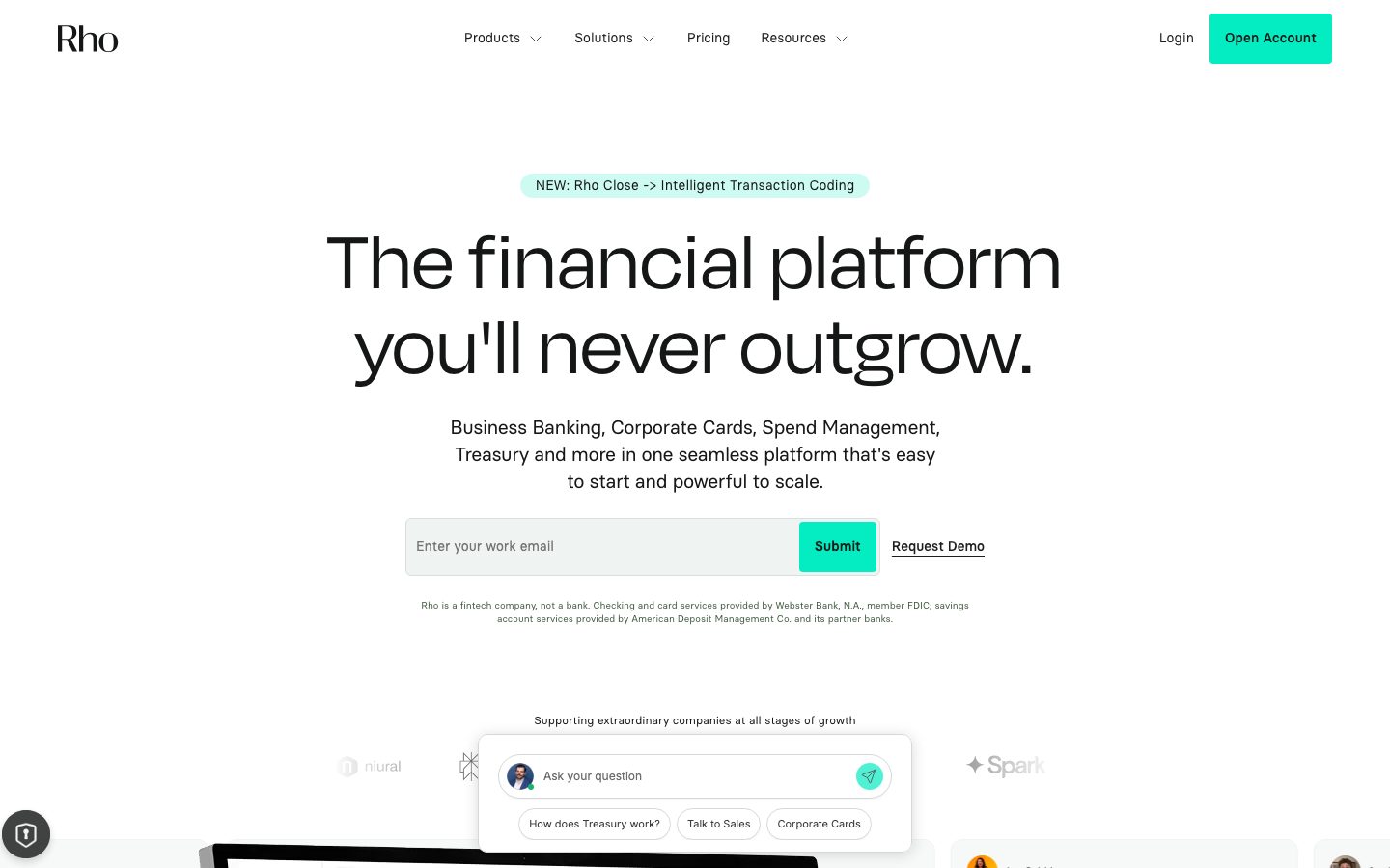
A confident fintech-banking interface built on a bright white canvas with oversized Degular display headlines (88px, near-black ink) and a single bright spring-mint CTA color. The system reads as serious-but-modern financial software — generous whitespace, soft 12px and large 32px card radii, product-UI screenshots shown in-flow, and near-black feature cards that punctuate an otherwise white-and-light-gray page. Brand voltage comes from the giant Degular headline and the saturated mint action color rather than from broad color use.
---
version: alpha
name: Rho-design-analysis
description: A confident fintech-banking interface built on a bright white canvas with oversized Degular display headlines (88px, near-black ink) and a single bright spring-mint CTA color. The system reads as serious-but-modern financial software — generous whitespace, soft 12px and large 32px card radii, product-UI screenshots shown in-flow, and near-black feature cards that punctuate an otherwise white-and-light-gray page. Brand voltage comes from the giant Degular headline and the saturated mint action color rather than from broad color use.

colors:
  primary: "#39efcd"
  ink: "#212529"
  black: "#000000"
  body: "#212529"
  muted: "#747c78"
  muted-soft: "#868e96"
  slate: "#64748b"
  hairline: "#e0e0e0"
  hairline-soft: "#ebebeb"
  canvas: "#ffffff"
  surface-soft: "#f5f5f5"
  surface-mint: "#f6f8f8"
  surface-mint-alt: "#f7f8f8"
  surface-dark: "#151716"
  surface-dark-alt: "#121212"
  on-dark: "#ffffff"
  accent-mint: "#00d4aa"
  accent-green: "#35d28b"
  accent-sage: "#b1ca85"
  accent-aqua: "#aaeee4"
  accent-mint-pale: "#cdfbf2"
  error: "#c91829"

typography:
  display:
    fontFamily: "Degular, Hanken Grotesk, Inter, sans-serif"
    fontSize: 88px
    fontWeight: 400
    lineHeight: 1.0
    letterSpacing: 1.28px
  eyebrow:
    fontFamily: "Degular, Hanken Grotesk, Inter, sans-serif"
    fontSize: 10.75px
    fontWeight: 400
    lineHeight: 1.3
    letterSpacing: 0.8px
  subhead:
    fontFamily: "Basier Circle, Inter, sans-serif"
    fontSize: 8px
    fontWeight: 400
    lineHeight: 1.4
    letterSpacing: normal
  body:
    fontFamily: "Basier Circle, Inter, sans-serif"
    fontSize: 12px
    fontWeight: 400
    lineHeight: 1.25
    letterSpacing: normal
  button:
    fontFamily: "Basier Circle, Inter, sans-serif"
    fontSize: 14px
    fontWeight: 400
    lineHeight: 1.0
    letterSpacing: normal

rounded:
  xs: 4px
  sm: 6px
  md: 8px
  lg: 12px
  xl: 32px
  pill: 100px

spacing:
  xxs: 4px
  xs: 8px
  sm: 12px
  md: 16px
  lg: 24px
  xl: 32px
  xxl: 40px
  huge: 48px
  section: 64px
  section-lg: 90px
  section-xl: 180px

components:
  button-primary:
    backgroundColor: "{colors.primary}"
    textColor: "{colors.ink}"
    typography: "{typography.button}"
    rounded: "{rounded.xs}"
    padding: 12px 24px
  button-text-link:
    backgroundColor: transparent
    textColor: "{colors.ink}"
    typography: "{typography.button}"
  nav-link:
    backgroundColor: transparent
    textColor: "{colors.ink}"
    typography: "{typography.body}"
  top-nav:
    backgroundColor: "{colors.canvas}"
    textColor: "{colors.ink}"
    typography: "{typography.body}"
  hero-band:
    backgroundColor: "{colors.canvas}"
    textColor: "{colors.ink}"
    typography: "{typography.display}"
    padding: 90px
  eyebrow-badge:
    backgroundColor: "{colors.accent-aqua}"
    textColor: "{colors.ink}"
    typography: "{typography.body}"
    rounded: "{rounded.pill}"
    padding: 8px 16px
  email-capture:
    backgroundColor: "{colors.surface-soft}"
    textColor: "{colors.ink}"
    typography: "{typography.body}"
    rounded: "{rounded.md}"
    padding: 8px
  input:
    backgroundColor: "{colors.canvas}"
    textColor: "{colors.ink}"
    typography: "{typography.body}"
    rounded: "{rounded.sm}"
    padding: 12px 16px
  card:
    backgroundColor: "{colors.surface-soft}"
    textColor: "{colors.ink}"
    typography: "{typography.body}"
    rounded: "{rounded.md}"
    padding: 32px
  card-dark:
    backgroundColor: "{colors.surface-dark}"
    textColor: "{colors.on-dark}"
    typography: "{typography.body}"
    rounded: "{rounded.lg}"
    padding: 32px
  feature-card:
    backgroundColor: "{colors.surface-soft}"
    textColor: "{colors.ink}"
    typography: "{typography.body}"
    rounded: "{rounded.lg}"
    padding: 32px
  product-mockup-card:
    backgroundColor: "{colors.canvas}"
    textColor: "{colors.ink}"
    rounded: "{rounded.xl}"
  testimonial-card:
    backgroundColor: "{colors.surface-mint}"
    textColor: "{colors.ink}"
    typography: "{typography.body}"
    rounded: "{rounded.lg}"
    padding: 24px
  chat-widget:
    backgroundColor: "{colors.canvas}"
    textColor: "{colors.ink}"
    typography: "{typography.body}"
    rounded: "{rounded.xl}"
    padding: 16px
  pill-prompt:
    backgroundColor: "{colors.canvas}"
    textColor: "{colors.ink}"
    typography: "{typography.body}"
    rounded: "{rounded.pill}"
    padding: 8px 16px
---

## Overview

Rho's marketing surface is a confident, modern fintech-banking interface — a bright white canvas (`{colors.canvas}` — #ffffff) carrying enormous Degular display headlines (`{typography.display}` — 88px) in near-black ink (`{colors.ink}` — #212529), with a single saturated spring-mint action color (`{colors.primary}` — #39efcd) reserved for CTAs. The page reads as serious financial software that has been deliberately softened: lots of whitespace, large soft-cornered cards, and real product-UI screenshots shown inline rather than abstract illustration.

Type voice splits into two families: **Degular** (a geometric display face) for the giant hero headline and small uppercase eyebrow labels, and **Basier Circle** for body copy, buttons, navigation, and supporting text. The hero headline is the loudest thing on the page — 88px, weight 400, with a touch of positive letter-spacing (1.28px) — and it does the brand-voltage work that a heavy color palette would do elsewhere.

Color voltage is concentrated: the page floor is white with light-gray cards (`{colors.surface-soft}` — #f5f5f5), the only consistently bright color is the mint CTA, and a small set of near-black feature cards (`{colors.surface-dark}` — #151716) punctuates the mid-page to add weight. A family of mint/teal/sage accents (`{colors.accent-mint}`, `{colors.accent-green}`, `{colors.accent-aqua}`, `{colors.accent-sage}`) appears sparingly in badges, product chrome, and small highlights.

**Key Characteristics:**
- Bright white canvas with one dominant action color — the spring-mint CTA (`{colors.primary}` — #39efcd) with dark `{colors.ink}` label text. The "Open Account", "Submit", "Apply Now" and "See Pricing" buttons all use it.
- Oversized Degular display headline (`{typography.display}` — 88px / weight 400 / 1.28px tracking). The headline IS the brand.
- Light-gray card surfaces (`{colors.surface-soft}` — #f5f5f5) for feature cards, with a contrasting set of near-black cards (`{colors.surface-dark}` — #151716) for emphasis bands.
- Product-UI screenshots shown directly in the flow — the dashboard mockup, the floating chat widget, testimonial tiles — rather than marketing illustrations.
- A floating chat/assistant widget (`{component.chat-widget}`) with pill-shaped quick-prompts (`{component.pill-prompt}`) overlaid on the hero/logo band.
- An aqua eyebrow badge (`{component.eyebrow-badge}`, `{colors.accent-aqua}` — #aaeee4) announcing "NEW: Rho Close" above the headline.
- Hierarchical radius: small `{rounded.xs}`/`{rounded.sm}` on buttons and inputs, `{rounded.md}`/`{rounded.lg}` (8–12px) on content cards, and a large `{rounded.xl}` (32px) on product-mockup containers and the chat widget.
- Generous section rhythm — `{spacing.section-lg}` (90px) and occasionally `{spacing.section-xl}` (180px) between major editorial bands.

## Colors

### Brand & Action
- **Primary** (`{colors.primary}` — #39efcd): The single dominant action color — bright spring-mint. Used on every CTA ("Open Account", "Submit", "Apply Now", "See Pricing"). Labels sit in `{colors.ink}`, not white, because the mint is light.
- **Accent Mint** (`{colors.accent-mint}` — #00d4aa): A deeper teal used in product chrome and small icon moments.
- **Accent Green** (`{colors.accent-green}` — #35d28b): A mid green used in product UI / status accents.
- **Accent Sage** (`{colors.accent-sage}` — #b1ca85): A muted olive-green seen in small highlight blocks.
- **Accent Aqua** (`{colors.accent-aqua}` — #aaeee4) / **Accent Mint Pale** (`{colors.accent-mint-pale}` — #cdfbf2): Pale mint fills for the eyebrow badge and soft highlight chips.

### Surface
- **Canvas** (`{colors.canvas}` — #ffffff): The default page floor and the product-mockup card background.
- **Surface Soft** (`{colors.surface-soft}` — #f5f5f5): Light-gray feature cards and the email-capture wrapper.
- **Surface Mint** (`{colors.surface-mint}` — #f6f8f8) / **Surface Mint Alt** (`{colors.surface-mint-alt}` — #f7f8f8): Barely-tinted off-white surfaces for testimonial tiles and soft section dividers.
- **Surface Dark** (`{colors.surface-dark}` — #151716) / **Surface Dark Alt** (`{colors.surface-dark-alt}` — #121212): Near-black emphasis cards ("Set up banking, treasury & cards fast", "Fast implementation, dedicated support") that punctuate the white page.

### Text
- **Ink / Body** (`{colors.ink}` — #212529): All headlines and primary running text.
- **Black** (`{colors.black}` — #000000): Pure black used for the wordmark and some icon strokes.
- **Muted** (`{colors.muted}` — #747c78): Secondary text — sub-headings, captions.
- **Muted Soft** (`{colors.muted-soft}` — #868e96): Tertiary text — fine print, disclaimers.
- **Slate** (`{colors.slate}` — #64748b): A cooler gray used for tertiary UI labels.
- **On Dark** (`{colors.on-dark}` — #ffffff): Text on the near-black feature cards.

### Lines & Semantic
- **Hairline** (`{colors.hairline}` — #e0e0e0) / **Hairline Soft** (`{colors.hairline-soft}` — #ebebeb): 1px borders on inputs, cards, and dividers.
- **Error** (`{colors.error}` — #c91829): The only semantic red captured — validation / error states.

## Typography

### Font Family
The system runs **Degular** for the display headline and small uppercase eyebrow labels, and **Basier Circle** for body copy, buttons, navigation, and supporting text. Degular is a geometric display family; Basier Circle is a humanist-geometric text family. Both are commercial/licensed typefaces — see the substitute note below.

The split is functional:
- Degular (display, weight 400, slightly positive tracking) — the 88px hero headline and ~11px uppercase eyebrows
- Basier Circle (body + UI, weight 400) — paragraphs, buttons, nav, captions

### Hierarchy

| Token | Size | Weight | Line Height | Letter Spacing | Use |
|---|---|---|---|---|---|
| `{typography.display}` | 88px | 400 | 1.0 | 1.28px | Hero/section headlines ("The financial platform you'll never outgrow.") — Degular. Covers both h1 and h2 (measured identical) |
| `{typography.eyebrow}` | 10.75px | 400 | 1.3 | 0.8px | Small uppercase eyebrow / label (h4) — Degular |
| `{typography.subhead}` | 8px | 400 | 1.4 | normal | Minor sub-label (h3) — Basier (measured small; see Known Gaps) |
| `{typography.body}` | 12px | 400 | 1.25 | normal | Running text, nav links, captions — Basier (measured small; see Known Gaps) |
| `{typography.button}` | 14px | 400 | 1.0 | normal | Button labels — Basier |

### Principles
The 88px Degular headline is the brand's loudest gesture — weight stays at 400 (the face is large enough that no extra weight is needed). Body and UI text all run in Basier Circle at weight 400, keeping the supporting layer quiet so the headline and the mint CTA carry the visual energy. Never put body copy in Degular; never set the hero headline in Basier.

### Note on Font Substitutes
Both Degular and Basier Circle are licensed commercial faces and should not be self-hosted without a license. For Degular, **Hanken Grotesk** or **Inter** at weight 400 with slight positive tracking is a usable open-source approximation of the geometric display character. For Basier Circle, **Inter** (or **Manrope**) at weight 400 is a close humanist-geometric substitute for body and UI text. The declared fallback stacks reflect these substitutes.

## Layout

### Spacing System
- **Base unit:** 4px.
- **Tokens:** `{spacing.xxs}` 4px · `{spacing.xs}` 8px · `{spacing.sm}` 12px · `{spacing.md}` 16px · `{spacing.lg}` 24px · `{spacing.xl}` 32px · `{spacing.xxl}` 40px · `{spacing.huge}` 48px · `{spacing.section}` 64px · `{spacing.section-lg}` 90px · `{spacing.section-xl}` 180px.
- **Dominant rhythms:** 16px (`{spacing.md}`) and 8px (`{spacing.xs}`) are by far the most frequent gaps — the fine-grain rhythm inside cards and rows.
- **Section padding:** `{spacing.section-lg}` (90px) between major editorial bands; `{spacing.section-xl}` (180px) for the largest separations.
- **Card internal padding:** `{spacing.xl}` (32px) for feature cards; `{spacing.lg}` (24px) for testimonial tiles.

### Grid & Container
- **Editorial body:** Center-aligned single column for hero (eyebrow badge → headline → sub-head → email capture → disclaimer), all centered on the canvas.
- **Feature card grids:** A 2-up emphasis row (the near-black cards) above a 3-up light-gray feature row ("Eliminate expense admin" / "Pay vendors without friction" / "Close the books faster").
- **Logo / social-proof band:** A horizontal row of partner logos with the floating chat widget overlaid.

### Whitespace Philosophy
Rho uses generous whitespace to make a dense financial product feel calm — the hero is almost entirely air around the 88px headline, and major bands separate at 90–180px. The fine-grain rhythm inside components stays tight (8–16px), so the contrast between big section air and tight card interiors gives the page its modern-SaaS pacing.

## Elevation & Depth

| Level | Treatment | Use |
|---|---|---|
| Flat | No shadow, no border | Body sections, top nav, hero band |
| Card surface | `{colors.surface-soft}` fill — `none` shadow (measured) | Feature cards, email-capture wrapper |
| Soft float | `rgba(0,0,0,0.08) 0px 4px 16px 0px` | Floating chat widget, product-mockup containers |
| Medium float | `rgba(0,0,0,0.15) 0px 2px 15px 0px` | Hovering / overlaid UI tiles |
| Strong float | `rgba(0,0,0,0.2) 0px 4px 8px 0px` | Pop-out prompts, emphasized overlays |
| Dark contrast | `{colors.surface-dark}` fill — color does the elevation work | Near-black emphasis cards |

The elevation philosophy is **soft and modern** — low-alpha drop shadows on floating product UI, flat fills for content cards, and color-block contrast (the near-black cards on a white page) for emphasis. No heavy shadows, no glassmorphism.

### Decorative Depth
- The dashboard product screenshot is shown on a near-white "tilted" stage that fades into the page — the screenshot carries its own internal chrome and shadows.
- The floating chat widget (`{component.chat-widget}`) sits above the logo band with a soft 4/16 shadow, creating a sense of an interactive overlay.

## Shapes

### Border Radius Scale

| Token | Value | Use |
|---|---|---|
| `{rounded.xs}` | 4px | Buttons, small chips (derived for the CTA; see Components) |
| `{rounded.sm}` | 6px | Text inputs |
| `{rounded.md}` | 8px | Standard content cards |
| `{rounded.lg}` | 12px | Larger feature cards, dark emphasis cards (the most frequent radius) |
| `{rounded.xl}` | 32px | Product-mockup containers, chat widget — the marquee soft radius |
| `{rounded.pill}` | 100px | Eyebrow badge, pill quick-prompts |

### Photography Geometry
Testimonial / "Why teams choose Rho" video tiles use rounded corners around 16:9 video stills. Product UI screenshots retain their native chrome inside `{rounded.xl}` containers. The largest captured radius (32px) is reserved for product-mockup and the chat widget — the softest, friendliest shapes on the page.

## Components

### Top Navigation

**`top-nav`** — White nav bar across the top of every page, `{colors.canvas}` background. Carries the "Rho" wordmark at left (in `{colors.black}`), a center menu (Products, Solutions, Pricing, Resources — several with dropdown carets), and a right cluster of a "Login" text-link plus the mint "Open Account" `{component.button-primary}`. Menu items render in `{typography.body}` ink.

**`nav-link`** — Inline nav menu item, transparent background, `{colors.ink}` text, `{typography.body}`.

### Buttons & Links

**`button-primary`** — The signature CTA. Background `{colors.primary}` (#39efcd), label in `{colors.ink}`, type `{typography.button}` (Basier 14px / 400). The button selector measured `radius: 0px` (an artifact — see Known Gaps); the visible buttons carry a small rounded corner, documented here as `{rounded.xs}` (derived from the visible screenshot). Used for "Open Account", "Submit", "Apply Now", "See Pricing".

**`button-text-link`** — Inline text button, no background, `{colors.ink}` label (e.g., "Request Demo" with an underline, "Login").

### Hero

**`hero-band`** — Center-aligned white hero. Stacks: `{component.eyebrow-badge}` → 88px `{typography.display}` headline → centered `{typography.body}` sub-head → `{component.email-capture}` → fine-print disclaimer in `{colors.muted-soft}`. Vertical padding `{spacing.section-lg}` (90px).

**`eyebrow-badge`** — Small pale-aqua pill announcing news ("NEW: Rho Close -> Intelligent Transaction Coding"). Background `{colors.accent-aqua}`, text `{colors.ink}`, type `{typography.body}`, rounded `{rounded.pill}`, padding 8px × 16px.

**`email-capture`** — A light-gray rounded wrapper holding an email input plus a mint "Submit" button. Background `{colors.surface-soft}`, rounded `{rounded.md}`, internal padding `{spacing.xs}` (8px).

### Inputs & Forms

**`input`** — Standard text input ("Enter your work email"). Background `{colors.canvas}`, text `{colors.ink}`, placeholder in `{colors.muted}`, type `{typography.body}`, rounded `{rounded.sm}` (6px, measured), padding 12px × 16px.

### Cards & Containers

**`card`** — The base card. Background `{colors.surface-soft}`, rounded `{rounded.md}` (8px, measured), `none` shadow (measured).

**`feature-card`** — Light-gray feature card used in the 3-up bottom row ("Eliminate expense admin", "Pay vendors without friction", "Close the books faster"). Background `{colors.surface-soft}`, rounded `{rounded.lg}` (12px), padding `{spacing.xl}` (32px). Carries a `{typography.display}`-family-adjacent title and `{typography.body}` description.

**`card-dark`** — Near-black emphasis card used in the 2-up row ("Set up banking, treasury & cards fast", "Fast implementation, dedicated support"). Background `{colors.surface-dark}` (#151716), text `{colors.on-dark}`, rounded `{rounded.lg}`, padding `{spacing.xl}`. The dark surface IS the emphasis signal on the otherwise white page.

**`product-mockup-card`** — A large container showing actual Rho dashboard UI (account balances, charts, transaction tables). Background `{colors.canvas}`, rounded `{rounded.xl}` (32px), soft `rgba(0,0,0,0.08) 0px 4px 16px` float shadow. The marketing shows the product itself, not an illustration of it.

**`testimonial-card`** — Customer-quote / video tile in the "Why teams choose Rho" row. Background `{colors.surface-mint}`, rounded `{rounded.lg}`, padding `{spacing.lg}` (24px). Holds a video still, a short quote in `{typography.body}`, and an attribution line in `{colors.muted}`.

### Overlay Widgets

**`chat-widget`** — A floating assistant card overlaid on the logo band ("Ask your question" with a mint send button). Background `{colors.canvas}`, rounded `{rounded.xl}` (32px), soft float shadow, internal padding `{spacing.md}` (16px).

**`pill-prompt`** — Quick-prompt pills inside the chat widget ("How does Treasury work?", "Talk to Sales", "Corporate Cards"). Background `{colors.canvas}` with hairline border, text `{colors.ink}`, type `{typography.body}`, rounded `{rounded.pill}`, padding 8px × 16px.

## Do's and Don'ts

### Do
- Reserve `{colors.primary}` (#39efcd) for action — every CTA uses the mint, and almost nothing else does.
- Set button labels on the mint CTA in `{colors.ink}`, never white — the mint is too light for white text.
- Use Degular for the giant headline and Basier Circle for everything else. Keep the boundary strict.
- Let the 88px headline carry the band — surround it with air (`{spacing.section-lg}` 90px) rather than adding decoration.
- Use the near-black `{component.card-dark}` sparingly to punctuate an otherwise white-and-gray page.
- Show real product UI inside `{rounded.xl}` (32px) containers rather than drawing marketing illustrations.
- Keep content-card radii hierarchical: `{rounded.md}`/`{rounded.lg}` for cards, `{rounded.xl}` for product/chat surfaces.

### Don't
- Don't spread the mint across large fills — it's an action color, not a surface color.
- Don't increase display weight past 400; the face is large enough to carry on its own.
- Don't put body copy in Degular or headlines in Basier.
- Don't add heavy drop shadows — the system uses low-alpha 4/16 and 2/15 floats only.
- Don't scatter the near-black cards; the dark surface is a scarce emphasis signal.
- Don't document hover states — default and active/pressed only.

## Responsive Behavior

### Breakpoints

| Name | Width | Key Changes |
|---|---|---|
| Mobile | < 768px | Hamburger nav; hero display scales down from 88px; email-capture stacks input above button; feature grids 1-up; dark emphasis cards stack |
| Tablet | 768–1024px | Top nav tightens; feature grids 2-up; product-mockup scales proportionally |
| Desktop | 1024–1440px | Full horizontal nav; 2-up dark cards above 3-up light feature row; centered hero |
| Wide | > 1440px | Same as desktop with more outer breathing room |

### Touch Targets
- `{component.button-primary}` carries 12px × 24px padding; effective tap area meets ~44px with the label height.
- `{component.input}` uses 12px × 16px padding for a comfortable field height.
- `{component.pill-prompt}` chips use 8px × 16px padding; effective tap area is small and should be padded up on touch.

### Collapsing Strategy
- Top nav collapses to a hamburger on mobile; the "Open Account" CTA stays visible.
- The centered hero stack reflows naturally — eyebrow badge, headline, sub-head, email capture, disclaimer.
- The email-capture wrapper splits into a stacked input + full-width submit button on narrow screens.
- The 2-up dark cards and 3-up light feature cards collapse to single column.
- Product-mockup and chat widget scale proportionally; the dashboard screenshot stays legible.

### Image Behavior
- Product UI screenshots retain native aspect ratios; their containers resize.
- Testimonial video stills crop to their rounded tiles at every breakpoint.

## Iteration Guide

1. Focus on ONE component at a time. Reference its YAML key directly (`{component.feature-card}`, `{component.card-dark}`).
2. Variants of an existing component (`-active`, `-disabled`) live as separate entries in `components:`.
3. Use `{token.refs}` everywhere — never inline hex.
4. Never document hover. Default and Active/Pressed states only.
5. The display headline stays Degular 400; body/UI stays Basier 400. The split does not blur.
6. The mint CTA is the only saturated color used at scale — keep it for action.
7. The near-black cards are the page's main contrast move; use them deliberately, not casually.

## Known Gaps

- **Body / sub-head font sizes look under-measured.** The analyzer reported h3 at 8px and body at 12px, and h4 at 10.75px — these are smaller than the rendered screenshots suggest and are likely capture/scaling artifacts. The values in the frontmatter are the measured ground-truth; for production, treat body as roughly 16px and h4/eyebrow as ~13–14px (derived from visual proportion against the measured 88px headline).
- **Button radius measured as 0px.** The `button-primary` selector returned `radius: 0px` and `padding: 0px`, but the visible CTAs have rounded corners and real padding. The documented `{rounded.xs}` radius and 12px × 24px padding are derived from the screenshots.
- **No active/hover/disabled button states were captured.** Press and disabled states for `button-primary` are not in the data and were not invented.
- **Degular and Basier Circle are licensed faces** (not flagged in `fonts_licensed`, but commercial); open-source substitutes are documented in the Typography section.
- **Primary-active / secondary button colors** — accent greens (`{colors.accent-green}` #35d28b, `{colors.accent-mint}` #00d4aa) were observed but their exact role (hover, status, product chrome) could not be confirmed as button states.
- **Pricing-page-specific components** (plan tiers, comparison tables) were captured as a page but no distinct tier-card tokens were extracted; their spec is a gap.
- **Footer** was not captured in the measured component set; its surface, columns, and link styling are unknown.
- **Animation and transition timings** (chat widget reveal, mockup parallax, carousel scrolling in "Why teams choose Rho") are out of scope.

<!-- Documented by duply · real-world design systems as ready-to-use DESIGN.md for AI coding agents · https://duply.ai/rho/design-md -->
Color Palette
Accent
Neutrals
Typography
display88px · 400 · 1
The quick brown fox jumpseyebrow10.75px · 400 · 1.3
The quick brown fox jumpssubhead8px · 400 · 1.4
The quick brown fox jumpsbody12px · 400 · 1.25
The quick brown fox jumpsbutton14px · 400 · 1
The quick brown fox jumpsSpacing & Shape
Spacing
| Name | Value | Preview |
|---|---|---|
| xxs | 4px | |
| xs | 8px | |
| sm | 12px | |
| md | 16px | |
| lg | 24px | |
| xl | 32px | |
| xxl | 40px | |
| huge | 48px | |
| section | 64px | |
| section-lg | 90px | |
| section-xl | 180px |
Border Radius
| Name | Value | Preview |
|---|---|---|
| xs | 4px | |
| sm | 6px | |
| md | 8px | |
| lg | 12px | |
| xl | 32px | |
| pill | 100px |
More like this


---
version: alpha
name: Rho-design-analysis
description: A confident fintech-banking interface built on a bright white canvas with oversized Degular display headlines (88px, near-black ink) and a single bright spring-mint CTA color. The system reads as serious-but-modern financial software — generous whitespace, soft 12px and large 32px card radii, product-UI screenshots shown in-flow, and near-black feature cards that punctuate an otherwise white-and-light-gray page. Brand voltage comes from the giant Degular headline and the saturated mint action color rather than from broad color use.

colors:
  primary: "#39efcd"
  ink: "#212529"
  black: "#000000"
  body: "#212529"
  muted: "#747c78"
  muted-soft: "#868e96"
  slate: "#64748b"
  hairline: "#e0e0e0"
  hairline-soft: "#ebebeb"
  canvas: "#ffffff"
  surface-soft: "#f5f5f5"
  surface-mint: "#f6f8f8"
  surface-mint-alt: "#f7f8f8"
  surface-dark: "#151716"
  surface-dark-alt: "#121212"
  on-dark: "#ffffff"
  accent-mint: "#00d4aa"
  accent-green: "#35d28b"
  accent-sage: "#b1ca85"
  accent-aqua: "#aaeee4"
  accent-mint-pale: "#cdfbf2"
  error: "#c91829"

typography:
  display:
    fontFamily: "Degular, Hanken Grotesk, Inter, sans-serif"
    fontSize: 88px
    fontWeight: 400
    lineHeight: 1.0
    letterSpacing: 1.28px
  eyebrow:
    fontFamily: "Degular, Hanken Grotesk, Inter, sans-serif"
    fontSize: 10.75px
    fontWeight: 400
    lineHeight: 1.3
    letterSpacing: 0.8px
  subhead:
    fontFamily: "Basier Circle, Inter, sans-serif"
    fontSize: 8px
    fontWeight: 400
    lineHeight: 1.4
    letterSpacing: normal
  body:
    fontFamily: "Basier Circle, Inter, sans-serif"
    fontSize: 12px
    fontWeight: 400
    lineHeight: 1.25
    letterSpacing: normal
  button:
    fontFamily: "Basier Circle, Inter, sans-serif"
    fontSize: 14px
    fontWeight: 400
    lineHeight: 1.0
    letterSpacing: normal

rounded:
  xs: 4px
  sm: 6px
  md: 8px
  lg: 12px
  xl: 32px
  pill: 100px

spacing:
  xxs: 4px
  xs: 8px
  sm: 12px
  md: 16px
  lg: 24px
  xl: 32px
  xxl: 40px
  huge: 48px
  section: 64px
  section-lg: 90px
  section-xl: 180px

components:
  button-primary:
    backgroundColor: "{colors.primary}"
    textColor: "{colors.ink}"
    typography: "{typography.button}"
    rounded: "{rounded.xs}"
    padding: 12px 24px
  button-text-link:
    backgroundColor: transparent
    textColor: "{colors.ink}"
    typography: "{typography.button}"
  nav-link:
    backgroundColor: transparent
    textColor: "{colors.ink}"
    typography: "{typography.body}"
  top-nav:
    backgroundColor: "{colors.canvas}"
    textColor: "{colors.ink}"
    typography: "{typography.body}"
  hero-band:
    backgroundColor: "{colors.canvas}"
    textColor: "{colors.ink}"
    typography: "{typography.display}"
    padding: 90px
  eyebrow-badge:
    backgroundColor: "{colors.accent-aqua}"
    textColor: "{colors.ink}"
    typography: "{typography.body}"
    rounded: "{rounded.pill}"
    padding: 8px 16px
  email-capture:
    backgroundColor: "{colors.surface-soft}"
    textColor: "{colors.ink}"
    typography: "{typography.body}"
    rounded: "{rounded.md}"
    padding: 8px
  input:
    backgroundColor: "{colors.canvas}"
    textColor: "{colors.ink}"
    typography: "{typography.body}"
    rounded: "{rounded.sm}"
    padding: 12px 16px
  card:
    backgroundColor: "{colors.surface-soft}"
    textColor: "{colors.ink}"
    typography: "{typography.body}"
    rounded: "{rounded.md}"
    padding: 32px
  card-dark:
    backgroundColor: "{colors.surface-dark}"
    textColor: "{colors.on-dark}"
    typography: "{typography.body}"
    rounded: "{rounded.lg}"
    padding: 32px
  feature-card:
    backgroundColor: "{colors.surface-soft}"
    textColor: "{colors.ink}"
    typography: "{typography.body}"
    rounded: "{rounded.lg}"
    padding: 32px
  product-mockup-card:
    backgroundColor: "{colors.canvas}"
    textColor: "{colors.ink}"
    rounded: "{rounded.xl}"
  testimonial-card:
    backgroundColor: "{colors.surface-mint}"
    textColor: "{colors.ink}"
    typography: "{typography.body}"
    rounded: "{rounded.lg}"
    padding: 24px
  chat-widget:
    backgroundColor: "{colors.canvas}"
    textColor: "{colors.ink}"
    typography: "{typography.body}"
    rounded: "{rounded.xl}"
    padding: 16px
  pill-prompt:
    backgroundColor: "{colors.canvas}"
    textColor: "{colors.ink}"
    typography: "{typography.body}"
    rounded: "{rounded.pill}"
    padding: 8px 16px
---

## Overview

Rho's marketing surface is a confident, modern fintech-banking interface — a bright white canvas (`{colors.canvas}` — #ffffff) carrying enormous Degular display headlines (`{typography.display}` — 88px) in near-black ink (`{colors.ink}` — #212529), with a single saturated spring-mint action color (`{colors.primary}` — #39efcd) reserved for CTAs. The page reads as serious financial software that has been deliberately softened: lots of whitespace, large soft-cornered cards, and real product-UI screenshots shown inline rather than abstract illustration.

Type voice splits into two families: **Degular** (a geometric display face) for the giant hero headline and small uppercase eyebrow labels, and **Basier Circle** for body copy, buttons, navigation, and supporting text. The hero headline is the loudest thing on the page — 88px, weight 400, with a touch of positive letter-spacing (1.28px) — and it does the brand-voltage work that a heavy color palette would do elsewhere.

Color voltage is concentrated: the page floor is white with light-gray cards (`{colors.surface-soft}` — #f5f5f5), the only consistently bright color is the mint CTA, and a small set of near-black feature cards (`{colors.surface-dark}` — #151716) punctuates the mid-page to add weight. A family of mint/teal/sage accents (`{colors.accent-mint}`, `{colors.accent-green}`, `{colors.accent-aqua}`, `{colors.accent-sage}`) appears sparingly in badges, product chrome, and small highlights.

**Key Characteristics:**
- Bright white canvas with one dominant action color — the spring-mint CTA (`{colors.primary}` — #39efcd) with dark `{colors.ink}` label text. The "Open Account", "Submit", "Apply Now" and "See Pricing" buttons all use it.
- Oversized Degular display headline (`{typography.display}` — 88px / weight 400 / 1.28px tracking). The headline IS the brand.
- Light-gray card surfaces (`{colors.surface-soft}` — #f5f5f5) for feature cards, with a contrasting set of near-black cards (`{colors.surface-dark}` — #151716) for emphasis bands.
- Product-UI screenshots shown directly in the flow — the dashboard mockup, the floating chat widget, testimonial tiles — rather than marketing illustrations.
- A floating chat/assistant widget (`{component.chat-widget}`) with pill-shaped quick-prompts (`{component.pill-prompt}`) overlaid on the hero/logo band.
- An aqua eyebrow badge (`{component.eyebrow-badge}`, `{colors.accent-aqua}` — #aaeee4) announcing "NEW: Rho Close" above the headline.
- Hierarchical radius: small `{rounded.xs}`/`{rounded.sm}` on buttons and inputs, `{rounded.md}`/`{rounded.lg}` (8–12px) on content cards, and a large `{rounded.xl}` (32px) on product-mockup containers and the chat widget.
- Generous section rhythm — `{spacing.section-lg}` (90px) and occasionally `{spacing.section-xl}` (180px) between major editorial bands.

## Colors

### Brand & Action
- **Primary** (`{colors.primary}` — #39efcd): The single dominant action color — bright spring-mint. Used on every CTA ("Open Account", "Submit", "Apply Now", "See Pricing"). Labels sit in `{colors.ink}`, not white, because the mint is light.
- **Accent Mint** (`{colors.accent-mint}` — #00d4aa): A deeper teal used in product chrome and small icon moments.
- **Accent Green** (`{colors.accent-green}` — #35d28b): A mid green used in product UI / status accents.
- **Accent Sage** (`{colors.accent-sage}` — #b1ca85): A muted olive-green seen in small highlight blocks.
- **Accent Aqua** (`{colors.accent-aqua}` — #aaeee4) / **Accent Mint Pale** (`{colors.accent-mint-pale}` — #cdfbf2): Pale mint fills for the eyebrow badge and soft highlight chips.

### Surface
- **Canvas** (`{colors.canvas}` — #ffffff): The default page floor and the product-mockup card background.
- **Surface Soft** (`{colors.surface-soft}` — #f5f5f5): Light-gray feature cards and the email-capture wrapper.
- **Surface Mint** (`{colors.surface-mint}` — #f6f8f8) / **Surface Mint Alt** (`{colors.surface-mint-alt}` — #f7f8f8): Barely-tinted off-white surfaces for testimonial tiles and soft section dividers.
- **Surface Dark** (`{colors.surface-dark}` — #151716) / **Surface Dark Alt** (`{colors.surface-dark-alt}` — #121212): Near-black emphasis cards ("Set up banking, treasury & cards fast", "Fast implementation, dedicated support") that punctuate the white page.

### Text
- **Ink / Body** (`{colors.ink}` — #212529): All headlines and primary running text.
- **Black** (`{colors.black}` — #000000): Pure black used for the wordmark and some icon strokes.
- **Muted** (`{colors.muted}` — #747c78): Secondary text — sub-headings, captions.
- **Muted Soft** (`{colors.muted-soft}` — #868e96): Tertiary text — fine print, disclaimers.
- **Slate** (`{colors.slate}` — #64748b): A cooler gray used for tertiary UI labels.
- **On Dark** (`{colors.on-dark}` — #ffffff): Text on the near-black feature cards.

### Lines & Semantic
- **Hairline** (`{colors.hairline}` — #e0e0e0) / **Hairline Soft** (`{colors.hairline-soft}` — #ebebeb): 1px borders on inputs, cards, and dividers.
- **Error** (`{colors.error}` — #c91829): The only semantic red captured — validation / error states.

## Typography

### Font Family
The system runs **Degular** for the display headline and small uppercase eyebrow labels, and **Basier Circle** for body copy, buttons, navigation, and supporting text. Degular is a geometric display family; Basier Circle is a humanist-geometric text family. Both are commercial/licensed typefaces — see the substitute note below.

The split is functional:
- Degular (display, weight 400, slightly positive tracking) — the 88px hero headline and ~11px uppercase eyebrows
- Basier Circle (body + UI, weight 400) — paragraphs, buttons, nav, captions

### Hierarchy

| Token | Size | Weight | Line Height | Letter Spacing | Use |
|---|---|---|---|---|---|
| `{typography.display}` | 88px | 400 | 1.0 | 1.28px | Hero/section headlines ("The financial platform you'll never outgrow.") — Degular. Covers both h1 and h2 (measured identical) |
| `{typography.eyebrow}` | 10.75px | 400 | 1.3 | 0.8px | Small uppercase eyebrow / label (h4) — Degular |
| `{typography.subhead}` | 8px | 400 | 1.4 | normal | Minor sub-label (h3) — Basier (measured small; see Known Gaps) |
| `{typography.body}` | 12px | 400 | 1.25 | normal | Running text, nav links, captions — Basier (measured small; see Known Gaps) |
| `{typography.button}` | 14px | 400 | 1.0 | normal | Button labels — Basier |

### Principles
The 88px Degular headline is the brand's loudest gesture — weight stays at 400 (the face is large enough that no extra weight is needed). Body and UI text all run in Basier Circle at weight 400, keeping the supporting layer quiet so the headline and the mint CTA carry the visual energy. Never put body copy in Degular; never set the hero headline in Basier.

### Note on Font Substitutes
Both Degular and Basier Circle are licensed commercial faces and should not be self-hosted without a license. For Degular, **Hanken Grotesk** or **Inter** at weight 400 with slight positive tracking is a usable open-source approximation of the geometric display character. For Basier Circle, **Inter** (or **Manrope**) at weight 400 is a close humanist-geometric substitute for body and UI text. The declared fallback stacks reflect these substitutes.

## Layout

### Spacing System
- **Base unit:** 4px.
- **Tokens:** `{spacing.xxs}` 4px · `{spacing.xs}` 8px · `{spacing.sm}` 12px · `{spacing.md}` 16px · `{spacing.lg}` 24px · `{spacing.xl}` 32px · `{spacing.xxl}` 40px · `{spacing.huge}` 48px · `{spacing.section}` 64px · `{spacing.section-lg}` 90px · `{spacing.section-xl}` 180px.
- **Dominant rhythms:** 16px (`{spacing.md}`) and 8px (`{spacing.xs}`) are by far the most frequent gaps — the fine-grain rhythm inside cards and rows.
- **Section padding:** `{spacing.section-lg}` (90px) between major editorial bands; `{spacing.section-xl}` (180px) for the largest separations.
- **Card internal padding:** `{spacing.xl}` (32px) for feature cards; `{spacing.lg}` (24px) for testimonial tiles.

### Grid & Container
- **Editorial body:** Center-aligned single column for hero (eyebrow badge → headline → sub-head → email capture → disclaimer), all centered on the canvas.
- **Feature card grids:** A 2-up emphasis row (the near-black cards) above a 3-up light-gray feature row ("Eliminate expense admin" / "Pay vendors without friction" / "Close the books faster").
- **Logo / social-proof band:** A horizontal row of partner logos with the floating chat widget overlaid.

### Whitespace Philosophy
Rho uses generous whitespace to make a dense financial product feel calm — the hero is almost entirely air around the 88px headline, and major bands separate at 90–180px. The fine-grain rhythm inside components stays tight (8–16px), so the contrast between big section air and tight card interiors gives the page its modern-SaaS pacing.

## Elevation & Depth

| Level | Treatment | Use |
|---|---|---|
| Flat | No shadow, no border | Body sections, top nav, hero band |
| Card surface | `{colors.surface-soft}` fill — `none` shadow (measured) | Feature cards, email-capture wrapper |
| Soft float | `rgba(0,0,0,0.08) 0px 4px 16px 0px` | Floating chat widget, product-mockup containers |
| Medium float | `rgba(0,0,0,0.15) 0px 2px 15px 0px` | Hovering / overlaid UI tiles |
| Strong float | `rgba(0,0,0,0.2) 0px 4px 8px 0px` | Pop-out prompts, emphasized overlays |
| Dark contrast | `{colors.surface-dark}` fill — color does the elevation work | Near-black emphasis cards |

The elevation philosophy is **soft and modern** — low-alpha drop shadows on floating product UI, flat fills for content cards, and color-block contrast (the near-black cards on a white page) for emphasis. No heavy shadows, no glassmorphism.

### Decorative Depth
- The dashboard product screenshot is shown on a near-white "tilted" stage that fades into the page — the screenshot carries its own internal chrome and shadows.
- The floating chat widget (`{component.chat-widget}`) sits above the logo band with a soft 4/16 shadow, creating a sense of an interactive overlay.

## Shapes

### Border Radius Scale

| Token | Value | Use |
|---|---|---|
| `{rounded.xs}` | 4px | Buttons, small chips (derived for the CTA; see Components) |
| `{rounded.sm}` | 6px | Text inputs |
| `{rounded.md}` | 8px | Standard content cards |
| `{rounded.lg}` | 12px | Larger feature cards, dark emphasis cards (the most frequent radius) |
| `{rounded.xl}` | 32px | Product-mockup containers, chat widget — the marquee soft radius |
| `{rounded.pill}` | 100px | Eyebrow badge, pill quick-prompts |

### Photography Geometry
Testimonial / "Why teams choose Rho" video tiles use rounded corners around 16:9 video stills. Product UI screenshots retain their native chrome inside `{rounded.xl}` containers. The largest captured radius (32px) is reserved for product-mockup and the chat widget — the softest, friendliest shapes on the page.

## Components

### Top Navigation

**`top-nav`** — White nav bar across the top of every page, `{colors.canvas}` background. Carries the "Rho" wordmark at left (in `{colors.black}`), a center menu (Products, Solutions, Pricing, Resources — several with dropdown carets), and a right cluster of a "Login" text-link plus the mint "Open Account" `{component.button-primary}`. Menu items render in `{typography.body}` ink.

**`nav-link`** — Inline nav menu item, transparent background, `{colors.ink}` text, `{typography.body}`.

### Buttons & Links

**`button-primary`** — The signature CTA. Background `{colors.primary}` (#39efcd), label in `{colors.ink}`, type `{typography.button}` (Basier 14px / 400). The button selector measured `radius: 0px` (an artifact — see Known Gaps); the visible buttons carry a small rounded corner, documented here as `{rounded.xs}` (derived from the visible screenshot). Used for "Open Account", "Submit", "Apply Now", "See Pricing".

**`button-text-link`** — Inline text button, no background, `{colors.ink}` label (e.g., "Request Demo" with an underline, "Login").

### Hero

**`hero-band`** — Center-aligned white hero. Stacks: `{component.eyebrow-badge}` → 88px `{typography.display}` headline → centered `{typography.body}` sub-head → `{component.email-capture}` → fine-print disclaimer in `{colors.muted-soft}`. Vertical padding `{spacing.section-lg}` (90px).

**`eyebrow-badge`** — Small pale-aqua pill announcing news ("NEW: Rho Close -> Intelligent Transaction Coding"). Background `{colors.accent-aqua}`, text `{colors.ink}`, type `{typography.body}`, rounded `{rounded.pill}`, padding 8px × 16px.

**`email-capture`** — A light-gray rounded wrapper holding an email input plus a mint "Submit" button. Background `{colors.surface-soft}`, rounded `{rounded.md}`, internal padding `{spacing.xs}` (8px).

### Inputs & Forms

**`input`** — Standard text input ("Enter your work email"). Background `{colors.canvas}`, text `{colors.ink}`, placeholder in `{colors.muted}`, type `{typography.body}`, rounded `{rounded.sm}` (6px, measured), padding 12px × 16px.

### Cards & Containers

**`card`** — The base card. Background `{colors.surface-soft}`, rounded `{rounded.md}` (8px, measured), `none` shadow (measured).

**`feature-card`** — Light-gray feature card used in the 3-up bottom row ("Eliminate expense admin", "Pay vendors without friction", "Close the books faster"). Background `{colors.surface-soft}`, rounded `{rounded.lg}` (12px), padding `{spacing.xl}` (32px). Carries a `{typography.display}`-family-adjacent title and `{typography.body}` description.

**`card-dark`** — Near-black emphasis card used in the 2-up row ("Set up banking, treasury & cards fast", "Fast implementation, dedicated support"). Background `{colors.surface-dark}` (#151716), text `{colors.on-dark}`, rounded `{rounded.lg}`, padding `{spacing.xl}`. The dark surface IS the emphasis signal on the otherwise white page.

**`product-mockup-card`** — A large container showing actual Rho dashboard UI (account balances, charts, transaction tables). Background `{colors.canvas}`, rounded `{rounded.xl}` (32px), soft `rgba(0,0,0,0.08) 0px 4px 16px` float shadow. The marketing shows the product itself, not an illustration of it.

**`testimonial-card`** — Customer-quote / video tile in the "Why teams choose Rho" row. Background `{colors.surface-mint}`, rounded `{rounded.lg}`, padding `{spacing.lg}` (24px). Holds a video still, a short quote in `{typography.body}`, and an attribution line in `{colors.muted}`.

### Overlay Widgets

**`chat-widget`** — A floating assistant card overlaid on the logo band ("Ask your question" with a mint send button). Background `{colors.canvas}`, rounded `{rounded.xl}` (32px), soft float shadow, internal padding `{spacing.md}` (16px).

**`pill-prompt`** — Quick-prompt pills inside the chat widget ("How does Treasury work?", "Talk to Sales", "Corporate Cards"). Background `{colors.canvas}` with hairline border, text `{colors.ink}`, type `{typography.body}`, rounded `{rounded.pill}`, padding 8px × 16px.

## Do's and Don'ts

### Do
- Reserve `{colors.primary}` (#39efcd) for action — every CTA uses the mint, and almost nothing else does.
- Set button labels on the mint CTA in `{colors.ink}`, never white — the mint is too light for white text.
- Use Degular for the giant headline and Basier Circle for everything else. Keep the boundary strict.
- Let the 88px headline carry the band — surround it with air (`{spacing.section-lg}` 90px) rather than adding decoration.
- Use the near-black `{component.card-dark}` sparingly to punctuate an otherwise white-and-gray page.
- Show real product UI inside `{rounded.xl}` (32px) containers rather than drawing marketing illustrations.
- Keep content-card radii hierarchical: `{rounded.md}`/`{rounded.lg}` for cards, `{rounded.xl}` for product/chat surfaces.

### Don't
- Don't spread the mint across large fills — it's an action color, not a surface color.
- Don't increase display weight past 400; the face is large enough to carry on its own.
- Don't put body copy in Degular or headlines in Basier.
- Don't add heavy drop shadows — the system uses low-alpha 4/16 and 2/15 floats only.
- Don't scatter the near-black cards; the dark surface is a scarce emphasis signal.
- Don't document hover states — default and active/pressed only.

## Responsive Behavior

### Breakpoints

| Name | Width | Key Changes |
|---|---|---|
| Mobile | < 768px | Hamburger nav; hero display scales down from 88px; email-capture stacks input above button; feature grids 1-up; dark emphasis cards stack |
| Tablet | 768–1024px | Top nav tightens; feature grids 2-up; product-mockup scales proportionally |
| Desktop | 1024–1440px | Full horizontal nav; 2-up dark cards above 3-up light feature row; centered hero |
| Wide | > 1440px | Same as desktop with more outer breathing room |

### Touch Targets
- `{component.button-primary}` carries 12px × 24px padding; effective tap area meets ~44px with the label height.
- `{component.input}` uses 12px × 16px padding for a comfortable field height.
- `{component.pill-prompt}` chips use 8px × 16px padding; effective tap area is small and should be padded up on touch.

### Collapsing Strategy
- Top nav collapses to a hamburger on mobile; the "Open Account" CTA stays visible.
- The centered hero stack reflows naturally — eyebrow badge, headline, sub-head, email capture, disclaimer.
- The email-capture wrapper splits into a stacked input + full-width submit button on narrow screens.
- The 2-up dark cards and 3-up light feature cards collapse to single column.
- Product-mockup and chat widget scale proportionally; the dashboard screenshot stays legible.

### Image Behavior
- Product UI screenshots retain native aspect ratios; their containers resize.
- Testimonial video stills crop to their rounded tiles at every breakpoint.

## Iteration Guide

1. Focus on ONE component at a time. Reference its YAML key directly (`{component.feature-card}`, `{component.card-dark}`).
2. Variants of an existing component (`-active`, `-disabled`) live as separate entries in `components:`.
3. Use `{token.refs}` everywhere — never inline hex.
4. Never document hover. Default and Active/Pressed states only.
5. The display headline stays Degular 400; body/UI stays Basier 400. The split does not blur.
6. The mint CTA is the only saturated color used at scale — keep it for action.
7. The near-black cards are the page's main contrast move; use them deliberately, not casually.

## Known Gaps

- **Body / sub-head font sizes look under-measured.** The analyzer reported h3 at 8px and body at 12px, and h4 at 10.75px — these are smaller than the rendered screenshots suggest and are likely capture/scaling artifacts. The values in the frontmatter are the measured ground-truth; for production, treat body as roughly 16px and h4/eyebrow as ~13–14px (derived from visual proportion against the measured 88px headline).
- **Button radius measured as 0px.** The `button-primary` selector returned `radius: 0px` and `padding: 0px`, but the visible CTAs have rounded corners and real padding. The documented `{rounded.xs}` radius and 12px × 24px padding are derived from the screenshots.
- **No active/hover/disabled button states were captured.** Press and disabled states for `button-primary` are not in the data and were not invented.
- **Degular and Basier Circle are licensed faces** (not flagged in `fonts_licensed`, but commercial); open-source substitutes are documented in the Typography section.
- **Primary-active / secondary button colors** — accent greens (`{colors.accent-green}` #35d28b, `{colors.accent-mint}` #00d4aa) were observed but their exact role (hover, status, product chrome) could not be confirmed as button states.
- **Pricing-page-specific components** (plan tiers, comparison tables) were captured as a page but no distinct tier-card tokens were extracted; their spec is a gap.
- **Footer** was not captured in the measured component set; its surface, columns, and link styling are unknown.
- **Animation and transition timings** (chat widget reveal, mockup parallax, carousel scrolling in "Why teams choose Rho") are out of scope.

<!-- Documented by duply · real-world design systems as ready-to-use DESIGN.md for AI coding agents · https://duply.ai/rho/design-md -->