MovingParts
A bold, Swiss-grotesque developer-tool marketing surface built on white canvas with near-black ink, oversized 110px display headlines, and razor-sharp zero-radius buttons, cards and inputs. The system reads as confident and engineering-first — huge condensed-feeling headlines, a high-contrast black product section, embedded iOS/SwiftUI device mockups as content, and small chromatic accents (electric green, violet, pink) drawn from product swatches and syntax-highlighted code. Brand voltage comes from scale and contrast rather than decoration.
---
version: alpha
name: MovingParts-design-analysis
description: A bold, Swiss-grotesque developer-tool marketing surface built on white canvas with near-black ink, oversized 110px display headlines, and razor-sharp zero-radius buttons, cards and inputs. The system reads as confident and engineering-first — huge condensed-feeling headlines, a high-contrast black product section, embedded iOS/SwiftUI device mockups as content, and small chromatic accents (electric green, violet, pink) drawn from product swatches and syntax-highlighted code. Brand voltage comes from scale and contrast rather than decoration.
colors:
ink: "#121212"
link: "#000000"
on-primary: "#ffffff"
canvas: "#ffffff"
surface-dark: "#191919"
surface-input: "#fcfcfc"
surface-soft: "#f5f5f5"
surface-soft-alt: "#f4f4f4"
hairline: "#efefef"
hairline-strong: "#e1e1e1"
divider: "#e8e8e8"
neutral-300: "#cfcfcf"
neutral-350: "#cccccc"
neutral-400: "#c5c5c5"
neutral-450: "#d3d3d3"
muted: "#999999"
muted-strong: "#808080"
accent-pink: "#dd4a68"
accent-green: "#00ffa6"
accent-violet: "#9c66ff"
accent-brown: "#9a6e3a"
typography:
h2:
fontFamily: "Unica77, Helvetica Neue, Arial, sans-serif"
fontSize: 110px
fontWeight: 700
lineHeight: 0.95
letterSpacing: -4.4px
body:
fontFamily: "Unica77, Helvetica Neue, Arial, sans-serif"
fontSize: 40px
fontWeight: 400
lineHeight: 1.27
letterSpacing: -0.2px
h3:
fontFamily: "Unica77, Helvetica Neue, Arial, sans-serif"
fontSize: 26.67px
fontWeight: 600
lineHeight: 1.47
letterSpacing: 1.07px
button:
fontFamily: "Unica77, Helvetica Neue, Arial, sans-serif"
fontSize: 28px
fontWeight: 600
lineHeight: 0.95
letterSpacing: normal
rounded:
none: 0px
xs: 2px
sm: 14px
md: 16px
lg: 18px
xl: 24px
2xl: 35px
round: 50px
device-sm: 77px
device-md: 90px
device-lg: 106px
spacing:
xxs: 4px
xs: 5px
sm: 12px
md: 16px
lg: 18px
xl: 20px
xxl: 21px
xxxl: 24px
components:
top-nav:
backgroundColor: "{colors.canvas}"
textColor: "{colors.link}"
typography: "{typography.h3}"
nav-link:
backgroundColor: transparent
textColor: "{colors.link}"
typography: "{typography.h3}"
hero-heading:
backgroundColor: transparent
textColor: "{colors.ink}"
typography: "{typography.h2}"
lead-paragraph:
backgroundColor: transparent
textColor: "{colors.ink}"
typography: "{typography.body}"
button-primary:
textColor: "{colors.on-primary}"
typography: "{typography.button}"
rounded: "{rounded.none}"
padding: 25px 30px
card:
backgroundColor: "{colors.canvas}"
rounded: "{rounded.none}"
input:
backgroundColor: "{colors.surface-input}"
textColor: "{colors.ink}"
typography: "{typography.h3}"
rounded: "{rounded.none}"
dark-section:
backgroundColor: "{colors.surface-dark}"
textColor: "{colors.on-primary}"
typography: "{typography.body}"
code-card:
backgroundColor: "{colors.surface-dark}"
textColor: "{colors.muted}"
typography: "{typography.h3}"
rounded: "{rounded.md}"
feature-column:
backgroundColor: transparent
textColor: "{colors.muted}"
typography: "{typography.h3}"
device-mockup:
backgroundColor: "{colors.canvas}"
rounded: "{rounded.device-lg}"
annotation-label:
textColor: "{colors.on-primary}"
typography: "{typography.h3}"
rounded: "{rounded.xs}"
---
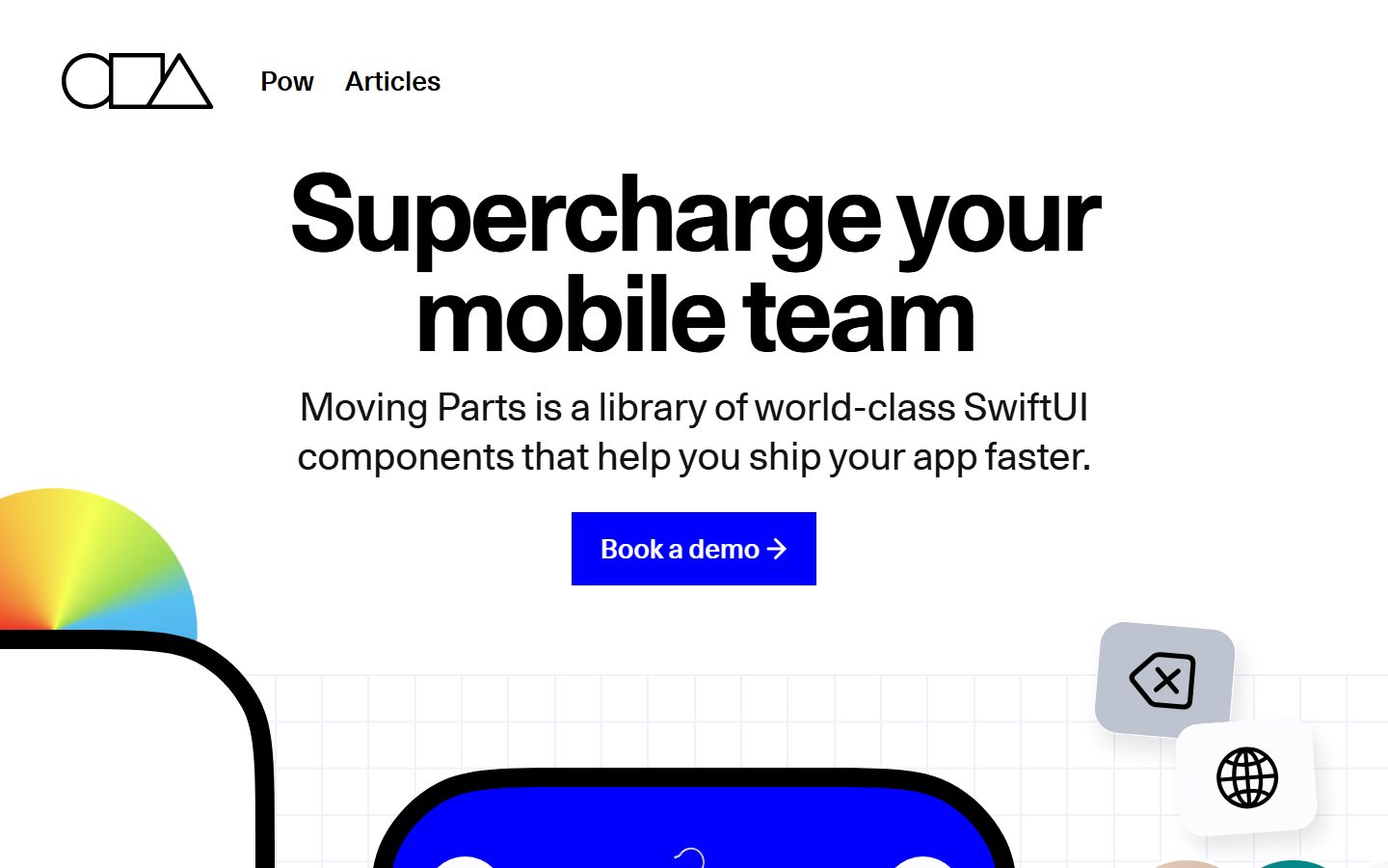
## Overview
Moving Parts' landing page is a bold, engineering-first marketing surface in the Swiss-grotesque tradition: a white canvas (`{colors.canvas}` — #ffffff) carrying enormous near-black headlines (`{colors.ink}` — #121212) and razor-sharp, zero-radius interactive elements. The page sells a SwiftUI component library, and it does so by showing the actual product — iOS app mockups, a shopping UI, a code editor panel — embedded directly into the editorial flow rather than illustrated around it.
The type voice is a single family — **Unica77** — used at four very distinct scales. The marquee headline runs at 110px / weight 700 with aggressive -4.4px tracking (`{typography.h2}`), the lead paragraph at a large 40px / weight 400 (`{typography.body}`), and small labels / nav items at ~26.67px / weight 600 with positive tracking (`{typography.h3}`). There is no secondary typeface — hierarchy is carried entirely by size, weight and tracking within one grotesque.
The signature structural move is **sharpness**: buttons, cards and inputs all measured `0px` border-radius. Against those hard edges, the only soft corners belong to the embedded iOS device mockups, which carry very large radii (measured up to 106px) to read as real phone hardware. The system alternates white editorial bands with a single high-contrast near-black band (`{colors.surface-dark}` — #191919) that holds the "Import engineering excellence" message and a dark code-editor card.
Color is otherwise scarce and almost entirely monochrome. Small chromatic accents — electric green (`{colors.accent-green}` — #00ffa6), violet (`{colors.accent-violet}` — #9c66ff), pink (`{colors.accent-pink}` — #dd4a68), brown-gold (`{colors.accent-brown}` — #9a6e3a) — appear inside product UI (color swatches) and in the syntax-highlighted code panel, never as page chrome.
**Key Characteristics:**
- White canvas, near-black ink, monochrome by default. Color appears only inside product/code artifacts.
- Oversized display headline at 110px / 700 / -4.4px tracking — the single loudest element on the page.
- Zero-radius (`{rounded.none}`) buttons, cards and inputs — hard Swiss edges are the brand's structural signature.
- One typeface (Unica77) at four scales — no display/body family split.
- Embedded iOS device mockups carry large hardware radii (`{rounded.device-lg}` — 106px) and are shown as content, with blue annotation labels naming the underlying SwiftUI components.
- A single near-black band (`{colors.surface-dark}` — #191919) interrupts the white page and hosts a dark code-editor card.
- Generous, irregular spacing rhythm clustered around the 16–24px range.
## Colors
### Brand & Ink
- **Ink** (`{colors.ink}` — #121212): All large display headlines and lead copy.
- **Link** (`{colors.link}` — #000000): Pure-black nav items and inline links (the system keeps links monochrome).
- **On Primary** (`{colors.on-primary}` — #ffffff): Text on the filled primary button and on the dark band.
### Surface
- **Canvas** (`{colors.canvas}` — #ffffff): The default page floor.
- **Surface Dark** (`{colors.surface-dark}` — #191919): The single near-black band ("Import engineering excellence") and the embedded code-editor card.
- **Surface Input** (`{colors.surface-input}` — #fcfcfc): Text-input fill — a barely-off-white.
- **Surface Soft** (`{colors.surface-soft}` — #f5f5f5) and **Surface Soft Alt** (`{colors.surface-soft-alt}` — #f4f4f4): Faint panel / background tints behind cards and grid artwork.
- **Hairline** (`{colors.hairline}` — #efefef), **Hairline Strong** (`{colors.hairline-strong}` — #e1e1e1), **Divider** (`{colors.divider}` — #e8e8e8): The light-on-light separator tones (the faint grid lines behind the hero and section edges).
- **Neutral scale** (`{colors.neutral-300}` #cfcfcf · `{colors.neutral-350}` #cccccc · `{colors.neutral-400}` #c5c5c5 · `{colors.neutral-450}` #d3d3d3): Mid-light greys used inside product UI fragments and disabled controls.
### Text Secondary
- **Muted** (`{colors.muted}` — #999999): The most frequent secondary tone — body copy in the dark band, code-panel base text, captions.
- **Muted Strong** (`{colors.muted-strong}` — #808080): A slightly heavier grey for tertiary labels.
### Accent (product / code only)
- **Accent Green** (`{colors.accent-green}` — #00ffa6): Product color swatches and toggles inside the iOS mockups.
- **Accent Violet** (`{colors.accent-violet}` — #9c66ff): Product color swatches.
- **Accent Pink** (`{colors.accent-pink}` — #dd4a68): Syntax highlighting in the code-editor card and a swatch tone.
- **Accent Brown** (`{colors.accent-brown}` — #9a6e3a): Syntax highlighting (string/constant) in the code-editor card.
These accents are deliberately confined to artifacts. The page chrome — nav, buttons, headings — stays monochrome.
## Typography
### Font Family
The entire system runs on **Unica77**, a neo-grotesque sans in the Helvetica/Akzidenz lineage. There is no second family — the design relies on dramatic size and weight steps within one face to create hierarchy. The fallback stack walks `Helvetica Neue, Arial, sans-serif`.
### Hierarchy
| Token | Size | Weight | Line Height | Letter Spacing | Use |
|---|---|---|---|---|---|
| `{typography.h2}` | 110px | 700 | 0.95 | -4.4px | The marquee headline ("Supercharge your mobile team") and section heads ("Import engineering excellence", "Compose anything mobile") |
| `{typography.body}` | 40px | 400 | 1.27 | -0.2px | Lead / subhead paragraph ("Moving Parts is a library of world-class SwiftUI components…") |
| `{typography.h3}` | 26.67px | 600 | 1.47 | 1.07px | Nav items, small labels, eyebrow text, annotation labels, secondary UI text |
| `{typography.button}` | 28px | 600 | 0.95 | normal | Primary button label ("Book a demo →") |
### Principles
Hierarchy is driven by extreme scale contrast: the 110px headline against the 40px lead and ~27px labels creates a clear three-step ladder within a single typeface. Display sizes use tight negative tracking (-4.4px on h2, -0.2px on body) for a dense, confident set; the smaller `{typography.h3}` flips to *positive* tracking (1.07px), which gives nav items and labels an open, slightly technical feel. Keep display weight at 700 and label weight at 600 — the contrast between them is part of the voice.
### Note on Font Substitutes
**Unica77** is a commercially licensed typeface (Lineto) and should not be assumed available as a free web font. Where it cannot be licensed, **Helvetica Neue** or open-source **Inter** / **Roboto** at matching weights reproduce the neo-grotesque character; preserve the aggressive negative tracking on the display sizes and the positive tracking on `{typography.h3}` to keep the signature.
## Layout
### Spacing System
- **Base rhythm:** measured spacing clusters in the 16–24px range with smaller 4–12px increments for tight internal gaps.
- **Tokens:** `{spacing.xxs}` 4px · `{spacing.xs}` 5px · `{spacing.sm}` 12px · `{spacing.md}` 16px · `{spacing.lg}` 18px · `{spacing.xl}` 20px · `{spacing.xxl}` 21px · `{spacing.xxxl}` 24px.
- The two most frequent measured values were 5px and 21px — fine internal gaps (5px) inside UI fragments and a ~21px content rhythm between stacked text blocks. Intermediate values (22px, 23px) were also observed and round into this scale.
### Grid & Container
- Hero is center-aligned at large scale: logo + minimal nav at top-left, then a centered headline / lead / button stack.
- Lower bands shift to multi-column feature rows (three text columns under both the dark band and the "Compose anything mobile" band).
- Device mockups float against soft background panels, frequently bleeding off the canvas edges.
- Large vertical scroll height with major bands separated by full-bleed background color changes (white → near-black → light panel → white).
### Whitespace Philosophy
The page is generous and editorial — the oversized headline owns the upper viewport, and product artifacts get room to breathe. Whitespace is used to let the 110px headline dominate without competing chrome.
## Elevation & Depth
| Level | Treatment | Use |
|---|---|---|
| Flat | No shadow, hard edges | Buttons, cards, inputs (all measured `0px` radius, `none` shadow) |
| Soft float | `rgba(0,0,0,0.1) 7.5px 14.17px 21.67px` | Floating product UI fragments / small cards near the hero |
| Medium float | `rgba(0,0,0,0.15) 15.83px 20.83px 21.67px` and `rgba(0,0,0,0.25) 4.17px 4.17px 16.67px` | Elevated device-adjacent panels |
| Strong drop | `rgba(0,0,0,0.3) 15px 20px 30px` | The most-lifted artifacts (device mockups casting onto the canvas) |
| Focus ring | `rgb(0,0,0) 0px 0px 0px 3.75px` | A solid 3.75px black outline — a focus / selected state on controls |
Shadows are large-offset and diffuse, used to make embedded product UI literally float above the white canvas. The base `{component.card}` itself is flat with no shadow — depth is reserved for the floating mockups, not for editorial cards.
## Shapes
### Border Radius Scale
| Token | Value | Use |
|---|---|---|
| `{rounded.none}` | 0px | Buttons, cards, inputs — the Swiss-sharp default |
| `{rounded.xs}` | 2px | Small annotation labels, fine UI chips |
| `{rounded.sm}` | 14px | Small product UI cards / tiles |
| `{rounded.md}` | 16px | Code-editor card, mid-size panels |
| `{rounded.lg}` | 18px | Rounded product UI containers |
| `{rounded.xl}` | 24px | Larger product cards |
| `{rounded.2xl}` | 35px | Soft background panels behind device mockups |
| `{rounded.round}` | 50px | Circular controls / swatches |
| `{rounded.device-sm}` | 77px | Inner device screen corners |
| `{rounded.device-md}` | 90px | Device frame corners |
| `{rounded.device-lg}` | 106px | Largest device-hardware corner radius |
The defining contrast is sharp page chrome (0px) versus heavily rounded device hardware (77–106px). The big radii belong almost entirely to the iOS mockups, which need to read as physical phones.
### Photography & Artwork Geometry
Product imagery sits inside the rounded device frames (`{rounded.device-md}`/`{rounded.device-lg}`); a rainbow/gradient color-wheel motif and a faint grid pattern decorate the hero background. Marketing cards themselves remain hard-edged.
## Components
### Navigation
**`top-nav`** — Minimal top bar on `{colors.canvas}`: the geometric circle-square-triangle logomark at left, followed by two text links ("Pow", "Articles"). Links use `{component.nav-link}` styling — `{colors.link}` (pure black) text in `{typography.h3}`. No background fill, no border, no shadow.
### Headline & Copy
**`hero-heading`** — The marquee display text in `{typography.h2}` (110px / 700 / -4.4px), `{colors.ink}`. Center-aligned in the hero; reused at large scale for section heads.
**`lead-paragraph`** — Sub-headline / lead copy in `{typography.body}` (40px / 400), `{colors.ink}` on light bands or `{colors.muted}` on the dark band.
### Buttons
**`button-primary`** — The filled CTA ("Book a demo →"). Label is `{colors.on-primary}` (#ffffff) in `{typography.button}` (28px / 600), padding 25px × 30px, radius `{rounded.none}` (hard rectangle). The fill background was not captured by the analyzer (see Known Gaps) — in the reference screenshots it renders as a saturated blue.
### Cards & Containers
**`card`** — The base editorial card: `{colors.canvas}` background, radius `{rounded.none}`, no shadow. Hard-edged and flat by default.
**`code-card`** — The dark code-editor panel in the "Import engineering excellence" band. Background `{colors.surface-dark}` (#191919), base text `{colors.muted}`, rounded `{rounded.md}` (16px, derived — the editor panel reads as softly rounded against the otherwise sharp system). Syntax highlighting uses `{colors.accent-pink}` and `{colors.accent-brown}`.
**`dark-section`** — The full-bleed near-black band. Background `{colors.surface-dark}`, text `{colors.on-primary}` for the heading and `{colors.muted}` for body copy, set in `{typography.body}` / `{typography.h3}`. The only inverted region on the page.
**`feature-column`** — Small three-up text columns beneath the dark band and the "Compose anything mobile" band. Transparent background, `{colors.muted}` body text, `{typography.h3}` for the bold mini-heading.
**`device-mockup`** — Embedded iOS app frames (shopping UI, bicycle product page) shown as content. Background `{colors.canvas}`, large hardware corners `{rounded.device-lg}` (106px), lifted off the canvas with the strong drop shadow (`rgba(0,0,0,0.3) 15px 20px 30px`). Product swatches inside use the accent palette (`{colors.accent-green}`, `{colors.accent-violet}`, `{colors.accent-pink}`).
**`annotation-label`** — Small floating tags naming SwiftUI components ("AsyncMedia", "ImagePager", "Markdown", "SingleChoice", "Offer"). Text `{colors.on-primary}` in `{typography.h3}`, radius `{rounded.xs}` (2px). The fill background was not captured (see Known Gaps); it renders blue in the screenshots.
### Inputs
**`input`** — Text field with `{colors.surface-input}` (#fcfcfc) fill, `{colors.ink}` text in `{typography.h3}`, radius `{rounded.none}` (hard rectangle). Appears in the embedded checkout/credit-card UI fragments.
## Do's and Don'ts
### Do
- Keep buttons, cards and inputs at `{rounded.none}` — the hard edge is the brand's structural signature.
- Let the 110px `{typography.h2}` headline dominate the viewport; pair it with the 40px `{typography.body}` lead and keep everything else small.
- Maintain the negative tracking on display sizes (-4.4px / -0.2px) and the positive tracking on `{typography.h3}` (1.07px).
- Confine accent colors (`{colors.accent-green}`, `{colors.accent-violet}`, `{colors.accent-pink}`, `{colors.accent-brown}`) to product UI and code artifacts.
- Use the large device radii (`{rounded.device-md}` / `{rounded.device-lg}`) only on the iOS hardware mockups, and float them with the strong drop shadow.
- Use a single near-black band (`{colors.surface-dark}`) for the engineering-credibility section; keep the rest white.
### Don't
- Don't round the chrome. A radius on a button or input breaks the Swiss-sharp identity.
- Don't introduce a second typeface — hierarchy comes from Unica77 size/weight steps only.
- Don't spread accent colors into nav, buttons, or headings; the page stays monochrome at the chrome layer.
- Don't add multiple dark bands — the single inverted section is a scarce, deliberate signal.
- Don't soften the headline weight below 700 or its tracking toward 0 — the dense, oversized set is the point.
- Don't document hover styling; only default and selected/focus (the 3.75px black ring) states exist here.
## Responsive Behavior
The analyzer captured a single landing page at one viewport, so breakpoint behavior is inferred from layout structure rather than measured.
### Inferred Breakpoints
| Name | Behavior |
|---|---|
| Mobile | The 110px headline must scale down substantially to fit narrow screens; the centered hero stack (logo, nav, headline, lead, button) collapses to a single column; three-up `{component.feature-column}` rows stack to one column; device mockups scale to fit |
| Tablet | Feature columns likely reduce to 2-up; headline scales between mobile and desktop sizes; device mockups stay legible |
| Desktop | Full 110px headline, centered hero, three-up feature columns, device mockups bleeding off canvas edges as captured |
### Touch Targets
- `{component.button-primary}` has 25px × 30px padding around a 28px label, giving a comfortably large tap target.
- Nav links in `{typography.h3}` (≈27px) are large enough to meet touch minimums.
### Image & Mockup Behavior
- Device mockups retain native aspect ratios and large corner radii while scaling proportionally.
- The hero grid pattern and gradient color-wheel motif are decorative and should crop/scale rather than reflow.
## Iteration Guide
1. Focus on ONE component at a time and reference its YAML key directly (`{component.button-primary}`, `{component.device-mockup}`).
2. Variants (`-active`, `-disabled`, `-focused`) belong as separate `components:` entries; the measured focus ring (`rgb(0,0,0) 0px 0px 0px 3.75px`) is a candidate for a documented focus variant once captured per-component.
3. Use `{token.refs}` everywhere — never inline a hex.
4. Document only default and selected/focus states; no hover.
5. Keep the chrome sharp (`{rounded.none}`) and the device hardware rounded — never blur that distinction.
6. The dark band is the only inverted surface; don't add others casually.
7. When in doubt about emphasis: bigger Unica77 before any color.
## Known Gaps
- **The blue brand fill was not captured.** The primary CTA ("Book a demo"), "Add to Cart" buttons, annotation labels, and a phone-screen background all render in a saturated blue in the screenshots, but no blue hex appears in the measured palette. `{component.button-primary}` and `{component.annotation-label}` therefore omit `backgroundColor`; this blue must be sampled before it can be tokenized.
- Only one page (landing) at one viewport was captured — all responsive breakpoints are inferred, not measured.
- Button styling was read from a single primary button; secondary/ghost button variants (the white circular controls in the mockups) were not separately measured.
- **Unica77 is a commercially licensed typeface** and was not flagged in `fonts_licensed`, but should not be assumed freely available; open-source substitutes are documented in the Typography section.
- The code-card radius (`{rounded.md}`, 16px) is derived from the radius scale and screenshot, not a per-component measurement (the generic card measured 0px).
- Shadow values are captured as raw `box-shadow` strings and mapped to elevation levels by inspection; per-component shadow assignment (which mockup uses which shadow) is approximate.
- Accent colors (#00ffa6, #9c66ff, #dd4a68, #9a6e3a) were read from product swatches and syntax highlighting; their exact roles inside the SwiftUI components are not individually confirmed.
- Animation, scroll, and transition behavior (the page is a motion-forward "Moving Parts" brand) is out of scope for this static capture.
<!-- Documented by duply · real-world design systems as ready-to-use DESIGN.md for AI coding agents · https://duply.ai/movingparts/design-md -->
Color Palette
Accent
Neutrals
Typography
h2110px · 700 · 0.95
The quick brown fox jumpsbody40px · 400 · 1.27
The quick brown fox jumpsh326.67px · 600 · 1.47
The quick brown fox jumpsbutton28px · 600 · 0.95
The quick brown fox jumpsSpacing & Shape
Spacing
| Name | Value | Preview |
|---|---|---|
| xxs | 4px | |
| xs | 5px | |
| sm | 12px | |
| md | 16px | |
| lg | 18px | |
| xl | 20px | |
| xxl | 21px | |
| xxxl | 24px |
Border Radius
| Name | Value | Preview |
|---|---|---|
| none | 0px | |
| xs | 2px | |
| sm | 14px | |
| md | 16px | |
| lg | 18px | |
| xl | 24px | |
| 2xl | 35px | |
| round | 50px | |
| device-sm | 77px | |
| device-md | 90px | |
| device-lg | 106px |
More like this


---
version: alpha
name: MovingParts-design-analysis
description: A bold, Swiss-grotesque developer-tool marketing surface built on white canvas with near-black ink, oversized 110px display headlines, and razor-sharp zero-radius buttons, cards and inputs. The system reads as confident and engineering-first — huge condensed-feeling headlines, a high-contrast black product section, embedded iOS/SwiftUI device mockups as content, and small chromatic accents (electric green, violet, pink) drawn from product swatches and syntax-highlighted code. Brand voltage comes from scale and contrast rather than decoration.

colors:
  ink: "#121212"
  link: "#000000"
  on-primary: "#ffffff"
  canvas: "#ffffff"
  surface-dark: "#191919"
  surface-input: "#fcfcfc"
  surface-soft: "#f5f5f5"
  surface-soft-alt: "#f4f4f4"
  hairline: "#efefef"
  hairline-strong: "#e1e1e1"
  divider: "#e8e8e8"
  neutral-300: "#cfcfcf"
  neutral-350: "#cccccc"
  neutral-400: "#c5c5c5"
  neutral-450: "#d3d3d3"
  muted: "#999999"
  muted-strong: "#808080"
  accent-pink: "#dd4a68"
  accent-green: "#00ffa6"
  accent-violet: "#9c66ff"
  accent-brown: "#9a6e3a"

typography:
  h2:
    fontFamily: "Unica77, Helvetica Neue, Arial, sans-serif"
    fontSize: 110px
    fontWeight: 700
    lineHeight: 0.95
    letterSpacing: -4.4px
  body:
    fontFamily: "Unica77, Helvetica Neue, Arial, sans-serif"
    fontSize: 40px
    fontWeight: 400
    lineHeight: 1.27
    letterSpacing: -0.2px
  h3:
    fontFamily: "Unica77, Helvetica Neue, Arial, sans-serif"
    fontSize: 26.67px
    fontWeight: 600
    lineHeight: 1.47
    letterSpacing: 1.07px
  button:
    fontFamily: "Unica77, Helvetica Neue, Arial, sans-serif"
    fontSize: 28px
    fontWeight: 600
    lineHeight: 0.95
    letterSpacing: normal

rounded:
  none: 0px
  xs: 2px
  sm: 14px
  md: 16px
  lg: 18px
  xl: 24px
  2xl: 35px
  round: 50px
  device-sm: 77px
  device-md: 90px
  device-lg: 106px

spacing:
  xxs: 4px
  xs: 5px
  sm: 12px
  md: 16px
  lg: 18px
  xl: 20px
  xxl: 21px
  xxxl: 24px

components:
  top-nav:
    backgroundColor: "{colors.canvas}"
    textColor: "{colors.link}"
    typography: "{typography.h3}"
  nav-link:
    backgroundColor: transparent
    textColor: "{colors.link}"
    typography: "{typography.h3}"
  hero-heading:
    backgroundColor: transparent
    textColor: "{colors.ink}"
    typography: "{typography.h2}"
  lead-paragraph:
    backgroundColor: transparent
    textColor: "{colors.ink}"
    typography: "{typography.body}"
  button-primary:
    textColor: "{colors.on-primary}"
    typography: "{typography.button}"
    rounded: "{rounded.none}"
    padding: 25px 30px
  card:
    backgroundColor: "{colors.canvas}"
    rounded: "{rounded.none}"
  input:
    backgroundColor: "{colors.surface-input}"
    textColor: "{colors.ink}"
    typography: "{typography.h3}"
    rounded: "{rounded.none}"
  dark-section:
    backgroundColor: "{colors.surface-dark}"
    textColor: "{colors.on-primary}"
    typography: "{typography.body}"
  code-card:
    backgroundColor: "{colors.surface-dark}"
    textColor: "{colors.muted}"
    typography: "{typography.h3}"
    rounded: "{rounded.md}"
  feature-column:
    backgroundColor: transparent
    textColor: "{colors.muted}"
    typography: "{typography.h3}"
  device-mockup:
    backgroundColor: "{colors.canvas}"
    rounded: "{rounded.device-lg}"
  annotation-label:
    textColor: "{colors.on-primary}"
    typography: "{typography.h3}"
    rounded: "{rounded.xs}"
---

## Overview

Moving Parts' landing page is a bold, engineering-first marketing surface in the Swiss-grotesque tradition: a white canvas (`{colors.canvas}` — #ffffff) carrying enormous near-black headlines (`{colors.ink}` — #121212) and razor-sharp, zero-radius interactive elements. The page sells a SwiftUI component library, and it does so by showing the actual product — iOS app mockups, a shopping UI, a code editor panel — embedded directly into the editorial flow rather than illustrated around it.

The type voice is a single family — **Unica77** — used at four very distinct scales. The marquee headline runs at 110px / weight 700 with aggressive -4.4px tracking (`{typography.h2}`), the lead paragraph at a large 40px / weight 400 (`{typography.body}`), and small labels / nav items at ~26.67px / weight 600 with positive tracking (`{typography.h3}`). There is no secondary typeface — hierarchy is carried entirely by size, weight and tracking within one grotesque.

The signature structural move is **sharpness**: buttons, cards and inputs all measured `0px` border-radius. Against those hard edges, the only soft corners belong to the embedded iOS device mockups, which carry very large radii (measured up to 106px) to read as real phone hardware. The system alternates white editorial bands with a single high-contrast near-black band (`{colors.surface-dark}` — #191919) that holds the "Import engineering excellence" message and a dark code-editor card.

Color is otherwise scarce and almost entirely monochrome. Small chromatic accents — electric green (`{colors.accent-green}` — #00ffa6), violet (`{colors.accent-violet}` — #9c66ff), pink (`{colors.accent-pink}` — #dd4a68), brown-gold (`{colors.accent-brown}` — #9a6e3a) — appear inside product UI (color swatches) and in the syntax-highlighted code panel, never as page chrome.

**Key Characteristics:**
- White canvas, near-black ink, monochrome by default. Color appears only inside product/code artifacts.
- Oversized display headline at 110px / 700 / -4.4px tracking — the single loudest element on the page.
- Zero-radius (`{rounded.none}`) buttons, cards and inputs — hard Swiss edges are the brand's structural signature.
- One typeface (Unica77) at four scales — no display/body family split.
- Embedded iOS device mockups carry large hardware radii (`{rounded.device-lg}` — 106px) and are shown as content, with blue annotation labels naming the underlying SwiftUI components.
- A single near-black band (`{colors.surface-dark}` — #191919) interrupts the white page and hosts a dark code-editor card.
- Generous, irregular spacing rhythm clustered around the 16–24px range.

## Colors

### Brand & Ink
- **Ink** (`{colors.ink}` — #121212): All large display headlines and lead copy.
- **Link** (`{colors.link}` — #000000): Pure-black nav items and inline links (the system keeps links monochrome).
- **On Primary** (`{colors.on-primary}` — #ffffff): Text on the filled primary button and on the dark band.

### Surface
- **Canvas** (`{colors.canvas}` — #ffffff): The default page floor.
- **Surface Dark** (`{colors.surface-dark}` — #191919): The single near-black band ("Import engineering excellence") and the embedded code-editor card.
- **Surface Input** (`{colors.surface-input}` — #fcfcfc): Text-input fill — a barely-off-white.
- **Surface Soft** (`{colors.surface-soft}` — #f5f5f5) and **Surface Soft Alt** (`{colors.surface-soft-alt}` — #f4f4f4): Faint panel / background tints behind cards and grid artwork.
- **Hairline** (`{colors.hairline}` — #efefef), **Hairline Strong** (`{colors.hairline-strong}` — #e1e1e1), **Divider** (`{colors.divider}` — #e8e8e8): The light-on-light separator tones (the faint grid lines behind the hero and section edges).
- **Neutral scale** (`{colors.neutral-300}` #cfcfcf · `{colors.neutral-350}` #cccccc · `{colors.neutral-400}` #c5c5c5 · `{colors.neutral-450}` #d3d3d3): Mid-light greys used inside product UI fragments and disabled controls.

### Text Secondary
- **Muted** (`{colors.muted}` — #999999): The most frequent secondary tone — body copy in the dark band, code-panel base text, captions.
- **Muted Strong** (`{colors.muted-strong}` — #808080): A slightly heavier grey for tertiary labels.

### Accent (product / code only)
- **Accent Green** (`{colors.accent-green}` — #00ffa6): Product color swatches and toggles inside the iOS mockups.
- **Accent Violet** (`{colors.accent-violet}` — #9c66ff): Product color swatches.
- **Accent Pink** (`{colors.accent-pink}` — #dd4a68): Syntax highlighting in the code-editor card and a swatch tone.
- **Accent Brown** (`{colors.accent-brown}` — #9a6e3a): Syntax highlighting (string/constant) in the code-editor card.

These accents are deliberately confined to artifacts. The page chrome — nav, buttons, headings — stays monochrome.

## Typography

### Font Family
The entire system runs on **Unica77**, a neo-grotesque sans in the Helvetica/Akzidenz lineage. There is no second family — the design relies on dramatic size and weight steps within one face to create hierarchy. The fallback stack walks `Helvetica Neue, Arial, sans-serif`.

### Hierarchy

| Token | Size | Weight | Line Height | Letter Spacing | Use |
|---|---|---|---|---|---|
| `{typography.h2}` | 110px | 700 | 0.95 | -4.4px | The marquee headline ("Supercharge your mobile team") and section heads ("Import engineering excellence", "Compose anything mobile") |
| `{typography.body}` | 40px | 400 | 1.27 | -0.2px | Lead / subhead paragraph ("Moving Parts is a library of world-class SwiftUI components…") |
| `{typography.h3}` | 26.67px | 600 | 1.47 | 1.07px | Nav items, small labels, eyebrow text, annotation labels, secondary UI text |
| `{typography.button}` | 28px | 600 | 0.95 | normal | Primary button label ("Book a demo →") |

### Principles
Hierarchy is driven by extreme scale contrast: the 110px headline against the 40px lead and ~27px labels creates a clear three-step ladder within a single typeface. Display sizes use tight negative tracking (-4.4px on h2, -0.2px on body) for a dense, confident set; the smaller `{typography.h3}` flips to *positive* tracking (1.07px), which gives nav items and labels an open, slightly technical feel. Keep display weight at 700 and label weight at 600 — the contrast between them is part of the voice.

### Note on Font Substitutes
**Unica77** is a commercially licensed typeface (Lineto) and should not be assumed available as a free web font. Where it cannot be licensed, **Helvetica Neue** or open-source **Inter** / **Roboto** at matching weights reproduce the neo-grotesque character; preserve the aggressive negative tracking on the display sizes and the positive tracking on `{typography.h3}` to keep the signature.

## Layout

### Spacing System
- **Base rhythm:** measured spacing clusters in the 16–24px range with smaller 4–12px increments for tight internal gaps.
- **Tokens:** `{spacing.xxs}` 4px · `{spacing.xs}` 5px · `{spacing.sm}` 12px · `{spacing.md}` 16px · `{spacing.lg}` 18px · `{spacing.xl}` 20px · `{spacing.xxl}` 21px · `{spacing.xxxl}` 24px.
- The two most frequent measured values were 5px and 21px — fine internal gaps (5px) inside UI fragments and a ~21px content rhythm between stacked text blocks. Intermediate values (22px, 23px) were also observed and round into this scale.

### Grid & Container
- Hero is center-aligned at large scale: logo + minimal nav at top-left, then a centered headline / lead / button stack.
- Lower bands shift to multi-column feature rows (three text columns under both the dark band and the "Compose anything mobile" band).
- Device mockups float against soft background panels, frequently bleeding off the canvas edges.
- Large vertical scroll height with major bands separated by full-bleed background color changes (white → near-black → light panel → white).

### Whitespace Philosophy
The page is generous and editorial — the oversized headline owns the upper viewport, and product artifacts get room to breathe. Whitespace is used to let the 110px headline dominate without competing chrome.

## Elevation & Depth

| Level | Treatment | Use |
|---|---|---|
| Flat | No shadow, hard edges | Buttons, cards, inputs (all measured `0px` radius, `none` shadow) |
| Soft float | `rgba(0,0,0,0.1) 7.5px 14.17px 21.67px` | Floating product UI fragments / small cards near the hero |
| Medium float | `rgba(0,0,0,0.15) 15.83px 20.83px 21.67px` and `rgba(0,0,0,0.25) 4.17px 4.17px 16.67px` | Elevated device-adjacent panels |
| Strong drop | `rgba(0,0,0,0.3) 15px 20px 30px` | The most-lifted artifacts (device mockups casting onto the canvas) |
| Focus ring | `rgb(0,0,0) 0px 0px 0px 3.75px` | A solid 3.75px black outline — a focus / selected state on controls |

Shadows are large-offset and diffuse, used to make embedded product UI literally float above the white canvas. The base `{component.card}` itself is flat with no shadow — depth is reserved for the floating mockups, not for editorial cards.

## Shapes

### Border Radius Scale

| Token | Value | Use |
|---|---|---|
| `{rounded.none}` | 0px | Buttons, cards, inputs — the Swiss-sharp default |
| `{rounded.xs}` | 2px | Small annotation labels, fine UI chips |
| `{rounded.sm}` | 14px | Small product UI cards / tiles |
| `{rounded.md}` | 16px | Code-editor card, mid-size panels |
| `{rounded.lg}` | 18px | Rounded product UI containers |
| `{rounded.xl}` | 24px | Larger product cards |
| `{rounded.2xl}` | 35px | Soft background panels behind device mockups |
| `{rounded.round}` | 50px | Circular controls / swatches |
| `{rounded.device-sm}` | 77px | Inner device screen corners |
| `{rounded.device-md}` | 90px | Device frame corners |
| `{rounded.device-lg}` | 106px | Largest device-hardware corner radius |

The defining contrast is sharp page chrome (0px) versus heavily rounded device hardware (77–106px). The big radii belong almost entirely to the iOS mockups, which need to read as physical phones.

### Photography & Artwork Geometry
Product imagery sits inside the rounded device frames (`{rounded.device-md}`/`{rounded.device-lg}`); a rainbow/gradient color-wheel motif and a faint grid pattern decorate the hero background. Marketing cards themselves remain hard-edged.

## Components

### Navigation

**`top-nav`** — Minimal top bar on `{colors.canvas}`: the geometric circle-square-triangle logomark at left, followed by two text links ("Pow", "Articles"). Links use `{component.nav-link}` styling — `{colors.link}` (pure black) text in `{typography.h3}`. No background fill, no border, no shadow.

### Headline & Copy

**`hero-heading`** — The marquee display text in `{typography.h2}` (110px / 700 / -4.4px), `{colors.ink}`. Center-aligned in the hero; reused at large scale for section heads.

**`lead-paragraph`** — Sub-headline / lead copy in `{typography.body}` (40px / 400), `{colors.ink}` on light bands or `{colors.muted}` on the dark band.

### Buttons

**`button-primary`** — The filled CTA ("Book a demo →"). Label is `{colors.on-primary}` (#ffffff) in `{typography.button}` (28px / 600), padding 25px × 30px, radius `{rounded.none}` (hard rectangle). The fill background was not captured by the analyzer (see Known Gaps) — in the reference screenshots it renders as a saturated blue.

### Cards & Containers

**`card`** — The base editorial card: `{colors.canvas}` background, radius `{rounded.none}`, no shadow. Hard-edged and flat by default.

**`code-card`** — The dark code-editor panel in the "Import engineering excellence" band. Background `{colors.surface-dark}` (#191919), base text `{colors.muted}`, rounded `{rounded.md}` (16px, derived — the editor panel reads as softly rounded against the otherwise sharp system). Syntax highlighting uses `{colors.accent-pink}` and `{colors.accent-brown}`.

**`dark-section`** — The full-bleed near-black band. Background `{colors.surface-dark}`, text `{colors.on-primary}` for the heading and `{colors.muted}` for body copy, set in `{typography.body}` / `{typography.h3}`. The only inverted region on the page.

**`feature-column`** — Small three-up text columns beneath the dark band and the "Compose anything mobile" band. Transparent background, `{colors.muted}` body text, `{typography.h3}` for the bold mini-heading.

**`device-mockup`** — Embedded iOS app frames (shopping UI, bicycle product page) shown as content. Background `{colors.canvas}`, large hardware corners `{rounded.device-lg}` (106px), lifted off the canvas with the strong drop shadow (`rgba(0,0,0,0.3) 15px 20px 30px`). Product swatches inside use the accent palette (`{colors.accent-green}`, `{colors.accent-violet}`, `{colors.accent-pink}`).

**`annotation-label`** — Small floating tags naming SwiftUI components ("AsyncMedia", "ImagePager", "Markdown", "SingleChoice", "Offer"). Text `{colors.on-primary}` in `{typography.h3}`, radius `{rounded.xs}` (2px). The fill background was not captured (see Known Gaps); it renders blue in the screenshots.

### Inputs

**`input`** — Text field with `{colors.surface-input}` (#fcfcfc) fill, `{colors.ink}` text in `{typography.h3}`, radius `{rounded.none}` (hard rectangle). Appears in the embedded checkout/credit-card UI fragments.

## Do's and Don'ts

### Do
- Keep buttons, cards and inputs at `{rounded.none}` — the hard edge is the brand's structural signature.
- Let the 110px `{typography.h2}` headline dominate the viewport; pair it with the 40px `{typography.body}` lead and keep everything else small.
- Maintain the negative tracking on display sizes (-4.4px / -0.2px) and the positive tracking on `{typography.h3}` (1.07px).
- Confine accent colors (`{colors.accent-green}`, `{colors.accent-violet}`, `{colors.accent-pink}`, `{colors.accent-brown}`) to product UI and code artifacts.
- Use the large device radii (`{rounded.device-md}` / `{rounded.device-lg}`) only on the iOS hardware mockups, and float them with the strong drop shadow.
- Use a single near-black band (`{colors.surface-dark}`) for the engineering-credibility section; keep the rest white.

### Don't
- Don't round the chrome. A radius on a button or input breaks the Swiss-sharp identity.
- Don't introduce a second typeface — hierarchy comes from Unica77 size/weight steps only.
- Don't spread accent colors into nav, buttons, or headings; the page stays monochrome at the chrome layer.
- Don't add multiple dark bands — the single inverted section is a scarce, deliberate signal.
- Don't soften the headline weight below 700 or its tracking toward 0 — the dense, oversized set is the point.
- Don't document hover styling; only default and selected/focus (the 3.75px black ring) states exist here.

## Responsive Behavior

The analyzer captured a single landing page at one viewport, so breakpoint behavior is inferred from layout structure rather than measured.

### Inferred Breakpoints

| Name | Behavior |
|---|---|
| Mobile | The 110px headline must scale down substantially to fit narrow screens; the centered hero stack (logo, nav, headline, lead, button) collapses to a single column; three-up `{component.feature-column}` rows stack to one column; device mockups scale to fit |
| Tablet | Feature columns likely reduce to 2-up; headline scales between mobile and desktop sizes; device mockups stay legible |
| Desktop | Full 110px headline, centered hero, three-up feature columns, device mockups bleeding off canvas edges as captured |

### Touch Targets
- `{component.button-primary}` has 25px × 30px padding around a 28px label, giving a comfortably large tap target.
- Nav links in `{typography.h3}` (≈27px) are large enough to meet touch minimums.

### Image & Mockup Behavior
- Device mockups retain native aspect ratios and large corner radii while scaling proportionally.
- The hero grid pattern and gradient color-wheel motif are decorative and should crop/scale rather than reflow.

## Iteration Guide

1. Focus on ONE component at a time and reference its YAML key directly (`{component.button-primary}`, `{component.device-mockup}`).
2. Variants (`-active`, `-disabled`, `-focused`) belong as separate `components:` entries; the measured focus ring (`rgb(0,0,0) 0px 0px 0px 3.75px`) is a candidate for a documented focus variant once captured per-component.
3. Use `{token.refs}` everywhere — never inline a hex.
4. Document only default and selected/focus states; no hover.
5. Keep the chrome sharp (`{rounded.none}`) and the device hardware rounded — never blur that distinction.
6. The dark band is the only inverted surface; don't add others casually.
7. When in doubt about emphasis: bigger Unica77 before any color.

## Known Gaps

- **The blue brand fill was not captured.** The primary CTA ("Book a demo"), "Add to Cart" buttons, annotation labels, and a phone-screen background all render in a saturated blue in the screenshots, but no blue hex appears in the measured palette. `{component.button-primary}` and `{component.annotation-label}` therefore omit `backgroundColor`; this blue must be sampled before it can be tokenized.
- Only one page (landing) at one viewport was captured — all responsive breakpoints are inferred, not measured.
- Button styling was read from a single primary button; secondary/ghost button variants (the white circular controls in the mockups) were not separately measured.
- **Unica77 is a commercially licensed typeface** and was not flagged in `fonts_licensed`, but should not be assumed freely available; open-source substitutes are documented in the Typography section.
- The code-card radius (`{rounded.md}`, 16px) is derived from the radius scale and screenshot, not a per-component measurement (the generic card measured 0px).
- Shadow values are captured as raw `box-shadow` strings and mapped to elevation levels by inspection; per-component shadow assignment (which mockup uses which shadow) is approximate.
- Accent colors (#00ffa6, #9c66ff, #dd4a68, #9a6e3a) were read from product swatches and syntax highlighting; their exact roles inside the SwiftUI components are not individually confirmed.
- Animation, scroll, and transition behavior (the page is a motion-forward "Moving Parts" brand) is out of scope for this static capture.

<!-- Documented by duply · real-world design systems as ready-to-use DESIGN.md for AI coding agents · https://duply.ai/movingparts/design-md -->