
Cursor
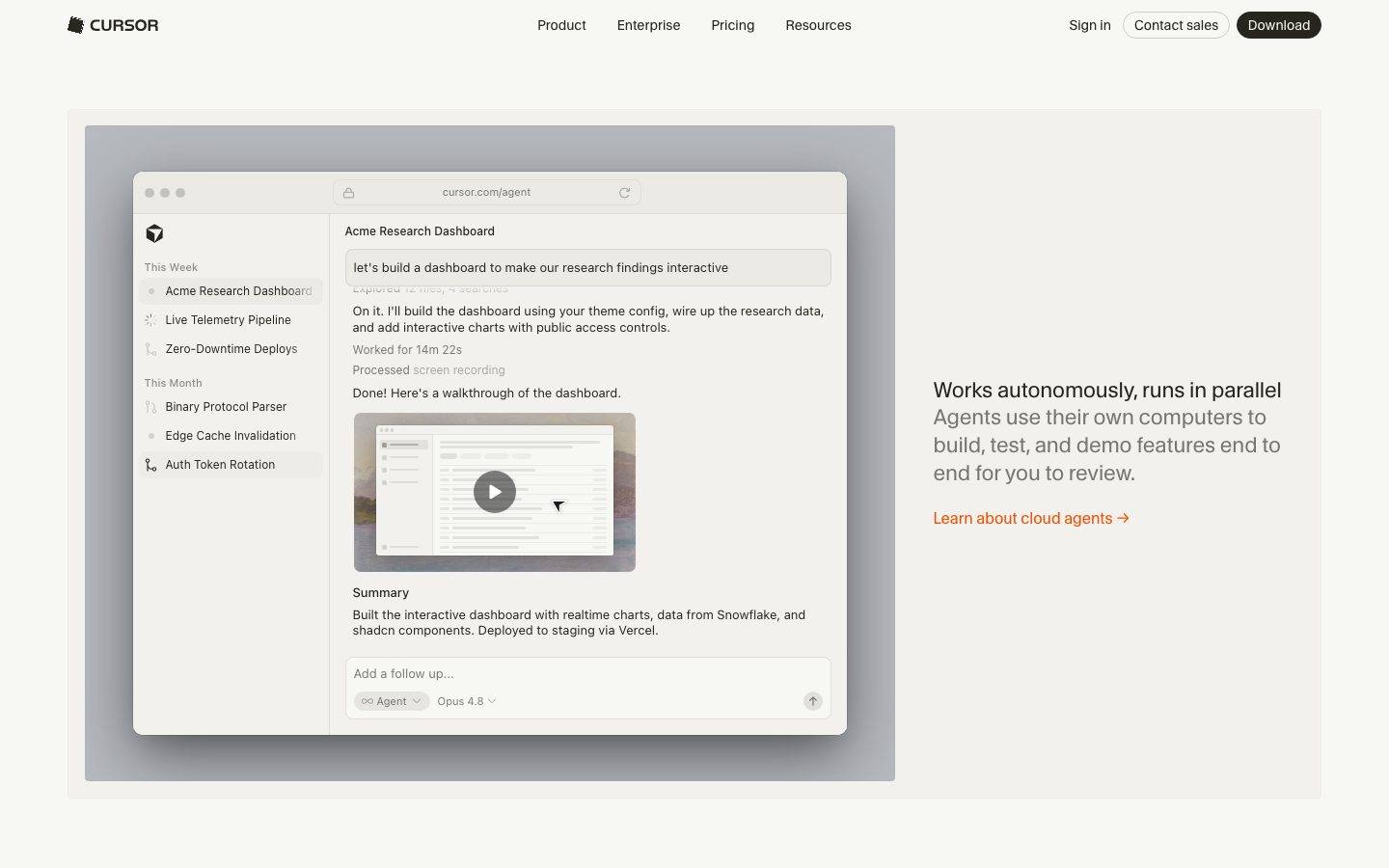
A warm-minimal developer-tool marketing surface built on a soft off-white canvas (#f7f7f4) with near-black warm ink text and pill-shaped dark CTAs. The system reads as calm, research-lab-quiet — generous whitespace, tightly-rounded warm-gray cards, and real product UI (agent panels, code windows, review dialogs) shown floating inside heavy-shadowed browser chrome. Brand voltage comes from the custom CursorGothic display face and a single warm-orange link accent, not from color-blocking.
Works withClaude CodeCursorCodexGemini CLICopilotv0LovableBoltWindsurfReplit
---
version: alpha
name: Cursor-design-analysis
description: "A warm-minimal developer-tool marketing surface built on a soft off-white canvas (#f7f7f4) with near-black warm ink text and pill-shaped dark CTAs. The system reads as calm, research-lab-quiet — generous whitespace, tightly-rounded warm-gray cards, and real product UI (agent panels, code windows, review dialogs) shown floating inside heavy-shadowed browser chrome. Brand voltage comes from the custom CursorGothic display face and a single warm-orange link accent, not from color-blocking."
colors:
  ink: "#26251e"
  ink-deep: "#1d1b15"
  ink-deeper: "#201e18"
  canvas: "#f7f7f4"
  surface: "#f2f1ed"
  surface-alt: "#ebeae5"
  hairline: "#e6e5e0"
  muted: "#606060"
  black: "#000000"
  white: "#ffffff"
  accent-orange: "#f54e00"
  accent-amber: "#c08532"
  accent-green: "#1f8a65"
  accent-blue: "#3b82f6"
  accent-teal: "#267f99"
  accent-pink: "#cf2d56"
typography:
  display:
    fontFamily: "CursorGothic, Inter, system-ui, sans-serif"
    fontSize: 26px
    fontWeight: 400
    lineHeight: 1.25
    letterSpacing: "-0.0125em"
  heading:
    fontFamily: "CursorGothic, Inter, system-ui, sans-serif"
    fontSize: 22px
    fontWeight: 400
    lineHeight: 1.3
    letterSpacing: "-0.005em"
  subhead:
    fontFamily: "system-ui, -apple-system, sans-serif"
    fontSize: 20px
    fontWeight: 700
    lineHeight: 1.55
    letterSpacing: "normal"
  body:
    fontFamily: "system-ui, -apple-system, sans-serif"
    fontSize: 13px
    fontWeight: 400
    lineHeight: 1.55
    letterSpacing: "normal"
  button:
    fontFamily: "CursorGothic, Inter, system-ui, sans-serif"
    fontSize: 14px
    fontWeight: 400
    lineHeight: 1.0
    letterSpacing: "normal"
rounded:
  none: 0px
  xs: 2px
  sm: 4px
  md: 8px
  lg: 10px
  xl: 12px
  pill: 9999px
spacing:
  xxs: 4px
  xs: 6px
  sm: 8px
  md: 12px
  lg: 16px
  xl: 18px
  xxl: 20px
components:
  button-primary:
    backgroundColor: "{colors.ink}"
    textColor: "{colors.canvas}"
    typography: "{typography.button}"
    rounded: "{rounded.pill}"
    padding: 5.6px 10.5px
  button-secondary:
    backgroundColor: "{colors.canvas}"
    textColor: "{colors.ink}"
    typography: "{typography.button}"
    rounded: "{rounded.pill}"
    padding: 5.6px 10.5px
  text-link:
    backgroundColor: transparent
    textColor: "{colors.accent-orange}"
    typography: "{typography.body}"
  top-nav:
    backgroundColor: "{colors.canvas}"
    textColor: "{colors.ink}"
    typography: "{typography.body}"
  card:
    backgroundColor: "{colors.surface}"
    textColor: "{colors.ink}"
    typography: "{typography.body}"
    rounded: "{rounded.sm}"
  testimonial-card:
    backgroundColor: "{colors.surface}"
    textColor: "{colors.ink}"
    typography: "{typography.body}"
    rounded: "{rounded.sm}"
  elevated-panel:
    backgroundColor: "{colors.white}"
    textColor: "{colors.ink}"
    typography: "{typography.body}"
    rounded: "{rounded.md}"
  text-input:
    backgroundColor: "{colors.white}"
    textColor: "{colors.ink}"
    typography: "{typography.body}"
    rounded: "{rounded.none}"
---

## Overview

Cursor's marketing surface is a warm, quiet developer-tool interface — a soft off-white canvas (`{colors.canvas}` — #f7f7f4) carrying near-black warm ink text (`{colors.ink}` — #26251e) and pill-shaped dark CTAs. The palette is intentionally low-contrast and warm-neutral: canvas, a slightly darker warm-gray card surface (`{colors.surface}` — #f2f1ed), and hairline dividers (`{colors.hairline}` — #e6e5e0) all sit within a few points of each other. The result reads as an applied-research lab rather than a loud SaaS pitch.

Type voice splits into two roles: **CursorGothic** (the brand's custom display/grotesque face — h1, h3, and button labels, weight 400 with slight negative tracking) and **system-ui** (h2 subheads at weight 700 and all body text at 13px). The display face carries the brand; the system font does the reading work.

Component voltage comes from **real product UI shown floating inside heavy-shadowed browser chrome** — agent task panels, mission-control windows, Slack/GitHub review threads, code terminals, PR-reviewer dialogs. Cursor doesn't illustrate the product; it drops actual product windows onto the warm canvas and lets deep drop-shadows lift them off the page. The single chromatic accent is a warm orange (`{colors.accent-orange}` — #f54e00) reserved for inline "Learn about… →" links.

**Key Characteristics:**
- Warm off-white canvas (`{colors.canvas}` — #f7f7f4) with warm near-black ink (`{colors.ink}` — #26251e). The whole system is warm-neutral, never cool gray.
- Pill-shaped dark primary CTA (`{component.button-primary}`) — background `{colors.ink}`, text `{colors.canvas}`, fully-rounded (`{rounded.pill}`, derived from the measured full-round button radius).
- Custom `CursorGothic` display face for headlines and buttons (substituted with Inter here). Slight negative letter-spacing (-0.0125em / -0.005em).
- Warm-gray card surface (`{colors.surface}` — #f2f1ed) at a very tight `{rounded.sm}` (4px) radius — the dominant radius in the system.
- Product UI fragments floated inside browser chrome with heavy multi-layer drop-shadows — the signature marketing device.
- Orange (`{colors.accent-orange}` — #f54e00) is the only recurring chromatic accent, and only on inline text links.
- Tight radius hierarchy: 4px cards, 8–12px larger panels, full-pill buttons.

## Colors

### Brand & Accent
- **Accent Orange** (`{colors.accent-orange}` — #f54e00): The single brand accent. Used on inline "Learn about cloud agents →" / "Learn about Automations →" links. This is the only chromatic voltage in the marketing chrome.
- **Accent Amber** (`{colors.accent-amber}` — #c08532): A warm gold measured at low frequency, appearing in small highlight moments and inside product-UI fragments.

### Syntax / Product-UI Accents
These hues are measured but appear almost entirely inside the embedded product-UI fragments (code windows, diff views, agent status), not in the marketing chrome:
- **Accent Green** (`{colors.accent-green}` — #1f8a65) — added-line / success tones in diffs.
- **Accent Blue** (`{colors.accent-blue}` — #3b82f6) — link / info tones in product UI.
- **Accent Teal** (`{colors.accent-teal}` — #267f99) — syntax highlighting.
- **Accent Pink** (`{colors.accent-pink}` — #cf2d56) — syntax / removed-line tones.

### Surface
- **Canvas** (`{colors.canvas}` — #f7f7f4): The default warm off-white page floor.
- **Surface** (`{colors.surface}` — #f2f1ed): Card, testimonial, and section-panel background — one warm step darker than canvas.
- **Surface Alt** (`{colors.surface-alt}` — #ebeae5): A secondary card/inset tone; also appears as a 2px ring in a measured focus/selection shadow.
- **Hairline** (`{colors.hairline}` — #e6e5e0): The 1px divider / border tone on light surfaces.
- **White** (`{colors.white}` — #ffffff): The floated product-window / elevated-panel background — brighter than canvas, which helps the panels read as lifted.
- **Black** (`{colors.black}` — #000000): Used in shadow layers and rare pure-black UI moments.

### Text
- **Ink** (`{colors.ink}` — #26251e): All headlines and primary text.
- **Ink Deep / Deeper** (`{colors.ink-deep}` — #1d1b15 / `{colors.ink-deeper}` — #201e18): Slightly darker warm-black variants measured on nested UI text and dark fills.
- **Muted** (`{colors.muted}` — #606060): Secondary / supporting text — sub-headlines and captions (e.g. "Agents use their own computers…").
- **On-Primary**: The primary button uses `{colors.canvas}` (#f7f7f4) as its label color — the canvas tone doubles as the on-dark text color.

## Typography

### Font Family
The system runs **CursorGothic** for display + buttons and **system-ui** for subheads + body. CursorGothic is Cursor's custom grotesque display face — weight 400 with slight negative letter-spacing, giving headlines a calm, precise, engineered feel. The system-ui stack (`system-ui, -apple-system, "Segoe UI", Roboto, sans-serif`) handles the reading layer at a compact 13px.

The split is functional:
- CursorGothic (display, 400 weight, -0.0125 to -0.005em tracking) — h1, h3, button labels
- system-ui (400–700 weight) — h2 subheads (700) and body (400)

### Hierarchy

| Token | Size | Weight | Line Height | Letter Spacing | Use |
|---|---|---|---|---|---|
| `{typography.display}` | 26px | 400 | 1.25 | -0.0125em | Page h1 ("Works autonomously, runs in parallel") — CursorGothic |
| `{typography.heading}` | 22px | 400 | 1.3 | -0.005em | Section headings ("Try Cursor now.") — CursorGothic |
| `{typography.subhead}` | 20px | 700 | 1.55 | normal | Bold system-font subheads / eyebrow labels |
| `{typography.body}` | 13px | 400 | 1.55 | normal | Default running text, captions, nav, testimonials |
| `{typography.button}` | 14px | 400 | 1.0 | normal | CTA button labels — CursorGothic |

### Principles
CursorGothic is the brand voice — headlines and buttons only. The negative letter-spacing (-0.0125 to -0.005em) is part of the signature; without it the display face reads generic. Body copy stays in the compact 13px system font — Cursor's marketing text is deliberately small and dense, matching a developer-tool sensibility.

Note the inversion versus most systems: the display face runs at weight **400** (light-normal) while the system subhead runs at **700**. The weight contrast, not the size jump, does much of the hierarchy work here.

### Note on Font Substitutes
CursorGothic is a custom typeface and is not available as a public web font. **Inter** (or another neutral grotesque such as **Space Grotesk**) at weight 400 with ~-0.01em letter-spacing is a usable approximation — it preserves the calm, even-width grotesque character. Never claim to ship CursorGothic; declare the fallback stack.

## Layout

### Spacing System
- **Base unit:** effectively 2px, with heavy clustering at 4 / 6 / 8px.
- **Tokens:** `{spacing.xxs}` 4px · `{spacing.xs}` 6px · `{spacing.sm}` 8px · `{spacing.md}` 12px · `{spacing.lg}` 16px · `{spacing.xl}` 18px · `{spacing.xxl}` 20px.
- **Dominant unit:** `{spacing.sm}` (8px) is by far the most frequent gap/padding value.
- Larger section rhythms (band-to-band vertical spacing) were not reliably measured — see Known Gaps.

### Grid & Container
- **Editorial layout:** Alternating full-width bands, each pairing a floated product-UI window with a short text block (heading + muted sub-line + orange text-link).
- **Hero:** Product window centered/left with the text block to the right.
- **Testimonials:** 3-up quote grid on `{colors.surface}` cards.
- **Feature rows:** left product-mockup / right copy, alternating sides down the page.

### Whitespace Philosophy
Cursor leans on generous vertical whitespace between bands and a lot of empty warm canvas around each floated product window. The dense 13px body and tight 8px internal spacing are offset by wide margins — the page reads calm and unhurried, like a research paper rather than a sales deck.

## Elevation & Depth

| Level | Treatment | Use |
|---|---|---|
| Flat | No shadow, no border | Canvas sections, top nav |
| Card surface | `{colors.surface}` fill, barely-there `rgba(0,0,0,0.02) 0 0 16px` + `rgba(0,0,0,0.008) 0 0 8px` | Feature / testimonial cards |
| Focus ring | `rgb(235,234,229) 0 0 0 2px` (a `{colors.surface-alt}` ring) | Selected / focused inputs |
| Floated panel | `rgba(0,0,0,0.14) 0 28px 70px`, `rgba(0,0,0,0.1) 0 14px 32px` + 1px hairline ring | Product-UI browser windows on canvas |
| Deep float | `rgba(0,0,0,0.3) 0 22px 70px 4px` / `rgba(0,0,0,0.35) 0 8px 30px` + 0.5px ring | The marquee hero window and modal dialogs |

The elevation philosophy is **deep, soft, warm shadows** used almost exclusively to lift real product windows off the flat canvas. Cards themselves stay nearly flat (2% and 0.8% alpha) — the drama is reserved for the product screenshots.

### Decorative Depth
- Product windows carry macOS-style browser chrome (traffic-light dots, URL bar) as content, plus their own internal panel shadows.
- Focus/selection uses a soft `{colors.surface-alt}` 2px ring rather than a bright color outline — consistent with the muted palette.

## Shapes

### Border Radius Scale

| Token | Value | Use |
|---|---|---|
| `{rounded.none}` | 0px | Text inputs (measured 0px radius) |
| `{rounded.xs}` | 2px | Small inline chips / minor accents |
| `{rounded.sm}` | 4px | Cards, panels — the dominant radius across the system |
| `{rounded.md}` | 8px | Larger floated panels, product windows |
| `{rounded.lg}` | 10px | Occasional larger containers |
| `{rounded.xl}` | 12px | Rare largest-container radius |
| `{rounded.pill}` | 9999px | Primary/secondary buttons (derived from the measured full-round button radius) |

### Geometry
Radius is tight and restrained — 4px does most of the work, giving cards a crisp, near-square feel. The only fully-rounded elements are buttons (pill). Text inputs are fully square (0px radius). The contrast between hard-square inputs, tight-4px cards, and full-pill buttons is a deliberate part of the shape language.

## Components

### Top Navigation

**`top-nav`** — Transparent-on-canvas nav bar pinned to the top of every page. Carries the Cursor wordmark + cube logo at left; center menu (Product, Enterprise, Pricing, Resources) in `{typography.body}` (system 13px); right cluster with "Sign in" text, a "Contact sales" `{component.button-secondary}`, and a "Download" `{component.button-primary}`. Background `{colors.canvas}`, text `{colors.ink}`.

### Buttons

**`button-primary`** — The signature dark CTA. Background `{colors.ink}` (#26251e), label `{colors.canvas}` (#f7f7f4), type `{typography.button}` (CursorGothic 14px / 400), padding 5.6px × 10.5px, fully rounded (`{rounded.pill}`). Used for "Download", "Download for macOS".

**`button-secondary`** — Outlined pill variant. Background `{colors.canvas}`, label `{colors.ink}`, 1px `{colors.hairline}` border, same pill radius + compact padding. Used for "Contact sales", "Request a demo →".

**`text-link`** — Inline orange link, no background. Text `{colors.accent-orange}` (#f54e00), type `{typography.body}`, with a trailing "→". Used for "Learn about cloud agents →", "Learn about Automations →", "Explore models →". The system's only recurring chromatic accent.

### Cards & Containers

**`card`** — Standard content card. Background `{colors.surface}` (#f2f1ed), rounded `{rounded.sm}` (4px), near-flat shadow (2% and 0.8% alpha). Holds feature copy and section content.

**`testimonial-card`** — Customer-quote card in the 3-up testimonial grid. Background `{colors.surface}`, rounded `{rounded.sm}`, body quote in `{typography.body}` with a small avatar + name + role row.

**`elevated-panel`** — The floated product-UI window (agent panel, mission-control window, PR-reviewer dialog). Background `{colors.white}` (brighter than canvas so it reads as lifted), rounded `{rounded.md}` (8px), heavy multi-layer drop-shadow + 1px hairline ring. This is the marquee marketing device — real product chrome shown floating on the warm canvas.

### Inputs & Forms

**`text-input`** — Text field. Background `{colors.white}`, text `{colors.ink}`, type `{typography.body}`, fully square (`{rounded.none}` — measured 0px radius). Focus renders a soft 2px `{colors.surface-alt}` ring (see Elevation).

## Do's and Don'ts

### Do
- Keep the palette warm-neutral. Canvas, surface, and hairline all sit within a few warm points of each other — resist introducing cool grays.
- Reserve `{colors.accent-orange}` for inline text links with a trailing "→". It is the only chromatic accent in the marketing chrome.
- Use CursorGothic weight 400 with negative letter-spacing for headlines and buttons; keep body in the compact 13px system font.
- Float real product windows (`{component.elevated-panel}`) with deep soft shadows on the flat canvas. Show the product, don't illustrate it.
- Keep card radius tight at `{rounded.sm}` (4px) and buttons fully pill.
- Let hierarchy come from weight contrast (400 display vs 700 subhead) and floated depth, not from color-blocking.

### Don't
- Don't color primary CTAs — they stay `{colors.ink}` dark. Orange is for links only.
- Don't bold the display face — CursorGothic runs at 400. Heavier weights break the calm voice.
- Don't apply heavy shadows to cards; reserve deep drop-shadows for floated product windows.
- Don't round text inputs — they are square (`{rounded.none}`) by design.
- Don't use the syntax accents (green / blue / teal / pink) in the marketing chrome; they belong inside product-UI fragments.
- Don't add hover-state styling beyond default + pressed.

## Responsive Behavior

### Breakpoints
Breakpoint widths were not directly measured; the following is inferred from the captured desktop layout and standard practice (derived).

| Name | Width | Key Changes |
|---|---|---|
| Mobile | < 768px | Nav collapses; alternating feature bands stack to single column (window above copy); testimonial grid → 1-up |
| Tablet | 768–1024px | Horizontal nav tightens; testimonial grid → 2-up; feature windows scale down |
| Desktop | 1024–1440px | Full nav; alternating left/right feature rows; 3-up testimonials |
| Wide | > 1440px | More outer canvas breathing room around floated windows |

### Touch Targets
- `{component.button-primary}` / `{component.button-secondary}` use compact ~5.6px vertical padding on a 14px label — effective tap height sits near the low end; padding should be increased for touch surfaces (derived).
- Nav links in `{typography.body}` (13px) are dense; mobile nav should expand spacing.

### Collapsing Strategy
- Alternating feature bands collapse to a single column (product window, then copy block).
- Testimonial grid reduces columns rather than shrinking type.
- Floated product windows scale proportionally, retaining their browser chrome and internal legibility.

## Iteration Guide

1. Focus on ONE component at a time; reference its YAML key directly (`{component.elevated-panel}`, `{component.button-primary}`).
2. Variants (`-secondary`, focus states) live as separate entries in `components:`.
3. Use `{token.refs}` everywhere — never inline hex.
4. Never document hover. Default and Active/Pressed states only.
5. Headlines stay CursorGothic 400 with negative tracking; body stays 13px system font. The split does not blur.
6. Orange is a link-only accent — don't spread it to buttons or fills.
7. When emphasizing, float deeper before you color.

## Known Gaps

- CursorGothic is a custom typeface with no public web font; a substitute (Inter / Space Grotesk) is documented. `fonts_licensed` was empty in the analysis, but the custom face is clearly non-shippable and treated as substituted.
- Section-level vertical rhythm (band-to-band spacing) was not reliably captured — measured spacing tops out at 22px, which reflects component-internal padding/gaps, not the large inter-section gaps visible in screenshots.
- Many measured accent hues (`{colors.accent-green}`, `{colors.accent-blue}`, `{colors.accent-teal}`, `{colors.accent-pink}`, plus #1a7f37 / #238636 / #1750eb / #171717) originate inside embedded product-UI code/diff views rather than the marketing chrome; their exact roles in the design system are approximate.
- The primary button padding is reported as measured (5.6px 10.5px 5.88px) and reflects sub-pixel computed values; canonical values would round to ~6px × 10px.
- Button radius was measured as an effective infinite value (3.35e7px) and mapped to `{rounded.pill}` (9999px) — derived.
- Input styling beyond radius (background, border, focus color) is inferred from screenshots + the measured focus-ring shadow; a form flow would be needed to confirm.
- Breakpoints, animation/transition timings, and error/success form states are out of scope for this capture.

<!-- Documented by Duply · real-world design systems as ready-to-use DESIGN.md for AI coding agents · https://duply.ai/cursor/design-md -->
Color Palette
Accent
Neutrals
Typography
display26px · 400 · 1.25
The quick brown fox jumpsheading22px · 400 · 1.3
The quick brown fox jumpssubhead20px · 700 · 1.55
The quick brown fox jumpsbody13px · 400 · 1.55
The quick brown fox jumpsbutton14px · 400 · 1
The quick brown fox jumpsSpacing & Shape
Spacing
| Name | Value | Preview |
|---|---|---|
| xxs | 4px | |
| xs | 6px | |
| sm | 8px | |
| md | 12px | |
| lg | 16px | |
| xl | 18px | |
| xxl | 20px |
Border Radius
| Name | Value | Preview |
|---|---|---|
| none | 0px | |
| xs | 2px | |
| sm | 4px | |
| md | 8px | |
| lg | 10px | |
| xl | 12px | |
| pill | 9999px |
FAQ
- What colors does Cursor use?
- Cursor's core palette includes #26251e, #1d1b15, #201e18, #f7f7f4, #f2f1ed. The full color set with usage roles (canvas, ink, surfaces, accent, semantic) is documented in the Cursor DESIGN.md.
- What font does Cursor use?
- Cursor's primary typeface is CursorGothic. The complete type scale (sizes, weights, line-height and letter-spacing per role), with an open substitute where the original is licensed, is documented in the DESIGN.md.
- What is the Cursor design system?
- A warm-minimal developer-tool marketing surface built on a soft off-white canvas (#f7f7f4) with near-black warm ink text and pill-shaped dark CTAs. The system reads as calm, research-lab-quiet — generous whitespace, tightly-rounded warm-gray cards, and real product UI (agent panels, code windows
Get this as a working kit
Cursor Launch Kit + DESIGN.md
$299$225
One-time payment
- A complete production-stack template, styled like Cursor, fully built and wired.
- One-time payment and the codebase is yours. No platform fees, no subscription.
Open it with Claude Code, Cursor, or any coding agent and build in plain language, then ship a complete web app.
- Your private DESIGN.md
- Marketing pages, blog, SEO & legal
- Email capture, newsletter & contact
- Accept payments (Stripe)
- Analytics (GA4 + PostHog)
- One-click deploy
- Auth, login & roles
- A full app dashboard, when you grow
More like this
---
version: alpha
name: Cursor-design-analysis
description: "A warm-minimal developer-tool marketing surface built on a soft off-white canvas (#f7f7f4) with near-black warm ink text and pill-shaped dark CTAs. The system reads as calm, research-lab-quiet — generous whitespace, tightly-rounded warm-gray cards, and real product UI (agent panels, code windows, review dialogs) shown floating inside heavy-shadowed browser chrome. Brand voltage comes from the custom CursorGothic display face and a single warm-orange link accent, not from color-blocking."
colors:
  ink: "#26251e"
  ink-deep: "#1d1b15"
  ink-deeper: "#201e18"
  canvas: "#f7f7f4"
  surface: "#f2f1ed"
  surface-alt: "#ebeae5"
  hairline: "#e6e5e0"
  muted: "#606060"
  black: "#000000"
  white: "#ffffff"
  accent-orange: "#f54e00"
  accent-amber: "#c08532"
  accent-green: "#1f8a65"
  accent-blue: "#3b82f6"
  accent-teal: "#267f99"
  accent-pink: "#cf2d56"
typography:
  display:
    fontFamily: "CursorGothic, Inter, system-ui, sans-serif"
    fontSize: 26px
    fontWeight: 400
    lineHeight: 1.25
    letterSpacing: "-0.0125em"
  heading:
    fontFamily: "CursorGothic, Inter, system-ui, sans-serif"
    fontSize: 22px
    fontWeight: 400
    lineHeight: 1.3
    letterSpacing: "-0.005em"
  subhead:
    fontFamily: "system-ui, -apple-system, sans-serif"
    fontSize: 20px
    fontWeight: 700
    lineHeight: 1.55
    letterSpacing: "normal"
  body:
    fontFamily: "system-ui, -apple-system, sans-serif"
    fontSize: 13px
    fontWeight: 400
    lineHeight: 1.55
    letterSpacing: "normal"
  button:
    fontFamily: "CursorGothic, Inter, system-ui, sans-serif"
    fontSize: 14px
    fontWeight: 400
    lineHeight: 1.0
    letterSpacing: "normal"
rounded:
  none: 0px
  xs: 2px
  sm: 4px
  md: 8px
  lg: 10px
  xl: 12px
  pill: 9999px
spacing:
  xxs: 4px
  xs: 6px
  sm: 8px
  md: 12px
  lg: 16px
  xl: 18px
  xxl: 20px
components:
  button-primary:
    backgroundColor: "{colors.ink}"
    textColor: "{colors.canvas}"
    typography: "{typography.button}"
    rounded: "{rounded.pill}"
    padding: 5.6px 10.5px
  button-secondary:
    backgroundColor: "{colors.canvas}"
    textColor: "{colors.ink}"
    typography: "{typography.button}"
    rounded: "{rounded.pill}"
    padding: 5.6px 10.5px
  text-link:
    backgroundColor: transparent
    textColor: "{colors.accent-orange}"
    typography: "{typography.body}"
  top-nav:
    backgroundColor: "{colors.canvas}"
    textColor: "{colors.ink}"
    typography: "{typography.body}"
  card:
    backgroundColor: "{colors.surface}"
    textColor: "{colors.ink}"
    typography: "{typography.body}"
    rounded: "{rounded.sm}"
  testimonial-card:
    backgroundColor: "{colors.surface}"
    textColor: "{colors.ink}"
    typography: "{typography.body}"
    rounded: "{rounded.sm}"
  elevated-panel:
    backgroundColor: "{colors.white}"
    textColor: "{colors.ink}"
    typography: "{typography.body}"
    rounded: "{rounded.md}"
  text-input:
    backgroundColor: "{colors.white}"
    textColor: "{colors.ink}"
    typography: "{typography.body}"
    rounded: "{rounded.none}"
---

## Overview

Cursor's marketing surface is a warm, quiet developer-tool interface — a soft off-white canvas (`{colors.canvas}` — #f7f7f4) carrying near-black warm ink text (`{colors.ink}` — #26251e) and pill-shaped dark CTAs. The palette is intentionally low-contrast and warm-neutral: canvas, a slightly darker warm-gray card surface (`{colors.surface}` — #f2f1ed), and hairline dividers (`{colors.hairline}` — #e6e5e0) all sit within a few points of each other. The result reads as an applied-research lab rather than a loud SaaS pitch.

Type voice splits into two roles: **CursorGothic** (the brand's custom display/grotesque face — h1, h3, and button labels, weight 400 with slight negative tracking) and **system-ui** (h2 subheads at weight 700 and all body text at 13px). The display face carries the brand; the system font does the reading work.

Component voltage comes from **real product UI shown floating inside heavy-shadowed browser chrome** — agent task panels, mission-control windows, Slack/GitHub review threads, code terminals, PR-reviewer dialogs. Cursor doesn't illustrate the product; it drops actual product windows onto the warm canvas and lets deep drop-shadows lift them off the page. The single chromatic accent is a warm orange (`{colors.accent-orange}` — #f54e00) reserved for inline "Learn about… →" links.

**Key Characteristics:**
- Warm off-white canvas (`{colors.canvas}` — #f7f7f4) with warm near-black ink (`{colors.ink}` — #26251e). The whole system is warm-neutral, never cool gray.
- Pill-shaped dark primary CTA (`{component.button-primary}`) — background `{colors.ink}`, text `{colors.canvas}`, fully-rounded (`{rounded.pill}`, derived from the measured full-round button radius).
- Custom `CursorGothic` display face for headlines and buttons (substituted with Inter here). Slight negative letter-spacing (-0.0125em / -0.005em).
- Warm-gray card surface (`{colors.surface}` — #f2f1ed) at a very tight `{rounded.sm}` (4px) radius — the dominant radius in the system.
- Product UI fragments floated inside browser chrome with heavy multi-layer drop-shadows — the signature marketing device.
- Orange (`{colors.accent-orange}` — #f54e00) is the only recurring chromatic accent, and only on inline text links.
- Tight radius hierarchy: 4px cards, 8–12px larger panels, full-pill buttons.

## Colors

### Brand & Accent
- **Accent Orange** (`{colors.accent-orange}` — #f54e00): The single brand accent. Used on inline "Learn about cloud agents →" / "Learn about Automations →" links. This is the only chromatic voltage in the marketing chrome.
- **Accent Amber** (`{colors.accent-amber}` — #c08532): A warm gold measured at low frequency, appearing in small highlight moments and inside product-UI fragments.

### Syntax / Product-UI Accents
These hues are measured but appear almost entirely inside the embedded product-UI fragments (code windows, diff views, agent status), not in the marketing chrome:
- **Accent Green** (`{colors.accent-green}` — #1f8a65) — added-line / success tones in diffs.
- **Accent Blue** (`{colors.accent-blue}` — #3b82f6) — link / info tones in product UI.
- **Accent Teal** (`{colors.accent-teal}` — #267f99) — syntax highlighting.
- **Accent Pink** (`{colors.accent-pink}` — #cf2d56) — syntax / removed-line tones.

### Surface
- **Canvas** (`{colors.canvas}` — #f7f7f4): The default warm off-white page floor.
- **Surface** (`{colors.surface}` — #f2f1ed): Card, testimonial, and section-panel background — one warm step darker than canvas.
- **Surface Alt** (`{colors.surface-alt}` — #ebeae5): A secondary card/inset tone; also appears as a 2px ring in a measured focus/selection shadow.
- **Hairline** (`{colors.hairline}` — #e6e5e0): The 1px divider / border tone on light surfaces.
- **White** (`{colors.white}` — #ffffff): The floated product-window / elevated-panel background — brighter than canvas, which helps the panels read as lifted.
- **Black** (`{colors.black}` — #000000): Used in shadow layers and rare pure-black UI moments.

### Text
- **Ink** (`{colors.ink}` — #26251e): All headlines and primary text.
- **Ink Deep / Deeper** (`{colors.ink-deep}` — #1d1b15 / `{colors.ink-deeper}` — #201e18): Slightly darker warm-black variants measured on nested UI text and dark fills.
- **Muted** (`{colors.muted}` — #606060): Secondary / supporting text — sub-headlines and captions (e.g. "Agents use their own computers…").
- **On-Primary**: The primary button uses `{colors.canvas}` (#f7f7f4) as its label color — the canvas tone doubles as the on-dark text color.

## Typography

### Font Family
The system runs **CursorGothic** for display + buttons and **system-ui** for subheads + body. CursorGothic is Cursor's custom grotesque display face — weight 400 with slight negative letter-spacing, giving headlines a calm, precise, engineered feel. The system-ui stack (`system-ui, -apple-system, "Segoe UI", Roboto, sans-serif`) handles the reading layer at a compact 13px.

The split is functional:
- CursorGothic (display, 400 weight, -0.0125 to -0.005em tracking) — h1, h3, button labels
- system-ui (400–700 weight) — h2 subheads (700) and body (400)

### Hierarchy

| Token | Size | Weight | Line Height | Letter Spacing | Use |
|---|---|---|---|---|---|
| `{typography.display}` | 26px | 400 | 1.25 | -0.0125em | Page h1 ("Works autonomously, runs in parallel") — CursorGothic |
| `{typography.heading}` | 22px | 400 | 1.3 | -0.005em | Section headings ("Try Cursor now.") — CursorGothic |
| `{typography.subhead}` | 20px | 700 | 1.55 | normal | Bold system-font subheads / eyebrow labels |
| `{typography.body}` | 13px | 400 | 1.55 | normal | Default running text, captions, nav, testimonials |
| `{typography.button}` | 14px | 400 | 1.0 | normal | CTA button labels — CursorGothic |

### Principles
CursorGothic is the brand voice — headlines and buttons only. The negative letter-spacing (-0.0125 to -0.005em) is part of the signature; without it the display face reads generic. Body copy stays in the compact 13px system font — Cursor's marketing text is deliberately small and dense, matching a developer-tool sensibility.

Note the inversion versus most systems: the display face runs at weight **400** (light-normal) while the system subhead runs at **700**. The weight contrast, not the size jump, does much of the hierarchy work here.

### Note on Font Substitutes
CursorGothic is a custom typeface and is not available as a public web font. **Inter** (or another neutral grotesque such as **Space Grotesk**) at weight 400 with ~-0.01em letter-spacing is a usable approximation — it preserves the calm, even-width grotesque character. Never claim to ship CursorGothic; declare the fallback stack.

## Layout

### Spacing System
- **Base unit:** effectively 2px, with heavy clustering at 4 / 6 / 8px.
- **Tokens:** `{spacing.xxs}` 4px · `{spacing.xs}` 6px · `{spacing.sm}` 8px · `{spacing.md}` 12px · `{spacing.lg}` 16px · `{spacing.xl}` 18px · `{spacing.xxl}` 20px.
- **Dominant unit:** `{spacing.sm}` (8px) is by far the most frequent gap/padding value.
- Larger section rhythms (band-to-band vertical spacing) were not reliably measured — see Known Gaps.

### Grid & Container
- **Editorial layout:** Alternating full-width bands, each pairing a floated product-UI window with a short text block (heading + muted sub-line + orange text-link).
- **Hero:** Product window centered/left with the text block to the right.
- **Testimonials:** 3-up quote grid on `{colors.surface}` cards.
- **Feature rows:** left product-mockup / right copy, alternating sides down the page.

### Whitespace Philosophy
Cursor leans on generous vertical whitespace between bands and a lot of empty warm canvas around each floated product window. The dense 13px body and tight 8px internal spacing are offset by wide margins — the page reads calm and unhurried, like a research paper rather than a sales deck.

## Elevation & Depth

| Level | Treatment | Use |
|---|---|---|
| Flat | No shadow, no border | Canvas sections, top nav |
| Card surface | `{colors.surface}` fill, barely-there `rgba(0,0,0,0.02) 0 0 16px` + `rgba(0,0,0,0.008) 0 0 8px` | Feature / testimonial cards |
| Focus ring | `rgb(235,234,229) 0 0 0 2px` (a `{colors.surface-alt}` ring) | Selected / focused inputs |
| Floated panel | `rgba(0,0,0,0.14) 0 28px 70px`, `rgba(0,0,0,0.1) 0 14px 32px` + 1px hairline ring | Product-UI browser windows on canvas |
| Deep float | `rgba(0,0,0,0.3) 0 22px 70px 4px` / `rgba(0,0,0,0.35) 0 8px 30px` + 0.5px ring | The marquee hero window and modal dialogs |

The elevation philosophy is **deep, soft, warm shadows** used almost exclusively to lift real product windows off the flat canvas. Cards themselves stay nearly flat (2% and 0.8% alpha) — the drama is reserved for the product screenshots.

### Decorative Depth
- Product windows carry macOS-style browser chrome (traffic-light dots, URL bar) as content, plus their own internal panel shadows.
- Focus/selection uses a soft `{colors.surface-alt}` 2px ring rather than a bright color outline — consistent with the muted palette.

## Shapes

### Border Radius Scale

| Token | Value | Use |
|---|---|---|
| `{rounded.none}` | 0px | Text inputs (measured 0px radius) |
| `{rounded.xs}` | 2px | Small inline chips / minor accents |
| `{rounded.sm}` | 4px | Cards, panels — the dominant radius across the system |
| `{rounded.md}` | 8px | Larger floated panels, product windows |
| `{rounded.lg}` | 10px | Occasional larger containers |
| `{rounded.xl}` | 12px | Rare largest-container radius |
| `{rounded.pill}` | 9999px | Primary/secondary buttons (derived from the measured full-round button radius) |

### Geometry
Radius is tight and restrained — 4px does most of the work, giving cards a crisp, near-square feel. The only fully-rounded elements are buttons (pill). Text inputs are fully square (0px radius). The contrast between hard-square inputs, tight-4px cards, and full-pill buttons is a deliberate part of the shape language.

## Components

### Top Navigation

**`top-nav`** — Transparent-on-canvas nav bar pinned to the top of every page. Carries the Cursor wordmark + cube logo at left; center menu (Product, Enterprise, Pricing, Resources) in `{typography.body}` (system 13px); right cluster with "Sign in" text, a "Contact sales" `{component.button-secondary}`, and a "Download" `{component.button-primary}`. Background `{colors.canvas}`, text `{colors.ink}`.

### Buttons

**`button-primary`** — The signature dark CTA. Background `{colors.ink}` (#26251e), label `{colors.canvas}` (#f7f7f4), type `{typography.button}` (CursorGothic 14px / 400), padding 5.6px × 10.5px, fully rounded (`{rounded.pill}`). Used for "Download", "Download for macOS".

**`button-secondary`** — Outlined pill variant. Background `{colors.canvas}`, label `{colors.ink}`, 1px `{colors.hairline}` border, same pill radius + compact padding. Used for "Contact sales", "Request a demo →".

**`text-link`** — Inline orange link, no background. Text `{colors.accent-orange}` (#f54e00), type `{typography.body}`, with a trailing "→". Used for "Learn about cloud agents →", "Learn about Automations →", "Explore models →". The system's only recurring chromatic accent.

### Cards & Containers

**`card`** — Standard content card. Background `{colors.surface}` (#f2f1ed), rounded `{rounded.sm}` (4px), near-flat shadow (2% and 0.8% alpha). Holds feature copy and section content.

**`testimonial-card`** — Customer-quote card in the 3-up testimonial grid. Background `{colors.surface}`, rounded `{rounded.sm}`, body quote in `{typography.body}` with a small avatar + name + role row.

**`elevated-panel`** — The floated product-UI window (agent panel, mission-control window, PR-reviewer dialog). Background `{colors.white}` (brighter than canvas so it reads as lifted), rounded `{rounded.md}` (8px), heavy multi-layer drop-shadow + 1px hairline ring. This is the marquee marketing device — real product chrome shown floating on the warm canvas.

### Inputs & Forms

**`text-input`** — Text field. Background `{colors.white}`, text `{colors.ink}`, type `{typography.body}`, fully square (`{rounded.none}` — measured 0px radius). Focus renders a soft 2px `{colors.surface-alt}` ring (see Elevation).

## Do's and Don'ts

### Do
- Keep the palette warm-neutral. Canvas, surface, and hairline all sit within a few warm points of each other — resist introducing cool grays.
- Reserve `{colors.accent-orange}` for inline text links with a trailing "→". It is the only chromatic accent in the marketing chrome.
- Use CursorGothic weight 400 with negative letter-spacing for headlines and buttons; keep body in the compact 13px system font.
- Float real product windows (`{component.elevated-panel}`) with deep soft shadows on the flat canvas. Show the product, don't illustrate it.
- Keep card radius tight at `{rounded.sm}` (4px) and buttons fully pill.
- Let hierarchy come from weight contrast (400 display vs 700 subhead) and floated depth, not from color-blocking.

### Don't
- Don't color primary CTAs — they stay `{colors.ink}` dark. Orange is for links only.
- Don't bold the display face — CursorGothic runs at 400. Heavier weights break the calm voice.
- Don't apply heavy shadows to cards; reserve deep drop-shadows for floated product windows.
- Don't round text inputs — they are square (`{rounded.none}`) by design.
- Don't use the syntax accents (green / blue / teal / pink) in the marketing chrome; they belong inside product-UI fragments.
- Don't add hover-state styling beyond default + pressed.

## Responsive Behavior

### Breakpoints
Breakpoint widths were not directly measured; the following is inferred from the captured desktop layout and standard practice (derived).

| Name | Width | Key Changes |
|---|---|---|
| Mobile | < 768px | Nav collapses; alternating feature bands stack to single column (window above copy); testimonial grid → 1-up |
| Tablet | 768–1024px | Horizontal nav tightens; testimonial grid → 2-up; feature windows scale down |
| Desktop | 1024–1440px | Full nav; alternating left/right feature rows; 3-up testimonials |
| Wide | > 1440px | More outer canvas breathing room around floated windows |

### Touch Targets
- `{component.button-primary}` / `{component.button-secondary}` use compact ~5.6px vertical padding on a 14px label — effective tap height sits near the low end; padding should be increased for touch surfaces (derived).
- Nav links in `{typography.body}` (13px) are dense; mobile nav should expand spacing.

### Collapsing Strategy
- Alternating feature bands collapse to a single column (product window, then copy block).
- Testimonial grid reduces columns rather than shrinking type.
- Floated product windows scale proportionally, retaining their browser chrome and internal legibility.

## Iteration Guide

1. Focus on ONE component at a time; reference its YAML key directly (`{component.elevated-panel}`, `{component.button-primary}`).
2. Variants (`-secondary`, focus states) live as separate entries in `components:`.
3. Use `{token.refs}` everywhere — never inline hex.
4. Never document hover. Default and Active/Pressed states only.
5. Headlines stay CursorGothic 400 with negative tracking; body stays 13px system font. The split does not blur.
6. Orange is a link-only accent — don't spread it to buttons or fills.
7. When emphasizing, float deeper before you color.

## Known Gaps

- CursorGothic is a custom typeface with no public web font; a substitute (Inter / Space Grotesk) is documented. `fonts_licensed` was empty in the analysis, but the custom face is clearly non-shippable and treated as substituted.
- Section-level vertical rhythm (band-to-band spacing) was not reliably captured — measured spacing tops out at 22px, which reflects component-internal padding/gaps, not the large inter-section gaps visible in screenshots.
- Many measured accent hues (`{colors.accent-green}`, `{colors.accent-blue}`, `{colors.accent-teal}`, `{colors.accent-pink}`, plus #1a7f37 / #238636 / #1750eb / #171717) originate inside embedded product-UI code/diff views rather than the marketing chrome; their exact roles in the design system are approximate.
- The primary button padding is reported as measured (5.6px 10.5px 5.88px) and reflects sub-pixel computed values; canonical values would round to ~6px × 10px.
- Button radius was measured as an effective infinite value (3.35e7px) and mapped to `{rounded.pill}` (9999px) — derived.
- Input styling beyond radius (background, border, focus color) is inferred from screenshots + the measured focus-ring shadow; a form flow would be needed to confirm.
- Breakpoints, animation/transition timings, and error/success form states are out of scope for this capture.

<!-- Documented by Duply · real-world design systems as ready-to-use DESIGN.md for AI coding agents · https://duply.ai/cursor/design-md -->