Augen
An ultra-minimal, gallery-grade product site for speculative "humanware" hardware — built on a near-white
---
version: alpha
name: Augen-design-analysis
description: An ultra-minimal, gallery-grade product site for speculative "humanware" hardware — built on a near-white #efefef canvas, set entirely in the light-weight PP Neue Montreal grotesque at a single near-uniform type size, and punctuated by deep-black full-bleed bands that frame floating product renders. Brand voltage is almost entirely typographic restraint plus a tight quartet of saturated accents (Apple-blue, green, orange, amber) carried on slim outlined pill tags rather than filled buttons.
colors:
ink: "#0f1012"
ink-deep: "#0c0d0f"
canvas: "#efefef"
surface: "#ffffff"
surface-soft: "#f8f8f8"
surface-dark: "#1d1e20"
black: "#000000"
accent: "#0071e3"
accent-green: "#00b982"
accent-orange: "#ff5102"
accent-amber: "#fca311"
muted: "#5e5e5e"
muted-soft: "#787878"
muted-light: "#f2f2f4"
on-dark: "#ffffff"
typography:
display:
fontFamily: "PP Neue Montreal, Inter, sans-serif"
fontSize: 27px
fontWeight: 350
lineHeight: 1.2
letterSpacing: -0.54px
body:
fontFamily: "PP Neue Montreal, Inter, sans-serif"
fontSize: 27px
fontWeight: 350
lineHeight: 1.2
letterSpacing: -0.54px
title:
fontFamily: "PP Neue Montreal, Inter, sans-serif"
fontSize: 16px
fontWeight: 350
lineHeight: 1.2
letterSpacing: -0.32px
button:
fontFamily: "PP Neue Montreal, Inter, sans-serif"
fontSize: 16px
fontWeight: 350
lineHeight: 1.2
letterSpacing: -0.32px
label:
fontFamily: "PP Neue Montreal, Inter, sans-serif"
fontSize: 14px
fontWeight: 350
lineHeight: 1.2
letterSpacing: -0.28px
rounded:
sm: 10px
md: 26px
lg: 54px
xl: 63px
pill: 94px
spacing:
xxs: 4px
xs: 11px
sm: 20px
md: 28px
lg: 36px
xl: 50px
xxl: 60px
components:
top-nav-container:
backgroundColor: "{colors.surface-soft}"
textColor: "{colors.ink}"
typography: "{typography.title}"
rounded: "{rounded.pill}"
padding: 11px 28px
height: 54px
nav-link:
backgroundColor: transparent
textColor: "{colors.ink}"
typography: "{typography.title}"
padding: 11px 20px
cta-pill:
backgroundColor: "{colors.surface-soft}"
textColor: "{colors.muted}"
typography: "{typography.label}"
rounded: "{rounded.pill}"
padding: 11px 20px
button-primary:
backgroundColor: transparent
textColor: "{colors.ink}"
typography: "{typography.button}"
rounded: "{rounded.sm}"
padding: 0px
tag-pill:
backgroundColor: transparent
textColor: "{colors.accent}"
typography: "{typography.title}"
rounded: "{rounded.pill}"
padding: 4px 11px
tag-pill-active:
backgroundColor: "{colors.accent}"
textColor: "{colors.on-dark}"
typography: "{typography.title}"
rounded: "{rounded.pill}"
padding: 4px 11px
hero-band:
backgroundColor: "{colors.surface}"
textColor: "{colors.ink}"
typography: "{typography.display}"
padding: 60px
product-band-light:
backgroundColor: "{colors.canvas}"
textColor: "{colors.ink}"
typography: "{typography.title}"
padding: 60px
product-band-dark:
backgroundColor: "{colors.surface-dark}"
textColor: "{colors.on-dark}"
typography: "{typography.title}"
padding: 60px
accent-band:
backgroundColor: "{colors.accent}"
textColor: "{colors.on-dark}"
padding: 60px
scroll-indicator:
backgroundColor: "{colors.surface-soft}"
textColor: "{colors.ink}"
rounded: "{rounded.pill}"
size: 36px
footer:
backgroundColor: "{colors.surface-dark}"
textColor: "{colors.muted-light}"
typography: "{typography.label}"
padding: 60px
---
## Overview
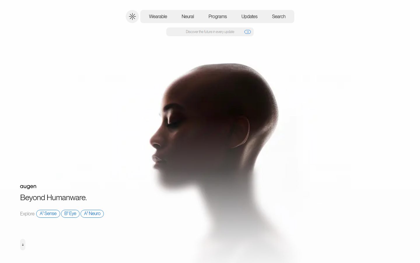
Augen is a speculative "humanware" hardware brand whose marketing surface is deliberately stripped to near-nothing. The page floor is `{colors.canvas}` (#efefef) — a soft, photographic near-white — with content bands alternating between bright `{colors.surface}` (#ffffff) and deep `{colors.surface-dark}` (#1d1e20) / `{colors.black}` (#000000). Floating product renders (a head in profile, a coin-shaped neural device) sit inside these bands with no card chrome at all — the void IS the frame.
The most distinctive decision is typographic uniformity: nearly everything is set in **PP Neue Montreal** at weight 350 (a light grotesque), with the headline ("Beyond Humanware.") and body copy both measured at 27px. There is almost no size hierarchy — emphasis comes from position, whitespace, and color rather than scale. Letter-spacing is consistently negative (-0.28 to -0.54px), tightening the light grotesque into a confident, editorial voice.
Color is held in reserve. The interface is monochrome (ink on near-white, white on near-black) until the brand's accent quartet appears: `{colors.accent}` Apple-blue (#0071e3), `{colors.accent-green}` (#00b982), `{colors.accent-orange}` (#ff5102), and `{colors.accent-amber}` (#fca311). These surface almost exclusively on slim **outlined pill tags** ("A¹ Sense", "B¹ Eye", "A¹ Neuro") and on one full-bleed Apple-blue band — never on a conventional filled button.
**Key Characteristics:**
- Soft near-white canvas (`{colors.canvas}` — #efefef) with full-bleed alternating light/dark bands. No drop shadows were measured anywhere (`shadows: []`) — depth is created entirely by surface-color contrast and floating renders.
- Single light-weight typeface (PP Neue Montreal, weight 350) carrying display, body, navigation, and labels alike. Headline and body share a 27px size — hierarchy is spatial, not scalar.
- Negative letter-spacing on every role (-0.28 to -0.54px) — the tightening is the brand's typographic signature.
- The primary action is a **text-only button** (`{component.button-primary}` measured at radius 0px, padding 0px, color `{colors.ink}`) — Augen does not render a filled CTA box on the hero.
- Outlined pill tags (`{component.tag-pill}`) in `{colors.accent}` blue carry product names; the active/selected pill (`{component.tag-pill-active}`) fills solid blue with white text.
- A floating pill-shaped top-nav container (`{component.top-nav-container}`) on `{colors.surface-soft}` (#f8f8f8) with `{rounded.pill}` (94px) corners — a soft "control bar" hovering over the hero.
- Extreme radius range: `{rounded.sm}` (10px) for inline chips up to `{rounded.pill}` (94px) for the nav bar and capsule tags. The mid values `{rounded.lg}` (54px) and `{rounded.xl}` (63px) belong to large capsule containers.
## Colors
### Brand & Accent
- **Accent / Blue** (`{colors.accent}` — #0071e3): The primary brand accent (highest-frequency accent, 84). Outlined pill tags, the active filled tag, inline link affordances, and one full-bleed band near the footer.
- **Accent Green** (`{colors.accent-green}` — #00b982): A secondary product accent in the quartet, used on tag/category moments.
- **Accent Orange** (`{colors.accent-orange}` — #ff5102): A secondary product accent.
- **Accent Amber** (`{colors.accent-amber}` — #fca311): A secondary product accent.
The four accents form a tight saturated quartet that maps to product lines. They appear in small, deliberate moments only — never as large background fills except for the single blue band.
### Surface
- **Canvas** (`{colors.canvas}` — #efefef): The default page floor — a soft photographic near-white, not pure white.
- **Surface** (`{colors.surface}` — #ffffff): The brightest band, used behind the hero portrait.
- **Surface Soft** (`{colors.surface-soft}` — #f8f8f8): The nav container, scroll indicator, and CTA pill fills.
- **Surface Dark** (`{colors.surface-dark}` — #1d1e20): The dark editorial bands and footer.
- **Black** (`{colors.black}` — #000000): The deepest full-bleed bands that frame floating renders.
### Text
- **Ink** (`{colors.ink}` — #0f1012): All primary text on light surfaces — headline, body, nav.
- **Ink Deep** (`{colors.ink-deep}` — #0c0d0f): A near-identical deepest ink used rarely on max-contrast moments.
- **Muted** (`{colors.muted}` — #5e5e5e): Secondary text — "Explore" labels, the CTA-pill copy.
- **Muted Soft** (`{colors.muted-soft}` — #787878): Tertiary fine-print.
- **Muted Light** (`{colors.muted-light}` — #f2f2f4): Low-contrast light text — labels on dark bands and footer link rows.
- **On Dark** (`{colors.on-dark}` — #ffffff): Text on dark bands and on the active filled tag.
## Typography
### Font Family
The entire system runs **PP Neue Montreal** at weight **350** (a commercial light grotesque from Pangram Pangram). There is effectively a single typeface and a single weight across the whole surface; emphasis is achieved through size jumps (27px display vs 14–16px labels), color, and whitespace rather than weight contrast. The fallback stack is `Inter, sans-serif`.
### Hierarchy
| Token | Size | Weight | Line Height | Letter Spacing | Use |
|---|---|---|---|---|---|
| `{typography.display}` | 27px | 350 | 1.2 | -0.54px | Hero headline ("Beyond Humanware.") — also the measured h1 |
| `{typography.body}` | 27px | 350 | 1.2 | -0.54px | Body/running text — shares the display size (measured identical) |
| `{typography.title}` | 16px | 350 | 1.2 | -0.32px | Section titles (h3), nav links, button labels, tag text |
| `{typography.button}` | 16px | 350 | 1.2 | -0.32px | Button labels |
| `{typography.label}` | 14px | 350 | 1.2 | -0.28px | Small captions, CTA-pill text, footer rows (h2) |
### Principles
The defining principle is restraint: one face, one weight, near-uniform sizing. The display and body both measured at 27px — the page leans on position and negative space to separate headline from supporting copy rather than dramatic size steps. Negative letter-spacing scales with size (tighter on larger type) and must be preserved — it is what gives the light grotesque its editorial confidence.
### Note on Font Substitutes
**PP Neue Montreal** is a licensed commercial typeface from Pangram Pangram and cannot be shipped freely. Use **Space Grotesk** (weight 400) or **Hanken Grotesk** as an open-source substitute — both are geometric grotesques with similar proportions. Apply roughly -0.02em to -0.035em letter-spacing to approximate the measured negative tracking. The substitute will read slightly heavier than weight 350; pair with a lighter optical weight where available. (The light 350 weight is the brand signature — the substitute should never default to 500+.)
## Layout
### Spacing System
- **Base unit:** ~4px, though the measured set is irregular (4, 11, 20, 28, 36, 50, 60 dominate).
- **Tokens:** `{spacing.xxs}` 4px · `{spacing.xs}` 11px · `{spacing.sm}` 20px · `{spacing.md}` 28px · `{spacing.lg}` 36px · `{spacing.xl}` 50px · `{spacing.xxl}` 60px.
- **Band padding:** `{spacing.xxl}` (60px) is the largest measured unit and governs the generous vertical breathing room around floating renders (derived as the band-level rhythm from the 60px value).
- **Inline grouping:** `{spacing.xs}` (11px) is the most frequent small gap — used inside the nav container and between tag pills.
### Grid & Container
- **Full-bleed bands:** Content is organized as stacked, edge-to-edge horizontal bands rather than a constrained centered column. Each band is a single surface color with one or two floating elements.
- **Hero:** Left-aligned text block (wordmark "augen", "Beyond Humanware." headline, "Explore" + tag row) anchored to the lower-left, with the product portrait floating center-right.
- **Footer:** Multi-column dark band — brand wordmark left, numbered "Pages" / "Follow" index columns, and a link list (A¹ Sense, B¹ Eye, A¹ Neuro, Programs, Updates) right.
### Whitespace Philosophy
Whitespace is the primary design material. The hero portrait floats in a vast white field; dark bands are mostly empty with a single small render or label. This gallery-like emptiness is intentional — the negative space frames the product and the typography rather than filling the viewport with content.
## Elevation & Depth
| Level | Treatment | Use |
|---|---|---|
| Flat | No shadow, no border | All bands, text, nav — `shadows: []` was measured (no box-shadows present) |
| Color-block | Surface-color contrast | Light bands (`{colors.surface}` / `{colors.canvas}`) vs dark bands (`{colors.surface-dark}` / `{colors.black}`) create depth purely through value contrast |
| Floating render | Product image dropped into empty band | The head portrait and the coin-shaped neural device float in negative space; their own photographic gradients/reflections provide depth, not CSS shadows |
The elevation philosophy is **photographic, not interface-driven**. No measured shadows exist; perceived depth comes entirely from band-to-band value contrast and from the renders' own lighting.
### Decorative Depth
- The hero portrait dissolves into the white canvas at its lower edge — a photographic fade rather than a hard crop.
- The single Apple-blue full-bleed band (`{component.accent-band}`) creates a chromatic interruption between dark sections — color used as a depth/pacing device.
## Shapes
### Border Radius Scale
| Token | Value | Use |
|---|---|---|
| `{rounded.sm}` | 10px | Small inline chips / nested control elements |
| `{rounded.md}` | 26px | Mid-size capsule containers |
| `{rounded.lg}` | 54px | Large capsule containers (nav-adjacent control surfaces) |
| `{rounded.xl}` | 63px | Extra-large capsule container |
| `{rounded.pill}` | 94px | Top-nav container, tag pills, scroll indicator — fully rounded capsules |
The radius language is **capsule-first**: the system favors very large rounding (54–94px) so that bars, tags, and indicators read as soft pills. There is no sharp-cornered card surface in the measured set; the only 0px radius belongs to the text-only `{component.button-primary}`.
### Photography Geometry
Product renders are presented un-cropped and un-framed — no rounded mask, no card. They float on the band background and rely on their own silhouette (a head profile, a circular device) for shape.
## Components
### Navigation
**`top-nav-container`** — A floating pill-shaped control bar hovering over the hero. Background `{colors.surface-soft}` (#f8f8f8), `{rounded.pill}` (94px), holding the Augen sun/asterisk glyph at left and horizontal nav links (Wearable, Neural, Programs, Updates, Search). Links in `{typography.title}` (16px / 350). Padding ~11px × 28px.
**`nav-link`** — Inline nav item, transparent background, `{colors.ink}` text, `{typography.title}`. No underline, no fill.
**`cta-pill`** — A second pill below the nav ("Discover the future in every update") on `{colors.surface-soft}`, text in `{colors.muted}` `{typography.label}` (14px), `{rounded.pill}`, with a small circular blue arrow affordance at the right end.
**`scroll-indicator`** — A small ~36px capsule (`{rounded.pill}`) on `{colors.surface-soft}` containing a downward arrow glyph in `{colors.ink}`, anchored at the lower-left of the hero.
### Buttons & Tags
**`button-primary`** — The measured primary action is **text-only**: color `{colors.ink}`, radius 0px, padding 0px, `{typography.button}` (16px / 350). Augen renders its primary CTA ("Explore") as plain ink text rather than a filled box — the system has no measured filled button.
**`tag-pill`** — Slim outlined capsule for product names ("A¹ Sense", "B¹ Eye", "A¹ Neuro"). Transparent background, `{colors.accent}` blue text and a 1px blue outline, `{rounded.pill}`, padding ~4px × 11px, `{typography.title}`.
**`tag-pill-active`** — The selected/filled state. Background fills solid `{colors.accent}` blue, text flips to `{colors.on-dark}` white (seen on the "A¹ Sense" pill in the "Explore in depth" row). Same radius and padding as the outline state.
### Bands & Containers
**`hero-band`** — The opening band on `{colors.surface}` (#ffffff). Carries the lowercase "augen" wordmark, the `{typography.display}` headline, an "Explore" label, and the tag-pill row, with the floating portrait at center-right. Vertical padding `{spacing.xxl}` (60px).
**`product-band-light`** — A `{colors.canvas}` band showcasing a floating product render (the coin-shaped neural device) with a small "Meet Our" label and an "Explore in depth" tag row. Padding `{spacing.xxl}`.
**`product-band-dark`** — A `{colors.surface-dark}` (#1d1e20) / black band used as a dramatic empty frame around product renders, with light text in `{colors.muted-light}`.
**`accent-band`** — A single full-bleed `{colors.accent}` Apple-blue band used as a chromatic interruption / pacing beat between dark sections. Text in `{colors.on-dark}`.
**`footer`** — Dark `{colors.surface-dark}` band closing the page. Carries the "augen" wordmark, numbered index columns ("10 Pages", "20 Follow"), and a link list (A¹ Sense, B¹ Eye, A¹ Neuro, Programs, Updates, LinkedIn, X). Body text in `{colors.muted-light}` `{typography.label}`, with the asterisk glyph and Privacy/Terms/Cookie links at the bottom. Padding `{spacing.xxl}` (60px).
## Do's and Don'ts
### Do
- Keep the whole surface in PP Neue Montreal (substitute: Space Grotesk) at weight 350. The single light weight is the brand voice.
- Preserve negative letter-spacing (-0.28 to -0.54px) at every size — it tightens the light grotesque into editorial confidence.
- Use full-bleed bands that alternate light (`{colors.surface}` / `{colors.canvas}`) and dark (`{colors.surface-dark}` / `{colors.black}`) for pacing.
- Float product renders in negative space with no card chrome. The void is the frame.
- Reserve the accent quartet (`{colors.accent}`, `{colors.accent-green}`, `{colors.accent-orange}`, `{colors.accent-amber}`) for outlined pill tags and the single blue band.
- Render the primary CTA as plain ink text (`{component.button-primary}`) — Augen does not box its main action.
- Use `{rounded.pill}` (94px) capsules for nav bars, tags, and indicators — the system is capsule-first.
### Don't
- Don't introduce a bold weight to create hierarchy. Use size, position, and whitespace instead.
- Don't add drop shadows — no shadows were measured; depth comes from value contrast and photography only.
- Don't fill the hero CTA into a colored button box; keep it text.
- Don't spread the saturated accents across large areas (except the single blue band) — they live on slim tags.
- Don't crop or mask product renders into cards; let them float.
- Don't crowd the bands — emptiness is intentional and is the brand's gallery aesthetic.
## Responsive Behavior
| Name | Width | Key Changes |
|---|---|---|
| Mobile | < 768px | Nav container collapses to glyph + condensed menu; hero text block stacks above/over the portrait; tag pills wrap; footer columns stack to single column |
| Tablet | 768–1024px | Floating nav pill tightens; band padding compresses toward `{spacing.xl}` (50px); portrait scales within the band |
| Desktop | 1024–1440px | Full floating nav with all links; hero text anchored lower-left with portrait center-right; `{spacing.xxl}` (60px) band rhythm |
| Wide | > 1440px | Same as desktop with more outer negative space around floating renders |
### Touch Targets
- `{component.nav-link}` and `{component.tag-pill}` rely on capsule padding (~11px) plus the surrounding pill for tap area; on touch these should be padded to meet a 44px minimum (the measured 4px tag padding is below WCAG target — see Known Gaps).
- `{component.scroll-indicator}` at ~36px is slightly under the 44px target.
### Collapsing Strategy
- Bands remain full-bleed and simply grow taller / stack their contents on narrow viewports.
- The floating nav pill condenses to the brand glyph plus a compact menu trigger.
- Footer index/link columns collapse to a single stacked column.
- Floating product renders scale proportionally and stay centered within their band.
### Image Behavior
- Product renders retain native aspect ratios and float without masks.
- The hero portrait keeps its lower-edge photographic fade into the canvas at all sizes.
## Iteration Guide
1. Focus on ONE component at a time, referencing its YAML key (`{component.tag-pill}`, `{component.top-nav-container}`).
2. Variants (`-active`, future `-disabled`) live as separate entries in `components:`.
3. Use `{token.refs}` everywhere — never inline a hex into a component.
4. Never document hover. Default and Active/Pressed states only (e.g., `{component.tag-pill}` → `{component.tag-pill-active}`).
5. Keep one typeface, one weight (350). When in doubt about emphasis, increase size or whitespace before adding weight.
6. Preserve negative letter-spacing on every type role.
7. The accent quartet stays scarce — tags and the single blue band only.
## Known Gaps
- The analyzer captured only the landing page; interior product pages (A¹ Sense, B¹ Eye, A¹ Neuro, Programs, Updates) were not measured.
- `shadows: []` — no box-shadows were detected. If subtle elevation exists on the floating nav pill, it was below the detection threshold; documented here as flat.
- Only one component (`button-primary`, measured as text-only at radius 0 / padding 0) was extracted programmatically. All other components (nav container, tag pills, bands, footer) are documented from screenshot ground-truth plus the measured token sets; their exact paddings are derived from the measured spacing scale rather than per-element computed values.
- PP Neue Montreal is a licensed commercial typeface; the open-source substitute (Space Grotesk / Hanken Grotesk) is documented in Typography. Exact weight 350 has no direct open equivalent.
- The display and body roles share a measured 27px size; whether the true running body copy is smaller on interior pages is unconfirmed (only landing-page text was measured).
- The accent quartet's per-product mapping (which color belongs to which product line) is inferred from screenshots, not confirmed from CSS.
- Tag-pill tap padding (~4px) measured below the WCAG 44px touch target; production touch sizing is unverified.
- Animation, scroll-triggered reveals, and the render's float/parallax behavior are out of scope.
<!-- Documented by duply · real-world design systems as ready-to-use DESIGN.md for AI coding agents · https://duply.ai/augen/design-md -->
Color Palette
Accent
Neutrals
Typography
display27px · 350 · 1.2
The quick brown fox jumpsbody27px · 350 · 1.2
The quick brown fox jumpstitle16px · 350 · 1.2
The quick brown fox jumpsbutton16px · 350 · 1.2
The quick brown fox jumpslabel14px · 350 · 1.2
The quick brown fox jumpsSpacing & Shape
Spacing
| Name | Value | Preview |
|---|---|---|
| xxs | 4px | |
| xs | 11px | |
| sm | 20px | |
| md | 28px | |
| lg | 36px | |
| xl | 50px | |
| xxl | 60px |
Border Radius
| Name | Value | Preview |
|---|---|---|
| sm | 10px | |
| md | 26px | |
| lg | 54px | |
| xl | 63px | |
| pill | 94px |
More like this


---
version: alpha
name: Augen-design-analysis
description: An ultra-minimal, gallery-grade product site for speculative "humanware" hardware — built on a near-white #efefef canvas, set entirely in the light-weight PP Neue Montreal grotesque at a single near-uniform type size, and punctuated by deep-black full-bleed bands that frame floating product renders. Brand voltage is almost entirely typographic restraint plus a tight quartet of saturated accents (Apple-blue, green, orange, amber) carried on slim outlined pill tags rather than filled buttons.

colors:
  ink: "#0f1012"
  ink-deep: "#0c0d0f"
  canvas: "#efefef"
  surface: "#ffffff"
  surface-soft: "#f8f8f8"
  surface-dark: "#1d1e20"
  black: "#000000"
  accent: "#0071e3"
  accent-green: "#00b982"
  accent-orange: "#ff5102"
  accent-amber: "#fca311"
  muted: "#5e5e5e"
  muted-soft: "#787878"
  muted-light: "#f2f2f4"
  on-dark: "#ffffff"

typography:
  display:
    fontFamily: "PP Neue Montreal, Inter, sans-serif"
    fontSize: 27px
    fontWeight: 350
    lineHeight: 1.2
    letterSpacing: -0.54px
  body:
    fontFamily: "PP Neue Montreal, Inter, sans-serif"
    fontSize: 27px
    fontWeight: 350
    lineHeight: 1.2
    letterSpacing: -0.54px
  title:
    fontFamily: "PP Neue Montreal, Inter, sans-serif"
    fontSize: 16px
    fontWeight: 350
    lineHeight: 1.2
    letterSpacing: -0.32px
  button:
    fontFamily: "PP Neue Montreal, Inter, sans-serif"
    fontSize: 16px
    fontWeight: 350
    lineHeight: 1.2
    letterSpacing: -0.32px
  label:
    fontFamily: "PP Neue Montreal, Inter, sans-serif"
    fontSize: 14px
    fontWeight: 350
    lineHeight: 1.2
    letterSpacing: -0.28px

rounded:
  sm: 10px
  md: 26px
  lg: 54px
  xl: 63px
  pill: 94px

spacing:
  xxs: 4px
  xs: 11px
  sm: 20px
  md: 28px
  lg: 36px
  xl: 50px
  xxl: 60px

components:
  top-nav-container:
    backgroundColor: "{colors.surface-soft}"
    textColor: "{colors.ink}"
    typography: "{typography.title}"
    rounded: "{rounded.pill}"
    padding: 11px 28px
    height: 54px
  nav-link:
    backgroundColor: transparent
    textColor: "{colors.ink}"
    typography: "{typography.title}"
    padding: 11px 20px
  cta-pill:
    backgroundColor: "{colors.surface-soft}"
    textColor: "{colors.muted}"
    typography: "{typography.label}"
    rounded: "{rounded.pill}"
    padding: 11px 20px
  button-primary:
    backgroundColor: transparent
    textColor: "{colors.ink}"
    typography: "{typography.button}"
    rounded: "{rounded.sm}"
    padding: 0px
  tag-pill:
    backgroundColor: transparent
    textColor: "{colors.accent}"
    typography: "{typography.title}"
    rounded: "{rounded.pill}"
    padding: 4px 11px
  tag-pill-active:
    backgroundColor: "{colors.accent}"
    textColor: "{colors.on-dark}"
    typography: "{typography.title}"
    rounded: "{rounded.pill}"
    padding: 4px 11px
  hero-band:
    backgroundColor: "{colors.surface}"
    textColor: "{colors.ink}"
    typography: "{typography.display}"
    padding: 60px
  product-band-light:
    backgroundColor: "{colors.canvas}"
    textColor: "{colors.ink}"
    typography: "{typography.title}"
    padding: 60px
  product-band-dark:
    backgroundColor: "{colors.surface-dark}"
    textColor: "{colors.on-dark}"
    typography: "{typography.title}"
    padding: 60px
  accent-band:
    backgroundColor: "{colors.accent}"
    textColor: "{colors.on-dark}"
    padding: 60px
  scroll-indicator:
    backgroundColor: "{colors.surface-soft}"
    textColor: "{colors.ink}"
    rounded: "{rounded.pill}"
    size: 36px
  footer:
    backgroundColor: "{colors.surface-dark}"
    textColor: "{colors.muted-light}"
    typography: "{typography.label}"
    padding: 60px
---

## Overview

Augen is a speculative "humanware" hardware brand whose marketing surface is deliberately stripped to near-nothing. The page floor is `{colors.canvas}` (#efefef) — a soft, photographic near-white — with content bands alternating between bright `{colors.surface}` (#ffffff) and deep `{colors.surface-dark}` (#1d1e20) / `{colors.black}` (#000000). Floating product renders (a head in profile, a coin-shaped neural device) sit inside these bands with no card chrome at all — the void IS the frame.

The most distinctive decision is typographic uniformity: nearly everything is set in **PP Neue Montreal** at weight 350 (a light grotesque), with the headline ("Beyond Humanware.") and body copy both measured at 27px. There is almost no size hierarchy — emphasis comes from position, whitespace, and color rather than scale. Letter-spacing is consistently negative (-0.28 to -0.54px), tightening the light grotesque into a confident, editorial voice.

Color is held in reserve. The interface is monochrome (ink on near-white, white on near-black) until the brand's accent quartet appears: `{colors.accent}` Apple-blue (#0071e3), `{colors.accent-green}` (#00b982), `{colors.accent-orange}` (#ff5102), and `{colors.accent-amber}` (#fca311). These surface almost exclusively on slim **outlined pill tags** ("A¹ Sense", "B¹ Eye", "A¹ Neuro") and on one full-bleed Apple-blue band — never on a conventional filled button.

**Key Characteristics:**
- Soft near-white canvas (`{colors.canvas}` — #efefef) with full-bleed alternating light/dark bands. No drop shadows were measured anywhere (`shadows: []`) — depth is created entirely by surface-color contrast and floating renders.
- Single light-weight typeface (PP Neue Montreal, weight 350) carrying display, body, navigation, and labels alike. Headline and body share a 27px size — hierarchy is spatial, not scalar.
- Negative letter-spacing on every role (-0.28 to -0.54px) — the tightening is the brand's typographic signature.
- The primary action is a **text-only button** (`{component.button-primary}` measured at radius 0px, padding 0px, color `{colors.ink}`) — Augen does not render a filled CTA box on the hero.
- Outlined pill tags (`{component.tag-pill}`) in `{colors.accent}` blue carry product names; the active/selected pill (`{component.tag-pill-active}`) fills solid blue with white text.
- A floating pill-shaped top-nav container (`{component.top-nav-container}`) on `{colors.surface-soft}` (#f8f8f8) with `{rounded.pill}` (94px) corners — a soft "control bar" hovering over the hero.
- Extreme radius range: `{rounded.sm}` (10px) for inline chips up to `{rounded.pill}` (94px) for the nav bar and capsule tags. The mid values `{rounded.lg}` (54px) and `{rounded.xl}` (63px) belong to large capsule containers.

## Colors

### Brand & Accent
- **Accent / Blue** (`{colors.accent}` — #0071e3): The primary brand accent (highest-frequency accent, 84). Outlined pill tags, the active filled tag, inline link affordances, and one full-bleed band near the footer.
- **Accent Green** (`{colors.accent-green}` — #00b982): A secondary product accent in the quartet, used on tag/category moments.
- **Accent Orange** (`{colors.accent-orange}` — #ff5102): A secondary product accent.
- **Accent Amber** (`{colors.accent-amber}` — #fca311): A secondary product accent.

The four accents form a tight saturated quartet that maps to product lines. They appear in small, deliberate moments only — never as large background fills except for the single blue band.

### Surface
- **Canvas** (`{colors.canvas}` — #efefef): The default page floor — a soft photographic near-white, not pure white.
- **Surface** (`{colors.surface}` — #ffffff): The brightest band, used behind the hero portrait.
- **Surface Soft** (`{colors.surface-soft}` — #f8f8f8): The nav container, scroll indicator, and CTA pill fills.
- **Surface Dark** (`{colors.surface-dark}` — #1d1e20): The dark editorial bands and footer.
- **Black** (`{colors.black}` — #000000): The deepest full-bleed bands that frame floating renders.

### Text
- **Ink** (`{colors.ink}` — #0f1012): All primary text on light surfaces — headline, body, nav.
- **Ink Deep** (`{colors.ink-deep}` — #0c0d0f): A near-identical deepest ink used rarely on max-contrast moments.
- **Muted** (`{colors.muted}` — #5e5e5e): Secondary text — "Explore" labels, the CTA-pill copy.
- **Muted Soft** (`{colors.muted-soft}` — #787878): Tertiary fine-print.
- **Muted Light** (`{colors.muted-light}` — #f2f2f4): Low-contrast light text — labels on dark bands and footer link rows.
- **On Dark** (`{colors.on-dark}` — #ffffff): Text on dark bands and on the active filled tag.

## Typography

### Font Family
The entire system runs **PP Neue Montreal** at weight **350** (a commercial light grotesque from Pangram Pangram). There is effectively a single typeface and a single weight across the whole surface; emphasis is achieved through size jumps (27px display vs 14–16px labels), color, and whitespace rather than weight contrast. The fallback stack is `Inter, sans-serif`.

### Hierarchy

| Token | Size | Weight | Line Height | Letter Spacing | Use |
|---|---|---|---|---|---|
| `{typography.display}` | 27px | 350 | 1.2 | -0.54px | Hero headline ("Beyond Humanware.") — also the measured h1 |
| `{typography.body}` | 27px | 350 | 1.2 | -0.54px | Body/running text — shares the display size (measured identical) |
| `{typography.title}` | 16px | 350 | 1.2 | -0.32px | Section titles (h3), nav links, button labels, tag text |
| `{typography.button}` | 16px | 350 | 1.2 | -0.32px | Button labels |
| `{typography.label}` | 14px | 350 | 1.2 | -0.28px | Small captions, CTA-pill text, footer rows (h2) |

### Principles
The defining principle is restraint: one face, one weight, near-uniform sizing. The display and body both measured at 27px — the page leans on position and negative space to separate headline from supporting copy rather than dramatic size steps. Negative letter-spacing scales with size (tighter on larger type) and must be preserved — it is what gives the light grotesque its editorial confidence.

### Note on Font Substitutes
**PP Neue Montreal** is a licensed commercial typeface from Pangram Pangram and cannot be shipped freely. Use **Space Grotesk** (weight 400) or **Hanken Grotesk** as an open-source substitute — both are geometric grotesques with similar proportions. Apply roughly -0.02em to -0.035em letter-spacing to approximate the measured negative tracking. The substitute will read slightly heavier than weight 350; pair with a lighter optical weight where available. (The light 350 weight is the brand signature — the substitute should never default to 500+.)

## Layout

### Spacing System
- **Base unit:** ~4px, though the measured set is irregular (4, 11, 20, 28, 36, 50, 60 dominate).
- **Tokens:** `{spacing.xxs}` 4px · `{spacing.xs}` 11px · `{spacing.sm}` 20px · `{spacing.md}` 28px · `{spacing.lg}` 36px · `{spacing.xl}` 50px · `{spacing.xxl}` 60px.
- **Band padding:** `{spacing.xxl}` (60px) is the largest measured unit and governs the generous vertical breathing room around floating renders (derived as the band-level rhythm from the 60px value).
- **Inline grouping:** `{spacing.xs}` (11px) is the most frequent small gap — used inside the nav container and between tag pills.

### Grid & Container
- **Full-bleed bands:** Content is organized as stacked, edge-to-edge horizontal bands rather than a constrained centered column. Each band is a single surface color with one or two floating elements.
- **Hero:** Left-aligned text block (wordmark "augen", "Beyond Humanware." headline, "Explore" + tag row) anchored to the lower-left, with the product portrait floating center-right.
- **Footer:** Multi-column dark band — brand wordmark left, numbered "Pages" / "Follow" index columns, and a link list (A¹ Sense, B¹ Eye, A¹ Neuro, Programs, Updates) right.

### Whitespace Philosophy
Whitespace is the primary design material. The hero portrait floats in a vast white field; dark bands are mostly empty with a single small render or label. This gallery-like emptiness is intentional — the negative space frames the product and the typography rather than filling the viewport with content.

## Elevation & Depth

| Level | Treatment | Use |
|---|---|---|
| Flat | No shadow, no border | All bands, text, nav — `shadows: []` was measured (no box-shadows present) |
| Color-block | Surface-color contrast | Light bands (`{colors.surface}` / `{colors.canvas}`) vs dark bands (`{colors.surface-dark}` / `{colors.black}`) create depth purely through value contrast |
| Floating render | Product image dropped into empty band | The head portrait and the coin-shaped neural device float in negative space; their own photographic gradients/reflections provide depth, not CSS shadows |

The elevation philosophy is **photographic, not interface-driven**. No measured shadows exist; perceived depth comes entirely from band-to-band value contrast and from the renders' own lighting.

### Decorative Depth
- The hero portrait dissolves into the white canvas at its lower edge — a photographic fade rather than a hard crop.
- The single Apple-blue full-bleed band (`{component.accent-band}`) creates a chromatic interruption between dark sections — color used as a depth/pacing device.

## Shapes

### Border Radius Scale

| Token | Value | Use |
|---|---|---|
| `{rounded.sm}` | 10px | Small inline chips / nested control elements |
| `{rounded.md}` | 26px | Mid-size capsule containers |
| `{rounded.lg}` | 54px | Large capsule containers (nav-adjacent control surfaces) |
| `{rounded.xl}` | 63px | Extra-large capsule container |
| `{rounded.pill}` | 94px | Top-nav container, tag pills, scroll indicator — fully rounded capsules |

The radius language is **capsule-first**: the system favors very large rounding (54–94px) so that bars, tags, and indicators read as soft pills. There is no sharp-cornered card surface in the measured set; the only 0px radius belongs to the text-only `{component.button-primary}`.

### Photography Geometry
Product renders are presented un-cropped and un-framed — no rounded mask, no card. They float on the band background and rely on their own silhouette (a head profile, a circular device) for shape.

## Components

### Navigation

**`top-nav-container`** — A floating pill-shaped control bar hovering over the hero. Background `{colors.surface-soft}` (#f8f8f8), `{rounded.pill}` (94px), holding the Augen sun/asterisk glyph at left and horizontal nav links (Wearable, Neural, Programs, Updates, Search). Links in `{typography.title}` (16px / 350). Padding ~11px × 28px.

**`nav-link`** — Inline nav item, transparent background, `{colors.ink}` text, `{typography.title}`. No underline, no fill.

**`cta-pill`** — A second pill below the nav ("Discover the future in every update") on `{colors.surface-soft}`, text in `{colors.muted}` `{typography.label}` (14px), `{rounded.pill}`, with a small circular blue arrow affordance at the right end.

**`scroll-indicator`** — A small ~36px capsule (`{rounded.pill}`) on `{colors.surface-soft}` containing a downward arrow glyph in `{colors.ink}`, anchored at the lower-left of the hero.

### Buttons & Tags

**`button-primary`** — The measured primary action is **text-only**: color `{colors.ink}`, radius 0px, padding 0px, `{typography.button}` (16px / 350). Augen renders its primary CTA ("Explore") as plain ink text rather than a filled box — the system has no measured filled button.

**`tag-pill`** — Slim outlined capsule for product names ("A¹ Sense", "B¹ Eye", "A¹ Neuro"). Transparent background, `{colors.accent}` blue text and a 1px blue outline, `{rounded.pill}`, padding ~4px × 11px, `{typography.title}`.

**`tag-pill-active`** — The selected/filled state. Background fills solid `{colors.accent}` blue, text flips to `{colors.on-dark}` white (seen on the "A¹ Sense" pill in the "Explore in depth" row). Same radius and padding as the outline state.

### Bands & Containers

**`hero-band`** — The opening band on `{colors.surface}` (#ffffff). Carries the lowercase "augen" wordmark, the `{typography.display}` headline, an "Explore" label, and the tag-pill row, with the floating portrait at center-right. Vertical padding `{spacing.xxl}` (60px).

**`product-band-light`** — A `{colors.canvas}` band showcasing a floating product render (the coin-shaped neural device) with a small "Meet Our" label and an "Explore in depth" tag row. Padding `{spacing.xxl}`.

**`product-band-dark`** — A `{colors.surface-dark}` (#1d1e20) / black band used as a dramatic empty frame around product renders, with light text in `{colors.muted-light}`.

**`accent-band`** — A single full-bleed `{colors.accent}` Apple-blue band used as a chromatic interruption / pacing beat between dark sections. Text in `{colors.on-dark}`.

**`footer`** — Dark `{colors.surface-dark}` band closing the page. Carries the "augen" wordmark, numbered index columns ("10 Pages", "20 Follow"), and a link list (A¹ Sense, B¹ Eye, A¹ Neuro, Programs, Updates, LinkedIn, X). Body text in `{colors.muted-light}` `{typography.label}`, with the asterisk glyph and Privacy/Terms/Cookie links at the bottom. Padding `{spacing.xxl}` (60px).

## Do's and Don'ts

### Do
- Keep the whole surface in PP Neue Montreal (substitute: Space Grotesk) at weight 350. The single light weight is the brand voice.
- Preserve negative letter-spacing (-0.28 to -0.54px) at every size — it tightens the light grotesque into editorial confidence.
- Use full-bleed bands that alternate light (`{colors.surface}` / `{colors.canvas}`) and dark (`{colors.surface-dark}` / `{colors.black}`) for pacing.
- Float product renders in negative space with no card chrome. The void is the frame.
- Reserve the accent quartet (`{colors.accent}`, `{colors.accent-green}`, `{colors.accent-orange}`, `{colors.accent-amber}`) for outlined pill tags and the single blue band.
- Render the primary CTA as plain ink text (`{component.button-primary}`) — Augen does not box its main action.
- Use `{rounded.pill}` (94px) capsules for nav bars, tags, and indicators — the system is capsule-first.

### Don't
- Don't introduce a bold weight to create hierarchy. Use size, position, and whitespace instead.
- Don't add drop shadows — no shadows were measured; depth comes from value contrast and photography only.
- Don't fill the hero CTA into a colored button box; keep it text.
- Don't spread the saturated accents across large areas (except the single blue band) — they live on slim tags.
- Don't crop or mask product renders into cards; let them float.
- Don't crowd the bands — emptiness is intentional and is the brand's gallery aesthetic.

## Responsive Behavior

| Name | Width | Key Changes |
|---|---|---|
| Mobile | < 768px | Nav container collapses to glyph + condensed menu; hero text block stacks above/over the portrait; tag pills wrap; footer columns stack to single column |
| Tablet | 768–1024px | Floating nav pill tightens; band padding compresses toward `{spacing.xl}` (50px); portrait scales within the band |
| Desktop | 1024–1440px | Full floating nav with all links; hero text anchored lower-left with portrait center-right; `{spacing.xxl}` (60px) band rhythm |
| Wide | > 1440px | Same as desktop with more outer negative space around floating renders |

### Touch Targets
- `{component.nav-link}` and `{component.tag-pill}` rely on capsule padding (~11px) plus the surrounding pill for tap area; on touch these should be padded to meet a 44px minimum (the measured 4px tag padding is below WCAG target — see Known Gaps).
- `{component.scroll-indicator}` at ~36px is slightly under the 44px target.

### Collapsing Strategy
- Bands remain full-bleed and simply grow taller / stack their contents on narrow viewports.
- The floating nav pill condenses to the brand glyph plus a compact menu trigger.
- Footer index/link columns collapse to a single stacked column.
- Floating product renders scale proportionally and stay centered within their band.

### Image Behavior
- Product renders retain native aspect ratios and float without masks.
- The hero portrait keeps its lower-edge photographic fade into the canvas at all sizes.

## Iteration Guide

1. Focus on ONE component at a time, referencing its YAML key (`{component.tag-pill}`, `{component.top-nav-container}`).
2. Variants (`-active`, future `-disabled`) live as separate entries in `components:`.
3. Use `{token.refs}` everywhere — never inline a hex into a component.
4. Never document hover. Default and Active/Pressed states only (e.g., `{component.tag-pill}` → `{component.tag-pill-active}`).
5. Keep one typeface, one weight (350). When in doubt about emphasis, increase size or whitespace before adding weight.
6. Preserve negative letter-spacing on every type role.
7. The accent quartet stays scarce — tags and the single blue band only.

## Known Gaps

- The analyzer captured only the landing page; interior product pages (A¹ Sense, B¹ Eye, A¹ Neuro, Programs, Updates) were not measured.
- `shadows: []` — no box-shadows were detected. If subtle elevation exists on the floating nav pill, it was below the detection threshold; documented here as flat.
- Only one component (`button-primary`, measured as text-only at radius 0 / padding 0) was extracted programmatically. All other components (nav container, tag pills, bands, footer) are documented from screenshot ground-truth plus the measured token sets; their exact paddings are derived from the measured spacing scale rather than per-element computed values.
- PP Neue Montreal is a licensed commercial typeface; the open-source substitute (Space Grotesk / Hanken Grotesk) is documented in Typography. Exact weight 350 has no direct open equivalent.
- The display and body roles share a measured 27px size; whether the true running body copy is smaller on interior pages is unconfirmed (only landing-page text was measured).
- The accent quartet's per-product mapping (which color belongs to which product line) is inferred from screenshots, not confirmed from CSS.
- Tag-pill tap padding (~4px) measured below the WCAG 44px touch target; production touch sizing is unverified.
- Animation, scroll-triggered reveals, and the render's float/parallax behavior are out of scope.

<!-- Documented by duply · real-world design systems as ready-to-use DESIGN.md for AI coding agents · https://duply.ai/augen/design-md -->