usebruno
A warm, developer-first marketing surface for the Bruno API client, built on a soft off-white canvas (#fbfbf8) with near-black CTAs, slate-ink typography, and a single amber brand accent (#f4aa41) borrowed from the Bruno mascot. The system reads as calm open-source SaaS — soft 16px rounded cards carrying real product-UI screenshots, generous line-height body copy, deep low-alpha ambient shadows, and Inter throughout at weight 400–600 with tight negative tracking on the oversized hero headline.
---
version: alpha
name: usebruno-design-analysis
description: "A warm, developer-first marketing surface for the Bruno API client, built on a soft off-white canvas (#fbfbf8) with near-black CTAs, slate-ink typography, and a single amber brand accent (#f4aa41) borrowed from the Bruno mascot. The system reads as calm open-source SaaS — soft 16px rounded cards carrying real product-UI screenshots, generous line-height body copy, deep low-alpha ambient shadows, and Inter throughout at weight 400–600 with tight negative tracking on the oversized hero headline."
colors:
ink: "#0f172a"
ink-strong: "#111827"
neutral: "#000000"
primary: "#ffffff"
on-primary: "#334155"
muted: "#475569"
slate: "#64748b"
slate-light: "#94a3b8"
slate-dark: "#1e293b"
canvas: "#fbfbf8"
surface-soft: "#f9fafb"
surface-card: "#ffffff"
hairline: "#e2e8f0"
accent: "#f4aa41"
accent-strong: "#e89b2f"
accent-deep: "#b86e10"
accent-bg: "#fff0dd"
amber-bg: "#fef3c7"
amber-bg-soft: "#fffbeb"
link-blue: "#1d4ed8"
link-blue-soft: "#eff6ff"
typography:
eyebrow:
fontFamily: "Inter, sans-serif"
fontSize: 14px
fontWeight: 600
lineHeight: 1.429
letterSpacing: -0.35px
display:
fontFamily: "Inter, sans-serif"
fontSize: 60px
fontWeight: 600
lineHeight: 1.0
letterSpacing: -2.4px
title:
fontFamily: "Inter, sans-serif"
fontSize: 24px
fontWeight: 500
lineHeight: 1.333
letterSpacing: 0
label:
fontFamily: "Inter, sans-serif"
fontSize: 14px
fontWeight: 600
lineHeight: 1.429
letterSpacing: 0
body:
fontFamily: "Inter, sans-serif"
fontSize: 20px
fontWeight: 400
lineHeight: 1.8
letterSpacing: 0
button:
fontFamily: "Inter, sans-serif"
fontSize: 16px
fontWeight: 400
lineHeight: 1.5
letterSpacing: 0
rounded:
sm: 6px
md: 12px
lg: 16px
xl: 20px
xxl: 24px
xxxl: 28px
full: 9999px
spacing:
xxs: 4px
xs: 8px
sm: 12px
md: 16px
lg: 20px
xl: 24px
xxl: 32px
xxxl: 40px
section: 56px
components:
top-nav:
backgroundColor: "{colors.canvas}"
textColor: "{colors.muted}"
typography: "{typography.label}"
padding: 20px 32px
button-primary:
backgroundColor: "{colors.ink-strong}"
textColor: "{colors.primary}"
typography: "{typography.button}"
rounded: "{rounded.md}"
padding: 16px 24px
button-secondary:
backgroundColor: "{colors.primary}"
textColor: "{colors.on-primary}"
typography: "{typography.button}"
rounded: "{rounded.md}"
padding: 16px 24px
nav-cta-vscode:
backgroundColor: "{colors.primary}"
textColor: "{colors.link-blue}"
typography: "{typography.label}"
rounded: "{rounded.md}"
padding: 8px 16px
eyebrow-pill:
backgroundColor: "{colors.surface-card}"
textColor: "{colors.accent}"
typography: "{typography.eyebrow}"
rounded: "{rounded.full}"
padding: 8px 20px
hero-band:
backgroundColor: "{colors.canvas}"
textColor: "{colors.ink}"
typography: "{typography.display}"
padding: 56px
product-mockup-card:
backgroundColor: "{colors.surface-card}"
textColor: "{colors.ink}"
rounded: "{rounded.lg}"
padding: 20px
feature-card:
backgroundColor: "{colors.surface-card}"
textColor: "{colors.ink}"
typography: "{typography.title}"
rounded: "{rounded.lg}"
padding: 40px
feature-illustration-tile:
backgroundColor: "{colors.surface-soft}"
textColor: "{colors.muted}"
rounded: "{rounded.lg}"
padding: 32px
testimonial-card:
backgroundColor: "{colors.surface-soft}"
textColor: "{colors.muted}"
typography: "{typography.body}"
rounded: "{rounded.lg}"
padding: 24px
faq-item:
backgroundColor: "{colors.surface-card}"
textColor: "{colors.ink}"
typography: "{typography.title}"
rounded: "{rounded.lg}"
padding: 24px
carousel-arrow:
backgroundColor: "{colors.surface-card}"
textColor: "{colors.muted}"
rounded: "{rounded.full}"
padding: 12px
footer:
backgroundColor: "{colors.canvas}"
textColor: "{colors.muted}"
typography: "{typography.label}"
padding: 56px
---
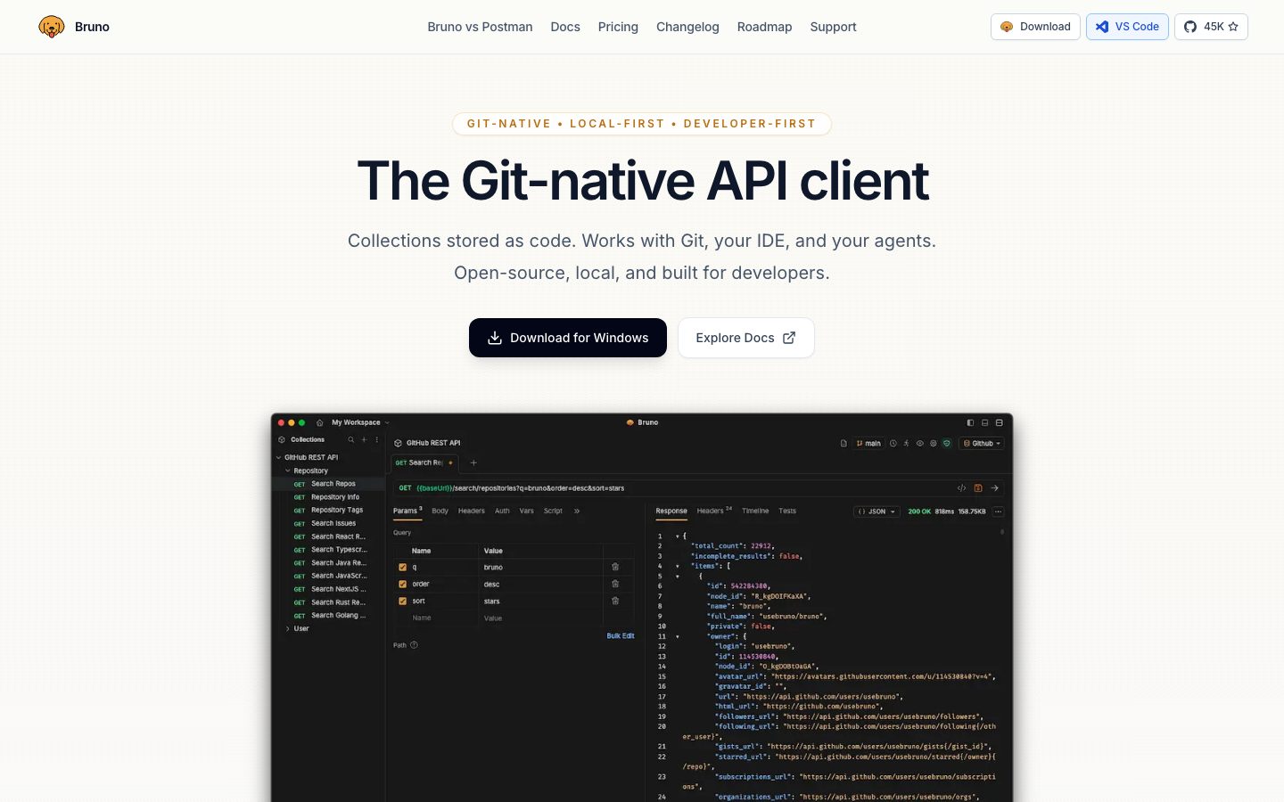
## Overview
Bruno's marketing page is a warm, developer-first open-source surface. The canvas is a soft off-white (`{colors.canvas}` — #fbfbf8) rather than pure white, which gives the whole page a slightly paper-like, low-glare tone that suits a tool aimed at people who stare at editors all day. Text is slate-ink (`{colors.ink}` — #0f172a), the supporting copy steps down to `{colors.muted}` (#475569), and the single brand voltage comes from the amber (`{colors.accent}` — #f4aa41) lifted directly from the Bruno mascot — used for the eyebrow tagline, inline highlight phrases, and the "get it" emphasis word.
The type system is **Inter for everything** — there is no display face. Brand character is achieved entirely through scale and tracking: the hero headline runs at `{typography.display}` (60px / weight 600 / -2.4px letter-spacing / line-height 1.0), a dense, tight, confident headline that anchors the page. Everything below it relaxes into open, airy body copy at `{typography.body}` (20px / line-height 1.8) — the generous leading is a deliberate readability signal.
The component voltage comes from **real product-UI screenshots shown inside soft-cornered cards** — the actual Bruno desktop app with its dark code editor, collection tree, and JSON response pane sits directly in the hero and in feature bands. Bruno shows the product rather than illustrating it. Where it does illustrate (the gateway diagram, the role/access icon grid), it uses line-art tiles on `{colors.surface-soft}`.
**Key Characteristics:**
- Warm off-white canvas (`{colors.canvas}` — #fbfbf8) instead of pure white — the defining surface decision.
- Near-black primary CTA (`{component.button-primary}`) using `{colors.ink-strong}` (#111827) paired with a white outlined secondary (`{component.button-secondary}`). Both at `{rounded.md}` (12px).
- Single amber accent (`{colors.accent}` — #f4aa41) used sparingly — eyebrow tagline, inline highlight phrases, emphasis words. The brand is near-monochrome at the action layer (CTAs are black/white, not amber).
- Inter-only typography. No display typeface — hierarchy is built from scale (60px hero down to 14px labels) and negative tracking.
- Soft 16px rounded cards (`{rounded.lg}` is the dominant radius — 37 occurrences) holding real product screenshots and feature copy.
- Deep, low-alpha ambient shadows (`rgba(15,23,42,0.06) 0 24px 60px`) float the product mockups off the warm canvas.
- Generous body line-height (1.8) — the readability signal of a developer-documentation voice.
## Colors
### Brand & Accent
- **Accent** (`{colors.accent}` — #f4aa41): The Bruno amber, lifted from the mascot. Used for the eyebrow tagline ("GIT-NATIVE • LOCAL-FIRST • DEVELOPER-FIRST"), inline highlight phrases inside feature paragraphs, and the emphasis word ("get it"). The system's only chromatic voltage.
- **Accent Strong** (`{colors.accent-strong}` — #e89b2f) / **Accent Deep** (`{colors.accent-deep}` — #b86e10): Darker amber steps used for hover/active depth and for amber text on light amber backgrounds.
- **Accent / Amber Backgrounds** (`{colors.accent-bg}` — #fff0dd, `{colors.amber-bg}` — #fef3c7, `{colors.amber-bg-soft}` — #fffbeb): Faint amber tint fills for highlight chips and soft callout zones.
- **Link Blue** (`{colors.link-blue}` — #1d4ed8) with **Link Blue Soft** (`{colors.link-blue-soft}` — #eff6ff): Reserved almost exclusively for the "VS Code" nav button — the only blue moment on the page.
### Text
- **Ink** (`{colors.ink}` — #0f172a): All headlines and primary text.
- **Ink Strong** (`{colors.ink-strong}` — #111827): The near-black used for the primary CTA fill.
- **Neutral** (`{colors.neutral}` — #000000): Pure black, used in icon line-art and the product screenshot chrome.
- **Muted** (`{colors.muted}` — #475569): Default running-text and supporting copy.
- **Slate** (`{colors.slate}` — #64748b) / **Slate Light** (`{colors.slate-light}` — #94a3b8): Tertiary labels, captions, footer fine-print.
- **On Primary** (`{colors.on-primary}` — #334155): Text color on the white secondary button.
### Surface
- **Canvas** (`{colors.canvas}` — #fbfbf8): The warm off-white page floor.
- **Surface Card** (`{colors.surface-card}` — #ffffff): True-white card and button surfaces that lift off the warm canvas.
- **Surface Soft** (`{colors.surface-soft}` — #f9fafb): Illustration tiles, testimonial cards, soft nested fills.
- **Slate Dark** (`{colors.slate-dark}` — #1e293b): Deep slate used in the product UI chrome and dark accents.
- **Hairline** (`{colors.hairline}` — #e2e8f0): The 1px divider/border tone on light surfaces.
## Typography
### Font Family
The entire system runs **Inter** (captured as the bundled web font `__Inter_f367f3`). There is no separate display face — `fonts_licensed` is empty, so Inter ships as-is with no substitution required. The fallback stack walks `Inter, sans-serif`. Brand character is built from scale and tracking rather than a custom typeface.
### Hierarchy
| Token | Size | Weight | Line Height | Letter Spacing | Use |
|---|---|---|---|---|---|
| `{typography.display}` | 60px | 600 | 1.0 | -2.4px | Hero headline ("The Git-native API client") |
| `{typography.title}` | 24px | 500 | 1.333 | 0 | Feature-band headlines, FAQ questions, section heads |
| `{typography.body}` | 20px | 400 | 1.8 | 0 | Running body copy — sub-headline, feature descriptions |
| `{typography.button}` | 16px | 400 | 1.5 | 0 | CTA button labels |
| `{typography.eyebrow}` | 14px | 600 | 1.429 | -0.35px | Eyebrow tagline pill above the hero |
| `{typography.label}` | 14px | 600 | 1.429 | 0 | Nav links, feature column labels, footer headers |
### Principles
The hero headline is the only place tracking goes sharply negative (-2.4px) — that tightness, paired with weight 600 at 60px and line-height 1.0, is the page's signature typographic moment. Everything else relaxes: body copy at 20px with line-height 1.8 is unusually airy, reading as documentation-grade legibility. Weight never exceeds 600 — the system stays in the 400–600 range across all roles, which keeps the developer-tool voice calm rather than shouty.
### Note on Font Substitutes
No licensed/custom faces are in use — Inter is open-source (SIL Open Font License) and ships directly. No substitution is necessary.
## Layout
### Spacing System
- **Base unit:** 4px.
- **Tokens:** `{spacing.xxs}` 4px · `{spacing.xs}` 8px · `{spacing.sm}` 12px · `{spacing.md}` 16px · `{spacing.lg}` 20px · `{spacing.xl}` 24px · `{spacing.xxl}` 32px · `{spacing.xxxl}` 40px · `{spacing.section}` 56px.
- **Most frequent measured steps:** 20px (the dominant gap/padding unit) and 32px (card and band internal padding).
- **Card internal padding:** `{spacing.xxxl}` (40px) for large feature cards; `{spacing.xl}` (24px) for testimonial and FAQ cards; `{spacing.lg}` (20px) for product-mockup cards.
- **Section rhythm:** `{spacing.section}` (56px) between major bands.
### Grid & Container
- **Hero:** Single centered column — eyebrow pill, headline, sub-headline, and CTA pair all stacked and centered, with the product mockup card spanning full content width below.
- **Feature columns:** A 4-up labeled row ("Developer First", "Native Git", "Local Only", "Designed for Scale") under the hero mockup.
- **Feature bands:** Alternating 2-column splits — copy on one side, product screenshot or icon-tile on the other.
- **Logo wall:** "Trusted by organizations" grid, ~6-up at desktop.
- **Testimonials:** Multi-column masonry of quote cards with a carousel control.
- **FAQ:** Single-column stack of expandable rows.
- **Footer:** 4-column link list (Company / Resources / Community / Trust & Legal).
### Whitespace Philosophy
Bruno breathes. The warm canvas with 56px band rhythm and 1.8 line-height body copy creates a calm, unhurried reading pace — appropriate for a tool whose pitch ("local-first, your data stays on your machine") rewards careful reading. Cards carry generous 24–40px internal padding so screenshots and copy never feel cramped.
## Elevation & Depth
| Level | Treatment | Use |
|---|---|---|
| Flat | No shadow | Canvas bands, nav, eyebrow text |
| Hairline lift | `rgba(0,0,0,0.05) 0 1px 2px` | Buttons, small pills, eyebrow pill |
| Soft card | `rgba(15,23,42,0.04) 0 1px 2px, rgba(15,23,42,0.05) 0 20px 50px` | Feature cards, testimonial cards |
| Floating mockup | `rgba(15,23,42,0.05) 0 1px 2px, rgba(15,23,42,0.06) 0 24px 60px` | The hero product-UI screenshot card |
| Deep panel | `rgba(15,23,42,0.08) 0 18px 45px` | Larger product panels in feature bands |
The elevation philosophy is **deep but extremely soft**: shadows reach 45–60px of blur but stay at very low alpha (0.04–0.08), so cards appear to hover gently off the warm canvas without any visible hard edge. There is no neumorphism or glassmorphism — just layered ambient drop shadows tinted with the slate ink (`rgba(15,23,42,...)`) rather than pure black.
## Shapes
### Border Radius Scale
| Token | Value | Use |
|---|---|---|
| `{rounded.sm}` | 6px | Small inline elements, inputs inside product chrome |
| `{rounded.md}` | 12px | CTA buttons (primary + secondary), nav buttons |
| `{rounded.lg}` | 16px | The dominant radius — feature cards, product-mockup cards, FAQ rows, illustration tiles (37 measured occurrences) |
| `{rounded.xl}` | 20px | Larger feature panels |
| `{rounded.xxl}` | 24px | Outer wrapper cards / band containers |
| `{rounded.xxxl}` | 28px | Largest container surfaces |
| `{rounded.full}` | 9999px | Eyebrow pill, carousel arrow buttons, circular avatars |
### Photography & Mockup Geometry
The product-UI screenshots retain their native window chrome (the dark Bruno desktop app with traffic-light controls) and sit inside `{rounded.lg}` (16px) card frames. Testimonial avatars and the mascot use `{rounded.full}`. Illustration tiles (gateway diagram, role/access icon grid) use line-art on `{colors.surface-soft}` inside `{rounded.lg}` frames.
## Components
### Top Navigation
**`top-nav`** — Warm-canvas nav bar with the Bruno mascot logo + wordmark at left, a centered horizontal menu (Bruno vs Postman, Docs, Pricing, Changelog, Roadmap, Support) in `{typography.label}` (`{colors.muted}`), and a right cluster: a "Download" button, a "VS Code" button (`{component.nav-cta-vscode}`), and a GitHub star count chip. No shadow — sits flat on the canvas.
**`nav-cta-vscode`** — The single blue moment on the page. White fill (`{colors.surface-card}`) with `{colors.link-blue}` text and icon, rounded `{rounded.md}`. Signals the VS Code extension.
### Buttons
**`button-primary`** — The hero's "Download for Windows" CTA. Near-black fill (`{colors.ink-strong}` — #111827), white label (`{colors.primary}`), type `{typography.button}` (Inter 16px / 400), rounded `{rounded.md}` (12px), with a download glyph. The dominant action color is black, not amber.
**`button-secondary`** — The "Explore Docs" CTA beside it. White fill (`{colors.primary}` — #ffffff), `{colors.on-primary}` (#334155) label, 1px `{colors.hairline}` border, rounded `{rounded.md}`. Carries an external-link glyph.
### Hero
**`hero-band`** — Centered hero on `{colors.canvas}`. Stacks `{component.eyebrow-pill}`, the `{typography.display}` headline ("The Git-native API client"), a two-line `{typography.body}` sub-headline in `{colors.muted}`, and the primary/secondary button pair — then a full-width `{component.product-mockup-card}` below.
**`eyebrow-pill`** — Small white pill above the headline carrying "GIT-NATIVE • LOCAL-FIRST • DEVELOPER-FIRST" in `{typography.eyebrow}` (Inter 14px / 600 / -0.35px) colored `{colors.accent}`. White fill (`{colors.surface-card}`), rounded `{rounded.full}`, with a hairline lift shadow.
### Cards & Containers
**`product-mockup-card`** — Frames a real Bruno desktop-app screenshot (collection tree, request editor, JSON response pane). White fill (`{colors.surface-card}`), rounded `{rounded.lg}` (16px), floated with the deep-soft ambient shadow. Bruno shows the product rather than illustrating it.
**`feature-card`** — Large feature band cards ("Built by and for Developers", "Collaborate via Git", "Secure & Local", "Effortless Scale"). White fill (`{colors.surface-card}`), rounded `{rounded.lg}`, internal padding `{spacing.xxxl}` (40px). Carries a `{typography.title}` headline, a subtitle line, and `{typography.body}` copy with inline amber (`{colors.accent}`) highlight phrases.
**`feature-illustration-tile`** — The line-art panels paired with feature copy (the IDE↔Git↔CI/CD gateway diagram, the role/access/audit icon grid, the data-stays-local mascot+cloud illustration). Background `{colors.surface-soft}`, rounded `{rounded.lg}`, padding `{spacing.xxl}` (32px). Icons rendered as monochrome `{colors.neutral}` line-art.
**`testimonial-card`** — Quote cards in the "Customer Testimonials" masonry. Background `{colors.surface-soft}`, type `{typography.body}` in `{colors.muted}`, rounded `{rounded.lg}`, padding `{spacing.xl}` (24px). Footer row carries a `{rounded.full}` avatar plus name and handle.
**`carousel-arrow`** — Circular previous/next control beneath the testimonial grid. White fill (`{colors.surface-card}`), `{colors.muted}` arrow glyph, rounded `{rounded.full}`, hairline lift shadow.
### FAQ
**`faq-item`** — Expandable question rows ("Does Bruno sync data from my app?", "How does collaboration work?"). White fill (`{colors.surface-card}`), question in `{typography.title}` (`{colors.ink}`), a "+" affordance at right, rounded `{rounded.lg}`, padding `{spacing.xl}` (24px). 1px `{colors.hairline}` divider tone.
### Footer
**`footer`** — Warm-canvas footer closing the page. Background `{colors.canvas}`, link text in `{colors.muted}` (`{typography.label}`), 4-column link list (Company / Resources / Community / Trust & Legal). Left column carries the mission statement in `{colors.slate}`; bottom strip holds the "All rights reserved" copyright and "Built for developer-first API workflows" tagline. Padding `{spacing.section}` (56px).
## Do's and Don'ts
### Do
- Use the warm off-white `{colors.canvas}` (#fbfbf8) as the page floor — it's the defining surface decision, not pure white.
- Keep CTAs monochrome: near-black `{component.button-primary}` + white `{component.button-secondary}`. The amber stays out of the action layer.
- Reserve `{colors.accent}` (#f4aa41) for the eyebrow pill, inline highlight phrases, and single emphasis words. It is scarce on purpose.
- Use `{rounded.lg}` (16px) as the default card radius — it's the system's dominant shape.
- Show real product screenshots inside `{component.product-mockup-card}` rather than illustrating the product.
- Float cards with the deep-but-soft ambient shadow (45–60px blur at 0.04–0.08 alpha) — never a hard, dark drop shadow.
- Keep body copy at `{typography.body}` (20px / line-height 1.8) — the airy leading is the documentation-grade readability signal.
### Don't
- Don't fill primary CTAs with amber. Bruno's action color is black.
- Don't introduce a second accent hue — the blue (`{colors.link-blue}`) is reserved for the VS Code button only.
- Don't push type weight beyond 600. The whole system lives in the 400–600 range.
- Don't apply tight negative tracking outside the hero `{typography.display}` — body and titles stay at neutral spacing.
- Don't tighten body line-height below 1.8; the openness is intentional.
- Don't use pure white for full bands — reserve `{colors.surface-card}` (#ffffff) for cards and buttons that lift off the warm canvas.
- Don't document hover states — default and active/pressed only.
## Responsive Behavior
### Breakpoints
| Name | Width | Key Changes |
|---|---|---|
| Mobile | < 768px | Nav collapses to logo + menu trigger; hero headline scales down from 60px; CTA pair stacks; feature splits collapse to single column; logo wall and testimonials go 1–2 up; footer columns stack |
| Tablet | 768–1024px | Horizontal nav tightens; feature columns go 2-up; testimonials 2-up |
| Desktop | 1024–1440px | Full horizontal nav; 4-up feature columns; alternating 2-column feature bands; ~6-up logo wall |
| Wide | > 1440px | Same as desktop with wider outer margins; centered content column |
### Touch Targets
- `{component.button-primary}` and `{component.button-secondary}` carry 16px × 24px padding (derived from the 16/24 spacing steps) — comfortably above 44px tall.
- `{component.nav-cta-vscode}` and nav buttons use 8px × 16px padding plus icon — effective tap area meets target with surrounding spacing.
- `{component.carousel-arrow}` is a full-circle control at ~12px padding around the glyph.
- `{component.faq-item}` rows are full-width tap targets.
### Collapsing Strategy
- Hero stays centered and stacks naturally; the product-mockup card scales proportionally while the dark app chrome stays legible.
- Alternating 2-column feature bands collapse to copy-then-illustration stacks on mobile.
- Testimonial masonry reduces column count and the carousel arrows persist.
- Footer's 4-column link list wraps to 2-up then 1-up.
### Image Behavior
- Product-UI screenshots retain native aspect ratios; the `{rounded.lg}` card frame resizes around them.
- Logo wall marks scale down uniformly.
- Avatars crop to `{rounded.full}` circles at every breakpoint.
## Iteration Guide
1. Focus on ONE component at a time. Reference its YAML key directly (`{component.feature-card}`, `{component.product-mockup-card}`).
2. Variants of an existing component (`-active`, `-disabled`) live as separate entries in `components:`.
3. Use `{token.refs}` everywhere — never inline a hex.
4. Never document hover. Default and Active/Pressed states only.
5. The hero `{typography.display}` is the only place tracking goes to -2.4px; everything else stays neutral.
6. Amber (`{colors.accent}`) is scarce — eyebrow, highlight phrases, emphasis word. Keep CTAs black/white.
7. The warm canvas (#fbfbf8) is the brand floor — keep pure white for cards only.
## Known Gaps
- The frequency analyzer captured `button-primary` as a **white** fill (#ffffff) with `{colors.on-primary}` (#334155) text — that is the "Explore Docs" secondary button. The screenshot ground-truth shows the actual primary "Download for Windows" CTA as a near-black button; its fill is documented from the measured `{colors.ink-strong}` (#111827) / `{colors.neutral}` tones rather than a directly-tagged primary-button sample. Exact CTA hex should be confirmed.
- The `h1` role measured at 14px / 600 / -0.35px — this is the eyebrow tagline, not a page title; it is documented as `{typography.eyebrow}`. The visually-dominant headline is the measured `h2` (60px), documented as `{typography.display}`.
- The measured `card` component reported `radius: 9999px` — this corresponds to a pill/circular element (eyebrow pill or avatar), not the rectangular content cards, which use the dominant `{rounded.lg}` (16px). Documented accordingly.
- The 18px radius (single occurrence) was treated as noise and not assigned a token.
- Amber-tint background hexes (`#fff0dd`, `#fef3c7`, `#fffbeb`) were measured at low frequency; their exact mapping to specific highlight chips vs. callout zones is inferred from screenshots.
- Active/pressed and disabled button states were not captured — only default states are extracted.
- Animation and transition timings (testimonial carousel, FAQ expand/collapse) are out of scope.
- Only the landing page was captured; Pricing, Docs, and Changelog surfaces may introduce additional tokens.
<!-- Documented by duply · real-world design systems as ready-to-use DESIGN.md for AI coding agents · https://duply.ai/usebruno/design-md -->
Color Palette
Accent
Neutrals
Typography
eyebrow14px · 600 · 1.429
The quick brown fox jumpsdisplay60px · 600 · 1
The quick brown fox jumpstitle24px · 500 · 1.333
The quick brown fox jumpslabel14px · 600 · 1.429
The quick brown fox jumpsbody20px · 400 · 1.8
The quick brown fox jumpsbutton16px · 400 · 1.5
The quick brown fox jumpsSpacing & Shape
Spacing
| Name | Value | Preview |
|---|---|---|
| xxs | 4px | |
| xs | 8px | |
| sm | 12px | |
| md | 16px | |
| lg | 20px | |
| xl | 24px | |
| xxl | 32px | |
| xxxl | 40px | |
| section | 56px |
Border Radius
| Name | Value | Preview |
|---|---|---|
| sm | 6px | |
| md | 12px | |
| lg | 16px | |
| xl | 20px | |
| xxl | 24px | |
| xxxl | 28px | |
| full | 9999px |
More like this


---
version: alpha
name: usebruno-design-analysis
description: "A warm, developer-first marketing surface for the Bruno API client, built on a soft off-white canvas (#fbfbf8) with near-black CTAs, slate-ink typography, and a single amber brand accent (#f4aa41) borrowed from the Bruno mascot. The system reads as calm open-source SaaS — soft 16px rounded cards carrying real product-UI screenshots, generous line-height body copy, deep low-alpha ambient shadows, and Inter throughout at weight 400–600 with tight negative tracking on the oversized hero headline."

colors:
  ink: "#0f172a"
  ink-strong: "#111827"
  neutral: "#000000"
  primary: "#ffffff"
  on-primary: "#334155"
  muted: "#475569"
  slate: "#64748b"
  slate-light: "#94a3b8"
  slate-dark: "#1e293b"
  canvas: "#fbfbf8"
  surface-soft: "#f9fafb"
  surface-card: "#ffffff"
  hairline: "#e2e8f0"
  accent: "#f4aa41"
  accent-strong: "#e89b2f"
  accent-deep: "#b86e10"
  accent-bg: "#fff0dd"
  amber-bg: "#fef3c7"
  amber-bg-soft: "#fffbeb"
  link-blue: "#1d4ed8"
  link-blue-soft: "#eff6ff"

typography:
  eyebrow:
    fontFamily: "Inter, sans-serif"
    fontSize: 14px
    fontWeight: 600
    lineHeight: 1.429
    letterSpacing: -0.35px
  display:
    fontFamily: "Inter, sans-serif"
    fontSize: 60px
    fontWeight: 600
    lineHeight: 1.0
    letterSpacing: -2.4px
  title:
    fontFamily: "Inter, sans-serif"
    fontSize: 24px
    fontWeight: 500
    lineHeight: 1.333
    letterSpacing: 0
  label:
    fontFamily: "Inter, sans-serif"
    fontSize: 14px
    fontWeight: 600
    lineHeight: 1.429
    letterSpacing: 0
  body:
    fontFamily: "Inter, sans-serif"
    fontSize: 20px
    fontWeight: 400
    lineHeight: 1.8
    letterSpacing: 0
  button:
    fontFamily: "Inter, sans-serif"
    fontSize: 16px
    fontWeight: 400
    lineHeight: 1.5
    letterSpacing: 0

rounded:
  sm: 6px
  md: 12px
  lg: 16px
  xl: 20px
  xxl: 24px
  xxxl: 28px
  full: 9999px

spacing:
  xxs: 4px
  xs: 8px
  sm: 12px
  md: 16px
  lg: 20px
  xl: 24px
  xxl: 32px
  xxxl: 40px
  section: 56px

components:
  top-nav:
    backgroundColor: "{colors.canvas}"
    textColor: "{colors.muted}"
    typography: "{typography.label}"
    padding: 20px 32px
  button-primary:
    backgroundColor: "{colors.ink-strong}"
    textColor: "{colors.primary}"
    typography: "{typography.button}"
    rounded: "{rounded.md}"
    padding: 16px 24px
  button-secondary:
    backgroundColor: "{colors.primary}"
    textColor: "{colors.on-primary}"
    typography: "{typography.button}"
    rounded: "{rounded.md}"
    padding: 16px 24px
  nav-cta-vscode:
    backgroundColor: "{colors.primary}"
    textColor: "{colors.link-blue}"
    typography: "{typography.label}"
    rounded: "{rounded.md}"
    padding: 8px 16px
  eyebrow-pill:
    backgroundColor: "{colors.surface-card}"
    textColor: "{colors.accent}"
    typography: "{typography.eyebrow}"
    rounded: "{rounded.full}"
    padding: 8px 20px
  hero-band:
    backgroundColor: "{colors.canvas}"
    textColor: "{colors.ink}"
    typography: "{typography.display}"
    padding: 56px
  product-mockup-card:
    backgroundColor: "{colors.surface-card}"
    textColor: "{colors.ink}"
    rounded: "{rounded.lg}"
    padding: 20px
  feature-card:
    backgroundColor: "{colors.surface-card}"
    textColor: "{colors.ink}"
    typography: "{typography.title}"
    rounded: "{rounded.lg}"
    padding: 40px
  feature-illustration-tile:
    backgroundColor: "{colors.surface-soft}"
    textColor: "{colors.muted}"
    rounded: "{rounded.lg}"
    padding: 32px
  testimonial-card:
    backgroundColor: "{colors.surface-soft}"
    textColor: "{colors.muted}"
    typography: "{typography.body}"
    rounded: "{rounded.lg}"
    padding: 24px
  faq-item:
    backgroundColor: "{colors.surface-card}"
    textColor: "{colors.ink}"
    typography: "{typography.title}"
    rounded: "{rounded.lg}"
    padding: 24px
  carousel-arrow:
    backgroundColor: "{colors.surface-card}"
    textColor: "{colors.muted}"
    rounded: "{rounded.full}"
    padding: 12px
  footer:
    backgroundColor: "{colors.canvas}"
    textColor: "{colors.muted}"
    typography: "{typography.label}"
    padding: 56px
---

## Overview

Bruno's marketing page is a warm, developer-first open-source surface. The canvas is a soft off-white (`{colors.canvas}` — #fbfbf8) rather than pure white, which gives the whole page a slightly paper-like, low-glare tone that suits a tool aimed at people who stare at editors all day. Text is slate-ink (`{colors.ink}` — #0f172a), the supporting copy steps down to `{colors.muted}` (#475569), and the single brand voltage comes from the amber (`{colors.accent}` — #f4aa41) lifted directly from the Bruno mascot — used for the eyebrow tagline, inline highlight phrases, and the "get it" emphasis word.

The type system is **Inter for everything** — there is no display face. Brand character is achieved entirely through scale and tracking: the hero headline runs at `{typography.display}` (60px / weight 600 / -2.4px letter-spacing / line-height 1.0), a dense, tight, confident headline that anchors the page. Everything below it relaxes into open, airy body copy at `{typography.body}` (20px / line-height 1.8) — the generous leading is a deliberate readability signal.

The component voltage comes from **real product-UI screenshots shown inside soft-cornered cards** — the actual Bruno desktop app with its dark code editor, collection tree, and JSON response pane sits directly in the hero and in feature bands. Bruno shows the product rather than illustrating it. Where it does illustrate (the gateway diagram, the role/access icon grid), it uses line-art tiles on `{colors.surface-soft}`.

**Key Characteristics:**
- Warm off-white canvas (`{colors.canvas}` — #fbfbf8) instead of pure white — the defining surface decision.
- Near-black primary CTA (`{component.button-primary}`) using `{colors.ink-strong}` (#111827) paired with a white outlined secondary (`{component.button-secondary}`). Both at `{rounded.md}` (12px).
- Single amber accent (`{colors.accent}` — #f4aa41) used sparingly — eyebrow tagline, inline highlight phrases, emphasis words. The brand is near-monochrome at the action layer (CTAs are black/white, not amber).
- Inter-only typography. No display typeface — hierarchy is built from scale (60px hero down to 14px labels) and negative tracking.
- Soft 16px rounded cards (`{rounded.lg}` is the dominant radius — 37 occurrences) holding real product screenshots and feature copy.
- Deep, low-alpha ambient shadows (`rgba(15,23,42,0.06) 0 24px 60px`) float the product mockups off the warm canvas.
- Generous body line-height (1.8) — the readability signal of a developer-documentation voice.

## Colors

### Brand & Accent
- **Accent** (`{colors.accent}` — #f4aa41): The Bruno amber, lifted from the mascot. Used for the eyebrow tagline ("GIT-NATIVE • LOCAL-FIRST • DEVELOPER-FIRST"), inline highlight phrases inside feature paragraphs, and the emphasis word ("get it"). The system's only chromatic voltage.
- **Accent Strong** (`{colors.accent-strong}` — #e89b2f) / **Accent Deep** (`{colors.accent-deep}` — #b86e10): Darker amber steps used for hover/active depth and for amber text on light amber backgrounds.
- **Accent / Amber Backgrounds** (`{colors.accent-bg}` — #fff0dd, `{colors.amber-bg}` — #fef3c7, `{colors.amber-bg-soft}` — #fffbeb): Faint amber tint fills for highlight chips and soft callout zones.
- **Link Blue** (`{colors.link-blue}` — #1d4ed8) with **Link Blue Soft** (`{colors.link-blue-soft}` — #eff6ff): Reserved almost exclusively for the "VS Code" nav button — the only blue moment on the page.

### Text
- **Ink** (`{colors.ink}` — #0f172a): All headlines and primary text.
- **Ink Strong** (`{colors.ink-strong}` — #111827): The near-black used for the primary CTA fill.
- **Neutral** (`{colors.neutral}` — #000000): Pure black, used in icon line-art and the product screenshot chrome.
- **Muted** (`{colors.muted}` — #475569): Default running-text and supporting copy.
- **Slate** (`{colors.slate}` — #64748b) / **Slate Light** (`{colors.slate-light}` — #94a3b8): Tertiary labels, captions, footer fine-print.
- **On Primary** (`{colors.on-primary}` — #334155): Text color on the white secondary button.

### Surface
- **Canvas** (`{colors.canvas}` — #fbfbf8): The warm off-white page floor.
- **Surface Card** (`{colors.surface-card}` — #ffffff): True-white card and button surfaces that lift off the warm canvas.
- **Surface Soft** (`{colors.surface-soft}` — #f9fafb): Illustration tiles, testimonial cards, soft nested fills.
- **Slate Dark** (`{colors.slate-dark}` — #1e293b): Deep slate used in the product UI chrome and dark accents.
- **Hairline** (`{colors.hairline}` — #e2e8f0): The 1px divider/border tone on light surfaces.

## Typography

### Font Family
The entire system runs **Inter** (captured as the bundled web font `__Inter_f367f3`). There is no separate display face — `fonts_licensed` is empty, so Inter ships as-is with no substitution required. The fallback stack walks `Inter, sans-serif`. Brand character is built from scale and tracking rather than a custom typeface.

### Hierarchy

| Token | Size | Weight | Line Height | Letter Spacing | Use |
|---|---|---|---|---|---|
| `{typography.display}` | 60px | 600 | 1.0 | -2.4px | Hero headline ("The Git-native API client") |
| `{typography.title}` | 24px | 500 | 1.333 | 0 | Feature-band headlines, FAQ questions, section heads |
| `{typography.body}` | 20px | 400 | 1.8 | 0 | Running body copy — sub-headline, feature descriptions |
| `{typography.button}` | 16px | 400 | 1.5 | 0 | CTA button labels |
| `{typography.eyebrow}` | 14px | 600 | 1.429 | -0.35px | Eyebrow tagline pill above the hero |
| `{typography.label}` | 14px | 600 | 1.429 | 0 | Nav links, feature column labels, footer headers |

### Principles
The hero headline is the only place tracking goes sharply negative (-2.4px) — that tightness, paired with weight 600 at 60px and line-height 1.0, is the page's signature typographic moment. Everything else relaxes: body copy at 20px with line-height 1.8 is unusually airy, reading as documentation-grade legibility. Weight never exceeds 600 — the system stays in the 400–600 range across all roles, which keeps the developer-tool voice calm rather than shouty.

### Note on Font Substitutes
No licensed/custom faces are in use — Inter is open-source (SIL Open Font License) and ships directly. No substitution is necessary.

## Layout

### Spacing System
- **Base unit:** 4px.
- **Tokens:** `{spacing.xxs}` 4px · `{spacing.xs}` 8px · `{spacing.sm}` 12px · `{spacing.md}` 16px · `{spacing.lg}` 20px · `{spacing.xl}` 24px · `{spacing.xxl}` 32px · `{spacing.xxxl}` 40px · `{spacing.section}` 56px.
- **Most frequent measured steps:** 20px (the dominant gap/padding unit) and 32px (card and band internal padding).
- **Card internal padding:** `{spacing.xxxl}` (40px) for large feature cards; `{spacing.xl}` (24px) for testimonial and FAQ cards; `{spacing.lg}` (20px) for product-mockup cards.
- **Section rhythm:** `{spacing.section}` (56px) between major bands.

### Grid & Container
- **Hero:** Single centered column — eyebrow pill, headline, sub-headline, and CTA pair all stacked and centered, with the product mockup card spanning full content width below.
- **Feature columns:** A 4-up labeled row ("Developer First", "Native Git", "Local Only", "Designed for Scale") under the hero mockup.
- **Feature bands:** Alternating 2-column splits — copy on one side, product screenshot or icon-tile on the other.
- **Logo wall:** "Trusted by organizations" grid, ~6-up at desktop.
- **Testimonials:** Multi-column masonry of quote cards with a carousel control.
- **FAQ:** Single-column stack of expandable rows.
- **Footer:** 4-column link list (Company / Resources / Community / Trust & Legal).

### Whitespace Philosophy
Bruno breathes. The warm canvas with 56px band rhythm and 1.8 line-height body copy creates a calm, unhurried reading pace — appropriate for a tool whose pitch ("local-first, your data stays on your machine") rewards careful reading. Cards carry generous 24–40px internal padding so screenshots and copy never feel cramped.

## Elevation & Depth

| Level | Treatment | Use |
|---|---|---|
| Flat | No shadow | Canvas bands, nav, eyebrow text |
| Hairline lift | `rgba(0,0,0,0.05) 0 1px 2px` | Buttons, small pills, eyebrow pill |
| Soft card | `rgba(15,23,42,0.04) 0 1px 2px, rgba(15,23,42,0.05) 0 20px 50px` | Feature cards, testimonial cards |
| Floating mockup | `rgba(15,23,42,0.05) 0 1px 2px, rgba(15,23,42,0.06) 0 24px 60px` | The hero product-UI screenshot card |
| Deep panel | `rgba(15,23,42,0.08) 0 18px 45px` | Larger product panels in feature bands |

The elevation philosophy is **deep but extremely soft**: shadows reach 45–60px of blur but stay at very low alpha (0.04–0.08), so cards appear to hover gently off the warm canvas without any visible hard edge. There is no neumorphism or glassmorphism — just layered ambient drop shadows tinted with the slate ink (`rgba(15,23,42,...)`) rather than pure black.

## Shapes

### Border Radius Scale

| Token | Value | Use |
|---|---|---|
| `{rounded.sm}` | 6px | Small inline elements, inputs inside product chrome |
| `{rounded.md}` | 12px | CTA buttons (primary + secondary), nav buttons |
| `{rounded.lg}` | 16px | The dominant radius — feature cards, product-mockup cards, FAQ rows, illustration tiles (37 measured occurrences) |
| `{rounded.xl}` | 20px | Larger feature panels |
| `{rounded.xxl}` | 24px | Outer wrapper cards / band containers |
| `{rounded.xxxl}` | 28px | Largest container surfaces |
| `{rounded.full}` | 9999px | Eyebrow pill, carousel arrow buttons, circular avatars |

### Photography & Mockup Geometry
The product-UI screenshots retain their native window chrome (the dark Bruno desktop app with traffic-light controls) and sit inside `{rounded.lg}` (16px) card frames. Testimonial avatars and the mascot use `{rounded.full}`. Illustration tiles (gateway diagram, role/access icon grid) use line-art on `{colors.surface-soft}` inside `{rounded.lg}` frames.

## Components

### Top Navigation

**`top-nav`** — Warm-canvas nav bar with the Bruno mascot logo + wordmark at left, a centered horizontal menu (Bruno vs Postman, Docs, Pricing, Changelog, Roadmap, Support) in `{typography.label}` (`{colors.muted}`), and a right cluster: a "Download" button, a "VS Code" button (`{component.nav-cta-vscode}`), and a GitHub star count chip. No shadow — sits flat on the canvas.

**`nav-cta-vscode`** — The single blue moment on the page. White fill (`{colors.surface-card}`) with `{colors.link-blue}` text and icon, rounded `{rounded.md}`. Signals the VS Code extension.

### Buttons

**`button-primary`** — The hero's "Download for Windows" CTA. Near-black fill (`{colors.ink-strong}` — #111827), white label (`{colors.primary}`), type `{typography.button}` (Inter 16px / 400), rounded `{rounded.md}` (12px), with a download glyph. The dominant action color is black, not amber.

**`button-secondary`** — The "Explore Docs" CTA beside it. White fill (`{colors.primary}` — #ffffff), `{colors.on-primary}` (#334155) label, 1px `{colors.hairline}` border, rounded `{rounded.md}`. Carries an external-link glyph.

### Hero

**`hero-band`** — Centered hero on `{colors.canvas}`. Stacks `{component.eyebrow-pill}`, the `{typography.display}` headline ("The Git-native API client"), a two-line `{typography.body}` sub-headline in `{colors.muted}`, and the primary/secondary button pair — then a full-width `{component.product-mockup-card}` below.

**`eyebrow-pill`** — Small white pill above the headline carrying "GIT-NATIVE • LOCAL-FIRST • DEVELOPER-FIRST" in `{typography.eyebrow}` (Inter 14px / 600 / -0.35px) colored `{colors.accent}`. White fill (`{colors.surface-card}`), rounded `{rounded.full}`, with a hairline lift shadow.

### Cards & Containers

**`product-mockup-card`** — Frames a real Bruno desktop-app screenshot (collection tree, request editor, JSON response pane). White fill (`{colors.surface-card}`), rounded `{rounded.lg}` (16px), floated with the deep-soft ambient shadow. Bruno shows the product rather than illustrating it.

**`feature-card`** — Large feature band cards ("Built by and for Developers", "Collaborate via Git", "Secure & Local", "Effortless Scale"). White fill (`{colors.surface-card}`), rounded `{rounded.lg}`, internal padding `{spacing.xxxl}` (40px). Carries a `{typography.title}` headline, a subtitle line, and `{typography.body}` copy with inline amber (`{colors.accent}`) highlight phrases.

**`feature-illustration-tile`** — The line-art panels paired with feature copy (the IDE↔Git↔CI/CD gateway diagram, the role/access/audit icon grid, the data-stays-local mascot+cloud illustration). Background `{colors.surface-soft}`, rounded `{rounded.lg}`, padding `{spacing.xxl}` (32px). Icons rendered as monochrome `{colors.neutral}` line-art.

**`testimonial-card`** — Quote cards in the "Customer Testimonials" masonry. Background `{colors.surface-soft}`, type `{typography.body}` in `{colors.muted}`, rounded `{rounded.lg}`, padding `{spacing.xl}` (24px). Footer row carries a `{rounded.full}` avatar plus name and handle.

**`carousel-arrow`** — Circular previous/next control beneath the testimonial grid. White fill (`{colors.surface-card}`), `{colors.muted}` arrow glyph, rounded `{rounded.full}`, hairline lift shadow.

### FAQ

**`faq-item`** — Expandable question rows ("Does Bruno sync data from my app?", "How does collaboration work?"). White fill (`{colors.surface-card}`), question in `{typography.title}` (`{colors.ink}`), a "+" affordance at right, rounded `{rounded.lg}`, padding `{spacing.xl}` (24px). 1px `{colors.hairline}` divider tone.

### Footer

**`footer`** — Warm-canvas footer closing the page. Background `{colors.canvas}`, link text in `{colors.muted}` (`{typography.label}`), 4-column link list (Company / Resources / Community / Trust & Legal). Left column carries the mission statement in `{colors.slate}`; bottom strip holds the "All rights reserved" copyright and "Built for developer-first API workflows" tagline. Padding `{spacing.section}` (56px).

## Do's and Don'ts

### Do
- Use the warm off-white `{colors.canvas}` (#fbfbf8) as the page floor — it's the defining surface decision, not pure white.
- Keep CTAs monochrome: near-black `{component.button-primary}` + white `{component.button-secondary}`. The amber stays out of the action layer.
- Reserve `{colors.accent}` (#f4aa41) for the eyebrow pill, inline highlight phrases, and single emphasis words. It is scarce on purpose.
- Use `{rounded.lg}` (16px) as the default card radius — it's the system's dominant shape.
- Show real product screenshots inside `{component.product-mockup-card}` rather than illustrating the product.
- Float cards with the deep-but-soft ambient shadow (45–60px blur at 0.04–0.08 alpha) — never a hard, dark drop shadow.
- Keep body copy at `{typography.body}` (20px / line-height 1.8) — the airy leading is the documentation-grade readability signal.

### Don't
- Don't fill primary CTAs with amber. Bruno's action color is black.
- Don't introduce a second accent hue — the blue (`{colors.link-blue}`) is reserved for the VS Code button only.
- Don't push type weight beyond 600. The whole system lives in the 400–600 range.
- Don't apply tight negative tracking outside the hero `{typography.display}` — body and titles stay at neutral spacing.
- Don't tighten body line-height below 1.8; the openness is intentional.
- Don't use pure white for full bands — reserve `{colors.surface-card}` (#ffffff) for cards and buttons that lift off the warm canvas.
- Don't document hover states — default and active/pressed only.

## Responsive Behavior

### Breakpoints

| Name | Width | Key Changes |
|---|---|---|
| Mobile | < 768px | Nav collapses to logo + menu trigger; hero headline scales down from 60px; CTA pair stacks; feature splits collapse to single column; logo wall and testimonials go 1–2 up; footer columns stack |
| Tablet | 768–1024px | Horizontal nav tightens; feature columns go 2-up; testimonials 2-up |
| Desktop | 1024–1440px | Full horizontal nav; 4-up feature columns; alternating 2-column feature bands; ~6-up logo wall |
| Wide | > 1440px | Same as desktop with wider outer margins; centered content column |

### Touch Targets
- `{component.button-primary}` and `{component.button-secondary}` carry 16px × 24px padding (derived from the 16/24 spacing steps) — comfortably above 44px tall.
- `{component.nav-cta-vscode}` and nav buttons use 8px × 16px padding plus icon — effective tap area meets target with surrounding spacing.
- `{component.carousel-arrow}` is a full-circle control at ~12px padding around the glyph.
- `{component.faq-item}` rows are full-width tap targets.

### Collapsing Strategy
- Hero stays centered and stacks naturally; the product-mockup card scales proportionally while the dark app chrome stays legible.
- Alternating 2-column feature bands collapse to copy-then-illustration stacks on mobile.
- Testimonial masonry reduces column count and the carousel arrows persist.
- Footer's 4-column link list wraps to 2-up then 1-up.

### Image Behavior
- Product-UI screenshots retain native aspect ratios; the `{rounded.lg}` card frame resizes around them.
- Logo wall marks scale down uniformly.
- Avatars crop to `{rounded.full}` circles at every breakpoint.

## Iteration Guide

1. Focus on ONE component at a time. Reference its YAML key directly (`{component.feature-card}`, `{component.product-mockup-card}`).
2. Variants of an existing component (`-active`, `-disabled`) live as separate entries in `components:`.
3. Use `{token.refs}` everywhere — never inline a hex.
4. Never document hover. Default and Active/Pressed states only.
5. The hero `{typography.display}` is the only place tracking goes to -2.4px; everything else stays neutral.
6. Amber (`{colors.accent}`) is scarce — eyebrow, highlight phrases, emphasis word. Keep CTAs black/white.
7. The warm canvas (#fbfbf8) is the brand floor — keep pure white for cards only.

## Known Gaps

- The frequency analyzer captured `button-primary` as a **white** fill (#ffffff) with `{colors.on-primary}` (#334155) text — that is the "Explore Docs" secondary button. The screenshot ground-truth shows the actual primary "Download for Windows" CTA as a near-black button; its fill is documented from the measured `{colors.ink-strong}` (#111827) / `{colors.neutral}` tones rather than a directly-tagged primary-button sample. Exact CTA hex should be confirmed.
- The `h1` role measured at 14px / 600 / -0.35px — this is the eyebrow tagline, not a page title; it is documented as `{typography.eyebrow}`. The visually-dominant headline is the measured `h2` (60px), documented as `{typography.display}`.
- The measured `card` component reported `radius: 9999px` — this corresponds to a pill/circular element (eyebrow pill or avatar), not the rectangular content cards, which use the dominant `{rounded.lg}` (16px). Documented accordingly.
- The 18px radius (single occurrence) was treated as noise and not assigned a token.
- Amber-tint background hexes (`#fff0dd`, `#fef3c7`, `#fffbeb`) were measured at low frequency; their exact mapping to specific highlight chips vs. callout zones is inferred from screenshots.
- Active/pressed and disabled button states were not captured — only default states are extracted.
- Animation and transition timings (testimonial carousel, FAQ expand/collapse) are out of scope.
- Only the landing page was captured; Pricing, Docs, and Changelog surfaces may introduce additional tokens.

<!-- Documented by duply · real-world design systems as ready-to-use DESIGN.md for AI coding agents · https://duply.ai/usebruno/design-md -->