Dagger
A warm, developer-tooling marketing surface built on a cream canvas (#f8f4ef) with near-black ink, white content cards, and bold General Sans display headlines. The system reads as friendly-but-technical — playful hand-drawn mascot illustrations sit inside saturated color tiles (teal, orange, yellow), white rounded cards (16px) carry feature copy, and a near-black ink footer closes the page. Brand voltage comes from the chunky General Sans display face and the saturated illustration tiles rather than from accent text colors.
---
version: alpha
name: Dagger-design-analysis
description: "A warm, developer-tooling marketing surface built on a cream canvas (#f8f4ef) with near-black ink, white content cards, and bold General Sans display headlines. The system reads as friendly-but-technical — playful hand-drawn mascot illustrations sit inside saturated color tiles (teal, orange, yellow), white rounded cards (16px) carry feature copy, and a near-black ink footer closes the page. Brand voltage comes from the chunky General Sans display face and the saturated illustration tiles rather than from accent text colors."
colors:
primary: "#131226"
ink: "#131226"
ink-soft: "#191922"
on-primary: "#ffffff"
canvas: "#f8f4ef"
surface-card: "#ffffff"
hairline: "#e6e6ee"
hairline-alt: "#e7e6ef"
accent-lavender: "#ede8fa"
accent-teal: "#40b9bc"
accent-orange: "#ef7b1a"
accent-yellow: "#fcc009"
accent-blue: "#3d66ff"
neutral-black: "#000000"
typography:
display-xl:
fontFamily: "General Sans, Inter, sans-serif"
fontSize: 68px
fontWeight: 600
lineHeight: 1.1
letterSpacing: -0.68px
display-lg:
fontFamily: "General Sans, Inter, sans-serif"
fontSize: 44px
fontWeight: 600
lineHeight: 1.1
letterSpacing: -0.44px
title:
fontFamily: "General Sans, Inter, sans-serif"
fontSize: 24px
fontWeight: 600
lineHeight: 1.2
letterSpacing: -0.24px
body:
fontFamily: "Inter, sans-serif"
fontSize: 20px
fontWeight: 400
lineHeight: 1.4
letterSpacing: normal
button:
fontFamily: "Inter, sans-serif"
fontSize: 16px
fontWeight: 500
lineHeight: 1
letterSpacing: 0
rounded:
sm: 4px
md: 8px
lg: 16px
spacing:
xxs: 4px
xs: 8px
sm: 12px
md: 16px
lg: 20px
xl: 24px
xxl: 32px
huge: 40px
huge2: 48px
section: 80px
section-lg: 100px
components:
top-nav:
backgroundColor: "{colors.canvas}"
textColor: "{colors.ink}"
typography: "{typography.button}"
padding: 16px 40px
button-primary:
backgroundColor: "{colors.primary}"
textColor: "{colors.on-primary}"
typography: "{typography.button}"
rounded: "{rounded.md}"
padding: 12px 24px
button-secondary:
backgroundColor: "{colors.surface-card}"
textColor: "{colors.ink}"
typography: "{typography.button}"
rounded: "{rounded.md}"
padding: 12px 24px
code-snippet-pill:
backgroundColor: "{colors.accent-lavender}"
textColor: "{colors.ink}"
typography: "{typography.body}"
rounded: "{rounded.md}"
padding: 12px 24px
card:
backgroundColor: "{colors.surface-card}"
textColor: "{colors.ink}"
typography: "{typography.body}"
rounded: "{rounded.lg}"
padding: 48px
illustration-tile-teal:
backgroundColor: "{colors.accent-teal}"
textColor: "{colors.ink}"
rounded: "{rounded.lg}"
illustration-tile-orange:
backgroundColor: "{colors.accent-orange}"
textColor: "{colors.ink}"
rounded: "{rounded.lg}"
illustration-tile-yellow:
backgroundColor: "{colors.accent-yellow}"
textColor: "{colors.ink}"
rounded: "{rounded.lg}"
community-card:
backgroundColor: "{colors.surface-card}"
textColor: "{colors.ink}"
typography: "{typography.body}"
rounded: "{rounded.lg}"
padding: 32px
email-input:
backgroundColor: "{colors.surface-card}"
textColor: "{colors.ink}"
typography: "{typography.body}"
rounded: "{rounded.md}"
padding: 12px 16px
footer:
backgroundColor: "{colors.ink}"
textColor: "{colors.on-primary}"
typography: "{typography.body}"
padding: 80px
---
## Overview
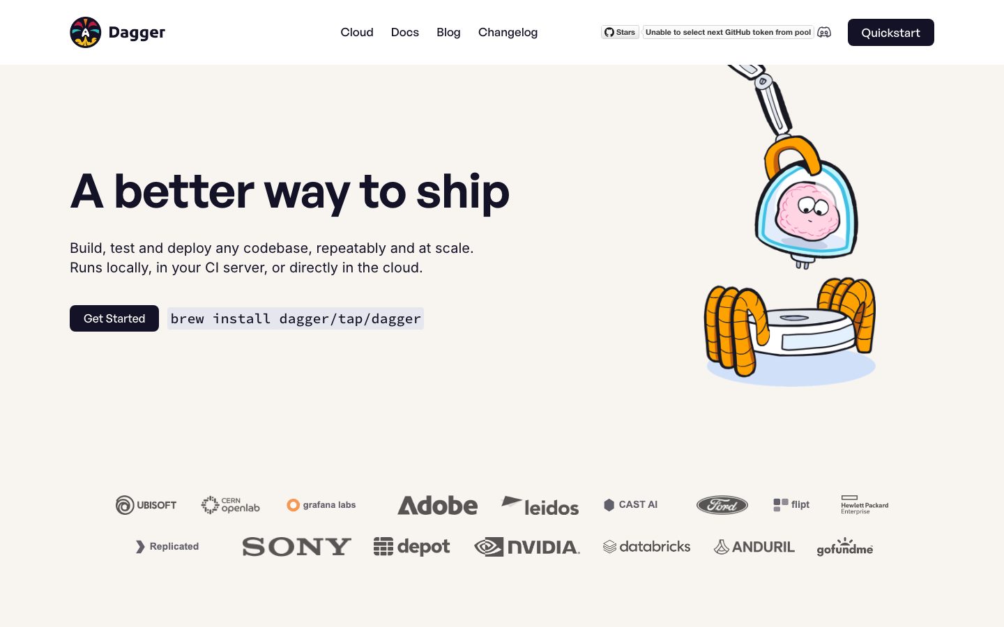
Dagger's landing surface is a warm, developer-tooling marketing page — a cream canvas (`{colors.canvas}` — #f8f4ef) holding near-black ink type (`{colors.ink}` — #131226), white rounded content cards (`{colors.surface-card}` — #ffffff at `{rounded.lg}` 16px), and saturated color tiles that frame playful hand-drawn mascot illustrations. The system reads as friendly-but-technical: the headline is big and chunky, the body copy is calm, and the brand personality lives in the cartoon astronaut/robot illustrations rather than in decorative chrome.
Type voice splits into two roles: **General Sans** (the display face — used for h1, h2, and card titles, weight 600 with negative letter-spacing) and **Inter** (used for body copy at a generously large 20px). General Sans gives the headlines their rounded, confident geometry; Inter keeps the supporting text neutral and readable.
Component voltage comes from **saturated illustration tiles** — teal (`{colors.accent-teal}` — #40b9bc), orange (`{colors.accent-orange}` — #ef7b1a), and yellow (`{colors.accent-yellow}` — #fcc009) squares that hold the mascot artwork inside otherwise-white feature cards. These tiles are the only large color blocks on the page; everything else stays cream, white, or ink.
The footer flips to `{colors.ink}` (#131226) — a deep near-black that visually closes the long-scroll page. It is the only dark surface in the system; everything above it is cream-with-white-cards.
**Key Characteristics:**
- Cream canvas (`{colors.canvas}` — #f8f4ef) with near-black ink type and near-black primary CTA (`{colors.primary}` — #131226). Buttons are `{rounded.md}` (8px).
- **General Sans** display headlines (weight 600, negative letter-spacing -0.24px to -0.68px) paired with **Inter** body copy at 20px.
- White content cards (`{colors.surface-card}` — #ffffff) at `{rounded.lg}` (16px) with no shadow — flat, modern, color-block layout.
- Saturated illustration tiles (teal / orange / yellow) frame the mascot artwork — the only large blocks of color in the system.
- A monospace-style code-snippet pill (`brew install dagger/tap/dagger`) on a light lavender fill (`{colors.accent-lavender}` — #ede8fa) sits beside the hero CTA.
- Logo cloud of customer marks (Ubisoft, Adobe, Sony, NVIDIA, etc.) rendered in muted gray below the hero.
- Dark ink footer (`{colors.ink}`) with light text closes the page — the only dark surface.
- Border radius is a small three-step scale: `{rounded.sm}` (4px), `{rounded.md}` (8px) for buttons + inputs, `{rounded.lg}` (16px) for cards + illustration tiles.
## Colors
### Brand & Ink
- **Primary / Ink** (`{colors.primary}` / `{colors.ink}` — #131226): The dominant color. Primary CTA background, all headlines, body text, and the footer surface.
- **Ink Soft** (`{colors.ink-soft}` — #191922): A slightly lifted near-black observed in the palette; used for nested dark elements / secondary dark fills.
- **Neutral Black** (`{colors.neutral-black}` — #000000): Pure black, used sparingly (icon strokes, illustration linework).
### Accent / Illustration
- **Accent Teal** (`{colors.accent-teal}` — #40b9bc): The "Programmable" and "Local-first" illustration tiles.
- **Accent Orange** (`{colors.accent-orange}` — #ef7b1a): The "Repeatable" illustration tile.
- **Accent Yellow** (`{colors.accent-yellow}` — #fcc009): The "Observable" illustration tile.
- **Accent Lavender** (`{colors.accent-lavender}` — #ede8fa): The light-purple fill behind the inline code-snippet pill in the hero. The system's most frequently-measured accent (frequency 68).
- **Accent Blue** (`{colors.accent-blue}` — #3d66ff): A rarely-used blue (frequency 1) — appears in small UI moments, not on hero CTAs.
These saturated accents are reserved for illustration tiles and the code pill — they never tint headlines or body text.
### Surface
- **Canvas** (`{colors.canvas}` — #f8f4ef): The warm cream page floor.
- **Surface Card** (`{colors.surface-card}` — #ffffff): Feature cards, community cards, inputs.
- **Hairline** (`{colors.hairline}` — #e6e6ee) and **Hairline Alt** (`{colors.hairline-alt}` — #e7e6ef): Barely-distinct light-gray border tones for dividers and input outlines.
### Text
- **Ink** (`{colors.ink}` — #131226): All headlines and body text on light surfaces.
- **On Primary** (`{colors.on-primary}` — #ffffff): Text on the primary button and the dark footer.
## Typography
### Font Family
The system runs **General Sans** for display + headlines and **Inter** for body copy. General Sans is an open-source geometric sans (available via Fontshare), so it can be shipped directly — it was not flagged as a licensed/custom face in the analysis. Inter handles the running text at a large 20px. The fallback stack walks `General Sans, Inter, sans-serif` for display and `Inter, sans-serif` for body.
The split is functional:
- General Sans (display, 600 weight, -0.24 to -0.68px tracking) — h1, h2, card titles
- Inter (body, 400 weight, 20px) — paragraphs, captions, button labels
### Hierarchy
| Token | Size | Weight | Line Height | Letter Spacing | Use |
|---|---|---|---|---|---|
| `{typography.display-xl}` | 68px | 600 | 1.1 | -0.68px | Hero h1 ("A better way to ship") — General Sans |
| `{typography.display-lg}` | 44px | 600 | 1.1 | -0.44px | Section heads ("Join the community") — General Sans |
| `{typography.title}` | 24px | 600 | 1.2 | -0.24px | Feature card titles ("Programmable", "Local-first") — General Sans |
| `{typography.body}` | 20px | 400 | 1.4 | normal | Default running-text, card copy, input text — Inter |
| `{typography.button}` | 16px | 500 | 1.0 | 0 | Button labels, nav items — derived from Inter (see note) |
### Principles
General Sans is the brand voice — every display headline uses it at weight 600 with negative letter-spacing. Inter handles supporting copy. The boundary is strict: never set body copy in General Sans, never set a display headline in Inter. The negative tracking (-0.24 to -0.68px) scales with size and is part of the headline character.
### Note on Font Substitutes
General Sans is open-source and ships directly. The `{typography.button}` role is **derived** — button/nav label sizing was not separately measured in the analysis, so it is interpolated from Inter at 16px/500 to give component references a resolvable token. If a closer match to the headline face is ever needed as a fallback, **Cabinet Grotesk** or **Satoshi** (both Fontshare) share General Sans's geometric character.
## Layout
### Spacing System
- **Base unit:** 4px.
- **Tokens:** `{spacing.xxs}` 4px · `{spacing.xs}` 8px · `{spacing.sm}` 12px · `{spacing.md}` 16px · `{spacing.lg}` 20px · `{spacing.xl}` 24px · `{spacing.xxl}` 32px · `{spacing.huge}` 40px · `{spacing.huge2}` 48px · `{spacing.section}` 80px · `{spacing.section-lg}` 100px.
- **Section padding:** `{spacing.section}` (80px) and `{spacing.section-lg}` (100px) are the most frequent large rhythms (frequency 9 and 8 respectively) — the vertical spacing between major bands.
- **Card internal padding:** `{spacing.huge2}` (48px) for feature cards; `{spacing.xxl}` (32px) for community cards.
- **Gutters / small rhythm:** `{spacing.xs}` (8px) is the most-used small token (frequency 22), with `{spacing.sm}` (12px) and `{spacing.md}` (16px) for tighter element spacing.
### Grid & Container
- **Hero:** Two-column split — h1 + sub-headline + CTA row at left, mascot illustration at right.
- **Feature bands:** Alternating two-column rows — illustration tile on one side, text block on the other; the side flips band to band (text-left / tile-left / text-left / tile-left).
- **Logo cloud:** Two centered rows of customer marks below the hero.
- **Community:** Two-up card grid (GitHub / Discord).
- **Footer:** Four-column link list (Resources / Community / Product / Company).
### Whitespace Philosophy
Dagger uses generous vertical rhythm — 80–100px between bands — and large card padding (48px). Combined with the 20px body size, the page reads as roomy and unhurried. Each feature band carries a single title + short paragraph + one illustration, never dense lists.
## Elevation & Depth
| Level | Treatment | Use |
|---|---|---|
| Flat | No shadow, no border | Canvas sections, top nav, hero |
| Card surface | `{colors.surface-card}` white on cream canvas — no shadow | Feature cards, community cards (`shadow: none` measured) |
| Color tile | Saturated accent fill (`{colors.accent-teal}` / `-orange` / `-yellow`) | Illustration tiles inside cards |
| Footer | `{colors.ink}` dark surface | Page-closing footer — color contrast does the depth work |
The analysis measured **no shadows** anywhere (`shadows: []`, card `shadow: none`). The elevation philosophy is purely **flat color-block** — white cards float on cream by tone contrast alone; the dark footer closes the page by inversion. No drop shadows, no neumorphism, no glassmorphism.
### Decorative Depth
- The mascot illustrations carry their own hand-drawn shading and cast shadows inside the colored tiles — these are artwork, not system shadow tokens.
## Shapes
### Border Radius Scale
| Token | Value | Use |
|---|---|---|
| `{rounded.sm}` | 4px | Smallest accents, fine UI details |
| `{rounded.md}` | 8px | Buttons (primary + secondary), inputs, code-snippet pill |
| `{rounded.lg}` | 16px | Content cards, community cards, illustration tiles |
The radius scale is intentionally short — three steps. Cards and color tiles share the same 16px corner, which keeps the layout visually unified. Buttons and inputs share 8px.
### Illustration Geometry
Illustration tiles are roughly square color blocks at `{rounded.lg}` (16px) corners, each holding a single mascot scene. The mascots themselves are hand-drawn cartoon characters (an astronaut, a robot arm, a brain-in-a-jar) — playful, organic linework that contrasts the clean geometric cards.
## Components
### Top Navigation
**`top-nav`** — Cream-canvas nav bar pinned to the top. `{colors.canvas}` background, `{colors.ink}` text. Carries the Dagger wordmark + circular logo at left, a center menu (Cloud, Docs, Blog, Changelog), a GitHub Stars widget, and a `{component.button-primary}` ("Quickstart") at right. Menu items in `{typography.button}`.
### Buttons
**`button-primary`** — The signature CTA. Background `{colors.primary}` (#131226), text `{colors.on-primary}`, type `{typography.button}`, padding 12px × 24px, rounded `{rounded.md}` (8px). Used for "Quickstart", "Get Started", and "Submit".
**`button-secondary`** — White button used for secondary actions ("Read Docs", "Learn More"). Background `{colors.surface-card}`, text `{colors.ink}`, hairline border in `{colors.hairline}`, same padding + radius as primary.
**`code-snippet-pill`** — The inline install command (`brew install dagger/tap/dagger`) beside the hero CTA. Light lavender fill `{colors.accent-lavender}`, ink monospace-style text, rounded `{rounded.md}`, padding 12px × 24px.
### Cards & Containers
**`card`** — The primary feature card. Background `{colors.surface-card}` (#ffffff), rounded `{rounded.lg}` (16px), no shadow, internal padding `{spacing.huge2}` (48px). Holds a `{typography.title}` heading, body copy in `{typography.body}`, and a paired illustration tile.
**`illustration-tile-teal` / `illustration-tile-orange` / `illustration-tile-yellow`** — Saturated square color blocks holding the mascot artwork. Backgrounds `{colors.accent-teal}` (#40b9bc), `{colors.accent-orange}` (#ef7b1a), `{colors.accent-yellow}` (#fcc009) respectively, rounded `{rounded.lg}` (16px). These are the only large color blocks on the page.
**`community-card`** — The two-up GitHub / Discord cards in the "Join the community" band. Background `{colors.surface-card}`, rounded `{rounded.lg}`, padding `{spacing.xxl}` (32px). Carries a centered icon, a `{typography.title}`-scale label, and a short body description.
### Inputs & Forms
**`email-input`** — The "Get email updates" field. Background `{colors.surface-card}`, text `{colors.ink}`, type `{typography.body}`, rounded `{rounded.md}` (8px), padding 12px × 16px. Pairs with a `{component.button-primary}` ("Submit").
### Footer
**`footer`** — Dark ink footer that closes the page. Background `{colors.ink}` (#131226), text `{colors.on-primary}`. Four-column link list (Resources / Community / Product / Company) with the Dagger wordmark at top-left. Vertical padding `{spacing.section}` (80px). The only dark surface in the system — the cream-to-ink inversion visually closes the page.
## Do's and Don'ts
### Do
- Reserve `{colors.primary}` (#131226) for primary CTAs, headlines, body text, and the footer. The brand is near-monochrome at the text + action layer.
- Use General Sans for every display headline and Inter for body. Never blur the boundary.
- Apply negative letter-spacing on display sizes (-0.24 to -0.68px, scaling with size). It's part of the headline character.
- Use the saturated illustration tiles (teal / orange / yellow) only to frame mascot artwork inside white cards — they are the page's color voltage.
- Keep cards flat — white on cream, no shadow. Tone contrast does the lifting.
- Set body copy at the generous 20px size; the roomy text is part of the calm, technical voice.
- End the page with the dark ink footer. The cream-to-dark transition closes the scroll.
### Don't
- Don't tint headlines or body with the accent colors — accents belong on illustration tiles and the lavender code pill only.
- Don't add drop shadows to cards. The system measured no shadows; flat color-block is the whole point.
- Don't introduce radii beyond `{rounded.lg}` (16px) — the three-step scale keeps cards and tiles unified.
- Don't place dark surfaces anywhere except the footer. The dark ink is a scarce, deliberate page-closing signal.
- Don't render headlines in Inter or body copy in General Sans.
- Don't add hover-state styling beyond default and pressed.
## Responsive Behavior
### Breakpoints
The analysis captured a single landing page at desktop width; responsive breakpoints were not directly measured. The following is the inferred collapse behavior based on the observed grid (documented as guidance, not measured tokens).
| Name | Width | Key Changes (inferred) |
|---|---|---|
| Mobile | < 768px | Hamburger nav; hero h1 scales down from 68px; hero illustration stacks below text; feature bands collapse to single column (tile above text); logo cloud wraps; footer columns stack |
| Tablet | 768–1024px | Nav tightens; feature bands stay two-column or begin stacking; community cards 2-up |
| Desktop | > 1024px | Full nav; two-column hero; alternating two-column feature bands; 4-column footer |
### Touch Targets
- `{component.button-primary}` padding 12px × 24px yields a comfortable tap height.
- `{component.email-input}` padding 12px × 16px.
- Exact minimum tap dimensions were not measured.
### Collapsing Strategy (inferred)
- Hero's two-column split collapses to single column — headline + sub-head + CTA row first, illustration below.
- Alternating feature bands collapse so the illustration tile sits above its text block.
- Community cards collapse 2 → 1.
- Footer's 4-column link list stacks toward 1 column.
## Iteration Guide
1. Focus on ONE component at a time. Reference its YAML key directly (`{component.card}`, `{component.illustration-tile-teal}`).
2. Variants of an existing component live as separate entries in `components:` (the three illustration tiles are already split by color).
3. Use `{token.refs}` everywhere — never inline hex in components.
4. Never document hover. Default and Active/Pressed states only.
5. Display headlines stay General Sans 600 with negative letter-spacing. Body stays Inter 400 / 20px. The pair does not blur.
6. The dark ink footer is the only dark surface. Don't add other dark cards casually.
7. Accent colors live on illustration tiles and the lavender code pill — keep them off text and CTAs.
## Known Gaps
- Only the landing page was captured; interior pages (Docs, Blog, Cloud, Changelog) and their components are out of scope.
- A distinct **muted / secondary text color** was not measured — body and headline both resolve to `{colors.ink}`; a softer gray for captions/footer-secondary may exist but is undocumented.
- The `{typography.button}` role is **derived** (interpolated from Inter at 16px/500); button and nav label sizing were not separately measured.
- An **h3** scale was not measured (the analysis captured h1, h2, h4, body) — the gap between 44px and 24px is undocumented.
- No shadow tokens were captured (`shadows: []`); the flat treatment is confirmed, but any subtle elevation on hover/press is unknown.
- Hover, focus, and active states for buttons and inputs were not extracted (no-hover policy aside, pressed/focus styling is unmeasured).
- Responsive breakpoints and touch-target minimums are inferred from the desktop capture, not measured.
- The customer logo-cloud marks render in a muted gray tone that was not isolated as a token.
- Accent hex values for the illustration tiles are measured at low frequency (2–4 occurrences) and reflect the single captured page; they may vary if more illustrations are added.
<!-- Documented by duply · real-world design systems as ready-to-use DESIGN.md for AI coding agents · https://duply.ai/dagger/design-md -->
Color Palette
Accent
Neutrals
Typography
display-xl68px · 600 · 1.1
The quick brown fox jumpsdisplay-lg44px · 600 · 1.1
The quick brown fox jumpstitle24px · 600 · 1.2
The quick brown fox jumpsbody20px · 400 · 1.4
The quick brown fox jumpsbutton16px · 500 · 1
The quick brown fox jumpsSpacing & Shape
Spacing
| Name | Value | Preview |
|---|---|---|
| xxs | 4px | |
| xs | 8px | |
| sm | 12px | |
| md | 16px | |
| lg | 20px | |
| xl | 24px | |
| xxl | 32px | |
| huge | 40px | |
| huge2 | 48px | |
| section | 80px | |
| section-lg | 100px |
Border Radius
| Name | Value | Preview |
|---|---|---|
| sm | 4px | |
| md | 8px | |
| lg | 16px |
More like this


---
version: alpha
name: Dagger-design-analysis
description: "A warm, developer-tooling marketing surface built on a cream canvas (#f8f4ef) with near-black ink, white content cards, and bold General Sans display headlines. The system reads as friendly-but-technical — playful hand-drawn mascot illustrations sit inside saturated color tiles (teal, orange, yellow), white rounded cards (16px) carry feature copy, and a near-black ink footer closes the page. Brand voltage comes from the chunky General Sans display face and the saturated illustration tiles rather than from accent text colors."

colors:
  primary: "#131226"
  ink: "#131226"
  ink-soft: "#191922"
  on-primary: "#ffffff"
  canvas: "#f8f4ef"
  surface-card: "#ffffff"
  hairline: "#e6e6ee"
  hairline-alt: "#e7e6ef"
  accent-lavender: "#ede8fa"
  accent-teal: "#40b9bc"
  accent-orange: "#ef7b1a"
  accent-yellow: "#fcc009"
  accent-blue: "#3d66ff"
  neutral-black: "#000000"

typography:
  display-xl:
    fontFamily: "General Sans, Inter, sans-serif"
    fontSize: 68px
    fontWeight: 600
    lineHeight: 1.1
    letterSpacing: -0.68px
  display-lg:
    fontFamily: "General Sans, Inter, sans-serif"
    fontSize: 44px
    fontWeight: 600
    lineHeight: 1.1
    letterSpacing: -0.44px
  title:
    fontFamily: "General Sans, Inter, sans-serif"
    fontSize: 24px
    fontWeight: 600
    lineHeight: 1.2
    letterSpacing: -0.24px
  body:
    fontFamily: "Inter, sans-serif"
    fontSize: 20px
    fontWeight: 400
    lineHeight: 1.4
    letterSpacing: normal
  button:
    fontFamily: "Inter, sans-serif"
    fontSize: 16px
    fontWeight: 500
    lineHeight: 1
    letterSpacing: 0

rounded:
  sm: 4px
  md: 8px
  lg: 16px

spacing:
  xxs: 4px
  xs: 8px
  sm: 12px
  md: 16px
  lg: 20px
  xl: 24px
  xxl: 32px
  huge: 40px
  huge2: 48px
  section: 80px
  section-lg: 100px

components:
  top-nav:
    backgroundColor: "{colors.canvas}"
    textColor: "{colors.ink}"
    typography: "{typography.button}"
    padding: 16px 40px
  button-primary:
    backgroundColor: "{colors.primary}"
    textColor: "{colors.on-primary}"
    typography: "{typography.button}"
    rounded: "{rounded.md}"
    padding: 12px 24px
  button-secondary:
    backgroundColor: "{colors.surface-card}"
    textColor: "{colors.ink}"
    typography: "{typography.button}"
    rounded: "{rounded.md}"
    padding: 12px 24px
  code-snippet-pill:
    backgroundColor: "{colors.accent-lavender}"
    textColor: "{colors.ink}"
    typography: "{typography.body}"
    rounded: "{rounded.md}"
    padding: 12px 24px
  card:
    backgroundColor: "{colors.surface-card}"
    textColor: "{colors.ink}"
    typography: "{typography.body}"
    rounded: "{rounded.lg}"
    padding: 48px
  illustration-tile-teal:
    backgroundColor: "{colors.accent-teal}"
    textColor: "{colors.ink}"
    rounded: "{rounded.lg}"
  illustration-tile-orange:
    backgroundColor: "{colors.accent-orange}"
    textColor: "{colors.ink}"
    rounded: "{rounded.lg}"
  illustration-tile-yellow:
    backgroundColor: "{colors.accent-yellow}"
    textColor: "{colors.ink}"
    rounded: "{rounded.lg}"
  community-card:
    backgroundColor: "{colors.surface-card}"
    textColor: "{colors.ink}"
    typography: "{typography.body}"
    rounded: "{rounded.lg}"
    padding: 32px
  email-input:
    backgroundColor: "{colors.surface-card}"
    textColor: "{colors.ink}"
    typography: "{typography.body}"
    rounded: "{rounded.md}"
    padding: 12px 16px
  footer:
    backgroundColor: "{colors.ink}"
    textColor: "{colors.on-primary}"
    typography: "{typography.body}"
    padding: 80px
---

## Overview

Dagger's landing surface is a warm, developer-tooling marketing page — a cream canvas (`{colors.canvas}` — #f8f4ef) holding near-black ink type (`{colors.ink}` — #131226), white rounded content cards (`{colors.surface-card}` — #ffffff at `{rounded.lg}` 16px), and saturated color tiles that frame playful hand-drawn mascot illustrations. The system reads as friendly-but-technical: the headline is big and chunky, the body copy is calm, and the brand personality lives in the cartoon astronaut/robot illustrations rather than in decorative chrome.

Type voice splits into two roles: **General Sans** (the display face — used for h1, h2, and card titles, weight 600 with negative letter-spacing) and **Inter** (used for body copy at a generously large 20px). General Sans gives the headlines their rounded, confident geometry; Inter keeps the supporting text neutral and readable.

Component voltage comes from **saturated illustration tiles** — teal (`{colors.accent-teal}` — #40b9bc), orange (`{colors.accent-orange}` — #ef7b1a), and yellow (`{colors.accent-yellow}` — #fcc009) squares that hold the mascot artwork inside otherwise-white feature cards. These tiles are the only large color blocks on the page; everything else stays cream, white, or ink.

The footer flips to `{colors.ink}` (#131226) — a deep near-black that visually closes the long-scroll page. It is the only dark surface in the system; everything above it is cream-with-white-cards.

**Key Characteristics:**
- Cream canvas (`{colors.canvas}` — #f8f4ef) with near-black ink type and near-black primary CTA (`{colors.primary}` — #131226). Buttons are `{rounded.md}` (8px).
- **General Sans** display headlines (weight 600, negative letter-spacing -0.24px to -0.68px) paired with **Inter** body copy at 20px.
- White content cards (`{colors.surface-card}` — #ffffff) at `{rounded.lg}` (16px) with no shadow — flat, modern, color-block layout.
- Saturated illustration tiles (teal / orange / yellow) frame the mascot artwork — the only large blocks of color in the system.
- A monospace-style code-snippet pill (`brew install dagger/tap/dagger`) on a light lavender fill (`{colors.accent-lavender}` — #ede8fa) sits beside the hero CTA.
- Logo cloud of customer marks (Ubisoft, Adobe, Sony, NVIDIA, etc.) rendered in muted gray below the hero.
- Dark ink footer (`{colors.ink}`) with light text closes the page — the only dark surface.
- Border radius is a small three-step scale: `{rounded.sm}` (4px), `{rounded.md}` (8px) for buttons + inputs, `{rounded.lg}` (16px) for cards + illustration tiles.

## Colors

### Brand & Ink
- **Primary / Ink** (`{colors.primary}` / `{colors.ink}` — #131226): The dominant color. Primary CTA background, all headlines, body text, and the footer surface.
- **Ink Soft** (`{colors.ink-soft}` — #191922): A slightly lifted near-black observed in the palette; used for nested dark elements / secondary dark fills.
- **Neutral Black** (`{colors.neutral-black}` — #000000): Pure black, used sparingly (icon strokes, illustration linework).

### Accent / Illustration
- **Accent Teal** (`{colors.accent-teal}` — #40b9bc): The "Programmable" and "Local-first" illustration tiles.
- **Accent Orange** (`{colors.accent-orange}` — #ef7b1a): The "Repeatable" illustration tile.
- **Accent Yellow** (`{colors.accent-yellow}` — #fcc009): The "Observable" illustration tile.
- **Accent Lavender** (`{colors.accent-lavender}` — #ede8fa): The light-purple fill behind the inline code-snippet pill in the hero. The system's most frequently-measured accent (frequency 68).
- **Accent Blue** (`{colors.accent-blue}` — #3d66ff): A rarely-used blue (frequency 1) — appears in small UI moments, not on hero CTAs.

These saturated accents are reserved for illustration tiles and the code pill — they never tint headlines or body text.

### Surface
- **Canvas** (`{colors.canvas}` — #f8f4ef): The warm cream page floor.
- **Surface Card** (`{colors.surface-card}` — #ffffff): Feature cards, community cards, inputs.
- **Hairline** (`{colors.hairline}` — #e6e6ee) and **Hairline Alt** (`{colors.hairline-alt}` — #e7e6ef): Barely-distinct light-gray border tones for dividers and input outlines.

### Text
- **Ink** (`{colors.ink}` — #131226): All headlines and body text on light surfaces.
- **On Primary** (`{colors.on-primary}` — #ffffff): Text on the primary button and the dark footer.

## Typography

### Font Family
The system runs **General Sans** for display + headlines and **Inter** for body copy. General Sans is an open-source geometric sans (available via Fontshare), so it can be shipped directly — it was not flagged as a licensed/custom face in the analysis. Inter handles the running text at a large 20px. The fallback stack walks `General Sans, Inter, sans-serif` for display and `Inter, sans-serif` for body.

The split is functional:
- General Sans (display, 600 weight, -0.24 to -0.68px tracking) — h1, h2, card titles
- Inter (body, 400 weight, 20px) — paragraphs, captions, button labels

### Hierarchy

| Token | Size | Weight | Line Height | Letter Spacing | Use |
|---|---|---|---|---|---|
| `{typography.display-xl}` | 68px | 600 | 1.1 | -0.68px | Hero h1 ("A better way to ship") — General Sans |
| `{typography.display-lg}` | 44px | 600 | 1.1 | -0.44px | Section heads ("Join the community") — General Sans |
| `{typography.title}` | 24px | 600 | 1.2 | -0.24px | Feature card titles ("Programmable", "Local-first") — General Sans |
| `{typography.body}` | 20px | 400 | 1.4 | normal | Default running-text, card copy, input text — Inter |
| `{typography.button}` | 16px | 500 | 1.0 | 0 | Button labels, nav items — derived from Inter (see note) |

### Principles
General Sans is the brand voice — every display headline uses it at weight 600 with negative letter-spacing. Inter handles supporting copy. The boundary is strict: never set body copy in General Sans, never set a display headline in Inter. The negative tracking (-0.24 to -0.68px) scales with size and is part of the headline character.

### Note on Font Substitutes
General Sans is open-source and ships directly. The `{typography.button}` role is **derived** — button/nav label sizing was not separately measured in the analysis, so it is interpolated from Inter at 16px/500 to give component references a resolvable token. If a closer match to the headline face is ever needed as a fallback, **Cabinet Grotesk** or **Satoshi** (both Fontshare) share General Sans's geometric character.

## Layout

### Spacing System
- **Base unit:** 4px.
- **Tokens:** `{spacing.xxs}` 4px · `{spacing.xs}` 8px · `{spacing.sm}` 12px · `{spacing.md}` 16px · `{spacing.lg}` 20px · `{spacing.xl}` 24px · `{spacing.xxl}` 32px · `{spacing.huge}` 40px · `{spacing.huge2}` 48px · `{spacing.section}` 80px · `{spacing.section-lg}` 100px.
- **Section padding:** `{spacing.section}` (80px) and `{spacing.section-lg}` (100px) are the most frequent large rhythms (frequency 9 and 8 respectively) — the vertical spacing between major bands.
- **Card internal padding:** `{spacing.huge2}` (48px) for feature cards; `{spacing.xxl}` (32px) for community cards.
- **Gutters / small rhythm:** `{spacing.xs}` (8px) is the most-used small token (frequency 22), with `{spacing.sm}` (12px) and `{spacing.md}` (16px) for tighter element spacing.

### Grid & Container
- **Hero:** Two-column split — h1 + sub-headline + CTA row at left, mascot illustration at right.
- **Feature bands:** Alternating two-column rows — illustration tile on one side, text block on the other; the side flips band to band (text-left / tile-left / text-left / tile-left).
- **Logo cloud:** Two centered rows of customer marks below the hero.
- **Community:** Two-up card grid (GitHub / Discord).
- **Footer:** Four-column link list (Resources / Community / Product / Company).

### Whitespace Philosophy
Dagger uses generous vertical rhythm — 80–100px between bands — and large card padding (48px). Combined with the 20px body size, the page reads as roomy and unhurried. Each feature band carries a single title + short paragraph + one illustration, never dense lists.

## Elevation & Depth

| Level | Treatment | Use |
|---|---|---|
| Flat | No shadow, no border | Canvas sections, top nav, hero |
| Card surface | `{colors.surface-card}` white on cream canvas — no shadow | Feature cards, community cards (`shadow: none` measured) |
| Color tile | Saturated accent fill (`{colors.accent-teal}` / `-orange` / `-yellow`) | Illustration tiles inside cards |
| Footer | `{colors.ink}` dark surface | Page-closing footer — color contrast does the depth work |

The analysis measured **no shadows** anywhere (`shadows: []`, card `shadow: none`). The elevation philosophy is purely **flat color-block** — white cards float on cream by tone contrast alone; the dark footer closes the page by inversion. No drop shadows, no neumorphism, no glassmorphism.

### Decorative Depth
- The mascot illustrations carry their own hand-drawn shading and cast shadows inside the colored tiles — these are artwork, not system shadow tokens.

## Shapes

### Border Radius Scale

| Token | Value | Use |
|---|---|---|
| `{rounded.sm}` | 4px | Smallest accents, fine UI details |
| `{rounded.md}` | 8px | Buttons (primary + secondary), inputs, code-snippet pill |
| `{rounded.lg}` | 16px | Content cards, community cards, illustration tiles |

The radius scale is intentionally short — three steps. Cards and color tiles share the same 16px corner, which keeps the layout visually unified. Buttons and inputs share 8px.

### Illustration Geometry
Illustration tiles are roughly square color blocks at `{rounded.lg}` (16px) corners, each holding a single mascot scene. The mascots themselves are hand-drawn cartoon characters (an astronaut, a robot arm, a brain-in-a-jar) — playful, organic linework that contrasts the clean geometric cards.

## Components

### Top Navigation

**`top-nav`** — Cream-canvas nav bar pinned to the top. `{colors.canvas}` background, `{colors.ink}` text. Carries the Dagger wordmark + circular logo at left, a center menu (Cloud, Docs, Blog, Changelog), a GitHub Stars widget, and a `{component.button-primary}` ("Quickstart") at right. Menu items in `{typography.button}`.

### Buttons

**`button-primary`** — The signature CTA. Background `{colors.primary}` (#131226), text `{colors.on-primary}`, type `{typography.button}`, padding 12px × 24px, rounded `{rounded.md}` (8px). Used for "Quickstart", "Get Started", and "Submit".

**`button-secondary`** — White button used for secondary actions ("Read Docs", "Learn More"). Background `{colors.surface-card}`, text `{colors.ink}`, hairline border in `{colors.hairline}`, same padding + radius as primary.

**`code-snippet-pill`** — The inline install command (`brew install dagger/tap/dagger`) beside the hero CTA. Light lavender fill `{colors.accent-lavender}`, ink monospace-style text, rounded `{rounded.md}`, padding 12px × 24px.

### Cards & Containers

**`card`** — The primary feature card. Background `{colors.surface-card}` (#ffffff), rounded `{rounded.lg}` (16px), no shadow, internal padding `{spacing.huge2}` (48px). Holds a `{typography.title}` heading, body copy in `{typography.body}`, and a paired illustration tile.

**`illustration-tile-teal` / `illustration-tile-orange` / `illustration-tile-yellow`** — Saturated square color blocks holding the mascot artwork. Backgrounds `{colors.accent-teal}` (#40b9bc), `{colors.accent-orange}` (#ef7b1a), `{colors.accent-yellow}` (#fcc009) respectively, rounded `{rounded.lg}` (16px). These are the only large color blocks on the page.

**`community-card`** — The two-up GitHub / Discord cards in the "Join the community" band. Background `{colors.surface-card}`, rounded `{rounded.lg}`, padding `{spacing.xxl}` (32px). Carries a centered icon, a `{typography.title}`-scale label, and a short body description.

### Inputs & Forms

**`email-input`** — The "Get email updates" field. Background `{colors.surface-card}`, text `{colors.ink}`, type `{typography.body}`, rounded `{rounded.md}` (8px), padding 12px × 16px. Pairs with a `{component.button-primary}` ("Submit").

### Footer

**`footer`** — Dark ink footer that closes the page. Background `{colors.ink}` (#131226), text `{colors.on-primary}`. Four-column link list (Resources / Community / Product / Company) with the Dagger wordmark at top-left. Vertical padding `{spacing.section}` (80px). The only dark surface in the system — the cream-to-ink inversion visually closes the page.

## Do's and Don'ts

### Do
- Reserve `{colors.primary}` (#131226) for primary CTAs, headlines, body text, and the footer. The brand is near-monochrome at the text + action layer.
- Use General Sans for every display headline and Inter for body. Never blur the boundary.
- Apply negative letter-spacing on display sizes (-0.24 to -0.68px, scaling with size). It's part of the headline character.
- Use the saturated illustration tiles (teal / orange / yellow) only to frame mascot artwork inside white cards — they are the page's color voltage.
- Keep cards flat — white on cream, no shadow. Tone contrast does the lifting.
- Set body copy at the generous 20px size; the roomy text is part of the calm, technical voice.
- End the page with the dark ink footer. The cream-to-dark transition closes the scroll.

### Don't
- Don't tint headlines or body with the accent colors — accents belong on illustration tiles and the lavender code pill only.
- Don't add drop shadows to cards. The system measured no shadows; flat color-block is the whole point.
- Don't introduce radii beyond `{rounded.lg}` (16px) — the three-step scale keeps cards and tiles unified.
- Don't place dark surfaces anywhere except the footer. The dark ink is a scarce, deliberate page-closing signal.
- Don't render headlines in Inter or body copy in General Sans.
- Don't add hover-state styling beyond default and pressed.

## Responsive Behavior

### Breakpoints
The analysis captured a single landing page at desktop width; responsive breakpoints were not directly measured. The following is the inferred collapse behavior based on the observed grid (documented as guidance, not measured tokens).

| Name | Width | Key Changes (inferred) |
|---|---|---|
| Mobile | < 768px | Hamburger nav; hero h1 scales down from 68px; hero illustration stacks below text; feature bands collapse to single column (tile above text); logo cloud wraps; footer columns stack |
| Tablet | 768–1024px | Nav tightens; feature bands stay two-column or begin stacking; community cards 2-up |
| Desktop | > 1024px | Full nav; two-column hero; alternating two-column feature bands; 4-column footer |

### Touch Targets
- `{component.button-primary}` padding 12px × 24px yields a comfortable tap height.
- `{component.email-input}` padding 12px × 16px.
- Exact minimum tap dimensions were not measured.

### Collapsing Strategy (inferred)
- Hero's two-column split collapses to single column — headline + sub-head + CTA row first, illustration below.
- Alternating feature bands collapse so the illustration tile sits above its text block.
- Community cards collapse 2 → 1.
- Footer's 4-column link list stacks toward 1 column.

## Iteration Guide

1. Focus on ONE component at a time. Reference its YAML key directly (`{component.card}`, `{component.illustration-tile-teal}`).
2. Variants of an existing component live as separate entries in `components:` (the three illustration tiles are already split by color).
3. Use `{token.refs}` everywhere — never inline hex in components.
4. Never document hover. Default and Active/Pressed states only.
5. Display headlines stay General Sans 600 with negative letter-spacing. Body stays Inter 400 / 20px. The pair does not blur.
6. The dark ink footer is the only dark surface. Don't add other dark cards casually.
7. Accent colors live on illustration tiles and the lavender code pill — keep them off text and CTAs.

## Known Gaps

- Only the landing page was captured; interior pages (Docs, Blog, Cloud, Changelog) and their components are out of scope.
- A distinct **muted / secondary text color** was not measured — body and headline both resolve to `{colors.ink}`; a softer gray for captions/footer-secondary may exist but is undocumented.
- The `{typography.button}` role is **derived** (interpolated from Inter at 16px/500); button and nav label sizing were not separately measured.
- An **h3** scale was not measured (the analysis captured h1, h2, h4, body) — the gap between 44px and 24px is undocumented.
- No shadow tokens were captured (`shadows: []`); the flat treatment is confirmed, but any subtle elevation on hover/press is unknown.
- Hover, focus, and active states for buttons and inputs were not extracted (no-hover policy aside, pressed/focus styling is unmeasured).
- Responsive breakpoints and touch-target minimums are inferred from the desktop capture, not measured.
- The customer logo-cloud marks render in a muted gray tone that was not isolated as a token.
- Accent hex values for the illustration tiles are measured at low frequency (2–4 occurrences) and reflect the single captured page; they may vary if more illustrations are added.

<!-- Documented by duply · real-world design systems as ready-to-use DESIGN.md for AI coding agents · https://duply.ai/dagger/design-md -->