
Faire
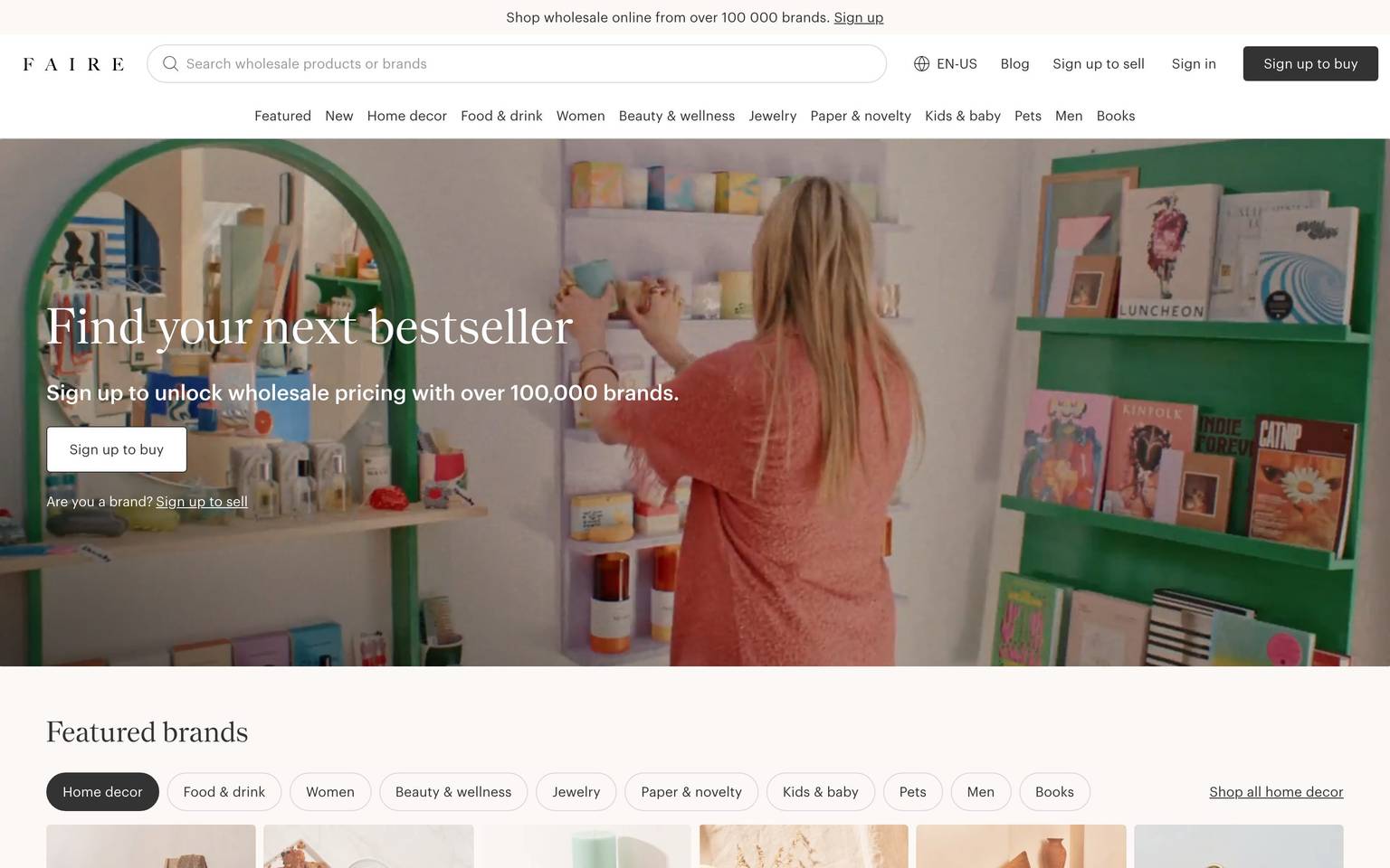
An editorial wholesale-marketplace interface built on a white canvas with pure-black CTAs, a high-contrast Nantes serif for headlines, and a light-weight Graphik sans for body and UI. The system reads as calm, premium, and retail-editorial — full-bleed lifestyle photography in the hero, warm color-blocked bands (maroon, chartreuse, cream, sand) marking major sections, pill-shaped category filters, and dense product/brand card grids. Brand voltage comes from the serif/sans pairing and the warm editorial band palette rather than from a bright accent hue.
Works withClaude CodeCursorCodexGemini CLICopilotv0LovableBoltWindsurfReplit
---
version: alpha
name: Faire-design-analysis
description: "An editorial wholesale-marketplace interface built on a white canvas with pure-black CTAs, a high-contrast Nantes serif for headlines, and a light-weight Graphik sans for body and UI. The system reads as calm, premium, and retail-editorial — full-bleed lifestyle photography in the hero, warm color-blocked bands (maroon, chartreuse, cream, sand) marking major sections, pill-shaped category filters, and dense product/brand card grids. Brand voltage comes from the serif/sans pairing and the warm editorial band palette rather than from a bright accent hue."

colors:
  primary: "#000000"
  ink: "#333333"
  neutral: "#757575"
  neutral-soft: "#6c6a6a"
  canvas: "#ffffff"
  surface-soft: "#f2f2f2"
  surface-soft-alt: "#f3f3f3"
  hairline: "#d4d4d4"
  on-primary: "#ffffff"
  accent-gold: "#735b21"
  accent-cream: "#fbf8f6"
  accent-maroon: "#41252a"
  accent-olive: "#50583d"
  accent-chartreuse: "#f1f29f"
  accent-peach: "#ffd0b6"
  accent-taupe: "#b5a998"
  accent-rust: "#7d3e1e"
  accent-sand: "#f6f2e8"
  accent-blue: "#365cbb"
  accent-blue-soft: "#e8eeff"

typography:
  display-lg:
    fontFamily: "Nantes, Fraunces, Georgia, serif"
    fontSize: 38px
    fontWeight: 400
    lineHeight: 1.316
    letterSpacing: normal
  display-md:
    fontFamily: "Nantes, Fraunces, Georgia, serif"
    fontSize: 30px
    fontWeight: 400
    lineHeight: 1.267
    letterSpacing: normal
  label:
    fontFamily: "Graphik, Inter, sans-serif"
    fontSize: 14px
    fontWeight: 500
    lineHeight: 1.429
    letterSpacing: 0.0107em
  body:
    fontFamily: "Graphik, Inter, sans-serif"
    fontSize: 14px
    fontWeight: 200
    lineHeight: 1.429
    letterSpacing: 0.0107em
  button:
    fontFamily: "Graphik, Inter, sans-serif"
    fontSize: 14px
    fontWeight: 200
    lineHeight: 1.429
    letterSpacing: 0.0107em

rounded:
  sm: 4px
  lg: 20px
  xl: 40px
  pill: 999px

spacing:
  xxs: 4px
  xs: 8px
  sm: 10px
  md: 16px
  lg: 24px
  xl: 32px
  xxl: 48px

components:
  top-nav:
    backgroundColor: "{colors.canvas}"
    textColor: "{colors.ink}"
    typography: "{typography.label}"
    padding: 16px
  search-input:
    backgroundColor: "{colors.surface-soft}"
    textColor: "{colors.ink}"
    typography: "{typography.body}"
    rounded: "{rounded.sm}"
    padding: 10px 16px
  button-primary:
    backgroundColor: "{colors.primary}"
    textColor: "{colors.on-primary}"
    typography: "{typography.button}"
    rounded: "{rounded.sm}"
    padding: 16px 24px
  button-text-link:
    backgroundColor: transparent
    textColor: "{colors.ink}"
    typography: "{typography.button}"
  category-tab-pill:
    backgroundColor: "{colors.canvas}"
    textColor: "{colors.ink}"
    typography: "{typography.button}"
    rounded: "{rounded.xl}"
    padding: 10px 16px
  category-tab-pill-active:
    backgroundColor: "{colors.primary}"
    textColor: "{colors.on-primary}"
    typography: "{typography.button}"
    rounded: "{rounded.xl}"
    padding: 10px 16px
  value-filter-pill:
    backgroundColor: "{colors.canvas}"
    textColor: "{colors.ink}"
    typography: "{typography.button}"
    rounded: "{rounded.xl}"
    padding: 10px 16px
  trending-search-dropdown:
    backgroundColor: "{colors.canvas}"
    textColor: "{colors.ink}"
    typography: "{typography.body}"
    rounded: "{rounded.sm}"
    padding: 24px
  hero-band:
    backgroundColor: "{colors.canvas}"
    textColor: "{colors.on-primary}"
    typography: "{typography.display-lg}"
    padding: 48px
  featured-brand-card:
    backgroundColor: "{colors.canvas}"
    textColor: "{colors.ink}"
    typography: "{typography.body}"
    rounded: "{rounded.sm}"
    padding: 8px
  product-card:
    backgroundColor: "{colors.canvas}"
    textColor: "{colors.ink}"
    typography: "{typography.body}"
    rounded: "{rounded.sm}"
    padding: 8px
  editorial-band-maroon:
    backgroundColor: "{colors.accent-maroon}"
    textColor: "{colors.on-primary}"
    typography: "{typography.display-md}"
    padding: 48px
  editorial-band-chartreuse:
    backgroundColor: "{colors.accent-chartreuse}"
    textColor: "{colors.ink}"
    typography: "{typography.display-md}"
    padding: 48px
  editorial-band-sand:
    backgroundColor: "{colors.accent-sand}"
    textColor: "{colors.ink}"
    typography: "{typography.display-md}"
    padding: 48px
  editorial-band-peach:
    backgroundColor: "{colors.accent-peach}"
    textColor: "{colors.ink}"
    typography: "{typography.display-md}"
    padding: 48px
  category-tile:
    backgroundColor: "{colors.canvas}"
    textColor: "{colors.on-primary}"
    typography: "{typography.display-md}"
    rounded: "{rounded.sm}"
  footer:
    backgroundColor: "{colors.canvas}"
    textColor: "{colors.neutral}"
    typography: "{typography.body}"
    padding: 48px
---

## Overview

Faire's marketing landing page is a calm, editorial wholesale-marketplace surface — white canvas (`{colors.canvas}` — #ffffff) with pure-black CTAs (`{colors.primary}` — #000000), a high-contrast **Nantes** serif for headlines, and a light-weight **Graphik** sans for body and UI. The page reads as a premium retail publication rather than a typical SaaS site: full-bleed lifestyle photography in the hero, dense brand/product card grids, and warm color-blocked editorial bands that punctuate the long-scroll flow.

Type voice splits cleanly into two roles: **Nantes** (a high-contrast display serif used for h3/h4 and the hero headline — "Find your next bestseller") and **Graphik** (a neutral grotesque used for everything else — body copy, buttons, nav, and labels). Notably, Graphik runs at a very light weight (200) for body and buttons, giving the interface an airy, understated feel; the label role bumps to weight 500 for nav items and section eyebrows.

Brand voltage comes from **warm editorial color bands** rather than a single bright accent. As you scroll, the white canvas is interrupted by a deep maroon "We're Faire" band (`{colors.accent-maroon}` — #41252a), a chartreuse "Try new brands with confidence" band (`{colors.accent-chartreuse}` — #f1f29f), and softer sand/cream/peach panels (`{colors.accent-sand}`, `{colors.accent-cream}`, `{colors.accent-peach}`). These bands do the pacing work; the accent palette is warm, muted, and photographic rather than digital.

**Key Characteristics:**
- White canvas with pure-black primary CTA (`{colors.primary}` — #000000, e.g. "Sign up to buy"). Buttons carry light-weight Graphik labels and a small `{rounded.sm}` (4px) corner.
- Nantes serif headlines paired with Graphik sans body — the serif/sans contrast is the primary brand signature (both are licensed faces; substitutes are documented in Typography).
- Pill-shaped category filters (`{rounded.xl}` — 40px) run under "Featured brands" and "Shop by your values" — the active pill flips to solid black.
- Warm color-blocked editorial bands (maroon, chartreuse, sand, peach, cream) mark major sections and break the white flow.
- Dense card grids — featured-brand cards and product/bestseller cards sit in 6-up horizontal rows with minimal chrome and tight `{spacing.xs}` (8px) padding.
- Full-bleed hero photography with white overlaid Nantes headline; no card container around the hero text.
- Near-monochrome UI layer — black CTAs, `{colors.ink}` (#333333) text, `{colors.neutral}` (#757575) secondary text — with color reserved for the photographic bands.

## Colors

### Brand & Action
- **Primary** (`{colors.primary}` — #000000): The dominant action color. All primary CTA buttons ("Sign up to buy", "Sign up to sell") and the active category pill. Also the measured `<a>` link color — the highest-frequency color on the page.
- **On Primary** (`{colors.on-primary}` — #ffffff): Text on black buttons and on dark editorial bands.

### Text
- **Ink** (`{colors.ink}` — #333333): Primary running text and most headings rendered in dark gray rather than pure black.
- **Neutral** (`{colors.neutral}` — #757575): Secondary text — sub-labels, brand locations ("New York, New York"), footer links.
- **Neutral Soft** (`{colors.neutral-soft}` — #6c6a6a): Tertiary text and fine print.

### Surface
- **Canvas** (`{colors.canvas}` — #ffffff): The default page floor and card background.
- **Surface Soft** (`{colors.surface-soft}` — #f2f2f2): Search-input fill and soft panel backgrounds.
- **Surface Soft Alt** (`{colors.surface-soft-alt}` — #f3f3f3): A near-identical soft gray used on alternating light panels.
- **Hairline** (`{colors.hairline}` — #d4d4d4): The 1px border tone on pills, inputs, and card outlines.

### Editorial Accent Bands
Faire's accent palette is warm and photographic — used as full-width band backgrounds, not on interactive elements:
- **Accent Maroon** (`{colors.accent-maroon}` — #41252a): The "We're Faire — the platform for retailers" band; deep, dark, and text-inverting.
- **Accent Chartreuse** (`{colors.accent-chartreuse}` — #f1f29f): The "Try new brands in your store, with confidence" band.
- **Accent Sand** (`{colors.accent-sand}` — #f6f2e8) & **Accent Cream** (`{colors.accent-cream}` — #fbf8f6): Soft warm panels for lower-density sections.
- **Accent Peach** (`{colors.accent-peach}` — #ffd0b6): The "perfect planter for your store" pre-footer band.
- **Accent Gold** (`{colors.accent-gold}` — #735b21), **Accent Olive** (`{colors.accent-olive}` — #50583d), **Accent Rust** (`{colors.accent-rust}` — #7d3e1e), **Accent Taupe** (`{colors.accent-taupe}` — #b5a998): Low-frequency warm tones that appear inside band treatments and photographic overlays.
- **Accent Blue** (`{colors.accent-blue}` — #365cbb) & **Accent Blue Soft** (`{colors.accent-blue-soft}` — #e8eeff): The only cool accents measured — used sparingly, likely on informational callouts or badges.

## Typography

### Font Family
The system runs **Nantes** for display headlines (h3, h4, hero) and **Graphik** for everything else (body, buttons, nav, labels). Nantes is a high-contrast modern serif with pronounced thick/thin stroke modulation; Graphik is a neutral geometric-humanist grotesque. Both are commercially licensed typefaces — they were not flagged in `fonts_licensed`, but neither is freely redistributable, so open-source substitutes are documented below and should be used if the licensed families are unavailable.

The split is functional and strict:
- Nantes (serif, 400 weight, normal tracking) — h3, h4, hero headline
- Graphik (sans, 200–500 weight, +0.0107em tracking) — body, buttons, nav, labels

Notably, Graphik body and button text run at weight **200** (extra-light), giving the UI a delicate, editorial feel; only the label role (nav items, section eyebrows) bumps to weight 500.

### Hierarchy

| Token | Family | Size | Weight | Line Height | Letter Spacing | Use |
|---|---|---|---|---|---|---|
| `{typography.display-lg}` | Nantes | 38px | 400 | 1.316 | normal | h3 — hero headline ("Find your next bestseller"), major band heads |
| `{typography.display-md}` | Nantes | 30px | 400 | 1.267 | normal | h4 — section heads ("The perfect planter for your store") |
| `{typography.label}` | Graphik | 14px | 500 | 1.429 | 0.0107em | Nav items, section eyebrows, tab labels (h2 role) |
| `{typography.body}` | Graphik | 14px | 200 | 1.429 | 0.0107em | Default running text, sub-headlines, captions |
| `{typography.button}` | Graphik | 14px | 200 | 1.429 | 0.0107em | Button labels, category-pill text |

### Principles
Nantes is the brand voice — every editorial headline uses it at weight 400, never bolded. The high-contrast serif carries the premium retail tone; putting a headline in Graphik would flatten the identity. Graphik handles all supporting type and stays light (200) except for the label role. The small positive tracking (+0.0107em) on all Graphik text is part of the voice — it opens the light-weight sans slightly for legibility at 14px.

### Note on Font Substitutes
If **Nantes** is unavailable, **Fraunces** (variable, high optical contrast) at weight 400 is the closest open-source substitute; **Playfair Display** or **Lora** are secondary alternatives. If **Graphik** is unavailable, **Inter** or **Work Sans** at weights 200/500 preserves the neutral grotesque character and the light body treatment. Do not ship the licensed faces unless a valid license is in place.

## Layout

### Spacing System
- **Base unit:** 4px (the highest-frequency spacing value — 329 occurrences).
- **Tokens:** `{spacing.xxs}` 4px · `{spacing.xs}` 8px · `{spacing.sm}` 10px · `{spacing.md}` 16px · `{spacing.lg}` 24px · `{spacing.xl}` 32px · `{spacing.xxl}` 48px.
- **Common rhythm:** 4px and 10px dominate the micro-spacing (icon gaps, inline label spacing); 16px and 48px are the mid/macro-band values. Larger measured gaps (103px, 211px, 547px — derived from full-bleed band offsets) are section-scale offsets, not component tokens.
- **Card internal padding:** `{spacing.xs}` (8px) for product and brand cards; band content uses `{spacing.xxl}` (48px).

### Grid & Container
- **Editorial body:** Full-width bands alternating with centered content columns.
- **Featured-brand / product grids:** ~6-up horizontal card rows at desktop with a carousel arrow control (`<` `>`) at each end.
- **Category-tile rows:** 3-up large photographic tiles ("Home decor", "Food & drink", "Women") with carousel navigation.
- **Footer:** Multi-column link lists (Company / Explore, then dense Trending Collections / Seasonal / Home decor / Bath category columns).

### Whitespace Philosophy
Faire alternates dense card grids with generous full-bleed editorial bands. The card rows are tight (8px card padding, minimal chrome) to maximize the number of brands/products visible; the editorial bands then open up with 48px+ padding to reset the eye. The rhythm is publication-like — scan-heavy grids interrupted by full-width statement panels.

## Elevation & Depth

| Level | Treatment | Use |
|---|---|---|
| Flat | No shadow, no border | Body sections, editorial bands, hero |
| Hairline | 1px `{colors.hairline}` border | Category pills, search input, card outlines |
| Soft drop | `rgba(0,0,0,0.15) 0px 2px 10px 0px` | The trending-search dropdown panel |
| Lifted drop | `color(srgb 0 0 0 / 0.1) 0px 7px 10px 0px` | Elevated overlay / floating panel |

The elevation philosophy is **minimal and flat** — only two shadow values were measured, both reserved for floating overlay panels (the search dropdown and one lifted surface). Cards, bands, and buttons stay flat, relying on photography and color-block contrast rather than shadow for depth.

### Decorative Depth
- The hero derives its depth entirely from full-bleed lifestyle photography behind white overlaid text — no card, no shadow.
- Editorial band color-blocks (maroon, chartreuse, peach) create visual layering through hue contrast against the white canvas rather than through elevation.

## Shapes

### Border Radius Scale

| Token | Value | Use |
|---|---|---|
| `{rounded.sm}` | 4px | The dominant radius (212 occurrences) — cards, buttons, inputs, image tiles |
| `{rounded.lg}` | 20px | Medium-radius containers / softer panels |
| `{rounded.xl}` | 40px | Category filter pills and value filter pills |
| `{rounded.pill}` | 999px | Fully-round elements (single measured use) |

### Photography Geometry
Featured-brand and product-card images use `{rounded.sm}` (4px) corners. Large category tiles ("Home decor", "Food & drink", "Women") use `{rounded.sm}` framed photography with a white overlaid Nantes label. The hero image is full-bleed with no radius. Pills (`{rounded.xl}`, 40px) are the only strongly-rounded shape in the system.

## Components

### Navigation

**`top-nav`** — White nav bar at the top of the page, `{colors.canvas}` background. Carries the letter-spaced "F A I R E" wordmark at far left, a wide `{component.search-input}` center, and a right-side cluster: language selector ("EN"), "Blog", "Sign up to sell", "Sign in" text link, and the black "Sign up to buy" `{component.button-primary}`. A category row (Beauty & wellness, Jewelry, Paper & novelty, Kids & baby, Pets, Men, Books) sits directly below. Nav labels use `{typography.label}` (Graphik 14px / 500).

**`search-input`** — Full-width search field ("Search wholesale products or brands") with a leading magnifier icon. Background `{colors.surface-soft}` (#f2f2f2), text `{colors.ink}`, type `{typography.body}`, rounded `{rounded.sm}`, padding 10px × 16px. On focus it reveals the `{component.trending-search-dropdown}`.

**`trending-search-dropdown`** — A floating panel below the search input showing "Trending searches" as a grid of thumbnail + label rows (Big spoon, Squishy-toys, Nats nuts, etc.). Background `{colors.canvas}`, rounded `{rounded.sm}`, padding `{spacing.lg}` (24px), lifted by the soft `rgba(0,0,0,0.15) 0px 2px 10px 0px` shadow.

### Buttons & Pills

**`button-primary`** — The signature CTA. Background `{colors.primary}` (#000000), text `{colors.on-primary}`, type `{typography.button}` (Graphik 14px / 200), rounded `{rounded.sm}` (derived — see Known Gaps; the measured button reported 0px radius while the 4px radius dominates the page and matches the screenshot rendering). Used for "Sign up to buy" and "Sign up to sell".

**`button-text-link`** — Inline text button with no background — "Sign in", "Sign up to sell", "All home decor". Transparent background, `{colors.ink}` text, `{typography.button}`, often underlined.

**`category-tab-pill`** — Filter pills under "Featured brands" (Home decor, Food & drink, Women, Beauty & wellness, Jewelry, …). Background `{colors.canvas}` with 1px `{colors.hairline}` border, text `{colors.ink}`, type `{typography.button}`, rounded `{rounded.xl}` (40px), padding 10px × 16px.

**`category-tab-pill-active`** — Active filter pill. Background flips to `{colors.primary}` (#000000), text `{colors.on-primary}`, same rounded `{rounded.xl}` and padding. The solid-black fill is the selected-state signal.

**`value-filter-pill`** — The "Shop by your values" pill row (Women owned, AAPI owned, Black owned, LGBTQ+ owned, Eco-friendly, Organic, Handmade, Not on Amazon, Gives back). Same styling as `{component.category-tab-pill}` — white pill, hairline border, `{rounded.xl}`; the active pill inverts to black.

### Cards & Tiles

**`featured-brand-card`** — Compact card in the "Featured brands" grid. Background `{colors.canvas}`, `{rounded.sm}` product image, brand name in `{typography.body}` and location in `{colors.neutral}` below. Padding `{spacing.xs}` (8px). Shown ~6-up in a carousel row.

**`product-card`** — Bestseller / product card ("Bestsellers near you"). Background `{colors.canvas}`, `{rounded.sm}` image, product title, star rating (e.g. "4.8 (1,528)") in `{typography.body}`, and an "Unlock wholesale price" text link in `{colors.neutral}`. Padding `{spacing.xs}` (8px).

**`category-tile`** — Large photographic tile in "Explore categories" (Home decor, Food & drink, Women). Full-bleed photo with `{rounded.sm}` corners and a white overlaid `{typography.display-md}` label. Background `{colors.canvas}` frame, text `{colors.on-primary}`.

### Editorial Bands

**`hero-band`** — Full-bleed hero with lifestyle photography and a white overlaid Nantes headline ("Find your next bestseller") in `{typography.display-lg}`, a `{typography.body}` sub-line ("Sign up to unlock wholesale pricing with over 100,000 brands."), and a `{component.button-primary}`. Text color `{colors.on-primary}` over the photograph. Padding `{spacing.xxl}` (48px).

**`editorial-band-maroon`** — The "We're Faire — the platform for retailers" band. Background `{colors.accent-maroon}` (#41252a), text `{colors.on-primary}`, headline in `{typography.display-md}`, padding `{spacing.xxl}` (48px). Holds a two-photo storefront composition.

**`editorial-band-chartreuse`** — The "Try new brands in your store, with confidence" band. Background `{colors.accent-chartreuse}` (#f1f29f), text `{colors.ink}`, headline `{typography.display-md}`, with a bulleted value list (low order minimums, 60-day terms, free returns) and a `{component.button-primary}`.

**`editorial-band-sand`** — Softer warm panel using `{colors.accent-sand}` (#f6f2e8) for lower-density statement sections ("For any retailer, no matter what you sell."), text `{colors.ink}`.

**`editorial-band-peach`** — The pre-footer "The perfect planter for your store, right this way." band. Background `{colors.accent-peach}` (#ffd0b6), text `{colors.ink}`, centered `{typography.display-md}` headline with a "Sign up for free" link.

### Footer

**`footer`** — Light footer on `{colors.canvas}` background with `{colors.neutral}` link text in `{typography.body}`. Top row carries Company / Explore link columns plus social icons; below sits a dense multi-column category directory (Trending Collections, Seasonal, Home decor, Bath) and legal line (Terms of Service, Privacy Policy, IP Policy, Accessibility Policy, Sitemap). Padding `{spacing.xxl}` (48px).

## Do's and Don'ts

### Do
- Reserve `{colors.primary}` (#000000) for CTA buttons and the active-pill state. Faire's action layer is pure black, not colored.
- Use Nantes for every editorial headline at weight 400, and Graphik for all body/UI. Never blur the serif/sans boundary.
- Keep Graphik body and button text at the light weight (200); only bump to weight 500 for nav labels and section eyebrows.
- Use the warm editorial bands (`{colors.accent-maroon}`, `{colors.accent-chartreuse}`, `{colors.accent-sand}`, `{colors.accent-peach}`) to pace long scrolls — alternate them with white card-grid sections.
- Use `{rounded.xl}` (40px) pills for all category and value filters; flip to black for the active state.
- Keep card chrome minimal — 4px image radius, 8px padding, tight grids of 6-up brands/products.
- Overlay hero and category-tile labels in white directly on full-bleed photography.

### Don't
- Don't put headlines in Graphik or body copy in Nantes — the pairing is strict.
- Don't introduce a bright digital accent for CTAs; the accent palette is warm/photographic and lives on bands, not buttons.
- Don't bold Nantes beyond weight 400 — the high-contrast serif carries the tone at regular weight.
- Don't add heavy shadows to cards or bands. Elevation is flat; only floating overlays (search dropdown) carry a shadow.
- Don't repeat the same editorial band color in consecutive sections — the pacing alternates white ↔ warm band.
- Don't add hover-state documentation; default and active/pressed (e.g. the black active pill) states only.

## Responsive Behavior

### Breakpoints
The analysis captured a single desktop landing snapshot; the second reference screenshot shows the full desktop long-scroll. Precise breakpoint values were not measured — the following is inferred from layout structure and marked accordingly.

| Name | Width | Key Changes (inferred) |
|---|---|---|
| Mobile | < 768px | Nav collapses; search input full-width; card rows scroll horizontally 1–2 visible; editorial bands stack single-column |
| Tablet | 768–1024px | Category pill rows wrap; brand/product grids reduce to 3–4-up |
| Desktop | > 1024px | Full top-nav + category row; ~6-up card carousels; full-width editorial bands |

### Touch Targets
- `{component.button-primary}` uses generous padding (≈16px × 24px) — comfortably above 44px tall.
- `{component.category-tab-pill}` at 10px × 16px padding reaches ~40px effective height with the pill silhouette.
- `{component.search-input}` is full-width with 10px × 16px padding.

### Collapsing Strategy (inferred)
- Card carousels (Featured brands, Bestsellers, categories) rely on `<` `>` arrow controls and horizontal scroll rather than reflowing to fewer columns at desktop.
- Editorial bands stack their photo + text composition vertically on narrow viewports.
- The dense footer directory collapses from many columns to stacked accordion-style lists on mobile.

### Image Behavior
- Hero photography is full-bleed and crops to viewport width.
- Brand/product card images retain their aspect ratio inside `{rounded.sm}` frames.
- Category tiles keep white overlaid labels legible as the photo scales.

## Iteration Guide

1. Focus on ONE component at a time. Reference its YAML key directly (`{component.category-tab-pill-active}`, `{component.editorial-band-maroon}`).
2. Variants of an existing component (`-active`) live as separate entries in `components:`.
3. Use `{token.refs}` everywhere — never inline a hex in a component.
4. Never document hover. Default and Active/Pressed states only (the black active pill is the primary state signal).
5. Headlines stay Nantes 400; body/UI stays Graphik 200 (labels 500). The pairing does not blur.
6. Accent color belongs on full-width editorial bands, never on CTAs — the action layer stays black.
7. When in doubt about emphasis: larger Nantes before bolder Nantes.

## Known Gaps

- The measured `button-primary` component reported `radius: 0px`, `padding: 0px`, and `color: #333333` — these are computed from a button whose visible fill and radius are painted via nested/pseudo elements. Button background is documented as `{colors.primary}` (#000000) and radius as `{rounded.sm}` (4px, derived) from screenshot ground-truth and the dominant page radius; exact button padding was not reliably captured.
- The `input` component reported `radius: 0px` while the rendered search field appears softly rounded; `{rounded.sm}` is used as a derived value pending confirmation.
- `#00ff00` (pure green, frequency 3) appears in the color extraction but is almost certainly a debug/placeholder or transparent-key artifact — it is excluded from the token set.
- Both typefaces (Nantes, Graphik) are commercially licensed but were NOT flagged in `fonts_licensed`; open-source substitutes (Fraunces, Inter) are documented, but the licensing status should be verified before shipping.
- Only two box-shadow values were measured; hover-elevated card states and any focus-ring treatments were not captured.
- Breakpoints, touch-target sizes, and collapsing behavior are inferred from a single desktop capture — mobile/tablet layouts were not measured.
- Semantic states (form validation, error/success, disabled buttons) were not present in the captured landing page and are out of scope.
- Larger measured spacing values (103px, 211px, 547px) are full-bleed band offsets, not reusable component tokens, and are excluded from the spacing scale.

<!-- Documented by Duply · real-world design systems as ready-to-use DESIGN.md for AI coding agents · https://duply.ai/faire/design-md -->
Color Palette
Accent
Neutrals
Typography
display-lg38px · 400 · 1.316
The quick brown fox jumpsdisplay-md30px · 400 · 1.267
The quick brown fox jumpslabel14px · 500 · 1.429
The quick brown fox jumpsbody14px · 200 · 1.429
The quick brown fox jumpsbutton14px · 200 · 1.429
The quick brown fox jumpsSpacing & Shape
Spacing
| Name | Value | Preview |
|---|---|---|
| xxs | 4px | |
| xs | 8px | |
| sm | 10px | |
| md | 16px | |
| lg | 24px | |
| xl | 32px | |
| xxl | 48px |
Border Radius
| Name | Value | Preview |
|---|---|---|
| sm | 4px | |
| lg | 20px | |
| xl | 40px | |
| pill | 999px |
FAQ
- What colors does Faire use?
- Faire's core palette includes #000000, #333333, #757575, #6c6a6a, #ffffff. The full color set with usage roles (canvas, ink, surfaces, accent, semantic) is documented in the Faire DESIGN.md.
- What font does Faire use?
- Faire's primary typeface is Nantes. The complete type scale (sizes, weights, line-height and letter-spacing per role), with an open substitute where the original is licensed, is documented in the DESIGN.md.
- What is the Faire design system?
- An editorial wholesale-marketplace interface built on a white canvas with pure-black CTAs, a high-contrast Nantes serif for headlines, and a light-weight Graphik sans for body and UI. The system reads as calm, premium, and retail-editorial — full-bleed lifestyle photography in the hero, warm
Get this as a working kit
Faire Launch Kit + DESIGN.md
$299$225
One-time payment
- A complete production-stack template, styled like Faire, fully built and wired.
- One-time payment and the codebase is yours. No platform fees, no subscription.
Open it with Claude Code, Cursor, or any coding agent and build in plain language, then ship a complete web app.
- Your private DESIGN.md
- Marketing pages, blog, SEO & legal
- Email capture, newsletter & contact
- Accept payments (Stripe)
- Analytics (GA4 + PostHog)
- One-click deploy
- Auth, login & roles
- A full app dashboard, when you grow
More like this

---
version: alpha
name: Faire-design-analysis
description: "An editorial wholesale-marketplace interface built on a white canvas with pure-black CTAs, a high-contrast Nantes serif for headlines, and a light-weight Graphik sans for body and UI. The system reads as calm, premium, and retail-editorial — full-bleed lifestyle photography in the hero, warm color-blocked bands (maroon, chartreuse, cream, sand) marking major sections, pill-shaped category filters, and dense product/brand card grids. Brand voltage comes from the serif/sans pairing and the warm editorial band palette rather than from a bright accent hue."

colors:
  primary: "#000000"
  ink: "#333333"
  neutral: "#757575"
  neutral-soft: "#6c6a6a"
  canvas: "#ffffff"
  surface-soft: "#f2f2f2"
  surface-soft-alt: "#f3f3f3"
  hairline: "#d4d4d4"
  on-primary: "#ffffff"
  accent-gold: "#735b21"
  accent-cream: "#fbf8f6"
  accent-maroon: "#41252a"
  accent-olive: "#50583d"
  accent-chartreuse: "#f1f29f"
  accent-peach: "#ffd0b6"
  accent-taupe: "#b5a998"
  accent-rust: "#7d3e1e"
  accent-sand: "#f6f2e8"
  accent-blue: "#365cbb"
  accent-blue-soft: "#e8eeff"

typography:
  display-lg:
    fontFamily: "Nantes, Fraunces, Georgia, serif"
    fontSize: 38px
    fontWeight: 400
    lineHeight: 1.316
    letterSpacing: normal
  display-md:
    fontFamily: "Nantes, Fraunces, Georgia, serif"
    fontSize: 30px
    fontWeight: 400
    lineHeight: 1.267
    letterSpacing: normal
  label:
    fontFamily: "Graphik, Inter, sans-serif"
    fontSize: 14px
    fontWeight: 500
    lineHeight: 1.429
    letterSpacing: 0.0107em
  body:
    fontFamily: "Graphik, Inter, sans-serif"
    fontSize: 14px
    fontWeight: 200
    lineHeight: 1.429
    letterSpacing: 0.0107em
  button:
    fontFamily: "Graphik, Inter, sans-serif"
    fontSize: 14px
    fontWeight: 200
    lineHeight: 1.429
    letterSpacing: 0.0107em

rounded:
  sm: 4px
  lg: 20px
  xl: 40px
  pill: 999px

spacing:
  xxs: 4px
  xs: 8px
  sm: 10px
  md: 16px
  lg: 24px
  xl: 32px
  xxl: 48px

components:
  top-nav:
    backgroundColor: "{colors.canvas}"
    textColor: "{colors.ink}"
    typography: "{typography.label}"
    padding: 16px
  search-input:
    backgroundColor: "{colors.surface-soft}"
    textColor: "{colors.ink}"
    typography: "{typography.body}"
    rounded: "{rounded.sm}"
    padding: 10px 16px
  button-primary:
    backgroundColor: "{colors.primary}"
    textColor: "{colors.on-primary}"
    typography: "{typography.button}"
    rounded: "{rounded.sm}"
    padding: 16px 24px
  button-text-link:
    backgroundColor: transparent
    textColor: "{colors.ink}"
    typography: "{typography.button}"
  category-tab-pill:
    backgroundColor: "{colors.canvas}"
    textColor: "{colors.ink}"
    typography: "{typography.button}"
    rounded: "{rounded.xl}"
    padding: 10px 16px
  category-tab-pill-active:
    backgroundColor: "{colors.primary}"
    textColor: "{colors.on-primary}"
    typography: "{typography.button}"
    rounded: "{rounded.xl}"
    padding: 10px 16px
  value-filter-pill:
    backgroundColor: "{colors.canvas}"
    textColor: "{colors.ink}"
    typography: "{typography.button}"
    rounded: "{rounded.xl}"
    padding: 10px 16px
  trending-search-dropdown:
    backgroundColor: "{colors.canvas}"
    textColor: "{colors.ink}"
    typography: "{typography.body}"
    rounded: "{rounded.sm}"
    padding: 24px
  hero-band:
    backgroundColor: "{colors.canvas}"
    textColor: "{colors.on-primary}"
    typography: "{typography.display-lg}"
    padding: 48px
  featured-brand-card:
    backgroundColor: "{colors.canvas}"
    textColor: "{colors.ink}"
    typography: "{typography.body}"
    rounded: "{rounded.sm}"
    padding: 8px
  product-card:
    backgroundColor: "{colors.canvas}"
    textColor: "{colors.ink}"
    typography: "{typography.body}"
    rounded: "{rounded.sm}"
    padding: 8px
  editorial-band-maroon:
    backgroundColor: "{colors.accent-maroon}"
    textColor: "{colors.on-primary}"
    typography: "{typography.display-md}"
    padding: 48px
  editorial-band-chartreuse:
    backgroundColor: "{colors.accent-chartreuse}"
    textColor: "{colors.ink}"
    typography: "{typography.display-md}"
    padding: 48px
  editorial-band-sand:
    backgroundColor: "{colors.accent-sand}"
    textColor: "{colors.ink}"
    typography: "{typography.display-md}"
    padding: 48px
  editorial-band-peach:
    backgroundColor: "{colors.accent-peach}"
    textColor: "{colors.ink}"
    typography: "{typography.display-md}"
    padding: 48px
  category-tile:
    backgroundColor: "{colors.canvas}"
    textColor: "{colors.on-primary}"
    typography: "{typography.display-md}"
    rounded: "{rounded.sm}"
  footer:
    backgroundColor: "{colors.canvas}"
    textColor: "{colors.neutral}"
    typography: "{typography.body}"
    padding: 48px
---

## Overview

Faire's marketing landing page is a calm, editorial wholesale-marketplace surface — white canvas (`{colors.canvas}` — #ffffff) with pure-black CTAs (`{colors.primary}` — #000000), a high-contrast **Nantes** serif for headlines, and a light-weight **Graphik** sans for body and UI. The page reads as a premium retail publication rather than a typical SaaS site: full-bleed lifestyle photography in the hero, dense brand/product card grids, and warm color-blocked editorial bands that punctuate the long-scroll flow.

Type voice splits cleanly into two roles: **Nantes** (a high-contrast display serif used for h3/h4 and the hero headline — "Find your next bestseller") and **Graphik** (a neutral grotesque used for everything else — body copy, buttons, nav, and labels). Notably, Graphik runs at a very light weight (200) for body and buttons, giving the interface an airy, understated feel; the label role bumps to weight 500 for nav items and section eyebrows.

Brand voltage comes from **warm editorial color bands** rather than a single bright accent. As you scroll, the white canvas is interrupted by a deep maroon "We're Faire" band (`{colors.accent-maroon}` — #41252a), a chartreuse "Try new brands with confidence" band (`{colors.accent-chartreuse}` — #f1f29f), and softer sand/cream/peach panels (`{colors.accent-sand}`, `{colors.accent-cream}`, `{colors.accent-peach}`). These bands do the pacing work; the accent palette is warm, muted, and photographic rather than digital.

**Key Characteristics:**
- White canvas with pure-black primary CTA (`{colors.primary}` — #000000, e.g. "Sign up to buy"). Buttons carry light-weight Graphik labels and a small `{rounded.sm}` (4px) corner.
- Nantes serif headlines paired with Graphik sans body — the serif/sans contrast is the primary brand signature (both are licensed faces; substitutes are documented in Typography).
- Pill-shaped category filters (`{rounded.xl}` — 40px) run under "Featured brands" and "Shop by your values" — the active pill flips to solid black.
- Warm color-blocked editorial bands (maroon, chartreuse, sand, peach, cream) mark major sections and break the white flow.
- Dense card grids — featured-brand cards and product/bestseller cards sit in 6-up horizontal rows with minimal chrome and tight `{spacing.xs}` (8px) padding.
- Full-bleed hero photography with white overlaid Nantes headline; no card container around the hero text.
- Near-monochrome UI layer — black CTAs, `{colors.ink}` (#333333) text, `{colors.neutral}` (#757575) secondary text — with color reserved for the photographic bands.

## Colors

### Brand & Action
- **Primary** (`{colors.primary}` — #000000): The dominant action color. All primary CTA buttons ("Sign up to buy", "Sign up to sell") and the active category pill. Also the measured `<a>` link color — the highest-frequency color on the page.
- **On Primary** (`{colors.on-primary}` — #ffffff): Text on black buttons and on dark editorial bands.

### Text
- **Ink** (`{colors.ink}` — #333333): Primary running text and most headings rendered in dark gray rather than pure black.
- **Neutral** (`{colors.neutral}` — #757575): Secondary text — sub-labels, brand locations ("New York, New York"), footer links.
- **Neutral Soft** (`{colors.neutral-soft}` — #6c6a6a): Tertiary text and fine print.

### Surface
- **Canvas** (`{colors.canvas}` — #ffffff): The default page floor and card background.
- **Surface Soft** (`{colors.surface-soft}` — #f2f2f2): Search-input fill and soft panel backgrounds.
- **Surface Soft Alt** (`{colors.surface-soft-alt}` — #f3f3f3): A near-identical soft gray used on alternating light panels.
- **Hairline** (`{colors.hairline}` — #d4d4d4): The 1px border tone on pills, inputs, and card outlines.

### Editorial Accent Bands
Faire's accent palette is warm and photographic — used as full-width band backgrounds, not on interactive elements:
- **Accent Maroon** (`{colors.accent-maroon}` — #41252a): The "We're Faire — the platform for retailers" band; deep, dark, and text-inverting.
- **Accent Chartreuse** (`{colors.accent-chartreuse}` — #f1f29f): The "Try new brands in your store, with confidence" band.
- **Accent Sand** (`{colors.accent-sand}` — #f6f2e8) & **Accent Cream** (`{colors.accent-cream}` — #fbf8f6): Soft warm panels for lower-density sections.
- **Accent Peach** (`{colors.accent-peach}` — #ffd0b6): The "perfect planter for your store" pre-footer band.
- **Accent Gold** (`{colors.accent-gold}` — #735b21), **Accent Olive** (`{colors.accent-olive}` — #50583d), **Accent Rust** (`{colors.accent-rust}` — #7d3e1e), **Accent Taupe** (`{colors.accent-taupe}` — #b5a998): Low-frequency warm tones that appear inside band treatments and photographic overlays.
- **Accent Blue** (`{colors.accent-blue}` — #365cbb) & **Accent Blue Soft** (`{colors.accent-blue-soft}` — #e8eeff): The only cool accents measured — used sparingly, likely on informational callouts or badges.

## Typography

### Font Family
The system runs **Nantes** for display headlines (h3, h4, hero) and **Graphik** for everything else (body, buttons, nav, labels). Nantes is a high-contrast modern serif with pronounced thick/thin stroke modulation; Graphik is a neutral geometric-humanist grotesque. Both are commercially licensed typefaces — they were not flagged in `fonts_licensed`, but neither is freely redistributable, so open-source substitutes are documented below and should be used if the licensed families are unavailable.

The split is functional and strict:
- Nantes (serif, 400 weight, normal tracking) — h3, h4, hero headline
- Graphik (sans, 200–500 weight, +0.0107em tracking) — body, buttons, nav, labels

Notably, Graphik body and button text run at weight **200** (extra-light), giving the UI a delicate, editorial feel; only the label role (nav items, section eyebrows) bumps to weight 500.

### Hierarchy

| Token | Family | Size | Weight | Line Height | Letter Spacing | Use |
|---|---|---|---|---|---|---|
| `{typography.display-lg}` | Nantes | 38px | 400 | 1.316 | normal | h3 — hero headline ("Find your next bestseller"), major band heads |
| `{typography.display-md}` | Nantes | 30px | 400 | 1.267 | normal | h4 — section heads ("The perfect planter for your store") |
| `{typography.label}` | Graphik | 14px | 500 | 1.429 | 0.0107em | Nav items, section eyebrows, tab labels (h2 role) |
| `{typography.body}` | Graphik | 14px | 200 | 1.429 | 0.0107em | Default running text, sub-headlines, captions |
| `{typography.button}` | Graphik | 14px | 200 | 1.429 | 0.0107em | Button labels, category-pill text |

### Principles
Nantes is the brand voice — every editorial headline uses it at weight 400, never bolded. The high-contrast serif carries the premium retail tone; putting a headline in Graphik would flatten the identity. Graphik handles all supporting type and stays light (200) except for the label role. The small positive tracking (+0.0107em) on all Graphik text is part of the voice — it opens the light-weight sans slightly for legibility at 14px.

### Note on Font Substitutes
If **Nantes** is unavailable, **Fraunces** (variable, high optical contrast) at weight 400 is the closest open-source substitute; **Playfair Display** or **Lora** are secondary alternatives. If **Graphik** is unavailable, **Inter** or **Work Sans** at weights 200/500 preserves the neutral grotesque character and the light body treatment. Do not ship the licensed faces unless a valid license is in place.

## Layout

### Spacing System
- **Base unit:** 4px (the highest-frequency spacing value — 329 occurrences).
- **Tokens:** `{spacing.xxs}` 4px · `{spacing.xs}` 8px · `{spacing.sm}` 10px · `{spacing.md}` 16px · `{spacing.lg}` 24px · `{spacing.xl}` 32px · `{spacing.xxl}` 48px.
- **Common rhythm:** 4px and 10px dominate the micro-spacing (icon gaps, inline label spacing); 16px and 48px are the mid/macro-band values. Larger measured gaps (103px, 211px, 547px — derived from full-bleed band offsets) are section-scale offsets, not component tokens.
- **Card internal padding:** `{spacing.xs}` (8px) for product and brand cards; band content uses `{spacing.xxl}` (48px).

### Grid & Container
- **Editorial body:** Full-width bands alternating with centered content columns.
- **Featured-brand / product grids:** ~6-up horizontal card rows at desktop with a carousel arrow control (`<` `>`) at each end.
- **Category-tile rows:** 3-up large photographic tiles ("Home decor", "Food & drink", "Women") with carousel navigation.
- **Footer:** Multi-column link lists (Company / Explore, then dense Trending Collections / Seasonal / Home decor / Bath category columns).

### Whitespace Philosophy
Faire alternates dense card grids with generous full-bleed editorial bands. The card rows are tight (8px card padding, minimal chrome) to maximize the number of brands/products visible; the editorial bands then open up with 48px+ padding to reset the eye. The rhythm is publication-like — scan-heavy grids interrupted by full-width statement panels.

## Elevation & Depth

| Level | Treatment | Use |
|---|---|---|
| Flat | No shadow, no border | Body sections, editorial bands, hero |
| Hairline | 1px `{colors.hairline}` border | Category pills, search input, card outlines |
| Soft drop | `rgba(0,0,0,0.15) 0px 2px 10px 0px` | The trending-search dropdown panel |
| Lifted drop | `color(srgb 0 0 0 / 0.1) 0px 7px 10px 0px` | Elevated overlay / floating panel |

The elevation philosophy is **minimal and flat** — only two shadow values were measured, both reserved for floating overlay panels (the search dropdown and one lifted surface). Cards, bands, and buttons stay flat, relying on photography and color-block contrast rather than shadow for depth.

### Decorative Depth
- The hero derives its depth entirely from full-bleed lifestyle photography behind white overlaid text — no card, no shadow.
- Editorial band color-blocks (maroon, chartreuse, peach) create visual layering through hue contrast against the white canvas rather than through elevation.

## Shapes

### Border Radius Scale

| Token | Value | Use |
|---|---|---|
| `{rounded.sm}` | 4px | The dominant radius (212 occurrences) — cards, buttons, inputs, image tiles |
| `{rounded.lg}` | 20px | Medium-radius containers / softer panels |
| `{rounded.xl}` | 40px | Category filter pills and value filter pills |
| `{rounded.pill}` | 999px | Fully-round elements (single measured use) |

### Photography Geometry
Featured-brand and product-card images use `{rounded.sm}` (4px) corners. Large category tiles ("Home decor", "Food & drink", "Women") use `{rounded.sm}` framed photography with a white overlaid Nantes label. The hero image is full-bleed with no radius. Pills (`{rounded.xl}`, 40px) are the only strongly-rounded shape in the system.

## Components

### Navigation

**`top-nav`** — White nav bar at the top of the page, `{colors.canvas}` background. Carries the letter-spaced "F A I R E" wordmark at far left, a wide `{component.search-input}` center, and a right-side cluster: language selector ("EN"), "Blog", "Sign up to sell", "Sign in" text link, and the black "Sign up to buy" `{component.button-primary}`. A category row (Beauty & wellness, Jewelry, Paper & novelty, Kids & baby, Pets, Men, Books) sits directly below. Nav labels use `{typography.label}` (Graphik 14px / 500).

**`search-input`** — Full-width search field ("Search wholesale products or brands") with a leading magnifier icon. Background `{colors.surface-soft}` (#f2f2f2), text `{colors.ink}`, type `{typography.body}`, rounded `{rounded.sm}`, padding 10px × 16px. On focus it reveals the `{component.trending-search-dropdown}`.

**`trending-search-dropdown`** — A floating panel below the search input showing "Trending searches" as a grid of thumbnail + label rows (Big spoon, Squishy-toys, Nats nuts, etc.). Background `{colors.canvas}`, rounded `{rounded.sm}`, padding `{spacing.lg}` (24px), lifted by the soft `rgba(0,0,0,0.15) 0px 2px 10px 0px` shadow.

### Buttons & Pills

**`button-primary`** — The signature CTA. Background `{colors.primary}` (#000000), text `{colors.on-primary}`, type `{typography.button}` (Graphik 14px / 200), rounded `{rounded.sm}` (derived — see Known Gaps; the measured button reported 0px radius while the 4px radius dominates the page and matches the screenshot rendering). Used for "Sign up to buy" and "Sign up to sell".

**`button-text-link`** — Inline text button with no background — "Sign in", "Sign up to sell", "All home decor". Transparent background, `{colors.ink}` text, `{typography.button}`, often underlined.

**`category-tab-pill`** — Filter pills under "Featured brands" (Home decor, Food & drink, Women, Beauty & wellness, Jewelry, …). Background `{colors.canvas}` with 1px `{colors.hairline}` border, text `{colors.ink}`, type `{typography.button}`, rounded `{rounded.xl}` (40px), padding 10px × 16px.

**`category-tab-pill-active`** — Active filter pill. Background flips to `{colors.primary}` (#000000), text `{colors.on-primary}`, same rounded `{rounded.xl}` and padding. The solid-black fill is the selected-state signal.

**`value-filter-pill`** — The "Shop by your values" pill row (Women owned, AAPI owned, Black owned, LGBTQ+ owned, Eco-friendly, Organic, Handmade, Not on Amazon, Gives back). Same styling as `{component.category-tab-pill}` — white pill, hairline border, `{rounded.xl}`; the active pill inverts to black.

### Cards & Tiles

**`featured-brand-card`** — Compact card in the "Featured brands" grid. Background `{colors.canvas}`, `{rounded.sm}` product image, brand name in `{typography.body}` and location in `{colors.neutral}` below. Padding `{spacing.xs}` (8px). Shown ~6-up in a carousel row.

**`product-card`** — Bestseller / product card ("Bestsellers near you"). Background `{colors.canvas}`, `{rounded.sm}` image, product title, star rating (e.g. "4.8 (1,528)") in `{typography.body}`, and an "Unlock wholesale price" text link in `{colors.neutral}`. Padding `{spacing.xs}` (8px).

**`category-tile`** — Large photographic tile in "Explore categories" (Home decor, Food & drink, Women). Full-bleed photo with `{rounded.sm}` corners and a white overlaid `{typography.display-md}` label. Background `{colors.canvas}` frame, text `{colors.on-primary}`.

### Editorial Bands

**`hero-band`** — Full-bleed hero with lifestyle photography and a white overlaid Nantes headline ("Find your next bestseller") in `{typography.display-lg}`, a `{typography.body}` sub-line ("Sign up to unlock wholesale pricing with over 100,000 brands."), and a `{component.button-primary}`. Text color `{colors.on-primary}` over the photograph. Padding `{spacing.xxl}` (48px).

**`editorial-band-maroon`** — The "We're Faire — the platform for retailers" band. Background `{colors.accent-maroon}` (#41252a), text `{colors.on-primary}`, headline in `{typography.display-md}`, padding `{spacing.xxl}` (48px). Holds a two-photo storefront composition.

**`editorial-band-chartreuse`** — The "Try new brands in your store, with confidence" band. Background `{colors.accent-chartreuse}` (#f1f29f), text `{colors.ink}`, headline `{typography.display-md}`, with a bulleted value list (low order minimums, 60-day terms, free returns) and a `{component.button-primary}`.

**`editorial-band-sand`** — Softer warm panel using `{colors.accent-sand}` (#f6f2e8) for lower-density statement sections ("For any retailer, no matter what you sell."), text `{colors.ink}`.

**`editorial-band-peach`** — The pre-footer "The perfect planter for your store, right this way." band. Background `{colors.accent-peach}` (#ffd0b6), text `{colors.ink}`, centered `{typography.display-md}` headline with a "Sign up for free" link.

### Footer

**`footer`** — Light footer on `{colors.canvas}` background with `{colors.neutral}` link text in `{typography.body}`. Top row carries Company / Explore link columns plus social icons; below sits a dense multi-column category directory (Trending Collections, Seasonal, Home decor, Bath) and legal line (Terms of Service, Privacy Policy, IP Policy, Accessibility Policy, Sitemap). Padding `{spacing.xxl}` (48px).

## Do's and Don'ts

### Do
- Reserve `{colors.primary}` (#000000) for CTA buttons and the active-pill state. Faire's action layer is pure black, not colored.
- Use Nantes for every editorial headline at weight 400, and Graphik for all body/UI. Never blur the serif/sans boundary.
- Keep Graphik body and button text at the light weight (200); only bump to weight 500 for nav labels and section eyebrows.
- Use the warm editorial bands (`{colors.accent-maroon}`, `{colors.accent-chartreuse}`, `{colors.accent-sand}`, `{colors.accent-peach}`) to pace long scrolls — alternate them with white card-grid sections.
- Use `{rounded.xl}` (40px) pills for all category and value filters; flip to black for the active state.
- Keep card chrome minimal — 4px image radius, 8px padding, tight grids of 6-up brands/products.
- Overlay hero and category-tile labels in white directly on full-bleed photography.

### Don't
- Don't put headlines in Graphik or body copy in Nantes — the pairing is strict.
- Don't introduce a bright digital accent for CTAs; the accent palette is warm/photographic and lives on bands, not buttons.
- Don't bold Nantes beyond weight 400 — the high-contrast serif carries the tone at regular weight.
- Don't add heavy shadows to cards or bands. Elevation is flat; only floating overlays (search dropdown) carry a shadow.
- Don't repeat the same editorial band color in consecutive sections — the pacing alternates white ↔ warm band.
- Don't add hover-state documentation; default and active/pressed (e.g. the black active pill) states only.

## Responsive Behavior

### Breakpoints
The analysis captured a single desktop landing snapshot; the second reference screenshot shows the full desktop long-scroll. Precise breakpoint values were not measured — the following is inferred from layout structure and marked accordingly.

| Name | Width | Key Changes (inferred) |
|---|---|---|
| Mobile | < 768px | Nav collapses; search input full-width; card rows scroll horizontally 1–2 visible; editorial bands stack single-column |
| Tablet | 768–1024px | Category pill rows wrap; brand/product grids reduce to 3–4-up |
| Desktop | > 1024px | Full top-nav + category row; ~6-up card carousels; full-width editorial bands |

### Touch Targets
- `{component.button-primary}` uses generous padding (≈16px × 24px) — comfortably above 44px tall.
- `{component.category-tab-pill}` at 10px × 16px padding reaches ~40px effective height with the pill silhouette.
- `{component.search-input}` is full-width with 10px × 16px padding.

### Collapsing Strategy (inferred)
- Card carousels (Featured brands, Bestsellers, categories) rely on `<` `>` arrow controls and horizontal scroll rather than reflowing to fewer columns at desktop.
- Editorial bands stack their photo + text composition vertically on narrow viewports.
- The dense footer directory collapses from many columns to stacked accordion-style lists on mobile.

### Image Behavior
- Hero photography is full-bleed and crops to viewport width.
- Brand/product card images retain their aspect ratio inside `{rounded.sm}` frames.
- Category tiles keep white overlaid labels legible as the photo scales.

## Iteration Guide

1. Focus on ONE component at a time. Reference its YAML key directly (`{component.category-tab-pill-active}`, `{component.editorial-band-maroon}`).
2. Variants of an existing component (`-active`) live as separate entries in `components:`.
3. Use `{token.refs}` everywhere — never inline a hex in a component.
4. Never document hover. Default and Active/Pressed states only (the black active pill is the primary state signal).
5. Headlines stay Nantes 400; body/UI stays Graphik 200 (labels 500). The pairing does not blur.
6. Accent color belongs on full-width editorial bands, never on CTAs — the action layer stays black.
7. When in doubt about emphasis: larger Nantes before bolder Nantes.

## Known Gaps

- The measured `button-primary` component reported `radius: 0px`, `padding: 0px`, and `color: #333333` — these are computed from a button whose visible fill and radius are painted via nested/pseudo elements. Button background is documented as `{colors.primary}` (#000000) and radius as `{rounded.sm}` (4px, derived) from screenshot ground-truth and the dominant page radius; exact button padding was not reliably captured.
- The `input` component reported `radius: 0px` while the rendered search field appears softly rounded; `{rounded.sm}` is used as a derived value pending confirmation.
- `#00ff00` (pure green, frequency 3) appears in the color extraction but is almost certainly a debug/placeholder or transparent-key artifact — it is excluded from the token set.
- Both typefaces (Nantes, Graphik) are commercially licensed but were NOT flagged in `fonts_licensed`; open-source substitutes (Fraunces, Inter) are documented, but the licensing status should be verified before shipping.
- Only two box-shadow values were measured; hover-elevated card states and any focus-ring treatments were not captured.
- Breakpoints, touch-target sizes, and collapsing behavior are inferred from a single desktop capture — mobile/tablet layouts were not measured.
- Semantic states (form validation, error/success, disabled buttons) were not present in the captured landing page and are out of scope.
- Larger measured spacing values (103px, 211px, 547px) are full-bleed band offsets, not reusable component tokens, and are excluded from the spacing scale.

<!-- Documented by Duply · real-world design systems as ready-to-use DESIGN.md for AI coding agents · https://duply.ai/faire/design-md -->