
Oakame
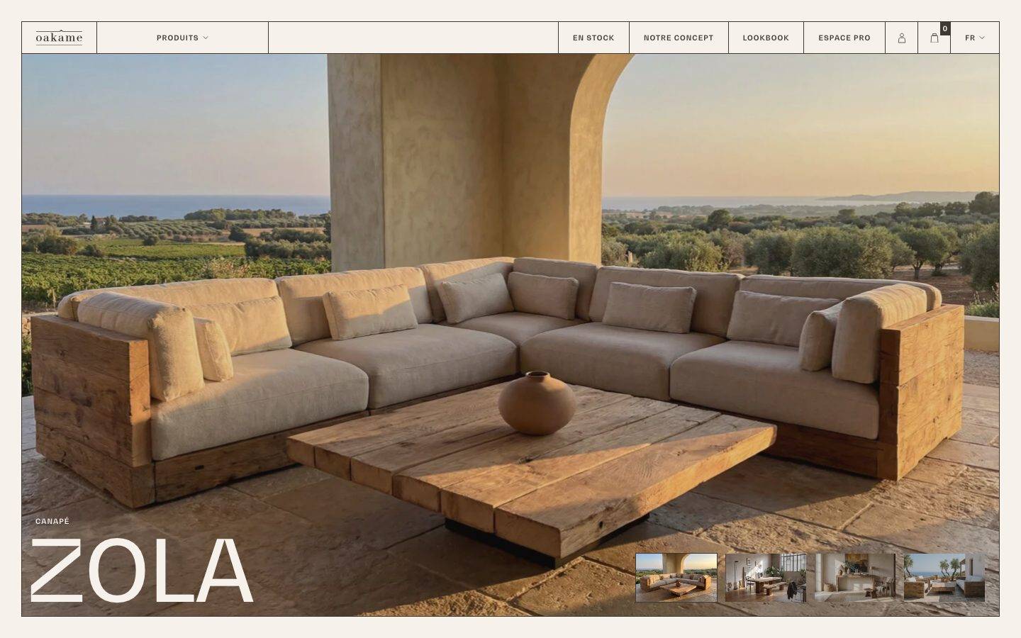
A warm, editorial e-commerce interface for artisanal reclaimed-oak furniture, anchored on a cream canvas (#f6f1eb) with dark warm-brown ink (#403a34). The system reads as quiet gallery-catalogue minimalism — full-bleed lifestyle photography, oversized BwGradual display type, sharp 0px corners everywhere, no shadows, and thin-outlined tracked-uppercase buttons. Brand voltage comes from massive display headlines and immersive product photography rather than color; the palette is deliberately monochromatic warm-neutral.
Works withClaude CodeCursorCodexGemini CLICopilotv0LovableBoltWindsurfReplit
---
version: alpha
name: Oakame-design-analysis
description: "A warm, editorial e-commerce interface for artisanal reclaimed-oak furniture, anchored on a cream canvas (#f6f1eb) with dark warm-brown ink (#403a34). The system reads as quiet gallery-catalogue minimalism — full-bleed lifestyle photography, oversized BwGradual display type, sharp 0px corners everywhere, no shadows, and thin-outlined tracked-uppercase buttons. Brand voltage comes from massive display headlines and immersive product photography rather than color; the palette is deliberately monochromatic warm-neutral."

colors:
  primary: "#403a34"
  ink: "#403a34"
  ink-strong: "#2f2f2f"
  body: "#515151"
  muted: "#767676"
  muted-soft: "#a1a1a1"
  canvas: "#f6f1eb"
  surface: "#ffffff"
  surface-soft: "#efefef"
  surface-lavender: "#e9e6ed"
  surface-lavender-strong: "#cfc8d8"
  hairline: "#cccccc"
  hairline-cool: "#bfc3c8"
  black: "#000000"
  accent-purple: "#7f54b3"
  accent-olive: "#b3af54"
  accent-red: "#b94a48"
  accent-red-strong: "#aa0000"
  accent-blue: "#579af6"
  accent-slate: "#3f4b5b"

typography:
  display:
    fontFamily: "BwGradual, Poppins, sans-serif"
    fontSize: 50px
    fontWeight: 500
    lineHeight: 1.2
    letterSpacing: normal
  title:
    fontFamily: "BwGradual, Poppins, sans-serif"
    fontSize: 18px
    fontWeight: 500
    lineHeight: 1.4
    letterSpacing: normal
  body:
    fontFamily: "BwGradual, Poppins, sans-serif"
    fontSize: 12px
    fontWeight: 400
    lineHeight: 1.5
    letterSpacing: normal
  caption-uppercase:
    fontFamily: "BwGradual, Poppins, sans-serif"
    fontSize: 10px
    fontWeight: 700
    lineHeight: 1.2
    letterSpacing: 0.1em

rounded:
  none: 0px

spacing:
  xxs: 4px
  xs: 8px
  sm: 10px
  md: 15px
  lg: 20px
  xl: 30px
  xxl: 50px
  section: 100px

components:
  top-nav:
    backgroundColor: "{colors.canvas}"
    textColor: "{colors.ink}"
    typography: "{typography.caption-uppercase}"
    rounded: "{rounded.none}"
  button-primary:
    backgroundColor: transparent
    textColor: "{colors.ink}"
    typography: "{typography.caption-uppercase}"
    rounded: "{rounded.none}"
    padding: 0px 20px
  nav-link:
    backgroundColor: transparent
    textColor: "{colors.ink}"
    typography: "{typography.caption-uppercase}"
    rounded: "{rounded.none}"
  hero-band:
    backgroundColor: "{colors.canvas}"
    textColor: "{colors.canvas}"
    typography: "{typography.display}"
    rounded: "{rounded.none}"
  product-title-overlay:
    backgroundColor: transparent
    textColor: "{colors.canvas}"
    typography: "{typography.display}"
    rounded: "{rounded.none}"
  card:
    backgroundColor: transparent
    textColor: "{colors.ink}"
    rounded: "{rounded.none}"
  info-card:
    backgroundColor: "{colors.canvas}"
    textColor: "{colors.body}"
    typography: "{typography.body}"
    rounded: "{rounded.none}"
    padding: 30px
  faq-accordion-item:
    backgroundColor: "{colors.canvas}"
    textColor: "{colors.ink}"
    typography: "{typography.body}"
    rounded: "{rounded.none}"
    padding: 20px
  thumbnail-tile:
    backgroundColor: "{colors.surface}"
    textColor: "{colors.ink}"
    rounded: "{rounded.none}"
  footer:
    backgroundColor: "{colors.canvas}"
    textColor: "{colors.ink}"
    typography: "{typography.caption-uppercase}"
    rounded: "{rounded.none}"

---

## Overview

Oakame is a French e-commerce surface for artisanal reclaimed-oak furniture, and its marketing/landing page reads as quiet gallery-catalogue minimalism. The page floor is a warm cream canvas (`{colors.canvas}` — #f6f1eb), all text is dark warm-brown ink (`{colors.ink}` — #403a34), and the layout is dominated by full-bleed lifestyle photography and oversized display typography. Everything is flat: no shadows were measured, and every measured corner radius is 0px — the system is sharp-edged and architectural.

Type voice is single-family: **BwGradual** carries everything, from the 50px `{typography.display}` headline down to the 10px tracked-uppercase `{typography.caption-uppercase}` used on nav and buttons. The brand does not split display and body across two faces — it modulates one family across a very wide size range (the giant "ZOLA" / "LÉ RECYC" / category headlines in the screenshots are much larger than the measured 50px h1, scaled up as art-directed display moments).

Brand voltage comes from two things only: **massive display headlines** and **immersive edge-to-edge product photography**. The palette is deliberately monochromatic warm-neutral — cream, brown, white, gray. The lavender/purple/red/blue accents that appear in the measured data (`#7f54b3`, `#e9e6ed`, `#b94a48`, `#579af6`, etc.) are almost certainly WooCommerce framework defaults leaking through the CSS rather than brand-intentional colors (see Known Gaps) and should not be treated as part of the visible brand system.

**Key Characteristics:**
- Warm cream canvas (`{colors.canvas}` — #f6f1eb) with dark warm-brown ink (`{colors.ink}` — #403a34). No white page floor — white (`{colors.surface}`) appears only on inset tiles/panels.
- Single typeface (BwGradual) across the whole system, modulated by size and weight rather than by family.
- Sharp corners everywhere — every measured radius is `{rounded.none}` (0px). No rounded cards, no pill buttons.
- No shadows measured — the system is entirely flat. Depth comes from photography and from thin hairline outlines.
- Thin-outlined, tracked-uppercase buttons (`{typography.caption-uppercase}` — 10px / 700 / 0.1em) with 0px 20px padding. Buttons read as small architectural labels, not filled CTAs.
- Full-bleed lifestyle photography anchors the hero and product moments; a thumbnail strip sits over the hero image bottom-right.
- Oversized display headlines used as compositional elements ("ZOLA", the category run-on headline).

## Colors

### Brand & Core
- **Primary / Ink** (`{colors.primary}` / `{colors.ink}` — #403a34): The single dominant color — a dark warm brown used for all headlines, body text, button labels, nav, and outlines. This is the action color and the text color simultaneously.
- **Ink Strong** (`{colors.ink-strong}` — #2f2f2f): A near-black used for the highest-contrast text moments.
- **Body** (`{colors.body}` — #515151): Secondary running-text gray.
- **Muted** (`{colors.muted}` — #767676): Tertiary text — captions, meta labels.
- **Muted Soft** (`{colors.muted-soft}` — #a1a1a1): Faintest text — fine print, disabled labels.

### Surface
- **Canvas** (`{colors.canvas}` — #f6f1eb): The universal warm-cream page floor. Nav, footer, and most bands sit on it.
- **Surface** (`{colors.surface}` — #ffffff): Pure white — appears on inset thumbnail tiles and small panels, not as the page background.
- **Surface Soft** (`{colors.surface-soft}` — #efefef): A cool light-gray used on divider fills / faint panels.
- **Surface Lavender** (`{colors.surface-lavender}` — #e9e6ed) and **Surface Lavender Strong** (`{colors.surface-lavender-strong}` — #cfc8d8): Cool lavender-gray tones measured at low frequency; likely framework UI surfaces (see Known Gaps).

### Hairline
- **Hairline** (`{colors.hairline}` — #cccccc): The 1px outline tone on cards, FAQ accordion rows, and outlined buttons on cream.
- **Hairline Cool** (`{colors.hairline-cool}` — #bfc3c8): A cooler border alternative.

### Framework / Incidental Accents
These were measured at very low frequency and are almost certainly WooCommerce default styling (notice/button/link colors) rather than brand-intentional hues. Documented for faithfulness, not for use:
- **Accent Purple** (`{colors.accent-purple}` — #7f54b3) — the WooCommerce default purple.
- **Accent Olive** (`{colors.accent-olive}` — #b3af54)
- **Accent Red / Red Strong** (`{colors.accent-red}` — #b94a48, `{colors.accent-red-strong}` — #aa0000) — validation/error defaults.
- **Accent Blue** (`{colors.accent-blue}` — #579af6) — link/info default.
- **Accent Slate** (`{colors.accent-slate}` — #3f4b5b)
- **Black** (`{colors.black}` — #000000)

## Typography

### Font Family
The entire system runs on **BwGradual** — a commercial humanist/geometric sans from Branding With Type. It carries display headlines, titles, body copy, and tracked-uppercase labels alike. There is no secondary family in the measured data.

BwGradual is a licensed commercial webfont and is not freely redistributable. Although it was not flagged in `fonts_licensed`, it should not be shipped without a license. A usable **open-source substitute** is **Poppins** (geometric, similar rounded proportions) at matching weights, or **Nunito Sans** for a slightly softer read. The declared fallback stack is `BwGradual, Poppins, sans-serif`.

### Hierarchy

| Token | Size | Weight | Line Height | Letter Spacing | Use |
|---|---|---|---|---|---|
| `{typography.display}` | 50px | 500 | 1.2 | normal | h1 headlines; scaled up further for the marquee "ZOLA" / category display moments |
| `{typography.title}` | 18px | 500 | 1.4 | normal | h3 sub-heads, card titles |
| `{typography.body}` | 12px | 400 | 1.5 | normal | Running paragraph text, descriptions |
| `{typography.caption-uppercase}` | 10px | 700 | 1.2 | 0.1em | Nav items, button labels, small tracked meta labels ("CANAPÉ", "NOTRE CONCEPT") |

### Principles
The system uses **one family, wide dynamic range**. Contrast is created by jumping from 10px tracked-uppercase micro-labels straight to a 50px+ display headline — the mid-sizes (title 18px, body 12px) are used sparingly. Body copy is unusually small (12px), which reinforces the editorial/catalogue feel where photography and headlines dominate and text recedes.

The `{typography.caption-uppercase}` role is the system's connective tissue: nav links, buttons, and category eyebrows all share the 10px / 700 / 0.1em tracked-uppercase treatment. It is the only tracked style in the system.

### Note on Font Substitutes
If BwGradual is unavailable, use **Poppins** (500 for display/title, 400 for body, 700 for the tracked-uppercase labels). Keep the 0.1em tracking on the uppercase role — that tracking is a core part of the label voice.

## Layout

### Spacing System
- **Base rhythm:** small increments cluster at 8px and 20px (the two most frequent measured values), with 15px and 30px close behind.
- **Tokens:** `{spacing.xxs}` 4px · `{spacing.xs}` 8px · `{spacing.sm}` 10px · `{spacing.md}` 15px · `{spacing.lg}` 20px · `{spacing.xl}` 30px · `{spacing.xxl}` 50px · `{spacing.section}` 100px.
- **Larger measured intervals** (68px, 80px, 100px, 150px, 200px) drive the very generous vertical gaps between editorial bands — the landing page uses extreme whitespace between sections, letting single headlines and photographs float on the cream canvas.
- **Component padding:** buttons use 0px vertical × 20px horizontal (`{spacing.lg}`); info panels and FAQ rows use `{spacing.xl}` (30px) / `{spacing.lg}` (20px).

### Grid & Container
- **Hero:** full-bleed edge-to-edge photography with a bottom-left product title overlay and a bottom-right 4-up thumbnail strip.
- **Editorial bands:** sparse, asymmetric placement — single labels and headlines positioned at the left, right, or center of otherwise empty cream space (visible in the long-scroll screenshot).
- **Product grid:** category names ("ZOLA", "CAMUS", "BONAPARTE", "BOCUSE", "GAUGUIN", "DESCARTES") laid out in a loose multi-column arrangement.
- **FAQ / info:** two-column split with an intro block on the left and accordion rows on the right.

### Whitespace Philosophy
Oakame uses **extreme, gallery-grade whitespace** — the vertical gaps between bands run to 100–200px, and most bands hold a single headline or a small cluster of labels. The effect is unhurried and premium: the page reads like a printed lookbook where each spread breathes.

## Elevation & Depth

| Level | Treatment | Use |
|---|---|---|
| Flat | No shadow, no border | Default for all bands and text on cream |
| Hairline outline | 1px `{colors.hairline}` border | Outlined buttons, FAQ accordion rows, bordered info panels |
| Photographic depth | Full-bleed imagery | Hero and product photography carry their own real-world depth |

No shadow tokens were measured (`shadows: []`). The system is deliberately **flat and sharp** — depth is delivered entirely by photography and by thin hairline outlines, never by drop shadows or blur. There is no glassmorphism, no neumorphism, no elevation layering.

### Decorative Depth
- The hero thumbnail strip sits directly over the photograph with no shadow — it reads as flat inset tiles on the image.
- Oversized display headlines that bleed off the edge of their container (e.g., "LÉ RECYC") act as compositional depth cues without any elevation styling.

## Shapes

### Border Radius Scale

| Token | Value | Use |
|---|---|---|
| `{rounded.none}` | 0px | Everything — buttons, cards, panels, thumbnails, inputs |

The entire system is sharp-cornered. Both measured components (`button-primary`, `card`) report a 0px radius, and no other radius values were captured. Rectangular geometry is a core brand signal — it reinforces the architectural, furniture-catalogue tone.

### Photography Geometry
Hero and product imagery are full-bleed rectangles with hard 0px corners. Thumbnail tiles in the hero strip are equal-width rectangles, also square-cornered. No circular avatars or rounded image masks were observed.

## Components

### Navigation

**`top-nav`** — Cream-canvas top bar spanning the page. Carries the "oakame" wordmark at left (a lowercase serif-styled logo lockup with a circumflex accent), a centered/left "PRODUITS" dropdown, and a right cluster of `{component.nav-link}` items ("EN STOCK", "NOTRE CONCEPT", "LOOKBOOK", "ESPACE PRO") plus account, cart, and "FR" language selector icons. All labels use `{typography.caption-uppercase}` (10px / 700 / 0.1em). Flat, no shadow, `{rounded.none}`.

**`nav-link`** — Individual tracked-uppercase menu item. Transparent background, `{colors.ink}` text, `{typography.caption-uppercase}`.

### Buttons

**`button-primary`** — The system's button, rendered as a thin-outlined tracked-uppercase label rather than a filled CTA. Transparent background, `{colors.ink}` text and 1px `{colors.hairline}` outline, `{typography.caption-uppercase}`, padding 0px × 20px, `{rounded.none}`. Used for "NOTRE CONCEPT", "TOUS NOS PRODUITS", "EN SAVOIR PLUS", "PLUS DE QUESTIONS". No filled/inverted variant was measured (default state only).

### Cards & Containers

**`card`** — Base container: sharp `{rounded.none}` corners, no shadow. Background is transparent (sits on cream). Used as the structural wrapper for content blocks.

**`info-card`** — Text panel (e.g., the "RECYCLÉ, QUALITÉ, FAIT-MAIN" concept block and its body copy). Cream background, `{colors.body}` text in `{typography.body}`, thin hairline outline, `{spacing.xl}` (30px) padding, `{rounded.none}`.

**`faq-accordion-item`** — Collapsible row in the "QU'EST QU'UNE PUCE NFC ?" FAQ block. Cream background, `{colors.ink}` label, `{typography.body}`, hairline divider outline, `{spacing.lg}` (20px) padding, `{rounded.none}`.

**`thumbnail-tile`** — Small rectangular image tile in the hero's bottom-right 4-up strip. White (`{colors.surface}`) mount, `{rounded.none}`, no shadow — flat inset over the hero photograph.

### Hero & Overlays

**`hero-band`** — Full-bleed lifestyle photograph (reclaimed-oak sofa in a Mediterranean setting). Carries a bottom-left product title overlay and a bottom-right thumbnail strip. Text over image is set in `{colors.canvas}` (cream reads as near-white on the warm photo).

**`product-title-overlay`** — Bottom-left product label lockup: a small `{typography.caption-uppercase}` eyebrow ("CANAPÉ") above an oversized `{typography.display}` product name ("ZOLA", scaled well beyond 50px as an art-directed display moment). Text color `{colors.canvas}`, no background fill.

### Footer

**`footer`** — Cream-canvas footer that closes the page. Carries the Oakame monogram/mark and tracked-uppercase link labels (`{typography.caption-uppercase}`) plus a tagline ("MOBILIER DESIGN, ÉCO-RESPONSABLE ET…"). Flat, `{rounded.none}`, no shadow. Unlike many systems, the footer does NOT invert to dark — it stays on the same warm cream floor as the rest of the page.

## Do's and Don'ts

### Do
- Keep the palette monochromatic warm-neutral: `{colors.ink}` on `{colors.canvas}`, with white (`{colors.surface}`) only for inset tiles. This restraint is the brand.
- Use `{typography.caption-uppercase}` (10px / 700 / 0.1em) for every nav item, button, and eyebrow label — the tracked-uppercase treatment is the connective voice.
- Set headlines in `{typography.display}` and scale them large as compositional elements. Big BwGradual is the primary brand gesture.
- Keep every corner sharp (`{rounded.none}`). Rectangular geometry is intentional.
- Keep the system flat — no shadows. Let photography and hairline outlines carry depth.
- Give bands extreme vertical whitespace (up to `{spacing.section}` and beyond). The gallery pacing is deliberate.
- Render buttons as thin-outlined tracked labels, not filled blocks.

### Don't
- Don't introduce the framework accent colors (`{colors.accent-purple}`, `{colors.accent-red}`, `{colors.accent-blue}`, etc.) into the brand surface — they are WooCommerce leakage, not brand hues.
- Don't add drop shadows or rounded corners — both break the flat, sharp, architectural language.
- Don't invert the footer to a dark surface; Oakame closes the page on the same cream floor.
- Don't fill buttons with a solid ink block; the brand button is outlined and tracked.
- Don't densify the layout — the extreme whitespace is a core premium signal.
- Don't add a second typeface; BwGradual (or its substitute) carries everything.
- Don't document hover states — default and pressed only.

## Responsive Behavior

Responsive breakpoints were not measured in this single-page (landing, desktop) capture. The following is inferred from the layout structure and marked accordingly; treat specifics as **derived**.

### Breakpoints (derived)

| Name | Width | Key Changes (derived) |
|---|---|---|
| Mobile | < 768px | Nav collapses to a menu toggle; hero title scales down; product-name grid stacks 1-up; thumbnail strip likely wraps or hides |
| Tablet | 768–1024px | Nav tightens; category grid reduces columns; two-column FAQ likely stacks |
| Desktop | > 1024px | Full horizontal nav, full-bleed hero with bottom-right thumbnail strip, multi-column category grid (as captured) |

### Touch Targets
- `{component.button-primary}` uses 0px vertical padding with a 10px label — the effective tap height is small and would need enlargement on touch devices (derived; not verified).
- Nav icons (account, cart, language) cluster at the top-right; exact hit-area sizing was not measured.

### Collapsing Strategy (derived)
- Full-bleed hero photography should scale proportionally, keeping the product-title overlay bottom-left.
- The loose multi-column category listing should reduce to fewer columns then single-column.
- The two-column FAQ/info split should stack intro-over-accordion.

## Iteration Guide

1. Focus on ONE component at a time; reference its YAML key directly (`{component.button-primary}`, `{component.faq-accordion-item}`).
2. Variants (`-active`, `-disabled`) should be added as separate `components:` entries once measured — none were captured here.
3. Use `{token.refs}` everywhere; never inline a hex in a component.
4. Never document hover; default and Active/Pressed states only.
5. Keep the trinity intact: cream canvas + brown ink + oversized BwGradual display. Color restraint is the brand.
6. Keep corners sharp and surfaces flat — resist adding radius or shadow tokens unless a future capture measures them.
7. When emphasizing: scale the display headline larger before reaching for weight or color.

## Known Gaps

- Only one page (landing) at one desktop viewport was captured; no responsive breakpoints, no hover/active/disabled states, and no interior product/cart pages were measured.
- **BwGradual is a licensed commercial webfont** — it was NOT flagged in `fonts_licensed`, but it should not be shipped without a license; Poppins/Nunito Sans substitutes are documented in Typography.
- The measured accent colors (`#7f54b3`, `#e9e6ed`, `#cfc8d8`, `#b3af54`, `#b94a48`, `#aa0000`, `#579af6`, `#3f4b5b`) appeared at very low frequency and match WooCommerce framework defaults; they are documented for faithfulness but flagged as likely non-brand leakage. Confirmation would require inspecting rendered elements.
- No border-radius or shadow tokens were measured (`radius: []`, `shadows: []`); the flat/sharp reading is inferred from the two components that reported 0px / none.
- Only four type sizes were measured (50 / 18 / 12 / 10px). The very large display headlines visible in the screenshots ("ZOLA", "LÉ RECYC", the category run-on) exceed 50px and were not individually measured — their sizes are treated as scaled `{typography.display}` moments (derived).
- No `on-primary` / inverted button text color was measured because the button is outlined rather than filled; a filled-button variant, if it exists, is undocumented.
- Exact nav-bar height, hero aspect ratio, and container max-width were not captured.
- No h2 role was measured; the hierarchy jumps from `{typography.display}` (h1) to `{typography.title}` (h3).

<!-- Documented by Duply · real-world design systems as ready-to-use DESIGN.md for AI coding agents · https://duply.ai/oakame/design-md -->
Color Palette
Accent
Neutrals
Typography
display50px · 500 · 1.2
The quick brown fox jumpstitle18px · 500 · 1.4
The quick brown fox jumpsbody12px · 400 · 1.5
The quick brown fox jumpscaption-uppercase10px · 700 · 1.2
The quick brown fox jumpsSpacing & Shape
Spacing
| Name | Value | Preview |
|---|---|---|
| xxs | 4px | |
| xs | 8px | |
| sm | 10px | |
| md | 15px | |
| lg | 20px | |
| xl | 30px | |
| xxl | 50px | |
| section | 100px |
Border Radius
| Name | Value | Preview |
|---|---|---|
| none | 0px |
FAQ
- What colors does Oakame use?
- Oakame's core palette includes #403a34, #403a34, #2f2f2f, #515151, #767676. The full color set with usage roles (canvas, ink, surfaces, accent, semantic) is documented in the Oakame DESIGN.md.
- What font does Oakame use?
- Oakame's primary typeface is BwGradual. The complete type scale (sizes, weights, line-height and letter-spacing per role), with an open substitute where the original is licensed, is documented in the DESIGN.md.
- What is the Oakame design system?
- A warm, editorial e-commerce interface for artisanal reclaimed-oak furniture, anchored on a cream canvas (#f6f1eb) with dark warm-brown ink (#403a34). The system reads as quiet gallery-catalogue minimalism — full-bleed lifestyle photography, oversized BwGradual display type, sharp 0px corners
Get this as a working kit
Oakame Launch Kit + DESIGN.md
$299$225
One-time payment
- A complete production-stack template, styled like Oakame, fully built and wired.
- One-time payment and the codebase is yours. No platform fees, no subscription.
Open it with Claude Code, Cursor, or any coding agent and build in plain language, then ship a complete web app.
- Your private DESIGN.md
- Marketing pages, blog, SEO & legal
- Email capture, newsletter & contact
- Accept payments (Stripe)
- Analytics (GA4 + PostHog)
- One-click deploy
- Auth, login & roles
- A full app dashboard, when you grow
More like this
---
version: alpha
name: Oakame-design-analysis
description: "A warm, editorial e-commerce interface for artisanal reclaimed-oak furniture, anchored on a cream canvas (#f6f1eb) with dark warm-brown ink (#403a34). The system reads as quiet gallery-catalogue minimalism — full-bleed lifestyle photography, oversized BwGradual display type, sharp 0px corners everywhere, no shadows, and thin-outlined tracked-uppercase buttons. Brand voltage comes from massive display headlines and immersive product photography rather than color; the palette is deliberately monochromatic warm-neutral."

colors:
  primary: "#403a34"
  ink: "#403a34"
  ink-strong: "#2f2f2f"
  body: "#515151"
  muted: "#767676"
  muted-soft: "#a1a1a1"
  canvas: "#f6f1eb"
  surface: "#ffffff"
  surface-soft: "#efefef"
  surface-lavender: "#e9e6ed"
  surface-lavender-strong: "#cfc8d8"
  hairline: "#cccccc"
  hairline-cool: "#bfc3c8"
  black: "#000000"
  accent-purple: "#7f54b3"
  accent-olive: "#b3af54"
  accent-red: "#b94a48"
  accent-red-strong: "#aa0000"
  accent-blue: "#579af6"
  accent-slate: "#3f4b5b"

typography:
  display:
    fontFamily: "BwGradual, Poppins, sans-serif"
    fontSize: 50px
    fontWeight: 500
    lineHeight: 1.2
    letterSpacing: normal
  title:
    fontFamily: "BwGradual, Poppins, sans-serif"
    fontSize: 18px
    fontWeight: 500
    lineHeight: 1.4
    letterSpacing: normal
  body:
    fontFamily: "BwGradual, Poppins, sans-serif"
    fontSize: 12px
    fontWeight: 400
    lineHeight: 1.5
    letterSpacing: normal
  caption-uppercase:
    fontFamily: "BwGradual, Poppins, sans-serif"
    fontSize: 10px
    fontWeight: 700
    lineHeight: 1.2
    letterSpacing: 0.1em

rounded:
  none: 0px

spacing:
  xxs: 4px
  xs: 8px
  sm: 10px
  md: 15px
  lg: 20px
  xl: 30px
  xxl: 50px
  section: 100px

components:
  top-nav:
    backgroundColor: "{colors.canvas}"
    textColor: "{colors.ink}"
    typography: "{typography.caption-uppercase}"
    rounded: "{rounded.none}"
  button-primary:
    backgroundColor: transparent
    textColor: "{colors.ink}"
    typography: "{typography.caption-uppercase}"
    rounded: "{rounded.none}"
    padding: 0px 20px
  nav-link:
    backgroundColor: transparent
    textColor: "{colors.ink}"
    typography: "{typography.caption-uppercase}"
    rounded: "{rounded.none}"
  hero-band:
    backgroundColor: "{colors.canvas}"
    textColor: "{colors.canvas}"
    typography: "{typography.display}"
    rounded: "{rounded.none}"
  product-title-overlay:
    backgroundColor: transparent
    textColor: "{colors.canvas}"
    typography: "{typography.display}"
    rounded: "{rounded.none}"
  card:
    backgroundColor: transparent
    textColor: "{colors.ink}"
    rounded: "{rounded.none}"
  info-card:
    backgroundColor: "{colors.canvas}"
    textColor: "{colors.body}"
    typography: "{typography.body}"
    rounded: "{rounded.none}"
    padding: 30px
  faq-accordion-item:
    backgroundColor: "{colors.canvas}"
    textColor: "{colors.ink}"
    typography: "{typography.body}"
    rounded: "{rounded.none}"
    padding: 20px
  thumbnail-tile:
    backgroundColor: "{colors.surface}"
    textColor: "{colors.ink}"
    rounded: "{rounded.none}"
  footer:
    backgroundColor: "{colors.canvas}"
    textColor: "{colors.ink}"
    typography: "{typography.caption-uppercase}"
    rounded: "{rounded.none}"

---

## Overview

Oakame is a French e-commerce surface for artisanal reclaimed-oak furniture, and its marketing/landing page reads as quiet gallery-catalogue minimalism. The page floor is a warm cream canvas (`{colors.canvas}` — #f6f1eb), all text is dark warm-brown ink (`{colors.ink}` — #403a34), and the layout is dominated by full-bleed lifestyle photography and oversized display typography. Everything is flat: no shadows were measured, and every measured corner radius is 0px — the system is sharp-edged and architectural.

Type voice is single-family: **BwGradual** carries everything, from the 50px `{typography.display}` headline down to the 10px tracked-uppercase `{typography.caption-uppercase}` used on nav and buttons. The brand does not split display and body across two faces — it modulates one family across a very wide size range (the giant "ZOLA" / "LÉ RECYC" / category headlines in the screenshots are much larger than the measured 50px h1, scaled up as art-directed display moments).

Brand voltage comes from two things only: **massive display headlines** and **immersive edge-to-edge product photography**. The palette is deliberately monochromatic warm-neutral — cream, brown, white, gray. The lavender/purple/red/blue accents that appear in the measured data (`#7f54b3`, `#e9e6ed`, `#b94a48`, `#579af6`, etc.) are almost certainly WooCommerce framework defaults leaking through the CSS rather than brand-intentional colors (see Known Gaps) and should not be treated as part of the visible brand system.

**Key Characteristics:**
- Warm cream canvas (`{colors.canvas}` — #f6f1eb) with dark warm-brown ink (`{colors.ink}` — #403a34). No white page floor — white (`{colors.surface}`) appears only on inset tiles/panels.
- Single typeface (BwGradual) across the whole system, modulated by size and weight rather than by family.
- Sharp corners everywhere — every measured radius is `{rounded.none}` (0px). No rounded cards, no pill buttons.
- No shadows measured — the system is entirely flat. Depth comes from photography and from thin hairline outlines.
- Thin-outlined, tracked-uppercase buttons (`{typography.caption-uppercase}` — 10px / 700 / 0.1em) with 0px 20px padding. Buttons read as small architectural labels, not filled CTAs.
- Full-bleed lifestyle photography anchors the hero and product moments; a thumbnail strip sits over the hero image bottom-right.
- Oversized display headlines used as compositional elements ("ZOLA", the category run-on headline).

## Colors

### Brand & Core
- **Primary / Ink** (`{colors.primary}` / `{colors.ink}` — #403a34): The single dominant color — a dark warm brown used for all headlines, body text, button labels, nav, and outlines. This is the action color and the text color simultaneously.
- **Ink Strong** (`{colors.ink-strong}` — #2f2f2f): A near-black used for the highest-contrast text moments.
- **Body** (`{colors.body}` — #515151): Secondary running-text gray.
- **Muted** (`{colors.muted}` — #767676): Tertiary text — captions, meta labels.
- **Muted Soft** (`{colors.muted-soft}` — #a1a1a1): Faintest text — fine print, disabled labels.

### Surface
- **Canvas** (`{colors.canvas}` — #f6f1eb): The universal warm-cream page floor. Nav, footer, and most bands sit on it.
- **Surface** (`{colors.surface}` — #ffffff): Pure white — appears on inset thumbnail tiles and small panels, not as the page background.
- **Surface Soft** (`{colors.surface-soft}` — #efefef): A cool light-gray used on divider fills / faint panels.
- **Surface Lavender** (`{colors.surface-lavender}` — #e9e6ed) and **Surface Lavender Strong** (`{colors.surface-lavender-strong}` — #cfc8d8): Cool lavender-gray tones measured at low frequency; likely framework UI surfaces (see Known Gaps).

### Hairline
- **Hairline** (`{colors.hairline}` — #cccccc): The 1px outline tone on cards, FAQ accordion rows, and outlined buttons on cream.
- **Hairline Cool** (`{colors.hairline-cool}` — #bfc3c8): A cooler border alternative.

### Framework / Incidental Accents
These were measured at very low frequency and are almost certainly WooCommerce default styling (notice/button/link colors) rather than brand-intentional hues. Documented for faithfulness, not for use:
- **Accent Purple** (`{colors.accent-purple}` — #7f54b3) — the WooCommerce default purple.
- **Accent Olive** (`{colors.accent-olive}` — #b3af54)
- **Accent Red / Red Strong** (`{colors.accent-red}` — #b94a48, `{colors.accent-red-strong}` — #aa0000) — validation/error defaults.
- **Accent Blue** (`{colors.accent-blue}` — #579af6) — link/info default.
- **Accent Slate** (`{colors.accent-slate}` — #3f4b5b)
- **Black** (`{colors.black}` — #000000)

## Typography

### Font Family
The entire system runs on **BwGradual** — a commercial humanist/geometric sans from Branding With Type. It carries display headlines, titles, body copy, and tracked-uppercase labels alike. There is no secondary family in the measured data.

BwGradual is a licensed commercial webfont and is not freely redistributable. Although it was not flagged in `fonts_licensed`, it should not be shipped without a license. A usable **open-source substitute** is **Poppins** (geometric, similar rounded proportions) at matching weights, or **Nunito Sans** for a slightly softer read. The declared fallback stack is `BwGradual, Poppins, sans-serif`.

### Hierarchy

| Token | Size | Weight | Line Height | Letter Spacing | Use |
|---|---|---|---|---|---|
| `{typography.display}` | 50px | 500 | 1.2 | normal | h1 headlines; scaled up further for the marquee "ZOLA" / category display moments |
| `{typography.title}` | 18px | 500 | 1.4 | normal | h3 sub-heads, card titles |
| `{typography.body}` | 12px | 400 | 1.5 | normal | Running paragraph text, descriptions |
| `{typography.caption-uppercase}` | 10px | 700 | 1.2 | 0.1em | Nav items, button labels, small tracked meta labels ("CANAPÉ", "NOTRE CONCEPT") |

### Principles
The system uses **one family, wide dynamic range**. Contrast is created by jumping from 10px tracked-uppercase micro-labels straight to a 50px+ display headline — the mid-sizes (title 18px, body 12px) are used sparingly. Body copy is unusually small (12px), which reinforces the editorial/catalogue feel where photography and headlines dominate and text recedes.

The `{typography.caption-uppercase}` role is the system's connective tissue: nav links, buttons, and category eyebrows all share the 10px / 700 / 0.1em tracked-uppercase treatment. It is the only tracked style in the system.

### Note on Font Substitutes
If BwGradual is unavailable, use **Poppins** (500 for display/title, 400 for body, 700 for the tracked-uppercase labels). Keep the 0.1em tracking on the uppercase role — that tracking is a core part of the label voice.

## Layout

### Spacing System
- **Base rhythm:** small increments cluster at 8px and 20px (the two most frequent measured values), with 15px and 30px close behind.
- **Tokens:** `{spacing.xxs}` 4px · `{spacing.xs}` 8px · `{spacing.sm}` 10px · `{spacing.md}` 15px · `{spacing.lg}` 20px · `{spacing.xl}` 30px · `{spacing.xxl}` 50px · `{spacing.section}` 100px.
- **Larger measured intervals** (68px, 80px, 100px, 150px, 200px) drive the very generous vertical gaps between editorial bands — the landing page uses extreme whitespace between sections, letting single headlines and photographs float on the cream canvas.
- **Component padding:** buttons use 0px vertical × 20px horizontal (`{spacing.lg}`); info panels and FAQ rows use `{spacing.xl}` (30px) / `{spacing.lg}` (20px).

### Grid & Container
- **Hero:** full-bleed edge-to-edge photography with a bottom-left product title overlay and a bottom-right 4-up thumbnail strip.
- **Editorial bands:** sparse, asymmetric placement — single labels and headlines positioned at the left, right, or center of otherwise empty cream space (visible in the long-scroll screenshot).
- **Product grid:** category names ("ZOLA", "CAMUS", "BONAPARTE", "BOCUSE", "GAUGUIN", "DESCARTES") laid out in a loose multi-column arrangement.
- **FAQ / info:** two-column split with an intro block on the left and accordion rows on the right.

### Whitespace Philosophy
Oakame uses **extreme, gallery-grade whitespace** — the vertical gaps between bands run to 100–200px, and most bands hold a single headline or a small cluster of labels. The effect is unhurried and premium: the page reads like a printed lookbook where each spread breathes.

## Elevation & Depth

| Level | Treatment | Use |
|---|---|---|
| Flat | No shadow, no border | Default for all bands and text on cream |
| Hairline outline | 1px `{colors.hairline}` border | Outlined buttons, FAQ accordion rows, bordered info panels |
| Photographic depth | Full-bleed imagery | Hero and product photography carry their own real-world depth |

No shadow tokens were measured (`shadows: []`). The system is deliberately **flat and sharp** — depth is delivered entirely by photography and by thin hairline outlines, never by drop shadows or blur. There is no glassmorphism, no neumorphism, no elevation layering.

### Decorative Depth
- The hero thumbnail strip sits directly over the photograph with no shadow — it reads as flat inset tiles on the image.
- Oversized display headlines that bleed off the edge of their container (e.g., "LÉ RECYC") act as compositional depth cues without any elevation styling.

## Shapes

### Border Radius Scale

| Token | Value | Use |
|---|---|---|
| `{rounded.none}` | 0px | Everything — buttons, cards, panels, thumbnails, inputs |

The entire system is sharp-cornered. Both measured components (`button-primary`, `card`) report a 0px radius, and no other radius values were captured. Rectangular geometry is a core brand signal — it reinforces the architectural, furniture-catalogue tone.

### Photography Geometry
Hero and product imagery are full-bleed rectangles with hard 0px corners. Thumbnail tiles in the hero strip are equal-width rectangles, also square-cornered. No circular avatars or rounded image masks were observed.

## Components

### Navigation

**`top-nav`** — Cream-canvas top bar spanning the page. Carries the "oakame" wordmark at left (a lowercase serif-styled logo lockup with a circumflex accent), a centered/left "PRODUITS" dropdown, and a right cluster of `{component.nav-link}` items ("EN STOCK", "NOTRE CONCEPT", "LOOKBOOK", "ESPACE PRO") plus account, cart, and "FR" language selector icons. All labels use `{typography.caption-uppercase}` (10px / 700 / 0.1em). Flat, no shadow, `{rounded.none}`.

**`nav-link`** — Individual tracked-uppercase menu item. Transparent background, `{colors.ink}` text, `{typography.caption-uppercase}`.

### Buttons

**`button-primary`** — The system's button, rendered as a thin-outlined tracked-uppercase label rather than a filled CTA. Transparent background, `{colors.ink}` text and 1px `{colors.hairline}` outline, `{typography.caption-uppercase}`, padding 0px × 20px, `{rounded.none}`. Used for "NOTRE CONCEPT", "TOUS NOS PRODUITS", "EN SAVOIR PLUS", "PLUS DE QUESTIONS". No filled/inverted variant was measured (default state only).

### Cards & Containers

**`card`** — Base container: sharp `{rounded.none}` corners, no shadow. Background is transparent (sits on cream). Used as the structural wrapper for content blocks.

**`info-card`** — Text panel (e.g., the "RECYCLÉ, QUALITÉ, FAIT-MAIN" concept block and its body copy). Cream background, `{colors.body}` text in `{typography.body}`, thin hairline outline, `{spacing.xl}` (30px) padding, `{rounded.none}`.

**`faq-accordion-item`** — Collapsible row in the "QU'EST QU'UNE PUCE NFC ?" FAQ block. Cream background, `{colors.ink}` label, `{typography.body}`, hairline divider outline, `{spacing.lg}` (20px) padding, `{rounded.none}`.

**`thumbnail-tile`** — Small rectangular image tile in the hero's bottom-right 4-up strip. White (`{colors.surface}`) mount, `{rounded.none}`, no shadow — flat inset over the hero photograph.

### Hero & Overlays

**`hero-band`** — Full-bleed lifestyle photograph (reclaimed-oak sofa in a Mediterranean setting). Carries a bottom-left product title overlay and a bottom-right thumbnail strip. Text over image is set in `{colors.canvas}` (cream reads as near-white on the warm photo).

**`product-title-overlay`** — Bottom-left product label lockup: a small `{typography.caption-uppercase}` eyebrow ("CANAPÉ") above an oversized `{typography.display}` product name ("ZOLA", scaled well beyond 50px as an art-directed display moment). Text color `{colors.canvas}`, no background fill.

### Footer

**`footer`** — Cream-canvas footer that closes the page. Carries the Oakame monogram/mark and tracked-uppercase link labels (`{typography.caption-uppercase}`) plus a tagline ("MOBILIER DESIGN, ÉCO-RESPONSABLE ET…"). Flat, `{rounded.none}`, no shadow. Unlike many systems, the footer does NOT invert to dark — it stays on the same warm cream floor as the rest of the page.

## Do's and Don'ts

### Do
- Keep the palette monochromatic warm-neutral: `{colors.ink}` on `{colors.canvas}`, with white (`{colors.surface}`) only for inset tiles. This restraint is the brand.
- Use `{typography.caption-uppercase}` (10px / 700 / 0.1em) for every nav item, button, and eyebrow label — the tracked-uppercase treatment is the connective voice.
- Set headlines in `{typography.display}` and scale them large as compositional elements. Big BwGradual is the primary brand gesture.
- Keep every corner sharp (`{rounded.none}`). Rectangular geometry is intentional.
- Keep the system flat — no shadows. Let photography and hairline outlines carry depth.
- Give bands extreme vertical whitespace (up to `{spacing.section}` and beyond). The gallery pacing is deliberate.
- Render buttons as thin-outlined tracked labels, not filled blocks.

### Don't
- Don't introduce the framework accent colors (`{colors.accent-purple}`, `{colors.accent-red}`, `{colors.accent-blue}`, etc.) into the brand surface — they are WooCommerce leakage, not brand hues.
- Don't add drop shadows or rounded corners — both break the flat, sharp, architectural language.
- Don't invert the footer to a dark surface; Oakame closes the page on the same cream floor.
- Don't fill buttons with a solid ink block; the brand button is outlined and tracked.
- Don't densify the layout — the extreme whitespace is a core premium signal.
- Don't add a second typeface; BwGradual (or its substitute) carries everything.
- Don't document hover states — default and pressed only.

## Responsive Behavior

Responsive breakpoints were not measured in this single-page (landing, desktop) capture. The following is inferred from the layout structure and marked accordingly; treat specifics as **derived**.

### Breakpoints (derived)

| Name | Width | Key Changes (derived) |
|---|---|---|
| Mobile | < 768px | Nav collapses to a menu toggle; hero title scales down; product-name grid stacks 1-up; thumbnail strip likely wraps or hides |
| Tablet | 768–1024px | Nav tightens; category grid reduces columns; two-column FAQ likely stacks |
| Desktop | > 1024px | Full horizontal nav, full-bleed hero with bottom-right thumbnail strip, multi-column category grid (as captured) |

### Touch Targets
- `{component.button-primary}` uses 0px vertical padding with a 10px label — the effective tap height is small and would need enlargement on touch devices (derived; not verified).
- Nav icons (account, cart, language) cluster at the top-right; exact hit-area sizing was not measured.

### Collapsing Strategy (derived)
- Full-bleed hero photography should scale proportionally, keeping the product-title overlay bottom-left.
- The loose multi-column category listing should reduce to fewer columns then single-column.
- The two-column FAQ/info split should stack intro-over-accordion.

## Iteration Guide

1. Focus on ONE component at a time; reference its YAML key directly (`{component.button-primary}`, `{component.faq-accordion-item}`).
2. Variants (`-active`, `-disabled`) should be added as separate `components:` entries once measured — none were captured here.
3. Use `{token.refs}` everywhere; never inline a hex in a component.
4. Never document hover; default and Active/Pressed states only.
5. Keep the trinity intact: cream canvas + brown ink + oversized BwGradual display. Color restraint is the brand.
6. Keep corners sharp and surfaces flat — resist adding radius or shadow tokens unless a future capture measures them.
7. When emphasizing: scale the display headline larger before reaching for weight or color.

## Known Gaps

- Only one page (landing) at one desktop viewport was captured; no responsive breakpoints, no hover/active/disabled states, and no interior product/cart pages were measured.
- **BwGradual is a licensed commercial webfont** — it was NOT flagged in `fonts_licensed`, but it should not be shipped without a license; Poppins/Nunito Sans substitutes are documented in Typography.
- The measured accent colors (`#7f54b3`, `#e9e6ed`, `#cfc8d8`, `#b3af54`, `#b94a48`, `#aa0000`, `#579af6`, `#3f4b5b`) appeared at very low frequency and match WooCommerce framework defaults; they are documented for faithfulness but flagged as likely non-brand leakage. Confirmation would require inspecting rendered elements.
- No border-radius or shadow tokens were measured (`radius: []`, `shadows: []`); the flat/sharp reading is inferred from the two components that reported 0px / none.
- Only four type sizes were measured (50 / 18 / 12 / 10px). The very large display headlines visible in the screenshots ("ZOLA", "LÉ RECYC", the category run-on) exceed 50px and were not individually measured — their sizes are treated as scaled `{typography.display}` moments (derived).
- No `on-primary` / inverted button text color was measured because the button is outlined rather than filled; a filled-button variant, if it exists, is undocumented.
- Exact nav-bar height, hero aspect ratio, and container max-width were not captured.
- No h2 role was measured; the hierarchy jumps from `{typography.display}` (h1) to `{typography.title}` (h3).

<!-- Documented by Duply · real-world design systems as ready-to-use DESIGN.md for AI coding agents · https://duply.ai/oakame/design-md -->