Customer.io
A bright, data-platform marketing surface built on a white canvas with near-black Saans display headlines, oversized hero type (96px), and dark CTA pills. The system pairs a clean monochrome editorial layer with embedded product-UI screenshots, crimson inline-text highlights, pale-green AI suggestion chips, and a single deep near-black "enterprise" band that anchors the lower page. Visual voltage comes from very large Saans headlines and from real product chrome shown inside the marketing flow rather than from broad use of accent color.
---
version: alpha
name: Customer.io-design-analysis
description: A bright, data-platform marketing surface built on a white canvas with near-black Saans display headlines, oversized hero type (96px), and dark CTA pills. The system pairs a clean monochrome editorial layer with embedded product-UI screenshots, crimson inline-text highlights, pale-green AI suggestion chips, and a single deep near-black "enterprise" band that anchors the lower page. Visual voltage comes from very large Saans headlines and from real product chrome shown inside the marketing flow rather than from broad use of accent color.
colors:
canvas: "#ffffff"
ink: "#242427"
on-dark: "#ffffff"
surface-dark: "#242427"
black: "#000000"
accent-crimson: "#c50122"
accent-pale-green: "#ebfeec"
ui-green: "#28c840"
ui-yellow: "#febc2e"
ui-red: "#ff5f57"
link: "#999999"
muted: "#666666"
typography:
h1:
fontFamily: "Saans, Inter, sans-serif"
fontSize: 96px
fontWeight: 475
lineHeight: 1.0
letterSpacing: 0.2px
h2:
fontFamily: "Saans, Inter, sans-serif"
fontSize: 40px
fontWeight: 475
lineHeight: 1.125
letterSpacing: 0.2px
h3:
fontFamily: "Saans, Inter, sans-serif"
fontSize: 20px
fontWeight: 600
lineHeight: 1.125
letterSpacing: 0.2px
body:
fontFamily: "Saans, Inter, sans-serif"
fontSize: 14px
fontWeight: 700
lineHeight: 1.4
letterSpacing: 0.2px
button:
fontFamily: "Saans, Inter, sans-serif"
fontSize: 16px
fontWeight: 700
lineHeight: 1.375
letterSpacing: 0.2px
rounded:
xs: 2px
sm: 4px
md: 6px
full: 9999px
spacing:
xxs: 4px
xs: 6px
sm: 8px
md: 12px
lg: 16px
xl: 24px
xxl: 32px
huge: 48px
giant: 64px
components:
top-nav:
backgroundColor: "{colors.canvas}"
textColor: "{colors.ink}"
typography: "{typography.button}"
padding: 24px 32px
nav-link:
backgroundColor: transparent
textColor: "{colors.ink}"
typography: "{typography.button}"
button-primary:
backgroundColor: "{colors.canvas}"
textColor: "{colors.muted}"
typography: "{typography.button}"
rounded: "{rounded.sm}"
padding: 12px 60px
button-outline:
backgroundColor: transparent
textColor: "{colors.ink}"
typography: "{typography.button}"
rounded: "{rounded.full}"
padding: 12px 60px
hero-band:
backgroundColor: "{colors.canvas}"
textColor: "{colors.ink}"
typography: "{typography.h1}"
padding: 64px
feature-grid-cell:
backgroundColor: "{colors.canvas}"
textColor: "{colors.ink}"
typography: "{typography.h3}"
padding: 32px
dark-section:
backgroundColor: "{colors.surface-dark}"
textColor: "{colors.on-dark}"
typography: "{typography.h2}"
padding: 64px
suggestion-chip:
backgroundColor: "{colors.accent-pale-green}"
textColor: "{colors.ink}"
typography: "{typography.body}"
rounded: "{rounded.full}"
padding: 8px 16px
accent-text-link:
backgroundColor: transparent
textColor: "{colors.accent-crimson}"
typography: "{typography.h2}"
text-link:
backgroundColor: transparent
textColor: "{colors.link}"
typography: "{typography.body}"
pill-card:
backgroundColor: "{colors.canvas}"
textColor: "{colors.ink}"
rounded: "{rounded.full}"
window-chrome-dot:
backgroundColor: "{colors.ui-red}"
textColor: "{colors.ink}"
rounded: "{rounded.full}"
---
## Overview
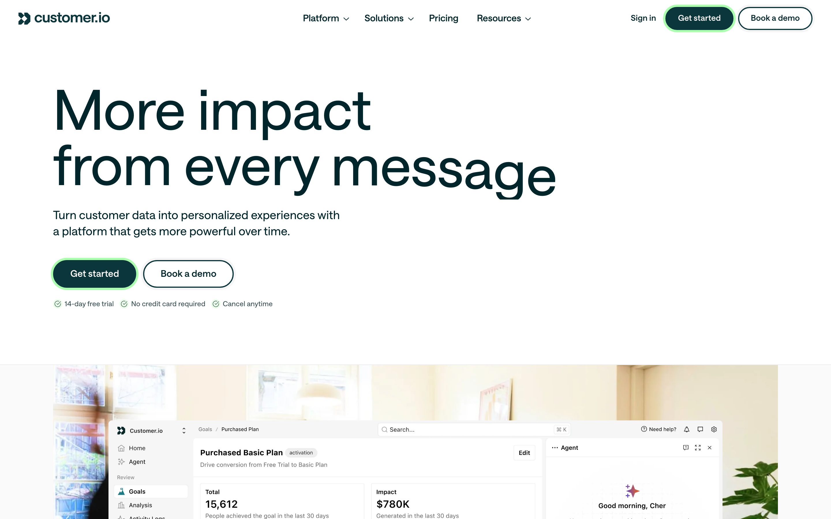
Customer.io's marketing surface is a bright, confident data-platform interface — white canvas (`{colors.canvas}` — #ffffff) carrying very large near-black Saans headlines (`{colors.ink}` — #242427) and dark pill-shaped CTAs. The page reads as modern B2B SaaS: generous whitespace, an oversized 96px hero headline, embedded product-UI screenshots shown directly in the flow, and a single deep near-black "enterprise" band that anchors the lower third of the long-scroll homepage.
The type voice is single-family: **Saans** does all the work — display headlines, sub-heads, body, and button labels. The hierarchy is driven by size and weight rather than by switching faces. Display headlines sit at weight 475 (a custom mid-weight that gives the large type an airy, almost-light feel), while body and buttons jump to weight 700. Every role carries a consistent 0.2px letter-spacing.
Color voltage is intentionally narrow. The brand body is monochrome (near-black on white), with **crimson** (`{colors.accent-crimson}` — #c50122) used as an inline-word highlight inside the large "We unify your data, messaging, and AI…" statement, and **pale green** (`{colors.accent-pale-green}` — #ebfeec) used for the AI-agent suggestion chips. The macOS-style **traffic-light dots** (`{colors.ui-red}` / `{colors.ui-yellow}` / `{colors.ui-green}`) appear as window chrome inside the embedded product screenshots — they are product UI shown as content, not brand accents.
The lower page flips to a near-black `{colors.surface-dark}` (#242427) enterprise band with white text — the only large dark surface on the page — which visually separates the "infrastructure / enterprise" story from the bright marketing bands above.
**Key Characteristics:**
- White canvas with oversized Saans headlines (`{typography.h1}` at 96px, weight 475). Hierarchy comes from scale, not color.
- Pill-shaped CTAs (`{rounded.full}`) — the hero shows a dark filled "Get started" button beside an outlined "Book a demo" pill.
- Embedded product screenshots (dashboards, charts, AI agent panel) shown directly in the marketing flow rather than illustrated.
- Narrow accent palette: crimson inline highlights, pale-green AI suggestion chips, traffic-light dots as product chrome.
- A single deep near-black enterprise band (`{colors.surface-dark}`) anchoring the lower page.
- Tight small-radius detailing on UI elements (`{rounded.xs}` 2px is the most-measured radius), contrasted with fully-rounded pill buttons.
- Dominant spacing rhythm built on 8px / 24px / 32px steps with 64px reserved for band separation.
## Colors
### Brand & Accent
- **Crimson** (`{colors.accent-crimson}` — #c50122): The single chromatic highlight in the editorial layer. Used to color individual words inside large statement headlines (e.g. the word "customers" in the unify-statement band). Never used as a button fill in the measured set.
- **Pale Green** (`{colors.accent-pale-green}` — #ebfeec): The fill for AI-agent suggestion chips ("Automate touch points", "Recommended send time", etc.). A soft, low-saturation green that signals the AI/assist surface.
### Product-UI Chrome
- **UI Green / Yellow / Red** (`{colors.ui-green}` — #28c840, `{colors.ui-yellow}` — #febc2e, `{colors.ui-red}` — #ff5f57): The macOS window traffic-light dots that appear inside the embedded product screenshots. These are product chrome shown as content, not brand colors — they should not be repurposed as marketing accents.
### Surface
- **Canvas** (`{colors.canvas}` — #ffffff): The default page floor for all bright bands.
- **Surface Dark** (`{colors.surface-dark}` — #242427): The near-black enterprise band background — the only large dark surface on the page.
- **Black** (`{colors.black}` — #000000): Measured at low frequency; a deeper near-black used in dark UI fragments.
### Text
- **Ink** (`{colors.ink}` — #242427): All headlines and primary text on the white canvas.
- **On Dark** (`{colors.on-dark}` — #ffffff): Text on the dark enterprise band and inside dark product chrome.
- **Muted** (`{colors.muted}` — #666666): The measured label color on the primary button; also tertiary text.
- **Link** (`{colors.link}` — #999999): Measured anchor color for low-emphasis inline links.
## Typography
### Font Family
The system runs a single typeface — **Saans** (captured in the analysis as `saansFont`) — across every role: display headlines, sub-heads, body, and button labels. Hierarchy is built from size and weight, not from a second family. The defining trait is the weight split: display headlines use a custom mid-weight of **475** (lighter than a typical semibold, which gives the very large type an open, refined feel), while body and button text jump to **700**. Every measured role carries **0.2px** letter-spacing.
### Hierarchy
| Token | Size | Weight | Line Height | Letter Spacing | Use |
|---|---|---|---|---|---|
| `{typography.h1}` | 96px | 475 | 1.0 | 0.2px | Hero headline ("More impact from every push") — Saans |
| `{typography.h2}` | 40px | 475 | 1.125 | 0.2px | Section heads, large statement bands — Saans |
| `{typography.h3}` | 20px | 600 | 1.125 | 0.2px | Card / feature titles — Saans |
| `{typography.body}` | 14px | 700 | 1.4 | 0.2px | Running text, descriptions, chip labels |
| `{typography.button}` | 16px | 700 | 1.375 | 0.2px | Button labels, nav links |
### Principles
Scale carries the hierarchy: the 96px hero is dramatically larger than the 40px section heads, and the mid-weight 475 keeps the giant type from feeling heavy. Body and buttons are bold (700), giving small text strong presence against the airy headlines. The 0.2px tracking is uniform across the system — keep it consistent rather than tuning per size.
### Note on Font Substitutes
Saans is a commercial typeface from a type foundry and is not a free web font; it was not flagged in `fonts_licensed`, but if Saans is unavailable, a geometric-leaning grotesque such as **Inter** (the declared fallback) approximates the proportions. Match the weight signature — a custom mid-weight near 475 for display, 700 for body — rather than defaulting Inter to 400/600. Note that Inter's humanist forms differ from Saans's cleaner grotesque character.
## Layout
### Spacing System
- **Base unit:** 4px.
- **Tokens:** `{spacing.xxs}` 4px · `{spacing.xs}` 6px · `{spacing.sm}` 8px · `{spacing.md}` 12px · `{spacing.lg}` 16px · `{spacing.xl}` 24px · `{spacing.xxl}` 32px · `{spacing.huge}` 48px · `{spacing.giant}` 64px.
- **Most frequent steps:** 24px (165 occurrences) and 8px (120) dominate internal rhythm; 32px (75) and 4px (83) handle medium and fine spacing; 64px (11) separates major bands.
- **Card / cell padding:** `{spacing.xxl}` (32px) is the typical block padding for feature cells.
- **Band separation:** `{spacing.giant}` (64px) is the largest measured step, used between editorial bands.
### Grid & Container
- **Hero:** Left-aligned single-column composition — oversized h1, sub-head, then a CTA row — with a wide product screenshot bleeding across the band below.
- **Feature grids:** Multi-up grids of capability cells (e.g. the 4-up "Everything you need" row and the 2×2 "Support every stage" grid).
- **Logo strip:** A horizontal trusted-by brand row beneath the hero screenshot.
- **Dark band:** A full-width enterprise section with nested integration / security / support sub-panels.
### Whitespace Philosophy
Customer.io leans on generous whitespace around its very large headlines — the hero type is allowed to dominate with substantial room above and below. The 8px/24px rhythm keeps component internals tight while 64px band gaps give the long-scroll page clear editorial pacing.
## Elevation & Depth
| Level | Treatment | Use |
|---|---|---|
| Flat | No shadow, no border | Body bands, hero, feature cells |
| Bottom rule | `rgb(221,221,221) 0px 2px 0px 0px` (a 2px bottom line) | Subtle underlines / dividers on inputs or list rows |
| Focus ring | `0 0 0 4px` ring in measured oklch tones | Interactive / selected states |
| Dark band | `{colors.surface-dark}` background, no shadow | Enterprise infrastructure section — color contrast does the elevation work |
The system is shadow-light. Rather than drop shadows, emphasis comes from **4px focus rings** measured in oklch — a pale green ring `oklch(0.9263 0.136 145.2)`, a light-neutral ring `oklch(0.97 0 0)`, and a dark-teal ring `oklch(0.3068 0.046 206.34)`. These were captured as raw oklch box-shadow values; their hex equivalents are not recorded (see Known Gaps).
### Decorative Depth
- Embedded product screenshots carry their own internal chrome (window dots, panel shadows) — this depth belongs to the product UI shown as content, not to the marketing system.
- The dark enterprise band provides the page's primary depth cue through color inversion rather than shadow.
## Shapes
### Border Radius Scale
| Token | Value | Use |
|---|---|---|
| `{rounded.xs}` | 2px | The most-measured radius (freq 30) — small UI elements, chips, inputs inside product fragments |
| `{rounded.sm}` | 4px | Primary button corners |
| `{rounded.md}` | 6px | Occasional slightly-softer element (freq 1) |
| `{rounded.full}` | 9999px | Pill CTAs, suggestion chips, circular dots — derived from the measured ~33,554,432px "card" radius, which is an effectively-infinite pill value |
The shape language contrasts two extremes: very tight 2–4px corners on the editorial / UI layer, and full pill rounding on CTAs, chips, and circular dots. There is no mid-size card radius in heavy use.
### Photography Geometry
Embedded product screenshots fill wide rectangular zones with minimal corner rounding; the avatar / testimonial portraits in the case-study band appear as rectangular crops. Suggestion chips and CTAs are the pill-rounded elements.
## Components
### Navigation
**`top-nav`** — White nav bar across the top of every page. Background `{colors.canvas}`, ink-colored wordmark + menu at left/center (Platform, Solutions, Pricing, Resources), right cluster with "Sign in" text, a filled "Get started" CTA, and an outlined "Book a demo" pill. Menu items use `{typography.button}`.
**`nav-link`** — Inline nav menu item. Transparent background, `{colors.ink}` text, `{typography.button}`.
### Buttons
**`button-primary`** — As measured: background `{colors.canvas}`, label `{colors.muted}` (#666666), `{typography.button}`, rounded `{rounded.sm}` (4px), padding 12px × 60px. Note: the hero's visually-dominant "Get started" CTA renders as a dark-green filled pill with a pale-green focus glow; that fill color was not captured as a hex (see Known Gaps), so this entry reflects the measured button only.
**`button-outline`** — The "Book a demo" pill. Transparent background, `{colors.ink}` text, hairline outline, rounded `{rounded.full}`, padding 12px × 60px.
### Bands & Cards
**`hero-band`** — White-canvas hero. Left-aligned oversized `{typography.h1}` (96px), a `{typography.body}` sub-head, and a CTA row; a wide product screenshot sits below. Background `{colors.canvas}`, padding `{spacing.giant}` (64px).
**`feature-grid-cell`** — A single cell in the multi-up capability / journey grids. Background `{colors.canvas}`, title in `{typography.h3}`, body in `{typography.body}`, padding `{spacing.xxl}` (32px).
**`dark-section`** — The near-black enterprise band ("Infrastructure built for teams…"). Background `{colors.surface-dark}` (#242427), text `{colors.on-dark}`, heading in `{typography.h2}`, padding `{spacing.giant}` (64px). The only large dark surface on the page.
**`pill-card`** — The measured fully-rounded card element. Background `{colors.canvas}`, rounded `{rounded.full}` (derived from the measured pill radius), carrying a 4px focus ring on selection.
### Accents & Chips
**`suggestion-chip`** — The AI-agent suggestion pill ("Automate touch points", "Recommended send time"). Background `{colors.accent-pale-green}` (#ebfeec), text `{colors.ink}`, `{typography.body}`, rounded `{rounded.full}`, padding 8px × 16px.
**`accent-text-link`** — Inline highlighted word inside large statement headlines. Transparent background, `{colors.accent-crimson}` text, inherits the surrounding `{typography.h2}` scale.
**`text-link`** — Low-emphasis inline link. Transparent background, `{colors.link}` (#999999) text, `{typography.body}`.
**`window-chrome-dot`** — The macOS traffic-light dots inside embedded product screenshots. Circular (`{rounded.full}`), filled with `{colors.ui-red}` / `{colors.ui-yellow}` / `{colors.ui-green}`. Documented as product chrome — not for marketing reuse.
## Do's and Don'ts
### Do
- Let `{typography.h1}` (96px, weight 475) dominate the hero. Scale is the primary hierarchy device.
- Keep the editorial layer monochrome — `{colors.ink}` on `{colors.canvas}` — and reserve `{colors.accent-crimson}` for single highlighted words.
- Use `{colors.accent-pale-green}` only for the AI-agent suggestion surface (`{component.suggestion-chip}`).
- Use full pill rounding (`{rounded.full}`) on CTAs and chips, and tight 2px (`{rounded.xs}`) corners on dense UI elements.
- Embed real product screenshots in the marketing flow; the traffic-light dots and panel chrome are part of that content.
- Reserve the dark `{colors.surface-dark}` band for the enterprise / infrastructure story — one dark anchor per page.
- Maintain the uniform 0.2px letter-spacing across all type roles.
### Don't
- Don't repurpose the product-UI traffic-light colors (`{colors.ui-red}`, `{colors.ui-yellow}`, `{colors.ui-green}`) as marketing accents.
- Don't bold the display headlines beyond their measured 475 weight — the mid-weight is what keeps the giant type airy.
- Don't add multiple dark bands; the single `{colors.surface-dark}` section is a scarce signal.
- Don't introduce mid-size card radii — the system uses either tight (2–4px) or full pill rounding.
- Don't spread crimson across body copy; it is an inline-word highlight only.
- Don't document hover states; default and active/pressed only.
## Responsive Behavior
| Name | Width | Key Changes |
|---|---|---|
| Mobile | < 768px | Hamburger nav; hero h1 scales down dramatically from 96px; CTA pills stack; feature grids collapse to 1-up; dark band stacks its sub-panels |
| Tablet | 768–1024px | Nav tightens; feature grids 2-up; hero screenshot scales proportionally |
| Desktop | 1024–1440px | Full horizontal nav; multi-up feature grids; full 96px hero |
| Wide | > 1440px | Same as desktop with additional outer breathing room |
### Touch Targets
- `{component.button-primary}` carries generous 12px × 60px padding, giving a wide tap area.
- `{component.button-outline}` matches the same padding.
- `{component.suggestion-chip}` uses 8px × 16px padding; effective tap area meets minimums with the pill silhouette.
### Collapsing Strategy
- The desktop nav collapses to a hamburger below the tablet breakpoint.
- The oversized hero headline reduces in size on smaller viewports while keeping its left-aligned composition.
- Feature grids reduce column count rather than shrinking cells.
- The dark enterprise band stacks its integration / security / support sub-panels vertically on mobile while retaining its dark surface.
### Image Behavior
- Embedded product screenshots scale proportionally; window chrome and dashboard content stay legible.
- Logo-strip brand marks wrap to additional rows on narrow viewports.
## Iteration Guide
1. Work on ONE component at a time, referencing its YAML key (`{component.suggestion-chip}`, `{component.dark-section}`).
2. State variants (`-active`, `-disabled`, `-focused`) belong as separate entries in `components:`.
3. Use `{token.refs}` everywhere — never inline a hex in a component.
4. Document only default and active/pressed states — never hover.
5. Hierarchy is size-first: prefer a larger Saans headline before a heavier weight.
6. Keep the accent palette narrow — crimson for highlighted words, pale green for AI chips, nothing more.
7. The dark band is the single dark anchor; do not add more dark surfaces casually.
## Known Gaps
- The hero's dominant **dark-green "Get started" CTA fill** was not captured as a hex. The measured `button-primary` reports a white background with `#666666` text (likely a secondary/disabled or differently-styled control), so the documented button reflects that measurement, not the green hero pill.
- The CTA's **pale-green focus glow** and other focus rings were captured only as oklch box-shadow values (`oklch(0.9263 0.136 145.2)`, `oklch(0.97 0 0)`, `oklch(0.3068 0.046 206.34)`); their hex equivalents are not recorded and were not derived.
- The **case-study / testimonial band** surfaces (soft peach and pale-blue card backgrounds visible in screenshots) were not captured as measured colors and are omitted from the palette.
- `ink` (#242427) and `surface-dark` (#242427) share the same measured value across two roles; whether a distinct darker headline tone exists separately from the band background is unconfirmed.
- The measured `card` radius (~33,554,432px) is an effectively-infinite pill value, mapped here to `{rounded.full}` (9999px, derived).
- **Saans** is a commercial typeface and not shippable as a free web font; an open substitute (Inter) is documented, but exact weight matching for the custom 475 display weight may require tuning.
- Animation, transition timings, and the AI-agent panel's interactive behavior are out of scope.
- Form input states (focus, error, success) beyond the measured 2px bottom-rule shadow were not extracted.
<!-- Documented by duply · real-world design systems as ready-to-use DESIGN.md for AI coding agents · https://duply.ai/customer/design-md -->
Color Palette
Accent
Neutrals
Typography
h196px · 475 · 1
The quick brown fox jumpsh240px · 475 · 1.125
The quick brown fox jumpsh320px · 600 · 1.125
The quick brown fox jumpsbody14px · 700 · 1.4
The quick brown fox jumpsbutton16px · 700 · 1.375
The quick brown fox jumpsSpacing & Shape
Spacing
| Name | Value | Preview |
|---|---|---|
| xxs | 4px | |
| xs | 6px | |
| sm | 8px | |
| md | 12px | |
| lg | 16px | |
| xl | 24px | |
| xxl | 32px | |
| huge | 48px | |
| giant | 64px |
Border Radius
| Name | Value | Preview |
|---|---|---|
| xs | 2px | |
| sm | 4px | |
| md | 6px | |
| full | 9999px |
More like this


---
version: alpha
name: Customer.io-design-analysis
description: A bright, data-platform marketing surface built on a white canvas with near-black Saans display headlines, oversized hero type (96px), and dark CTA pills. The system pairs a clean monochrome editorial layer with embedded product-UI screenshots, crimson inline-text highlights, pale-green AI suggestion chips, and a single deep near-black "enterprise" band that anchors the lower page. Visual voltage comes from very large Saans headlines and from real product chrome shown inside the marketing flow rather than from broad use of accent color.
colors:
  canvas: "#ffffff"
  ink: "#242427"
  on-dark: "#ffffff"
  surface-dark: "#242427"
  black: "#000000"
  accent-crimson: "#c50122"
  accent-pale-green: "#ebfeec"
  ui-green: "#28c840"
  ui-yellow: "#febc2e"
  ui-red: "#ff5f57"
  link: "#999999"
  muted: "#666666"
typography:
  h1:
    fontFamily: "Saans, Inter, sans-serif"
    fontSize: 96px
    fontWeight: 475
    lineHeight: 1.0
    letterSpacing: 0.2px
  h2:
    fontFamily: "Saans, Inter, sans-serif"
    fontSize: 40px
    fontWeight: 475
    lineHeight: 1.125
    letterSpacing: 0.2px
  h3:
    fontFamily: "Saans, Inter, sans-serif"
    fontSize: 20px
    fontWeight: 600
    lineHeight: 1.125
    letterSpacing: 0.2px
  body:
    fontFamily: "Saans, Inter, sans-serif"
    fontSize: 14px
    fontWeight: 700
    lineHeight: 1.4
    letterSpacing: 0.2px
  button:
    fontFamily: "Saans, Inter, sans-serif"
    fontSize: 16px
    fontWeight: 700
    lineHeight: 1.375
    letterSpacing: 0.2px
rounded:
  xs: 2px
  sm: 4px
  md: 6px
  full: 9999px
spacing:
  xxs: 4px
  xs: 6px
  sm: 8px
  md: 12px
  lg: 16px
  xl: 24px
  xxl: 32px
  huge: 48px
  giant: 64px
components:
  top-nav:
    backgroundColor: "{colors.canvas}"
    textColor: "{colors.ink}"
    typography: "{typography.button}"
    padding: 24px 32px
  nav-link:
    backgroundColor: transparent
    textColor: "{colors.ink}"
    typography: "{typography.button}"
  button-primary:
    backgroundColor: "{colors.canvas}"
    textColor: "{colors.muted}"
    typography: "{typography.button}"
    rounded: "{rounded.sm}"
    padding: 12px 60px
  button-outline:
    backgroundColor: transparent
    textColor: "{colors.ink}"
    typography: "{typography.button}"
    rounded: "{rounded.full}"
    padding: 12px 60px
  hero-band:
    backgroundColor: "{colors.canvas}"
    textColor: "{colors.ink}"
    typography: "{typography.h1}"
    padding: 64px
  feature-grid-cell:
    backgroundColor: "{colors.canvas}"
    textColor: "{colors.ink}"
    typography: "{typography.h3}"
    padding: 32px
  dark-section:
    backgroundColor: "{colors.surface-dark}"
    textColor: "{colors.on-dark}"
    typography: "{typography.h2}"
    padding: 64px
  suggestion-chip:
    backgroundColor: "{colors.accent-pale-green}"
    textColor: "{colors.ink}"
    typography: "{typography.body}"
    rounded: "{rounded.full}"
    padding: 8px 16px
  accent-text-link:
    backgroundColor: transparent
    textColor: "{colors.accent-crimson}"
    typography: "{typography.h2}"
  text-link:
    backgroundColor: transparent
    textColor: "{colors.link}"
    typography: "{typography.body}"
  pill-card:
    backgroundColor: "{colors.canvas}"
    textColor: "{colors.ink}"
    rounded: "{rounded.full}"
  window-chrome-dot:
    backgroundColor: "{colors.ui-red}"
    textColor: "{colors.ink}"
    rounded: "{rounded.full}"
---

## Overview

Customer.io's marketing surface is a bright, confident data-platform interface — white canvas (`{colors.canvas}` — #ffffff) carrying very large near-black Saans headlines (`{colors.ink}` — #242427) and dark pill-shaped CTAs. The page reads as modern B2B SaaS: generous whitespace, an oversized 96px hero headline, embedded product-UI screenshots shown directly in the flow, and a single deep near-black "enterprise" band that anchors the lower third of the long-scroll homepage.

The type voice is single-family: **Saans** does all the work — display headlines, sub-heads, body, and button labels. The hierarchy is driven by size and weight rather than by switching faces. Display headlines sit at weight 475 (a custom mid-weight that gives the large type an airy, almost-light feel), while body and buttons jump to weight 700. Every role carries a consistent 0.2px letter-spacing.

Color voltage is intentionally narrow. The brand body is monochrome (near-black on white), with **crimson** (`{colors.accent-crimson}` — #c50122) used as an inline-word highlight inside the large "We unify your data, messaging, and AI…" statement, and **pale green** (`{colors.accent-pale-green}` — #ebfeec) used for the AI-agent suggestion chips. The macOS-style **traffic-light dots** (`{colors.ui-red}` / `{colors.ui-yellow}` / `{colors.ui-green}`) appear as window chrome inside the embedded product screenshots — they are product UI shown as content, not brand accents.

The lower page flips to a near-black `{colors.surface-dark}` (#242427) enterprise band with white text — the only large dark surface on the page — which visually separates the "infrastructure / enterprise" story from the bright marketing bands above.

**Key Characteristics:**
- White canvas with oversized Saans headlines (`{typography.h1}` at 96px, weight 475). Hierarchy comes from scale, not color.
- Pill-shaped CTAs (`{rounded.full}`) — the hero shows a dark filled "Get started" button beside an outlined "Book a demo" pill.
- Embedded product screenshots (dashboards, charts, AI agent panel) shown directly in the marketing flow rather than illustrated.
- Narrow accent palette: crimson inline highlights, pale-green AI suggestion chips, traffic-light dots as product chrome.
- A single deep near-black enterprise band (`{colors.surface-dark}`) anchoring the lower page.
- Tight small-radius detailing on UI elements (`{rounded.xs}` 2px is the most-measured radius), contrasted with fully-rounded pill buttons.
- Dominant spacing rhythm built on 8px / 24px / 32px steps with 64px reserved for band separation.

## Colors

### Brand & Accent
- **Crimson** (`{colors.accent-crimson}` — #c50122): The single chromatic highlight in the editorial layer. Used to color individual words inside large statement headlines (e.g. the word "customers" in the unify-statement band). Never used as a button fill in the measured set.
- **Pale Green** (`{colors.accent-pale-green}` — #ebfeec): The fill for AI-agent suggestion chips ("Automate touch points", "Recommended send time", etc.). A soft, low-saturation green that signals the AI/assist surface.

### Product-UI Chrome
- **UI Green / Yellow / Red** (`{colors.ui-green}` — #28c840, `{colors.ui-yellow}` — #febc2e, `{colors.ui-red}` — #ff5f57): The macOS window traffic-light dots that appear inside the embedded product screenshots. These are product chrome shown as content, not brand colors — they should not be repurposed as marketing accents.

### Surface
- **Canvas** (`{colors.canvas}` — #ffffff): The default page floor for all bright bands.
- **Surface Dark** (`{colors.surface-dark}` — #242427): The near-black enterprise band background — the only large dark surface on the page.
- **Black** (`{colors.black}` — #000000): Measured at low frequency; a deeper near-black used in dark UI fragments.

### Text
- **Ink** (`{colors.ink}` — #242427): All headlines and primary text on the white canvas.
- **On Dark** (`{colors.on-dark}` — #ffffff): Text on the dark enterprise band and inside dark product chrome.
- **Muted** (`{colors.muted}` — #666666): The measured label color on the primary button; also tertiary text.
- **Link** (`{colors.link}` — #999999): Measured anchor color for low-emphasis inline links.

## Typography

### Font Family
The system runs a single typeface — **Saans** (captured in the analysis as `saansFont`) — across every role: display headlines, sub-heads, body, and button labels. Hierarchy is built from size and weight, not from a second family. The defining trait is the weight split: display headlines use a custom mid-weight of **475** (lighter than a typical semibold, which gives the very large type an open, refined feel), while body and button text jump to **700**. Every measured role carries **0.2px** letter-spacing.

### Hierarchy

| Token | Size | Weight | Line Height | Letter Spacing | Use |
|---|---|---|---|---|---|
| `{typography.h1}` | 96px | 475 | 1.0 | 0.2px | Hero headline ("More impact from every push") — Saans |
| `{typography.h2}` | 40px | 475 | 1.125 | 0.2px | Section heads, large statement bands — Saans |
| `{typography.h3}` | 20px | 600 | 1.125 | 0.2px | Card / feature titles — Saans |
| `{typography.body}` | 14px | 700 | 1.4 | 0.2px | Running text, descriptions, chip labels |
| `{typography.button}` | 16px | 700 | 1.375 | 0.2px | Button labels, nav links |

### Principles
Scale carries the hierarchy: the 96px hero is dramatically larger than the 40px section heads, and the mid-weight 475 keeps the giant type from feeling heavy. Body and buttons are bold (700), giving small text strong presence against the airy headlines. The 0.2px tracking is uniform across the system — keep it consistent rather than tuning per size.

### Note on Font Substitutes
Saans is a commercial typeface from a type foundry and is not a free web font; it was not flagged in `fonts_licensed`, but if Saans is unavailable, a geometric-leaning grotesque such as **Inter** (the declared fallback) approximates the proportions. Match the weight signature — a custom mid-weight near 475 for display, 700 for body — rather than defaulting Inter to 400/600. Note that Inter's humanist forms differ from Saans's cleaner grotesque character.

## Layout

### Spacing System
- **Base unit:** 4px.
- **Tokens:** `{spacing.xxs}` 4px · `{spacing.xs}` 6px · `{spacing.sm}` 8px · `{spacing.md}` 12px · `{spacing.lg}` 16px · `{spacing.xl}` 24px · `{spacing.xxl}` 32px · `{spacing.huge}` 48px · `{spacing.giant}` 64px.
- **Most frequent steps:** 24px (165 occurrences) and 8px (120) dominate internal rhythm; 32px (75) and 4px (83) handle medium and fine spacing; 64px (11) separates major bands.
- **Card / cell padding:** `{spacing.xxl}` (32px) is the typical block padding for feature cells.
- **Band separation:** `{spacing.giant}` (64px) is the largest measured step, used between editorial bands.

### Grid & Container
- **Hero:** Left-aligned single-column composition — oversized h1, sub-head, then a CTA row — with a wide product screenshot bleeding across the band below.
- **Feature grids:** Multi-up grids of capability cells (e.g. the 4-up "Everything you need" row and the 2×2 "Support every stage" grid).
- **Logo strip:** A horizontal trusted-by brand row beneath the hero screenshot.
- **Dark band:** A full-width enterprise section with nested integration / security / support sub-panels.

### Whitespace Philosophy
Customer.io leans on generous whitespace around its very large headlines — the hero type is allowed to dominate with substantial room above and below. The 8px/24px rhythm keeps component internals tight while 64px band gaps give the long-scroll page clear editorial pacing.

## Elevation & Depth

| Level | Treatment | Use |
|---|---|---|
| Flat | No shadow, no border | Body bands, hero, feature cells |
| Bottom rule | `rgb(221,221,221) 0px 2px 0px 0px` (a 2px bottom line) | Subtle underlines / dividers on inputs or list rows |
| Focus ring | `0 0 0 4px` ring in measured oklch tones | Interactive / selected states |
| Dark band | `{colors.surface-dark}` background, no shadow | Enterprise infrastructure section — color contrast does the elevation work |

The system is shadow-light. Rather than drop shadows, emphasis comes from **4px focus rings** measured in oklch — a pale green ring `oklch(0.9263 0.136 145.2)`, a light-neutral ring `oklch(0.97 0 0)`, and a dark-teal ring `oklch(0.3068 0.046 206.34)`. These were captured as raw oklch box-shadow values; their hex equivalents are not recorded (see Known Gaps).

### Decorative Depth
- Embedded product screenshots carry their own internal chrome (window dots, panel shadows) — this depth belongs to the product UI shown as content, not to the marketing system.
- The dark enterprise band provides the page's primary depth cue through color inversion rather than shadow.

## Shapes

### Border Radius Scale

| Token | Value | Use |
|---|---|---|
| `{rounded.xs}` | 2px | The most-measured radius (freq 30) — small UI elements, chips, inputs inside product fragments |
| `{rounded.sm}` | 4px | Primary button corners |
| `{rounded.md}` | 6px | Occasional slightly-softer element (freq 1) |
| `{rounded.full}` | 9999px | Pill CTAs, suggestion chips, circular dots — derived from the measured ~33,554,432px "card" radius, which is an effectively-infinite pill value |

The shape language contrasts two extremes: very tight 2–4px corners on the editorial / UI layer, and full pill rounding on CTAs, chips, and circular dots. There is no mid-size card radius in heavy use.

### Photography Geometry
Embedded product screenshots fill wide rectangular zones with minimal corner rounding; the avatar / testimonial portraits in the case-study band appear as rectangular crops. Suggestion chips and CTAs are the pill-rounded elements.

## Components

### Navigation

**`top-nav`** — White nav bar across the top of every page. Background `{colors.canvas}`, ink-colored wordmark + menu at left/center (Platform, Solutions, Pricing, Resources), right cluster with "Sign in" text, a filled "Get started" CTA, and an outlined "Book a demo" pill. Menu items use `{typography.button}`.

**`nav-link`** — Inline nav menu item. Transparent background, `{colors.ink}` text, `{typography.button}`.

### Buttons

**`button-primary`** — As measured: background `{colors.canvas}`, label `{colors.muted}` (#666666), `{typography.button}`, rounded `{rounded.sm}` (4px), padding 12px × 60px. Note: the hero's visually-dominant "Get started" CTA renders as a dark-green filled pill with a pale-green focus glow; that fill color was not captured as a hex (see Known Gaps), so this entry reflects the measured button only.

**`button-outline`** — The "Book a demo" pill. Transparent background, `{colors.ink}` text, hairline outline, rounded `{rounded.full}`, padding 12px × 60px.

### Bands & Cards

**`hero-band`** — White-canvas hero. Left-aligned oversized `{typography.h1}` (96px), a `{typography.body}` sub-head, and a CTA row; a wide product screenshot sits below. Background `{colors.canvas}`, padding `{spacing.giant}` (64px).

**`feature-grid-cell`** — A single cell in the multi-up capability / journey grids. Background `{colors.canvas}`, title in `{typography.h3}`, body in `{typography.body}`, padding `{spacing.xxl}` (32px).

**`dark-section`** — The near-black enterprise band ("Infrastructure built for teams…"). Background `{colors.surface-dark}` (#242427), text `{colors.on-dark}`, heading in `{typography.h2}`, padding `{spacing.giant}` (64px). The only large dark surface on the page.

**`pill-card`** — The measured fully-rounded card element. Background `{colors.canvas}`, rounded `{rounded.full}` (derived from the measured pill radius), carrying a 4px focus ring on selection.

### Accents & Chips

**`suggestion-chip`** — The AI-agent suggestion pill ("Automate touch points", "Recommended send time"). Background `{colors.accent-pale-green}` (#ebfeec), text `{colors.ink}`, `{typography.body}`, rounded `{rounded.full}`, padding 8px × 16px.

**`accent-text-link`** — Inline highlighted word inside large statement headlines. Transparent background, `{colors.accent-crimson}` text, inherits the surrounding `{typography.h2}` scale.

**`text-link`** — Low-emphasis inline link. Transparent background, `{colors.link}` (#999999) text, `{typography.body}`.

**`window-chrome-dot`** — The macOS traffic-light dots inside embedded product screenshots. Circular (`{rounded.full}`), filled with `{colors.ui-red}` / `{colors.ui-yellow}` / `{colors.ui-green}`. Documented as product chrome — not for marketing reuse.

## Do's and Don'ts

### Do
- Let `{typography.h1}` (96px, weight 475) dominate the hero. Scale is the primary hierarchy device.
- Keep the editorial layer monochrome — `{colors.ink}` on `{colors.canvas}` — and reserve `{colors.accent-crimson}` for single highlighted words.
- Use `{colors.accent-pale-green}` only for the AI-agent suggestion surface (`{component.suggestion-chip}`).
- Use full pill rounding (`{rounded.full}`) on CTAs and chips, and tight 2px (`{rounded.xs}`) corners on dense UI elements.
- Embed real product screenshots in the marketing flow; the traffic-light dots and panel chrome are part of that content.
- Reserve the dark `{colors.surface-dark}` band for the enterprise / infrastructure story — one dark anchor per page.
- Maintain the uniform 0.2px letter-spacing across all type roles.

### Don't
- Don't repurpose the product-UI traffic-light colors (`{colors.ui-red}`, `{colors.ui-yellow}`, `{colors.ui-green}`) as marketing accents.
- Don't bold the display headlines beyond their measured 475 weight — the mid-weight is what keeps the giant type airy.
- Don't add multiple dark bands; the single `{colors.surface-dark}` section is a scarce signal.
- Don't introduce mid-size card radii — the system uses either tight (2–4px) or full pill rounding.
- Don't spread crimson across body copy; it is an inline-word highlight only.
- Don't document hover states; default and active/pressed only.

## Responsive Behavior

| Name | Width | Key Changes |
|---|---|---|
| Mobile | < 768px | Hamburger nav; hero h1 scales down dramatically from 96px; CTA pills stack; feature grids collapse to 1-up; dark band stacks its sub-panels |
| Tablet | 768–1024px | Nav tightens; feature grids 2-up; hero screenshot scales proportionally |
| Desktop | 1024–1440px | Full horizontal nav; multi-up feature grids; full 96px hero |
| Wide | > 1440px | Same as desktop with additional outer breathing room |

### Touch Targets
- `{component.button-primary}` carries generous 12px × 60px padding, giving a wide tap area.
- `{component.button-outline}` matches the same padding.
- `{component.suggestion-chip}` uses 8px × 16px padding; effective tap area meets minimums with the pill silhouette.

### Collapsing Strategy
- The desktop nav collapses to a hamburger below the tablet breakpoint.
- The oversized hero headline reduces in size on smaller viewports while keeping its left-aligned composition.
- Feature grids reduce column count rather than shrinking cells.
- The dark enterprise band stacks its integration / security / support sub-panels vertically on mobile while retaining its dark surface.

### Image Behavior
- Embedded product screenshots scale proportionally; window chrome and dashboard content stay legible.
- Logo-strip brand marks wrap to additional rows on narrow viewports.

## Iteration Guide

1. Work on ONE component at a time, referencing its YAML key (`{component.suggestion-chip}`, `{component.dark-section}`).
2. State variants (`-active`, `-disabled`, `-focused`) belong as separate entries in `components:`.
3. Use `{token.refs}` everywhere — never inline a hex in a component.
4. Document only default and active/pressed states — never hover.
5. Hierarchy is size-first: prefer a larger Saans headline before a heavier weight.
6. Keep the accent palette narrow — crimson for highlighted words, pale green for AI chips, nothing more.
7. The dark band is the single dark anchor; do not add more dark surfaces casually.

## Known Gaps

- The hero's dominant **dark-green "Get started" CTA fill** was not captured as a hex. The measured `button-primary` reports a white background with `#666666` text (likely a secondary/disabled or differently-styled control), so the documented button reflects that measurement, not the green hero pill.
- The CTA's **pale-green focus glow** and other focus rings were captured only as oklch box-shadow values (`oklch(0.9263 0.136 145.2)`, `oklch(0.97 0 0)`, `oklch(0.3068 0.046 206.34)`); their hex equivalents are not recorded and were not derived.
- The **case-study / testimonial band** surfaces (soft peach and pale-blue card backgrounds visible in screenshots) were not captured as measured colors and are omitted from the palette.
- `ink` (#242427) and `surface-dark` (#242427) share the same measured value across two roles; whether a distinct darker headline tone exists separately from the band background is unconfirmed.
- The measured `card` radius (~33,554,432px) is an effectively-infinite pill value, mapped here to `{rounded.full}` (9999px, derived).
- **Saans** is a commercial typeface and not shippable as a free web font; an open substitute (Inter) is documented, but exact weight matching for the custom 475 display weight may require tuning.
- Animation, transition timings, and the AI-agent panel's interactive behavior are out of scope.
- Form input states (focus, error, success) beyond the measured 2px bottom-rule shadow were not extracted.

<!-- Documented by duply · real-world design systems as ready-to-use DESIGN.md for AI coding agents · https://duply.ai/customer/design-md -->