getlago
A precise, developer-first billing-platform interface built on a warm off-white canvas (#f5f5ef) with crisp black text and a single grotesque typeface (GT America). The system reads as quiet, engineering-grade SaaS — flat surfaces with no shadows, tight 8px-radius white cards and inputs, soft pill chips for multi-select questions, and a clean horizontal top-nav. Brand voltage comes from a saturated accent spectrum (red, orange, yellow, green, violet) used sparingly in iconography and logo marks rather than from heavy surface color.
---
version: alpha
name: getlago-design-analysis
description: A precise, developer-first billing-platform interface built on a warm off-white canvas (#f5f5ef) with crisp black text and a single grotesque typeface (GT America). The system reads as quiet, engineering-grade SaaS — flat surfaces with no shadows, tight 8px-radius white cards and inputs, soft pill chips for multi-select questions, and a clean horizontal top-nav. Brand voltage comes from a saturated accent spectrum (red, orange, yellow, green, violet) used sparingly in iconography and logo marks rather than from heavy surface color.
colors:
ink: "#000000"
ink-soft: "#202020"
ink-navy: "#1e2939"
body: "#646464"
muted: "#6a7282"
muted-soft: "#a3a3a3"
muted-faint: "#b4b4b4"
hairline: "#e5e7eb"
hairline-soft: "#eeeeee"
canvas: "#ffffff"
surface-soft: "#f5f5ef"
surface-dark: "#060d17"
on-primary: "#ffffff"
accent-red: "#fb2c36"
accent-red-strong: "#e40014"
accent-pink: "#ffcaca"
accent-orange: "#fe6e00"
accent-yellow: "#edb200"
accent-green: "#00a544"
accent-violet: "#c07eff"
accent-violet-strong: "#9810fa"
typography:
h1:
fontFamily: "GT America, Inter, sans-serif"
fontSize: 40px
fontWeight: 500
lineHeight: 1.2
letterSpacing: -1px
body:
fontFamily: "GT America, Inter, sans-serif"
fontSize: 14px
fontWeight: 500
lineHeight: 1.429
letterSpacing: -0.25px
button:
fontFamily: "GT America, Inter, sans-serif"
fontSize: 16px
fontWeight: 500
lineHeight: 1.5
letterSpacing: -0.25px
rounded:
sm: 6px
md: 8px
lg: 10px
full: 9999px
spacing:
xxs: 4px
xs: 8px
sm: 12px
md: 16px
lg: 24px
xl: 32px
xxl: 48px
section: 96px
components:
top-nav:
backgroundColor: "{colors.surface-soft}"
textColor: "{colors.ink}"
typography: "{typography.body}"
nav-link:
backgroundColor: transparent
textColor: "{colors.ink}"
typography: "{typography.body}"
button-primary:
backgroundColor: "{colors.ink}"
textColor: "{colors.on-primary}"
typography: "{typography.button}"
rounded: "{rounded.md}"
padding: 0px 12px
chip-option:
backgroundColor: "{colors.canvas}"
textColor: "{colors.ink}"
typography: "{typography.body}"
rounded: "{rounded.md}"
form-card:
backgroundColor: "{colors.canvas}"
textColor: "{colors.ink}"
rounded: "{rounded.lg}"
padding: 32px
logo-tile-card:
backgroundColor: "{colors.canvas}"
textColor: "{colors.muted}"
rounded: "{rounded.lg}"
padding: 24px
text-input:
backgroundColor: "{colors.canvas}"
textColor: "{colors.ink}"
typography: "{typography.body}"
rounded: "{rounded.md}"
padding: 8px 12px
textarea-input:
backgroundColor: "{colors.canvas}"
textColor: "{colors.ink}"
typography: "{typography.body}"
rounded: "{rounded.md}"
padding: 12px
checkbox:
backgroundColor: "{colors.canvas}"
textColor: "{colors.ink}"
rounded: "{rounded.sm}"
avatar-circle:
backgroundColor: "{colors.hairline-soft}"
textColor: "{colors.ink}"
rounded: "{rounded.full}"
text-link:
backgroundColor: transparent
textColor: "{colors.ink}"
typography: "{typography.body}"
---
## Overview
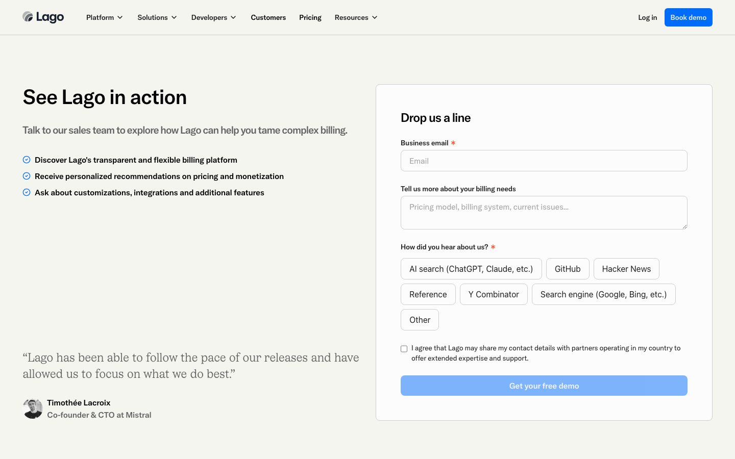
Lago's marketing surface is a quiet, developer-first billing-platform interface. The page floor is a warm off-white (`{colors.surface-soft}` — #f5f5ef) carrying crisp black headlines (`{colors.ink}` — #000000) and a single grotesque typeface — **GT America** — across every role. There are no decorative gradients on the canvas and no shadows in the measured system; the design relies on hairline borders, flat white cards, and generous whitespace to build hierarchy.
The type voice is monolithic: one family (GT America) at a single weight (500) handles the h1 hero, body copy, and button labels. The only modulation is size and negative letter-spacing (-1px on the 40px h1, -0.25px on body and buttons). This gives the brand a tight, engineered, slightly condensed feel — confident without flourish.
Brand voltage does NOT come from surface color. It comes from a saturated accent spectrum — red (`{colors.accent-red}` — #fb2c36), orange (`{colors.accent-orange}` — #fe6e00), yellow (`{colors.accent-yellow}` — #edb200), green (`{colors.accent-green}` — #00a544), violet (`{colors.accent-violet}` — #c07eff) — that appears in iconography, status dots, and partner-logo marks at small scale, never as a full surface fill.
The signature interactive moment is the contact form card: a flat white panel (`{component.form-card}`) holding labeled inputs, a multi-line textarea, and a row of **soft pill chips** (`{component.chip-option}`) for the "How did you hear about us?" multi-select. Below the fold, partner logos sit in flat white logo-tile cards grouped by category (AI, Enterprise, IoT/Infrastructure, Finance).
**Key Characteristics:**
- Warm off-white canvas (`{colors.surface-soft}` — #f5f5ef) instead of pure white — a deliberately softer page floor than typical SaaS white.
- Single typeface, single weight: GT America 500 across hero, body, and buttons. Hierarchy is built from size + negative tracking, not weight contrast.
- Flat, shadowless surfaces. The measured shadow set is empty — depth is communicated by hairline borders (`{colors.hairline}` — #e5e7eb) and color blocking only.
- Tight radius scale: `{rounded.md}` (8px) dominates buttons, inputs, and chips; `{rounded.lg}` (10px) on content cards; `{rounded.full}` on avatars.
- Multi-select pill chips (`{component.chip-option}`) — white with hairline outline — are the most distinctive interactive component.
- Saturated accent spectrum reserved for icons, status dots, and logo marks; the action layer itself stays near-monochrome.
- Section-level whitespace anchored at `{spacing.section}` (96px) between major bands.
## Colors
### Brand & Accent
Lago's palette is near-monochrome at the surface and action layer, with a small saturated accent spectrum used at icon/mark scale:
- **Accent Red** (`{colors.accent-red}` — #fb2c36) and **Accent Red Strong** (`{colors.accent-red-strong}` — #e40014): The required-field asterisks and primary brand accent dots.
- **Accent Orange** (`{colors.accent-orange}` — #fe6e00), **Accent Yellow** (`{colors.accent-yellow}` — #edb200), **Accent Green** (`{colors.accent-green}` — #00a544): Status / category iconography and small chromatic flourishes (e.g., the checkmark bullets read green-blue tone).
- **Accent Violet** (`{colors.accent-violet}` — #c07eff) and **Accent Violet Strong** (`{colors.accent-violet-strong}` — #9810fa): Secondary accent for iconography.
- **Accent Pink** (`{colors.accent-pink}` — #ffcaca): A soft tint pairing with the red, used as a faint highlight.
These appear sparingly — never as a CTA fill or a full section background.
### Surface
- **Canvas** (`{colors.canvas}` — #ffffff): Cards, inputs, chips, logo tiles.
- **Surface Soft** (`{colors.surface-soft}` — #f5f5ef): The warm off-white page floor and top-nav background.
- **Surface Dark** (`{colors.surface-dark}` — #060d17): The single deep near-black surface in the measured set, reserved for dark bands / inverted panels.
### Text
- **Ink** (`{colors.ink}` — #000000): The dominant text color — h1, body, labels (highest frequency in the measured set at 205).
- **Ink Soft** (`{colors.ink-soft}` — #202020): Slightly softened heading/body tone.
- **Ink Navy** (`{colors.ink-navy}` — #1e2939): A dark slate used for headings on inverted or tinted contexts.
- **Body** (`{colors.body}` — #646464): Secondary running text.
- **Muted** (`{colors.muted}` — #6a7282): Sub-labels, helper text.
- **Muted Soft** (`{colors.muted-soft}` — #a3a3a3) and **Muted Faint** (`{colors.muted-faint}` — #b4b4b4): Placeholder text, fine print, and de-emphasized logo marks.
- **On Primary** (`{colors.on-primary}` — #ffffff): Text on the primary CTA.
### Hairlines
- **Hairline** (`{colors.hairline}` — #e5e7eb): 1px borders on inputs, chips, cards, logo tiles.
- **Hairline Soft** (`{colors.hairline-soft}` — #eeeeee): Faint dividers and avatar fills.
## Typography
### Font Family
The system runs a single typeface — **GT America** (Grilli Type's grotesque) — across every measured role. GT America is a licensed commercial typeface and is not shippable as a public web font; document and ship an **open-source substitute** instead. **Inter** (weight 500, -0.025em tracking) is the closest free approximation that preserves the neutral-grotesque silhouette; **Hanken Grotesk** at 500 is an alternate. The fallback stack is declared as `GT America, Inter, sans-serif`.
The system uses a single weight (500) everywhere. Hierarchy is built from size and negative letter-spacing, not weight contrast.
### Hierarchy
| Token | Size | Weight | Line Height | Letter Spacing | Use |
|---|---|---|---|---|---|
| `{typography.h1}` | 40px | 500 | 1.2 | -1px | Hero headline ("See Lago in action") |
| `{typography.body}` | 14px | 500 | 1.429 | -0.25px | Body copy, labels, sub-headings, nav links, helper text |
| `{typography.button}` | 16px | 500 | 1.5 | -0.25px | Button and CTA labels |
### Principles
GT America 500 is the entire voice — there is no second family and no bold/regular split in the measured data. Negative letter-spacing (-1px on the hero, -0.25px elsewhere) is part of the brand signature; removing it reads as off-brand. Section headings inside cards (e.g., "Drop us a line") and small labels were not separately measured — they render in the GT America 500 voice at intermediate sizes (see Known Gaps).
### Note on Font Substitutes
GT America is licensed. Do not claim to ship it. Use **Inter** weight 500 with ~-0.025em tracking as the primary substitute, or **Hanken Grotesk** weight 500. Both preserve the neutral-grotesque, single-weight character; GT America's slightly tighter apertures will differ but the spacing signature carries over.
## Layout
### Spacing System
- **Base unit:** 4px.
- **Tokens:** `{spacing.xxs}` 4px · `{spacing.xs}` 8px · `{spacing.sm}` 12px · `{spacing.md}` 16px · `{spacing.lg}` 24px · `{spacing.xl}` 32px · `{spacing.xxl}` 48px · `{spacing.section}` 96px.
- **Dominant rhythm:** 8px (frequency 39) and 16px (frequency 55) are the most-used spacing values — tight, consistent gaps between form fields, chips, and list rows.
- **Section padding:** `{spacing.section}` (96px) between major bands.
- **Card internal padding:** `{spacing.xl}` (32px) for the form card; `{spacing.lg}` (24px) for logo-tile cards.
### Grid & Container
- **Hero band:** Two-column split — h1 + supporting bullets + testimonial on the left, the contact form card on the right.
- **Logo wall:** 4-column category grid (AI / Enterprise / IoT-Infrastructure / Finance), each a flat white tile holding a 2×2 logo grid.
- **Chip rows:** The multi-select question wraps soft pill chips across rows with consistent 8px gaps.
### Whitespace Philosophy
Lago uses generous, calm whitespace with no decorative fills. The off-white canvas and flat white cards do all the surface work, while 8/16px micro-rhythm keeps form fields and chips tightly grouped. The result reads as engineering-grade and uncluttered.
## Elevation & Depth
| Level | Treatment | Use |
|---|---|---|
| Flat | No shadow, no border | Page bands, top nav, hero text column |
| Hairline | 1px `{colors.hairline}` border | Inputs, textarea, chips, form card, logo tiles |
| Surface contrast | White card on `{colors.surface-soft}` canvas | Form card and logo tiles lift via tone contrast, not shadow |
The measured shadow set is **empty** — the system is deliberately shadowless. Depth is communicated entirely through hairline borders and the white-on-off-white tone difference. There is no neumorphism, no glassmorphism, and no drop-shadow elevation in the measured data.
## Shapes
### Border Radius Scale
| Token | Value | Use |
|---|---|---|
| `{rounded.sm}` | 6px | Checkbox, small controls |
| `{rounded.md}` | 8px | Buttons, inputs, textarea, chips (the dominant radius — frequency 45) |
| `{rounded.lg}` | 10px | Content cards (form card, logo tiles) |
| `{rounded.full}` | 9999px | Avatars and any fully-pilled element — derived from a measured card radius of ~3.36e7px (effectively infinite/full) |
### Photography Geometry
Avatar photos (e.g., the testimonial portrait) render as perfect circles via `{rounded.full}`. Partner-logo marks sit as flat monochrome glyphs inside white tiles with no clipping radius of their own.
## Components
### Navigation
**`top-nav`** — Horizontal nav pinned to the top of the page. Background `{colors.surface-soft}` (matching the canvas), text `{colors.ink}`, type `{typography.body}` (GT America 14px / 500). Carries the Lago wordmark + leaf logo at left; a center menu cluster (Platform, Solutions, Developers, Customers, Pricing, Resources) with caret dropdowns; and a right-side cluster with "Log in" text-link and a "Book demo" `{component.button-primary}`.
**`nav-link`** — Inline menu item, transparent background, `{colors.ink}` text, `{typography.body}`.
### Buttons
**`button-primary`** — The primary CTA ("Book demo", "Get your free demo"). Measured props: rounded `{rounded.md}` (8px), padding 0px × 12px, label type `{typography.button}` (GT America 16px / 500). The fill color was NOT captured in the measured palette — the documented `{colors.ink}` is a derived placeholder (the rendered CTA in screenshots is a saturated blue that does not appear in the measured color set; see Known Gaps).
**`text-link`** — Inline link ("Log in"), transparent background, `{colors.ink}` text, `{typography.body}`.
### Form & Inputs
**`form-card`** — The "Drop us a line" contact panel. Background `{colors.canvas}`, rounded `{rounded.lg}` (10px), 1px `{colors.hairline}` border, internal padding `{spacing.xl}` (32px). Holds the section heading, labeled inputs, the chip group, a consent checkbox, and the primary CTA.
**`text-input`** — Single-line input (Business email). Background `{colors.canvas}`, text `{colors.ink}`, placeholder `{colors.muted-soft}`, type `{typography.body}`, rounded `{rounded.md}` (8px), 1px `{colors.hairline}` border, padding 8px × 12px.
**`textarea-input`** — Multi-line input ("Tell us more about your billing needs"). Same surface and border as `text-input`, rounded `{rounded.md}`, padding `{spacing.sm}` (12px).
**`chip-option`** — Soft pill chips for the "How did you hear about us?" multi-select (AI search, GitHub, Hacker News, Reference, Y Combinator, Search engine, Other). Background `{colors.canvas}`, text `{colors.ink}`, type `{typography.body}`, rounded `{rounded.md}` (8px), 1px `{colors.hairline}` border. The chip row is the system's signature interactive component.
**`checkbox`** — Square consent checkbox. Background `{colors.canvas}`, 1px `{colors.hairline}` border, rounded `{rounded.sm}` (6px).
### Cards & Media
**`logo-tile-card`** — Flat white tile in the partner logo wall, grouped by category (AI / Enterprise / IoT-Infrastructure / Finance). Background `{colors.canvas}`, rounded `{rounded.lg}` (10px), padding `{spacing.lg}` (24px), 1px `{colors.hairline}` border. Holds a 2×2 grid of monochrome partner marks in `{colors.muted}`; the small category label above sits in `{colors.muted-soft}`.
**`avatar-circle`** — Circular portrait in the testimonial row (Timothée Lacroix). Background `{colors.hairline-soft}`, rounded `{rounded.full}`.
## Do's and Don'ts
### Do
- Use the warm off-white `{colors.surface-soft}` (#f5f5ef) as the page floor and reserve pure white `{colors.canvas}` for cards, inputs, and chips. The tone contrast is what builds depth.
- Keep the entire type system in GT America (or its substitute) at weight 500. Build hierarchy with size and negative tracking, not new weights.
- Apply the negative letter-spacing (-1px on h1, -0.25px on body/buttons). It's part of the brand voice.
- Keep surfaces flat and shadowless. Use 1px `{colors.hairline}` borders to define inputs, chips, and cards.
- Use `{rounded.md}` (8px) as the default control radius — buttons, inputs, chips all share it.
- Reserve the saturated accent spectrum (red, orange, yellow, green, violet) for icons, status dots, and logo marks at small scale.
### Don't
- Don't add drop shadows. The measured system has none — depth comes from tone and hairlines.
- Don't fill CTAs or section backgrounds with the saturated accent colors. The action layer stays near-monochrome.
- Don't introduce a second typeface or a bold weight — the single-family, single-weight discipline is the brand.
- Don't use pure white as the page floor; the warm off-white is deliberate.
- Don't round content cards beyond `{rounded.lg}` (10px) or controls beyond `{rounded.md}` (8px), except true circles (`{rounded.full}`) for avatars.
- Don't document hover states — default and pressed/active only.
## Responsive Behavior
### Breakpoints
Breakpoint widths were not measured. From the captured desktop layout, the inferred collapsing strategy is:
| Name | Width (inferred) | Key Changes |
|---|---|---|
| Mobile | < 768px | Top nav collapses to a menu trigger; hero two-column stacks (text first, form card below); chip rows wrap to more lines; logo wall stacks 4 → 1 |
| Tablet | 768–1024px | Nav tightens; hero may stay split or stack; logo wall 4 → 2 |
| Desktop | > 1024px | Full horizontal nav, two-column hero, 4-up logo wall |
### Touch Targets
- `{component.button-primary}` uses 0px × 12px padding with `{typography.button}` (16px) — vertical height is set by line-height; ensure a ≥44px effective tap height at implementation.
- `{component.chip-option}` and `{component.text-input}` use 8–12px padding; confirm tap heights meet 44px on mobile.
### Collapsing Strategy
- Hero two-column collapses to single-column, form card moving below the headline + bullets.
- Chip group wraps naturally; chips keep their 8px gap rhythm.
- Logo-tile cards reduce column count rather than shrinking the marks.
## Iteration Guide
1. Focus on ONE component at a time. Reference its YAML key directly (`{component.form-card}`, `{component.chip-option}`).
2. Variants (`-active`, `-disabled`, `-focused`) live as separate `components:` entries when measured.
3. Use `{token.refs}` everywhere — never inline a hex in a component.
4. Never document hover. Default and Active/Pressed only.
5. Keep the single-family / single-weight discipline. New emphasis = bigger GT America, not bolder or a new face.
6. Keep surfaces flat — reach for hairlines and tone contrast before any shadow.
7. The accent spectrum is scarce by design; resist using it on the action layer.
## Known Gaps
- **Primary CTA fill color was not captured.** The rendered "Book demo" / "Get your free demo" buttons in the screenshots are a saturated blue, but no blue appears in the measured color set. `{component.button-primary}` references `{colors.ink}` as a derived placeholder; the true brand blue must be sampled before shipping.
- **GT America is a licensed typeface** (Grilli Type) and is not shippable as a public web font; Inter / Hanken Grotesk substitutes are documented in Typography.
- **Only three typography roles were measured** (h1, body, button). Intermediate sizes — card section headings ("Drop us a line"), form labels, small category captions, and any h2/h3 — were not separately captured and are approximated within the GT America 500 voice.
- **No active/pressed, focus, or disabled states were measured** for buttons, inputs, or chips (the disabled-looking light-blue "Get your free demo" state in the screenshot is unconfirmed in measured data).
- **Shadow set is empty** — confirmed flat in the measured data, but subtle elevation on focus/hover (out of scope) was not tested.
- **The measured `card` radius (~3.36e7px)** indicates a fully-pilled/circular element (likely the avatar); the form card's true ~10px radius is mapped to `{rounded.lg}` from screenshot ground-truth.
- **Breakpoints, container max-width, and animation/transition timings** were not measured; responsive behavior above is inferred from the desktop capture.
- The pricing and solutions pages were captured but their distinct component specs (pricing tier cards, feature tables) were not surfaced in the measured component set.
<!-- Documented by duply · real-world design systems as ready-to-use DESIGN.md for AI coding agents · https://duply.ai/getlago/design-md -->
Color Palette
Accent
Neutrals
Typography
h140px · 500 · 1.2
The quick brown fox jumpsbody14px · 500 · 1.429
The quick brown fox jumpsbutton16px · 500 · 1.5
The quick brown fox jumpsSpacing & Shape
Spacing
| Name | Value | Preview |
|---|---|---|
| xxs | 4px | |
| xs | 8px | |
| sm | 12px | |
| md | 16px | |
| lg | 24px | |
| xl | 32px | |
| xxl | 48px | |
| section | 96px |
Border Radius
| Name | Value | Preview |
|---|---|---|
| sm | 6px | |
| md | 8px | |
| lg | 10px | |
| full | 9999px |
More like this


---
version: alpha
name: getlago-design-analysis
description: A precise, developer-first billing-platform interface built on a warm off-white canvas (#f5f5ef) with crisp black text and a single grotesque typeface (GT America). The system reads as quiet, engineering-grade SaaS — flat surfaces with no shadows, tight 8px-radius white cards and inputs, soft pill chips for multi-select questions, and a clean horizontal top-nav. Brand voltage comes from a saturated accent spectrum (red, orange, yellow, green, violet) used sparingly in iconography and logo marks rather than from heavy surface color.
colors:
  ink: "#000000"
  ink-soft: "#202020"
  ink-navy: "#1e2939"
  body: "#646464"
  muted: "#6a7282"
  muted-soft: "#a3a3a3"
  muted-faint: "#b4b4b4"
  hairline: "#e5e7eb"
  hairline-soft: "#eeeeee"
  canvas: "#ffffff"
  surface-soft: "#f5f5ef"
  surface-dark: "#060d17"
  on-primary: "#ffffff"
  accent-red: "#fb2c36"
  accent-red-strong: "#e40014"
  accent-pink: "#ffcaca"
  accent-orange: "#fe6e00"
  accent-yellow: "#edb200"
  accent-green: "#00a544"
  accent-violet: "#c07eff"
  accent-violet-strong: "#9810fa"
typography:
  h1:
    fontFamily: "GT America, Inter, sans-serif"
    fontSize: 40px
    fontWeight: 500
    lineHeight: 1.2
    letterSpacing: -1px
  body:
    fontFamily: "GT America, Inter, sans-serif"
    fontSize: 14px
    fontWeight: 500
    lineHeight: 1.429
    letterSpacing: -0.25px
  button:
    fontFamily: "GT America, Inter, sans-serif"
    fontSize: 16px
    fontWeight: 500
    lineHeight: 1.5
    letterSpacing: -0.25px
rounded:
  sm: 6px
  md: 8px
  lg: 10px
  full: 9999px
spacing:
  xxs: 4px
  xs: 8px
  sm: 12px
  md: 16px
  lg: 24px
  xl: 32px
  xxl: 48px
  section: 96px
components:
  top-nav:
    backgroundColor: "{colors.surface-soft}"
    textColor: "{colors.ink}"
    typography: "{typography.body}"
  nav-link:
    backgroundColor: transparent
    textColor: "{colors.ink}"
    typography: "{typography.body}"
  button-primary:
    backgroundColor: "{colors.ink}"
    textColor: "{colors.on-primary}"
    typography: "{typography.button}"
    rounded: "{rounded.md}"
    padding: 0px 12px
  chip-option:
    backgroundColor: "{colors.canvas}"
    textColor: "{colors.ink}"
    typography: "{typography.body}"
    rounded: "{rounded.md}"
  form-card:
    backgroundColor: "{colors.canvas}"
    textColor: "{colors.ink}"
    rounded: "{rounded.lg}"
    padding: 32px
  logo-tile-card:
    backgroundColor: "{colors.canvas}"
    textColor: "{colors.muted}"
    rounded: "{rounded.lg}"
    padding: 24px
  text-input:
    backgroundColor: "{colors.canvas}"
    textColor: "{colors.ink}"
    typography: "{typography.body}"
    rounded: "{rounded.md}"
    padding: 8px 12px
  textarea-input:
    backgroundColor: "{colors.canvas}"
    textColor: "{colors.ink}"
    typography: "{typography.body}"
    rounded: "{rounded.md}"
    padding: 12px
  checkbox:
    backgroundColor: "{colors.canvas}"
    textColor: "{colors.ink}"
    rounded: "{rounded.sm}"
  avatar-circle:
    backgroundColor: "{colors.hairline-soft}"
    textColor: "{colors.ink}"
    rounded: "{rounded.full}"
  text-link:
    backgroundColor: transparent
    textColor: "{colors.ink}"
    typography: "{typography.body}"
---

## Overview

Lago's marketing surface is a quiet, developer-first billing-platform interface. The page floor is a warm off-white (`{colors.surface-soft}` — #f5f5ef) carrying crisp black headlines (`{colors.ink}` — #000000) and a single grotesque typeface — **GT America** — across every role. There are no decorative gradients on the canvas and no shadows in the measured system; the design relies on hairline borders, flat white cards, and generous whitespace to build hierarchy.

The type voice is monolithic: one family (GT America) at a single weight (500) handles the h1 hero, body copy, and button labels. The only modulation is size and negative letter-spacing (-1px on the 40px h1, -0.25px on body and buttons). This gives the brand a tight, engineered, slightly condensed feel — confident without flourish.

Brand voltage does NOT come from surface color. It comes from a saturated accent spectrum — red (`{colors.accent-red}` — #fb2c36), orange (`{colors.accent-orange}` — #fe6e00), yellow (`{colors.accent-yellow}` — #edb200), green (`{colors.accent-green}` — #00a544), violet (`{colors.accent-violet}` — #c07eff) — that appears in iconography, status dots, and partner-logo marks at small scale, never as a full surface fill.

The signature interactive moment is the contact form card: a flat white panel (`{component.form-card}`) holding labeled inputs, a multi-line textarea, and a row of **soft pill chips** (`{component.chip-option}`) for the "How did you hear about us?" multi-select. Below the fold, partner logos sit in flat white logo-tile cards grouped by category (AI, Enterprise, IoT/Infrastructure, Finance).

**Key Characteristics:**
- Warm off-white canvas (`{colors.surface-soft}` — #f5f5ef) instead of pure white — a deliberately softer page floor than typical SaaS white.
- Single typeface, single weight: GT America 500 across hero, body, and buttons. Hierarchy is built from size + negative tracking, not weight contrast.
- Flat, shadowless surfaces. The measured shadow set is empty — depth is communicated by hairline borders (`{colors.hairline}` — #e5e7eb) and color blocking only.
- Tight radius scale: `{rounded.md}` (8px) dominates buttons, inputs, and chips; `{rounded.lg}` (10px) on content cards; `{rounded.full}` on avatars.
- Multi-select pill chips (`{component.chip-option}`) — white with hairline outline — are the most distinctive interactive component.
- Saturated accent spectrum reserved for icons, status dots, and logo marks; the action layer itself stays near-monochrome.
- Section-level whitespace anchored at `{spacing.section}` (96px) between major bands.

## Colors

### Brand & Accent
Lago's palette is near-monochrome at the surface and action layer, with a small saturated accent spectrum used at icon/mark scale:
- **Accent Red** (`{colors.accent-red}` — #fb2c36) and **Accent Red Strong** (`{colors.accent-red-strong}` — #e40014): The required-field asterisks and primary brand accent dots.
- **Accent Orange** (`{colors.accent-orange}` — #fe6e00), **Accent Yellow** (`{colors.accent-yellow}` — #edb200), **Accent Green** (`{colors.accent-green}` — #00a544): Status / category iconography and small chromatic flourishes (e.g., the checkmark bullets read green-blue tone).
- **Accent Violet** (`{colors.accent-violet}` — #c07eff) and **Accent Violet Strong** (`{colors.accent-violet-strong}` — #9810fa): Secondary accent for iconography.
- **Accent Pink** (`{colors.accent-pink}` — #ffcaca): A soft tint pairing with the red, used as a faint highlight.

These appear sparingly — never as a CTA fill or a full section background.

### Surface
- **Canvas** (`{colors.canvas}` — #ffffff): Cards, inputs, chips, logo tiles.
- **Surface Soft** (`{colors.surface-soft}` — #f5f5ef): The warm off-white page floor and top-nav background.
- **Surface Dark** (`{colors.surface-dark}` — #060d17): The single deep near-black surface in the measured set, reserved for dark bands / inverted panels.

### Text
- **Ink** (`{colors.ink}` — #000000): The dominant text color — h1, body, labels (highest frequency in the measured set at 205).
- **Ink Soft** (`{colors.ink-soft}` — #202020): Slightly softened heading/body tone.
- **Ink Navy** (`{colors.ink-navy}` — #1e2939): A dark slate used for headings on inverted or tinted contexts.
- **Body** (`{colors.body}` — #646464): Secondary running text.
- **Muted** (`{colors.muted}` — #6a7282): Sub-labels, helper text.
- **Muted Soft** (`{colors.muted-soft}` — #a3a3a3) and **Muted Faint** (`{colors.muted-faint}` — #b4b4b4): Placeholder text, fine print, and de-emphasized logo marks.
- **On Primary** (`{colors.on-primary}` — #ffffff): Text on the primary CTA.

### Hairlines
- **Hairline** (`{colors.hairline}` — #e5e7eb): 1px borders on inputs, chips, cards, logo tiles.
- **Hairline Soft** (`{colors.hairline-soft}` — #eeeeee): Faint dividers and avatar fills.

## Typography

### Font Family
The system runs a single typeface — **GT America** (Grilli Type's grotesque) — across every measured role. GT America is a licensed commercial typeface and is not shippable as a public web font; document and ship an **open-source substitute** instead. **Inter** (weight 500, -0.025em tracking) is the closest free approximation that preserves the neutral-grotesque silhouette; **Hanken Grotesk** at 500 is an alternate. The fallback stack is declared as `GT America, Inter, sans-serif`.

The system uses a single weight (500) everywhere. Hierarchy is built from size and negative letter-spacing, not weight contrast.

### Hierarchy

| Token | Size | Weight | Line Height | Letter Spacing | Use |
|---|---|---|---|---|---|
| `{typography.h1}` | 40px | 500 | 1.2 | -1px | Hero headline ("See Lago in action") |
| `{typography.body}` | 14px | 500 | 1.429 | -0.25px | Body copy, labels, sub-headings, nav links, helper text |
| `{typography.button}` | 16px | 500 | 1.5 | -0.25px | Button and CTA labels |

### Principles
GT America 500 is the entire voice — there is no second family and no bold/regular split in the measured data. Negative letter-spacing (-1px on the hero, -0.25px elsewhere) is part of the brand signature; removing it reads as off-brand. Section headings inside cards (e.g., "Drop us a line") and small labels were not separately measured — they render in the GT America 500 voice at intermediate sizes (see Known Gaps).

### Note on Font Substitutes
GT America is licensed. Do not claim to ship it. Use **Inter** weight 500 with ~-0.025em tracking as the primary substitute, or **Hanken Grotesk** weight 500. Both preserve the neutral-grotesque, single-weight character; GT America's slightly tighter apertures will differ but the spacing signature carries over.

## Layout

### Spacing System
- **Base unit:** 4px.
- **Tokens:** `{spacing.xxs}` 4px · `{spacing.xs}` 8px · `{spacing.sm}` 12px · `{spacing.md}` 16px · `{spacing.lg}` 24px · `{spacing.xl}` 32px · `{spacing.xxl}` 48px · `{spacing.section}` 96px.
- **Dominant rhythm:** 8px (frequency 39) and 16px (frequency 55) are the most-used spacing values — tight, consistent gaps between form fields, chips, and list rows.
- **Section padding:** `{spacing.section}` (96px) between major bands.
- **Card internal padding:** `{spacing.xl}` (32px) for the form card; `{spacing.lg}` (24px) for logo-tile cards.

### Grid & Container
- **Hero band:** Two-column split — h1 + supporting bullets + testimonial on the left, the contact form card on the right.
- **Logo wall:** 4-column category grid (AI / Enterprise / IoT-Infrastructure / Finance), each a flat white tile holding a 2×2 logo grid.
- **Chip rows:** The multi-select question wraps soft pill chips across rows with consistent 8px gaps.

### Whitespace Philosophy
Lago uses generous, calm whitespace with no decorative fills. The off-white canvas and flat white cards do all the surface work, while 8/16px micro-rhythm keeps form fields and chips tightly grouped. The result reads as engineering-grade and uncluttered.

## Elevation & Depth

| Level | Treatment | Use |
|---|---|---|
| Flat | No shadow, no border | Page bands, top nav, hero text column |
| Hairline | 1px `{colors.hairline}` border | Inputs, textarea, chips, form card, logo tiles |
| Surface contrast | White card on `{colors.surface-soft}` canvas | Form card and logo tiles lift via tone contrast, not shadow |

The measured shadow set is **empty** — the system is deliberately shadowless. Depth is communicated entirely through hairline borders and the white-on-off-white tone difference. There is no neumorphism, no glassmorphism, and no drop-shadow elevation in the measured data.

## Shapes

### Border Radius Scale

| Token | Value | Use |
|---|---|---|
| `{rounded.sm}` | 6px | Checkbox, small controls |
| `{rounded.md}` | 8px | Buttons, inputs, textarea, chips (the dominant radius — frequency 45) |
| `{rounded.lg}` | 10px | Content cards (form card, logo tiles) |
| `{rounded.full}` | 9999px | Avatars and any fully-pilled element — derived from a measured card radius of ~3.36e7px (effectively infinite/full) |

### Photography Geometry
Avatar photos (e.g., the testimonial portrait) render as perfect circles via `{rounded.full}`. Partner-logo marks sit as flat monochrome glyphs inside white tiles with no clipping radius of their own.

## Components

### Navigation

**`top-nav`** — Horizontal nav pinned to the top of the page. Background `{colors.surface-soft}` (matching the canvas), text `{colors.ink}`, type `{typography.body}` (GT America 14px / 500). Carries the Lago wordmark + leaf logo at left; a center menu cluster (Platform, Solutions, Developers, Customers, Pricing, Resources) with caret dropdowns; and a right-side cluster with "Log in" text-link and a "Book demo" `{component.button-primary}`.

**`nav-link`** — Inline menu item, transparent background, `{colors.ink}` text, `{typography.body}`.

### Buttons

**`button-primary`** — The primary CTA ("Book demo", "Get your free demo"). Measured props: rounded `{rounded.md}` (8px), padding 0px × 12px, label type `{typography.button}` (GT America 16px / 500). The fill color was NOT captured in the measured palette — the documented `{colors.ink}` is a derived placeholder (the rendered CTA in screenshots is a saturated blue that does not appear in the measured color set; see Known Gaps).

**`text-link`** — Inline link ("Log in"), transparent background, `{colors.ink}` text, `{typography.body}`.

### Form & Inputs

**`form-card`** — The "Drop us a line" contact panel. Background `{colors.canvas}`, rounded `{rounded.lg}` (10px), 1px `{colors.hairline}` border, internal padding `{spacing.xl}` (32px). Holds the section heading, labeled inputs, the chip group, a consent checkbox, and the primary CTA.

**`text-input`** — Single-line input (Business email). Background `{colors.canvas}`, text `{colors.ink}`, placeholder `{colors.muted-soft}`, type `{typography.body}`, rounded `{rounded.md}` (8px), 1px `{colors.hairline}` border, padding 8px × 12px.

**`textarea-input`** — Multi-line input ("Tell us more about your billing needs"). Same surface and border as `text-input`, rounded `{rounded.md}`, padding `{spacing.sm}` (12px).

**`chip-option`** — Soft pill chips for the "How did you hear about us?" multi-select (AI search, GitHub, Hacker News, Reference, Y Combinator, Search engine, Other). Background `{colors.canvas}`, text `{colors.ink}`, type `{typography.body}`, rounded `{rounded.md}` (8px), 1px `{colors.hairline}` border. The chip row is the system's signature interactive component.

**`checkbox`** — Square consent checkbox. Background `{colors.canvas}`, 1px `{colors.hairline}` border, rounded `{rounded.sm}` (6px).

### Cards & Media

**`logo-tile-card`** — Flat white tile in the partner logo wall, grouped by category (AI / Enterprise / IoT-Infrastructure / Finance). Background `{colors.canvas}`, rounded `{rounded.lg}` (10px), padding `{spacing.lg}` (24px), 1px `{colors.hairline}` border. Holds a 2×2 grid of monochrome partner marks in `{colors.muted}`; the small category label above sits in `{colors.muted-soft}`.

**`avatar-circle`** — Circular portrait in the testimonial row (Timothée Lacroix). Background `{colors.hairline-soft}`, rounded `{rounded.full}`.

## Do's and Don'ts

### Do
- Use the warm off-white `{colors.surface-soft}` (#f5f5ef) as the page floor and reserve pure white `{colors.canvas}` for cards, inputs, and chips. The tone contrast is what builds depth.
- Keep the entire type system in GT America (or its substitute) at weight 500. Build hierarchy with size and negative tracking, not new weights.
- Apply the negative letter-spacing (-1px on h1, -0.25px on body/buttons). It's part of the brand voice.
- Keep surfaces flat and shadowless. Use 1px `{colors.hairline}` borders to define inputs, chips, and cards.
- Use `{rounded.md}` (8px) as the default control radius — buttons, inputs, chips all share it.
- Reserve the saturated accent spectrum (red, orange, yellow, green, violet) for icons, status dots, and logo marks at small scale.

### Don't
- Don't add drop shadows. The measured system has none — depth comes from tone and hairlines.
- Don't fill CTAs or section backgrounds with the saturated accent colors. The action layer stays near-monochrome.
- Don't introduce a second typeface or a bold weight — the single-family, single-weight discipline is the brand.
- Don't use pure white as the page floor; the warm off-white is deliberate.
- Don't round content cards beyond `{rounded.lg}` (10px) or controls beyond `{rounded.md}` (8px), except true circles (`{rounded.full}`) for avatars.
- Don't document hover states — default and pressed/active only.

## Responsive Behavior

### Breakpoints
Breakpoint widths were not measured. From the captured desktop layout, the inferred collapsing strategy is:

| Name | Width (inferred) | Key Changes |
|---|---|---|
| Mobile | < 768px | Top nav collapses to a menu trigger; hero two-column stacks (text first, form card below); chip rows wrap to more lines; logo wall stacks 4 → 1 |
| Tablet | 768–1024px | Nav tightens; hero may stay split or stack; logo wall 4 → 2 |
| Desktop | > 1024px | Full horizontal nav, two-column hero, 4-up logo wall |

### Touch Targets
- `{component.button-primary}` uses 0px × 12px padding with `{typography.button}` (16px) — vertical height is set by line-height; ensure a ≥44px effective tap height at implementation.
- `{component.chip-option}` and `{component.text-input}` use 8–12px padding; confirm tap heights meet 44px on mobile.

### Collapsing Strategy
- Hero two-column collapses to single-column, form card moving below the headline + bullets.
- Chip group wraps naturally; chips keep their 8px gap rhythm.
- Logo-tile cards reduce column count rather than shrinking the marks.

## Iteration Guide

1. Focus on ONE component at a time. Reference its YAML key directly (`{component.form-card}`, `{component.chip-option}`).
2. Variants (`-active`, `-disabled`, `-focused`) live as separate `components:` entries when measured.
3. Use `{token.refs}` everywhere — never inline a hex in a component.
4. Never document hover. Default and Active/Pressed only.
5. Keep the single-family / single-weight discipline. New emphasis = bigger GT America, not bolder or a new face.
6. Keep surfaces flat — reach for hairlines and tone contrast before any shadow.
7. The accent spectrum is scarce by design; resist using it on the action layer.

## Known Gaps

- **Primary CTA fill color was not captured.** The rendered "Book demo" / "Get your free demo" buttons in the screenshots are a saturated blue, but no blue appears in the measured color set. `{component.button-primary}` references `{colors.ink}` as a derived placeholder; the true brand blue must be sampled before shipping.
- **GT America is a licensed typeface** (Grilli Type) and is not shippable as a public web font; Inter / Hanken Grotesk substitutes are documented in Typography.
- **Only three typography roles were measured** (h1, body, button). Intermediate sizes — card section headings ("Drop us a line"), form labels, small category captions, and any h2/h3 — were not separately captured and are approximated within the GT America 500 voice.
- **No active/pressed, focus, or disabled states were measured** for buttons, inputs, or chips (the disabled-looking light-blue "Get your free demo" state in the screenshot is unconfirmed in measured data).
- **Shadow set is empty** — confirmed flat in the measured data, but subtle elevation on focus/hover (out of scope) was not tested.
- **The measured `card` radius (~3.36e7px)** indicates a fully-pilled/circular element (likely the avatar); the form card's true ~10px radius is mapped to `{rounded.lg}` from screenshot ground-truth.
- **Breakpoints, container max-width, and animation/transition timings** were not measured; responsive behavior above is inferred from the desktop capture.
- The pricing and solutions pages were captured but their distinct component specs (pricing tier cards, feature tables) were not surfaced in the measured component set.

<!-- Documented by duply · real-world design systems as ready-to-use DESIGN.md for AI coding agents · https://duply.ai/getlago/design-md -->