Retool
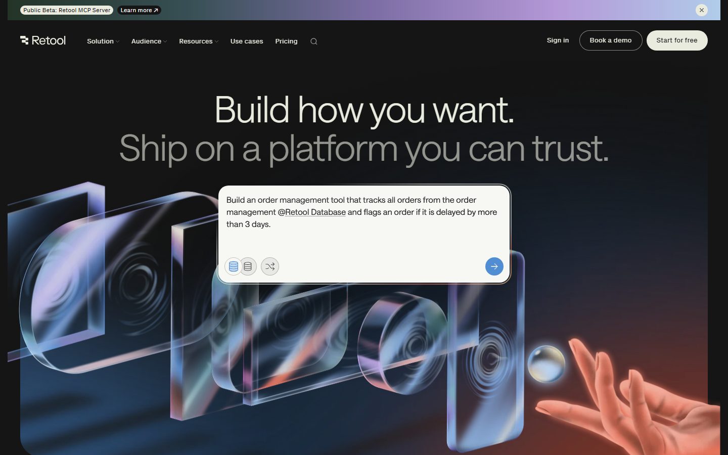
A dark, engineering-confident product interface built on a near-black canvas (#151515) with a bone-white primary action color (#e9ebdf) and the custom Saans display typeface set thin (weight 300) at large sizes with negative tracking. The system reads as serious developer-platform software — pill-shaped CTAs, prism/glass 3D hero artwork, light "AI prompt" cards floated over the dark field, monochrome logo walls, and pastel accent flecks that come from product chrome rather than brand color. Brand voltage comes from the thin large-scale Saans headline and the dark-on-light prompt card moments, not from saturated accents.
---
version: alpha
name: Retool-design-analysis
description: A dark, engineering-confident product interface built on a near-black canvas (#151515) with a bone-white primary action color (#e9ebdf) and the custom Saans display typeface set thin (weight 300) at large sizes with negative tracking. The system reads as serious developer-platform software — pill-shaped CTAs, prism/glass 3D hero artwork, light "AI prompt" cards floated over the dark field, monochrome logo walls, and pastel accent flecks that come from product chrome rather than brand color. Brand voltage comes from the thin large-scale Saans headline and the dark-on-light prompt card moments, not from saturated accents.

colors:
  ink: "#e9ebdf"
  body: "#cbccc4"
  subtle: "#c8bfb5"
  muted: "#8b867f"
  muted-soft: "#b6b8af"
  canvas: "#151515"
  canvas-elevated: "#242424"
  surface-dark: "#2e2f2d"
  surface-light: "#f7f8f4"
  on-light: "#151515"
  on-primary: "#151515"
  white: "#ffffff"
  black: "#000000"
  accent-blue: "#518dd2"
  accent-red: "#c72844"
  accent-purple: "#9874d2"
  pastel-blue: "#b0ccea"
  pastel-violet: "#d0c1ea"
  pastel-amber: "#f6d6a0"
  pastel-coral: "#f5c2b2"
  pastel-green: "#afd1c6"
  pastel-pink: "#e8bae8"

typography:
  display:
    fontFamily: "Saans, Inter, sans-serif"
    fontSize: 72px
    fontWeight: 300
    lineHeight: 1.05
    letterSpacing: -1.584px
  heading:
    fontFamily: "Saans, Inter, sans-serif"
    fontSize: 24px
    fontWeight: 380
    lineHeight: 1.2
    letterSpacing: -0.24px
  body:
    fontFamily: "Saans, Inter, sans-serif"
    fontSize: 14px
    fontWeight: 300
    lineHeight: 1.5
    letterSpacing: 0.14px
  button:
    fontFamily: "ui-sans-serif, system-ui, sans-serif"
    fontSize: 16px
    fontWeight: 400
    lineHeight: 1.5
    letterSpacing: normal

rounded:
  xs: 4px
  sm: 6px
  md: 8px
  lg: 20px
  xl: 24px
  xxl: 36px
  huge: 40px
  full: 9999px

spacing:
  xxs: 4px
  xs: 8px
  sm: 12px
  md: 16px
  lg: 24px
  xl: 40px
  xxl: 64px

components:
  top-nav:
    backgroundColor: "{colors.canvas}"
    textColor: "{colors.ink}"
    typography: "{typography.body}"
  announcement-bar:
    backgroundColor: transparent
    textColor: "{colors.ink}"
    typography: "{typography.body}"
  button-primary:
    backgroundColor: "{colors.ink}"
    textColor: "{colors.on-primary}"
    typography: "{typography.button}"
    rounded: "{rounded.full}"
    padding: 0px
  button-secondary:
    backgroundColor: transparent
    textColor: "{colors.ink}"
    typography: "{typography.button}"
    rounded: "{rounded.full}"
  button-text:
    backgroundColor: transparent
    textColor: "{colors.ink}"
    typography: "{typography.button}"
  prompt-card:
    backgroundColor: "{colors.surface-light}"
    textColor: "{colors.on-light}"
    typography: "{typography.body}"
    rounded: "{rounded.xl}"
    padding: 24px
  prompt-card-send:
    backgroundColor: "{colors.accent-blue}"
    textColor: "{colors.white}"
    rounded: "{rounded.full}"
    size: 40px
  card:
    backgroundColor: "{colors.canvas}"
    textColor: "{colors.ink}"
    typography: "{typography.body}"
    rounded: "{rounded.xs}"
  feature-card:
    backgroundColor: "{colors.canvas-elevated}"
    textColor: "{colors.body}"
    typography: "{typography.body}"
    rounded: "{rounded.xs}"
    padding: 24px
  team-panel:
    backgroundColor: "{colors.surface-dark}"
    textColor: "{colors.body}"
    typography: "{typography.body}"
    rounded: "{rounded.xs}"
    padding: 24px
  logo-wall:
    backgroundColor: "{colors.canvas}"
    textColor: "{colors.muted}"
    typography: "{typography.body}"
  badge-pill:
    backgroundColor: "{colors.canvas-elevated}"
    textColor: "{colors.ink}"
    typography: "{typography.body}"
    rounded: "{rounded.full}"
    padding: 4px 12px
  text-link:
    backgroundColor: transparent
    textColor: "{colors.ink}"
    typography: "{typography.body}"
---

## Overview

Retool's marketing surface is a dark, engineering-confident developer-platform interface — a near-black canvas (`{colors.canvas}` — #151515) carrying bone-white headlines in the custom **Saans** typeface set thin (weight 300) at large display scale. The system reads as serious internal-tools software for builders: muted, monochrome, technical, with brand energy coming from typographic scale and from light "AI prompt" cards floated over the dark field rather than from saturated accent color.

The headline voice is distinctive: Saans at **72px / weight 300** with **-1.584px** tracking. Thin-and-large is the entire identity — "Build how you want." renders nearly hairline-weight at hero scale, with a second line dropping to a muted tone (`{colors.body}` — #cbccc4) to split the message. This thin display treatment is the inverse of the bold-display SaaS convention and is what makes Retool feel precise rather than loud.

Component voltage comes from **product chrome shown directly on the page** — the floated light prompt card (`{colors.surface-light}` — #f7f8f4) holding an actual AI-build instruction with a blue circular send button (`{colors.accent-blue}` — #518dd2), database icons, and 3D prism/glass hero artwork. The pastel accent set (blue, violet, amber, coral, green, pink) appears almost entirely inside that artwork and product UI, not on buttons or type.

The primary CTA inverts the page: a bone-white pill (`{colors.ink}` background, `{colors.on-primary}` text) at `{rounded.full}`. Pills are the dominant button shape across the nav (Start for free, Book a demo). Everything else stays on the dark canvas — logo walls, feature cards, and team panels all sit on `{colors.canvas}` or its slightly-elevated neighbors (`{colors.canvas-elevated}` — #242424, `{colors.surface-dark}` — #2e2f2d).

**Key Characteristics:**
- Near-black canvas (`{colors.canvas}` — #151515) as the universal page floor; no light page mode observed.
- Bone-white primary CTA pill (`{colors.ink}` — #e9ebdf on dark), fully rounded (`{rounded.full}`). Pills are the signature button shape.
- Custom **Saans** display typeface set thin (weight 300) at 72px with -1.584px tracking. Thin-large is the brand voice.
- Floated light prompt cards (`{colors.surface-light}` — #f7f8f4) reproducing the actual AI build experience, with a blue circular send button (`{colors.accent-blue}`).
- Pastel accent set (blue/violet/amber/coral/green/pink) confined to 3D hero artwork and product chrome — never on CTAs or headlines.
- Monochrome logo wall (DoorDash, OpenAI, Stripe, Unity, Philips) in muted tone (`{colors.muted}` — #8b867f).
- Two-tier headline color: bright `{colors.ink}` line one, muted `{colors.body}` line two.
- Radius split: small functional radii (`{rounded.xs}`–`{rounded.md}`, 4–8px) for content cards, large radii (`{rounded.lg}`–`{rounded.huge}`, 20–40px) for floated cards and artwork containers, and `{rounded.full}` for pills and circular buttons.

## Colors

### Brand & Accent
- **Accent Blue** (`{colors.accent-blue}` — #518dd2): The most-used accent. The circular send button on prompt cards, inline link highlights, and database icon fills. Retool's nearest thing to a brand accent.
- **Accent Red** (`{colors.accent-red}` — #c72844): A secondary accent appearing in artwork and small highlight moments.
- **Accent Purple** (`{colors.accent-purple}` — #9874d2): Used in the prism/glass hero gradient and decorative artwork.
- **Pastel Set** — `{colors.pastel-blue}` (#b0ccea), `{colors.pastel-violet}` (#d0c1ea), `{colors.pastel-amber}` (#f6d6a0), `{colors.pastel-coral}` (#f5c2b2), `{colors.pastel-green}` (#afd1c6), `{colors.pastel-pink}` (#e8bae8). These chromatic flecks live inside the 3D glass artwork, the announcement-bar gradient, and product UI fragments — never on type or CTAs.

### Surface
- **Canvas** (`{colors.canvas}` — #151515): The default page floor for every band.
- **Canvas Elevated** (`{colors.canvas-elevated}` — #242424): Slightly raised feature cards and badge pills against the canvas.
- **Surface Dark** (`{colors.surface-dark}` — #2e2f2d): Nested team panels and darker content blocks.
- **Surface Light** (`{colors.surface-light}` — #f7f8f4): The floated AI prompt card — the only light surface in the system, used as a deliberate, scarce inversion.

### Text
- **Ink** (`{colors.ink}` — #e9ebdf): Primary headlines and bright text on dark canvas — a warm bone-white, not pure white.
- **Body** (`{colors.body}` — #cbccc4): The muted second headline line and running body text.
- **Subtle** (`{colors.subtle}` — #c8bfb5): Tertiary text and faint supporting copy.
- **Muted** (`{colors.muted}` — #8b867f): Logo-wall tone, captions, fine print.
- **Muted Soft** (`{colors.muted-soft}` — #b6b8af): Secondary muted text and dividers.
- **On Light / On Primary** (`{colors.on-light}` / `{colors.on-primary}` — #151515): Text on the light prompt card and on the bone-white primary CTA.

### Neutrals
- **White** (`{colors.white}` — #ffffff): Icons and text on accent-blue surfaces (e.g., the send button arrow).
- **Black** (`{colors.black}` — #000000): Pure-black used in shadows and the deepest artwork shadows.

## Typography

### Font Family
The system runs **Saans** (referenced in computed styles as `saansFont`) for nearly everything — headlines, sub-headings, and body — with `ui-sans-serif` used on button labels. Saans is a commercial display/text typeface; it is documented here with an open-source substitute since it is not freely redistributable. The button role uses the system UI sans stack (`ui-sans-serif, system-ui, sans-serif`).

The character of the system is **thin-and-large**: display type is weight 300 (not the typical 600–700 display weight), which gives Retool its precise, technical-but-calm voice.

### Hierarchy

| Token | Size | Weight | Line Height | Letter Spacing | Use |
|---|---|---|---|---|---|
| `{typography.display}` | 72px | 300 | 1.05 | -1.584px | Hero h1 + section h2 ("Build how you want.", "AI made building easy.") — Saans thin |
| `{typography.heading}` | 24px | 380 | 1.2 | -0.24px | h3 sub-heads and card titles — Saans, weight 380 (an intermediate custom weight) |
| `{typography.body}` | 14px | 300 | 1.5 | 0.14px | Default running text, nav links, captions |
| `{typography.button}` | 16px | 400 | 1.5 | normal | Button labels — ui-sans-serif |

### Principles
The display weight is the signature: 300 (thin) at 72px. Never thicken hero headlines to a conventional bold — the thinness is the brand. The two-tone headline (bright `{colors.ink}` first line, muted `{colors.body}` second line) is a recurring device that splits a two-clause message visually.

Body text is small (14px) and also thin (300) with a touch of positive tracking (0.14px) — this keeps the dense developer-platform copy feeling open on the dark field. The h3 role uses an unusual measured weight of **380**, an intermediate Saans cut between regular and medium; preserve it where the typeface supports variable weights, and round to 400 on fallback fonts.

### Note on Font Substitutes
Saans is a commercial typeface and is not shipped here. **Inter** is the closest practical substitute — set Inter at weight 300 with roughly -0.022em tracking to approximate the display role, and Inter 400 for body. **Hanken Grotesk** or **General Sans** are alternative geometric-humanist substitutes that better capture Saans's slightly geometric character. The 380 weight on h3 maps to Inter 400 (or a variable-font 380 instance where available).

## Layout

### Spacing System
- **Base unit:** 4px.
- **Tokens:** `{spacing.xxs}` 4px · `{spacing.xs}` 8px · `{spacing.sm}` 12px · `{spacing.md}` 16px · `{spacing.lg}` 24px · `{spacing.xl}` 40px · `{spacing.xxl}` 64px.
- **Most-used steps:** 4px (very high frequency, micro-gaps), 16px and 24px (component padding and gutters), 40px (section-internal rhythm).
- **Card internal padding:** `{spacing.lg}` (24px) for prompt cards, feature cards, and team panels.
- Intermediate measured values of 14px, 17px, 20px, 32px, 36px, and 56px also appear; the canonical scale above absorbs them to the nearest token.

### Grid & Container
- **Editorial body:** centered single-column hero with the headline stacked above the floated prompt card and 3D artwork.
- **Logo wall:** roughly 4-up rows of monochrome customer logos.
- **Feature rows:** 3-up "Build / Launch / Scale" card grids on the governance band.
- **Team panels:** stacked right-rail panels (Data teams / Operations teams / Eng + platform teams) beside a large product visual.
- Long-scroll landing page; vertical rhythm carries the page from hero → logo wall → governance → team panels → customer-proof band.

### Whitespace Philosophy
Retool leans on large vertical breathing room around the thin hero headline — the type's thinness needs the surrounding dark space to read as deliberate rather than sparse. Within content bands, padding tightens to 16–24px so dense developer copy stays organized. The result is calm at the macro scale and efficient at the component scale.

## Elevation & Depth

| Level | Treatment | Use |
|---|---|---|
| Flat | No shadow, no border, on `{colors.canvas}` | Body sections, nav, logo wall |
| Hairline ring | `rgba(0,0,0,0.12) 0px 1px 2px`, plus a `rgb(0,0,0) 0px 0px 0px 0.5px` ring | Small floated controls / subtly raised UI |
| Floated card | `rgba(0,0,0,0.35) 0px 68px 116px` — a very large soft drop | The light prompt card lifted high off the dark canvas |

The depth philosophy is **deep and soft** — the signature is the single huge low-alpha drop shadow (0 68px 116px at 0.35 alpha) under the floated light prompt card, which makes it appear to hover well above the near-black page. The smaller hairline-ring shadow handles minor control elevation. There is no neumorphism and no glassmorphism in the chrome itself, though the 3D hero artwork renders literal glass/prism geometry as illustration.

### Decorative Depth
- The hero 3D prism/glass artwork carries internal refraction, chromatic edges, and ambient pastel light — it is decorative imagery, not a system token.
- The announcement bar at the very top uses a horizontal pastel gradient (green→violet→blue) as a thin attention band; this gradient is artwork, not a tokenized surface.

## Shapes

### Border Radius Scale

| Token | Value | Use |
|---|---|---|
| `{rounded.xs}` | 4px | Content cards, feature cards, team panels (measured card radius) |
| `{rounded.sm}` | 6px | Small inputs, dropdown items |
| `{rounded.md}` | 8px | Slightly larger small controls |
| `{rounded.lg}` | 20px | Floated/large card corners |
| `{rounded.xl}` | 24px | Prompt card container |
| `{rounded.xxl}` | 36px | Large artwork / panel containers |
| `{rounded.huge}` | 40px | Largest rounded containers |
| `{rounded.full}` | 9999px | Pills (primary + secondary CTAs), circular icon buttons, badge pills |

The radius language is bimodal: tight 4–8px corners on dense content cards versus generous 20–40px corners on floated marketing cards, with `{rounded.full}` reserved for all pill buttons and circular controls. The most frequent radius observed is `{rounded.full}` — pills dominate the interactive layer.

### Photography & Artwork Geometry
The hero and section artwork are rendered 3D glass/prism compositions with soft pastel lighting and a partial photographic hand. These illustrative panels sit in large-radius containers (`{rounded.xxl}`–`{rounded.huge}`). Customer logos render as flat monochrome marks on the canvas.

## Components

### Navigation

**`top-nav`** — Transparent-over-canvas top bar carrying the Retool wordmark + logo at left, the primary menu (Solution, Audience, Resources, Use cases, Pricing) and a search icon center-left, and a right cluster of "Sign in" (`{component.button-text}`), "Book a demo" (`{component.button-secondary}`), and "Start for free" (`{component.button-primary}`). Menu items in `{typography.body}`.

**`announcement-bar`** — A thin top banner ("Public Beta: Retool MCP Server" + "Learn more") on a pastel horizontal gradient, dismissible via an × at right. Text in `{colors.ink}`; the gradient background is artwork, not a token.

### Buttons

**`button-primary`** — The signature CTA ("Start for free"). Background inverts the page to `{colors.ink}` (#e9ebdf) with `{colors.on-primary}` (#151515) text, fully rounded (`{rounded.full}`), label in `{typography.button}` (ui-sans-serif 16px / 400). The measured internal padding computed as 0px (the label is centered via layout); visual padding is approximately 12px × 24px (derived from screenshots — not a measured token).

**`button-secondary`** — The "Book a demo" pill. Transparent background, `{colors.ink}` text, 1px hairline outline, fully rounded (`{rounded.full}`), same label type as primary.

**`button-text`** — Inline text button ("Sign in") in the nav. No background, `{colors.ink}` text, `{typography.button}`.

### Cards & Surfaces

**`prompt-card`** — The signature floated AI-instruction card. The only light surface in the system: background `{colors.surface-light}` (#f7f8f4), text `{colors.on-light}`, rounded `{rounded.xl}` (24px), padding `{spacing.lg}` (24px), lifted by the large soft drop shadow. Holds a build instruction, small database/shuffle icon controls, and a circular send button.

**`prompt-card-send`** — The 40px circular send button inside the prompt card. Background `{colors.accent-blue}` (#518dd2), white arrow icon (`{colors.white}`), rounded `{rounded.full}`.

**`card`** — Generic content card on the dark canvas. Background `{colors.canvas}`, text `{colors.ink}`, rounded `{rounded.xs}` (4px), no shadow (measured `radius: 0`, `shadow: none` — squared corners on baseline content blocks).

**`feature-card`** — Used in the 3-up "Build / Launch / Scale" governance grid. Background `{colors.canvas-elevated}` (#242424), text `{colors.body}`, rounded `{rounded.xs}`, padding `{spacing.lg}`. Carries a small heading in `{typography.heading}` and a body description with an inline arrow `{component.text-link}`.

**`team-panel`** — Right-rail panels (Data teams, Operations teams, Eng + platform teams). Background `{colors.surface-dark}` (#2e2f2d), text `{colors.body}`, rounded `{rounded.xs}`, padding `{spacing.lg}`. Each holds a heading, supporting copy, and an inline action link.

### Logos & Badges

**`logo-wall`** — Monochrome customer-logo band (DoorDash, OpenAI, Peloton, Orangetheory, Pfizer, Stripe, Unity, Philips). Logos render in `{colors.muted}` (#8b867f) on `{colors.canvas}` — uniform muted tone, no color logos.

**`badge-pill`** — Small label pill (e.g., "AppGen for the enterprise"). Background `{colors.canvas-elevated}`, text `{colors.ink}`, `{typography.body}`, rounded `{rounded.full}`, padding 4px × 12px.

### Links

**`text-link`** — Inline action link with trailing arrow ("Ship securely →", "Explore enterprise app building →"). Transparent background, `{colors.ink}` text, `{typography.body}`.

## Do's and Don'ts

### Do
- Keep the page on the dark canvas (`{colors.canvas}` — #151515). Retool has no light page mode; the only light surface is the floated `{component.prompt-card}`.
- Set hero headlines in Saans weight 300 at large scale with negative tracking. The thin-large headline IS the brand.
- Use the two-tone headline device: bright `{colors.ink}` first line, muted `{colors.body}` second line.
- Reserve `{colors.ink}` (bone-white) for the primary CTA pill. The button inverts the page rather than using an accent.
- Keep CTAs and circular controls fully rounded (`{rounded.full}`). Pills are the signature interactive shape.
- Confine the pastel accent set to artwork and product chrome. Color comes from the 3D glass and product UI, not from buttons or type.
- Float the light prompt card high off the dark page with the large soft drop shadow — that hover is the system's headline depth moment.

### Don't
- Don't thicken hero headlines to bold. Saans 300 thin is intentional; a bold display weight reads as off-brand.
- Don't tint the primary CTA with `{colors.accent-blue}` or any pastel. The action layer is monochrome bone-on-dark.
- Don't introduce additional light surfaces beyond the prompt card. The light inversion is scarce by design.
- Don't render customer logos in color. The logo wall stays uniformly muted (`{colors.muted}`).
- Don't apply large radii (`{rounded.lg}`+) to dense content cards — those stay tight at `{rounded.xs}` (4px). Large radii are for floated/artwork containers only.
- Don't document hover states; default + active/pressed only.

## Responsive Behavior

### Breakpoints

| Name | Width | Key Changes |
|---|---|---|
| Mobile | < 768px | Hamburger nav; hero headline scales down from 72px; prompt card and 3D artwork stack; feature grids 1-up; team panels stack |
| Tablet | 768–1024px | Nav tightens; feature cards 2-up; logo wall wraps to fewer per row |
| Desktop | 1024–1440px | Full horizontal nav; 3-up feature grid; right-rail team panels beside product visual |
| Wide | > 1440px | Same as desktop with more outer breathing room around the centered hero |

### Touch Targets
- `{component.button-primary}` and `{component.button-secondary}` are pill CTAs sized for comfortable tapping; exact heights not measured (see Known Gaps).
- `{component.prompt-card-send}` is a 40px circular control — meets touch-target minimums.
- Nav items in `{typography.body}` (14px) rely on surrounding padding for tap area.

### Collapsing Strategy
- Top nav collapses to a hamburger on mobile.
- The hero's headline-over-card-over-artwork stack collapses vertically; the prompt card remains the focal element.
- Feature and team grids reduce column count rather than shrinking card content.
- The monochrome logo wall reflows to fewer logos per row.

### Image Behavior
- The 3D glass/prism hero artwork scales proportionally; pastel lighting and refraction are baked into the asset.
- The floated prompt card keeps its `{rounded.xl}` corners and soft drop shadow at all sizes.

## Iteration Guide

1. Focus on ONE component at a time and reference its YAML key directly (`{component.prompt-card}`, `{component.feature-card}`).
2. Variants of a component (`-active`, `-disabled`, `-focused`) live as separate entries in `components:`.
3. Use `{token.refs}` everywhere — never inline a hex in a component.
4. Never document hover. Default and Active/Pressed states only.
5. Hero headlines stay Saans weight 300 with negative tracking. Body stays Saans 300 at 14px. Don't blur the thin-display identity.
6. The dark canvas is the only page mode; the light prompt card is the only light surface. Add light surfaces sparingly and deliberately.
7. When in doubt about emphasis: bigger thin Saans before bolder Saans.

## Known Gaps

- **Button geometry:** `button-primary` computed an internal padding of `0px` and no explicit height — the measured selector captured a flex-centered label rather than the padded pill. Visual padding (~12px × 24px) and pill height are derived from screenshots and should be confirmed against the live CSS.
- **Saans licensing:** Saans is a commercial typeface and is not shipped; substitutes (Inter, Hanken Grotesk, General Sans) are documented in Typography. The exact fallback stack used by Retool beyond `saansFont` was not fully captured.
- **h3 weight 380:** the measured intermediate weight (380) assumes a variable-font Saans instance; non-variable fallbacks should round to 400.
- **Active/pressed states:** no pressed or disabled button colors were measured; only the default `button-primary` fill is confirmed.
- **Announcement-bar and hero gradients:** the top banner gradient and 3D artwork lighting are not tokenized — they are imagery, and their exact color stops are out of scope.
- **Pricing page:** captured but no pricing-specific components (tier cards, toggles) were measured; pricing-tier styling is not documented.
- **Form inputs:** the prompt card's text field and the search control were not measured as discrete input components; their focus/validation states are unconfirmed.
- **Spacing scale:** intermediate measured values (14, 17, 20, 32, 36, 56px) were collapsed into the canonical token set; the live design may treat some as distinct steps.
- Animation and transition timings (prompt-card entrance, artwork motion) are not in scope.

<!-- Documented by duply · real-world design systems as ready-to-use DESIGN.md for AI coding agents · https://duply.ai/retool/design-md -->
Color Palette
Accent
Neutrals
Typography
display72px · 300 · 1.05
The quick brown fox jumpsheading24px · 380 · 1.2
The quick brown fox jumpsbody14px · 300 · 1.5
The quick brown fox jumpsbutton16px · 400 · 1.5
The quick brown fox jumpsSpacing & Shape
Spacing
| Name | Value | Preview |
|---|---|---|
| xxs | 4px | |
| xs | 8px | |
| sm | 12px | |
| md | 16px | |
| lg | 24px | |
| xl | 40px | |
| xxl | 64px |
Border Radius
| Name | Value | Preview |
|---|---|---|
| xs | 4px | |
| sm | 6px | |
| md | 8px | |
| lg | 20px | |
| xl | 24px | |
| xxl | 36px | |
| huge | 40px | |
| full | 9999px |
More like this


---
version: alpha
name: Retool-design-analysis
description: A dark, engineering-confident product interface built on a near-black canvas (#151515) with a bone-white primary action color (#e9ebdf) and the custom Saans display typeface set thin (weight 300) at large sizes with negative tracking. The system reads as serious developer-platform software — pill-shaped CTAs, prism/glass 3D hero artwork, light "AI prompt" cards floated over the dark field, monochrome logo walls, and pastel accent flecks that come from product chrome rather than brand color. Brand voltage comes from the thin large-scale Saans headline and the dark-on-light prompt card moments, not from saturated accents.

colors:
  ink: "#e9ebdf"
  body: "#cbccc4"
  subtle: "#c8bfb5"
  muted: "#8b867f"
  muted-soft: "#b6b8af"
  canvas: "#151515"
  canvas-elevated: "#242424"
  surface-dark: "#2e2f2d"
  surface-light: "#f7f8f4"
  on-light: "#151515"
  on-primary: "#151515"
  white: "#ffffff"
  black: "#000000"
  accent-blue: "#518dd2"
  accent-red: "#c72844"
  accent-purple: "#9874d2"
  pastel-blue: "#b0ccea"
  pastel-violet: "#d0c1ea"
  pastel-amber: "#f6d6a0"
  pastel-coral: "#f5c2b2"
  pastel-green: "#afd1c6"
  pastel-pink: "#e8bae8"

typography:
  display:
    fontFamily: "Saans, Inter, sans-serif"
    fontSize: 72px
    fontWeight: 300
    lineHeight: 1.05
    letterSpacing: -1.584px
  heading:
    fontFamily: "Saans, Inter, sans-serif"
    fontSize: 24px
    fontWeight: 380
    lineHeight: 1.2
    letterSpacing: -0.24px
  body:
    fontFamily: "Saans, Inter, sans-serif"
    fontSize: 14px
    fontWeight: 300
    lineHeight: 1.5
    letterSpacing: 0.14px
  button:
    fontFamily: "ui-sans-serif, system-ui, sans-serif"
    fontSize: 16px
    fontWeight: 400
    lineHeight: 1.5
    letterSpacing: normal

rounded:
  xs: 4px
  sm: 6px
  md: 8px
  lg: 20px
  xl: 24px
  xxl: 36px
  huge: 40px
  full: 9999px

spacing:
  xxs: 4px
  xs: 8px
  sm: 12px
  md: 16px
  lg: 24px
  xl: 40px
  xxl: 64px

components:
  top-nav:
    backgroundColor: "{colors.canvas}"
    textColor: "{colors.ink}"
    typography: "{typography.body}"
  announcement-bar:
    backgroundColor: transparent
    textColor: "{colors.ink}"
    typography: "{typography.body}"
  button-primary:
    backgroundColor: "{colors.ink}"
    textColor: "{colors.on-primary}"
    typography: "{typography.button}"
    rounded: "{rounded.full}"
    padding: 0px
  button-secondary:
    backgroundColor: transparent
    textColor: "{colors.ink}"
    typography: "{typography.button}"
    rounded: "{rounded.full}"
  button-text:
    backgroundColor: transparent
    textColor: "{colors.ink}"
    typography: "{typography.button}"
  prompt-card:
    backgroundColor: "{colors.surface-light}"
    textColor: "{colors.on-light}"
    typography: "{typography.body}"
    rounded: "{rounded.xl}"
    padding: 24px
  prompt-card-send:
    backgroundColor: "{colors.accent-blue}"
    textColor: "{colors.white}"
    rounded: "{rounded.full}"
    size: 40px
  card:
    backgroundColor: "{colors.canvas}"
    textColor: "{colors.ink}"
    typography: "{typography.body}"
    rounded: "{rounded.xs}"
  feature-card:
    backgroundColor: "{colors.canvas-elevated}"
    textColor: "{colors.body}"
    typography: "{typography.body}"
    rounded: "{rounded.xs}"
    padding: 24px
  team-panel:
    backgroundColor: "{colors.surface-dark}"
    textColor: "{colors.body}"
    typography: "{typography.body}"
    rounded: "{rounded.xs}"
    padding: 24px
  logo-wall:
    backgroundColor: "{colors.canvas}"
    textColor: "{colors.muted}"
    typography: "{typography.body}"
  badge-pill:
    backgroundColor: "{colors.canvas-elevated}"
    textColor: "{colors.ink}"
    typography: "{typography.body}"
    rounded: "{rounded.full}"
    padding: 4px 12px
  text-link:
    backgroundColor: transparent
    textColor: "{colors.ink}"
    typography: "{typography.body}"
---

## Overview

Retool's marketing surface is a dark, engineering-confident developer-platform interface — a near-black canvas (`{colors.canvas}` — #151515) carrying bone-white headlines in the custom **Saans** typeface set thin (weight 300) at large display scale. The system reads as serious internal-tools software for builders: muted, monochrome, technical, with brand energy coming from typographic scale and from light "AI prompt" cards floated over the dark field rather than from saturated accent color.

The headline voice is distinctive: Saans at **72px / weight 300** with **-1.584px** tracking. Thin-and-large is the entire identity — "Build how you want." renders nearly hairline-weight at hero scale, with a second line dropping to a muted tone (`{colors.body}` — #cbccc4) to split the message. This thin display treatment is the inverse of the bold-display SaaS convention and is what makes Retool feel precise rather than loud.

Component voltage comes from **product chrome shown directly on the page** — the floated light prompt card (`{colors.surface-light}` — #f7f8f4) holding an actual AI-build instruction with a blue circular send button (`{colors.accent-blue}` — #518dd2), database icons, and 3D prism/glass hero artwork. The pastel accent set (blue, violet, amber, coral, green, pink) appears almost entirely inside that artwork and product UI, not on buttons or type.

The primary CTA inverts the page: a bone-white pill (`{colors.ink}` background, `{colors.on-primary}` text) at `{rounded.full}`. Pills are the dominant button shape across the nav (Start for free, Book a demo). Everything else stays on the dark canvas — logo walls, feature cards, and team panels all sit on `{colors.canvas}` or its slightly-elevated neighbors (`{colors.canvas-elevated}` — #242424, `{colors.surface-dark}` — #2e2f2d).

**Key Characteristics:**
- Near-black canvas (`{colors.canvas}` — #151515) as the universal page floor; no light page mode observed.
- Bone-white primary CTA pill (`{colors.ink}` — #e9ebdf on dark), fully rounded (`{rounded.full}`). Pills are the signature button shape.
- Custom **Saans** display typeface set thin (weight 300) at 72px with -1.584px tracking. Thin-large is the brand voice.
- Floated light prompt cards (`{colors.surface-light}` — #f7f8f4) reproducing the actual AI build experience, with a blue circular send button (`{colors.accent-blue}`).
- Pastel accent set (blue/violet/amber/coral/green/pink) confined to 3D hero artwork and product chrome — never on CTAs or headlines.
- Monochrome logo wall (DoorDash, OpenAI, Stripe, Unity, Philips) in muted tone (`{colors.muted}` — #8b867f).
- Two-tier headline color: bright `{colors.ink}` line one, muted `{colors.body}` line two.
- Radius split: small functional radii (`{rounded.xs}`–`{rounded.md}`, 4–8px) for content cards, large radii (`{rounded.lg}`–`{rounded.huge}`, 20–40px) for floated cards and artwork containers, and `{rounded.full}` for pills and circular buttons.

## Colors

### Brand & Accent
- **Accent Blue** (`{colors.accent-blue}` — #518dd2): The most-used accent. The circular send button on prompt cards, inline link highlights, and database icon fills. Retool's nearest thing to a brand accent.
- **Accent Red** (`{colors.accent-red}` — #c72844): A secondary accent appearing in artwork and small highlight moments.
- **Accent Purple** (`{colors.accent-purple}` — #9874d2): Used in the prism/glass hero gradient and decorative artwork.
- **Pastel Set** — `{colors.pastel-blue}` (#b0ccea), `{colors.pastel-violet}` (#d0c1ea), `{colors.pastel-amber}` (#f6d6a0), `{colors.pastel-coral}` (#f5c2b2), `{colors.pastel-green}` (#afd1c6), `{colors.pastel-pink}` (#e8bae8). These chromatic flecks live inside the 3D glass artwork, the announcement-bar gradient, and product UI fragments — never on type or CTAs.

### Surface
- **Canvas** (`{colors.canvas}` — #151515): The default page floor for every band.
- **Canvas Elevated** (`{colors.canvas-elevated}` — #242424): Slightly raised feature cards and badge pills against the canvas.
- **Surface Dark** (`{colors.surface-dark}` — #2e2f2d): Nested team panels and darker content blocks.
- **Surface Light** (`{colors.surface-light}` — #f7f8f4): The floated AI prompt card — the only light surface in the system, used as a deliberate, scarce inversion.

### Text
- **Ink** (`{colors.ink}` — #e9ebdf): Primary headlines and bright text on dark canvas — a warm bone-white, not pure white.
- **Body** (`{colors.body}` — #cbccc4): The muted second headline line and running body text.
- **Subtle** (`{colors.subtle}` — #c8bfb5): Tertiary text and faint supporting copy.
- **Muted** (`{colors.muted}` — #8b867f): Logo-wall tone, captions, fine print.
- **Muted Soft** (`{colors.muted-soft}` — #b6b8af): Secondary muted text and dividers.
- **On Light / On Primary** (`{colors.on-light}` / `{colors.on-primary}` — #151515): Text on the light prompt card and on the bone-white primary CTA.

### Neutrals
- **White** (`{colors.white}` — #ffffff): Icons and text on accent-blue surfaces (e.g., the send button arrow).
- **Black** (`{colors.black}` — #000000): Pure-black used in shadows and the deepest artwork shadows.

## Typography

### Font Family
The system runs **Saans** (referenced in computed styles as `saansFont`) for nearly everything — headlines, sub-headings, and body — with `ui-sans-serif` used on button labels. Saans is a commercial display/text typeface; it is documented here with an open-source substitute since it is not freely redistributable. The button role uses the system UI sans stack (`ui-sans-serif, system-ui, sans-serif`).

The character of the system is **thin-and-large**: display type is weight 300 (not the typical 600–700 display weight), which gives Retool its precise, technical-but-calm voice.

### Hierarchy

| Token | Size | Weight | Line Height | Letter Spacing | Use |
|---|---|---|---|---|---|
| `{typography.display}` | 72px | 300 | 1.05 | -1.584px | Hero h1 + section h2 ("Build how you want.", "AI made building easy.") — Saans thin |
| `{typography.heading}` | 24px | 380 | 1.2 | -0.24px | h3 sub-heads and card titles — Saans, weight 380 (an intermediate custom weight) |
| `{typography.body}` | 14px | 300 | 1.5 | 0.14px | Default running text, nav links, captions |
| `{typography.button}` | 16px | 400 | 1.5 | normal | Button labels — ui-sans-serif |

### Principles
The display weight is the signature: 300 (thin) at 72px. Never thicken hero headlines to a conventional bold — the thinness is the brand. The two-tone headline (bright `{colors.ink}` first line, muted `{colors.body}` second line) is a recurring device that splits a two-clause message visually.

Body text is small (14px) and also thin (300) with a touch of positive tracking (0.14px) — this keeps the dense developer-platform copy feeling open on the dark field. The h3 role uses an unusual measured weight of **380**, an intermediate Saans cut between regular and medium; preserve it where the typeface supports variable weights, and round to 400 on fallback fonts.

### Note on Font Substitutes
Saans is a commercial typeface and is not shipped here. **Inter** is the closest practical substitute — set Inter at weight 300 with roughly -0.022em tracking to approximate the display role, and Inter 400 for body. **Hanken Grotesk** or **General Sans** are alternative geometric-humanist substitutes that better capture Saans's slightly geometric character. The 380 weight on h3 maps to Inter 400 (or a variable-font 380 instance where available).

## Layout

### Spacing System
- **Base unit:** 4px.
- **Tokens:** `{spacing.xxs}` 4px · `{spacing.xs}` 8px · `{spacing.sm}` 12px · `{spacing.md}` 16px · `{spacing.lg}` 24px · `{spacing.xl}` 40px · `{spacing.xxl}` 64px.
- **Most-used steps:** 4px (very high frequency, micro-gaps), 16px and 24px (component padding and gutters), 40px (section-internal rhythm).
- **Card internal padding:** `{spacing.lg}` (24px) for prompt cards, feature cards, and team panels.
- Intermediate measured values of 14px, 17px, 20px, 32px, 36px, and 56px also appear; the canonical scale above absorbs them to the nearest token.

### Grid & Container
- **Editorial body:** centered single-column hero with the headline stacked above the floated prompt card and 3D artwork.
- **Logo wall:** roughly 4-up rows of monochrome customer logos.
- **Feature rows:** 3-up "Build / Launch / Scale" card grids on the governance band.
- **Team panels:** stacked right-rail panels (Data teams / Operations teams / Eng + platform teams) beside a large product visual.
- Long-scroll landing page; vertical rhythm carries the page from hero → logo wall → governance → team panels → customer-proof band.

### Whitespace Philosophy
Retool leans on large vertical breathing room around the thin hero headline — the type's thinness needs the surrounding dark space to read as deliberate rather than sparse. Within content bands, padding tightens to 16–24px so dense developer copy stays organized. The result is calm at the macro scale and efficient at the component scale.

## Elevation & Depth

| Level | Treatment | Use |
|---|---|---|
| Flat | No shadow, no border, on `{colors.canvas}` | Body sections, nav, logo wall |
| Hairline ring | `rgba(0,0,0,0.12) 0px 1px 2px`, plus a `rgb(0,0,0) 0px 0px 0px 0.5px` ring | Small floated controls / subtly raised UI |
| Floated card | `rgba(0,0,0,0.35) 0px 68px 116px` — a very large soft drop | The light prompt card lifted high off the dark canvas |

The depth philosophy is **deep and soft** — the signature is the single huge low-alpha drop shadow (0 68px 116px at 0.35 alpha) under the floated light prompt card, which makes it appear to hover well above the near-black page. The smaller hairline-ring shadow handles minor control elevation. There is no neumorphism and no glassmorphism in the chrome itself, though the 3D hero artwork renders literal glass/prism geometry as illustration.

### Decorative Depth
- The hero 3D prism/glass artwork carries internal refraction, chromatic edges, and ambient pastel light — it is decorative imagery, not a system token.
- The announcement bar at the very top uses a horizontal pastel gradient (green→violet→blue) as a thin attention band; this gradient is artwork, not a tokenized surface.

## Shapes

### Border Radius Scale

| Token | Value | Use |
|---|---|---|
| `{rounded.xs}` | 4px | Content cards, feature cards, team panels (measured card radius) |
| `{rounded.sm}` | 6px | Small inputs, dropdown items |
| `{rounded.md}` | 8px | Slightly larger small controls |
| `{rounded.lg}` | 20px | Floated/large card corners |
| `{rounded.xl}` | 24px | Prompt card container |
| `{rounded.xxl}` | 36px | Large artwork / panel containers |
| `{rounded.huge}` | 40px | Largest rounded containers |
| `{rounded.full}` | 9999px | Pills (primary + secondary CTAs), circular icon buttons, badge pills |

The radius language is bimodal: tight 4–8px corners on dense content cards versus generous 20–40px corners on floated marketing cards, with `{rounded.full}` reserved for all pill buttons and circular controls. The most frequent radius observed is `{rounded.full}` — pills dominate the interactive layer.

### Photography & Artwork Geometry
The hero and section artwork are rendered 3D glass/prism compositions with soft pastel lighting and a partial photographic hand. These illustrative panels sit in large-radius containers (`{rounded.xxl}`–`{rounded.huge}`). Customer logos render as flat monochrome marks on the canvas.

## Components

### Navigation

**`top-nav`** — Transparent-over-canvas top bar carrying the Retool wordmark + logo at left, the primary menu (Solution, Audience, Resources, Use cases, Pricing) and a search icon center-left, and a right cluster of "Sign in" (`{component.button-text}`), "Book a demo" (`{component.button-secondary}`), and "Start for free" (`{component.button-primary}`). Menu items in `{typography.body}`.

**`announcement-bar`** — A thin top banner ("Public Beta: Retool MCP Server" + "Learn more") on a pastel horizontal gradient, dismissible via an × at right. Text in `{colors.ink}`; the gradient background is artwork, not a token.

### Buttons

**`button-primary`** — The signature CTA ("Start for free"). Background inverts the page to `{colors.ink}` (#e9ebdf) with `{colors.on-primary}` (#151515) text, fully rounded (`{rounded.full}`), label in `{typography.button}` (ui-sans-serif 16px / 400). The measured internal padding computed as 0px (the label is centered via layout); visual padding is approximately 12px × 24px (derived from screenshots — not a measured token).

**`button-secondary`** — The "Book a demo" pill. Transparent background, `{colors.ink}` text, 1px hairline outline, fully rounded (`{rounded.full}`), same label type as primary.

**`button-text`** — Inline text button ("Sign in") in the nav. No background, `{colors.ink}` text, `{typography.button}`.

### Cards & Surfaces

**`prompt-card`** — The signature floated AI-instruction card. The only light surface in the system: background `{colors.surface-light}` (#f7f8f4), text `{colors.on-light}`, rounded `{rounded.xl}` (24px), padding `{spacing.lg}` (24px), lifted by the large soft drop shadow. Holds a build instruction, small database/shuffle icon controls, and a circular send button.

**`prompt-card-send`** — The 40px circular send button inside the prompt card. Background `{colors.accent-blue}` (#518dd2), white arrow icon (`{colors.white}`), rounded `{rounded.full}`.

**`card`** — Generic content card on the dark canvas. Background `{colors.canvas}`, text `{colors.ink}`, rounded `{rounded.xs}` (4px), no shadow (measured `radius: 0`, `shadow: none` — squared corners on baseline content blocks).

**`feature-card`** — Used in the 3-up "Build / Launch / Scale" governance grid. Background `{colors.canvas-elevated}` (#242424), text `{colors.body}`, rounded `{rounded.xs}`, padding `{spacing.lg}`. Carries a small heading in `{typography.heading}` and a body description with an inline arrow `{component.text-link}`.

**`team-panel`** — Right-rail panels (Data teams, Operations teams, Eng + platform teams). Background `{colors.surface-dark}` (#2e2f2d), text `{colors.body}`, rounded `{rounded.xs}`, padding `{spacing.lg}`. Each holds a heading, supporting copy, and an inline action link.

### Logos & Badges

**`logo-wall`** — Monochrome customer-logo band (DoorDash, OpenAI, Peloton, Orangetheory, Pfizer, Stripe, Unity, Philips). Logos render in `{colors.muted}` (#8b867f) on `{colors.canvas}` — uniform muted tone, no color logos.

**`badge-pill`** — Small label pill (e.g., "AppGen for the enterprise"). Background `{colors.canvas-elevated}`, text `{colors.ink}`, `{typography.body}`, rounded `{rounded.full}`, padding 4px × 12px.

### Links

**`text-link`** — Inline action link with trailing arrow ("Ship securely →", "Explore enterprise app building →"). Transparent background, `{colors.ink}` text, `{typography.body}`.

## Do's and Don'ts

### Do
- Keep the page on the dark canvas (`{colors.canvas}` — #151515). Retool has no light page mode; the only light surface is the floated `{component.prompt-card}`.
- Set hero headlines in Saans weight 300 at large scale with negative tracking. The thin-large headline IS the brand.
- Use the two-tone headline device: bright `{colors.ink}` first line, muted `{colors.body}` second line.
- Reserve `{colors.ink}` (bone-white) for the primary CTA pill. The button inverts the page rather than using an accent.
- Keep CTAs and circular controls fully rounded (`{rounded.full}`). Pills are the signature interactive shape.
- Confine the pastel accent set to artwork and product chrome. Color comes from the 3D glass and product UI, not from buttons or type.
- Float the light prompt card high off the dark page with the large soft drop shadow — that hover is the system's headline depth moment.

### Don't
- Don't thicken hero headlines to bold. Saans 300 thin is intentional; a bold display weight reads as off-brand.
- Don't tint the primary CTA with `{colors.accent-blue}` or any pastel. The action layer is monochrome bone-on-dark.
- Don't introduce additional light surfaces beyond the prompt card. The light inversion is scarce by design.
- Don't render customer logos in color. The logo wall stays uniformly muted (`{colors.muted}`).
- Don't apply large radii (`{rounded.lg}`+) to dense content cards — those stay tight at `{rounded.xs}` (4px). Large radii are for floated/artwork containers only.
- Don't document hover states; default + active/pressed only.

## Responsive Behavior

### Breakpoints

| Name | Width | Key Changes |
|---|---|---|
| Mobile | < 768px | Hamburger nav; hero headline scales down from 72px; prompt card and 3D artwork stack; feature grids 1-up; team panels stack |
| Tablet | 768–1024px | Nav tightens; feature cards 2-up; logo wall wraps to fewer per row |
| Desktop | 1024–1440px | Full horizontal nav; 3-up feature grid; right-rail team panels beside product visual |
| Wide | > 1440px | Same as desktop with more outer breathing room around the centered hero |

### Touch Targets
- `{component.button-primary}` and `{component.button-secondary}` are pill CTAs sized for comfortable tapping; exact heights not measured (see Known Gaps).
- `{component.prompt-card-send}` is a 40px circular control — meets touch-target minimums.
- Nav items in `{typography.body}` (14px) rely on surrounding padding for tap area.

### Collapsing Strategy
- Top nav collapses to a hamburger on mobile.
- The hero's headline-over-card-over-artwork stack collapses vertically; the prompt card remains the focal element.
- Feature and team grids reduce column count rather than shrinking card content.
- The monochrome logo wall reflows to fewer logos per row.

### Image Behavior
- The 3D glass/prism hero artwork scales proportionally; pastel lighting and refraction are baked into the asset.
- The floated prompt card keeps its `{rounded.xl}` corners and soft drop shadow at all sizes.

## Iteration Guide

1. Focus on ONE component at a time and reference its YAML key directly (`{component.prompt-card}`, `{component.feature-card}`).
2. Variants of a component (`-active`, `-disabled`, `-focused`) live as separate entries in `components:`.
3. Use `{token.refs}` everywhere — never inline a hex in a component.
4. Never document hover. Default and Active/Pressed states only.
5. Hero headlines stay Saans weight 300 with negative tracking. Body stays Saans 300 at 14px. Don't blur the thin-display identity.
6. The dark canvas is the only page mode; the light prompt card is the only light surface. Add light surfaces sparingly and deliberately.
7. When in doubt about emphasis: bigger thin Saans before bolder Saans.

## Known Gaps

- **Button geometry:** `button-primary` computed an internal padding of `0px` and no explicit height — the measured selector captured a flex-centered label rather than the padded pill. Visual padding (~12px × 24px) and pill height are derived from screenshots and should be confirmed against the live CSS.
- **Saans licensing:** Saans is a commercial typeface and is not shipped; substitutes (Inter, Hanken Grotesk, General Sans) are documented in Typography. The exact fallback stack used by Retool beyond `saansFont` was not fully captured.
- **h3 weight 380:** the measured intermediate weight (380) assumes a variable-font Saans instance; non-variable fallbacks should round to 400.
- **Active/pressed states:** no pressed or disabled button colors were measured; only the default `button-primary` fill is confirmed.
- **Announcement-bar and hero gradients:** the top banner gradient and 3D artwork lighting are not tokenized — they are imagery, and their exact color stops are out of scope.
- **Pricing page:** captured but no pricing-specific components (tier cards, toggles) were measured; pricing-tier styling is not documented.
- **Form inputs:** the prompt card's text field and the search control were not measured as discrete input components; their focus/validation states are unconfirmed.
- **Spacing scale:** intermediate measured values (14, 17, 20, 32, 36, 56px) were collapsed into the canonical token set; the live design may treat some as distinct steps.
- Animation and transition timings (prompt-card entrance, artwork motion) are not in scope.

<!-- Documented by duply · real-world design systems as ready-to-use DESIGN.md for AI coding agents · https://duply.ai/retool/design-md -->