n8n
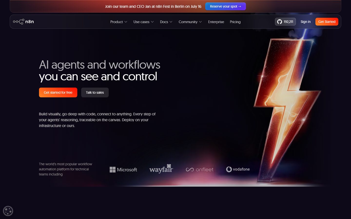
A dark, technical workflow-automation interface built on a deep near-black violet canvas (#0e0918) with warm orange-to-red CTA voltage and the geometric Geomanist display typeface. The system reads as developer-confident and product-led — node/canvas product fragments shown inside soft-rounded dark cards, white headlines over muted gray body text, and a single high-energy orange gradient reserved for the primary action. Brand voltage comes from the lightning-bolt hero imagery and the warm accent stack against an otherwise cool dark surface.
---
version: alpha
name: n8n-design-analysis
description: A dark, technical workflow-automation interface built on a deep near-black violet canvas (#0e0918) with warm orange-to-red CTA voltage and the geometric Geomanist display typeface. The system reads as developer-confident and product-led — node/canvas product fragments shown inside soft-rounded dark cards, white headlines over muted gray body text, and a single high-energy orange gradient reserved for the primary action. Brand voltage comes from the lightning-bolt hero imagery and the warm accent stack against an otherwise cool dark surface.

colors:
  ink: "#ffffff"
  body: "#d1cece"
  muted: "#9d9797"
  muted-soft: "#7a7a7a"
  muted-mid: "#999999"
  neutral-light: "#e4e4e4"
  neutral-faint: "#a3a3a3"
  neutral-border: "#464646"
  canvas: "#0e0918"
  surface: "#1b1728"
  surface-alt: "#1a1624"
  surface-violet: "#1f192a"
  black: "#000000"
  accent-orange: "#ff9b26"
  accent-orange-alt: "#fd8925"
  accent-red: "#ee4f27"
  accent-red-bright: "#ff0c00"
  accent-blue: "#077ac7"
  accent-purple: "#6b21ef"
  accent-green: "#35a670"
  on-accent: "#ffffff"

typography:
  display:
    fontFamily: "Geomanist, Inter, sans-serif"
    fontSize: 48px
    fontWeight: 400
    lineHeight: 1.0
    letterSpacing: -0.96px
  title:
    fontFamily: "Geomanist, Inter, sans-serif"
    fontSize: 24px
    fontWeight: 400
    lineHeight: 1.2
    letterSpacing: -0.48px
  body:
    fontFamily: "Geomanist, Inter, sans-serif"
    fontSize: 16px
    fontWeight: 400
    lineHeight: 1.5
    letterSpacing: normal
  button:
    fontFamily: "Geomanist, Inter, sans-serif"
    fontSize: 14px
    fontWeight: 400
    lineHeight: 1.5
    letterSpacing: normal

rounded:
  xs: 4px
  sm: 6px
  md: 8px
  lg: 12px
  xl: 16px
  xxl: 24px
  pill: 40px

spacing:
  xxs: 4px
  xs: 8px
  sm: 12px
  md: 16px
  lg: 20px
  xl: 24px
  xxl: 32px
  huge: 40px
  huge-44: 44px
  section: 48px

components:
  top-nav:
    backgroundColor: "{colors.canvas}"
    textColor: "{colors.body}"
    typography: "{typography.button}"
    rounded: "{rounded.lg}"
  announcement-bar:
    backgroundColor: "{colors.surface}"
    textColor: "{colors.ink}"
    typography: "{typography.button}"
  button-primary:
    backgroundColor: "{colors.accent-orange}"
    textColor: "{colors.on-accent}"
    typography: "{typography.button}"
    rounded: "{rounded.md}"
    padding: 0px 20px
  button-secondary:
    backgroundColor: "{colors.surface-alt}"
    textColor: "{colors.ink}"
    typography: "{typography.button}"
    rounded: "{rounded.md}"
    padding: 0px 20px
  button-tertiary:
    backgroundColor: "{colors.accent-purple}"
    textColor: "{colors.on-accent}"
    typography: "{typography.button}"
    rounded: "{rounded.md}"
    padding: 0px 20px
  github-stat-pill:
    backgroundColor: "{colors.surface}"
    textColor: "{colors.body}"
    typography: "{typography.button}"
    rounded: "{rounded.pill}"
    padding: 8px 16px
  feature-card:
    backgroundColor: "{colors.surface}"
    textColor: "{colors.body}"
    typography: "{typography.body}"
    rounded: "{rounded.xl}"
    padding: 32px
  product-mockup-card:
    backgroundColor: "{colors.surface-alt}"
    textColor: "{colors.body}"
    rounded: "{rounded.xl}"
    padding: 24px
  testimonial-card:
    backgroundColor: "{colors.surface}"
    textColor: "{colors.body}"
    typography: "{typography.body}"
    rounded: "{rounded.lg}"
    padding: 24px
  footer:
    backgroundColor: "{colors.canvas}"
    textColor: "{colors.muted}"
    typography: "{typography.body}"
    padding: 48px
---

## Overview

n8n's marketing surface is a **dark, developer-first interface** anchored on a deep near-black violet canvas (`{colors.canvas}` — #0e0918). Headlines render white (`{colors.ink}` — #ffffff), body copy steps down to a warm gray (`{colors.body}` — #d1cece), and a single high-energy orange gradient (`{colors.accent-orange}` — #ff9b26) carries the primary CTA. The page reads as technical and confident — automation product for engineers — without going neon or busy.

Type is set entirely in **Geomanist**, a geometric sans, at weight 400 across every role. The display headline ("AI agents and workflows you can see and control") uses negative letter-spacing (-0.96px) to tighten the geometric forms; body and button text sit at normal tracking. There is no second typeface — Geomanist does everything from 48px display to 14px button labels.

Brand voltage comes from two places: the **glowing lightning-bolt hero imagery** (warm orange/red light against the cool dark canvas) and the **warm accent stack** (`{colors.accent-orange}`, `{colors.accent-red}`, `{colors.accent-red-bright}`) reserved almost entirely for the primary action and decorative glow. Product fragments — node canvas, self-hosting toggles, workflow chrome — are shown directly inside soft-rounded dark cards rather than illustrated.

**Key Characteristics:**
- Deep violet-black canvas (`{colors.canvas}` — #0e0918). The entire site is dark; there is no light mode in the captured pages.
- Single warm orange CTA (`{colors.accent-orange}` — #ff9b26) on a `{rounded.md}` (8px) button. The orange gradient is the only loud color on the page.
- Geomanist geometric sans for every text role at weight 400 (substituted with an open-source face below — Geomanist is a commercial/licensed typeface).
- Soft-rounded dark cards (`{rounded.xl}` — 16px) carrying product UI fragments and feature copy, with a subtle warm inset hairline shadow.
- Layered dark surfaces: `{colors.surface}` (#1b1728), `{colors.surface-alt}` (#1a1624), `{colors.surface-violet}` (#1f192a) give shallow depth without leaving the near-black family.
- Spacing rhythm built on a 4px base with a strong 16px (`{spacing.md}`) and 32px (`{spacing.xxl}`) cadence.
- Pill-radius (`{rounded.pill}` — 40px) used for the GitHub star-count chip; everything else is `{rounded.md}`/`{rounded.lg}`/`{rounded.xl}`.

## Colors

### Brand & Accent
- **Accent Orange** (`{colors.accent-orange}` — #ff9b26): The primary action color. Drives the "Get started for free" / "Get Started" CTA gradient and warm glow accents. The single loudest hue in the system.
- **Accent Orange Alt** (`{colors.accent-orange-alt}` — #fd8925): A second warm orange used in the gradient blend and decorative glow.
- **Accent Red** (`{colors.accent-red}` — #ee4f27) and **Accent Red Bright** (`{colors.accent-red-bright}` — #ff0c00): The hotter end of the warm stack — used in the lightning-bolt hero imagery and the orange→red CTA gradient.
- **Accent Blue** (`{colors.accent-blue}` — #077ac7): A cool accent that appears in the announcement-bar "Reserve your spot" button and as a CTA shadow tint (it shows up in the layered button box-shadow).
- **Accent Purple** (`{colors.accent-purple}` — #6b21ef): Secondary CTA accent ("Explore AI" button inside feature cards) and product-UI highlight chips.
- **Accent Green** (`{colors.accent-green}` — #35a670): Success/checkmark accent in product fragments and feature checklists.

### Surface
- **Canvas** (`{colors.canvas}` — #0e0918): The page floor — a deep violet-black behind every section.
- **Surface** (`{colors.surface}` — #1b1728): The primary raised card surface, announcement bar, GitHub chip.
- **Surface Alt** (`{colors.surface-alt}` — #1a1624): A near-identical card tone for secondary cards and the dark "Talk to sales" button.
- **Surface Violet** (`{colors.surface-violet}` — #1f192a): The lightest of the dark surfaces — nested panels and inner product-UI tiles.
- **Black** (`{colors.black}` — #000000): Used in shadow tints and the deepest occlusion zones.

### Text
- **Ink** (`{colors.ink}` — #ffffff): All headlines and high-emphasis labels.
- **Body** (`{colors.body}` — #d1cece): Default running-text — a warm light gray, not pure white.
- **Muted** (`{colors.muted}` — #9d9797): Secondary text — sub-labels, captions.
- **Muted Soft** (`{colors.muted-soft}` — #7a7a7a) and **Muted Mid** (`{colors.muted-mid}` — #999999): Tertiary text and fine print.
- **Neutral Light** (`{colors.neutral-light}` — #e4e4e4) / **Neutral Faint** (`{colors.neutral-faint}` — #a3a3a3): Additional gray steps observed in UI chrome and logos.
- **Neutral Border** (`{colors.neutral-border}` — #464646): Hairline borders/dividers on dark surfaces.
- **On Accent** (`{colors.on-accent}` — #ffffff): Text on the orange/purple/blue buttons.

## Typography

### Font Family
The system runs a single typeface: **Geomanist**, a geometric sans-serif, at weight 400 across every role. There is no secondary body/UI face — Geomanist handles display headlines, titles, body copy, and button labels alike. Display sizes get negative letter-spacing (-0.96px at 48px, -0.48px at 24px) to tighten the geometric forms; body and button text use normal tracking.

### Note on Font Substitutes
**Geomanist is a commercial/licensed typeface** (by Atipo) and should not be self-served without a license. For an open-source substitute, **Inter** at weight 400 (with roughly -0.02em tracking on display sizes) preserves the clean geometric-leaning silhouette; **Manrope** at weight 400–500 is a closer geometric match for the display headlines. The frontmatter fallback stack is `Geomanist, Inter, sans-serif`.

### Hierarchy

| Token | Size | Weight | Line Height | Letter Spacing | Use |
|---|---|---|---|---|---|
| `{typography.display}` | 48px | 400 | 1.0 | -0.96px | Section heads / hero headline ("AI agents and workflows…") |
| `{typography.title}` | 24px | 400 | 1.2 | -0.48px | Card titles, sub-section heads ("Runs where you decide") |
| `{typography.body}` | 16px | 400 | 1.5 | normal | Default running-text, feature descriptions |
| `{typography.button}` | 14px | 400 | 1.5 | normal | Button labels, nav links, chip text |

### Principles
Weight stays at 400 everywhere — n8n never bolds to 600/700. Emphasis comes from size and from white-vs-gray contrast (`{colors.ink}` headlines over `{colors.body}` paragraphs), not from weight. Display sizes carry negative tracking; body never does.

## Layout

### Spacing System
- **Base unit:** 4px.
- **Tokens:** `{spacing.xxs}` 4px · `{spacing.xs}` 8px · `{spacing.sm}` 12px · `{spacing.md}` 16px · `{spacing.lg}` 20px · `{spacing.xl}` 24px · `{spacing.xxl}` 32px · `{spacing.huge}` 40px · `{spacing.huge-44}` 44px · `{spacing.section}` 48px.
- **Dominant rhythm:** 16px (`{spacing.md}`) is by far the most frequent spacing value (measured ~181 occurrences) — the workhorse gap/padding unit. 32px (`{spacing.xxl}`) and 48px (`{spacing.section}`) handle larger band and card separation.
- **Card internal padding:** `{spacing.xxl}` (32px) on feature cards; `{spacing.xl}` (24px) on testimonial and product-mockup cards.

### Grid & Container
- **Hero band:** A left-weighted split — headline + CTA cluster + sub-copy on the left, hero lightning-bolt imagery on the right.
- **Feature grids:** 2-up card layouts at desktop ("Build complex AI…" / "Let people and logic guide AI decisions"), with nested product-mockup tiles.
- **Testimonials:** Multi-column quote cards on the dark canvas.
- **Footer:** Multi-column link list on the canvas, closed by a warm orange glow at the page bottom.

### Whitespace Philosophy
n8n leans into generous dark whitespace — long vertical gaps between bands let the glowing hero imagery and product fragments breathe against the near-black canvas. The 16px base rhythm keeps card interiors tight and scannable while section gaps stay large.

## Elevation & Depth

| Level | Treatment | Use |
|---|---|---|
| Flat | No shadow, on `{colors.canvas}` | Body sections, hero copy |
| Hairline ring | `rgba(0,0,0,0.44) 0px 0px 0px 1px` | Subtle 1px ring around chips/inputs |
| Soft ambient | `rgba(0,0,0,0.26) 0px 0px 8px 0px` | Floating dark elements |
| Warm card inset | `rgba(255,255,255,0.1) 0px 0px 0px 1px inset, rgba(255,142,93,0.3) 0px 1px 0px 0px inset` | Feature/product cards — a 1px white inset ring + a warm orange top inset highlight |
| Layered CTA | `rgba(255,255,255,0.2) 0px 1px 1px 0px inset, rgba(8,8,8,0.2) 0px 1px 2px, rgba(8,8,8,0.08) 0px 4px 4px, rgb(7,122,199) 0px 7px 0px -12px, rgba(255,255,255,0.12) 0px 6px 12px` | The primary CTA's multi-layer glow — white top inset, dark ambient drop, and a blue (`{colors.accent-blue}`) lift shadow |

The elevation philosophy is **glow over shadow**: on dark surfaces, depth is signaled by inset highlights (warm orange top edge, white 1px ring) and colored lift shadows rather than dark drop shadows. The CTA stacks five shadow layers — including a blue lift tint — to feel physically raised.

### Decorative Depth
- The hero lightning-bolt imagery emits a warm orange/red glow that bleeds into the surrounding canvas — purely decorative product imagery, not a token.
- A faint radial violet glow sits behind mid-page feature bands, lifting cards off the canvas.

## Shapes

### Border Radius Scale

| Token | Value | Use |
|---|---|---|
| `{rounded.xs}` | 4px | Rare — small inline accents |
| `{rounded.sm}` | 6px | Small chips, inner UI cells |
| `{rounded.md}` | 8px | Standard buttons (primary, secondary, tertiary) |
| `{rounded.lg}` | 12px | Default content cards, testimonial cards (most-used radius — measured ~80×) |
| `{rounded.xl}` | 16px | Larger feature cards and product-mockup containers (sometimes bottom-only: `0 0 16px 16px`) |
| `{rounded.xxl}` | 24px | Large panels and rounded section containers |
| `{rounded.pill}` | 40px | GitHub star-count chip and fully-rounded pills |

### Imagery Geometry
Product-UI fragments inside cards retain their native chrome (node connectors, toggle rows, checkmark lists). Some cards round only their bottom corners (`0px 0px 16px 16px`), implying a header image or product canvas seated flush at the top edge.

## Components

### Navigation

**`top-nav`** — Dark nav pinned to the top, sitting on `{colors.canvas}` with a rounded container edge (`{rounded.lg}`). Carries the n8n wordmark + node logo at left, a horizontal menu (Product, Use cases, Docs, Community, Enterprise, Pricing) center, and a right cluster: a `{component.github-stat-pill}` star count, a "Sign in" text link, and a primary "Get Started" CTA. Nav labels use `{typography.button}` (Geomanist 14px / 400) in `{colors.body}`.

**`announcement-bar`** — A full-width strip above the nav ("Join our team and CEO Jan at n8n Fest in Berlin on July 16") on `{colors.surface}`, with a blue "Reserve your spot →" button (`{colors.accent-blue}`) and white text.

### Buttons

**`button-primary`** — The signature CTA. Warm orange fill (`{colors.accent-orange}`, blending toward `{colors.accent-red}` as a gradient — derived from the orange→red accent stack and the layered box-shadow), white text (`{colors.on-accent}`), type `{typography.button}`, rounded `{rounded.md}` (8px), padding `0px 20px`. Carries the five-layer lift shadow described in Elevation. Used for "Get started for free" and "Get Started".

**`button-secondary`** — Dark companion button ("Talk to sales"). Background `{colors.surface-alt}`, white text, same `{rounded.md}` radius and `0px 20px` padding. Sits beside the primary in the hero CTA cluster.

**`button-tertiary`** — Purple accent button ("Explore AI") used inside feature cards. Background `{colors.accent-purple}`, white text, `{rounded.md}`.

**`github-stat-pill`** — The GitHub star-count chip in the nav (e.g., "192,211"). Background `{colors.surface}`, `{colors.body}` text, fully rounded `{rounded.pill}` (40px), with the 1px dark hairline ring shadow.

### Cards & Containers

**`feature-card`** — The primary dark content card ("Build complex AI without getting boxed in"). Background `{colors.surface}`, rounded `{rounded.xl}` (16px), internal padding `{spacing.xxl}` (32px), with the warm-inset card shadow (white 1px ring + orange top inset). Carries a `{typography.title}` headline, `{typography.body}` description, an embedded product-mockup, and sometimes a `{component.button-tertiary}`.

**`product-mockup-card`** — Cards showing actual n8n product UI fragments (node canvas, self-hosting toggles, "Local AI" chips). Background `{colors.surface-alt}`, rounded `{rounded.xl}`, padding `{spacing.xl}` (24px). The product chrome inside carries its own radii; checkmark items use `{colors.accent-green}`.

**`testimonial-card`** — Customer-quote cards ("Thank you to the n8n community…", "n8n is a beast for automation."). Background `{colors.surface}`, rounded `{rounded.lg}` (12px), padding `{spacing.xl}` (24px). Quote in `{typography.body}` with a name/handle in `{colors.muted}` below.

### Footer

**`footer`** — Multi-column dark footer on `{colors.canvas}` closing the page, with link groups (Careers, Contact, Case Studies, AI agent report, Partners, Affiliate program) in `{colors.muted}` text. A warm orange glow rises from the page bottom edge to close the long scroll.

## Do's and Don'ts

### Do
- Keep the entire interface dark — `{colors.canvas}` (#0e0918) is the floor; layer `{colors.surface}` / `{colors.surface-alt}` / `{colors.surface-violet}` for shallow depth.
- Reserve `{colors.accent-orange}` for the single primary CTA per band. The orange is loud by design — don't dilute it.
- Set all text in Geomanist (or its substitute) at weight 400. Use size and white-vs-gray contrast for hierarchy, never weight.
- Apply negative letter-spacing on display/title sizes (-0.96px / -0.48px). It's part of the geometric voice.
- Use inset highlights (white 1px ring, warm orange top edge) for card elevation rather than heavy dark drop shadows.
- Embed real product UI fragments (node canvas, toggles, checklists) inside cards — show the product, don't illustrate it.
- Use `{rounded.lg}` (12px) as the default card radius and `{rounded.xl}` (16px) for larger feature cards.

### Don't
- Don't introduce a light surface — there's no light mode in the system.
- Don't bold type past weight 400. n8n is a single-weight system.
- Don't spread the warm orange across non-action elements; keep it on the primary CTA and decorative glow.
- Don't use the blue (`{colors.accent-blue}`) or purple (`{colors.accent-purple}`) on the main hero CTA — those are reserved for the announcement bar and in-card secondary actions respectively.
- Don't add radii beyond `{rounded.pill}` (40px) except where a fully-rounded chip is intended.
- Don't document hover states — primary CTA pressed/active only.

## Responsive Behavior

### Breakpoints
The captured pages were measured at desktop width; precise breakpoint values were not extracted. Observed structure implies a standard collapse.

| Name | Width (inferred) | Key Changes |
|---|---|---|
| Mobile | < 768px | Nav collapses to hamburger; hero headline + CTA stack above hero imagery; feature/testimonial grids go 1-up |
| Tablet | 768–1024px | Nav tightens; 2-up feature grid may reduce to 1-up; product-mockup tiles stack |
| Desktop | > 1024px | Full horizontal nav, left-weighted hero split, 2-up feature grids |

### Touch Targets
- `{component.button-primary}` uses `0px 20px` horizontal padding; vertical height was not captured — confirm a ≥44px tap height in build (the 44px spacing token appears in the system).
- `{component.github-stat-pill}` is a compact pill; ensure its tap area meets minimums on mobile.

### Collapsing Strategy
- Hero splits to single column on mobile (copy + CTA first, imagery below).
- Feature grids reduce column count rather than scaling cards down.
- Footer link columns wrap to fewer columns on narrow widths.

## Iteration Guide

1. Focus on ONE component at a time. Reference its YAML key directly (`{component.feature-card}`, `{component.button-primary}`).
2. Variants live as separate entries in `components:` — don't fold an active/secondary state into a base component.
3. Use `{token.refs}` everywhere — never inline a hex in a component.
4. Never document hover. Default and active/pressed only.
5. Type stays Geomanist (or substitute) at weight 400. Hierarchy is size + white/gray contrast, not weight.
6. The warm orange CTA is the only loud color — keep it scarce.
7. Depth on dark surfaces = inset highlight + colored lift shadow, not dark drop shadow.

## Known Gaps

- **No h1 token was measured** — the hero headline ("AI agents and workflows you can see and control") appears larger than the 48px `{typography.display}` (h2) value; its exact size/weight needs ground-truth confirmation. Documented display size is the measured h2.
- **Geomanist is a licensed/commercial typeface** but was not flagged in `fonts_licensed`; treat it as licensed and use the documented open-source substitute (Inter / Manrope) unless a license is held.
- **Button background colors are derived**, not directly measured — analysis captured only the white text color (`#ffffff`), 8px radius, and `0px 20px` padding for `button-primary`. The orange gradient fill is inferred (derived) from the warm accent stack and the layered box-shadow that contains a blue lift tint.
- **Button and input heights** were not captured; only horizontal padding is measured.
- **Card backgrounds** assigned to `{colors.surface}` / `{colors.surface-alt}` are mapped from the measured dark-surface palette; the analysis card record captured only radius and shadow, not fill.
- **Gradient stops** for the CTA and hero glow are not precisely measured — the orange/red blend is documented from the accent palette and screenshot ground-truth.
- **Animation, transition timings, and hover/focus states** are out of scope and were not extracted.
- **Breakpoint values** are inferred from layout, not measured.

<!-- Documented by duply · real-world design systems as ready-to-use DESIGN.md for AI coding agents · https://duply.ai/n8n/design-md -->
Color Palette
Accent
Neutrals
Typography
display48px · 400 · 1
The quick brown fox jumpstitle24px · 400 · 1.2
The quick brown fox jumpsbody16px · 400 · 1.5
The quick brown fox jumpsbutton14px · 400 · 1.5
The quick brown fox jumpsSpacing & Shape
Spacing
| Name | Value | Preview |
|---|---|---|
| xxs | 4px | |
| xs | 8px | |
| sm | 12px | |
| md | 16px | |
| lg | 20px | |
| xl | 24px | |
| xxl | 32px | |
| huge | 40px | |
| huge-44 | 44px | |
| section | 48px |
Border Radius
| Name | Value | Preview |
|---|---|---|
| xs | 4px | |
| sm | 6px | |
| md | 8px | |
| lg | 12px | |
| xl | 16px | |
| xxl | 24px | |
| pill | 40px |
More like this


---
version: alpha
name: n8n-design-analysis
description: A dark, technical workflow-automation interface built on a deep near-black violet canvas (#0e0918) with warm orange-to-red CTA voltage and the geometric Geomanist display typeface. The system reads as developer-confident and product-led — node/canvas product fragments shown inside soft-rounded dark cards, white headlines over muted gray body text, and a single high-energy orange gradient reserved for the primary action. Brand voltage comes from the lightning-bolt hero imagery and the warm accent stack against an otherwise cool dark surface.

colors:
  ink: "#ffffff"
  body: "#d1cece"
  muted: "#9d9797"
  muted-soft: "#7a7a7a"
  muted-mid: "#999999"
  neutral-light: "#e4e4e4"
  neutral-faint: "#a3a3a3"
  neutral-border: "#464646"
  canvas: "#0e0918"
  surface: "#1b1728"
  surface-alt: "#1a1624"
  surface-violet: "#1f192a"
  black: "#000000"
  accent-orange: "#ff9b26"
  accent-orange-alt: "#fd8925"
  accent-red: "#ee4f27"
  accent-red-bright: "#ff0c00"
  accent-blue: "#077ac7"
  accent-purple: "#6b21ef"
  accent-green: "#35a670"
  on-accent: "#ffffff"

typography:
  display:
    fontFamily: "Geomanist, Inter, sans-serif"
    fontSize: 48px
    fontWeight: 400
    lineHeight: 1.0
    letterSpacing: -0.96px
  title:
    fontFamily: "Geomanist, Inter, sans-serif"
    fontSize: 24px
    fontWeight: 400
    lineHeight: 1.2
    letterSpacing: -0.48px
  body:
    fontFamily: "Geomanist, Inter, sans-serif"
    fontSize: 16px
    fontWeight: 400
    lineHeight: 1.5
    letterSpacing: normal
  button:
    fontFamily: "Geomanist, Inter, sans-serif"
    fontSize: 14px
    fontWeight: 400
    lineHeight: 1.5
    letterSpacing: normal

rounded:
  xs: 4px
  sm: 6px
  md: 8px
  lg: 12px
  xl: 16px
  xxl: 24px
  pill: 40px

spacing:
  xxs: 4px
  xs: 8px
  sm: 12px
  md: 16px
  lg: 20px
  xl: 24px
  xxl: 32px
  huge: 40px
  huge-44: 44px
  section: 48px

components:
  top-nav:
    backgroundColor: "{colors.canvas}"
    textColor: "{colors.body}"
    typography: "{typography.button}"
    rounded: "{rounded.lg}"
  announcement-bar:
    backgroundColor: "{colors.surface}"
    textColor: "{colors.ink}"
    typography: "{typography.button}"
  button-primary:
    backgroundColor: "{colors.accent-orange}"
    textColor: "{colors.on-accent}"
    typography: "{typography.button}"
    rounded: "{rounded.md}"
    padding: 0px 20px
  button-secondary:
    backgroundColor: "{colors.surface-alt}"
    textColor: "{colors.ink}"
    typography: "{typography.button}"
    rounded: "{rounded.md}"
    padding: 0px 20px
  button-tertiary:
    backgroundColor: "{colors.accent-purple}"
    textColor: "{colors.on-accent}"
    typography: "{typography.button}"
    rounded: "{rounded.md}"
    padding: 0px 20px
  github-stat-pill:
    backgroundColor: "{colors.surface}"
    textColor: "{colors.body}"
    typography: "{typography.button}"
    rounded: "{rounded.pill}"
    padding: 8px 16px
  feature-card:
    backgroundColor: "{colors.surface}"
    textColor: "{colors.body}"
    typography: "{typography.body}"
    rounded: "{rounded.xl}"
    padding: 32px
  product-mockup-card:
    backgroundColor: "{colors.surface-alt}"
    textColor: "{colors.body}"
    rounded: "{rounded.xl}"
    padding: 24px
  testimonial-card:
    backgroundColor: "{colors.surface}"
    textColor: "{colors.body}"
    typography: "{typography.body}"
    rounded: "{rounded.lg}"
    padding: 24px
  footer:
    backgroundColor: "{colors.canvas}"
    textColor: "{colors.muted}"
    typography: "{typography.body}"
    padding: 48px
---

## Overview

n8n's marketing surface is a **dark, developer-first interface** anchored on a deep near-black violet canvas (`{colors.canvas}` — #0e0918). Headlines render white (`{colors.ink}` — #ffffff), body copy steps down to a warm gray (`{colors.body}` — #d1cece), and a single high-energy orange gradient (`{colors.accent-orange}` — #ff9b26) carries the primary CTA. The page reads as technical and confident — automation product for engineers — without going neon or busy.

Type is set entirely in **Geomanist**, a geometric sans, at weight 400 across every role. The display headline ("AI agents and workflows you can see and control") uses negative letter-spacing (-0.96px) to tighten the geometric forms; body and button text sit at normal tracking. There is no second typeface — Geomanist does everything from 48px display to 14px button labels.

Brand voltage comes from two places: the **glowing lightning-bolt hero imagery** (warm orange/red light against the cool dark canvas) and the **warm accent stack** (`{colors.accent-orange}`, `{colors.accent-red}`, `{colors.accent-red-bright}`) reserved almost entirely for the primary action and decorative glow. Product fragments — node canvas, self-hosting toggles, workflow chrome — are shown directly inside soft-rounded dark cards rather than illustrated.

**Key Characteristics:**
- Deep violet-black canvas (`{colors.canvas}` — #0e0918). The entire site is dark; there is no light mode in the captured pages.
- Single warm orange CTA (`{colors.accent-orange}` — #ff9b26) on a `{rounded.md}` (8px) button. The orange gradient is the only loud color on the page.
- Geomanist geometric sans for every text role at weight 400 (substituted with an open-source face below — Geomanist is a commercial/licensed typeface).
- Soft-rounded dark cards (`{rounded.xl}` — 16px) carrying product UI fragments and feature copy, with a subtle warm inset hairline shadow.
- Layered dark surfaces: `{colors.surface}` (#1b1728), `{colors.surface-alt}` (#1a1624), `{colors.surface-violet}` (#1f192a) give shallow depth without leaving the near-black family.
- Spacing rhythm built on a 4px base with a strong 16px (`{spacing.md}`) and 32px (`{spacing.xxl}`) cadence.
- Pill-radius (`{rounded.pill}` — 40px) used for the GitHub star-count chip; everything else is `{rounded.md}`/`{rounded.lg}`/`{rounded.xl}`.

## Colors

### Brand & Accent
- **Accent Orange** (`{colors.accent-orange}` — #ff9b26): The primary action color. Drives the "Get started for free" / "Get Started" CTA gradient and warm glow accents. The single loudest hue in the system.
- **Accent Orange Alt** (`{colors.accent-orange-alt}` — #fd8925): A second warm orange used in the gradient blend and decorative glow.
- **Accent Red** (`{colors.accent-red}` — #ee4f27) and **Accent Red Bright** (`{colors.accent-red-bright}` — #ff0c00): The hotter end of the warm stack — used in the lightning-bolt hero imagery and the orange→red CTA gradient.
- **Accent Blue** (`{colors.accent-blue}` — #077ac7): A cool accent that appears in the announcement-bar "Reserve your spot" button and as a CTA shadow tint (it shows up in the layered button box-shadow).
- **Accent Purple** (`{colors.accent-purple}` — #6b21ef): Secondary CTA accent ("Explore AI" button inside feature cards) and product-UI highlight chips.
- **Accent Green** (`{colors.accent-green}` — #35a670): Success/checkmark accent in product fragments and feature checklists.

### Surface
- **Canvas** (`{colors.canvas}` — #0e0918): The page floor — a deep violet-black behind every section.
- **Surface** (`{colors.surface}` — #1b1728): The primary raised card surface, announcement bar, GitHub chip.
- **Surface Alt** (`{colors.surface-alt}` — #1a1624): A near-identical card tone for secondary cards and the dark "Talk to sales" button.
- **Surface Violet** (`{colors.surface-violet}` — #1f192a): The lightest of the dark surfaces — nested panels and inner product-UI tiles.
- **Black** (`{colors.black}` — #000000): Used in shadow tints and the deepest occlusion zones.

### Text
- **Ink** (`{colors.ink}` — #ffffff): All headlines and high-emphasis labels.
- **Body** (`{colors.body}` — #d1cece): Default running-text — a warm light gray, not pure white.
- **Muted** (`{colors.muted}` — #9d9797): Secondary text — sub-labels, captions.
- **Muted Soft** (`{colors.muted-soft}` — #7a7a7a) and **Muted Mid** (`{colors.muted-mid}` — #999999): Tertiary text and fine print.
- **Neutral Light** (`{colors.neutral-light}` — #e4e4e4) / **Neutral Faint** (`{colors.neutral-faint}` — #a3a3a3): Additional gray steps observed in UI chrome and logos.
- **Neutral Border** (`{colors.neutral-border}` — #464646): Hairline borders/dividers on dark surfaces.
- **On Accent** (`{colors.on-accent}` — #ffffff): Text on the orange/purple/blue buttons.

## Typography

### Font Family
The system runs a single typeface: **Geomanist**, a geometric sans-serif, at weight 400 across every role. There is no secondary body/UI face — Geomanist handles display headlines, titles, body copy, and button labels alike. Display sizes get negative letter-spacing (-0.96px at 48px, -0.48px at 24px) to tighten the geometric forms; body and button text use normal tracking.

### Note on Font Substitutes
**Geomanist is a commercial/licensed typeface** (by Atipo) and should not be self-served without a license. For an open-source substitute, **Inter** at weight 400 (with roughly -0.02em tracking on display sizes) preserves the clean geometric-leaning silhouette; **Manrope** at weight 400–500 is a closer geometric match for the display headlines. The frontmatter fallback stack is `Geomanist, Inter, sans-serif`.

### Hierarchy

| Token | Size | Weight | Line Height | Letter Spacing | Use |
|---|---|---|---|---|---|
| `{typography.display}` | 48px | 400 | 1.0 | -0.96px | Section heads / hero headline ("AI agents and workflows…") |
| `{typography.title}` | 24px | 400 | 1.2 | -0.48px | Card titles, sub-section heads ("Runs where you decide") |
| `{typography.body}` | 16px | 400 | 1.5 | normal | Default running-text, feature descriptions |
| `{typography.button}` | 14px | 400 | 1.5 | normal | Button labels, nav links, chip text |

### Principles
Weight stays at 400 everywhere — n8n never bolds to 600/700. Emphasis comes from size and from white-vs-gray contrast (`{colors.ink}` headlines over `{colors.body}` paragraphs), not from weight. Display sizes carry negative tracking; body never does.

## Layout

### Spacing System
- **Base unit:** 4px.
- **Tokens:** `{spacing.xxs}` 4px · `{spacing.xs}` 8px · `{spacing.sm}` 12px · `{spacing.md}` 16px · `{spacing.lg}` 20px · `{spacing.xl}` 24px · `{spacing.xxl}` 32px · `{spacing.huge}` 40px · `{spacing.huge-44}` 44px · `{spacing.section}` 48px.
- **Dominant rhythm:** 16px (`{spacing.md}`) is by far the most frequent spacing value (measured ~181 occurrences) — the workhorse gap/padding unit. 32px (`{spacing.xxl}`) and 48px (`{spacing.section}`) handle larger band and card separation.
- **Card internal padding:** `{spacing.xxl}` (32px) on feature cards; `{spacing.xl}` (24px) on testimonial and product-mockup cards.

### Grid & Container
- **Hero band:** A left-weighted split — headline + CTA cluster + sub-copy on the left, hero lightning-bolt imagery on the right.
- **Feature grids:** 2-up card layouts at desktop ("Build complex AI…" / "Let people and logic guide AI decisions"), with nested product-mockup tiles.
- **Testimonials:** Multi-column quote cards on the dark canvas.
- **Footer:** Multi-column link list on the canvas, closed by a warm orange glow at the page bottom.

### Whitespace Philosophy
n8n leans into generous dark whitespace — long vertical gaps between bands let the glowing hero imagery and product fragments breathe against the near-black canvas. The 16px base rhythm keeps card interiors tight and scannable while section gaps stay large.

## Elevation & Depth

| Level | Treatment | Use |
|---|---|---|
| Flat | No shadow, on `{colors.canvas}` | Body sections, hero copy |
| Hairline ring | `rgba(0,0,0,0.44) 0px 0px 0px 1px` | Subtle 1px ring around chips/inputs |
| Soft ambient | `rgba(0,0,0,0.26) 0px 0px 8px 0px` | Floating dark elements |
| Warm card inset | `rgba(255,255,255,0.1) 0px 0px 0px 1px inset, rgba(255,142,93,0.3) 0px 1px 0px 0px inset` | Feature/product cards — a 1px white inset ring + a warm orange top inset highlight |
| Layered CTA | `rgba(255,255,255,0.2) 0px 1px 1px 0px inset, rgba(8,8,8,0.2) 0px 1px 2px, rgba(8,8,8,0.08) 0px 4px 4px, rgb(7,122,199) 0px 7px 0px -12px, rgba(255,255,255,0.12) 0px 6px 12px` | The primary CTA's multi-layer glow — white top inset, dark ambient drop, and a blue (`{colors.accent-blue}`) lift shadow |

The elevation philosophy is **glow over shadow**: on dark surfaces, depth is signaled by inset highlights (warm orange top edge, white 1px ring) and colored lift shadows rather than dark drop shadows. The CTA stacks five shadow layers — including a blue lift tint — to feel physically raised.

### Decorative Depth
- The hero lightning-bolt imagery emits a warm orange/red glow that bleeds into the surrounding canvas — purely decorative product imagery, not a token.
- A faint radial violet glow sits behind mid-page feature bands, lifting cards off the canvas.

## Shapes

### Border Radius Scale

| Token | Value | Use |
|---|---|---|
| `{rounded.xs}` | 4px | Rare — small inline accents |
| `{rounded.sm}` | 6px | Small chips, inner UI cells |
| `{rounded.md}` | 8px | Standard buttons (primary, secondary, tertiary) |
| `{rounded.lg}` | 12px | Default content cards, testimonial cards (most-used radius — measured ~80×) |
| `{rounded.xl}` | 16px | Larger feature cards and product-mockup containers (sometimes bottom-only: `0 0 16px 16px`) |
| `{rounded.xxl}` | 24px | Large panels and rounded section containers |
| `{rounded.pill}` | 40px | GitHub star-count chip and fully-rounded pills |

### Imagery Geometry
Product-UI fragments inside cards retain their native chrome (node connectors, toggle rows, checkmark lists). Some cards round only their bottom corners (`0px 0px 16px 16px`), implying a header image or product canvas seated flush at the top edge.

## Components

### Navigation

**`top-nav`** — Dark nav pinned to the top, sitting on `{colors.canvas}` with a rounded container edge (`{rounded.lg}`). Carries the n8n wordmark + node logo at left, a horizontal menu (Product, Use cases, Docs, Community, Enterprise, Pricing) center, and a right cluster: a `{component.github-stat-pill}` star count, a "Sign in" text link, and a primary "Get Started" CTA. Nav labels use `{typography.button}` (Geomanist 14px / 400) in `{colors.body}`.

**`announcement-bar`** — A full-width strip above the nav ("Join our team and CEO Jan at n8n Fest in Berlin on July 16") on `{colors.surface}`, with a blue "Reserve your spot →" button (`{colors.accent-blue}`) and white text.

### Buttons

**`button-primary`** — The signature CTA. Warm orange fill (`{colors.accent-orange}`, blending toward `{colors.accent-red}` as a gradient — derived from the orange→red accent stack and the layered box-shadow), white text (`{colors.on-accent}`), type `{typography.button}`, rounded `{rounded.md}` (8px), padding `0px 20px`. Carries the five-layer lift shadow described in Elevation. Used for "Get started for free" and "Get Started".

**`button-secondary`** — Dark companion button ("Talk to sales"). Background `{colors.surface-alt}`, white text, same `{rounded.md}` radius and `0px 20px` padding. Sits beside the primary in the hero CTA cluster.

**`button-tertiary`** — Purple accent button ("Explore AI") used inside feature cards. Background `{colors.accent-purple}`, white text, `{rounded.md}`.

**`github-stat-pill`** — The GitHub star-count chip in the nav (e.g., "192,211"). Background `{colors.surface}`, `{colors.body}` text, fully rounded `{rounded.pill}` (40px), with the 1px dark hairline ring shadow.

### Cards & Containers

**`feature-card`** — The primary dark content card ("Build complex AI without getting boxed in"). Background `{colors.surface}`, rounded `{rounded.xl}` (16px), internal padding `{spacing.xxl}` (32px), with the warm-inset card shadow (white 1px ring + orange top inset). Carries a `{typography.title}` headline, `{typography.body}` description, an embedded product-mockup, and sometimes a `{component.button-tertiary}`.

**`product-mockup-card`** — Cards showing actual n8n product UI fragments (node canvas, self-hosting toggles, "Local AI" chips). Background `{colors.surface-alt}`, rounded `{rounded.xl}`, padding `{spacing.xl}` (24px). The product chrome inside carries its own radii; checkmark items use `{colors.accent-green}`.

**`testimonial-card`** — Customer-quote cards ("Thank you to the n8n community…", "n8n is a beast for automation."). Background `{colors.surface}`, rounded `{rounded.lg}` (12px), padding `{spacing.xl}` (24px). Quote in `{typography.body}` with a name/handle in `{colors.muted}` below.

### Footer

**`footer`** — Multi-column dark footer on `{colors.canvas}` closing the page, with link groups (Careers, Contact, Case Studies, AI agent report, Partners, Affiliate program) in `{colors.muted}` text. A warm orange glow rises from the page bottom edge to close the long scroll.

## Do's and Don'ts

### Do
- Keep the entire interface dark — `{colors.canvas}` (#0e0918) is the floor; layer `{colors.surface}` / `{colors.surface-alt}` / `{colors.surface-violet}` for shallow depth.
- Reserve `{colors.accent-orange}` for the single primary CTA per band. The orange is loud by design — don't dilute it.
- Set all text in Geomanist (or its substitute) at weight 400. Use size and white-vs-gray contrast for hierarchy, never weight.
- Apply negative letter-spacing on display/title sizes (-0.96px / -0.48px). It's part of the geometric voice.
- Use inset highlights (white 1px ring, warm orange top edge) for card elevation rather than heavy dark drop shadows.
- Embed real product UI fragments (node canvas, toggles, checklists) inside cards — show the product, don't illustrate it.
- Use `{rounded.lg}` (12px) as the default card radius and `{rounded.xl}` (16px) for larger feature cards.

### Don't
- Don't introduce a light surface — there's no light mode in the system.
- Don't bold type past weight 400. n8n is a single-weight system.
- Don't spread the warm orange across non-action elements; keep it on the primary CTA and decorative glow.
- Don't use the blue (`{colors.accent-blue}`) or purple (`{colors.accent-purple}`) on the main hero CTA — those are reserved for the announcement bar and in-card secondary actions respectively.
- Don't add radii beyond `{rounded.pill}` (40px) except where a fully-rounded chip is intended.
- Don't document hover states — primary CTA pressed/active only.

## Responsive Behavior

### Breakpoints
The captured pages were measured at desktop width; precise breakpoint values were not extracted. Observed structure implies a standard collapse.

| Name | Width (inferred) | Key Changes |
|---|---|---|
| Mobile | < 768px | Nav collapses to hamburger; hero headline + CTA stack above hero imagery; feature/testimonial grids go 1-up |
| Tablet | 768–1024px | Nav tightens; 2-up feature grid may reduce to 1-up; product-mockup tiles stack |
| Desktop | > 1024px | Full horizontal nav, left-weighted hero split, 2-up feature grids |

### Touch Targets
- `{component.button-primary}` uses `0px 20px` horizontal padding; vertical height was not captured — confirm a ≥44px tap height in build (the 44px spacing token appears in the system).
- `{component.github-stat-pill}` is a compact pill; ensure its tap area meets minimums on mobile.

### Collapsing Strategy
- Hero splits to single column on mobile (copy + CTA first, imagery below).
- Feature grids reduce column count rather than scaling cards down.
- Footer link columns wrap to fewer columns on narrow widths.

## Iteration Guide

1. Focus on ONE component at a time. Reference its YAML key directly (`{component.feature-card}`, `{component.button-primary}`).
2. Variants live as separate entries in `components:` — don't fold an active/secondary state into a base component.
3. Use `{token.refs}` everywhere — never inline a hex in a component.
4. Never document hover. Default and active/pressed only.
5. Type stays Geomanist (or substitute) at weight 400. Hierarchy is size + white/gray contrast, not weight.
6. The warm orange CTA is the only loud color — keep it scarce.
7. Depth on dark surfaces = inset highlight + colored lift shadow, not dark drop shadow.

## Known Gaps

- **No h1 token was measured** — the hero headline ("AI agents and workflows you can see and control") appears larger than the 48px `{typography.display}` (h2) value; its exact size/weight needs ground-truth confirmation. Documented display size is the measured h2.
- **Geomanist is a licensed/commercial typeface** but was not flagged in `fonts_licensed`; treat it as licensed and use the documented open-source substitute (Inter / Manrope) unless a license is held.
- **Button background colors are derived**, not directly measured — analysis captured only the white text color (`#ffffff`), 8px radius, and `0px 20px` padding for `button-primary`. The orange gradient fill is inferred (derived) from the warm accent stack and the layered box-shadow that contains a blue lift tint.
- **Button and input heights** were not captured; only horizontal padding is measured.
- **Card backgrounds** assigned to `{colors.surface}` / `{colors.surface-alt}` are mapped from the measured dark-surface palette; the analysis card record captured only radius and shadow, not fill.
- **Gradient stops** for the CTA and hero glow are not precisely measured — the orange/red blend is documented from the accent palette and screenshot ground-truth.
- **Animation, transition timings, and hover/focus states** are out of scope and were not extracted.
- **Breakpoint values** are inferred from layout, not measured.

<!-- Documented by duply · real-world design systems as ready-to-use DESIGN.md for AI coding agents · https://duply.ai/n8n/design-md -->